Compare commits
| Author | SHA1 | Date | |
|---|---|---|---|
 Alexander Holliday |
c633a9ad8d | ||
|
Alexander Holliday
|
923eda1307 | ||
|
Alexander Holliday
|
997342a31c |
No files matched your search
@@ -1 +0,0 @@
|
||||
* @ajhollid @mohicody @Br0wnHammer @Owaiseimdad @karenvicent @shanikauwu1
|
||||
@@ -6,9 +6,7 @@ import { URLSearchParams } from "url";
|
||||
// POEditor API information
|
||||
const API_TOKEN = process.env.POEDITOR_API;
|
||||
const PROJECT_ID = process.env.POEDITOR_PROJECT_ID;
|
||||
const LANGUAGES = (
|
||||
process.env.LANGUAGES || "ar,zh-tw,cs,en,fi,fr,de,pt-br,ru,es,tr,ja"
|
||||
).split(",");
|
||||
const LANGUAGES = (process.env.LANGUAGES || "tr,en").split(",");
|
||||
const EXPORT_FORMAT = process.env.EXPORT_FORMAT || "key_value_json";
|
||||
|
||||
// POEditor API endpoint
|
||||
|
||||
@@ -39,3 +39,24 @@ jobs:
|
||||
- name: Check server formatting
|
||||
working-directory: server
|
||||
run: npm run format-check
|
||||
close-pr-if-needed:
|
||||
if: always()
|
||||
runs-on: ubuntu-latest
|
||||
needs: [format-client, format-server]
|
||||
steps:
|
||||
- name: Checkout repo
|
||||
uses: actions/checkout@v4
|
||||
|
||||
- name: Get PR number
|
||||
id: pr
|
||||
run: echo "PR_NUMBER=$(jq -r .pull_request.number "$GITHUB_EVENT_PATH")" >> $GITHUB_ENV
|
||||
|
||||
- name: Close PR using GitHub CLI
|
||||
if: |
|
||||
needs.format-client.result == 'failure' ||
|
||||
needs.format-server.result == 'failure'
|
||||
env:
|
||||
GH_TOKEN: ${{ secrets.GITHUB_TOKEN }}
|
||||
run: |
|
||||
gh pr close "$PR_NUMBER" --delete-branch --comment "❌ Formatting check failed — PR auto-closed.
|
||||
Please run \`npm run format\` in both `client` and `server` directories and push again."
|
||||
@@ -79,6 +79,18 @@ jobs:
|
||||
run: |
|
||||
docker push ghcr.io/bluewave-labs/checkmate-mongo:${{ steps.extract_tag.outputs.version }}
|
||||
|
||||
- name: Build Redis Docker image
|
||||
run: |
|
||||
docker build \
|
||||
-t ghcr.io/bluewave-labs/checkmate-redis:${{ steps.extract_tag.outputs.version }} \
|
||||
-f ./docker/dist/redis.Dockerfile \
|
||||
--label org.opencontainers.image.source=https://github.com/bluewave-labs/checkmate \
|
||||
.
|
||||
|
||||
- name: Push Redis Docker image
|
||||
run: |
|
||||
docker push ghcr.io/bluewave-labs/checkmate-redis:${{ steps.extract_tag.outputs.version }}
|
||||
|
||||
docker-build-and-push-server-mono-multiarch:
|
||||
runs-on: ubuntu-latest
|
||||
steps:
|
||||
|
||||
@@ -74,6 +74,18 @@ jobs:
|
||||
run: |
|
||||
docker push ghcr.io/bluewave-labs/checkmate-mongo:latest
|
||||
|
||||
- name: Build Redis Docker image
|
||||
run: |
|
||||
docker build \
|
||||
-t ghcr.io/bluewave-labs/checkmate-redis:latest \
|
||||
-f ./docker/dist/redis.Dockerfile \
|
||||
--label org.opencontainers.image.source=https://github.com/bluewave-labs/checkmate \
|
||||
.
|
||||
|
||||
- name: Push Redis Docker image
|
||||
run: |
|
||||
docker push ghcr.io/bluewave-labs/checkmate-redis:latest
|
||||
|
||||
docker-build-and-push-server-mono-multiarch:
|
||||
runs-on: ubuntu-latest
|
||||
steps:
|
||||
|
||||
@@ -7,7 +7,7 @@ on:
|
||||
languages:
|
||||
description: "Languages to synchronize (comma separated, e.g.: tr,en,es)"
|
||||
required: false
|
||||
default: "ar,zh-tw,cs,en,fi,fr,de,pt-br,ru,es,tr,ja"
|
||||
default: "ar,zh-tw,cs,en,fi,fr,de,pt-br,ru,es,tr"
|
||||
format:
|
||||
description: "Export format (key_value_json or json)"
|
||||
required: false
|
||||
|
||||
@@ -71,6 +71,17 @@ jobs:
|
||||
- name: Push MongoDB Docker image
|
||||
run: docker push ghcr.io/bluewave-labs/checkmate:mongo-demo
|
||||
|
||||
- name: Build Redis Docker image
|
||||
run: |
|
||||
docker build \
|
||||
-t ghcr.io/bluewave-labs/checkmate:redis-demo \
|
||||
-f ./docker/prod/redis.Dockerfile \
|
||||
--label org.opencontainers.image.source=https://github.com/bluewave-labs/checkmate \
|
||||
.
|
||||
|
||||
- name: Push Redis Docker image
|
||||
run: docker push ghcr.io/bluewave-labs/checkmate:redis-demo
|
||||
|
||||
deploy-to-demo:
|
||||
needs: docker-build-and-push-server
|
||||
runs-on: ubuntu-latest
|
||||
|
||||
@@ -71,6 +71,17 @@ jobs:
|
||||
- name: Push MongoDB Docker image
|
||||
run: docker push ghcr.io/bluewave-labs/checkmate:mongo-staging
|
||||
|
||||
- name: Build Redis Docker image
|
||||
run: |
|
||||
docker build \
|
||||
-t ghcr.io/bluewave-labs/checkmate:redis-staging \
|
||||
-f ./docker/staging/redis.Dockerfile \
|
||||
--label org.opencontainers.image.source=https://github.com/bluewave-labs/checkmate \
|
||||
.
|
||||
|
||||
- name: Push Redis Docker image
|
||||
run: docker push ghcr.io/bluewave-labs/checkmate:redis-staging
|
||||
|
||||
deploy-to-staging:
|
||||
needs: docker-build-and-push-server
|
||||
runs-on: ubuntu-latest
|
||||
|
||||
-172
@@ -1,172 +0,0 @@
|
||||
<p align=center> <a href="https://trendshift.io/repositories/12443" target="_blank"><img src="https://trendshift.io/api/badge/repositories/12443" alt="bluewave-labs%2Fcheckmate | Trendshift" style="width: 250px; height: 55px;" width="250" height="55"/></a></p>
|
||||
|
||||

|
||||

|
||||

|
||||

|
||||

|
||||

|
||||

|
||||
[](https://www.bestpractices.dev/projects/9901)
|
||||
[](https://deepwiki.com/bluewave-labs/checkmate)
|
||||
|
||||
<h1 align="center"><a href="https://bluewavelabs.ca" target="_blank">Checkmate</a></h1>
|
||||
|
||||
<p align="center"><strong>Una aplicación de código abierto para monitoreo de infraestructura y tiempo de actividad</strong></p>
|
||||
|
||||
<img width="1660" alt="image" src="https://github.com/user-attachments/assets/b748f36d-a271-4965-ad0a-18bf153bbee7" />
|
||||
|
||||
Este repositorio contiene tanto el frontend como el backend de Checkmate, una herramienta de monitoreo de código abierto y autoalojada para rastrear hardware de servidores, tiempo de actividad, tiempos de respuesta e incidentes en tiempo real con visualizaciones atractivas. Checkmate revisa regularmente si un servidor o sitio web es accesible y funciona de manera óptima, proporcionando alertas e informes en tiempo real sobre la disponibilidad, el tiempo de inactividad y el tiempo de respuesta de los servicios monitoreados.
|
||||
|
||||
Checkmate también tiene un agente llamado [Capture](https://github.com/bluewave-labs/capture), para recuperar datos de servidores remotos. Aunque Capture no es obligatorio para ejecutar Checkmate, proporciona información adicional sobre el estado de la CPU, RAM, disco y temperatura de tus servidores.
|
||||
|
||||
Checkmate ha sido probado con más de 1000 monitores activos sin problemas ni cuellos de botella de rendimiento.
|
||||
|
||||
**Si deseas patrocinar una función, [visita este enlace](https://checkmate.so/sponsored-features).**
|
||||
|
||||
## 📚 Tabla de contenidos
|
||||
|
||||
- [📦 Demo](#demo)
|
||||
- [🔗 Guía del usuario](#guía-del-usuario)
|
||||
- [🛠️ Instalación](#instalación)
|
||||
- [🏁 Traducciones](#traducciones)
|
||||
- [🚀 Rendimiento](#rendimiento)
|
||||
- [💚 Preguntas e ideas](#preguntas-e-ideas)
|
||||
- [🧩 Características](#características)
|
||||
- [🏗️ Capturas de pantalla](#capturas-de-pantalla)
|
||||
- [🏗️ Tecnologías](#tecnologías)
|
||||
- [🔗 Enlaces útiles](#enlaces-útiles)
|
||||
- [🤝 Contribuciones](#contribuciones)
|
||||
- [💰 Patrocinadores](#patrocinadores)
|
||||
|
||||
...
|
||||
|
||||
**[Texto truncado para mantener la longitud del mensaje manejable]**
|
||||
|
||||
## Demo
|
||||
|
||||
Puedes ver la última versión de [Checkmate](https://checkmate-demo.bluewavelabs.ca/) en acción. El usuario es uptimedemo@demo.com y la contraseña es Demouser1! (ten en cuenta que actualizamos el servidor de demostración de vez en cuando, así que si no funciona para ti, por favor contáctanos en el canal de Discusiones).
|
||||
|
||||
## Guía del usuario
|
||||
|
||||
Las instrucciones de uso se pueden encontrar [aquí](https://docs.checkmate.so/checkmate-2.1). Todavía está en desarrollo y parte de la información puede estar desactualizada ya que continuamente añadimos funciones cada semana. ¡Ten por seguro que estamos haciendo lo mejor posible! :)
|
||||
|
||||
## Instalación
|
||||
|
||||
Consulta las instrucciones de instalación en el [portal de documentación de Checkmate](https://docs.checkmate.so/checkmate-2.1/users-guide/quickstart).
|
||||
|
||||
Alternativamente, también puedes usar [Coolify](https://coolify.io/), [Elestio](https://elest.io/open-source/checkmate), [K8s](./charts/helm/checkmate/INSTALLATION.md) o [Pikapods](https://www.pikapods.com/) para desplegar rápidamente una instancia de Checkmate. Si deseas monitorear tu infraestructura de servidores, necesitarás el agente [Capture](https://github.com/bluewave-labs/capture). El repositorio de Capture también contiene las instrucciones de instalación.
|
||||
|
||||
## Traducciones
|
||||
|
||||
Si deseas usar Checkmate en tu idioma, por favor [ve a esta página](https://poeditor.com/join/project/lRUoGZFCsJ) y regístrate para el idioma al que te gustaría traducir Checkmate.
|
||||
|
||||
## Rendimiento
|
||||
|
||||
Gracias a extensas optimizaciones, Checkmate opera con un uso de memoria excepcionalmente bajo, requiriendo recursos mínimos de memoria y CPU. Aquí está el uso de memoria de una instancia de Node.js ejecutándose en un servidor que monitorea 323 servidores cada minuto:
|
||||
|
||||

|
||||
|
||||
También puedes ver el consumo de memoria de MongoDB y Redis en el mismo servidor (398Mb y 15Mb) para la misma cantidad de servidores:
|
||||
|
||||

|
||||
|
||||
## Preguntas e Ideas
|
||||
|
||||
Si tienes alguna pregunta, sugerencia o comentario, tienes varias opciones:
|
||||
|
||||
- [Canal de Discord](https://discord.gg/NAb6H3UTjK)
|
||||
- [Discusiones en GitHub](https://github.com/bluewave-labs/bluewave-uptime/discussions)
|
||||
- [Grupo en Reddit](https://www.reddit.com/r/CheckmateMonitoring/)
|
||||
|
||||
¡No dudes en hacer preguntas o compartir tus ideas, nos encantaría saber de ti!
|
||||
|
||||
## Características
|
||||
|
||||
- Completamente de código abierto, desplegable en tus propios servidores o dispositivos personales (por ejemplo, Raspberry Pi 4 o 5)
|
||||
- Monitoreo de sitios web
|
||||
- Monitoreo de velocidad de carga
|
||||
- Monitoreo de infraestructura (memoria, uso de disco, rendimiento de CPU, etc) - requiere el agente [Capture](https://github.com/bluewave-labs/capture)
|
||||
- Monitoreo de Docker
|
||||
- Monitoreo con ping
|
||||
- Monitoreo de certificados SSL
|
||||
- Monitoreo de puertos
|
||||
- Incidentes en una sola vista
|
||||
- Páginas de estado
|
||||
- Notificaciones por correo, Webhooks, Discord, Telegram, Slack
|
||||
- Mantenimiento programado
|
||||
- Monitoreo de consultas JSON
|
||||
- Soporte para múltiples idiomas
|
||||
|
||||
**Hoja de ruta a corto plazo:** ([Milestone 2.2](https://github.com/bluewave-labs/Checkmate/milestone/8))
|
||||
|
||||
- Mejores notificaciones
|
||||
- Monitoreo de red
|
||||
- ...y algunas funciones más
|
||||
|
||||
## Capturas de pantalla
|
||||
|
||||
<p>
|
||||
<img width="1628" alt="image" src="https://github.com/user-attachments/assets/2eff6464-0738-4a32-9312-26e1e8e86275" />
|
||||
</p>
|
||||
<p>
|
||||
<img width="1656" alt="image" src="https://github.com/user-attachments/assets/616c3563-c2a7-4ee4-af6c-7e6068955d1a" />
|
||||
</p>
|
||||
<p>
|
||||
<img width="1652" alt="image" src="https://github.com/user-attachments/assets/7912d7cf-0d0e-4f26-aa5c-2ad7170b5c99" />
|
||||
</p>
|
||||
<p>
|
||||
<img width="1652" alt="image" src="https://github.com/user-attachments/assets/08c2c6ac-3a2f-44d1-a229-d1746a3f9d16" />
|
||||
</p>
|
||||
|
||||
## Tecnologías
|
||||
|
||||
- [ReactJs](https://react.dev/)
|
||||
- [MUI (framework de React)](https://mui.com/)
|
||||
- [Node.js](https://nodejs.org/en)
|
||||
- [MongoDB](https://mongodb.com)
|
||||
- [Recharts](https://recharts.org)
|
||||
- ¡Y muchos otros componentes de código abierto!
|
||||
|
||||
## Enlaces útiles
|
||||
|
||||
- Si deseas apoyarnos, por favor considera darle una ⭐ y haz clic en "watch".
|
||||
- ¿Tienes una pregunta o sugerencia para la hoja de ruta? Revisa nuestro [canal de Discord](https://discord.gg/NAb6H3UTjK) o el foro de [Discusiones](https://github.com/bluewave-labs/checkmate/discussions).
|
||||
- ¿Quieres saber cuándo hay una nueva versión? Usa [Newreleases](https://newreleases.io/), un servicio gratuito para seguir lanzamientos.
|
||||
- Mira un video de instalación y uso de Checkmate [aquí](https://www.youtube.com/watch?v=GfFOc0xHIwY)
|
||||
|
||||
## Contribuciones
|
||||
|
||||
Somos [Alex](http://github.com/ajhollid) (líder de equipo), [Vishnu](http://github.com/vishnusn77), [Mohadeseh](http://github.com/mohicody), [Gorkem](http://github.com/gorkem-bwl/), [Owaise](http://github.com/Owaiseimdad), [Aryaman](https://github.com/Br0wnHammer) y [Mert](https://github.com/mertssmnoglu), ayudando a personas y empresas a monitorear su infraestructura y servidores.
|
||||
|
||||
Nos enorgullecemos de construir conexiones fuertes con contribuyentes de todos los niveles. A pesar de ser un proyecto joven, Checkmate ya ha ganado más de 7000 estrellas y ha atraído a más de 90 contribuyentes de todo el mundo.
|
||||
|
||||
Nuestro repositorio ha sido marcado con estrella por empleados de **Google, Microsoft, Intel, Cisco, Tencent, Electronic Arts, ByteDance, JP Morgan Chase, Deloitte, Accenture, Foxconn, Broadcom, China Telecom, Barclays, Capgemini, Wipro, Cloudflare, Dassault Systèmes y NEC**, ¡así que no te detengas — participa, contribuye y aprende con nosotros!
|
||||
|
||||
Cómo contribuir:
|
||||
|
||||
0. Dale una estrella al repositorio :)
|
||||
1. Revisa la [guía para contribuidores](https://github.com/bluewave-labs/Checkmate/blob/develop/CONTRIBUTING.md). Se anima a los nuevos a revisar las etiquetas `good-first-issue`.
|
||||
2. Consulta la [estructura del proyecto](https://docs.checkmate.so/checkmate-2.1/developers-guide/general-project-structure) y la [visión general](https://bluewavelabs.gitbook.io/checkmate/developers-guide/high-level-overview).
|
||||
3. Lee una estructura detallada de [Checkmate](https://deepwiki.com/bluewave-labs/Checkmate) si deseas profundizar en la arquitectura.
|
||||
4. Abre un issue si crees que has encontrado un error.
|
||||
5. Revisa los issues con la etiqueta `good-first-issue` si eres nuevo.
|
||||
6. Haz un pull request para añadir nuevas funciones, mejoras o correcciones.
|
||||
|
||||
<a href="https://github.com/bluewave-labs/checkmate/graphs/contributors">
|
||||
<img src="https://contrib.rocks/image?repo=bluewave-labs/checkmate" />
|
||||
</a>
|
||||
|
||||
[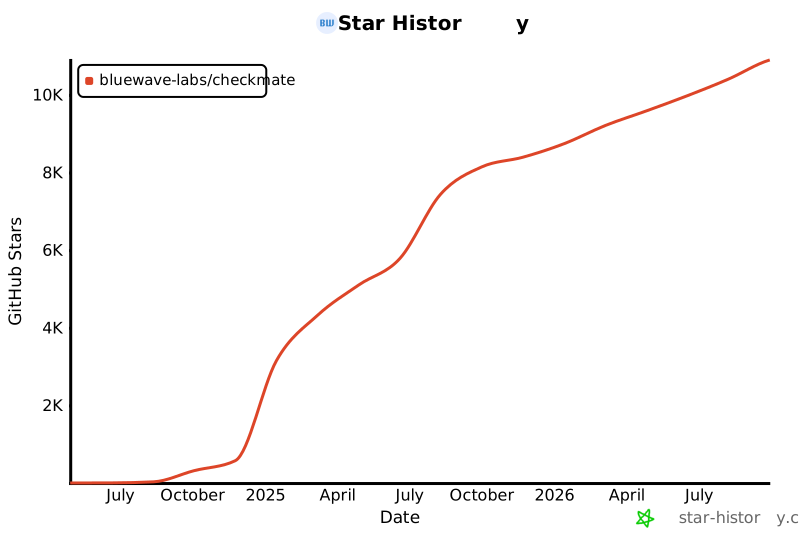](https://star-history.com/#bluewave-labs/bluewave-uptime&Date)
|
||||
|
||||
## Patrocinadores
|
||||
|
||||
Gracias a [Gitbook](https://gitbook.io/) por darnos una cuenta gratuita para su plataforma de documentación, y a [Poeditor](https://poeditor.com/) por proporcionarnos una cuenta gratuita para servicios de traducción. Si deseas patrocinar Checkmate, por favor envía un correo a hello@bluewavelabs.ca
|
||||
|
||||
Si deseas patrocinar una función, [visita esta página](https://checkmate.so/sponsored-features).
|
||||
|
||||
También puedes revisar otros proyectos de BlueWave orientados a desarrolladores y contribuidores:
|
||||
|
||||
- [VerifyWise](https://github.com/bluewave-labs/verifywise), la primera plataforma de gobernanza de IA de código abierto.
|
||||
- [DataRoom](https://github.com/bluewave-labs/bluewave-dataroom), una aplicación de intercambio de archivos seguro, también conocida como dataroom.
|
||||
- [Guidefox](https://github.com/bluewave-labs/guidefox), una app que ayuda a nuevos usuarios a aprender a usar tu producto mediante pistas, tours, popups y banners.
|
||||
@@ -18,7 +18,7 @@
|
||||
|
||||
This repository contains both the frontend and the backend of Checkmate, an open-source, self-hosted monitoring tool for tracking server hardware, uptime, response times, and incidents in real-time with beautiful visualizations. Checkmate regularly checks whether a server/website is accessible and performs optimally, providing real-time alerts and reports on the monitored services' availability, downtime, and response time.
|
||||
|
||||
Checkmate also has an agent, called [Capture](https://github.com/bluewave-labs/capture), to retrieve data from remote servers. While Capture is not required to run Checkmate, it provides additional insights about your servers' CPU, RAM, disk, and temperature status. Capture can run on Linux, Windows, Mac, Raspberry Pi, or any device that can run Go.
|
||||
Checkmate also has an agent, called [Capture](https://github.com/bluewave-labs/capture), to retrieve data from remote servers. While Capture is not required to run Checkmate, it provides additional insights about your servers' CPU, RAM, disk, and temperature status.
|
||||
|
||||
Checkmate has been stress-tested with 1000+ active monitors without any particular issues or performance bottlenecks.
|
||||
|
||||
@@ -26,46 +26,37 @@ Checkmate has been stress-tested with 1000+ active monitors without any particul
|
||||
|
||||
## 📚 Table of contents
|
||||
|
||||
- [📦 Demo](#demo)
|
||||
- [🔗 User's guide](#users-guide)
|
||||
- [🛠️ Installation](#installation)
|
||||
- [🏁 Translations](#translations)
|
||||
- [🚀 Performance](#performance)
|
||||
- [💚 Questions & Ideas](#questions--ideas)
|
||||
- [🧩 Features](#features)
|
||||
- [🏗️ Screenshots](#screenshots)
|
||||
- [🏗️ Tech stack](#tech-stack)
|
||||
- [📦 Demo](#-demo)
|
||||
- [🔗 User's guide](#-users-guide)
|
||||
- [🛠️ Installation](#️-installation)
|
||||
- [🏁 Translations](#-translations)
|
||||
- [🚀 Performance](#-performance)
|
||||
- [💚 Questions & Ideas](#-questions--ideas)
|
||||
- [🧩 Features](#-features)
|
||||
- [🏗️ Screenshots](#-screenshots)
|
||||
- [🏗️ Tech stack](#-tech-stack)
|
||||
- [🔗 A few links](#a-few-links)
|
||||
- [🤝 Contributing](#contributing)
|
||||
- [💰 Our sponsors](#our-sponsors)
|
||||
- [🤝 Contributing](#-contributing)
|
||||
- [💰 Our sponsors](#-our-sponsors)
|
||||
|
||||
|
||||
## Demo
|
||||
## 📦 Demo
|
||||
|
||||
You can see the latest build of [Checkmate](https://checkmate-demo.bluewavelabs.ca/) in action. The username is uptimedemo@demo.com and the password is Demouser1! (just a note that we update the demo server from time to time, so if it doesn't work for you, please ping us on the Discussions channel).
|
||||
|
||||
## User's guide
|
||||
## 🔗 User's guide
|
||||
|
||||
Usage instructions can be found [here](https://docs.checkmate.so/checkmate-2.1). It's still WIP and some of the information there might be outdated as we continuously add features weekly. Rest assured, we are doing our best! :)
|
||||
|
||||
## Installation
|
||||
## 🛠️ Installation
|
||||
|
||||
See installation instructions in [Checkmate documentation portal](https://docs.checkmate.so/checkmate-2.1/users-guide/quickstart).
|
||||
See installation instructions in [Checkmate documentation portal](https://docs.checkmate.so/checkmate-2.1/users-guide/quickstart). Alternatively, you can also use [Coolify](https://coolify.io/), [Elestio](https://elest.io/open-source/checkmate) or [Pikapods](https://www.pikapods.com/) to quickly spin off a Checkmate instance. If you would like to monitor your server infrastructure, you'll need [Capture agent](https://github.com/bluewave-labs/capture). Capture repository also contains the installation instructions.
|
||||
|
||||
Alternatively, you can also use [Coolify](https://coolify.io/), [Elestio](https://elest.io/open-source/checkmate), [K8s](./charts/helm/checkmate/INSTALLATION.md) or [Pikapods](https://www.pikapods.com/) to quickly spin off a Checkmate instance. If you would like to monitor your server infrastructure, you'll need [Capture agent](https://github.com/bluewave-labs/capture). Capture repository also contains the installation instructions.
|
||||
|
||||
### Using a Custom CA
|
||||
|
||||
If you need to monitor internal HTTPS endpoints with certificates from private Certificate Authorities (like Smallstep), see our [Custom CA Trust Guide](./docs/custom-ca-trust.md) for Docker configuration options.
|
||||
|
||||
For more documentation, see the [docs directory](./docs/).
|
||||
|
||||
|
||||
## Translations
|
||||
## 🏁 Translations
|
||||
|
||||
If you would like to use Checkmate in your language, please [go to this page](https://poeditor.com/join/project/lRUoGZFCsJ) and register for the language you would like to translate Checkmate to.
|
||||
|
||||
## Performance
|
||||
## 🚀 Performance
|
||||
|
||||
Thanks to extensive optimizations, Checkmate operates with an exceptionally small memory footprint, requiring minimal memory and CPU resources. Here’s the memory usage of a Node.js instance running on a server that monitors 323 servers every minute:
|
||||
|
||||
@@ -75,44 +66,34 @@ You can see the memory footprint of MongoDB and Redis on the same server (398Mb
|
||||
|
||||

|
||||
|
||||
## Questions & Ideas
|
||||
## 💚 Questions & Ideas
|
||||
|
||||
If you have any questions, suggestions or comments, you have several options:
|
||||
If you have any questions, suggestions or comments, please use our [Discord channel](https://discord.gg/NAb6H3UTjK). We've also launched our [Discussions](https://github.com/bluewave-labs/bluewave-uptime/discussions) page! Feel free to ask questions or share your ideas—we'd love to hear from you!
|
||||
|
||||
- [Discord channel](https://discord.gg/NAb6H3UTjK)
|
||||
- [GitHub Discussions](https://github.com/bluewave-labs/bluewave-uptime/discussions)
|
||||
- [Reddit group](https://www.reddit.com/r/CheckmateMonitoring/)
|
||||
|
||||
Feel free to ask questions or share your ideas - we'd love to hear from you!
|
||||
|
||||
## Features
|
||||
## 🧩 Features
|
||||
|
||||
- Completely open source, deployable on your servers or home devices (e.g Raspberry Pi 4 or 5)
|
||||
- Website monitoring
|
||||
- Page speed monitoring
|
||||
- Infrastructure monitoring (memory, disk usage, CPU performance, network etc) - requires [Capture](https://github.com/bluewave-labs/capture) agent
|
||||
- Infrastructure monitoring (memory, disk usage, CPU performance etc) - requires [Capture](https://github.com/bluewave-labs/capture)
|
||||
- Docker monitoring
|
||||
- Ping monitoring
|
||||
- SSL monitoring
|
||||
- Port monitoring
|
||||
- Game server monitoring (3.0)
|
||||
- Incidents at a glance
|
||||
- Status pages
|
||||
- E-mail, Webhooks, Discord and Slack notifications
|
||||
- E-mail, Webhooks, Discord, Telegram, Slack notifications
|
||||
- Scheduled maintenance
|
||||
- JSON query monitoring
|
||||
- Multi-language support for English, German, Japanese, Portuguese (Brazil), Russian, Turkish, Ukrainian, Vietnamese, Chinese (Traditional, Taiwan)
|
||||
- Support for multiple languages
|
||||
|
||||
**Short term roadmap:**
|
||||
**Short term roadmap:** ([Milestone 2.2](https://github.com/bluewave-labs/Checkmate/milestone/8))
|
||||
|
||||
- Plugins that will help Checkmate get any information from a remote service (e.g database, etc)
|
||||
- Better notifications
|
||||
- Network monitoring
|
||||
- ..and a few more features
|
||||
|
||||
If you would like to sponsor an additional feature, [see this page](https://checkmate.so/sponsored-features).
|
||||
|
||||
## Screenshots
|
||||
## 🏗️ Screenshots
|
||||
|
||||
<p>
|
||||
<img width="1628" alt="image" src="https://github.com/user-attachments/assets/2eff6464-0738-4a32-9312-26e1e8e86275" />
|
||||
@@ -129,7 +110,7 @@ If you would like to sponsor an additional feature, [see this page](https://chec
|
||||
|
||||
|
||||
|
||||
## Tech stack
|
||||
## 🏗️ Tech stack
|
||||
|
||||
- [ReactJs](https://react.dev/)
|
||||
- [MUI (React framework)](https://mui.com/)
|
||||
@@ -145,11 +126,11 @@ If you would like to sponsor an additional feature, [see this page](https://chec
|
||||
- Need a ping when there's a new release? Use [Newreleases](https://newreleases.io/), a free service to track releases.
|
||||
- Watch a Checkmate [installation and usage video](https://www.youtube.com/watch?v=GfFOc0xHIwY)
|
||||
|
||||
## Contributing
|
||||
## 🤝 Contributing
|
||||
|
||||
We are [Alex](http://github.com/ajhollid) (team lead), [Gorkem](http://github.com/gorkem-bwl/), [Owaise](http://github.com/Owaiseimdad), [Aryaman](https://github.com/Br0wnHammer), [Mert](https://github.com/mertssmnoglu) and [Karen](https://github.com/karenvicent) helping individuals and businesses monitor their infra and servers.
|
||||
We are [Alex](http://github.com/ajhollid) (team lead), [Vishnu](http://github.com/vishnusn77), [Mohadeseh](http://github.com/mohicody), [Gorkem](http://github.com/gorkem-bwl/), [Owaise](http://github.com/Owaiseimdad), [Aryaman](https://github.com/Br0wnHammer) and [Mert](https://github.com/mertssmnoglu) helping individuals and businesses monitor their infra and servers.
|
||||
|
||||
We pride ourselves on building strong connections with contributors at every level. Despite being a young project, Checkmate has already earned 7000+ stars and attracted 90+ contributors from around the globe.
|
||||
We pride ourselves on building strong connections with contributors at every level. Despite being a young project, Checkmate has already earned 6000+ stars and attracted 80+ contributors from around the globe.
|
||||
|
||||
Our repo is starred by employees from **Google, Microsoft, Intel, Cisco, Tencent, Electronic Arts, ByteDance, JP Morgan Chase, Deloitte, Accenture, Foxconn, Broadcom, China Telecom, Barclays, Capgemini, Wipro, Cloudflare, Dassault Systèmes and NEC**, so don’t hold back — jump in, contribute and learn with us!
|
||||
|
||||
@@ -169,7 +150,7 @@ Here's how you can contribute:
|
||||
|
||||
[](https://star-history.com/#bluewave-labs/bluewave-uptime&Date)
|
||||
|
||||
## Our sponsors
|
||||
## 💰 Our sponsors
|
||||
|
||||
Thanks to [Gitbook](https://gitbook.io/) for giving us a free tier for their documentation platform, and [Poeditor](https://poeditor.com/) providing us a free account to use their i18n services. If you would like to sponsor Checkmate, please send an email to hello@bluewavelabs.ca
|
||||
|
||||
|
||||
@@ -1,17 +0,0 @@
|
||||
.DS_Store
|
||||
.git/
|
||||
.gitignore
|
||||
.bzr/
|
||||
.bzrignore
|
||||
.hg/
|
||||
.hgignore
|
||||
.svn/
|
||||
*.swp
|
||||
*.bak
|
||||
*.tmp
|
||||
*.orig
|
||||
*~
|
||||
.project
|
||||
.idea/
|
||||
*.tmproj
|
||||
.vscode/
|
||||
@@ -1,6 +0,0 @@
|
||||
apiVersion: v2
|
||||
name: checkmate-chart
|
||||
description: A Helm chart for Checkmate App
|
||||
type: application
|
||||
version: 0.1.0
|
||||
appVersion: "2.3"
|
||||
@@ -1,39 +0,0 @@
|
||||
# Kubernetes Installation Guide for Checkmate
|
||||
|
||||
This guide walks you through deploying Checkmate on your Kubernetes cluster using Helm.
|
||||
|
||||
## Prerequisites
|
||||
|
||||
- A running Kubernetes cluster
|
||||
- Helm CLI installed and configured
|
||||
- `kubectl` configured to access your cluster
|
||||
|
||||
## Steps
|
||||
|
||||
### 1. Clone the repo and navigate to the Helm chart
|
||||
|
||||
```bash
|
||||
git clone https://github.com/bluewave-labs/checkmate.git
|
||||
cd checkmate/charts/helm/checkmate
|
||||
```
|
||||
|
||||
### 2. Customize values.yaml
|
||||
Edit `values.yaml` to update:
|
||||
- `client.ingress.host` and `server.ingress.host` with your domain names
|
||||
- `server.protocol` (usually http or https)
|
||||
- Secrets under the `secrets` section (`JWT_SECRET`, email credentials, API keys, etc.) — replace all change_me values
|
||||
|
||||
### 3. Deploy the Helm chart
|
||||
```bash
|
||||
helm install checkmate ./charts/helm/checkmate
|
||||
```
|
||||
This will deploy the client, server, MongoDB, and Redis components.
|
||||
|
||||
### 4. Verify the deployment
|
||||
Check pods and services:
|
||||
```bash
|
||||
kubectl get pods
|
||||
kubectl get svc
|
||||
```
|
||||
|
||||
Once all pods are `Running` and `Ready`, you can access Checkmate via the configured ingress hosts.
|
||||
@@ -1,12 +0,0 @@
|
||||
{{- if eq .Values.client.ingress.host "change_me" }}
|
||||
{{- fail "client.ingress.host must be overridden and not set to 'change_me'" }}
|
||||
{{- end }}
|
||||
|
||||
{{- if eq .Values.server.ingress.host "change_me" }}
|
||||
{{- fail "server.ingress.host must be overridden and not set to 'change_me'" }}
|
||||
{{- end }}
|
||||
|
||||
{{- $protocol := .Values.server.protocol }}
|
||||
{{- if not (or (eq $protocol "http") (eq $protocol "https")) }}
|
||||
{{- fail "server.protocol must be either 'http' or 'https'" }}
|
||||
{{- end }}
|
||||
@@ -1,22 +0,0 @@
|
||||
apiVersion: apps/v1
|
||||
kind: Deployment
|
||||
metadata:
|
||||
name: client
|
||||
spec:
|
||||
replicas: 1
|
||||
selector:
|
||||
matchLabels:
|
||||
app: client
|
||||
template:
|
||||
metadata:
|
||||
labels:
|
||||
app: client
|
||||
spec:
|
||||
containers:
|
||||
- name: client
|
||||
image: {{ .Values.client.image }}
|
||||
ports:
|
||||
- containerPort: {{ .Values.client.port }}
|
||||
env:
|
||||
- name: UPTIME_APP_API_BASE_URL
|
||||
value: "{{ .Values.server.protocol }}://{{ .Values.server.ingress.host }}/api/v1"
|
||||
@@ -1,20 +0,0 @@
|
||||
{{- if .Values.client.ingress.enabled }}
|
||||
apiVersion: networking.k8s.io/v1
|
||||
kind: Ingress
|
||||
metadata:
|
||||
name: client-ingress
|
||||
annotations:
|
||||
nginx.ingress.kubernetes.io/rewrite-target: /
|
||||
spec:
|
||||
rules:
|
||||
- host: {{ .Values.client.ingress.host }}
|
||||
http:
|
||||
paths:
|
||||
- path: /
|
||||
pathType: Prefix
|
||||
backend:
|
||||
service:
|
||||
name: client
|
||||
port:
|
||||
number: {{ .Values.client.port }}
|
||||
{{- end }}
|
||||
@@ -1,9 +0,0 @@
|
||||
apiVersion: v1
|
||||
kind: Service
|
||||
metadata:
|
||||
name: client
|
||||
spec:
|
||||
selector:
|
||||
app: client
|
||||
ports:
|
||||
- port: {{ .Values.client.port }}
|
||||
@@ -1,27 +0,0 @@
|
||||
apiVersion: apps/v1
|
||||
kind: Deployment
|
||||
metadata:
|
||||
name: mongodb
|
||||
spec:
|
||||
replicas: 1
|
||||
selector:
|
||||
matchLabels:
|
||||
app: mongodb
|
||||
template:
|
||||
metadata:
|
||||
labels:
|
||||
app: mongodb
|
||||
spec:
|
||||
containers:
|
||||
- name: mongodb
|
||||
image: {{ .Values.mongodb.image }}
|
||||
ports:
|
||||
- containerPort: {{ .Values.mongodb.port }}
|
||||
command: ["mongod", "--quiet", "--bind_ip_all"]
|
||||
volumeMounts:
|
||||
- name: mongodb-data
|
||||
mountPath: /data/db
|
||||
volumes:
|
||||
- name: mongodb-data
|
||||
persistentVolumeClaim:
|
||||
claimName: mongodb-pvc
|
||||
@@ -1,10 +0,0 @@
|
||||
apiVersion: v1
|
||||
kind: PersistentVolumeClaim
|
||||
metadata:
|
||||
name: mongodb-pvc
|
||||
spec:
|
||||
accessModes:
|
||||
- ReadWriteOnce
|
||||
resources:
|
||||
requests:
|
||||
storage: {{ .Values.persistence.mongodbSize }}
|
||||
@@ -1,9 +0,0 @@
|
||||
apiVersion: v1
|
||||
kind: Service
|
||||
metadata:
|
||||
name: mongodb
|
||||
spec:
|
||||
selector:
|
||||
app: mongodb
|
||||
ports:
|
||||
- port: {{ .Values.mongodb.port }}
|
||||
@@ -1,26 +0,0 @@
|
||||
apiVersion: apps/v1
|
||||
kind: Deployment
|
||||
metadata:
|
||||
name: redis
|
||||
spec:
|
||||
replicas: 1
|
||||
selector:
|
||||
matchLabels:
|
||||
app: redis
|
||||
template:
|
||||
metadata:
|
||||
labels:
|
||||
app: redis
|
||||
spec:
|
||||
containers:
|
||||
- name: redis
|
||||
image: {{ .Values.redis.image }}
|
||||
ports:
|
||||
- containerPort: {{ .Values.redis.port }}
|
||||
volumeMounts:
|
||||
- name: redis-data
|
||||
mountPath: /data
|
||||
volumes:
|
||||
- name: redis-data
|
||||
persistentVolumeClaim:
|
||||
claimName: redis-pvc
|
||||
@@ -1,10 +0,0 @@
|
||||
apiVersion: v1
|
||||
kind: PersistentVolumeClaim
|
||||
metadata:
|
||||
name: redis-pvc
|
||||
spec:
|
||||
accessModes:
|
||||
- ReadWriteOnce
|
||||
resources:
|
||||
requests:
|
||||
storage: {{ .Values.persistence.redisSize }}
|
||||
@@ -1,9 +0,0 @@
|
||||
apiVersion: v1
|
||||
kind: Service
|
||||
metadata:
|
||||
name: redis
|
||||
spec:
|
||||
selector:
|
||||
app: redis
|
||||
ports:
|
||||
- port: {{ .Values.redis.port }}
|
||||
@@ -1,19 +0,0 @@
|
||||
{{- $secrets := .Values.secrets }}
|
||||
|
||||
{{- if or (not $secrets.JWT_SECRET) (eq $secrets.JWT_SECRET "change_me") }}
|
||||
{{- fail "secrets.JWT_SECRET must be overridden and cannot be 'change_me'" }}
|
||||
{{- end }}
|
||||
|
||||
{{- if or (not $secrets.REFRESH_TOKEN_SECRET) (eq $secrets.REFRESH_TOKEN_SECRET "change_me") }}
|
||||
{{- fail "secrets.REFRESH_TOKEN_SECRET must be overridden and cannot be 'change_me'" }}
|
||||
{{- end }}
|
||||
|
||||
apiVersion: v1
|
||||
kind: Secret
|
||||
metadata:
|
||||
name: checkmate-secrets
|
||||
type: Opaque
|
||||
stringData:
|
||||
{{- range $key, $value := $secrets }}
|
||||
{{ $key }}: {{ $value | quote }}
|
||||
{{- end }}
|
||||
@@ -1,22 +0,0 @@
|
||||
apiVersion: apps/v1
|
||||
kind: Deployment
|
||||
metadata:
|
||||
name: server
|
||||
spec:
|
||||
replicas: 1
|
||||
selector:
|
||||
matchLabels:
|
||||
app: server
|
||||
template:
|
||||
metadata:
|
||||
labels:
|
||||
app: server
|
||||
spec:
|
||||
containers:
|
||||
- name: server
|
||||
image: {{ .Values.server.image }}
|
||||
ports:
|
||||
- containerPort: {{ .Values.server.port }}
|
||||
envFrom:
|
||||
- secretRef:
|
||||
name: checkmate-secrets
|
||||
@@ -1,25 +0,0 @@
|
||||
{{- if .Values.server.ingress.enabled }}
|
||||
apiVersion: networking.k8s.io/v1
|
||||
kind: Ingress
|
||||
metadata:
|
||||
name: server-ingress
|
||||
annotations:
|
||||
nginx.ingress.kubernetes.io/rewrite-target: /
|
||||
nginx.ingress.kubernetes.io/enable-cors: "true"
|
||||
nginx.ingress.kubernetes.io/cors-allow-origin: "http://{{ .Values.client.ingress.host }},https://{{ .Values.client.ingress.host }}"
|
||||
nginx.ingress.kubernetes.io/cors-allow-methods: "GET, PUT, POST, DELETE, PATCH, OPTIONS"
|
||||
nginx.ingress.kubernetes.io/cors-allow-headers: "DNT,User-Agent,X-Requested-With,If-Modified-Since,Cache-Control,Content-Type,Range,Authorization"
|
||||
nginx.ingress.kubernetes.io/cors-allow-credentials: "true"
|
||||
spec:
|
||||
rules:
|
||||
- host: {{ .Values.server.ingress.host }}
|
||||
http:
|
||||
paths:
|
||||
- path: /
|
||||
pathType: Prefix
|
||||
backend:
|
||||
service:
|
||||
name: server
|
||||
port:
|
||||
number: {{ .Values.server.port }}
|
||||
{{- end }}
|
||||
@@ -1,9 +0,0 @@
|
||||
apiVersion: v1
|
||||
kind: Service
|
||||
metadata:
|
||||
name: server
|
||||
spec:
|
||||
selector:
|
||||
app: server
|
||||
ports:
|
||||
- port: {{ .Values.server.port }}
|
||||
@@ -1,41 +0,0 @@
|
||||
client:
|
||||
image: ghcr.io/bluewave-labs/checkmate-client:v2.3
|
||||
port: 80
|
||||
ingress:
|
||||
enabled: true
|
||||
host: change_me
|
||||
|
||||
server:
|
||||
image: ghcr.io/bluewave-labs/checkmate-backend:v2.3
|
||||
port: 52345
|
||||
protocol: change_me
|
||||
ingress:
|
||||
enabled: true
|
||||
host: change_me
|
||||
|
||||
redis:
|
||||
image: redis:7.2
|
||||
port: 6379
|
||||
|
||||
mongodb:
|
||||
image: mongo:7.0
|
||||
port: 27017
|
||||
|
||||
secrets:
|
||||
JWT_SECRET: change_me
|
||||
REFRESH_TOKEN_SECRET: change_me
|
||||
SYSTEM_EMAIL_ADDRESS: test@example.com
|
||||
SYSTEM_EMAIL_PASSWORD: change_me
|
||||
SYSTEM_EMAIL_HOST: smtp.example.com
|
||||
SYSTEM_EMAIL_PORT: "587"
|
||||
PAGESPEED_API_KEY: change_me
|
||||
DB_CONNECTION_STRING: mongodb://mongodb:27017/uptime_db
|
||||
REDIS_HOST: redis
|
||||
REDIS_PORT: "6379"
|
||||
DB_TYPE: MongoDB
|
||||
TOKEN_TTL: 99d
|
||||
REFRESH_TOKEN_TTL: 99d
|
||||
|
||||
persistence:
|
||||
mongodbSize: 5Gi
|
||||
redisSize: 1Gi
|
||||
@@ -1,35 +0,0 @@
|
||||
import LeftArrow from "../../assets/icons/left-arrow.svg?react";
|
||||
import LeftArrowDouble from "../../assets/icons/left-arrow-double.svg?react";
|
||||
import LeftArrowLong from "../../assets/icons/left-arrow-long.svg?react";
|
||||
import PropTypes from "prop-types";
|
||||
|
||||
const ArrowLeft = ({ type, color = "#667085", ...props }) => {
|
||||
if (type === "double") {
|
||||
return (
|
||||
<LeftArrowDouble
|
||||
style={{ color }}
|
||||
{...props}
|
||||
/>
|
||||
);
|
||||
} else if (type === "long") {
|
||||
return (
|
||||
<LeftArrowLong
|
||||
style={{ color }}
|
||||
{...props}
|
||||
/>
|
||||
);
|
||||
} else {
|
||||
return (
|
||||
<LeftArrow
|
||||
style={{ color }}
|
||||
{...props}
|
||||
/>
|
||||
);
|
||||
}
|
||||
};
|
||||
|
||||
ArrowLeft.propTypes = {
|
||||
color: PropTypes.string,
|
||||
type: PropTypes.oneOf(["double", "long", "default"]),
|
||||
};
|
||||
export default ArrowLeft;
|
||||
@@ -1,28 +0,0 @@
|
||||
import RightArrow from "../../assets/icons/right-arrow.svg?react";
|
||||
import RightArrowDouble from "../../assets/icons/right-arrow-double.svg?react";
|
||||
import PropTypes from "prop-types";
|
||||
|
||||
const ArrowRight = ({ type, color = "#667085", ...props }) => {
|
||||
if (type === "double") {
|
||||
return (
|
||||
<RightArrowDouble
|
||||
style={{ color }}
|
||||
{...props}
|
||||
/>
|
||||
);
|
||||
} else {
|
||||
return (
|
||||
<RightArrow
|
||||
style={{ color }}
|
||||
{...props}
|
||||
/>
|
||||
);
|
||||
}
|
||||
};
|
||||
|
||||
ArrowRight.propTypes = {
|
||||
type: PropTypes.oneOf(["double", "default"]),
|
||||
color: PropTypes.string,
|
||||
};
|
||||
|
||||
export default ArrowRight;
|
||||
@@ -15,7 +15,7 @@ import { useTheme } from "@emotion/react";
|
||||
* <Avatar src="assets/img" first="Alex" last="Holliday" small />
|
||||
*/
|
||||
|
||||
const Avatar = ({ src, small, sx, onClick = () => {} }) => {
|
||||
const Avatar = ({ src, small, sx }) => {
|
||||
const { user } = useSelector((state) => state.auth);
|
||||
const theme = useTheme();
|
||||
|
||||
@@ -31,7 +31,6 @@ const Avatar = ({ src, small, sx, onClick = () => {} }) => {
|
||||
|
||||
return (
|
||||
<MuiAvatar
|
||||
onClick={onClick}
|
||||
alt={`${user?.firstName} ${user?.lastName}`}
|
||||
/* TODO What is the /static/images/avatar/2.jpg ?*/
|
||||
src={src ? src : user?.avatarImage ? image : "/static/images/avatar/2.jpg"}
|
||||
@@ -67,7 +66,6 @@ Avatar.propTypes = {
|
||||
src: PropTypes.string,
|
||||
small: PropTypes.bool,
|
||||
sx: PropTypes.object,
|
||||
onClick: PropTypes.func,
|
||||
};
|
||||
|
||||
export default Avatar;
|
||||
@@ -2,7 +2,8 @@ import PropTypes from "prop-types";
|
||||
import { Box, Breadcrumbs as MUIBreadcrumbs } from "@mui/material";
|
||||
import { useTheme } from "@emotion/react";
|
||||
import { useNavigate } from "react-router-dom";
|
||||
import ArrowRight from "../ArrowRight";
|
||||
import ArrowRight from "../../assets/icons/right-arrow.svg?react";
|
||||
|
||||
import "./index.css";
|
||||
|
||||
/**
|
||||
|
||||
@@ -1,10 +1,8 @@
|
||||
import { useTheme } from "@emotion/react";
|
||||
import { useEffect, useState, useMemo } from "react";
|
||||
import Stack from "@mui/material/Stack";
|
||||
import { Box, Typography } from "@mui/material";
|
||||
import PropTypes from "prop-types";
|
||||
import "./index.css";
|
||||
import CircularProgress from "@mui/material/CircularProgress";
|
||||
|
||||
const MINIMUM_VALUE = 0;
|
||||
const MAXIMUM_VALUE = 100;
|
||||
@@ -17,26 +15,19 @@ const MAXIMUM_VALUE = 100;
|
||||
* @param {number} [props.progress=0] - Progress percentage (0-100)
|
||||
* @param {number} [props.radius=60] - Radius of the gauge circle
|
||||
* @param {number} [props.strokeWidth=15] - Width of the gauge stroke
|
||||
* @param {number} [props.precision=1] - Precision of the progress percentage
|
||||
* @param {string} [props.unit="%"] - Unit of progress
|
||||
* @param {number} [props.threshold=50] - Threshold for color change
|
||||
*
|
||||
* @example
|
||||
* <CustomGauge
|
||||
* progress={75}
|
||||
* radius={50}
|
||||
* strokeWidth={10}
|
||||
* threshold={50}
|
||||
* />
|
||||
*
|
||||
* @returns {React.ReactElement} Rendered CustomGauge component
|
||||
*/
|
||||
const CustomGauge = ({
|
||||
isLoading = false,
|
||||
progress = 0,
|
||||
radius = 70,
|
||||
strokeWidth = 15,
|
||||
precision = 1,
|
||||
unit = "%",
|
||||
}) => {
|
||||
const CustomGauge = ({ progress = 0, radius = 70, strokeWidth = 15, threshold = 50 }) => {
|
||||
const theme = useTheme();
|
||||
// Calculate the length of the stroke for the circle
|
||||
const { circumference, totalSize, strokeLength } = useMemo(
|
||||
@@ -61,28 +52,10 @@ const CustomGauge = ({
|
||||
|
||||
const progressWithinRange = Math.max(MINIMUM_VALUE, Math.min(progress, MAXIMUM_VALUE));
|
||||
|
||||
let fillColor;
|
||||
if (progressWithinRange < 50) {
|
||||
fillColor = theme.palette.success.main;
|
||||
} else if (progressWithinRange < 80) {
|
||||
fillColor = theme.palette.warning.lowContrast;
|
||||
} else {
|
||||
fillColor = theme.palette.error.lowContrast;
|
||||
}
|
||||
|
||||
if (isLoading) {
|
||||
return (
|
||||
<Stack
|
||||
className="radial-chart"
|
||||
width={radius}
|
||||
height={radius}
|
||||
alignItems="center"
|
||||
justifyContent="center"
|
||||
>
|
||||
<CircularProgress color="accent" />
|
||||
</Stack>
|
||||
);
|
||||
}
|
||||
const fillColor =
|
||||
progressWithinRange > threshold
|
||||
? theme.palette.error.lowContrast // CAIO_REVIEW
|
||||
: theme.palette.accent.main; // CAIO_REVIEW
|
||||
|
||||
return (
|
||||
<Box
|
||||
@@ -98,7 +71,7 @@ const CustomGauge = ({
|
||||
>
|
||||
<circle
|
||||
className="radial-chart-base"
|
||||
stroke={theme.palette.secondary.light}
|
||||
stroke={theme.palette.secondary.light} // CAIO_REVIEW
|
||||
strokeWidth={strokeWidth}
|
||||
fill="none"
|
||||
cx={totalSize / 2} // Center the circle
|
||||
@@ -130,7 +103,7 @@ const CustomGauge = ({
|
||||
fill: theme.typography.h2.color,
|
||||
}}
|
||||
>
|
||||
{`${progressWithinRange.toFixed(precision)}${unit}`}
|
||||
{`${progressWithinRange.toFixed(1)}%`}
|
||||
</Typography>
|
||||
</Box>
|
||||
);
|
||||
@@ -139,10 +112,8 @@ const CustomGauge = ({
|
||||
export default CustomGauge;
|
||||
|
||||
CustomGauge.propTypes = {
|
||||
isLoading: PropTypes.bool,
|
||||
progress: PropTypes.number,
|
||||
radius: PropTypes.number,
|
||||
strokeWidth: PropTypes.number,
|
||||
precision: PropTypes.number,
|
||||
unit: PropTypes.string,
|
||||
threshold: PropTypes.number,
|
||||
};
|
||||
@@ -88,51 +88,7 @@ PercentTick.propTypes = {
|
||||
*/
|
||||
const getFormattedPercentage = (value) => {
|
||||
if (typeof value !== "number") return value;
|
||||
return `${(value * 100).toFixed(2)}%`;
|
||||
};
|
||||
|
||||
/**
|
||||
* Custom tick component for rendering network bytes per second.
|
||||
*
|
||||
* @param {Object} props - The properties object.
|
||||
* @param {number} props.x - The x-coordinate for the tick.
|
||||
* @param {number} props.y - The y-coordinate for the tick.
|
||||
* @param {Object} props.payload - The payload object containing tick data.
|
||||
* @param {number} props.index - The index of the tick.
|
||||
* @returns {JSX.Element|null} The rendered tick component or null for the first tick.
|
||||
*/
|
||||
export const NetworkTick = ({ x, y, payload, index, formatter }) => {
|
||||
const theme = useTheme();
|
||||
if (index === 0) return null;
|
||||
|
||||
if (formatter === undefined) {
|
||||
formatter = (value, space = false) => {
|
||||
if (typeof value !== "number") return value;
|
||||
// need to add space between value and unit
|
||||
return `${(value / 1024).toFixed(1)}${space ? " " : ""}Kbps`;
|
||||
};
|
||||
}
|
||||
|
||||
return (
|
||||
<Text
|
||||
x={x - 20}
|
||||
y={y}
|
||||
textAnchor="middle"
|
||||
fill={theme.palette.primary.contrastTextTertiary}
|
||||
fontSize={11}
|
||||
fontWeight={400}
|
||||
>
|
||||
{formatter(payload?.value, true)}
|
||||
</Text>
|
||||
);
|
||||
};
|
||||
|
||||
NetworkTick.propTypes = {
|
||||
x: PropTypes.number,
|
||||
y: PropTypes.number,
|
||||
payload: PropTypes.object,
|
||||
index: PropTypes.number,
|
||||
formatter: PropTypes.func,
|
||||
return `${(value * 100).toFixed(2)}.%`;
|
||||
};
|
||||
|
||||
/**
|
||||
@@ -156,7 +112,6 @@ export const InfrastructureTooltip = ({
|
||||
yLabel,
|
||||
dotColor,
|
||||
dateRange,
|
||||
formatter = getFormattedPercentage,
|
||||
}) => {
|
||||
const uiTimezone = useSelector((state) => state.ui.timezone);
|
||||
const theme = useTheme();
|
||||
@@ -211,8 +166,8 @@ export const InfrastructureTooltip = ({
|
||||
sx={{ opacity: 0.8 }}
|
||||
>
|
||||
{yIdx >= 0
|
||||
? `${yLabel} ${formatter(payload[0].payload[hardwareType][yIdx][metric])}`
|
||||
: `${yLabel} ${formatter(payload[0].payload[yKey])}`}
|
||||
? `${yLabel} ${getFormattedPercentage(payload[0].payload[hardwareType][yIdx][metric])}`
|
||||
: `${yLabel} ${getFormattedPercentage(payload[0].payload[yKey])}`}
|
||||
</Typography>
|
||||
</Stack>
|
||||
</Box>
|
||||
|
||||
@@ -51,10 +51,9 @@ const Check = ({ text, noHighlightText, variant = "info", outlined = false }) =>
|
||||
sx={{
|
||||
color:
|
||||
variant === "info"
|
||||
? theme.palette.primary.contrastTextSecondary
|
||||
? theme.palette.primary.contrastTextTertiary
|
||||
: colors[variant],
|
||||
opacity: 0.9,
|
||||
fontWeight: 450,
|
||||
opacity: 0.8,
|
||||
}}
|
||||
>
|
||||
{noHighlightText && <Typography component="span">{noHighlightText}</Typography>}{" "}
|
||||
|
||||
@@ -4,14 +4,15 @@ const ConfigBox = styled(Stack)(({ theme }) => ({
|
||||
display: "flex",
|
||||
flexDirection: "row",
|
||||
justifyContent: "space-between",
|
||||
gap: theme.spacing(20),
|
||||
backgroundColor: theme.palette.primary.main,
|
||||
border: 1,
|
||||
borderStyle: "solid",
|
||||
borderColor: theme.palette.primary.lowContrast,
|
||||
borderRadius: theme.spacing(2),
|
||||
"& > *": {
|
||||
paddingTop: theme.spacing(15),
|
||||
paddingBottom: theme.spacing(15),
|
||||
paddingTop: theme.spacing(12),
|
||||
paddingBottom: theme.spacing(18),
|
||||
},
|
||||
"& > div:first-of-type": {
|
||||
flex: 0.7,
|
||||
@@ -20,16 +21,11 @@ const ConfigBox = styled(Stack)(({ theme }) => ({
|
||||
borderRightColor: theme.palette.primary.lowContrast,
|
||||
paddingRight: theme.spacing(15),
|
||||
paddingLeft: theme.spacing(15),
|
||||
backgroundColor: theme.palette.tertiary.background,
|
||||
"& :is(h1, h2):first-of-type": {
|
||||
fontWeight: 600,
|
||||
marginBottom: theme.spacing(4),
|
||||
},
|
||||
},
|
||||
"& > div:last-of-type": {
|
||||
flex: 1,
|
||||
paddingRight: theme.spacing(20),
|
||||
paddingLeft: theme.spacing(20),
|
||||
paddingLeft: theme.spacing(18),
|
||||
},
|
||||
"& h1, & h2": {
|
||||
color: theme.palette.primary.contrastTextSecondary,
|
||||
|
||||
@@ -1,44 +0,0 @@
|
||||
import { Button, Stack } from "@mui/material";
|
||||
import { useTheme } from "@mui/material/styles";
|
||||
import { useNavigate } from "react-router-dom";
|
||||
import { useTranslation } from "react-i18next";
|
||||
import PropTypes from "prop-types";
|
||||
|
||||
const FallbackActionButtons = ({ link, type }) => {
|
||||
const theme = useTheme();
|
||||
const navigate = useNavigate();
|
||||
const { t } = useTranslation();
|
||||
|
||||
return (
|
||||
<Stack
|
||||
gap={theme.spacing(10)}
|
||||
alignItems="center"
|
||||
>
|
||||
<Button
|
||||
variant="contained"
|
||||
color="accent"
|
||||
sx={{ fontWeight: 700 }}
|
||||
onClick={() => navigate(link)}
|
||||
>
|
||||
{t(`${type}.fallback.actionButton`)}
|
||||
</Button>
|
||||
{type === "uptimeMonitor" && (
|
||||
<Button
|
||||
variant="contained"
|
||||
color="accent"
|
||||
sx={{ alignSelf: "center" }}
|
||||
onClick={() => navigate("/uptime/bulk-import")}
|
||||
>
|
||||
{t("bulkImport.fallbackPage")}
|
||||
</Button>
|
||||
)}
|
||||
</Stack>
|
||||
);
|
||||
};
|
||||
FallbackActionButtons.propTypes = {
|
||||
title: PropTypes.string.isRequired,
|
||||
link: PropTypes.string.isRequired,
|
||||
type: PropTypes.string.isRequired,
|
||||
};
|
||||
|
||||
export default FallbackActionButtons;
|
||||
@@ -1,40 +0,0 @@
|
||||
import { useTheme } from "@emotion/react";
|
||||
import Box from "@mui/material/Box";
|
||||
import Background from "../../assets/Images/background-grid.svg?react";
|
||||
import SkeletonDark from "../../assets/Images/create-placeholder-dark.svg?react";
|
||||
import OutputAnimation from "../../assets/Animations/output.gif";
|
||||
import DarkmodeOutput from "../../assets/Animations/darkmodeOutput.gif";
|
||||
import { useSelector } from "react-redux";
|
||||
const FallbackBackground = () => {
|
||||
const theme = useTheme();
|
||||
const mode = useSelector((state) => state.ui.mode);
|
||||
return (
|
||||
<>
|
||||
<Box
|
||||
component="img"
|
||||
src={mode === "light" ? OutputAnimation : DarkmodeOutput}
|
||||
Background="transparent"
|
||||
alt="Loading animation"
|
||||
sx={{
|
||||
zIndex: 1,
|
||||
border: "none",
|
||||
borderRadius: theme.spacing(8),
|
||||
width: "100%",
|
||||
transform: "scale(0.6667)",
|
||||
}}
|
||||
/>
|
||||
<Box
|
||||
className="background-pattern-svg"
|
||||
sx={{
|
||||
"& svg g g:last-of-type path": {
|
||||
stroke: theme.palette.primary.lowContrast,
|
||||
},
|
||||
}}
|
||||
>
|
||||
<Background style={{ width: "100%" }} />
|
||||
</Box>
|
||||
</>
|
||||
);
|
||||
};
|
||||
|
||||
export default FallbackBackground;
|
||||
@@ -1,35 +0,0 @@
|
||||
import PropTypes from "prop-types";
|
||||
import { useTheme } from "@mui/material/styles";
|
||||
import Box from "@mui/material/Box";
|
||||
import Stack from "@mui/material/Stack";
|
||||
import Check from "../Check/Check";
|
||||
const FallbackCheckList = ({ checks, type }) => {
|
||||
const theme = useTheme();
|
||||
return (
|
||||
<Box
|
||||
sx={{
|
||||
display: "flex",
|
||||
flexWrap: "wrap",
|
||||
gap: theme.spacing(2),
|
||||
alignItems: "flex-start",
|
||||
maxWidth: { xs: "90%", md: "80%", lg: "75%" },
|
||||
}}
|
||||
>
|
||||
{checks?.map((check, index) => (
|
||||
<Check
|
||||
text={check}
|
||||
key={`${type.trim().split(" ")[0]}-${index}`}
|
||||
outlined={true}
|
||||
/>
|
||||
))}
|
||||
</Box>
|
||||
);
|
||||
};
|
||||
|
||||
FallbackCheckList.propTypes = {
|
||||
checks: PropTypes.arrayOf(PropTypes.string).isRequired,
|
||||
title: PropTypes.string.isRequired,
|
||||
type: PropTypes.string.isRequired,
|
||||
};
|
||||
|
||||
export default FallbackCheckList;
|
||||
@@ -1,44 +0,0 @@
|
||||
import { useTheme } from "@emotion/react";
|
||||
import { Box, Stack } from "@mui/material";
|
||||
import PropTypes from "prop-types";
|
||||
|
||||
const FallbackContainer = ({ children, type }) => {
|
||||
const theme = useTheme();
|
||||
return (
|
||||
<Box
|
||||
border={1}
|
||||
borderColor={theme.palette.tertiary.border}
|
||||
borderRadius={theme.shape.borderRadius}
|
||||
backgroundColor={theme.palette.tertiary.background}
|
||||
overflow="hidden"
|
||||
sx={{
|
||||
display: "flex",
|
||||
borderStyle: "dashed",
|
||||
height: "fit-content",
|
||||
minHeight: "60vh",
|
||||
width: {
|
||||
sm: "90%",
|
||||
md: "70%",
|
||||
lg: "50%",
|
||||
xl: "40%",
|
||||
},
|
||||
padding: `${theme.spacing(20)} ${theme.spacing(10)}`,
|
||||
}}
|
||||
>
|
||||
<Stack
|
||||
className={`fallback__${type?.trim().split(" ")[0]}`}
|
||||
alignItems="center"
|
||||
gap={theme.spacing(20)}
|
||||
>
|
||||
{children}
|
||||
</Stack>
|
||||
</Box>
|
||||
);
|
||||
};
|
||||
|
||||
FallbackContainer.propTypes = {
|
||||
children: PropTypes.node,
|
||||
type: PropTypes.string,
|
||||
};
|
||||
|
||||
export default FallbackContainer;
|
||||
@@ -1,69 +0,0 @@
|
||||
import Box from "@mui/material/Box";
|
||||
import { useTheme } from "@mui/material/styles";
|
||||
import Link from "@mui/material/Link";
|
||||
import { Link as RouterLink } from "react-router-dom";
|
||||
import { useTranslation } from "react-i18next";
|
||||
import Alert from "../Alert";
|
||||
import PropTypes from "prop-types";
|
||||
|
||||
const renderWarningMessage = (t) => {
|
||||
return (
|
||||
<>
|
||||
{t("pageSpeedWarning")}{" "}
|
||||
<Link
|
||||
component={RouterLink}
|
||||
to="/settings"
|
||||
sx={{
|
||||
textDecoration: "underline",
|
||||
color: "inherit",
|
||||
fontWeight: "inherit",
|
||||
"&:hover": {
|
||||
textDecoration: "underline",
|
||||
},
|
||||
}}
|
||||
>
|
||||
{t("pageSpeedLearnMoreLink")}
|
||||
</Link>{" "}
|
||||
{t("pageSpeedAddApiKey")}
|
||||
</>
|
||||
);
|
||||
};
|
||||
|
||||
const FallbackPageSpeedWarning = ({ settingsData }) => {
|
||||
const theme = useTheme();
|
||||
const { t } = useTranslation();
|
||||
return (
|
||||
<Box sx={{ width: "80%", maxWidth: "600px", zIndex: 1 }}>
|
||||
<Box
|
||||
sx={{
|
||||
"& .alert.row-stack": {
|
||||
backgroundColor: theme.palette.warningSecondary.main,
|
||||
borderColor: theme.palette.warningSecondary.lowContrast,
|
||||
"& .MuiTypography-root": {
|
||||
color: theme.palette.warningSecondary.contrastText,
|
||||
},
|
||||
"& .MuiBox-root > svg": {
|
||||
color: theme.palette.warningSecondary.contrastText,
|
||||
},
|
||||
},
|
||||
}}
|
||||
>
|
||||
{settingsData?.pagespeedKeySet === false && (
|
||||
<Alert
|
||||
variant="warning"
|
||||
hasIcon={true}
|
||||
body={renderWarningMessage(t)}
|
||||
/>
|
||||
)}
|
||||
</Box>
|
||||
</Box>
|
||||
);
|
||||
};
|
||||
|
||||
FallbackPageSpeedWarning.propTypes = {
|
||||
settingsData: PropTypes.shape({
|
||||
pagespeedKeySet: PropTypes.bool,
|
||||
}),
|
||||
};
|
||||
|
||||
export default FallbackPageSpeedWarning;
|
||||
@@ -1,21 +0,0 @@
|
||||
import { useTheme } from "@mui/material/styles";
|
||||
import { Typography } from "@mui/material";
|
||||
import PropTypes from "prop-types";
|
||||
|
||||
const FallbackTitle = ({ title }) => {
|
||||
const theme = useTheme();
|
||||
return (
|
||||
<Typography
|
||||
alignSelf="center"
|
||||
component="h1"
|
||||
marginY={theme.spacing(4)}
|
||||
color={theme.palette.primary.contrastText}
|
||||
>
|
||||
{title}
|
||||
</Typography>
|
||||
);
|
||||
};
|
||||
FallbackTitle.propTypes = {
|
||||
title: PropTypes.string.isRequired,
|
||||
};
|
||||
export default FallbackTitle;
|
||||
@@ -38,3 +38,7 @@
|
||||
background-size: cover;
|
||||
background-repeat: no-repeat;
|
||||
}
|
||||
|
||||
.fallback__status > .MuiStack-root {
|
||||
margin-left: var(--env-var-spacing-2);
|
||||
}
|
||||
@@ -1,26 +1,72 @@
|
||||
import PropTypes from "prop-types";
|
||||
import { useTheme } from "@emotion/react";
|
||||
import { Box, Stack } from "@mui/material";
|
||||
import { Box, Button, Stack, Typography, Link } from "@mui/material";
|
||||
import { Link as RouterLink } from "react-router-dom";
|
||||
import Skeleton from "../../assets/Images/create-placeholder.svg?react";
|
||||
import SkeletonDark from "../../assets/Images/create-placeholder-dark.svg?react";
|
||||
import Background from "../../assets/Images/background-grid.svg?react";
|
||||
import Check from "../Check/Check";
|
||||
import { useNavigate } from "react-router-dom";
|
||||
import { useSelector } from "react-redux";
|
||||
import Alert from "../Alert";
|
||||
import { useTranslation } from "react-i18next";
|
||||
import "./index.css";
|
||||
import FallbackTitle from "./FallbackTitle";
|
||||
import FallbackCheckList from "./FallbackCheckList";
|
||||
import FallbackActionButtons from "./FallBackActionButtons";
|
||||
import FallbackBackground from "./FallbackBackground";
|
||||
import FallbackContainer from "./FallbackContainer";
|
||||
import { useFetchSettings } from "../../Hooks/settingsHooks";
|
||||
import { useState } from "react";
|
||||
/**
|
||||
* Fallback component to display a fallback UI with a title, a list of checks, and a navigation button.
|
||||
*
|
||||
* @param {Object} props - The component props.
|
||||
* @param {string} props.title - The title to be displayed in the fallback UI.
|
||||
* @param {string} props.type - The type of the fallback (e.g., "pageSpeed", "notifications").
|
||||
* @param {Array<string>} props.checks - An array of strings representing the checks to display.
|
||||
* @param {string} [props.link="/"] - The link to navigate to.
|
||||
* @param {boolean} [props.vowelStart=false] - Whether the title starts with a vowel.
|
||||
* @param {boolean} [props.showPageSpeedWarning=false] - Whether to show the PageSpeed API warning.
|
||||
* @returns {JSX.Element} The rendered fallback UI.
|
||||
*/
|
||||
|
||||
const Fallback = ({ title, checks, link = "/", isAdmin, type, children }) => {
|
||||
const Fallback = ({
|
||||
title,
|
||||
checks,
|
||||
link = "/",
|
||||
isAdmin,
|
||||
vowelStart = false,
|
||||
showPageSpeedWarning = false,
|
||||
}) => {
|
||||
const theme = useTheme();
|
||||
const navigate = useNavigate();
|
||||
const mode = useSelector((state) => state.ui.mode);
|
||||
const { t } = useTranslation();
|
||||
const [settingsData, setSettingsData] = useState(undefined);
|
||||
|
||||
const [isLoading, error] = useFetchSettings({
|
||||
setSettingsData,
|
||||
setIsApiKeySet: () => {},
|
||||
setIsEmailPasswordSet: () => {},
|
||||
});
|
||||
// Custom warning message with clickable link
|
||||
const renderWarningMessage = () => {
|
||||
return (
|
||||
<>
|
||||
{t("pageSpeedWarning")}{" "}
|
||||
<Link
|
||||
component={RouterLink}
|
||||
to="/settings"
|
||||
sx={{
|
||||
textDecoration: "underline",
|
||||
color: "inherit",
|
||||
fontWeight: "inherit",
|
||||
"&:hover": {
|
||||
textDecoration: "underline",
|
||||
},
|
||||
}}
|
||||
>
|
||||
{t("pageSpeedLearnMoreLink")}
|
||||
</Link>{" "}
|
||||
{t("pageSpeedAddApiKey")}
|
||||
</>
|
||||
);
|
||||
};
|
||||
return (
|
||||
<Box
|
||||
position="relative"
|
||||
@@ -32,44 +78,135 @@ const Fallback = ({ title, checks, link = "/", isAdmin, type, children }) => {
|
||||
alignItems: "center",
|
||||
}}
|
||||
>
|
||||
<FallbackContainer type={type}>
|
||||
<FallbackBackground />
|
||||
<Box
|
||||
border={1}
|
||||
borderColor={theme.palette.primary.lowContrast}
|
||||
borderRadius={theme.shape.borderRadius}
|
||||
backgroundColor={theme.palette.primary.main}
|
||||
overflow="hidden"
|
||||
sx={{
|
||||
display: "flex",
|
||||
borderStyle: "dashed",
|
||||
height: {
|
||||
sm: "50vh",
|
||||
md: "70vh",
|
||||
lg: "60vh",
|
||||
xl: "55vh",
|
||||
},
|
||||
width: {
|
||||
sm: "90%",
|
||||
md: "50%",
|
||||
lg: "40%",
|
||||
},
|
||||
padding: theme.spacing(10),
|
||||
}}
|
||||
>
|
||||
<Stack
|
||||
gap={theme.spacing(5)}
|
||||
zIndex={1}
|
||||
className={`fallback__${title?.trim().split(" ")[0]}`}
|
||||
alignItems="center"
|
||||
gap={theme.spacing(20)}
|
||||
>
|
||||
<FallbackTitle title={title} />
|
||||
<FallbackCheckList
|
||||
checks={checks}
|
||||
title={title}
|
||||
type={type}
|
||||
/>
|
||||
</Stack>
|
||||
{isAdmin && (
|
||||
<Stack
|
||||
gap={theme.spacing(10)}
|
||||
alignItems="center"
|
||||
{mode === "light" ? (
|
||||
<Skeleton style={{ zIndex: 1 }} />
|
||||
) : (
|
||||
<SkeletonDark style={{ zIndex: 1 }} />
|
||||
)}
|
||||
<Box
|
||||
className="background-pattern-svg"
|
||||
sx={{
|
||||
"& svg g g:last-of-type path": {
|
||||
stroke: theme.palette.primary.lowContrast,
|
||||
},
|
||||
}}
|
||||
>
|
||||
<FallbackActionButtons
|
||||
title={title}
|
||||
link={link}
|
||||
type={type}
|
||||
/>
|
||||
{children}
|
||||
<Background style={{ width: "100%" }} />
|
||||
</Box>
|
||||
<Stack
|
||||
gap={theme.spacing(4)}
|
||||
maxWidth={theme.spacing(180)}
|
||||
zIndex={1}
|
||||
>
|
||||
<Typography
|
||||
alignSelf="center"
|
||||
component="h1"
|
||||
marginY={theme.spacing(4)}
|
||||
color={theme.palette.primary.contrastTextTertiary}
|
||||
>
|
||||
{vowelStart ? "An" : "A"} {title} is used to:
|
||||
</Typography>
|
||||
{checks?.map((check, index) => (
|
||||
<Check
|
||||
text={check}
|
||||
key={`${title.trim().split(" ")[0]}-${index}`}
|
||||
outlined={true}
|
||||
/>
|
||||
))}
|
||||
</Stack>
|
||||
)}
|
||||
</FallbackContainer>
|
||||
{/* TODO - display a different fallback if user is not an admin*/}
|
||||
{isAdmin && (
|
||||
<>
|
||||
<Button
|
||||
variant="contained"
|
||||
color="accent"
|
||||
sx={{ alignSelf: "center" }}
|
||||
onClick={() => navigate(link)}
|
||||
>
|
||||
Let's create your first {title}
|
||||
</Button>
|
||||
{/* Bulk create of uptime monitors */}
|
||||
{title === "uptime monitor" && (
|
||||
<Button
|
||||
variant="contained"
|
||||
color="accent"
|
||||
sx={{ alignSelf: "center" }}
|
||||
onClick={() => navigate("/uptime/bulk-import")}
|
||||
>
|
||||
{t("bulkImport.fallbackPage")}
|
||||
</Button>
|
||||
)}
|
||||
|
||||
{/* Warning box for PageSpeed monitor */}
|
||||
{title === "pagespeed monitor" && showPageSpeedWarning && (
|
||||
<Box sx={{ width: "80%", maxWidth: "600px", zIndex: 1 }}>
|
||||
<Box
|
||||
sx={{
|
||||
"& .alert.row-stack": {
|
||||
backgroundColor: theme.palette.warningSecondary.main,
|
||||
borderColor: theme.palette.warningSecondary.lowContrast,
|
||||
"& .MuiTypography-root": {
|
||||
color: theme.palette.warningSecondary.contrastText,
|
||||
},
|
||||
"& .MuiBox-root > svg": {
|
||||
color: theme.palette.warningSecondary.contrastText,
|
||||
},
|
||||
},
|
||||
}}
|
||||
>
|
||||
{settingsData?.pagespeedKeySet === false && (
|
||||
<Alert
|
||||
variant="warning"
|
||||
hasIcon={true}
|
||||
body={renderWarningMessage()}
|
||||
/>
|
||||
)}
|
||||
</Box>
|
||||
</Box>
|
||||
)}
|
||||
</>
|
||||
)}
|
||||
</Stack>
|
||||
</Box>
|
||||
</Box>
|
||||
);
|
||||
};
|
||||
|
||||
Fallback.propTypes = {
|
||||
title: PropTypes.string.isRequired,
|
||||
checks: PropTypes.arrayOf(PropTypes.string).isRequired,
|
||||
link: PropTypes.string,
|
||||
isAdmin: PropTypes.bool,
|
||||
vowelStart: PropTypes.bool,
|
||||
showPageSpeedWarning: PropTypes.bool,
|
||||
type: PropTypes.string.isRequired,
|
||||
children: PropTypes.node,
|
||||
};
|
||||
|
||||
export default Fallback;
|
||||
@@ -1,7 +1,7 @@
|
||||
import { useTheme } from "@emotion/react";
|
||||
import { Box, Stack } from "@mui/material";
|
||||
import OutputAnimation from "../../assets/Animations/output.gif";
|
||||
import DarkmodeOutput from "../../assets/Animations/darkmodeOutput.gif";
|
||||
import Skeleton from "../../assets/Images/create-placeholder.svg?react";
|
||||
import SkeletonDark from "../../assets/Images/create-placeholder-dark.svg?react";
|
||||
import Background from "../../assets/Images/background-grid.svg?react";
|
||||
import { useSelector } from "react-redux";
|
||||
|
||||
@@ -37,18 +37,11 @@ const GenericFallback = ({ children }) => {
|
||||
marginTop: "100px",
|
||||
}}
|
||||
>
|
||||
<Box
|
||||
component="img"
|
||||
src={mode === "light" ? OutputAnimation : DarkmodeOutput}
|
||||
Background="transparent"
|
||||
alt="Loading animation"
|
||||
sx={{
|
||||
zIndex: 1,
|
||||
border: "none",
|
||||
borderRadius: theme.spacing(8),
|
||||
width: "100%",
|
||||
}}
|
||||
/>
|
||||
{mode === "light" ? (
|
||||
<Skeleton style={{ zIndex: 1 }} />
|
||||
) : (
|
||||
<SkeletonDark style={{ zIndex: 1 }} />
|
||||
)}
|
||||
<Box
|
||||
sx={{
|
||||
"& svg g g:last-of-type path": {
|
||||
|
||||
@@ -1,51 +0,0 @@
|
||||
import { Stack, Typography } from "@mui/material";
|
||||
import PropTypes from "prop-types";
|
||||
import { useTheme } from "@emotion/react";
|
||||
|
||||
const DEFAULT_GAP = 6;
|
||||
const FieldWrapper = ({
|
||||
label,
|
||||
children,
|
||||
gap,
|
||||
labelMb,
|
||||
labelFontWeight = 500,
|
||||
labelVariant = "h3",
|
||||
labelSx = {},
|
||||
sx = {},
|
||||
}) => {
|
||||
const theme = useTheme();
|
||||
return (
|
||||
<Stack
|
||||
gap={gap ?? theme.spacing(DEFAULT_GAP)}
|
||||
sx={sx}
|
||||
>
|
||||
{label && (
|
||||
<Typography
|
||||
component={labelVariant}
|
||||
color={theme.palette.primary.contrastTextSecondary}
|
||||
fontWeight={labelFontWeight}
|
||||
sx={{
|
||||
...(labelMb !== undefined && { mb: theme.spacing(labelMb) }),
|
||||
...labelSx,
|
||||
}}
|
||||
>
|
||||
{label}
|
||||
</Typography>
|
||||
)}
|
||||
{children}
|
||||
</Stack>
|
||||
);
|
||||
};
|
||||
|
||||
FieldWrapper.propTypes = {
|
||||
label: PropTypes.node,
|
||||
children: PropTypes.node.isRequired,
|
||||
gap: PropTypes.oneOfType([PropTypes.string, PropTypes.number, PropTypes.object]),
|
||||
labelMb: PropTypes.number,
|
||||
labelFontWeight: PropTypes.number,
|
||||
labelVariant: PropTypes.string,
|
||||
labelSx: PropTypes.object,
|
||||
sx: PropTypes.object,
|
||||
};
|
||||
|
||||
export default FieldWrapper;
|
||||
@@ -24,17 +24,7 @@ import "./index.css";
|
||||
* @returns {JSX.Element} - The rendered Radio component.
|
||||
*/
|
||||
|
||||
const Radio = ({
|
||||
name,
|
||||
checked,
|
||||
value,
|
||||
id,
|
||||
size,
|
||||
title,
|
||||
desc,
|
||||
onChange,
|
||||
labelSpacing,
|
||||
}) => {
|
||||
const Radio = ({ name, checked, value, id, size, title, desc, onChange }) => {
|
||||
const theme = useTheme();
|
||||
|
||||
return (
|
||||
@@ -63,14 +53,7 @@ const Radio = ({
|
||||
onChange={onChange}
|
||||
label={
|
||||
<>
|
||||
<Typography
|
||||
component="p"
|
||||
mb={
|
||||
labelSpacing !== undefined ? theme.spacing(labelSpacing) : theme.spacing(2)
|
||||
}
|
||||
>
|
||||
{title}
|
||||
</Typography>
|
||||
<Typography component="p">{title}</Typography>
|
||||
<Typography
|
||||
component="h6"
|
||||
mt={theme.spacing(1)}
|
||||
|
||||
@@ -4,6 +4,7 @@ import {
|
||||
ListItem,
|
||||
Autocomplete,
|
||||
TextField,
|
||||
Stack,
|
||||
Typography,
|
||||
Checkbox,
|
||||
} from "@mui/material";
|
||||
@@ -11,7 +12,6 @@ import { useTheme } from "@emotion/react";
|
||||
import SearchIcon from "../../../assets/icons/search.svg?react";
|
||||
import React, { useEffect } from "react";
|
||||
import { useTranslation } from "react-i18next";
|
||||
import FieldWrapper from "../FieldWrapper";
|
||||
|
||||
/**
|
||||
* Search component using Material UI's Autocomplete.
|
||||
@@ -24,7 +24,6 @@ import FieldWrapper from "../FieldWrapper";
|
||||
* @param {Function} props.handleChange - Function to call when the input changes
|
||||
* @param {Function} Prop.onBlur - Function to call when the input is blured
|
||||
* @param {Object} props.sx - Additional styles to apply to the component
|
||||
* @param {string} props.unit - Label to identify type of options
|
||||
* @returns {JSX.Element} The rendered Search component
|
||||
*/
|
||||
|
||||
@@ -32,6 +31,7 @@ const SearchAdornment = () => {
|
||||
const theme = useTheme();
|
||||
return (
|
||||
<Box
|
||||
mr={theme.spacing(4)}
|
||||
height={16}
|
||||
sx={{
|
||||
"& svg": {
|
||||
@@ -49,7 +49,7 @@ const SearchAdornment = () => {
|
||||
);
|
||||
};
|
||||
|
||||
//TODO keep search state inside of component.
|
||||
//TODO keep search state inside of component
|
||||
const Search = ({
|
||||
label,
|
||||
id,
|
||||
@@ -68,14 +68,6 @@ const Search = ({
|
||||
startAdornment,
|
||||
endAdornment,
|
||||
onBlur,
|
||||
//FieldWrapper's props
|
||||
gap,
|
||||
labelMb,
|
||||
labelFontWeight,
|
||||
labelVariant,
|
||||
labelSx = {},
|
||||
unit = "option",
|
||||
maxWidth = "100%",
|
||||
}) => {
|
||||
const theme = useTheme();
|
||||
const { t } = useTranslation();
|
||||
@@ -147,17 +139,15 @@ const Search = ({
|
||||
getOptionLabel={(option) => option[filteredBy]}
|
||||
isOptionEqualToValue={(option, value) => option._id === value._id} // Compare by unique identifier
|
||||
renderInput={(params) => (
|
||||
<FieldWrapper
|
||||
label={label}
|
||||
labelMb={labelMb}
|
||||
labelVariant={labelVariant}
|
||||
labelFontWeight={labelFontWeight}
|
||||
labelSx={labelSx}
|
||||
gap={gap}
|
||||
sx={{
|
||||
...sx,
|
||||
}}
|
||||
>
|
||||
<Stack>
|
||||
<Typography
|
||||
component="h3"
|
||||
fontSize={"var(--env-var-font-size-medium)"}
|
||||
color={theme.palette.primary.contrastTextSecondary}
|
||||
fontWeight={500}
|
||||
>
|
||||
{label}
|
||||
</Typography>
|
||||
<TextField
|
||||
{...params}
|
||||
error={Boolean(error)}
|
||||
@@ -185,7 +175,7 @@ const Search = ({
|
||||
{error}
|
||||
</Typography>
|
||||
)}
|
||||
</FieldWrapper>
|
||||
</Stack>
|
||||
)}
|
||||
filterOptions={(options, { inputValue }) => {
|
||||
if (inputValue.trim() === "" && multiple && isAdorned) {
|
||||
@@ -196,12 +186,7 @@ const Search = ({
|
||||
);
|
||||
|
||||
if (filtered.length === 0) {
|
||||
return [
|
||||
{
|
||||
[filteredBy]: t("general.noOptionsFound", { unit: unit }),
|
||||
noOptions: true,
|
||||
},
|
||||
];
|
||||
return [{ [filteredBy]: "No monitors found", noOptions: true }];
|
||||
}
|
||||
return filtered;
|
||||
}}
|
||||
@@ -282,9 +267,7 @@ const Search = ({
|
||||
}}
|
||||
sx={{
|
||||
/* height: 34,*/
|
||||
"&.MuiAutocomplete-root .MuiAutocomplete-input": {
|
||||
padding: `0 ${theme.spacing(5)}`,
|
||||
},
|
||||
"&.MuiAutocomplete-root .MuiAutocomplete-input": { p: 0 },
|
||||
...sx,
|
||||
}}
|
||||
/>
|
||||
@@ -298,7 +281,7 @@ Search.propTypes = {
|
||||
options: PropTypes.array.isRequired,
|
||||
filteredBy: PropTypes.string.isRequired,
|
||||
secondaryLabel: PropTypes.string,
|
||||
value: PropTypes.oneOfType([PropTypes.array, PropTypes.object]),
|
||||
value: PropTypes.array,
|
||||
inputValue: PropTypes.string.isRequired,
|
||||
handleInputChange: PropTypes.func.isRequired,
|
||||
handleChange: PropTypes.func,
|
||||
@@ -309,7 +292,6 @@ Search.propTypes = {
|
||||
startAdornment: PropTypes.object,
|
||||
endAdornment: PropTypes.object,
|
||||
onBlur: PropTypes.func,
|
||||
unit: PropTypes.string,
|
||||
};
|
||||
|
||||
export default Search;
|
||||
@@ -2,7 +2,6 @@ import PropTypes from "prop-types";
|
||||
import { useTheme } from "@emotion/react";
|
||||
import { MenuItem, Select as MuiSelect, Stack, Typography } from "@mui/material";
|
||||
import KeyboardArrowDownIcon from "@mui/icons-material/KeyboardArrowDown";
|
||||
import FieldWrapper from "../FieldWrapper";
|
||||
|
||||
import "./index.css";
|
||||
|
||||
@@ -50,16 +49,9 @@ const Select = ({
|
||||
onChange,
|
||||
onBlur,
|
||||
sx,
|
||||
error = false,
|
||||
name = "",
|
||||
labelControlSpacing = 6,
|
||||
labelControlSpacing = 2,
|
||||
maxWidth,
|
||||
//FieldWrapper's props
|
||||
labelMb,
|
||||
labelFontWeight,
|
||||
labelVariant,
|
||||
labelSx = {},
|
||||
fieldWrapperSx = {},
|
||||
}) => {
|
||||
const theme = useTheme();
|
||||
const itemStyles = {
|
||||
@@ -77,24 +69,26 @@ const Select = ({
|
||||
};
|
||||
|
||||
return (
|
||||
<FieldWrapper
|
||||
label={label}
|
||||
labelMb={labelMb}
|
||||
labelVariant={labelVariant}
|
||||
labelFontWeight={labelFontWeight}
|
||||
labelSx={labelSx}
|
||||
gap={labelControlSpacing}
|
||||
sx={{
|
||||
...fieldWrapperSx,
|
||||
}}
|
||||
<Stack
|
||||
gap={theme.spacing(labelControlSpacing)}
|
||||
className="select-wrapper"
|
||||
>
|
||||
{label && (
|
||||
<Typography
|
||||
component="h3"
|
||||
color={theme.palette.primary.contrastTextSecondary}
|
||||
fontWeight={500}
|
||||
fontSize={13}
|
||||
>
|
||||
{label}
|
||||
</Typography>
|
||||
)}
|
||||
<MuiSelect
|
||||
className="select-component"
|
||||
value={value}
|
||||
onChange={onChange}
|
||||
onBlur={onBlur}
|
||||
displayEmpty
|
||||
error={error}
|
||||
name={name}
|
||||
inputProps={{ id: id }}
|
||||
IconComponent={KeyboardArrowDownIcon}
|
||||
@@ -113,13 +107,6 @@ const Select = ({
|
||||
"& svg path": {
|
||||
fill: theme.palette.primary.contrastTextTertiary,
|
||||
},
|
||||
"& .MuiSelect-select": {
|
||||
padding: "0",
|
||||
minHeight: "34px",
|
||||
display: "flex",
|
||||
alignItems: "center",
|
||||
lineHeight: 1,
|
||||
},
|
||||
...sx,
|
||||
}}
|
||||
renderValue={(selected) => {
|
||||
@@ -164,7 +151,7 @@ const Select = ({
|
||||
</MenuItem>
|
||||
))}
|
||||
</MuiSelect>
|
||||
</FieldWrapper>
|
||||
</Stack>
|
||||
);
|
||||
};
|
||||
|
||||
@@ -174,7 +161,6 @@ Select.propTypes = {
|
||||
label: PropTypes.string,
|
||||
placeholder: PropTypes.string,
|
||||
isHidden: PropTypes.bool,
|
||||
error: PropTypes.bool,
|
||||
value: PropTypes.oneOfType([PropTypes.string, PropTypes.number, PropTypes.bool])
|
||||
.isRequired,
|
||||
items: PropTypes.arrayOf(
|
||||
|
||||
@@ -2,7 +2,6 @@ import { Stack, TextField, Typography } from "@mui/material";
|
||||
import { useTheme } from "@emotion/react";
|
||||
import { forwardRef, useState, cloneElement } from "react";
|
||||
import PropTypes from "prop-types";
|
||||
import FieldWrapper from "../FieldWrapper";
|
||||
|
||||
const getSx = (theme, type, maxWidth) => {
|
||||
const sx = {
|
||||
@@ -86,43 +85,31 @@ const TextInput = forwardRef(
|
||||
marginLeft,
|
||||
disabled = false,
|
||||
hidden = false,
|
||||
//FieldWrapper's props
|
||||
gap,
|
||||
labelMb,
|
||||
labelFontWeight,
|
||||
labelVariant,
|
||||
labelSx = {},
|
||||
sx = {},
|
||||
},
|
||||
ref
|
||||
) => {
|
||||
const [fieldType, setFieldType] = useState(type);
|
||||
const theme = useTheme();
|
||||
const labelContent = label && (
|
||||
<>
|
||||
{label}
|
||||
{isRequired && <Required />}
|
||||
{isOptional && <Optional optionalLabel={optionalLabel} />}
|
||||
</>
|
||||
);
|
||||
return (
|
||||
<FieldWrapper
|
||||
label={labelContent}
|
||||
labelMb={labelMb}
|
||||
labelVariant={labelVariant}
|
||||
labelFontWeight={labelFontWeight}
|
||||
labelSx={labelSx}
|
||||
gap={gap}
|
||||
sx={{
|
||||
flex,
|
||||
display: hidden ? "none" : "",
|
||||
mt: marginTop,
|
||||
mr: marginRight,
|
||||
mb: marginBottom,
|
||||
ml: marginLeft,
|
||||
...sx,
|
||||
}}
|
||||
<Stack
|
||||
flex={flex}
|
||||
display={hidden ? "none" : ""}
|
||||
marginTop={marginTop}
|
||||
marginRight={marginRight}
|
||||
marginBottom={marginBottom}
|
||||
marginLeft={marginLeft}
|
||||
>
|
||||
<Typography
|
||||
component="h3"
|
||||
fontSize={"var(--env-var-font-size-medium)"}
|
||||
color={theme.palette.primary.contrastTextSecondary}
|
||||
fontWeight={500}
|
||||
mb={theme.spacing(2)}
|
||||
>
|
||||
{label}
|
||||
{isRequired && <Required />}
|
||||
{isOptional && <Optional optionalLabel={optionalLabel} />}
|
||||
</Typography>
|
||||
<TextField
|
||||
id={id}
|
||||
name={name}
|
||||
@@ -145,7 +132,7 @@ const TextInput = forwardRef(
|
||||
}}
|
||||
disabled={disabled}
|
||||
/>
|
||||
</FieldWrapper>
|
||||
</Stack>
|
||||
);
|
||||
}
|
||||
);
|
||||
|
||||
@@ -6,13 +6,6 @@ import { useSelector } from "react-redux";
|
||||
import { useDispatch } from "react-redux";
|
||||
import { setLanguage } from "../Features/UI/uiSlice";
|
||||
|
||||
const langMap = {
|
||||
cs: "cz",
|
||||
ja: "jp",
|
||||
uk: "ua",
|
||||
vi: "vn",
|
||||
};
|
||||
|
||||
const LanguageSelector = () => {
|
||||
const { i18n } = useTranslation();
|
||||
const theme = useTheme();
|
||||
@@ -30,44 +23,30 @@ const LanguageSelector = () => {
|
||||
value={language}
|
||||
onChange={handleChange}
|
||||
size="small"
|
||||
sx={{
|
||||
minWidth: 80,
|
||||
"& .MuiSelect-select": {
|
||||
display: "flex",
|
||||
alignItems: "center",
|
||||
justifyContent: "center",
|
||||
},
|
||||
"& .MuiSelect-icon": {
|
||||
alignSelf: "center",
|
||||
},
|
||||
}}
|
||||
sx={{ minWidth: 80 }}
|
||||
>
|
||||
{languages.map((lang) => {
|
||||
let parsedLang = lang === "en" ? "gb" : lang;
|
||||
|
||||
// Fix for Czech
|
||||
if (parsedLang === "cs") {
|
||||
parsedLang = "cz";
|
||||
}
|
||||
if (parsedLang.includes("-")) {
|
||||
parsedLang = parsedLang.split("-")[1].toLowerCase();
|
||||
}
|
||||
|
||||
parsedLang = langMap[parsedLang] || parsedLang;
|
||||
|
||||
const flag = parsedLang ? `fi fi-${parsedLang}` : null;
|
||||
|
||||
return (
|
||||
<MenuItem
|
||||
key={lang}
|
||||
value={lang}
|
||||
sx={{
|
||||
display: "flex",
|
||||
justifyContent: "center",
|
||||
alignItems: "center",
|
||||
}}
|
||||
>
|
||||
<Stack
|
||||
direction="row"
|
||||
spacing={theme.spacing(2)}
|
||||
alignItems="center"
|
||||
justifyContent="center"
|
||||
>
|
||||
<Box
|
||||
component="span"
|
||||
|
||||
@@ -12,13 +12,13 @@
|
||||
}
|
||||
} */
|
||||
|
||||
/* .home-layout aside {
|
||||
.home-layout aside {
|
||||
position: sticky;
|
||||
top: 0;
|
||||
left: 0;
|
||||
height: 100vh;
|
||||
max-width: var(--env-var-side-bar-width);
|
||||
} */
|
||||
}
|
||||
|
||||
.home-layout > div {
|
||||
min-height: calc(100vh - var(--env-var-spacing-2) * 2);
|
||||
|
||||
@@ -10,18 +10,7 @@ import { useState, useEffect } from "react";
|
||||
import { useTheme } from "@mui/material/styles";
|
||||
import PropTypes from "prop-types";
|
||||
|
||||
const NotificationConfig = ({
|
||||
notifications,
|
||||
setMonitor,
|
||||
setNotifications,
|
||||
//FieldWrapper's props
|
||||
gap,
|
||||
labelMb,
|
||||
labelFontWeight,
|
||||
labelVariant,
|
||||
labelSx = {},
|
||||
sx = {},
|
||||
}) => {
|
||||
const NotificationConfig = ({ notifications, setMonitor, setNotifications }) => {
|
||||
// Local state
|
||||
const [notificationsSearch, setNotificationsSearch] = useState("");
|
||||
const [selectedNotifications, setSelectedNotifications] = useState([]);
|
||||
@@ -77,14 +66,6 @@ const NotificationConfig = ({
|
||||
handleChange={(value) => {
|
||||
handleSearch(value);
|
||||
}}
|
||||
labelMb={labelMb}
|
||||
labelVariant={labelVariant}
|
||||
labelFontWeight={labelFontWeight}
|
||||
labelSx={labelSx}
|
||||
gap={gap}
|
||||
sx={{
|
||||
...sx,
|
||||
}}
|
||||
/>
|
||||
<Stack
|
||||
flex={1}
|
||||
|
||||
@@ -1,277 +0,0 @@
|
||||
import Stack from "@mui/material/Stack";
|
||||
import Box from "@mui/material/Box";
|
||||
import Typography from "@mui/material/Typography";
|
||||
import Tooltip from "@mui/material/Tooltip";
|
||||
import IconButton from "@mui/material/IconButton";
|
||||
import Avatar from "../../Avatar";
|
||||
import Menu from "@mui/material/Menu";
|
||||
import MenuItem from "@mui/material/MenuItem";
|
||||
import Divider from "@mui/material/Divider";
|
||||
import DotsVertical from "../../../assets/icons/dots-vertical.svg?react";
|
||||
import LogoutSvg from "../../../assets/icons/logout.svg?react";
|
||||
|
||||
import { useTheme } from "@emotion/react";
|
||||
import { useSelector } from "react-redux";
|
||||
import { useTranslation } from "react-i18next";
|
||||
import { useState } from "react";
|
||||
import { useNavigate } from "react-router";
|
||||
import { clearAuthState } from "../../../Features/Auth/authSlice";
|
||||
import { useDispatch } from "react-redux";
|
||||
import PropTypes from "prop-types";
|
||||
|
||||
const getFilteredAccountMenuItems = (user, items) => {
|
||||
if (!user) return [];
|
||||
|
||||
let filtered = [...items];
|
||||
|
||||
if (user.role?.includes("demo")) {
|
||||
filtered = filtered.filter((item) => item.name !== "Password");
|
||||
}
|
||||
|
||||
if (!user.role?.includes("superadmin")) {
|
||||
filtered = filtered.filter((item) => item.name !== "Team");
|
||||
}
|
||||
|
||||
return filtered;
|
||||
};
|
||||
|
||||
const getRoleDisplayText = (user, t) => {
|
||||
if (!user?.role) return "";
|
||||
|
||||
if (user.role.includes("superadmin")) return t("roles.superAdmin");
|
||||
if (user.role.includes("admin")) return t("roles.admin");
|
||||
if (user.role.includes("user")) return t("roles.teamMember");
|
||||
if (user.role.includes("demo")) return t("roles.demoUser");
|
||||
|
||||
return user.role;
|
||||
};
|
||||
|
||||
const AuthFooter = ({ collapsed, accountMenuItems }) => {
|
||||
const { t } = useTranslation();
|
||||
const theme = useTheme();
|
||||
const authState = useSelector((state) => state.auth);
|
||||
const navigate = useNavigate();
|
||||
const dispatch = useDispatch();
|
||||
|
||||
const [anchorEl, setAnchorEl] = useState(null);
|
||||
|
||||
const openPopup = (event) => {
|
||||
setAnchorEl(event.currentTarget);
|
||||
};
|
||||
|
||||
const closePopup = () => {
|
||||
setAnchorEl(null);
|
||||
};
|
||||
|
||||
const logout = async () => {
|
||||
dispatch(clearAuthState());
|
||||
navigate("/login");
|
||||
};
|
||||
const renderAccountMenuItems = (user, items) => {
|
||||
const filteredItems = getFilteredAccountMenuItems(user, items);
|
||||
|
||||
return filteredItems.map((item) => (
|
||||
<MenuItem
|
||||
key={item.name}
|
||||
onClick={() => {
|
||||
closePopup();
|
||||
navigate(item.path);
|
||||
}}
|
||||
sx={{
|
||||
gap: theme.spacing(2),
|
||||
borderRadius: theme.shape.borderRadius,
|
||||
pl: theme.spacing(4),
|
||||
}}
|
||||
>
|
||||
{item.icon}
|
||||
{item.name}
|
||||
</MenuItem>
|
||||
));
|
||||
};
|
||||
return (
|
||||
<Stack
|
||||
direction="row"
|
||||
height="var(--env-var-side-bar-auth-footer-height)"
|
||||
alignItems="center"
|
||||
py={theme.spacing(4)}
|
||||
px={theme.spacing(8)}
|
||||
gap={theme.spacing(2)}
|
||||
borderRadius={theme.shape.borderRadius}
|
||||
boxSizing={"border-box"}
|
||||
>
|
||||
<Avatar
|
||||
small={true}
|
||||
onClick={(e) => collapsed && openPopup(e)}
|
||||
sx={{
|
||||
cursor: collapsed ? "pointer" : "default",
|
||||
}}
|
||||
/>
|
||||
|
||||
<Stack
|
||||
direction={"row"}
|
||||
alignItems={"center"}
|
||||
gap={theme.spacing(2)}
|
||||
minWidth={0}
|
||||
maxWidth={collapsed ? 0 : "100%"}
|
||||
sx={{
|
||||
opacity: collapsed ? 0 : 1,
|
||||
transition: "opacity 300ms ease, max-width 300ms ease",
|
||||
transitionDelay: collapsed ? "0ms" : "300ms",
|
||||
}}
|
||||
>
|
||||
<Stack
|
||||
ml={theme.spacing(2)}
|
||||
sx={{
|
||||
maxWidth: "50%",
|
||||
overflow: "hidden",
|
||||
}}
|
||||
>
|
||||
<Typography
|
||||
color={theme.palette.primary.contrastText}
|
||||
fontWeight={500}
|
||||
lineHeight={1}
|
||||
fontSize={"var(--env-var-font-size-medium)"}
|
||||
sx={{
|
||||
display: "block",
|
||||
whiteSpace: "nowrap",
|
||||
overflow: "hidden",
|
||||
textOverflow: "ellipsis",
|
||||
}}
|
||||
>
|
||||
{authState.user?.firstName} {authState.user?.lastName}
|
||||
</Typography>
|
||||
<Typography
|
||||
color={theme.palette.primary.contrastText}
|
||||
fontSize={"var(--env-var-font-size-small)"}
|
||||
textOverflow="ellipsis"
|
||||
overflow="hidden"
|
||||
whiteSpace="nowrap"
|
||||
sx={{ textTransform: "capitalize", opacity: 0.8 }}
|
||||
>
|
||||
{getRoleDisplayText(authState.user, t)}
|
||||
</Typography>
|
||||
</Stack>
|
||||
<Tooltip
|
||||
title={t("navControls")}
|
||||
disableInteractive
|
||||
>
|
||||
<IconButton
|
||||
sx={{
|
||||
ml: "50px",
|
||||
"&:focus": { outline: "none" },
|
||||
alignSelf: "center",
|
||||
|
||||
"& svg": {
|
||||
width: "22px",
|
||||
height: "22px",
|
||||
},
|
||||
"& svg path": {
|
||||
/* Vertical three dots */
|
||||
stroke: theme.palette.primary.contrastTextTertiary,
|
||||
},
|
||||
}}
|
||||
onClick={(event) => openPopup(event)}
|
||||
>
|
||||
<DotsVertical />
|
||||
</IconButton>
|
||||
</Tooltip>
|
||||
</Stack>
|
||||
<Menu
|
||||
className="sidebar-popup"
|
||||
anchorEl={anchorEl}
|
||||
open={Boolean(anchorEl)}
|
||||
onClose={closePopup}
|
||||
disableScrollLock
|
||||
anchorOrigin={{
|
||||
vertical: "top",
|
||||
horizontal: "right",
|
||||
}}
|
||||
slotProps={{
|
||||
paper: {
|
||||
sx: {
|
||||
marginTop: theme.spacing(-4),
|
||||
marginLeft: collapsed ? theme.spacing(2) : 0,
|
||||
},
|
||||
},
|
||||
}}
|
||||
MenuListProps={{
|
||||
sx: {
|
||||
p: 2,
|
||||
"& li": { m: 0 },
|
||||
"& li:has(.MuiBox-root):hover": {
|
||||
backgroundColor: "transparent",
|
||||
},
|
||||
},
|
||||
}}
|
||||
sx={{
|
||||
ml: theme.spacing(4),
|
||||
}}
|
||||
>
|
||||
{collapsed && (
|
||||
<MenuItem sx={{ cursor: "default", minWidth: "50%" }}>
|
||||
<Box
|
||||
mb={theme.spacing(2)}
|
||||
sx={{
|
||||
minWidth: "50%",
|
||||
maxWidth: "max-content",
|
||||
overflow: "visible",
|
||||
whiteSpace: "nowrap",
|
||||
}}
|
||||
>
|
||||
<Typography
|
||||
component="span"
|
||||
fontWeight={500}
|
||||
fontSize={13}
|
||||
sx={{
|
||||
display: "block",
|
||||
whiteSpace: "nowrap",
|
||||
overflow: "visible",
|
||||
// wordBreak: "break-word",
|
||||
textOverflow: "clip",
|
||||
}}
|
||||
>
|
||||
{authState.user?.firstName} {authState.user?.lastName}
|
||||
</Typography>
|
||||
<Typography
|
||||
sx={{
|
||||
textTransform: "capitalize",
|
||||
fontSize: 12,
|
||||
whiteSpace: "nowrap",
|
||||
overflow: "visible",
|
||||
// wordBreak: "break-word",
|
||||
}}
|
||||
>
|
||||
{authState.user?.role}
|
||||
</Typography>
|
||||
</Box>
|
||||
</MenuItem>
|
||||
)}
|
||||
{/* TODO Do we need two dividers? */}
|
||||
{collapsed && <Divider />}
|
||||
{/* <Divider /> */}
|
||||
{renderAccountMenuItems(authState.user, accountMenuItems)}
|
||||
<MenuItem
|
||||
onClick={logout}
|
||||
sx={{
|
||||
gap: theme.spacing(4),
|
||||
borderRadius: theme.shape.borderRadius,
|
||||
pl: theme.spacing(4),
|
||||
"& svg path": {
|
||||
stroke: theme.palette.primary.contrastTextTertiary,
|
||||
},
|
||||
}}
|
||||
>
|
||||
<LogoutSvg />
|
||||
{t("menu.logOut", "Log out")}
|
||||
</MenuItem>
|
||||
</Menu>
|
||||
</Stack>
|
||||
);
|
||||
};
|
||||
|
||||
AuthFooter.propTypes = {
|
||||
collapsed: PropTypes.bool,
|
||||
accountMenuItems: PropTypes.array,
|
||||
};
|
||||
|
||||
export default AuthFooter;
|
||||
@@ -1,55 +0,0 @@
|
||||
import IconButton from "@mui/material/IconButton";
|
||||
import ArrowRight from "../../ArrowRight";
|
||||
import ArrowLeft from "../../ArrowLeft";
|
||||
import { useTheme } from "@mui/material/styles";
|
||||
import { useDispatch } from "react-redux";
|
||||
import { toggleSidebar } from "../../../Features/UI/uiSlice";
|
||||
import PropTypes from "prop-types";
|
||||
|
||||
const CollapseButton = ({ collapsed }) => {
|
||||
const theme = useTheme();
|
||||
const dispatch = useDispatch();
|
||||
const arrowIcon = collapsed ? (
|
||||
<ArrowRight
|
||||
height={theme.spacing(8)}
|
||||
width={theme.spacing(8)}
|
||||
color={theme.palette.primary.contrastTextSecondary}
|
||||
/>
|
||||
) : (
|
||||
<ArrowLeft
|
||||
height={theme.spacing(8)}
|
||||
width={theme.spacing(8)}
|
||||
color={theme.palette.primary.contrastTextSecondary}
|
||||
/>
|
||||
);
|
||||
return (
|
||||
<IconButton
|
||||
sx={{
|
||||
position: "absolute",
|
||||
/* TODO 60 is a magic number. if logo chnges size this might break */
|
||||
top: 60,
|
||||
right: 0,
|
||||
transform: `translate(50%, 0)`,
|
||||
backgroundColor: theme.palette.tertiary.main,
|
||||
border: `1px solid ${theme.palette.primary.lowContrast}`,
|
||||
p: theme.spacing(2.5),
|
||||
|
||||
"&:focus": { outline: "none" },
|
||||
"&:hover": {
|
||||
backgroundColor: theme.palette.primary.lowContrast,
|
||||
borderColor: theme.palette.primary.lowContrast,
|
||||
},
|
||||
}}
|
||||
onClick={() => {
|
||||
dispatch(toggleSidebar());
|
||||
}}
|
||||
>
|
||||
{arrowIcon}
|
||||
</IconButton>
|
||||
);
|
||||
};
|
||||
|
||||
CollapseButton.propTypes = {
|
||||
collapsed: PropTypes.bool.isRequired,
|
||||
};
|
||||
export default CollapseButton;
|
||||
@@ -1,67 +0,0 @@
|
||||
import Stack from "@mui/material/Stack";
|
||||
import Box from "@mui/material/Box";
|
||||
import Typography from "@mui/material/Typography";
|
||||
import { useTheme } from "@mui/material/styles";
|
||||
import { useNavigate } from "react-router";
|
||||
import { useTranslation } from "react-i18next";
|
||||
import PropTypes from "prop-types";
|
||||
|
||||
const Logo = ({ collapsed }) => {
|
||||
const { t } = useTranslation();
|
||||
const theme = useTheme();
|
||||
const navigate = useNavigate();
|
||||
|
||||
return (
|
||||
<Stack
|
||||
pt={theme.spacing(6)}
|
||||
pb={theme.spacing(12)}
|
||||
pl={theme.spacing(8)}
|
||||
direction="row"
|
||||
alignItems="center"
|
||||
gap={theme.spacing(4)}
|
||||
onClick={() => navigate("/")}
|
||||
sx={{ cursor: "pointer" }}
|
||||
>
|
||||
<Typography
|
||||
pl={theme.spacing("1px")}
|
||||
minWidth={theme.spacing(16)}
|
||||
minHeight={theme.spacing(16)}
|
||||
display={"flex"}
|
||||
justifyContent={"center"}
|
||||
alignItems={"center"}
|
||||
backgroundColor={theme.palette.accent.main}
|
||||
borderRadius={theme.shape.borderRadius}
|
||||
color={theme.palette.accent.contrastText}
|
||||
fontSize={18}
|
||||
>
|
||||
C
|
||||
</Typography>
|
||||
<Box
|
||||
overflow={"hidden"}
|
||||
sx={{
|
||||
transition: "opacity 900ms ease, width 900ms ease",
|
||||
opacity: collapsed ? 0 : 1,
|
||||
whiteSpace: "nowrap",
|
||||
width: collapsed ? 0 : "100%",
|
||||
}}
|
||||
>
|
||||
{" "}
|
||||
<Typography
|
||||
lineHeight={1}
|
||||
mt={theme.spacing(2)}
|
||||
color={theme.palette.primary.contrastText}
|
||||
fontSize={"var(--env-var-font-size-medium-plus)"}
|
||||
sx={{ fontWeight: 500 }}
|
||||
>
|
||||
{t("common.appName")}
|
||||
</Typography>
|
||||
</Box>
|
||||
</Stack>
|
||||
);
|
||||
};
|
||||
|
||||
Logo.propTypes = {
|
||||
collapsed: PropTypes.bool,
|
||||
};
|
||||
|
||||
export default Logo;
|
||||
@@ -1,97 +0,0 @@
|
||||
import Tooltip from "@mui/material/Tooltip";
|
||||
import ListItemButton from "@mui/material/ListItemButton";
|
||||
import ListItemIcon from "@mui/material/ListItemIcon";
|
||||
import Box from "@mui/material/Box";
|
||||
import Typography from "@mui/material/Typography";
|
||||
import { useTheme } from "@emotion/react";
|
||||
import PropTypes from "prop-types";
|
||||
|
||||
const NavItem = ({ item, collapsed, selected, onClick }) => {
|
||||
const theme = useTheme();
|
||||
const iconStroke = selected
|
||||
? theme.palette.primary.contrastText
|
||||
: theme.palette.primary.contrastTextTertiary;
|
||||
|
||||
const buttonBgColor = selected ? theme.palette.secondary.main : "transparent";
|
||||
const buttonBgHoverColor = selected
|
||||
? theme.palette.secondary.main
|
||||
: theme.palette.tertiary.main;
|
||||
const fontWeight = selected ? 600 : 400;
|
||||
return (
|
||||
<Tooltip
|
||||
placement="right"
|
||||
title={collapsed ? item.name : ""}
|
||||
slotProps={{
|
||||
popper: {
|
||||
modifiers: [
|
||||
{
|
||||
name: "offset",
|
||||
options: {
|
||||
offset: [0, -16],
|
||||
},
|
||||
},
|
||||
],
|
||||
},
|
||||
}}
|
||||
disableInteractive
|
||||
>
|
||||
<ListItemButton
|
||||
sx={{
|
||||
backgroundColor: buttonBgColor,
|
||||
"&:hover": {
|
||||
backgroundColor: buttonBgHoverColor,
|
||||
},
|
||||
height: 37,
|
||||
gap: theme.spacing(4),
|
||||
borderRadius: theme.shape.borderRadius,
|
||||
px: theme.spacing(4),
|
||||
pl: theme.spacing(5),
|
||||
}}
|
||||
onClick={onClick}
|
||||
>
|
||||
<ListItemIcon
|
||||
sx={{
|
||||
minWidth: 0,
|
||||
"& svg": {
|
||||
height: 20,
|
||||
width: 20,
|
||||
opacity: 0.81,
|
||||
},
|
||||
"& svg path": {
|
||||
stroke: iconStroke,
|
||||
},
|
||||
}}
|
||||
>
|
||||
{item.icon}
|
||||
</ListItemIcon>
|
||||
<Box
|
||||
sx={{
|
||||
overflow: "hidden",
|
||||
transition: "opacity 900ms ease",
|
||||
opacity: collapsed ? 0 : 1,
|
||||
whiteSpace: "nowrap",
|
||||
}}
|
||||
>
|
||||
<Typography
|
||||
variant="body1"
|
||||
color={theme.palette.primary.contrastText}
|
||||
sx={{
|
||||
fontWeight: fontWeight,
|
||||
opacity: 0.9,
|
||||
}}
|
||||
>
|
||||
{item.name}
|
||||
</Typography>
|
||||
</Box>
|
||||
</ListItemButton>
|
||||
</Tooltip>
|
||||
);
|
||||
};
|
||||
|
||||
NavItem.propTypes = {
|
||||
item: PropTypes.object,
|
||||
collapsed: PropTypes.bool,
|
||||
selected: PropTypes.bool,
|
||||
onClick: PropTypes.func,
|
||||
};
|
||||
export default NavItem;
|
||||
@@ -0,0 +1,106 @@
|
||||
/* TODO */
|
||||
aside .MuiList-root svg {
|
||||
width: 20px;
|
||||
height: 20px;
|
||||
opacity: 0.9;
|
||||
}
|
||||
aside span.MuiTypography-root {
|
||||
font-size: var(--env-var-font-size-medium);
|
||||
line-height: 1;
|
||||
}
|
||||
aside .MuiStack-root + span.MuiTypography-root {
|
||||
font-size: var(--env-var-font-size-medium-plus);
|
||||
}
|
||||
aside .MuiListSubheader-root {
|
||||
font-size: var(--env-var-font-size-small);
|
||||
font-weight: 500;
|
||||
line-height: 1.5;
|
||||
text-transform: uppercase;
|
||||
margin-bottom: 2px;
|
||||
opacity: 0.6;
|
||||
}
|
||||
aside p.MuiTypography-root {
|
||||
font-size: var(--env-var-font-size-small);
|
||||
opacity: 0.8;
|
||||
}
|
||||
aside .MuiListItemButton-root:not(.selected-path) > * {
|
||||
opacity: 0.9;
|
||||
}
|
||||
aside .selected-path > * {
|
||||
opacity: 1;
|
||||
}
|
||||
aside .selected-path span.MuiTypography-root {
|
||||
font-weight: 600;
|
||||
}
|
||||
aside .MuiCollapse-wrapperInner .MuiList-root > .MuiListItemButton-root {
|
||||
position: relative;
|
||||
}
|
||||
aside .MuiCollapse-wrapperInner .MuiList-root svg,
|
||||
aside .MuiList-root .MuiListItemText-root + svg {
|
||||
width: 18px;
|
||||
height: 18px;
|
||||
}
|
||||
|
||||
.sidebar-popup li.MuiButtonBase-root:has(.MuiBox-root) {
|
||||
padding-bottom: 0;
|
||||
}
|
||||
.sidebar-popup svg {
|
||||
width: 16px;
|
||||
height: 16px;
|
||||
opacity: 0.9;
|
||||
}
|
||||
|
||||
/* TRANSITIONS */
|
||||
aside {
|
||||
flex: 1;
|
||||
transition: max-width 650ms cubic-bezier(0.36, -0.01, 0, 0.77);
|
||||
}
|
||||
.home-layout aside.collapsed {
|
||||
max-width: 64px;
|
||||
}
|
||||
|
||||
aside.expanded .MuiTypography-root,
|
||||
aside.expanded p.MuiTypography-root,
|
||||
aside.expanded .MuiListItemText-root + svg,
|
||||
aside.expanded .MuiAvatar-root + .MuiBox-root + .MuiIconButton-root {
|
||||
visibility: visible;
|
||||
animation: fadeIn 1s ease;
|
||||
}
|
||||
|
||||
aside.collapsed .MuiTypography-root,
|
||||
aside.collapsed p.MuiTypography-root,
|
||||
aside.collapsed .MuiListItemText-root + svg,
|
||||
aside.collapsed .MuiAvatar-root + .MuiBox-root + .MuiIconButton-root {
|
||||
opacity: 0;
|
||||
visibility: hidden;
|
||||
}
|
||||
|
||||
aside .MuiListSubheader-root {
|
||||
transition: padding 200ms ease;
|
||||
}
|
||||
|
||||
.sidebar-delay-fade {
|
||||
opacity: 0;
|
||||
visibility: hidden;
|
||||
transition: opacity 0.3s ease;
|
||||
}
|
||||
|
||||
aside.expanded.sidebar-ready .sidebar-delay-fade {
|
||||
opacity: 1;
|
||||
visibility: visible;
|
||||
}
|
||||
|
||||
@keyframes fadeIn {
|
||||
0% {
|
||||
opacity: 0;
|
||||
visibility: hidden;
|
||||
}
|
||||
30% {
|
||||
opacity: 0;
|
||||
visibility: hidden;
|
||||
}
|
||||
100% {
|
||||
opacity: 0.9;
|
||||
visibility: visible;
|
||||
}
|
||||
}
|
||||
@@ -1,16 +1,26 @@
|
||||
import Stack from "@mui/material/Stack";
|
||||
|
||||
import List from "@mui/material/List";
|
||||
import Logo from "./components/logo";
|
||||
import CollapseButton from "./components/collapseButton";
|
||||
import Divider from "@mui/material/Divider";
|
||||
import NavItem from "./components/navItem";
|
||||
import AuthFooter from "./components/authFooter";
|
||||
|
||||
import React, { useEffect, useState, useRef } from "react";
|
||||
import {
|
||||
Box,
|
||||
Collapse,
|
||||
Divider,
|
||||
IconButton,
|
||||
List,
|
||||
ListItemButton,
|
||||
ListItemIcon,
|
||||
ListItemText,
|
||||
Menu,
|
||||
MenuItem,
|
||||
Stack,
|
||||
Tooltip,
|
||||
Typography,
|
||||
} from "@mui/material";
|
||||
import ThemeSwitch from "../ThemeSwitch";
|
||||
import Avatar from "../Avatar";
|
||||
import StarPrompt from "../StarPrompt";
|
||||
import LockSvg from "../../assets/icons/lock.svg?react";
|
||||
import UserSvg from "../../assets/icons/user.svg?react";
|
||||
import TeamSvg from "../../assets/icons/user-two.svg?react";
|
||||
import LogoutSvg from "../../assets/icons/logout.svg?react";
|
||||
import Support from "../../assets/icons/support.svg?react";
|
||||
import Maintenance from "../../assets/icons/maintenance.svg?react";
|
||||
import Monitors from "../../assets/icons/monitors.svg?react";
|
||||
@@ -18,6 +28,11 @@ import Incidents from "../../assets/icons/incidents.svg?react";
|
||||
import Integrations from "../../assets/icons/integrations.svg?react";
|
||||
import PageSpeed from "../../assets/icons/page-speed.svg?react";
|
||||
import Settings from "../../assets/icons/settings.svg?react";
|
||||
import ArrowDown from "../../assets/icons/down-arrow.svg?react";
|
||||
import ArrowUp from "../../assets/icons/up-arrow.svg?react";
|
||||
import ArrowRight from "../../assets/icons/right-arrow.svg?react";
|
||||
import ArrowLeft from "../../assets/icons/left-arrow.svg?react";
|
||||
import DotsVertical from "../../assets/icons/dots-vertical.svg?react";
|
||||
import ChangeLog from "../../assets/icons/changeLog.svg?react";
|
||||
import Docs from "../../assets/icons/docs.svg?react";
|
||||
import StatusPages from "../../assets/icons/status-pages.svg?react";
|
||||
@@ -25,18 +40,17 @@ import Discussions from "../../assets/icons/discussions.svg?react";
|
||||
import Notifications from "../../assets/icons/notifications.svg?react";
|
||||
import Logs from "../../assets/icons/logs.svg?react";
|
||||
|
||||
// Utils
|
||||
import { useTheme } from "@mui/material/styles";
|
||||
import { useSelector } from "react-redux";
|
||||
import { useTranslation } from "react-i18next";
|
||||
import { useNavigate } from "react-router";
|
||||
import "./index.css";
|
||||
|
||||
const URL_MAP = {
|
||||
support: "https://discord.com/invite/NAb6H3UTjK",
|
||||
discussions: "https://github.com/bluewave-labs/checkmate/discussions",
|
||||
docs: "https://bluewavelabs.gitbook.io/checkmate",
|
||||
changelog: "https://github.com/bluewave-labs/checkmate/releases",
|
||||
};
|
||||
// Utils
|
||||
import { useLocation, useNavigate } from "react-router";
|
||||
import { useTheme } from "@emotion/react";
|
||||
import { useDispatch, useSelector } from "react-redux";
|
||||
import { useTranslation } from "react-i18next";
|
||||
import { clearAuthState } from "../../Features/Auth/authSlice";
|
||||
import { toggleSidebar } from "../../Features/UI/uiSlice";
|
||||
import { TurnedIn } from "@mui/icons-material";
|
||||
import { rules } from "eslint-plugin-react-refresh";
|
||||
|
||||
const getMenu = (t) => [
|
||||
{ name: t("menu.uptime"), path: "uptime", icon: <Monitors /> },
|
||||
@@ -78,94 +92,782 @@ const getAccountMenuItems = (t) => [
|
||||
{ name: t("menu.team"), path: "account/team", icon: <TeamSvg /> },
|
||||
];
|
||||
|
||||
const Sidebar = () => {
|
||||
const theme = useTheme();
|
||||
const { t } = useTranslation();
|
||||
const navigate = useNavigate();
|
||||
// Redux state
|
||||
const collapsed = useSelector((state) => state.ui.sidebar.collapsed);
|
||||
/* TODO this could be a key in nested Path would be the link */
|
||||
const URL_MAP = {
|
||||
support: "https://discord.com/invite/NAb6H3UTjK",
|
||||
discussions: "https://github.com/bluewave-labs/checkmate/discussions",
|
||||
docs: "https://bluewavelabs.gitbook.io/checkmate",
|
||||
changelog: "https://github.com/bluewave-labs/checkmate/releases",
|
||||
};
|
||||
|
||||
const PATH_MAP = {
|
||||
monitors: "Dashboard",
|
||||
pagespeed: "Dashboard",
|
||||
infrastructure: "Dashboard",
|
||||
account: "Account",
|
||||
settings: "Settings",
|
||||
};
|
||||
|
||||
/**
|
||||
* @component
|
||||
* Sidebar component serves as a sidebar containing a menu.
|
||||
*
|
||||
* @returns {JSX.Element} The JSX element representing the Sidebar component.
|
||||
*/
|
||||
|
||||
function Sidebar() {
|
||||
const theme = useTheme();
|
||||
const navigate = useNavigate();
|
||||
const location = useLocation();
|
||||
const dispatch = useDispatch();
|
||||
const { t } = useTranslation();
|
||||
const authState = useSelector((state) => state.auth);
|
||||
|
||||
const menu = getMenu(t);
|
||||
const otherMenuItems = getOtherMenuItems(t);
|
||||
const accountMenuItems = getAccountMenuItems(t);
|
||||
const collapsed = useSelector((state) => state.ui.sidebar.collapsed);
|
||||
const [open, setOpen] = useState({ Dashboard: false, Account: false, Other: false });
|
||||
const [anchorEl, setAnchorEl] = useState(null);
|
||||
const [popup, setPopup] = useState();
|
||||
const { user } = useSelector((state) => state.auth);
|
||||
|
||||
return (
|
||||
<Stack
|
||||
height="100vh"
|
||||
width={
|
||||
collapsed
|
||||
? "var(--env-var-side-bar-collapsed-width)"
|
||||
: "var(--env-var-side-bar-width)"
|
||||
}
|
||||
component="aside"
|
||||
position="sticky"
|
||||
top={0}
|
||||
borderRight={`1px solid ${theme.palette.primary.lowContrast}`}
|
||||
paddingTop={theme.spacing(6)}
|
||||
paddingBottom={theme.spacing(6)}
|
||||
gap={theme.spacing(6)}
|
||||
sx={{
|
||||
transition: "width 650ms cubic-bezier(0.36, -0.01, 0, 0.77)",
|
||||
}}
|
||||
>
|
||||
<CollapseButton collapsed={collapsed} />
|
||||
<Logo collapsed={collapsed} />
|
||||
<List
|
||||
component="nav"
|
||||
aria-labelledby="nested-menu-subheader"
|
||||
disablePadding
|
||||
const sidebarRef = useRef(null);
|
||||
const [sidebarReady, setSidebarReady] = useState(false);
|
||||
const TRANSITION_DURATION = 200;
|
||||
let menu = getMenu(t);
|
||||
menu = menu.filter((item) => {
|
||||
if (item.path === "logs") {
|
||||
return user.role?.includes("admin") || user.role?.includes("superadmin");
|
||||
}
|
||||
return true;
|
||||
});
|
||||
|
||||
useEffect(() => {
|
||||
if (!collapsed) {
|
||||
setSidebarReady(false);
|
||||
const timeout = setTimeout(() => {
|
||||
setSidebarReady(true);
|
||||
}, TRANSITION_DURATION);
|
||||
return () => clearTimeout(timeout);
|
||||
} else {
|
||||
setSidebarReady(false);
|
||||
}
|
||||
}, [collapsed]);
|
||||
|
||||
const renderAccountMenuItems = () => {
|
||||
let filteredAccountMenuItems = [...accountMenuItems];
|
||||
|
||||
// If the user is in demo mode, remove the "Password" option
|
||||
if (user.role?.includes("demo")) {
|
||||
filteredAccountMenuItems = filteredAccountMenuItems.filter(
|
||||
(item) => item.name !== "Password"
|
||||
);
|
||||
}
|
||||
|
||||
// If the user is NOT a superadmin, remove the "Team" option
|
||||
if (user.role && !user.role.includes("superadmin")) {
|
||||
filteredAccountMenuItems = filteredAccountMenuItems.filter(
|
||||
(item) => item.name !== "Team"
|
||||
);
|
||||
}
|
||||
|
||||
return filteredAccountMenuItems.map((item) => (
|
||||
<MenuItem
|
||||
key={item.name}
|
||||
onClick={() => {
|
||||
closePopup();
|
||||
navigate(item.path);
|
||||
}}
|
||||
sx={{
|
||||
px: theme.spacing(6),
|
||||
height: "100%",
|
||||
gap: theme.spacing(2),
|
||||
borderRadius: theme.shape.borderRadius,
|
||||
pl: theme.spacing(4),
|
||||
}}
|
||||
>
|
||||
{menu.map((item) => {
|
||||
const selected = location.pathname.startsWith(`/${item.path}`);
|
||||
return (
|
||||
<NavItem
|
||||
key={item.path}
|
||||
item={item}
|
||||
collapsed={collapsed}
|
||||
selected={selected}
|
||||
onClick={() => navigate(`/${item.path}`)}
|
||||
/>
|
||||
{item.icon}
|
||||
{item.name}
|
||||
</MenuItem>
|
||||
));
|
||||
};
|
||||
|
||||
const openPopup = (event, id) => {
|
||||
setAnchorEl(event.currentTarget);
|
||||
setPopup(id);
|
||||
};
|
||||
const closePopup = () => {
|
||||
setAnchorEl(null);
|
||||
};
|
||||
|
||||
/**
|
||||
* Handles logging out the user
|
||||
*
|
||||
*/
|
||||
const logout = async () => {
|
||||
// Clear auth state
|
||||
dispatch(clearAuthState());
|
||||
navigate("/login");
|
||||
};
|
||||
|
||||
useEffect(() => {
|
||||
const matchedKey = Object.keys(PATH_MAP).find((key) =>
|
||||
location.pathname.includes(key)
|
||||
);
|
||||
|
||||
if (matchedKey) {
|
||||
setOpen((prev) => ({ ...prev, [PATH_MAP[matchedKey]]: true }));
|
||||
}
|
||||
}, [location]);
|
||||
|
||||
const iconColor = theme.palette.primary.contrastTextTertiary;
|
||||
const sidebarClassName = `${collapsed ? "collapsed" : "expanded"} ${sidebarReady ? "sidebar-ready" : ""}`;
|
||||
|
||||
/* TODO refactor this, there are a some ternaries and comments in the return */
|
||||
return (
|
||||
<Stack
|
||||
component="aside"
|
||||
ref={sidebarRef}
|
||||
className={sidebarClassName}
|
||||
/* TODO general padding should be here */
|
||||
py={theme.spacing(6)}
|
||||
gap={theme.spacing(6)}
|
||||
/* TODO set all style in this sx if possible (when general)
|
||||
This is the top lever for styles
|
||||
*/
|
||||
sx={{
|
||||
position: "relative",
|
||||
borderRight: `1px solid ${theme.palette.primary.lowContrast}`,
|
||||
borderColor: theme.palette.primary.lowContrast,
|
||||
borderRadius: 0,
|
||||
"& :is(p, span, .MuiListSubheader-root)": {
|
||||
/*
|
||||
Text color for unselected menu items and menu headings
|
||||
Secondary contrast text against main background
|
||||
*/
|
||||
color: theme.palette.primary.contrastTextSecondary,
|
||||
},
|
||||
"& .MuiList-root svg path": {
|
||||
/* Menu Icons */
|
||||
stroke: iconColor,
|
||||
},
|
||||
"& .selected-path": {
|
||||
/* Selected menu item */
|
||||
backgroundColor: theme.palette.secondary.main,
|
||||
"&:hover": {
|
||||
backgroundColor: theme.palette.secondary.main,
|
||||
},
|
||||
"& .MuiListItemIcon-root svg path": {
|
||||
/* Selected menu item icon */
|
||||
stroke: theme.palette.secondary.contrastText,
|
||||
},
|
||||
"& .MuiListItemText-root :is(p, span)": {
|
||||
/* Selected menu item text */
|
||||
color: theme.palette.secondary.contrastText,
|
||||
},
|
||||
},
|
||||
"& .MuiListItemButton-root:not(.selected-path)": {
|
||||
transition: "background-color .3s",
|
||||
" &:hover": {
|
||||
/* Hovered menu item bg color */
|
||||
backgroundColor: theme.palette.tertiary.main,
|
||||
"& :is(p, span)": {
|
||||
/* Hovered menu item text color */
|
||||
color: theme.palette.tertiary.contrastText,
|
||||
},
|
||||
},
|
||||
},
|
||||
}}
|
||||
>
|
||||
<IconButton
|
||||
sx={{
|
||||
position: "absolute",
|
||||
/* TODO 60 is a magic number. if logo chnges size this might break */
|
||||
top: 60,
|
||||
right: 0,
|
||||
transform: `translate(50%, 0)`,
|
||||
backgroundColor: theme.palette.tertiary.main,
|
||||
border: 1,
|
||||
borderColor: theme.palette.primary.lowContrast,
|
||||
p: theme.spacing(2.5),
|
||||
"& svg": {
|
||||
width: theme.spacing(8),
|
||||
height: theme.spacing(8),
|
||||
"& path": {
|
||||
/* TODO this should be set at the top level if possible */
|
||||
stroke: theme.palette.primary.contrastTextSecondary,
|
||||
},
|
||||
},
|
||||
"&:focus": { outline: "none" },
|
||||
"&:hover": {
|
||||
backgroundColor: theme.palette.primary.lowContrast,
|
||||
borderColor: theme.palette.primary.lowContrast,
|
||||
},
|
||||
}}
|
||||
onClick={() => {
|
||||
setOpen((prev) =>
|
||||
Object.fromEntries(Object.keys(prev).map((key) => [key, false]))
|
||||
);
|
||||
})}
|
||||
</List>
|
||||
dispatch(toggleSidebar());
|
||||
}}
|
||||
>
|
||||
{collapsed ? <ArrowRight /> : <ArrowLeft />}
|
||||
</IconButton>
|
||||
{/* TODO Alignment done using padding. Use single source of truth to that*/}
|
||||
<Stack
|
||||
pt={theme.spacing(6)}
|
||||
pb={theme.spacing(12)}
|
||||
pl={theme.spacing(8)}
|
||||
>
|
||||
{/* TODO Abstract logo into component */}
|
||||
{/* TODO Turn logo into a link */}
|
||||
<Stack
|
||||
direction="row"
|
||||
alignItems="center"
|
||||
gap={theme.spacing(4)}
|
||||
onClick={() => navigate("/")}
|
||||
sx={{ cursor: "pointer" }}
|
||||
>
|
||||
<Stack
|
||||
justifyContent="center"
|
||||
alignItems="center"
|
||||
minWidth={theme.spacing(16)}
|
||||
minHeight={theme.spacing(16)}
|
||||
pl="1px"
|
||||
fontSize={18}
|
||||
color={theme.palette.accent.contrastText}
|
||||
sx={{
|
||||
position: "relative",
|
||||
backgroundColor: theme.palette.accent.main,
|
||||
color: theme.palette.accent.contrastText,
|
||||
borderRadius: theme.shape.borderRadius,
|
||||
userSelect: "none",
|
||||
}}
|
||||
>
|
||||
C
|
||||
</Stack>
|
||||
<Typography
|
||||
component="span"
|
||||
mt={theme.spacing(2)}
|
||||
sx={{ opacity: 0.8, fontWeight: 500 }}
|
||||
>
|
||||
{t("common.appName")}
|
||||
</Typography>
|
||||
</Stack>
|
||||
</Stack>
|
||||
<Box
|
||||
sx={{
|
||||
flexGrow: 1,
|
||||
overflow: "auto",
|
||||
overflowX: "hidden",
|
||||
"&::-webkit-scrollbar": {
|
||||
width: theme.spacing(2),
|
||||
},
|
||||
"&::-webkit-scrollbar-thumb": {
|
||||
backgroundColor: theme.palette.primary.lowContrast,
|
||||
borderRadius: theme.spacing(4),
|
||||
},
|
||||
}}
|
||||
>
|
||||
<List
|
||||
component="nav"
|
||||
aria-labelledby="nested-menu-subheader"
|
||||
disablePadding
|
||||
sx={{
|
||||
px: theme.spacing(6),
|
||||
height: "100%",
|
||||
/* overflow: "hidden", */
|
||||
}}
|
||||
>
|
||||
{menu.map((item) => {
|
||||
return item.path ? (
|
||||
/* If item has a path */
|
||||
<Tooltip
|
||||
key={item.path}
|
||||
placement="right"
|
||||
title={collapsed ? item.name : ""}
|
||||
slotProps={{
|
||||
popper: {
|
||||
modifiers: [
|
||||
{
|
||||
name: "offset",
|
||||
options: {
|
||||
offset: [0, -16],
|
||||
},
|
||||
},
|
||||
],
|
||||
},
|
||||
}}
|
||||
disableInteractive
|
||||
>
|
||||
<ListItemButton
|
||||
className={
|
||||
location.pathname.startsWith(`/${item.path}`) ? "selected-path" : ""
|
||||
}
|
||||
onClick={() => navigate(`/${item.path}`)}
|
||||
sx={{
|
||||
height: "37px",
|
||||
gap: theme.spacing(4),
|
||||
borderRadius: theme.shape.borderRadius,
|
||||
px: theme.spacing(4),
|
||||
pl: theme.spacing(5),
|
||||
}}
|
||||
>
|
||||
<ListItemIcon sx={{ minWidth: 0 }}>{item.icon}</ListItemIcon>
|
||||
<ListItemText>{item.name}</ListItemText>
|
||||
</ListItemButton>
|
||||
</Tooltip>
|
||||
) : collapsed ? (
|
||||
/* TODO Do we ever get here? If item does not have a path and collapsed state is true */
|
||||
<React.Fragment key={item.name}>
|
||||
<Tooltip
|
||||
placement="right"
|
||||
title={collapsed ? item.name : ""}
|
||||
slotProps={{
|
||||
popper: {
|
||||
modifiers: [
|
||||
{
|
||||
name: "offset",
|
||||
options: {
|
||||
offset: [0, -16],
|
||||
},
|
||||
},
|
||||
],
|
||||
},
|
||||
}}
|
||||
disableInteractive
|
||||
>
|
||||
<ListItemButton
|
||||
className={
|
||||
Boolean(anchorEl) && popup === item.name ? "selected-path" : ""
|
||||
}
|
||||
onClick={(event) => openPopup(event, item.name)}
|
||||
sx={{
|
||||
position: "relative",
|
||||
gap: theme.spacing(4),
|
||||
borderRadius: theme.shape.borderRadius,
|
||||
px: theme.spacing(4),
|
||||
}}
|
||||
>
|
||||
<ListItemIcon sx={{ minWidth: 0 }}>{item.icon}</ListItemIcon>
|
||||
<ListItemText>{item.name}</ListItemText>
|
||||
</ListItemButton>
|
||||
</Tooltip>
|
||||
<Menu
|
||||
className="sidebar-popup"
|
||||
anchorEl={anchorEl}
|
||||
open={Boolean(anchorEl) && popup === item.name}
|
||||
onClose={closePopup}
|
||||
disableScrollLock
|
||||
anchorOrigin={{
|
||||
vertical: "top",
|
||||
horizontal: "right",
|
||||
}}
|
||||
slotProps={{
|
||||
paper: {
|
||||
sx: {
|
||||
mt: theme.spacing(-2),
|
||||
ml: theme.spacing(1),
|
||||
},
|
||||
},
|
||||
}}
|
||||
MenuListProps={{ sx: { px: 1, py: 2 } }}
|
||||
sx={{
|
||||
ml: theme.spacing(8),
|
||||
/* TODO what is this selection? */
|
||||
"& .selected-path": {
|
||||
backgroundColor: theme.palette.tertiary.main,
|
||||
},
|
||||
}}
|
||||
>
|
||||
{item.nested.map((child) => {
|
||||
if (
|
||||
child.name === "Team" &&
|
||||
authState.user?.role &&
|
||||
!authState.user.role.includes("superadmin")
|
||||
) {
|
||||
return null;
|
||||
}
|
||||
|
||||
return (
|
||||
<MenuItem
|
||||
className={
|
||||
location.pathname.includes(child.path) ? "selected-path" : ""
|
||||
}
|
||||
key={child.path}
|
||||
onClick={() => {
|
||||
const url = URL_MAP[child.path];
|
||||
if (url) {
|
||||
window.open(url, "_blank", "noreferrer");
|
||||
} else {
|
||||
navigate(`/${child.path}`);
|
||||
}
|
||||
closePopup();
|
||||
}}
|
||||
sx={{
|
||||
gap: theme.spacing(4),
|
||||
opacity: 0.9,
|
||||
/* TODO this has no effect? */
|
||||
"& svg": {
|
||||
"& path": {
|
||||
stroke: theme.palette.primary.contrastTextTertiary,
|
||||
strokeWidth: 1.1,
|
||||
},
|
||||
},
|
||||
}}
|
||||
>
|
||||
{child.icon}
|
||||
{child.name}
|
||||
</MenuItem>
|
||||
);
|
||||
})}
|
||||
</Menu>
|
||||
</React.Fragment>
|
||||
) : (
|
||||
/* TODO Do we ever get here? If item does not have a path and collapsed state is false */
|
||||
<React.Fragment key={item.name}>
|
||||
<ListItemButton
|
||||
onClick={() =>
|
||||
setOpen((prev) => ({
|
||||
...Object.fromEntries(Object.keys(prev).map((key) => [key, false])),
|
||||
[item.name]: !prev[item.name],
|
||||
}))
|
||||
}
|
||||
sx={{
|
||||
gap: theme.spacing(4),
|
||||
borderRadius: theme.shape.borderRadius,
|
||||
px: theme.spacing(4),
|
||||
}}
|
||||
>
|
||||
<ListItemIcon sx={{ minWidth: 0 }}>{item.icon}</ListItemIcon>
|
||||
<ListItemText>{item.name}</ListItemText>
|
||||
{open[`${item.name}`] ? <ArrowUp /> : <ArrowDown />}
|
||||
</ListItemButton>
|
||||
<Collapse
|
||||
in={open[`${item.name}`]}
|
||||
timeout="auto"
|
||||
>
|
||||
<List
|
||||
component="div"
|
||||
disablePadding
|
||||
sx={{ pl: theme.spacing(12) }}
|
||||
>
|
||||
{item.nested.map((child) => {
|
||||
if (
|
||||
child.name === "Team" &&
|
||||
authState.user?.role &&
|
||||
!authState.user.role.includes("superadmin")
|
||||
) {
|
||||
return null;
|
||||
}
|
||||
|
||||
return (
|
||||
<ListItemButton
|
||||
className={
|
||||
location.pathname.includes(child.path) ? "selected-path" : ""
|
||||
}
|
||||
key={child.path}
|
||||
onClick={() => {
|
||||
const url = URL_MAP[child.path];
|
||||
if (url) {
|
||||
window.open(url, "_blank", "noreferrer");
|
||||
} else {
|
||||
navigate(`/${child.path}`);
|
||||
}
|
||||
}}
|
||||
sx={{
|
||||
gap: theme.spacing(4),
|
||||
borderRadius: theme.shape.borderRadius,
|
||||
pl: theme.spacing(4),
|
||||
"&::before": {
|
||||
content: `""`,
|
||||
position: "absolute",
|
||||
top: 0,
|
||||
left: "-7px",
|
||||
height: "100%",
|
||||
borderLeft: 1,
|
||||
borderLeftColor: theme.palette.primary.lowContrast,
|
||||
},
|
||||
"&:last-child::before": {
|
||||
height: "50%",
|
||||
},
|
||||
"&::after": {
|
||||
content: `""`,
|
||||
position: "absolute",
|
||||
top: "45%",
|
||||
left: "-8px",
|
||||
height: "3px",
|
||||
width: "3px",
|
||||
borderRadius: "50%",
|
||||
backgroundColor: theme.palette.primary.lowContrast,
|
||||
},
|
||||
"&.selected-path::after": {
|
||||
/* TODO what is this selector doing? */
|
||||
backgroundColor: theme.palette.primary.contrastTextTertiary,
|
||||
transform: "scale(1.2)",
|
||||
},
|
||||
}}
|
||||
>
|
||||
<ListItemIcon sx={{ minWidth: 0 }}>{child.icon}</ListItemIcon>
|
||||
<ListItemText>{child.name}</ListItemText>
|
||||
</ListItemButton>
|
||||
);
|
||||
})}
|
||||
</List>
|
||||
</Collapse>
|
||||
</React.Fragment>
|
||||
);
|
||||
})}
|
||||
</List>
|
||||
</Box>
|
||||
|
||||
{!collapsed && <StarPrompt />}
|
||||
|
||||
<List
|
||||
component="nav"
|
||||
disablePadding
|
||||
sx={{ px: theme.spacing(6) }}
|
||||
>
|
||||
{otherMenuItems.map((item) => {
|
||||
const selected = location.pathname.startsWith(`/${item.path}`);
|
||||
|
||||
return (
|
||||
<NavItem
|
||||
return item.path ? (
|
||||
<Tooltip
|
||||
key={item.path}
|
||||
item={item}
|
||||
collapsed={collapsed}
|
||||
selected={selected}
|
||||
onClick={() => {
|
||||
const url = URL_MAP[item.path];
|
||||
if (url) {
|
||||
window.open(url, "_blank", "noreferrer");
|
||||
} else {
|
||||
navigate(`/${item.path}`);
|
||||
}
|
||||
placement="right"
|
||||
title={collapsed ? item.name : ""}
|
||||
slotProps={{
|
||||
popper: {
|
||||
modifiers: [
|
||||
{
|
||||
name: "offset",
|
||||
options: {
|
||||
offset: [0, -16],
|
||||
},
|
||||
},
|
||||
],
|
||||
},
|
||||
}}
|
||||
/>
|
||||
);
|
||||
disableInteractive
|
||||
>
|
||||
<ListItemButton
|
||||
className={
|
||||
location.pathname.startsWith(`/${item.path}`) ? "selected-path" : ""
|
||||
}
|
||||
onClick={() => {
|
||||
const url = URL_MAP[item.path];
|
||||
if (url) {
|
||||
window.open(url, "_blank", "noreferrer");
|
||||
} else {
|
||||
navigate(`/${item.path}`);
|
||||
}
|
||||
}}
|
||||
sx={{
|
||||
height: "37px",
|
||||
gap: theme.spacing(4),
|
||||
borderRadius: theme.shape.borderRadius,
|
||||
px: theme.spacing(4),
|
||||
pl: theme.spacing(5),
|
||||
}}
|
||||
>
|
||||
<ListItemIcon sx={{ minWidth: 0 }}>{item.icon} </ListItemIcon>
|
||||
<ListItemText>{item.name} </ListItemText>{" "}
|
||||
</ListItemButton>
|
||||
</Tooltip>
|
||||
) : null;
|
||||
})}
|
||||
</List>
|
||||
<Divider sx={{ mt: "auto", borderColor: theme.palette.primary.lowContrast }} />
|
||||
<AuthFooter
|
||||
collapsed={collapsed}
|
||||
accountMenuItems={accountMenuItems}
|
||||
/>
|
||||
<Stack
|
||||
direction="row"
|
||||
height="50px"
|
||||
alignItems="center"
|
||||
py={theme.spacing(4)}
|
||||
px={theme.spacing(8)}
|
||||
gap={theme.spacing(2)}
|
||||
borderRadius={theme.shape.borderRadius}
|
||||
>
|
||||
{collapsed ? (
|
||||
<>
|
||||
<Tooltip
|
||||
title="Options"
|
||||
slotProps={{
|
||||
popper: {
|
||||
modifiers: [
|
||||
{
|
||||
name: "offset",
|
||||
options: {
|
||||
offset: [0, -10],
|
||||
},
|
||||
},
|
||||
],
|
||||
},
|
||||
}}
|
||||
disableInteractive
|
||||
>
|
||||
<IconButton
|
||||
onClick={(event) => openPopup(event, "logout")}
|
||||
sx={{ p: 0, "&:focus": { outline: "none" } }}
|
||||
>
|
||||
<Avatar small={true} />
|
||||
</IconButton>
|
||||
</Tooltip>
|
||||
</>
|
||||
) : (
|
||||
<>
|
||||
<Avatar small={true} />
|
||||
<Box
|
||||
ml={theme.spacing(2)}
|
||||
sx={{ maxWidth: "50%", overflow: "hidden" }}
|
||||
>
|
||||
<Typography
|
||||
component="span"
|
||||
fontWeight={500}
|
||||
sx={{
|
||||
display: "block",
|
||||
whiteSpace: "nowrap",
|
||||
overflow: "hidden",
|
||||
textOverflow: "ellipsis",
|
||||
}}
|
||||
>
|
||||
{authState.user?.firstName} {authState.user?.lastName}
|
||||
</Typography>
|
||||
<Typography sx={{ textTransform: "capitalize" }}>
|
||||
{authState.user?.role?.includes("superadmin")
|
||||
? t("roles.superAdmin")
|
||||
: authState.user?.role?.includes("admin")
|
||||
? t("roles.admin")
|
||||
: authState.user?.role?.includes("user")
|
||||
? t("roles.teamMember")
|
||||
: authState.user?.role?.includes("demo")
|
||||
? t("roles.demoUser")
|
||||
: authState.user?.role}
|
||||
</Typography>
|
||||
</Box>
|
||||
<Stack
|
||||
className="sidebar-delay-fade"
|
||||
flexDirection={"row"}
|
||||
marginLeft={"auto"}
|
||||
columnGap={theme.spacing(2)}
|
||||
>
|
||||
<ThemeSwitch color={iconColor} />
|
||||
<Tooltip
|
||||
title={t("navControls")}
|
||||
disableInteractive
|
||||
>
|
||||
<IconButton
|
||||
sx={{
|
||||
ml: "auto",
|
||||
mr: "-8px",
|
||||
"&:focus": { outline: "none" },
|
||||
alignSelf: "center",
|
||||
padding: "10px",
|
||||
|
||||
"& svg": {
|
||||
width: "22px",
|
||||
height: "22px",
|
||||
},
|
||||
"& svg path": {
|
||||
/* Vertical three dots */
|
||||
stroke: iconColor,
|
||||
},
|
||||
}}
|
||||
onClick={(event) => openPopup(event, "logout")}
|
||||
>
|
||||
<DotsVertical />
|
||||
</IconButton>
|
||||
</Tooltip>
|
||||
</Stack>
|
||||
</>
|
||||
)}
|
||||
<Menu
|
||||
className="sidebar-popup"
|
||||
anchorEl={anchorEl}
|
||||
open={Boolean(anchorEl) && popup === "logout"}
|
||||
onClose={closePopup}
|
||||
disableScrollLock
|
||||
anchorOrigin={{
|
||||
vertical: "top",
|
||||
horizontal: "right",
|
||||
}}
|
||||
slotProps={{
|
||||
paper: {
|
||||
sx: {
|
||||
marginTop: theme.spacing(-4),
|
||||
marginLeft: collapsed ? theme.spacing(2) : 0,
|
||||
},
|
||||
},
|
||||
}}
|
||||
MenuListProps={{
|
||||
sx: {
|
||||
p: 2,
|
||||
"& li": { m: 0 },
|
||||
"& li:has(.MuiBox-root):hover": {
|
||||
backgroundColor: "transparent",
|
||||
},
|
||||
},
|
||||
}}
|
||||
sx={{
|
||||
ml: theme.spacing(4),
|
||||
}}
|
||||
>
|
||||
{collapsed && (
|
||||
<MenuItem sx={{ cursor: "default", minWidth: "50%" }}>
|
||||
<Box
|
||||
mb={theme.spacing(2)}
|
||||
sx={{
|
||||
minWidth: "50%",
|
||||
maxWidth: "max-content",
|
||||
overflow: "visible",
|
||||
whiteSpace: "nowrap",
|
||||
}}
|
||||
>
|
||||
<Typography
|
||||
component="span"
|
||||
fontWeight={500}
|
||||
fontSize={13}
|
||||
sx={{
|
||||
display: "block",
|
||||
whiteSpace: "nowrap",
|
||||
overflow: "visible",
|
||||
// wordBreak: "break-word",
|
||||
textOverflow: "clip",
|
||||
}}
|
||||
>
|
||||
{authState.user?.firstName} {authState.user?.lastName}
|
||||
</Typography>
|
||||
<Typography
|
||||
sx={{
|
||||
textTransform: "capitalize",
|
||||
fontSize: 12,
|
||||
whiteSpace: "nowrap",
|
||||
overflow: "visible",
|
||||
// wordBreak: "break-word",
|
||||
}}
|
||||
>
|
||||
{authState.user?.role}
|
||||
</Typography>
|
||||
</Box>
|
||||
</MenuItem>
|
||||
)}
|
||||
{/* TODO Do we need two dividers? */}
|
||||
{collapsed && <Divider />}
|
||||
{/* <Divider /> */}
|
||||
{renderAccountMenuItems()}
|
||||
<MenuItem
|
||||
onClick={logout}
|
||||
sx={{
|
||||
gap: theme.spacing(4),
|
||||
borderRadius: theme.shape.borderRadius,
|
||||
pl: theme.spacing(4),
|
||||
"& svg path": {
|
||||
stroke: iconColor,
|
||||
},
|
||||
}}
|
||||
>
|
||||
<LogoutSvg />
|
||||
{t("menu.logOut", "Log out")}
|
||||
</MenuItem>
|
||||
</Menu>
|
||||
</Stack>
|
||||
</Stack>
|
||||
);
|
||||
};
|
||||
}
|
||||
|
||||
export default Sidebar;
|
||||
@@ -16,7 +16,6 @@ const CustomTabList = ({ value, onChange, children, ...props }) => {
|
||||
return (
|
||||
<Box
|
||||
sx={{
|
||||
marginBottom: theme.spacing(12),
|
||||
borderBottom: `1px solid ${theme.palette.primary.lowContrast}`,
|
||||
"& .MuiTabs-root": { height: "fit-content", minHeight: "0" },
|
||||
}}
|
||||
|
||||
+3
-3
@@ -2,10 +2,10 @@ import TabPanel from "@mui/lab/TabPanel";
|
||||
import { useState } from "react";
|
||||
import { useTheme } from "@emotion/react";
|
||||
import { Box, Stack, Typography, Button } from "@mui/material";
|
||||
import { PasswordEndAdornment } from "../../../Components/Inputs/TextInput/Adornments";
|
||||
import TextInput from "../../../Components/Inputs/TextInput";
|
||||
import { PasswordEndAdornment } from "../../Inputs/TextInput/Adornments";
|
||||
import TextInput from "../../Inputs/TextInput";
|
||||
import { newOrChangedCredentials } from "../../../Validation/validation";
|
||||
import Alert from "../../../Components/Alert";
|
||||
import Alert from "../../Alert";
|
||||
import { update } from "../../../Features/Auth/authSlice";
|
||||
import { useDispatch, useSelector } from "react-redux";
|
||||
import { createToast } from "../../../Utils/toastUtils";
|
||||
+6
-5
@@ -2,16 +2,16 @@ import { useTheme } from "@emotion/react";
|
||||
import { useState } from "react";
|
||||
import TabPanel from "@mui/lab/TabPanel";
|
||||
import { Box, Button, Divider, Stack, Typography } from "@mui/material";
|
||||
import Avatar from "../../../Components/Avatar";
|
||||
import TextInput from "../../../Components/Inputs/TextInput";
|
||||
import ImageUpload from "../../../Components/Inputs/ImageUpload";
|
||||
import Avatar from "../../Avatar";
|
||||
import TextInput from "../../Inputs/TextInput";
|
||||
import ImageUpload from "../../Inputs/ImageUpload";
|
||||
import { newOrChangedCredentials } from "../../../Validation/validation";
|
||||
import { useDispatch, useSelector } from "react-redux";
|
||||
import { clearAuthState, deleteUser, update } from "../../../Features/Auth/authSlice";
|
||||
import { createToast } from "../../../Utils/toastUtils";
|
||||
import { logger } from "../../../Utils/Logger";
|
||||
import { GenericDialog } from "../../../Components/Dialog/genericDialog";
|
||||
import Dialog from "../../../Components/Dialog";
|
||||
import { GenericDialog } from "../../Dialog/genericDialog";
|
||||
import Dialog from "../../Dialog";
|
||||
import { useTranslation } from "react-i18next";
|
||||
|
||||
/**
|
||||
@@ -191,6 +191,7 @@ const ProfilePanel = () => {
|
||||
>
|
||||
<Stack
|
||||
component="form"
|
||||
className="edit-profile-form"
|
||||
noValidate
|
||||
spellCheck="false"
|
||||
gap={SPACING_GAP}
|
||||
+7
-19
@@ -3,16 +3,14 @@ import TabPanel from "@mui/lab/TabPanel";
|
||||
import { Button, ButtonGroup, Stack, Typography } from "@mui/material";
|
||||
import { useEffect, useState } from "react";
|
||||
import { useTranslation } from "react-i18next";
|
||||
import TextInput from "../../../Components/Inputs/TextInput";
|
||||
import TextInput from "../../Inputs/TextInput";
|
||||
import { newOrChangedCredentials } from "../../../Validation/validation";
|
||||
import { networkService } from "../../../main";
|
||||
import { createToast } from "../../../Utils/toastUtils";
|
||||
import Select from "../../../Components/Inputs/Select";
|
||||
import { GenericDialog } from "../../../Components/Dialog/genericDialog";
|
||||
import DataTable from "../../../Components/Table";
|
||||
import Select from "../../Inputs/Select";
|
||||
import { GenericDialog } from "../../Dialog/genericDialog";
|
||||
import DataTable from "../../Table/";
|
||||
import { useGetInviteToken } from "../../../Hooks/inviteHooks";
|
||||
import { useNavigate } from "react-router-dom";
|
||||
import { useIsSuperAdmin } from "../../../Hooks/useIsAdmin";
|
||||
/**
|
||||
* TeamPanel component manages the organization and team members,
|
||||
* providing functionalities like renaming the organization, managing team members,
|
||||
@@ -36,9 +34,8 @@ const TeamPanel = () => {
|
||||
const [isDisabled, setIsDisabled] = useState(true);
|
||||
const [errors, setErrors] = useState({});
|
||||
const [isSendingInvite, setIsSendingInvite] = useState(false);
|
||||
const navigate = useNavigate();
|
||||
|
||||
const [getInviteToken, clearToken, isLoading, error, token] = useGetInviteToken();
|
||||
const isSuperAdmin = useIsSuperAdmin();
|
||||
|
||||
const headers = [
|
||||
{
|
||||
@@ -187,6 +184,7 @@ const TeamPanel = () => {
|
||||
|
||||
return (
|
||||
<TabPanel
|
||||
className="team-panel table-container"
|
||||
value="team"
|
||||
sx={{
|
||||
"& h1": {
|
||||
@@ -251,17 +249,7 @@ const TeamPanel = () => {
|
||||
<DataTable
|
||||
headers={headers}
|
||||
data={data}
|
||||
config={{
|
||||
emptyView: t("teamPanel.noMembers"),
|
||||
rowSX: {
|
||||
cursor: isSuperAdmin ? "pointer" : "default",
|
||||
},
|
||||
onRowClick: (row) => {
|
||||
if (isSuperAdmin) {
|
||||
navigate(`/account/team/${row.id}`);
|
||||
}
|
||||
},
|
||||
}}
|
||||
config={{ emptyView: t("teamPanel.noMembers") }}
|
||||
/>
|
||||
</Stack>
|
||||
|
||||
@@ -1,7 +1,9 @@
|
||||
import PropTypes from "prop-types";
|
||||
import { Box, Button } from "@mui/material";
|
||||
import LeftArrow from "../../../ArrowLeft";
|
||||
import RightArrow from "../../../ArrowRight";
|
||||
import LeftArrowDouble from "../../../../assets/icons/left-arrow-double.svg?react";
|
||||
import RightArrowDouble from "../../../../assets/icons/right-arrow-double.svg?react";
|
||||
import LeftArrow from "../../../../assets/icons/left-arrow.svg?react";
|
||||
import RightArrow from "../../../../assets/icons/right-arrow.svg?react";
|
||||
import { useTheme } from "@emotion/react";
|
||||
|
||||
TablePaginationActions.propTypes = {
|
||||
@@ -48,7 +50,7 @@ function TablePaginationActions({ count, page, rowsPerPage, onPageChange }) {
|
||||
disabled={page === 0}
|
||||
aria-label="first page"
|
||||
>
|
||||
<LeftArrow type="double" />
|
||||
<LeftArrowDouble />
|
||||
</Button>
|
||||
<Button
|
||||
variant="group"
|
||||
@@ -72,7 +74,7 @@ function TablePaginationActions({ count, page, rowsPerPage, onPageChange }) {
|
||||
disabled={page >= Math.ceil(count / rowsPerPage) - 1}
|
||||
aria-label="last page"
|
||||
>
|
||||
<RightArrow type="double" />
|
||||
<RightArrowDouble />
|
||||
</Button>
|
||||
</Box>
|
||||
);
|
||||
|
||||
@@ -70,9 +70,6 @@ const DataTable = ({
|
||||
backgroundColor: theme.palette.primary.main,
|
||||
color: theme.palette.primary.contrastTextSecondary,
|
||||
},
|
||||
"& .MuiTableBody-root .MuiTableRow-root:last-child .MuiTableCell-root": {
|
||||
borderBottom: "none",
|
||||
},
|
||||
}}
|
||||
>
|
||||
<TableHead>
|
||||
|
||||
@@ -1,34 +0,0 @@
|
||||
import Stack from "@mui/material/Stack";
|
||||
import Typography from "@mui/material/Typography";
|
||||
|
||||
import { useTheme } from "@emotion/react";
|
||||
import PropTypes from "prop-types";
|
||||
|
||||
const ToastBody = ({ body }) => {
|
||||
const theme = useTheme();
|
||||
|
||||
if (Array.isArray(body)) {
|
||||
return (
|
||||
<Stack gap={theme.spacing(2)}>
|
||||
{body.map((item, idx) => (
|
||||
<Typography
|
||||
key={`item-${idx}`}
|
||||
color={theme.palette.secondary.contrastText}
|
||||
>
|
||||
{item}
|
||||
</Typography>
|
||||
))}
|
||||
</Stack>
|
||||
);
|
||||
} else if (typeof body === "string") {
|
||||
return <Typography color={theme.palette.secondary.contrastText}>{body}</Typography>;
|
||||
}
|
||||
|
||||
return null;
|
||||
};
|
||||
|
||||
ToastBody.propTypes = {
|
||||
body: PropTypes.oneOfType([PropTypes.string, PropTypes.array]),
|
||||
};
|
||||
|
||||
export default ToastBody;
|
||||
@@ -1,96 +0,0 @@
|
||||
import Stack from "@mui/material/Stack";
|
||||
import IconButton from "@mui/material/IconButton";
|
||||
import Typography from "@mui/material/Typography";
|
||||
import Button from "@mui/material/Button";
|
||||
import ToastBody from "./body";
|
||||
import InfoOutlinedIcon from "@mui/icons-material/InfoOutlined";
|
||||
import ErrorOutlineOutlinedIcon from "@mui/icons-material/ErrorOutlineOutlined";
|
||||
import WarningAmberOutlinedIcon from "@mui/icons-material/WarningAmberOutlined";
|
||||
import CloseIcon from "@mui/icons-material/Close";
|
||||
|
||||
// Utils
|
||||
import { useTheme } from "@emotion/react";
|
||||
import PropTypes from "prop-types";
|
||||
|
||||
const icons = {
|
||||
info: <InfoOutlinedIcon />,
|
||||
error: <ErrorOutlineOutlinedIcon />,
|
||||
warning: <WarningAmberOutlinedIcon />,
|
||||
};
|
||||
|
||||
const Toast = ({ variant, title, body, onClick, hasDismiss, hasIcon }) => {
|
||||
const theme = useTheme();
|
||||
const icon = icons[variant];
|
||||
|
||||
return (
|
||||
<Stack
|
||||
gap={theme.spacing(2)}
|
||||
paddingTop={theme.spacing(4)}
|
||||
paddingRight={theme.spacing(8)}
|
||||
paddingBottom={theme.spacing(4)}
|
||||
paddingLeft={theme.spacing(8)}
|
||||
backgroundColor={theme.palette.alert.main}
|
||||
border={`solid 1px ${theme.palette.alert.contrastText}`}
|
||||
borderRadius={theme.shape.borderRadius}
|
||||
>
|
||||
<Stack
|
||||
direction="row"
|
||||
gap={theme.spacing(8)}
|
||||
justifyContent="space-between"
|
||||
alignItems="center"
|
||||
>
|
||||
{hasIcon && icon}
|
||||
{title && (
|
||||
<Typography
|
||||
fontWeight="700"
|
||||
color={theme.palette.secondary.contrastText}
|
||||
>
|
||||
{title}
|
||||
</Typography>
|
||||
)}
|
||||
{title && (
|
||||
<IconButton onClick={onClick}>
|
||||
<CloseIcon />
|
||||
</IconButton>
|
||||
)}
|
||||
</Stack>
|
||||
|
||||
<Stack
|
||||
direction="row"
|
||||
gap={theme.spacing(2)}
|
||||
alignItems="center"
|
||||
>
|
||||
<ToastBody body={body} />
|
||||
{!title && (
|
||||
<IconButton onClick={onClick}>
|
||||
<CloseIcon />
|
||||
</IconButton>
|
||||
)}
|
||||
</Stack>
|
||||
{hasDismiss && (
|
||||
<Button
|
||||
variant="text"
|
||||
color="info"
|
||||
onClick={onClick}
|
||||
sx={{
|
||||
fontWeight: "600",
|
||||
width: "fit-content",
|
||||
}}
|
||||
>
|
||||
Dismiss
|
||||
</Button>
|
||||
)}
|
||||
</Stack>
|
||||
);
|
||||
};
|
||||
|
||||
export default Toast;
|
||||
|
||||
Toast.propTypes = {
|
||||
variant: PropTypes.string.isRequired,
|
||||
title: PropTypes.string,
|
||||
body: PropTypes.oneOfType([PropTypes.string, PropTypes.array]),
|
||||
hasDismiss: PropTypes.bool,
|
||||
hasIcon: PropTypes.bool,
|
||||
onClick: PropTypes.func,
|
||||
};
|
||||
@@ -44,6 +44,7 @@ export const login = createAsyncThunk("auth/login", async (form, thunkApi) => {
|
||||
|
||||
export const update = createAsyncThunk("auth/update", async (data, thunkApi) => {
|
||||
const { localData: form } = data;
|
||||
const user = thunkApi.getState().auth.user;
|
||||
try {
|
||||
const fd = new FormData();
|
||||
form.firstName && fd.append("firstName", form.firstName);
|
||||
@@ -59,6 +60,7 @@ export const update = createAsyncThunk("auth/update", async (data, thunkApi) =>
|
||||
form.deleteProfileImage && fd.append("deleteProfileImage", form.deleteProfileImage);
|
||||
|
||||
const res = await networkService.updateUser({
|
||||
userId: user._id,
|
||||
form: fd,
|
||||
});
|
||||
return res.data;
|
||||
@@ -75,8 +77,10 @@ export const update = createAsyncThunk("auth/update", async (data, thunkApi) =>
|
||||
});
|
||||
|
||||
export const deleteUser = createAsyncThunk("auth/delete", async (_, thunkApi) => {
|
||||
const user = thunkApi.getState().auth.user;
|
||||
|
||||
try {
|
||||
const res = await networkService.deleteUser();
|
||||
const res = await networkService.deleteUser({ userId: user._id });
|
||||
return res.data;
|
||||
} catch (error) {
|
||||
if (error.response && error.response.data) {
|
||||
|
||||
@@ -185,30 +185,23 @@ const useResolveIncident = () => {
|
||||
return [resolveIncident, isLoading];
|
||||
};
|
||||
|
||||
const useAcknowledgeChecks = () => {
|
||||
const useAckAllChecks = () => {
|
||||
const [isLoading, setIsLoading] = useState(false);
|
||||
const { t } = useTranslation();
|
||||
|
||||
const acknowledge = async (setUpdateTrigger, monitorId = null) => {
|
||||
setIsLoading(true);
|
||||
const ackAllChecks = async (setUpdateTrigger) => {
|
||||
try {
|
||||
if (monitorId) {
|
||||
await networkService.updateMonitorChecksStatus({ monitorId, ack: true });
|
||||
} else {
|
||||
await networkService.updateAllChecksStatus({ ack: true });
|
||||
}
|
||||
setIsLoading(true);
|
||||
await networkService.updateAllChecksStatus({ ack: true });
|
||||
setUpdateTrigger((prev) => !prev);
|
||||
} catch (error) {
|
||||
const toastMessage = monitorId
|
||||
? t("checkHooks.failureResolveMonitor")
|
||||
: t("checkHooks.failureResolveAll");
|
||||
createToast({ body: toastMessage });
|
||||
createToast({ body: t("checkHooks.failureResolveAll") });
|
||||
} finally {
|
||||
setIsLoading(false);
|
||||
}
|
||||
};
|
||||
|
||||
return { acknowledge, isLoading };
|
||||
return [ackAllChecks, isLoading];
|
||||
};
|
||||
|
||||
export {
|
||||
@@ -216,5 +209,5 @@ export {
|
||||
useFetchChecksTeam,
|
||||
useFetchChecksSummaryByTeamId,
|
||||
useResolveIncident,
|
||||
useAcknowledgeChecks,
|
||||
useAckAllChecks,
|
||||
};
|
||||
@@ -32,83 +32,4 @@ const useFetchLogs = () => {
|
||||
return [logs, isLoading, error];
|
||||
};
|
||||
|
||||
const useFetchQueueData = (trigger) => {
|
||||
const [jobs, setJobs] = useState(undefined);
|
||||
const [metrics, setMetrics] = useState(undefined);
|
||||
const [isLoading, setIsLoading] = useState(false);
|
||||
const [error, setError] = useState(undefined);
|
||||
|
||||
useEffect(() => {
|
||||
const fetchJobs = async () => {
|
||||
try {
|
||||
setIsLoading(true);
|
||||
const response = await networkService.getQueueData();
|
||||
if (response.status === 200) {
|
||||
setJobs(response.data.data.jobs);
|
||||
setMetrics(response.data.data.metrics);
|
||||
}
|
||||
} catch (error) {
|
||||
setError(error);
|
||||
} finally {
|
||||
setIsLoading(false);
|
||||
}
|
||||
};
|
||||
|
||||
fetchJobs();
|
||||
}, [trigger]);
|
||||
|
||||
return [jobs, metrics, isLoading, error];
|
||||
};
|
||||
|
||||
const useFlushQueue = () => {
|
||||
const [isLoading, setIsLoading] = useState(false);
|
||||
const [error, setError] = useState(undefined);
|
||||
|
||||
const flushQueue = async (trigger, setTrigger) => {
|
||||
try {
|
||||
setIsLoading(true);
|
||||
await networkService.flushQueue();
|
||||
createToast({
|
||||
body: "Queue flushed",
|
||||
});
|
||||
} catch (error) {
|
||||
setError(error);
|
||||
createToast({
|
||||
body: error.message,
|
||||
});
|
||||
} finally {
|
||||
setIsLoading(false);
|
||||
setTrigger(!trigger);
|
||||
}
|
||||
};
|
||||
return [flushQueue, isLoading, error];
|
||||
};
|
||||
|
||||
const useFetchDiagnostics = () => {
|
||||
const [isLoading, setIsLoading] = useState(false);
|
||||
const [error, setError] = useState(undefined);
|
||||
const [diagnostics, setDiagnostics] = useState(undefined);
|
||||
|
||||
const fetchDiagnostics = async () => {
|
||||
try {
|
||||
setIsLoading(true);
|
||||
const response = await networkService.getDiagnostics();
|
||||
setDiagnostics(response.data.data);
|
||||
} catch (error) {
|
||||
createToast({
|
||||
body: error.message,
|
||||
});
|
||||
setError(error);
|
||||
} finally {
|
||||
setIsLoading(false);
|
||||
}
|
||||
};
|
||||
|
||||
useEffect(() => {
|
||||
fetchDiagnostics();
|
||||
}, []);
|
||||
|
||||
return [diagnostics, fetchDiagnostics, isLoading, error];
|
||||
};
|
||||
|
||||
export { useFetchLogs, useFetchQueueData, useFlushQueue, useFetchDiagnostics };
|
||||
export { useFetchLogs };
|
||||
@@ -202,32 +202,9 @@ const useFetchStatsByMonitorId = ({
|
||||
return [monitor, audits, isLoading, networkError];
|
||||
};
|
||||
|
||||
const useFetchMonitorGames = ({ setGames, updateTrigger }) => {
|
||||
const [isLoading, setIsLoading] = useState(true);
|
||||
useEffect(() => {
|
||||
const fetchGames = async () => {
|
||||
try {
|
||||
setIsLoading(true);
|
||||
const res = await networkService.getMonitorGames();
|
||||
setGames(res.data.data);
|
||||
} catch (error) {
|
||||
createToast({ body: error.message });
|
||||
} finally {
|
||||
setIsLoading(false);
|
||||
}
|
||||
};
|
||||
fetchGames();
|
||||
}, [setGames, updateTrigger]);
|
||||
return [isLoading];
|
||||
};
|
||||
|
||||
const useFetchMonitorById = ({ monitorId, setMonitor, updateTrigger }) => {
|
||||
const [isLoading, setIsLoading] = useState(true);
|
||||
useEffect(() => {
|
||||
if (typeof monitorId === "undefined") {
|
||||
setIsLoading(false);
|
||||
return;
|
||||
}
|
||||
const fetchMonitor = async () => {
|
||||
try {
|
||||
setIsLoading(true);
|
||||
@@ -319,28 +296,6 @@ const useCreateMonitor = () => {
|
||||
return [createMonitor, isLoading];
|
||||
};
|
||||
|
||||
const useFetchGlobalSettings = () => {
|
||||
const [isLoading, setIsLoading] = useState(true);
|
||||
const [globalSettings, setGlobalSettings] = useState(undefined);
|
||||
useEffect(() => {
|
||||
const fetchGlobalSettings = async () => {
|
||||
try {
|
||||
const res = await networkService.getAppSettings();
|
||||
setGlobalSettings(res?.data);
|
||||
} catch (error) {
|
||||
console.error("Failed to fetch global settings:", error);
|
||||
createToast({ body: "Failed to load global settings" });
|
||||
} finally {
|
||||
setIsLoading(false);
|
||||
}
|
||||
};
|
||||
|
||||
fetchGlobalSettings();
|
||||
}, []);
|
||||
|
||||
return [globalSettings, isLoading];
|
||||
};
|
||||
|
||||
const useDeleteMonitor = () => {
|
||||
const [isLoading, setIsLoading] = useState(false);
|
||||
const navigate = useNavigate();
|
||||
@@ -376,12 +331,7 @@ const useUpdateMonitor = () => {
|
||||
expectedValue: monitor.expectedValue,
|
||||
ignoreTlsErrors: monitor.ignoreTlsErrors,
|
||||
jsonPath: monitor.jsonPath,
|
||||
...((monitor.type === "port" || monitor.type === "game") && {
|
||||
port: monitor.port,
|
||||
}),
|
||||
...(monitor.type == "game" && {
|
||||
gameId: monitor.gameId,
|
||||
}),
|
||||
...(monitor.type === "port" && { port: monitor.port }),
|
||||
...(monitor.type === "hardware" && {
|
||||
thresholds: monitor.thresholds,
|
||||
secret: monitor.secret,
|
||||
@@ -545,7 +495,6 @@ export {
|
||||
useFetchUptimeMonitorById,
|
||||
useFetchHardwareMonitorById,
|
||||
useCreateMonitor,
|
||||
useFetchGlobalSettings,
|
||||
useDeleteMonitor,
|
||||
useUpdateMonitor,
|
||||
usePauseMonitor,
|
||||
@@ -554,5 +503,4 @@ export {
|
||||
useDeleteMonitorStats,
|
||||
useCreateBulkMonitors,
|
||||
useExportMonitors,
|
||||
useFetchMonitorGames,
|
||||
};
|
||||
@@ -0,0 +1,57 @@
|
||||
import { useState, useEffect } from "react";
|
||||
import { networkService } from "../main";
|
||||
import { createToast } from "../Utils/toastUtils";
|
||||
|
||||
const useFetchQueueData = (trigger) => {
|
||||
const [jobs, setJobs] = useState(undefined);
|
||||
const [metrics, setMetrics] = useState(undefined);
|
||||
const [isLoading, setIsLoading] = useState(false);
|
||||
const [error, setError] = useState(undefined);
|
||||
|
||||
useEffect(() => {
|
||||
const fetchJobs = async () => {
|
||||
try {
|
||||
setIsLoading(true);
|
||||
const response = await networkService.getQueueData();
|
||||
if (response.status === 200) {
|
||||
setJobs(response.data.data.jobs);
|
||||
setMetrics(response.data.data.metrics);
|
||||
}
|
||||
} catch (error) {
|
||||
setError(error);
|
||||
} finally {
|
||||
setIsLoading(false);
|
||||
}
|
||||
};
|
||||
|
||||
fetchJobs();
|
||||
}, [trigger]);
|
||||
|
||||
return [jobs, metrics, isLoading, error];
|
||||
};
|
||||
|
||||
const useFlushQueue = () => {
|
||||
const [isLoading, setIsLoading] = useState(false);
|
||||
const [error, setError] = useState(undefined);
|
||||
|
||||
const flushQueue = async (trigger, setTrigger) => {
|
||||
try {
|
||||
setIsLoading(true);
|
||||
await networkService.flushQueue();
|
||||
createToast({
|
||||
body: "Queue flushed",
|
||||
});
|
||||
} catch (error) {
|
||||
setError(error);
|
||||
createToast({
|
||||
body: error.message,
|
||||
});
|
||||
} finally {
|
||||
setIsLoading(false);
|
||||
setTrigger(!trigger);
|
||||
}
|
||||
};
|
||||
return [flushQueue, isLoading, error];
|
||||
};
|
||||
|
||||
export { useFetchQueueData, useFlushQueue };
|
||||
@@ -8,10 +8,4 @@ const useIsAdmin = () => {
|
||||
return isAdmin;
|
||||
};
|
||||
|
||||
const useIsSuperAdmin = () => {
|
||||
const { user } = useSelector((state) => state.auth);
|
||||
const isSuperAdmin = user?.role?.includes("superadmin");
|
||||
return isSuperAdmin;
|
||||
};
|
||||
|
||||
export { useIsAdmin, useIsSuperAdmin };
|
||||
export { useIsAdmin };
|
||||
@@ -6,18 +6,18 @@ const useMonitorUtils = () => {
|
||||
let uptimePercentage = "";
|
||||
let percentageColor = "";
|
||||
|
||||
if (monitor?.uptimePercentage !== undefined) {
|
||||
if (monitor.uptimePercentage !== undefined) {
|
||||
uptimePercentage =
|
||||
monitor?.uptimePercentage === 0
|
||||
monitor.uptimePercentage === 0
|
||||
? "0"
|
||||
: (monitor?.uptimePercentage * 100).toFixed(2);
|
||||
: (monitor.uptimePercentage * 100).toFixed(2);
|
||||
|
||||
percentageColor =
|
||||
monitor?.uptimePercentage < 0.25
|
||||
monitor.uptimePercentage < 0.25
|
||||
? theme.palette.error.main
|
||||
: monitor?.uptimePercentage < 0.5
|
||||
: monitor.uptimePercentage < 0.5
|
||||
? theme.palette.warning.main
|
||||
: monitor?.uptimePercentage < 0.75
|
||||
: monitor.uptimePercentage < 0.75
|
||||
? theme.palette.success.main
|
||||
: theme.palette.success.main;
|
||||
}
|
||||
@@ -32,7 +32,7 @@ const useMonitorUtils = () => {
|
||||
|
||||
const determineState = useCallback((monitor) => {
|
||||
if (typeof monitor === "undefined") return "pending";
|
||||
if (monitor?.isActive === false) return "paused";
|
||||
if (monitor.isActive === false) return "paused";
|
||||
if (monitor?.status === undefined) return "pending";
|
||||
return monitor?.status == true ? "up" : "down";
|
||||
}, []);
|
||||
|
||||
@@ -1,61 +0,0 @@
|
||||
import { useEffect, useState, useCallback } from "react";
|
||||
import { networkService } from "../main";
|
||||
import { createToast } from "../Utils/toastUtils";
|
||||
import { useTranslation } from "react-i18next";
|
||||
|
||||
export const useGetUser = (userId) => {
|
||||
const [user, setUser] = useState(undefined);
|
||||
const [isLoading, setIsLoading] = useState(false);
|
||||
const [error, setError] = useState(null);
|
||||
|
||||
const fetchUser = useCallback(async () => {
|
||||
try {
|
||||
setIsLoading(true);
|
||||
const response = await networkService.getUserById({ userId });
|
||||
setUser(response?.data?.data);
|
||||
} catch (error) {
|
||||
createToast({
|
||||
body: error.message,
|
||||
});
|
||||
setError(error);
|
||||
} finally {
|
||||
setIsLoading(false);
|
||||
}
|
||||
}, [userId]);
|
||||
|
||||
useEffect(() => {
|
||||
if (userId) {
|
||||
fetchUser();
|
||||
}
|
||||
}, [userId, fetchUser]);
|
||||
|
||||
return [user, isLoading, error];
|
||||
};
|
||||
|
||||
export const useEditUser = (userId) => {
|
||||
const [isLoading, setIsLoading] = useState(false);
|
||||
const [error, setError] = useState(null);
|
||||
const { t } = useTranslation();
|
||||
|
||||
const editUser = useCallback(
|
||||
async (user) => {
|
||||
try {
|
||||
setIsLoading(true);
|
||||
await networkService.editUser({ userId, user });
|
||||
createToast({
|
||||
body: t("editUserPage.toast.successUserUpdate"),
|
||||
});
|
||||
} catch (error) {
|
||||
createToast({
|
||||
body: error.message,
|
||||
});
|
||||
setError(error);
|
||||
} finally {
|
||||
setIsLoading(false);
|
||||
}
|
||||
},
|
||||
[userId]
|
||||
);
|
||||
|
||||
return [editUser, isLoading, error];
|
||||
};
|
||||
@@ -1,102 +0,0 @@
|
||||
import { useState, useEffect } from "react";
|
||||
import { ROLES } from "../../../../Utils/roleUtils";
|
||||
import { editUserValidation } from "../../../../Validation/validation";
|
||||
import Joi from "joi";
|
||||
import { createToast } from "../../../../Utils/toastUtils";
|
||||
import { useTranslation } from "react-i18next";
|
||||
export const useEditUserForm = (user) => {
|
||||
const [searchInput, setSearchInput] = useState("");
|
||||
const [form, setForm] = useState({
|
||||
firstName: "",
|
||||
lastName: "",
|
||||
email: "",
|
||||
role: [],
|
||||
});
|
||||
|
||||
// Effect to set user
|
||||
useEffect(() => {
|
||||
if (user) {
|
||||
setForm({
|
||||
firstName: user?.firstName,
|
||||
lastName: user?.lastName,
|
||||
email: user?.email,
|
||||
role: user?.role,
|
||||
});
|
||||
}
|
||||
}, [user]);
|
||||
|
||||
const handleRoleChange = (value) => {
|
||||
const hasSuperAdmin = form.role.includes(ROLES.SUPERADMIN);
|
||||
const newRoles = value.map((item) => item.role);
|
||||
if (hasSuperAdmin && !newRoles.includes(ROLES.SUPERADMIN)) {
|
||||
newRoles.push(ROLES.SUPERADMIN);
|
||||
}
|
||||
|
||||
setForm({
|
||||
...form,
|
||||
role: newRoles,
|
||||
});
|
||||
};
|
||||
|
||||
const handleDeleteRole = (role) => {
|
||||
if (role === ROLES.SUPERADMIN) return;
|
||||
setForm({ ...form, role: form?.role?.filter((r) => r !== role) });
|
||||
};
|
||||
|
||||
const handleSearchInput = (value) => {
|
||||
setSearchInput(value);
|
||||
};
|
||||
|
||||
return [
|
||||
form,
|
||||
setForm,
|
||||
handleRoleChange,
|
||||
handleDeleteRole,
|
||||
searchInput,
|
||||
handleSearchInput,
|
||||
];
|
||||
};
|
||||
|
||||
export const useValidateEditUserForm = () => {
|
||||
const [errors, setErrors] = useState({});
|
||||
const { t } = useTranslation();
|
||||
const validateForm = (form) => {
|
||||
const { error } = editUserValidation.validate(form, {
|
||||
abortEarly: false,
|
||||
});
|
||||
const errs = error?.details;
|
||||
const errsObj = errs?.reduce((acc, curr) => {
|
||||
acc[curr.path[0]] = curr.message;
|
||||
return acc;
|
||||
}, {});
|
||||
setErrors(errsObj);
|
||||
|
||||
if (errs?.length > 0) {
|
||||
createToast({
|
||||
variant: "warning",
|
||||
hasIcon: true,
|
||||
title: t("editUserPage.toast.validationErrors"),
|
||||
body: errs.map((err) => t(err.message)),
|
||||
});
|
||||
return false;
|
||||
}
|
||||
return true;
|
||||
};
|
||||
|
||||
const validateField = (name, value) => {
|
||||
const fieldSchema = Joi.object({
|
||||
[name]: editUserValidation.extract(name),
|
||||
});
|
||||
|
||||
const { error } = fieldSchema.validate({ [name]: value });
|
||||
|
||||
setErrors((prev) => {
|
||||
const prevErrors = { ...prev };
|
||||
if (error) prevErrors[name] = error.details[0].message;
|
||||
else delete prevErrors[name];
|
||||
return prevErrors;
|
||||
});
|
||||
};
|
||||
|
||||
return [errors, validateForm, validateField];
|
||||
};
|
||||
@@ -1,122 +0,0 @@
|
||||
// Components
|
||||
import Stack from "@mui/material/Stack";
|
||||
import Box from "@mui/material/Box";
|
||||
import Typography from "@mui/material/Typography";
|
||||
import Breadcrumbs from "../../../Components/Breadcrumbs";
|
||||
import TextInput from "../../../Components/Inputs/TextInput";
|
||||
import Search from "../../../Components/Inputs/Search";
|
||||
import Button from "@mui/material/Button";
|
||||
import RoleTable from "../components/RoleTable";
|
||||
|
||||
// Utils
|
||||
import { useParams } from "react-router-dom";
|
||||
import { useTheme } from "@emotion/react";
|
||||
import { useTranslation } from "react-i18next";
|
||||
import { useGetUser, useEditUser } from "../../../Hooks/userHooks";
|
||||
import { EDITABLE_ROLES, ROLES } from "../../../Utils/roleUtils";
|
||||
import { useEditUserForm, useValidateEditUserForm } from "./hooks/editUser";
|
||||
|
||||
const EditUser = () => {
|
||||
const { userId } = useParams();
|
||||
const theme = useTheme();
|
||||
const { t } = useTranslation();
|
||||
const BREADCRUMBS = [
|
||||
{ name: t("menu.team"), path: "/account/team" },
|
||||
{ name: t("editUserPage.title"), path: "" },
|
||||
];
|
||||
|
||||
const [user, isLoading, error] = useGetUser(userId);
|
||||
const [editUser, isSaving, saveError] = useEditUser(userId);
|
||||
const [
|
||||
form,
|
||||
setForm,
|
||||
handleRoleChange,
|
||||
handleDeleteRole,
|
||||
searchInput,
|
||||
handleSearchInput,
|
||||
] = useEditUserForm(user);
|
||||
const [errors, validateForm, validateField] = useValidateEditUserForm();
|
||||
|
||||
const onChange = (e) => {
|
||||
const name = e.target.name;
|
||||
const value = e.target.value;
|
||||
validateField(name, value);
|
||||
setForm({ ...form, [name]: value });
|
||||
};
|
||||
|
||||
const handleSubmit = (e) => {
|
||||
e.preventDefault();
|
||||
const valid = validateForm(form);
|
||||
if (valid) {
|
||||
editUser(form);
|
||||
}
|
||||
};
|
||||
|
||||
return (
|
||||
<Stack gap={theme.spacing(20)}>
|
||||
<Breadcrumbs list={BREADCRUMBS} />
|
||||
<Typography variant="h2">{t("editUserPage.title")}</Typography>
|
||||
<Stack
|
||||
component="form"
|
||||
onSubmit={handleSubmit}
|
||||
gap={theme.spacing(12)}
|
||||
maxWidth="50%"
|
||||
>
|
||||
<TextInput
|
||||
name="firstName"
|
||||
label={t("editUserPage.form.firstName")}
|
||||
value={form?.firstName}
|
||||
onChange={onChange}
|
||||
error={errors?.firstName ? true : false}
|
||||
helperText={t(errors?.firstName)}
|
||||
/>
|
||||
<TextInput
|
||||
name="lastName"
|
||||
label={t("editUserPage.form.lastName")}
|
||||
value={form?.lastName}
|
||||
onChange={onChange}
|
||||
error={errors?.lastName ? true : false}
|
||||
helperText={t(errors?.lastName)}
|
||||
/>
|
||||
<TextInput
|
||||
name="email"
|
||||
label={t("editUserPage.form.email")}
|
||||
value={form?.email}
|
||||
disabled={true}
|
||||
error={errors?.email ? true : false}
|
||||
helperText={t(errors?.email)}
|
||||
/>
|
||||
<Search
|
||||
label={t("editUserPage.form.role")}
|
||||
filteredBy="role"
|
||||
inputValue={searchInput}
|
||||
handleInputChange={handleSearchInput}
|
||||
value={
|
||||
form?.role
|
||||
?.filter((role) => role !== ROLES.SUPERADMIN)
|
||||
.map((role) => ({ role, _id: role })) || []
|
||||
}
|
||||
options={EDITABLE_ROLES}
|
||||
multiple={true}
|
||||
handleChange={handleRoleChange}
|
||||
/>
|
||||
<RoleTable
|
||||
roles={form?.role}
|
||||
handleDeleteRole={handleDeleteRole}
|
||||
/>
|
||||
<Box>
|
||||
<Button
|
||||
type="submit"
|
||||
variant="contained"
|
||||
color="accent"
|
||||
loading={isLoading || isSaving}
|
||||
>
|
||||
{t("editUserPage.form.save")}
|
||||
</Button>
|
||||
</Box>
|
||||
</Stack>
|
||||
</Stack>
|
||||
);
|
||||
};
|
||||
|
||||
export default EditUser;
|
||||
@@ -1,42 +0,0 @@
|
||||
import Typography from "@mui/material/Typography";
|
||||
import DataTable from "../../../../Components/Table";
|
||||
import DeleteOutlineRoundedIcon from "@mui/icons-material/DeleteOutlineRounded";
|
||||
|
||||
import { useTranslation } from "react-i18next";
|
||||
import { ROLES } from "../../../../Utils/roleUtils";
|
||||
|
||||
const RoleTable = ({ roles, handleDeleteRole }) => {
|
||||
const { t } = useTranslation();
|
||||
const HEADERS = [
|
||||
{
|
||||
id: "name",
|
||||
content: <Typography>{t("editUserPage.table.roleHeader")}</Typography>,
|
||||
render: (row) => {
|
||||
return row;
|
||||
},
|
||||
},
|
||||
{
|
||||
id: "delete",
|
||||
content: <Typography>{t("editUserPage.table.actionHeader")}</Typography>,
|
||||
render: (row) => {
|
||||
if (row === ROLES.SUPERADMIN) return null;
|
||||
return (
|
||||
<DeleteOutlineRoundedIcon
|
||||
onClick={() => {
|
||||
handleDeleteRole(row);
|
||||
}}
|
||||
sx={{ cursor: "pointer" }}
|
||||
/>
|
||||
);
|
||||
},
|
||||
},
|
||||
];
|
||||
return (
|
||||
<DataTable
|
||||
headers={HEADERS}
|
||||
data={roles}
|
||||
/>
|
||||
);
|
||||
};
|
||||
|
||||
export default RoleTable;
|
||||
@@ -0,0 +1,38 @@
|
||||
.account h1.MuiTypography-root,
|
||||
.account p.MuiTypography-root,
|
||||
.account input,
|
||||
.account button,
|
||||
.account td,
|
||||
.account .MuiSelect-select {
|
||||
font-size: var(--env-var-font-size-medium);
|
||||
}
|
||||
.account h1.MuiTypography-root {
|
||||
font-weight: 600;
|
||||
}
|
||||
.account .MuiTabPanel-root {
|
||||
padding: 0;
|
||||
margin-top: 50px;
|
||||
}
|
||||
.account button:not(.MuiIconButton-root) {
|
||||
min-height: 34px;
|
||||
}
|
||||
.account .field {
|
||||
flex: 1;
|
||||
}
|
||||
#modal-delete-account,
|
||||
#modal-edit-org-name,
|
||||
#modal-invite-member {
|
||||
font-size: var(--env-var-font-size-large);
|
||||
}
|
||||
|
||||
.account .MuiStack-root:has(span.MuiTypography-root.input-error) {
|
||||
position: relative;
|
||||
}
|
||||
.account:not(:has(#modal-invite-member)) span.MuiTypography-root.input-error {
|
||||
position: absolute;
|
||||
top: 100%;
|
||||
}
|
||||
|
||||
.account .MuiTableBody-root .MuiTableCell-root {
|
||||
padding: var(--env-var-spacing-1-plus) var(--env-var-spacing-2);
|
||||
}
|
||||
@@ -5,10 +5,11 @@ import { useSelector } from "react-redux";
|
||||
import { Box, Tab, useTheme } from "@mui/material";
|
||||
import CustomTabList from "../../Components/Tab";
|
||||
import TabContext from "@mui/lab/TabContext";
|
||||
import ProfilePanel from "./components/ProfilePanel";
|
||||
import PasswordPanel from "./components/PasswordPanel";
|
||||
import TeamPanel from "./components/TeamPanel";
|
||||
import ProfilePanel from "../../Components/TabPanels/Account/ProfilePanel";
|
||||
import PasswordPanel from "../../Components/TabPanels/Account/PasswordPanel";
|
||||
import TeamPanel from "../../Components/TabPanels/Account/TeamPanel";
|
||||
import { useTranslation } from "react-i18next";
|
||||
import "./index.css";
|
||||
|
||||
/**
|
||||
* Account component renders a settings page with tabs for Profile, Password, and Team settings.
|
||||
@@ -32,9 +33,7 @@ const Account = ({ open = "profile" }) => {
|
||||
{ name: t("menu.password"), value: "password" },
|
||||
{ name: t("menu.team"), value: "team" },
|
||||
];
|
||||
|
||||
const hideTeams = !requiredRoles.some((role) => user.role.includes(role));
|
||||
|
||||
if (hideTeams) {
|
||||
tabList = [
|
||||
{ name: t("menu.profile"), value: "profile" },
|
||||
@@ -64,6 +63,7 @@ const Account = ({ open = "profile" }) => {
|
||||
|
||||
return (
|
||||
<Box
|
||||
className="account"
|
||||
px={theme.spacing(20)}
|
||||
py={theme.spacing(12)}
|
||||
>
|
||||
|
||||
@@ -1,22 +0,0 @@
|
||||
// Hook to avoid double submits and manage loading state
|
||||
import { useState, useCallback } from "react";
|
||||
|
||||
const useLoadingSubmit = () => {
|
||||
const [submitting, setSubmitting] = useState(false);
|
||||
const executeSubmit = useCallback(
|
||||
async (submitFunction) => {
|
||||
if (submitting) return;
|
||||
setSubmitting(true);
|
||||
try {
|
||||
return await submitFunction();
|
||||
} finally {
|
||||
setSubmitting(false);
|
||||
}
|
||||
},
|
||||
[submitting]
|
||||
);
|
||||
|
||||
return { submitting, executeSubmit };
|
||||
};
|
||||
|
||||
export default useLoadingSubmit;
|
||||
@@ -1,19 +0,0 @@
|
||||
import { useState } from "react";
|
||||
|
||||
const useLoginForm = () => {
|
||||
const [form, setForm] = useState({
|
||||
email: "",
|
||||
password: "",
|
||||
});
|
||||
const onChange = (e) => {
|
||||
let { name, value } = e.target;
|
||||
if (name === "email") {
|
||||
value = value.toLowerCase();
|
||||
}
|
||||
const updatedForm = { ...form, [name]: value };
|
||||
setForm(updatedForm);
|
||||
};
|
||||
return [form, onChange];
|
||||
};
|
||||
|
||||
export default useLoginForm;
|
||||
@@ -1,40 +0,0 @@
|
||||
import { useDispatch } from "react-redux";
|
||||
import { login } from "../../../../Features/Auth/authSlice";
|
||||
import { useNavigate } from "react-router-dom";
|
||||
import { createToast } from "../../../../Utils/toastUtils";
|
||||
import { useTranslation } from "react-i18next";
|
||||
|
||||
const useLoginSubmit = () => {
|
||||
const dispatch = useDispatch();
|
||||
const navigate = useNavigate();
|
||||
const { t } = useTranslation();
|
||||
|
||||
const handleLoginSubmit = async (form, setErrors) => {
|
||||
const action = await dispatch(login(form));
|
||||
if (action.payload.success) {
|
||||
navigate("/uptime");
|
||||
createToast({
|
||||
body: t("auth.login.toasts.success"),
|
||||
});
|
||||
} else {
|
||||
if (action.payload) {
|
||||
if (action.payload.msg === "Incorrect password")
|
||||
setErrors({
|
||||
password: t("auth.login.errors.password.incorrect"),
|
||||
});
|
||||
// dispatch errors
|
||||
createToast({
|
||||
body: t("auth.login.toasts.incorrectPassword"),
|
||||
});
|
||||
} else {
|
||||
// unknown errors
|
||||
createToast({
|
||||
body: t("common.toasts.unknownError"),
|
||||
});
|
||||
}
|
||||
}
|
||||
};
|
||||
return [handleLoginSubmit];
|
||||
};
|
||||
|
||||
export default useLoginSubmit;
|
||||
@@ -1,31 +0,0 @@
|
||||
import { useState } from "react";
|
||||
import { loginCredentials } from "../../../../Validation/validation";
|
||||
|
||||
const useValidateLoginForm = () => {
|
||||
const [errors, setErrors] = useState({
|
||||
email: "",
|
||||
password: "",
|
||||
});
|
||||
const validateField = (name, value) => {
|
||||
const { error } = loginCredentials.validate({ [name]: value });
|
||||
setErrors((prev) => ({
|
||||
...prev,
|
||||
[name]: error?.details?.[0]?.message || "",
|
||||
}));
|
||||
};
|
||||
const validateForm = (form) => {
|
||||
const { error } = loginCredentials.validate(form, { abortEarly: false });
|
||||
if (error) {
|
||||
const formErrors = {};
|
||||
for (const err of error.details) {
|
||||
formErrors[err.path[0]] = err.message;
|
||||
}
|
||||
setErrors(formErrors);
|
||||
return false;
|
||||
}
|
||||
return true;
|
||||
};
|
||||
return [errors, setErrors, validateField, validateForm];
|
||||
};
|
||||
|
||||
export default useValidateLoginForm;
|
||||
@@ -1,102 +1,167 @@
|
||||
// Components
|
||||
import Stack from "@mui/material/Stack";
|
||||
import AuthHeader from "../components/AuthHeader";
|
||||
import Button from "@mui/material/Button";
|
||||
import TextInput from "../../../Components/Inputs/TextInput";
|
||||
import { PasswordEndAdornment } from "../../../Components/Inputs/TextInput/Adornments";
|
||||
import { loginCredentials } from "../../../Validation/validation";
|
||||
import TextLink from "../../../Components/TextLink";
|
||||
import AuthPageWrapper from "../components/AuthPageWrapper";
|
||||
import Typography from "@mui/material/Typography";
|
||||
|
||||
// Utils
|
||||
import { login } from "../../../Features/Auth/authSlice";
|
||||
import { useNavigate } from "react-router-dom";
|
||||
import { useDispatch } from "react-redux";
|
||||
import { useState } from "react";
|
||||
import { useTheme } from "@mui/material/styles";
|
||||
import { useTranslation } from "react-i18next";
|
||||
import useLoginForm from "./hooks/useLoginForm";
|
||||
import useValidateLoginForm from "./hooks/useValidateLoginForm";
|
||||
import useLoginSubmit from "./hooks/useLoginSubmit";
|
||||
import useLoadingSubmit from "./hooks/useLoadingSubmit";
|
||||
import { createToast } from "../../../Utils/toastUtils";
|
||||
|
||||
const Login = () => {
|
||||
// Local state
|
||||
const [form, setForm] = useState({
|
||||
email: "",
|
||||
password: "",
|
||||
});
|
||||
const [errors, setErrors] = useState({
|
||||
email: "",
|
||||
password: "",
|
||||
});
|
||||
|
||||
// Hooks
|
||||
const { t } = useTranslation();
|
||||
const theme = useTheme();
|
||||
const [form, onChange] = useLoginForm();
|
||||
const [errors, setErrors, validateField, validateForm] = useValidateLoginForm();
|
||||
const [handleLoginSubmit] = useLoginSubmit();
|
||||
const { submitting, executeSubmit } = useLoadingSubmit();
|
||||
const dispatch = useDispatch();
|
||||
const navigate = useNavigate();
|
||||
|
||||
// Handlers
|
||||
const handleChange = (e) => {
|
||||
onChange(e);
|
||||
validateField(e.target.name, e.target.value);
|
||||
const onChange = (e) => {
|
||||
let { name, value } = e.target;
|
||||
if (name === "email") {
|
||||
value = value.toLowerCase();
|
||||
}
|
||||
const updatedForm = { ...form, [name]: value };
|
||||
const { error } = loginCredentials.validate({ [name]: value });
|
||||
setForm(updatedForm);
|
||||
setErrors((prev) => ({
|
||||
...prev,
|
||||
[name]: error?.details?.[0]?.message || "",
|
||||
}));
|
||||
};
|
||||
|
||||
const onSubmit = async (e) => {
|
||||
e.preventDefault();
|
||||
const isValid = validateForm(form);
|
||||
if (!isValid) return;
|
||||
await executeSubmit(() => handleLoginSubmit(form, setErrors));
|
||||
const toSubmit = { ...form };
|
||||
const { error } = loginCredentials.validate(toSubmit, { abortEarly: false });
|
||||
|
||||
if (error) {
|
||||
const formErrors = {};
|
||||
for (const err of error.details) {
|
||||
formErrors[err.path[0]] = err.message;
|
||||
}
|
||||
setErrors(formErrors);
|
||||
return;
|
||||
}
|
||||
|
||||
const action = await dispatch(login(form));
|
||||
if (action.payload.success) {
|
||||
navigate("/uptime");
|
||||
createToast({
|
||||
body: t("auth.login.toasts.success"),
|
||||
});
|
||||
} else {
|
||||
if (action.payload) {
|
||||
if (action.payload.msg === "Incorrect password")
|
||||
setErrors({
|
||||
password: t("auth.login.errors.password.incorrect"),
|
||||
});
|
||||
// dispatch errors
|
||||
createToast({
|
||||
body: t("auth.login.toasts.incorrectPassword"),
|
||||
});
|
||||
} else {
|
||||
// unknown errors
|
||||
createToast({
|
||||
body: t("common.toasts.unknownError"),
|
||||
});
|
||||
}
|
||||
}
|
||||
};
|
||||
|
||||
return (
|
||||
<AuthPageWrapper
|
||||
welcome={t("auth.login.welcome")}
|
||||
heading={t("auth.login.heading")}
|
||||
<Stack
|
||||
gap={theme.spacing(10)}
|
||||
minHeight="100vh"
|
||||
>
|
||||
<AuthHeader />
|
||||
<Stack
|
||||
component="form"
|
||||
margin="auto"
|
||||
width="100%"
|
||||
padding={theme.spacing(8)}
|
||||
gap={theme.spacing(12)}
|
||||
onSubmit={onSubmit}
|
||||
sx={{
|
||||
width: {
|
||||
sm: "80%",
|
||||
md: "70%",
|
||||
lg: "65%",
|
||||
xl: "65%",
|
||||
},
|
||||
}}
|
||||
alignItems="center"
|
||||
gap={theme.spacing(10)}
|
||||
>
|
||||
<TextInput
|
||||
type="email"
|
||||
name="email"
|
||||
label={t("auth.common.inputs.email.label")}
|
||||
placeholder={t("auth.common.inputs.email.placeholder")}
|
||||
autoComplete="email"
|
||||
value={form.email}
|
||||
onChange={handleChange}
|
||||
error={errors.email ? true : false}
|
||||
helperText={errors.email ? t(errors.email) : ""} // Localization keys are in validation.js
|
||||
/>
|
||||
<TextInput
|
||||
type="password"
|
||||
name="password"
|
||||
label={t("auth.common.inputs.password.label")}
|
||||
placeholder="••••••••••"
|
||||
autoComplete="current-password"
|
||||
value={form.password}
|
||||
onChange={handleChange}
|
||||
error={errors.password ? true : false}
|
||||
helperText={errors.password ? t(errors.password) : ""} // Localization keys are in validation.js
|
||||
endAdornment={<PasswordEndAdornment />}
|
||||
/>
|
||||
<Button
|
||||
variant="contained"
|
||||
color="accent"
|
||||
type="submit"
|
||||
sx={{ width: "100%", alignSelf: "center", fontWeight: 700 }}
|
||||
loading={submitting}
|
||||
<Typography variant="h1">{t("auth.login.heading")}</Typography>
|
||||
|
||||
<Stack
|
||||
component="form"
|
||||
width="100%"
|
||||
maxWidth={600}
|
||||
alignSelf="center"
|
||||
justifyContent="center"
|
||||
borderRadius={theme.spacing(5)}
|
||||
borderColor={theme.palette.primary.lowContrast}
|
||||
backgroundColor={theme.palette.primary.main}
|
||||
padding={theme.spacing(12)}
|
||||
gap={theme.spacing(12)}
|
||||
onSubmit={onSubmit}
|
||||
>
|
||||
Login
|
||||
</Button>
|
||||
<TextInput
|
||||
type="email"
|
||||
name="email"
|
||||
label={t("auth.common.inputs.email.label")}
|
||||
isRequired={true}
|
||||
placeholder={t("auth.common.inputs.email.placeholder")}
|
||||
autoComplete="email"
|
||||
value={form.email}
|
||||
onChange={onChange}
|
||||
error={errors.email ? true : false}
|
||||
helperText={errors.email ? t(errors.email) : ""} // Localization keys are in validation.js
|
||||
/>
|
||||
<TextInput
|
||||
type="password"
|
||||
name="password"
|
||||
label={t("auth.common.inputs.password.label")}
|
||||
isRequired={true}
|
||||
placeholder="••••••••••"
|
||||
autoComplete="current-password"
|
||||
value={form.password}
|
||||
onChange={onChange}
|
||||
error={errors.password ? true : false}
|
||||
helperText={errors.password ? t(errors.password) : ""} // Localization keys are in validation.js
|
||||
endAdornment={<PasswordEndAdornment />}
|
||||
/>
|
||||
<Button
|
||||
variant="contained"
|
||||
color="accent"
|
||||
type="submit"
|
||||
sx={{ width: "30%", alignSelf: "flex-end" }}
|
||||
>
|
||||
Login
|
||||
</Button>
|
||||
</Stack>
|
||||
<TextLink
|
||||
text={t("auth.login.links.forgotPassword")}
|
||||
linkText={t("auth.login.links.forgotPasswordLink")}
|
||||
href="/forgot-password"
|
||||
/>
|
||||
<TextLink
|
||||
text={t("auth.login.links.register")}
|
||||
linkText={t("auth.login.links.registerLink")}
|
||||
href="/register"
|
||||
/>
|
||||
</AuthPageWrapper>
|
||||
</Stack>
|
||||
);
|
||||
};
|
||||
|
||||
export default Login;
|
||||
@@ -1,10 +1,10 @@
|
||||
// Components
|
||||
import Stack from "@mui/material/Stack";
|
||||
import Typography from "@mui/material/Typography";
|
||||
import AuthHeader from "../components/AuthHeader";
|
||||
import TextInput from "../../../Components/Inputs/TextInput";
|
||||
import Check from "../../../Components/Check/Check";
|
||||
import Button from "@mui/material/Button";
|
||||
import Box from "@mui/material/Box";
|
||||
import PasswordTooltip from "../components/PasswordTooltip";
|
||||
|
||||
// Utils
|
||||
import { useTheme } from "@emotion/react";
|
||||
@@ -16,7 +16,6 @@ import { useParams } from "react-router-dom";
|
||||
import { networkService } from "../../../main";
|
||||
import { newOrChangedCredentials } from "../../../Validation/validation";
|
||||
import { register } from "../../../Features/Auth/authSlice";
|
||||
import AuthPageWrapper from "../components/AuthPageWrapper";
|
||||
import { createToast } from "../../../Utils/toastUtils";
|
||||
import PropTypes from "prop-types";
|
||||
|
||||
@@ -196,38 +195,59 @@ const Register = ({ superAdminExists }) => {
|
||||
};
|
||||
|
||||
return (
|
||||
<AuthPageWrapper
|
||||
heading={t("auth.registration.heading.user")}
|
||||
welcome={t("auth.registration.welcome")}
|
||||
<Stack
|
||||
gap={theme.spacing(10)}
|
||||
minHeight="100vh"
|
||||
>
|
||||
<AuthHeader />
|
||||
<Stack
|
||||
component="form"
|
||||
margin="auto"
|
||||
width="100%"
|
||||
padding={theme.spacing(8)}
|
||||
gap={theme.spacing(8)}
|
||||
onSubmit={onSubmit}
|
||||
sx={{
|
||||
width: {
|
||||
sm: "80%",
|
||||
},
|
||||
}}
|
||||
alignItems="center"
|
||||
gap={theme.spacing(10)}
|
||||
>
|
||||
<Typography variant="h2">
|
||||
{superAdminExists
|
||||
? t("auth.registration.description.user")
|
||||
: t("auth.registration.description.superAdmin")}
|
||||
</Typography>
|
||||
<Typography variant="h1">{t("auth.registration.heading.user")}</Typography>
|
||||
|
||||
<Stack
|
||||
direction={{ xs: "column", lg: "row" }}
|
||||
justifyContent="space-between"
|
||||
gap={theme.spacing(4)}
|
||||
component="form"
|
||||
width="100%"
|
||||
maxWidth={600}
|
||||
alignSelf="center"
|
||||
justifyContent="center"
|
||||
border={1}
|
||||
borderRadius={theme.spacing(5)}
|
||||
borderColor={theme.palette.primary.lowContrast}
|
||||
backgroundColor={theme.palette.primary.main}
|
||||
padding={theme.spacing(12)}
|
||||
gap={theme.spacing(12)}
|
||||
onSubmit={onSubmit}
|
||||
>
|
||||
<Typography variant="h1">
|
||||
{superAdminExists
|
||||
? t("auth.registration.heading.user")
|
||||
: t("auth.registration.heading.superAdmin")}
|
||||
</Typography>
|
||||
<Typography>
|
||||
{superAdminExists
|
||||
? t("auth.registration.description.user")
|
||||
: t("auth.registration.description.superAdmin")}
|
||||
</Typography>
|
||||
<TextInput
|
||||
type="email"
|
||||
name="email"
|
||||
label={t("auth.common.inputs.email.label")}
|
||||
isRequired={true}
|
||||
placeholder={t("auth.common.inputs.email.placeholder")}
|
||||
autoComplete="email"
|
||||
value={form.email}
|
||||
onInput={(e) => (e.target.value = e.target.value.toLowerCase())}
|
||||
onChange={onChange}
|
||||
error={errors.email ? true : false}
|
||||
helperText={errors.email ? t(errors.email) : ""} // Localization keys are in validation.js
|
||||
/>
|
||||
<TextInput
|
||||
name="firstName"
|
||||
sx={{ flex: 1 }}
|
||||
label={t("auth.common.inputs.firstName.label")}
|
||||
width="100%"
|
||||
gap={theme.spacing(4)}
|
||||
isRequired={true}
|
||||
placeholder={t("auth.common.inputs.firstName.placeholder")}
|
||||
autoComplete="given-name"
|
||||
@@ -239,9 +259,6 @@ const Register = ({ superAdminExists }) => {
|
||||
<TextInput
|
||||
name="lastName"
|
||||
label={t("auth.common.inputs.lastName.label")}
|
||||
sx={{ flex: 1 }}
|
||||
width="100%"
|
||||
gap={theme.spacing(4)}
|
||||
isRequired={true}
|
||||
placeholder={t("auth.common.inputs.lastName.placeholder")}
|
||||
autoComplete="family-name"
|
||||
@@ -250,76 +267,82 @@ const Register = ({ superAdminExists }) => {
|
||||
error={errors.lastName ? true : false}
|
||||
helperText={errors.lastName ? t(errors.lastName) : ""} // Localization keys are in validation.js
|
||||
/>
|
||||
</Stack>
|
||||
<TextInput
|
||||
type="email"
|
||||
name="email"
|
||||
gap={theme.spacing(4)}
|
||||
label={t("auth.common.inputs.email.label")}
|
||||
isRequired={true}
|
||||
placeholder={t("auth.common.inputs.email.placeholder")}
|
||||
autoComplete="email"
|
||||
value={form.email}
|
||||
onInput={(e) => (e.target.value = e.target.value.toLowerCase())}
|
||||
onChange={onChange}
|
||||
error={errors.email ? true : false}
|
||||
helperText={errors.email ? t(errors.email) : ""} // Localization keys are in validation.js
|
||||
/>
|
||||
<PasswordTooltip
|
||||
feedback={feedback}
|
||||
form={form}
|
||||
>
|
||||
<Box>
|
||||
<TextInput
|
||||
type="password"
|
||||
id="register-password-input"
|
||||
name="password"
|
||||
label={t("auth.common.inputs.password.label")}
|
||||
gap={theme.spacing(4)}
|
||||
isRequired={true}
|
||||
placeholder="••••••••••"
|
||||
autoComplete="current-password"
|
||||
value={form.password}
|
||||
onChange={onPasswordChange}
|
||||
error={errors.password && errors.password[0] ? true : false}
|
||||
helperText={
|
||||
errors.password === "auth.common.inputs.password.errors.empty"
|
||||
? t(errors.password)
|
||||
: ""
|
||||
}
|
||||
<TextInput
|
||||
type="password"
|
||||
id="register-password-input"
|
||||
name="password"
|
||||
label={t("auth.common.inputs.password.label")}
|
||||
isRequired={true}
|
||||
placeholder="••••••••••"
|
||||
autoComplete="current-password"
|
||||
value={form.password}
|
||||
onChange={onPasswordChange}
|
||||
error={errors.password && errors.password[0] ? true : false}
|
||||
helperText={
|
||||
errors.password === "auth.common.inputs.password.errors.empty"
|
||||
? t(errors.password)
|
||||
: ""
|
||||
} // Other errors are related to required password conditions and are visualized below the input
|
||||
/>
|
||||
<TextInput
|
||||
type="password"
|
||||
id="register-confirm-input"
|
||||
name="confirm"
|
||||
label={t("auth.common.inputs.passwordConfirm.label")}
|
||||
isRequired={true}
|
||||
placeholder={t("auth.common.inputs.passwordConfirm.placeholder")}
|
||||
autoComplete="current-password"
|
||||
value={form.confirm}
|
||||
onChange={onPasswordChange}
|
||||
error={errors.confirm && errors.confirm[0] ? true : false}
|
||||
/>
|
||||
<Stack
|
||||
gap={theme.spacing(4)}
|
||||
mb={{ xs: theme.spacing(6), sm: theme.spacing(8) }}
|
||||
>
|
||||
<Check
|
||||
noHighlightText={t("auth.common.inputs.password.rules.length.beginning")}
|
||||
text={t("auth.common.inputs.password.rules.length.highlighted")}
|
||||
variant={feedback.length}
|
||||
/>
|
||||
</Box>
|
||||
</PasswordTooltip>
|
||||
<TextInput
|
||||
type="password"
|
||||
id="register-confirm-input"
|
||||
name="confirm"
|
||||
label={t("auth.common.inputs.passwordConfirm.label")}
|
||||
gap={theme.spacing(4)}
|
||||
isRequired={true}
|
||||
placeholder={t("auth.common.inputs.passwordConfirm.placeholder")}
|
||||
autoComplete="current-password"
|
||||
value={form.confirm}
|
||||
onChange={onPasswordChange}
|
||||
marginBottom={theme.spacing(4)}
|
||||
error={errors.confirm && errors.confirm[0] ? true : false}
|
||||
/>
|
||||
<Button
|
||||
disabled={isLoading}
|
||||
variant="contained"
|
||||
color="accent"
|
||||
type="submit"
|
||||
sx={{
|
||||
width: "100%",
|
||||
alignSelf: "center",
|
||||
fontWeight: 700,
|
||||
mt: theme.spacing(10),
|
||||
}}
|
||||
>
|
||||
{t("auth.common.navigation.continue")}
|
||||
</Button>
|
||||
<Check
|
||||
noHighlightText={t("auth.common.inputs.password.rules.special.beginning")}
|
||||
text={t("auth.common.inputs.password.rules.special.highlighted")}
|
||||
variant={feedback.special}
|
||||
/>
|
||||
<Check
|
||||
noHighlightText={t("auth.common.inputs.password.rules.number.beginning")}
|
||||
text={t("auth.common.inputs.password.rules.number.highlighted")}
|
||||
variant={feedback.number}
|
||||
/>
|
||||
<Check
|
||||
noHighlightText={t("auth.common.inputs.password.rules.uppercase.beginning")}
|
||||
text={t("auth.common.inputs.password.rules.uppercase.highlighted")}
|
||||
variant={feedback.uppercase}
|
||||
/>
|
||||
<Check
|
||||
noHighlightText={t("auth.common.inputs.password.rules.lowercase.beginning")}
|
||||
text={t("auth.common.inputs.password.rules.lowercase.highlighted")}
|
||||
variant={feedback.lowercase}
|
||||
/>
|
||||
<Check
|
||||
noHighlightText={t("auth.common.inputs.password.rules.match.beginning")}
|
||||
text={t("auth.common.inputs.password.rules.match.highlighted")}
|
||||
variant={feedback.confirm}
|
||||
/>
|
||||
</Stack>
|
||||
<Button
|
||||
disabled={isLoading}
|
||||
variant="contained"
|
||||
color="accent"
|
||||
type="submit"
|
||||
sx={{ width: "30%", alignSelf: "flex-end" }}
|
||||
>
|
||||
{t("auth.common.navigation.continue")}
|
||||
</Button>
|
||||
</Stack>
|
||||
</Stack>
|
||||
</AuthPageWrapper>
|
||||
</Stack>
|
||||
);
|
||||
};
|
||||
|
||||
|
||||
@@ -9,7 +9,7 @@ import ThemeSwitch from "../../../Components/ThemeSwitch";
|
||||
import { useTheme } from "@mui/material/styles";
|
||||
import { useTranslation } from "react-i18next";
|
||||
|
||||
const AuthHeader = ({ hideLogo = false }) => {
|
||||
const AuthHeader = () => {
|
||||
// Hooks
|
||||
const theme = useTheme();
|
||||
const { t } = useTranslation();
|
||||
@@ -27,12 +27,8 @@ const AuthHeader = ({ hideLogo = false }) => {
|
||||
alignItems="center"
|
||||
gap={theme.spacing(4)}
|
||||
>
|
||||
{!hideLogo && (
|
||||
<>
|
||||
<Logo style={{ borderRadius: theme.shape.borderRadius }} />
|
||||
<Typography sx={{ userSelect: "none" }}>{t("common.appName")}</Typography>
|
||||
</>
|
||||
)}
|
||||
<Logo style={{ borderRadius: theme.shape.borderRadius }} />
|
||||
<Typography sx={{ userSelect: "none" }}>{t("common.appName")}</Typography>
|
||||
</Stack>
|
||||
<Stack
|
||||
direction="row"
|
||||
|
||||
@@ -1,107 +0,0 @@
|
||||
import Background from "../../../assets/Images/background-grid.svg?react";
|
||||
import Stack from "@mui/material/Stack";
|
||||
import Box from "@mui/material/Box";
|
||||
import Typography from "@mui/material/Typography";
|
||||
import AuthHeader from "../components/AuthHeader";
|
||||
import { useTheme } from "@mui/material/styles";
|
||||
import Logo from "../../../assets/icons/checkmate-icon.svg?react";
|
||||
import PropTypes from "prop-types";
|
||||
|
||||
const AuthPageWrapper = ({ children, heading, welcome }) => {
|
||||
const theme = useTheme();
|
||||
return (
|
||||
<Stack
|
||||
gap={theme.spacing(10)}
|
||||
minHeight="100vh"
|
||||
position="relative"
|
||||
backgroundColor={theme.palette.primary.main}
|
||||
sx={{ overflow: "hidden" }}
|
||||
>
|
||||
<AuthHeader hideLogo={true} />
|
||||
<Box
|
||||
sx={{
|
||||
position: "absolute",
|
||||
top: 0,
|
||||
left: "0%",
|
||||
transform: "translate(-40%, -40%)",
|
||||
zIndex: 0,
|
||||
width: "100%",
|
||||
height: "100%",
|
||||
"& svg g g:last-of-type path": {
|
||||
stroke: theme.palette.primary.lowContrast,
|
||||
},
|
||||
}}
|
||||
>
|
||||
<Background style={{ width: "100%" }} />
|
||||
</Box>
|
||||
<Box
|
||||
sx={{
|
||||
position: "absolute",
|
||||
bottom: 0,
|
||||
right: 0,
|
||||
transform: "translate(45%, 55%)",
|
||||
zIndex: 0,
|
||||
width: "100%",
|
||||
height: "100%",
|
||||
"& svg g g:last-of-type path": {
|
||||
stroke: theme.palette.primary.lowContrast,
|
||||
},
|
||||
}}
|
||||
>
|
||||
<Background style={{ width: "100%" }} />
|
||||
</Box>
|
||||
<Stack
|
||||
backgroundColor={theme.palette.primary.main}
|
||||
sx={{
|
||||
borderRadius: theme.spacing(8),
|
||||
boxShadow: theme.palette.tertiary.cardShadow,
|
||||
margin: "auto",
|
||||
alignItems: "center",
|
||||
gap: theme.spacing(10),
|
||||
padding: theme.spacing(20),
|
||||
zIndex: 1,
|
||||
position: "relative",
|
||||
width: {
|
||||
sm: "60%",
|
||||
md: "50%",
|
||||
lg: "40%",
|
||||
xl: "30%",
|
||||
},
|
||||
}}
|
||||
>
|
||||
<Box
|
||||
mb={theme.spacing(10)}
|
||||
mt={theme.spacing(5)}
|
||||
>
|
||||
<Box
|
||||
sx={{
|
||||
width: { xs: 60, sm: 70, md: 80 },
|
||||
}}
|
||||
/>
|
||||
<Logo style={{ width: "100%", height: "100%" }} />
|
||||
</Box>
|
||||
<Stack
|
||||
mb={theme.spacing(4)}
|
||||
textAlign="center"
|
||||
>
|
||||
<Typography
|
||||
variant="h1"
|
||||
mb={theme.spacing(2)}
|
||||
>
|
||||
{welcome}
|
||||
</Typography>
|
||||
<Typography variant="h1">{heading}</Typography>
|
||||
</Stack>
|
||||
{children}
|
||||
</Stack>
|
||||
</Stack>
|
||||
);
|
||||
};
|
||||
|
||||
export default AuthPageWrapper;
|
||||
|
||||
AuthPageWrapper.propTypes = {
|
||||
children: PropTypes.node,
|
||||
heading: PropTypes.node,
|
||||
welcome: PropTypes.node,
|
||||
};
|
||||
@@ -1,116 +0,0 @@
|
||||
import Check from "../../../Components/Check/Check";
|
||||
import Stack from "@mui/material/Stack";
|
||||
import { Tooltip, useTheme } from "@mui/material";
|
||||
import { useTranslation } from "react-i18next";
|
||||
import PropTypes from "prop-types";
|
||||
|
||||
const PasswordTooltip = ({ feedback, form, children }) => {
|
||||
const theme = useTheme();
|
||||
const { t } = useTranslation();
|
||||
const hasPassword = form.password.length > 0;
|
||||
const hasInvalidFeedback = Object.values(feedback).some(
|
||||
(status) => status !== "success"
|
||||
);
|
||||
const showPasswordTooltip = hasPassword && hasInvalidFeedback;
|
||||
return (
|
||||
<Tooltip
|
||||
placement="right"
|
||||
arrow
|
||||
open={showPasswordTooltip}
|
||||
title={
|
||||
<Stack
|
||||
gap={theme.spacing(4)}
|
||||
mb={{ xs: theme.spacing(6), sm: theme.spacing(8) }}
|
||||
>
|
||||
<Check
|
||||
noHighlightText={
|
||||
t("auth.common.inputs.password.rules.length.beginning") +
|
||||
" " +
|
||||
t("auth.common.inputs.password.rules.length.highlighted")
|
||||
}
|
||||
variant={feedback.length}
|
||||
/>
|
||||
<Check
|
||||
noHighlightText={
|
||||
t("auth.common.inputs.password.rules.special.beginning") +
|
||||
" " +
|
||||
t("auth.common.inputs.password.rules.special.highlighted")
|
||||
}
|
||||
variant={feedback.special}
|
||||
/>
|
||||
<Check
|
||||
noHighlightText={
|
||||
t("auth.common.inputs.password.rules.number.beginning") +
|
||||
" " +
|
||||
t("auth.common.inputs.password.rules.number.highlighted")
|
||||
}
|
||||
variant={feedback.number}
|
||||
/>
|
||||
<Check
|
||||
noHighlightText={
|
||||
t("auth.common.inputs.password.rules.uppercase.beginning") +
|
||||
" " +
|
||||
t("auth.common.inputs.password.rules.uppercase.highlighted")
|
||||
}
|
||||
variant={feedback.uppercase}
|
||||
/>
|
||||
<Check
|
||||
noHighlightText={
|
||||
t("auth.common.inputs.password.rules.lowercase.beginning") +
|
||||
" " +
|
||||
t("auth.common.inputs.password.rules.lowercase.highlighted")
|
||||
}
|
||||
variant={feedback.lowercase}
|
||||
/>
|
||||
<Check
|
||||
noHighlightText={
|
||||
t("auth.common.inputs.password.rules.match.beginning") +
|
||||
" " +
|
||||
t("auth.common.inputs.password.rules.match.highlighted")
|
||||
}
|
||||
variant={feedback.confirm}
|
||||
/>
|
||||
</Stack>
|
||||
}
|
||||
slotProps={{
|
||||
tooltip: {
|
||||
sx: {
|
||||
backgroundColor: theme.palette.tertiary.background,
|
||||
border: `0.5px solid ${theme.palette.primary.lowContrast}90`,
|
||||
borderRadius: theme.spacing(4),
|
||||
color: theme.palette.primary.contrastText,
|
||||
width: "auto",
|
||||
maxWidth: { xs: "25vw", md: "none" },
|
||||
whiteSpace: { xs: "normal", md: "nowrap" },
|
||||
paddingTop: theme.spacing(8),
|
||||
px: theme.spacing(8),
|
||||
},
|
||||
},
|
||||
arrow: {
|
||||
sx: {
|
||||
color: theme.palette.tertiary.background,
|
||||
},
|
||||
},
|
||||
}}
|
||||
>
|
||||
{children}
|
||||
</Tooltip>
|
||||
);
|
||||
};
|
||||
|
||||
PasswordTooltip.propTypes = {
|
||||
feedback: PropTypes.shape({
|
||||
length: PropTypes.string.isRequired,
|
||||
special: PropTypes.string,
|
||||
number: PropTypes.string,
|
||||
uppercase: PropTypes.string,
|
||||
lowercase: PropTypes.string,
|
||||
confirm: PropTypes.string,
|
||||
}),
|
||||
form: PropTypes.shape({
|
||||
password: PropTypes.string.isRequired,
|
||||
}),
|
||||
children: PropTypes.node,
|
||||
};
|
||||
|
||||
export default PasswordTooltip;
|
||||
@@ -2,22 +2,18 @@ import PropTypes from "prop-types";
|
||||
import { useTheme } from "@emotion/react";
|
||||
import { Box, Stack, Typography } from "@mui/material";
|
||||
import Background from "../../../../assets/Images/background-grid.svg?react";
|
||||
import AlertIcon from "../../../../assets/icons/alert-icon.svg?react";
|
||||
import CheckIcon from "../../../../assets/icons/check-icon.svg?react";
|
||||
import CloseIcon from "../../../../assets/icons/close-icon.svg?react";
|
||||
import WarningIcon from "../../../../assets/icons/warning-icon.svg?react";
|
||||
import MonitorHeartOutlinedIcon from "@mui/icons-material/MonitorHeartOutlined";
|
||||
import TaskAltOutlinedIcon from "@mui/icons-material/TaskAltOutlined";
|
||||
import CancelOutlinedIcon from "@mui/icons-material/CancelOutlined";
|
||||
import WarningAmberRoundedIcon from "@mui/icons-material/WarningAmberRounded";
|
||||
|
||||
const StatusBox = ({ title, value, status }) => {
|
||||
const theme = useTheme();
|
||||
let sharedStyles = {
|
||||
position: "absolute",
|
||||
right: 8,
|
||||
"& svg": {
|
||||
width: 20,
|
||||
height: 20,
|
||||
opacity: 0.9,
|
||||
"& path": { stroke: theme.palette.primary.contrastTextTertiary, strokeWidth: 1.7 },
|
||||
},
|
||||
opacity: 0.5,
|
||||
"& svg path": { stroke: theme.palette.primary.contrastTextTertiary },
|
||||
};
|
||||
|
||||
let color;
|
||||
@@ -26,28 +22,28 @@ const StatusBox = ({ title, value, status }) => {
|
||||
color = theme.palette.success.lowContrast;
|
||||
icon = (
|
||||
<Box sx={{ ...sharedStyles, top: theme.spacing(6), right: theme.spacing(6) }}>
|
||||
<CheckIcon />
|
||||
<TaskAltOutlinedIcon fontSize="small" />
|
||||
</Box>
|
||||
);
|
||||
} else if (status === "down") {
|
||||
color = theme.palette.error.lowContrast;
|
||||
icon = (
|
||||
<Box sx={{ ...sharedStyles, top: theme.spacing(6), right: theme.spacing(6) }}>
|
||||
<CloseIcon />
|
||||
<CancelOutlinedIcon fontSize="small" />
|
||||
</Box>
|
||||
);
|
||||
} else if (status === "paused") {
|
||||
color = theme.palette.warning.lowContrast;
|
||||
icon = (
|
||||
<Box sx={{ ...sharedStyles, top: theme.spacing(6), right: theme.spacing(6) }}>
|
||||
<WarningIcon />
|
||||
<WarningAmberRoundedIcon fontSize="small" />
|
||||
</Box>
|
||||
);
|
||||
} else {
|
||||
color = theme.palette.accent.main;
|
||||
icon = (
|
||||
<Box sx={{ ...sharedStyles, top: theme.spacing(6), right: theme.spacing(6) }}>
|
||||
<AlertIcon />
|
||||
<MonitorHeartOutlinedIcon fontSize="small" />
|
||||
</Box>
|
||||
);
|
||||
}
|
||||
|
||||
@@ -11,7 +11,7 @@ import { Box, Button } from "@mui/material";
|
||||
import { useTheme } from "@emotion/react";
|
||||
import { useFetchMonitorsByTeamId } from "../../Hooks/monitorHooks";
|
||||
import { useFetchChecksSummaryByTeamId } from "../../Hooks/checkHooks";
|
||||
import { useAcknowledgeChecks } from "../../Hooks/checkHooks";
|
||||
import { useAckAllChecks } from "../../Hooks/checkHooks";
|
||||
import { useState, useEffect } from "react";
|
||||
import NetworkError from "../../Components/GenericFallback/NetworkError";
|
||||
import { useTranslation } from "react-i18next";
|
||||
@@ -34,7 +34,7 @@ const Incidents = () => {
|
||||
const [updateTrigger, setUpdateTrigger] = useState(false);
|
||||
|
||||
//Hooks
|
||||
const { acknowledge, isLoadingAcknowledge } = useAcknowledgeChecks();
|
||||
const [ackAllChecks, ackAllLoading] = useAckAllChecks();
|
||||
|
||||
//Utils
|
||||
const theme = useTheme();
|
||||
@@ -62,9 +62,8 @@ const Incidents = () => {
|
||||
setMonitorLookup(monitorLookup);
|
||||
}, [monitors]);
|
||||
|
||||
const handleAcknowledge = () => {
|
||||
const monitorId = selectedMonitor === "0" ? null : selectedMonitor;
|
||||
acknowledge(setUpdateTrigger, monitorId);
|
||||
const handleAckAllChecks = () => {
|
||||
ackAllChecks(setUpdateTrigger);
|
||||
};
|
||||
|
||||
if (networkError || networkErrorSummary) {
|
||||
@@ -82,12 +81,10 @@ const Incidents = () => {
|
||||
<Button
|
||||
variant="contained"
|
||||
color="accent"
|
||||
onClick={handleAcknowledge}
|
||||
disabled={isLoadingAcknowledge}
|
||||
onClick={handleAckAllChecks}
|
||||
disabled={ackAllLoading}
|
||||
>
|
||||
{selectedMonitor === "0"
|
||||
? t("incidentsPageActionResolveAll")
|
||||
: t("incidentsPageActionResolveMonitor")}
|
||||
{t("incidentsPageActionResolve")}
|
||||
</Button>
|
||||
</Box>
|
||||
<StatusBoxes
|
||||
|
||||
@@ -62,15 +62,14 @@ export const CustomThreshold = ({
|
||||
const theme = useTheme();
|
||||
return (
|
||||
<Stack
|
||||
direction={{ sm: "column", md: "row" }}
|
||||
spacing={theme.spacing(2)}
|
||||
direction={"row"}
|
||||
sx={{
|
||||
width: "50%",
|
||||
justifyContent: "space-between",
|
||||
flexWrap: "wrap",
|
||||
}}
|
||||
>
|
||||
<Box
|
||||
sx={{
|
||||
width: { md: "45%", lg: "25%", xl: "20%" },
|
||||
}}
|
||||
justifyContent="flex-start"
|
||||
>
|
||||
<Box>
|
||||
<Checkbox
|
||||
id={checkboxId}
|
||||
name={checkboxName}
|
||||
@@ -82,10 +81,8 @@ export const CustomThreshold = ({
|
||||
<Stack
|
||||
direction={"row"}
|
||||
sx={{
|
||||
justifyContent: "flex-start",
|
||||
justifyContent: "flex-end",
|
||||
}}
|
||||
alignItems="center"
|
||||
spacing={theme.spacing(4)}
|
||||
>
|
||||
<TextInput
|
||||
maxWidth="var(--env-var-width-4)"
|
||||
|
||||
@@ -1,51 +1,73 @@
|
||||
// React, Redux, Router
|
||||
import { useTheme } from "@emotion/react";
|
||||
import { useParams } from "react-router-dom";
|
||||
import { useState, useEffect } from "react";
|
||||
import { useSelector } from "react-redux";
|
||||
|
||||
// Utility and Network
|
||||
import { infrastructureMonitorValidation } from "../../../Validation/validation";
|
||||
import { useFetchHardwareMonitorById } from "../../../Hooks/monitorHooks";
|
||||
import { capitalizeFirstLetter } from "../../../Utils/stringUtils";
|
||||
import { useTranslation } from "react-i18next";
|
||||
import { useGetNotificationsByTeamId } from "../../../Hooks/useNotifications";
|
||||
import NotificationsConfig from "../../../Components/NotificationConfig";
|
||||
import { useUpdateMonitor, useCreateMonitor } from "../../../Hooks/monitorHooks";
|
||||
|
||||
// MUI
|
||||
import { Box, Stack, Typography, Button, ButtonGroup } from "@mui/material";
|
||||
|
||||
//Components
|
||||
import Breadcrumbs from "../../../Components/Breadcrumbs";
|
||||
import ConfigBox from "../../../Components/ConfigBox";
|
||||
import Dialog from "../../../Components/Dialog";
|
||||
import FieldWrapper from "../../../Components/Inputs/FieldWrapper";
|
||||
import Link from "../../../Components/Link";
|
||||
import PauseCircleOutlineIcon from "@mui/icons-material/PauseCircleOutline";
|
||||
import PlayCircleOutlineRoundedIcon from "@mui/icons-material/PlayCircleOutlineRounded";
|
||||
import PulseDot from "../../../Components/Animated/PulseDot";
|
||||
import Select from "../../../Components/Inputs/Select";
|
||||
import ConfigBox from "../../../Components/ConfigBox";
|
||||
import TextInput from "../../../Components/Inputs/TextInput";
|
||||
import { Box, Stack, Tooltip, Typography, Button, ButtonGroup } from "@mui/material";
|
||||
import { CustomThreshold } from "./Components/CustomThreshold";
|
||||
import { HttpAdornment } from "../../../Components/Inputs/TextInput/Adornments";
|
||||
import { createToast } from "../../../Utils/toastUtils";
|
||||
// Utils
|
||||
import NotificationsConfig from "../../../Components/NotificationConfig";
|
||||
import { capitalizeFirstLetter } from "../../../Utils/stringUtils";
|
||||
import { infrastructureMonitorValidation } from "../../../Validation/validation";
|
||||
import { useGetNotificationsByTeamId } from "../../../Hooks/useNotifications";
|
||||
import { useMonitorUtils } from "../../../Hooks/useMonitorUtils";
|
||||
import { useParams } from "react-router-dom";
|
||||
import { useSelector } from "react-redux";
|
||||
import { useState, useEffect } from "react";
|
||||
import { useTheme } from "@emotion/react";
|
||||
import { useTranslation } from "react-i18next";
|
||||
import {
|
||||
useCreateMonitor,
|
||||
useDeleteMonitor,
|
||||
useFetchGlobalSettings,
|
||||
useFetchHardwareMonitorById,
|
||||
usePauseMonitor,
|
||||
useUpdateMonitor,
|
||||
} from "../../../Hooks/monitorHooks";
|
||||
import Select from "../../../Components/Inputs/Select";
|
||||
import { CustomThreshold } from "./Components/CustomThreshold";
|
||||
|
||||
const SELECT_VALUES = [
|
||||
{ _id: 0.25, name: "15 seconds" },
|
||||
{ _id: 0.5, name: "30 seconds" },
|
||||
{ _id: 1, name: "1 minute" },
|
||||
{ _id: 2, name: "2 minutes" },
|
||||
{ _id: 5, name: "5 minutes" },
|
||||
{ _id: 10, name: "10 minutes" },
|
||||
];
|
||||
|
||||
const METRICS = ["cpu", "memory", "disk", "temperature"];
|
||||
const METRIC_PREFIX = "usage_";
|
||||
const MS_PER_MINUTE = 60000;
|
||||
|
||||
const hasAlertError = (errors) => {
|
||||
return Object.keys(errors).filter((k) => k.startsWith(METRIC_PREFIX)).length > 0;
|
||||
};
|
||||
|
||||
const getAlertError = (errors) => {
|
||||
return Object.keys(errors).find((key) => key.startsWith(METRIC_PREFIX))
|
||||
? errors[Object.keys(errors).find((key) => key.startsWith(METRIC_PREFIX))]
|
||||
: null;
|
||||
};
|
||||
|
||||
const CreateInfrastructureMonitor = () => {
|
||||
const theme = useTheme();
|
||||
const { user } = useSelector((state) => state.auth);
|
||||
const { monitorId } = useParams();
|
||||
const { t } = useTranslation();
|
||||
|
||||
// Determine if we are creating or editing
|
||||
const isCreate = typeof monitorId === "undefined";
|
||||
|
||||
const theme = useTheme();
|
||||
const { t } = useTranslation();
|
||||
// Fetch monitor details if editing
|
||||
const [monitor, isLoading, networkError] = useFetchHardwareMonitorById({ monitorId });
|
||||
const [notifications, notificationsAreLoading, notificationsError] =
|
||||
useGetNotificationsByTeamId();
|
||||
const [updateMonitor, isUpdating] = useUpdateMonitor();
|
||||
const [createMonitor, isCreating] = useCreateMonitor();
|
||||
|
||||
// State
|
||||
const [errors, setErrors] = useState({});
|
||||
const [https, setHttps] = useState(false);
|
||||
const [isOpen, setIsOpen] = useState(false);
|
||||
const [updateTrigger, setUpdateTrigger] = useState(false);
|
||||
const [infrastructureMonitor, setInfrastructureMonitor] = useState({
|
||||
url: "",
|
||||
name: "",
|
||||
@@ -63,107 +85,36 @@ const CreateInfrastructureMonitor = () => {
|
||||
secret: "",
|
||||
});
|
||||
|
||||
// Fetch monitor details if editing
|
||||
const { statusColor, pagespeedStatusMsg, determineState } = useMonitorUtils();
|
||||
const [monitor, isLoading] = useFetchHardwareMonitorById({
|
||||
monitorId,
|
||||
updateTrigger,
|
||||
});
|
||||
const [createMonitor, isCreating] = useCreateMonitor();
|
||||
const [deleteMonitor, isDeleting] = useDeleteMonitor();
|
||||
const [globalSettings, globalSettingsLoading] = useFetchGlobalSettings();
|
||||
const [notifications, notificationsAreLoading] = useGetNotificationsByTeamId();
|
||||
const [pauseMonitor, isPausing] = usePauseMonitor();
|
||||
const [updateMonitor, isUpdating] = useUpdateMonitor();
|
||||
|
||||
const FREQUENCIES = [
|
||||
{ _id: 0.25, name: t("time.fifteenSeconds") },
|
||||
{ _id: 0.5, name: t("time.thirtySeconds") },
|
||||
{ _id: 1, name: t("time.oneMinute") },
|
||||
{ _id: 2, name: t("time.twoMinutes") },
|
||||
{ _id: 5, name: t("time.fiveMinutes") },
|
||||
{ _id: 10, name: t("time.tenMinutes") },
|
||||
];
|
||||
const CRUMBS = [
|
||||
{ name: "Infrastructure monitors", path: "/infrastructure" },
|
||||
...(isCreate
|
||||
? [{ name: "Create", path: "/infrastructure/create" }]
|
||||
: [
|
||||
{ name: "Details", path: `/infrastructure/${monitorId}` },
|
||||
{ name: "Configure", path: `/infrastructure/configure/${monitorId}` },
|
||||
]),
|
||||
];
|
||||
const METRICS = ["cpu", "memory", "disk", "temperature"];
|
||||
const METRIC_PREFIX = "usage_";
|
||||
const MS_PER_MINUTE = 60000;
|
||||
|
||||
const hasAlertError = (errors) => {
|
||||
return Object.keys(errors).filter((k) => k.startsWith(METRIC_PREFIX)).length > 0;
|
||||
};
|
||||
|
||||
const getAlertError = (errors) => {
|
||||
const errorKey = Object.keys(errors).find((key) => key.startsWith(METRIC_PREFIX));
|
||||
return errorKey ? errors[errorKey] : null;
|
||||
};
|
||||
|
||||
// Populate form fields if editing
|
||||
useEffect(() => {
|
||||
if (isCreate) {
|
||||
if (globalSettingsLoading) return;
|
||||
if (isCreate || !monitor) return;
|
||||
|
||||
const gt = globalSettings?.data?.settings?.globalThresholds || {};
|
||||
setInfrastructureMonitor({
|
||||
url: monitor.url.replace(/^https?:\/\//, ""),
|
||||
name: monitor.name || "",
|
||||
notifications: monitor.notifications,
|
||||
interval: monitor.interval / MS_PER_MINUTE,
|
||||
cpu: monitor.thresholds?.usage_cpu !== undefined,
|
||||
usage_cpu: monitor.thresholds?.usage_cpu ? monitor.thresholds.usage_cpu * 100 : "",
|
||||
|
||||
setHttps(false);
|
||||
memory: monitor.thresholds?.usage_memory !== undefined,
|
||||
usage_memory: monitor.thresholds?.usage_memory
|
||||
? monitor.thresholds.usage_memory * 100
|
||||
: "",
|
||||
|
||||
setInfrastructureMonitor({
|
||||
url: "",
|
||||
name: "",
|
||||
notifications: [],
|
||||
interval: 0.25,
|
||||
cpu: gt.cpu !== undefined,
|
||||
usage_cpu: gt.cpu !== undefined ? gt.cpu.toString() : "",
|
||||
memory: gt.memory !== undefined,
|
||||
usage_memory: gt.memory !== undefined ? gt.memory.toString() : "",
|
||||
disk: gt.disk !== undefined,
|
||||
usage_disk: gt.disk !== undefined ? gt.disk.toString() : "",
|
||||
temperature: gt.temperature !== undefined,
|
||||
usage_temperature: gt.temperature !== undefined ? gt.temperature.toString() : "",
|
||||
secret: "",
|
||||
});
|
||||
} else if (monitor) {
|
||||
const { thresholds = {} } = monitor;
|
||||
disk: monitor.thresholds?.usage_disk !== undefined,
|
||||
usage_disk: monitor.thresholds?.usage_disk
|
||||
? monitor.thresholds.usage_disk * 100
|
||||
: "",
|
||||
|
||||
setHttps(monitor.url.startsWith("https"));
|
||||
|
||||
setInfrastructureMonitor({
|
||||
url: monitor.url.replace(/^https?:\/\//, ""),
|
||||
name: monitor.name || "",
|
||||
notifications: monitor.notifications || [],
|
||||
interval: monitor.interval / MS_PER_MINUTE,
|
||||
cpu: thresholds.usage_cpu !== undefined,
|
||||
usage_cpu:
|
||||
thresholds.usage_cpu !== undefined
|
||||
? (thresholds.usage_cpu * 100).toString()
|
||||
: "",
|
||||
memory: thresholds.usage_memory !== undefined,
|
||||
usage_memory:
|
||||
thresholds.usage_memory !== undefined
|
||||
? (thresholds.usage_memory * 100).toString()
|
||||
: "",
|
||||
disk: thresholds.usage_disk !== undefined,
|
||||
usage_disk:
|
||||
thresholds.usage_disk !== undefined
|
||||
? (thresholds.usage_disk * 100).toString()
|
||||
: "",
|
||||
temperature: thresholds.usage_temperature !== undefined,
|
||||
usage_temperature:
|
||||
thresholds.usage_temperature !== undefined
|
||||
? (thresholds.usage_temperature * 100).toString()
|
||||
: "",
|
||||
secret: monitor.secret || "",
|
||||
});
|
||||
}
|
||||
}, [isCreate, monitor, globalSettings, globalSettingsLoading]);
|
||||
temperature: monitor.thresholds?.usage_temperature !== undefined,
|
||||
usage_temperature: monitor.thresholds?.usage_temperature
|
||||
? monitor.thresholds.usage_temperature * 100
|
||||
: "",
|
||||
secret: monitor.secret || "",
|
||||
});
|
||||
setHttps(monitor.url.startsWith("https"));
|
||||
}, [isCreate, monitor]);
|
||||
|
||||
// Handlers
|
||||
const onSubmit = async (event) => {
|
||||
@@ -246,10 +197,6 @@ const CreateInfrastructureMonitor = () => {
|
||||
: await updateMonitor({ monitor: form, redirect: "/infrastructure" });
|
||||
};
|
||||
|
||||
const triggerUpdate = () => {
|
||||
setUpdateTrigger(!updateTrigger);
|
||||
};
|
||||
|
||||
const onChange = (event) => {
|
||||
const { value, name } = event.target;
|
||||
setInfrastructureMonitor({
|
||||
@@ -276,26 +223,19 @@ const CreateInfrastructureMonitor = () => {
|
||||
});
|
||||
};
|
||||
|
||||
const handlePause = async () => {
|
||||
await pauseMonitor({ monitorId, triggerUpdate });
|
||||
};
|
||||
|
||||
const handleRemove = async (event) => {
|
||||
event.preventDefault();
|
||||
await deleteMonitor({ monitor, redirect: "/infrastructure" });
|
||||
};
|
||||
|
||||
const isBusy =
|
||||
isLoading ||
|
||||
isUpdating ||
|
||||
isCreating ||
|
||||
isDeleting ||
|
||||
isPausing ||
|
||||
notificationsAreLoading;
|
||||
|
||||
return (
|
||||
<Box className="create-infrastructure-monitor">
|
||||
<Breadcrumbs list={CRUMBS} />
|
||||
<Breadcrumbs
|
||||
list={[
|
||||
{ name: "Infrastructure monitors", path: "/infrastructure" },
|
||||
...(isCreate
|
||||
? [{ name: "Create", path: "/infrastructure/create" }]
|
||||
: [
|
||||
{ name: "Details", path: `/infrastructure/${monitorId}` },
|
||||
{ name: "Configure", path: `/infrastructure/configure/${monitorId}` },
|
||||
]),
|
||||
]}
|
||||
/>
|
||||
<Stack
|
||||
component="form"
|
||||
onSubmit={onSubmit}
|
||||
@@ -304,141 +244,27 @@ const CreateInfrastructureMonitor = () => {
|
||||
gap={theme.spacing(12)}
|
||||
mt={theme.spacing(6)}
|
||||
>
|
||||
<Stack
|
||||
direction="row"
|
||||
gap={theme.spacing(2)}
|
||||
<Typography
|
||||
component="h1"
|
||||
variant="h1"
|
||||
>
|
||||
<Box>
|
||||
<Typography
|
||||
component="h1"
|
||||
variant="h1"
|
||||
>
|
||||
<Typography
|
||||
component="span"
|
||||
fontSize="inherit"
|
||||
color={
|
||||
!isCreate ? theme.palette.primary.contrastTextSecondary : undefined
|
||||
}
|
||||
>
|
||||
{!isCreate ? infrastructureMonitor.name : t("createYour") + " "}
|
||||
</Typography>
|
||||
{isCreate ? (
|
||||
<Typography
|
||||
component="span"
|
||||
fontSize="inherit"
|
||||
fontWeight="inherit"
|
||||
color={theme.palette.primary.contrastTextSecondary}
|
||||
>
|
||||
{t("monitor")}
|
||||
</Typography>
|
||||
) : (
|
||||
<></>
|
||||
)}
|
||||
</Typography>
|
||||
{!isCreate && (
|
||||
<Stack
|
||||
direction="row"
|
||||
alignItems="center"
|
||||
height="fit-content"
|
||||
gap={theme.spacing(2)}
|
||||
>
|
||||
<Tooltip
|
||||
title={pagespeedStatusMsg[determineState(monitor)]}
|
||||
disableInteractive
|
||||
slotProps={{
|
||||
popper: {
|
||||
modifiers: [
|
||||
{
|
||||
name: "offset",
|
||||
options: { offset: [0, -8] },
|
||||
},
|
||||
],
|
||||
},
|
||||
}}
|
||||
>
|
||||
<Box>
|
||||
<PulseDot color={statusColor[determineState(monitor)]} />
|
||||
</Box>
|
||||
</Tooltip>
|
||||
<Typography
|
||||
component="h2"
|
||||
variant="monitorUrl"
|
||||
>
|
||||
{infrastructureMonitor.url?.replace(/^https?:\/\//, "") || "..."}
|
||||
</Typography>
|
||||
<Typography
|
||||
position="relative"
|
||||
variant="body2"
|
||||
ml={theme.spacing(6)}
|
||||
mt={theme.spacing(1)}
|
||||
sx={{
|
||||
"&:before": {
|
||||
position: "absolute",
|
||||
content: `""`,
|
||||
width: theme.spacing(2),
|
||||
height: theme.spacing(2),
|
||||
borderRadius: "50%",
|
||||
backgroundColor: theme.palette.primary.contrastTextTertiary,
|
||||
opacity: 0.8,
|
||||
left: theme.spacing(-5),
|
||||
top: "50%",
|
||||
transform: "translateY(-50%)",
|
||||
},
|
||||
}}
|
||||
>
|
||||
{t("editing")}
|
||||
</Typography>
|
||||
</Stack>
|
||||
)}
|
||||
</Box>
|
||||
{!isCreate && (
|
||||
<Box
|
||||
alignSelf="flex-end"
|
||||
ml="auto"
|
||||
>
|
||||
<Button
|
||||
onClick={handlePause}
|
||||
loading={isBusy}
|
||||
variant="contained"
|
||||
color="secondary"
|
||||
sx={{
|
||||
pl: theme.spacing(4),
|
||||
pr: theme.spacing(6),
|
||||
"& svg": {
|
||||
mr: theme.spacing(2),
|
||||
"& path": {
|
||||
stroke: theme.palette.primary.contrastTextTertiary,
|
||||
strokeWidth: 0.1,
|
||||
},
|
||||
},
|
||||
}}
|
||||
>
|
||||
{monitor?.isActive ? (
|
||||
<>
|
||||
<PauseCircleOutlineIcon />
|
||||
{t("pause")}
|
||||
</>
|
||||
) : (
|
||||
<>
|
||||
<PlayCircleOutlineRoundedIcon />
|
||||
{t("resume")}
|
||||
</>
|
||||
)}
|
||||
</Button>
|
||||
<Button
|
||||
loading={isBusy}
|
||||
variant="contained"
|
||||
color="error"
|
||||
onClick={() => setIsOpen(true)}
|
||||
sx={{ ml: theme.spacing(6) }}
|
||||
>
|
||||
{t("remove")}
|
||||
</Button>
|
||||
</Box>
|
||||
)}
|
||||
</Stack>
|
||||
<Typography
|
||||
component="span"
|
||||
fontSize="inherit"
|
||||
>
|
||||
{t(isCreate ? "infrastructureCreateYour" : "infrastructureEditYour")}{" "}
|
||||
</Typography>
|
||||
<Typography
|
||||
component="span"
|
||||
variant="h2"
|
||||
fontSize="inherit"
|
||||
fontWeight="inherit"
|
||||
>
|
||||
{t("monitor")}
|
||||
</Typography>
|
||||
</Typography>
|
||||
<ConfigBox>
|
||||
<Stack>
|
||||
<Stack gap={theme.spacing(6)}>
|
||||
<Typography
|
||||
component="h2"
|
||||
variant="h2"
|
||||
@@ -457,7 +283,7 @@ const CreateInfrastructureMonitor = () => {
|
||||
/>
|
||||
</Typography>
|
||||
</Stack>
|
||||
<Stack gap={theme.spacing(8)}>
|
||||
<Stack gap={theme.spacing(15)}>
|
||||
<TextInput
|
||||
type="url"
|
||||
id="url"
|
||||
@@ -473,10 +299,8 @@ const CreateInfrastructureMonitor = () => {
|
||||
disabled={!isCreate}
|
||||
/>
|
||||
{isCreate && (
|
||||
<FieldWrapper
|
||||
label={t("infrastructureProtocol")}
|
||||
labelVariant="p"
|
||||
>
|
||||
<Box>
|
||||
<Typography component="p">{t("infrastructureProtocol")}</Typography>
|
||||
<ButtonGroup>
|
||||
<Button
|
||||
variant="group"
|
||||
@@ -493,7 +317,7 @@ const CreateInfrastructureMonitor = () => {
|
||||
{t("http")}
|
||||
</Button>
|
||||
</ButtonGroup>
|
||||
</FieldWrapper>
|
||||
</Box>
|
||||
)}
|
||||
<TextInput
|
||||
type="text"
|
||||
@@ -520,12 +344,7 @@ const CreateInfrastructureMonitor = () => {
|
||||
</ConfigBox>
|
||||
<ConfigBox>
|
||||
<Box>
|
||||
<Typography
|
||||
component="h2"
|
||||
variant="h2"
|
||||
>
|
||||
{t("notificationConfig.title")}
|
||||
</Typography>
|
||||
<Typography component="h2">{t("notificationConfig.title")}</Typography>
|
||||
<Typography component="p">{t("notificationConfig.description")}</Typography>
|
||||
</Box>
|
||||
<NotificationsConfig
|
||||
@@ -602,7 +421,7 @@ const CreateInfrastructureMonitor = () => {
|
||||
label="Check frequency"
|
||||
value={infrastructureMonitor.interval || 15}
|
||||
onChange={onChange}
|
||||
items={FREQUENCIES}
|
||||
items={SELECT_VALUES}
|
||||
/>
|
||||
</Stack>
|
||||
</ConfigBox>
|
||||
@@ -614,23 +433,12 @@ const CreateInfrastructureMonitor = () => {
|
||||
type="submit"
|
||||
variant="contained"
|
||||
color="accent"
|
||||
loading={isBusy}
|
||||
loading={isLoading || isUpdating || isCreating || notificationsAreLoading}
|
||||
>
|
||||
{t(isCreate ? "infrastructureCreateMonitor" : "infrastructureEditMonitor")}
|
||||
</Button>
|
||||
</Stack>
|
||||
</Stack>
|
||||
{!isCreate && (
|
||||
<Dialog
|
||||
open={isOpen}
|
||||
theme={theme}
|
||||
title={t("deleteDialogTitle")}
|
||||
description={t("deleteDialogDescription")}
|
||||
onCancel={() => setIsOpen(false)}
|
||||
confirmationButtonLabel={t("delete")}
|
||||
onConfirm={handleRemove}
|
||||
/>
|
||||
)}
|
||||
</Box>
|
||||
);
|
||||
};
|
||||
|
||||
@@ -2,19 +2,18 @@
|
||||
import { Stack } from "@mui/material";
|
||||
import Gauge from "./Gauge";
|
||||
import SkeletonLayout from "./skeleton";
|
||||
import PropTypes from "prop-types";
|
||||
|
||||
// Utils
|
||||
import { useHardwareUtils } from "../../Hooks/useHardwareUtils";
|
||||
import { useTheme } from "@emotion/react";
|
||||
import { useTranslation } from "react-i18next";
|
||||
|
||||
const Gauges = ({ isLoading = false, monitor }) => {
|
||||
const Gauges = ({ shouldRender, monitor }) => {
|
||||
const { decimalToPercentage, formatBytes } = useHardwareUtils();
|
||||
const theme = useTheme();
|
||||
const { t } = useTranslation();
|
||||
|
||||
if (isLoading) {
|
||||
if (!shouldRender) {
|
||||
return <SkeletonLayout />;
|
||||
}
|
||||
|
||||
@@ -61,7 +60,6 @@ const Gauges = ({ isLoading = false, monitor }) => {
|
||||
return (
|
||||
<Stack
|
||||
direction="row"
|
||||
flexWrap="wrap"
|
||||
gap={theme.spacing(8)}
|
||||
>
|
||||
{gauges.map((gauge) => {
|
||||
@@ -81,9 +79,4 @@ const Gauges = ({ isLoading = false, monitor }) => {
|
||||
);
|
||||
};
|
||||
|
||||
Gauges.propTypes = {
|
||||
isLoading: PropTypes.bool,
|
||||
monitor: PropTypes.object,
|
||||
};
|
||||
|
||||
export default Gauges;
|
||||
@@ -1,132 +0,0 @@
|
||||
import PropTypes from "prop-types";
|
||||
import { Stack, Typography } from "@mui/material";
|
||||
import InfraAreaChart from "../../../../../Pages/Infrastructure/Details/Components/AreaChartBoxes/InfraAreaChart";
|
||||
|
||||
import {
|
||||
TzTick,
|
||||
InfrastructureTooltip,
|
||||
NetworkTick,
|
||||
} from "../../../../../Components/Charts/Utils/chartUtils";
|
||||
import { useTheme } from "@emotion/react";
|
||||
import { useTranslation } from "react-i18next";
|
||||
import { useHardwareUtils } from "../../Hooks/useHardwareUtils";
|
||||
|
||||
const NetworkCharts = ({ ethernetData, dateRange }) => {
|
||||
const theme = useTheme();
|
||||
const { t } = useTranslation();
|
||||
|
||||
const { formatBytesPerSecondString, formatPacketsPerSecondString } = useHardwareUtils();
|
||||
|
||||
if (!ethernetData?.length) {
|
||||
return <Typography>{t("noNetworkStatsAvailable")}</Typography>;
|
||||
}
|
||||
|
||||
const configs = [
|
||||
{
|
||||
type: "network-bytes",
|
||||
data: ethernetData,
|
||||
dataKeys: ["bytesPerSec"],
|
||||
heading: t("dataReceived"),
|
||||
strokeColor: theme.palette.info.main,
|
||||
gradientStartColor: theme.palette.info.main,
|
||||
yLabel: t("rate"),
|
||||
xTick: <TzTick dateRange={dateRange} />,
|
||||
yTick: <NetworkTick formatter={formatBytesPerSecondString} />,
|
||||
toolTip: (
|
||||
<InfrastructureTooltip
|
||||
dotColor={theme.palette.info.main}
|
||||
yKey={"bytesPerSec"}
|
||||
yLabel={t("dataRate") + ": "}
|
||||
dateRange={dateRange}
|
||||
formatter={formatBytesPerSecondString}
|
||||
/>
|
||||
),
|
||||
},
|
||||
{
|
||||
type: "network-packets",
|
||||
data: ethernetData,
|
||||
dataKeys: ["packetsPerSec"],
|
||||
heading: t("packetsReceivedRate"),
|
||||
strokeColor: theme.palette.success.main,
|
||||
gradientStartColor: theme.palette.success.main,
|
||||
yLabel: t("rate"),
|
||||
xTick: <TzTick dateRange={dateRange} />,
|
||||
yTick: <NetworkTick formatter={formatPacketsPerSecondString} />,
|
||||
toolTip: (
|
||||
<InfrastructureTooltip
|
||||
dotColor={theme.palette.success.main}
|
||||
yKey={"packetsPerSec"}
|
||||
yLabel={t("packetsPerSecond") + ": "}
|
||||
dateRange={dateRange}
|
||||
formatter={formatPacketsPerSecondString}
|
||||
/>
|
||||
),
|
||||
},
|
||||
{
|
||||
type: "network-errors",
|
||||
data: ethernetData,
|
||||
dataKeys: ["errors"],
|
||||
heading: t("networkErrors"),
|
||||
strokeColor: theme.palette.error.main,
|
||||
gradientStartColor: theme.palette.error.main,
|
||||
yLabel: t("errors"),
|
||||
xTick: <TzTick dateRange={dateRange} />,
|
||||
toolTip: (
|
||||
<InfrastructureTooltip
|
||||
dotColor={theme.palette.error.main}
|
||||
yKey={"errors"}
|
||||
yLabel={t("errors") + ": "}
|
||||
dateRange={dateRange}
|
||||
formatter={(value) => Math.round(value).toLocaleString()}
|
||||
/>
|
||||
),
|
||||
},
|
||||
{
|
||||
type: "network-drops",
|
||||
data: ethernetData,
|
||||
dataKeys: ["drops"],
|
||||
heading: t("networkDrops"),
|
||||
strokeColor: theme.palette.warning.main,
|
||||
gradientStartColor: theme.palette.warning.main,
|
||||
yLabel: t("drops"),
|
||||
xTick: <TzTick dateRange={dateRange} />,
|
||||
toolTip: (
|
||||
<InfrastructureTooltip
|
||||
dotColor={theme.palette.warning.main}
|
||||
yKey={"drops"}
|
||||
yLabel={t("drops") + ": "}
|
||||
dateRange={dateRange}
|
||||
formatter={(value) => Math.round(value).toLocaleString()}
|
||||
/>
|
||||
),
|
||||
},
|
||||
];
|
||||
|
||||
return (
|
||||
<Stack
|
||||
direction={"row"}
|
||||
gap={theme.spacing(8)}
|
||||
flexWrap="wrap"
|
||||
sx={{
|
||||
"& > *": {
|
||||
flexBasis: `calc(50% - ${theme.spacing(8)})`,
|
||||
maxWidth: `calc(50% - ${theme.spacing(8)})`,
|
||||
},
|
||||
}}
|
||||
>
|
||||
{configs.map((config) => (
|
||||
<InfraAreaChart
|
||||
key={config.type}
|
||||
config={config}
|
||||
/>
|
||||
))}
|
||||
</Stack>
|
||||
);
|
||||
};
|
||||
|
||||
NetworkCharts.propTypes = {
|
||||
ethernetData: PropTypes.array.isRequired,
|
||||
dateRange: PropTypes.string.isRequired,
|
||||
};
|
||||
|
||||
export default NetworkCharts;
|
||||
@@ -1,81 +0,0 @@
|
||||
import PropTypes from "prop-types";
|
||||
import StatusBoxes from "../../../../../Components/StatusBoxes";
|
||||
import StatBox from "../../../../../Components/StatBox";
|
||||
import { Typography } from "@mui/material";
|
||||
import { useTranslation } from "react-i18next";
|
||||
import { useHardwareUtils } from "../../Hooks/useHardwareUtils";
|
||||
|
||||
function formatNumber(num) {
|
||||
return num != null ? num.toLocaleString() : "0";
|
||||
}
|
||||
|
||||
const NetworkStatBoxes = ({ shouldRender, net, ifaceName }) => {
|
||||
const { t } = useTranslation();
|
||||
const { formatBytes } = useHardwareUtils();
|
||||
|
||||
const filtered = net?.filter((iface) => iface.name === ifaceName) || [];
|
||||
|
||||
if (!net?.length) {
|
||||
return <Typography>{t("noNetworkStatsAvailable")}</Typography>;
|
||||
}
|
||||
|
||||
return (
|
||||
<StatusBoxes
|
||||
shouldRender={shouldRender}
|
||||
flexWrap="wrap"
|
||||
>
|
||||
{filtered
|
||||
.map((iface) => [
|
||||
<StatBox
|
||||
key={`${iface.name}-bytes-sent`}
|
||||
heading={t("bytesSent")}
|
||||
subHeading={formatBytes(iface.bytes_sent)}
|
||||
/>,
|
||||
<StatBox
|
||||
key={`${iface.name}-bytes-recv`}
|
||||
heading={t("bytesReceived")}
|
||||
subHeading={formatBytes(iface.bytes_recv)}
|
||||
/>,
|
||||
<StatBox
|
||||
key={`${iface.name}-packets-sent`}
|
||||
heading={t("packetsSent")}
|
||||
subHeading={formatNumber(iface.packets_sent)}
|
||||
/>,
|
||||
<StatBox
|
||||
key={`${iface.name}-packets-recv`}
|
||||
heading={t("packetsReceived")}
|
||||
subHeading={formatNumber(iface.packets_recv)}
|
||||
/>,
|
||||
<StatBox
|
||||
key={`${iface.name}-err-in`}
|
||||
heading={t("errorsIn")}
|
||||
subHeading={formatNumber(iface.err_in)}
|
||||
/>,
|
||||
<StatBox
|
||||
key={`${iface.name}-err-out`}
|
||||
heading={t("errorsOut")}
|
||||
subHeading={formatNumber(iface.err_out)}
|
||||
/>,
|
||||
])
|
||||
.flat()}
|
||||
</StatusBoxes>
|
||||
);
|
||||
};
|
||||
|
||||
NetworkStatBoxes.propTypes = {
|
||||
shouldRender: PropTypes.bool.isRequired,
|
||||
net: PropTypes.arrayOf(
|
||||
PropTypes.shape({
|
||||
name: PropTypes.string.isRequired,
|
||||
bytes_sent: PropTypes.number,
|
||||
bytes_recv: PropTypes.number,
|
||||
packets_sent: PropTypes.number,
|
||||
packets_recv: PropTypes.number,
|
||||
err_in: PropTypes.number,
|
||||
err_out: PropTypes.number,
|
||||
})
|
||||
),
|
||||
ifaceName: PropTypes.string.isRequired,
|
||||
};
|
||||
|
||||
export default NetworkStatBoxes;
|
||||
@@ -1,110 +0,0 @@
|
||||
import PropTypes from "prop-types";
|
||||
import { useState, useEffect } from "react";
|
||||
import { FormControl, InputLabel, Select, MenuItem, Box } from "@mui/material";
|
||||
import { useTranslation } from "react-i18next";
|
||||
import { useTheme } from "@emotion/react";
|
||||
import NetworkStatBoxes from "./NetworkStatBoxes";
|
||||
import NetworkCharts from "./NetworkCharts";
|
||||
import MonitorTimeFrameHeader from "../../../../../Components/MonitorTimeFrameHeader";
|
||||
|
||||
const getAvailableInterfaces = (net) => {
|
||||
return (net || []).map((iface) => iface.name).filter(Boolean);
|
||||
};
|
||||
|
||||
const getNetworkInterfaceData = (checks, ifaceName) => {
|
||||
if (!ifaceName) return [];
|
||||
|
||||
// Transform backend data structure for the selected interface
|
||||
// Backend already calculates deltas, we just reshape the data
|
||||
return (checks || [])
|
||||
.map((check) => {
|
||||
const networkInterface = (check.net || []).find(
|
||||
(iface) => iface.name === ifaceName
|
||||
);
|
||||
if (!networkInterface) return null;
|
||||
return {
|
||||
_id: check._id,
|
||||
bytesPerSec: networkInterface.deltaBytesRecv,
|
||||
packetsPerSec: networkInterface.deltaPacketsRecv,
|
||||
errors: networkInterface.deltaErrOut ?? 0,
|
||||
drops: networkInterface.deltaDropOut ?? 0,
|
||||
};
|
||||
})
|
||||
.filter(Boolean);
|
||||
};
|
||||
|
||||
const Network = ({ net, checks, isLoading, dateRange, setDateRange }) => {
|
||||
const { t } = useTranslation();
|
||||
const theme = useTheme();
|
||||
|
||||
const availableInterfaces = getAvailableInterfaces(net);
|
||||
const [selectedInterface, setSelectedInterface] = useState("");
|
||||
|
||||
// Set default interface when data loads
|
||||
useEffect(() => {
|
||||
if (availableInterfaces.length > 0 && !selectedInterface) {
|
||||
setSelectedInterface(availableInterfaces[0]);
|
||||
}
|
||||
}, [availableInterfaces, selectedInterface]);
|
||||
|
||||
const ethernetData = getNetworkInterfaceData(checks, selectedInterface);
|
||||
|
||||
return (
|
||||
<>
|
||||
<NetworkStatBoxes
|
||||
shouldRender={!isLoading}
|
||||
net={net}
|
||||
ifaceName={selectedInterface}
|
||||
/>
|
||||
<Box
|
||||
display="flex"
|
||||
justifyContent="space-between"
|
||||
alignItems="flex-end"
|
||||
gap={theme.spacing(4)}
|
||||
>
|
||||
{availableInterfaces.length > 0 && (
|
||||
<FormControl
|
||||
variant="outlined"
|
||||
size="small"
|
||||
sx={{ minWidth: 200 }}
|
||||
>
|
||||
<InputLabel>{t("networkInterface")}</InputLabel>
|
||||
<Select
|
||||
value={selectedInterface}
|
||||
onChange={(e) => setSelectedInterface(e.target.value)}
|
||||
label={t("networkInterface")}
|
||||
>
|
||||
{availableInterfaces.map((interfaceName) => (
|
||||
<MenuItem
|
||||
key={interfaceName}
|
||||
value={interfaceName}
|
||||
>
|
||||
{interfaceName}
|
||||
</MenuItem>
|
||||
))}
|
||||
</Select>
|
||||
</FormControl>
|
||||
)}
|
||||
<MonitorTimeFrameHeader
|
||||
isLoading={isLoading}
|
||||
dateRange={dateRange}
|
||||
setDateRange={setDateRange}
|
||||
/>
|
||||
</Box>
|
||||
<NetworkCharts
|
||||
ethernetData={ethernetData}
|
||||
dateRange={dateRange}
|
||||
/>
|
||||
</>
|
||||
);
|
||||
};
|
||||
|
||||
Network.propTypes = {
|
||||
net: PropTypes.array,
|
||||
checks: PropTypes.array,
|
||||
isLoading: PropTypes.bool.isRequired,
|
||||
dateRange: PropTypes.string.isRequired,
|
||||
setDateRange: PropTypes.func.isRequired,
|
||||
};
|
||||
|
||||
export default Network;
|
||||
@@ -1,56 +0,0 @@
|
||||
import {
|
||||
Card,
|
||||
CardContent,
|
||||
Skeleton,
|
||||
Table,
|
||||
TableHead,
|
||||
TableRow,
|
||||
TableCell,
|
||||
TableBody,
|
||||
} from "@mui/material";
|
||||
|
||||
const SkeletonLayout = () => {
|
||||
return (
|
||||
<Card>
|
||||
<CardContent>
|
||||
<Skeleton
|
||||
variant="text"
|
||||
width={180}
|
||||
height={32}
|
||||
/>
|
||||
<Table size="small">
|
||||
<TableHead>
|
||||
<TableRow>
|
||||
<TableCell>Name</TableCell>
|
||||
<TableCell>Bytes Sent</TableCell>
|
||||
<TableCell>Bytes Received</TableCell>
|
||||
<TableCell>Packets Sent</TableCell>
|
||||
<TableCell>Packets Received</TableCell>
|
||||
<TableCell>Errors In</TableCell>
|
||||
<TableCell>Errors Out</TableCell>
|
||||
<TableCell>Drops In</TableCell>
|
||||
<TableCell>Drops Out</TableCell>
|
||||
</TableRow>
|
||||
</TableHead>
|
||||
<TableBody>
|
||||
{Array.from({ length: 5 }).map((_, idx) => (
|
||||
<TableRow key={idx}>
|
||||
{Array.from({ length: 9 }).map((__, colIdx) => (
|
||||
<TableCell key={colIdx}>
|
||||
<Skeleton
|
||||
variant="text"
|
||||
width={80}
|
||||
height={24}
|
||||
/>
|
||||
</TableCell>
|
||||
))}
|
||||
</TableRow>
|
||||
))}
|
||||
</TableBody>
|
||||
</Table>
|
||||
</CardContent>
|
||||
</Card>
|
||||
);
|
||||
};
|
||||
|
||||
export default SkeletonLayout;
|
||||
@@ -57,7 +57,7 @@ const useHardwareUtils = () => {
|
||||
if (GB >= 1) {
|
||||
return (
|
||||
<>
|
||||
{Number(GB.toFixed(2))}
|
||||
{Number(GB.toFixed(0))}
|
||||
{space ? " " : ""}
|
||||
<Typography component="span">{t("gb")}</Typography>
|
||||
</>
|
||||
@@ -65,7 +65,7 @@ const useHardwareUtils = () => {
|
||||
} else {
|
||||
return (
|
||||
<>
|
||||
{Number(MB.toFixed(2))}
|
||||
{Number(MB.toFixed(0))}
|
||||
{space ? " " : ""}
|
||||
<Typography component="span">{t("mb")}</Typography>
|
||||
</>
|
||||
@@ -73,53 +73,6 @@ const useHardwareUtils = () => {
|
||||
}
|
||||
};
|
||||
|
||||
const formatBytesPerSecondString = (bytesPerSec, space = false) => {
|
||||
if (
|
||||
bytesPerSec === undefined ||
|
||||
bytesPerSec === null ||
|
||||
typeof bytesPerSec !== "number" ||
|
||||
bytesPerSec === 0
|
||||
) {
|
||||
return `0${space ? " " : ""}B/s`;
|
||||
}
|
||||
|
||||
const GB = bytesPerSec / (1024 * 1024 * 1024);
|
||||
const MB = bytesPerSec / (1024 * 1024);
|
||||
const KB = bytesPerSec / 1024;
|
||||
|
||||
if (GB >= 1) {
|
||||
return `${Number(GB.toFixed(1))}${space ? " " : ""}GB/s`;
|
||||
} else if (MB >= 1) {
|
||||
return `${Number(MB.toFixed(1))}${space ? " " : ""}MB/s`;
|
||||
} else if (KB >= 1) {
|
||||
return `${Number(KB.toFixed(1))}${space ? " " : ""}KB/s`;
|
||||
} else {
|
||||
return `${Number(bytesPerSec.toFixed(1))}${space ? " " : ""}B/s`;
|
||||
}
|
||||
};
|
||||
|
||||
const formatPacketsPerSecondString = (packetsPerSec, space = false) => {
|
||||
if (
|
||||
packetsPerSec === undefined ||
|
||||
packetsPerSec === null ||
|
||||
typeof packetsPerSec !== "number" ||
|
||||
packetsPerSec === 0
|
||||
) {
|
||||
return `0${space ? " " : ""}pps`;
|
||||
}
|
||||
|
||||
const M = packetsPerSec / (1000 * 1000);
|
||||
const K = packetsPerSec / 1000;
|
||||
|
||||
if (M >= 1) {
|
||||
return `${Number(M.toFixed(1))}${space ? " " : ""}Mpps`;
|
||||
} else if (K >= 1) {
|
||||
return `${Number(K.toFixed(1))}${space ? " " : ""}Kpps`;
|
||||
} else {
|
||||
return `${Math.round(packetsPerSec)}${space ? " " : ""}pps`;
|
||||
}
|
||||
};
|
||||
|
||||
/**
|
||||
* Converts a decimal value to a percentage
|
||||
*
|
||||
@@ -181,8 +134,6 @@ const useHardwareUtils = () => {
|
||||
decimalToPercentage,
|
||||
buildTemps,
|
||||
getDimensions,
|
||||
formatBytesPerSecondString,
|
||||
formatPacketsPerSecondString,
|
||||
};
|
||||
};
|
||||
|
||||
|
||||
@@ -1,5 +1,5 @@
|
||||
// Components
|
||||
import { Stack, Typography, Tab } from "@mui/material";
|
||||
import { Stack, Typography } from "@mui/material";
|
||||
import Breadcrumbs from "../../../Components/Breadcrumbs";
|
||||
import MonitorDetailsControlHeader from "../../../Components/MonitorDetailsControlHeader";
|
||||
import MonitorTimeFrameHeader from "../../../Components/MonitorTimeFrameHeader";
|
||||
@@ -7,9 +7,6 @@ import StatusBoxes from "./Components/StatusBoxes";
|
||||
import GaugeBoxes from "./Components/GaugeBoxes";
|
||||
import AreaChartBoxes from "./Components/AreaChartBoxes";
|
||||
import GenericFallback from "../../../Components/GenericFallback";
|
||||
import NetworkStats from "./Components/NetworkStats";
|
||||
import CustomTabList from "../../../Components/Tab";
|
||||
import TabContext from "@mui/lab/TabContext";
|
||||
|
||||
// Utils
|
||||
import { useTheme } from "@emotion/react";
|
||||
@@ -25,10 +22,11 @@ const BREADCRUMBS = [
|
||||
{ name: "details", path: "" },
|
||||
];
|
||||
const InfrastructureDetails = () => {
|
||||
// Redux state
|
||||
|
||||
// Local state
|
||||
const [dateRange, setDateRange] = useState("recent");
|
||||
const [trigger, setTrigger] = useState(false);
|
||||
const [tab, setTab] = useState("details");
|
||||
|
||||
// Utils
|
||||
const theme = useTheme();
|
||||
@@ -89,51 +87,23 @@ const InfrastructureDetails = () => {
|
||||
monitor={monitor}
|
||||
triggerUpdate={triggerUpdate}
|
||||
/>
|
||||
<TabContext value={tab}>
|
||||
<CustomTabList
|
||||
value={tab}
|
||||
onChange={(e, v) => setTab(v)}
|
||||
>
|
||||
<Tab
|
||||
label={t("details")}
|
||||
value="details"
|
||||
/>
|
||||
<Tab
|
||||
label={t("network")}
|
||||
value="network"
|
||||
/>
|
||||
</CustomTabList>
|
||||
{tab === "details" && (
|
||||
<>
|
||||
<StatusBoxes
|
||||
shouldRender={!isLoading}
|
||||
monitor={monitor}
|
||||
/>
|
||||
<GaugeBoxes
|
||||
isLoading={isLoading}
|
||||
monitor={monitor}
|
||||
/>
|
||||
<MonitorTimeFrameHeader
|
||||
isLoading={isLoading}
|
||||
dateRange={dateRange}
|
||||
setDateRange={setDateRange}
|
||||
/>
|
||||
<AreaChartBoxes
|
||||
shouldRender={!isLoading}
|
||||
monitor={monitor}
|
||||
/>
|
||||
</>
|
||||
)}
|
||||
{tab === "network" && (
|
||||
<NetworkStats
|
||||
net={monitor?.stats?.aggregateData?.latestCheck?.net || []}
|
||||
isLoading={isLoading}
|
||||
checks={monitor?.stats?.checks}
|
||||
dateRange={dateRange}
|
||||
setDateRange={setDateRange}
|
||||
/>
|
||||
)}
|
||||
</TabContext>
|
||||
<StatusBoxes
|
||||
shouldRender={!isLoading}
|
||||
monitor={monitor}
|
||||
/>
|
||||
<GaugeBoxes
|
||||
shouldRender={!isLoading}
|
||||
monitor={monitor}
|
||||
/>
|
||||
<MonitorTimeFrameHeader
|
||||
shouldRender={!isLoading}
|
||||
dateRange={dateRange}
|
||||
setDateRange={setDateRange}
|
||||
/>
|
||||
<AreaChartBoxes
|
||||
shouldRender={!isLoading}
|
||||
monitor={monitor}
|
||||
/>
|
||||
</Stack>
|
||||
);
|
||||
};
|
||||
|
||||
Loaded 100 of 379 files, more files were not shown because too many files have changed in this diff.
Show more
Reference in new issue
Block a user