Compare commits
2
Commits
| Author | SHA1 | Date | |
|---|---|---|---|
 Alexander Holliday |
c8d3e3b70c | ||
|
Alexander Holliday
|
7a90a6f9f4 |
No files matched your search
@@ -1,2 +0,0 @@
|
||||
* text=auto
|
||||
* text eol=lf
|
||||
@@ -1,28 +1,27 @@
|
||||
**(Please remove this line only before submitting your PR. Ensure that all relevant items are checked before submission.)**
|
||||
**(Please remove this line only before submitting your PR. Ensure that all relevant items are checked before submission.)**
|
||||
|
||||
## Describe your changes
|
||||
|
||||
Briefly describe the changes you made and their purpose.
|
||||
Briefly describe the changes you made and their purpose.
|
||||
|
||||
## Write your issue number after "Fixes "
|
||||
|
||||
Fixes #123
|
||||
Fixes #123
|
||||
|
||||
## Please ensure all items are checked off before requesting a review. "Checked off" means you need to add an "x" character between brackets so they turn into checkmarks.
|
||||
|
||||
- [ ] (Do not skip this or your PR will be closed) I deployed the application locally.
|
||||
- [ ] (Do not skip this or your PR will be closed) I have performed a self-reviewing and testing of my code.
|
||||
- [ ] (Do not skip this or your PR will be closed) I have performed a self-review and testing of my code.
|
||||
- [ ] I have included the issue # in the PR.
|
||||
- [ ] I have added i18n support to visible strings (instead of `<div>Add</div>`, use):
|
||||
|
||||
- [ ] I have added i18n support to visible strings (instead of `<div>Add</div>`, use):
|
||||
```Javascript
|
||||
const { t } = useTranslation();
|
||||
<div>{t('add')}</div>
|
||||
```
|
||||
|
||||
- [ ] I have **not** included any files that are not related to my pull request, including package-lock and package-json if dependencies have not changed
|
||||
- [ ] I didn't use any hardcoded values (otherwise it will not scale, and will make it difficult to maintain consistency across the application).
|
||||
- [ ] I made sure font sizes, color choices etc are all referenced from the theme. I don't have any hardcoded dimensions.
|
||||
- [ ] My PR is granular and targeted to one specific feature.
|
||||
- [ ] I ran `npm run format` in server and client directories, which automatically formats your code.
|
||||
- [ ] I took a screenshot or a video and attached to this PR if there is a UI change.
|
||||
|
||||
@@ -7,7 +7,7 @@ import { URLSearchParams } from "url";
|
||||
const API_TOKEN = process.env.POEDITOR_API;
|
||||
const PROJECT_ID = process.env.POEDITOR_PROJECT_ID;
|
||||
const LANGUAGES = (
|
||||
process.env.LANGUAGES || "ar,zh-tw,cs,en,fi,fr,de,pt-br,ru,es,tr,ja,zh-cn,th"
|
||||
process.env.LANGUAGES || "ar,zh-tw,cs,en,fi,fr,de,pt-br,ru,es,tr,ja,zh-cn"
|
||||
).split(",");
|
||||
const EXPORT_FORMAT = process.env.EXPORT_FORMAT || "key_value_json";
|
||||
|
||||
|
||||
@@ -1,40 +0,0 @@
|
||||
name: Build Check (Client & Server)
|
||||
on:
|
||||
pull_request:
|
||||
workflow_dispatch:
|
||||
|
||||
jobs:
|
||||
build-client:
|
||||
runs-on: ubuntu-latest
|
||||
steps:
|
||||
- uses: actions/checkout@v4
|
||||
|
||||
- name: Set up Node
|
||||
uses: actions/setup-node@v4
|
||||
with:
|
||||
node-version: 22
|
||||
|
||||
- name: Install client dependencies
|
||||
working-directory: client
|
||||
run: npm install
|
||||
|
||||
- name: Check client build
|
||||
working-directory: client
|
||||
run: npm run build
|
||||
build-server:
|
||||
runs-on: ubuntu-latest
|
||||
steps:
|
||||
- uses: actions/checkout@v4
|
||||
|
||||
- name: Set up Node
|
||||
uses: actions/setup-node@v4
|
||||
with:
|
||||
node-version: 22
|
||||
|
||||
- name: Install server dependencies
|
||||
working-directory: server
|
||||
run: npm install
|
||||
|
||||
- name: Check server build
|
||||
working-directory: server
|
||||
run: npm run build
|
||||
@@ -1,23 +0,0 @@
|
||||
name: Test Check (Server)
|
||||
on:
|
||||
pull_request:
|
||||
workflow_dispatch:
|
||||
|
||||
jobs:
|
||||
test-server:
|
||||
runs-on: ubuntu-latest
|
||||
steps:
|
||||
- uses: actions/checkout@v4
|
||||
|
||||
- name: Set up Node
|
||||
uses: actions/setup-node@v4
|
||||
with:
|
||||
node-version: 22
|
||||
|
||||
- name: Install server dependencies
|
||||
working-directory: server
|
||||
run: npm install
|
||||
|
||||
- name: Run server tests
|
||||
working-directory: server
|
||||
run: npm test
|
||||
@@ -107,7 +107,6 @@ jobs:
|
||||
context: .
|
||||
file: ./docker/dist-arm/server.Dockerfile
|
||||
push: true
|
||||
no-cache: true
|
||||
tags: |
|
||||
ghcr.io/bluewave-labs/checkmate-backend-mono-multiarch:${{ steps.extract_tag.outputs.version }}
|
||||
platforms: linux/amd64,linux/arm64
|
||||
|
||||
@@ -102,7 +102,6 @@ jobs:
|
||||
context: .
|
||||
file: ./docker/dist-arm/server.Dockerfile
|
||||
push: true
|
||||
no-cache: true
|
||||
tags: |
|
||||
ghcr.io/bluewave-labs/checkmate-backend-mono-multiarch:latest
|
||||
platforms: linux/amd64,linux/arm64
|
||||
|
||||
+104
-122
@@ -1,138 +1,120 @@
|
||||
name: POEditor Translation Synchronization (disabled)
|
||||
|
||||
# This workflow is intentionally disabled — kept for reference only.
|
||||
# The full definition is preserved commented-out below. To re-enable,
|
||||
# delete the stub job and uncomment the section starting at `on:`.
|
||||
name: POEditor Translation Synchronization
|
||||
|
||||
on:
|
||||
workflow_dispatch:
|
||||
# For manual triggering
|
||||
workflow_dispatch:
|
||||
inputs:
|
||||
languages:
|
||||
description: "Languages to synchronize (comma separated, e.g.: tr,en,es)"
|
||||
required: false
|
||||
default: "ar,zh-tw,cs,en,fi,fr,de,pt-br,ru,es,tr,ja,zh-cn"
|
||||
format:
|
||||
description: "Export format (key_value_json or json)"
|
||||
required: false
|
||||
default: "key_value_json"
|
||||
|
||||
permissions:
|
||||
contents: write
|
||||
pull-requests: write
|
||||
|
||||
jobs:
|
||||
disabled:
|
||||
if: false
|
||||
runs-on: ubuntu-latest
|
||||
steps:
|
||||
- run: echo "This workflow is disabled. See comments below for the original definition."
|
||||
sync-translations:
|
||||
runs-on: ubuntu-latest
|
||||
permissions:
|
||||
contents: write
|
||||
issues: write
|
||||
pull-requests: write
|
||||
|
||||
# ---------------------------------------------------------------------------
|
||||
# Original (disabled) workflow below. Do not uncomment if you don't know what you're doing.
|
||||
# ---------------------------------------------------------------------------
|
||||
steps:
|
||||
- name: Checkout code
|
||||
uses: actions/checkout@v3
|
||||
with:
|
||||
token: ${{ secrets.GITHUB_TOKEN }}
|
||||
fetch-depth: 0
|
||||
|
||||
# on:
|
||||
# # For manual triggering
|
||||
# workflow_dispatch:
|
||||
# inputs:
|
||||
# languages:
|
||||
# description: "Languages to synchronize (comma separated, e.g.: tr,en,es)"
|
||||
# required: false
|
||||
# default: "ar,zh-tw,cs,en,fi,fr,de,pt-br,ru,es,tr,ja,zh-cn,th"
|
||||
# format:
|
||||
# description: "Export format (key_value_json or json)"
|
||||
# required: false
|
||||
# default: "key_value_json"
|
||||
- name: Setup Node.js
|
||||
uses: actions/setup-node@v3
|
||||
with:
|
||||
node-version: "22"
|
||||
|
||||
# permissions:
|
||||
# contents: write
|
||||
# pull-requests: write
|
||||
- name: Create package.json for scripts
|
||||
run: |
|
||||
mkdir -p .github/scripts
|
||||
cat > .github/scripts/package.json << EOF
|
||||
{
|
||||
"name": "poeditor-scripts",
|
||||
"version": "1.0.0",
|
||||
"private": true,
|
||||
"type": "module",
|
||||
"dependencies": {
|
||||
"axios": "^1.6.0",
|
||||
"fs-extra": "^11.1.1"
|
||||
}
|
||||
}
|
||||
EOF
|
||||
|
||||
# jobs:
|
||||
# sync-translations:
|
||||
# runs-on: ubuntu-latest
|
||||
# permissions:
|
||||
# contents: write
|
||||
# issues: write
|
||||
# pull-requests: write
|
||||
- name: Install dependencies
|
||||
run: |
|
||||
cd .github/scripts
|
||||
npm install
|
||||
|
||||
# steps:
|
||||
# - name: Checkout code
|
||||
# uses: actions/checkout@v3
|
||||
# with:
|
||||
# token: ${{ secrets.GITHUB_TOKEN }}
|
||||
# fetch-depth: 0
|
||||
- name: Download translations from POEditor
|
||||
env:
|
||||
POEDITOR_API: ${{ secrets.POEDITOR_API }}
|
||||
POEDITOR_PROJECT_ID: ${{ secrets.POEDITOR_PROJECT_ID }}
|
||||
LANGUAGES: ${{ github.event.inputs.languages || 'tr,en' }}
|
||||
EXPORT_FORMAT: ${{ github.event.inputs.format || 'key_value_json' }}
|
||||
run: |
|
||||
mkdir -p temp
|
||||
node .github/scripts/download-translations.js
|
||||
|
||||
# - name: Setup Node.js
|
||||
# uses: actions/setup-node@v3
|
||||
# with:
|
||||
# node-version: "22"
|
||||
- name: Verify translation files
|
||||
run: |
|
||||
echo "Verifying translation files..."
|
||||
for file in temp/*.json; do
|
||||
echo "Checking $file"
|
||||
if [ ! -s "$file" ]; then
|
||||
echo "Error: $file is empty or does not exist"
|
||||
exit 1
|
||||
fi
|
||||
# Validate JSON format
|
||||
cat "$file" | jq . > /dev/null || { echo "Error: $file is not valid JSON"; exit 1; }
|
||||
done
|
||||
echo "All translation files are valid"
|
||||
|
||||
# - name: Create package.json for scripts
|
||||
# run: |
|
||||
# mkdir -p .github/scripts
|
||||
# cat > .github/scripts/package.json << EOF
|
||||
# {
|
||||
# "name": "poeditor-scripts",
|
||||
# "version": "1.0.0",
|
||||
# "private": true,
|
||||
# "type": "module",
|
||||
# "dependencies": {
|
||||
# "axios": "^1.6.0",
|
||||
# "fs-extra": "^11.1.1"
|
||||
# }
|
||||
# }
|
||||
# EOF
|
||||
- name: Copy translations to project
|
||||
run: |
|
||||
mkdir -p client/src/locales
|
||||
cp -r temp/* client/src/locales/
|
||||
echo "Translation files copied to client/src/locales/"
|
||||
|
||||
# - name: Install dependencies
|
||||
# run: |
|
||||
# cd .github/scripts
|
||||
# npm install
|
||||
- name: Get current date
|
||||
id: date
|
||||
run: echo "date=$(date +'%Y-%m-%d %H:%M:%S')" >> $GITHUB_OUTPUT
|
||||
|
||||
# - name: Download translations from POEditor
|
||||
# env:
|
||||
# POEDITOR_API: ${{ secrets.POEDITOR_API }}
|
||||
# POEDITOR_PROJECT_ID: ${{ secrets.POEDITOR_PROJECT_ID }}
|
||||
# LANGUAGES: ${{ github.event.inputs.languages || 'tr,en' }}
|
||||
# EXPORT_FORMAT: ${{ github.event.inputs.format || 'key_value_json' }}
|
||||
# run: |
|
||||
# mkdir -p temp
|
||||
# node .github/scripts/download-translations.js
|
||||
- name: Format client code
|
||||
run: |
|
||||
cd client
|
||||
npm ci
|
||||
npm run format
|
||||
|
||||
# - name: Verify translation files
|
||||
# run: |
|
||||
# echo "Verifying translation files..."
|
||||
# for file in temp/*.json; do
|
||||
# echo "Checking $file"
|
||||
# if [ ! -s "$file" ]; then
|
||||
# echo "Error: $file is empty or does not exist"
|
||||
# exit 1
|
||||
# fi
|
||||
# # Validate JSON format
|
||||
# cat "$file" | jq . > /dev/null || { echo "Error: $file is not valid JSON"; exit 1; }
|
||||
# done
|
||||
# echo "All translation files are valid"
|
||||
- name: Create Pull Request
|
||||
uses: peter-evans/create-pull-request@v7
|
||||
with:
|
||||
token: ${{ secrets.GITHUB_TOKEN }}
|
||||
commit-message: "feat: translations updated from POEditor"
|
||||
title: "🌐 Updated Translations from POEditor"
|
||||
body: |
|
||||
This PR contains the latest translations from POEditor.
|
||||
|
||||
# - name: Copy translations to project
|
||||
# run: |
|
||||
# mkdir -p client/src/locales
|
||||
# cp -r temp/* client/src/locales/
|
||||
# echo "Translation files copied to client/src/locales/"
|
||||
📅 Update Date: ${{ steps.date.outputs.date }}
|
||||
🔄 Updated Languages: ${{ github.event.inputs.languages || 'tr,en' }}
|
||||
|
||||
# - name: Get current date
|
||||
# id: date
|
||||
# run: echo "date=$(date +'%Y-%m-%d %H:%M:%S')" >> $GITHUB_OUTPUT
|
||||
|
||||
# - name: Format client code
|
||||
# run: |
|
||||
# cd client
|
||||
# npm ci
|
||||
# npm run format
|
||||
|
||||
# - name: Create Pull Request
|
||||
# uses: peter-evans/create-pull-request@v7
|
||||
# with:
|
||||
# token: ${{ secrets.GITHUB_TOKEN }}
|
||||
# commit-message: "feat: translations updated from POEditor"
|
||||
# title: "🌐 Updated Translations from POEditor"
|
||||
# body: |
|
||||
# This PR contains the latest translations from POEditor.
|
||||
|
||||
# 📅 Update Date: ${{ steps.date.outputs.date }}
|
||||
# 🔄 Updated Languages: ${{ github.event.inputs.languages || 'tr,en' }}
|
||||
|
||||
# ⚠️ Please review the translations and approve the PR if everything looks correct.
|
||||
# branch: translation-update-${{ github.run_number }}
|
||||
# delete-branch: true
|
||||
# base: develop
|
||||
# add-paths: |
|
||||
# client/src/locales/*.json
|
||||
# committer: GitHub Action <github-actions[bot]@users.noreply.github.com>
|
||||
# author: GitHub Action <github-actions[bot]@users.noreply.github.com>
|
||||
⚠️ Please review the translations and approve the PR if everything looks correct.
|
||||
branch: translation-update-${{ github.run_number }}
|
||||
delete-branch: true
|
||||
base: develop
|
||||
add-paths: |
|
||||
client/src/locales/*.json
|
||||
committer: GitHub Action <github-actions[bot]@users.noreply.github.com>
|
||||
author: GitHub Action <github-actions[bot]@users.noreply.github.com>
|
||||
@@ -2,7 +2,7 @@ name: Demo deploy
|
||||
|
||||
on:
|
||||
push:
|
||||
branches: [ "demo" ]
|
||||
branches: ["demo"]
|
||||
workflow_dispatch:
|
||||
jobs:
|
||||
docker-build-and-push-client:
|
||||
@@ -84,8 +84,7 @@ jobs:
|
||||
script: |
|
||||
cd checkmate
|
||||
git pull
|
||||
cd docker/unified
|
||||
cd docker/prod
|
||||
docker compose down
|
||||
docker compose pull
|
||||
docker compose up -d
|
||||
docker system prune -af
|
||||
@@ -2,7 +2,7 @@ name: Staging deploy
|
||||
|
||||
on:
|
||||
push:
|
||||
branches: [ "develop" ]
|
||||
branches: ["develop"]
|
||||
|
||||
jobs:
|
||||
docker-build-and-push-client:
|
||||
@@ -78,14 +78,13 @@ jobs:
|
||||
- name: SSH into server and restart container using Docker Compose
|
||||
uses: appleboy/ssh-action@v1.2.2
|
||||
with:
|
||||
host: ${{ secrets.DEMO_SERVER_HOST }}
|
||||
username: ${{ secrets.DEMO_SERVER_USER }}
|
||||
key: ${{ secrets.DEMO_SERVER_SSH_KEY }}
|
||||
host: ${{ secrets.STAGING_SERVER_HOST }}
|
||||
username: ${{ secrets.STAGING_SERVER_USER }}
|
||||
key: ${{ secrets.STAGING_SERVER_SSH_KEY }}
|
||||
script: |
|
||||
cd checkmate
|
||||
git pull
|
||||
cd docker/unified
|
||||
cd docker/staging
|
||||
docker compose down
|
||||
docker compose pull
|
||||
docker compose up -d
|
||||
docker system prune -af
|
||||
+1
-10
@@ -1,10 +1 @@
|
||||
.idea
|
||||
.vscode
|
||||
.VSCodeCounter
|
||||
*.sh
|
||||
mongo
|
||||
node_modules/
|
||||
docs/architecture
|
||||
docs/reviews
|
||||
docs/todo
|
||||
docs/frontend
|
||||
.vscode
|
||||
@@ -1,4 +0,0 @@
|
||||
#!/bin/sh
|
||||
echo "Running lint-staged..."
|
||||
cd client && npx lint-staged && cd ..
|
||||
cd server && npx lint-staged && cd ..
|
||||
@@ -1,195 +0,0 @@
|
||||
# CLAUDE.md
|
||||
|
||||
This file provides guidance to Claude Code (claude.ai/code) when working with code in this repository.
|
||||
|
||||
## Project Overview
|
||||
|
||||
Checkmate is an open-source uptime and infrastructure monitoring application. It monitors server hardware, uptime, response times, and incidents with real-time alerts. The companion agent [Capture](https://github.com/bluewave-labs/capture) provides infrastructure metrics (CPU, RAM, disk, temperature).
|
||||
|
||||
## Development Commands
|
||||
|
||||
### Client (React/Vite)
|
||||
```bash
|
||||
cd client
|
||||
npm install
|
||||
npm run dev # Start dev server at http://localhost:5173
|
||||
npm run build # TypeScript check + production build
|
||||
npm run lint # ESLint (strict, max-warnings 0)
|
||||
npm run format # Prettier formatting
|
||||
npm run format-check # Check formatting
|
||||
```
|
||||
|
||||
### Server (Node.js/Express)
|
||||
```bash
|
||||
cd server
|
||||
npm install
|
||||
npm run dev # Start with hot-reload (nodemon + tsx) at http://localhost:52345
|
||||
npm run build # TypeScript compile + path alias resolution
|
||||
npm run test # Run Mocha tests with c8 coverage
|
||||
npm run lint # ESLint v9
|
||||
npm run lint-fix # Auto-fix lint issues
|
||||
npm run format # Prettier formatting
|
||||
```
|
||||
|
||||
### Docker Development
|
||||
```bash
|
||||
cd docker/dev
|
||||
./build_images.sh
|
||||
docker run -d -p 27017:27017 -v uptime_mongo_data:/data/db --name uptime_database_mongo mongo:6.0
|
||||
```
|
||||
|
||||
## Environment Setup
|
||||
|
||||
### Server `.env` (minimum required)
|
||||
```env
|
||||
CLIENT_HOST="http://localhost:5173"
|
||||
JWT_SECRET="my_secret_key_change_this"
|
||||
DB_CONNECTION_STRING="mongodb://localhost:27017/uptime_db"
|
||||
TOKEN_TTL="99d"
|
||||
ORIGIN="localhost"
|
||||
LOG_LEVEL="debug"
|
||||
```
|
||||
|
||||
### Client `.env`
|
||||
```env
|
||||
VITE_APP_API_BASE_URL="http://localhost:52345/api/v1"
|
||||
VITE_APP_LOG_LEVEL="debug"
|
||||
```
|
||||
|
||||
## Architecture
|
||||
|
||||
### Monorepo Structure
|
||||
- `/client` - React 18 + TypeScript + Vite + MUI frontend
|
||||
- `/server` - Node.js 20+ + Express + TypeScript backend
|
||||
- `/docker` - Multi-environment Docker configs (dev, staging, prod, arm, mono)
|
||||
|
||||
### Backend Layers
|
||||
```
|
||||
server/src/
|
||||
├── controllers/ # Route handlers (authController, monitorController, etc.)
|
||||
├── service/ # Business logic
|
||||
│ ├── business/ # Core monitoring logic
|
||||
│ ├── infrastructure/ # Server/system utilities
|
||||
│ └── system/ # App-level settings
|
||||
├── db/
|
||||
│ ├── models/ # Mongoose schemas (Monitor, Check, Incident, User, etc.)
|
||||
│ ├── migration/ # Database migrations (run on startup)
|
||||
│ └── modules/ # Database-specific modules
|
||||
├── middleware/v1/ # verifyJWT, rateLimiter, sanitization, responseHandler
|
||||
├── routes/v1/ # API route definitions
|
||||
├── validation/ # Joi input validation schemas
|
||||
└── repositories/ # Data access layer
|
||||
```
|
||||
|
||||
### Frontend Structure
|
||||
```
|
||||
client/src/
|
||||
├── Components/ # Reusable UI components
|
||||
├── Pages/ # Page components (Auth, Uptime, Infrastructure, Incidents, etc.)
|
||||
├── Features/ # Redux slices (Auth, UI)
|
||||
├── Hooks/ # Custom React hooks
|
||||
├── Utils/ # Utilities (NetworkService.js is main API client)
|
||||
├── Validation/ # Input validation
|
||||
└── locales/ # i18n translations
|
||||
```
|
||||
|
||||
### API
|
||||
- Base URL: `/api/v1`
|
||||
- Documentation: `http://localhost:52345/api-docs` (Swagger UI)
|
||||
- OpenAPI spec: `/server/openapi.json`
|
||||
|
||||
### Key Technologies
|
||||
- **State Management**: Redux Toolkit + Redux-Persist
|
||||
- **Data Fetching**: SWR + Axios
|
||||
- **Database**: MongoDB with Mongoose ODM
|
||||
- **Queue/Cache**: Redis + BullMQ + Pulse (cron scheduling)
|
||||
- **i18n**: i18next + react-i18next (translations via PoEditor)
|
||||
|
||||
---
|
||||
|
||||
## Backend Architecture Patterns
|
||||
|
||||
### Repository Pattern & Separation of Concerns
|
||||
|
||||
The backend enforces a strict three-layer separation between HTTP handling, business logic, and data access:
|
||||
|
||||
```
|
||||
Request → Controller → Service → Repository → MongoDB (Mongoose)
|
||||
```
|
||||
|
||||
- **Controllers** (`/controllers`) handle HTTP concerns only: parsing request params, calling the appropriate service, and returning a response via the `responseHandler` middleware. They contain no business logic.
|
||||
- **Services** (`/service/business`) contain all business logic: deciding whether an incident should be created, whether a notification should fire, what state a monitor is in, etc.
|
||||
- **Repositories** (`/repositories`) are the sole layer that talks to MongoDB through Mongoose. They expose clean, reusable query methods (e.g. `findByMonitorId`, `createCheck`) so that services never construct raw DB queries directly.
|
||||
|
||||
This separation makes each layer independently testable and keeps Mongoose-specific code out of business logic. When adding a new feature, the pattern to follow is: add a repository method for any new DB query, call it from a service, and expose it via a controller route.
|
||||
|
||||
### Monitoring Flow: From Check to Notification
|
||||
|
||||
Background monitoring runs on a scheduled queue, not on the HTTP request cycle. The high-level flow for uptime monitoring is:
|
||||
|
||||
```
|
||||
Pulse (cron) → BullMQ Job → StatusService
|
||||
├── performs HTTP/port/ping check
|
||||
├── saves Check via CheckRepository
|
||||
├── evaluates monitor state change
|
||||
│ └── calls IncidentService (create / resolve incident)
|
||||
└── calls NotificationService (email, Slack, Discord, webhook)
|
||||
```
|
||||
|
||||
1. **Pulse** (cron scheduler) enqueues a job into a **BullMQ** queue for each active monitor at its configured interval.
|
||||
2. A **BullMQ worker** picks up the job and calls `StatusService`, which performs the actual check (HTTP request, TCP port probe, ping, etc.).
|
||||
3. The result is persisted as a `Check` document via the repository layer.
|
||||
4. `StatusService` compares the new result against the monitor's previous state. If the monitor transitions from up → down (or down → up), it delegates to `IncidentService` to open or resolve an `Incident` document.
|
||||
5. On a state change, `NotificationService` reads the monitor's configured `Notification` documents and dispatches alerts to all enabled channels (email, Discord, Slack, webhooks).
|
||||
|
||||
### Queue System (BullMQ + Redis)
|
||||
|
||||
Redis serves two roles: job queue storage for BullMQ and ephemeral caching. BullMQ manages concurrency, retries, and backpressure for monitoring jobs, ensuring checks are processed reliably even under load.
|
||||
|
||||
- Each monitor type (HTTP, port, ping, infrastructure) maps to its own queue worker so failures in one type don't block others.
|
||||
- Job scheduling interval is driven by the `interval` field on the `Monitor` model.
|
||||
- Failed jobs are retried with configurable backoff before being moved to a dead-letter state.
|
||||
- Redis is also used to cache frequently read data (e.g. aggregated stats) to reduce MongoDB query pressure.
|
||||
|
||||
When working on anything related to check scheduling, incident lifecycle, or notifications, trace the flow starting from the relevant BullMQ worker rather than from the controller layer.
|
||||
|
||||
---
|
||||
|
||||
## Code Conventions
|
||||
|
||||
### Internationalization
|
||||
All user-facing strings must use the translation function:
|
||||
```javascript
|
||||
t('your.key') // Never hardcode UI strings
|
||||
```
|
||||
|
||||
### Branching
|
||||
- Always branch from `develop` (not master)
|
||||
- Use descriptive names: `feat/add-alerts`, `fix/login-error`
|
||||
- PRs target `develop` branch
|
||||
|
||||
### Formatting
|
||||
- **Client**: Prettier with `printWidth: 90`, tabs, double quotes
|
||||
- **Server**: Prettier with `printWidth: 150`, tabs, double quotes
|
||||
- Both use ESLint with strict settings
|
||||
|
||||
### Testing
|
||||
Server tests use Mocha + Chai + Sinon:
|
||||
```bash
|
||||
npm test # Run all tests with coverage
|
||||
npm test -- --grep "pattern" # Run specific tests
|
||||
```
|
||||
Test files: `server/tests/**/*.test.js`
|
||||
|
||||
## Database Models
|
||||
|
||||
Key Mongoose models in `/server/src/db/models/`:
|
||||
- **Monitor** - Monitoring configuration (website, infrastructure, port, etc.)
|
||||
- **Check** - Individual monitoring check results
|
||||
- **Incident** - Downtime incidents
|
||||
- **User** - User accounts
|
||||
- **Team** - Team/workspace management
|
||||
- **StatusPage** - Public status pages
|
||||
- **Notification** - Alert configuration (email, Discord, Slack, webhooks)
|
||||
- **MaintenanceWindow** - Scheduled maintenance periods
|
||||
- **AppSettings** - Global application settings
|
||||
+69
-69
@@ -1,69 +1,69 @@
|
||||
# Contributor Covenant Code of Conduct
|
||||
|
||||
## Our Pledge
|
||||
|
||||
We as members, contributors, and leaders pledge to make participation in the **checkmate** project and community a harassment-free experience for everyone, regardless of age, body size, visible or invisible disability, ethnicity, gender identity and expression, level of experience, education, socio-economic status, nationality, personal appearance, race, religion, or sexual identity and orientation.
|
||||
|
||||
We pledge to act and interact in ways that contribute to an open, welcoming, diverse, inclusive, and healthy community, especially during Hacktoberfest, where we encourage new contributors to join and feel supported.
|
||||
|
||||
## Our Standards
|
||||
|
||||
Examples of behavior that contributes to a positive environment for our community include:
|
||||
|
||||
- Demonstrating empathy and kindness toward other people
|
||||
- Being respectful of differing opinions, viewpoints, and experiences
|
||||
- Giving and gracefully accepting constructive feedback
|
||||
- Accepting responsibility and apologizing to those affected by our mistakes, and learning from the experience
|
||||
- Focusing on what is best not just for us as individuals, but for the overall community
|
||||
|
||||
Examples of unacceptable behavior include:
|
||||
|
||||
- The use of sexualized language or imagery, and sexual attention or advances of any kind
|
||||
- Trolling, insulting or derogatory comments, and personal or political attacks
|
||||
- Public or private harassment
|
||||
- Publishing others' private information, such as a physical or email address, without their explicit permission
|
||||
- Other conduct which could reasonably be considered inappropriate in a professional setting
|
||||
|
||||
## Our Responsibilities
|
||||
|
||||
Project maintainers are responsible for clarifying and enforcing our standards of acceptable behavior and will take appropriate and fair corrective action in response to any behavior that they deem inappropriate, threatening, offensive, or harmful.
|
||||
|
||||
Project maintainers have the right and responsibility to remove, edit, or reject comments, commits, code, wiki edits, issues, and other contributions that are not aligned with this Code of Conduct, especially during Hacktoberfest to ensure a positive experience for all contributors.
|
||||
|
||||
## Scope
|
||||
|
||||
This Code of Conduct applies within all project spaces, and it also applies when an individual is officially representing the project or its community in public spaces. Examples of representing our project include using an official project email address, posting via an official social media account, or acting as an appointed representative at an online or offline event.
|
||||
|
||||
## Enforcement
|
||||
|
||||
Instances of abusive, harassing, or otherwise unacceptable behavior may be reported by contacting the project team at hello@bluewavelabs.ca. All complaints will be reviewed and investigated promptly and fairly.
|
||||
|
||||
All project team members are obligated to respect the privacy and security of the reporter of any incident.
|
||||
|
||||
## Enforcement Guidelines
|
||||
|
||||
Project maintainers will follow these Community Impact Guidelines in determining the consequences for any action they deem in violation of this Code of Conduct:
|
||||
|
||||
### 1. Correction
|
||||
**Community Impact**: Use of inappropriate language or other behavior deemed unprofessional or unwelcome in the community.
|
||||
**Consequence**: A private, written warning from project maintainers, providing clarity around the nature of the violation and an explanation of why the behavior was inappropriate. A public apology may be requested.
|
||||
|
||||
### 2. Warning
|
||||
**Community Impact**: A violation through a single incident or series of actions.
|
||||
**Consequence**: A warning with consequences for continued behavior. No interaction with the people involved, including unsolicited interaction with those enforcing the Code of Conduct, for a specified period of time. This includes avoiding interactions in community spaces as well as external channels like social media. Violating these terms may lead to a temporary or permanent ban.
|
||||
|
||||
### 3. Temporary Ban
|
||||
**Community Impact**: A serious violation of community standards, including sustained inappropriate behavior.
|
||||
**Consequence**: A temporary ban from any sort of interaction or public communication with the community for a specified period of time. No public or private interaction with the people involved, including unsolicited interaction with those enforcing the Code of Conduct, is allowed during this period. Violating these terms may lead to a permanent ban.
|
||||
|
||||
### 4. Permanent Ban
|
||||
**Community Impact**: Demonstrating a pattern of violation of community standards, including sustained inappropriate behavior, harassment of an individual, or aggression toward or disparagement of classes of individuals.
|
||||
**Consequence**: A permanent ban from any sort of public interaction within the community.
|
||||
|
||||
## Attribution
|
||||
|
||||
This Code of Conduct is adapted from the [Contributor Covenant](https://www.contributor-covenant.org), version 2.0, available at https://www.contributor-covenant.org/version/2/0/code_of_conduct.html.
|
||||
|
||||
---
|
||||
|
||||
By following this Code of Conduct, we can ensure a welcoming and inclusive environment, encouraging new contributors to engage with the project and the community. Thank you for helping make **checkmate** a positive space for all!
|
||||
# Contributor Covenant Code of Conduct
|
||||
|
||||
## Our Pledge
|
||||
|
||||
We as members, contributors, and leaders pledge to make participation in the **bluewave-uptime** project and community a harassment-free experience for everyone, regardless of age, body size, visible or invisible disability, ethnicity, gender identity and expression, level of experience, education, socio-economic status, nationality, personal appearance, race, religion, or sexual identity and orientation.
|
||||
|
||||
We pledge to act and interact in ways that contribute to an open, welcoming, diverse, inclusive, and healthy community, especially during Hacktoberfest, where we encourage new contributors to join and feel supported.
|
||||
|
||||
## Our Standards
|
||||
|
||||
Examples of behavior that contributes to a positive environment for our community include:
|
||||
|
||||
- Demonstrating empathy and kindness toward other people
|
||||
- Being respectful of differing opinions, viewpoints, and experiences
|
||||
- Giving and gracefully accepting constructive feedback
|
||||
- Accepting responsibility and apologizing to those affected by our mistakes, and learning from the experience
|
||||
- Focusing on what is best not just for us as individuals, but for the overall community
|
||||
|
||||
Examples of unacceptable behavior include:
|
||||
|
||||
- The use of sexualized language or imagery, and sexual attention or advances of any kind
|
||||
- Trolling, insulting or derogatory comments, and personal or political attacks
|
||||
- Public or private harassment
|
||||
- Publishing others' private information, such as a physical or email address, without their explicit permission
|
||||
- Other conduct which could reasonably be considered inappropriate in a professional setting
|
||||
|
||||
## Our Responsibilities
|
||||
|
||||
Project maintainers are responsible for clarifying and enforcing our standards of acceptable behavior and will take appropriate and fair corrective action in response to any behavior that they deem inappropriate, threatening, offensive, or harmful.
|
||||
|
||||
Project maintainers have the right and responsibility to remove, edit, or reject comments, commits, code, wiki edits, issues, and other contributions that are not aligned with this Code of Conduct, especially during Hacktoberfest to ensure a positive experience for all contributors.
|
||||
|
||||
## Scope
|
||||
|
||||
This Code of Conduct applies within all project spaces, and it also applies when an individual is officially representing the project or its community in public spaces. Examples of representing our project include using an official project email address, posting via an official social media account, or acting as an appointed representative at an online or offline event.
|
||||
|
||||
## Enforcement
|
||||
|
||||
Instances of abusive, harassing, or otherwise unacceptable behavior may be reported by contacting the project team at hello@bluewavelabs.ca. All complaints will be reviewed and investigated promptly and fairly.
|
||||
|
||||
All project team members are obligated to respect the privacy and security of the reporter of any incident.
|
||||
|
||||
## Enforcement Guidelines
|
||||
|
||||
Project maintainers will follow these Community Impact Guidelines in determining the consequences for any action they deem in violation of this Code of Conduct:
|
||||
|
||||
### 1. Correction
|
||||
**Community Impact**: Use of inappropriate language or other behavior deemed unprofessional or unwelcome in the community.
|
||||
**Consequence**: A private, written warning from project maintainers, providing clarity around the nature of the violation and an explanation of why the behavior was inappropriate. A public apology may be requested.
|
||||
|
||||
### 2. Warning
|
||||
**Community Impact**: A violation through a single incident or series of actions.
|
||||
**Consequence**: A warning with consequences for continued behavior. No interaction with the people involved, including unsolicited interaction with those enforcing the Code of Conduct, for a specified period of time. This includes avoiding interactions in community spaces as well as external channels like social media. Violating these terms may lead to a temporary or permanent ban.
|
||||
|
||||
### 3. Temporary Ban
|
||||
**Community Impact**: A serious violation of community standards, including sustained inappropriate behavior.
|
||||
**Consequence**: A temporary ban from any sort of interaction or public communication with the community for a specified period of time. No public or private interaction with the people involved, including unsolicited interaction with those enforcing the Code of Conduct, is allowed during this period. Violating these terms may lead to a permanent ban.
|
||||
|
||||
### 4. Permanent Ban
|
||||
**Community Impact**: Demonstrating a pattern of violation of community standards, including sustained inappropriate behavior, harassment of an individual, or aggression toward or disparagement of classes of individuals.
|
||||
**Consequence**: A permanent ban from any sort of public interaction within the community.
|
||||
|
||||
## Attribution
|
||||
|
||||
This Code of Conduct is adapted from the [Contributor Covenant](https://www.contributor-covenant.org), version 2.0, available at https://www.contributor-covenant.org/version/2/0/code_of_conduct.html.
|
||||
|
||||
---
|
||||
|
||||
By following this Code of Conduct, we can ensure a welcoming and inclusive environment, encouraging new contributors to engage with the project and the community. Thank you for helping make **bluewave-uptime** a positive space for all!
|
||||
+12
-197
@@ -6,35 +6,10 @@ We truly appreciate all kinds of contributions — code, ideas, translations or
|
||||
|
||||
Before you start, please take a moment to read the relevant section. It helps us review and accept contributions faster, and makes the whole process smoother for everyone. 💚
|
||||
|
||||
PS: **We work closely with contributors on our [Discord channel](https://discord.com/invite/NAb6H3UTjK)**. You'll find community members, core maintainers, and first-timers helping each other out.
|
||||
PS: **We work closely with contributors on our [Discord channel](https://discord.com/invite/NAb6H3UTjK)**. You’ll find community members, core maintainers, and first-timers helping each other out.
|
||||
|
||||
---
|
||||
|
||||
|
||||
## 🚀 Quick Setup Checklist
|
||||
|
||||
Before you dive in, make sure you have these installed:
|
||||
|
||||
```bash
|
||||
# Check Node.js (v20+ required)
|
||||
node --version
|
||||
|
||||
# Check npm
|
||||
npm --version
|
||||
|
||||
# Check Docker
|
||||
docker --version
|
||||
|
||||
# Check Git
|
||||
git --version
|
||||
```
|
||||
|
||||
**New to contributing?** Start here:
|
||||
1. Pick a [`good-first-issue`](https://github.com/bluewave-labs/checkmate/issues?q=is%3Aissue+is%3Aopen+label%3A%22good+first+issue%22)
|
||||
2. Comment that you'd like to work on it
|
||||
3. Follow the [setup guide](#set-up-checkmate-locally) below
|
||||
4. Join our [Discord](https://discord.com/invite/NAb6H3UTjK) if you get stuck
|
||||
|
||||
## Table of contents
|
||||
|
||||
- [How do I...?](#how-do-i)
|
||||
@@ -57,12 +32,12 @@ git --version
|
||||
|
||||
### Get help or ask a question?
|
||||
|
||||
Ask anything in our [Discord server](https://discord.com/invite/NAb6H3UTjK) — we're friendly and happy to help. [Our core contributors](https://github.com/bluewave-labs/checkmate?tab=readme-ov-file#-contributing) are active and ready to support you. You can also use [GitHub Discussions](https://github.com/bluewave-labs/Checkmate/discussions) section to ask your questions.
|
||||
Ask anything in our [Discord server](https://discord.com/invite/NAb6H3UTjK) — we’re friendly and happy to help. [Our core contributors](https://github.com/bluewave-labs/checkmate?tab=readme-ov-file#-contributing) are active and ready to support you. You can also use [GitHub Discussions](https://github.com/bluewave-labs/Checkmate/discussions) section to ask your questions.
|
||||
|
||||
### Report a bug?
|
||||
|
||||
1. Search [existing issues](https://github.com/bluewave-labs/checkmate/issues).
|
||||
2. If it's not listed, open a **new issue**.
|
||||
2. If it’s not listed, open a **new issue**.
|
||||
3. Include as much detail as possible: what happened, what you expected, and steps to reproduce. Logs and screenshots help.
|
||||
|
||||
### Suggest a new feature?
|
||||
@@ -73,181 +48,19 @@ Ask anything in our [Discord server](https://discord.com/invite/NAb6H3UTjK) —
|
||||
|
||||
### Set up Checkmate locally?
|
||||
|
||||
#### Prerequisites
|
||||
|
||||
- Node.js (with npm)
|
||||
- Docker
|
||||
- Git
|
||||
|
||||
#### Step 1: Clone the Repository
|
||||
|
||||
```bash
|
||||
git clone https://github.com/bluewave-labs/Checkmate.git
|
||||
cd Checkmate
|
||||
```
|
||||
|
||||
#### Step 2: Set Up Docker Containers (MongoDB)
|
||||
|
||||
Navigate to the Docker dev directory:
|
||||
|
||||
```bash
|
||||
cd docker/dev
|
||||
```
|
||||
|
||||
Build the Docker images:
|
||||
|
||||
Linux:
|
||||
```bash
|
||||
./build_images.sh
|
||||
```
|
||||
|
||||
Windows:
|
||||
```bash
|
||||
./build_images.bat
|
||||
```
|
||||
|
||||
Run MongoDB container:
|
||||
|
||||
```bash
|
||||
docker run -d -p 27017:27017 -v uptime_mongo_data:/data/db --name uptime_database_mongo mongo:6.0
|
||||
```
|
||||
|
||||
Navigate back to the root directory:
|
||||
|
||||
```bash
|
||||
cd ../..
|
||||
```
|
||||
|
||||
#### Step 3: Set Up the Backend (Server)
|
||||
|
||||
Navigate to the server directory:
|
||||
|
||||
```bash
|
||||
cd server
|
||||
```
|
||||
|
||||
Install dependencies:
|
||||
|
||||
Frontend & backend:
|
||||
```bash
|
||||
npm install
|
||||
```
|
||||
|
||||
Create a `.env` file in the `server` directory with the following minimum required configuration:
|
||||
|
||||
```env
|
||||
CLIENT_HOST="http://localhost:5173"
|
||||
JWT_SECRET="my_secret_key_change_this"
|
||||
DB_CONNECTION_STRING="mongodb://localhost:27017/uptime_db"
|
||||
TOKEN_TTL="99d"
|
||||
ORIGIN="localhost"
|
||||
LOG_LEVEL="debug"
|
||||
```
|
||||
|
||||
**Environment Variables Explained:**
|
||||
|
||||
- `CLIENT_HOST`: Frontend URL (default: http://localhost:5173)
|
||||
- `JWT_SECRET`: Secret key for JWT tokens (change to something secure)
|
||||
- `DB_CONNECTION_STRING`: MongoDB connection URL
|
||||
- `ORIGIN`: Origin for CORS purposes
|
||||
- `TOKEN_TTL`: Token time to live (in vercel/ms format)
|
||||
- `LOG_LEVEL`: Debug level (debug, info, warn, error)
|
||||
|
||||
Start the backend server:
|
||||
|
||||
```bash
|
||||
npm run dev
|
||||
```
|
||||
|
||||
The server will run at `http://localhost:52345`.
|
||||
|
||||
#### Step 4: Set Up the Frontend (Client)
|
||||
|
||||
Open a new terminal window and navigate to the client directory from the root:
|
||||
|
||||
```bash
|
||||
cd client
|
||||
```
|
||||
|
||||
Install dependencies:
|
||||
|
||||
```bash
|
||||
npm install
|
||||
```
|
||||
|
||||
Create a `.env` file in the `client` directory:
|
||||
|
||||
```env
|
||||
VITE_APP_API_BASE_URL="http://localhost:52345/api/v1"
|
||||
VITE_APP_LOG_LEVEL="debug"
|
||||
```
|
||||
|
||||
**Environment Variables Explained:**
|
||||
|
||||
- `VITE_APP_API_BASE_URL`: Backend API URL
|
||||
- `VITE_APP_LOG_LEVEL`: Log level (none, error, warn, debug, info)
|
||||
|
||||
Start the frontend:
|
||||
|
||||
```bash
|
||||
npm run dev
|
||||
```
|
||||
|
||||
The client will run at `http://localhost:5173`.
|
||||
|
||||
#### Step 5: Access the Application
|
||||
|
||||
Open your browser and navigate to:
|
||||
|
||||
- **Frontend**: http://localhost:5173
|
||||
- **Backend API**: http://localhost:52345
|
||||
- **API Documentation**: http://localhost:52345/api-docs
|
||||
|
||||
#### Managing Docker Containers
|
||||
|
||||
Stop containers:
|
||||
|
||||
```bash
|
||||
docker stop uptime_database_mongo
|
||||
```
|
||||
|
||||
Start containers:
|
||||
|
||||
```bash
|
||||
docker start uptime_database_mongo
|
||||
```
|
||||
|
||||
Remove containers (if needed):
|
||||
|
||||
```bash
|
||||
docker rm uptime_database_mongo
|
||||
```
|
||||
|
||||
#### Troubleshooting
|
||||
|
||||
**Port already in use:**
|
||||
|
||||
- Check if another service is using ports 5173, 52345, 27017, or 6379
|
||||
- Stop the conflicting service or change the port in `.env` files
|
||||
|
||||
**MongoDB connection issues:**
|
||||
|
||||
- Verify container is running: `docker ps`
|
||||
- Check container logs: `docker logs uptime_database_mongo`
|
||||
|
||||
**Module not found errors:**
|
||||
|
||||
- Ensure you ran `npm install` in both `client` and `server` directories
|
||||
|
||||
**Need more help?**
|
||||
|
||||
- Check the [full documentation](https://docs.checkmate.so)
|
||||
- Ask on [Discord](https://discord.com/invite/NAb6H3UTjK)
|
||||
By default, the frontend expects the backend on `http://localhost:3001`. Update configs if needed.
|
||||
|
||||
### Start contributing code?
|
||||
|
||||
1. Pick or open an issue (check `good-first-issue`s first)
|
||||
2. (optional but highly suggested) Read a detailed structure of [Checkmate](https://deepwiki.com/bluewave-labs/Checkmate) if you would like to deep dive into the architecture.
|
||||
3. Ask to be assigned. If there is already someone assigned and it's been more than 7 days, you can raise the flag and ask to be assigned as well.
|
||||
3. Ask to be assigned. If there is alrady someone assigned and it's been more than 7 days, you can raise the flag and ask to be assigned as well.
|
||||
4. Create a branch from `develop`.
|
||||
5. Write your code.
|
||||
6. Run and test locally.
|
||||
@@ -262,7 +75,6 @@ Docs live in [checkmate-documentation](https://github.com/bluewave-labs/checkmat
|
||||
### Help with translations?
|
||||
|
||||
We use [PoEditor](https://poeditor.com) for translations. You can:
|
||||
|
||||
- [Sign up and join your language team](https://poeditor.com/join/project/lRUoGZFCsJ).
|
||||
- Translate UI strings.
|
||||
- Ask questions on Discord in the relevant #translations channel.
|
||||
@@ -272,7 +84,6 @@ Make sure all new UI strings in code use `t('key')`.
|
||||
### Submit a pull request?
|
||||
|
||||
Follow the [pull request checklist](#pull-request-checklist). Your PR should:
|
||||
|
||||
- Be focused on one issue.
|
||||
- Be tested locally.
|
||||
- Use our linting and translation rules.
|
||||
@@ -312,6 +123,7 @@ If one or more of these are missing, we may ask you to update your pull request
|
||||
|
||||
## Branching model
|
||||
|
||||
|
||||
- Code contributions should go to the `develop` branch.
|
||||
- `master` is used for stable releases.
|
||||
- Use descriptive branch names, like `fix/login-error` or `feat/add-alerts`.
|
||||
@@ -325,10 +137,13 @@ If one or more of these are missing, we may ask you to update your pull request
|
||||
|
||||
## Thank you
|
||||
|
||||
Thanks for making Checkmate better. We mean it. Whether it's your first pull request or your 50th, we're excited to build with you.
|
||||
Thanks for making Checkmate better. We mean it. Whether it’s your first pull request or your 50th, we’re excited to build with you.
|
||||
|
||||
PS: feel free to introduce yourself on [Discord](https://discord.gg/NAb6H3UTjK) and say hi.
|
||||
|
||||
PS: feel free to introduce yourself on [Discord](https://discord.gg/YOUR-DISCORD-LINK) and say hi.
|
||||
|
||||
-- Checkmate team
|
||||
|
||||
Also make sure you read the [document about how to make a good pull request](/PULLREQUESTS.md).
|
||||
|
||||
|
||||
-11325
File diff suppressed because it is too large.
Load diff
+1
-1
@@ -33,4 +33,4 @@ Ensure you execute `npm run format` before submitting your pull requests in both
|
||||
|
||||
### Keep PRs focused
|
||||
|
||||
It may be tempting to address a bug you suddenly remembered or make some tiny adjustments in some component that bothers you, but don’t! Keep all commits in your pull request fully focused on the specific feature you are working on. Open up another PR if you want to fix a bug or work on another feature.
|
||||
It may be tempting to address a bug you suddenly remembered or make some tiny adjustments in some component that bothers you, but don’t! Keep all commits in your pull request fully focused on the specific feature you are working on. Open up another PR if you want to fix a big or work on another feature.
|
||||
+1
-1
@@ -76,7 +76,7 @@ También puedes ver el consumo de memoria de MongoDB y Redis en el mismo servido
|
||||
Si tienes alguna pregunta, sugerencia o comentario, tienes varias opciones:
|
||||
|
||||
- [Canal de Discord](https://discord.gg/NAb6H3UTjK)
|
||||
- [Discusiones en GitHub](https://github.com/bluewave-labs/checkmate/discussions)
|
||||
- [Discusiones en GitHub](https://github.com/bluewave-labs/bluewave-uptime/discussions)
|
||||
- [Grupo en Reddit](https://www.reddit.com/r/CheckmateMonitoring/)
|
||||
|
||||
¡No dudes en hacer preguntas o compartir tus ideas, nos encantaría saber de ti!
|
||||
|
||||
@@ -14,8 +14,6 @@
|
||||
|
||||
<p align="center"><strong>An open source uptime and infrastructure monitoring application</strong></p>
|
||||
|
||||
[](https://www.pikapods.com/pods?run=checkmate)
|
||||
|
||||
<img width="1660" alt="image" src="https://github.com/user-attachments/assets/b748f36d-a271-4965-ad0a-18bf153bbee7" />
|
||||
|
||||
This repository contains both the frontend and the backend of Checkmate, an open-source, self-hosted monitoring tool for tracking server hardware, uptime, response times, and incidents in real-time with beautiful visualizations. Checkmate regularly checks whether a server/website is accessible and performs optimally, providing real-time alerts and reports on the monitored services' availability, downtime, and response time.
|
||||
@@ -31,6 +29,7 @@ Checkmate has been stress-tested with 1000+ active monitors without any particul
|
||||
- [📦 Demo](#demo)
|
||||
- [🔗 User's guide](#users-guide)
|
||||
- [🛠️ Installation](#installation)
|
||||
- [🏁 Translations](#translations)
|
||||
- [🚀 Performance](#performance)
|
||||
- [💚 Questions & Ideas](#questions--ideas)
|
||||
- [🧩 Features](#features)
|
||||
@@ -43,23 +42,17 @@ Checkmate has been stress-tested with 1000+ active monitors without any particul
|
||||
|
||||
## Demo
|
||||
|
||||
You can see the latest build of [Checkmate](https://demo.checkmate.so/) in action.
|
||||
|
||||
The username is demouser@demo.com and the password is Demouser1! (just a note that we update the demo server from time to time, so if it doesn't work for you, please ping us on the Discussions channel).
|
||||
You can see the latest build of [Checkmate](https://checkmate-demo.bluewavelabs.ca/) in action. The username is uptimedemo@demo.com and the password is Demouser1! (just a note that we update the demo server from time to time, so if it doesn't work for you, please ping us on the Discussions channel).
|
||||
|
||||
## User's guide
|
||||
|
||||
Usage instructions can be found [here](https://checkmate.so/docs).
|
||||
|
||||
## Prerequisites
|
||||
- [Docker](https://www.docker.com/) installed
|
||||
- [Git](https://git-scm.com/) installed
|
||||
Usage instructions can be found [here](https://docs.checkmate.so/checkmate-2.1). It's still WIP and some of the information there might be outdated as we continuously add features weekly. Rest assured, we are doing our best! :)
|
||||
|
||||
## Installation
|
||||
|
||||
See installation instructions in [Checkmate documentation portal](https://checkmate.so/docs).
|
||||
See installation instructions in [Checkmate documentation portal](https://docs.checkmate.so/checkmate-2.1/users-guide/quickstart).
|
||||
|
||||
Alternatively, you can also use [Coolify](https://coolify.io/), [Elestio](https://elest.io/open-source/checkmate), [K8s](./charts/helm/checkmate/INSTALLATION.md), [Sive Host](https://sive.host) (South Africa), [Cloudzy](https://cloudzy.com/marketplace/checkmate) or [Pikapods](https://www.pikapods.com/) to quickly spin off a Checkmate instance. If you would like to monitor your server infrastructure, you'll need [Capture agent](https://github.com/bluewave-labs/capture). Capture repository also contains the installation instructions.
|
||||
Alternatively, you can also use [Coolify](https://coolify.io/), [Elestio](https://elest.io/open-source/checkmate), [K8s](./charts/helm/checkmate/INSTALLATION.md) or [Pikapods](https://www.pikapods.com/) to quickly spin off a Checkmate instance. If you would like to monitor your server infrastructure, you'll need [Capture agent](https://github.com/bluewave-labs/capture). Capture repository also contains the installation instructions.
|
||||
|
||||
### Using a Custom CA
|
||||
|
||||
@@ -67,6 +60,11 @@ If you need to monitor internal HTTPS endpoints with certificates from private C
|
||||
|
||||
For more documentation, see the [docs directory](./docs/).
|
||||
|
||||
|
||||
## Translations
|
||||
|
||||
If you would like to use Checkmate in your language, please [go to this page](https://poeditor.com/join/project/lRUoGZFCsJ) and register for the language you would like to translate Checkmate to.
|
||||
|
||||
## Performance
|
||||
|
||||
Thanks to extensive optimizations, Checkmate operates with an exceptionally small memory footprint, requiring minimal memory and CPU resources. Here’s the memory usage of a Node.js instance running on a server that monitors 323 servers every minute:
|
||||
@@ -81,8 +79,9 @@ You can see the memory footprint of MongoDB and Redis on the same server (398Mb
|
||||
|
||||
If you have any questions, suggestions or comments, you have several options:
|
||||
|
||||
- [Discord channel](https://discord.gg/NAb6H3UTjK) (preferred)
|
||||
- [GitHub Discussions](https://github.com/bluewave-labs/Checkmate/discussions) (we check here from time to time)
|
||||
- [Discord channel](https://discord.gg/NAb6H3UTjK)
|
||||
- [GitHub Discussions](https://github.com/bluewave-labs/bluewave-uptime/discussions)
|
||||
- [Reddit group](https://www.reddit.com/r/CheckmateMonitoring/)
|
||||
|
||||
Feel free to ask questions or share your ideas - we'd love to hear from you!
|
||||
|
||||
@@ -92,7 +91,6 @@ Feel free to ask questions or share your ideas - we'd love to hear from you!
|
||||
- Website monitoring
|
||||
- Page speed monitoring
|
||||
- Infrastructure monitoring (memory, disk usage, CPU performance, network etc) - requires [Capture](https://github.com/bluewave-labs/capture) agent
|
||||
- Selective disk monitoring with mountpoint selection
|
||||
- Docker monitoring
|
||||
- Ping monitoring
|
||||
- SSL monitoring
|
||||
@@ -114,15 +112,6 @@ Feel free to ask questions or share your ideas - we'd love to hear from you!
|
||||
|
||||
If you would like to sponsor an additional feature, [see this page](https://checkmate.so/sponsored-features).
|
||||
|
||||
## Monitor Lifecycle
|
||||
|
||||
1. A monitor executes a check (HTTP / ping / port / hardware via Capture agent)
|
||||
2. The result is stored (success/failure + response time)
|
||||
3. Recent check results are evaluated against the monitor's configured status change threshold
|
||||
4. If the monitor's status change threshold is met and the current status is not equal to the previous status, the monitor's state changes (e.g. `initializing`, `up`, `down`, `breached`)
|
||||
5. Upon a state change: an incident is either created or resolved, depending on the monitor's current status
|
||||
6. Notifications are triggered based on configuration
|
||||
|
||||
## Screenshots
|
||||
|
||||
<p>
|
||||
@@ -158,7 +147,7 @@ If you would like to sponsor an additional feature, [see this page](https://chec
|
||||
|
||||
## Contributing
|
||||
|
||||
We are [Alex](http://github.com/ajhollid) (team lead), [Gorkem](http://github.com/gorkem-bwl/), [Aryaman](https://github.com/Br0wnHammer), [Mert](https://github.com/mertssmnoglu) and [Karen](https://github.com/karenvicent) helping individuals and businesses monitor their infra and servers.
|
||||
We are [Alex](http://github.com/ajhollid) (team lead), [Gorkem](http://github.com/gorkem-bwl/), [Owaise](http://github.com/Owaiseimdad), [Aryaman](https://github.com/Br0wnHammer), [Mert](https://github.com/mertssmnoglu) and [Karen](https://github.com/karenvicent) helping individuals and businesses monitor their infra and servers.
|
||||
|
||||
We pride ourselves on building strong connections with contributors at every level. Despite being a young project, Checkmate has already earned 7000+ stars and attracted 90+ contributors from around the globe.
|
||||
|
||||
@@ -168,20 +157,26 @@ Here's how you can contribute:
|
||||
|
||||
0. Star this repo :)
|
||||
1. Check [Contributor's guideline](https://github.com/bluewave-labs/Checkmate/blob/develop/CONTRIBUTING.md). First timers are encouraged to check `good-first-issue` tag.
|
||||
2. Read a detailed structure of [Checkmate](https://deepwiki.com/bluewave-labs/Checkmate) if you would like to deep dive into the architecture.
|
||||
3. Open an issue if you believe you've encountered a bug.
|
||||
4. Check for good-first-issue's if you are a newcomer.
|
||||
5. Make a pull request to add new features/make quality-of-life improvements/fix bugs.
|
||||
6. Check out this interactive walkthrough of the `Checkmate` codebase on CodeCanvas [here](https://www.code-canvas.com/?session=unauthenticatedGithub&repo=Checkmate&owner=bluewave-labs&branch=develop&OnboardingTutorial=true). To refine existing dataflow simulation or create new ones, follow the quick tutorial [here](https://docs.code-canvas.com/updating-diagram).
|
||||
2. Check [project structure](https://docs.checkmate.so/checkmate-2.1/developers-guide/general-project-structure) and [high level overview](https://bluewavelabs.gitbook.io/checkmate/developers-guide/high-level-overview).
|
||||
3. Read a detailed structure of [Checkmate](https://deepwiki.com/bluewave-labs/Checkmate) if you would like to deep dive into the architecture.
|
||||
4. Open an issue if you believe you've encountered a bug.
|
||||
5. Check for good-first-issue's if you are a newcomer.
|
||||
6. Make a pull request to add new features/make quality-of-life improvements/fix bugs.
|
||||
|
||||
<a href="https://github.com/bluewave-labs/checkmate/graphs/contributors">
|
||||
<img src="https://contrib.rocks/image?repo=bluewave-labs/checkmate" />
|
||||
</a>
|
||||
|
||||
[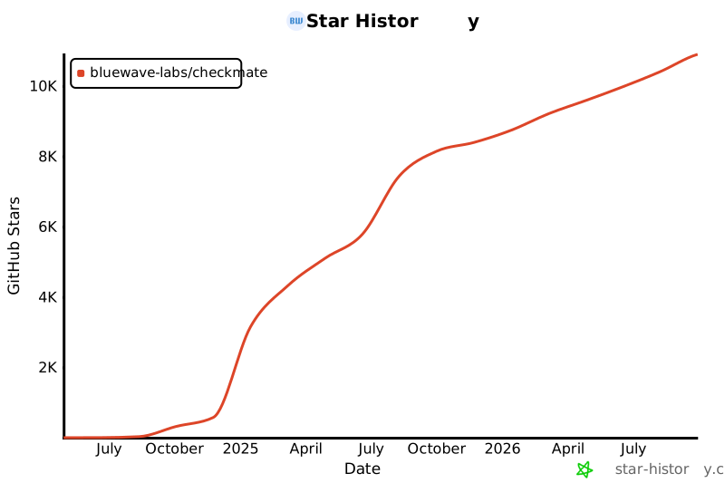](https://star-history.com/#bluewave-labs/Checkmate&Date)
|
||||
[](https://star-history.com/#bluewave-labs/bluewave-uptime&Date)
|
||||
|
||||
## Our sponsors
|
||||
|
||||
Thanks to [Gitbook](https://gitbook.io/) for giving us a free tier for their documentation platform, and [Poeditor](https://poeditor.com/) providing us a free account to use their i18n services. If you would like to sponsor Checkmate, please send an email to hello@bluewavelabs.ca
|
||||
|
||||
If you would like to sponsor a feature, [see this page](https://checkmate.so/sponsored-features).
|
||||
|
||||
Also check other developer and contributor-friendly projects of BlueWave:
|
||||
|
||||
- [VerifyWise](https://github.com/bluewave-labs/verifywise), the first open source AI governance platform.
|
||||
- [DataRoom](https://github.com/bluewave-labs/bluewave-dataroom), an secure file sharing application, aka dataroom.
|
||||
- [Guidefox](https://github.com/bluewave-labs/guidefox), an application that helps new users learn how to use your product via hints, tours, popups and banners.
|
||||
@@ -21,12 +21,7 @@ cd checkmate/charts/helm/checkmate
|
||||
Edit `values.yaml` to update:
|
||||
- `client.ingress.host` and `server.ingress.host` with your domain names
|
||||
- `server.protocol` (usually http or https)
|
||||
- **If upgrading**: Migrate persistence settings from flat structure to nested:
|
||||
- Old: `persistence.mongodbSize` → New: `persistence.mongo.size`
|
||||
- Old: `persistence.redisSize` → New: `persistence.redis.size`
|
||||
- Add: `persistence.mongo.storageClass` and `persistence.redis.storageClass` (leave empty for default)
|
||||
- Secrets under the `secrets` section (`JWT_SECRET`, email credentials, API keys, etc.) — replace all change_me values
|
||||
- **For TLS/HTTPS**: Configure ingress TLS settings (see section below)
|
||||
|
||||
### 3. Deploy the Helm chart
|
||||
```bash
|
||||
@@ -42,75 +37,3 @@ kubectl get svc
|
||||
```
|
||||
|
||||
Once all pods are `Running` and `Ready`, you can access Checkmate via the configured ingress hosts.
|
||||
|
||||
## Enabling TLS/HTTPS with cert-manager
|
||||
|
||||
If you have [cert-manager](https://cert-manager.io/) installed in your cluster, you can enable automatic TLS certificate provisioning using Let's Encrypt or other certificate issuers.
|
||||
|
||||
### Prerequisites
|
||||
- cert-manager installed in your cluster
|
||||
- A ClusterIssuer or Issuer configured (e.g., `letsencrypt-prod`)
|
||||
|
||||
### Configuration
|
||||
|
||||
Edit `values.yaml` to enable TLS (and update protocols to https):
|
||||
|
||||
```yaml
|
||||
client:
|
||||
protocol: https
|
||||
ingress:
|
||||
enabled: true
|
||||
host: checkmate.example.com
|
||||
className: nginx
|
||||
annotations:
|
||||
cert-manager.io/cluster-issuer: "letsencrypt-prod"
|
||||
tls:
|
||||
enabled: true
|
||||
secretName: checkmate-client-tls
|
||||
|
||||
server:
|
||||
protocol: https
|
||||
ingress:
|
||||
enabled: true
|
||||
host: checkmate.example.com
|
||||
className: nginx
|
||||
annotations:
|
||||
cert-manager.io/cluster-issuer: "letsencrypt-prod"
|
||||
tls:
|
||||
enabled: true
|
||||
secretName: checkmate-server-tls
|
||||
```
|
||||
|
||||
### Alternative: Using --set flags
|
||||
|
||||
You can also enable TLS during installation using Helm's `--set` flags:
|
||||
|
||||
```bash
|
||||
helm install checkmate ./charts/helm/checkmate \
|
||||
--set client.protocol=https \
|
||||
--set server.protocol=https \
|
||||
--set client.ingress.annotations."cert-manager\.io/cluster-issuer"="letsencrypt-prod" \
|
||||
--set client.ingress.tls.enabled=true \
|
||||
--set client.ingress.tls.secretName=checkmate-client-tls \
|
||||
--set server.ingress.annotations."cert-manager\.io/cluster-issuer"="letsencrypt-prod" \
|
||||
--set server.ingress.tls.enabled=true \
|
||||
--set server.ingress.tls.secretName=checkmate-server-tls
|
||||
```
|
||||
|
||||
### Verification
|
||||
|
||||
After deployment, cert-manager will automatically create the TLS secrets. You can verify the certificate status:
|
||||
|
||||
```bash
|
||||
# Check certificates
|
||||
kubectl get certificates
|
||||
|
||||
# Check certificate details
|
||||
kubectl describe certificate checkmate-client-tls
|
||||
kubectl describe certificate checkmate-server-tls
|
||||
|
||||
# Verify the secrets were created
|
||||
kubectl get secrets | grep checkmate-tls
|
||||
```
|
||||
|
||||
The ingress will automatically use these secrets to enable HTTPS access to your Checkmate instance.
|
||||
@@ -0,0 +1,12 @@
|
||||
{{- if eq .Values.client.ingress.host "change_me" }}
|
||||
{{- fail "client.ingress.host must be overridden and not set to 'change_me'" }}
|
||||
{{- end }}
|
||||
|
||||
{{- if eq .Values.server.ingress.host "change_me" }}
|
||||
{{- fail "server.ingress.host must be overridden and not set to 'change_me'" }}
|
||||
{{- end }}
|
||||
|
||||
{{- $protocol := .Values.server.protocol }}
|
||||
{{- if not (or (eq $protocol "http") (eq $protocol "https")) }}
|
||||
{{- fail "server.protocol must be either 'http' or 'https'" }}
|
||||
{{- end }}
|
||||
@@ -1,25 +1,17 @@
|
||||
apiVersion: apps/v1
|
||||
kind: Deployment
|
||||
metadata:
|
||||
name: checkmate-client
|
||||
name: client
|
||||
spec:
|
||||
replicas: 1
|
||||
selector:
|
||||
matchLabels:
|
||||
app: checkmate-client
|
||||
app: client
|
||||
template:
|
||||
metadata:
|
||||
labels:
|
||||
app: checkmate-client
|
||||
app: client
|
||||
spec:
|
||||
{{- with .Values.client.affinity }}
|
||||
affinity:
|
||||
{{- tpl ( . | toYaml) $ | nindent 8 }}
|
||||
{{- end }}
|
||||
{{- with .Values.client.tolerations }}
|
||||
tolerations:
|
||||
{{- tpl ( . | toYaml) $ | nindent 8 }}
|
||||
{{- end }}
|
||||
containers:
|
||||
- name: client
|
||||
image: {{ .Values.client.image }}
|
||||
@@ -28,17 +20,3 @@ spec:
|
||||
env:
|
||||
- name: UPTIME_APP_API_BASE_URL
|
||||
value: "{{ .Values.server.protocol }}://{{ .Values.server.ingress.host }}/api/v1"
|
||||
- name: UPTIME_APP_CLIENT_HOST
|
||||
value: "{{ .Values.client.protocol }}://{{ .Values.client.ingress.host }}"
|
||||
volumeMounts:
|
||||
- name: config-volume
|
||||
mountPath: /etc/nginx/conf.d/default.conf
|
||||
subPath: default.conf
|
||||
{{- with .Values.client.resources }}
|
||||
resources:
|
||||
{{- tpl ( . | toYaml) $ | nindent 12 }}
|
||||
{{- end }}
|
||||
volumes:
|
||||
- name: config-volume
|
||||
configMap:
|
||||
name: checkmate-server-nginx-cm
|
||||
@@ -2,21 +2,10 @@
|
||||
apiVersion: networking.k8s.io/v1
|
||||
kind: Ingress
|
||||
metadata:
|
||||
name: checkmate-client-ingress
|
||||
{{- if .Values.client.ingress.annotations }}
|
||||
name: client-ingress
|
||||
annotations:
|
||||
{{- range $key, $value := .Values.client.ingress.annotations }}
|
||||
{{ $key }}: {{ $value | quote }}
|
||||
{{- end }}
|
||||
{{- end }}
|
||||
nginx.ingress.kubernetes.io/rewrite-target: /
|
||||
spec:
|
||||
ingressClassName: {{ .Values.client.ingress.className }}
|
||||
{{- if .Values.client.ingress.tls.enabled }}
|
||||
tls:
|
||||
- hosts:
|
||||
- {{ .Values.client.ingress.host }}
|
||||
secretName: {{ default (printf "%s-client-tls" .Release.Name) .Values.client.ingress.tls.secretName }}
|
||||
{{- end }}
|
||||
rules:
|
||||
- host: {{ .Values.client.ingress.host }}
|
||||
http:
|
||||
@@ -25,7 +14,7 @@ spec:
|
||||
pathType: Prefix
|
||||
backend:
|
||||
service:
|
||||
name: checkmate-client
|
||||
name: client
|
||||
port:
|
||||
number: {{ .Values.client.port }}
|
||||
{{- end }}
|
||||
@@ -1,9 +1,9 @@
|
||||
apiVersion: v1
|
||||
kind: Service
|
||||
metadata:
|
||||
name: checkmate-client
|
||||
name: client
|
||||
spec:
|
||||
selector:
|
||||
app: checkmate-client
|
||||
app: client
|
||||
ports:
|
||||
- port: {{ .Values.client.port }}
|
||||
@@ -0,0 +1,27 @@
|
||||
apiVersion: apps/v1
|
||||
kind: Deployment
|
||||
metadata:
|
||||
name: mongodb
|
||||
spec:
|
||||
replicas: 1
|
||||
selector:
|
||||
matchLabels:
|
||||
app: mongodb
|
||||
template:
|
||||
metadata:
|
||||
labels:
|
||||
app: mongodb
|
||||
spec:
|
||||
containers:
|
||||
- name: mongodb
|
||||
image: {{ .Values.mongodb.image }}
|
||||
ports:
|
||||
- containerPort: {{ .Values.mongodb.port }}
|
||||
command: ["mongod", "--quiet", "--bind_ip_all"]
|
||||
volumeMounts:
|
||||
- name: mongodb-data
|
||||
mountPath: /data/db
|
||||
volumes:
|
||||
- name: mongodb-data
|
||||
persistentVolumeClaim:
|
||||
claimName: mongodb-pvc
|
||||
@@ -0,0 +1,10 @@
|
||||
apiVersion: v1
|
||||
kind: PersistentVolumeClaim
|
||||
metadata:
|
||||
name: mongodb-pvc
|
||||
spec:
|
||||
accessModes:
|
||||
- ReadWriteOnce
|
||||
resources:
|
||||
requests:
|
||||
storage: {{ .Values.persistence.mongodbSize }}
|
||||
@@ -1,9 +1,9 @@
|
||||
apiVersion: v1
|
||||
kind: Service
|
||||
metadata:
|
||||
name: checkmate-mongodb
|
||||
name: mongodb
|
||||
spec:
|
||||
selector:
|
||||
app: checkmate-mongodb
|
||||
app: mongodb
|
||||
ports:
|
||||
- port: {{ .Values.mongodb.port }}
|
||||
@@ -1,44 +0,0 @@
|
||||
apiVersion: apps/v1
|
||||
kind: StatefulSet
|
||||
metadata:
|
||||
name: checkmate-mongodb
|
||||
spec:
|
||||
replicas: 1
|
||||
selector:
|
||||
matchLabels:
|
||||
app: checkmate-mongodb
|
||||
template:
|
||||
metadata:
|
||||
labels:
|
||||
app: checkmate-mongodb
|
||||
spec:
|
||||
{{- with .Values.mongodb.affinity }}
|
||||
affinity:
|
||||
{{- tpl ( . | toYaml) $ | nindent 8 }}
|
||||
{{- end }}
|
||||
{{- with .Values.mongodb.tolerations }}
|
||||
tolerations:
|
||||
{{- tpl ( . | toYaml) $ | nindent 8 }}
|
||||
{{- end }}
|
||||
containers:
|
||||
- name: mongodb
|
||||
image: {{ .Values.mongodb.image }}
|
||||
ports:
|
||||
- containerPort: {{ .Values.mongodb.port }}
|
||||
command: ["mongod", "--quiet", "--bind_ip_all"]
|
||||
volumeMounts:
|
||||
- name: checkmate-mongo-persistent-storage
|
||||
mountPath: /data/db
|
||||
{{- with .Values.mongodb.resources }}
|
||||
resources:
|
||||
{{- tpl ( . | toYaml) $ | nindent 12 }}
|
||||
{{- end }}
|
||||
volumeClaimTemplates:
|
||||
- metadata:
|
||||
name: checkmate-mongo-persistent-storage
|
||||
spec:
|
||||
storageClassName: {{ .Values.persistence.mongo.storageClass | quote }}
|
||||
accessModes: ["ReadWriteOnce"]
|
||||
resources:
|
||||
requests:
|
||||
storage: {{ .Values.persistence.mongo.size | default "5Gi" | quote }}
|
||||
@@ -1,48 +0,0 @@
|
||||
{{- if eq .Values.client.ingress.host "change_me" }}
|
||||
{{- fail "client.ingress.host must be overridden and not set to 'change_me'" }}
|
||||
{{- end }}
|
||||
|
||||
{{- if eq .Values.server.ingress.host "change_me" }}
|
||||
{{- fail "server.ingress.host must be overridden and not set to 'change_me'" }}
|
||||
{{- end }}
|
||||
|
||||
{{- $serverProtocol := .Values.server.protocol }}
|
||||
{{- if not (or (eq $serverProtocol "http") (eq $serverProtocol "https")) }}
|
||||
{{- fail "server.protocol must be either 'http' or 'https'" }}
|
||||
{{- end }}
|
||||
|
||||
{{- $clientProtocol := .Values.client.protocol }}
|
||||
{{- if not (or (eq $clientProtocol "http") (eq $clientProtocol "https")) }}
|
||||
{{- fail "client.protocol must be either 'http' or 'https'" }}
|
||||
{{- end }}
|
||||
|
||||
{{/* Enforce protocol when TLS is enabled to avoid mixed-content */}}
|
||||
{{- if and .Values.client.ingress.tls.enabled (ne $clientProtocol "https") }}
|
||||
{{- fail "client.ingress.tls.enabled is true but client.protocol is not 'https'. Set client.protocol: https to avoid mixed content." }}
|
||||
{{- end }}
|
||||
|
||||
{{- if and .Values.server.ingress.tls.enabled (ne $serverProtocol "https") }}
|
||||
{{- fail "server.ingress.tls.enabled is true but server.protocol is not 'https'. Set server.protocol: https to ensure correct API base URL." }}
|
||||
{{- end }}
|
||||
|
||||
{{/* If client runs on https, API must also be https to avoid mixed content */}}
|
||||
{{- if and (eq $clientProtocol "https") (ne $serverProtocol "https") }}
|
||||
{{- fail "client.protocol is 'https' but server.protocol is not. Set server.protocol: https to prevent browser mixed-content issues." }}
|
||||
{{- end }}
|
||||
|
||||
{{/* Fail early if TLS enabled without cert-manager annotations (cluster-issuer or issuer) */}}
|
||||
{{- $cAnn := .Values.client.ingress.annotations | default dict }}
|
||||
{{- $sAnn := .Values.server.ingress.annotations | default dict }}
|
||||
|
||||
{{- $clientHasIssuer := or (hasKey $cAnn "cert-manager.io/cluster-issuer") (hasKey $cAnn "cert-manager.io/issuer") }}
|
||||
{{- $serverHasIssuer := or (hasKey $sAnn "cert-manager.io/cluster-issuer") (hasKey $sAnn "cert-manager.io/issuer") }}
|
||||
|
||||
{{- if and .Values.client.ingress.tls.enabled (not $clientHasIssuer) }}
|
||||
{{- fail "client.ingress.tls.enabled is true but no cert-manager issuer annotation found. Add 'cert-manager.io/cluster-issuer' or 'cert-manager.io/issuer'." }}
|
||||
{{- end }}
|
||||
|
||||
{{- if and .Values.server.ingress.tls.enabled (not $serverHasIssuer) }}
|
||||
{{- fail "server.ingress.tls.enabled is true but no cert-manager issuer annotation found. Add 'cert-manager.io/cluster-issuer' or 'cert-manager.io/issuer'." }}
|
||||
{{- end }}
|
||||
|
||||
{{/* Secret name can be omitted; we default to <release>-client|server-tls in templates */}}
|
||||
@@ -0,0 +1,26 @@
|
||||
apiVersion: apps/v1
|
||||
kind: Deployment
|
||||
metadata:
|
||||
name: redis
|
||||
spec:
|
||||
replicas: 1
|
||||
selector:
|
||||
matchLabels:
|
||||
app: redis
|
||||
template:
|
||||
metadata:
|
||||
labels:
|
||||
app: redis
|
||||
spec:
|
||||
containers:
|
||||
- name: redis
|
||||
image: {{ .Values.redis.image }}
|
||||
ports:
|
||||
- containerPort: {{ .Values.redis.port }}
|
||||
volumeMounts:
|
||||
- name: redis-data
|
||||
mountPath: /data
|
||||
volumes:
|
||||
- name: redis-data
|
||||
persistentVolumeClaim:
|
||||
claimName: redis-pvc
|
||||
@@ -0,0 +1,10 @@
|
||||
apiVersion: v1
|
||||
kind: PersistentVolumeClaim
|
||||
metadata:
|
||||
name: redis-pvc
|
||||
spec:
|
||||
accessModes:
|
||||
- ReadWriteOnce
|
||||
resources:
|
||||
requests:
|
||||
storage: {{ .Values.persistence.redisSize }}
|
||||
@@ -1,11 +1,9 @@
|
||||
{{- if .Values.redis.enabled }}
|
||||
apiVersion: v1
|
||||
kind: Service
|
||||
metadata:
|
||||
name: checkmate-redis
|
||||
name: redis
|
||||
spec:
|
||||
selector:
|
||||
app: checkmate-redis
|
||||
app: redis
|
||||
ports:
|
||||
- port: {{ .Values.redis.port }}
|
||||
{{- end }}
|
||||
@@ -1,33 +0,0 @@
|
||||
{{- if .Values.redis.enabled }}
|
||||
apiVersion: apps/v1
|
||||
kind: StatefulSet
|
||||
metadata:
|
||||
name: checkmate-redis
|
||||
spec:
|
||||
replicas: 1
|
||||
selector:
|
||||
matchLabels:
|
||||
app: checkmate-redis
|
||||
template:
|
||||
metadata:
|
||||
labels:
|
||||
app: checkmate-redis
|
||||
spec:
|
||||
containers:
|
||||
- name: redis
|
||||
image: {{ .Values.redis.image }}
|
||||
ports:
|
||||
- containerPort: {{ .Values.redis.port }}
|
||||
volumeMounts:
|
||||
- name: redis-data
|
||||
mountPath: /data
|
||||
volumeClaimTemplates:
|
||||
- metadata:
|
||||
name: checkmate-redis-persistent-storage
|
||||
spec:
|
||||
storageClassName: {{ .Values.persistence.redis.storageClass | quote }}
|
||||
accessModes: ["ReadWriteOnce"]
|
||||
resources:
|
||||
requests:
|
||||
storage: {{ .Values.persistence.redis.size | default "1Gi" | quote }}
|
||||
{{- end }}
|
||||
@@ -4,6 +4,10 @@
|
||||
{{- fail "secrets.JWT_SECRET must be overridden and cannot be 'change_me'" }}
|
||||
{{- end }}
|
||||
|
||||
{{- if or (not $secrets.REFRESH_TOKEN_SECRET) (eq $secrets.REFRESH_TOKEN_SECRET "change_me") }}
|
||||
{{- fail "secrets.REFRESH_TOKEN_SECRET must be overridden and cannot be 'change_me'" }}
|
||||
{{- end }}
|
||||
|
||||
apiVersion: v1
|
||||
kind: Secret
|
||||
metadata:
|
||||
|
||||
@@ -1,25 +1,17 @@
|
||||
apiVersion: apps/v1
|
||||
kind: Deployment
|
||||
metadata:
|
||||
name: checkmate-server
|
||||
name: server
|
||||
spec:
|
||||
replicas: 1
|
||||
selector:
|
||||
matchLabels:
|
||||
app: checkmate-server
|
||||
app: server
|
||||
template:
|
||||
metadata:
|
||||
labels:
|
||||
app: checkmate-server
|
||||
app: server
|
||||
spec:
|
||||
{{- with .Values.server.affinity }}
|
||||
affinity:
|
||||
{{- tpl ( . | toYaml) $ | nindent 8 }}
|
||||
{{- end }}
|
||||
{{- with .Values.server.tolerations }}
|
||||
tolerations:
|
||||
{{- tpl ( . | toYaml) $ | nindent 8 }}
|
||||
{{- end }}
|
||||
containers:
|
||||
- name: server
|
||||
image: {{ .Values.server.image }}
|
||||
@@ -28,10 +20,3 @@ spec:
|
||||
envFrom:
|
||||
- secretRef:
|
||||
name: checkmate-secrets
|
||||
{{- with .Values.server.resources }}
|
||||
resources:
|
||||
{{- tpl ( . | toYaml) $ | nindent 12 }}
|
||||
{{- end }}
|
||||
env:
|
||||
- name: CLIENT_HOST
|
||||
value: "{{ .Values.client.protocol }}://{{ .Values.client.ingress.host }}"
|
||||
@@ -2,37 +2,24 @@
|
||||
apiVersion: networking.k8s.io/v1
|
||||
kind: Ingress
|
||||
metadata:
|
||||
name: checkmate-server-ingress
|
||||
{{- if .Values.server.ingress.annotations }}
|
||||
name: server-ingress
|
||||
annotations:
|
||||
{{- range $key, $value := .Values.server.ingress.annotations }}
|
||||
{{ $key }}: {{ $value | quote }}
|
||||
{{- end }}
|
||||
{{- end }}
|
||||
{{/*#annotations:
|
||||
#nginx.ingress.kubernetes.io/rewrite-target: /
|
||||
#nginx.ingress.kubernetes.io/enable-cors: "true"
|
||||
#nginx.ingress.kubernetes.io/cors-allow-origin: "http://{{ .Values.client.ingress.host }},https://{{ .Values.client.ingress.host }}"
|
||||
#nginx.ingress.kubernetes.io/cors-allow-methods: "GET, PUT, POST, DELETE, PATCH, OPTIONS"
|
||||
#nginx.ingress.kubernetes.io/cors-allow-headers: "DNT,User-Agent,X-Requested-With,If-Modified-Since,Cache-Control,Content-Type,Range,Authorization"
|
||||
#nginx.ingress.kubernetes.io/cors-allow-credentials: "true"*/}}
|
||||
nginx.ingress.kubernetes.io/rewrite-target: /
|
||||
nginx.ingress.kubernetes.io/enable-cors: "true"
|
||||
nginx.ingress.kubernetes.io/cors-allow-origin: "http://{{ .Values.client.ingress.host }},https://{{ .Values.client.ingress.host }}"
|
||||
nginx.ingress.kubernetes.io/cors-allow-methods: "GET, PUT, POST, DELETE, PATCH, OPTIONS"
|
||||
nginx.ingress.kubernetes.io/cors-allow-headers: "DNT,User-Agent,X-Requested-With,If-Modified-Since,Cache-Control,Content-Type,Range,Authorization"
|
||||
nginx.ingress.kubernetes.io/cors-allow-credentials: "true"
|
||||
spec:
|
||||
ingressClassName: {{ .Values.server.ingress.className }}
|
||||
{{- if .Values.server.ingress.tls.enabled }}
|
||||
tls:
|
||||
- hosts:
|
||||
- {{ .Values.server.ingress.host }}
|
||||
secretName: {{ default (printf "%s-server-tls" .Release.Name) .Values.server.ingress.tls.secretName }}
|
||||
{{- end }}
|
||||
rules:
|
||||
- host: {{ .Values.server.ingress.host }}
|
||||
http:
|
||||
paths:
|
||||
- path: /api/v1
|
||||
- path: /
|
||||
pathType: Prefix
|
||||
backend:
|
||||
service:
|
||||
name: checkmate-server
|
||||
name: server
|
||||
port:
|
||||
number: {{ .Values.server.port }}
|
||||
{{- end }}
|
||||
@@ -1,41 +0,0 @@
|
||||
apiVersion: v1
|
||||
kind: ConfigMap
|
||||
metadata:
|
||||
name: checkmate-server-nginx-cm
|
||||
data:
|
||||
default.conf: |
|
||||
server {
|
||||
listen 80;
|
||||
listen [::]:80;
|
||||
|
||||
server_name checkmate-demo.bluewavelabs.ca;
|
||||
server_tokens off;
|
||||
|
||||
location /.well-known/acme-challenge/ {
|
||||
root /var/www/certbot;
|
||||
}
|
||||
|
||||
location / {
|
||||
root /usr/share/nginx/html;
|
||||
index index.html index.htm;
|
||||
try_files $uri $uri/ /index.html;
|
||||
}
|
||||
|
||||
# location /api/ {
|
||||
# proxy_pass http://{{ .Values.server.ingress.host }}:5000/api/;
|
||||
# proxy_http_version 1.1;
|
||||
# proxy_set_header Host $host;
|
||||
# proxy_set_header X-Real-IP $remote_addr;
|
||||
# proxy_set_header X-Forwarded-For $proxy_add_x_forwarded_for;
|
||||
# proxy_set_header X-Forwarded-Proto $scheme;
|
||||
# }
|
||||
|
||||
location /api-docs/ {
|
||||
proxy_pass http://{{ .Values.server.ingress.host }}:5000/api-docs/;
|
||||
proxy_http_version 1.1;
|
||||
proxy_set_header Host $host;
|
||||
proxy_set_header X-Real-IP $remote_addr;
|
||||
proxy_set_header X-Forwarded-For $proxy_add_x_forwarded_for;
|
||||
proxy_set_header X-Forwarded-Proto $scheme;
|
||||
}
|
||||
}
|
||||
@@ -1,9 +1,9 @@
|
||||
apiVersion: v1
|
||||
kind: Service
|
||||
metadata:
|
||||
name: checkmate-server
|
||||
name: server
|
||||
spec:
|
||||
selector:
|
||||
app: checkmate-server
|
||||
app: server
|
||||
ports:
|
||||
- port: {{ .Values.server.port }}
|
||||
@@ -1,70 +1,41 @@
|
||||
client:
|
||||
image: ghcr.io/bluewave-labs/checkmate-client:v3.2.0
|
||||
image: ghcr.io/bluewave-labs/checkmate-client:v2.3
|
||||
port: 80
|
||||
protocol: http
|
||||
ingress:
|
||||
enabled: true
|
||||
host: change_me
|
||||
className: nginx
|
||||
annotations: {}
|
||||
# Example annotations for cert-manager:
|
||||
# annotations:
|
||||
# cert-manager.io/cluster-issuer: "letsencrypt-prod"
|
||||
tls:
|
||||
enabled: false
|
||||
# secretName: {{ .Release.Name }}-client-tls # Optional; defaults to <release>-client-tls if omitted
|
||||
# Note: when enabling TLS, also set client.protocol: https and add
|
||||
# a cert-manager issuer annotation (e.g. cert-manager.io/cluster-issuer: "letsencrypt-prod").
|
||||
# The secret will be automatically created by cert-manager when using the cert-manager.io/cluster-issuer annotation
|
||||
|
||||
server:
|
||||
image: ghcr.io/bluewave-labs/checkmate-backend:v3.2.0
|
||||
image: ghcr.io/bluewave-labs/checkmate-backend:v2.3
|
||||
port: 52345
|
||||
protocol: http
|
||||
protocol: change_me
|
||||
ingress:
|
||||
enabled: true
|
||||
host: change_me
|
||||
className: nginx
|
||||
annotations: {}
|
||||
# Example annotations for cert-manager:
|
||||
# annotations:
|
||||
# cert-manager.io/cluster-issuer: "letsencrypt-prod"
|
||||
tls:
|
||||
enabled: false
|
||||
# secretName: {{ .Release.Name }}-server-tls # Optional; defaults to <release>-server-tls if omitted
|
||||
# Note: when enabling TLS, also set server.protocol: https and add
|
||||
# a cert-manager issuer annotation (e.g. cert-manager.io/cluster-issuer: "letsencrypt-prod").
|
||||
# The secret will be automatically created by cert-manager when using the cert-manager.io/cluster-issuer annotation
|
||||
|
||||
redis:
|
||||
enabled: false
|
||||
image: redis:7.2
|
||||
port: 6379
|
||||
|
||||
mongodb:
|
||||
image: ghcr.io/bluewave-labs/checkmate-mongo:v3.2.0
|
||||
image: mongo:7.0
|
||||
port: 27017
|
||||
|
||||
secrets:
|
||||
JWT_SECRET: change_me
|
||||
# REFRESH_TOKEN_SECRET: change_me
|
||||
# SYSTEM_EMAIL_ADDRESS: test@example.com
|
||||
# SYSTEM_EMAIL_PASSWORD: change_me
|
||||
# SYSTEM_EMAIL_HOST: smtp.example.com
|
||||
# SYSTEM_EMAIL_PORT: "587"
|
||||
# PAGESPEED_API_KEY: change_me
|
||||
DB_CONNECTION_STRING: mongodb://checkmate-mongodb.namespace.svc:27017/uptime_db
|
||||
CLIENT_HOST: change_me
|
||||
# REDIS_HOST: redis
|
||||
# REDIS_PORT: "6379"
|
||||
# DB_TYPE: MongoDB
|
||||
# TOKEN_TTL: 99d
|
||||
# REFRESH_TOKEN_TTL: 99d
|
||||
REFRESH_TOKEN_SECRET: change_me
|
||||
SYSTEM_EMAIL_ADDRESS: test@example.com
|
||||
SYSTEM_EMAIL_PASSWORD: change_me
|
||||
SYSTEM_EMAIL_HOST: smtp.example.com
|
||||
SYSTEM_EMAIL_PORT: "587"
|
||||
PAGESPEED_API_KEY: change_me
|
||||
DB_CONNECTION_STRING: mongodb://mongodb:27017/uptime_db
|
||||
REDIS_HOST: redis
|
||||
REDIS_PORT: "6379"
|
||||
DB_TYPE: MongoDB
|
||||
TOKEN_TTL: 99d
|
||||
REFRESH_TOKEN_TTL: 99d
|
||||
|
||||
persistence:
|
||||
mongo:
|
||||
size: 5Gi
|
||||
storageClass: ""
|
||||
redis:
|
||||
size: 1Gi
|
||||
storageClass: ""
|
||||
mongodbSize: 5Gi
|
||||
redisSize: 1Gi
|
||||
@@ -1,4 +1,3 @@
|
||||
VITE_APP_API_BASE_URL=UPTIME_APP_API_BASE_URL
|
||||
VITE_APP_API_V2_BASE_URL=UPTIME_APP_API_V2_BASE_URL
|
||||
VITE_APP_CLIENT_HOST=UPTIME_APP_CLIENT_HOST
|
||||
VITE_APP_LOG_LEVEL=UPTIME_APP_LOG_LEVEL
|
||||
+1
-2
@@ -28,5 +28,4 @@ dist-ssr
|
||||
|
||||
# Scripts
|
||||
*.sh
|
||||
!env.sh
|
||||
.env.development
|
||||
!env.sh
|
||||
+1
-1
@@ -18,7 +18,7 @@
|
||||
<div id="root"></div>
|
||||
<script
|
||||
type="module"
|
||||
src="/src/main.tsx"
|
||||
src="/src/main.jsx"
|
||||
></script>
|
||||
</body>
|
||||
</html>
|
||||
Generated
+1657
-2378
File diff suppressed because it is too large.
Load diff
+19
-27
@@ -1,61 +1,55 @@
|
||||
{
|
||||
"name": "client",
|
||||
"private": true,
|
||||
"version": "3.6.1",
|
||||
"version": "0.0.0",
|
||||
"type": "module",
|
||||
"scripts": {
|
||||
"dev": "vite",
|
||||
"build": "tsc -b && vite build",
|
||||
"build-dev": "tsc -b && vite build --mode development",
|
||||
"build": "vite build",
|
||||
"build-dev": "vite build --mode development",
|
||||
"lint": "eslint . --ext js,jsx --report-unused-disable-directives --max-warnings 0",
|
||||
"preview": "vite preview",
|
||||
"format": "prettier --write .",
|
||||
"format-check": "prettier --check ."
|
||||
},
|
||||
"lint-staged": {
|
||||
"**/*": "prettier --write"
|
||||
},
|
||||
"dependencies": {
|
||||
"@emotion/react": "^11.13.3",
|
||||
"@emotion/styled": "^11.13.0",
|
||||
"@hello-pangea/dnd": "^18.0.0",
|
||||
"@hookform/resolvers": "5.2.2",
|
||||
"@mui/lab": "7.0.0",
|
||||
"@mui/material": "7.3.7",
|
||||
"@mui/x-charts": "7.29.1",
|
||||
"@mui/x-date-pickers": "7.29.4",
|
||||
"@mui/icons-material": "6.4.11",
|
||||
"@mui/lab": "6.0.0-dev.240424162023-9968b4889d",
|
||||
"@mui/material": "6.4.11",
|
||||
"@mui/x-charts": "^7.5.1",
|
||||
"@mui/x-date-pickers": "7.29.0",
|
||||
"@reduxjs/toolkit": "2.7.0",
|
||||
"@types/maplibre-gl": "^1.13.2",
|
||||
"axios": "^1.7.4",
|
||||
"dayjs": "1.11.13",
|
||||
"flag-icons": "7.3.2",
|
||||
"html2canvas": "^1.4.1",
|
||||
"human-interval": "2.0.1",
|
||||
"i18next": "25.4.2",
|
||||
"joi": "17.13.3",
|
||||
"lucide-react": "^0.562.0",
|
||||
"maplibre-gl": "^5.19.0",
|
||||
"mui-color-input": "^7.0.0",
|
||||
"pretty-bytes": "^7.1.0",
|
||||
"pretty-ms": "^9.3.0",
|
||||
"mui-color-input": "^6.0.0",
|
||||
"react": "18.3.1",
|
||||
"react-dom": "^18.2.0",
|
||||
"react-hook-form": "^7.63.0",
|
||||
"react-i18next": "^15.4.0",
|
||||
"react-icons": "5.5.0",
|
||||
"react-map-gl": "^8.1.0",
|
||||
"react-redux": "9.2.0",
|
||||
"react-router": "^6.23.0",
|
||||
"react-router-dom": "^6.23.1",
|
||||
"react-toastify": "^10.0.5",
|
||||
"recharts": "2.15.2",
|
||||
"redux-persist": "6.0.0",
|
||||
"swr": "^2.3.6",
|
||||
"vite-plugin-svgr": "^4.2.0",
|
||||
"zod": "^4.3.6"
|
||||
"vite-plugin-svgr": "^4.2.0"
|
||||
},
|
||||
"unusedDepencies": {
|
||||
"@solana/wallet-adapter-base": "0.9.25",
|
||||
"@solana/wallet-adapter-material-ui": "0.16.35",
|
||||
"@solana/wallet-adapter-react": "0.15.37",
|
||||
"@solana/wallet-adapter-react-ui": "0.9.37",
|
||||
"@solana/wallet-adapter-wallets": "0.19.34",
|
||||
"@solana/web3.js": "1.98.0"
|
||||
},
|
||||
"devDependencies": {
|
||||
"@types/node": "24.5.2",
|
||||
"@types/react": "^18.2.66",
|
||||
"@types/react-dom": "^18.2.22",
|
||||
"@vitejs/plugin-react": "^4.2.1",
|
||||
@@ -63,9 +57,7 @@
|
||||
"eslint-plugin-react": "^7.34.1",
|
||||
"eslint-plugin-react-hooks": "^5.0.0",
|
||||
"eslint-plugin-react-refresh": "^0.4.6",
|
||||
"lint-staged": "^16.2.7",
|
||||
"prettier": "^3.3.3",
|
||||
"typescript": "5.9.3",
|
||||
"vite": "6.4.1"
|
||||
"vite": "6.3.5"
|
||||
}
|
||||
}
|
||||
@@ -1,258 +0,0 @@
|
||||
/**
|
||||
* Locale Migration Script
|
||||
*
|
||||
* Restructures all non-English locale files to match en.json's nested key structure.
|
||||
* Recovers translations via safe key-matching strategies, uses English placeholders
|
||||
* for unmatched keys.
|
||||
*
|
||||
* Usage: npx tsx client/scripts/migrate-locales.ts
|
||||
*
|
||||
* SAFETY: en.json is NEVER modified. Originals are backed up before overwriting.
|
||||
*/
|
||||
|
||||
import fs from "fs";
|
||||
import path from "path";
|
||||
|
||||
const LOCALES_DIR = path.resolve(import.meta.dirname, "../src/locales");
|
||||
const BACKUP_DIR = path.join(LOCALES_DIR, "backup");
|
||||
const REPORT_PATH = path.join(LOCALES_DIR, "migration-report.json");
|
||||
|
||||
// ── Helpers ──────────────────────────────────────────────────────────────────
|
||||
|
||||
/** Flatten a nested object into { "a.b.c": value } pairs */
|
||||
function flattenKeys(obj: Record<string, unknown>, prefix = ""): Record<string, string> {
|
||||
const result: Record<string, string> = {};
|
||||
for (const [key, value] of Object.entries(obj)) {
|
||||
const fullPath = prefix ? `${prefix}.${key}` : key;
|
||||
if (typeof value === "object" && value !== null && !Array.isArray(value)) {
|
||||
Object.assign(result, flattenKeys(value as Record<string, unknown>, fullPath));
|
||||
} else {
|
||||
result[fullPath] = String(value);
|
||||
}
|
||||
}
|
||||
return result;
|
||||
}
|
||||
|
||||
/** Set a value at a dot-separated path in a nested object */
|
||||
function setNestedValue(
|
||||
obj: Record<string, unknown>,
|
||||
keyPath: string,
|
||||
value: string
|
||||
): void {
|
||||
const parts = keyPath.split(".");
|
||||
let current = obj;
|
||||
for (let i = 0; i < parts.length - 1; i++) {
|
||||
const part = parts[i];
|
||||
if (!(part in current) || typeof current[part] !== "object") {
|
||||
current[part] = {};
|
||||
}
|
||||
current = current[part] as Record<string, unknown>;
|
||||
}
|
||||
current[parts[parts.length - 1]] = value;
|
||||
}
|
||||
|
||||
// ── Build mapping indexes from en.json ───────────────────────────────────────
|
||||
|
||||
function buildIndexes(enFlat: Record<string, string>) {
|
||||
const enKeys = Object.keys(enFlat);
|
||||
|
||||
// last segment -> en key paths
|
||||
const lastSegIndex: Record<string, string[]> = {};
|
||||
// last 2 segments -> en key paths
|
||||
const suffixIndex: Record<string, string[]> = {};
|
||||
|
||||
for (const keyPath of enKeys) {
|
||||
const parts = keyPath.split(".");
|
||||
const lastSeg = parts[parts.length - 1].toLowerCase();
|
||||
if (!lastSegIndex[lastSeg]) lastSegIndex[lastSeg] = [];
|
||||
lastSegIndex[lastSeg].push(keyPath);
|
||||
|
||||
if (parts.length >= 2) {
|
||||
const suffix = parts.slice(-2).join(".").toLowerCase();
|
||||
if (!suffixIndex[suffix]) suffixIndex[suffix] = [];
|
||||
suffixIndex[suffix].push(keyPath);
|
||||
}
|
||||
}
|
||||
|
||||
return { lastSegIndex, suffixIndex };
|
||||
}
|
||||
|
||||
// ── Mapping logic ────────────────────────────────────────────────────────────
|
||||
|
||||
type MatchStrategy = "exact" | "suffix-2" | "unique-name" | "english-placeholder";
|
||||
|
||||
interface KeyMatch {
|
||||
enKey: string;
|
||||
value: string;
|
||||
strategy: MatchStrategy;
|
||||
}
|
||||
|
||||
function buildMigratedLocale(
|
||||
enFlat: Record<string, string>,
|
||||
langFlat: Record<string, string>,
|
||||
indexes: ReturnType<typeof buildIndexes>
|
||||
): { matches: KeyMatch[]; result: Record<string, unknown> } {
|
||||
const { lastSegIndex, suffixIndex } = indexes;
|
||||
const matches: KeyMatch[] = [];
|
||||
const result: Record<string, unknown> = {};
|
||||
|
||||
// Build reverse lookup: for each orphan key in lang, index by last segment and suffix
|
||||
const langByLastSeg: Record<string, { key: string; value: string }[]> = {};
|
||||
const langBySuffix: Record<string, { key: string; value: string }[]> = {};
|
||||
|
||||
for (const [langKey, langValue] of Object.entries(langFlat)) {
|
||||
const parts = langKey.split(".");
|
||||
const lastSeg = parts[parts.length - 1].toLowerCase();
|
||||
if (!langByLastSeg[lastSeg]) langByLastSeg[lastSeg] = [];
|
||||
langByLastSeg[lastSeg].push({ key: langKey, value: langValue });
|
||||
|
||||
if (parts.length >= 2) {
|
||||
const suffix = parts.slice(-2).join(".").toLowerCase();
|
||||
if (!langBySuffix[suffix]) langBySuffix[suffix] = [];
|
||||
langBySuffix[suffix].push({ key: langKey, value: langValue });
|
||||
}
|
||||
}
|
||||
|
||||
for (const enKey of Object.keys(enFlat)) {
|
||||
const enValue = enFlat[enKey];
|
||||
const parts = enKey.split(".");
|
||||
const lastSeg = parts[parts.length - 1].toLowerCase();
|
||||
const suffix = parts.length >= 2 ? parts.slice(-2).join(".").toLowerCase() : null;
|
||||
|
||||
// Strategy 1: Exact path match
|
||||
if (langFlat[enKey] !== undefined) {
|
||||
const value = langFlat[enKey];
|
||||
setNestedValue(result, enKey, value);
|
||||
matches.push({ enKey, value, strategy: "exact" });
|
||||
continue;
|
||||
}
|
||||
|
||||
// Strategy 2: 2-segment suffix match (lang key suffix matches en key suffix, both unique)
|
||||
if (suffix) {
|
||||
const enCandidates = suffixIndex[suffix];
|
||||
const langCandidates = langBySuffix[suffix];
|
||||
if (
|
||||
enCandidates &&
|
||||
enCandidates.length === 1 &&
|
||||
langCandidates &&
|
||||
langCandidates.length === 1
|
||||
) {
|
||||
const value = langCandidates[0].value;
|
||||
setNestedValue(result, enKey, value);
|
||||
matches.push({ enKey, value, strategy: "suffix-2" });
|
||||
continue;
|
||||
}
|
||||
}
|
||||
|
||||
// Strategy 3: Unique last-segment match
|
||||
const enCandidates = lastSegIndex[lastSeg];
|
||||
const langCandidates = langByLastSeg[lastSeg];
|
||||
if (
|
||||
enCandidates &&
|
||||
enCandidates.length === 1 &&
|
||||
langCandidates &&
|
||||
langCandidates.length === 1
|
||||
) {
|
||||
const value = langCandidates[0].value;
|
||||
setNestedValue(result, enKey, value);
|
||||
matches.push({ enKey, value, strategy: "unique-name" });
|
||||
continue;
|
||||
}
|
||||
|
||||
// No match — use English placeholder
|
||||
setNestedValue(result, enKey, enValue);
|
||||
matches.push({ enKey, value: enValue, strategy: "english-placeholder" });
|
||||
}
|
||||
|
||||
return { matches, result };
|
||||
}
|
||||
|
||||
// ── Main ─────────────────────────────────────────────────────────────────────
|
||||
|
||||
function main() {
|
||||
// Load en.json
|
||||
const enPath = path.join(LOCALES_DIR, "en.json");
|
||||
const en = JSON.parse(fs.readFileSync(enPath, "utf8"));
|
||||
const enFlat = flattenKeys(en);
|
||||
const enKeyCount = Object.keys(enFlat).length;
|
||||
const indexes = buildIndexes(enFlat);
|
||||
|
||||
console.log(`English: ${enKeyCount} keys (source of truth — NOT modified)\n`);
|
||||
|
||||
// Find all non-English locale files
|
||||
const localeFiles = fs
|
||||
.readdirSync(LOCALES_DIR)
|
||||
.filter(
|
||||
(f: string) =>
|
||||
f.endsWith(".json") && f !== "en.json" && f !== "migration-report.json"
|
||||
);
|
||||
|
||||
if (localeFiles.length === 0) {
|
||||
console.log("No locale files to migrate.");
|
||||
return;
|
||||
}
|
||||
|
||||
// Create backup directory
|
||||
if (!fs.existsSync(BACKUP_DIR)) {
|
||||
fs.mkdirSync(BACKUP_DIR, { recursive: true });
|
||||
}
|
||||
|
||||
const report: Record<
|
||||
string,
|
||||
{
|
||||
total: number;
|
||||
exact: number;
|
||||
suffix: number;
|
||||
uniqueName: number;
|
||||
placeholder: number;
|
||||
}
|
||||
> = {};
|
||||
|
||||
for (const file of localeFiles) {
|
||||
const lang = file.replace(".json", "");
|
||||
const filePath = path.join(LOCALES_DIR, file);
|
||||
|
||||
// Backup original
|
||||
const backupPath = path.join(BACKUP_DIR, file);
|
||||
fs.copyFileSync(filePath, backupPath);
|
||||
|
||||
// Load and flatten
|
||||
const langData = JSON.parse(fs.readFileSync(filePath, "utf8"));
|
||||
const langFlat = flattenKeys(langData);
|
||||
|
||||
// Migrate
|
||||
const { matches, result } = buildMigratedLocale(enFlat, langFlat, indexes);
|
||||
|
||||
// Write migrated file
|
||||
fs.writeFileSync(filePath, JSON.stringify(result, null, "\t") + "\n", "utf8");
|
||||
|
||||
// Compute stats
|
||||
const stats = {
|
||||
total: enKeyCount,
|
||||
exact: matches.filter((m) => m.strategy === "exact").length,
|
||||
suffix: matches.filter((m) => m.strategy === "suffix-2").length,
|
||||
uniqueName: matches.filter((m) => m.strategy === "unique-name").length,
|
||||
placeholder: matches.filter((m) => m.strategy === "english-placeholder").length,
|
||||
};
|
||||
report[lang] = stats;
|
||||
|
||||
const translated = stats.exact + stats.suffix + stats.uniqueName;
|
||||
const pct = ((translated / enKeyCount) * 100).toFixed(1);
|
||||
console.log(
|
||||
`${lang.padEnd(8)} ${String(translated).padStart(4)} translated (${pct}%) | ` +
|
||||
`exact: ${stats.exact} suffix: ${stats.suffix} name: ${stats.uniqueName} ` +
|
||||
`placeholder: ${stats.placeholder}`
|
||||
);
|
||||
}
|
||||
|
||||
// Write report
|
||||
fs.writeFileSync(REPORT_PATH, JSON.stringify(report, null, "\t") + "\n", "utf8");
|
||||
|
||||
const totalLangs = localeFiles.length;
|
||||
console.log(
|
||||
`\nMigrated ${totalLangs} locale files. Originals backed up to locales/backup/`
|
||||
);
|
||||
console.log(`Report written to ${REPORT_PATH}`);
|
||||
}
|
||||
|
||||
main();
|
||||
@@ -0,0 +1,41 @@
|
||||
import { useEffect } from "react";
|
||||
import { useSelector } from "react-redux";
|
||||
import "react-toastify/dist/ReactToastify.css";
|
||||
import { ToastContainer } from "react-toastify";
|
||||
import { ThemeProvider } from "@emotion/react";
|
||||
import lightTheme from "./Utils/Theme/lightTheme";
|
||||
import darkTheme from "./Utils/Theme/darkTheme";
|
||||
import { CssBaseline, GlobalStyles } from "@mui/material";
|
||||
import { logger } from "./Utils/Logger"; // Import the logger
|
||||
import { networkService } from "./main";
|
||||
import { Routes } from "./Routes";
|
||||
import WalletProvider from "./Components/WalletProvider";
|
||||
import AppLayout from "./Components/Layouts/AppLayout";
|
||||
|
||||
function App() {
|
||||
const mode = useSelector((state) => state.ui.mode);
|
||||
|
||||
// Cleanup
|
||||
useEffect(() => {
|
||||
return () => {
|
||||
logger.cleanup();
|
||||
networkService.cleanup();
|
||||
};
|
||||
}, []);
|
||||
|
||||
return (
|
||||
/* Extract Themeprovider, baseline and global styles to Styles */
|
||||
<ThemeProvider theme={mode === "light" ? lightTheme : darkTheme}>
|
||||
<WalletProvider>
|
||||
<CssBaseline />
|
||||
|
||||
<AppLayout>
|
||||
<Routes />
|
||||
</AppLayout>
|
||||
<ToastContainer />
|
||||
</WalletProvider>
|
||||
</ThemeProvider>
|
||||
);
|
||||
}
|
||||
|
||||
export default App;
|
||||
@@ -1,56 +0,0 @@
|
||||
import { type CSSProperties } from "react";
|
||||
import { useSelector } from "react-redux";
|
||||
import "react-toastify/dist/ReactToastify.css";
|
||||
import { ToastContainer } from "react-toastify";
|
||||
import { ThemeProvider } from "@emotion/react";
|
||||
import { CssBaseline, GlobalStyles } from "@mui/material";
|
||||
import { SWRConfig } from "swr";
|
||||
import { Routes } from "./Routes";
|
||||
import AppLayout from "@/Components/layout/AppLayout";
|
||||
import type { RootState } from "@/Types/state";
|
||||
import { lightTheme, darkTheme } from "@/Utils/Theme/Theme";
|
||||
|
||||
const swrConfig = {
|
||||
dedupingInterval: 5000,
|
||||
revalidateOnFocus: false,
|
||||
revalidateOnReconnect: true,
|
||||
shouldRetryOnError: false,
|
||||
errorRetryCount: 2,
|
||||
errorRetryInterval: 1000,
|
||||
focusThrottleInterval: 5000,
|
||||
};
|
||||
|
||||
function App() {
|
||||
const mode = useSelector((state: RootState) => state.ui.mode);
|
||||
const theme = mode === "light" ? lightTheme : darkTheme;
|
||||
|
||||
return (
|
||||
<SWRConfig value={swrConfig}>
|
||||
<ThemeProvider theme={theme}>
|
||||
<CssBaseline />
|
||||
<GlobalStyles
|
||||
styles={{
|
||||
body: {
|
||||
backgroundColor: theme.palette.background.default,
|
||||
},
|
||||
}}
|
||||
/>
|
||||
<AppLayout>
|
||||
<Routes />
|
||||
</AppLayout>
|
||||
<ToastContainer
|
||||
newestOnTop={true}
|
||||
theme={mode}
|
||||
style={
|
||||
{
|
||||
"--toastify-color-progress-light": "#7C8BA1",
|
||||
"--toastify-color-progress-dark": "#7C8BA1",
|
||||
} as CSSProperties
|
||||
}
|
||||
/>
|
||||
</ThemeProvider>
|
||||
</SWRConfig>
|
||||
);
|
||||
}
|
||||
|
||||
export default App;
|
||||
@@ -0,0 +1,224 @@
|
||||
// Components
|
||||
import IconButton from "@mui/material/IconButton";
|
||||
import Menu from "@mui/material/Menu";
|
||||
import MenuItem from "@mui/material/MenuItem";
|
||||
import Settings from "../../assets/icons/settings-bold.svg?react";
|
||||
import Dialog from "../../Components/Dialog";
|
||||
|
||||
// Utils
|
||||
import { useState } from "react";
|
||||
import { useTheme } from "@emotion/react";
|
||||
import { useNavigate } from "react-router-dom";
|
||||
import { createToast } from "../../Utils/toastUtils";
|
||||
|
||||
import PropTypes from "prop-types";
|
||||
import { usePauseMonitor, useDeleteMonitor } from "../../Hooks/monitorHooks";
|
||||
|
||||
const ActionsMenu = ({
|
||||
monitor,
|
||||
isAdmin,
|
||||
updateRowCallback,
|
||||
pauseCallback,
|
||||
setIsLoading = () => {},
|
||||
}) => {
|
||||
const [anchorEl, setAnchorEl] = useState(null);
|
||||
const [actions, setActions] = useState({});
|
||||
const [isOpen, setIsOpen] = useState(false);
|
||||
const theme = useTheme();
|
||||
const [pauseMonitor, isPausing, error] = usePauseMonitor();
|
||||
const [deleteMonitor, isDeleting] = useDeleteMonitor();
|
||||
|
||||
const handleRemove = async (event) => {
|
||||
event.preventDefault();
|
||||
event.stopPropagation();
|
||||
let monitor = { _id: actions.id };
|
||||
await deleteMonitor({ monitor });
|
||||
updateRowCallback();
|
||||
};
|
||||
|
||||
const handlePause = async () => {
|
||||
try {
|
||||
setIsLoading(true);
|
||||
await pauseMonitor({ monitorId: monitor._id });
|
||||
pauseCallback();
|
||||
} catch (error) {
|
||||
createToast({ body: "Failed to pause monitor." });
|
||||
} finally {
|
||||
setIsLoading(false);
|
||||
}
|
||||
};
|
||||
|
||||
const openMenu = (event, id, url) => {
|
||||
event.preventDefault();
|
||||
event.stopPropagation();
|
||||
setAnchorEl(event.currentTarget);
|
||||
setActions({ id: id, url: url });
|
||||
};
|
||||
|
||||
const openRemove = (e) => {
|
||||
closeMenu(e);
|
||||
setIsOpen(true);
|
||||
};
|
||||
|
||||
const closeMenu = (e) => {
|
||||
e.stopPropagation();
|
||||
setAnchorEl(null);
|
||||
};
|
||||
|
||||
const navigate = useNavigate();
|
||||
return (
|
||||
<>
|
||||
<IconButton
|
||||
aria-label="monitor actions"
|
||||
onClick={(event) => {
|
||||
event.stopPropagation();
|
||||
openMenu(event, monitor._id, monitor.type === "ping" ? null : monitor.url);
|
||||
}}
|
||||
sx={{
|
||||
"&:focus": {
|
||||
outline: "none",
|
||||
},
|
||||
"& svg path": {
|
||||
stroke: theme.palette.primary.contrastTextTertiary,
|
||||
},
|
||||
}}
|
||||
>
|
||||
<Settings />
|
||||
</IconButton>
|
||||
|
||||
<Menu
|
||||
className="actions-menu"
|
||||
anchorEl={anchorEl}
|
||||
open={Boolean(anchorEl)}
|
||||
onClose={(e) => closeMenu(e)}
|
||||
disableScrollLock
|
||||
slotProps={{
|
||||
paper: {
|
||||
sx: {
|
||||
"& ul": {
|
||||
p: theme.spacing(2.5),
|
||||
backgroundColor: theme.palette.primary.main,
|
||||
},
|
||||
"& li": { m: 0, color: theme.palette.primary.contrastTextSecondary },
|
||||
/*
|
||||
This should not be set automatically on the last of type
|
||||
"& li:last-of-type": {
|
||||
color: theme.palette.error.main,
|
||||
}, */
|
||||
},
|
||||
},
|
||||
}}
|
||||
>
|
||||
{actions.url !== null ? (
|
||||
<MenuItem
|
||||
onClick={(e) => {
|
||||
closeMenu(e);
|
||||
e.stopPropagation();
|
||||
window.open(actions.url, "_blank", "noreferrer");
|
||||
}}
|
||||
>
|
||||
Open site
|
||||
</MenuItem>
|
||||
) : (
|
||||
""
|
||||
)}
|
||||
<MenuItem
|
||||
onClick={(e) => {
|
||||
e.stopPropagation();
|
||||
navigate(`/uptime/${actions.id}`);
|
||||
}}
|
||||
>
|
||||
Details
|
||||
</MenuItem>
|
||||
{/* TODO - pass monitor id to Incidents page */}
|
||||
<MenuItem
|
||||
onClick={(e) => {
|
||||
e.stopPropagation();
|
||||
navigate(`/incidents/${actions.id}`);
|
||||
}}
|
||||
>
|
||||
Incidents
|
||||
</MenuItem>
|
||||
{isAdmin && (
|
||||
<MenuItem
|
||||
onClick={(e) => {
|
||||
e.stopPropagation();
|
||||
|
||||
navigate(`/uptime/configure/${actions.id}`);
|
||||
}}
|
||||
>
|
||||
Configure
|
||||
</MenuItem>
|
||||
)}
|
||||
{isAdmin && (
|
||||
<MenuItem
|
||||
onClick={(e) => {
|
||||
e.stopPropagation();
|
||||
navigate(`/uptime/create/${actions.id}`);
|
||||
}}
|
||||
>
|
||||
Clone
|
||||
</MenuItem>
|
||||
)}
|
||||
{isAdmin && (
|
||||
<MenuItem
|
||||
onClick={(e) => {
|
||||
closeMenu(e);
|
||||
|
||||
e.stopPropagation();
|
||||
handlePause(e);
|
||||
}}
|
||||
>
|
||||
{monitor?.isActive === true ? "Pause" : "Resume"}
|
||||
</MenuItem>
|
||||
)}
|
||||
{isAdmin && (
|
||||
<MenuItem
|
||||
onClick={(e) => {
|
||||
e.stopPropagation();
|
||||
openRemove(e);
|
||||
}}
|
||||
sx={{ "&.MuiButtonBase-root": { color: theme.palette.error.main } }}
|
||||
>
|
||||
Remove
|
||||
</MenuItem>
|
||||
)}
|
||||
</Menu>
|
||||
<Dialog
|
||||
open={isOpen}
|
||||
theme={theme}
|
||||
title="Do you really want to delete this monitor?"
|
||||
description="Once deleted, this monitor cannot be retrieved."
|
||||
/* Do we need stop propagation? */
|
||||
onCancel={(e) => {
|
||||
e.stopPropagation();
|
||||
setIsOpen(false);
|
||||
}}
|
||||
confirmationButtonLabel="Delete"
|
||||
/* Do we need stop propagation? */
|
||||
onConfirm={(e) => {
|
||||
e.stopPropagation();
|
||||
handleRemove(e);
|
||||
}}
|
||||
isLoading={isDeleting}
|
||||
modelTitle="modal-delete-monitor"
|
||||
modelDescription="delete-monitor-confirmation"
|
||||
/>
|
||||
</>
|
||||
);
|
||||
};
|
||||
|
||||
ActionsMenu.propTypes = {
|
||||
monitor: PropTypes.shape({
|
||||
_id: PropTypes.string,
|
||||
url: PropTypes.string,
|
||||
type: PropTypes.string,
|
||||
isActive: PropTypes.bool,
|
||||
}).isRequired,
|
||||
isAdmin: PropTypes.bool,
|
||||
updateRowCallback: PropTypes.func,
|
||||
pauseCallback: PropTypes.func,
|
||||
setIsLoading: PropTypes.func,
|
||||
};
|
||||
|
||||
export default ActionsMenu;
|
||||
@@ -0,0 +1,9 @@
|
||||
.alert {
|
||||
margin: 0;
|
||||
width: fit-content;
|
||||
}
|
||||
.alert,
|
||||
.alert button,
|
||||
.alert .MuiTypography-root {
|
||||
font-size: var(--env-var-font-size-medium);
|
||||
}
|
||||
@@ -0,0 +1,127 @@
|
||||
import PropTypes from "prop-types";
|
||||
import { useTheme } from "@emotion/react";
|
||||
import { Box, Button, IconButton, Stack, Typography } from "@mui/material";
|
||||
import InfoOutlinedIcon from "@mui/icons-material/InfoOutlined";
|
||||
import ErrorOutlineOutlinedIcon from "@mui/icons-material/ErrorOutlineOutlined";
|
||||
import WarningAmberOutlinedIcon from "@mui/icons-material/WarningAmberOutlined";
|
||||
import CloseIcon from "@mui/icons-material/Close";
|
||||
import "./index.css";
|
||||
|
||||
/**
|
||||
* Icons mapping for different alert variants.
|
||||
* @type {Object<string, JSX.Element>}
|
||||
*/
|
||||
|
||||
const icons = {
|
||||
info: <InfoOutlinedIcon />,
|
||||
error: <ErrorOutlineOutlinedIcon />,
|
||||
warning: <WarningAmberOutlinedIcon />,
|
||||
};
|
||||
|
||||
/**
|
||||
* @param {Object} props
|
||||
* @param {'info' | 'error' | 'warning'} props.variant - The type of alert.
|
||||
* @param {string} [props.title] - The title of the alert.
|
||||
* @param {string} [props.body] - The body text of the alert.
|
||||
* @param {boolean} [props.isToast] - Indicates if the alert is used as a toast notification.
|
||||
* @param {boolean} [props.hasIcon] - Whether to display an icon in the alert.
|
||||
* @param {function} props.onClick - Toast dismiss function.
|
||||
* @returns {JSX.Element}
|
||||
*/
|
||||
|
||||
const Alert = ({ variant, title, body, isToast, hasIcon = true, onClick }) => {
|
||||
const theme = useTheme();
|
||||
/* TODO
|
||||
Do we need other variants for alert?
|
||||
*/
|
||||
|
||||
const text = theme.palette.secondary.contrastText;
|
||||
const border = theme.palette.alert.contrastText;
|
||||
const bg = theme.palette.alert.main;
|
||||
const icon = icons[variant];
|
||||
|
||||
return (
|
||||
<Stack
|
||||
direction="row"
|
||||
justifyContent="flex-start"
|
||||
alignItems={hasIcon ? "" : "center"}
|
||||
className="alert row-stack"
|
||||
gap={theme.spacing(8)}
|
||||
sx={{
|
||||
padding: hasIcon ? theme.spacing(8) : `${theme.spacing(4)} ${theme.spacing(8)}`,
|
||||
backgroundColor: bg,
|
||||
border: `solid 1px ${border}`,
|
||||
borderRadius: theme.shape.borderRadius,
|
||||
}}
|
||||
>
|
||||
{hasIcon && <Box sx={{ color: text }}>{icon}</Box>}
|
||||
<Stack
|
||||
direction="column"
|
||||
gap="2px"
|
||||
sx={{ flex: 1 }}
|
||||
>
|
||||
{title && (
|
||||
<Typography sx={{ fontWeight: "700", color: `${text}` }}>{title}</Typography>
|
||||
)}
|
||||
{body && (
|
||||
<Typography sx={{ fontWeight: "400", color: `${text}` }}>{body}</Typography>
|
||||
)}
|
||||
{hasIcon && isToast && (
|
||||
<Button
|
||||
variant="text"
|
||||
color="info"
|
||||
onClick={onClick}
|
||||
sx={{
|
||||
fontWeight: "600",
|
||||
width: "fit-content",
|
||||
mt: theme.spacing(4),
|
||||
padding: 0,
|
||||
minWidth: 0,
|
||||
}}
|
||||
>
|
||||
Dismiss
|
||||
</Button>
|
||||
)}
|
||||
</Stack>
|
||||
{isToast && (
|
||||
<IconButton
|
||||
onClick={onClick}
|
||||
sx={{
|
||||
alignSelf: "flex-start",
|
||||
ml: "auto",
|
||||
mr: "-5px",
|
||||
mt: hasIcon ? "-5px" : 0,
|
||||
padding: "5px",
|
||||
"&:focus": {
|
||||
outline: "none",
|
||||
},
|
||||
}}
|
||||
>
|
||||
<CloseIcon
|
||||
sx={{
|
||||
fontSize: "20px",
|
||||
}}
|
||||
/>
|
||||
</IconButton>
|
||||
)}
|
||||
</Stack>
|
||||
);
|
||||
};
|
||||
|
||||
Alert.propTypes = {
|
||||
variant: PropTypes.oneOf(["info", "error", "warning"]).isRequired,
|
||||
title: PropTypes.string,
|
||||
body: PropTypes.oneOfType([PropTypes.string, PropTypes.object]),
|
||||
isToast: PropTypes.bool,
|
||||
hasIcon: PropTypes.bool,
|
||||
onClick: function (props, propName, componentName) {
|
||||
if (props.isToast && !props[propName]) {
|
||||
return new Error(
|
||||
`Prop '${propName}' is required when 'isToast' is true in '${componentName}'.`
|
||||
);
|
||||
}
|
||||
return null;
|
||||
},
|
||||
};
|
||||
|
||||
export default Alert;
|
||||
@@ -0,0 +1,68 @@
|
||||
import PropTypes from "prop-types";
|
||||
import { Box, Stack, useTheme } from "@mui/material";
|
||||
// import useUtils from "../../Pages/Uptime/utils";
|
||||
|
||||
/**
|
||||
* A component that renders a pulsating dot with a specified color.
|
||||
*
|
||||
* @component
|
||||
* @example
|
||||
* // Example usage:
|
||||
* <PulseDot color="#f00" />
|
||||
*
|
||||
* @param {Object} props
|
||||
* @param {string} props.color - The color of the dot.
|
||||
* @returns {JSX.Element} The PulseDot component.
|
||||
*/
|
||||
|
||||
const PulseDot = ({ color }) => {
|
||||
const theme = useTheme();
|
||||
// const { statusToTheme } = useUtils();
|
||||
/* TODO refactor so it gets status and gets theme color. Then uses theme.palette.[themeColor].lowContrast */
|
||||
/* const themeColor = statusToTheme[status]; */
|
||||
|
||||
return (
|
||||
<Stack
|
||||
width="26px"
|
||||
height="24px"
|
||||
alignItems="center"
|
||||
justifyContent="center"
|
||||
>
|
||||
<Box
|
||||
minWidth="18px"
|
||||
minHeight="18px"
|
||||
sx={{
|
||||
position: "relative",
|
||||
backgroundColor: color,
|
||||
borderRadius: "50%",
|
||||
"&::before": {
|
||||
content: `""`,
|
||||
position: "absolute",
|
||||
width: "100%",
|
||||
height: "100%",
|
||||
backgroundColor: "inherit",
|
||||
borderRadius: "50%",
|
||||
animation: "ripple 1.8s ease-out infinite",
|
||||
},
|
||||
"&::after": {
|
||||
content: `""`,
|
||||
position: "absolute",
|
||||
width: "7px",
|
||||
height: "7px",
|
||||
borderRadius: "50%",
|
||||
backgroundColor: theme.palette.accent.contrastText,
|
||||
top: "50%",
|
||||
left: "50%",
|
||||
transform: "translate(-50%, -50%)",
|
||||
},
|
||||
}}
|
||||
/>
|
||||
</Stack>
|
||||
);
|
||||
};
|
||||
|
||||
PulseDot.propTypes = {
|
||||
color: PropTypes.string.isRequired,
|
||||
};
|
||||
|
||||
export default PulseDot;
|
||||
@@ -0,0 +1,35 @@
|
||||
import LeftArrow from "../../assets/icons/left-arrow.svg?react";
|
||||
import LeftArrowDouble from "../../assets/icons/left-arrow-double.svg?react";
|
||||
import LeftArrowLong from "../../assets/icons/left-arrow-long.svg?react";
|
||||
import PropTypes from "prop-types";
|
||||
|
||||
const ArrowLeft = ({ type, color = "#667085", ...props }) => {
|
||||
if (type === "double") {
|
||||
return (
|
||||
<LeftArrowDouble
|
||||
style={{ color }}
|
||||
{...props}
|
||||
/>
|
||||
);
|
||||
} else if (type === "long") {
|
||||
return (
|
||||
<LeftArrowLong
|
||||
style={{ color }}
|
||||
{...props}
|
||||
/>
|
||||
);
|
||||
} else {
|
||||
return (
|
||||
<LeftArrow
|
||||
style={{ color }}
|
||||
{...props}
|
||||
/>
|
||||
);
|
||||
}
|
||||
};
|
||||
|
||||
ArrowLeft.propTypes = {
|
||||
color: PropTypes.string,
|
||||
type: PropTypes.oneOf(["double", "long", "default"]),
|
||||
};
|
||||
export default ArrowLeft;
|
||||
@@ -0,0 +1,28 @@
|
||||
import RightArrow from "../../assets/icons/right-arrow.svg?react";
|
||||
import RightArrowDouble from "../../assets/icons/right-arrow-double.svg?react";
|
||||
import PropTypes from "prop-types";
|
||||
|
||||
const ArrowRight = ({ type, color = "#667085", ...props }) => {
|
||||
if (type === "double") {
|
||||
return (
|
||||
<RightArrowDouble
|
||||
style={{ color }}
|
||||
{...props}
|
||||
/>
|
||||
);
|
||||
} else {
|
||||
return (
|
||||
<RightArrow
|
||||
style={{ color }}
|
||||
{...props}
|
||||
/>
|
||||
);
|
||||
}
|
||||
};
|
||||
|
||||
ArrowRight.propTypes = {
|
||||
type: PropTypes.oneOf(["double", "default"]),
|
||||
color: PropTypes.string,
|
||||
};
|
||||
|
||||
export default ArrowRight;
|
||||
Whitespace-only changes.
@@ -0,0 +1,73 @@
|
||||
import { Avatar as MuiAvatar } from "@mui/material";
|
||||
import PropTypes from "prop-types";
|
||||
import { useSelector } from "react-redux";
|
||||
import { useEffect, useState } from "react";
|
||||
import { useTheme } from "@emotion/react";
|
||||
/**
|
||||
* @component
|
||||
* @param {Object} props
|
||||
* @param {string} props.src - Path to image for avatar
|
||||
* @param {boolean} props.small - Specifies if avatar should be large
|
||||
* @param {Object} [props.sx] - Additional styles to apply to the button.
|
||||
* @returns {JSX.Element}
|
||||
* @example
|
||||
* // Render a red label
|
||||
* <Avatar src="assets/img" first="Alex" last="Holliday" small />
|
||||
*/
|
||||
|
||||
const Avatar = ({ src, small, sx, onClick = () => {} }) => {
|
||||
const { user } = useSelector((state) => state.auth);
|
||||
const theme = useTheme();
|
||||
|
||||
const style = small ? { width: 32, height: 32 } : { width: 64, height: 64 };
|
||||
const border = small ? 1 : 3;
|
||||
|
||||
const [image, setImage] = useState();
|
||||
useEffect(() => {
|
||||
if (user.avatarImage) {
|
||||
setImage(`data:image/png;base64,${user.avatarImage}`);
|
||||
}
|
||||
}, [user?.avatarImage]);
|
||||
|
||||
return (
|
||||
<MuiAvatar
|
||||
onClick={onClick}
|
||||
alt={`${user?.firstName} ${user?.lastName}`}
|
||||
/* TODO What is the /static/images/avatar/2.jpg ?*/
|
||||
src={src ? src : user?.avatarImage ? image : "/static/images/avatar/2.jpg"}
|
||||
sx={{
|
||||
fontSize: small ? "16px" : "22px",
|
||||
fontWeight: 400,
|
||||
color: theme.palette.accent.contrastText,
|
||||
backgroundColor: theme.palette.accent.main, // Same BG color as checkmate BG in sidebar
|
||||
display: "inline-flex",
|
||||
/*
|
||||
TODO not sure what this is for*/
|
||||
"&::before": {
|
||||
content: `""`,
|
||||
position: "absolute",
|
||||
top: 0,
|
||||
left: 0,
|
||||
width: `100%`,
|
||||
height: `100%`,
|
||||
border: `${border}px solid rgba(255,255,255,0.2)`,
|
||||
borderRadius: "50%",
|
||||
},
|
||||
...style,
|
||||
...sx,
|
||||
}}
|
||||
>
|
||||
{user.firstName?.charAt(0)}
|
||||
{user.lastName?.charAt(0) || ""}
|
||||
</MuiAvatar>
|
||||
);
|
||||
};
|
||||
|
||||
Avatar.propTypes = {
|
||||
src: PropTypes.string,
|
||||
small: PropTypes.bool,
|
||||
sx: PropTypes.object,
|
||||
onClick: PropTypes.func,
|
||||
};
|
||||
|
||||
export default Avatar;
|
||||
@@ -0,0 +1,22 @@
|
||||
.MuiBreadcrumbs-root {
|
||||
min-height: 34px;
|
||||
}
|
||||
.MuiBreadcrumbs-root svg {
|
||||
width: 16px;
|
||||
min-height: 16px;
|
||||
}
|
||||
.MuiBreadcrumbs-root .MuiBreadcrumbs-li a {
|
||||
font-size: var(--env-var-font-size-medium);
|
||||
font-weight: 400;
|
||||
}
|
||||
.MuiBreadcrumbs-root .MuiBreadcrumbs-li:not(:last-child) {
|
||||
cursor: pointer;
|
||||
}
|
||||
.MuiBreadcrumbs-root .MuiBreadcrumbs-li:last-child a {
|
||||
font-weight: 500;
|
||||
opacity: 1;
|
||||
cursor: default;
|
||||
}
|
||||
.MuiBreadcrumbs-root .MuiBreadcrumbs-separator {
|
||||
margin: 0;
|
||||
}
|
||||
@@ -0,0 +1,78 @@
|
||||
import PropTypes from "prop-types";
|
||||
import { Box, Breadcrumbs as MUIBreadcrumbs } from "@mui/material";
|
||||
import { useTheme } from "@emotion/react";
|
||||
import { useNavigate } from "react-router-dom";
|
||||
import ArrowRight from "../ArrowRight";
|
||||
import "./index.css";
|
||||
|
||||
/**
|
||||
* Breadcrumbs component that displays a list of breadcrumb items.
|
||||
*
|
||||
* @param {Object} props
|
||||
* @param {Array} props.list - Array of breadcrumb items. Each item should have `name` and `path` properties.
|
||||
* @param {string} props.list.name - The name to display for the breadcrumb.
|
||||
* @param {string} props.list.path - The path to navigate to when the breadcrumb is clicked.
|
||||
*
|
||||
* @returns {JSX.Element} The rendered Breadcrumbs component.
|
||||
*/
|
||||
|
||||
const Breadcrumbs = ({ list }) => {
|
||||
const theme = useTheme();
|
||||
const navigate = useNavigate();
|
||||
|
||||
return (
|
||||
<MUIBreadcrumbs
|
||||
separator={<ArrowRight />}
|
||||
aria-label="breadcrumb"
|
||||
px={theme.spacing(2)}
|
||||
py={theme.spacing(3.5)}
|
||||
width="fit-content"
|
||||
backgroundColor={theme.palette.secondary.main}
|
||||
borderRadius={theme.shape.borderRadius}
|
||||
lineHeight="18px"
|
||||
sx={{
|
||||
"& .MuiBreadcrumbs-li a": {
|
||||
transition: "background-color 0.2s ease-in-out, color 0.2s ease-in-out",
|
||||
},
|
||||
"& .MuiBreadcrumbs-li:not(:last-of-type):hover a": {
|
||||
backgroundColor: theme.palette.secondary.contrastText,
|
||||
color: theme.palette.secondary.main,
|
||||
},
|
||||
}}
|
||||
>
|
||||
{list.map((item, index) => {
|
||||
return (
|
||||
<Box
|
||||
component="a"
|
||||
key={`${item.name}-${index}`}
|
||||
px={theme.spacing(4)}
|
||||
pt={theme.spacing(2)}
|
||||
pb={theme.spacing(3)}
|
||||
borderRadius={theme.shape.borderRadius}
|
||||
onClick={() => navigate(item.path)}
|
||||
sx={{
|
||||
opacity: 0.8,
|
||||
textTransform: "capitalize",
|
||||
"&, &:hover": {
|
||||
color: theme.palette.secondary.contrastText,
|
||||
},
|
||||
}}
|
||||
>
|
||||
{item.name}
|
||||
</Box>
|
||||
);
|
||||
})}
|
||||
</MUIBreadcrumbs>
|
||||
);
|
||||
};
|
||||
|
||||
Breadcrumbs.propTypes = {
|
||||
list: PropTypes.arrayOf(
|
||||
PropTypes.shape({
|
||||
name: PropTypes.string.isRequired,
|
||||
path: PropTypes.string.isRequired,
|
||||
}).isRequired
|
||||
).isRequired,
|
||||
};
|
||||
|
||||
export default Breadcrumbs;
|
||||
@@ -0,0 +1,30 @@
|
||||
import React from "react";
|
||||
import Button from "@mui/material/Button";
|
||||
import { styled } from "@mui/material/styles";
|
||||
|
||||
const RoundGradientButton = styled(Button)(({ theme }) => ({
|
||||
position: "relative",
|
||||
border: "5px solid transparent",
|
||||
backgroundClip: "padding-box",
|
||||
borderRadius: 30,
|
||||
fontSize: "1.2rem",
|
||||
color: theme.palette.primary.contrastText,
|
||||
backgroundColor: theme.palette.background.main,
|
||||
|
||||
"&:after": {
|
||||
position: "absolute",
|
||||
top: -3,
|
||||
left: -3,
|
||||
right: -3,
|
||||
bottom: -3,
|
||||
background:
|
||||
theme.palette.mode === "dark"
|
||||
? "linear-gradient(90deg, #842bd2, #ff5451, #8c52ff)"
|
||||
: "linear-gradient(90deg, #842bd2, #ff5451, #8c52ff)",
|
||||
content: '""',
|
||||
zIndex: -1,
|
||||
borderRadius: 30,
|
||||
},
|
||||
}));
|
||||
|
||||
export default RoundGradientButton;
|
||||
@@ -0,0 +1,214 @@
|
||||
/**
|
||||
* CustomAreaChart component for rendering an area chart with optional gradient and custom ticks.
|
||||
*
|
||||
* @param {Object} props - The properties object.
|
||||
* @param {Array} props.data - The data array for the chart.
|
||||
* @param {Array} props.dataKeys - An array of data keys to be plotted as separate areas.
|
||||
* @param {string} props.xKey - The key for the x-axis data.
|
||||
* @param {string} [props.yKey] - The key for the y-axis data (optional).
|
||||
* @param {Object} [props.xTick] - Custom tick component for the x-axis.
|
||||
* @param {Object} [props.yTick] - Custom tick component for the y-axis.
|
||||
* @param {string} [props.strokeColor] - The base stroke color for the areas.
|
||||
* If not provided, uses a predefined color palette.
|
||||
* @param {string} [props.fillColor] - The base fill color for the areas.
|
||||
* @param {boolean} [props.gradient=false] - Whether to apply a gradient fill to the areas.
|
||||
* @param {string} [props.gradientDirection="vertical"] - The direction of the gradient.
|
||||
* @param {string} [props.gradientStartColor] - The start color of the gradient.
|
||||
* Defaults to the area's stroke color if not provided.
|
||||
* @param {string} [props.gradientEndColor] - The end color of the gradient.
|
||||
* @param {Object} [props.customTooltip] - Custom tooltip component for the chart.
|
||||
* @param {string|number} [props.height="100%"] - Height of the chart container.
|
||||
*
|
||||
* @returns {JSX.Element} The rendered area chart component.
|
||||
*
|
||||
* @example
|
||||
* // Single series chart
|
||||
* <CustomAreaChart
|
||||
* data={temperatureData}
|
||||
* dataKeys={["temperature"]}
|
||||
* xKey="date"
|
||||
* yKey="temperature"
|
||||
* gradient={true}
|
||||
* gradientStartColor="#ff6b6b"
|
||||
* gradientEndColor="#4ecdc4"
|
||||
* />
|
||||
*
|
||||
* @example
|
||||
* // Multi-series chart with custom tooltip
|
||||
* <CustomAreaChart
|
||||
* data={performanceData}
|
||||
* dataKeys={["cpu.usage", "memory.usage"]}
|
||||
* xKey="timestamp"
|
||||
* xTick={<CustomTimeTick />}
|
||||
* yTick={<PercentageTick />}
|
||||
* gradient={true}
|
||||
* customTooltip={({ active, payload, label }) => (
|
||||
* <CustomTooltip
|
||||
* label={label}
|
||||
* payload={payload}
|
||||
* active={active}
|
||||
* />
|
||||
* )}
|
||||
* />
|
||||
*/
|
||||
|
||||
import {
|
||||
AreaChart,
|
||||
Area,
|
||||
XAxis,
|
||||
YAxis,
|
||||
CartesianGrid,
|
||||
Tooltip,
|
||||
ResponsiveContainer,
|
||||
} from "recharts";
|
||||
import { createGradient } from "../Utils/gradientUtils";
|
||||
import PropTypes from "prop-types";
|
||||
import { useTheme } from "@mui/material";
|
||||
import { useId } from "react";
|
||||
import { Fragment } from "react";
|
||||
|
||||
const CustomAreaChart = ({
|
||||
data,
|
||||
dataKeys,
|
||||
xKey,
|
||||
xDomain,
|
||||
yKey,
|
||||
yDomain,
|
||||
xTick,
|
||||
yTick,
|
||||
strokeColor,
|
||||
fillColor,
|
||||
gradient = false,
|
||||
gradientDirection = "vertical",
|
||||
gradientStartColor,
|
||||
gradientEndColor,
|
||||
customTooltip,
|
||||
height = "100%",
|
||||
}) => {
|
||||
const theme = useTheme();
|
||||
const uniqueId = useId();
|
||||
|
||||
const AREA_COLORS = [
|
||||
// Blues
|
||||
"#3182bd", // Deep blue
|
||||
"#6baed6", // Medium blue
|
||||
"#9ecae1", // Light blue
|
||||
|
||||
// Greens
|
||||
"#74c476", // Soft green
|
||||
"#a1d99b", // Light green
|
||||
"#c7e9c0", // Pale green
|
||||
|
||||
// Oranges
|
||||
"#fdae6b", // Warm orange
|
||||
"#fdd0a2", // Light orange
|
||||
"#feedde", // Pale orange
|
||||
|
||||
// Purples
|
||||
"#9467bd", // Lavender
|
||||
"#a55194", // Deep magenta
|
||||
"#c994c7", // Soft magenta
|
||||
|
||||
// Reds
|
||||
"#ff9896", // Soft red
|
||||
"#de2d26", // Deep red
|
||||
"#fc9272", // Medium red
|
||||
|
||||
// Cyans/Teals
|
||||
"#17becf", // Cyan
|
||||
"#7fcdbb", // Teal
|
||||
"#a1dab4", // Light teal
|
||||
|
||||
// Yellows
|
||||
"#fec44f", // Mustard
|
||||
"#fee391", // Light yellow
|
||||
"#ffffd4", // Pale yellow
|
||||
|
||||
// Additional colors
|
||||
"#e377c2", // Soft pink
|
||||
"#bcbd22", // Olive
|
||||
"#2ca02c", // Vibrant green
|
||||
];
|
||||
|
||||
return (
|
||||
<ResponsiveContainer
|
||||
width="100%"
|
||||
height={height}
|
||||
// FE team HELP! Why does this overflow if set to 100%?
|
||||
>
|
||||
<AreaChart data={data}>
|
||||
<XAxis
|
||||
dataKey={xKey}
|
||||
{...(xDomain && { domain: xDomain })}
|
||||
{...(xTick && { tick: xTick })}
|
||||
/>
|
||||
<YAxis
|
||||
dataKey={yKey}
|
||||
{...(yDomain && { domain: yDomain })}
|
||||
{...(yTick && { tick: yTick })}
|
||||
/>
|
||||
|
||||
<CartesianGrid
|
||||
stroke={theme.palette.primary.lowContrast}
|
||||
strokeWidth={1}
|
||||
strokeOpacity={1}
|
||||
fill="transparent"
|
||||
vertical={false}
|
||||
/>
|
||||
{dataKeys.map((dataKey, index) => {
|
||||
const gradientId = `gradient-${uniqueId}-${index}`;
|
||||
|
||||
return (
|
||||
<Fragment key={dataKey}>
|
||||
{gradient === true &&
|
||||
createGradient({
|
||||
id: gradientId,
|
||||
startColor: gradientStartColor || AREA_COLORS[index],
|
||||
endColor: gradientEndColor,
|
||||
direction: gradientDirection,
|
||||
})}
|
||||
<Area
|
||||
yKey={dataKey}
|
||||
key={dataKey}
|
||||
type="monotone"
|
||||
dataKey={dataKey}
|
||||
stroke={strokeColor || AREA_COLORS[index]}
|
||||
fill={gradient === true ? `url(#${gradientId})` : fillColor}
|
||||
/>
|
||||
</Fragment>
|
||||
);
|
||||
})}
|
||||
{customTooltip ? (
|
||||
<Tooltip
|
||||
cursor={{ stroke: theme.palette.primary.lowContrast }}
|
||||
content={customTooltip}
|
||||
wrapperStyle={{ pointerEvents: "none" }}
|
||||
/>
|
||||
) : (
|
||||
<Tooltip />
|
||||
)}
|
||||
</AreaChart>
|
||||
</ResponsiveContainer>
|
||||
);
|
||||
};
|
||||
|
||||
CustomAreaChart.propTypes = {
|
||||
data: PropTypes.array.isRequired,
|
||||
dataKeys: PropTypes.array.isRequired,
|
||||
xTick: PropTypes.object, // Recharts takes an instance of component, so we can't pass the component itself
|
||||
yTick: PropTypes.object, // Recharts takes an instance of component, so we can't pass the component itself
|
||||
xKey: PropTypes.string.isRequired,
|
||||
xDomain: PropTypes.array,
|
||||
yKey: PropTypes.string,
|
||||
yDomain: PropTypes.array,
|
||||
fillColor: PropTypes.string,
|
||||
strokeColor: PropTypes.string,
|
||||
gradient: PropTypes.bool,
|
||||
gradientDirection: PropTypes.string,
|
||||
gradientStartColor: PropTypes.string,
|
||||
gradientEndColor: PropTypes.string,
|
||||
customTooltip: PropTypes.object,
|
||||
height: PropTypes.oneOfType([PropTypes.string, PropTypes.number]),
|
||||
};
|
||||
|
||||
export default CustomAreaChart;
|
||||
Whitespace-only changes.
@@ -0,0 +1,181 @@
|
||||
import { useTheme } from "@emotion/react";
|
||||
import { Box, Stack, Tooltip, Typography } from "@mui/material";
|
||||
import { formatDateWithTz } from "../../../Utils/timeUtils";
|
||||
import { useEffect, useState } from "react";
|
||||
import "./index.css";
|
||||
import { useSelector } from "react-redux";
|
||||
|
||||
/* TODO add prop validation and jsdocs */
|
||||
const BarChart = ({ checks = [] }) => {
|
||||
const theme = useTheme();
|
||||
const [animate, setAnimate] = useState(false);
|
||||
const uiTimezone = useSelector((state) => state.ui.timezone);
|
||||
|
||||
useEffect(() => {
|
||||
setAnimate(true);
|
||||
});
|
||||
|
||||
// set responseTime to average if there's only one check
|
||||
if (checks.length === 1) {
|
||||
checks[0] = { ...checks[0], responseTime: 50 };
|
||||
}
|
||||
|
||||
if (checks.length !== 25) {
|
||||
const placeholders = Array(25 - checks.length).fill("placeholder");
|
||||
checks = [...checks, ...placeholders];
|
||||
}
|
||||
|
||||
return (
|
||||
<Stack
|
||||
direction="row"
|
||||
flexWrap="nowrap"
|
||||
gap={theme.spacing(1.5)}
|
||||
height="50px"
|
||||
width="fit-content"
|
||||
onClick={(event) => event.stopPropagation()}
|
||||
sx={{
|
||||
cursor: "default",
|
||||
}}
|
||||
>
|
||||
{checks.map((check, index) =>
|
||||
check === "placeholder" ? (
|
||||
/* TODO what is the purpose of this box? */
|
||||
// CAIO_REVIEW the purpose of this box is to make sure there are always at least 25 bars
|
||||
// even if there are less than 25 checks
|
||||
<Box
|
||||
key={`${check}-${index}`}
|
||||
position="relative"
|
||||
width={theme.spacing(4.5)}
|
||||
height="100%"
|
||||
backgroundColor={theme.palette.primary.lowContrast}
|
||||
sx={{
|
||||
borderRadius: theme.spacing(1.5),
|
||||
}}
|
||||
/>
|
||||
) : (
|
||||
<Tooltip
|
||||
title={
|
||||
<>
|
||||
<Typography>
|
||||
{formatDateWithTz(
|
||||
check.updatedAt,
|
||||
"ddd, MMMM D, YYYY, HH:mm A",
|
||||
uiTimezone
|
||||
)}
|
||||
</Typography>
|
||||
<Box mt={theme.spacing(2)}>
|
||||
<Box
|
||||
display="inline-block"
|
||||
width={theme.spacing(4)}
|
||||
height={theme.spacing(4)}
|
||||
backgroundColor={
|
||||
check.status
|
||||
? theme.palette.success.lowContrast
|
||||
: theme.palette.error.lowContrast
|
||||
}
|
||||
sx={{ borderRadius: "50%" }}
|
||||
/>
|
||||
<Stack
|
||||
display="inline-flex"
|
||||
direction="row"
|
||||
justifyContent="space-between"
|
||||
ml={theme.spacing(2)}
|
||||
gap={theme.spacing(12)}
|
||||
>
|
||||
<Typography
|
||||
component="span"
|
||||
sx={{ opacity: 0.8 }}
|
||||
>
|
||||
Response Time
|
||||
</Typography>
|
||||
<Typography component="span">
|
||||
{check.originalResponseTime}
|
||||
<Typography
|
||||
component="span"
|
||||
sx={{ opacity: 0.8 }}
|
||||
>
|
||||
{" "}
|
||||
ms
|
||||
</Typography>
|
||||
</Typography>
|
||||
</Stack>
|
||||
</Box>
|
||||
</>
|
||||
}
|
||||
placement="top"
|
||||
key={`check-${check?._id}`}
|
||||
slotProps={{
|
||||
popper: {
|
||||
className: "bar-tooltip",
|
||||
modifiers: [
|
||||
{
|
||||
name: "offset",
|
||||
options: {
|
||||
offset: [0, -10],
|
||||
},
|
||||
},
|
||||
],
|
||||
sx: {
|
||||
"& .MuiTooltip-tooltip": {
|
||||
backgroundColor: theme.palette.secondary.main,
|
||||
border: 1,
|
||||
borderColor: theme.palette.primary.lowContrast,
|
||||
borderRadius: theme.shape.borderRadius,
|
||||
boxShadow: theme.shape.boxShadow,
|
||||
px: theme.spacing(4),
|
||||
py: theme.spacing(3),
|
||||
},
|
||||
"& .MuiTooltip-tooltip p": {
|
||||
/* TODO Font size should point to theme */
|
||||
fontSize: 12,
|
||||
color: theme.palette.secondary.contrastText,
|
||||
fontWeight: 500,
|
||||
},
|
||||
"& .MuiTooltip-tooltip span": {
|
||||
/* TODO Font size should point to theme */
|
||||
fontSize: 11,
|
||||
color: theme.palette.secondary.contrastText,
|
||||
fontWeight: 600,
|
||||
},
|
||||
},
|
||||
},
|
||||
}}
|
||||
>
|
||||
<Box
|
||||
position="relative"
|
||||
width="9px"
|
||||
height="100%"
|
||||
backgroundColor={theme.palette.primary.lowContrast} // CAIO_REVIEW
|
||||
sx={{
|
||||
borderRadius: theme.spacing(1.5),
|
||||
/*
|
||||
TODO this doesn't seem to be used
|
||||
"&:hover > .MuiBox-root": {
|
||||
filter: "brightness(0.8)",
|
||||
}, */
|
||||
}}
|
||||
>
|
||||
<Box
|
||||
position="absolute"
|
||||
bottom={0}
|
||||
width="100%"
|
||||
height={`${animate ? check.responseTime : 0}%`}
|
||||
backgroundColor={
|
||||
check.status
|
||||
? theme.palette.success.lowContrast
|
||||
: theme.palette.error.lowContrast
|
||||
}
|
||||
sx={{
|
||||
borderRadius: theme.spacing(1.5),
|
||||
transition: "height 600ms cubic-bezier(0.4, 0, 0.2, 1)",
|
||||
}}
|
||||
/>
|
||||
</Box>
|
||||
</Tooltip>
|
||||
)
|
||||
)}
|
||||
</Stack>
|
||||
);
|
||||
};
|
||||
|
||||
export default BarChart;
|
||||
@@ -0,0 +1,106 @@
|
||||
// Components
|
||||
import { Typography, Stack } from "@mui/material";
|
||||
import PropTypes from "prop-types";
|
||||
import { useTheme } from "@emotion/react";
|
||||
import IconBox from "../../IconBox";
|
||||
|
||||
/**
|
||||
* `EmptyView` is a functional React component that displays an empty state view with an optional icon, header, and message.
|
||||
*
|
||||
* @component
|
||||
* @param {Object} props - The properties that define the `EmptyView` component.
|
||||
* @param {React.ReactNode} [props.icon] - An optional icon to display at the top of the empty view.
|
||||
* @param {string} [props.header] - An optional header text displayed next to the icon.
|
||||
* @param {string} [props.message="No Data"] - The message to be displayed in the empty view.
|
||||
* @param {'h1' | 'h2' | 'h3'} [props.headingLevel="h2"] - The heading level for the message text.
|
||||
* @param {string} [props.justifyContent="flex-start"] - The CSS `justify-content` value to align elements vertically.
|
||||
* @param {string} [props.height="100%"] - The height of the empty view container.
|
||||
*
|
||||
* @example
|
||||
* // Example usage of EmptyView component:
|
||||
* <EmptyView
|
||||
* icon={<SomeIcon />}
|
||||
* header="Average Response Time"
|
||||
* message="No Response Time Available"
|
||||
* headingLevel="h2"
|
||||
* justifyContent="center"
|
||||
* height="50%"
|
||||
* />
|
||||
*
|
||||
* @returns {React.Element} The `EmptyView` component with customizable icon, header, and message.
|
||||
*/
|
||||
|
||||
const EmptyView = ({
|
||||
icon,
|
||||
header,
|
||||
message = "No Data",
|
||||
headingLevel = "h2",
|
||||
justifyContent = "flex-start",
|
||||
height = "100%",
|
||||
}) => {
|
||||
const theme = useTheme();
|
||||
return (
|
||||
<Stack
|
||||
flex={1}
|
||||
direction="row"
|
||||
sx={{
|
||||
backgroundColor: theme.palette.primary.main,
|
||||
|
||||
border: 1,
|
||||
borderStyle: "solid",
|
||||
borderColor: theme.palette.primary.lowContrast,
|
||||
borderRadius: 2,
|
||||
borderTopRightRadius: 4,
|
||||
borderBottomRightRadius: 4,
|
||||
}}
|
||||
>
|
||||
<Stack
|
||||
flex={1}
|
||||
alignItems="center"
|
||||
sx={{
|
||||
padding: theme.spacing(8),
|
||||
justifyContent,
|
||||
gap: theme.spacing(8),
|
||||
height,
|
||||
"& h2": {
|
||||
color: theme.palette.primary.contrastTextSecondary,
|
||||
fontSize: 15,
|
||||
fontWeight: 500,
|
||||
},
|
||||
|
||||
"& tspan, & text": {
|
||||
fill: theme.palette.primary.contrastTextTertiary,
|
||||
},
|
||||
}}
|
||||
>
|
||||
<Stack
|
||||
alignSelf="flex-start"
|
||||
direction="row"
|
||||
alignItems="center"
|
||||
gap={theme.spacing(6)}
|
||||
>
|
||||
{icon && <IconBox>{icon}</IconBox>}
|
||||
{header && <Typography component="h2">{header}</Typography>}
|
||||
</Stack>
|
||||
<Stack
|
||||
flex={1}
|
||||
justifyContent="center"
|
||||
alignItems="center"
|
||||
>
|
||||
<Typography component={headingLevel}>{message}</Typography>
|
||||
</Stack>
|
||||
</Stack>
|
||||
</Stack>
|
||||
);
|
||||
};
|
||||
|
||||
EmptyView.propTypes = {
|
||||
message: PropTypes.string,
|
||||
icon: PropTypes.node,
|
||||
header: PropTypes.string,
|
||||
headingLevel: PropTypes.oneOf(["h1", "h2", "h3"]),
|
||||
justifyContent: PropTypes.string,
|
||||
height: PropTypes.string,
|
||||
};
|
||||
|
||||
export default EmptyView;
|
||||
@@ -0,0 +1,104 @@
|
||||
import { Stack, Typography } from "@mui/material";
|
||||
import { useTheme } from "@emotion/react";
|
||||
import IconBox from "../../IconBox";
|
||||
import EmptyView from "./EmptyView";
|
||||
import PropTypes from "prop-types";
|
||||
|
||||
const ChartBox = ({
|
||||
children,
|
||||
icon,
|
||||
header,
|
||||
height = "300px",
|
||||
justifyContent = "space-between",
|
||||
Legend,
|
||||
borderRadiusRight = 4,
|
||||
sx,
|
||||
noDataMessage,
|
||||
isEmpty = false,
|
||||
}) => {
|
||||
const theme = useTheme();
|
||||
if (isEmpty) {
|
||||
return (
|
||||
<EmptyView
|
||||
icon={icon}
|
||||
header={header}
|
||||
message={noDataMessage}
|
||||
/>
|
||||
);
|
||||
}
|
||||
return (
|
||||
<Stack
|
||||
flex={1}
|
||||
direction="row"
|
||||
sx={{
|
||||
backgroundColor: theme.palette.primary.main,
|
||||
|
||||
border: 1,
|
||||
borderStyle: "solid",
|
||||
borderColor: theme.palette.primary.lowContrast,
|
||||
borderRadius: 2,
|
||||
borderTopRightRadius: borderRadiusRight,
|
||||
borderBottomRightRadius: borderRadiusRight,
|
||||
}}
|
||||
>
|
||||
<Stack
|
||||
flex={1}
|
||||
sx={{
|
||||
padding: theme.spacing(8),
|
||||
justifyContent,
|
||||
gap: theme.spacing(8),
|
||||
height,
|
||||
minWidth: 250,
|
||||
"& h2": {
|
||||
color: theme.palette.primary.contrastTextSecondary,
|
||||
fontSize: 15,
|
||||
fontWeight: 500,
|
||||
},
|
||||
"& .MuiBox-root:not(.area-tooltip) p": {
|
||||
color: theme.palette.primary.contrastTextTertiary,
|
||||
fontSize: 13,
|
||||
},
|
||||
"& .MuiBox-root > span": {
|
||||
color: theme.palette.primary.contrastText,
|
||||
fontSize: 20,
|
||||
"& span": {
|
||||
opacity: 0.8,
|
||||
marginLeft: 2,
|
||||
fontSize: 15,
|
||||
},
|
||||
},
|
||||
|
||||
"& tspan, & text": {
|
||||
fill: theme.palette.primary.contrastTextTertiary,
|
||||
},
|
||||
"& path": {
|
||||
transition: "fill 300ms ease, stroke-width 400ms ease",
|
||||
},
|
||||
}}
|
||||
>
|
||||
<Stack
|
||||
alignSelf="flex-start"
|
||||
direction="row"
|
||||
alignItems="center"
|
||||
gap={theme.spacing(6)}
|
||||
>
|
||||
{icon && <IconBox>{icon}</IconBox>}
|
||||
{header && <Typography component="h2">{header}</Typography>}
|
||||
</Stack>
|
||||
{children}
|
||||
</Stack>
|
||||
{Legend && Legend}
|
||||
</Stack>
|
||||
);
|
||||
};
|
||||
|
||||
export default ChartBox;
|
||||
|
||||
ChartBox.propTypes = {
|
||||
children: PropTypes.node,
|
||||
icon: PropTypes.node,
|
||||
header: PropTypes.string,
|
||||
height: PropTypes.string,
|
||||
noDataMessage: PropTypes.string,
|
||||
isEmpty: PropTypes.bool,
|
||||
};
|
||||
@@ -0,0 +1,14 @@
|
||||
.radial-chart {
|
||||
position: relative;
|
||||
display: inline-block;
|
||||
}
|
||||
|
||||
.radial-chart-base {
|
||||
opacity: 0.3;
|
||||
}
|
||||
|
||||
.radial-chart-progress {
|
||||
transform: rotate(-90deg);
|
||||
transform-origin: center;
|
||||
transition: stroke-dashoffset 1.5s ease-in-out;
|
||||
}
|
||||
@@ -0,0 +1,148 @@
|
||||
import { useTheme } from "@emotion/react";
|
||||
import { useEffect, useState, useMemo } from "react";
|
||||
import Stack from "@mui/material/Stack";
|
||||
import { Box, Typography } from "@mui/material";
|
||||
import PropTypes from "prop-types";
|
||||
import "./index.css";
|
||||
import CircularProgress from "@mui/material/CircularProgress";
|
||||
|
||||
const MINIMUM_VALUE = 0;
|
||||
const MAXIMUM_VALUE = 100;
|
||||
|
||||
/**
|
||||
* A Performant SVG based circular gauge
|
||||
*
|
||||
* @component
|
||||
* @param {Object} props - Component properties
|
||||
* @param {number} [props.progress=0] - Progress percentage (0-100)
|
||||
* @param {number} [props.radius=60] - Radius of the gauge circle
|
||||
* @param {number} [props.strokeWidth=15] - Width of the gauge stroke
|
||||
* @param {number} [props.precision=1] - Precision of the progress percentage
|
||||
* @param {string} [props.unit="%"] - Unit of progress
|
||||
*
|
||||
* @example
|
||||
* <CustomGauge
|
||||
* progress={75}
|
||||
* radius={50}
|
||||
* strokeWidth={10}
|
||||
* />
|
||||
*
|
||||
* @returns {React.ReactElement} Rendered CustomGauge component
|
||||
*/
|
||||
const CustomGauge = ({
|
||||
isLoading = false,
|
||||
progress = 0,
|
||||
radius = 70,
|
||||
strokeWidth = 15,
|
||||
precision = 1,
|
||||
unit = "%",
|
||||
}) => {
|
||||
const theme = useTheme();
|
||||
// Calculate the length of the stroke for the circle
|
||||
const { circumference, totalSize, strokeLength } = useMemo(
|
||||
() => ({
|
||||
circumference: 2 * Math.PI * radius,
|
||||
totalSize: radius * 2 + strokeWidth * 2,
|
||||
strokeLength: (progress / 100) * (2 * Math.PI * radius),
|
||||
}),
|
||||
[radius, strokeWidth, progress]
|
||||
);
|
||||
|
||||
// Handle initial animation
|
||||
const [offset, setOffset] = useState(circumference);
|
||||
useEffect(() => {
|
||||
setOffset(circumference);
|
||||
const timer = setTimeout(() => {
|
||||
setOffset(circumference - strokeLength);
|
||||
}, 100);
|
||||
|
||||
return () => clearTimeout(timer);
|
||||
}, [progress, circumference, strokeLength]);
|
||||
|
||||
const progressWithinRange = Math.max(MINIMUM_VALUE, Math.min(progress, MAXIMUM_VALUE));
|
||||
|
||||
let fillColor;
|
||||
if (progressWithinRange < 50) {
|
||||
fillColor = theme.palette.success.main;
|
||||
} else if (progressWithinRange < 80) {
|
||||
fillColor = theme.palette.warning.lowContrast;
|
||||
} else {
|
||||
fillColor = theme.palette.error.lowContrast;
|
||||
}
|
||||
|
||||
if (isLoading) {
|
||||
return (
|
||||
<Stack
|
||||
className="radial-chart"
|
||||
width={radius}
|
||||
height={radius}
|
||||
alignItems="center"
|
||||
justifyContent="center"
|
||||
>
|
||||
<CircularProgress color="accent" />
|
||||
</Stack>
|
||||
);
|
||||
}
|
||||
|
||||
return (
|
||||
<Box
|
||||
className="radial-chart"
|
||||
width={radius}
|
||||
height={radius}
|
||||
sx={{ backgroundColor: theme.palette.primary.main, borderRadius: "50%" }}
|
||||
>
|
||||
<svg
|
||||
viewBox={`0 0 ${totalSize} ${totalSize}`}
|
||||
width={radius}
|
||||
height={radius}
|
||||
>
|
||||
<circle
|
||||
className="radial-chart-base"
|
||||
stroke={theme.palette.secondary.light}
|
||||
strokeWidth={strokeWidth}
|
||||
fill="none"
|
||||
cx={totalSize / 2} // Center the circle
|
||||
cy={totalSize / 2} // Center the circle
|
||||
r={radius}
|
||||
/>
|
||||
<circle
|
||||
className="radial-chart-progress"
|
||||
stroke={fillColor}
|
||||
strokeWidth={strokeWidth}
|
||||
strokeDasharray={`${circumference} ${circumference}`}
|
||||
strokeDashoffset={offset}
|
||||
strokeLinecap="round"
|
||||
fill="none"
|
||||
cx={totalSize / 2}
|
||||
cy={totalSize / 2}
|
||||
r={radius}
|
||||
/>
|
||||
</svg>
|
||||
|
||||
<Typography
|
||||
className="radial-chart-text"
|
||||
style={{
|
||||
position: "absolute",
|
||||
top: "50%",
|
||||
left: "50%",
|
||||
transform: "translate(-50%, -50%)",
|
||||
...theme.typography.h2,
|
||||
fill: theme.typography.h2.color,
|
||||
}}
|
||||
>
|
||||
{`${progressWithinRange.toFixed(precision)}${unit}`}
|
||||
</Typography>
|
||||
</Box>
|
||||
);
|
||||
};
|
||||
|
||||
export default CustomGauge;
|
||||
|
||||
CustomGauge.propTypes = {
|
||||
isLoading: PropTypes.bool,
|
||||
progress: PropTypes.number,
|
||||
radius: PropTypes.number,
|
||||
strokeWidth: PropTypes.number,
|
||||
precision: PropTypes.number,
|
||||
unit: PropTypes.string,
|
||||
};
|
||||
@@ -0,0 +1,181 @@
|
||||
// Components
|
||||
import { Stack, Box, Tooltip, Typography } from "@mui/material";
|
||||
|
||||
// Utils
|
||||
import { useTheme } from "@emotion/react";
|
||||
import { useState, useEffect } from "react";
|
||||
import PropTypes from "prop-types";
|
||||
import { formatDateWithTz } from "../../../Utils/timeUtils";
|
||||
import { useSelector } from "react-redux";
|
||||
|
||||
const PlaceholderCheck = ({ daysToShow }) => {
|
||||
const theme = useTheme();
|
||||
|
||||
return (
|
||||
<Box
|
||||
width={`calc(30vw / ${daysToShow})`}
|
||||
height="100%"
|
||||
backgroundColor={theme.palette.primary.lowContrast}
|
||||
sx={{
|
||||
borderRadius: theme.spacing(1.5),
|
||||
}}
|
||||
/>
|
||||
);
|
||||
};
|
||||
|
||||
PlaceholderCheck.propTypes = {
|
||||
daysToShow: PropTypes.number,
|
||||
};
|
||||
|
||||
const Check = ({ check, daysToShow }) => {
|
||||
const [animate, setAnimate] = useState(false);
|
||||
|
||||
const theme = useTheme();
|
||||
useEffect(() => {
|
||||
setAnimate(true);
|
||||
}, []);
|
||||
const uiTimezone = useSelector((state) => state.ui.timezone);
|
||||
|
||||
return (
|
||||
<Tooltip
|
||||
title={
|
||||
<>
|
||||
<Typography>
|
||||
{formatDateWithTz(check._id, "ddd, MMMM D, YYYY", uiTimezone)}
|
||||
</Typography>
|
||||
<Box mt={theme.spacing(2)}>
|
||||
<Stack
|
||||
display="inline-flex"
|
||||
direction="row"
|
||||
justifyContent="space-between"
|
||||
gap={theme.spacing(4)}
|
||||
>
|
||||
<Typography
|
||||
component="span"
|
||||
sx={{ opacity: 0.8 }}
|
||||
>
|
||||
Uptime percentage
|
||||
</Typography>
|
||||
<Typography component="span">
|
||||
{check.upPercentage.toFixed(2)}
|
||||
<Typography
|
||||
component="span"
|
||||
sx={{ opacity: 0.8 }}
|
||||
>
|
||||
{" "}
|
||||
%
|
||||
</Typography>
|
||||
</Typography>
|
||||
</Stack>
|
||||
</Box>
|
||||
</>
|
||||
}
|
||||
placement="top"
|
||||
key={`check-${check?._id}`}
|
||||
slotProps={{
|
||||
popper: {
|
||||
className: "bar-tooltip",
|
||||
modifiers: [
|
||||
{
|
||||
name: "offset",
|
||||
options: {
|
||||
offset: [0, -10],
|
||||
},
|
||||
},
|
||||
],
|
||||
sx: {
|
||||
"& .MuiTooltip-tooltip": {
|
||||
backgroundColor: theme.palette.secondary.main,
|
||||
border: 1,
|
||||
borderColor: theme.palette.primary.lowContrast,
|
||||
borderRadius: theme.shape.borderRadius,
|
||||
boxShadow: theme.shape.boxShadow,
|
||||
px: theme.spacing(4),
|
||||
py: theme.spacing(3),
|
||||
},
|
||||
"& .MuiTooltip-tooltip p": {
|
||||
/* TODO Font size should point to theme */
|
||||
fontSize: 12,
|
||||
color: theme.palette.secondary.contrastText,
|
||||
fontWeight: 500,
|
||||
},
|
||||
"& .MuiTooltip-tooltip span": {
|
||||
/* TODO Font size should point to theme */
|
||||
fontSize: 11,
|
||||
color: theme.palette.secondary.contrastText,
|
||||
fontWeight: 600,
|
||||
},
|
||||
},
|
||||
},
|
||||
}}
|
||||
>
|
||||
<Box
|
||||
position="relative"
|
||||
width={`calc(30vw / ${daysToShow})`}
|
||||
height="100%"
|
||||
backgroundColor={theme.palette.error.lowContrast}
|
||||
sx={{
|
||||
borderRadius: theme.spacing(1.5),
|
||||
}}
|
||||
>
|
||||
<Box
|
||||
position="absolute"
|
||||
bottom={0}
|
||||
width="100%"
|
||||
height={`${animate ? check.upPercentage : 0}%`}
|
||||
backgroundColor={theme.palette.success.lowContrast}
|
||||
sx={{
|
||||
borderRadius: theme.spacing(1.5),
|
||||
transition: "height 600ms cubic-bezier(0.4, 0, 0.2, 1)",
|
||||
}}
|
||||
/>
|
||||
</Box>
|
||||
</Tooltip>
|
||||
);
|
||||
};
|
||||
|
||||
Check.propTypes = {
|
||||
check: PropTypes.object,
|
||||
daysToShow: PropTypes.number,
|
||||
};
|
||||
|
||||
const DePINStatusPageBarChart = ({ checks = [], daysToShow = 30 }) => {
|
||||
if (checks.length !== daysToShow) {
|
||||
const placeholders = Array(daysToShow - checks.length).fill("placeholder");
|
||||
checks = [...checks, ...placeholders];
|
||||
}
|
||||
return (
|
||||
<Stack
|
||||
direction="row"
|
||||
justifyContent="space-between"
|
||||
width="100%"
|
||||
flexWrap="nowrap"
|
||||
height="50px"
|
||||
>
|
||||
{checks.map((check) => {
|
||||
if (check === "placeholder") {
|
||||
return (
|
||||
<PlaceholderCheck
|
||||
key={Math.random()}
|
||||
daysToShow={daysToShow}
|
||||
/>
|
||||
);
|
||||
}
|
||||
return (
|
||||
<Check
|
||||
key={Math.random()}
|
||||
check={check}
|
||||
daysToShow={daysToShow}
|
||||
/>
|
||||
);
|
||||
})}
|
||||
</Stack>
|
||||
);
|
||||
};
|
||||
|
||||
DePINStatusPageBarChart.propTypes = {
|
||||
checks: PropTypes.array,
|
||||
daysToShow: PropTypes.number,
|
||||
};
|
||||
|
||||
export default DePINStatusPageBarChart;
|
||||
@@ -0,0 +1,42 @@
|
||||
import { Stack, Typography } from "@mui/material";
|
||||
import { useTheme } from "@emotion/react";
|
||||
import IconBox from "../../IconBox";
|
||||
import PropTypes from "prop-types";
|
||||
|
||||
const LegendBox = ({ children, icon, header, sx }) => {
|
||||
const theme = useTheme();
|
||||
return (
|
||||
<Stack
|
||||
direction="column"
|
||||
gap={theme.spacing(4)}
|
||||
borderRadius={theme.spacing(8)}
|
||||
sx={{
|
||||
...sx,
|
||||
"& label": { pl: theme.spacing(6) },
|
||||
borderLeftStyle: "solid",
|
||||
borderLeftWidth: 1,
|
||||
borderLeftColor: theme.palette.primary.lowContrast,
|
||||
backgroundColor: theme.palette.primary.main,
|
||||
padding: theme.spacing(8),
|
||||
background: `linear-gradient(325deg, ${theme.palette.tertiary.main} 20%, ${theme.palette.primary.main} 45%)`,
|
||||
}}
|
||||
>
|
||||
<Stack
|
||||
direction="row"
|
||||
gap={theme.spacing(6)}
|
||||
>
|
||||
<IconBox>{icon}</IconBox>
|
||||
<Typography component="h2">{header}</Typography>
|
||||
</Stack>
|
||||
{children}
|
||||
</Stack>
|
||||
);
|
||||
};
|
||||
|
||||
LegendBox.propTypes = {
|
||||
children: PropTypes.node,
|
||||
icon: PropTypes.node,
|
||||
header: PropTypes.string,
|
||||
};
|
||||
|
||||
export default LegendBox;
|
||||
Whitespace-only changes.
@@ -0,0 +1,222 @@
|
||||
import PropTypes from "prop-types";
|
||||
import {
|
||||
AreaChart,
|
||||
Area,
|
||||
XAxis,
|
||||
Tooltip,
|
||||
CartesianGrid,
|
||||
ResponsiveContainer,
|
||||
Text,
|
||||
} from "recharts";
|
||||
import { Box, Stack, Typography } from "@mui/material";
|
||||
import { useTheme } from "@emotion/react";
|
||||
import { useMemo, useState } from "react";
|
||||
import { useSelector } from "react-redux";
|
||||
import { formatDateWithTz } from "../../../Utils/timeUtils";
|
||||
import {
|
||||
tooltipDateFormatLookup,
|
||||
tickDateFormatLookup,
|
||||
} from "../Utils/chartUtilFunctions";
|
||||
|
||||
import "./index.css";
|
||||
const CustomToolTip = ({ active, payload, label, dateRange }) => {
|
||||
const format = tooltipDateFormatLookup(dateRange);
|
||||
const uiTimezone = useSelector((state) => state.ui.timezone);
|
||||
const theme = useTheme();
|
||||
if (active && payload && payload.length) {
|
||||
const responseTime = payload[0]?.payload?.originalAvgResponseTime
|
||||
? payload[0]?.payload?.originalAvgResponseTime
|
||||
: (payload[0]?.payload?.avgResponseTime ?? 0);
|
||||
return (
|
||||
<Box
|
||||
className="area-tooltip"
|
||||
sx={{
|
||||
backgroundColor: theme.palette.primary.main,
|
||||
border: 1,
|
||||
borderColor: theme.palette.primary.lowContrast,
|
||||
borderRadius: theme.shape.borderRadius,
|
||||
py: theme.spacing(2),
|
||||
px: theme.spacing(4),
|
||||
}}
|
||||
>
|
||||
<Typography
|
||||
sx={{
|
||||
color: theme.palette.primary.contrastTextTertiary,
|
||||
fontSize: 12,
|
||||
fontWeight: 500,
|
||||
}}
|
||||
>
|
||||
{formatDateWithTz(label, format, uiTimezone)}
|
||||
</Typography>
|
||||
<Box mt={theme.spacing(1)}>
|
||||
<Box
|
||||
display="inline-block"
|
||||
width={theme.spacing(4)}
|
||||
height={theme.spacing(4)}
|
||||
backgroundColor={theme.palette.primary.main}
|
||||
sx={{ borderRadius: "50%" }}
|
||||
/>
|
||||
<Stack
|
||||
display="inline-flex"
|
||||
direction="row"
|
||||
justifyContent="space-between"
|
||||
ml={theme.spacing(3)}
|
||||
sx={{
|
||||
"& span": {
|
||||
color: theme.palette.primary.contrastTextTertiary,
|
||||
fontSize: 11,
|
||||
fontWeight: 500,
|
||||
},
|
||||
}}
|
||||
>
|
||||
<Typography
|
||||
component="span"
|
||||
sx={{ opacity: 0.8 }}
|
||||
>
|
||||
Response time:
|
||||
</Typography>
|
||||
<Typography
|
||||
ml={theme.spacing(4)}
|
||||
component="span"
|
||||
>
|
||||
{Math.floor(responseTime)}
|
||||
<Typography
|
||||
component="span"
|
||||
sx={{ opacity: 0.8 }}
|
||||
>
|
||||
{" "}
|
||||
ms
|
||||
</Typography>
|
||||
</Typography>
|
||||
</Stack>
|
||||
</Box>
|
||||
{/* Display original value */}
|
||||
</Box>
|
||||
);
|
||||
}
|
||||
return null;
|
||||
};
|
||||
|
||||
CustomToolTip.propTypes = {
|
||||
active: PropTypes.bool,
|
||||
payload: PropTypes.arrayOf(
|
||||
PropTypes.shape({
|
||||
value: PropTypes.number,
|
||||
payload: PropTypes.shape({
|
||||
_id: PropTypes.string,
|
||||
avgResponseTime: PropTypes.number,
|
||||
originalAvgResponseTime: PropTypes.number,
|
||||
}),
|
||||
})
|
||||
),
|
||||
label: PropTypes.oneOfType([PropTypes.string, PropTypes.number]),
|
||||
dateRange: PropTypes.string,
|
||||
};
|
||||
const CustomTick = ({ x, y, payload, dateRange }) => {
|
||||
const format = tickDateFormatLookup(dateRange);
|
||||
const theme = useTheme();
|
||||
const uiTimezone = useSelector((state) => state.ui.timezone);
|
||||
return (
|
||||
<Text
|
||||
x={x}
|
||||
y={y + 10}
|
||||
textAnchor="middle"
|
||||
fill={theme.palette.primary.contrastTextTertiary}
|
||||
fontSize={11}
|
||||
fontWeight={400}
|
||||
>
|
||||
{formatDateWithTz(payload?.value, format, uiTimezone)}
|
||||
</Text>
|
||||
);
|
||||
};
|
||||
|
||||
CustomTick.propTypes = {
|
||||
x: PropTypes.number,
|
||||
y: PropTypes.number,
|
||||
payload: PropTypes.object,
|
||||
index: PropTypes.number,
|
||||
dateRange: PropTypes.string,
|
||||
};
|
||||
|
||||
const MonitorDetailsAreaChart = ({ checks, dateRange }) => {
|
||||
const theme = useTheme();
|
||||
const memoizedChecks = useMemo(() => checks, [checks[0]]);
|
||||
const [isHovered, setIsHovered] = useState(false);
|
||||
return (
|
||||
<ResponsiveContainer
|
||||
width="100%"
|
||||
minWidth={25}
|
||||
height={220}
|
||||
>
|
||||
<AreaChart
|
||||
width="100%"
|
||||
height="100%"
|
||||
data={memoizedChecks}
|
||||
margin={{
|
||||
top: 10,
|
||||
right: 0,
|
||||
left: 0,
|
||||
bottom: 0,
|
||||
}}
|
||||
onMouseMove={() => setIsHovered(true)}
|
||||
onMouseLeave={() => setIsHovered(false)}
|
||||
>
|
||||
<CartesianGrid
|
||||
stroke={theme.palette.primary.lowContrast}
|
||||
strokeWidth={1}
|
||||
strokeOpacity={1}
|
||||
fill="transparent"
|
||||
vertical={false}
|
||||
/>
|
||||
<defs>
|
||||
<linearGradient
|
||||
id="colorUv"
|
||||
x1="0"
|
||||
y1="0"
|
||||
x2="0"
|
||||
y2="1"
|
||||
>
|
||||
<stop
|
||||
offset="0%"
|
||||
stopColor={theme.palette.accent.main}
|
||||
stopOpacity={0.8}
|
||||
/>
|
||||
<stop
|
||||
offset="100%"
|
||||
stopColor={theme.palette.accent.light}
|
||||
stopOpacity={0}
|
||||
/>
|
||||
</linearGradient>
|
||||
</defs>
|
||||
<XAxis
|
||||
stroke={theme.palette.primary.lowContrast}
|
||||
dataKey="_id"
|
||||
tick={<CustomTick dateRange={dateRange} />}
|
||||
axisLine={false}
|
||||
tickLine={false}
|
||||
height={20}
|
||||
/>
|
||||
<Tooltip
|
||||
cursor={{ stroke: theme.palette.primary.lowContrast }}
|
||||
content={<CustomToolTip dateRange={dateRange} />}
|
||||
wrapperStyle={{ pointerEvents: "none" }}
|
||||
/>
|
||||
<Area
|
||||
type="monotone"
|
||||
dataKey="avgResponseTime"
|
||||
stroke={theme.palette.accent.main} // CAIO_REVIEW
|
||||
fill="url(#colorUv)"
|
||||
strokeWidth={isHovered ? 2.5 : 1.5}
|
||||
activeDot={{ stroke: theme.palette.accent.main, r: 5 }} // CAIO_REVIEW
|
||||
/>
|
||||
</AreaChart>
|
||||
</ResponsiveContainer>
|
||||
);
|
||||
};
|
||||
|
||||
MonitorDetailsAreaChart.propTypes = {
|
||||
checks: PropTypes.array,
|
||||
dateRange: PropTypes.string,
|
||||
};
|
||||
|
||||
export default MonitorDetailsAreaChart;
|
||||
@@ -0,0 +1,211 @@
|
||||
import { useTheme } from "@emotion/react";
|
||||
import { Box, Stack, Tooltip, Typography } from "@mui/material";
|
||||
import { formatDateWithTz } from "../../../Utils/timeUtils";
|
||||
import { useEffect, useState } from "react";
|
||||
import { useSelector } from "react-redux";
|
||||
import PropTypes from "prop-types";
|
||||
|
||||
/**
|
||||
* A customizable Bar component that renders a colored bar with optional children.
|
||||
* @component
|
||||
*
|
||||
* @param {string} width The width of the bar (e.g., "100px").
|
||||
* @param {string} height The height of the bar (e.g., "50px").
|
||||
* @param {string} backgroundColor The background color of the bar (e.g., "#FF5733").
|
||||
* @param {string} [borderRadius] Optional border radius for the bar (e.g., "8px").
|
||||
* @param {node} children The content to be rendered inside the bar.
|
||||
* @returns {JSX.Element} The Bar component.
|
||||
*/
|
||||
|
||||
const Bar = ({ width, height, backgroundColor, borderRadius, children }) => {
|
||||
const theme = useTheme();
|
||||
|
||||
return (
|
||||
<Box
|
||||
width={width}
|
||||
position="relative"
|
||||
height={height}
|
||||
backgroundColor={backgroundColor}
|
||||
sx={{
|
||||
borderRadius: borderRadius || theme.spacing(1.5),
|
||||
}}
|
||||
>
|
||||
{children}
|
||||
</Box>
|
||||
);
|
||||
};
|
||||
|
||||
Bar.propTypes = {
|
||||
width: PropTypes.oneOfType([PropTypes.string, PropTypes.object]).isRequired,
|
||||
height: PropTypes.string.isRequired,
|
||||
backgroundColor: PropTypes.string.isRequired,
|
||||
borderRadius: PropTypes.string,
|
||||
children: PropTypes.node,
|
||||
};
|
||||
|
||||
/* TODO add prop validation and jsdocs */
|
||||
const StatusPageBarChart = ({ checks = [] }) => {
|
||||
const theme = useTheme();
|
||||
const [animate, setAnimate] = useState(false);
|
||||
const uiTimezone = useSelector((state) => state.ui.timezone);
|
||||
|
||||
const barWidth = {
|
||||
xs: "calc(60% / 25)",
|
||||
xl: "calc(40% / 25)",
|
||||
};
|
||||
|
||||
useEffect(() => {
|
||||
setAnimate(true);
|
||||
}, []);
|
||||
|
||||
// set responseTime to average if there's only one check
|
||||
if (checks.length === 1) {
|
||||
checks[0] = { ...checks[0], responseTime: 50 };
|
||||
}
|
||||
|
||||
if (checks.length !== 25) {
|
||||
const placeholders = Array(25 - checks.length).fill("placeholder");
|
||||
checks = [...checks, ...placeholders];
|
||||
}
|
||||
|
||||
return (
|
||||
<Stack
|
||||
direction="row"
|
||||
justifyContent="space-between"
|
||||
width="100%"
|
||||
flexWrap="nowrap"
|
||||
height="50px"
|
||||
onClick={(event) => event.stopPropagation()}
|
||||
sx={{
|
||||
cursor: "default",
|
||||
}}
|
||||
>
|
||||
{checks.map((check, index) =>
|
||||
check === "placeholder" ? (
|
||||
/* TODO what is the purpose of this box? */
|
||||
// CAIO_REVIEW the purpose of this box is to make sure there are always at least 25 bars
|
||||
// even if there are less than 25 checks
|
||||
<Bar
|
||||
key={`${check}-${index}`}
|
||||
width={barWidth}
|
||||
height="100%"
|
||||
backgroundColor={theme.palette.primary.lowContrast}
|
||||
/>
|
||||
) : (
|
||||
<Tooltip
|
||||
title={
|
||||
<>
|
||||
<Typography>
|
||||
{formatDateWithTz(
|
||||
check.createdAt,
|
||||
"ddd, MMMM D, YYYY, HH:mm A",
|
||||
uiTimezone
|
||||
)}
|
||||
</Typography>
|
||||
<Box mt={theme.spacing(2)}>
|
||||
<Box
|
||||
display="inline-block"
|
||||
width={theme.spacing(4)}
|
||||
height={theme.spacing(4)}
|
||||
backgroundColor={
|
||||
check.status
|
||||
? theme.palette.success.lowContrast
|
||||
: theme.palette.error.lowContrast
|
||||
}
|
||||
sx={{ borderRadius: "50%" }}
|
||||
/>
|
||||
<Stack
|
||||
display="inline-flex"
|
||||
direction="row"
|
||||
justifyContent="space-between"
|
||||
ml={theme.spacing(2)}
|
||||
gap={theme.spacing(12)}
|
||||
>
|
||||
<Typography
|
||||
component="span"
|
||||
sx={{ opacity: 0.8 }}
|
||||
>
|
||||
Response Time
|
||||
</Typography>
|
||||
<Typography component="span">
|
||||
{check.originalResponseTime}
|
||||
<Typography
|
||||
component="span"
|
||||
sx={{ opacity: 0.8 }}
|
||||
>
|
||||
{" "}
|
||||
ms
|
||||
</Typography>
|
||||
</Typography>
|
||||
</Stack>
|
||||
</Box>
|
||||
</>
|
||||
}
|
||||
placement="top"
|
||||
key={`check-${check?._id}`}
|
||||
slotProps={{
|
||||
popper: {
|
||||
className: "bar-tooltip",
|
||||
modifiers: [
|
||||
{
|
||||
name: "offset",
|
||||
options: {
|
||||
offset: [0, -10],
|
||||
},
|
||||
},
|
||||
],
|
||||
sx: {
|
||||
"& .MuiTooltip-tooltip": {
|
||||
backgroundColor: theme.palette.secondary.main,
|
||||
border: 1,
|
||||
borderColor: theme.palette.primary.lowContrast,
|
||||
borderRadius: theme.shape.borderRadius,
|
||||
boxShadow: theme.shape.boxShadow,
|
||||
px: theme.spacing(4),
|
||||
py: theme.spacing(3),
|
||||
},
|
||||
"& .MuiTooltip-tooltip p": {
|
||||
/* TODO Font size should point to theme */
|
||||
fontSize: 12,
|
||||
color: theme.palette.secondary.contrastText,
|
||||
fontWeight: 500,
|
||||
},
|
||||
"& .MuiTooltip-tooltip span": {
|
||||
/* TODO Font size should point to theme */
|
||||
fontSize: 11,
|
||||
color: theme.palette.secondary.contrastText,
|
||||
fontWeight: 600,
|
||||
},
|
||||
},
|
||||
},
|
||||
}}
|
||||
>
|
||||
<Bar
|
||||
width={barWidth}
|
||||
height="100%"
|
||||
backgroundColor={theme.palette.primary.lowContrast}
|
||||
>
|
||||
<Box
|
||||
position="absolute"
|
||||
bottom={0}
|
||||
width="100%"
|
||||
height={`${animate ? check.responseTime : 0}%`}
|
||||
backgroundColor={
|
||||
check.status
|
||||
? theme.palette.success.lowContrast
|
||||
: theme.palette.error.lowContrast
|
||||
}
|
||||
sx={{
|
||||
borderRadius: theme.spacing(1.5),
|
||||
transition: "height 600ms cubic-bezier(0.4, 0, 0.2, 1)",
|
||||
}}
|
||||
/>
|
||||
</Bar>
|
||||
</Tooltip>
|
||||
)
|
||||
)}
|
||||
</Stack>
|
||||
);
|
||||
};
|
||||
|
||||
export default StatusPageBarChart;
|
||||
@@ -0,0 +1,27 @@
|
||||
export const tooltipDateFormatLookup = (dateRange) => {
|
||||
const dateFormatLookup = {
|
||||
recent: "ddd. MMMM D, YYYY, hh:mm A",
|
||||
day: "ddd. MMMM D, YYYY, hh:mm A",
|
||||
week: "ddd. MMMM D, YYYY, hh:mm A",
|
||||
month: "ddd. MMMM D, YYYY",
|
||||
};
|
||||
const format = dateFormatLookup[dateRange];
|
||||
if (format === undefined) {
|
||||
return "";
|
||||
}
|
||||
return format;
|
||||
};
|
||||
|
||||
export const tickDateFormatLookup = (dateRange) => {
|
||||
const tickFormatLookup = {
|
||||
recent: "h:mm A",
|
||||
day: "h:mm A",
|
||||
week: "MM/D, h:mm A",
|
||||
month: "ddd. M/D",
|
||||
};
|
||||
const format = tickFormatLookup[dateRange];
|
||||
if (format === undefined) {
|
||||
return "";
|
||||
}
|
||||
return format;
|
||||
};
|
||||
@@ -0,0 +1,337 @@
|
||||
import PropTypes from "prop-types";
|
||||
import { useSelector } from "react-redux";
|
||||
import { useTheme } from "@mui/material";
|
||||
import { Text } from "recharts";
|
||||
import { formatDateWithTz } from "../../../Utils/timeUtils";
|
||||
import { Box, Stack, Typography } from "@mui/material";
|
||||
import { tickDateFormatLookup, tooltipDateFormatLookup } from "./chartUtilFunctions";
|
||||
/**
|
||||
* Custom tick component for rendering time with timezone.
|
||||
*
|
||||
* @param {Object} props - The properties object.
|
||||
* @param {number} props.x - The x-coordinate for the tick.
|
||||
* @param {number} props.y - The y-coordinate for the tick.
|
||||
* @param {Object} props.payload - The payload object containing tick data.
|
||||
* @param {number} props.index - The index of the tick.
|
||||
* @returns {JSX.Element} The rendered tick component.
|
||||
*/
|
||||
export const TzTick = ({ x, y, payload, index, dateRange }) => {
|
||||
const theme = useTheme();
|
||||
const uiTimezone = useSelector((state) => state.ui.timezone);
|
||||
const format = tickDateFormatLookup(dateRange);
|
||||
return (
|
||||
<Text
|
||||
x={x}
|
||||
y={y + 10}
|
||||
textAnchor="middle"
|
||||
fill={theme.palette.primary.contrastTextTertiary}
|
||||
fontSize={11}
|
||||
fontWeight={400}
|
||||
>
|
||||
{formatDateWithTz(payload?.value, format, uiTimezone)}
|
||||
</Text>
|
||||
);
|
||||
};
|
||||
|
||||
TzTick.propTypes = {
|
||||
x: PropTypes.number,
|
||||
y: PropTypes.number,
|
||||
payload: PropTypes.object,
|
||||
index: PropTypes.number,
|
||||
dateRange: PropTypes.string,
|
||||
};
|
||||
|
||||
/**
|
||||
* Custom tick component for rendering percentage values.
|
||||
*
|
||||
* @param {Object} props - The properties object.
|
||||
* @param {number} props.x - The x-coordinate for the tick.
|
||||
* @param {number} props.y - The y-coordinate for the tick.
|
||||
* @param {Object} props.payload - The payload object containing tick data.
|
||||
* @param {number} props.index - The index of the tick.
|
||||
* @returns {JSX.Element|null} The rendered tick component or null for the first tick.
|
||||
*/
|
||||
export const PercentTick = ({ x, y, payload, index }) => {
|
||||
const theme = useTheme();
|
||||
if (index === 0) return null;
|
||||
return (
|
||||
<Text
|
||||
x={x - 20}
|
||||
y={y}
|
||||
textAnchor="middle"
|
||||
fill={theme.palette.primary.contrastTextTertiary}
|
||||
fontSize={11}
|
||||
fontWeight={400}
|
||||
>
|
||||
{`${(payload?.value * 100).toFixed()}%`}
|
||||
</Text>
|
||||
);
|
||||
};
|
||||
|
||||
PercentTick.propTypes = {
|
||||
x: PropTypes.number,
|
||||
y: PropTypes.number,
|
||||
payload: PropTypes.object,
|
||||
index: PropTypes.number,
|
||||
};
|
||||
|
||||
/**
|
||||
* Converts a decimal value to a formatted percentage string.
|
||||
*
|
||||
* @param {number} value - The decimal value to convert (e.g., 0.75)
|
||||
* @returns {string} Formatted percentage string (e.g., "75.00%") or original input if not a number
|
||||
*
|
||||
* @example
|
||||
* getFormattedPercentage(0.7543) // Returns "75.43%"
|
||||
* getFormattedPercentage(1) // Returns "100.00%"
|
||||
* getFormattedPercentage("test") // Returns "test"
|
||||
*/
|
||||
const getFormattedPercentage = (value) => {
|
||||
if (typeof value !== "number") return value;
|
||||
return `${(value * 100).toFixed(2)}%`;
|
||||
};
|
||||
|
||||
/**
|
||||
* Custom tick component for rendering network bytes per second.
|
||||
*
|
||||
* @param {Object} props - The properties object.
|
||||
* @param {number} props.x - The x-coordinate for the tick.
|
||||
* @param {number} props.y - The y-coordinate for the tick.
|
||||
* @param {Object} props.payload - The payload object containing tick data.
|
||||
* @param {number} props.index - The index of the tick.
|
||||
* @returns {JSX.Element|null} The rendered tick component or null for the first tick.
|
||||
*/
|
||||
export const NetworkTick = ({ x, y, payload, index, formatter }) => {
|
||||
const theme = useTheme();
|
||||
if (index === 0) return null;
|
||||
|
||||
if (formatter === undefined) {
|
||||
formatter = (value, space = false) => {
|
||||
if (typeof value !== "number") return value;
|
||||
// need to add space between value and unit
|
||||
return `${(value / 1024).toFixed(1)}${space ? " " : ""}Kbps`;
|
||||
};
|
||||
}
|
||||
|
||||
return (
|
||||
<Text
|
||||
x={x - 20}
|
||||
y={y}
|
||||
textAnchor="middle"
|
||||
fill={theme.palette.primary.contrastTextTertiary}
|
||||
fontSize={11}
|
||||
fontWeight={400}
|
||||
>
|
||||
{formatter(payload?.value, true)}
|
||||
</Text>
|
||||
);
|
||||
};
|
||||
|
||||
NetworkTick.propTypes = {
|
||||
x: PropTypes.number,
|
||||
y: PropTypes.number,
|
||||
payload: PropTypes.object,
|
||||
index: PropTypes.number,
|
||||
formatter: PropTypes.func,
|
||||
};
|
||||
|
||||
/**
|
||||
* Custom tooltip component for displaying infrastructure data.
|
||||
*
|
||||
* @param {Object} props - The properties object.
|
||||
* @param {boolean} props.active - Indicates if the tooltip is active.
|
||||
* @param {Array} props.payload - The payload array containing tooltip data.
|
||||
* @param {string} props.label - The label for the tooltip.
|
||||
* @param {string} props.yKey - The key for the y-axis data.
|
||||
* @param {string} props.yLabel - The label for the y-axis data.
|
||||
* @param {string} props.dotColor - The color of the dot in the tooltip.
|
||||
* @returns {JSX.Element|null} The rendered tooltip component or null if inactive.
|
||||
*/
|
||||
export const InfrastructureTooltip = ({
|
||||
active,
|
||||
payload,
|
||||
label,
|
||||
yKey,
|
||||
yIdx = -1,
|
||||
yLabel,
|
||||
dotColor,
|
||||
dateRange,
|
||||
formatter = getFormattedPercentage,
|
||||
}) => {
|
||||
const uiTimezone = useSelector((state) => state.ui.timezone);
|
||||
const theme = useTheme();
|
||||
|
||||
const format = tooltipDateFormatLookup(dateRange);
|
||||
if (active && payload && payload.length) {
|
||||
const [hardwareType, metric] = yKey.split(".");
|
||||
return (
|
||||
<Box
|
||||
className="area-tooltip"
|
||||
sx={{
|
||||
backgroundColor: theme.palette.primary.main,
|
||||
border: 1,
|
||||
borderColor: theme.palette.primary.lowContrast,
|
||||
borderRadius: theme.shape.borderRadius,
|
||||
py: theme.spacing(2),
|
||||
px: theme.spacing(4),
|
||||
}}
|
||||
>
|
||||
<Typography
|
||||
sx={{
|
||||
color: theme.palette.primary.contrastTextTertiary,
|
||||
fontSize: 12,
|
||||
fontWeight: 500,
|
||||
}}
|
||||
>
|
||||
{formatDateWithTz(label, format, uiTimezone)}
|
||||
</Typography>
|
||||
<Box mt={theme.spacing(1)}>
|
||||
<Box
|
||||
display="inline-block"
|
||||
width={theme.spacing(4)}
|
||||
height={theme.spacing(4)}
|
||||
backgroundColor={dotColor}
|
||||
sx={{ borderRadius: "50%" }}
|
||||
/>
|
||||
<Stack
|
||||
display="inline-flex"
|
||||
direction="row"
|
||||
justifyContent="space-between"
|
||||
ml={theme.spacing(3)}
|
||||
sx={{
|
||||
"& span": {
|
||||
color: theme.palette.primary.contrastTextTertiary,
|
||||
fontSize: 11,
|
||||
fontWeight: 500,
|
||||
},
|
||||
}}
|
||||
>
|
||||
<Typography
|
||||
component="span"
|
||||
sx={{ opacity: 0.8 }}
|
||||
>
|
||||
{yIdx >= 0
|
||||
? `${yLabel} ${formatter(payload[0].payload[hardwareType][yIdx][metric])}`
|
||||
: `${yLabel} ${formatter(payload[0].payload[yKey])}`}
|
||||
</Typography>
|
||||
</Stack>
|
||||
</Box>
|
||||
{/* Display original value */}
|
||||
</Box>
|
||||
);
|
||||
}
|
||||
return null;
|
||||
};
|
||||
|
||||
InfrastructureTooltip.propTypes = {
|
||||
active: PropTypes.bool,
|
||||
payload: PropTypes.array,
|
||||
label: PropTypes.oneOfType([
|
||||
PropTypes.instanceOf(Date),
|
||||
PropTypes.string,
|
||||
PropTypes.number,
|
||||
]),
|
||||
yKey: PropTypes.string,
|
||||
yIdx: PropTypes.number,
|
||||
yLabel: PropTypes.string,
|
||||
dotColor: PropTypes.string,
|
||||
dateRange: PropTypes.string,
|
||||
};
|
||||
|
||||
export const TemperatureTooltip = ({
|
||||
active,
|
||||
payload,
|
||||
label,
|
||||
keys,
|
||||
dotColor,
|
||||
dateRange,
|
||||
}) => {
|
||||
const uiTimezone = useSelector((state) => state.ui.timezone);
|
||||
const theme = useTheme();
|
||||
const format = tooltipDateFormatLookup(dateRange);
|
||||
const formatCoreKey = (key) => {
|
||||
return key.replace(/^core(\d+)$/, "Core $1");
|
||||
};
|
||||
if (active && payload && payload.length) {
|
||||
return (
|
||||
<Box
|
||||
className="area-tooltip"
|
||||
sx={{
|
||||
backgroundColor: theme.palette.primary.main,
|
||||
border: 1,
|
||||
borderColor: theme.palette.primary.lowContrast,
|
||||
borderRadius: theme.shape.borderRadius,
|
||||
py: theme.spacing(2),
|
||||
px: theme.spacing(4),
|
||||
}}
|
||||
>
|
||||
<Typography
|
||||
sx={{
|
||||
color: theme.palette.primary.contrastTextTertiary,
|
||||
fontSize: 12,
|
||||
fontWeight: 500,
|
||||
}}
|
||||
>
|
||||
{formatDateWithTz(label, format, uiTimezone)}
|
||||
</Typography>
|
||||
|
||||
<Stack direction="column">
|
||||
{keys.map((key) => {
|
||||
return (
|
||||
<Stack
|
||||
key={key}
|
||||
display="inline-flex"
|
||||
direction="row"
|
||||
justifyContent="space-between"
|
||||
ml={theme.spacing(3)}
|
||||
sx={{
|
||||
"& span": {
|
||||
color: theme.palette.primary.contrastTextTertiary,
|
||||
fontSize: 11,
|
||||
fontWeight: 500,
|
||||
},
|
||||
}}
|
||||
>
|
||||
<Stack
|
||||
direction="row"
|
||||
alignItems="center"
|
||||
gap={theme.spacing(2)}
|
||||
>
|
||||
<Box
|
||||
display="inline-block"
|
||||
width={theme.spacing(4)}
|
||||
height={theme.spacing(4)}
|
||||
backgroundColor={dotColor}
|
||||
sx={{ borderRadius: "50%" }}
|
||||
/>
|
||||
|
||||
<Typography
|
||||
component="span"
|
||||
sx={{ opacity: 0.8 }}
|
||||
>
|
||||
{`${formatCoreKey(key)}: ${payload[0].payload[key]} °C`}
|
||||
</Typography>
|
||||
</Stack>
|
||||
<Typography component="span"></Typography>
|
||||
</Stack>
|
||||
);
|
||||
})}
|
||||
</Stack>
|
||||
</Box>
|
||||
);
|
||||
}
|
||||
return null;
|
||||
};
|
||||
|
||||
TemperatureTooltip.propTypes = {
|
||||
active: PropTypes.bool,
|
||||
keys: PropTypes.array,
|
||||
payload: PropTypes.array,
|
||||
label: PropTypes.oneOfType([
|
||||
PropTypes.instanceOf(Date),
|
||||
PropTypes.string,
|
||||
PropTypes.number,
|
||||
]),
|
||||
dotColor: PropTypes.string,
|
||||
dateRange: PropTypes.string,
|
||||
};
|
||||
@@ -0,0 +1,47 @@
|
||||
/**
|
||||
* Creates an SVG gradient definition for use in charts
|
||||
* @param {Object} params - The gradient parameters
|
||||
* @param {string} [params.id="colorUv"] - Unique identifier for the gradient
|
||||
* @param {string} params.startColor - Starting color of the gradient (hex, rgb, or color name)
|
||||
* @param {string} params.endColor - Ending color of the gradient (hex, rgb, or color name)
|
||||
* @param {number} [params.startOpacity=0.8] - Starting opacity (0-1)
|
||||
* @param {number} [params.endOpacity=0] - Ending opacity (0-1)
|
||||
* @param {('vertical'|'horizontal')} [params.direction="vertical"] - Direction of the gradient
|
||||
* @returns {JSX.Element} SVG gradient definition element
|
||||
* @example
|
||||
* createCustomGradient({
|
||||
* startColor: "#1976D2",
|
||||
* endColor: "#42A5F5",
|
||||
* direction: "horizontal"
|
||||
* })
|
||||
*/
|
||||
|
||||
export const createGradient = ({
|
||||
id,
|
||||
startColor,
|
||||
endColor,
|
||||
startOpacity = 0.8,
|
||||
endOpacity = 0,
|
||||
direction = "vertical", // or "horizontal"
|
||||
}) => (
|
||||
<defs>
|
||||
<linearGradient
|
||||
id={id}
|
||||
x1={direction === "vertical" ? "0" : "0"}
|
||||
y1={direction === "vertical" ? "0" : "0"}
|
||||
x2={direction === "vertical" ? "0" : "1"}
|
||||
y2={direction === "vertical" ? "1" : "0"}
|
||||
>
|
||||
<stop
|
||||
offset="0%"
|
||||
stopColor={startColor}
|
||||
stopOpacity={startOpacity}
|
||||
/>
|
||||
<stop
|
||||
offset="100%"
|
||||
stopColor={endColor}
|
||||
stopOpacity={endOpacity}
|
||||
/>
|
||||
</linearGradient>
|
||||
</defs>
|
||||
);
|
||||
@@ -0,0 +1,74 @@
|
||||
import "./check.css";
|
||||
import PropTypes from "prop-types";
|
||||
import CheckGrey from "../../assets/icons/check.svg?react";
|
||||
import CheckOutlined from "../../assets/icons/check-outlined.svg?react";
|
||||
import { Box, Stack, Typography } from "@mui/material";
|
||||
import { useTheme } from "@emotion/react";
|
||||
|
||||
/**
|
||||
* `Check` is a functional React component that displays a check icon and a label.
|
||||
*
|
||||
* @component
|
||||
* @param {Object} props - The properties that define the `Check` component.
|
||||
* @param {string} props.text - The text to be displayed as the label next to the check icon.
|
||||
* @param {'info' | 'error' | 'success'} [props.variant='info'] - The variant of the check component, affecting its styling.
|
||||
* @param {boolean} [props.outlined] - Whether the check icon should be outlined or not.
|
||||
*
|
||||
* @example
|
||||
* // To use this component, import it and use it in your JSX like this:
|
||||
* <Check text="Your Text Here" />
|
||||
*
|
||||
* @returns {React.Element} The `Check` component with a check icon and a label, defined by the `text` prop.
|
||||
*/
|
||||
const Check = ({ text, noHighlightText, variant = "info", outlined = false }) => {
|
||||
const theme = useTheme();
|
||||
const colors = {
|
||||
success: theme.palette.success.main,
|
||||
error: theme.palette.error.main,
|
||||
info: theme.palette.info.border,
|
||||
};
|
||||
return (
|
||||
<Stack
|
||||
direction="row"
|
||||
className="check"
|
||||
gap={outlined ? theme.spacing(6) : theme.spacing(4)}
|
||||
alignItems="center"
|
||||
>
|
||||
{outlined ? (
|
||||
<CheckOutlined alt="check" />
|
||||
) : (
|
||||
<Box
|
||||
lineHeight={0}
|
||||
sx={{
|
||||
"& svg > path": { fill: colors[variant] },
|
||||
}}
|
||||
>
|
||||
<CheckGrey alt="form checks" />
|
||||
</Box>
|
||||
)}
|
||||
<Typography
|
||||
component="span"
|
||||
sx={{
|
||||
color:
|
||||
variant === "info"
|
||||
? theme.palette.primary.contrastTextSecondary
|
||||
: colors[variant],
|
||||
opacity: 0.9,
|
||||
fontWeight: 450,
|
||||
}}
|
||||
>
|
||||
{noHighlightText && <Typography component="span">{noHighlightText}</Typography>}{" "}
|
||||
{text}
|
||||
</Typography>
|
||||
</Stack>
|
||||
);
|
||||
};
|
||||
|
||||
Check.propTypes = {
|
||||
text: PropTypes.oneOfType([PropTypes.string, PropTypes.element]),
|
||||
noHighlightText: PropTypes.string,
|
||||
variant: PropTypes.oneOf(["info", "error", "success"]),
|
||||
outlined: PropTypes.bool,
|
||||
};
|
||||
|
||||
export default Check;
|
||||
Whitespace-only changes.
@@ -0,0 +1,29 @@
|
||||
import { Box } from "@mui/material";
|
||||
import PropTypes from "prop-types";
|
||||
import { useTheme } from "@emotion/react";
|
||||
const CircularCount = ({ count }) => {
|
||||
const theme = useTheme();
|
||||
return (
|
||||
<Box
|
||||
component="span"
|
||||
color={theme.palette.tertiary.contrastText}
|
||||
border={2}
|
||||
borderColor={theme.palette.accent.main}
|
||||
backgroundColor={theme.palette.tertiary.main}
|
||||
sx={{
|
||||
padding: ".25em .75em",
|
||||
borderRadius: "50rem",
|
||||
fontSize: "12px",
|
||||
fontWeight: 500,
|
||||
}}
|
||||
>
|
||||
{count}
|
||||
</Box>
|
||||
);
|
||||
};
|
||||
|
||||
CircularCount.propTypes = {
|
||||
count: PropTypes.number,
|
||||
};
|
||||
|
||||
export default CircularCount;
|
||||
@@ -0,0 +1,213 @@
|
||||
import { useState } from "react";
|
||||
import { styled, alpha } from "@mui/material/styles";
|
||||
import Box from "@mui/material/Box";
|
||||
import AppBar from "@mui/material/AppBar";
|
||||
import Toolbar from "@mui/material/Toolbar";
|
||||
import Button from "@mui/material/Button";
|
||||
import IconButton from "@mui/material/IconButton";
|
||||
import Container from "@mui/material/Container";
|
||||
import MenuItem from "@mui/material/MenuItem";
|
||||
import Drawer from "@mui/material/Drawer";
|
||||
import MenuIcon from "@mui/icons-material/Menu";
|
||||
import CloseRoundedIcon from "@mui/icons-material/CloseRounded";
|
||||
import ThemeSwitch from "../ThemeSwitch";
|
||||
import { useTheme } from "@mui/material/styles";
|
||||
import { useSelector } from "react-redux";
|
||||
import { useLocation, useNavigate } from "react-router-dom";
|
||||
|
||||
const StyledToolbar = styled(Toolbar)(({ theme, mode }) => ({
|
||||
display: "flex",
|
||||
alignItems: "center",
|
||||
justifyContent: "space-between",
|
||||
flexShrink: 0,
|
||||
borderRadius: `calc(${theme.shape.borderRadius}px + 4px)`,
|
||||
backdropFilter: "blur(24px)",
|
||||
border: "1px solid",
|
||||
borderColor:
|
||||
mode === "light"
|
||||
? alpha(theme.palette.common.black, 0.1)
|
||||
: alpha(theme.palette.common.white, 0.1),
|
||||
backgroundColor:
|
||||
mode === "light"
|
||||
? alpha(theme.palette.common.white, 0.4)
|
||||
: alpha(theme.palette.common.black, 0.4),
|
||||
boxShadow: theme.shadows[3],
|
||||
padding: "8px 12px",
|
||||
}));
|
||||
|
||||
const StyledMenuItem = styled(MenuItem)(({ theme }) => ({
|
||||
fontSize: "1.1rem",
|
||||
margin: theme.spacing(4, 2),
|
||||
}));
|
||||
|
||||
const AppAppBar = () => {
|
||||
const [open, setOpen] = useState(false);
|
||||
const theme = useTheme();
|
||||
const mode = useSelector((state) => state.ui.mode);
|
||||
const location = useLocation();
|
||||
const navigate = useNavigate();
|
||||
|
||||
const logoSrc =
|
||||
mode === "light" ? "/images/prism-black.png" : "/images/prism-white.png";
|
||||
|
||||
const toggleDrawer = (newOpen) => () => {
|
||||
setOpen(newOpen);
|
||||
};
|
||||
|
||||
const handleScroll = (id) => {
|
||||
if (location.pathname === "/") {
|
||||
const element = document.getElementById(id);
|
||||
if (element) {
|
||||
element.scrollIntoView({ behavior: "smooth" });
|
||||
}
|
||||
} else {
|
||||
navigate(`/#${id}`);
|
||||
}
|
||||
};
|
||||
|
||||
return (
|
||||
<AppBar
|
||||
position="fixed"
|
||||
sx={{
|
||||
boxShadow: 0,
|
||||
bgcolor: "transparent",
|
||||
backgroundImage: "none",
|
||||
border: "none",
|
||||
mt: "calc(var(--template-frame-height, 0px) + 28px)",
|
||||
}}
|
||||
>
|
||||
<Container maxWidth="lg">
|
||||
<StyledToolbar
|
||||
variant="dense"
|
||||
disableGutters
|
||||
mode={mode}
|
||||
>
|
||||
<Box sx={{ flexGrow: 1, display: "flex", alignItems: "center", px: 0 }}>
|
||||
<img
|
||||
src={logoSrc}
|
||||
alt="Prism Logo"
|
||||
style={{
|
||||
height: "auto",
|
||||
width: "auto",
|
||||
marginRight: "10px",
|
||||
maxHeight: "32px",
|
||||
}}
|
||||
/>
|
||||
<Box sx={{ display: { xs: "none", md: "flex" } }}>
|
||||
<Button
|
||||
variant="text"
|
||||
color="info"
|
||||
size="large"
|
||||
onClick={() => handleScroll("features")}
|
||||
>
|
||||
Features
|
||||
</Button>
|
||||
<Button
|
||||
variant="text"
|
||||
color="info"
|
||||
size="large"
|
||||
onClick={() => handleScroll("highlights")}
|
||||
>
|
||||
Highlights
|
||||
</Button>
|
||||
<Button
|
||||
variant="text"
|
||||
color="info"
|
||||
size="large"
|
||||
onClick={() => handleScroll("faq")}
|
||||
>
|
||||
FAQ
|
||||
</Button>
|
||||
<Button
|
||||
variant="text"
|
||||
color="info"
|
||||
size="large"
|
||||
href="https://uprock.com/blog"
|
||||
>
|
||||
Blog
|
||||
</Button>
|
||||
</Box>
|
||||
</Box>
|
||||
<Box
|
||||
sx={{
|
||||
display: { xs: "none", md: "flex" },
|
||||
gap: 1,
|
||||
alignItems: "center",
|
||||
}}
|
||||
>
|
||||
{/* <Button color="primary" variant="text" size="small">
|
||||
Sign in
|
||||
</Button>
|
||||
<Button color="primary" variant="contained" size="small">
|
||||
Sign up
|
||||
</Button> */}
|
||||
</Box>
|
||||
<Box
|
||||
sx={{
|
||||
display: { xs: "flex", md: "none" },
|
||||
|
||||
gap: 1,
|
||||
}}
|
||||
>
|
||||
<IconButton
|
||||
aria-label="Menu button"
|
||||
onClick={toggleDrawer(true)}
|
||||
>
|
||||
<MenuIcon sx={{ color: theme.palette.text.primary }} />
|
||||
</IconButton>
|
||||
<Drawer
|
||||
anchor="top"
|
||||
open={open}
|
||||
onClose={toggleDrawer(false)}
|
||||
PaperProps={{
|
||||
sx: {
|
||||
top: 0,
|
||||
marginTop: 0,
|
||||
borderRadius: 0,
|
||||
backgroundColor: theme.palette.background.paper,
|
||||
},
|
||||
}}
|
||||
>
|
||||
<Box sx={{ p: 4, backgroundColor: theme.palette.background.main }}>
|
||||
<Box
|
||||
sx={{
|
||||
display: "flex",
|
||||
justifyContent: "flex-end",
|
||||
}}
|
||||
>
|
||||
<IconButton onClick={toggleDrawer(false)}>
|
||||
<CloseRoundedIcon sx={{ color: theme.palette.text.primary }} />
|
||||
</IconButton>
|
||||
</Box>
|
||||
|
||||
<StyledMenuItem>Features</StyledMenuItem>
|
||||
<StyledMenuItem>Testimonials</StyledMenuItem>
|
||||
<StyledMenuItem>Highlights</StyledMenuItem>
|
||||
<StyledMenuItem>FAQ</StyledMenuItem>
|
||||
<StyledMenuItem
|
||||
component="a"
|
||||
href="https://uprock.com/blog"
|
||||
>
|
||||
Blog
|
||||
</StyledMenuItem>
|
||||
{/* <MenuItem>
|
||||
<Button color="primary" variant="contained" fullWidth>
|
||||
Sign up
|
||||
</Button>
|
||||
</MenuItem>
|
||||
<MenuItem>
|
||||
<Button color="primary" variant="outlined" fullWidth>
|
||||
Sign in
|
||||
</Button>
|
||||
</MenuItem> */}
|
||||
</Box>
|
||||
</Drawer>
|
||||
</Box>
|
||||
<ThemeSwitch />
|
||||
</StyledToolbar>
|
||||
</Container>
|
||||
</AppBar>
|
||||
);
|
||||
};
|
||||
|
||||
export default AppAppBar;
|
||||
@@ -0,0 +1,255 @@
|
||||
import * as React from "react";
|
||||
import Box from "@mui/material/Box";
|
||||
import Container from "@mui/material/Container";
|
||||
import IconButton from "@mui/material/IconButton";
|
||||
import Link from "@mui/material/Link";
|
||||
import Stack from "@mui/material/Stack";
|
||||
import Typography from "@mui/material/Typography";
|
||||
import { FaFacebook, FaLinkedin, FaGithub, FaTwitter, FaEnvelope } from "react-icons/fa";
|
||||
|
||||
function Copyright() {
|
||||
return (
|
||||
<Typography sx={{ color: "text.secondary", mt: 1 }}>
|
||||
{"Copyright © "}
|
||||
<Link
|
||||
color="text.secondary"
|
||||
href="https://prism.uprock.com/"
|
||||
>
|
||||
UpRock
|
||||
</Link>
|
||||
|
||||
{new Date().getFullYear()}
|
||||
</Typography>
|
||||
);
|
||||
}
|
||||
|
||||
export default function Footer() {
|
||||
return (
|
||||
<Container
|
||||
sx={{
|
||||
display: "flex",
|
||||
flexDirection: "column",
|
||||
alignItems: "center",
|
||||
gap: { xs: 4, sm: 8 },
|
||||
py: { xs: 24, sm: 24 },
|
||||
px: { xs: 12, sm: 12 },
|
||||
textAlign: { sm: "center", md: "left" },
|
||||
}}
|
||||
>
|
||||
<Box
|
||||
sx={{
|
||||
display: "flex",
|
||||
justifyContent: "space-between",
|
||||
pt: { xs: 4, sm: 8 },
|
||||
width: "100%",
|
||||
borderColor: "divider",
|
||||
}}
|
||||
>
|
||||
<div>
|
||||
<Link
|
||||
color="text.secondary"
|
||||
href="https://uprock.com/privacy-policy"
|
||||
>
|
||||
Privacy Policy
|
||||
</Link>
|
||||
<Typography sx={{ display: "inline", mx: 0.5, opacity: 0.5 }}>
|
||||
•
|
||||
</Typography>
|
||||
<Link
|
||||
color="text.secondary"
|
||||
href="https://uprock.com/terms-of-use"
|
||||
>
|
||||
Terms of Service
|
||||
</Link>
|
||||
<Copyright />
|
||||
</div>
|
||||
<Stack
|
||||
direction="row"
|
||||
spacing={1}
|
||||
useFlexGap
|
||||
sx={{ justifyContent: "left", color: "text.secondary" }}
|
||||
>
|
||||
<IconButton
|
||||
color="inherit"
|
||||
size="small"
|
||||
href="mailto:prism@uprock.com?subject=Interested%20in%20UpRock%20Prism"
|
||||
aria-label="Contact Us"
|
||||
sx={{ alignSelf: "center" }}
|
||||
>
|
||||
<FaEnvelope />
|
||||
</IconButton>
|
||||
<IconButton
|
||||
color="inherit"
|
||||
size="small"
|
||||
href="https://facebook.com/uprockcom"
|
||||
aria-label="Facebook"
|
||||
sx={{ alignSelf: "center" }}
|
||||
>
|
||||
<FaFacebook />
|
||||
</IconButton>
|
||||
<IconButton
|
||||
color="inherit"
|
||||
size="small"
|
||||
href="https://x.com/uprockcom"
|
||||
aria-label="X"
|
||||
sx={{ alignSelf: "center" }}
|
||||
>
|
||||
<FaTwitter />
|
||||
</IconButton>
|
||||
<IconButton
|
||||
color="inherit"
|
||||
size="small"
|
||||
href="https://www.linkedin.com/company/uprock/"
|
||||
aria-label="LinkedIn"
|
||||
sx={{ alignSelf: "center" }}
|
||||
>
|
||||
<FaLinkedin />
|
||||
</IconButton>
|
||||
<IconButton
|
||||
color="inherit"
|
||||
size="small"
|
||||
href="https://github.com/uprockcom"
|
||||
aria-label="GitHub"
|
||||
sx={{ alignSelf: "center" }}
|
||||
>
|
||||
<FaGithub />
|
||||
</IconButton>
|
||||
</Stack>
|
||||
</Box>
|
||||
|
||||
<Box
|
||||
sx={{
|
||||
display: "flex",
|
||||
flexDirection: "column",
|
||||
alignItems: "center",
|
||||
mt: 4,
|
||||
}}
|
||||
>
|
||||
<Typography
|
||||
variant="h2"
|
||||
sx={{ color: "text.secondary" }}
|
||||
>
|
||||
Made with ❤️ by
|
||||
<Link
|
||||
href="https://uprock.com"
|
||||
color="inherit"
|
||||
sx={{ mx: 0.5 }}
|
||||
>
|
||||
UpRock
|
||||
</Link>
|
||||
&
|
||||
<Link
|
||||
href="https://bluewavelabs.ca"
|
||||
color="inherit"
|
||||
sx={{ mx: 0.5 }}
|
||||
>
|
||||
Bluewave Labs
|
||||
</Link>
|
||||
</Typography>
|
||||
<Box
|
||||
sx={{
|
||||
display: "flex",
|
||||
alignItems: "center",
|
||||
mt: 2,
|
||||
}}
|
||||
>
|
||||
<Typography
|
||||
variant="h2"
|
||||
sx={{ color: "text.secondary", mr: 1 }}
|
||||
>
|
||||
Built on
|
||||
</Typography>
|
||||
<svg
|
||||
id="Layer_1"
|
||||
xmlns="http://www.w3.org/2000/svg"
|
||||
xmlnsXlink="http://www.w3.org/1999/xlink"
|
||||
x="0px"
|
||||
y="0px"
|
||||
viewBox="0 0 397.7 311.7"
|
||||
xmlSpace="preserve"
|
||||
width="15"
|
||||
height="15"
|
||||
>
|
||||
<style type="text/css">
|
||||
{`.st0{fill:url(#SVGID_1_);}
|
||||
.st1{fill:url(#SVGID_2_);}
|
||||
.st2{fill:url(#SVGID_3_);}`}
|
||||
</style>
|
||||
<linearGradient
|
||||
id="SVGID_1_"
|
||||
gradientUnits="userSpaceOnUse"
|
||||
x1="360.8791"
|
||||
y1="351.4553"
|
||||
x2="141.213"
|
||||
y2="-69.2936"
|
||||
gradientTransform="matrix(1 0 0 -1 0 314)"
|
||||
>
|
||||
<stop
|
||||
offset="0"
|
||||
style={{ stopColor: "rgb(0, 255, 163)" }}
|
||||
/>
|
||||
<stop
|
||||
offset="1"
|
||||
style={{ stopColor: "rgb(220, 31, 255)" }}
|
||||
/>
|
||||
</linearGradient>
|
||||
<path
|
||||
className="st0"
|
||||
d="M64.6,237.9c2.4-2.4,5.7-3.8,9.2-3.8h317.4c5.8,0,8.7,7,4.6,11.1l-62.7,62.7c-2.4,2.4-5.7,3.8-9.2,3.8H6.5 c-5.8,0-8.7-7-4.6-11.1L64.6,237.9z"
|
||||
/>
|
||||
<linearGradient
|
||||
id="SVGID_2_"
|
||||
gradientUnits="userSpaceOnUse"
|
||||
x1="264.8291"
|
||||
y1="401.6014"
|
||||
x2="45.163"
|
||||
y2="-19.1475"
|
||||
gradientTransform="matrix(1 0 0 -1 0 314)"
|
||||
>
|
||||
<stop
|
||||
offset="0"
|
||||
style={{ stopColor: "rgb(0, 255, 163)" }}
|
||||
/>
|
||||
<stop
|
||||
offset="1"
|
||||
style={{ stopColor: "rgb(220, 31, 255)" }}
|
||||
/>
|
||||
</linearGradient>
|
||||
<path
|
||||
className="st1"
|
||||
d="M64.6,3.8C67.1,1.4,70.4,0,73.8,0h317.4c5.8,0,8.7,7,4.6,11.1l-62.7,62.7c-2.4,2.4-5.7,3.8-9.2,3.8H6.5 c-5.8,0-8.7-7-4.6-11.1L64.6,3.8z"
|
||||
/>
|
||||
<linearGradient
|
||||
id="SVGID_3_"
|
||||
gradientUnits="userSpaceOnUse"
|
||||
x1="312.5484"
|
||||
y1="376.688"
|
||||
x2="92.8822"
|
||||
y2="-44.061"
|
||||
gradientTransform="matrix(1 0 0 -1 0 314)"
|
||||
>
|
||||
<stop
|
||||
offset="0"
|
||||
style={{ stopColor: "rgb(0, 255, 163)" }}
|
||||
/>
|
||||
<stop
|
||||
offset="1"
|
||||
style={{ stopColor: "rgb(220, 31, 255)" }}
|
||||
/>
|
||||
</linearGradient>
|
||||
<path
|
||||
className="st2"
|
||||
d="M333.1,120.1c-2.4-2.4-5.7-3.8-9.2-3.8H6.5c-5.8,0-8.7,7-4.6,11.1l62.7,62.7c2.4,2.4,5.7,3.8,9.2,3.8h317.4 c5.8,0,8.7-7,4.6-11.1L333.1,120.1z"
|
||||
/>
|
||||
</svg>
|
||||
<Typography
|
||||
variant="h2"
|
||||
sx={{ color: "text.secondary", ml: 1 }}
|
||||
>
|
||||
Solana
|
||||
</Typography>
|
||||
</Box>
|
||||
</Box>
|
||||
</Container>
|
||||
);
|
||||
}
|
||||
@@ -0,0 +1,39 @@
|
||||
import { Stack, styled } from "@mui/material";
|
||||
|
||||
const ConfigBox = styled(Stack)(({ theme }) => ({
|
||||
display: "flex",
|
||||
flexDirection: "row",
|
||||
justifyContent: "space-between",
|
||||
backgroundColor: theme.palette.primary.main,
|
||||
border: 1,
|
||||
borderStyle: "solid",
|
||||
borderColor: theme.palette.primary.lowContrast,
|
||||
borderRadius: theme.spacing(2),
|
||||
"& > *": {
|
||||
paddingTop: theme.spacing(15),
|
||||
paddingBottom: theme.spacing(15),
|
||||
},
|
||||
"& > div:first-of-type": {
|
||||
flex: 0.7,
|
||||
borderRight: 1,
|
||||
borderRightStyle: "solid",
|
||||
borderRightColor: theme.palette.primary.lowContrast,
|
||||
paddingRight: theme.spacing(15),
|
||||
paddingLeft: theme.spacing(15),
|
||||
backgroundColor: theme.palette.tertiary.background,
|
||||
"& :is(h1, h2):first-of-type": {
|
||||
fontWeight: 600,
|
||||
marginBottom: theme.spacing(4),
|
||||
},
|
||||
},
|
||||
"& > div:last-of-type": {
|
||||
flex: 1,
|
||||
paddingRight: theme.spacing(20),
|
||||
paddingLeft: theme.spacing(20),
|
||||
},
|
||||
"& h1, & h2": {
|
||||
color: theme.palette.primary.contrastTextSecondary,
|
||||
},
|
||||
}));
|
||||
|
||||
export default ConfigBox;
|
||||
@@ -0,0 +1,58 @@
|
||||
import { Box, Stack, Typography } from "@mui/material";
|
||||
import PropTypes from "prop-types";
|
||||
import { useTheme } from "@emotion/react";
|
||||
import ConfigBox from "../ConfigBox";
|
||||
|
||||
/**
|
||||
* ConfigRow is a styled container used to layout content in a row format with specific padding, border, and spacing.
|
||||
* It serves as the wrapper for ConfigBox, with the left section displaying the title and description,
|
||||
* and the right section displaying the children.
|
||||
*
|
||||
* @component
|
||||
* @example
|
||||
* return (
|
||||
* <ConfigBox>
|
||||
* <div>Left content (Title + Description)</div>
|
||||
* <div>Right content (Children)</div>
|
||||
* </ConfigBox>
|
||||
* );
|
||||
*/
|
||||
|
||||
const ConfigRow = ({ title, description, children }) => {
|
||||
const theme = useTheme();
|
||||
|
||||
return (
|
||||
<ConfigBox>
|
||||
<Box>
|
||||
<Typography
|
||||
component="h2"
|
||||
variant="h2"
|
||||
>
|
||||
{title}
|
||||
</Typography>
|
||||
{description && (
|
||||
<Typography
|
||||
variant="body2"
|
||||
mt={theme.spacing(2)}
|
||||
>
|
||||
{description}
|
||||
</Typography>
|
||||
)}
|
||||
</Box>
|
||||
<Stack
|
||||
gap={theme.spacing(15)}
|
||||
mt={theme.spacing(4)}
|
||||
>
|
||||
{children}
|
||||
</Stack>
|
||||
</ConfigBox>
|
||||
);
|
||||
};
|
||||
|
||||
ConfigRow.propTypes = {
|
||||
title: PropTypes.string.isRequired,
|
||||
description: PropTypes.string,
|
||||
children: PropTypes.node,
|
||||
};
|
||||
|
||||
export default ConfigRow;
|
||||
@@ -0,0 +1,73 @@
|
||||
import { useId } from "react";
|
||||
import PropTypes from "prop-types";
|
||||
import { Modal, Stack, Typography } from "@mui/material";
|
||||
|
||||
const GenericDialog = ({ title, description, open, onClose, theme, children, width }) => {
|
||||
const titleId = useId();
|
||||
const descriptionId = useId();
|
||||
const ariaDescribedBy = description?.length > 0 ? descriptionId : "";
|
||||
return (
|
||||
<Modal
|
||||
aria-labelledby={titleId}
|
||||
aria-describedby={ariaDescribedBy}
|
||||
open={open}
|
||||
onClose={onClose}
|
||||
onClick={(e) => e.stopPropagation()}
|
||||
>
|
||||
<Stack
|
||||
gap={theme.spacing(2)}
|
||||
width={width}
|
||||
sx={{
|
||||
position: "absolute",
|
||||
top: "50%",
|
||||
left: "50%",
|
||||
transform: "translate(-50%, -50%)",
|
||||
minWidth: 400,
|
||||
bgcolor: theme.palette.primary.main,
|
||||
border: 1,
|
||||
borderColor: theme.palette.primary.lowContrast,
|
||||
borderRadius: theme.shape.borderRadius,
|
||||
boxShadow: 24,
|
||||
p: theme.spacing(15),
|
||||
"&:focus": {
|
||||
outline: "none",
|
||||
},
|
||||
}}
|
||||
>
|
||||
<Typography
|
||||
id={titleId}
|
||||
component="h2"
|
||||
fontSize={16}
|
||||
color={theme.palette.primary.contrastText}
|
||||
fontWeight={600}
|
||||
marginBottom={theme.spacing(4)}
|
||||
>
|
||||
{title}
|
||||
</Typography>
|
||||
{description && (
|
||||
<Typography
|
||||
id={descriptionId}
|
||||
color={theme.palette.primary.contrastTextTertiary}
|
||||
marginBottom={theme.spacing(4)}
|
||||
>
|
||||
{description}
|
||||
</Typography>
|
||||
)}
|
||||
{children}
|
||||
</Stack>
|
||||
</Modal>
|
||||
);
|
||||
};
|
||||
|
||||
GenericDialog.propTypes = {
|
||||
title: PropTypes.string.isRequired,
|
||||
description: PropTypes.string,
|
||||
open: PropTypes.bool.isRequired,
|
||||
onClose: PropTypes.func.isRequired,
|
||||
theme: PropTypes.object.isRequired,
|
||||
children: PropTypes.oneOfType([PropTypes.arrayOf(PropTypes.node), PropTypes.node])
|
||||
.isRequired,
|
||||
width: PropTypes.oneOfType([PropTypes.string, PropTypes.number, PropTypes.object]),
|
||||
};
|
||||
|
||||
export { GenericDialog };
|
||||
@@ -0,0 +1,63 @@
|
||||
import PropTypes from "prop-types";
|
||||
import { Button, Stack } from "@mui/material";
|
||||
import { GenericDialog } from "./genericDialog";
|
||||
import { useTheme } from "@emotion/react";
|
||||
import { useTranslation } from "react-i18next";
|
||||
|
||||
const Dialog = ({
|
||||
title,
|
||||
description,
|
||||
open,
|
||||
onCancel,
|
||||
confirmationButtonLabel,
|
||||
onConfirm,
|
||||
isLoading,
|
||||
}) => {
|
||||
const theme = useTheme();
|
||||
const { t } = useTranslation();
|
||||
|
||||
return (
|
||||
<GenericDialog
|
||||
title={title}
|
||||
description={description}
|
||||
open={open}
|
||||
onClose={onCancel}
|
||||
theme={theme}
|
||||
>
|
||||
<Stack
|
||||
direction="row"
|
||||
gap={theme.spacing(4)}
|
||||
mt={theme.spacing(12)}
|
||||
justifyContent="flex-end"
|
||||
>
|
||||
<Button
|
||||
variant="contained"
|
||||
color="secondary"
|
||||
onClick={onCancel}
|
||||
>
|
||||
{t("cancel", "Cancel")}
|
||||
</Button>
|
||||
<Button
|
||||
variant="contained"
|
||||
color="error"
|
||||
loading={isLoading}
|
||||
onClick={onConfirm}
|
||||
>
|
||||
{confirmationButtonLabel}
|
||||
</Button>
|
||||
</Stack>
|
||||
</GenericDialog>
|
||||
);
|
||||
};
|
||||
|
||||
Dialog.propTypes = {
|
||||
title: PropTypes.string.isRequired,
|
||||
description: PropTypes.string,
|
||||
open: PropTypes.bool.isRequired,
|
||||
onCancel: PropTypes.func.isRequired,
|
||||
confirmationButtonLabel: PropTypes.string.isRequired,
|
||||
onConfirm: PropTypes.func.isRequired,
|
||||
isLoading: PropTypes.bool,
|
||||
};
|
||||
|
||||
export default Dialog;
|
||||
@@ -0,0 +1,24 @@
|
||||
import PropTypes from "prop-types";
|
||||
|
||||
const Dot = ({ color = "gray", size = "4px", style }) => {
|
||||
return (
|
||||
<span
|
||||
style={{
|
||||
content: '""',
|
||||
width: size,
|
||||
height: size,
|
||||
borderRadius: "50%",
|
||||
backgroundColor: color,
|
||||
opacity: 0.8,
|
||||
...style,
|
||||
}}
|
||||
/>
|
||||
);
|
||||
};
|
||||
|
||||
Dot.propTypes = {
|
||||
color: PropTypes.string,
|
||||
size: PropTypes.string,
|
||||
};
|
||||
|
||||
export default Dot;
|
||||
@@ -0,0 +1,44 @@
|
||||
import { Button, Stack } from "@mui/material";
|
||||
import { useTheme } from "@mui/material/styles";
|
||||
import { useNavigate } from "react-router-dom";
|
||||
import { useTranslation } from "react-i18next";
|
||||
import PropTypes from "prop-types";
|
||||
|
||||
const FallbackActionButtons = ({ link, type }) => {
|
||||
const theme = useTheme();
|
||||
const navigate = useNavigate();
|
||||
const { t } = useTranslation();
|
||||
|
||||
return (
|
||||
<Stack
|
||||
gap={theme.spacing(10)}
|
||||
alignItems="center"
|
||||
>
|
||||
<Button
|
||||
variant="contained"
|
||||
color="accent"
|
||||
sx={{ fontWeight: 700 }}
|
||||
onClick={() => navigate(link)}
|
||||
>
|
||||
{t(`${type}.fallback.actionButton`)}
|
||||
</Button>
|
||||
{type === "uptimeMonitor" && (
|
||||
<Button
|
||||
variant="contained"
|
||||
color="accent"
|
||||
sx={{ alignSelf: "center" }}
|
||||
onClick={() => navigate("/uptime/bulk-import")}
|
||||
>
|
||||
{t("bulkImport.fallbackPage")}
|
||||
</Button>
|
||||
)}
|
||||
</Stack>
|
||||
);
|
||||
};
|
||||
FallbackActionButtons.propTypes = {
|
||||
title: PropTypes.string.isRequired,
|
||||
link: PropTypes.string.isRequired,
|
||||
type: PropTypes.string.isRequired,
|
||||
};
|
||||
|
||||
export default FallbackActionButtons;
|
||||
@@ -0,0 +1,39 @@
|
||||
import { useTheme } from "@emotion/react";
|
||||
import Box from "@mui/material/Box";
|
||||
import Background from "../../assets/Images/background-grid.svg?react";
|
||||
import OutputAnimation from "../../assets/Animations/output.gif";
|
||||
import DarkmodeOutput from "../../assets/Animations/darkmodeOutput.gif";
|
||||
import { useSelector } from "react-redux";
|
||||
const FallbackBackground = () => {
|
||||
const theme = useTheme();
|
||||
const mode = useSelector((state) => state.ui.mode);
|
||||
return (
|
||||
<>
|
||||
<Box
|
||||
component="img"
|
||||
src={mode === "light" ? OutputAnimation : DarkmodeOutput}
|
||||
background="transparent"
|
||||
alt="Loading animation"
|
||||
sx={{
|
||||
zIndex: 1,
|
||||
border: "none",
|
||||
borderRadius: theme.spacing(8),
|
||||
width: "100%",
|
||||
transform: "scale(0.6667)",
|
||||
}}
|
||||
/>
|
||||
<Box
|
||||
className="background-pattern-svg"
|
||||
sx={{
|
||||
"& svg g g:last-of-type path": {
|
||||
stroke: theme.palette.primary.lowContrast,
|
||||
},
|
||||
}}
|
||||
>
|
||||
<Background style={{ width: "100%" }} />
|
||||
</Box>
|
||||
</>
|
||||
);
|
||||
};
|
||||
|
||||
export default FallbackBackground;
|
||||
@@ -0,0 +1,35 @@
|
||||
import PropTypes from "prop-types";
|
||||
import { useTheme } from "@mui/material/styles";
|
||||
import Box from "@mui/material/Box";
|
||||
import Stack from "@mui/material/Stack";
|
||||
import Check from "../Check/Check";
|
||||
const FallbackCheckList = ({ checks, type }) => {
|
||||
const theme = useTheme();
|
||||
return (
|
||||
<Box
|
||||
sx={{
|
||||
display: "flex",
|
||||
flexWrap: "wrap",
|
||||
gap: theme.spacing(2),
|
||||
alignItems: "flex-start",
|
||||
maxWidth: { xs: "90%", md: "80%", lg: "75%" },
|
||||
}}
|
||||
>
|
||||
{checks?.map((check, index) => (
|
||||
<Check
|
||||
text={check}
|
||||
key={`${type.trim().split(" ")[0]}-${index}`}
|
||||
outlined={true}
|
||||
/>
|
||||
))}
|
||||
</Box>
|
||||
);
|
||||
};
|
||||
|
||||
FallbackCheckList.propTypes = {
|
||||
checks: PropTypes.arrayOf(PropTypes.string).isRequired,
|
||||
title: PropTypes.string.isRequired,
|
||||
type: PropTypes.string.isRequired,
|
||||
};
|
||||
|
||||
export default FallbackCheckList;
|
||||
@@ -0,0 +1,44 @@
|
||||
import { useTheme } from "@emotion/react";
|
||||
import { Box, Stack } from "@mui/material";
|
||||
import PropTypes from "prop-types";
|
||||
|
||||
const FallbackContainer = ({ children, type }) => {
|
||||
const theme = useTheme();
|
||||
return (
|
||||
<Box
|
||||
border={1}
|
||||
borderColor={theme.palette.tertiary.border}
|
||||
borderRadius={theme.shape.borderRadius}
|
||||
backgroundColor={theme.palette.tertiary.background}
|
||||
overflow="hidden"
|
||||
sx={{
|
||||
display: "flex",
|
||||
borderStyle: "dashed",
|
||||
height: "fit-content",
|
||||
minHeight: "60vh",
|
||||
width: {
|
||||
sm: "90%",
|
||||
md: "70%",
|
||||
lg: "50%",
|
||||
xl: "40%",
|
||||
},
|
||||
padding: `${theme.spacing(20)} ${theme.spacing(10)}`,
|
||||
}}
|
||||
>
|
||||
<Stack
|
||||
className={`fallback__${type?.trim().split(" ")[0]}`}
|
||||
alignItems="center"
|
||||
gap={theme.spacing(20)}
|
||||
>
|
||||
{children}
|
||||
</Stack>
|
||||
</Box>
|
||||
);
|
||||
};
|
||||
|
||||
FallbackContainer.propTypes = {
|
||||
children: PropTypes.node,
|
||||
type: PropTypes.string,
|
||||
};
|
||||
|
||||
export default FallbackContainer;
|
||||
@@ -0,0 +1,69 @@
|
||||
import Box from "@mui/material/Box";
|
||||
import { useTheme } from "@mui/material/styles";
|
||||
import Link from "@mui/material/Link";
|
||||
import { Link as RouterLink } from "react-router-dom";
|
||||
import { useTranslation } from "react-i18next";
|
||||
import Alert from "../Alert";
|
||||
import PropTypes from "prop-types";
|
||||
|
||||
const renderWarningMessage = (t) => {
|
||||
return (
|
||||
<>
|
||||
{t("pageSpeedWarning")}{" "}
|
||||
<Link
|
||||
component={RouterLink}
|
||||
to="/settings"
|
||||
sx={{
|
||||
textDecoration: "underline",
|
||||
color: "inherit",
|
||||
fontWeight: "inherit",
|
||||
"&:hover": {
|
||||
textDecoration: "underline",
|
||||
},
|
||||
}}
|
||||
>
|
||||
{t("pageSpeedLearnMoreLink")}
|
||||
</Link>{" "}
|
||||
{t("pageSpeedAddApiKey")}
|
||||
</>
|
||||
);
|
||||
};
|
||||
|
||||
const FallbackPageSpeedWarning = ({ settingsData }) => {
|
||||
const theme = useTheme();
|
||||
const { t } = useTranslation();
|
||||
return (
|
||||
<Box sx={{ width: "80%", maxWidth: "600px", zIndex: 1 }}>
|
||||
<Box
|
||||
sx={{
|
||||
"& .alert.row-stack": {
|
||||
backgroundColor: theme.palette.warningSecondary.main,
|
||||
borderColor: theme.palette.warningSecondary.lowContrast,
|
||||
"& .MuiTypography-root": {
|
||||
color: theme.palette.warningSecondary.contrastText,
|
||||
},
|
||||
"& .MuiBox-root > svg": {
|
||||
color: theme.palette.warningSecondary.contrastText,
|
||||
},
|
||||
},
|
||||
}}
|
||||
>
|
||||
{settingsData?.pagespeedKeySet === false && (
|
||||
<Alert
|
||||
variant="warning"
|
||||
hasIcon={true}
|
||||
body={renderWarningMessage(t)}
|
||||
/>
|
||||
)}
|
||||
</Box>
|
||||
</Box>
|
||||
);
|
||||
};
|
||||
|
||||
FallbackPageSpeedWarning.propTypes = {
|
||||
settingsData: PropTypes.shape({
|
||||
pagespeedKeySet: PropTypes.bool,
|
||||
}),
|
||||
};
|
||||
|
||||
export default FallbackPageSpeedWarning;
|
||||
@@ -0,0 +1,21 @@
|
||||
import { useTheme } from "@mui/material/styles";
|
||||
import { Typography } from "@mui/material";
|
||||
import PropTypes from "prop-types";
|
||||
|
||||
const FallbackTitle = ({ title }) => {
|
||||
const theme = useTheme();
|
||||
return (
|
||||
<Typography
|
||||
alignSelf="center"
|
||||
component="h1"
|
||||
marginY={theme.spacing(4)}
|
||||
color={theme.palette.primary.contrastText}
|
||||
>
|
||||
{title}
|
||||
</Typography>
|
||||
);
|
||||
};
|
||||
FallbackTitle.propTypes = {
|
||||
title: PropTypes.string.isRequired,
|
||||
};
|
||||
export default FallbackTitle;
|
||||
@@ -0,0 +1,40 @@
|
||||
[class*="fallback__"] {
|
||||
width: fit-content;
|
||||
margin: auto;
|
||||
}
|
||||
|
||||
[class*="fallback__"] h1.MuiTypography-root {
|
||||
font-size: var(--env-var-font-size-large);
|
||||
font-weight: 600;
|
||||
}
|
||||
|
||||
[class*="fallback__"] button.MuiButtonBase-root,
|
||||
[class*="fallback__"] .check {
|
||||
width: max-content;
|
||||
}
|
||||
|
||||
[class*="fallback__"] button.MuiButtonBase-root {
|
||||
min-height: 34px;
|
||||
}
|
||||
|
||||
[class*="fallback__"] .check span.MuiTypography-root,
|
||||
[class*="fallback__"] button.MuiButtonBase-root {
|
||||
font-size: var(--env-var-font-size-medium);
|
||||
}
|
||||
|
||||
[class*="fallback__"] .background-pattern-svg {
|
||||
position: absolute;
|
||||
top: 0;
|
||||
left: 50%;
|
||||
transform: translate(-50%, -50%);
|
||||
z-index: 0;
|
||||
|
||||
width: 100%;
|
||||
max-width: 800px;
|
||||
height: 100%;
|
||||
max-height: 800px;
|
||||
|
||||
background-position: center;
|
||||
background-size: cover;
|
||||
background-repeat: no-repeat;
|
||||
}
|
||||
@@ -0,0 +1,75 @@
|
||||
import PropTypes from "prop-types";
|
||||
import { useTheme } from "@emotion/react";
|
||||
import { Box, Stack } from "@mui/material";
|
||||
import "./index.css";
|
||||
import FallbackTitle from "./FallbackTitle";
|
||||
import FallbackCheckList from "./FallbackCheckList";
|
||||
import FallbackActionButtons from "./FallBackActionButtons";
|
||||
import FallbackBackground from "./FallbackBackground";
|
||||
import FallbackContainer from "./FallbackContainer";
|
||||
/**
|
||||
* Fallback component to display a fallback UI with a title, a list of checks, and a navigation button.
|
||||
*
|
||||
* @param {Object} props - The component props.
|
||||
* @param {string} props.title - The title to be displayed in the fallback UI.
|
||||
* @param {string} props.type - The type of the fallback (e.g., "pageSpeed", "notifications").
|
||||
* @param {Array<string>} props.checks - An array of strings representing the checks to display.
|
||||
* @param {string} [props.link="/"] - The link to navigate to.
|
||||
* @param {boolean} [props.showPageSpeedWarning=false] - Whether to show the PageSpeed API warning.
|
||||
* @returns {JSX.Element} The rendered fallback UI.
|
||||
*/
|
||||
|
||||
const Fallback = ({ title, checks, link = "/", isAdmin, type, children }) => {
|
||||
const theme = useTheme();
|
||||
return (
|
||||
<Box
|
||||
position="relative"
|
||||
sx={{
|
||||
height: "100%",
|
||||
width: "100%",
|
||||
display: "flex",
|
||||
justifyContent: "center",
|
||||
alignItems: "center",
|
||||
}}
|
||||
>
|
||||
<FallbackContainer type={type}>
|
||||
<FallbackBackground />
|
||||
<Stack
|
||||
gap={theme.spacing(5)}
|
||||
zIndex={1}
|
||||
alignItems="center"
|
||||
>
|
||||
<FallbackTitle title={title} />
|
||||
<FallbackCheckList
|
||||
checks={checks}
|
||||
title={title}
|
||||
type={type}
|
||||
/>
|
||||
</Stack>
|
||||
{isAdmin && (
|
||||
<Stack
|
||||
gap={theme.spacing(10)}
|
||||
alignItems="center"
|
||||
>
|
||||
<FallbackActionButtons
|
||||
title={title}
|
||||
link={link}
|
||||
type={type}
|
||||
/>
|
||||
{children}
|
||||
</Stack>
|
||||
)}
|
||||
</FallbackContainer>
|
||||
</Box>
|
||||
);
|
||||
};
|
||||
Fallback.propTypes = {
|
||||
title: PropTypes.string.isRequired,
|
||||
checks: PropTypes.arrayOf(PropTypes.string).isRequired,
|
||||
link: PropTypes.string,
|
||||
isAdmin: PropTypes.bool,
|
||||
showPageSpeedWarning: PropTypes.bool,
|
||||
type: PropTypes.string.isRequired,
|
||||
children: PropTypes.node,
|
||||
};
|
||||
export default Fallback;
|
||||
@@ -0,0 +1,99 @@
|
||||
import { Checkbox, FormControl, ListItemText, MenuItem, Select } from "@mui/material";
|
||||
import { useTheme } from "@emotion/react";
|
||||
import PropTypes from "prop-types";
|
||||
import AddCircleOutlineIcon from "@mui/icons-material/AddCircleOutline";
|
||||
|
||||
/**
|
||||
* A reusable filter header component that displays a dropdown menu with selectable options.
|
||||
*
|
||||
* @component
|
||||
* @param {Object} props - The component props.
|
||||
* @param {string} props.header - The header text to display when no options are selected.
|
||||
* @param {Array} props.options - An array of options to display in the dropdown menu. Each option should have a `value` and `label`.
|
||||
* @param {Array} [props.value] - The currently selected values.
|
||||
* @param {Function} props.onChange - The callback function to handle changes in the selected values.
|
||||
* @param {boolean} [props.multiple=true] - Whether multiple options can be selected.
|
||||
* @returns {JSX.Element} The rendered FilterHeader component.
|
||||
*/
|
||||
|
||||
const FilterHeader = ({ header, options, value, onChange, multiple = true }) => {
|
||||
const theme = useTheme();
|
||||
|
||||
const controlledValue = value === undefined ? [] : value; // Ensure value is always treated as an array for controlled component purposes
|
||||
|
||||
return (
|
||||
<FormControl
|
||||
sx={{ minWidth: "10%" }}
|
||||
size="small"
|
||||
>
|
||||
<Select
|
||||
multiple={multiple}
|
||||
IconComponent={(props) => (
|
||||
<AddCircleOutlineIcon
|
||||
{...props}
|
||||
sx={{ fontSize: "medium" }}
|
||||
/>
|
||||
)}
|
||||
displayEmpty
|
||||
value={controlledValue}
|
||||
onChange={onChange}
|
||||
renderValue={(selected) => {
|
||||
if (!selected?.length) {
|
||||
return header;
|
||||
}
|
||||
|
||||
return (
|
||||
header +
|
||||
" | " +
|
||||
selected
|
||||
.map((value) => options.find((option) => option.value === value)?.label)
|
||||
.filter(Boolean)
|
||||
.join(", ")
|
||||
);
|
||||
}}
|
||||
MenuProps={{
|
||||
anchorOrigin: {
|
||||
vertical: "bottom",
|
||||
horizontal: "left",
|
||||
},
|
||||
transformOrigin: {
|
||||
vertical: "top",
|
||||
horizontal: "left",
|
||||
},
|
||||
}}
|
||||
>
|
||||
{options.map((option) => (
|
||||
<MenuItem
|
||||
key={option.value}
|
||||
value={option.value}
|
||||
sx={{
|
||||
height: theme.spacing(17),
|
||||
padding: 0,
|
||||
}}
|
||||
>
|
||||
<Checkbox
|
||||
checked={controlledValue.includes(option.value)}
|
||||
size="small"
|
||||
/>
|
||||
<ListItemText primary={option.label} />
|
||||
</MenuItem>
|
||||
))}
|
||||
</Select>
|
||||
</FormControl>
|
||||
);
|
||||
};
|
||||
|
||||
FilterHeader.propTypes = {
|
||||
header: PropTypes.string.isRequired,
|
||||
options: PropTypes.arrayOf(
|
||||
PropTypes.shape({
|
||||
value: PropTypes.string.isRequired,
|
||||
label: PropTypes.string.isRequired,
|
||||
})
|
||||
).isRequired,
|
||||
value: PropTypes.arrayOf(PropTypes.string),
|
||||
onChange: PropTypes.func.isRequired,
|
||||
multiple: PropTypes.bool,
|
||||
};
|
||||
|
||||
export default FilterHeader;
|
||||
@@ -0,0 +1,23 @@
|
||||
import { Typography } from "@mui/material";
|
||||
import { useTheme } from "@emotion/react";
|
||||
import { useTranslation } from "react-i18next";
|
||||
|
||||
const NetworkError = () => {
|
||||
const theme = useTheme();
|
||||
const { t } = useTranslation();
|
||||
|
||||
return (
|
||||
<>
|
||||
<Typography
|
||||
variant="h1"
|
||||
marginY={theme.spacing(4)}
|
||||
color={theme.palette.primary.contrastTextTertiary}
|
||||
>
|
||||
{t("common.toasts.networkError")}
|
||||
</Typography>
|
||||
<Typography>{t("common.toasts.checkConnection")}</Typography>
|
||||
</>
|
||||
);
|
||||
};
|
||||
|
||||
export default NetworkError;
|
||||
@@ -0,0 +1,85 @@
|
||||
import { useTheme } from "@emotion/react";
|
||||
import { Box, Stack } from "@mui/material";
|
||||
import OutputAnimation from "../../assets/Animations/output.gif";
|
||||
import DarkmodeOutput from "../../assets/Animations/darkmodeOutput.gif";
|
||||
import Background from "../../assets/Images/background-grid.svg?react";
|
||||
import { useSelector } from "react-redux";
|
||||
|
||||
/**
|
||||
* Fallback component to display a fallback UI for network errors
|
||||
*
|
||||
* @returns {JSX.Element} The rendered fallback UI.
|
||||
*/
|
||||
|
||||
const GenericFallback = ({ children }) => {
|
||||
const theme = useTheme();
|
||||
const mode = useSelector((state) => state.ui.mode);
|
||||
|
||||
return (
|
||||
<Box
|
||||
padding={theme.spacing(16)}
|
||||
position="relative"
|
||||
border={1}
|
||||
borderColor={theme.palette.primary.lowContrast}
|
||||
borderRadius={theme.shape.borderRadius}
|
||||
backgroundColor={theme.palette.primary.main}
|
||||
overflow="hidden"
|
||||
sx={{
|
||||
borderStyle: "dashed",
|
||||
}}
|
||||
>
|
||||
<Stack
|
||||
alignItems="center"
|
||||
gap={theme.spacing(20)}
|
||||
sx={{
|
||||
width: "fit-content",
|
||||
margin: "auto",
|
||||
marginTop: "100px",
|
||||
}}
|
||||
>
|
||||
<Box
|
||||
component="img"
|
||||
src={mode === "light" ? OutputAnimation : DarkmodeOutput}
|
||||
Background="transparent"
|
||||
alt="Loading animation"
|
||||
sx={{
|
||||
zIndex: 1,
|
||||
border: "none",
|
||||
borderRadius: theme.spacing(8),
|
||||
width: "100%",
|
||||
}}
|
||||
/>
|
||||
<Box
|
||||
sx={{
|
||||
"& svg g g:last-of-type path": {
|
||||
stroke: theme.palette.primary.lowContrast,
|
||||
},
|
||||
position: "absolute",
|
||||
top: "0",
|
||||
left: "50%",
|
||||
transform: "translate(-50%, -50%)",
|
||||
width: "100%",
|
||||
maxWidth: "800px",
|
||||
height: "100%",
|
||||
maxHeight: "800px",
|
||||
backgroundPosition: "center",
|
||||
backgroundSize: "cover",
|
||||
backgroundRepeat: "no-repeat",
|
||||
}}
|
||||
>
|
||||
<Background style={{ width: "100%" }} />
|
||||
</Box>
|
||||
<Stack
|
||||
gap={theme.spacing(4)}
|
||||
alignItems="center"
|
||||
maxWidth={"300px"}
|
||||
zIndex={1}
|
||||
>
|
||||
{children}
|
||||
</Stack>
|
||||
</Stack>
|
||||
</Box>
|
||||
);
|
||||
};
|
||||
|
||||
export default GenericFallback;
|
||||
@@ -0,0 +1,49 @@
|
||||
import { useEffect, useState } from "react";
|
||||
import { useNavigate } from "react-router-dom";
|
||||
|
||||
import { logger } from "../../Utils/Logger";
|
||||
import { networkService } from "../../main";
|
||||
|
||||
const withAdminCheck = (WrappedComponent) => {
|
||||
const WithAdminCheck = (props) => {
|
||||
const navigate = useNavigate();
|
||||
const [isChecking, setIsChecking] = useState(true);
|
||||
const [superAdminExists, setSuperAdminExists] = useState(false);
|
||||
|
||||
useEffect(() => {
|
||||
networkService
|
||||
.doesSuperAdminExist()
|
||||
.then((response) => {
|
||||
if (response?.data?.data === true) {
|
||||
navigate("/login");
|
||||
} else {
|
||||
setSuperAdminExists(false);
|
||||
}
|
||||
})
|
||||
.catch((error) => {
|
||||
logger.error(error);
|
||||
})
|
||||
.finally(() => {
|
||||
setIsChecking(false);
|
||||
});
|
||||
}, [navigate]);
|
||||
|
||||
if (isChecking) {
|
||||
return null;
|
||||
}
|
||||
|
||||
return (
|
||||
<WrappedComponent
|
||||
{...props}
|
||||
superAdminExists={superAdminExists}
|
||||
/>
|
||||
);
|
||||
};
|
||||
const wrappedComponentName =
|
||||
WrappedComponent.displayName || WrappedComponent.name || "Component";
|
||||
WithAdminCheck.displayName = `WithAdminCheck(${wrappedComponentName})`;
|
||||
|
||||
return WithAdminCheck;
|
||||
};
|
||||
|
||||
export default withAdminCheck;
|
||||
@@ -0,0 +1,32 @@
|
||||
import { Typography } from "@mui/material";
|
||||
import PropTypes from "prop-types";
|
||||
|
||||
/**
|
||||
* A heading component that renders text with a specific heading level.
|
||||
*
|
||||
* @param {Object} props - The properties passed to the Heading component.
|
||||
* @param {('h1'|'h2'|'h3')} props.component - The heading level for the component.
|
||||
* @param {Object} props.style - Custom styles to apply to the heading.
|
||||
* @param {string} props.children - The content to display inside the heading.
|
||||
* @returns {JSX.Element} The Typography component with specified heading properties.
|
||||
*/
|
||||
|
||||
function Heading({ component, style, children }) {
|
||||
return (
|
||||
<Typography
|
||||
component={component}
|
||||
variant="h2"
|
||||
fontWeight={600}
|
||||
style={style}
|
||||
>
|
||||
{children}
|
||||
</Typography>
|
||||
);
|
||||
}
|
||||
|
||||
Heading.propTypes = {
|
||||
component: PropTypes.oneOf(["h1", "h2", "h3"]).isRequired,
|
||||
style: PropTypes.object,
|
||||
children: PropTypes.string.isRequired,
|
||||
};
|
||||
export { Heading };
|
||||
@@ -0,0 +1,56 @@
|
||||
import { Stack, Typography } from "@mui/material";
|
||||
import PropTypes from "prop-types";
|
||||
import { useTheme } from "@emotion/react";
|
||||
import Dot from "../Dot";
|
||||
/**
|
||||
* Host component.
|
||||
* This subcomponent receives a params object and displays the host details.
|
||||
*
|
||||
* @component
|
||||
* @param {Object} params - An object containing the following properties:
|
||||
* @param {string} params.url - The URL of the host.
|
||||
* @param {string} params.title - The name of the host.
|
||||
* @param {string} params.percentageColor - The color of the percentage text.
|
||||
* @param {number} params.percentage - The percentage to display.
|
||||
* @returns {React.ElementType} Returns a div element with the host details.
|
||||
*/
|
||||
const Host = ({ url, title, percentageColor, percentage, showURL }) => {
|
||||
const theme = useTheme();
|
||||
return (
|
||||
<Stack>
|
||||
<Stack
|
||||
direction="row"
|
||||
position="relative"
|
||||
alignItems="center"
|
||||
gap={theme.spacing(4)}
|
||||
>
|
||||
{title}
|
||||
{percentageColor && percentage && (
|
||||
<>
|
||||
<Dot />
|
||||
<Typography
|
||||
component="span"
|
||||
sx={{
|
||||
color: percentageColor,
|
||||
fontWeight: 500,
|
||||
}}
|
||||
>
|
||||
{percentage}%
|
||||
</Typography>
|
||||
</>
|
||||
)}
|
||||
</Stack>
|
||||
{showURL && <span style={{ opacity: 0.6 }}>{url}</span>}
|
||||
</Stack>
|
||||
);
|
||||
};
|
||||
|
||||
Host.propTypes = {
|
||||
title: PropTypes.string,
|
||||
percentageColor: PropTypes.string,
|
||||
percentage: PropTypes.string,
|
||||
url: PropTypes.string,
|
||||
showURL: PropTypes.bool,
|
||||
};
|
||||
|
||||
export default Host;
|
||||
@@ -0,0 +1,67 @@
|
||||
import PropTypes from "prop-types";
|
||||
import { useTheme } from "@mui/material";
|
||||
import { BaseLabel } from "../Label";
|
||||
|
||||
/**
|
||||
* @component
|
||||
* @param {Object} props
|
||||
* @param {number} props.status - The http status for the label
|
||||
* @param {Styles} props.customStyles - CSS Styles passed from parent component
|
||||
* @returns {JSX.Element}
|
||||
* @example
|
||||
* // Render a http status label
|
||||
* <HttpStatusLabel status={404} />
|
||||
*/
|
||||
|
||||
const DEFAULT_CODE = 9999; // Default code for unknown status
|
||||
|
||||
const handleStatusCode = (status) => {
|
||||
if (status) {
|
||||
return status;
|
||||
}
|
||||
return DEFAULT_CODE;
|
||||
};
|
||||
|
||||
const getRoundedStatusCode = (status) => {
|
||||
return Math.floor(status / 100) * 100;
|
||||
};
|
||||
|
||||
const HttpStatusLabel = ({ status, customStyles }) => {
|
||||
const theme = useTheme();
|
||||
const colors = {
|
||||
400: {
|
||||
color: theme.palette.warning.main,
|
||||
borderColor: theme.palette.warning.lowContrast,
|
||||
},
|
||||
500: {
|
||||
color: theme.palette.error.main,
|
||||
borderColor: theme.palette.error.lowContrast,
|
||||
},
|
||||
default: {
|
||||
color: theme.palette.primary.contrastText,
|
||||
borderColor: theme.palette.primary.contrastText,
|
||||
},
|
||||
};
|
||||
|
||||
const statusCode = handleStatusCode(status);
|
||||
|
||||
const { borderColor, color } =
|
||||
colors[getRoundedStatusCode(statusCode)] || colors.default;
|
||||
return (
|
||||
<BaseLabel
|
||||
label={String(statusCode)}
|
||||
styles={{
|
||||
color: color,
|
||||
borderColor: borderColor,
|
||||
...customStyles,
|
||||
}}
|
||||
/>
|
||||
);
|
||||
};
|
||||
|
||||
HttpStatusLabel.propTypes = {
|
||||
status: PropTypes.number,
|
||||
customStyles: PropTypes.object,
|
||||
};
|
||||
|
||||
export { HttpStatusLabel };
|
||||
+2
-3
@@ -1,9 +1,8 @@
|
||||
import i18n from "@/Utils/i18n.js";
|
||||
import i18n from "../../Utils/i18n";
|
||||
import { useSelector } from "react-redux";
|
||||
import { useEffect } from "react";
|
||||
import type { RootState } from "@/store";
|
||||
const I18nLoader = () => {
|
||||
const language = useSelector((state: RootState) => state.ui.language ?? "en");
|
||||
const language = useSelector((state) => state.ui.language);
|
||||
|
||||
useEffect(() => {
|
||||
if (language && i18n.language !== language) {
|
||||
@@ -0,0 +1,77 @@
|
||||
import { Box, styled } from "@mui/material";
|
||||
import PropTypes from "prop-types";
|
||||
|
||||
/**
|
||||
* IconBox - A styled box component for rendering icons with consistent sizing and styling
|
||||
*
|
||||
* @component
|
||||
* @param {Object} [props] - Configuration options for the IconBox
|
||||
* @param {number} [props.height=34] - Height of the icon box
|
||||
* @param {number} [props.width=34] - Width of the icon box
|
||||
* @param {number} [props.minWidth=34] - Minimum width of the icon box
|
||||
* @param {number} [props.borderRadius=4] - Border radius of the icon box
|
||||
* @param {number} [props.svgWidth=20] - Width of the SVG icon
|
||||
* @param {number} [props.svgHeight=20] - Height of the SVG icon
|
||||
*
|
||||
* @example
|
||||
* // Basic usage
|
||||
* <IconBox>
|
||||
* <SomeIcon />
|
||||
* </IconBox>
|
||||
*
|
||||
* @example
|
||||
* // Customized usage
|
||||
* <IconBox
|
||||
* height={40}
|
||||
* width={40}
|
||||
* svgWidth={24}
|
||||
* svgHeight={24}
|
||||
* >
|
||||
* <CustomIcon />
|
||||
* </IconBox>
|
||||
*
|
||||
* @returns {React.ReactElement} A styled box containing an icon
|
||||
*/
|
||||
const IconBox = styled(Box)(
|
||||
({
|
||||
theme,
|
||||
height = 34,
|
||||
width = 34,
|
||||
minWidth = 34,
|
||||
borderRadius = 4,
|
||||
svgWidth = 20,
|
||||
svgHeight = 20,
|
||||
}) => ({
|
||||
height: height,
|
||||
minWidth: minWidth,
|
||||
width: width,
|
||||
position: "relative",
|
||||
border: 1,
|
||||
borderStyle: "solid",
|
||||
borderColor: theme.palette.primary.lowContrast,
|
||||
borderRadius: borderRadius,
|
||||
backgroundColor: theme.palette.tertiary.main,
|
||||
"& svg": {
|
||||
position: "absolute",
|
||||
top: "50%",
|
||||
left: "50%",
|
||||
transform: "translate(-50%, -50%)",
|
||||
width: svgWidth,
|
||||
height: svgHeight,
|
||||
"& path": {
|
||||
stroke: theme.palette.primary.contrastTextTertiary,
|
||||
},
|
||||
},
|
||||
})
|
||||
);
|
||||
|
||||
IconBox.propTypes = {
|
||||
height: PropTypes.number,
|
||||
width: PropTypes.number,
|
||||
minWidth: PropTypes.number,
|
||||
borderRadius: PropTypes.number,
|
||||
svgWidth: PropTypes.number,
|
||||
svgHeight: PropTypes.number,
|
||||
};
|
||||
|
||||
export default IconBox;
|
||||
Loaded 100 of 1084 files, more files were not shown because too many files have changed in this diff.
Show more
Reference in new issue
Block a user