Compare commits
7
Commits
| Author | SHA1 | Date | |
|---|---|---|---|
 Alexander Holliday |
a924227805 | ||
|
Alexander Holliday
|
2144d3f8c0 | ||
|
Alexander Holliday
|
fcd6786149 | ||
|
Alexander Holliday
|
ea968ebf3c | ||
|
Alexander Holliday
|
8a7b852974 | ||
|
Alexander Holliday
|
c8d3e3b70c | ||
|
Alexander Holliday
|
7a90a6f9f4 |
No files matched your search
@@ -1,40 +0,0 @@
|
||||
name: Build Check (Client & Server)
|
||||
on:
|
||||
pull_request:
|
||||
workflow_dispatch:
|
||||
|
||||
jobs:
|
||||
build-client:
|
||||
runs-on: ubuntu-latest
|
||||
steps:
|
||||
- uses: actions/checkout@v4
|
||||
|
||||
- name: Set up Node
|
||||
uses: actions/setup-node@v4
|
||||
with:
|
||||
node-version: 22
|
||||
|
||||
- name: Install client dependencies
|
||||
working-directory: client
|
||||
run: npm install
|
||||
|
||||
- name: Check client build
|
||||
working-directory: client
|
||||
run: npm run build
|
||||
build-server:
|
||||
runs-on: ubuntu-latest
|
||||
steps:
|
||||
- uses: actions/checkout@v4
|
||||
|
||||
- name: Set up Node
|
||||
uses: actions/setup-node@v4
|
||||
with:
|
||||
node-version: 22
|
||||
|
||||
- name: Install server dependencies
|
||||
working-directory: server
|
||||
run: npm install
|
||||
|
||||
- name: Check server build
|
||||
working-directory: server
|
||||
run: npm run build
|
||||
@@ -107,7 +107,6 @@ jobs:
|
||||
context: .
|
||||
file: ./docker/dist-arm/server.Dockerfile
|
||||
push: true
|
||||
no-cache: true
|
||||
tags: |
|
||||
ghcr.io/bluewave-labs/checkmate-backend-mono-multiarch:${{ steps.extract_tag.outputs.version }}
|
||||
platforms: linux/amd64,linux/arm64
|
||||
|
||||
@@ -102,7 +102,6 @@ jobs:
|
||||
context: .
|
||||
file: ./docker/dist-arm/server.Dockerfile
|
||||
push: true
|
||||
no-cache: true
|
||||
tags: |
|
||||
ghcr.io/bluewave-labs/checkmate-backend-mono-multiarch:latest
|
||||
platforms: linux/amd64,linux/arm64
|
||||
|
||||
+105
-105
@@ -1,120 +1,120 @@
|
||||
# name: POEditor Translation Synchronization
|
||||
name: POEditor Translation Synchronization
|
||||
|
||||
# on:
|
||||
# # For manual triggering
|
||||
# workflow_dispatch:
|
||||
# inputs:
|
||||
# languages:
|
||||
# description: "Languages to synchronize (comma separated, e.g.: tr,en,es)"
|
||||
# required: false
|
||||
# default: "ar,zh-tw,cs,en,fi,fr,de,pt-br,ru,es,tr,ja,zh-cn,th"
|
||||
# format:
|
||||
# description: "Export format (key_value_json or json)"
|
||||
# required: false
|
||||
# default: "key_value_json"
|
||||
on:
|
||||
# For manual triggering
|
||||
workflow_dispatch:
|
||||
inputs:
|
||||
languages:
|
||||
description: "Languages to synchronize (comma separated, e.g.: tr,en,es)"
|
||||
required: false
|
||||
default: "ar,zh-tw,cs,en,fi,fr,de,pt-br,ru,es,tr,ja,zh-cn,th"
|
||||
format:
|
||||
description: "Export format (key_value_json or json)"
|
||||
required: false
|
||||
default: "key_value_json"
|
||||
|
||||
# permissions:
|
||||
# contents: write
|
||||
# pull-requests: write
|
||||
permissions:
|
||||
contents: write
|
||||
pull-requests: write
|
||||
|
||||
# jobs:
|
||||
# sync-translations:
|
||||
# runs-on: ubuntu-latest
|
||||
# permissions:
|
||||
# contents: write
|
||||
# issues: write
|
||||
# pull-requests: write
|
||||
jobs:
|
||||
sync-translations:
|
||||
runs-on: ubuntu-latest
|
||||
permissions:
|
||||
contents: write
|
||||
issues: write
|
||||
pull-requests: write
|
||||
|
||||
# steps:
|
||||
# - name: Checkout code
|
||||
# uses: actions/checkout@v3
|
||||
# with:
|
||||
# token: ${{ secrets.GITHUB_TOKEN }}
|
||||
# fetch-depth: 0
|
||||
steps:
|
||||
- name: Checkout code
|
||||
uses: actions/checkout@v3
|
||||
with:
|
||||
token: ${{ secrets.GITHUB_TOKEN }}
|
||||
fetch-depth: 0
|
||||
|
||||
# - name: Setup Node.js
|
||||
# uses: actions/setup-node@v3
|
||||
# with:
|
||||
# node-version: "22"
|
||||
- name: Setup Node.js
|
||||
uses: actions/setup-node@v3
|
||||
with:
|
||||
node-version: "22"
|
||||
|
||||
# - name: Create package.json for scripts
|
||||
# run: |
|
||||
# mkdir -p .github/scripts
|
||||
# cat > .github/scripts/package.json << EOF
|
||||
# {
|
||||
# "name": "poeditor-scripts",
|
||||
# "version": "1.0.0",
|
||||
# "private": true,
|
||||
# "type": "module",
|
||||
# "dependencies": {
|
||||
# "axios": "^1.6.0",
|
||||
# "fs-extra": "^11.1.1"
|
||||
# }
|
||||
# }
|
||||
# EOF
|
||||
- name: Create package.json for scripts
|
||||
run: |
|
||||
mkdir -p .github/scripts
|
||||
cat > .github/scripts/package.json << EOF
|
||||
{
|
||||
"name": "poeditor-scripts",
|
||||
"version": "1.0.0",
|
||||
"private": true,
|
||||
"type": "module",
|
||||
"dependencies": {
|
||||
"axios": "^1.6.0",
|
||||
"fs-extra": "^11.1.1"
|
||||
}
|
||||
}
|
||||
EOF
|
||||
|
||||
# - name: Install dependencies
|
||||
# run: |
|
||||
# cd .github/scripts
|
||||
# npm install
|
||||
- name: Install dependencies
|
||||
run: |
|
||||
cd .github/scripts
|
||||
npm install
|
||||
|
||||
# - name: Download translations from POEditor
|
||||
# env:
|
||||
# POEDITOR_API: ${{ secrets.POEDITOR_API }}
|
||||
# POEDITOR_PROJECT_ID: ${{ secrets.POEDITOR_PROJECT_ID }}
|
||||
# LANGUAGES: ${{ github.event.inputs.languages || 'tr,en' }}
|
||||
# EXPORT_FORMAT: ${{ github.event.inputs.format || 'key_value_json' }}
|
||||
# run: |
|
||||
# mkdir -p temp
|
||||
# node .github/scripts/download-translations.js
|
||||
- name: Download translations from POEditor
|
||||
env:
|
||||
POEDITOR_API: ${{ secrets.POEDITOR_API }}
|
||||
POEDITOR_PROJECT_ID: ${{ secrets.POEDITOR_PROJECT_ID }}
|
||||
LANGUAGES: ${{ github.event.inputs.languages || 'tr,en' }}
|
||||
EXPORT_FORMAT: ${{ github.event.inputs.format || 'key_value_json' }}
|
||||
run: |
|
||||
mkdir -p temp
|
||||
node .github/scripts/download-translations.js
|
||||
|
||||
# - name: Verify translation files
|
||||
# run: |
|
||||
# echo "Verifying translation files..."
|
||||
# for file in temp/*.json; do
|
||||
# echo "Checking $file"
|
||||
# if [ ! -s "$file" ]; then
|
||||
# echo "Error: $file is empty or does not exist"
|
||||
# exit 1
|
||||
# fi
|
||||
# # Validate JSON format
|
||||
# cat "$file" | jq . > /dev/null || { echo "Error: $file is not valid JSON"; exit 1; }
|
||||
# done
|
||||
# echo "All translation files are valid"
|
||||
- name: Verify translation files
|
||||
run: |
|
||||
echo "Verifying translation files..."
|
||||
for file in temp/*.json; do
|
||||
echo "Checking $file"
|
||||
if [ ! -s "$file" ]; then
|
||||
echo "Error: $file is empty or does not exist"
|
||||
exit 1
|
||||
fi
|
||||
# Validate JSON format
|
||||
cat "$file" | jq . > /dev/null || { echo "Error: $file is not valid JSON"; exit 1; }
|
||||
done
|
||||
echo "All translation files are valid"
|
||||
|
||||
# - name: Copy translations to project
|
||||
# run: |
|
||||
# mkdir -p client/src/locales
|
||||
# cp -r temp/* client/src/locales/
|
||||
# echo "Translation files copied to client/src/locales/"
|
||||
- name: Copy translations to project
|
||||
run: |
|
||||
mkdir -p client/src/locales
|
||||
cp -r temp/* client/src/locales/
|
||||
echo "Translation files copied to client/src/locales/"
|
||||
|
||||
# - name: Get current date
|
||||
# id: date
|
||||
# run: echo "date=$(date +'%Y-%m-%d %H:%M:%S')" >> $GITHUB_OUTPUT
|
||||
- name: Get current date
|
||||
id: date
|
||||
run: echo "date=$(date +'%Y-%m-%d %H:%M:%S')" >> $GITHUB_OUTPUT
|
||||
|
||||
# - name: Format client code
|
||||
# run: |
|
||||
# cd client
|
||||
# npm ci
|
||||
# npm run format
|
||||
- name: Format client code
|
||||
run: |
|
||||
cd client
|
||||
npm ci
|
||||
npm run format
|
||||
|
||||
# - name: Create Pull Request
|
||||
# uses: peter-evans/create-pull-request@v7
|
||||
# with:
|
||||
# token: ${{ secrets.GITHUB_TOKEN }}
|
||||
# commit-message: "feat: translations updated from POEditor"
|
||||
# title: "🌐 Updated Translations from POEditor"
|
||||
# body: |
|
||||
# This PR contains the latest translations from POEditor.
|
||||
- name: Create Pull Request
|
||||
uses: peter-evans/create-pull-request@v7
|
||||
with:
|
||||
token: ${{ secrets.GITHUB_TOKEN }}
|
||||
commit-message: "feat: translations updated from POEditor"
|
||||
title: "🌐 Updated Translations from POEditor"
|
||||
body: |
|
||||
This PR contains the latest translations from POEditor.
|
||||
|
||||
# 📅 Update Date: ${{ steps.date.outputs.date }}
|
||||
# 🔄 Updated Languages: ${{ github.event.inputs.languages || 'tr,en' }}
|
||||
📅 Update Date: ${{ steps.date.outputs.date }}
|
||||
🔄 Updated Languages: ${{ github.event.inputs.languages || 'tr,en' }}
|
||||
|
||||
# ⚠️ Please review the translations and approve the PR if everything looks correct.
|
||||
# branch: translation-update-${{ github.run_number }}
|
||||
# delete-branch: true
|
||||
# base: develop
|
||||
# add-paths: |
|
||||
# client/src/locales/*.json
|
||||
# committer: GitHub Action <github-actions[bot]@users.noreply.github.com>
|
||||
# author: GitHub Action <github-actions[bot]@users.noreply.github.com>
|
||||
⚠️ Please review the translations and approve the PR if everything looks correct.
|
||||
branch: translation-update-${{ github.run_number }}
|
||||
delete-branch: true
|
||||
base: develop
|
||||
add-paths: |
|
||||
client/src/locales/*.json
|
||||
committer: GitHub Action <github-actions[bot]@users.noreply.github.com>
|
||||
author: GitHub Action <github-actions[bot]@users.noreply.github.com>
|
||||
@@ -88,4 +88,3 @@ jobs:
|
||||
docker compose down
|
||||
docker compose pull
|
||||
docker compose up -d
|
||||
docker system prune -af
|
||||
+1
-12
@@ -1,12 +1 @@
|
||||
.idea
|
||||
.vscode
|
||||
.VSCodeCounter
|
||||
*.sh
|
||||
mongo
|
||||
timescaledb
|
||||
node_modules/
|
||||
docs/architecture
|
||||
docs/reviews
|
||||
docs/todo
|
||||
docs/frontend
|
||||
docs/timescale
|
||||
.vscode
|
||||
@@ -1,4 +0,0 @@
|
||||
#!/bin/sh
|
||||
echo "Running lint-staged..."
|
||||
cd client && npx lint-staged && cd ..
|
||||
cd server && npx lint-staged && cd ..
|
||||
@@ -1,145 +0,0 @@
|
||||
# CLAUDE.md
|
||||
|
||||
This file provides guidance to Claude Code (claude.ai/code) when working with code in this repository.
|
||||
|
||||
## Project Overview
|
||||
|
||||
Checkmate is an open-source uptime and infrastructure monitoring application. It monitors server hardware, uptime, response times, and incidents with real-time alerts. The companion agent [Capture](https://github.com/bluewave-labs/capture) provides infrastructure metrics (CPU, RAM, disk, temperature).
|
||||
|
||||
## Development Commands
|
||||
|
||||
### Client (React/Vite)
|
||||
```bash
|
||||
cd client
|
||||
npm install
|
||||
npm run dev # Start dev server at http://localhost:5173
|
||||
npm run build # TypeScript check + production build
|
||||
npm run lint # ESLint (strict, max-warnings 0)
|
||||
npm run format # Prettier formatting
|
||||
npm run format-check # Check formatting
|
||||
```
|
||||
|
||||
### Server (Node.js/Express)
|
||||
```bash
|
||||
cd server
|
||||
npm install
|
||||
npm run dev # Start with hot-reload (nodemon + tsx) at http://localhost:52345
|
||||
npm run build # TypeScript compile + path alias resolution
|
||||
npm run test # Run Mocha tests with c8 coverage
|
||||
npm run lint # ESLint v9
|
||||
npm run lint-fix # Auto-fix lint issues
|
||||
npm run format # Prettier formatting
|
||||
```
|
||||
|
||||
### Docker Development
|
||||
```bash
|
||||
cd docker/dev
|
||||
./build_images.sh
|
||||
docker run -d -p 27017:27017 -v uptime_mongo_data:/data/db --name uptime_database_mongo mongo:6.0
|
||||
```
|
||||
|
||||
## Environment Setup
|
||||
|
||||
### Server `.env` (minimum required)
|
||||
```env
|
||||
CLIENT_HOST="http://localhost:5173"
|
||||
JWT_SECRET="my_secret_key_change_this"
|
||||
DB_CONNECTION_STRING="mongodb://localhost:27017/uptime_db"
|
||||
TOKEN_TTL="99d"
|
||||
ORIGIN="localhost"
|
||||
LOG_LEVEL="debug"
|
||||
```
|
||||
|
||||
### Client `.env`
|
||||
```env
|
||||
VITE_APP_API_BASE_URL="http://localhost:52345/api/v1"
|
||||
VITE_APP_LOG_LEVEL="debug"
|
||||
```
|
||||
|
||||
## Architecture
|
||||
|
||||
### Monorepo Structure
|
||||
- `/client` - React 18 + TypeScript + Vite + MUI frontend
|
||||
- `/server` - Node.js 20+ + Express + TypeScript backend
|
||||
- `/docker` - Multi-environment Docker configs (dev, staging, prod, arm, mono)
|
||||
|
||||
### Backend Layers
|
||||
```
|
||||
server/src/
|
||||
├── controllers/ # Route handlers (authController, monitorController, etc.)
|
||||
├── service/ # Business logic
|
||||
│ ├── business/ # Core monitoring logic
|
||||
│ ├── infrastructure/ # Server/system utilities
|
||||
│ └── system/ # App-level settings
|
||||
├── db/
|
||||
│ ├── models/ # Mongoose schemas (Monitor, Check, Incident, User, etc.)
|
||||
│ ├── migration/ # Database migrations (run on startup)
|
||||
│ └── modules/ # Database-specific modules
|
||||
├── middleware/v1/ # verifyJWT, rateLimiter, sanitization, responseHandler
|
||||
├── routes/v1/ # API route definitions
|
||||
├── validation/ # Joi input validation schemas
|
||||
└── repositories/ # Data access layer
|
||||
```
|
||||
|
||||
### Frontend Structure
|
||||
```
|
||||
client/src/
|
||||
├── Components/ # Reusable UI components
|
||||
├── Pages/ # Page components (Auth, Uptime, Infrastructure, Incidents, etc.)
|
||||
├── Features/ # Redux slices (Auth, UI)
|
||||
├── Hooks/ # Custom React hooks
|
||||
├── Utils/ # Utilities (NetworkService.js is main API client)
|
||||
├── Validation/ # Input validation
|
||||
└── locales/ # i18n translations
|
||||
```
|
||||
|
||||
### API
|
||||
- Base URL: `/api/v1`
|
||||
- Documentation: `http://localhost:52345/api-docs` (Swagger UI)
|
||||
- OpenAPI spec: `/server/openapi.json`
|
||||
|
||||
### Key Technologies
|
||||
- **State Management**: Redux Toolkit + Redux-Persist
|
||||
- **Data Fetching**: SWR + Axios
|
||||
- **Database**: MongoDB with Mongoose ODM
|
||||
- **Queue/Cache**: Redis + BullMQ + Pulse (cron scheduling)
|
||||
- **i18n**: i18next + react-i18next (translations via PoEditor)
|
||||
|
||||
## Code Conventions
|
||||
|
||||
### Internationalization
|
||||
All user-facing strings must use the translation function:
|
||||
```javascript
|
||||
t('your.key') // Never hardcode UI strings
|
||||
```
|
||||
|
||||
### Branching
|
||||
- Always branch from `develop` (not master)
|
||||
- Use descriptive names: `feat/add-alerts`, `fix/login-error`
|
||||
- PRs target `develop` branch
|
||||
|
||||
### Formatting
|
||||
- **Client**: Prettier with `printWidth: 90`, tabs, double quotes
|
||||
- **Server**: Prettier with `printWidth: 150`, tabs, double quotes
|
||||
- Both use ESLint with strict settings
|
||||
|
||||
### Testing
|
||||
Server tests use Mocha + Chai + Sinon:
|
||||
```bash
|
||||
npm test # Run all tests with coverage
|
||||
npm test -- --grep "pattern" # Run specific tests
|
||||
```
|
||||
Test files: `server/tests/**/*.test.js`
|
||||
|
||||
## Database Models
|
||||
|
||||
Key Mongoose models in `/server/src/db/models/`:
|
||||
- **Monitor** - Monitoring configuration (website, infrastructure, port, etc.)
|
||||
- **Check** - Individual monitoring check results
|
||||
- **Incident** - Downtime incidents
|
||||
- **User** - User accounts
|
||||
- **Team** - Team/workspace management
|
||||
- **StatusPage** - Public status pages
|
||||
- **Notification** - Alert configuration (email, Discord, Slack, webhooks)
|
||||
- **MaintenanceWindow** - Scheduled maintenance periods
|
||||
- **AppSettings** - Global application settings
|
||||
+12
-191
@@ -6,35 +6,10 @@ We truly appreciate all kinds of contributions — code, ideas, translations or
|
||||
|
||||
Before you start, please take a moment to read the relevant section. It helps us review and accept contributions faster, and makes the whole process smoother for everyone. 💚
|
||||
|
||||
PS: **We work closely with contributors on our [Discord channel](https://discord.com/invite/NAb6H3UTjK)**. You'll find community members, core maintainers, and first-timers helping each other out.
|
||||
PS: **We work closely with contributors on our [Discord channel](https://discord.com/invite/NAb6H3UTjK)**. You’ll find community members, core maintainers, and first-timers helping each other out.
|
||||
|
||||
---
|
||||
|
||||
|
||||
## 🚀 Quick Setup Checklist
|
||||
|
||||
Before you dive in, make sure you have these installed:
|
||||
|
||||
```bash
|
||||
# Check Node.js (v16+ required)
|
||||
node --version
|
||||
|
||||
# Check npm
|
||||
npm --version
|
||||
|
||||
# Check Docker
|
||||
docker --version
|
||||
|
||||
# Check Git
|
||||
git --version
|
||||
```
|
||||
|
||||
**New to contributing?** Start here:
|
||||
1. Pick a [`good-first-issue`](https://github.com/bluewave-labs/checkmate/issues?q=is%3Aissue+is%3Aopen+label%3A%22good+first+issue%22)
|
||||
2. Comment that you'd like to work on it
|
||||
3. Follow the [setup guide](#set-up-checkmate-locally) below
|
||||
4. Join our [Discord](https://discord.com/invite/NAb6H3UTjK) if you get stuck
|
||||
|
||||
## Table of contents
|
||||
|
||||
- [How do I...?](#how-do-i)
|
||||
@@ -57,12 +32,12 @@ git --version
|
||||
|
||||
### Get help or ask a question?
|
||||
|
||||
Ask anything in our [Discord server](https://discord.com/invite/NAb6H3UTjK) — we're friendly and happy to help. [Our core contributors](https://github.com/bluewave-labs/checkmate?tab=readme-ov-file#-contributing) are active and ready to support you. You can also use [GitHub Discussions](https://github.com/bluewave-labs/Checkmate/discussions) section to ask your questions.
|
||||
Ask anything in our [Discord server](https://discord.com/invite/NAb6H3UTjK) — we’re friendly and happy to help. [Our core contributors](https://github.com/bluewave-labs/checkmate?tab=readme-ov-file#-contributing) are active and ready to support you. You can also use [GitHub Discussions](https://github.com/bluewave-labs/Checkmate/discussions) section to ask your questions.
|
||||
|
||||
### Report a bug?
|
||||
|
||||
1. Search [existing issues](https://github.com/bluewave-labs/checkmate/issues).
|
||||
2. If it's not listed, open a **new issue**.
|
||||
2. If it’s not listed, open a **new issue**.
|
||||
3. Include as much detail as possible: what happened, what you expected, and steps to reproduce. Logs and screenshots help.
|
||||
|
||||
### Suggest a new feature?
|
||||
@@ -73,175 +48,19 @@ Ask anything in our [Discord server](https://discord.com/invite/NAb6H3UTjK) —
|
||||
|
||||
### Set up Checkmate locally?
|
||||
|
||||
#### Prerequisites
|
||||
|
||||
- Node.js (with npm)
|
||||
- Docker
|
||||
- Git
|
||||
|
||||
#### Step 1: Clone the Repository
|
||||
|
||||
```bash
|
||||
git clone https://github.com/bluewave-labs/Checkmate.git
|
||||
cd Checkmate
|
||||
```
|
||||
|
||||
#### Step 2: Set Up Docker Containers (MongoDB)
|
||||
|
||||
Navigate to the Docker dev directory:
|
||||
|
||||
```bash
|
||||
cd docker/dev
|
||||
```
|
||||
|
||||
Build the Docker images:
|
||||
|
||||
```bash
|
||||
./build_images.sh
|
||||
```
|
||||
|
||||
Run MongoDB container:
|
||||
|
||||
```bash
|
||||
docker run -d -p 27017:27017 -v uptime_mongo_data:/data/db --name uptime_database_mongo mongo:6.0
|
||||
```
|
||||
|
||||
Navigate back to the root directory:
|
||||
|
||||
```bash
|
||||
cd ../..
|
||||
```
|
||||
|
||||
#### Step 3: Set Up the Backend (Server)
|
||||
|
||||
Navigate to the server directory:
|
||||
|
||||
```bash
|
||||
cd server
|
||||
```
|
||||
|
||||
Install dependencies:
|
||||
|
||||
Frontend & backend:
|
||||
```bash
|
||||
npm install
|
||||
```
|
||||
|
||||
Create a `.env` file in the `server` directory with the following minimum required configuration:
|
||||
|
||||
```env
|
||||
CLIENT_HOST="http://localhost:5173"
|
||||
JWT_SECRET="my_secret_key_change_this"
|
||||
DB_CONNECTION_STRING="mongodb://localhost:27017/uptime_db"
|
||||
TOKEN_TTL="99d"
|
||||
ORIGIN="localhost"
|
||||
LOG_LEVEL="debug"
|
||||
```
|
||||
|
||||
**Environment Variables Explained:**
|
||||
|
||||
- `CLIENT_HOST`: Frontend URL (default: http://localhost:5173)
|
||||
- `JWT_SECRET`: Secret key for JWT tokens (change to something secure)
|
||||
- `DB_CONNECTION_STRING`: MongoDB connection URL
|
||||
- `ORIGIN`: Origin for CORS purposes
|
||||
- `TOKEN_TTL`: Token time to live (in vercel/ms format)
|
||||
- `LOG_LEVEL`: Debug level (debug, info, warn, error)
|
||||
|
||||
Start the backend server:
|
||||
|
||||
```bash
|
||||
npm run dev
|
||||
```
|
||||
|
||||
The server will run at `http://localhost:52345`.
|
||||
|
||||
#### Step 4: Set Up the Frontend (Client)
|
||||
|
||||
Open a new terminal window and navigate to the client directory from the root:
|
||||
|
||||
```bash
|
||||
cd client
|
||||
```
|
||||
|
||||
Install dependencies:
|
||||
|
||||
```bash
|
||||
npm install
|
||||
```
|
||||
|
||||
Create a `.env` file in the `client` directory:
|
||||
|
||||
```env
|
||||
VITE_APP_API_BASE_URL="http://localhost:52345/api/v1"
|
||||
VITE_APP_LOG_LEVEL="debug"
|
||||
```
|
||||
|
||||
**Environment Variables Explained:**
|
||||
|
||||
- `VITE_APP_API_BASE_URL`: Backend API URL
|
||||
- `VITE_APP_LOG_LEVEL`: Log level (none, error, warn, debug, info)
|
||||
|
||||
Start the frontend:
|
||||
|
||||
```bash
|
||||
npm run dev
|
||||
```
|
||||
|
||||
The client will run at `http://localhost:5173`.
|
||||
|
||||
#### Step 5: Access the Application
|
||||
|
||||
Open your browser and navigate to:
|
||||
|
||||
- **Frontend**: http://localhost:5173
|
||||
- **Backend API**: http://localhost:52345
|
||||
- **API Documentation**: http://localhost:52345/api-docs
|
||||
|
||||
#### Managing Docker Containers
|
||||
|
||||
Stop containers:
|
||||
|
||||
```bash
|
||||
docker stop uptime_database_mongo
|
||||
```
|
||||
|
||||
Start containers:
|
||||
|
||||
```bash
|
||||
docker start uptime_database_mongo
|
||||
```
|
||||
|
||||
Remove containers (if needed):
|
||||
|
||||
```bash
|
||||
docker rm uptime_database_mongo
|
||||
```
|
||||
|
||||
#### Troubleshooting
|
||||
|
||||
**Port already in use:**
|
||||
|
||||
- Check if another service is using ports 5173, 52345, 27017, or 6379
|
||||
- Stop the conflicting service or change the port in `.env` files
|
||||
|
||||
**MongoDB connection issues:**
|
||||
|
||||
- Verify container is running: `docker ps`
|
||||
- Check container logs: `docker logs uptime_database_mongo`
|
||||
|
||||
**Module not found errors:**
|
||||
|
||||
- Ensure you ran `npm install` in both `client` and `server` directories
|
||||
|
||||
**Need more help?**
|
||||
|
||||
- Check the [full documentation](https://docs.checkmate.so)
|
||||
- Ask on [Discord](https://discord.com/invite/NAb6H3UTjK)
|
||||
By default, the frontend expects the backend on `http://localhost:3001`. Update configs if needed.
|
||||
|
||||
### Start contributing code?
|
||||
|
||||
1. Pick or open an issue (check `good-first-issue`s first)
|
||||
2. (optional but highly suggested) Read a detailed structure of [Checkmate](https://deepwiki.com/bluewave-labs/Checkmate) if you would like to deep dive into the architecture.
|
||||
3. Ask to be assigned. If there is already someone assigned and it's been more than 7 days, you can raise the flag and ask to be assigned as well.
|
||||
3. Ask to be assigned. If there is alrady someone assigned and it's been more than 7 days, you can raise the flag and ask to be assigned as well.
|
||||
4. Create a branch from `develop`.
|
||||
5. Write your code.
|
||||
6. Run and test locally.
|
||||
@@ -256,7 +75,6 @@ Docs live in [checkmate-documentation](https://github.com/bluewave-labs/checkmat
|
||||
### Help with translations?
|
||||
|
||||
We use [PoEditor](https://poeditor.com) for translations. You can:
|
||||
|
||||
- [Sign up and join your language team](https://poeditor.com/join/project/lRUoGZFCsJ).
|
||||
- Translate UI strings.
|
||||
- Ask questions on Discord in the relevant #translations channel.
|
||||
@@ -266,7 +84,6 @@ Make sure all new UI strings in code use `t('key')`.
|
||||
### Submit a pull request?
|
||||
|
||||
Follow the [pull request checklist](#pull-request-checklist). Your PR should:
|
||||
|
||||
- Be focused on one issue.
|
||||
- Be tested locally.
|
||||
- Use our linting and translation rules.
|
||||
@@ -306,6 +123,7 @@ If one or more of these are missing, we may ask you to update your pull request
|
||||
|
||||
## Branching model
|
||||
|
||||
|
||||
- Code contributions should go to the `develop` branch.
|
||||
- `master` is used for stable releases.
|
||||
- Use descriptive branch names, like `fix/login-error` or `feat/add-alerts`.
|
||||
@@ -319,10 +137,13 @@ If one or more of these are missing, we may ask you to update your pull request
|
||||
|
||||
## Thank you
|
||||
|
||||
Thanks for making Checkmate better. We mean it. Whether it's your first pull request or your 50th, we're excited to build with you.
|
||||
Thanks for making Checkmate better. We mean it. Whether it’s your first pull request or your 50th, we’re excited to build with you.
|
||||
|
||||
PS: feel free to introduce yourself on [Discord](https://discord.gg/NAb6H3UTjK) and say hi.
|
||||
|
||||
PS: feel free to introduce yourself on [Discord](https://discord.gg/YOUR-DISCORD-LINK) and say hi.
|
||||
|
||||
-- Checkmate team
|
||||
|
||||
Also make sure you read the [document about how to make a good pull request](/PULLREQUESTS.md).
|
||||
|
||||
|
||||
-11325
File diff suppressed because it is too large.
Load diff
@@ -29,6 +29,7 @@ Checkmate has been stress-tested with 1000+ active monitors without any particul
|
||||
- [📦 Demo](#demo)
|
||||
- [🔗 User's guide](#users-guide)
|
||||
- [🛠️ Installation](#installation)
|
||||
- [🏁 Translations](#translations)
|
||||
- [🚀 Performance](#performance)
|
||||
- [💚 Questions & Ideas](#questions--ideas)
|
||||
- [🧩 Features](#features)
|
||||
@@ -41,21 +42,17 @@ Checkmate has been stress-tested with 1000+ active monitors without any particul
|
||||
|
||||
## Demo
|
||||
|
||||
You can see the latest build of [Checkmate](https://checkmate-demo.bluewavelabs.ca/) in action. The username is demouser@demo.com and the password is Demouser1! (just a note that we update the demo server from time to time, so if it doesn't work for you, please ping us on the Discussions channel).
|
||||
You can see the latest build of [Checkmate](https://checkmate-demo.bluewavelabs.ca/) in action. The username is uptimedemo@demo.com and the password is Demouser1! (just a note that we update the demo server from time to time, so if it doesn't work for you, please ping us on the Discussions channel).
|
||||
|
||||
## User's guide
|
||||
|
||||
Usage instructions can be found [here](https://checkmate.so/docs).
|
||||
|
||||
## Prerequisites
|
||||
- [Docker](https://www.docker.com/) installed
|
||||
- [Git](https://git-scm.com/) installed
|
||||
Usage instructions can be found [here](https://docs.checkmate.so/checkmate-2.1). It's still WIP and some of the information there might be outdated as we continuously add features weekly. Rest assured, we are doing our best! :)
|
||||
|
||||
## Installation
|
||||
|
||||
See installation instructions in [Checkmate documentation portal](https://checkmate.so/docs).
|
||||
See installation instructions in [Checkmate documentation portal](https://docs.checkmate.so/checkmate-2.1/users-guide/quickstart).
|
||||
|
||||
Alternatively, you can also use [Coolify](https://coolify.io/), [Elestio](https://elest.io/open-source/checkmate), [K8s](./charts/helm/checkmate/INSTALLATION.md), [Sive Host](https://sive.host) (South Africa), [Cloudzy](https://cloudzy.com/marketplace/checkmate) or [Pikapods](https://www.pikapods.com/) to quickly spin off a Checkmate instance. If you would like to monitor your server infrastructure, you'll need [Capture agent](https://github.com/bluewave-labs/capture). Capture repository also contains the installation instructions.
|
||||
Alternatively, you can also use [Coolify](https://coolify.io/), [Elestio](https://elest.io/open-source/checkmate), [K8s](./charts/helm/checkmate/INSTALLATION.md), [Sive Host](https://sive.host) (South Africa) or [Pikapods](https://www.pikapods.com/) to quickly spin off a Checkmate instance. If you would like to monitor your server infrastructure, you'll need [Capture agent](https://github.com/bluewave-labs/capture). Capture repository also contains the installation instructions.
|
||||
|
||||
### Using a Custom CA
|
||||
|
||||
@@ -63,6 +60,11 @@ If you need to monitor internal HTTPS endpoints with certificates from private C
|
||||
|
||||
For more documentation, see the [docs directory](./docs/).
|
||||
|
||||
|
||||
## Translations
|
||||
|
||||
If you would like to use Checkmate in your language, please [go to this page](https://poeditor.com/join/project/lRUoGZFCsJ) and register for the language you would like to translate Checkmate to.
|
||||
|
||||
## Performance
|
||||
|
||||
Thanks to extensive optimizations, Checkmate operates with an exceptionally small memory footprint, requiring minimal memory and CPU resources. Here’s the memory usage of a Node.js instance running on a server that monitors 323 servers every minute:
|
||||
@@ -77,8 +79,9 @@ You can see the memory footprint of MongoDB and Redis on the same server (398Mb
|
||||
|
||||
If you have any questions, suggestions or comments, you have several options:
|
||||
|
||||
- [Discord channel](https://discord.gg/NAb6H3UTjK) (preferred)
|
||||
- [GitHub Discussions](https://github.com/bluewave-labs/Checkmate/discussions) (we check here from time to time)
|
||||
- [Discord channel](https://discord.gg/NAb6H3UTjK)
|
||||
- [GitHub Discussions](https://github.com/bluewave-labs/bluewave-uptime/discussions)
|
||||
- [Reddit group](https://www.reddit.com/r/CheckmateMonitoring/)
|
||||
|
||||
Feel free to ask questions or share your ideas - we'd love to hear from you!
|
||||
|
||||
@@ -88,7 +91,6 @@ Feel free to ask questions or share your ideas - we'd love to hear from you!
|
||||
- Website monitoring
|
||||
- Page speed monitoring
|
||||
- Infrastructure monitoring (memory, disk usage, CPU performance, network etc) - requires [Capture](https://github.com/bluewave-labs/capture) agent
|
||||
- Selective disk monitoring with mountpoint selection
|
||||
- Docker monitoring
|
||||
- Ping monitoring
|
||||
- SSL monitoring
|
||||
@@ -145,7 +147,7 @@ If you would like to sponsor an additional feature, [see this page](https://chec
|
||||
|
||||
## Contributing
|
||||
|
||||
We are [Alex](http://github.com/ajhollid) (team lead), [Gorkem](http://github.com/gorkem-bwl/), [Aryaman](https://github.com/Br0wnHammer), [Mert](https://github.com/mertssmnoglu) and [Karen](https://github.com/karenvicent) helping individuals and businesses monitor their infra and servers.
|
||||
We are [Alex](http://github.com/ajhollid) (team lead), [Gorkem](http://github.com/gorkem-bwl/), [Owaise](http://github.com/Owaiseimdad), [Aryaman](https://github.com/Br0wnHammer), [Mert](https://github.com/mertssmnoglu) and [Karen](https://github.com/karenvicent) helping individuals and businesses monitor their infra and servers.
|
||||
|
||||
We pride ourselves on building strong connections with contributors at every level. Despite being a young project, Checkmate has already earned 7000+ stars and attracted 90+ contributors from around the globe.
|
||||
|
||||
@@ -155,20 +157,26 @@ Here's how you can contribute:
|
||||
|
||||
0. Star this repo :)
|
||||
1. Check [Contributor's guideline](https://github.com/bluewave-labs/Checkmate/blob/develop/CONTRIBUTING.md). First timers are encouraged to check `good-first-issue` tag.
|
||||
2. Read a detailed structure of [Checkmate](https://deepwiki.com/bluewave-labs/Checkmate) if you would like to deep dive into the architecture.
|
||||
3. Open an issue if you believe you've encountered a bug.
|
||||
4. Check for good-first-issue's if you are a newcomer.
|
||||
5. Make a pull request to add new features/make quality-of-life improvements/fix bugs.
|
||||
6. Check out this interactive walkthrough of the `Checkmate` codebase on CodeCanvas [here](https://www.code-canvas.com/?session=unauthenticatedGithub&repo=Checkmate&owner=bluewave-labs&branch=develop&OnboardingTutorial=true). To refine existing dataflow simulation or create new ones, follow the quick tutorial [here](https://docs.code-canvas.com/updating-diagram).
|
||||
2. Check [project structure](https://docs.checkmate.so/checkmate-2.1/developers-guide/general-project-structure) and [high level overview](https://bluewavelabs.gitbook.io/checkmate/developers-guide/high-level-overview).
|
||||
3. Read a detailed structure of [Checkmate](https://deepwiki.com/bluewave-labs/Checkmate) if you would like to deep dive into the architecture.
|
||||
4. Open an issue if you believe you've encountered a bug.
|
||||
5. Check for good-first-issue's if you are a newcomer.
|
||||
6. Make a pull request to add new features/make quality-of-life improvements/fix bugs.
|
||||
|
||||
<a href="https://github.com/bluewave-labs/checkmate/graphs/contributors">
|
||||
<img src="https://contrib.rocks/image?repo=bluewave-labs/checkmate" />
|
||||
</a>
|
||||
|
||||
[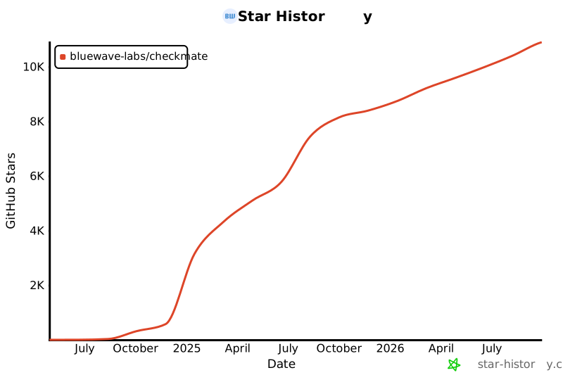](https://star-history.com/#bluewave-labs/Checkmate&Date)
|
||||
[](https://star-history.com/#bluewave-labs/bluewave-uptime&Date)
|
||||
|
||||
## Our sponsors
|
||||
|
||||
Thanks to [Gitbook](https://gitbook.io/) for giving us a free tier for their documentation platform, and [Poeditor](https://poeditor.com/) providing us a free account to use their i18n services. If you would like to sponsor Checkmate, please send an email to hello@bluewavelabs.ca
|
||||
|
||||
If you would like to sponsor a feature, [see this page](https://checkmate.so/sponsored-features).
|
||||
|
||||
Also check other developer and contributor-friendly projects of BlueWave:
|
||||
|
||||
- [VerifyWise](https://github.com/bluewave-labs/verifywise), the first open source AI governance platform.
|
||||
- [DataRoom](https://github.com/bluewave-labs/bluewave-dataroom), an secure file sharing application, aka dataroom.
|
||||
- [Guidefox](https://github.com/bluewave-labs/guidefox), an application that helps new users learn how to use your product via hints, tours, popups and banners.
|
||||
@@ -21,12 +21,7 @@ cd checkmate/charts/helm/checkmate
|
||||
Edit `values.yaml` to update:
|
||||
- `client.ingress.host` and `server.ingress.host` with your domain names
|
||||
- `server.protocol` (usually http or https)
|
||||
- **If upgrading**: Migrate persistence settings from flat structure to nested:
|
||||
- Old: `persistence.mongodbSize` → New: `persistence.mongo.size`
|
||||
- Old: `persistence.redisSize` → New: `persistence.redis.size`
|
||||
- Add: `persistence.mongo.storageClass` and `persistence.redis.storageClass` (leave empty for default)
|
||||
- Secrets under the `secrets` section (`JWT_SECRET`, email credentials, API keys, etc.) — replace all change_me values
|
||||
- **For TLS/HTTPS**: Configure ingress TLS settings (see section below)
|
||||
|
||||
### 3. Deploy the Helm chart
|
||||
```bash
|
||||
@@ -42,75 +37,3 @@ kubectl get svc
|
||||
```
|
||||
|
||||
Once all pods are `Running` and `Ready`, you can access Checkmate via the configured ingress hosts.
|
||||
|
||||
## Enabling TLS/HTTPS with cert-manager
|
||||
|
||||
If you have [cert-manager](https://cert-manager.io/) installed in your cluster, you can enable automatic TLS certificate provisioning using Let's Encrypt or other certificate issuers.
|
||||
|
||||
### Prerequisites
|
||||
- cert-manager installed in your cluster
|
||||
- A ClusterIssuer or Issuer configured (e.g., `letsencrypt-prod`)
|
||||
|
||||
### Configuration
|
||||
|
||||
Edit `values.yaml` to enable TLS (and update protocols to https):
|
||||
|
||||
```yaml
|
||||
client:
|
||||
protocol: https
|
||||
ingress:
|
||||
enabled: true
|
||||
host: checkmate.example.com
|
||||
className: nginx
|
||||
annotations:
|
||||
cert-manager.io/cluster-issuer: "letsencrypt-prod"
|
||||
tls:
|
||||
enabled: true
|
||||
secretName: checkmate-client-tls
|
||||
|
||||
server:
|
||||
protocol: https
|
||||
ingress:
|
||||
enabled: true
|
||||
host: checkmate.example.com
|
||||
className: nginx
|
||||
annotations:
|
||||
cert-manager.io/cluster-issuer: "letsencrypt-prod"
|
||||
tls:
|
||||
enabled: true
|
||||
secretName: checkmate-server-tls
|
||||
```
|
||||
|
||||
### Alternative: Using --set flags
|
||||
|
||||
You can also enable TLS during installation using Helm's `--set` flags:
|
||||
|
||||
```bash
|
||||
helm install checkmate ./charts/helm/checkmate \
|
||||
--set client.protocol=https \
|
||||
--set server.protocol=https \
|
||||
--set client.ingress.annotations."cert-manager\.io/cluster-issuer"="letsencrypt-prod" \
|
||||
--set client.ingress.tls.enabled=true \
|
||||
--set client.ingress.tls.secretName=checkmate-client-tls \
|
||||
--set server.ingress.annotations."cert-manager\.io/cluster-issuer"="letsencrypt-prod" \
|
||||
--set server.ingress.tls.enabled=true \
|
||||
--set server.ingress.tls.secretName=checkmate-server-tls
|
||||
```
|
||||
|
||||
### Verification
|
||||
|
||||
After deployment, cert-manager will automatically create the TLS secrets. You can verify the certificate status:
|
||||
|
||||
```bash
|
||||
# Check certificates
|
||||
kubectl get certificates
|
||||
|
||||
# Check certificate details
|
||||
kubectl describe certificate checkmate-client-tls
|
||||
kubectl describe certificate checkmate-server-tls
|
||||
|
||||
# Verify the secrets were created
|
||||
kubectl get secrets | grep checkmate-tls
|
||||
```
|
||||
|
||||
The ingress will automatically use these secrets to enable HTTPS access to your Checkmate instance.
|
||||
@@ -0,0 +1,12 @@
|
||||
{{- if eq .Values.client.ingress.host "change_me" }}
|
||||
{{- fail "client.ingress.host must be overridden and not set to 'change_me'" }}
|
||||
{{- end }}
|
||||
|
||||
{{- if eq .Values.server.ingress.host "change_me" }}
|
||||
{{- fail "server.ingress.host must be overridden and not set to 'change_me'" }}
|
||||
{{- end }}
|
||||
|
||||
{{- $protocol := .Values.server.protocol }}
|
||||
{{- if not (or (eq $protocol "http") (eq $protocol "https")) }}
|
||||
{{- fail "server.protocol must be either 'http' or 'https'" }}
|
||||
{{- end }}
|
||||
@@ -1,25 +1,17 @@
|
||||
apiVersion: apps/v1
|
||||
kind: Deployment
|
||||
metadata:
|
||||
name: checkmate-client
|
||||
name: client
|
||||
spec:
|
||||
replicas: 1
|
||||
selector:
|
||||
matchLabels:
|
||||
app: checkmate-client
|
||||
app: client
|
||||
template:
|
||||
metadata:
|
||||
labels:
|
||||
app: checkmate-client
|
||||
app: client
|
||||
spec:
|
||||
{{- with .Values.client.affinity }}
|
||||
affinity:
|
||||
{{- tpl ( . | toYaml) $ | nindent 8 }}
|
||||
{{- end }}
|
||||
{{- with .Values.client.tolerations }}
|
||||
tolerations:
|
||||
{{- tpl ( . | toYaml) $ | nindent 8 }}
|
||||
{{- end }}
|
||||
containers:
|
||||
- name: client
|
||||
image: {{ .Values.client.image }}
|
||||
@@ -28,17 +20,3 @@ spec:
|
||||
env:
|
||||
- name: UPTIME_APP_API_BASE_URL
|
||||
value: "{{ .Values.server.protocol }}://{{ .Values.server.ingress.host }}/api/v1"
|
||||
- name: UPTIME_APP_CLIENT_HOST
|
||||
value: "{{ .Values.client.protocol }}://{{ .Values.client.ingress.host }}"
|
||||
volumeMounts:
|
||||
- name: config-volume
|
||||
mountPath: /etc/nginx/conf.d/default.conf
|
||||
subPath: default.conf
|
||||
{{- with .Values.client.resources }}
|
||||
resources:
|
||||
{{- tpl ( . | toYaml) $ | nindent 12 }}
|
||||
{{- end }}
|
||||
volumes:
|
||||
- name: config-volume
|
||||
configMap:
|
||||
name: checkmate-server-nginx-cm
|
||||
@@ -2,21 +2,10 @@
|
||||
apiVersion: networking.k8s.io/v1
|
||||
kind: Ingress
|
||||
metadata:
|
||||
name: checkmate-client-ingress
|
||||
{{- if .Values.client.ingress.annotations }}
|
||||
name: client-ingress
|
||||
annotations:
|
||||
{{- range $key, $value := .Values.client.ingress.annotations }}
|
||||
{{ $key }}: {{ $value | quote }}
|
||||
{{- end }}
|
||||
{{- end }}
|
||||
nginx.ingress.kubernetes.io/rewrite-target: /
|
||||
spec:
|
||||
ingressClassName: {{ .Values.client.ingress.className }}
|
||||
{{- if .Values.client.ingress.tls.enabled }}
|
||||
tls:
|
||||
- hosts:
|
||||
- {{ .Values.client.ingress.host }}
|
||||
secretName: {{ default (printf "%s-client-tls" .Release.Name) .Values.client.ingress.tls.secretName }}
|
||||
{{- end }}
|
||||
rules:
|
||||
- host: {{ .Values.client.ingress.host }}
|
||||
http:
|
||||
@@ -25,7 +14,7 @@ spec:
|
||||
pathType: Prefix
|
||||
backend:
|
||||
service:
|
||||
name: checkmate-client
|
||||
name: client
|
||||
port:
|
||||
number: {{ .Values.client.port }}
|
||||
{{- end }}
|
||||
@@ -1,9 +1,9 @@
|
||||
apiVersion: v1
|
||||
kind: Service
|
||||
metadata:
|
||||
name: checkmate-client
|
||||
name: client
|
||||
spec:
|
||||
selector:
|
||||
app: checkmate-client
|
||||
app: client
|
||||
ports:
|
||||
- port: {{ .Values.client.port }}
|
||||
@@ -0,0 +1,27 @@
|
||||
apiVersion: apps/v1
|
||||
kind: Deployment
|
||||
metadata:
|
||||
name: mongodb
|
||||
spec:
|
||||
replicas: 1
|
||||
selector:
|
||||
matchLabels:
|
||||
app: mongodb
|
||||
template:
|
||||
metadata:
|
||||
labels:
|
||||
app: mongodb
|
||||
spec:
|
||||
containers:
|
||||
- name: mongodb
|
||||
image: {{ .Values.mongodb.image }}
|
||||
ports:
|
||||
- containerPort: {{ .Values.mongodb.port }}
|
||||
command: ["mongod", "--quiet", "--bind_ip_all"]
|
||||
volumeMounts:
|
||||
- name: mongodb-data
|
||||
mountPath: /data/db
|
||||
volumes:
|
||||
- name: mongodb-data
|
||||
persistentVolumeClaim:
|
||||
claimName: mongodb-pvc
|
||||
@@ -0,0 +1,10 @@
|
||||
apiVersion: v1
|
||||
kind: PersistentVolumeClaim
|
||||
metadata:
|
||||
name: mongodb-pvc
|
||||
spec:
|
||||
accessModes:
|
||||
- ReadWriteOnce
|
||||
resources:
|
||||
requests:
|
||||
storage: {{ .Values.persistence.mongodbSize }}
|
||||
@@ -1,9 +1,9 @@
|
||||
apiVersion: v1
|
||||
kind: Service
|
||||
metadata:
|
||||
name: checkmate-mongodb
|
||||
name: mongodb
|
||||
spec:
|
||||
selector:
|
||||
app: checkmate-mongodb
|
||||
app: mongodb
|
||||
ports:
|
||||
- port: {{ .Values.mongodb.port }}
|
||||
@@ -1,44 +0,0 @@
|
||||
apiVersion: apps/v1
|
||||
kind: StatefulSet
|
||||
metadata:
|
||||
name: checkmate-mongodb
|
||||
spec:
|
||||
replicas: 1
|
||||
selector:
|
||||
matchLabels:
|
||||
app: checkmate-mongodb
|
||||
template:
|
||||
metadata:
|
||||
labels:
|
||||
app: checkmate-mongodb
|
||||
spec:
|
||||
{{- with .Values.mongodb.affinity }}
|
||||
affinity:
|
||||
{{- tpl ( . | toYaml) $ | nindent 8 }}
|
||||
{{- end }}
|
||||
{{- with .Values.mongodb.tolerations }}
|
||||
tolerations:
|
||||
{{- tpl ( . | toYaml) $ | nindent 8 }}
|
||||
{{- end }}
|
||||
containers:
|
||||
- name: mongodb
|
||||
image: {{ .Values.mongodb.image }}
|
||||
ports:
|
||||
- containerPort: {{ .Values.mongodb.port }}
|
||||
command: ["mongod", "--quiet", "--bind_ip_all"]
|
||||
volumeMounts:
|
||||
- name: checkmate-mongo-persistent-storage
|
||||
mountPath: /data/db
|
||||
{{- with .Values.mongodb.resources }}
|
||||
resources:
|
||||
{{- tpl ( . | toYaml) $ | nindent 12 }}
|
||||
{{- end }}
|
||||
volumeClaimTemplates:
|
||||
- metadata:
|
||||
name: checkmate-mongo-persistent-storage
|
||||
spec:
|
||||
storageClassName: {{ .Values.persistence.mongo.storageClass | quote }}
|
||||
accessModes: ["ReadWriteOnce"]
|
||||
resources:
|
||||
requests:
|
||||
storage: {{ .Values.persistence.mongo.size | default "5Gi" | quote }}
|
||||
@@ -1,48 +0,0 @@
|
||||
{{- if eq .Values.client.ingress.host "change_me" }}
|
||||
{{- fail "client.ingress.host must be overridden and not set to 'change_me'" }}
|
||||
{{- end }}
|
||||
|
||||
{{- if eq .Values.server.ingress.host "change_me" }}
|
||||
{{- fail "server.ingress.host must be overridden and not set to 'change_me'" }}
|
||||
{{- end }}
|
||||
|
||||
{{- $serverProtocol := .Values.server.protocol }}
|
||||
{{- if not (or (eq $serverProtocol "http") (eq $serverProtocol "https")) }}
|
||||
{{- fail "server.protocol must be either 'http' or 'https'" }}
|
||||
{{- end }}
|
||||
|
||||
{{- $clientProtocol := .Values.client.protocol }}
|
||||
{{- if not (or (eq $clientProtocol "http") (eq $clientProtocol "https")) }}
|
||||
{{- fail "client.protocol must be either 'http' or 'https'" }}
|
||||
{{- end }}
|
||||
|
||||
{{/* Enforce protocol when TLS is enabled to avoid mixed-content */}}
|
||||
{{- if and .Values.client.ingress.tls.enabled (ne $clientProtocol "https") }}
|
||||
{{- fail "client.ingress.tls.enabled is true but client.protocol is not 'https'. Set client.protocol: https to avoid mixed content." }}
|
||||
{{- end }}
|
||||
|
||||
{{- if and .Values.server.ingress.tls.enabled (ne $serverProtocol "https") }}
|
||||
{{- fail "server.ingress.tls.enabled is true but server.protocol is not 'https'. Set server.protocol: https to ensure correct API base URL." }}
|
||||
{{- end }}
|
||||
|
||||
{{/* If client runs on https, API must also be https to avoid mixed content */}}
|
||||
{{- if and (eq $clientProtocol "https") (ne $serverProtocol "https") }}
|
||||
{{- fail "client.protocol is 'https' but server.protocol is not. Set server.protocol: https to prevent browser mixed-content issues." }}
|
||||
{{- end }}
|
||||
|
||||
{{/* Fail early if TLS enabled without cert-manager annotations (cluster-issuer or issuer) */}}
|
||||
{{- $cAnn := .Values.client.ingress.annotations | default dict }}
|
||||
{{- $sAnn := .Values.server.ingress.annotations | default dict }}
|
||||
|
||||
{{- $clientHasIssuer := or (hasKey $cAnn "cert-manager.io/cluster-issuer") (hasKey $cAnn "cert-manager.io/issuer") }}
|
||||
{{- $serverHasIssuer := or (hasKey $sAnn "cert-manager.io/cluster-issuer") (hasKey $sAnn "cert-manager.io/issuer") }}
|
||||
|
||||
{{- if and .Values.client.ingress.tls.enabled (not $clientHasIssuer) }}
|
||||
{{- fail "client.ingress.tls.enabled is true but no cert-manager issuer annotation found. Add 'cert-manager.io/cluster-issuer' or 'cert-manager.io/issuer'." }}
|
||||
{{- end }}
|
||||
|
||||
{{- if and .Values.server.ingress.tls.enabled (not $serverHasIssuer) }}
|
||||
{{- fail "server.ingress.tls.enabled is true but no cert-manager issuer annotation found. Add 'cert-manager.io/cluster-issuer' or 'cert-manager.io/issuer'." }}
|
||||
{{- end }}
|
||||
|
||||
{{/* Secret name can be omitted; we default to <release>-client|server-tls in templates */}}
|
||||
@@ -0,0 +1,26 @@
|
||||
apiVersion: apps/v1
|
||||
kind: Deployment
|
||||
metadata:
|
||||
name: redis
|
||||
spec:
|
||||
replicas: 1
|
||||
selector:
|
||||
matchLabels:
|
||||
app: redis
|
||||
template:
|
||||
metadata:
|
||||
labels:
|
||||
app: redis
|
||||
spec:
|
||||
containers:
|
||||
- name: redis
|
||||
image: {{ .Values.redis.image }}
|
||||
ports:
|
||||
- containerPort: {{ .Values.redis.port }}
|
||||
volumeMounts:
|
||||
- name: redis-data
|
||||
mountPath: /data
|
||||
volumes:
|
||||
- name: redis-data
|
||||
persistentVolumeClaim:
|
||||
claimName: redis-pvc
|
||||
@@ -0,0 +1,10 @@
|
||||
apiVersion: v1
|
||||
kind: PersistentVolumeClaim
|
||||
metadata:
|
||||
name: redis-pvc
|
||||
spec:
|
||||
accessModes:
|
||||
- ReadWriteOnce
|
||||
resources:
|
||||
requests:
|
||||
storage: {{ .Values.persistence.redisSize }}
|
||||
@@ -1,11 +1,9 @@
|
||||
{{- if .Values.redis.enabled }}
|
||||
apiVersion: v1
|
||||
kind: Service
|
||||
metadata:
|
||||
name: checkmate-redis
|
||||
name: redis
|
||||
spec:
|
||||
selector:
|
||||
app: checkmate-redis
|
||||
app: redis
|
||||
ports:
|
||||
- port: {{ .Values.redis.port }}
|
||||
{{- end }}
|
||||
@@ -1,33 +0,0 @@
|
||||
{{- if .Values.redis.enabled }}
|
||||
apiVersion: apps/v1
|
||||
kind: StatefulSet
|
||||
metadata:
|
||||
name: checkmate-redis
|
||||
spec:
|
||||
replicas: 1
|
||||
selector:
|
||||
matchLabels:
|
||||
app: checkmate-redis
|
||||
template:
|
||||
metadata:
|
||||
labels:
|
||||
app: checkmate-redis
|
||||
spec:
|
||||
containers:
|
||||
- name: redis
|
||||
image: {{ .Values.redis.image }}
|
||||
ports:
|
||||
- containerPort: {{ .Values.redis.port }}
|
||||
volumeMounts:
|
||||
- name: redis-data
|
||||
mountPath: /data
|
||||
volumeClaimTemplates:
|
||||
- metadata:
|
||||
name: checkmate-redis-persistent-storage
|
||||
spec:
|
||||
storageClassName: {{ .Values.persistence.redis.storageClass | quote }}
|
||||
accessModes: ["ReadWriteOnce"]
|
||||
resources:
|
||||
requests:
|
||||
storage: {{ .Values.persistence.redis.size | default "1Gi" | quote }}
|
||||
{{- end }}
|
||||
@@ -4,6 +4,10 @@
|
||||
{{- fail "secrets.JWT_SECRET must be overridden and cannot be 'change_me'" }}
|
||||
{{- end }}
|
||||
|
||||
{{- if or (not $secrets.REFRESH_TOKEN_SECRET) (eq $secrets.REFRESH_TOKEN_SECRET "change_me") }}
|
||||
{{- fail "secrets.REFRESH_TOKEN_SECRET must be overridden and cannot be 'change_me'" }}
|
||||
{{- end }}
|
||||
|
||||
apiVersion: v1
|
||||
kind: Secret
|
||||
metadata:
|
||||
|
||||
@@ -1,25 +1,17 @@
|
||||
apiVersion: apps/v1
|
||||
kind: Deployment
|
||||
metadata:
|
||||
name: checkmate-server
|
||||
name: server
|
||||
spec:
|
||||
replicas: 1
|
||||
selector:
|
||||
matchLabels:
|
||||
app: checkmate-server
|
||||
app: server
|
||||
template:
|
||||
metadata:
|
||||
labels:
|
||||
app: checkmate-server
|
||||
app: server
|
||||
spec:
|
||||
{{- with .Values.server.affinity }}
|
||||
affinity:
|
||||
{{- tpl ( . | toYaml) $ | nindent 8 }}
|
||||
{{- end }}
|
||||
{{- with .Values.server.tolerations }}
|
||||
tolerations:
|
||||
{{- tpl ( . | toYaml) $ | nindent 8 }}
|
||||
{{- end }}
|
||||
containers:
|
||||
- name: server
|
||||
image: {{ .Values.server.image }}
|
||||
@@ -28,10 +20,3 @@ spec:
|
||||
envFrom:
|
||||
- secretRef:
|
||||
name: checkmate-secrets
|
||||
{{- with .Values.server.resources }}
|
||||
resources:
|
||||
{{- tpl ( . | toYaml) $ | nindent 12 }}
|
||||
{{- end }}
|
||||
env:
|
||||
- name: CLIENT_HOST
|
||||
value: "{{ .Values.client.protocol }}://{{ .Values.client.ingress.host }}"
|
||||
@@ -2,37 +2,24 @@
|
||||
apiVersion: networking.k8s.io/v1
|
||||
kind: Ingress
|
||||
metadata:
|
||||
name: checkmate-server-ingress
|
||||
{{- if .Values.server.ingress.annotations }}
|
||||
name: server-ingress
|
||||
annotations:
|
||||
{{- range $key, $value := .Values.server.ingress.annotations }}
|
||||
{{ $key }}: {{ $value | quote }}
|
||||
{{- end }}
|
||||
{{- end }}
|
||||
{{/*#annotations:
|
||||
#nginx.ingress.kubernetes.io/rewrite-target: /
|
||||
#nginx.ingress.kubernetes.io/enable-cors: "true"
|
||||
#nginx.ingress.kubernetes.io/cors-allow-origin: "http://{{ .Values.client.ingress.host }},https://{{ .Values.client.ingress.host }}"
|
||||
#nginx.ingress.kubernetes.io/cors-allow-methods: "GET, PUT, POST, DELETE, PATCH, OPTIONS"
|
||||
#nginx.ingress.kubernetes.io/cors-allow-headers: "DNT,User-Agent,X-Requested-With,If-Modified-Since,Cache-Control,Content-Type,Range,Authorization"
|
||||
#nginx.ingress.kubernetes.io/cors-allow-credentials: "true"*/}}
|
||||
nginx.ingress.kubernetes.io/rewrite-target: /
|
||||
nginx.ingress.kubernetes.io/enable-cors: "true"
|
||||
nginx.ingress.kubernetes.io/cors-allow-origin: "http://{{ .Values.client.ingress.host }},https://{{ .Values.client.ingress.host }}"
|
||||
nginx.ingress.kubernetes.io/cors-allow-methods: "GET, PUT, POST, DELETE, PATCH, OPTIONS"
|
||||
nginx.ingress.kubernetes.io/cors-allow-headers: "DNT,User-Agent,X-Requested-With,If-Modified-Since,Cache-Control,Content-Type,Range,Authorization"
|
||||
nginx.ingress.kubernetes.io/cors-allow-credentials: "true"
|
||||
spec:
|
||||
ingressClassName: {{ .Values.server.ingress.className }}
|
||||
{{- if .Values.server.ingress.tls.enabled }}
|
||||
tls:
|
||||
- hosts:
|
||||
- {{ .Values.server.ingress.host }}
|
||||
secretName: {{ default (printf "%s-server-tls" .Release.Name) .Values.server.ingress.tls.secretName }}
|
||||
{{- end }}
|
||||
rules:
|
||||
- host: {{ .Values.server.ingress.host }}
|
||||
http:
|
||||
paths:
|
||||
- path: /api/v1
|
||||
- path: /
|
||||
pathType: Prefix
|
||||
backend:
|
||||
service:
|
||||
name: checkmate-server
|
||||
name: server
|
||||
port:
|
||||
number: {{ .Values.server.port }}
|
||||
{{- end }}
|
||||
@@ -1,41 +0,0 @@
|
||||
apiVersion: v1
|
||||
kind: ConfigMap
|
||||
metadata:
|
||||
name: checkmate-server-nginx-cm
|
||||
data:
|
||||
default.conf: |
|
||||
server {
|
||||
listen 80;
|
||||
listen [::]:80;
|
||||
|
||||
server_name checkmate-demo.bluewavelabs.ca;
|
||||
server_tokens off;
|
||||
|
||||
location /.well-known/acme-challenge/ {
|
||||
root /var/www/certbot;
|
||||
}
|
||||
|
||||
location / {
|
||||
root /usr/share/nginx/html;
|
||||
index index.html index.htm;
|
||||
try_files $uri $uri/ /index.html;
|
||||
}
|
||||
|
||||
# location /api/ {
|
||||
# proxy_pass http://{{ .Values.server.ingress.host }}:5000/api/;
|
||||
# proxy_http_version 1.1;
|
||||
# proxy_set_header Host $host;
|
||||
# proxy_set_header X-Real-IP $remote_addr;
|
||||
# proxy_set_header X-Forwarded-For $proxy_add_x_forwarded_for;
|
||||
# proxy_set_header X-Forwarded-Proto $scheme;
|
||||
# }
|
||||
|
||||
location /api-docs/ {
|
||||
proxy_pass http://{{ .Values.server.ingress.host }}:5000/api-docs/;
|
||||
proxy_http_version 1.1;
|
||||
proxy_set_header Host $host;
|
||||
proxy_set_header X-Real-IP $remote_addr;
|
||||
proxy_set_header X-Forwarded-For $proxy_add_x_forwarded_for;
|
||||
proxy_set_header X-Forwarded-Proto $scheme;
|
||||
}
|
||||
}
|
||||
@@ -1,9 +1,9 @@
|
||||
apiVersion: v1
|
||||
kind: Service
|
||||
metadata:
|
||||
name: checkmate-server
|
||||
name: server
|
||||
spec:
|
||||
selector:
|
||||
app: checkmate-server
|
||||
app: server
|
||||
ports:
|
||||
- port: {{ .Values.server.port }}
|
||||
@@ -1,70 +1,41 @@
|
||||
client:
|
||||
image: ghcr.io/bluewave-labs/checkmate-client:v3.2.0
|
||||
image: ghcr.io/bluewave-labs/checkmate-client:v2.3
|
||||
port: 80
|
||||
protocol: http
|
||||
ingress:
|
||||
enabled: true
|
||||
host: change_me
|
||||
className: nginx
|
||||
annotations: {}
|
||||
# Example annotations for cert-manager:
|
||||
# annotations:
|
||||
# cert-manager.io/cluster-issuer: "letsencrypt-prod"
|
||||
tls:
|
||||
enabled: false
|
||||
# secretName: {{ .Release.Name }}-client-tls # Optional; defaults to <release>-client-tls if omitted
|
||||
# Note: when enabling TLS, also set client.protocol: https and add
|
||||
# a cert-manager issuer annotation (e.g. cert-manager.io/cluster-issuer: "letsencrypt-prod").
|
||||
# The secret will be automatically created by cert-manager when using the cert-manager.io/cluster-issuer annotation
|
||||
|
||||
server:
|
||||
image: ghcr.io/bluewave-labs/checkmate-backend:v3.2.0
|
||||
image: ghcr.io/bluewave-labs/checkmate-backend:v2.3
|
||||
port: 52345
|
||||
protocol: http
|
||||
protocol: change_me
|
||||
ingress:
|
||||
enabled: true
|
||||
host: change_me
|
||||
className: nginx
|
||||
annotations: {}
|
||||
# Example annotations for cert-manager:
|
||||
# annotations:
|
||||
# cert-manager.io/cluster-issuer: "letsencrypt-prod"
|
||||
tls:
|
||||
enabled: false
|
||||
# secretName: {{ .Release.Name }}-server-tls # Optional; defaults to <release>-server-tls if omitted
|
||||
# Note: when enabling TLS, also set server.protocol: https and add
|
||||
# a cert-manager issuer annotation (e.g. cert-manager.io/cluster-issuer: "letsencrypt-prod").
|
||||
# The secret will be automatically created by cert-manager when using the cert-manager.io/cluster-issuer annotation
|
||||
|
||||
redis:
|
||||
enabled: false
|
||||
image: redis:7.2
|
||||
port: 6379
|
||||
|
||||
mongodb:
|
||||
image: ghcr.io/bluewave-labs/checkmate-mongo:v3.2.0
|
||||
image: mongo:7.0
|
||||
port: 27017
|
||||
|
||||
secrets:
|
||||
JWT_SECRET: change_me
|
||||
# REFRESH_TOKEN_SECRET: change_me
|
||||
# SYSTEM_EMAIL_ADDRESS: test@example.com
|
||||
# SYSTEM_EMAIL_PASSWORD: change_me
|
||||
# SYSTEM_EMAIL_HOST: smtp.example.com
|
||||
# SYSTEM_EMAIL_PORT: "587"
|
||||
# PAGESPEED_API_KEY: change_me
|
||||
DB_CONNECTION_STRING: mongodb://checkmate-mongodb.namespace.svc:27017/uptime_db
|
||||
CLIENT_HOST: change_me
|
||||
# REDIS_HOST: redis
|
||||
# REDIS_PORT: "6379"
|
||||
# DB_TYPE: MongoDB
|
||||
# TOKEN_TTL: 99d
|
||||
# REFRESH_TOKEN_TTL: 99d
|
||||
REFRESH_TOKEN_SECRET: change_me
|
||||
SYSTEM_EMAIL_ADDRESS: test@example.com
|
||||
SYSTEM_EMAIL_PASSWORD: change_me
|
||||
SYSTEM_EMAIL_HOST: smtp.example.com
|
||||
SYSTEM_EMAIL_PORT: "587"
|
||||
PAGESPEED_API_KEY: change_me
|
||||
DB_CONNECTION_STRING: mongodb://mongodb:27017/uptime_db
|
||||
REDIS_HOST: redis
|
||||
REDIS_PORT: "6379"
|
||||
DB_TYPE: MongoDB
|
||||
TOKEN_TTL: 99d
|
||||
REFRESH_TOKEN_TTL: 99d
|
||||
|
||||
persistence:
|
||||
mongo:
|
||||
size: 5Gi
|
||||
storageClass: ""
|
||||
redis:
|
||||
size: 1Gi
|
||||
storageClass: ""
|
||||
mongodbSize: 5Gi
|
||||
redisSize: 1Gi
|
||||
@@ -1,4 +1,3 @@
|
||||
VITE_APP_API_BASE_URL=UPTIME_APP_API_BASE_URL
|
||||
VITE_APP_API_V2_BASE_URL=UPTIME_APP_API_V2_BASE_URL
|
||||
VITE_APP_CLIENT_HOST=UPTIME_APP_CLIENT_HOST
|
||||
VITE_APP_LOG_LEVEL=UPTIME_APP_LOG_LEVEL
|
||||
+1
-2
@@ -28,5 +28,4 @@ dist-ssr
|
||||
|
||||
# Scripts
|
||||
*.sh
|
||||
!env.sh
|
||||
.env.development
|
||||
!env.sh
|
||||
+1
-1
@@ -18,7 +18,7 @@
|
||||
<div id="root"></div>
|
||||
<script
|
||||
type="module"
|
||||
src="/src/main.tsx"
|
||||
src="/src/main.jsx"
|
||||
></script>
|
||||
</body>
|
||||
</html>
|
||||
Generated
+1657
-2364
File diff suppressed because it is too large.
Load diff
+18
-26
@@ -5,57 +5,51 @@
|
||||
"type": "module",
|
||||
"scripts": {
|
||||
"dev": "vite",
|
||||
"build": "tsc -b && vite build",
|
||||
"build-dev": "tsc -b && vite build --mode development",
|
||||
"build": "vite build",
|
||||
"build-dev": "vite build --mode development",
|
||||
"lint": "eslint . --ext js,jsx --report-unused-disable-directives --max-warnings 0",
|
||||
"preview": "vite preview",
|
||||
"format": "prettier --write .",
|
||||
"format-check": "prettier --check ."
|
||||
},
|
||||
"lint-staged": {
|
||||
"**/*": "prettier --write"
|
||||
},
|
||||
"dependencies": {
|
||||
"@emotion/react": "^11.13.3",
|
||||
"@emotion/styled": "^11.13.0",
|
||||
"@hello-pangea/dnd": "^18.0.0",
|
||||
"@hookform/resolvers": "5.2.2",
|
||||
"@mui/lab": "7.0.0",
|
||||
"@mui/material": "7.3.7",
|
||||
"@mui/x-charts": "7.29.1",
|
||||
"@mui/x-date-pickers": "7.29.4",
|
||||
"@mui/icons-material": "6.4.11",
|
||||
"@mui/lab": "6.0.0-dev.240424162023-9968b4889d",
|
||||
"@mui/material": "6.4.11",
|
||||
"@mui/x-charts": "^7.5.1",
|
||||
"@mui/x-date-pickers": "7.29.0",
|
||||
"@reduxjs/toolkit": "2.7.0",
|
||||
"@types/maplibre-gl": "^1.13.2",
|
||||
"axios": "^1.7.4",
|
||||
"dayjs": "1.11.13",
|
||||
"flag-icons": "7.3.2",
|
||||
"html2canvas": "^1.4.1",
|
||||
"human-interval": "2.0.1",
|
||||
"i18next": "25.4.2",
|
||||
"joi": "17.13.3",
|
||||
"lucide-react": "^0.562.0",
|
||||
"maplibre-gl": "^5.19.0",
|
||||
"mui-color-input": "^7.0.0",
|
||||
"pretty-bytes": "^7.1.0",
|
||||
"pretty-ms": "^9.3.0",
|
||||
"mui-color-input": "^6.0.0",
|
||||
"react": "18.3.1",
|
||||
"react-dom": "^18.2.0",
|
||||
"react-hook-form": "^7.63.0",
|
||||
"react-i18next": "^15.4.0",
|
||||
"react-icons": "5.5.0",
|
||||
"react-map-gl": "^8.1.0",
|
||||
"react-redux": "9.2.0",
|
||||
"react-router": "^6.23.0",
|
||||
"react-router-dom": "^6.23.1",
|
||||
"react-toastify": "^10.0.5",
|
||||
"recharts": "2.15.2",
|
||||
"redux-persist": "6.0.0",
|
||||
"swr": "^2.3.6",
|
||||
"vite-plugin-svgr": "^4.2.0",
|
||||
"zod": "^4.3.6"
|
||||
"vite-plugin-svgr": "^4.2.0"
|
||||
},
|
||||
"unusedDepencies": {
|
||||
"@solana/wallet-adapter-base": "0.9.25",
|
||||
"@solana/wallet-adapter-material-ui": "0.16.35",
|
||||
"@solana/wallet-adapter-react": "0.15.37",
|
||||
"@solana/wallet-adapter-react-ui": "0.9.37",
|
||||
"@solana/wallet-adapter-wallets": "0.19.34",
|
||||
"@solana/web3.js": "1.98.0"
|
||||
},
|
||||
"devDependencies": {
|
||||
"@types/node": "24.5.2",
|
||||
"@types/react": "^18.2.66",
|
||||
"@types/react-dom": "^18.2.22",
|
||||
"@vitejs/plugin-react": "^4.2.1",
|
||||
@@ -63,9 +57,7 @@
|
||||
"eslint-plugin-react": "^7.34.1",
|
||||
"eslint-plugin-react-hooks": "^5.0.0",
|
||||
"eslint-plugin-react-refresh": "^0.4.6",
|
||||
"lint-staged": "^16.2.7",
|
||||
"prettier": "^3.3.3",
|
||||
"typescript": "5.9.3",
|
||||
"vite": "6.4.1"
|
||||
"vite": "6.3.6"
|
||||
}
|
||||
}
|
||||
@@ -1,258 +0,0 @@
|
||||
/**
|
||||
* Locale Migration Script
|
||||
*
|
||||
* Restructures all non-English locale files to match en.json's nested key structure.
|
||||
* Recovers translations via safe key-matching strategies, uses English placeholders
|
||||
* for unmatched keys.
|
||||
*
|
||||
* Usage: npx tsx client/scripts/migrate-locales.ts
|
||||
*
|
||||
* SAFETY: en.json is NEVER modified. Originals are backed up before overwriting.
|
||||
*/
|
||||
|
||||
import fs from "fs";
|
||||
import path from "path";
|
||||
|
||||
const LOCALES_DIR = path.resolve(import.meta.dirname, "../src/locales");
|
||||
const BACKUP_DIR = path.join(LOCALES_DIR, "backup");
|
||||
const REPORT_PATH = path.join(LOCALES_DIR, "migration-report.json");
|
||||
|
||||
// ── Helpers ──────────────────────────────────────────────────────────────────
|
||||
|
||||
/** Flatten a nested object into { "a.b.c": value } pairs */
|
||||
function flattenKeys(obj: Record<string, unknown>, prefix = ""): Record<string, string> {
|
||||
const result: Record<string, string> = {};
|
||||
for (const [key, value] of Object.entries(obj)) {
|
||||
const fullPath = prefix ? `${prefix}.${key}` : key;
|
||||
if (typeof value === "object" && value !== null && !Array.isArray(value)) {
|
||||
Object.assign(result, flattenKeys(value as Record<string, unknown>, fullPath));
|
||||
} else {
|
||||
result[fullPath] = String(value);
|
||||
}
|
||||
}
|
||||
return result;
|
||||
}
|
||||
|
||||
/** Set a value at a dot-separated path in a nested object */
|
||||
function setNestedValue(
|
||||
obj: Record<string, unknown>,
|
||||
keyPath: string,
|
||||
value: string
|
||||
): void {
|
||||
const parts = keyPath.split(".");
|
||||
let current = obj;
|
||||
for (let i = 0; i < parts.length - 1; i++) {
|
||||
const part = parts[i];
|
||||
if (!(part in current) || typeof current[part] !== "object") {
|
||||
current[part] = {};
|
||||
}
|
||||
current = current[part] as Record<string, unknown>;
|
||||
}
|
||||
current[parts[parts.length - 1]] = value;
|
||||
}
|
||||
|
||||
// ── Build mapping indexes from en.json ───────────────────────────────────────
|
||||
|
||||
function buildIndexes(enFlat: Record<string, string>) {
|
||||
const enKeys = Object.keys(enFlat);
|
||||
|
||||
// last segment -> en key paths
|
||||
const lastSegIndex: Record<string, string[]> = {};
|
||||
// last 2 segments -> en key paths
|
||||
const suffixIndex: Record<string, string[]> = {};
|
||||
|
||||
for (const keyPath of enKeys) {
|
||||
const parts = keyPath.split(".");
|
||||
const lastSeg = parts[parts.length - 1].toLowerCase();
|
||||
if (!lastSegIndex[lastSeg]) lastSegIndex[lastSeg] = [];
|
||||
lastSegIndex[lastSeg].push(keyPath);
|
||||
|
||||
if (parts.length >= 2) {
|
||||
const suffix = parts.slice(-2).join(".").toLowerCase();
|
||||
if (!suffixIndex[suffix]) suffixIndex[suffix] = [];
|
||||
suffixIndex[suffix].push(keyPath);
|
||||
}
|
||||
}
|
||||
|
||||
return { lastSegIndex, suffixIndex };
|
||||
}
|
||||
|
||||
// ── Mapping logic ────────────────────────────────────────────────────────────
|
||||
|
||||
type MatchStrategy = "exact" | "suffix-2" | "unique-name" | "english-placeholder";
|
||||
|
||||
interface KeyMatch {
|
||||
enKey: string;
|
||||
value: string;
|
||||
strategy: MatchStrategy;
|
||||
}
|
||||
|
||||
function buildMigratedLocale(
|
||||
enFlat: Record<string, string>,
|
||||
langFlat: Record<string, string>,
|
||||
indexes: ReturnType<typeof buildIndexes>
|
||||
): { matches: KeyMatch[]; result: Record<string, unknown> } {
|
||||
const { lastSegIndex, suffixIndex } = indexes;
|
||||
const matches: KeyMatch[] = [];
|
||||
const result: Record<string, unknown> = {};
|
||||
|
||||
// Build reverse lookup: for each orphan key in lang, index by last segment and suffix
|
||||
const langByLastSeg: Record<string, { key: string; value: string }[]> = {};
|
||||
const langBySuffix: Record<string, { key: string; value: string }[]> = {};
|
||||
|
||||
for (const [langKey, langValue] of Object.entries(langFlat)) {
|
||||
const parts = langKey.split(".");
|
||||
const lastSeg = parts[parts.length - 1].toLowerCase();
|
||||
if (!langByLastSeg[lastSeg]) langByLastSeg[lastSeg] = [];
|
||||
langByLastSeg[lastSeg].push({ key: langKey, value: langValue });
|
||||
|
||||
if (parts.length >= 2) {
|
||||
const suffix = parts.slice(-2).join(".").toLowerCase();
|
||||
if (!langBySuffix[suffix]) langBySuffix[suffix] = [];
|
||||
langBySuffix[suffix].push({ key: langKey, value: langValue });
|
||||
}
|
||||
}
|
||||
|
||||
for (const enKey of Object.keys(enFlat)) {
|
||||
const enValue = enFlat[enKey];
|
||||
const parts = enKey.split(".");
|
||||
const lastSeg = parts[parts.length - 1].toLowerCase();
|
||||
const suffix = parts.length >= 2 ? parts.slice(-2).join(".").toLowerCase() : null;
|
||||
|
||||
// Strategy 1: Exact path match
|
||||
if (langFlat[enKey] !== undefined) {
|
||||
const value = langFlat[enKey];
|
||||
setNestedValue(result, enKey, value);
|
||||
matches.push({ enKey, value, strategy: "exact" });
|
||||
continue;
|
||||
}
|
||||
|
||||
// Strategy 2: 2-segment suffix match (lang key suffix matches en key suffix, both unique)
|
||||
if (suffix) {
|
||||
const enCandidates = suffixIndex[suffix];
|
||||
const langCandidates = langBySuffix[suffix];
|
||||
if (
|
||||
enCandidates &&
|
||||
enCandidates.length === 1 &&
|
||||
langCandidates &&
|
||||
langCandidates.length === 1
|
||||
) {
|
||||
const value = langCandidates[0].value;
|
||||
setNestedValue(result, enKey, value);
|
||||
matches.push({ enKey, value, strategy: "suffix-2" });
|
||||
continue;
|
||||
}
|
||||
}
|
||||
|
||||
// Strategy 3: Unique last-segment match
|
||||
const enCandidates = lastSegIndex[lastSeg];
|
||||
const langCandidates = langByLastSeg[lastSeg];
|
||||
if (
|
||||
enCandidates &&
|
||||
enCandidates.length === 1 &&
|
||||
langCandidates &&
|
||||
langCandidates.length === 1
|
||||
) {
|
||||
const value = langCandidates[0].value;
|
||||
setNestedValue(result, enKey, value);
|
||||
matches.push({ enKey, value, strategy: "unique-name" });
|
||||
continue;
|
||||
}
|
||||
|
||||
// No match — use English placeholder
|
||||
setNestedValue(result, enKey, enValue);
|
||||
matches.push({ enKey, value: enValue, strategy: "english-placeholder" });
|
||||
}
|
||||
|
||||
return { matches, result };
|
||||
}
|
||||
|
||||
// ── Main ─────────────────────────────────────────────────────────────────────
|
||||
|
||||
function main() {
|
||||
// Load en.json
|
||||
const enPath = path.join(LOCALES_DIR, "en.json");
|
||||
const en = JSON.parse(fs.readFileSync(enPath, "utf8"));
|
||||
const enFlat = flattenKeys(en);
|
||||
const enKeyCount = Object.keys(enFlat).length;
|
||||
const indexes = buildIndexes(enFlat);
|
||||
|
||||
console.log(`English: ${enKeyCount} keys (source of truth — NOT modified)\n`);
|
||||
|
||||
// Find all non-English locale files
|
||||
const localeFiles = fs
|
||||
.readdirSync(LOCALES_DIR)
|
||||
.filter(
|
||||
(f: string) =>
|
||||
f.endsWith(".json") && f !== "en.json" && f !== "migration-report.json"
|
||||
);
|
||||
|
||||
if (localeFiles.length === 0) {
|
||||
console.log("No locale files to migrate.");
|
||||
return;
|
||||
}
|
||||
|
||||
// Create backup directory
|
||||
if (!fs.existsSync(BACKUP_DIR)) {
|
||||
fs.mkdirSync(BACKUP_DIR, { recursive: true });
|
||||
}
|
||||
|
||||
const report: Record<
|
||||
string,
|
||||
{
|
||||
total: number;
|
||||
exact: number;
|
||||
suffix: number;
|
||||
uniqueName: number;
|
||||
placeholder: number;
|
||||
}
|
||||
> = {};
|
||||
|
||||
for (const file of localeFiles) {
|
||||
const lang = file.replace(".json", "");
|
||||
const filePath = path.join(LOCALES_DIR, file);
|
||||
|
||||
// Backup original
|
||||
const backupPath = path.join(BACKUP_DIR, file);
|
||||
fs.copyFileSync(filePath, backupPath);
|
||||
|
||||
// Load and flatten
|
||||
const langData = JSON.parse(fs.readFileSync(filePath, "utf8"));
|
||||
const langFlat = flattenKeys(langData);
|
||||
|
||||
// Migrate
|
||||
const { matches, result } = buildMigratedLocale(enFlat, langFlat, indexes);
|
||||
|
||||
// Write migrated file
|
||||
fs.writeFileSync(filePath, JSON.stringify(result, null, "\t") + "\n", "utf8");
|
||||
|
||||
// Compute stats
|
||||
const stats = {
|
||||
total: enKeyCount,
|
||||
exact: matches.filter((m) => m.strategy === "exact").length,
|
||||
suffix: matches.filter((m) => m.strategy === "suffix-2").length,
|
||||
uniqueName: matches.filter((m) => m.strategy === "unique-name").length,
|
||||
placeholder: matches.filter((m) => m.strategy === "english-placeholder").length,
|
||||
};
|
||||
report[lang] = stats;
|
||||
|
||||
const translated = stats.exact + stats.suffix + stats.uniqueName;
|
||||
const pct = ((translated / enKeyCount) * 100).toFixed(1);
|
||||
console.log(
|
||||
`${lang.padEnd(8)} ${String(translated).padStart(4)} translated (${pct}%) | ` +
|
||||
`exact: ${stats.exact} suffix: ${stats.suffix} name: ${stats.uniqueName} ` +
|
||||
`placeholder: ${stats.placeholder}`
|
||||
);
|
||||
}
|
||||
|
||||
// Write report
|
||||
fs.writeFileSync(REPORT_PATH, JSON.stringify(report, null, "\t") + "\n", "utf8");
|
||||
|
||||
const totalLangs = localeFiles.length;
|
||||
console.log(
|
||||
`\nMigrated ${totalLangs} locale files. Originals backed up to locales/backup/`
|
||||
);
|
||||
console.log(`Report written to ${REPORT_PATH}`);
|
||||
}
|
||||
|
||||
main();
|
||||
@@ -0,0 +1,41 @@
|
||||
import { useEffect } from "react";
|
||||
import { useSelector } from "react-redux";
|
||||
import "react-toastify/dist/ReactToastify.css";
|
||||
import { ToastContainer } from "react-toastify";
|
||||
import { ThemeProvider } from "@emotion/react";
|
||||
import lightTheme from "./Utils/Theme/lightTheme";
|
||||
import darkTheme from "./Utils/Theme/darkTheme";
|
||||
import { CssBaseline, GlobalStyles } from "@mui/material";
|
||||
import { logger } from "./Utils/Logger"; // Import the logger
|
||||
import { networkService } from "./main";
|
||||
import { Routes } from "./Routes";
|
||||
import WalletProvider from "./Components/WalletProvider";
|
||||
import AppLayout from "./Components/Layouts/AppLayout";
|
||||
|
||||
function App() {
|
||||
const mode = useSelector((state) => state.ui.mode);
|
||||
|
||||
// Cleanup
|
||||
useEffect(() => {
|
||||
return () => {
|
||||
logger.cleanup();
|
||||
networkService.cleanup();
|
||||
};
|
||||
}, []);
|
||||
|
||||
return (
|
||||
/* Extract Themeprovider, baseline and global styles to Styles */
|
||||
<ThemeProvider theme={mode === "light" ? lightTheme : darkTheme}>
|
||||
<WalletProvider>
|
||||
<CssBaseline />
|
||||
|
||||
<AppLayout>
|
||||
<Routes />
|
||||
</AppLayout>
|
||||
<ToastContainer />
|
||||
</WalletProvider>
|
||||
</ThemeProvider>
|
||||
);
|
||||
}
|
||||
|
||||
export default App;
|
||||
@@ -1,56 +0,0 @@
|
||||
import { type CSSProperties } from "react";
|
||||
import { useSelector } from "react-redux";
|
||||
import "react-toastify/dist/ReactToastify.css";
|
||||
import { ToastContainer } from "react-toastify";
|
||||
import { ThemeProvider } from "@emotion/react";
|
||||
import { CssBaseline, GlobalStyles } from "@mui/material";
|
||||
import { SWRConfig } from "swr";
|
||||
import { Routes } from "./Routes";
|
||||
import AppLayout from "@/Components/layout/AppLayout";
|
||||
import type { RootState } from "@/Types/state";
|
||||
import { lightTheme, darkTheme } from "@/Utils/Theme/Theme";
|
||||
|
||||
const swrConfig = {
|
||||
dedupingInterval: 5000,
|
||||
revalidateOnFocus: false,
|
||||
revalidateOnReconnect: true,
|
||||
shouldRetryOnError: false,
|
||||
errorRetryCount: 2,
|
||||
errorRetryInterval: 1000,
|
||||
focusThrottleInterval: 5000,
|
||||
};
|
||||
|
||||
function App() {
|
||||
const mode = useSelector((state: RootState) => state.ui.mode);
|
||||
const theme = mode === "light" ? lightTheme : darkTheme;
|
||||
|
||||
return (
|
||||
<SWRConfig value={swrConfig}>
|
||||
<ThemeProvider theme={theme}>
|
||||
<CssBaseline />
|
||||
<GlobalStyles
|
||||
styles={{
|
||||
body: {
|
||||
backgroundColor: theme.palette.background.default,
|
||||
},
|
||||
}}
|
||||
/>
|
||||
<AppLayout>
|
||||
<Routes />
|
||||
</AppLayout>
|
||||
<ToastContainer
|
||||
newestOnTop={true}
|
||||
theme={mode}
|
||||
style={
|
||||
{
|
||||
"--toastify-color-progress-light": "#7C8BA1",
|
||||
"--toastify-color-progress-dark": "#7C8BA1",
|
||||
} as CSSProperties
|
||||
}
|
||||
/>
|
||||
</ThemeProvider>
|
||||
</SWRConfig>
|
||||
);
|
||||
}
|
||||
|
||||
export default App;
|
||||
@@ -0,0 +1,224 @@
|
||||
// Components
|
||||
import IconButton from "@mui/material/IconButton";
|
||||
import Menu from "@mui/material/Menu";
|
||||
import MenuItem from "@mui/material/MenuItem";
|
||||
import Settings from "../../assets/icons/settings-bold.svg?react";
|
||||
import Dialog from "../../Components/Dialog";
|
||||
|
||||
// Utils
|
||||
import { useState } from "react";
|
||||
import { useTheme } from "@emotion/react";
|
||||
import { useNavigate } from "react-router-dom";
|
||||
import { createToast } from "../../Utils/toastUtils";
|
||||
|
||||
import PropTypes from "prop-types";
|
||||
import { usePauseMonitor, useDeleteMonitor } from "../../Hooks/monitorHooks";
|
||||
|
||||
const ActionsMenu = ({
|
||||
monitor,
|
||||
isAdmin,
|
||||
updateRowCallback,
|
||||
pauseCallback,
|
||||
setIsLoading = () => {},
|
||||
}) => {
|
||||
const [anchorEl, setAnchorEl] = useState(null);
|
||||
const [actions, setActions] = useState({});
|
||||
const [isOpen, setIsOpen] = useState(false);
|
||||
const theme = useTheme();
|
||||
const [pauseMonitor, isPausing, error] = usePauseMonitor();
|
||||
const [deleteMonitor, isDeleting] = useDeleteMonitor();
|
||||
|
||||
const handleRemove = async (event) => {
|
||||
event.preventDefault();
|
||||
event.stopPropagation();
|
||||
let monitor = { _id: actions.id };
|
||||
await deleteMonitor({ monitor });
|
||||
updateRowCallback();
|
||||
};
|
||||
|
||||
const handlePause = async () => {
|
||||
try {
|
||||
setIsLoading(true);
|
||||
await pauseMonitor({ monitorId: monitor._id });
|
||||
pauseCallback();
|
||||
} catch (error) {
|
||||
createToast({ body: "Failed to pause monitor." });
|
||||
} finally {
|
||||
setIsLoading(false);
|
||||
}
|
||||
};
|
||||
|
||||
const openMenu = (event, id, url) => {
|
||||
event.preventDefault();
|
||||
event.stopPropagation();
|
||||
setAnchorEl(event.currentTarget);
|
||||
setActions({ id: id, url: url });
|
||||
};
|
||||
|
||||
const openRemove = (e) => {
|
||||
closeMenu(e);
|
||||
setIsOpen(true);
|
||||
};
|
||||
|
||||
const closeMenu = (e) => {
|
||||
e.stopPropagation();
|
||||
setAnchorEl(null);
|
||||
};
|
||||
|
||||
const navigate = useNavigate();
|
||||
return (
|
||||
<>
|
||||
<IconButton
|
||||
aria-label="monitor actions"
|
||||
onClick={(event) => {
|
||||
event.stopPropagation();
|
||||
openMenu(event, monitor._id, monitor.type === "ping" ? null : monitor.url);
|
||||
}}
|
||||
sx={{
|
||||
"&:focus": {
|
||||
outline: "none",
|
||||
},
|
||||
"& svg path": {
|
||||
stroke: theme.palette.primary.contrastTextTertiary,
|
||||
},
|
||||
}}
|
||||
>
|
||||
<Settings />
|
||||
</IconButton>
|
||||
|
||||
<Menu
|
||||
className="actions-menu"
|
||||
anchorEl={anchorEl}
|
||||
open={Boolean(anchorEl)}
|
||||
onClose={(e) => closeMenu(e)}
|
||||
disableScrollLock
|
||||
slotProps={{
|
||||
paper: {
|
||||
sx: {
|
||||
"& ul": {
|
||||
p: theme.spacing(2.5),
|
||||
backgroundColor: theme.palette.primary.main,
|
||||
},
|
||||
"& li": { m: 0, color: theme.palette.primary.contrastTextSecondary },
|
||||
/*
|
||||
This should not be set automatically on the last of type
|
||||
"& li:last-of-type": {
|
||||
color: theme.palette.error.main,
|
||||
}, */
|
||||
},
|
||||
},
|
||||
}}
|
||||
>
|
||||
{actions.url !== null ? (
|
||||
<MenuItem
|
||||
onClick={(e) => {
|
||||
closeMenu(e);
|
||||
e.stopPropagation();
|
||||
window.open(actions.url, "_blank", "noreferrer");
|
||||
}}
|
||||
>
|
||||
Open site
|
||||
</MenuItem>
|
||||
) : (
|
||||
""
|
||||
)}
|
||||
<MenuItem
|
||||
onClick={(e) => {
|
||||
e.stopPropagation();
|
||||
navigate(`/uptime/${actions.id}`);
|
||||
}}
|
||||
>
|
||||
Details
|
||||
</MenuItem>
|
||||
{/* TODO - pass monitor id to Incidents page */}
|
||||
<MenuItem
|
||||
onClick={(e) => {
|
||||
e.stopPropagation();
|
||||
navigate(`/incidents/${actions.id}`);
|
||||
}}
|
||||
>
|
||||
Incidents
|
||||
</MenuItem>
|
||||
{isAdmin && (
|
||||
<MenuItem
|
||||
onClick={(e) => {
|
||||
e.stopPropagation();
|
||||
|
||||
navigate(`/uptime/configure/${actions.id}`);
|
||||
}}
|
||||
>
|
||||
Configure
|
||||
</MenuItem>
|
||||
)}
|
||||
{isAdmin && (
|
||||
<MenuItem
|
||||
onClick={(e) => {
|
||||
e.stopPropagation();
|
||||
navigate(`/uptime/create/${actions.id}`);
|
||||
}}
|
||||
>
|
||||
Clone
|
||||
</MenuItem>
|
||||
)}
|
||||
{isAdmin && (
|
||||
<MenuItem
|
||||
onClick={(e) => {
|
||||
closeMenu(e);
|
||||
|
||||
e.stopPropagation();
|
||||
handlePause(e);
|
||||
}}
|
||||
>
|
||||
{monitor?.isActive === true ? "Pause" : "Resume"}
|
||||
</MenuItem>
|
||||
)}
|
||||
{isAdmin && (
|
||||
<MenuItem
|
||||
onClick={(e) => {
|
||||
e.stopPropagation();
|
||||
openRemove(e);
|
||||
}}
|
||||
sx={{ "&.MuiButtonBase-root": { color: theme.palette.error.main } }}
|
||||
>
|
||||
Remove
|
||||
</MenuItem>
|
||||
)}
|
||||
</Menu>
|
||||
<Dialog
|
||||
open={isOpen}
|
||||
theme={theme}
|
||||
title="Do you really want to delete this monitor?"
|
||||
description="Once deleted, this monitor cannot be retrieved."
|
||||
/* Do we need stop propagation? */
|
||||
onCancel={(e) => {
|
||||
e.stopPropagation();
|
||||
setIsOpen(false);
|
||||
}}
|
||||
confirmationButtonLabel="Delete"
|
||||
/* Do we need stop propagation? */
|
||||
onConfirm={(e) => {
|
||||
e.stopPropagation();
|
||||
handleRemove(e);
|
||||
}}
|
||||
isLoading={isDeleting}
|
||||
modelTitle="modal-delete-monitor"
|
||||
modelDescription="delete-monitor-confirmation"
|
||||
/>
|
||||
</>
|
||||
);
|
||||
};
|
||||
|
||||
ActionsMenu.propTypes = {
|
||||
monitor: PropTypes.shape({
|
||||
_id: PropTypes.string,
|
||||
url: PropTypes.string,
|
||||
type: PropTypes.string,
|
||||
isActive: PropTypes.bool,
|
||||
}).isRequired,
|
||||
isAdmin: PropTypes.bool,
|
||||
updateRowCallback: PropTypes.func,
|
||||
pauseCallback: PropTypes.func,
|
||||
setIsLoading: PropTypes.func,
|
||||
};
|
||||
|
||||
export default ActionsMenu;
|
||||
@@ -0,0 +1,9 @@
|
||||
.alert {
|
||||
margin: 0;
|
||||
width: fit-content;
|
||||
}
|
||||
.alert,
|
||||
.alert button,
|
||||
.alert .MuiTypography-root {
|
||||
font-size: var(--env-var-font-size-medium);
|
||||
}
|
||||
@@ -0,0 +1,127 @@
|
||||
import PropTypes from "prop-types";
|
||||
import { useTheme } from "@emotion/react";
|
||||
import { Box, Button, IconButton, Stack, Typography } from "@mui/material";
|
||||
import InfoOutlinedIcon from "@mui/icons-material/InfoOutlined";
|
||||
import ErrorOutlineOutlinedIcon from "@mui/icons-material/ErrorOutlineOutlined";
|
||||
import WarningAmberOutlinedIcon from "@mui/icons-material/WarningAmberOutlined";
|
||||
import CloseIcon from "@mui/icons-material/Close";
|
||||
import "./index.css";
|
||||
|
||||
/**
|
||||
* Icons mapping for different alert variants.
|
||||
* @type {Object<string, JSX.Element>}
|
||||
*/
|
||||
|
||||
const icons = {
|
||||
info: <InfoOutlinedIcon />,
|
||||
error: <ErrorOutlineOutlinedIcon />,
|
||||
warning: <WarningAmberOutlinedIcon />,
|
||||
};
|
||||
|
||||
/**
|
||||
* @param {Object} props
|
||||
* @param {'info' | 'error' | 'warning'} props.variant - The type of alert.
|
||||
* @param {string} [props.title] - The title of the alert.
|
||||
* @param {string} [props.body] - The body text of the alert.
|
||||
* @param {boolean} [props.isToast] - Indicates if the alert is used as a toast notification.
|
||||
* @param {boolean} [props.hasIcon] - Whether to display an icon in the alert.
|
||||
* @param {function} props.onClick - Toast dismiss function.
|
||||
* @returns {JSX.Element}
|
||||
*/
|
||||
|
||||
const Alert = ({ variant, title, body, isToast, hasIcon = true, onClick }) => {
|
||||
const theme = useTheme();
|
||||
/* TODO
|
||||
Do we need other variants for alert?
|
||||
*/
|
||||
|
||||
const text = theme.palette.secondary.contrastText;
|
||||
const border = theme.palette.alert.contrastText;
|
||||
const bg = theme.palette.alert.main;
|
||||
const icon = icons[variant];
|
||||
|
||||
return (
|
||||
<Stack
|
||||
direction="row"
|
||||
justifyContent="flex-start"
|
||||
alignItems={hasIcon ? "" : "center"}
|
||||
className="alert row-stack"
|
||||
gap={theme.spacing(8)}
|
||||
sx={{
|
||||
padding: hasIcon ? theme.spacing(8) : `${theme.spacing(4)} ${theme.spacing(8)}`,
|
||||
backgroundColor: bg,
|
||||
border: `solid 1px ${border}`,
|
||||
borderRadius: theme.shape.borderRadius,
|
||||
}}
|
||||
>
|
||||
{hasIcon && <Box sx={{ color: text }}>{icon}</Box>}
|
||||
<Stack
|
||||
direction="column"
|
||||
gap="2px"
|
||||
sx={{ flex: 1 }}
|
||||
>
|
||||
{title && (
|
||||
<Typography sx={{ fontWeight: "700", color: `${text}` }}>{title}</Typography>
|
||||
)}
|
||||
{body && (
|
||||
<Typography sx={{ fontWeight: "400", color: `${text}` }}>{body}</Typography>
|
||||
)}
|
||||
{hasIcon && isToast && (
|
||||
<Button
|
||||
variant="text"
|
||||
color="info"
|
||||
onClick={onClick}
|
||||
sx={{
|
||||
fontWeight: "600",
|
||||
width: "fit-content",
|
||||
mt: theme.spacing(4),
|
||||
padding: 0,
|
||||
minWidth: 0,
|
||||
}}
|
||||
>
|
||||
Dismiss
|
||||
</Button>
|
||||
)}
|
||||
</Stack>
|
||||
{isToast && (
|
||||
<IconButton
|
||||
onClick={onClick}
|
||||
sx={{
|
||||
alignSelf: "flex-start",
|
||||
ml: "auto",
|
||||
mr: "-5px",
|
||||
mt: hasIcon ? "-5px" : 0,
|
||||
padding: "5px",
|
||||
"&:focus": {
|
||||
outline: "none",
|
||||
},
|
||||
}}
|
||||
>
|
||||
<CloseIcon
|
||||
sx={{
|
||||
fontSize: "20px",
|
||||
}}
|
||||
/>
|
||||
</IconButton>
|
||||
)}
|
||||
</Stack>
|
||||
);
|
||||
};
|
||||
|
||||
Alert.propTypes = {
|
||||
variant: PropTypes.oneOf(["info", "error", "warning"]).isRequired,
|
||||
title: PropTypes.string,
|
||||
body: PropTypes.oneOfType([PropTypes.string, PropTypes.object]),
|
||||
isToast: PropTypes.bool,
|
||||
hasIcon: PropTypes.bool,
|
||||
onClick: function (props, propName, componentName) {
|
||||
if (props.isToast && !props[propName]) {
|
||||
return new Error(
|
||||
`Prop '${propName}' is required when 'isToast' is true in '${componentName}'.`
|
||||
);
|
||||
}
|
||||
return null;
|
||||
},
|
||||
};
|
||||
|
||||
export default Alert;
|
||||
@@ -0,0 +1,68 @@
|
||||
import PropTypes from "prop-types";
|
||||
import { Box, Stack, useTheme } from "@mui/material";
|
||||
// import useUtils from "../../Pages/Uptime/utils";
|
||||
|
||||
/**
|
||||
* A component that renders a pulsating dot with a specified color.
|
||||
*
|
||||
* @component
|
||||
* @example
|
||||
* // Example usage:
|
||||
* <PulseDot color="#f00" />
|
||||
*
|
||||
* @param {Object} props
|
||||
* @param {string} props.color - The color of the dot.
|
||||
* @returns {JSX.Element} The PulseDot component.
|
||||
*/
|
||||
|
||||
const PulseDot = ({ color }) => {
|
||||
const theme = useTheme();
|
||||
// const { statusToTheme } = useUtils();
|
||||
/* TODO refactor so it gets status and gets theme color. Then uses theme.palette.[themeColor].lowContrast */
|
||||
/* const themeColor = statusToTheme[status]; */
|
||||
|
||||
return (
|
||||
<Stack
|
||||
width="26px"
|
||||
height="24px"
|
||||
alignItems="center"
|
||||
justifyContent="center"
|
||||
>
|
||||
<Box
|
||||
minWidth="18px"
|
||||
minHeight="18px"
|
||||
sx={{
|
||||
position: "relative",
|
||||
backgroundColor: color,
|
||||
borderRadius: "50%",
|
||||
"&::before": {
|
||||
content: `""`,
|
||||
position: "absolute",
|
||||
width: "100%",
|
||||
height: "100%",
|
||||
backgroundColor: "inherit",
|
||||
borderRadius: "50%",
|
||||
animation: "ripple 1.8s ease-out infinite",
|
||||
},
|
||||
"&::after": {
|
||||
content: `""`,
|
||||
position: "absolute",
|
||||
width: "7px",
|
||||
height: "7px",
|
||||
borderRadius: "50%",
|
||||
backgroundColor: theme.palette.accent.contrastText,
|
||||
top: "50%",
|
||||
left: "50%",
|
||||
transform: "translate(-50%, -50%)",
|
||||
},
|
||||
}}
|
||||
/>
|
||||
</Stack>
|
||||
);
|
||||
};
|
||||
|
||||
PulseDot.propTypes = {
|
||||
color: PropTypes.string.isRequired,
|
||||
};
|
||||
|
||||
export default PulseDot;
|
||||
@@ -0,0 +1,35 @@
|
||||
import LeftArrow from "../../assets/icons/left-arrow.svg?react";
|
||||
import LeftArrowDouble from "../../assets/icons/left-arrow-double.svg?react";
|
||||
import LeftArrowLong from "../../assets/icons/left-arrow-long.svg?react";
|
||||
import PropTypes from "prop-types";
|
||||
|
||||
const ArrowLeft = ({ type, color = "#667085", ...props }) => {
|
||||
if (type === "double") {
|
||||
return (
|
||||
<LeftArrowDouble
|
||||
style={{ color }}
|
||||
{...props}
|
||||
/>
|
||||
);
|
||||
} else if (type === "long") {
|
||||
return (
|
||||
<LeftArrowLong
|
||||
style={{ color }}
|
||||
{...props}
|
||||
/>
|
||||
);
|
||||
} else {
|
||||
return (
|
||||
<LeftArrow
|
||||
style={{ color }}
|
||||
{...props}
|
||||
/>
|
||||
);
|
||||
}
|
||||
};
|
||||
|
||||
ArrowLeft.propTypes = {
|
||||
color: PropTypes.string,
|
||||
type: PropTypes.oneOf(["double", "long", "default"]),
|
||||
};
|
||||
export default ArrowLeft;
|
||||
@@ -0,0 +1,28 @@
|
||||
import RightArrow from "../../assets/icons/right-arrow.svg?react";
|
||||
import RightArrowDouble from "../../assets/icons/right-arrow-double.svg?react";
|
||||
import PropTypes from "prop-types";
|
||||
|
||||
const ArrowRight = ({ type, color = "#667085", ...props }) => {
|
||||
if (type === "double") {
|
||||
return (
|
||||
<RightArrowDouble
|
||||
style={{ color }}
|
||||
{...props}
|
||||
/>
|
||||
);
|
||||
} else {
|
||||
return (
|
||||
<RightArrow
|
||||
style={{ color }}
|
||||
{...props}
|
||||
/>
|
||||
);
|
||||
}
|
||||
};
|
||||
|
||||
ArrowRight.propTypes = {
|
||||
type: PropTypes.oneOf(["double", "default"]),
|
||||
color: PropTypes.string,
|
||||
};
|
||||
|
||||
export default ArrowRight;
|
||||
Whitespace-only changes.
@@ -0,0 +1,73 @@
|
||||
import { Avatar as MuiAvatar } from "@mui/material";
|
||||
import PropTypes from "prop-types";
|
||||
import { useSelector } from "react-redux";
|
||||
import { useEffect, useState } from "react";
|
||||
import { useTheme } from "@emotion/react";
|
||||
/**
|
||||
* @component
|
||||
* @param {Object} props
|
||||
* @param {string} props.src - Path to image for avatar
|
||||
* @param {boolean} props.small - Specifies if avatar should be large
|
||||
* @param {Object} [props.sx] - Additional styles to apply to the button.
|
||||
* @returns {JSX.Element}
|
||||
* @example
|
||||
* // Render a red label
|
||||
* <Avatar src="assets/img" first="Alex" last="Holliday" small />
|
||||
*/
|
||||
|
||||
const Avatar = ({ src, small, sx, onClick = () => {} }) => {
|
||||
const { user } = useSelector((state) => state.auth);
|
||||
const theme = useTheme();
|
||||
|
||||
const style = small ? { width: 32, height: 32 } : { width: 64, height: 64 };
|
||||
const border = small ? 1 : 3;
|
||||
|
||||
const [image, setImage] = useState();
|
||||
useEffect(() => {
|
||||
if (user.avatarImage) {
|
||||
setImage(`data:image/png;base64,${user.avatarImage}`);
|
||||
}
|
||||
}, [user?.avatarImage]);
|
||||
|
||||
return (
|
||||
<MuiAvatar
|
||||
onClick={onClick}
|
||||
alt={`${user?.firstName} ${user?.lastName}`}
|
||||
/* TODO What is the /static/images/avatar/2.jpg ?*/
|
||||
src={src ? src : user?.avatarImage ? image : "/static/images/avatar/2.jpg"}
|
||||
sx={{
|
||||
fontSize: small ? "16px" : "22px",
|
||||
fontWeight: 400,
|
||||
color: theme.palette.accent.contrastText,
|
||||
backgroundColor: theme.palette.accent.main, // Same BG color as checkmate BG in sidebar
|
||||
display: "inline-flex",
|
||||
/*
|
||||
TODO not sure what this is for*/
|
||||
"&::before": {
|
||||
content: `""`,
|
||||
position: "absolute",
|
||||
top: 0,
|
||||
left: 0,
|
||||
width: `100%`,
|
||||
height: `100%`,
|
||||
border: `${border}px solid rgba(255,255,255,0.2)`,
|
||||
borderRadius: "50%",
|
||||
},
|
||||
...style,
|
||||
...sx,
|
||||
}}
|
||||
>
|
||||
{user.firstName?.charAt(0)}
|
||||
{user.lastName?.charAt(0) || ""}
|
||||
</MuiAvatar>
|
||||
);
|
||||
};
|
||||
|
||||
Avatar.propTypes = {
|
||||
src: PropTypes.string,
|
||||
small: PropTypes.bool,
|
||||
sx: PropTypes.object,
|
||||
onClick: PropTypes.func,
|
||||
};
|
||||
|
||||
export default Avatar;
|
||||
@@ -0,0 +1,22 @@
|
||||
.MuiBreadcrumbs-root {
|
||||
min-height: 34px;
|
||||
}
|
||||
.MuiBreadcrumbs-root svg {
|
||||
width: 16px;
|
||||
min-height: 16px;
|
||||
}
|
||||
.MuiBreadcrumbs-root .MuiBreadcrumbs-li a {
|
||||
font-size: var(--env-var-font-size-medium);
|
||||
font-weight: 400;
|
||||
}
|
||||
.MuiBreadcrumbs-root .MuiBreadcrumbs-li:not(:last-child) {
|
||||
cursor: pointer;
|
||||
}
|
||||
.MuiBreadcrumbs-root .MuiBreadcrumbs-li:last-child a {
|
||||
font-weight: 500;
|
||||
opacity: 1;
|
||||
cursor: default;
|
||||
}
|
||||
.MuiBreadcrumbs-root .MuiBreadcrumbs-separator {
|
||||
margin: 0;
|
||||
}
|
||||
@@ -0,0 +1,78 @@
|
||||
import PropTypes from "prop-types";
|
||||
import { Box, Breadcrumbs as MUIBreadcrumbs } from "@mui/material";
|
||||
import { useTheme } from "@emotion/react";
|
||||
import { useNavigate } from "react-router-dom";
|
||||
import ArrowRight from "../ArrowRight";
|
||||
import "./index.css";
|
||||
|
||||
/**
|
||||
* Breadcrumbs component that displays a list of breadcrumb items.
|
||||
*
|
||||
* @param {Object} props
|
||||
* @param {Array} props.list - Array of breadcrumb items. Each item should have `name` and `path` properties.
|
||||
* @param {string} props.list.name - The name to display for the breadcrumb.
|
||||
* @param {string} props.list.path - The path to navigate to when the breadcrumb is clicked.
|
||||
*
|
||||
* @returns {JSX.Element} The rendered Breadcrumbs component.
|
||||
*/
|
||||
|
||||
const Breadcrumbs = ({ list }) => {
|
||||
const theme = useTheme();
|
||||
const navigate = useNavigate();
|
||||
|
||||
return (
|
||||
<MUIBreadcrumbs
|
||||
separator={<ArrowRight />}
|
||||
aria-label="breadcrumb"
|
||||
px={theme.spacing(2)}
|
||||
py={theme.spacing(3.5)}
|
||||
width="fit-content"
|
||||
backgroundColor={theme.palette.secondary.main}
|
||||
borderRadius={theme.shape.borderRadius}
|
||||
lineHeight="18px"
|
||||
sx={{
|
||||
"& .MuiBreadcrumbs-li a": {
|
||||
transition: "background-color 0.2s ease-in-out, color 0.2s ease-in-out",
|
||||
},
|
||||
"& .MuiBreadcrumbs-li:not(:last-of-type):hover a": {
|
||||
backgroundColor: theme.palette.secondary.contrastText,
|
||||
color: theme.palette.secondary.main,
|
||||
},
|
||||
}}
|
||||
>
|
||||
{list.map((item, index) => {
|
||||
return (
|
||||
<Box
|
||||
component="a"
|
||||
key={`${item.name}-${index}`}
|
||||
px={theme.spacing(4)}
|
||||
pt={theme.spacing(2)}
|
||||
pb={theme.spacing(3)}
|
||||
borderRadius={theme.shape.borderRadius}
|
||||
onClick={() => navigate(item.path)}
|
||||
sx={{
|
||||
opacity: 0.8,
|
||||
textTransform: "capitalize",
|
||||
"&, &:hover": {
|
||||
color: theme.palette.secondary.contrastText,
|
||||
},
|
||||
}}
|
||||
>
|
||||
{item.name}
|
||||
</Box>
|
||||
);
|
||||
})}
|
||||
</MUIBreadcrumbs>
|
||||
);
|
||||
};
|
||||
|
||||
Breadcrumbs.propTypes = {
|
||||
list: PropTypes.arrayOf(
|
||||
PropTypes.shape({
|
||||
name: PropTypes.string.isRequired,
|
||||
path: PropTypes.string.isRequired,
|
||||
}).isRequired
|
||||
).isRequired,
|
||||
};
|
||||
|
||||
export default Breadcrumbs;
|
||||
@@ -0,0 +1,30 @@
|
||||
import React from "react";
|
||||
import Button from "@mui/material/Button";
|
||||
import { styled } from "@mui/material/styles";
|
||||
|
||||
const RoundGradientButton = styled(Button)(({ theme }) => ({
|
||||
position: "relative",
|
||||
border: "5px solid transparent",
|
||||
backgroundClip: "padding-box",
|
||||
borderRadius: 30,
|
||||
fontSize: "1.2rem",
|
||||
color: theme.palette.primary.contrastText,
|
||||
backgroundColor: theme.palette.background.main,
|
||||
|
||||
"&:after": {
|
||||
position: "absolute",
|
||||
top: -3,
|
||||
left: -3,
|
||||
right: -3,
|
||||
bottom: -3,
|
||||
background:
|
||||
theme.palette.mode === "dark"
|
||||
? "linear-gradient(90deg, #842bd2, #ff5451, #8c52ff)"
|
||||
: "linear-gradient(90deg, #842bd2, #ff5451, #8c52ff)",
|
||||
content: '""',
|
||||
zIndex: -1,
|
||||
borderRadius: 30,
|
||||
},
|
||||
}));
|
||||
|
||||
export default RoundGradientButton;
|
||||
@@ -0,0 +1,214 @@
|
||||
/**
|
||||
* CustomAreaChart component for rendering an area chart with optional gradient and custom ticks.
|
||||
*
|
||||
* @param {Object} props - The properties object.
|
||||
* @param {Array} props.data - The data array for the chart.
|
||||
* @param {Array} props.dataKeys - An array of data keys to be plotted as separate areas.
|
||||
* @param {string} props.xKey - The key for the x-axis data.
|
||||
* @param {string} [props.yKey] - The key for the y-axis data (optional).
|
||||
* @param {Object} [props.xTick] - Custom tick component for the x-axis.
|
||||
* @param {Object} [props.yTick] - Custom tick component for the y-axis.
|
||||
* @param {string} [props.strokeColor] - The base stroke color for the areas.
|
||||
* If not provided, uses a predefined color palette.
|
||||
* @param {string} [props.fillColor] - The base fill color for the areas.
|
||||
* @param {boolean} [props.gradient=false] - Whether to apply a gradient fill to the areas.
|
||||
* @param {string} [props.gradientDirection="vertical"] - The direction of the gradient.
|
||||
* @param {string} [props.gradientStartColor] - The start color of the gradient.
|
||||
* Defaults to the area's stroke color if not provided.
|
||||
* @param {string} [props.gradientEndColor] - The end color of the gradient.
|
||||
* @param {Object} [props.customTooltip] - Custom tooltip component for the chart.
|
||||
* @param {string|number} [props.height="100%"] - Height of the chart container.
|
||||
*
|
||||
* @returns {JSX.Element} The rendered area chart component.
|
||||
*
|
||||
* @example
|
||||
* // Single series chart
|
||||
* <CustomAreaChart
|
||||
* data={temperatureData}
|
||||
* dataKeys={["temperature"]}
|
||||
* xKey="date"
|
||||
* yKey="temperature"
|
||||
* gradient={true}
|
||||
* gradientStartColor="#ff6b6b"
|
||||
* gradientEndColor="#4ecdc4"
|
||||
* />
|
||||
*
|
||||
* @example
|
||||
* // Multi-series chart with custom tooltip
|
||||
* <CustomAreaChart
|
||||
* data={performanceData}
|
||||
* dataKeys={["cpu.usage", "memory.usage"]}
|
||||
* xKey="timestamp"
|
||||
* xTick={<CustomTimeTick />}
|
||||
* yTick={<PercentageTick />}
|
||||
* gradient={true}
|
||||
* customTooltip={({ active, payload, label }) => (
|
||||
* <CustomTooltip
|
||||
* label={label}
|
||||
* payload={payload}
|
||||
* active={active}
|
||||
* />
|
||||
* )}
|
||||
* />
|
||||
*/
|
||||
|
||||
import {
|
||||
AreaChart,
|
||||
Area,
|
||||
XAxis,
|
||||
YAxis,
|
||||
CartesianGrid,
|
||||
Tooltip,
|
||||
ResponsiveContainer,
|
||||
} from "recharts";
|
||||
import { createGradient } from "../Utils/gradientUtils";
|
||||
import PropTypes from "prop-types";
|
||||
import { useTheme } from "@mui/material";
|
||||
import { useId } from "react";
|
||||
import { Fragment } from "react";
|
||||
|
||||
const CustomAreaChart = ({
|
||||
data,
|
||||
dataKeys,
|
||||
xKey,
|
||||
xDomain,
|
||||
yKey,
|
||||
yDomain,
|
||||
xTick,
|
||||
yTick,
|
||||
strokeColor,
|
||||
fillColor,
|
||||
gradient = false,
|
||||
gradientDirection = "vertical",
|
||||
gradientStartColor,
|
||||
gradientEndColor,
|
||||
customTooltip,
|
||||
height = "100%",
|
||||
}) => {
|
||||
const theme = useTheme();
|
||||
const uniqueId = useId();
|
||||
|
||||
const AREA_COLORS = [
|
||||
// Blues
|
||||
"#3182bd", // Deep blue
|
||||
"#6baed6", // Medium blue
|
||||
"#9ecae1", // Light blue
|
||||
|
||||
// Greens
|
||||
"#74c476", // Soft green
|
||||
"#a1d99b", // Light green
|
||||
"#c7e9c0", // Pale green
|
||||
|
||||
// Oranges
|
||||
"#fdae6b", // Warm orange
|
||||
"#fdd0a2", // Light orange
|
||||
"#feedde", // Pale orange
|
||||
|
||||
// Purples
|
||||
"#9467bd", // Lavender
|
||||
"#a55194", // Deep magenta
|
||||
"#c994c7", // Soft magenta
|
||||
|
||||
// Reds
|
||||
"#ff9896", // Soft red
|
||||
"#de2d26", // Deep red
|
||||
"#fc9272", // Medium red
|
||||
|
||||
// Cyans/Teals
|
||||
"#17becf", // Cyan
|
||||
"#7fcdbb", // Teal
|
||||
"#a1dab4", // Light teal
|
||||
|
||||
// Yellows
|
||||
"#fec44f", // Mustard
|
||||
"#fee391", // Light yellow
|
||||
"#ffffd4", // Pale yellow
|
||||
|
||||
// Additional colors
|
||||
"#e377c2", // Soft pink
|
||||
"#bcbd22", // Olive
|
||||
"#2ca02c", // Vibrant green
|
||||
];
|
||||
|
||||
return (
|
||||
<ResponsiveContainer
|
||||
width="100%"
|
||||
height={height}
|
||||
// FE team HELP! Why does this overflow if set to 100%?
|
||||
>
|
||||
<AreaChart data={data}>
|
||||
<XAxis
|
||||
dataKey={xKey}
|
||||
{...(xDomain && { domain: xDomain })}
|
||||
{...(xTick && { tick: xTick })}
|
||||
/>
|
||||
<YAxis
|
||||
dataKey={yKey}
|
||||
{...(yDomain && { domain: yDomain })}
|
||||
{...(yTick && { tick: yTick })}
|
||||
/>
|
||||
|
||||
<CartesianGrid
|
||||
stroke={theme.palette.primary.lowContrast}
|
||||
strokeWidth={1}
|
||||
strokeOpacity={1}
|
||||
fill="transparent"
|
||||
vertical={false}
|
||||
/>
|
||||
{dataKeys.map((dataKey, index) => {
|
||||
const gradientId = `gradient-${uniqueId}-${index}`;
|
||||
|
||||
return (
|
||||
<Fragment key={dataKey}>
|
||||
{gradient === true &&
|
||||
createGradient({
|
||||
id: gradientId,
|
||||
startColor: gradientStartColor || AREA_COLORS[index],
|
||||
endColor: gradientEndColor,
|
||||
direction: gradientDirection,
|
||||
})}
|
||||
<Area
|
||||
yKey={dataKey}
|
||||
key={dataKey}
|
||||
type="monotone"
|
||||
dataKey={dataKey}
|
||||
stroke={strokeColor || AREA_COLORS[index]}
|
||||
fill={gradient === true ? `url(#${gradientId})` : fillColor}
|
||||
/>
|
||||
</Fragment>
|
||||
);
|
||||
})}
|
||||
{customTooltip ? (
|
||||
<Tooltip
|
||||
cursor={{ stroke: theme.palette.primary.lowContrast }}
|
||||
content={customTooltip}
|
||||
wrapperStyle={{ pointerEvents: "none" }}
|
||||
/>
|
||||
) : (
|
||||
<Tooltip />
|
||||
)}
|
||||
</AreaChart>
|
||||
</ResponsiveContainer>
|
||||
);
|
||||
};
|
||||
|
||||
CustomAreaChart.propTypes = {
|
||||
data: PropTypes.array.isRequired,
|
||||
dataKeys: PropTypes.array.isRequired,
|
||||
xTick: PropTypes.object, // Recharts takes an instance of component, so we can't pass the component itself
|
||||
yTick: PropTypes.object, // Recharts takes an instance of component, so we can't pass the component itself
|
||||
xKey: PropTypes.string.isRequired,
|
||||
xDomain: PropTypes.array,
|
||||
yKey: PropTypes.string,
|
||||
yDomain: PropTypes.array,
|
||||
fillColor: PropTypes.string,
|
||||
strokeColor: PropTypes.string,
|
||||
gradient: PropTypes.bool,
|
||||
gradientDirection: PropTypes.string,
|
||||
gradientStartColor: PropTypes.string,
|
||||
gradientEndColor: PropTypes.string,
|
||||
customTooltip: PropTypes.object,
|
||||
height: PropTypes.oneOfType([PropTypes.string, PropTypes.number]),
|
||||
};
|
||||
|
||||
export default CustomAreaChart;
|
||||
Whitespace-only changes.
@@ -0,0 +1,181 @@
|
||||
import { useTheme } from "@emotion/react";
|
||||
import { Box, Stack, Tooltip, Typography } from "@mui/material";
|
||||
import { formatDateWithTz } from "../../../Utils/timeUtils";
|
||||
import { useEffect, useState } from "react";
|
||||
import "./index.css";
|
||||
import { useSelector } from "react-redux";
|
||||
|
||||
/* TODO add prop validation and jsdocs */
|
||||
const BarChart = ({ checks = [] }) => {
|
||||
const theme = useTheme();
|
||||
const [animate, setAnimate] = useState(false);
|
||||
const uiTimezone = useSelector((state) => state.ui.timezone);
|
||||
|
||||
useEffect(() => {
|
||||
setAnimate(true);
|
||||
});
|
||||
|
||||
// set responseTime to average if there's only one check
|
||||
if (checks.length === 1) {
|
||||
checks[0] = { ...checks[0], responseTime: 50 };
|
||||
}
|
||||
|
||||
if (checks.length !== 25) {
|
||||
const placeholders = Array(25 - checks.length).fill("placeholder");
|
||||
checks = [...checks, ...placeholders];
|
||||
}
|
||||
|
||||
return (
|
||||
<Stack
|
||||
direction="row"
|
||||
flexWrap="nowrap"
|
||||
gap={theme.spacing(1.5)}
|
||||
height="50px"
|
||||
width="fit-content"
|
||||
onClick={(event) => event.stopPropagation()}
|
||||
sx={{
|
||||
cursor: "default",
|
||||
}}
|
||||
>
|
||||
{checks.map((check, index) =>
|
||||
check === "placeholder" ? (
|
||||
/* TODO what is the purpose of this box? */
|
||||
// CAIO_REVIEW the purpose of this box is to make sure there are always at least 25 bars
|
||||
// even if there are less than 25 checks
|
||||
<Box
|
||||
key={`${check}-${index}`}
|
||||
position="relative"
|
||||
width={theme.spacing(4.5)}
|
||||
height="100%"
|
||||
backgroundColor={theme.palette.primary.lowContrast}
|
||||
sx={{
|
||||
borderRadius: theme.spacing(1.5),
|
||||
}}
|
||||
/>
|
||||
) : (
|
||||
<Tooltip
|
||||
title={
|
||||
<>
|
||||
<Typography>
|
||||
{formatDateWithTz(
|
||||
check.updatedAt,
|
||||
"ddd, MMMM D, YYYY, HH:mm A",
|
||||
uiTimezone
|
||||
)}
|
||||
</Typography>
|
||||
<Box mt={theme.spacing(2)}>
|
||||
<Box
|
||||
display="inline-block"
|
||||
width={theme.spacing(4)}
|
||||
height={theme.spacing(4)}
|
||||
backgroundColor={
|
||||
check.status
|
||||
? theme.palette.success.lowContrast
|
||||
: theme.palette.error.lowContrast
|
||||
}
|
||||
sx={{ borderRadius: "50%" }}
|
||||
/>
|
||||
<Stack
|
||||
display="inline-flex"
|
||||
direction="row"
|
||||
justifyContent="space-between"
|
||||
ml={theme.spacing(2)}
|
||||
gap={theme.spacing(12)}
|
||||
>
|
||||
<Typography
|
||||
component="span"
|
||||
sx={{ opacity: 0.8 }}
|
||||
>
|
||||
Response Time
|
||||
</Typography>
|
||||
<Typography component="span">
|
||||
{check.originalResponseTime}
|
||||
<Typography
|
||||
component="span"
|
||||
sx={{ opacity: 0.8 }}
|
||||
>
|
||||
{" "}
|
||||
ms
|
||||
</Typography>
|
||||
</Typography>
|
||||
</Stack>
|
||||
</Box>
|
||||
</>
|
||||
}
|
||||
placement="top"
|
||||
key={`check-${check?._id}`}
|
||||
slotProps={{
|
||||
popper: {
|
||||
className: "bar-tooltip",
|
||||
modifiers: [
|
||||
{
|
||||
name: "offset",
|
||||
options: {
|
||||
offset: [0, -10],
|
||||
},
|
||||
},
|
||||
],
|
||||
sx: {
|
||||
"& .MuiTooltip-tooltip": {
|
||||
backgroundColor: theme.palette.secondary.main,
|
||||
border: 1,
|
||||
borderColor: theme.palette.primary.lowContrast,
|
||||
borderRadius: theme.shape.borderRadius,
|
||||
boxShadow: theme.shape.boxShadow,
|
||||
px: theme.spacing(4),
|
||||
py: theme.spacing(3),
|
||||
},
|
||||
"& .MuiTooltip-tooltip p": {
|
||||
/* TODO Font size should point to theme */
|
||||
fontSize: 12,
|
||||
color: theme.palette.secondary.contrastText,
|
||||
fontWeight: 500,
|
||||
},
|
||||
"& .MuiTooltip-tooltip span": {
|
||||
/* TODO Font size should point to theme */
|
||||
fontSize: 11,
|
||||
color: theme.palette.secondary.contrastText,
|
||||
fontWeight: 600,
|
||||
},
|
||||
},
|
||||
},
|
||||
}}
|
||||
>
|
||||
<Box
|
||||
position="relative"
|
||||
width="9px"
|
||||
height="100%"
|
||||
backgroundColor={theme.palette.primary.lowContrast} // CAIO_REVIEW
|
||||
sx={{
|
||||
borderRadius: theme.spacing(1.5),
|
||||
/*
|
||||
TODO this doesn't seem to be used
|
||||
"&:hover > .MuiBox-root": {
|
||||
filter: "brightness(0.8)",
|
||||
}, */
|
||||
}}
|
||||
>
|
||||
<Box
|
||||
position="absolute"
|
||||
bottom={0}
|
||||
width="100%"
|
||||
height={`${animate ? check.responseTime : 0}%`}
|
||||
backgroundColor={
|
||||
check.status
|
||||
? theme.palette.success.lowContrast
|
||||
: theme.palette.error.lowContrast
|
||||
}
|
||||
sx={{
|
||||
borderRadius: theme.spacing(1.5),
|
||||
transition: "height 600ms cubic-bezier(0.4, 0, 0.2, 1)",
|
||||
}}
|
||||
/>
|
||||
</Box>
|
||||
</Tooltip>
|
||||
)
|
||||
)}
|
||||
</Stack>
|
||||
);
|
||||
};
|
||||
|
||||
export default BarChart;
|
||||
@@ -0,0 +1,106 @@
|
||||
// Components
|
||||
import { Typography, Stack } from "@mui/material";
|
||||
import PropTypes from "prop-types";
|
||||
import { useTheme } from "@emotion/react";
|
||||
import IconBox from "../../IconBox";
|
||||
|
||||
/**
|
||||
* `EmptyView` is a functional React component that displays an empty state view with an optional icon, header, and message.
|
||||
*
|
||||
* @component
|
||||
* @param {Object} props - The properties that define the `EmptyView` component.
|
||||
* @param {React.ReactNode} [props.icon] - An optional icon to display at the top of the empty view.
|
||||
* @param {string} [props.header] - An optional header text displayed next to the icon.
|
||||
* @param {string} [props.message="No Data"] - The message to be displayed in the empty view.
|
||||
* @param {'h1' | 'h2' | 'h3'} [props.headingLevel="h2"] - The heading level for the message text.
|
||||
* @param {string} [props.justifyContent="flex-start"] - The CSS `justify-content` value to align elements vertically.
|
||||
* @param {string} [props.height="100%"] - The height of the empty view container.
|
||||
*
|
||||
* @example
|
||||
* // Example usage of EmptyView component:
|
||||
* <EmptyView
|
||||
* icon={<SomeIcon />}
|
||||
* header="Average Response Time"
|
||||
* message="No Response Time Available"
|
||||
* headingLevel="h2"
|
||||
* justifyContent="center"
|
||||
* height="50%"
|
||||
* />
|
||||
*
|
||||
* @returns {React.Element} The `EmptyView` component with customizable icon, header, and message.
|
||||
*/
|
||||
|
||||
const EmptyView = ({
|
||||
icon,
|
||||
header,
|
||||
message = "No Data",
|
||||
headingLevel = "h2",
|
||||
justifyContent = "flex-start",
|
||||
height = "100%",
|
||||
}) => {
|
||||
const theme = useTheme();
|
||||
return (
|
||||
<Stack
|
||||
flex={1}
|
||||
direction="row"
|
||||
sx={{
|
||||
backgroundColor: theme.palette.primary.main,
|
||||
|
||||
border: 1,
|
||||
borderStyle: "solid",
|
||||
borderColor: theme.palette.primary.lowContrast,
|
||||
borderRadius: 2,
|
||||
borderTopRightRadius: 4,
|
||||
borderBottomRightRadius: 4,
|
||||
}}
|
||||
>
|
||||
<Stack
|
||||
flex={1}
|
||||
alignItems="center"
|
||||
sx={{
|
||||
padding: theme.spacing(8),
|
||||
justifyContent,
|
||||
gap: theme.spacing(8),
|
||||
height,
|
||||
"& h2": {
|
||||
color: theme.palette.primary.contrastTextSecondary,
|
||||
fontSize: 15,
|
||||
fontWeight: 500,
|
||||
},
|
||||
|
||||
"& tspan, & text": {
|
||||
fill: theme.palette.primary.contrastTextTertiary,
|
||||
},
|
||||
}}
|
||||
>
|
||||
<Stack
|
||||
alignSelf="flex-start"
|
||||
direction="row"
|
||||
alignItems="center"
|
||||
gap={theme.spacing(6)}
|
||||
>
|
||||
{icon && <IconBox>{icon}</IconBox>}
|
||||
{header && <Typography component="h2">{header}</Typography>}
|
||||
</Stack>
|
||||
<Stack
|
||||
flex={1}
|
||||
justifyContent="center"
|
||||
alignItems="center"
|
||||
>
|
||||
<Typography component={headingLevel}>{message}</Typography>
|
||||
</Stack>
|
||||
</Stack>
|
||||
</Stack>
|
||||
);
|
||||
};
|
||||
|
||||
EmptyView.propTypes = {
|
||||
message: PropTypes.string,
|
||||
icon: PropTypes.node,
|
||||
header: PropTypes.string,
|
||||
headingLevel: PropTypes.oneOf(["h1", "h2", "h3"]),
|
||||
justifyContent: PropTypes.string,
|
||||
height: PropTypes.string,
|
||||
};
|
||||
|
||||
export default EmptyView;
|
||||
@@ -0,0 +1,104 @@
|
||||
import { Stack, Typography } from "@mui/material";
|
||||
import { useTheme } from "@emotion/react";
|
||||
import IconBox from "../../IconBox";
|
||||
import EmptyView from "./EmptyView";
|
||||
import PropTypes from "prop-types";
|
||||
|
||||
const ChartBox = ({
|
||||
children,
|
||||
icon,
|
||||
header,
|
||||
height = "300px",
|
||||
justifyContent = "space-between",
|
||||
Legend,
|
||||
borderRadiusRight = 4,
|
||||
sx,
|
||||
noDataMessage,
|
||||
isEmpty = false,
|
||||
}) => {
|
||||
const theme = useTheme();
|
||||
if (isEmpty) {
|
||||
return (
|
||||
<EmptyView
|
||||
icon={icon}
|
||||
header={header}
|
||||
message={noDataMessage}
|
||||
/>
|
||||
);
|
||||
}
|
||||
return (
|
||||
<Stack
|
||||
flex={1}
|
||||
direction="row"
|
||||
sx={{
|
||||
backgroundColor: theme.palette.primary.main,
|
||||
|
||||
border: 1,
|
||||
borderStyle: "solid",
|
||||
borderColor: theme.palette.primary.lowContrast,
|
||||
borderRadius: 2,
|
||||
borderTopRightRadius: borderRadiusRight,
|
||||
borderBottomRightRadius: borderRadiusRight,
|
||||
}}
|
||||
>
|
||||
<Stack
|
||||
flex={1}
|
||||
sx={{
|
||||
padding: theme.spacing(8),
|
||||
justifyContent,
|
||||
gap: theme.spacing(8),
|
||||
height,
|
||||
minWidth: 250,
|
||||
"& h2": {
|
||||
color: theme.palette.primary.contrastTextSecondary,
|
||||
fontSize: 15,
|
||||
fontWeight: 500,
|
||||
},
|
||||
"& .MuiBox-root:not(.area-tooltip) p": {
|
||||
color: theme.palette.primary.contrastTextTertiary,
|
||||
fontSize: 13,
|
||||
},
|
||||
"& .MuiBox-root > span": {
|
||||
color: theme.palette.primary.contrastText,
|
||||
fontSize: 20,
|
||||
"& span": {
|
||||
opacity: 0.8,
|
||||
marginLeft: 2,
|
||||
fontSize: 15,
|
||||
},
|
||||
},
|
||||
|
||||
"& tspan, & text": {
|
||||
fill: theme.palette.primary.contrastTextTertiary,
|
||||
},
|
||||
"& path": {
|
||||
transition: "fill 300ms ease, stroke-width 400ms ease",
|
||||
},
|
||||
}}
|
||||
>
|
||||
<Stack
|
||||
alignSelf="flex-start"
|
||||
direction="row"
|
||||
alignItems="center"
|
||||
gap={theme.spacing(6)}
|
||||
>
|
||||
{icon && <IconBox>{icon}</IconBox>}
|
||||
{header && <Typography component="h2">{header}</Typography>}
|
||||
</Stack>
|
||||
{children}
|
||||
</Stack>
|
||||
{Legend && Legend}
|
||||
</Stack>
|
||||
);
|
||||
};
|
||||
|
||||
export default ChartBox;
|
||||
|
||||
ChartBox.propTypes = {
|
||||
children: PropTypes.node,
|
||||
icon: PropTypes.node,
|
||||
header: PropTypes.string,
|
||||
height: PropTypes.string,
|
||||
noDataMessage: PropTypes.string,
|
||||
isEmpty: PropTypes.bool,
|
||||
};
|
||||
@@ -0,0 +1,14 @@
|
||||
.radial-chart {
|
||||
position: relative;
|
||||
display: inline-block;
|
||||
}
|
||||
|
||||
.radial-chart-base {
|
||||
opacity: 0.3;
|
||||
}
|
||||
|
||||
.radial-chart-progress {
|
||||
transform: rotate(-90deg);
|
||||
transform-origin: center;
|
||||
transition: stroke-dashoffset 1.5s ease-in-out;
|
||||
}
|
||||
@@ -0,0 +1,148 @@
|
||||
import { useTheme } from "@emotion/react";
|
||||
import { useEffect, useState, useMemo } from "react";
|
||||
import Stack from "@mui/material/Stack";
|
||||
import { Box, Typography } from "@mui/material";
|
||||
import PropTypes from "prop-types";
|
||||
import "./index.css";
|
||||
import CircularProgress from "@mui/material/CircularProgress";
|
||||
|
||||
const MINIMUM_VALUE = 0;
|
||||
const MAXIMUM_VALUE = 100;
|
||||
|
||||
/**
|
||||
* A Performant SVG based circular gauge
|
||||
*
|
||||
* @component
|
||||
* @param {Object} props - Component properties
|
||||
* @param {number} [props.progress=0] - Progress percentage (0-100)
|
||||
* @param {number} [props.radius=60] - Radius of the gauge circle
|
||||
* @param {number} [props.strokeWidth=15] - Width of the gauge stroke
|
||||
* @param {number} [props.precision=1] - Precision of the progress percentage
|
||||
* @param {string} [props.unit="%"] - Unit of progress
|
||||
*
|
||||
* @example
|
||||
* <CustomGauge
|
||||
* progress={75}
|
||||
* radius={50}
|
||||
* strokeWidth={10}
|
||||
* />
|
||||
*
|
||||
* @returns {React.ReactElement} Rendered CustomGauge component
|
||||
*/
|
||||
const CustomGauge = ({
|
||||
isLoading = false,
|
||||
progress = 0,
|
||||
radius = 70,
|
||||
strokeWidth = 15,
|
||||
precision = 1,
|
||||
unit = "%",
|
||||
}) => {
|
||||
const theme = useTheme();
|
||||
// Calculate the length of the stroke for the circle
|
||||
const { circumference, totalSize, strokeLength } = useMemo(
|
||||
() => ({
|
||||
circumference: 2 * Math.PI * radius,
|
||||
totalSize: radius * 2 + strokeWidth * 2,
|
||||
strokeLength: (progress / 100) * (2 * Math.PI * radius),
|
||||
}),
|
||||
[radius, strokeWidth, progress]
|
||||
);
|
||||
|
||||
// Handle initial animation
|
||||
const [offset, setOffset] = useState(circumference);
|
||||
useEffect(() => {
|
||||
setOffset(circumference);
|
||||
const timer = setTimeout(() => {
|
||||
setOffset(circumference - strokeLength);
|
||||
}, 100);
|
||||
|
||||
return () => clearTimeout(timer);
|
||||
}, [progress, circumference, strokeLength]);
|
||||
|
||||
const progressWithinRange = Math.max(MINIMUM_VALUE, Math.min(progress, MAXIMUM_VALUE));
|
||||
|
||||
let fillColor;
|
||||
if (progressWithinRange < 50) {
|
||||
fillColor = theme.palette.success.main;
|
||||
} else if (progressWithinRange < 80) {
|
||||
fillColor = theme.palette.warning.lowContrast;
|
||||
} else {
|
||||
fillColor = theme.palette.error.lowContrast;
|
||||
}
|
||||
|
||||
if (isLoading) {
|
||||
return (
|
||||
<Stack
|
||||
className="radial-chart"
|
||||
width={radius}
|
||||
height={radius}
|
||||
alignItems="center"
|
||||
justifyContent="center"
|
||||
>
|
||||
<CircularProgress color="accent" />
|
||||
</Stack>
|
||||
);
|
||||
}
|
||||
|
||||
return (
|
||||
<Box
|
||||
className="radial-chart"
|
||||
width={radius}
|
||||
height={radius}
|
||||
sx={{ backgroundColor: theme.palette.primary.main, borderRadius: "50%" }}
|
||||
>
|
||||
<svg
|
||||
viewBox={`0 0 ${totalSize} ${totalSize}`}
|
||||
width={radius}
|
||||
height={radius}
|
||||
>
|
||||
<circle
|
||||
className="radial-chart-base"
|
||||
stroke={theme.palette.secondary.light}
|
||||
strokeWidth={strokeWidth}
|
||||
fill="none"
|
||||
cx={totalSize / 2} // Center the circle
|
||||
cy={totalSize / 2} // Center the circle
|
||||
r={radius}
|
||||
/>
|
||||
<circle
|
||||
className="radial-chart-progress"
|
||||
stroke={fillColor}
|
||||
strokeWidth={strokeWidth}
|
||||
strokeDasharray={`${circumference} ${circumference}`}
|
||||
strokeDashoffset={offset}
|
||||
strokeLinecap="round"
|
||||
fill="none"
|
||||
cx={totalSize / 2}
|
||||
cy={totalSize / 2}
|
||||
r={radius}
|
||||
/>
|
||||
</svg>
|
||||
|
||||
<Typography
|
||||
className="radial-chart-text"
|
||||
style={{
|
||||
position: "absolute",
|
||||
top: "50%",
|
||||
left: "50%",
|
||||
transform: "translate(-50%, -50%)",
|
||||
...theme.typography.h2,
|
||||
fill: theme.typography.h2.color,
|
||||
}}
|
||||
>
|
||||
{`${progressWithinRange.toFixed(precision)}${unit}`}
|
||||
</Typography>
|
||||
</Box>
|
||||
);
|
||||
};
|
||||
|
||||
export default CustomGauge;
|
||||
|
||||
CustomGauge.propTypes = {
|
||||
isLoading: PropTypes.bool,
|
||||
progress: PropTypes.number,
|
||||
radius: PropTypes.number,
|
||||
strokeWidth: PropTypes.number,
|
||||
precision: PropTypes.number,
|
||||
unit: PropTypes.string,
|
||||
};
|
||||
@@ -0,0 +1,181 @@
|
||||
// Components
|
||||
import { Stack, Box, Tooltip, Typography } from "@mui/material";
|
||||
|
||||
// Utils
|
||||
import { useTheme } from "@emotion/react";
|
||||
import { useState, useEffect } from "react";
|
||||
import PropTypes from "prop-types";
|
||||
import { formatDateWithTz } from "../../../Utils/timeUtils";
|
||||
import { useSelector } from "react-redux";
|
||||
|
||||
const PlaceholderCheck = ({ daysToShow }) => {
|
||||
const theme = useTheme();
|
||||
|
||||
return (
|
||||
<Box
|
||||
width={`calc(30vw / ${daysToShow})`}
|
||||
height="100%"
|
||||
backgroundColor={theme.palette.primary.lowContrast}
|
||||
sx={{
|
||||
borderRadius: theme.spacing(1.5),
|
||||
}}
|
||||
/>
|
||||
);
|
||||
};
|
||||
|
||||
PlaceholderCheck.propTypes = {
|
||||
daysToShow: PropTypes.number,
|
||||
};
|
||||
|
||||
const Check = ({ check, daysToShow }) => {
|
||||
const [animate, setAnimate] = useState(false);
|
||||
|
||||
const theme = useTheme();
|
||||
useEffect(() => {
|
||||
setAnimate(true);
|
||||
}, []);
|
||||
const uiTimezone = useSelector((state) => state.ui.timezone);
|
||||
|
||||
return (
|
||||
<Tooltip
|
||||
title={
|
||||
<>
|
||||
<Typography>
|
||||
{formatDateWithTz(check._id, "ddd, MMMM D, YYYY", uiTimezone)}
|
||||
</Typography>
|
||||
<Box mt={theme.spacing(2)}>
|
||||
<Stack
|
||||
display="inline-flex"
|
||||
direction="row"
|
||||
justifyContent="space-between"
|
||||
gap={theme.spacing(4)}
|
||||
>
|
||||
<Typography
|
||||
component="span"
|
||||
sx={{ opacity: 0.8 }}
|
||||
>
|
||||
Uptime percentage
|
||||
</Typography>
|
||||
<Typography component="span">
|
||||
{check.upPercentage.toFixed(2)}
|
||||
<Typography
|
||||
component="span"
|
||||
sx={{ opacity: 0.8 }}
|
||||
>
|
||||
{" "}
|
||||
%
|
||||
</Typography>
|
||||
</Typography>
|
||||
</Stack>
|
||||
</Box>
|
||||
</>
|
||||
}
|
||||
placement="top"
|
||||
key={`check-${check?._id}`}
|
||||
slotProps={{
|
||||
popper: {
|
||||
className: "bar-tooltip",
|
||||
modifiers: [
|
||||
{
|
||||
name: "offset",
|
||||
options: {
|
||||
offset: [0, -10],
|
||||
},
|
||||
},
|
||||
],
|
||||
sx: {
|
||||
"& .MuiTooltip-tooltip": {
|
||||
backgroundColor: theme.palette.secondary.main,
|
||||
border: 1,
|
||||
borderColor: theme.palette.primary.lowContrast,
|
||||
borderRadius: theme.shape.borderRadius,
|
||||
boxShadow: theme.shape.boxShadow,
|
||||
px: theme.spacing(4),
|
||||
py: theme.spacing(3),
|
||||
},
|
||||
"& .MuiTooltip-tooltip p": {
|
||||
/* TODO Font size should point to theme */
|
||||
fontSize: 12,
|
||||
color: theme.palette.secondary.contrastText,
|
||||
fontWeight: 500,
|
||||
},
|
||||
"& .MuiTooltip-tooltip span": {
|
||||
/* TODO Font size should point to theme */
|
||||
fontSize: 11,
|
||||
color: theme.palette.secondary.contrastText,
|
||||
fontWeight: 600,
|
||||
},
|
||||
},
|
||||
},
|
||||
}}
|
||||
>
|
||||
<Box
|
||||
position="relative"
|
||||
width={`calc(30vw / ${daysToShow})`}
|
||||
height="100%"
|
||||
backgroundColor={theme.palette.error.lowContrast}
|
||||
sx={{
|
||||
borderRadius: theme.spacing(1.5),
|
||||
}}
|
||||
>
|
||||
<Box
|
||||
position="absolute"
|
||||
bottom={0}
|
||||
width="100%"
|
||||
height={`${animate ? check.upPercentage : 0}%`}
|
||||
backgroundColor={theme.palette.success.lowContrast}
|
||||
sx={{
|
||||
borderRadius: theme.spacing(1.5),
|
||||
transition: "height 600ms cubic-bezier(0.4, 0, 0.2, 1)",
|
||||
}}
|
||||
/>
|
||||
</Box>
|
||||
</Tooltip>
|
||||
);
|
||||
};
|
||||
|
||||
Check.propTypes = {
|
||||
check: PropTypes.object,
|
||||
daysToShow: PropTypes.number,
|
||||
};
|
||||
|
||||
const DePINStatusPageBarChart = ({ checks = [], daysToShow = 30 }) => {
|
||||
if (checks.length !== daysToShow) {
|
||||
const placeholders = Array(daysToShow - checks.length).fill("placeholder");
|
||||
checks = [...checks, ...placeholders];
|
||||
}
|
||||
return (
|
||||
<Stack
|
||||
direction="row"
|
||||
justifyContent="space-between"
|
||||
width="100%"
|
||||
flexWrap="nowrap"
|
||||
height="50px"
|
||||
>
|
||||
{checks.map((check) => {
|
||||
if (check === "placeholder") {
|
||||
return (
|
||||
<PlaceholderCheck
|
||||
key={Math.random()}
|
||||
daysToShow={daysToShow}
|
||||
/>
|
||||
);
|
||||
}
|
||||
return (
|
||||
<Check
|
||||
key={Math.random()}
|
||||
check={check}
|
||||
daysToShow={daysToShow}
|
||||
/>
|
||||
);
|
||||
})}
|
||||
</Stack>
|
||||
);
|
||||
};
|
||||
|
||||
DePINStatusPageBarChart.propTypes = {
|
||||
checks: PropTypes.array,
|
||||
daysToShow: PropTypes.number,
|
||||
};
|
||||
|
||||
export default DePINStatusPageBarChart;
|
||||
@@ -0,0 +1,42 @@
|
||||
import { Stack, Typography } from "@mui/material";
|
||||
import { useTheme } from "@emotion/react";
|
||||
import IconBox from "../../IconBox";
|
||||
import PropTypes from "prop-types";
|
||||
|
||||
const LegendBox = ({ children, icon, header, sx }) => {
|
||||
const theme = useTheme();
|
||||
return (
|
||||
<Stack
|
||||
direction="column"
|
||||
gap={theme.spacing(4)}
|
||||
borderRadius={theme.spacing(8)}
|
||||
sx={{
|
||||
...sx,
|
||||
"& label": { pl: theme.spacing(6) },
|
||||
borderLeftStyle: "solid",
|
||||
borderLeftWidth: 1,
|
||||
borderLeftColor: theme.palette.primary.lowContrast,
|
||||
backgroundColor: theme.palette.primary.main,
|
||||
padding: theme.spacing(8),
|
||||
background: `linear-gradient(325deg, ${theme.palette.tertiary.main} 20%, ${theme.palette.primary.main} 45%)`,
|
||||
}}
|
||||
>
|
||||
<Stack
|
||||
direction="row"
|
||||
gap={theme.spacing(6)}
|
||||
>
|
||||
<IconBox>{icon}</IconBox>
|
||||
<Typography component="h2">{header}</Typography>
|
||||
</Stack>
|
||||
{children}
|
||||
</Stack>
|
||||
);
|
||||
};
|
||||
|
||||
LegendBox.propTypes = {
|
||||
children: PropTypes.node,
|
||||
icon: PropTypes.node,
|
||||
header: PropTypes.string,
|
||||
};
|
||||
|
||||
export default LegendBox;
|
||||
Whitespace-only changes.
@@ -0,0 +1,222 @@
|
||||
import PropTypes from "prop-types";
|
||||
import {
|
||||
AreaChart,
|
||||
Area,
|
||||
XAxis,
|
||||
Tooltip,
|
||||
CartesianGrid,
|
||||
ResponsiveContainer,
|
||||
Text,
|
||||
} from "recharts";
|
||||
import { Box, Stack, Typography } from "@mui/material";
|
||||
import { useTheme } from "@emotion/react";
|
||||
import { useMemo, useState } from "react";
|
||||
import { useSelector } from "react-redux";
|
||||
import { formatDateWithTz } from "../../../Utils/timeUtils";
|
||||
import {
|
||||
tooltipDateFormatLookup,
|
||||
tickDateFormatLookup,
|
||||
} from "../Utils/chartUtilFunctions";
|
||||
|
||||
import "./index.css";
|
||||
const CustomToolTip = ({ active, payload, label, dateRange }) => {
|
||||
const format = tooltipDateFormatLookup(dateRange);
|
||||
const uiTimezone = useSelector((state) => state.ui.timezone);
|
||||
const theme = useTheme();
|
||||
if (active && payload && payload.length) {
|
||||
const responseTime = payload[0]?.payload?.originalAvgResponseTime
|
||||
? payload[0]?.payload?.originalAvgResponseTime
|
||||
: (payload[0]?.payload?.avgResponseTime ?? 0);
|
||||
return (
|
||||
<Box
|
||||
className="area-tooltip"
|
||||
sx={{
|
||||
backgroundColor: theme.palette.primary.main,
|
||||
border: 1,
|
||||
borderColor: theme.palette.primary.lowContrast,
|
||||
borderRadius: theme.shape.borderRadius,
|
||||
py: theme.spacing(2),
|
||||
px: theme.spacing(4),
|
||||
}}
|
||||
>
|
||||
<Typography
|
||||
sx={{
|
||||
color: theme.palette.primary.contrastTextTertiary,
|
||||
fontSize: 12,
|
||||
fontWeight: 500,
|
||||
}}
|
||||
>
|
||||
{formatDateWithTz(label, format, uiTimezone)}
|
||||
</Typography>
|
||||
<Box mt={theme.spacing(1)}>
|
||||
<Box
|
||||
display="inline-block"
|
||||
width={theme.spacing(4)}
|
||||
height={theme.spacing(4)}
|
||||
backgroundColor={theme.palette.primary.main}
|
||||
sx={{ borderRadius: "50%" }}
|
||||
/>
|
||||
<Stack
|
||||
display="inline-flex"
|
||||
direction="row"
|
||||
justifyContent="space-between"
|
||||
ml={theme.spacing(3)}
|
||||
sx={{
|
||||
"& span": {
|
||||
color: theme.palette.primary.contrastTextTertiary,
|
||||
fontSize: 11,
|
||||
fontWeight: 500,
|
||||
},
|
||||
}}
|
||||
>
|
||||
<Typography
|
||||
component="span"
|
||||
sx={{ opacity: 0.8 }}
|
||||
>
|
||||
Response time:
|
||||
</Typography>
|
||||
<Typography
|
||||
ml={theme.spacing(4)}
|
||||
component="span"
|
||||
>
|
||||
{Math.floor(responseTime)}
|
||||
<Typography
|
||||
component="span"
|
||||
sx={{ opacity: 0.8 }}
|
||||
>
|
||||
{" "}
|
||||
ms
|
||||
</Typography>
|
||||
</Typography>
|
||||
</Stack>
|
||||
</Box>
|
||||
{/* Display original value */}
|
||||
</Box>
|
||||
);
|
||||
}
|
||||
return null;
|
||||
};
|
||||
|
||||
CustomToolTip.propTypes = {
|
||||
active: PropTypes.bool,
|
||||
payload: PropTypes.arrayOf(
|
||||
PropTypes.shape({
|
||||
value: PropTypes.number,
|
||||
payload: PropTypes.shape({
|
||||
_id: PropTypes.string,
|
||||
avgResponseTime: PropTypes.number,
|
||||
originalAvgResponseTime: PropTypes.number,
|
||||
}),
|
||||
})
|
||||
),
|
||||
label: PropTypes.oneOfType([PropTypes.string, PropTypes.number]),
|
||||
dateRange: PropTypes.string,
|
||||
};
|
||||
const CustomTick = ({ x, y, payload, dateRange }) => {
|
||||
const format = tickDateFormatLookup(dateRange);
|
||||
const theme = useTheme();
|
||||
const uiTimezone = useSelector((state) => state.ui.timezone);
|
||||
return (
|
||||
<Text
|
||||
x={x}
|
||||
y={y + 10}
|
||||
textAnchor="middle"
|
||||
fill={theme.palette.primary.contrastTextTertiary}
|
||||
fontSize={11}
|
||||
fontWeight={400}
|
||||
>
|
||||
{formatDateWithTz(payload?.value, format, uiTimezone)}
|
||||
</Text>
|
||||
);
|
||||
};
|
||||
|
||||
CustomTick.propTypes = {
|
||||
x: PropTypes.number,
|
||||
y: PropTypes.number,
|
||||
payload: PropTypes.object,
|
||||
index: PropTypes.number,
|
||||
dateRange: PropTypes.string,
|
||||
};
|
||||
|
||||
const MonitorDetailsAreaChart = ({ checks, dateRange }) => {
|
||||
const theme = useTheme();
|
||||
const memoizedChecks = useMemo(() => checks, [checks[0]]);
|
||||
const [isHovered, setIsHovered] = useState(false);
|
||||
return (
|
||||
<ResponsiveContainer
|
||||
width="100%"
|
||||
minWidth={25}
|
||||
height={220}
|
||||
>
|
||||
<AreaChart
|
||||
width="100%"
|
||||
height="100%"
|
||||
data={memoizedChecks}
|
||||
margin={{
|
||||
top: 10,
|
||||
right: 0,
|
||||
left: 0,
|
||||
bottom: 0,
|
||||
}}
|
||||
onMouseMove={() => setIsHovered(true)}
|
||||
onMouseLeave={() => setIsHovered(false)}
|
||||
>
|
||||
<CartesianGrid
|
||||
stroke={theme.palette.primary.lowContrast}
|
||||
strokeWidth={1}
|
||||
strokeOpacity={1}
|
||||
fill="transparent"
|
||||
vertical={false}
|
||||
/>
|
||||
<defs>
|
||||
<linearGradient
|
||||
id="colorUv"
|
||||
x1="0"
|
||||
y1="0"
|
||||
x2="0"
|
||||
y2="1"
|
||||
>
|
||||
<stop
|
||||
offset="0%"
|
||||
stopColor={theme.palette.accent.main}
|
||||
stopOpacity={0.8}
|
||||
/>
|
||||
<stop
|
||||
offset="100%"
|
||||
stopColor={theme.palette.accent.light}
|
||||
stopOpacity={0}
|
||||
/>
|
||||
</linearGradient>
|
||||
</defs>
|
||||
<XAxis
|
||||
stroke={theme.palette.primary.lowContrast}
|
||||
dataKey="_id"
|
||||
tick={<CustomTick dateRange={dateRange} />}
|
||||
axisLine={false}
|
||||
tickLine={false}
|
||||
height={20}
|
||||
/>
|
||||
<Tooltip
|
||||
cursor={{ stroke: theme.palette.primary.lowContrast }}
|
||||
content={<CustomToolTip dateRange={dateRange} />}
|
||||
wrapperStyle={{ pointerEvents: "none" }}
|
||||
/>
|
||||
<Area
|
||||
type="monotone"
|
||||
dataKey="avgResponseTime"
|
||||
stroke={theme.palette.accent.main} // CAIO_REVIEW
|
||||
fill="url(#colorUv)"
|
||||
strokeWidth={isHovered ? 2.5 : 1.5}
|
||||
activeDot={{ stroke: theme.palette.accent.main, r: 5 }} // CAIO_REVIEW
|
||||
/>
|
||||
</AreaChart>
|
||||
</ResponsiveContainer>
|
||||
);
|
||||
};
|
||||
|
||||
MonitorDetailsAreaChart.propTypes = {
|
||||
checks: PropTypes.array,
|
||||
dateRange: PropTypes.string,
|
||||
};
|
||||
|
||||
export default MonitorDetailsAreaChart;
|
||||
@@ -0,0 +1,217 @@
|
||||
import { useTheme } from "@emotion/react";
|
||||
import { Box, Stack, Tooltip, Typography } from "@mui/material";
|
||||
import { formatDateWithTz } from "../../../Utils/timeUtils";
|
||||
import { useEffect, useState, forwardRef } from "react";
|
||||
import { useSelector } from "react-redux";
|
||||
import PropTypes from "prop-types";
|
||||
|
||||
/**
|
||||
* A customizable Bar component that renders a colored bar with optional children.
|
||||
* @component
|
||||
*
|
||||
* @param {string} width The width of the bar (e.g., "100px").
|
||||
* @param {string} height The height of the bar (e.g., "50px").
|
||||
* @param {string} backgroundColor The background color of the bar (e.g., "#FF5733").
|
||||
* @param {string} [borderRadius] Optional border radius for the bar (e.g., "8px").
|
||||
* @param {node} children The content to be rendered inside the bar.
|
||||
* @returns {JSX.Element} The Bar component.
|
||||
*/
|
||||
|
||||
const Bar = forwardRef(
|
||||
({ width, height, backgroundColor, borderRadius, children, ...otherProps }, ref) => {
|
||||
const theme = useTheme();
|
||||
|
||||
return (
|
||||
<Box
|
||||
ref={ref}
|
||||
position="relative"
|
||||
width={width}
|
||||
height={height}
|
||||
backgroundColor={backgroundColor}
|
||||
sx={{
|
||||
borderRadius: borderRadius || theme.spacing(1.5),
|
||||
}}
|
||||
{...otherProps}
|
||||
>
|
||||
{children}
|
||||
</Box>
|
||||
);
|
||||
}
|
||||
);
|
||||
|
||||
Bar.displayName = "Bar";
|
||||
|
||||
Bar.propTypes = {
|
||||
width: PropTypes.oneOfType([PropTypes.string, PropTypes.object]).isRequired,
|
||||
height: PropTypes.string.isRequired,
|
||||
backgroundColor: PropTypes.string.isRequired,
|
||||
borderRadius: PropTypes.string,
|
||||
children: PropTypes.node,
|
||||
};
|
||||
|
||||
/* TODO add prop validation and jsdocs */
|
||||
const StatusPageBarChart = ({ checks = [] }) => {
|
||||
const theme = useTheme();
|
||||
const [animate, setAnimate] = useState(false);
|
||||
const uiTimezone = useSelector((state) => state.ui.timezone);
|
||||
|
||||
const barWidth = {
|
||||
xs: "calc(60% / 25)",
|
||||
xl: "calc(40% / 25)",
|
||||
};
|
||||
|
||||
useEffect(() => {
|
||||
setAnimate(true);
|
||||
}, []);
|
||||
|
||||
// set responseTime to average if there's only one check
|
||||
if (checks.length === 1) {
|
||||
checks[0] = { ...checks[0], responseTime: 50 };
|
||||
}
|
||||
|
||||
if (checks.length !== 25) {
|
||||
const placeholders = Array(25 - checks.length).fill("placeholder");
|
||||
checks = [...checks, ...placeholders];
|
||||
}
|
||||
|
||||
return (
|
||||
<Stack
|
||||
direction="row"
|
||||
justifyContent="space-between"
|
||||
width="100%"
|
||||
flexWrap="nowrap"
|
||||
height="50px"
|
||||
onClick={(event) => event.stopPropagation()}
|
||||
sx={{
|
||||
cursor: "default",
|
||||
}}
|
||||
>
|
||||
{checks.map((check, index) =>
|
||||
check === "placeholder" ? (
|
||||
/* TODO what is the purpose of this box? */
|
||||
// CAIO_REVIEW the purpose of this box is to make sure there are always at least 25 bars
|
||||
// even if there are less than 25 checks
|
||||
<Bar
|
||||
key={`${check}-${index}`}
|
||||
width={barWidth}
|
||||
height="100%"
|
||||
backgroundColor={theme.palette.primary.lowContrast}
|
||||
/>
|
||||
) : (
|
||||
<Tooltip
|
||||
title={
|
||||
<>
|
||||
<Typography>
|
||||
{formatDateWithTz(
|
||||
check.createdAt,
|
||||
"ddd, MMMM D, YYYY, HH:mm A",
|
||||
uiTimezone
|
||||
)}
|
||||
</Typography>
|
||||
<Box mt={theme.spacing(2)}>
|
||||
<Box
|
||||
display="inline-block"
|
||||
width={theme.spacing(4)}
|
||||
height={theme.spacing(4)}
|
||||
backgroundColor={
|
||||
check.status
|
||||
? theme.palette.success.lowContrast
|
||||
: theme.palette.error.lowContrast
|
||||
}
|
||||
sx={{ borderRadius: "50%" }}
|
||||
/>
|
||||
<Stack
|
||||
display="inline-flex"
|
||||
direction="row"
|
||||
justifyContent="space-between"
|
||||
ml={theme.spacing(2)}
|
||||
gap={theme.spacing(12)}
|
||||
>
|
||||
<Typography
|
||||
component="span"
|
||||
sx={{ opacity: 0.8 }}
|
||||
>
|
||||
Response Time
|
||||
</Typography>
|
||||
<Typography component="span">
|
||||
{check.originalResponseTime}
|
||||
<Typography
|
||||
component="span"
|
||||
sx={{ opacity: 0.8 }}
|
||||
>
|
||||
{" "}
|
||||
ms
|
||||
</Typography>
|
||||
</Typography>
|
||||
</Stack>
|
||||
</Box>
|
||||
</>
|
||||
}
|
||||
placement="top"
|
||||
key={`check-${check?._id}`}
|
||||
slotProps={{
|
||||
popper: {
|
||||
className: "bar-tooltip",
|
||||
modifiers: [
|
||||
{
|
||||
name: "offset",
|
||||
options: {
|
||||
offset: [0, -10],
|
||||
},
|
||||
},
|
||||
],
|
||||
sx: {
|
||||
"& .MuiTooltip-tooltip": {
|
||||
backgroundColor: theme.palette.secondary.main,
|
||||
border: 1,
|
||||
borderColor: theme.palette.primary.lowContrast,
|
||||
borderRadius: theme.shape.borderRadius,
|
||||
boxShadow: theme.shape.boxShadow,
|
||||
px: theme.spacing(4),
|
||||
py: theme.spacing(3),
|
||||
},
|
||||
"& .MuiTooltip-tooltip p": {
|
||||
/* TODO Font size should point to theme */
|
||||
fontSize: 12,
|
||||
color: theme.palette.secondary.contrastText,
|
||||
fontWeight: 500,
|
||||
},
|
||||
"& .MuiTooltip-tooltip span": {
|
||||
/* TODO Font size should point to theme */
|
||||
fontSize: 11,
|
||||
color: theme.palette.secondary.contrastText,
|
||||
fontWeight: 600,
|
||||
},
|
||||
},
|
||||
},
|
||||
}}
|
||||
>
|
||||
<Bar
|
||||
width={barWidth}
|
||||
height="100%"
|
||||
backgroundColor={theme.palette.primary.lowContrast}
|
||||
>
|
||||
<Box
|
||||
position="absolute"
|
||||
bottom={0}
|
||||
width="100%"
|
||||
height={`${animate ? check.responseTime : 0}%`}
|
||||
backgroundColor={
|
||||
check.status
|
||||
? theme.palette.success.lowContrast
|
||||
: theme.palette.error.lowContrast
|
||||
}
|
||||
sx={{
|
||||
borderRadius: theme.spacing(1.5),
|
||||
transition: "height 600ms cubic-bezier(0.4, 0, 0.2, 1)",
|
||||
}}
|
||||
/>
|
||||
</Bar>
|
||||
</Tooltip>
|
||||
)
|
||||
)}
|
||||
</Stack>
|
||||
);
|
||||
};
|
||||
|
||||
export default StatusPageBarChart;
|
||||
@@ -0,0 +1,27 @@
|
||||
export const tooltipDateFormatLookup = (dateRange) => {
|
||||
const dateFormatLookup = {
|
||||
recent: "ddd. MMMM D, YYYY, hh:mm A",
|
||||
day: "ddd. MMMM D, YYYY, hh:mm A",
|
||||
week: "ddd. MMMM D, YYYY, hh:mm A",
|
||||
month: "ddd. MMMM D, YYYY",
|
||||
};
|
||||
const format = dateFormatLookup[dateRange];
|
||||
if (format === undefined) {
|
||||
return "";
|
||||
}
|
||||
return format;
|
||||
};
|
||||
|
||||
export const tickDateFormatLookup = (dateRange) => {
|
||||
const tickFormatLookup = {
|
||||
recent: "h:mm A",
|
||||
day: "h:mm A",
|
||||
week: "MM/D, h:mm A",
|
||||
month: "ddd. M/D",
|
||||
};
|
||||
const format = tickFormatLookup[dateRange];
|
||||
if (format === undefined) {
|
||||
return "";
|
||||
}
|
||||
return format;
|
||||
};
|
||||
@@ -0,0 +1,337 @@
|
||||
import PropTypes from "prop-types";
|
||||
import { useSelector } from "react-redux";
|
||||
import { useTheme } from "@mui/material";
|
||||
import { Text } from "recharts";
|
||||
import { formatDateWithTz } from "../../../Utils/timeUtils";
|
||||
import { Box, Stack, Typography } from "@mui/material";
|
||||
import { tickDateFormatLookup, tooltipDateFormatLookup } from "./chartUtilFunctions";
|
||||
/**
|
||||
* Custom tick component for rendering time with timezone.
|
||||
*
|
||||
* @param {Object} props - The properties object.
|
||||
* @param {number} props.x - The x-coordinate for the tick.
|
||||
* @param {number} props.y - The y-coordinate for the tick.
|
||||
* @param {Object} props.payload - The payload object containing tick data.
|
||||
* @param {number} props.index - The index of the tick.
|
||||
* @returns {JSX.Element} The rendered tick component.
|
||||
*/
|
||||
export const TzTick = ({ x, y, payload, index, dateRange }) => {
|
||||
const theme = useTheme();
|
||||
const uiTimezone = useSelector((state) => state.ui.timezone);
|
||||
const format = tickDateFormatLookup(dateRange);
|
||||
return (
|
||||
<Text
|
||||
x={x}
|
||||
y={y + 10}
|
||||
textAnchor="middle"
|
||||
fill={theme.palette.primary.contrastTextTertiary}
|
||||
fontSize={11}
|
||||
fontWeight={400}
|
||||
>
|
||||
{formatDateWithTz(payload?.value, format, uiTimezone)}
|
||||
</Text>
|
||||
);
|
||||
};
|
||||
|
||||
TzTick.propTypes = {
|
||||
x: PropTypes.number,
|
||||
y: PropTypes.number,
|
||||
payload: PropTypes.object,
|
||||
index: PropTypes.number,
|
||||
dateRange: PropTypes.string,
|
||||
};
|
||||
|
||||
/**
|
||||
* Custom tick component for rendering percentage values.
|
||||
*
|
||||
* @param {Object} props - The properties object.
|
||||
* @param {number} props.x - The x-coordinate for the tick.
|
||||
* @param {number} props.y - The y-coordinate for the tick.
|
||||
* @param {Object} props.payload - The payload object containing tick data.
|
||||
* @param {number} props.index - The index of the tick.
|
||||
* @returns {JSX.Element|null} The rendered tick component or null for the first tick.
|
||||
*/
|
||||
export const PercentTick = ({ x, y, payload, index }) => {
|
||||
const theme = useTheme();
|
||||
if (index === 0) return null;
|
||||
return (
|
||||
<Text
|
||||
x={x - 20}
|
||||
y={y}
|
||||
textAnchor="middle"
|
||||
fill={theme.palette.primary.contrastTextTertiary}
|
||||
fontSize={11}
|
||||
fontWeight={400}
|
||||
>
|
||||
{`${(payload?.value * 100).toFixed()}%`}
|
||||
</Text>
|
||||
);
|
||||
};
|
||||
|
||||
PercentTick.propTypes = {
|
||||
x: PropTypes.number,
|
||||
y: PropTypes.number,
|
||||
payload: PropTypes.object,
|
||||
index: PropTypes.number,
|
||||
};
|
||||
|
||||
/**
|
||||
* Converts a decimal value to a formatted percentage string.
|
||||
*
|
||||
* @param {number} value - The decimal value to convert (e.g., 0.75)
|
||||
* @returns {string} Formatted percentage string (e.g., "75.00%") or original input if not a number
|
||||
*
|
||||
* @example
|
||||
* getFormattedPercentage(0.7543) // Returns "75.43%"
|
||||
* getFormattedPercentage(1) // Returns "100.00%"
|
||||
* getFormattedPercentage("test") // Returns "test"
|
||||
*/
|
||||
const getFormattedPercentage = (value) => {
|
||||
if (typeof value !== "number") return value;
|
||||
return `${(value * 100).toFixed(2)}%`;
|
||||
};
|
||||
|
||||
/**
|
||||
* Custom tick component for rendering network bytes per second.
|
||||
*
|
||||
* @param {Object} props - The properties object.
|
||||
* @param {number} props.x - The x-coordinate for the tick.
|
||||
* @param {number} props.y - The y-coordinate for the tick.
|
||||
* @param {Object} props.payload - The payload object containing tick data.
|
||||
* @param {number} props.index - The index of the tick.
|
||||
* @returns {JSX.Element|null} The rendered tick component or null for the first tick.
|
||||
*/
|
||||
export const NetworkTick = ({ x, y, payload, index, formatter }) => {
|
||||
const theme = useTheme();
|
||||
if (index === 0) return null;
|
||||
|
||||
if (formatter === undefined) {
|
||||
formatter = (value, space = false) => {
|
||||
if (typeof value !== "number") return value;
|
||||
// need to add space between value and unit
|
||||
return `${(value / 1024).toFixed(1)}${space ? " " : ""}Kbps`;
|
||||
};
|
||||
}
|
||||
|
||||
return (
|
||||
<Text
|
||||
x={x - 20}
|
||||
y={y}
|
||||
textAnchor="middle"
|
||||
fill={theme.palette.primary.contrastTextTertiary}
|
||||
fontSize={11}
|
||||
fontWeight={400}
|
||||
>
|
||||
{formatter(payload?.value, true)}
|
||||
</Text>
|
||||
);
|
||||
};
|
||||
|
||||
NetworkTick.propTypes = {
|
||||
x: PropTypes.number,
|
||||
y: PropTypes.number,
|
||||
payload: PropTypes.object,
|
||||
index: PropTypes.number,
|
||||
formatter: PropTypes.func,
|
||||
};
|
||||
|
||||
/**
|
||||
* Custom tooltip component for displaying infrastructure data.
|
||||
*
|
||||
* @param {Object} props - The properties object.
|
||||
* @param {boolean} props.active - Indicates if the tooltip is active.
|
||||
* @param {Array} props.payload - The payload array containing tooltip data.
|
||||
* @param {string} props.label - The label for the tooltip.
|
||||
* @param {string} props.yKey - The key for the y-axis data.
|
||||
* @param {string} props.yLabel - The label for the y-axis data.
|
||||
* @param {string} props.dotColor - The color of the dot in the tooltip.
|
||||
* @returns {JSX.Element|null} The rendered tooltip component or null if inactive.
|
||||
*/
|
||||
export const InfrastructureTooltip = ({
|
||||
active,
|
||||
payload,
|
||||
label,
|
||||
yKey,
|
||||
yIdx = -1,
|
||||
yLabel,
|
||||
dotColor,
|
||||
dateRange,
|
||||
formatter = getFormattedPercentage,
|
||||
}) => {
|
||||
const uiTimezone = useSelector((state) => state.ui.timezone);
|
||||
const theme = useTheme();
|
||||
|
||||
const format = tooltipDateFormatLookup(dateRange);
|
||||
if (active && payload && payload.length) {
|
||||
const [hardwareType, metric] = yKey.split(".");
|
||||
return (
|
||||
<Box
|
||||
className="area-tooltip"
|
||||
sx={{
|
||||
backgroundColor: theme.palette.primary.main,
|
||||
border: 1,
|
||||
borderColor: theme.palette.primary.lowContrast,
|
||||
borderRadius: theme.shape.borderRadius,
|
||||
py: theme.spacing(2),
|
||||
px: theme.spacing(4),
|
||||
}}
|
||||
>
|
||||
<Typography
|
||||
sx={{
|
||||
color: theme.palette.primary.contrastTextTertiary,
|
||||
fontSize: 12,
|
||||
fontWeight: 500,
|
||||
}}
|
||||
>
|
||||
{formatDateWithTz(label, format, uiTimezone)}
|
||||
</Typography>
|
||||
<Box mt={theme.spacing(1)}>
|
||||
<Box
|
||||
display="inline-block"
|
||||
width={theme.spacing(4)}
|
||||
height={theme.spacing(4)}
|
||||
backgroundColor={dotColor}
|
||||
sx={{ borderRadius: "50%" }}
|
||||
/>
|
||||
<Stack
|
||||
display="inline-flex"
|
||||
direction="row"
|
||||
justifyContent="space-between"
|
||||
ml={theme.spacing(3)}
|
||||
sx={{
|
||||
"& span": {
|
||||
color: theme.palette.primary.contrastTextTertiary,
|
||||
fontSize: 11,
|
||||
fontWeight: 500,
|
||||
},
|
||||
}}
|
||||
>
|
||||
<Typography
|
||||
component="span"
|
||||
sx={{ opacity: 0.8 }}
|
||||
>
|
||||
{yIdx >= 0
|
||||
? `${yLabel} ${formatter(payload[0].payload[hardwareType][yIdx][metric])}`
|
||||
: `${yLabel} ${formatter(payload[0].payload[yKey])}`}
|
||||
</Typography>
|
||||
</Stack>
|
||||
</Box>
|
||||
{/* Display original value */}
|
||||
</Box>
|
||||
);
|
||||
}
|
||||
return null;
|
||||
};
|
||||
|
||||
InfrastructureTooltip.propTypes = {
|
||||
active: PropTypes.bool,
|
||||
payload: PropTypes.array,
|
||||
label: PropTypes.oneOfType([
|
||||
PropTypes.instanceOf(Date),
|
||||
PropTypes.string,
|
||||
PropTypes.number,
|
||||
]),
|
||||
yKey: PropTypes.string,
|
||||
yIdx: PropTypes.number,
|
||||
yLabel: PropTypes.string,
|
||||
dotColor: PropTypes.string,
|
||||
dateRange: PropTypes.string,
|
||||
};
|
||||
|
||||
export const TemperatureTooltip = ({
|
||||
active,
|
||||
payload,
|
||||
label,
|
||||
keys,
|
||||
dotColor,
|
||||
dateRange,
|
||||
}) => {
|
||||
const uiTimezone = useSelector((state) => state.ui.timezone);
|
||||
const theme = useTheme();
|
||||
const format = tooltipDateFormatLookup(dateRange);
|
||||
const formatCoreKey = (key) => {
|
||||
return key.replace(/^core(\d+)$/, "Core $1");
|
||||
};
|
||||
if (active && payload && payload.length) {
|
||||
return (
|
||||
<Box
|
||||
className="area-tooltip"
|
||||
sx={{
|
||||
backgroundColor: theme.palette.primary.main,
|
||||
border: 1,
|
||||
borderColor: theme.palette.primary.lowContrast,
|
||||
borderRadius: theme.shape.borderRadius,
|
||||
py: theme.spacing(2),
|
||||
px: theme.spacing(4),
|
||||
}}
|
||||
>
|
||||
<Typography
|
||||
sx={{
|
||||
color: theme.palette.primary.contrastTextTertiary,
|
||||
fontSize: 12,
|
||||
fontWeight: 500,
|
||||
}}
|
||||
>
|
||||
{formatDateWithTz(label, format, uiTimezone)}
|
||||
</Typography>
|
||||
|
||||
<Stack direction="column">
|
||||
{keys.map((key) => {
|
||||
return (
|
||||
<Stack
|
||||
key={key}
|
||||
display="inline-flex"
|
||||
direction="row"
|
||||
justifyContent="space-between"
|
||||
ml={theme.spacing(3)}
|
||||
sx={{
|
||||
"& span": {
|
||||
color: theme.palette.primary.contrastTextTertiary,
|
||||
fontSize: 11,
|
||||
fontWeight: 500,
|
||||
},
|
||||
}}
|
||||
>
|
||||
<Stack
|
||||
direction="row"
|
||||
alignItems="center"
|
||||
gap={theme.spacing(2)}
|
||||
>
|
||||
<Box
|
||||
display="inline-block"
|
||||
width={theme.spacing(4)}
|
||||
height={theme.spacing(4)}
|
||||
backgroundColor={dotColor}
|
||||
sx={{ borderRadius: "50%" }}
|
||||
/>
|
||||
|
||||
<Typography
|
||||
component="span"
|
||||
sx={{ opacity: 0.8 }}
|
||||
>
|
||||
{`${formatCoreKey(key)}: ${payload[0].payload[key]} °C`}
|
||||
</Typography>
|
||||
</Stack>
|
||||
<Typography component="span"></Typography>
|
||||
</Stack>
|
||||
);
|
||||
})}
|
||||
</Stack>
|
||||
</Box>
|
||||
);
|
||||
}
|
||||
return null;
|
||||
};
|
||||
|
||||
TemperatureTooltip.propTypes = {
|
||||
active: PropTypes.bool,
|
||||
keys: PropTypes.array,
|
||||
payload: PropTypes.array,
|
||||
label: PropTypes.oneOfType([
|
||||
PropTypes.instanceOf(Date),
|
||||
PropTypes.string,
|
||||
PropTypes.number,
|
||||
]),
|
||||
dotColor: PropTypes.string,
|
||||
dateRange: PropTypes.string,
|
||||
};
|
||||
@@ -0,0 +1,47 @@
|
||||
/**
|
||||
* Creates an SVG gradient definition for use in charts
|
||||
* @param {Object} params - The gradient parameters
|
||||
* @param {string} [params.id="colorUv"] - Unique identifier for the gradient
|
||||
* @param {string} params.startColor - Starting color of the gradient (hex, rgb, or color name)
|
||||
* @param {string} params.endColor - Ending color of the gradient (hex, rgb, or color name)
|
||||
* @param {number} [params.startOpacity=0.8] - Starting opacity (0-1)
|
||||
* @param {number} [params.endOpacity=0] - Ending opacity (0-1)
|
||||
* @param {('vertical'|'horizontal')} [params.direction="vertical"] - Direction of the gradient
|
||||
* @returns {JSX.Element} SVG gradient definition element
|
||||
* @example
|
||||
* createCustomGradient({
|
||||
* startColor: "#1976D2",
|
||||
* endColor: "#42A5F5",
|
||||
* direction: "horizontal"
|
||||
* })
|
||||
*/
|
||||
|
||||
export const createGradient = ({
|
||||
id,
|
||||
startColor,
|
||||
endColor,
|
||||
startOpacity = 0.8,
|
||||
endOpacity = 0,
|
||||
direction = "vertical", // or "horizontal"
|
||||
}) => (
|
||||
<defs>
|
||||
<linearGradient
|
||||
id={id}
|
||||
x1={direction === "vertical" ? "0" : "0"}
|
||||
y1={direction === "vertical" ? "0" : "0"}
|
||||
x2={direction === "vertical" ? "0" : "1"}
|
||||
y2={direction === "vertical" ? "1" : "0"}
|
||||
>
|
||||
<stop
|
||||
offset="0%"
|
||||
stopColor={startColor}
|
||||
stopOpacity={startOpacity}
|
||||
/>
|
||||
<stop
|
||||
offset="100%"
|
||||
stopColor={endColor}
|
||||
stopOpacity={endOpacity}
|
||||
/>
|
||||
</linearGradient>
|
||||
</defs>
|
||||
);
|
||||
@@ -0,0 +1,74 @@
|
||||
import "./check.css";
|
||||
import PropTypes from "prop-types";
|
||||
import CheckGrey from "../../assets/icons/check.svg?react";
|
||||
import CheckOutlined from "../../assets/icons/check-outlined.svg?react";
|
||||
import { Box, Stack, Typography } from "@mui/material";
|
||||
import { useTheme } from "@emotion/react";
|
||||
|
||||
/**
|
||||
* `Check` is a functional React component that displays a check icon and a label.
|
||||
*
|
||||
* @component
|
||||
* @param {Object} props - The properties that define the `Check` component.
|
||||
* @param {string} props.text - The text to be displayed as the label next to the check icon.
|
||||
* @param {'info' | 'error' | 'success'} [props.variant='info'] - The variant of the check component, affecting its styling.
|
||||
* @param {boolean} [props.outlined] - Whether the check icon should be outlined or not.
|
||||
*
|
||||
* @example
|
||||
* // To use this component, import it and use it in your JSX like this:
|
||||
* <Check text="Your Text Here" />
|
||||
*
|
||||
* @returns {React.Element} The `Check` component with a check icon and a label, defined by the `text` prop.
|
||||
*/
|
||||
const Check = ({ text, noHighlightText, variant = "info", outlined = false }) => {
|
||||
const theme = useTheme();
|
||||
const colors = {
|
||||
success: theme.palette.success.main,
|
||||
error: theme.palette.error.main,
|
||||
info: theme.palette.info.border,
|
||||
};
|
||||
return (
|
||||
<Stack
|
||||
direction="row"
|
||||
className="check"
|
||||
gap={outlined ? theme.spacing(6) : theme.spacing(4)}
|
||||
alignItems="center"
|
||||
>
|
||||
{outlined ? (
|
||||
<CheckOutlined alt="check" />
|
||||
) : (
|
||||
<Box
|
||||
lineHeight={0}
|
||||
sx={{
|
||||
"& svg > path": { fill: colors[variant] },
|
||||
}}
|
||||
>
|
||||
<CheckGrey alt="form checks" />
|
||||
</Box>
|
||||
)}
|
||||
<Typography
|
||||
component="span"
|
||||
sx={{
|
||||
color:
|
||||
variant === "info"
|
||||
? theme.palette.primary.contrastTextSecondary
|
||||
: colors[variant],
|
||||
opacity: 0.9,
|
||||
fontWeight: 450,
|
||||
}}
|
||||
>
|
||||
{noHighlightText && <Typography component="span">{noHighlightText}</Typography>}{" "}
|
||||
{text}
|
||||
</Typography>
|
||||
</Stack>
|
||||
);
|
||||
};
|
||||
|
||||
Check.propTypes = {
|
||||
text: PropTypes.oneOfType([PropTypes.string, PropTypes.element]),
|
||||
noHighlightText: PropTypes.string,
|
||||
variant: PropTypes.oneOf(["info", "error", "success"]),
|
||||
outlined: PropTypes.bool,
|
||||
};
|
||||
|
||||
export default Check;
|
||||
Whitespace-only changes.
@@ -0,0 +1,29 @@
|
||||
import { Box } from "@mui/material";
|
||||
import PropTypes from "prop-types";
|
||||
import { useTheme } from "@emotion/react";
|
||||
const CircularCount = ({ count }) => {
|
||||
const theme = useTheme();
|
||||
return (
|
||||
<Box
|
||||
component="span"
|
||||
color={theme.palette.tertiary.contrastText}
|
||||
border={2}
|
||||
borderColor={theme.palette.accent.main}
|
||||
backgroundColor={theme.palette.tertiary.main}
|
||||
sx={{
|
||||
padding: ".25em .75em",
|
||||
borderRadius: "50rem",
|
||||
fontSize: "12px",
|
||||
fontWeight: 500,
|
||||
}}
|
||||
>
|
||||
{count}
|
||||
</Box>
|
||||
);
|
||||
};
|
||||
|
||||
CircularCount.propTypes = {
|
||||
count: PropTypes.number,
|
||||
};
|
||||
|
||||
export default CircularCount;
|
||||
@@ -0,0 +1,213 @@
|
||||
import { useState } from "react";
|
||||
import { styled, alpha } from "@mui/material/styles";
|
||||
import Box from "@mui/material/Box";
|
||||
import AppBar from "@mui/material/AppBar";
|
||||
import Toolbar from "@mui/material/Toolbar";
|
||||
import Button from "@mui/material/Button";
|
||||
import IconButton from "@mui/material/IconButton";
|
||||
import Container from "@mui/material/Container";
|
||||
import MenuItem from "@mui/material/MenuItem";
|
||||
import Drawer from "@mui/material/Drawer";
|
||||
import MenuIcon from "@mui/icons-material/Menu";
|
||||
import CloseRoundedIcon from "@mui/icons-material/CloseRounded";
|
||||
import ThemeSwitch from "../ThemeSwitch";
|
||||
import { useTheme } from "@mui/material/styles";
|
||||
import { useSelector } from "react-redux";
|
||||
import { useLocation, useNavigate } from "react-router-dom";
|
||||
|
||||
const StyledToolbar = styled(Toolbar)(({ theme, mode }) => ({
|
||||
display: "flex",
|
||||
alignItems: "center",
|
||||
justifyContent: "space-between",
|
||||
flexShrink: 0,
|
||||
borderRadius: `calc(${theme.shape.borderRadius}px + 4px)`,
|
||||
backdropFilter: "blur(24px)",
|
||||
border: "1px solid",
|
||||
borderColor:
|
||||
mode === "light"
|
||||
? alpha(theme.palette.common.black, 0.1)
|
||||
: alpha(theme.palette.common.white, 0.1),
|
||||
backgroundColor:
|
||||
mode === "light"
|
||||
? alpha(theme.palette.common.white, 0.4)
|
||||
: alpha(theme.palette.common.black, 0.4),
|
||||
boxShadow: theme.shadows[3],
|
||||
padding: "8px 12px",
|
||||
}));
|
||||
|
||||
const StyledMenuItem = styled(MenuItem)(({ theme }) => ({
|
||||
fontSize: "1.1rem",
|
||||
margin: theme.spacing(4, 2),
|
||||
}));
|
||||
|
||||
const AppAppBar = () => {
|
||||
const [open, setOpen] = useState(false);
|
||||
const theme = useTheme();
|
||||
const mode = useSelector((state) => state.ui.mode);
|
||||
const location = useLocation();
|
||||
const navigate = useNavigate();
|
||||
|
||||
const logoSrc =
|
||||
mode === "light" ? "/images/prism-black.png" : "/images/prism-white.png";
|
||||
|
||||
const toggleDrawer = (newOpen) => () => {
|
||||
setOpen(newOpen);
|
||||
};
|
||||
|
||||
const handleScroll = (id) => {
|
||||
if (location.pathname === "/") {
|
||||
const element = document.getElementById(id);
|
||||
if (element) {
|
||||
element.scrollIntoView({ behavior: "smooth" });
|
||||
}
|
||||
} else {
|
||||
navigate(`/#${id}`);
|
||||
}
|
||||
};
|
||||
|
||||
return (
|
||||
<AppBar
|
||||
position="fixed"
|
||||
sx={{
|
||||
boxShadow: 0,
|
||||
bgcolor: "transparent",
|
||||
backgroundImage: "none",
|
||||
border: "none",
|
||||
mt: "calc(var(--template-frame-height, 0px) + 28px)",
|
||||
}}
|
||||
>
|
||||
<Container maxWidth="lg">
|
||||
<StyledToolbar
|
||||
variant="dense"
|
||||
disableGutters
|
||||
mode={mode}
|
||||
>
|
||||
<Box sx={{ flexGrow: 1, display: "flex", alignItems: "center", px: 0 }}>
|
||||
<img
|
||||
src={logoSrc}
|
||||
alt="Prism Logo"
|
||||
style={{
|
||||
height: "auto",
|
||||
width: "auto",
|
||||
marginRight: "10px",
|
||||
maxHeight: "32px",
|
||||
}}
|
||||
/>
|
||||
<Box sx={{ display: { xs: "none", md: "flex" } }}>
|
||||
<Button
|
||||
variant="text"
|
||||
color="info"
|
||||
size="large"
|
||||
onClick={() => handleScroll("features")}
|
||||
>
|
||||
Features
|
||||
</Button>
|
||||
<Button
|
||||
variant="text"
|
||||
color="info"
|
||||
size="large"
|
||||
onClick={() => handleScroll("highlights")}
|
||||
>
|
||||
Highlights
|
||||
</Button>
|
||||
<Button
|
||||
variant="text"
|
||||
color="info"
|
||||
size="large"
|
||||
onClick={() => handleScroll("faq")}
|
||||
>
|
||||
FAQ
|
||||
</Button>
|
||||
<Button
|
||||
variant="text"
|
||||
color="info"
|
||||
size="large"
|
||||
href="https://uprock.com/blog"
|
||||
>
|
||||
Blog
|
||||
</Button>
|
||||
</Box>
|
||||
</Box>
|
||||
<Box
|
||||
sx={{
|
||||
display: { xs: "none", md: "flex" },
|
||||
gap: 1,
|
||||
alignItems: "center",
|
||||
}}
|
||||
>
|
||||
{/* <Button color="primary" variant="text" size="small">
|
||||
Sign in
|
||||
</Button>
|
||||
<Button color="primary" variant="contained" size="small">
|
||||
Sign up
|
||||
</Button> */}
|
||||
</Box>
|
||||
<Box
|
||||
sx={{
|
||||
display: { xs: "flex", md: "none" },
|
||||
|
||||
gap: 1,
|
||||
}}
|
||||
>
|
||||
<IconButton
|
||||
aria-label="Menu button"
|
||||
onClick={toggleDrawer(true)}
|
||||
>
|
||||
<MenuIcon sx={{ color: theme.palette.text.primary }} />
|
||||
</IconButton>
|
||||
<Drawer
|
||||
anchor="top"
|
||||
open={open}
|
||||
onClose={toggleDrawer(false)}
|
||||
PaperProps={{
|
||||
sx: {
|
||||
top: 0,
|
||||
marginTop: 0,
|
||||
borderRadius: 0,
|
||||
backgroundColor: theme.palette.background.paper,
|
||||
},
|
||||
}}
|
||||
>
|
||||
<Box sx={{ p: 4, backgroundColor: theme.palette.background.main }}>
|
||||
<Box
|
||||
sx={{
|
||||
display: "flex",
|
||||
justifyContent: "flex-end",
|
||||
}}
|
||||
>
|
||||
<IconButton onClick={toggleDrawer(false)}>
|
||||
<CloseRoundedIcon sx={{ color: theme.palette.text.primary }} />
|
||||
</IconButton>
|
||||
</Box>
|
||||
|
||||
<StyledMenuItem>Features</StyledMenuItem>
|
||||
<StyledMenuItem>Testimonials</StyledMenuItem>
|
||||
<StyledMenuItem>Highlights</StyledMenuItem>
|
||||
<StyledMenuItem>FAQ</StyledMenuItem>
|
||||
<StyledMenuItem
|
||||
component="a"
|
||||
href="https://uprock.com/blog"
|
||||
>
|
||||
Blog
|
||||
</StyledMenuItem>
|
||||
{/* <MenuItem>
|
||||
<Button color="primary" variant="contained" fullWidth>
|
||||
Sign up
|
||||
</Button>
|
||||
</MenuItem>
|
||||
<MenuItem>
|
||||
<Button color="primary" variant="outlined" fullWidth>
|
||||
Sign in
|
||||
</Button>
|
||||
</MenuItem> */}
|
||||
</Box>
|
||||
</Drawer>
|
||||
</Box>
|
||||
<ThemeSwitch />
|
||||
</StyledToolbar>
|
||||
</Container>
|
||||
</AppBar>
|
||||
);
|
||||
};
|
||||
|
||||
export default AppAppBar;
|
||||
@@ -0,0 +1,255 @@
|
||||
import * as React from "react";
|
||||
import Box from "@mui/material/Box";
|
||||
import Container from "@mui/material/Container";
|
||||
import IconButton from "@mui/material/IconButton";
|
||||
import Link from "@mui/material/Link";
|
||||
import Stack from "@mui/material/Stack";
|
||||
import Typography from "@mui/material/Typography";
|
||||
import { FaFacebook, FaLinkedin, FaGithub, FaTwitter, FaEnvelope } from "react-icons/fa";
|
||||
|
||||
function Copyright() {
|
||||
return (
|
||||
<Typography sx={{ color: "text.secondary", mt: 1 }}>
|
||||
{"Copyright © "}
|
||||
<Link
|
||||
color="text.secondary"
|
||||
href="https://prism.uprock.com/"
|
||||
>
|
||||
UpRock
|
||||
</Link>
|
||||
|
||||
{new Date().getFullYear()}
|
||||
</Typography>
|
||||
);
|
||||
}
|
||||
|
||||
export default function Footer() {
|
||||
return (
|
||||
<Container
|
||||
sx={{
|
||||
display: "flex",
|
||||
flexDirection: "column",
|
||||
alignItems: "center",
|
||||
gap: { xs: 4, sm: 8 },
|
||||
py: { xs: 24, sm: 24 },
|
||||
px: { xs: 12, sm: 12 },
|
||||
textAlign: { sm: "center", md: "left" },
|
||||
}}
|
||||
>
|
||||
<Box
|
||||
sx={{
|
||||
display: "flex",
|
||||
justifyContent: "space-between",
|
||||
pt: { xs: 4, sm: 8 },
|
||||
width: "100%",
|
||||
borderColor: "divider",
|
||||
}}
|
||||
>
|
||||
<div>
|
||||
<Link
|
||||
color="text.secondary"
|
||||
href="https://uprock.com/privacy-policy"
|
||||
>
|
||||
Privacy Policy
|
||||
</Link>
|
||||
<Typography sx={{ display: "inline", mx: 0.5, opacity: 0.5 }}>
|
||||
•
|
||||
</Typography>
|
||||
<Link
|
||||
color="text.secondary"
|
||||
href="https://uprock.com/terms-of-use"
|
||||
>
|
||||
Terms of Service
|
||||
</Link>
|
||||
<Copyright />
|
||||
</div>
|
||||
<Stack
|
||||
direction="row"
|
||||
spacing={1}
|
||||
useFlexGap
|
||||
sx={{ justifyContent: "left", color: "text.secondary" }}
|
||||
>
|
||||
<IconButton
|
||||
color="inherit"
|
||||
size="small"
|
||||
href="mailto:prism@uprock.com?subject=Interested%20in%20UpRock%20Prism"
|
||||
aria-label="Contact Us"
|
||||
sx={{ alignSelf: "center" }}
|
||||
>
|
||||
<FaEnvelope />
|
||||
</IconButton>
|
||||
<IconButton
|
||||
color="inherit"
|
||||
size="small"
|
||||
href="https://facebook.com/uprockcom"
|
||||
aria-label="Facebook"
|
||||
sx={{ alignSelf: "center" }}
|
||||
>
|
||||
<FaFacebook />
|
||||
</IconButton>
|
||||
<IconButton
|
||||
color="inherit"
|
||||
size="small"
|
||||
href="https://x.com/uprockcom"
|
||||
aria-label="X"
|
||||
sx={{ alignSelf: "center" }}
|
||||
>
|
||||
<FaTwitter />
|
||||
</IconButton>
|
||||
<IconButton
|
||||
color="inherit"
|
||||
size="small"
|
||||
href="https://www.linkedin.com/company/uprock/"
|
||||
aria-label="LinkedIn"
|
||||
sx={{ alignSelf: "center" }}
|
||||
>
|
||||
<FaLinkedin />
|
||||
</IconButton>
|
||||
<IconButton
|
||||
color="inherit"
|
||||
size="small"
|
||||
href="https://github.com/uprockcom"
|
||||
aria-label="GitHub"
|
||||
sx={{ alignSelf: "center" }}
|
||||
>
|
||||
<FaGithub />
|
||||
</IconButton>
|
||||
</Stack>
|
||||
</Box>
|
||||
|
||||
<Box
|
||||
sx={{
|
||||
display: "flex",
|
||||
flexDirection: "column",
|
||||
alignItems: "center",
|
||||
mt: 4,
|
||||
}}
|
||||
>
|
||||
<Typography
|
||||
variant="h2"
|
||||
sx={{ color: "text.secondary" }}
|
||||
>
|
||||
Made with ❤️ by
|
||||
<Link
|
||||
href="https://uprock.com"
|
||||
color="inherit"
|
||||
sx={{ mx: 0.5 }}
|
||||
>
|
||||
UpRock
|
||||
</Link>
|
||||
&
|
||||
<Link
|
||||
href="https://bluewavelabs.ca"
|
||||
color="inherit"
|
||||
sx={{ mx: 0.5 }}
|
||||
>
|
||||
Bluewave Labs
|
||||
</Link>
|
||||
</Typography>
|
||||
<Box
|
||||
sx={{
|
||||
display: "flex",
|
||||
alignItems: "center",
|
||||
mt: 2,
|
||||
}}
|
||||
>
|
||||
<Typography
|
||||
variant="h2"
|
||||
sx={{ color: "text.secondary", mr: 1 }}
|
||||
>
|
||||
Built on
|
||||
</Typography>
|
||||
<svg
|
||||
id="Layer_1"
|
||||
xmlns="http://www.w3.org/2000/svg"
|
||||
xmlnsXlink="http://www.w3.org/1999/xlink"
|
||||
x="0px"
|
||||
y="0px"
|
||||
viewBox="0 0 397.7 311.7"
|
||||
xmlSpace="preserve"
|
||||
width="15"
|
||||
height="15"
|
||||
>
|
||||
<style type="text/css">
|
||||
{`.st0{fill:url(#SVGID_1_);}
|
||||
.st1{fill:url(#SVGID_2_);}
|
||||
.st2{fill:url(#SVGID_3_);}`}
|
||||
</style>
|
||||
<linearGradient
|
||||
id="SVGID_1_"
|
||||
gradientUnits="userSpaceOnUse"
|
||||
x1="360.8791"
|
||||
y1="351.4553"
|
||||
x2="141.213"
|
||||
y2="-69.2936"
|
||||
gradientTransform="matrix(1 0 0 -1 0 314)"
|
||||
>
|
||||
<stop
|
||||
offset="0"
|
||||
style={{ stopColor: "rgb(0, 255, 163)" }}
|
||||
/>
|
||||
<stop
|
||||
offset="1"
|
||||
style={{ stopColor: "rgb(220, 31, 255)" }}
|
||||
/>
|
||||
</linearGradient>
|
||||
<path
|
||||
className="st0"
|
||||
d="M64.6,237.9c2.4-2.4,5.7-3.8,9.2-3.8h317.4c5.8,0,8.7,7,4.6,11.1l-62.7,62.7c-2.4,2.4-5.7,3.8-9.2,3.8H6.5 c-5.8,0-8.7-7-4.6-11.1L64.6,237.9z"
|
||||
/>
|
||||
<linearGradient
|
||||
id="SVGID_2_"
|
||||
gradientUnits="userSpaceOnUse"
|
||||
x1="264.8291"
|
||||
y1="401.6014"
|
||||
x2="45.163"
|
||||
y2="-19.1475"
|
||||
gradientTransform="matrix(1 0 0 -1 0 314)"
|
||||
>
|
||||
<stop
|
||||
offset="0"
|
||||
style={{ stopColor: "rgb(0, 255, 163)" }}
|
||||
/>
|
||||
<stop
|
||||
offset="1"
|
||||
style={{ stopColor: "rgb(220, 31, 255)" }}
|
||||
/>
|
||||
</linearGradient>
|
||||
<path
|
||||
className="st1"
|
||||
d="M64.6,3.8C67.1,1.4,70.4,0,73.8,0h317.4c5.8,0,8.7,7,4.6,11.1l-62.7,62.7c-2.4,2.4-5.7,3.8-9.2,3.8H6.5 c-5.8,0-8.7-7-4.6-11.1L64.6,3.8z"
|
||||
/>
|
||||
<linearGradient
|
||||
id="SVGID_3_"
|
||||
gradientUnits="userSpaceOnUse"
|
||||
x1="312.5484"
|
||||
y1="376.688"
|
||||
x2="92.8822"
|
||||
y2="-44.061"
|
||||
gradientTransform="matrix(1 0 0 -1 0 314)"
|
||||
>
|
||||
<stop
|
||||
offset="0"
|
||||
style={{ stopColor: "rgb(0, 255, 163)" }}
|
||||
/>
|
||||
<stop
|
||||
offset="1"
|
||||
style={{ stopColor: "rgb(220, 31, 255)" }}
|
||||
/>
|
||||
</linearGradient>
|
||||
<path
|
||||
className="st2"
|
||||
d="M333.1,120.1c-2.4-2.4-5.7-3.8-9.2-3.8H6.5c-5.8,0-8.7,7-4.6,11.1l62.7,62.7c2.4,2.4,5.7,3.8,9.2,3.8h317.4 c5.8,0,8.7-7,4.6-11.1L333.1,120.1z"
|
||||
/>
|
||||
</svg>
|
||||
<Typography
|
||||
variant="h2"
|
||||
sx={{ color: "text.secondary", ml: 1 }}
|
||||
>
|
||||
Solana
|
||||
</Typography>
|
||||
</Box>
|
||||
</Box>
|
||||
</Container>
|
||||
);
|
||||
}
|
||||
@@ -0,0 +1,39 @@
|
||||
import { Stack, styled } from "@mui/material";
|
||||
|
||||
const ConfigBox = styled(Stack)(({ theme }) => ({
|
||||
display: "flex",
|
||||
flexDirection: "row",
|
||||
justifyContent: "space-between",
|
||||
backgroundColor: theme.palette.primary.main,
|
||||
border: 1,
|
||||
borderStyle: "solid",
|
||||
borderColor: theme.palette.primary.lowContrast,
|
||||
borderRadius: theme.spacing(2),
|
||||
"& > *": {
|
||||
paddingTop: theme.spacing(15),
|
||||
paddingBottom: theme.spacing(15),
|
||||
},
|
||||
"& > div:first-of-type": {
|
||||
flex: 0.7,
|
||||
borderRight: 1,
|
||||
borderRightStyle: "solid",
|
||||
borderRightColor: theme.palette.primary.lowContrast,
|
||||
paddingRight: theme.spacing(15),
|
||||
paddingLeft: theme.spacing(15),
|
||||
backgroundColor: theme.palette.tertiary.background,
|
||||
"& :is(h1, h2):first-of-type": {
|
||||
fontWeight: 600,
|
||||
marginBottom: theme.spacing(4),
|
||||
},
|
||||
},
|
||||
"& > div:last-of-type": {
|
||||
flex: 1,
|
||||
paddingRight: theme.spacing(20),
|
||||
paddingLeft: theme.spacing(20),
|
||||
},
|
||||
"& h1, & h2": {
|
||||
color: theme.palette.primary.contrastTextSecondary,
|
||||
},
|
||||
}));
|
||||
|
||||
export default ConfigBox;
|
||||
@@ -0,0 +1,58 @@
|
||||
import { Box, Stack, Typography } from "@mui/material";
|
||||
import PropTypes from "prop-types";
|
||||
import { useTheme } from "@emotion/react";
|
||||
import ConfigBox from "../ConfigBox";
|
||||
|
||||
/**
|
||||
* ConfigRow is a styled container used to layout content in a row format with specific padding, border, and spacing.
|
||||
* It serves as the wrapper for ConfigBox, with the left section displaying the title and description,
|
||||
* and the right section displaying the children.
|
||||
*
|
||||
* @component
|
||||
* @example
|
||||
* return (
|
||||
* <ConfigBox>
|
||||
* <div>Left content (Title + Description)</div>
|
||||
* <div>Right content (Children)</div>
|
||||
* </ConfigBox>
|
||||
* );
|
||||
*/
|
||||
|
||||
const ConfigRow = ({ title, description, children }) => {
|
||||
const theme = useTheme();
|
||||
|
||||
return (
|
||||
<ConfigBox>
|
||||
<Box>
|
||||
<Typography
|
||||
component="h2"
|
||||
variant="h2"
|
||||
>
|
||||
{title}
|
||||
</Typography>
|
||||
{description && (
|
||||
<Typography
|
||||
variant="body2"
|
||||
mt={theme.spacing(2)}
|
||||
>
|
||||
{description}
|
||||
</Typography>
|
||||
)}
|
||||
</Box>
|
||||
<Stack
|
||||
gap={theme.spacing(15)}
|
||||
mt={theme.spacing(4)}
|
||||
>
|
||||
{children}
|
||||
</Stack>
|
||||
</ConfigBox>
|
||||
);
|
||||
};
|
||||
|
||||
ConfigRow.propTypes = {
|
||||
title: PropTypes.string.isRequired,
|
||||
description: PropTypes.string,
|
||||
children: PropTypes.node,
|
||||
};
|
||||
|
||||
export default ConfigRow;
|
||||
@@ -0,0 +1,73 @@
|
||||
import { useId } from "react";
|
||||
import PropTypes from "prop-types";
|
||||
import { Modal, Stack, Typography } from "@mui/material";
|
||||
|
||||
const GenericDialog = ({ title, description, open, onClose, theme, children, width }) => {
|
||||
const titleId = useId();
|
||||
const descriptionId = useId();
|
||||
const ariaDescribedBy = description?.length > 0 ? descriptionId : "";
|
||||
return (
|
||||
<Modal
|
||||
aria-labelledby={titleId}
|
||||
aria-describedby={ariaDescribedBy}
|
||||
open={open}
|
||||
onClose={onClose}
|
||||
onClick={(e) => e.stopPropagation()}
|
||||
>
|
||||
<Stack
|
||||
gap={theme.spacing(2)}
|
||||
width={width}
|
||||
sx={{
|
||||
position: "absolute",
|
||||
top: "50%",
|
||||
left: "50%",
|
||||
transform: "translate(-50%, -50%)",
|
||||
minWidth: 400,
|
||||
bgcolor: theme.palette.primary.main,
|
||||
border: 1,
|
||||
borderColor: theme.palette.primary.lowContrast,
|
||||
borderRadius: theme.shape.borderRadius,
|
||||
boxShadow: 24,
|
||||
p: theme.spacing(15),
|
||||
"&:focus": {
|
||||
outline: "none",
|
||||
},
|
||||
}}
|
||||
>
|
||||
<Typography
|
||||
id={titleId}
|
||||
component="h2"
|
||||
fontSize={16}
|
||||
color={theme.palette.primary.contrastText}
|
||||
fontWeight={600}
|
||||
marginBottom={theme.spacing(4)}
|
||||
>
|
||||
{title}
|
||||
</Typography>
|
||||
{description && (
|
||||
<Typography
|
||||
id={descriptionId}
|
||||
color={theme.palette.primary.contrastTextTertiary}
|
||||
marginBottom={theme.spacing(4)}
|
||||
>
|
||||
{description}
|
||||
</Typography>
|
||||
)}
|
||||
{children}
|
||||
</Stack>
|
||||
</Modal>
|
||||
);
|
||||
};
|
||||
|
||||
GenericDialog.propTypes = {
|
||||
title: PropTypes.string.isRequired,
|
||||
description: PropTypes.string,
|
||||
open: PropTypes.bool.isRequired,
|
||||
onClose: PropTypes.func.isRequired,
|
||||
theme: PropTypes.object.isRequired,
|
||||
children: PropTypes.oneOfType([PropTypes.arrayOf(PropTypes.node), PropTypes.node])
|
||||
.isRequired,
|
||||
width: PropTypes.oneOfType([PropTypes.string, PropTypes.number, PropTypes.object]),
|
||||
};
|
||||
|
||||
export { GenericDialog };
|
||||
@@ -0,0 +1,63 @@
|
||||
import PropTypes from "prop-types";
|
||||
import { Button, Stack } from "@mui/material";
|
||||
import { GenericDialog } from "./genericDialog";
|
||||
import { useTheme } from "@emotion/react";
|
||||
import { useTranslation } from "react-i18next";
|
||||
|
||||
const Dialog = ({
|
||||
title,
|
||||
description,
|
||||
open,
|
||||
onCancel,
|
||||
confirmationButtonLabel,
|
||||
onConfirm,
|
||||
isLoading,
|
||||
}) => {
|
||||
const theme = useTheme();
|
||||
const { t } = useTranslation();
|
||||
|
||||
return (
|
||||
<GenericDialog
|
||||
title={title}
|
||||
description={description}
|
||||
open={open}
|
||||
onClose={onCancel}
|
||||
theme={theme}
|
||||
>
|
||||
<Stack
|
||||
direction="row"
|
||||
gap={theme.spacing(4)}
|
||||
mt={theme.spacing(12)}
|
||||
justifyContent="flex-end"
|
||||
>
|
||||
<Button
|
||||
variant="contained"
|
||||
color="secondary"
|
||||
onClick={onCancel}
|
||||
>
|
||||
{t("cancel", "Cancel")}
|
||||
</Button>
|
||||
<Button
|
||||
variant="contained"
|
||||
color="error"
|
||||
loading={isLoading}
|
||||
onClick={onConfirm}
|
||||
>
|
||||
{confirmationButtonLabel}
|
||||
</Button>
|
||||
</Stack>
|
||||
</GenericDialog>
|
||||
);
|
||||
};
|
||||
|
||||
Dialog.propTypes = {
|
||||
title: PropTypes.string.isRequired,
|
||||
description: PropTypes.string,
|
||||
open: PropTypes.bool.isRequired,
|
||||
onCancel: PropTypes.func.isRequired,
|
||||
confirmationButtonLabel: PropTypes.string.isRequired,
|
||||
onConfirm: PropTypes.func.isRequired,
|
||||
isLoading: PropTypes.bool,
|
||||
};
|
||||
|
||||
export default Dialog;
|
||||
@@ -0,0 +1,24 @@
|
||||
import PropTypes from "prop-types";
|
||||
|
||||
const Dot = ({ color = "gray", size = "4px", style }) => {
|
||||
return (
|
||||
<span
|
||||
style={{
|
||||
content: '""',
|
||||
width: size,
|
||||
height: size,
|
||||
borderRadius: "50%",
|
||||
backgroundColor: color,
|
||||
opacity: 0.8,
|
||||
...style,
|
||||
}}
|
||||
/>
|
||||
);
|
||||
};
|
||||
|
||||
Dot.propTypes = {
|
||||
color: PropTypes.string,
|
||||
size: PropTypes.string,
|
||||
};
|
||||
|
||||
export default Dot;
|
||||
@@ -0,0 +1,44 @@
|
||||
import { Button, Stack } from "@mui/material";
|
||||
import { useTheme } from "@mui/material/styles";
|
||||
import { useNavigate } from "react-router-dom";
|
||||
import { useTranslation } from "react-i18next";
|
||||
import PropTypes from "prop-types";
|
||||
|
||||
const FallbackActionButtons = ({ link, type }) => {
|
||||
const theme = useTheme();
|
||||
const navigate = useNavigate();
|
||||
const { t } = useTranslation();
|
||||
|
||||
return (
|
||||
<Stack
|
||||
gap={theme.spacing(10)}
|
||||
alignItems="center"
|
||||
>
|
||||
<Button
|
||||
variant="contained"
|
||||
color="accent"
|
||||
sx={{ fontWeight: 700 }}
|
||||
onClick={() => navigate(link)}
|
||||
>
|
||||
{t(`${type}.fallback.actionButton`)}
|
||||
</Button>
|
||||
{type === "uptimeMonitor" && (
|
||||
<Button
|
||||
variant="contained"
|
||||
color="accent"
|
||||
sx={{ alignSelf: "center" }}
|
||||
onClick={() => navigate("/uptime/bulk-import")}
|
||||
>
|
||||
{t("bulkImport.fallbackPage")}
|
||||
</Button>
|
||||
)}
|
||||
</Stack>
|
||||
);
|
||||
};
|
||||
FallbackActionButtons.propTypes = {
|
||||
title: PropTypes.string.isRequired,
|
||||
link: PropTypes.string.isRequired,
|
||||
type: PropTypes.string.isRequired,
|
||||
};
|
||||
|
||||
export default FallbackActionButtons;
|
||||
@@ -0,0 +1,39 @@
|
||||
import { useTheme } from "@emotion/react";
|
||||
import Box from "@mui/material/Box";
|
||||
import Background from "../../assets/Images/background-grid.svg?react";
|
||||
import OutputAnimation from "../../assets/Animations/output.gif";
|
||||
import DarkmodeOutput from "../../assets/Animations/darkmodeOutput.gif";
|
||||
import { useSelector } from "react-redux";
|
||||
const FallbackBackground = () => {
|
||||
const theme = useTheme();
|
||||
const mode = useSelector((state) => state.ui.mode);
|
||||
return (
|
||||
<>
|
||||
<Box
|
||||
component="img"
|
||||
src={mode === "light" ? OutputAnimation : DarkmodeOutput}
|
||||
background="transparent"
|
||||
alt="Loading animation"
|
||||
sx={{
|
||||
zIndex: 1,
|
||||
border: "none",
|
||||
borderRadius: theme.spacing(8),
|
||||
width: "100%",
|
||||
transform: "scale(0.6667)",
|
||||
}}
|
||||
/>
|
||||
<Box
|
||||
className="background-pattern-svg"
|
||||
sx={{
|
||||
"& svg g g:last-of-type path": {
|
||||
stroke: theme.palette.primary.lowContrast,
|
||||
},
|
||||
}}
|
||||
>
|
||||
<Background style={{ width: "100%" }} />
|
||||
</Box>
|
||||
</>
|
||||
);
|
||||
};
|
||||
|
||||
export default FallbackBackground;
|
||||
@@ -0,0 +1,35 @@
|
||||
import PropTypes from "prop-types";
|
||||
import { useTheme } from "@mui/material/styles";
|
||||
import Box from "@mui/material/Box";
|
||||
import Stack from "@mui/material/Stack";
|
||||
import Check from "../Check/Check";
|
||||
const FallbackCheckList = ({ checks, type }) => {
|
||||
const theme = useTheme();
|
||||
return (
|
||||
<Box
|
||||
sx={{
|
||||
display: "flex",
|
||||
flexWrap: "wrap",
|
||||
gap: theme.spacing(2),
|
||||
alignItems: "flex-start",
|
||||
maxWidth: { xs: "90%", md: "80%", lg: "75%" },
|
||||
}}
|
||||
>
|
||||
{checks?.map((check, index) => (
|
||||
<Check
|
||||
text={check}
|
||||
key={`${type.trim().split(" ")[0]}-${index}`}
|
||||
outlined={true}
|
||||
/>
|
||||
))}
|
||||
</Box>
|
||||
);
|
||||
};
|
||||
|
||||
FallbackCheckList.propTypes = {
|
||||
checks: PropTypes.arrayOf(PropTypes.string).isRequired,
|
||||
title: PropTypes.string.isRequired,
|
||||
type: PropTypes.string.isRequired,
|
||||
};
|
||||
|
||||
export default FallbackCheckList;
|
||||
@@ -0,0 +1,44 @@
|
||||
import { useTheme } from "@emotion/react";
|
||||
import { Box, Stack } from "@mui/material";
|
||||
import PropTypes from "prop-types";
|
||||
|
||||
const FallbackContainer = ({ children, type }) => {
|
||||
const theme = useTheme();
|
||||
return (
|
||||
<Box
|
||||
border={1}
|
||||
borderColor={theme.palette.tertiary.border}
|
||||
borderRadius={theme.shape.borderRadius}
|
||||
backgroundColor={theme.palette.tertiary.background}
|
||||
overflow="hidden"
|
||||
sx={{
|
||||
display: "flex",
|
||||
borderStyle: "dashed",
|
||||
height: "fit-content",
|
||||
minHeight: "60vh",
|
||||
width: {
|
||||
sm: "90%",
|
||||
md: "70%",
|
||||
lg: "50%",
|
||||
xl: "40%",
|
||||
},
|
||||
padding: `${theme.spacing(20)} ${theme.spacing(10)}`,
|
||||
}}
|
||||
>
|
||||
<Stack
|
||||
className={`fallback__${type?.trim().split(" ")[0]}`}
|
||||
alignItems="center"
|
||||
gap={theme.spacing(20)}
|
||||
>
|
||||
{children}
|
||||
</Stack>
|
||||
</Box>
|
||||
);
|
||||
};
|
||||
|
||||
FallbackContainer.propTypes = {
|
||||
children: PropTypes.node,
|
||||
type: PropTypes.string,
|
||||
};
|
||||
|
||||
export default FallbackContainer;
|
||||
@@ -0,0 +1,69 @@
|
||||
import Box from "@mui/material/Box";
|
||||
import { useTheme } from "@mui/material/styles";
|
||||
import Link from "@mui/material/Link";
|
||||
import { Link as RouterLink } from "react-router-dom";
|
||||
import { useTranslation } from "react-i18next";
|
||||
import Alert from "../Alert";
|
||||
import PropTypes from "prop-types";
|
||||
|
||||
const renderWarningMessage = (t) => {
|
||||
return (
|
||||
<>
|
||||
{t("pageSpeedWarning")}{" "}
|
||||
<Link
|
||||
component={RouterLink}
|
||||
to="/settings"
|
||||
sx={{
|
||||
textDecoration: "underline",
|
||||
color: "inherit",
|
||||
fontWeight: "inherit",
|
||||
"&:hover": {
|
||||
textDecoration: "underline",
|
||||
},
|
||||
}}
|
||||
>
|
||||
{t("pageSpeedLearnMoreLink")}
|
||||
</Link>{" "}
|
||||
{t("pageSpeedAddApiKey")}
|
||||
</>
|
||||
);
|
||||
};
|
||||
|
||||
const FallbackPageSpeedWarning = ({ settingsData }) => {
|
||||
const theme = useTheme();
|
||||
const { t } = useTranslation();
|
||||
return (
|
||||
<Box sx={{ width: "80%", maxWidth: "600px", zIndex: 1 }}>
|
||||
<Box
|
||||
sx={{
|
||||
"& .alert.row-stack": {
|
||||
backgroundColor: theme.palette.warningSecondary.main,
|
||||
borderColor: theme.palette.warningSecondary.lowContrast,
|
||||
"& .MuiTypography-root": {
|
||||
color: theme.palette.warningSecondary.contrastText,
|
||||
},
|
||||
"& .MuiBox-root > svg": {
|
||||
color: theme.palette.warningSecondary.contrastText,
|
||||
},
|
||||
},
|
||||
}}
|
||||
>
|
||||
{settingsData?.pagespeedKeySet === false && (
|
||||
<Alert
|
||||
variant="warning"
|
||||
hasIcon={true}
|
||||
body={renderWarningMessage(t)}
|
||||
/>
|
||||
)}
|
||||
</Box>
|
||||
</Box>
|
||||
);
|
||||
};
|
||||
|
||||
FallbackPageSpeedWarning.propTypes = {
|
||||
settingsData: PropTypes.shape({
|
||||
pagespeedKeySet: PropTypes.bool,
|
||||
}),
|
||||
};
|
||||
|
||||
export default FallbackPageSpeedWarning;
|
||||
@@ -0,0 +1,21 @@
|
||||
import { useTheme } from "@mui/material/styles";
|
||||
import { Typography } from "@mui/material";
|
||||
import PropTypes from "prop-types";
|
||||
|
||||
const FallbackTitle = ({ title }) => {
|
||||
const theme = useTheme();
|
||||
return (
|
||||
<Typography
|
||||
alignSelf="center"
|
||||
component="h1"
|
||||
marginY={theme.spacing(4)}
|
||||
color={theme.palette.primary.contrastText}
|
||||
>
|
||||
{title}
|
||||
</Typography>
|
||||
);
|
||||
};
|
||||
FallbackTitle.propTypes = {
|
||||
title: PropTypes.string.isRequired,
|
||||
};
|
||||
export default FallbackTitle;
|
||||
@@ -0,0 +1,40 @@
|
||||
[class*="fallback__"] {
|
||||
width: fit-content;
|
||||
margin: auto;
|
||||
}
|
||||
|
||||
[class*="fallback__"] h1.MuiTypography-root {
|
||||
font-size: var(--env-var-font-size-large);
|
||||
font-weight: 600;
|
||||
}
|
||||
|
||||
[class*="fallback__"] button.MuiButtonBase-root,
|
||||
[class*="fallback__"] .check {
|
||||
width: max-content;
|
||||
}
|
||||
|
||||
[class*="fallback__"] button.MuiButtonBase-root {
|
||||
min-height: 34px;
|
||||
}
|
||||
|
||||
[class*="fallback__"] .check span.MuiTypography-root,
|
||||
[class*="fallback__"] button.MuiButtonBase-root {
|
||||
font-size: var(--env-var-font-size-medium);
|
||||
}
|
||||
|
||||
[class*="fallback__"] .background-pattern-svg {
|
||||
position: absolute;
|
||||
top: 0;
|
||||
left: 50%;
|
||||
transform: translate(-50%, -50%);
|
||||
z-index: 0;
|
||||
|
||||
width: 100%;
|
||||
max-width: 800px;
|
||||
height: 100%;
|
||||
max-height: 800px;
|
||||
|
||||
background-position: center;
|
||||
background-size: cover;
|
||||
background-repeat: no-repeat;
|
||||
}
|
||||
@@ -0,0 +1,75 @@
|
||||
import PropTypes from "prop-types";
|
||||
import { useTheme } from "@emotion/react";
|
||||
import { Box, Stack } from "@mui/material";
|
||||
import "./index.css";
|
||||
import FallbackTitle from "./FallbackTitle";
|
||||
import FallbackCheckList from "./FallbackCheckList";
|
||||
import FallbackActionButtons from "./FallBackActionButtons";
|
||||
import FallbackBackground from "./FallbackBackground";
|
||||
import FallbackContainer from "./FallbackContainer";
|
||||
/**
|
||||
* Fallback component to display a fallback UI with a title, a list of checks, and a navigation button.
|
||||
*
|
||||
* @param {Object} props - The component props.
|
||||
* @param {string} props.title - The title to be displayed in the fallback UI.
|
||||
* @param {string} props.type - The type of the fallback (e.g., "pageSpeed", "notifications").
|
||||
* @param {Array<string>} props.checks - An array of strings representing the checks to display.
|
||||
* @param {string} [props.link="/"] - The link to navigate to.
|
||||
* @param {boolean} [props.showPageSpeedWarning=false] - Whether to show the PageSpeed API warning.
|
||||
* @returns {JSX.Element} The rendered fallback UI.
|
||||
*/
|
||||
|
||||
const Fallback = ({ title, checks, link = "/", isAdmin, type, children }) => {
|
||||
const theme = useTheme();
|
||||
return (
|
||||
<Box
|
||||
position="relative"
|
||||
sx={{
|
||||
height: "100%",
|
||||
width: "100%",
|
||||
display: "flex",
|
||||
justifyContent: "center",
|
||||
alignItems: "center",
|
||||
}}
|
||||
>
|
||||
<FallbackContainer type={type}>
|
||||
<FallbackBackground />
|
||||
<Stack
|
||||
gap={theme.spacing(5)}
|
||||
zIndex={1}
|
||||
alignItems="center"
|
||||
>
|
||||
<FallbackTitle title={title} />
|
||||
<FallbackCheckList
|
||||
checks={checks}
|
||||
title={title}
|
||||
type={type}
|
||||
/>
|
||||
</Stack>
|
||||
{isAdmin && (
|
||||
<Stack
|
||||
gap={theme.spacing(10)}
|
||||
alignItems="center"
|
||||
>
|
||||
<FallbackActionButtons
|
||||
title={title}
|
||||
link={link}
|
||||
type={type}
|
||||
/>
|
||||
{children}
|
||||
</Stack>
|
||||
)}
|
||||
</FallbackContainer>
|
||||
</Box>
|
||||
);
|
||||
};
|
||||
Fallback.propTypes = {
|
||||
title: PropTypes.string.isRequired,
|
||||
checks: PropTypes.arrayOf(PropTypes.string).isRequired,
|
||||
link: PropTypes.string,
|
||||
isAdmin: PropTypes.bool,
|
||||
showPageSpeedWarning: PropTypes.bool,
|
||||
type: PropTypes.string.isRequired,
|
||||
children: PropTypes.node,
|
||||
};
|
||||
export default Fallback;
|
||||
@@ -0,0 +1,99 @@
|
||||
import { Checkbox, FormControl, ListItemText, MenuItem, Select } from "@mui/material";
|
||||
import { useTheme } from "@emotion/react";
|
||||
import PropTypes from "prop-types";
|
||||
import AddCircleOutlineIcon from "@mui/icons-material/AddCircleOutline";
|
||||
|
||||
/**
|
||||
* A reusable filter header component that displays a dropdown menu with selectable options.
|
||||
*
|
||||
* @component
|
||||
* @param {Object} props - The component props.
|
||||
* @param {string} props.header - The header text to display when no options are selected.
|
||||
* @param {Array} props.options - An array of options to display in the dropdown menu. Each option should have a `value` and `label`.
|
||||
* @param {Array} [props.value] - The currently selected values.
|
||||
* @param {Function} props.onChange - The callback function to handle changes in the selected values.
|
||||
* @param {boolean} [props.multiple=true] - Whether multiple options can be selected.
|
||||
* @returns {JSX.Element} The rendered FilterHeader component.
|
||||
*/
|
||||
|
||||
const FilterHeader = ({ header, options, value, onChange, multiple = true }) => {
|
||||
const theme = useTheme();
|
||||
|
||||
const controlledValue = value === undefined ? [] : value; // Ensure value is always treated as an array for controlled component purposes
|
||||
|
||||
return (
|
||||
<FormControl
|
||||
sx={{ minWidth: "10%" }}
|
||||
size="small"
|
||||
>
|
||||
<Select
|
||||
multiple={multiple}
|
||||
IconComponent={(props) => (
|
||||
<AddCircleOutlineIcon
|
||||
{...props}
|
||||
sx={{ fontSize: "medium" }}
|
||||
/>
|
||||
)}
|
||||
displayEmpty
|
||||
value={controlledValue}
|
||||
onChange={onChange}
|
||||
renderValue={(selected) => {
|
||||
if (!selected?.length) {
|
||||
return header;
|
||||
}
|
||||
|
||||
return (
|
||||
header +
|
||||
" | " +
|
||||
selected
|
||||
.map((value) => options.find((option) => option.value === value)?.label)
|
||||
.filter(Boolean)
|
||||
.join(", ")
|
||||
);
|
||||
}}
|
||||
MenuProps={{
|
||||
anchorOrigin: {
|
||||
vertical: "bottom",
|
||||
horizontal: "left",
|
||||
},
|
||||
transformOrigin: {
|
||||
vertical: "top",
|
||||
horizontal: "left",
|
||||
},
|
||||
}}
|
||||
>
|
||||
{options.map((option) => (
|
||||
<MenuItem
|
||||
key={option.value}
|
||||
value={option.value}
|
||||
sx={{
|
||||
height: theme.spacing(17),
|
||||
padding: 0,
|
||||
}}
|
||||
>
|
||||
<Checkbox
|
||||
checked={controlledValue.includes(option.value)}
|
||||
size="small"
|
||||
/>
|
||||
<ListItemText primary={option.label} />
|
||||
</MenuItem>
|
||||
))}
|
||||
</Select>
|
||||
</FormControl>
|
||||
);
|
||||
};
|
||||
|
||||
FilterHeader.propTypes = {
|
||||
header: PropTypes.string.isRequired,
|
||||
options: PropTypes.arrayOf(
|
||||
PropTypes.shape({
|
||||
value: PropTypes.string.isRequired,
|
||||
label: PropTypes.string.isRequired,
|
||||
})
|
||||
).isRequired,
|
||||
value: PropTypes.arrayOf(PropTypes.string),
|
||||
onChange: PropTypes.func.isRequired,
|
||||
multiple: PropTypes.bool,
|
||||
};
|
||||
|
||||
export default FilterHeader;
|
||||
@@ -0,0 +1,23 @@
|
||||
import { Typography } from "@mui/material";
|
||||
import { useTheme } from "@emotion/react";
|
||||
import { useTranslation } from "react-i18next";
|
||||
|
||||
const NetworkError = () => {
|
||||
const theme = useTheme();
|
||||
const { t } = useTranslation();
|
||||
|
||||
return (
|
||||
<>
|
||||
<Typography
|
||||
variant="h1"
|
||||
marginY={theme.spacing(4)}
|
||||
color={theme.palette.primary.contrastTextTertiary}
|
||||
>
|
||||
{t("common.toasts.networkError")}
|
||||
</Typography>
|
||||
<Typography>{t("common.toasts.checkConnection")}</Typography>
|
||||
</>
|
||||
);
|
||||
};
|
||||
|
||||
export default NetworkError;
|
||||
@@ -0,0 +1,85 @@
|
||||
import { useTheme } from "@emotion/react";
|
||||
import { Box, Stack } from "@mui/material";
|
||||
import OutputAnimation from "../../assets/Animations/output.gif";
|
||||
import DarkmodeOutput from "../../assets/Animations/darkmodeOutput.gif";
|
||||
import Background from "../../assets/Images/background-grid.svg?react";
|
||||
import { useSelector } from "react-redux";
|
||||
|
||||
/**
|
||||
* Fallback component to display a fallback UI for network errors
|
||||
*
|
||||
* @returns {JSX.Element} The rendered fallback UI.
|
||||
*/
|
||||
|
||||
const GenericFallback = ({ children }) => {
|
||||
const theme = useTheme();
|
||||
const mode = useSelector((state) => state.ui.mode);
|
||||
|
||||
return (
|
||||
<Box
|
||||
padding={theme.spacing(16)}
|
||||
position="relative"
|
||||
border={1}
|
||||
borderColor={theme.palette.primary.lowContrast}
|
||||
borderRadius={theme.shape.borderRadius}
|
||||
backgroundColor={theme.palette.primary.main}
|
||||
overflow="hidden"
|
||||
sx={{
|
||||
borderStyle: "dashed",
|
||||
}}
|
||||
>
|
||||
<Stack
|
||||
alignItems="center"
|
||||
gap={theme.spacing(20)}
|
||||
sx={{
|
||||
width: "fit-content",
|
||||
margin: "auto",
|
||||
marginTop: "100px",
|
||||
}}
|
||||
>
|
||||
<Box
|
||||
component="img"
|
||||
src={mode === "light" ? OutputAnimation : DarkmodeOutput}
|
||||
Background="transparent"
|
||||
alt="Loading animation"
|
||||
sx={{
|
||||
zIndex: 1,
|
||||
border: "none",
|
||||
borderRadius: theme.spacing(8),
|
||||
width: "100%",
|
||||
}}
|
||||
/>
|
||||
<Box
|
||||
sx={{
|
||||
"& svg g g:last-of-type path": {
|
||||
stroke: theme.palette.primary.lowContrast,
|
||||
},
|
||||
position: "absolute",
|
||||
top: "0",
|
||||
left: "50%",
|
||||
transform: "translate(-50%, -50%)",
|
||||
width: "100%",
|
||||
maxWidth: "800px",
|
||||
height: "100%",
|
||||
maxHeight: "800px",
|
||||
backgroundPosition: "center",
|
||||
backgroundSize: "cover",
|
||||
backgroundRepeat: "no-repeat",
|
||||
}}
|
||||
>
|
||||
<Background style={{ width: "100%" }} />
|
||||
</Box>
|
||||
<Stack
|
||||
gap={theme.spacing(4)}
|
||||
alignItems="center"
|
||||
maxWidth={"300px"}
|
||||
zIndex={1}
|
||||
>
|
||||
{children}
|
||||
</Stack>
|
||||
</Stack>
|
||||
</Box>
|
||||
);
|
||||
};
|
||||
|
||||
export default GenericFallback;
|
||||
@@ -0,0 +1,49 @@
|
||||
import { useEffect, useState } from "react";
|
||||
import { useNavigate } from "react-router-dom";
|
||||
|
||||
import { logger } from "../../Utils/Logger";
|
||||
import { networkService } from "../../main";
|
||||
|
||||
const withAdminCheck = (WrappedComponent) => {
|
||||
const WithAdminCheck = (props) => {
|
||||
const navigate = useNavigate();
|
||||
const [isChecking, setIsChecking] = useState(true);
|
||||
const [superAdminExists, setSuperAdminExists] = useState(false);
|
||||
|
||||
useEffect(() => {
|
||||
networkService
|
||||
.doesSuperAdminExist()
|
||||
.then((response) => {
|
||||
if (response?.data?.data === true) {
|
||||
navigate("/login");
|
||||
} else {
|
||||
setSuperAdminExists(false);
|
||||
}
|
||||
})
|
||||
.catch((error) => {
|
||||
logger.error(error);
|
||||
})
|
||||
.finally(() => {
|
||||
setIsChecking(false);
|
||||
});
|
||||
}, [navigate]);
|
||||
|
||||
if (isChecking) {
|
||||
return null;
|
||||
}
|
||||
|
||||
return (
|
||||
<WrappedComponent
|
||||
{...props}
|
||||
superAdminExists={superAdminExists}
|
||||
/>
|
||||
);
|
||||
};
|
||||
const wrappedComponentName =
|
||||
WrappedComponent.displayName || WrappedComponent.name || "Component";
|
||||
WithAdminCheck.displayName = `WithAdminCheck(${wrappedComponentName})`;
|
||||
|
||||
return WithAdminCheck;
|
||||
};
|
||||
|
||||
export default withAdminCheck;
|
||||
@@ -0,0 +1,32 @@
|
||||
import { Typography } from "@mui/material";
|
||||
import PropTypes from "prop-types";
|
||||
|
||||
/**
|
||||
* A heading component that renders text with a specific heading level.
|
||||
*
|
||||
* @param {Object} props - The properties passed to the Heading component.
|
||||
* @param {('h1'|'h2'|'h3')} props.component - The heading level for the component.
|
||||
* @param {Object} props.style - Custom styles to apply to the heading.
|
||||
* @param {string} props.children - The content to display inside the heading.
|
||||
* @returns {JSX.Element} The Typography component with specified heading properties.
|
||||
*/
|
||||
|
||||
function Heading({ component, style, children }) {
|
||||
return (
|
||||
<Typography
|
||||
component={component}
|
||||
variant="h2"
|
||||
fontWeight={600}
|
||||
style={style}
|
||||
>
|
||||
{children}
|
||||
</Typography>
|
||||
);
|
||||
}
|
||||
|
||||
Heading.propTypes = {
|
||||
component: PropTypes.oneOf(["h1", "h2", "h3"]).isRequired,
|
||||
style: PropTypes.object,
|
||||
children: PropTypes.string.isRequired,
|
||||
};
|
||||
export { Heading };
|
||||
@@ -0,0 +1,56 @@
|
||||
import { Stack, Typography } from "@mui/material";
|
||||
import PropTypes from "prop-types";
|
||||
import { useTheme } from "@emotion/react";
|
||||
import Dot from "../Dot";
|
||||
/**
|
||||
* Host component.
|
||||
* This subcomponent receives a params object and displays the host details.
|
||||
*
|
||||
* @component
|
||||
* @param {Object} params - An object containing the following properties:
|
||||
* @param {string} params.url - The URL of the host.
|
||||
* @param {string} params.title - The name of the host.
|
||||
* @param {string} params.percentageColor - The color of the percentage text.
|
||||
* @param {number} params.percentage - The percentage to display.
|
||||
* @returns {React.ElementType} Returns a div element with the host details.
|
||||
*/
|
||||
const Host = ({ url, title, percentageColor, percentage, showURL }) => {
|
||||
const theme = useTheme();
|
||||
return (
|
||||
<Stack>
|
||||
<Stack
|
||||
direction="row"
|
||||
position="relative"
|
||||
alignItems="center"
|
||||
gap={theme.spacing(4)}
|
||||
>
|
||||
{title}
|
||||
{percentageColor && percentage && (
|
||||
<>
|
||||
<Dot />
|
||||
<Typography
|
||||
component="span"
|
||||
sx={{
|
||||
color: percentageColor,
|
||||
fontWeight: 500,
|
||||
}}
|
||||
>
|
||||
{percentage}%
|
||||
</Typography>
|
||||
</>
|
||||
)}
|
||||
</Stack>
|
||||
{showURL && <span style={{ opacity: 0.6 }}>{url}</span>}
|
||||
</Stack>
|
||||
);
|
||||
};
|
||||
|
||||
Host.propTypes = {
|
||||
title: PropTypes.string,
|
||||
percentageColor: PropTypes.string,
|
||||
percentage: PropTypes.string,
|
||||
url: PropTypes.string,
|
||||
showURL: PropTypes.bool,
|
||||
};
|
||||
|
||||
export default Host;
|
||||
@@ -0,0 +1,67 @@
|
||||
import PropTypes from "prop-types";
|
||||
import { useTheme } from "@mui/material";
|
||||
import { BaseLabel } from "../Label";
|
||||
|
||||
/**
|
||||
* @component
|
||||
* @param {Object} props
|
||||
* @param {number} props.status - The http status for the label
|
||||
* @param {Styles} props.customStyles - CSS Styles passed from parent component
|
||||
* @returns {JSX.Element}
|
||||
* @example
|
||||
* // Render a http status label
|
||||
* <HttpStatusLabel status={404} />
|
||||
*/
|
||||
|
||||
const DEFAULT_CODE = 9999; // Default code for unknown status
|
||||
|
||||
const handleStatusCode = (status) => {
|
||||
if (status) {
|
||||
return status;
|
||||
}
|
||||
return DEFAULT_CODE;
|
||||
};
|
||||
|
||||
const getRoundedStatusCode = (status) => {
|
||||
return Math.floor(status / 100) * 100;
|
||||
};
|
||||
|
||||
const HttpStatusLabel = ({ status, customStyles }) => {
|
||||
const theme = useTheme();
|
||||
const colors = {
|
||||
400: {
|
||||
color: theme.palette.warning.main,
|
||||
borderColor: theme.palette.warning.lowContrast,
|
||||
},
|
||||
500: {
|
||||
color: theme.palette.error.main,
|
||||
borderColor: theme.palette.error.lowContrast,
|
||||
},
|
||||
default: {
|
||||
color: theme.palette.primary.contrastText,
|
||||
borderColor: theme.palette.primary.contrastText,
|
||||
},
|
||||
};
|
||||
|
||||
const statusCode = handleStatusCode(status);
|
||||
|
||||
const { borderColor, color } =
|
||||
colors[getRoundedStatusCode(statusCode)] || colors.default;
|
||||
return (
|
||||
<BaseLabel
|
||||
label={String(statusCode)}
|
||||
styles={{
|
||||
color: color,
|
||||
borderColor: borderColor,
|
||||
...customStyles,
|
||||
}}
|
||||
/>
|
||||
);
|
||||
};
|
||||
|
||||
HttpStatusLabel.propTypes = {
|
||||
status: PropTypes.number,
|
||||
customStyles: PropTypes.object,
|
||||
};
|
||||
|
||||
export { HttpStatusLabel };
|
||||
+2
-3
@@ -1,9 +1,8 @@
|
||||
import i18n from "@/Utils/i18n.js";
|
||||
import i18n from "../../Utils/i18n";
|
||||
import { useSelector } from "react-redux";
|
||||
import { useEffect } from "react";
|
||||
import type { RootState } from "@/store";
|
||||
const I18nLoader = () => {
|
||||
const language = useSelector((state: RootState) => state.ui.language ?? "en");
|
||||
const language = useSelector((state) => state.ui.language);
|
||||
|
||||
useEffect(() => {
|
||||
if (language && i18n.language !== language) {
|
||||
@@ -0,0 +1,77 @@
|
||||
import { Box, styled } from "@mui/material";
|
||||
import PropTypes from "prop-types";
|
||||
|
||||
/**
|
||||
* IconBox - A styled box component for rendering icons with consistent sizing and styling
|
||||
*
|
||||
* @component
|
||||
* @param {Object} [props] - Configuration options for the IconBox
|
||||
* @param {number} [props.height=34] - Height of the icon box
|
||||
* @param {number} [props.width=34] - Width of the icon box
|
||||
* @param {number} [props.minWidth=34] - Minimum width of the icon box
|
||||
* @param {number} [props.borderRadius=4] - Border radius of the icon box
|
||||
* @param {number} [props.svgWidth=20] - Width of the SVG icon
|
||||
* @param {number} [props.svgHeight=20] - Height of the SVG icon
|
||||
*
|
||||
* @example
|
||||
* // Basic usage
|
||||
* <IconBox>
|
||||
* <SomeIcon />
|
||||
* </IconBox>
|
||||
*
|
||||
* @example
|
||||
* // Customized usage
|
||||
* <IconBox
|
||||
* height={40}
|
||||
* width={40}
|
||||
* svgWidth={24}
|
||||
* svgHeight={24}
|
||||
* >
|
||||
* <CustomIcon />
|
||||
* </IconBox>
|
||||
*
|
||||
* @returns {React.ReactElement} A styled box containing an icon
|
||||
*/
|
||||
const IconBox = styled(Box)(
|
||||
({
|
||||
theme,
|
||||
height = 34,
|
||||
width = 34,
|
||||
minWidth = 34,
|
||||
borderRadius = 4,
|
||||
svgWidth = 20,
|
||||
svgHeight = 20,
|
||||
}) => ({
|
||||
height: height,
|
||||
minWidth: minWidth,
|
||||
width: width,
|
||||
position: "relative",
|
||||
border: 1,
|
||||
borderStyle: "solid",
|
||||
borderColor: theme.palette.primary.lowContrast,
|
||||
borderRadius: borderRadius,
|
||||
backgroundColor: theme.palette.tertiary.main,
|
||||
"& svg": {
|
||||
position: "absolute",
|
||||
top: "50%",
|
||||
left: "50%",
|
||||
transform: "translate(-50%, -50%)",
|
||||
width: svgWidth,
|
||||
height: svgHeight,
|
||||
"& path": {
|
||||
stroke: theme.palette.primary.contrastTextTertiary,
|
||||
},
|
||||
},
|
||||
})
|
||||
);
|
||||
|
||||
IconBox.propTypes = {
|
||||
height: PropTypes.number,
|
||||
width: PropTypes.number,
|
||||
minWidth: PropTypes.number,
|
||||
borderRadius: PropTypes.number,
|
||||
svgWidth: PropTypes.number,
|
||||
svgHeight: PropTypes.number,
|
||||
};
|
||||
|
||||
export default IconBox;
|
||||
@@ -0,0 +1,72 @@
|
||||
import { Box } from "@mui/material";
|
||||
import PropTypes from "prop-types";
|
||||
|
||||
const isValidBase64Image = (data) => {
|
||||
return /^[A-Za-z0-9+/=]+$/.test(data);
|
||||
};
|
||||
|
||||
const Image = ({
|
||||
shouldRender = true,
|
||||
src,
|
||||
alt,
|
||||
width = "auto",
|
||||
height = "auto",
|
||||
minWidth = "auto",
|
||||
minHeight = "auto",
|
||||
maxWidth = "auto",
|
||||
maxHeight = "auto",
|
||||
base64,
|
||||
placeholder,
|
||||
sx,
|
||||
}) => {
|
||||
if (shouldRender === false) {
|
||||
return null;
|
||||
}
|
||||
|
||||
if (typeof src !== "undefined" && typeof base64 !== "undefined") {
|
||||
console.warn("base64 takes precedence over src and overwrites it");
|
||||
}
|
||||
|
||||
if (typeof base64 !== "undefined" && isValidBase64Image(base64)) {
|
||||
src = `data:image/png;base64,${base64}`;
|
||||
}
|
||||
|
||||
if (
|
||||
typeof src === "undefined" &&
|
||||
typeof base64 === "undefined" &&
|
||||
typeof placeholder !== "undefined"
|
||||
) {
|
||||
src = placeholder;
|
||||
}
|
||||
|
||||
return (
|
||||
<Box
|
||||
component="img"
|
||||
src={src}
|
||||
alt={alt}
|
||||
minWidth={minWidth}
|
||||
minHeight={minHeight}
|
||||
maxWidth={maxWidth}
|
||||
maxHeight={maxHeight}
|
||||
width={width}
|
||||
height={height}
|
||||
sx={{ ...sx }}
|
||||
/>
|
||||
);
|
||||
};
|
||||
|
||||
Image.propTypes = {
|
||||
shouldRender: PropTypes.bool,
|
||||
src: PropTypes.string,
|
||||
alt: PropTypes.string.isRequired,
|
||||
width: PropTypes.string,
|
||||
height: PropTypes.string,
|
||||
minWidth: PropTypes.string,
|
||||
minHeight: PropTypes.string,
|
||||
maxWidth: PropTypes.string,
|
||||
maxHeight: PropTypes.string,
|
||||
base64: PropTypes.string,
|
||||
sx: PropTypes.object,
|
||||
};
|
||||
|
||||
export default Image;
|
||||
@@ -0,0 +1,42 @@
|
||||
import { RowContainer } from "../StandardContainer";
|
||||
import { Stack, Typography } from "@mui/material";
|
||||
import Image from "../Image";
|
||||
|
||||
import { useTheme } from "@mui/material/styles";
|
||||
|
||||
const InfoBox = ({
|
||||
img,
|
||||
icon: Icon,
|
||||
alt,
|
||||
heading,
|
||||
headingLevel = 2,
|
||||
subHeading,
|
||||
subHeadingLevel = "",
|
||||
sx,
|
||||
}) => {
|
||||
const theme = useTheme();
|
||||
return (
|
||||
<RowContainer sx={{ ...sx }}>
|
||||
{img && (
|
||||
<Image
|
||||
src={img}
|
||||
height={"30px"}
|
||||
width={"30px"}
|
||||
alt={alt}
|
||||
sx={{ marginRight: theme.spacing(8) }}
|
||||
/>
|
||||
)}
|
||||
{Icon && (
|
||||
<Icon sx={{ width: "30px", height: "30px", marginRight: theme.spacing(8) }} />
|
||||
)}
|
||||
<Stack>
|
||||
<Typography variant={`h${headingLevel}`}>{heading}</Typography>
|
||||
<Typography variant={subHeadingLevel ? `h${subHeadingLevel}` : "body1"}>
|
||||
{subHeading}
|
||||
</Typography>
|
||||
</Stack>
|
||||
</RowContainer>
|
||||
);
|
||||
};
|
||||
|
||||
export default InfoBox;
|
||||
Whitespace-only changes.
@@ -0,0 +1,118 @@
|
||||
import PropTypes from "prop-types";
|
||||
import { FormControlLabel, Checkbox as MuiCheckbox } from "@mui/material";
|
||||
import { useTheme } from "@emotion/react";
|
||||
import CheckboxOutline from "../../../assets/icons/checkbox-outline.svg?react";
|
||||
import CheckboxFilled from "../../../assets/icons/checkbox-filled.svg?react";
|
||||
import "./index.css";
|
||||
|
||||
/**
|
||||
* Checkbox Component
|
||||
*
|
||||
* A customized checkbox component using Material-UI that supports custom sizing,
|
||||
* disabled states, and custom icons.
|
||||
*
|
||||
* @component
|
||||
* @param {Object} props - Component properties
|
||||
* @param {string} props.id - Unique identifier for the checkbox input
|
||||
* @param {string} [props.name] - Optional name attribute for the checkbox
|
||||
* @param {(string|React.ReactNode)} props.label - Label text or node for the checkbox
|
||||
* @param {('small'|'medium'|'large')} [props.size='medium'] - Size of the checkbox icon
|
||||
* @param {boolean} props.isChecked - Current checked state of the checkbox
|
||||
* @param {string} [props.value] - Optional value associated with the checkbox
|
||||
* @param {Function} [props.onChange] - Callback function triggered when checkbox state changes
|
||||
* @param {boolean} [props.isDisabled] - Determines if the checkbox is disabled
|
||||
*
|
||||
* @returns {React.ReactElement} Rendered Checkbox component
|
||||
*
|
||||
* @example
|
||||
* // Basic usage
|
||||
* <Checkbox
|
||||
* id="terms-checkbox"
|
||||
* label="I agree to terms"
|
||||
* isChecked={agreed}
|
||||
* onChange={handleAgree}
|
||||
* />
|
||||
*
|
||||
* @example
|
||||
* // With custom size and disabled state
|
||||
* <Checkbox
|
||||
* id="advanced-checkbox"
|
||||
* label="Advanced Option"
|
||||
* size="large"
|
||||
* isChecked={isAdvanced}
|
||||
* isDisabled={!canModify}
|
||||
* onChange={handleAdvancedToggle}
|
||||
* />
|
||||
*/
|
||||
const Checkbox = ({
|
||||
id,
|
||||
name,
|
||||
label,
|
||||
size = "medium",
|
||||
isChecked,
|
||||
value,
|
||||
onChange,
|
||||
isDisabled,
|
||||
}) => {
|
||||
/* TODO move sizes to theme */
|
||||
const sizes = { small: "14px", medium: "16px", large: "18px" };
|
||||
const theme = useTheme();
|
||||
return (
|
||||
<FormControlLabel
|
||||
className="checkbox-wrapper"
|
||||
control={
|
||||
<MuiCheckbox
|
||||
checked={isDisabled ? false : isChecked}
|
||||
name={name}
|
||||
value={value}
|
||||
onChange={onChange}
|
||||
icon={<CheckboxOutline />}
|
||||
checkedIcon={<CheckboxFilled />}
|
||||
inputProps={{
|
||||
"aria-label": "controlled checkbox",
|
||||
id: id,
|
||||
}}
|
||||
sx={{
|
||||
"&:hover": { backgroundColor: "transparent" },
|
||||
"& svg": { width: sizes[size], height: sizes[size] },
|
||||
}}
|
||||
/>
|
||||
}
|
||||
label={label}
|
||||
disabled={isDisabled}
|
||||
sx={{
|
||||
borderRadius: theme.shape.borderRadius,
|
||||
p: theme.spacing(2.5),
|
||||
"& .MuiButtonBase-root": {
|
||||
width: theme.spacing(10),
|
||||
p: 0,
|
||||
mr: theme.spacing(6),
|
||||
},
|
||||
"&:not(:has(.Mui-disabled)):hover": {
|
||||
backgroundColor: theme.palette.tertiary.main,
|
||||
},
|
||||
"& span.MuiTypography-root": {
|
||||
fontSize: 13,
|
||||
color: theme.palette.primary.contrastTextTertiary,
|
||||
},
|
||||
".MuiFormControlLabel-label.Mui-disabled": {
|
||||
color: theme.palette.primary.contrastTextTertiary,
|
||||
opacity: 0.25,
|
||||
},
|
||||
}}
|
||||
/>
|
||||
);
|
||||
};
|
||||
|
||||
Checkbox.propTypes = {
|
||||
id: PropTypes.string,
|
||||
name: PropTypes.string,
|
||||
label: PropTypes.oneOfType([PropTypes.string, PropTypes.node]).isRequired,
|
||||
size: PropTypes.oneOf(["small", "medium", "large"]),
|
||||
isChecked: PropTypes.bool.isRequired,
|
||||
value: PropTypes.oneOfType([PropTypes.string, PropTypes.bool]),
|
||||
onChange: PropTypes.func,
|
||||
isDisabled: PropTypes.bool,
|
||||
};
|
||||
|
||||
export default Checkbox;
|
||||
@@ -0,0 +1,63 @@
|
||||
import PropTypes from "prop-types";
|
||||
import { Stack, Typography } from "@mui/material";
|
||||
import { useTheme } from "@emotion/react";
|
||||
import { MuiColorInput } from "mui-color-input";
|
||||
|
||||
/**
|
||||
*
|
||||
* @param {*} id The ID of the component
|
||||
* @param {*} value The color value of the component
|
||||
* @param {*} error The error of the component
|
||||
* @param {*} onChange The Change handler function
|
||||
* @param {*} onBlur The Blur handler function
|
||||
* @returns The ColorPicker component
|
||||
* Example usage:
|
||||
* <ColorPicker
|
||||
* id="color"
|
||||
* value={form.color}
|
||||
* error={errors["color"]}
|
||||
* onChange={handleColorChange}
|
||||
* onBlur={handleBlur}
|
||||
* >
|
||||
* </ColorPicker>
|
||||
*/
|
||||
const ColorPicker = ({ id, name, value, error, onChange, onBlur }) => {
|
||||
const theme = useTheme();
|
||||
return (
|
||||
<Stack gap={theme.spacing(4)}>
|
||||
<MuiColorInput
|
||||
format="hex"
|
||||
name={name}
|
||||
type="color-picker"
|
||||
value={value}
|
||||
id={id}
|
||||
onChange={(color) => onChange({ target: { name, value: color } })}
|
||||
onBlur={onBlur}
|
||||
/>
|
||||
{error && (
|
||||
<Typography
|
||||
component="span"
|
||||
className="input-error"
|
||||
color={theme.palette.error.main}
|
||||
mt={theme.spacing(2)}
|
||||
sx={{
|
||||
opacity: 0.8,
|
||||
}}
|
||||
>
|
||||
{error}
|
||||
</Typography>
|
||||
)}
|
||||
</Stack>
|
||||
);
|
||||
};
|
||||
|
||||
ColorPicker.propTypes = {
|
||||
id: PropTypes.string.isRequired,
|
||||
value: PropTypes.string,
|
||||
error: PropTypes.string,
|
||||
onChange: PropTypes.func.isRequired,
|
||||
onBlur: PropTypes.func,
|
||||
name: PropTypes.string,
|
||||
};
|
||||
|
||||
export default ColorPicker;
|
||||
@@ -0,0 +1,51 @@
|
||||
import { Stack, Typography } from "@mui/material";
|
||||
import PropTypes from "prop-types";
|
||||
import { useTheme } from "@emotion/react";
|
||||
|
||||
const DEFAULT_GAP = 6;
|
||||
const FieldWrapper = ({
|
||||
label,
|
||||
children,
|
||||
gap,
|
||||
labelMb,
|
||||
labelFontWeight = 500,
|
||||
labelVariant = "h3",
|
||||
labelSx = {},
|
||||
sx = {},
|
||||
}) => {
|
||||
const theme = useTheme();
|
||||
return (
|
||||
<Stack
|
||||
gap={gap ?? theme.spacing(DEFAULT_GAP)}
|
||||
sx={sx}
|
||||
>
|
||||
{label && (
|
||||
<Typography
|
||||
component={labelVariant}
|
||||
color={theme.palette.primary.contrastTextSecondary}
|
||||
fontWeight={labelFontWeight}
|
||||
sx={{
|
||||
...(labelMb !== undefined && { mb: theme.spacing(labelMb) }),
|
||||
...labelSx,
|
||||
}}
|
||||
>
|
||||
{label}
|
||||
</Typography>
|
||||
)}
|
||||
{children}
|
||||
</Stack>
|
||||
);
|
||||
};
|
||||
|
||||
FieldWrapper.propTypes = {
|
||||
label: PropTypes.node,
|
||||
children: PropTypes.node.isRequired,
|
||||
gap: PropTypes.oneOfType([PropTypes.string, PropTypes.number, PropTypes.object]),
|
||||
labelMb: PropTypes.number,
|
||||
labelFontWeight: PropTypes.number,
|
||||
labelVariant: PropTypes.string,
|
||||
labelSx: PropTypes.object,
|
||||
sx: PropTypes.object,
|
||||
};
|
||||
|
||||
export default FieldWrapper;
|
||||
@@ -0,0 +1,242 @@
|
||||
// Components
|
||||
import { Box, Stack, Typography } from "@mui/material";
|
||||
import CloudUploadIcon from "@mui/icons-material/CloudUpload";
|
||||
import Image from "../../../Components/Image";
|
||||
import TextField from "@mui/material/TextField";
|
||||
import IconButton from "@mui/material/IconButton";
|
||||
import ProgressUpload from "../../ProgressBars";
|
||||
import ImageIcon from "@mui/icons-material/Image";
|
||||
|
||||
// Utils
|
||||
import PropTypes from "prop-types";
|
||||
import { useCallback, useState, useRef, useEffect } from "react";
|
||||
import { useTheme } from "@emotion/react";
|
||||
import { useTranslation } from "react-i18next";
|
||||
|
||||
/**
|
||||
* ImageUpload component allows users to upload images with drag-and-drop functionality.
|
||||
* It supports file size and format validation.
|
||||
*
|
||||
* @component
|
||||
* @param {Object} props - Component props
|
||||
* @param {boolean} [props.previewIsRound=false] - Determines if the image preview should be round
|
||||
* @param {string} [props.src] - Source URL of the image to display
|
||||
* @param {function} props.onChange - Callback function to handle file change, takes a file as an argument
|
||||
* @param {number} [props.maxSize=3145728] - Maximum file size allowed in bytes (default is 3MB)
|
||||
* @param {Array<string>} [props.accept=['jpg', 'jpeg', 'png']] - Array of accepted file formats
|
||||
* @param {Object} [props.errors] - Object containing error messages
|
||||
* @returns {JSX.Element} The rendered component
|
||||
*/
|
||||
const ImageUpload = ({
|
||||
previewIsRound = false,
|
||||
src,
|
||||
onChange,
|
||||
maxSize = 3 * 1024 * 1024,
|
||||
accept = ["jpg", "jpeg", "png"],
|
||||
error,
|
||||
}) => {
|
||||
const theme = useTheme();
|
||||
const { t } = useTranslation();
|
||||
const [uploadComplete, setUploadComplete] = useState(false);
|
||||
const [completedFile, setCompletedFile] = useState(null);
|
||||
const [file, setFile] = useState(null);
|
||||
const [progress, setProgress] = useState({ value: 0, isLoading: false });
|
||||
const intervalRef = useRef(null);
|
||||
const [localError, setLocalError] = useState(null);
|
||||
const [isDragging, setIsDragging] = useState(false);
|
||||
|
||||
const roundStyle = previewIsRound ? { borderRadius: "50%" } : {};
|
||||
|
||||
const handleImageChange = useCallback(
|
||||
(file) => {
|
||||
if (!file) return;
|
||||
|
||||
const isValidType = accept.some((type) => file.type.includes(type));
|
||||
const isValidSize = file.size <= maxSize;
|
||||
|
||||
if (!isValidType) {
|
||||
setLocalError(t("invalidFileFormat"));
|
||||
return;
|
||||
}
|
||||
if (!isValidSize) {
|
||||
setLocalError(t("invalidFileSize"));
|
||||
return;
|
||||
}
|
||||
|
||||
setLocalError(null);
|
||||
|
||||
const previewFile = {
|
||||
src: URL.createObjectURL(file),
|
||||
name: file.name,
|
||||
file,
|
||||
};
|
||||
|
||||
setFile(previewFile);
|
||||
setProgress({ value: 0, isLoading: true });
|
||||
|
||||
intervalRef.current = setInterval(() => {
|
||||
setProgress((prev) => {
|
||||
const buffer = 12;
|
||||
if (prev.value + buffer >= 100) {
|
||||
clearInterval(intervalRef.current);
|
||||
setUploadComplete(true);
|
||||
setCompletedFile(previewFile);
|
||||
return { value: 100, isLoading: false };
|
||||
}
|
||||
return { value: prev.value + buffer, isLoading: true };
|
||||
});
|
||||
}, 120);
|
||||
},
|
||||
[maxSize, accept]
|
||||
);
|
||||
|
||||
useEffect(() => {
|
||||
if (uploadComplete && completedFile) {
|
||||
onChange?.(completedFile);
|
||||
setUploadComplete(false);
|
||||
setCompletedFile(null);
|
||||
}
|
||||
}, [uploadComplete, completedFile, onChange]);
|
||||
|
||||
return (
|
||||
<>
|
||||
{src ? (
|
||||
<Stack
|
||||
direction="row"
|
||||
justifyContent="center"
|
||||
>
|
||||
<Image
|
||||
alt="Uploaded preview"
|
||||
src={src}
|
||||
width="250px"
|
||||
height="250px"
|
||||
sx={{ ...roundStyle }}
|
||||
/>
|
||||
</Stack>
|
||||
) : (
|
||||
<>
|
||||
<Box
|
||||
className="image-field-wrapper"
|
||||
mt={theme.spacing(8)}
|
||||
onDragEnter={() => setIsDragging(true)}
|
||||
onDragLeave={() => setIsDragging(false)}
|
||||
onDrop={() => setIsDragging(false)}
|
||||
sx={{
|
||||
position: "relative",
|
||||
height: "fit-content",
|
||||
border: "dashed",
|
||||
borderRadius: theme.shape.borderRadius,
|
||||
borderColor: isDragging
|
||||
? theme.palette.primary.main
|
||||
: theme.palette.primary.lowContrast,
|
||||
backgroundColor: isDragging ? "hsl(215, 87%, 51%, 0.05)" : "transparent",
|
||||
borderWidth: "2px",
|
||||
transition: "0.2s",
|
||||
"&:hover": {
|
||||
borderColor: theme.palette.primary.main,
|
||||
backgroundColor: "hsl(215, 87%, 51%, 0.05)",
|
||||
},
|
||||
}}
|
||||
>
|
||||
<TextField
|
||||
type="file"
|
||||
onChange={(e) => handleImageChange(e?.target?.files?.[0])}
|
||||
sx={{
|
||||
width: "100%",
|
||||
"& .MuiInputBase-input[type='file']": {
|
||||
opacity: 0,
|
||||
cursor: "pointer",
|
||||
maxWidth: "500px",
|
||||
minHeight: "175px",
|
||||
zIndex: 1,
|
||||
},
|
||||
"& fieldset": {
|
||||
padding: 0,
|
||||
border: "none",
|
||||
},
|
||||
}}
|
||||
/>
|
||||
<Stack
|
||||
alignItems="center"
|
||||
gap="4px"
|
||||
sx={{
|
||||
position: "absolute",
|
||||
top: "50%",
|
||||
left: "50%",
|
||||
transform: "translate(-50%, -50%)",
|
||||
zIndex: 0,
|
||||
width: "100%",
|
||||
}}
|
||||
>
|
||||
<IconButton
|
||||
sx={{
|
||||
pointerEvents: "none",
|
||||
borderRadius: theme.shape.borderRadius,
|
||||
border: `solid ${theme.shape.borderThick}px ${theme.palette.primary.lowContrast}`,
|
||||
boxShadow: theme.shape.boxShadow,
|
||||
}}
|
||||
>
|
||||
<CloudUploadIcon />
|
||||
</IconButton>
|
||||
<Typography
|
||||
component="h2"
|
||||
color={theme.palette.primary.contrastTextTertiary}
|
||||
>
|
||||
<Typography
|
||||
component="span"
|
||||
fontSize="inherit"
|
||||
color="info"
|
||||
fontWeight={500}
|
||||
>
|
||||
{t("ClickUpload")}
|
||||
</Typography>{" "}
|
||||
or {t("DragandDrop")}
|
||||
</Typography>
|
||||
<Typography
|
||||
component="p"
|
||||
color={theme.palette.primary.contrastTextTertiary}
|
||||
sx={{ opacity: 0.6 }}
|
||||
>
|
||||
({t("MaxSize")}: {Math.round(maxSize / 1024 / 1024)}MB)
|
||||
</Typography>
|
||||
</Stack>
|
||||
</Box>
|
||||
{(localError || progress.isLoading || progress.value !== 0) && (
|
||||
<ProgressUpload
|
||||
icon={<ImageIcon />}
|
||||
label={file?.name || "Upload failed"}
|
||||
size={file?.size}
|
||||
progress={progress.value}
|
||||
onClick={() => {
|
||||
clearInterval(intervalRef.current);
|
||||
setFile(null);
|
||||
setProgress({ value: 0, isLoading: false });
|
||||
setLocalError(null);
|
||||
onChange(undefined);
|
||||
}}
|
||||
error={localError || error}
|
||||
/>
|
||||
)}
|
||||
<Typography
|
||||
component="p"
|
||||
color={theme.palette.primary.contrastTextTertiary}
|
||||
sx={{ opacity: 0.6 }}
|
||||
>
|
||||
{t("SupportedFormats")}: {accept.join(", ").toUpperCase()}
|
||||
</Typography>
|
||||
</>
|
||||
)}
|
||||
</>
|
||||
);
|
||||
};
|
||||
|
||||
ImageUpload.propTypes = {
|
||||
previewIsRound: PropTypes.bool,
|
||||
src: PropTypes.string,
|
||||
onChange: PropTypes.func,
|
||||
maxSize: PropTypes.number,
|
||||
accept: PropTypes.array,
|
||||
error: PropTypes.string,
|
||||
};
|
||||
|
||||
export default ImageUpload;
|
||||
Whitespace-only changes.
Loaded 100 of 1037 files, more files were not shown because too many files have changed in this diff.
Show more
Reference in new issue
Block a user