Compare commits
278
Commits
| Author | SHA1 | Date | |
|---|---|---|---|
 Alex Holliday |
a236bec6c1 | ||
|
Alex Holliday
|
b4d127c6ce | ||
|
Alex Holliday
|
0dd977eeef | ||
|
Alex Holliday
|
58a77d6aa2 | ||
|
Alex Holliday
|
c42932a7b3 | ||
|
Alex Holliday
|
c1bb1fd29d | ||
|
Alex Holliday
|
03ce8f84ea | ||
|
Alex Holliday
|
77f943a7c7 | ||
|
Alex Holliday
|
9248870716 | ||
|
Alex Holliday
|
a3e24b5420 | ||
|
Alex Holliday
|
3611aee468 | ||
|
Alex Holliday
|
61bf2a0dfb | ||
|
Alex Holliday
|
052b9377bc | ||
|
Alex Holliday
|
ba7cc3bb0c | ||
|
Alex Holliday
|
51081a6a0e | ||
|
Alex Holliday
|
605b4713af | ||
|
Alex Holliday
|
81d6c4651f | ||
|
Alex Holliday
|
74f22a3e70 | ||
|
Alex Holliday
|
ce568424a3 | ||
|
Alex Holliday
|
9583332852 | ||
|
Alex Holliday
|
afb30dceff | ||
|
Alex Holliday
|
7aae57e9ab | ||
|
Alex Holliday
|
36cdb20dfc | ||
|
Alex Holliday
|
e62e4898b9 | ||
|
Alex Holliday
|
3182141d0a | ||
|
Alex Holliday
|
cdc58e5905 | ||
|
Alex Holliday
|
7ef1803cf0 | ||
|
Alex Holliday
|
6e341108bb | ||
|
Alex Holliday
|
af6c242a18 | ||
|
Alex Holliday
|
e2b012fdde | ||
|
Alex Holliday
|
e5ef14215f | ||
|
Alex Holliday
|
602597abe2 | ||
|
Alex Holliday
|
3bdfe5567d | ||
|
Alex Holliday
|
56aa7b3e1a | ||
|
Alex Holliday
|
82cb59ae9e | ||
|
Alex Holliday
|
8e6a8e5a06 | ||
|
Alex Holliday
|
7f15811fdf | ||
|
Alex Holliday
|
86cfc89545 | ||
|
Alex Holliday
|
5c9d6b5523 | ||
|
Alex Holliday
|
8b079905a3 | ||
|
Alex Holliday
|
7a01a8a8a3 | ||
|
Alex Holliday
|
f56f91c31d | ||
|
Alex Holliday
|
dea0ff106f | ||
|
Alex Holliday
|
445b594cab | ||
|
Alex Holliday
|
4f4863db75 | ||
|
Alex Holliday
|
a4d818e0c5 | ||
|
Alex Holliday
|
378a40ce84 | ||
|
Alex Holliday
|
a250bf38aa | ||
|
Alex Holliday
|
18408a6bf6 | ||
|
Alex Holliday
|
6dcfb67246 | ||
|
Alex Holliday
|
8fb13273bf | ||
|
Alex Holliday
|
a2454cbab6 | ||
|
Alex Holliday
|
15ceb4af46 | ||
|
Alex Holliday
|
24cbcec2c9 | ||
|
Alex Holliday
|
e55ae64222 | ||
|
Alex Holliday
|
4dfeb71a9d | ||
|
Alex Holliday
|
df707ab194 | ||
|
Alex Holliday
|
16aec18c28 | ||
|
Alex Holliday
|
de39688663 | ||
|
Alex Holliday
|
4ed89ace23 | ||
|
Alex Holliday
|
7961a9a88e | ||
|
Alex Holliday
|
805ee93914 | ||
|
Alex Holliday
|
a967c12ba5 | ||
|
Alex Holliday
|
3f8198f3df | ||
|
Alex Holliday
|
658c7c090f | ||
|
Alex Holliday
|
4667c59573 | ||
|
Alex Holliday
|
6978a7e2bb | ||
|
Alex Holliday
|
7f33251961 | ||
|
Alex Holliday
|
46740aa4b9 | ||
|
Alex Holliday
|
92fd405395 | ||
|
Alex Holliday
|
9f32eb6362 | ||
|
Alex Holliday
|
b200157f28 | ||
|
Alex Holliday
|
6323f70bd2 | ||
|
Alex Holliday
|
7681edbf49 | ||
|
Alex Holliday
|
66c406151a | ||
|
Alex Holliday
|
d139e0b643 | ||
|
Alex Holliday
|
1a8a18248b | ||
|
Alex Holliday
|
26ed713923 | ||
|
Alex Holliday
|
9fa2980204 | ||
|
Alex Holliday
|
0535ddbc38 | ||
|
Alex Holliday
|
caca71dce5 | ||
|
Alex Holliday
|
08d53b80b7 | ||
|
Alex Holliday
|
d8007a9a5f | ||
|
Alex Holliday
|
df95ee7687 | ||
|
Alex Holliday
|
e07c82611c | ||
|
Alex Holliday
|
e76fc05f8d | ||
|
Alex Holliday
|
4d7c5ca885 | ||
|
Alex Holliday
|
61d40c7cd8 | ||
|
Alex Holliday
|
88dc2f4096 | ||
|
Alex Holliday
|
6f41167456 | ||
|
Alex Holliday
|
40977775f0 | ||
|
Alex Holliday
|
93dd49c875 | ||
|
Alex Holliday
|
a2db7b46d6 | ||
|
Alex Holliday
|
58f5896d15 | ||
|
Alex Holliday
|
aa346abf5b | ||
|
Alex Holliday
|
1ee8a873f6 | ||
|
Alex Holliday
|
fdd935c676 | ||
|
Alex Holliday
|
d12a6cce8a | ||
|
Alex Holliday
|
35a6d5711d | ||
|
Alex Holliday
|
8c9a4bd6ec | ||
|
Alex Holliday
|
3f33b302f9 | ||
|
Alex Holliday
|
96567a9818 | ||
|
Alex Holliday
|
5489a107f9 | ||
|
Alex Holliday
|
9f695ecdcc | ||
|
Alex Holliday
|
c8dc5b93cb | ||
|
Alex Holliday
|
95e415ed13 | ||
|
Alex Holliday
|
59e85f7613 | ||
|
Alex Holliday
|
e1db8ea513 | ||
|
Alex Holliday
|
f9f94cc33c | ||
|
Alex Holliday
|
a17309e17c | ||
|
Alex Holliday
|
57d714ac59 | ||
|
Alex Holliday
|
60e50cb5db | ||
|
Alex Holliday
|
aa282439fc | ||
|
Alex Holliday
|
f92d08810a | ||
|
Alex Holliday
|
9222d0b62d | ||
|
Alex Holliday
|
4b1e8fb002 | ||
|
Alex Holliday
|
837c4598ff | ||
|
Alex Holliday
|
0b626f991f | ||
|
Alex Holliday
|
03b6d5976c | ||
|
Alex Holliday
|
968eb6a2a8 | ||
|
Alex Holliday
|
465e673f4b | ||
|
Alex Holliday
|
422d13ef25 | ||
|
Alex Holliday
|
666d522ee9 | ||
|
Alex Holliday
|
660346d2bc | ||
|
Alex Holliday
|
07b08d0037 | ||
|
Alex Holliday
|
71575a9d86 | ||
|
Alex Holliday
|
e4183baf75 | ||
|
Alex Holliday
|
4e3630465c | ||
|
Alex Holliday
|
2e523cc431 | ||
|
Alex Holliday
|
1a2d11e6de | ||
|
Alex Holliday
|
4b92b2a8df | ||
|
Alex Holliday
|
fc2c3aa6a6 | ||
|
Alex Holliday
|
2eb6850cb9 | ||
|
Alex Holliday
|
6f99249d62 | ||
|
Alex Holliday
|
9aa87f57ae | ||
|
Alex Holliday
|
16c7a007d5 | ||
|
Alex Holliday
|
92f7a929fa | ||
|
Alex Holliday
|
5e9c85f372 | ||
|
Alex Holliday
|
901b5a43c8 | ||
|
Alex Holliday
|
c9dea5c0ae | ||
|
Alex Holliday
|
22f7d002fd | ||
|
Alex Holliday
|
63dd455e4a | ||
|
Alex Holliday
|
64d1ba08f9 | ||
|
Alex Holliday
|
b94e6052c3 | ||
|
Alex Holliday
|
d6cddbd812 | ||
|
Alex Holliday
|
fe03451393 | ||
|
Alex Holliday
|
b6a3d1e34d | ||
|
Alex Holliday
|
9bfe146e2b | ||
|
Alex Holliday
|
c7945aa4a9 | ||
|
Alex Holliday
|
0d41e7229b | ||
|
Alex Holliday
|
8d3d764a0d | ||
|
Alex Holliday
|
35679fb433 | ||
|
Alex Holliday
|
4eb2f0bee3 | ||
|
Alex Holliday
|
2cb803948c | ||
|
Alex Holliday
|
85589d6d3a | ||
|
Alex Holliday
|
93317cbba7 | ||
|
Alex Holliday
|
8ae7638432 | ||
|
Alex Holliday
|
4f01ed7019 | ||
|
Alex Holliday
|
b4e4ec1110 | ||
|
Alex Holliday
|
bda3a7e91c | ||
|
Alex Holliday
|
03d681f212 | ||
|
Alex Holliday
|
69ea8eaf6b | ||
|
Alex Holliday
|
bd14ea3461 | ||
|
Alex Holliday
|
3616b69925 | ||
|
Alex Holliday
|
e12e198aed | ||
|
Alex Holliday
|
36208aacea | ||
|
Alex Holliday
|
f78ea7ab9c | ||
|
Alex Holliday
|
a8e55db134 | ||
|
Alex Holliday
|
50b734cf24 | ||
|
Alex Holliday
|
a3f7ac8ae3 | ||
|
Alex Holliday
|
4525f8035b | ||
|
Alex Holliday
|
8274eb2ec9 | ||
|
Alex Holliday
|
b6c699c141 | ||
|
Alex Holliday
|
dd463bb60b | ||
|
Alex Holliday
|
32fbb8f434 | ||
|
Alex Holliday
|
28ebdcb216 | ||
|
Alex Holliday
|
c762f9425a | ||
|
Alex Holliday
|
b3206f4011 | ||
|
Alex Holliday
|
c0a8398baa | ||
|
Alex Holliday
|
2b3c601a05 | ||
|
Alex Holliday
|
b4135e26ce | ||
|
Alex Holliday
|
0453b790af | ||
|
Alex Holliday
|
7631e65cd2 | ||
|
Alex Holliday
|
2ab983eff5 | ||
|
Alex Holliday
|
75ef6c934d | ||
|
Alex Holliday
|
ba6c9a481d | ||
|
Alex Holliday
|
5c889f3a63 | ||
|
Alex Holliday
|
c088956d6f | ||
|
Alex Holliday
|
30d7b3d258 | ||
|
Alex Holliday
|
53355cad04 | ||
|
Alex Holliday
|
07efd08837 | ||
|
Alex Holliday
|
a9a598941f | ||
|
Alex Holliday
|
ad2954e326 | ||
|
Alex Holliday
|
d77de3b6bc | ||
|
Alex Holliday
|
e0e260be8f | ||
|
Alex Holliday
|
634885c362 | ||
|
Alex Holliday
|
1b162578c2 | ||
|
Alex Holliday
|
01c0e9ef4d | ||
|
Alex Holliday
|
7b207f2ccb | ||
|
Alex Holliday
|
6bca0ed00b | ||
|
Alex Holliday
|
d76da4b00c | ||
|
Alex Holliday
|
6eabaebd86 | ||
|
Alex Holliday
|
f476a57748 | ||
|
Alex Holliday
|
e600f293b0 | ||
|
Alex Holliday
|
c43241eb52 | ||
|
Alex Holliday
|
86ce30b5f4 | ||
|
Alex Holliday
|
08887bbc58 | ||
|
Alex Holliday
|
ce97e201c9 | ||
|
Alex Holliday
|
229027830d | ||
|
Alex Holliday
|
5876b97ede | ||
|
Alex Holliday
|
686b96d4b3 | ||
|
Alex Holliday
|
ee04ac2b98 | ||
|
Alex Holliday
|
6c04f46e8a | ||
|
Alex Holliday
|
8774042725 | ||
|
Alex Holliday
|
c50b0cbfd6 | ||
|
Alex Holliday
|
5780c0b969 | ||
|
Alex Holliday
|
36d13d556e | ||
|
Alex Holliday
|
cb5d8c3468 | ||
|
Alex Holliday
|
4e8281aefb | ||
|
Alex Holliday
|
92750ce8f9 | ||
|
Alex Holliday
|
5f43c23b26 | ||
|
Alex Holliday
|
746ed4a3c1 | ||
|
Alex Holliday
|
816a1607a1 | ||
|
Alex Holliday
|
3bffe61b42 | ||
|
Alex Holliday
|
33aab936fe | ||
|
Alex Holliday
|
b5bdd73a90 | ||
|
Alex Holliday
|
4a79013ef2 | ||
|
Alex Holliday
|
a8d83b33b4 | ||
|
Alex Holliday
|
c2a1d6d97e | ||
|
Alex Holliday
|
68ab185f84 | ||
|
Alex Holliday
|
82dbac9ac9 | ||
|
Alex Holliday
|
1e26fb1e3b | ||
|
Alex Holliday
|
d5f1032bdf | ||
|
Alex Holliday
|
db64ad1de4 | ||
|
Alex Holliday
|
ef4ca52285 | ||
|
Alex Holliday
|
e0d4f0d0f6 | ||
|
Alex Holliday
|
f7490ffe64 | ||
|
Alex Holliday
|
9be77a547d | ||
|
Alex Holliday
|
e4d6e0930f | ||
|
Alex Holliday
|
2319b67d05 | ||
|
Alex Holliday
|
94ecaddae2 | ||
|
Alex Holliday
|
e032e4b9b6 | ||
|
Alex Holliday
|
b88c46a6a1 | ||
|
Alex Holliday
|
3c71583324 | ||
|
Alex Holliday
|
710d506de2 | ||
|
Alex Holliday
|
c92c7fb9c1 | ||
|
Alex Holliday
|
3a1fb61847 | ||
|
Alex Holliday
|
9bce91c20d | ||
|
Alex Holliday
|
1683c2980e | ||
|
Alex Holliday
|
5d825537ae | ||
|
Alex Holliday
|
caa863afe8 | ||
|
Alex Holliday
|
6881be7555 | ||
|
Alex Holliday
|
af6fede1b3 | ||
|
Alex Holliday
|
60153a88e2 | ||
|
Alex Holliday
|
3faff5dc54 | ||
|
Alex Holliday
|
819c0ca05a | ||
|
Alex Holliday
|
459d78cbcb | ||
|
Alex Holliday
|
eea6b12be6 | ||
|
Alex Holliday
|
196ebc30dc | ||
|
Alex Holliday
|
f40667615e | ||
|
Alex Holliday
|
986e8b926a | ||
|
Alex Holliday
|
bab99059c5 | ||
|
Alex Holliday
|
adbb4e7817 | ||
|
Alex Holliday
|
a40277be4a | ||
|
Alex Holliday
|
dd302c08b3 | ||
|
Alex Holliday
|
55784c93de | ||
|
Alex Holliday
|
3b738100ec | ||
|
Alex Holliday
|
c7046be642 | ||
|
Alex Holliday
|
841a9832ec | ||
|
Alex Holliday
|
6379a66a8d | ||
|
Alexander Holliday
|
f8cea8b075 | ||
|
Alex Holliday
|
29b68b8c87 | ||
|
Alex Holliday
|
30ce3f6bf4 | ||
|
Alex Holliday
|
313121d9a4 | ||
|
Alex Holliday
|
04c9b28216 | ||
|
Alex Holliday
|
c9d33c4292 | ||
|
Alex Holliday
|
b4da045770 | ||
|
Alex Holliday
|
75acf7b38f |
No files matched your search
@@ -0,0 +1,75 @@
|
||||
name: Build images (feat/saas)
|
||||
|
||||
on:
|
||||
push:
|
||||
branches: ["feat/saas"]
|
||||
workflow_dispatch:
|
||||
|
||||
env:
|
||||
PLATFORMS: linux/amd64,linux/arm64
|
||||
TAG: latest
|
||||
IMAGE_CLIENT: ghcr.io/ajhollid/checkmate-saas-client
|
||||
IMAGE_SERVER: ghcr.io/ajhollid/checkmate-saas-server
|
||||
|
||||
jobs:
|
||||
build-and-push:
|
||||
runs-on: ubuntu-latest
|
||||
steps:
|
||||
- name: Checkout code
|
||||
uses: actions/checkout@v4
|
||||
with:
|
||||
fetch-depth: 0
|
||||
|
||||
- name: Set up QEMU (for multi-arch emulation)
|
||||
uses: docker/setup-qemu-action@v3
|
||||
with:
|
||||
platforms: arm64
|
||||
|
||||
- name: Set up Docker Buildx (multiarch)
|
||||
uses: docker/setup-buildx-action@v3
|
||||
with:
|
||||
install: true
|
||||
driver-opts: |
|
||||
network=host
|
||||
buildkitd-flags: --debug
|
||||
|
||||
- name: Log in to GitHub Container Registry
|
||||
uses: docker/login-action@v3
|
||||
with:
|
||||
registry: ghcr.io
|
||||
username: ${{ secrets.GHCR_USER }}
|
||||
password: ${{ secrets.GHCR_AJHOLLID_TOKEN }}
|
||||
|
||||
- name: Build and push Client (multi-arch)
|
||||
uses: docker/build-push-action@v5
|
||||
with:
|
||||
context: client
|
||||
file: client/Dockerfile
|
||||
platforms: ${{ env.PLATFORMS }}
|
||||
push: true
|
||||
tags: ${{ env.IMAGE_CLIENT }}:${{ env.TAG }}
|
||||
|
||||
- name: Build and push Server (multi-arch)
|
||||
uses: docker/build-push-action@v5
|
||||
with:
|
||||
context: server
|
||||
file: server/Dockerfile
|
||||
platforms: ${{ env.PLATFORMS }}
|
||||
push: true
|
||||
tags: ${{ env.IMAGE_SERVER }}:${{ env.TAG }}
|
||||
deploy-to-ajhollid:
|
||||
needs: build-and-push
|
||||
runs-on: ubuntu-latest
|
||||
steps:
|
||||
- name: SSH into server and restart container using Docker Compose
|
||||
uses: appleboy/ssh-action@v1.2.2
|
||||
with:
|
||||
host: ${{ secrets.AJHOLLID_HOST }}
|
||||
username: ${{ secrets.AJHOLLID_USER }}
|
||||
key: ${{ secrets.AJHOLLID_SSH_PRIVATE_KEY }}
|
||||
script: |
|
||||
cd checkmate-saas
|
||||
docker compose down
|
||||
docker compose pull
|
||||
docker compose up -d
|
||||
docker system prune -af
|
||||
+6
-1
@@ -1,3 +1,8 @@
|
||||
.idea
|
||||
.vscode
|
||||
.VSCodeCounter
|
||||
.VSCodeCounter
|
||||
AGENTS.md
|
||||
*.sh
|
||||
notes
|
||||
docker-compose.yml
|
||||
mongo
|
||||
@@ -1,183 +1,50 @@
|
||||
<p align=center> <a href="https://trendshift.io/repositories/12443" target="_blank"><img src="https://trendshift.io/api/badge/repositories/12443" alt="bluewave-labs%2Fcheckmate | Trendshift" style="width: 250px; height: 55px;" width="250" height="55"/></a></p>
|
||||
|
||||

|
||||

|
||||

|
||||

|
||||

|
||||

|
||||

|
||||
[](https://www.bestpractices.dev/projects/9901)
|
||||
[](https://deepwiki.com/bluewave-labs/checkmate)
|
||||
# Checkmate
|
||||
|
||||
<h1 align="center"><a href="https://bluewavelabs.ca" target="_blank">Checkmate</a></h1>
|
||||
A full‑stack uptime and infrastructure monitoring app. The repository contains an Express/TypeScript API and a React/TypeScript client.
|
||||
|
||||
<p align="center"><strong>An open source uptime and infrastructure monitoring application</strong></p>
|
||||
## Project Structure
|
||||
- `server/` – Node.js API (TypeScript, ESM)
|
||||
- Source: `server/src`
|
||||
- Routes mounted under `/api/v1/*` via `server/src/init/routes.ts`
|
||||
- Tests: `server/tests`
|
||||
- Build output: `server/dist`
|
||||
- `client/` – React + TypeScript (Vite)
|
||||
- Source: `client/src`
|
||||
- Public assets: `client/public`
|
||||
|
||||
<img width="1660" alt="image" src="https://github.com/user-attachments/assets/b748f36d-a271-4965-ad0a-18bf153bbee7" />
|
||||
## Key Features
|
||||
- JWT authentication and permission checks (team/org).
|
||||
- Monitors API: create, list (with sorting/pagination), get checks, toggle pause, update, delete.
|
||||
- Import/Export monitors (`GET /api/v1/monitors/export`, `POST /api/v1/monitors/import`).
|
||||
- Notification channels and diagnostics endpoints.
|
||||
- System settings (SMTP) with env‑first email transport fallback to DB settings.
|
||||
|
||||
This repository contains both the frontend and the backend of Checkmate, an open-source, self-hosted monitoring tool for tracking server hardware, uptime, response times, and incidents in real-time with beautiful visualizations. Checkmate regularly checks whether a server/website is accessible and performs optimally, providing real-time alerts and reports on the monitored services' availability, downtime, and response time.
|
||||
## Getting Started
|
||||
1. Prerequisites: Node 18+, MongoDB
|
||||
2. Environment
|
||||
- Server: create `server/.env` with at least:
|
||||
- `MONGODB_URI=mongodb://localhost:27017/saas`
|
||||
- `JWT_SECRET=replace_me`
|
||||
- `ORIGIN=http://localhost:5173`
|
||||
- Optional SMTP: `SMTP_HOST`, `SMTP_PORT`, `SMTP_USER`, `SMTP_PASS`
|
||||
3. Install
|
||||
- `cd server && npm ci`
|
||||
- `cd ../client && npm ci`
|
||||
4. Run
|
||||
- API: `cd server && npm run dev` (listens on `http://localhost:52345`)
|
||||
- Client: `cd client && npm run dev` (Vite dev server)
|
||||
|
||||
Checkmate also has an agent, called [Capture](https://github.com/bluewave-labs/capture), to retrieve data from remote servers. While Capture is not required to run Checkmate, it provides additional insights about your servers' CPU, RAM, disk, and temperature status. Capture can run on Linux, Windows, Mac, Raspberry Pi, or any device that can run Go.
|
||||
## Scripts
|
||||
- Server
|
||||
- `npm run dev` – Start API in watch mode
|
||||
- `npm run build` – Type‑check and compile (tsc + tsc‑alias)
|
||||
- `npm test` / `npm run test:coverage` – Jest tests and coverage
|
||||
- Client
|
||||
- `npm run dev` – Start Vite dev server
|
||||
- `npm run build` – Type‑check and build
|
||||
- `npm run preview` – Preview production build
|
||||
|
||||
Checkmate has been stress-tested with 1000+ active monitors without any particular issues or performance bottlenecks.
|
||||
|
||||
**If you would like to sponsor a feature, [see this link](https://checkmate.so/sponsored-features).**
|
||||
|
||||
## 📚 Table of contents
|
||||
|
||||
- [📦 Demo](#demo)
|
||||
- [🔗 User's guide](#users-guide)
|
||||
- [🛠️ Installation](#installation)
|
||||
- [🏁 Translations](#translations)
|
||||
- [🚀 Performance](#performance)
|
||||
- [💚 Questions & Ideas](#questions--ideas)
|
||||
- [🧩 Features](#features)
|
||||
- [🏗️ Screenshots](#screenshots)
|
||||
- [🏗️ Tech stack](#tech-stack)
|
||||
- [🔗 A few links](#a-few-links)
|
||||
- [🤝 Contributing](#contributing)
|
||||
- [💰 Our sponsors](#our-sponsors)
|
||||
|
||||
|
||||
## Demo
|
||||
|
||||
You can see the latest build of [Checkmate](https://checkmate-demo.bluewavelabs.ca/) in action. The username is uptimedemo@demo.com and the password is Demouser1! (just a note that we update the demo server from time to time, so if it doesn't work for you, please ping us on the Discussions channel).
|
||||
|
||||
## User's guide
|
||||
|
||||
Usage instructions can be found [here](https://docs.checkmate.so/checkmate-2.1). It's still WIP and some of the information there might be outdated as we continuously add features weekly. Rest assured, we are doing our best! :)
|
||||
|
||||
## Installation
|
||||
|
||||
See installation instructions in [Checkmate documentation portal](https://docs.checkmate.so/checkmate-2.1/users-guide/quickstart).
|
||||
|
||||
Alternatively, you can also use [Coolify](https://coolify.io/), [Elestio](https://elest.io/open-source/checkmate), [K8s](./charts/helm/checkmate/INSTALLATION.md), [Sive Host](https://sive.host) (South Africa) or [Pikapods](https://www.pikapods.com/) to quickly spin off a Checkmate instance. If you would like to monitor your server infrastructure, you'll need [Capture agent](https://github.com/bluewave-labs/capture). Capture repository also contains the installation instructions.
|
||||
|
||||
### Using a Custom CA
|
||||
|
||||
If you need to monitor internal HTTPS endpoints with certificates from private Certificate Authorities (like Smallstep), see our [Custom CA Trust Guide](./docs/custom-ca-trust.md) for Docker configuration options.
|
||||
|
||||
For more documentation, see the [docs directory](./docs/).
|
||||
|
||||
|
||||
## Translations
|
||||
|
||||
If you would like to use Checkmate in your language, please [go to this page](https://poeditor.com/join/project/lRUoGZFCsJ) and register for the language you would like to translate Checkmate to.
|
||||
|
||||
## Performance
|
||||
|
||||
Thanks to extensive optimizations, Checkmate operates with an exceptionally small memory footprint, requiring minimal memory and CPU resources. Here’s the memory usage of a Node.js instance running on a server that monitors 323 servers every minute:
|
||||
|
||||

|
||||
|
||||
You can see the memory footprint of MongoDB and Redis on the same server (398Mb and 15Mb) for the same amount of servers:
|
||||
|
||||

|
||||
|
||||
## Questions & Ideas
|
||||
|
||||
If you have any questions, suggestions or comments, you have several options:
|
||||
|
||||
- [Discord channel](https://discord.gg/NAb6H3UTjK)
|
||||
- [GitHub Discussions](https://github.com/bluewave-labs/bluewave-uptime/discussions)
|
||||
- [Reddit group](https://www.reddit.com/r/CheckmateMonitoring/)
|
||||
|
||||
Feel free to ask questions or share your ideas - we'd love to hear from you!
|
||||
|
||||
## Features
|
||||
|
||||
- Completely open source, deployable on your servers or home devices (e.g Raspberry Pi 4 or 5)
|
||||
- Website monitoring
|
||||
- Page speed monitoring
|
||||
- Infrastructure monitoring (memory, disk usage, CPU performance, network etc) - requires [Capture](https://github.com/bluewave-labs/capture) agent
|
||||
- Docker monitoring
|
||||
- Ping monitoring
|
||||
- SSL monitoring
|
||||
- Port monitoring
|
||||
- Game server monitoring (3.0)
|
||||
- Incidents at a glance
|
||||
- Status pages
|
||||
- E-mail, Webhooks, Discord and Slack notifications
|
||||
- Scheduled maintenance
|
||||
- JSON query monitoring
|
||||
- Multi-language support for English, German, Japanese, Portuguese (Brazil), Russian, Turkish, Ukrainian, Vietnamese, Chinese (Traditional, Taiwan)
|
||||
|
||||
**Short term roadmap:**
|
||||
|
||||
- Plugins that will help Checkmate get any information from a remote service (e.g database, etc)
|
||||
- Better notifications
|
||||
- Network monitoring
|
||||
- ..and a few more features
|
||||
|
||||
If you would like to sponsor an additional feature, [see this page](https://checkmate.so/sponsored-features).
|
||||
|
||||
## Screenshots
|
||||
|
||||
<p>
|
||||
<img width="1628" alt="image" src="https://github.com/user-attachments/assets/2eff6464-0738-4a32-9312-26e1e8e86275" />
|
||||
</p>
|
||||
<p>
|
||||
<img width="1656" alt="image" src="https://github.com/user-attachments/assets/616c3563-c2a7-4ee4-af6c-7e6068955d1a" />
|
||||
</p>
|
||||
<p>
|
||||
</p><img width="1652" alt="image" src="https://github.com/user-attachments/assets/7912d7cf-0d0e-4f26-aa5c-2ad7170b5c99" />
|
||||
</p>
|
||||
<p>
|
||||
<img width="1652" alt="image" src="https://github.com/user-attachments/assets/08c2c6ac-3a2f-44d1-a229-d1746a3f9d16" />
|
||||
</p>
|
||||
|
||||
|
||||
|
||||
## Tech stack
|
||||
|
||||
- [ReactJs](https://react.dev/)
|
||||
- [MUI (React framework)](https://mui.com/)
|
||||
- [Node.js](https://nodejs.org/en)
|
||||
- [MongoDB](https://mongodb.com)
|
||||
- [Recharts](https://recharts.org)
|
||||
- Lots of other open source components!
|
||||
|
||||
## A few links
|
||||
|
||||
- If you would like to support us, please consider giving it a ⭐ and click on "watch".
|
||||
- Have a question or suggestion for the roadmap/featureset? Check our [Discord channel](https://discord.gg/NAb6H3UTjK) or [Discussions](https://github.com/bluewave-labs/checkmate/discussions) forum.
|
||||
- Need a ping when there's a new release? Use [Newreleases](https://newreleases.io/), a free service to track releases.
|
||||
- Watch a Checkmate [installation and usage video](https://www.youtube.com/watch?v=GfFOc0xHIwY)
|
||||
|
||||
## Contributing
|
||||
|
||||
We are [Alex](http://github.com/ajhollid) (team lead), [Gorkem](http://github.com/gorkem-bwl/), [Owaise](http://github.com/Owaiseimdad), [Aryaman](https://github.com/Br0wnHammer), [Mert](https://github.com/mertssmnoglu) and [Karen](https://github.com/karenvicent) helping individuals and businesses monitor their infra and servers.
|
||||
|
||||
We pride ourselves on building strong connections with contributors at every level. Despite being a young project, Checkmate has already earned 7000+ stars and attracted 90+ contributors from around the globe.
|
||||
|
||||
Our repo is starred by employees from **Google, Microsoft, Intel, Cisco, Tencent, Electronic Arts, ByteDance, JP Morgan Chase, Deloitte, Accenture, Foxconn, Broadcom, China Telecom, Barclays, Capgemini, Wipro, Cloudflare, Dassault Systèmes and NEC**, so don’t hold back — jump in, contribute and learn with us!
|
||||
|
||||
Here's how you can contribute:
|
||||
|
||||
0. Star this repo :)
|
||||
1. Check [Contributor's guideline](https://github.com/bluewave-labs/Checkmate/blob/develop/CONTRIBUTING.md). First timers are encouraged to check `good-first-issue` tag.
|
||||
2. Check [project structure](https://docs.checkmate.so/checkmate-2.1/developers-guide/general-project-structure) and [high level overview](https://bluewavelabs.gitbook.io/checkmate/developers-guide/high-level-overview).
|
||||
3. Read a detailed structure of [Checkmate](https://deepwiki.com/bluewave-labs/Checkmate) if you would like to deep dive into the architecture.
|
||||
4. Open an issue if you believe you've encountered a bug.
|
||||
5. Check for good-first-issue's if you are a newcomer.
|
||||
6. Make a pull request to add new features/make quality-of-life improvements/fix bugs.
|
||||
7. Check out this interactive walkthrough of the `Checkmate` codebase on CodeCanvas [here](https://www.code-canvas.com/?session=unauthenticatedGithub&repo=Checkmate&owner=bluewave-labs&branch=develop&OnboardingTutorial=true). To refine existing dataflow simulation or create new ones, follow the quick tutorial [here](https://docs.code-canvas.com/updating-diagram).
|
||||
|
||||
<a href="https://github.com/bluewave-labs/checkmate/graphs/contributors">
|
||||
<img src="https://contrib.rocks/image?repo=bluewave-labs/checkmate" />
|
||||
</a>
|
||||
|
||||
[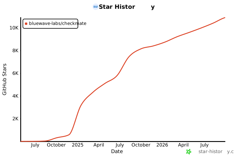](https://star-history.com/#bluewave-labs/bluewave-uptime&Date)
|
||||
|
||||
## Our sponsors
|
||||
|
||||
Thanks to [Gitbook](https://gitbook.io/) for giving us a free tier for their documentation platform, and [Poeditor](https://poeditor.com/) providing us a free account to use their i18n services. If you would like to sponsor Checkmate, please send an email to hello@bluewavelabs.ca
|
||||
|
||||
If you would like to sponsor a feature, [see this page](https://checkmate.so/sponsored-features).
|
||||
|
||||
Also check other developer and contributor-friendly projects of BlueWave:
|
||||
|
||||
- [VerifyWise](https://github.com/bluewave-labs/verifywise), the first open source AI governance platform.
|
||||
- [DataRoom](https://github.com/bluewave-labs/bluewave-dataroom), an secure file sharing application, aka dataroom.
|
||||
- [Guidefox](https://github.com/bluewave-labs/guidefox), an application that helps new users learn how to use your product via hints, tours, popups and banners.
|
||||
## Notes
|
||||
- The API expects valid JWTs on most routes; see `server/src/routes` for middleware usage.
|
||||
- Mongo connection retries are handled in `server/src/db/MongoDB.ts`.
|
||||
- Email transport prioritizes env config; if unset, it uses values from system settings.
|
||||
@@ -1,17 +0,0 @@
|
||||
.DS_Store
|
||||
.git/
|
||||
.gitignore
|
||||
.bzr/
|
||||
.bzrignore
|
||||
.hg/
|
||||
.hgignore
|
||||
.svn/
|
||||
*.swp
|
||||
*.bak
|
||||
*.tmp
|
||||
*.orig
|
||||
*~
|
||||
.project
|
||||
.idea/
|
||||
*.tmproj
|
||||
.vscode/
|
||||
@@ -1,6 +0,0 @@
|
||||
apiVersion: v2
|
||||
name: checkmate-chart
|
||||
description: A Helm chart for Checkmate App
|
||||
type: application
|
||||
version: 0.1.0
|
||||
appVersion: "2.3"
|
||||
@@ -1,43 +0,0 @@
|
||||
# Kubernetes Installation Guide for Checkmate
|
||||
|
||||
This guide walks you through deploying Checkmate on your Kubernetes cluster using Helm.
|
||||
|
||||
## Prerequisites
|
||||
|
||||
- A running Kubernetes cluster
|
||||
- Helm CLI installed and configured
|
||||
- `kubectl` configured to access your cluster
|
||||
|
||||
## Steps
|
||||
|
||||
### 1. Clone the repo and navigate to the Helm chart
|
||||
|
||||
```bash
|
||||
git clone https://github.com/bluewave-labs/checkmate.git
|
||||
cd checkmate/charts/helm/checkmate
|
||||
```
|
||||
|
||||
### 2. Customize values.yaml
|
||||
Edit `values.yaml` to update:
|
||||
- `client.ingress.host` and `server.ingress.host` with your domain names
|
||||
- `server.protocol` (usually http or https)
|
||||
- **If upgrading**: Migrate persistence settings from flat structure to nested:
|
||||
- Old: `persistence.mongodbSize` → New: `persistence.mongo.size`
|
||||
- Old: `persistence.redisSize` → New: `persistence.redis.size`
|
||||
- Add: `persistence.mongo.storageClass` and `persistence.redis.storageClass` (leave empty for default)
|
||||
- Secrets under the `secrets` section (`JWT_SECRET`, email credentials, API keys, etc.) — replace all change_me values
|
||||
|
||||
### 3. Deploy the Helm chart
|
||||
```bash
|
||||
helm install checkmate ./charts/helm/checkmate
|
||||
```
|
||||
This will deploy the client, server, MongoDB, and Redis components.
|
||||
|
||||
### 4. Verify the deployment
|
||||
Check pods and services:
|
||||
```bash
|
||||
kubectl get pods
|
||||
kubectl get svc
|
||||
```
|
||||
|
||||
Once all pods are `Running` and `Ready`, you can access Checkmate via the configured ingress hosts.
|
||||
@@ -1,12 +0,0 @@
|
||||
{{- if eq .Values.client.ingress.host "change_me" }}
|
||||
{{- fail "client.ingress.host must be overridden and not set to 'change_me'" }}
|
||||
{{- end }}
|
||||
|
||||
{{- if eq .Values.server.ingress.host "change_me" }}
|
||||
{{- fail "server.ingress.host must be overridden and not set to 'change_me'" }}
|
||||
{{- end }}
|
||||
|
||||
{{- $protocol := .Values.server.protocol }}
|
||||
{{- if not (or (eq $protocol "http") (eq $protocol "https")) }}
|
||||
{{- fail "server.protocol must be either 'http' or 'https'" }}
|
||||
{{- end }}
|
||||
@@ -1,44 +0,0 @@
|
||||
apiVersion: apps/v1
|
||||
kind: Deployment
|
||||
metadata:
|
||||
name: checkmate-client
|
||||
spec:
|
||||
replicas: 1
|
||||
selector:
|
||||
matchLabels:
|
||||
app: checkmate-client
|
||||
template:
|
||||
metadata:
|
||||
labels:
|
||||
app: checkmate-client
|
||||
spec:
|
||||
{{- with .Values.client.affinity }}
|
||||
affinity:
|
||||
{{- tpl ( . | toYaml) $ | nindent 8 }}
|
||||
{{- end }}
|
||||
{{- with .Values.client.tolerations }}
|
||||
tolerations:
|
||||
{{- tpl ( . | toYaml) $ | nindent 8 }}
|
||||
{{- end }}
|
||||
containers:
|
||||
- name: client
|
||||
image: {{ .Values.client.image }}
|
||||
ports:
|
||||
- containerPort: {{ .Values.client.port }}
|
||||
env:
|
||||
- name: UPTIME_APP_API_BASE_URL
|
||||
value: "{{ .Values.server.protocol }}://{{ .Values.server.ingress.host }}/api/v1"
|
||||
- name: UPTIME_APP_CLIENT_HOST
|
||||
value: "{{ .Values.client.protocol }}://{{ .Values.client.ingress.host }}"
|
||||
volumeMounts:
|
||||
- name: config-volume
|
||||
mountPath: /etc/nginx/conf.d/default.conf
|
||||
subPath: default.conf
|
||||
{{- with .Values.client.resources }}
|
||||
resources:
|
||||
{{- tpl ( . | toYaml) $ | nindent 12 }}
|
||||
{{- end }}
|
||||
volumes:
|
||||
- name: config-volume
|
||||
configMap:
|
||||
name: checkmate-server-nginx-cm
|
||||
@@ -1,25 +0,0 @@
|
||||
{{- if .Values.client.ingress.enabled }}
|
||||
apiVersion: networking.k8s.io/v1
|
||||
kind: Ingress
|
||||
metadata:
|
||||
name: checkmate-client-ingress
|
||||
{{- if .Values.client.ingress.annotations }}
|
||||
annotations:
|
||||
{{- range $key, $value := .Values.client.ingress.annotations }}
|
||||
{{ $key }}: {{ $value | quote }}
|
||||
{{- end }}
|
||||
{{- end }}
|
||||
spec:
|
||||
ingressClassName: {{ .Values.client.ingress.className }}
|
||||
rules:
|
||||
- host: {{ .Values.client.ingress.host }}
|
||||
http:
|
||||
paths:
|
||||
- path: /
|
||||
pathType: Prefix
|
||||
backend:
|
||||
service:
|
||||
name: checkmate-client
|
||||
port:
|
||||
number: {{ .Values.client.port }}
|
||||
{{- end }}
|
||||
@@ -1,9 +0,0 @@
|
||||
apiVersion: v1
|
||||
kind: Service
|
||||
metadata:
|
||||
name: checkmate-client
|
||||
spec:
|
||||
selector:
|
||||
app: checkmate-client
|
||||
ports:
|
||||
- port: {{ .Values.client.port }}
|
||||
@@ -1,9 +0,0 @@
|
||||
apiVersion: v1
|
||||
kind: Service
|
||||
metadata:
|
||||
name: checkmate-mongodb
|
||||
spec:
|
||||
selector:
|
||||
app: checkmate-mongodb
|
||||
ports:
|
||||
- port: {{ .Values.mongodb.port }}
|
||||
@@ -1,44 +0,0 @@
|
||||
apiVersion: apps/v1
|
||||
kind: StatefulSet
|
||||
metadata:
|
||||
name: checkmate-mongodb
|
||||
spec:
|
||||
replicas: 1
|
||||
selector:
|
||||
matchLabels:
|
||||
app: checkmate-mongodb
|
||||
template:
|
||||
metadata:
|
||||
labels:
|
||||
app: checkmate-mongodb
|
||||
spec:
|
||||
{{- with .Values.mongodb.affinity }}
|
||||
affinity:
|
||||
{{- tpl ( . | toYaml) $ | nindent 8 }}
|
||||
{{- end }}
|
||||
{{- with .Values.mongodb.tolerations }}
|
||||
tolerations:
|
||||
{{- tpl ( . | toYaml) $ | nindent 8 }}
|
||||
{{- end }}
|
||||
containers:
|
||||
- name: mongodb
|
||||
image: {{ .Values.mongodb.image }}
|
||||
ports:
|
||||
- containerPort: {{ .Values.mongodb.port }}
|
||||
command: ["mongod", "--quiet", "--bind_ip_all"]
|
||||
volumeMounts:
|
||||
- name: checkmate-mongo-persistent-storage
|
||||
mountPath: /data/db
|
||||
{{- with .Values.mongodb.resources }}
|
||||
resources:
|
||||
{{- tpl ( . | toYaml) $ | nindent 12 }}
|
||||
{{- end }}
|
||||
volumeClaimTemplates:
|
||||
- metadata:
|
||||
name: checkmate-mongo-persistent-storage
|
||||
spec:
|
||||
storageClassName: {{ .Values.persistence.mongo.storageClass | quote }}
|
||||
accessModes: ["ReadWriteOnce"]
|
||||
resources:
|
||||
requests:
|
||||
storage: {{ .Values.persistence.mongo.size | default "5Gi" | quote }}
|
||||
@@ -1,11 +0,0 @@
|
||||
{{- if .Values.redis.enabled }}
|
||||
apiVersion: v1
|
||||
kind: Service
|
||||
metadata:
|
||||
name: checkmate-redis
|
||||
spec:
|
||||
selector:
|
||||
app: checkmate-redis
|
||||
ports:
|
||||
- port: {{ .Values.redis.port }}
|
||||
{{- end }}
|
||||
@@ -1,33 +0,0 @@
|
||||
{{- if .Values.redis.enabled }}
|
||||
apiVersion: apps/v1
|
||||
kind: StatefulSet
|
||||
metadata:
|
||||
name: checkmate-redis
|
||||
spec:
|
||||
replicas: 1
|
||||
selector:
|
||||
matchLabels:
|
||||
app: checkmate-redis
|
||||
template:
|
||||
metadata:
|
||||
labels:
|
||||
app: checkmate-redis
|
||||
spec:
|
||||
containers:
|
||||
- name: redis
|
||||
image: {{ .Values.redis.image }}
|
||||
ports:
|
||||
- containerPort: {{ .Values.redis.port }}
|
||||
volumeMounts:
|
||||
- name: redis-data
|
||||
mountPath: /data
|
||||
volumeClaimTemplates:
|
||||
- metadata:
|
||||
name: checkmate-redis-persistent-storage
|
||||
spec:
|
||||
storageClassName: {{ .Values.persistence.redis.storageClass | quote }}
|
||||
accessModes: ["ReadWriteOnce"]
|
||||
resources:
|
||||
requests:
|
||||
storage: {{ .Values.persistence.redis.size | default "1Gi" | quote }}
|
||||
{{- end }}
|
||||
@@ -1,15 +0,0 @@
|
||||
{{- $secrets := .Values.secrets }}
|
||||
|
||||
{{- if or (not $secrets.JWT_SECRET) (eq $secrets.JWT_SECRET "change_me") }}
|
||||
{{- fail "secrets.JWT_SECRET must be overridden and cannot be 'change_me'" }}
|
||||
{{- end }}
|
||||
|
||||
apiVersion: v1
|
||||
kind: Secret
|
||||
metadata:
|
||||
name: checkmate-secrets
|
||||
type: Opaque
|
||||
stringData:
|
||||
{{- range $key, $value := $secrets }}
|
||||
{{ $key }}: {{ $value | quote }}
|
||||
{{- end }}
|
||||
@@ -1,37 +0,0 @@
|
||||
apiVersion: apps/v1
|
||||
kind: Deployment
|
||||
metadata:
|
||||
name: checkmate-server
|
||||
spec:
|
||||
replicas: 1
|
||||
selector:
|
||||
matchLabels:
|
||||
app: checkmate-server
|
||||
template:
|
||||
metadata:
|
||||
labels:
|
||||
app: checkmate-server
|
||||
spec:
|
||||
{{- with .Values.server.affinity }}
|
||||
affinity:
|
||||
{{- tpl ( . | toYaml) $ | nindent 8 }}
|
||||
{{- end }}
|
||||
{{- with .Values.server.tolerations }}
|
||||
tolerations:
|
||||
{{- tpl ( . | toYaml) $ | nindent 8 }}
|
||||
{{- end }}
|
||||
containers:
|
||||
- name: server
|
||||
image: {{ .Values.server.image }}
|
||||
ports:
|
||||
- containerPort: {{ .Values.server.port }}
|
||||
envFrom:
|
||||
- secretRef:
|
||||
name: checkmate-secrets
|
||||
{{- with .Values.server.resources }}
|
||||
resources:
|
||||
{{- tpl ( . | toYaml) $ | nindent 12 }}
|
||||
{{- end }}
|
||||
env:
|
||||
- name: CLIENT_HOST
|
||||
value: "{{ .Values.client.protocol }}://{{ .Values.client.ingress.host }}"
|
||||
@@ -1,32 +0,0 @@
|
||||
{{- if .Values.server.ingress.enabled }}
|
||||
apiVersion: networking.k8s.io/v1
|
||||
kind: Ingress
|
||||
metadata:
|
||||
name: checkmate-server-ingress
|
||||
{{- if .Values.server.ingress.annotations }}
|
||||
annotations:
|
||||
{{- range $key, $value := .Values.server.ingress.annotations }}
|
||||
{{ $key }}: {{ $value | quote }}
|
||||
{{- end }}
|
||||
{{- end }}
|
||||
{{/*#annotations:
|
||||
#nginx.ingress.kubernetes.io/rewrite-target: /
|
||||
#nginx.ingress.kubernetes.io/enable-cors: "true"
|
||||
#nginx.ingress.kubernetes.io/cors-allow-origin: "http://{{ .Values.client.ingress.host }},https://{{ .Values.client.ingress.host }}"
|
||||
#nginx.ingress.kubernetes.io/cors-allow-methods: "GET, PUT, POST, DELETE, PATCH, OPTIONS"
|
||||
#nginx.ingress.kubernetes.io/cors-allow-headers: "DNT,User-Agent,X-Requested-With,If-Modified-Since,Cache-Control,Content-Type,Range,Authorization"
|
||||
#nginx.ingress.kubernetes.io/cors-allow-credentials: "true"*/}}
|
||||
spec:
|
||||
ingressClassName: {{ .Values.server.ingress.className }}
|
||||
rules:
|
||||
- host: {{ .Values.server.ingress.host }}
|
||||
http:
|
||||
paths:
|
||||
- path: /api/v1
|
||||
pathType: Prefix
|
||||
backend:
|
||||
service:
|
||||
name: checkmate-server
|
||||
port:
|
||||
number: {{ .Values.server.port }}
|
||||
{{- end }}
|
||||
@@ -1,41 +0,0 @@
|
||||
apiVersion: v1
|
||||
kind: ConfigMap
|
||||
metadata:
|
||||
name: checkmate-server-nginx-cm
|
||||
data:
|
||||
default.conf: |
|
||||
server {
|
||||
listen 80;
|
||||
listen [::]:80;
|
||||
|
||||
server_name checkmate-demo.bluewavelabs.ca;
|
||||
server_tokens off;
|
||||
|
||||
location /.well-known/acme-challenge/ {
|
||||
root /var/www/certbot;
|
||||
}
|
||||
|
||||
location / {
|
||||
root /usr/share/nginx/html;
|
||||
index index.html index.htm;
|
||||
try_files $uri $uri/ /index.html;
|
||||
}
|
||||
|
||||
# location /api/ {
|
||||
# proxy_pass http://{{ .Values.server.ingress.host }}:5000/api/;
|
||||
# proxy_http_version 1.1;
|
||||
# proxy_set_header Host $host;
|
||||
# proxy_set_header X-Real-IP $remote_addr;
|
||||
# proxy_set_header X-Forwarded-For $proxy_add_x_forwarded_for;
|
||||
# proxy_set_header X-Forwarded-Proto $scheme;
|
||||
# }
|
||||
|
||||
location /api-docs/ {
|
||||
proxy_pass http://{{ .Values.server.ingress.host }}:5000/api-docs/;
|
||||
proxy_http_version 1.1;
|
||||
proxy_set_header Host $host;
|
||||
proxy_set_header X-Real-IP $remote_addr;
|
||||
proxy_set_header X-Forwarded-For $proxy_add_x_forwarded_for;
|
||||
proxy_set_header X-Forwarded-Proto $scheme;
|
||||
}
|
||||
}
|
||||
@@ -1,9 +0,0 @@
|
||||
apiVersion: v1
|
||||
kind: Service
|
||||
metadata:
|
||||
name: checkmate-server
|
||||
spec:
|
||||
selector:
|
||||
app: checkmate-server
|
||||
ports:
|
||||
- port: {{ .Values.server.port }}
|
||||
@@ -1,52 +0,0 @@
|
||||
client:
|
||||
image: ghcr.io/bluewave-labs/checkmate-client:v3.2.0
|
||||
port: 80
|
||||
protocol: http
|
||||
ingress:
|
||||
enabled: true
|
||||
host: change_me
|
||||
className: nginx
|
||||
annotations: {}
|
||||
|
||||
server:
|
||||
image: ghcr.io/bluewave-labs/checkmate-backend:v3.2.0
|
||||
port: 52345
|
||||
protocol: http
|
||||
ingress:
|
||||
enabled: true
|
||||
host: change_me
|
||||
className: nginx
|
||||
annotations: {}
|
||||
|
||||
redis:
|
||||
enabled: false
|
||||
image: redis:7.2
|
||||
port: 6379
|
||||
|
||||
mongodb:
|
||||
image: ghcr.io/bluewave-labs/checkmate-mongo:v3.2.0
|
||||
port: 27017
|
||||
|
||||
secrets:
|
||||
JWT_SECRET: change_me
|
||||
# REFRESH_TOKEN_SECRET: change_me
|
||||
# SYSTEM_EMAIL_ADDRESS: test@example.com
|
||||
# SYSTEM_EMAIL_PASSWORD: change_me
|
||||
# SYSTEM_EMAIL_HOST: smtp.example.com
|
||||
# SYSTEM_EMAIL_PORT: "587"
|
||||
# PAGESPEED_API_KEY: change_me
|
||||
DB_CONNECTION_STRING: mongodb://checkmate-mongodb.namespace.svc:27017/uptime_db
|
||||
CLIENT_HOST: change_me
|
||||
# REDIS_HOST: redis
|
||||
# REDIS_PORT: "6379"
|
||||
# DB_TYPE: MongoDB
|
||||
# TOKEN_TTL: 99d
|
||||
# REFRESH_TOKEN_TTL: 99d
|
||||
|
||||
persistence:
|
||||
mongo:
|
||||
size: 5Gi
|
||||
storageClass: ""
|
||||
redis:
|
||||
size: 1Gi
|
||||
storageClass: ""
|
||||
@@ -1,14 +0,0 @@
|
||||
language: "en-CA"
|
||||
tone_instructions: "His palms are sweaty, knees weak, arms are heavy There’s vomit on his sweater already, mom’s spaghetti"
|
||||
early_access: false
|
||||
reviews:
|
||||
profile: "chill"
|
||||
request_changes_workflow: false
|
||||
high_level_summary: false
|
||||
poem: false
|
||||
review_status: false
|
||||
auto_review:
|
||||
enabled: true
|
||||
drafts: false
|
||||
chat:
|
||||
auto_reply: false
|
||||
@@ -1,3 +0,0 @@
|
||||
Client/node_modules/
|
||||
Server/node_modules/
|
||||
Server/*.env
|
||||
@@ -1,4 +0,0 @@
|
||||
VITE_APP_API_BASE_URL=UPTIME_APP_API_BASE_URL
|
||||
VITE_APP_API_V2_BASE_URL=UPTIME_APP_API_V2_BASE_URL
|
||||
VITE_APP_CLIENT_HOST=UPTIME_APP_CLIENT_HOST
|
||||
VITE_APP_LOG_LEVEL=UPTIME_APP_LOG_LEVEL
|
||||
@@ -1,23 +0,0 @@
|
||||
module.exports = {
|
||||
root: true,
|
||||
env: { browser: true, es2020: true },
|
||||
extends: [
|
||||
"eslint:recommended",
|
||||
"plugin:react/recommended",
|
||||
"plugin:react/jsx-runtime",
|
||||
"plugin:react-hooks/recommended",
|
||||
],
|
||||
ignorePatterns: ["dist", ".eslintrc.cjs"],
|
||||
parserOptions: { ecmaVersion: "latest", sourceType: "module" },
|
||||
settings: { react: { version: "18.2" } },
|
||||
plugins: ["react-refresh"],
|
||||
rules: {
|
||||
"react/jsx-no-target-blank": "off",
|
||||
"react-refresh/only-export-components": ["warn", { allowConstantExport: true }],
|
||||
"react/no-unescaped-entities": "off",
|
||||
},
|
||||
globals: {
|
||||
__APP_VERSION__: "readonly",
|
||||
process: "readonly",
|
||||
},
|
||||
};
|
||||
+1
-1
@@ -24,7 +24,7 @@ dist-ssr
|
||||
*.sw?
|
||||
|
||||
.env
|
||||
|
||||
.env.*
|
||||
|
||||
# Scripts
|
||||
*.sh
|
||||
|
||||
@@ -1,16 +0,0 @@
|
||||
{
|
||||
"printWidth": 90,
|
||||
"useTabs": true,
|
||||
"tabWidth": 2,
|
||||
"singleQuote": false,
|
||||
"bracketSpacing": true,
|
||||
"proseWrap": "preserve",
|
||||
"bracketSameLine": false,
|
||||
"singleAttributePerLine": true,
|
||||
"semi": true,
|
||||
"jsxSingleQuote": false,
|
||||
"quoteProps": "as-needed",
|
||||
"arrowParens": "always",
|
||||
"trailingComma": "es5",
|
||||
"htmlWhitespaceSensitivity": "css"
|
||||
}
|
||||
@@ -0,0 +1,17 @@
|
||||
# syntax=docker/dockerfile:1.6
|
||||
|
||||
ARG NODE_VERSION=20
|
||||
|
||||
FROM --platform=$BUILDPLATFORM node:${NODE_VERSION}-bookworm-slim AS build
|
||||
ENV NODE_OPTIONS="--max-old-space-size=4096"
|
||||
WORKDIR /app
|
||||
COPY package*.json ./
|
||||
RUN npm ci
|
||||
COPY . .
|
||||
RUN npm run build
|
||||
|
||||
# Assets-only image: no web server. Contains built files at /dist.
|
||||
FROM --platform=$TARGETPLATFORM busybox:stable
|
||||
WORKDIR /
|
||||
COPY --from=build /app/dist /dist
|
||||
# No CMD provided intentionally — this image is for copying/volume population.
|
||||
+73
-1
@@ -1 +1,73 @@
|
||||
This directory contains the client side (frontend) of Checkmate.
|
||||
# React + TypeScript + Vite
|
||||
|
||||
This template provides a minimal setup to get React working in Vite with HMR and some ESLint rules.
|
||||
|
||||
Currently, two official plugins are available:
|
||||
|
||||
- [@vitejs/plugin-react](https://github.com/vitejs/vite-plugin-react/blob/main/packages/plugin-react) uses [Babel](https://babeljs.io/) (or [oxc](https://oxc.rs) when used in [rolldown-vite](https://vite.dev/guide/rolldown)) for Fast Refresh
|
||||
- [@vitejs/plugin-react-swc](https://github.com/vitejs/vite-plugin-react/blob/main/packages/plugin-react-swc) uses [SWC](https://swc.rs/) for Fast Refresh
|
||||
|
||||
## React Compiler
|
||||
|
||||
The React Compiler is not enabled on this template because of its impact on dev & build performances. To add it, see [this documentation](https://react.dev/learn/react-compiler/installation).
|
||||
|
||||
## Expanding the ESLint configuration
|
||||
|
||||
If you are developing a production application, we recommend updating the configuration to enable type-aware lint rules:
|
||||
|
||||
```js
|
||||
export default defineConfig([
|
||||
globalIgnores(['dist']),
|
||||
{
|
||||
files: ['**/*.{ts,tsx}'],
|
||||
extends: [
|
||||
// Other configs...
|
||||
|
||||
// Remove tseslint.configs.recommended and replace with this
|
||||
tseslint.configs.recommendedTypeChecked,
|
||||
// Alternatively, use this for stricter rules
|
||||
tseslint.configs.strictTypeChecked,
|
||||
// Optionally, add this for stylistic rules
|
||||
tseslint.configs.stylisticTypeChecked,
|
||||
|
||||
// Other configs...
|
||||
],
|
||||
languageOptions: {
|
||||
parserOptions: {
|
||||
project: ['./tsconfig.node.json', './tsconfig.app.json'],
|
||||
tsconfigRootDir: import.meta.dirname,
|
||||
},
|
||||
// other options...
|
||||
},
|
||||
},
|
||||
])
|
||||
```
|
||||
|
||||
You can also install [eslint-plugin-react-x](https://github.com/Rel1cx/eslint-react/tree/main/packages/plugins/eslint-plugin-react-x) and [eslint-plugin-react-dom](https://github.com/Rel1cx/eslint-react/tree/main/packages/plugins/eslint-plugin-react-dom) for React-specific lint rules:
|
||||
|
||||
```js
|
||||
// eslint.config.js
|
||||
import reactX from 'eslint-plugin-react-x'
|
||||
import reactDom from 'eslint-plugin-react-dom'
|
||||
|
||||
export default defineConfig([
|
||||
globalIgnores(['dist']),
|
||||
{
|
||||
files: ['**/*.{ts,tsx}'],
|
||||
extends: [
|
||||
// Other configs...
|
||||
// Enable lint rules for React
|
||||
reactX.configs['recommended-typescript'],
|
||||
// Enable lint rules for React DOM
|
||||
reactDom.configs.recommended,
|
||||
],
|
||||
languageOptions: {
|
||||
parserOptions: {
|
||||
project: ['./tsconfig.node.json', './tsconfig.app.json'],
|
||||
tsconfigRootDir: import.meta.dirname,
|
||||
},
|
||||
// other options...
|
||||
},
|
||||
},
|
||||
])
|
||||
```
|
||||
@@ -1,8 +0,0 @@
|
||||
#!/bin/sh
|
||||
for i in $(env | grep UPTIME_APP_)
|
||||
do
|
||||
key=$(echo $i | cut -d '=' -f 1)
|
||||
value=$(echo $i | cut -d '=' -f 2-)
|
||||
echo $key=$value
|
||||
find /usr/share/nginx/html -type f \( -name '*.js' -o -name '*.css' \) -exec sed -i "s|${key}|${value}|g" '{}' +
|
||||
done
|
||||
@@ -0,0 +1,28 @@
|
||||
import js from "@eslint/js";
|
||||
import globals from "globals";
|
||||
import reactHooks from "eslint-plugin-react-hooks";
|
||||
import reactRefresh from "eslint-plugin-react-refresh";
|
||||
import tseslint from "typescript-eslint";
|
||||
import { defineConfig, globalIgnores } from "eslint/config";
|
||||
|
||||
export default defineConfig([
|
||||
globalIgnores(["dist"]),
|
||||
{
|
||||
files: ["**/*.{ts,tsx}"],
|
||||
extends: [
|
||||
js.configs.recommended,
|
||||
tseslint.configs.recommended,
|
||||
reactHooks.configs["recommended-latest"],
|
||||
reactRefresh.configs.vite,
|
||||
],
|
||||
languageOptions: {
|
||||
ecmaVersion: 2020,
|
||||
globals: globals.browser,
|
||||
},
|
||||
rules: {
|
||||
"@typescript-eslint/no-explicit-any": "off",
|
||||
"@typescript-eslint/no-unsafe-function-type": "off",
|
||||
"@typescript-eslint/no-empty-object-type": "off",
|
||||
},
|
||||
},
|
||||
]);
|
||||
@@ -0,0 +1,6 @@
|
||||
/** @type {import('i18n-unused').RunOptions} */
|
||||
module.exports = {
|
||||
localesPath: "src/locales",
|
||||
srcPath: "src",
|
||||
translationKeyMatcher: /\bt\s*\(\s*['"`](.*?)['"`]/g,
|
||||
};
|
||||
+13
-19
@@ -1,24 +1,18 @@
|
||||
<!doctype html>
|
||||
<html lang="en">
|
||||
<head>
|
||||
<meta charset="UTF-8" />
|
||||
<link
|
||||
rel="icon"
|
||||
href="./checkmate_favicon.svg"
|
||||
/>
|
||||
<meta
|
||||
name="viewport"
|
||||
content="width=device-width, initial-scale=1.0"
|
||||
/>
|
||||
|
||||
<title>Checkmate</title>
|
||||
</head>
|
||||
<head>
|
||||
<meta charset="UTF-8" />
|
||||
<link rel="icon" href="./checkmate_favicon.svg" />
|
||||
<meta name="viewport" content="width=device-width, initial-scale=1.0" />
|
||||
|
||||
<title>Checkmate</title>
|
||||
</head>
|
||||
|
||||
<body>
|
||||
<div id="root"></div>
|
||||
<script src="/env.js"></script>
|
||||
<script type="module" src="/src/main.tsx"></script>
|
||||
</body>
|
||||
|
||||
<body>
|
||||
<div id="root"></div>
|
||||
<script
|
||||
type="module"
|
||||
src="/src/main.jsx"
|
||||
></script>
|
||||
</body>
|
||||
</html>
|
||||
Generated
+5661
-6782
File diff suppressed because it is too large.
Load diff
+56
-61
@@ -1,63 +1,58 @@
|
||||
{
|
||||
"name": "client",
|
||||
"private": true,
|
||||
"version": "0.0.0",
|
||||
"type": "module",
|
||||
"scripts": {
|
||||
"dev": "vite",
|
||||
"build": "tsc -b && vite build",
|
||||
"build-dev": "tsc -b && vite build --mode development",
|
||||
"lint": "eslint . --ext js,jsx --report-unused-disable-directives --max-warnings 0",
|
||||
"preview": "vite preview",
|
||||
"format": "prettier --write .",
|
||||
"format-check": "prettier --check ."
|
||||
},
|
||||
"dependencies": {
|
||||
"@emotion/react": "^11.13.3",
|
||||
"@emotion/styled": "^11.13.0",
|
||||
"@hello-pangea/dnd": "^18.0.0",
|
||||
"@hookform/resolvers": "5.2.2",
|
||||
"@mui/icons-material": "6.4.11",
|
||||
"@mui/lab": "6.0.0-dev.240424162023-9968b4889d",
|
||||
"@mui/material": "6.4.11",
|
||||
"@mui/x-charts": "^7.5.1",
|
||||
"@mui/x-date-pickers": "7.29.0",
|
||||
"@reduxjs/toolkit": "2.7.0",
|
||||
"axios": "^1.7.4",
|
||||
"dayjs": "1.11.13",
|
||||
"flag-icons": "7.3.2",
|
||||
"html2canvas": "^1.4.1",
|
||||
"human-interval": "2.0.1",
|
||||
"i18next": "25.4.2",
|
||||
"joi": "17.13.3",
|
||||
"mui-color-input": "^6.0.0",
|
||||
"pretty-ms": "9.3.0",
|
||||
"react": "18.3.1",
|
||||
"react-dom": "^18.2.0",
|
||||
"react-hook-form": "7.63.0",
|
||||
"react-i18next": "^15.4.0",
|
||||
"react-icons": "5.5.0",
|
||||
"react-redux": "9.2.0",
|
||||
"react-router": "^6.23.0",
|
||||
"react-router-dom": "^6.23.1",
|
||||
"react-toastify": "^10.0.5",
|
||||
"recharts": "2.15.2",
|
||||
"redux-persist": "6.0.0",
|
||||
"swr": "2.3.6",
|
||||
"vite-plugin-svgr": "^4.2.0",
|
||||
"zod": "4.1.11"
|
||||
},
|
||||
"devDependencies": {
|
||||
"@types/node": "24.5.2",
|
||||
"@types/react": "^18.2.66",
|
||||
"@types/react-dom": "^18.2.22",
|
||||
"@vitejs/plugin-react": "^4.2.1",
|
||||
"eslint": "^8.57.0",
|
||||
"eslint-plugin-react": "^7.34.1",
|
||||
"eslint-plugin-react-hooks": "^5.0.0",
|
||||
"eslint-plugin-react-refresh": "^0.4.6",
|
||||
"prettier": "^3.3.3",
|
||||
"typescript": "5.9.3",
|
||||
"vite": "6.3.6"
|
||||
}
|
||||
"name": "checkmate",
|
||||
"private": true,
|
||||
"version": "0.0.0",
|
||||
"type": "module",
|
||||
"scripts": {
|
||||
"i18n:display": "i18n-unused display-unused > test.log",
|
||||
"dev": "vite --host 127.0.0.1 --mode development",
|
||||
"build": "tsc -b && vite build --mode production",
|
||||
"lint": "eslint .",
|
||||
"preview": "vite preview"
|
||||
},
|
||||
"dependencies": {
|
||||
"@emotion/react": "11.14.0",
|
||||
"@emotion/styled": "11.14.1",
|
||||
"@hookform/resolvers": "5.2.2",
|
||||
"@mui/material": "7.3.4",
|
||||
"@mui/x-date-pickers": "8.16.0",
|
||||
"@reduxjs/toolkit": "2.9.0",
|
||||
"axios": "1.12.2",
|
||||
"dayjs": "1.11.18",
|
||||
"flag-icons": "7.5.0",
|
||||
"human-interval": "2.0.1",
|
||||
"lucide-react": "0.553.0",
|
||||
"ms": "2.1.3",
|
||||
"pretty-ms": "9.3.0",
|
||||
"react": "18.3.1",
|
||||
"react-dom": "18.3.1",
|
||||
"react-i18next": "16.0.1",
|
||||
"react-redux": "9.2.0",
|
||||
"react-router": "7.9.4",
|
||||
"react-router-dom": "7.9.4",
|
||||
"react-toastify": "^11.0.5",
|
||||
"recharts": "2.15.2",
|
||||
"redux-persist": "6.0.0",
|
||||
"swr": "2.3.6",
|
||||
"vite-plugin-svgr": "4.5.0",
|
||||
"zod": "4.1.12"
|
||||
},
|
||||
"devDependencies": {
|
||||
"@eslint/js": "^9.36.0",
|
||||
"@types/ms": "2.1.0",
|
||||
"@types/node": "^24.10.1",
|
||||
"@types/react": "^19.1.16",
|
||||
"@types/react-dom": "^19.1.9",
|
||||
"@vitejs/plugin-react": "^5.0.4",
|
||||
"eslint": "^9.36.0",
|
||||
"eslint-plugin-react-hooks": "^5.2.0",
|
||||
"eslint-plugin-react-refresh": "^0.4.22",
|
||||
"globals": "^16.4.0",
|
||||
"i18n-unused": "0.19.0",
|
||||
"prettier": "^3.6.2",
|
||||
"ts-node": "^10.9.2",
|
||||
"typescript": "~5.9.3",
|
||||
"typescript-eslint": "^8.45.0",
|
||||
"vite": "^7.1.7"
|
||||
}
|
||||
}
|
||||
@@ -1,6 +0,0 @@
|
||||
type,name,url,interval,port,expectedValue,jsonPath,matchMethod
|
||||
http,HTTP Monitor,https://www.google.com,60000,,,,
|
||||
http,API Monitor,http://reqres.in/api/users/2,120000,,Janet,data.first_name,equal
|
||||
ping,Ping monitor,127.0.0.1,60000,,,,
|
||||
docker,Docker monitor,bbdd20b4e3757d63e070bc16e04d3f770c4a8f6e62e813de380f23b141e2ca01,60000,,,,
|
||||
port,Port monitor,127.0.0.1,60000,5000,,,
|
||||
|
@@ -1 +0,0 @@
|
||||
type,name,url,interval,port,expectedValue,jsonPath,matchMethod
|
||||
|

@@ -1,49 +0,0 @@
|
||||
<svg width="32" height="32" viewBox="0 0 600 600" fill="none" xmlns="http://www.w3.org/2000/svg">
|
||||
<path d="M218.252 79.2667L218.045 78.4143C218.712 77.617 219.642 77.5282 220.615 77.4361C224.829 77.0374 243.307 76.7077 246.676 77.418C248.299 77.76 249.661 78.5248 250.932 79.5734C254.845 82.8003 259.018 88.0302 262.403 91.9284C263.57 93.2734 264.805 95.1623 266.183 96.2584C268.203 99.7185 274.532 101.602 278.167 102.623C278.397 102.688 278.631 102.741 278.863 102.797C274.983 106.185 272.016 110.321 268.272 113.745C272.574 124.188 286.689 184.953 289.397 187.986C290.165 188.212 290.291 188.048 291.045 187.739C290.627 188.446 290.337 189.3 289.588 189.656L288.963 188.533C286.703 188.347 273.044 195.497 269.836 196.808C267.39 197.808 264.851 198.458 262.414 199.405C261.197 196.797 260.413 193.923 259.329 191.244C254.43 179.142 250.091 166.843 245.71 154.552C240.241 139.206 234.226 124.026 228.882 108.642C226.389 101.466 223.549 94.5009 220.953 87.3749C220.026 84.8301 219.72 81.4795 218.252 79.2667Z" fill="#3158B7"/>
|
||||
<path d="M218.252 79.2667L218.045 78.4143C218.712 77.617 219.642 77.5282 220.615 77.4361C224.829 77.0374 243.307 76.7077 246.676 77.418C248.299 77.76 249.661 78.5248 250.932 79.5734C254.845 82.8003 259.018 88.0302 262.403 91.9284C263.57 93.2734 264.805 95.1623 266.183 96.2584C268.203 99.7185 274.532 101.602 278.167 102.623C278.397 102.688 278.631 102.741 278.863 102.797C274.983 106.185 272.016 110.321 268.272 113.745C266.08 111.774 263.588 110.159 261.208 108.427C256.477 104.982 251.692 101.649 246.906 98.282L233.54 88.9767C228.729 85.5908 223.823 81.3267 218.252 79.2667Z" fill="#73E4FA"/>
|
||||
<path d="M299.595 19.4005C302.177 17.8183 305.226 16.8946 307.955 15.5556C310.387 14.3626 312.673 12.8604 315.15 11.7619C315.624 11.5519 315.886 11.4697 316.398 11.4844C315.732 13.7848 316.431 26.6622 316.441 30.2652C316.474 42.2192 316.084 54.2432 316.385 66.1867C316.416 67.4343 316.377 68.6301 316.847 69.8026C316.457 79.0631 316.718 88.4086 316.651 97.6808L316.423 172.062C316.376 177.75 316.385 183.438 316.448 189.125C316.469 192.585 316.902 196.888 316.126 200.243C316.055 199.033 315.728 197.334 316.025 196.183C315.86 197.435 315.463 198.762 315.391 200.002C315.283 201.847 315.798 203.719 315.391 205.559C314.431 204.554 313.43 203.906 312.592 202.729C308.228 196.602 310.556 194.07 301.963 190.683C299.704 189.793 293.054 186.88 291.045 187.739C290.291 188.048 290.165 188.212 289.397 187.986C286.689 184.953 272.574 124.188 268.272 113.745C272.016 110.321 274.983 106.185 278.863 102.797C278.631 102.741 278.397 102.688 278.167 102.623C274.532 101.602 268.203 99.7184 266.183 96.2583C269.435 97.3504 272.901 97.5882 276.304 97.6583C280.306 97.7408 283.403 97.3026 286.383 94.3544C288.086 92.669 289.516 90.6569 291.136 88.8839C293.303 86.512 296.041 84.1801 297.633 81.3777C300.012 77.1924 299.115 62.4967 299.219 57.0841C296.538 56.7086 293.912 56.806 291.218 56.6995C288.184 56.5796 285.396 56.0507 283.294 53.6585C280.886 50.9188 280.696 47.3466 281.035 43.8756C282.423 29.6657 295.122 37.239 298.804 33.8184C299.712 32.9739 299.469 21.618 299.595 19.4005Z" fill="#3D7ECD"/>
|
||||
<path d="M362.288 269.421L362.773 270.062C364.332 274.37 365.193 279.073 366.359 283.516C368.419 291.371 370.61 299.194 372.793 307.015L395.769 388.039L411.304 442.863L415.766 458.213C416.528 460.836 417.569 463.467 417.96 466.175C417.89 466.842 418.03 466.869 417.485 467.324C413.349 466.406 409.11 465.92 404.942 465.147C396.892 463.653 388.881 461.984 380.817 460.552C380.516 459.221 380.489 457.712 380.305 456.347C379.896 453.327 379.359 450.33 378.694 447.356C376.712 438.738 374.16 430.227 372.075 421.626L351.327 334.35C349.071 324.725 347.019 314.981 344.607 305.405C342.561 297.284 340.078 289.201 338.622 280.946C339.912 280.649 340.991 280.35 342.142 279.684C345.072 278.136 348.264 277.064 351.221 275.536C354.9 273.636 358.345 270.649 362.288 269.421Z" fill="#73E4FA"/>
|
||||
<path d="M316.398 11.4845C316.949 11.6168 317.496 11.7682 318.021 11.982C320.527 13.0022 322.595 14.8975 325.025 16.0401C326.641 16.7993 328.506 17.0278 330.066 17.9189C330.615 18.2326 331.175 18.6401 331.516 19.1833C333.638 22.5617 329.941 33.143 334.144 34.5595C335.071 34.872 336.309 34.7269 337.278 34.6636C342.517 34.3216 346.04 34.3235 349.065 39.1827C350.891 42.117 351.841 45.3207 350.982 48.7564C350.164 52.0314 347.831 55.4635 344.902 57.2399C344.309 57.5993 343.657 57.8308 343.003 58.0488C342.382 58.2541 341.729 58.4831 341.176 58.8402C339.34 60.0257 337.705 61.6472 335.85 62.8819C335.083 63.3916 333.536 63.9343 333.114 64.7163C333.015 64.8989 332.938 65.0921 332.849 65.2797C331.994 71.778 330.942 74.7954 335.242 80.4525C338.105 84.2196 345.676 93.407 349.248 96.0711C350.329 96.8768 351.548 97.3899 352.858 97.674C354.638 97.679 356.567 97.8353 358.319 97.4932C366.986 95.8002 372.945 85.6789 379.155 80.1412C380.557 78.8916 382.117 77.8947 383.974 77.4926C387.385 76.754 391.296 77.2429 394.773 77.2627C400.744 77.2966 406.631 77.1509 412.603 77.4939C413.066 77.8038 413.08 77.6663 413.16 78.1487C413.385 79.5036 412.832 81.0938 412.41 82.377C409.805 90.2864 406.49 98.1119 403.607 105.936L387.525 150.29C383.617 161.269 379.569 172.195 375.381 183.07C373.017 189.241 370.826 195.663 367.756 201.518C366.906 200.846 366.105 200.384 365.115 199.946C357.118 196.547 349.468 191.947 341.757 187.926C341.211 187.423 341.102 187.207 340.301 187.318C338.422 187.579 336.346 188.419 334.502 188.929C330.434 190.055 321.796 191.764 319.469 195.652C318.572 197.151 317.692 200.22 316.337 201.245C316.225 200.886 316.145 200.621 316.126 200.243C316.902 196.888 316.469 192.585 316.448 189.125C316.385 183.438 316.377 177.75 316.423 172.062L316.651 97.6809C316.718 88.4087 316.457 79.0632 316.847 69.8027C316.377 68.6302 316.416 67.4344 316.385 66.1868C316.084 54.2433 316.474 42.2193 316.441 30.2653C316.431 26.6623 315.732 13.7849 316.398 11.4845Z" fill="#73E4FA"/>
|
||||
<path d="M332.127 57.4141C335.751 57.5106 339.378 57.8905 343.003 58.0488C342.382 58.2541 341.729 58.4831 341.176 58.8402C339.34 60.0257 337.705 61.6472 335.85 62.8819C335.083 63.3916 333.536 63.9343 333.114 64.7163C333.015 64.8989 332.938 65.0921 332.849 65.2797C332.684 62.6459 332.422 60.0356 332.127 57.4141Z" fill="black"/>
|
||||
<path d="M352.858 97.674C354.638 97.679 356.567 97.8353 358.319 97.4932C366.986 95.8002 372.945 85.6789 379.155 80.1412C380.557 78.8916 382.117 77.8947 383.974 77.4926C387.385 76.754 391.296 77.2429 394.773 77.2627C400.744 77.2966 406.631 77.1509 412.603 77.4939C412.123 77.5931 411.776 77.6589 411.35 77.9133C409.284 79.1482 407.188 81.3404 405.081 82.7802C394.559 89.9716 384.283 97.4873 373.787 104.715C371.042 106.605 368.398 108.696 365.587 110.481C363.016 106.042 360.879 102.667 356.684 99.576C355.908 99.004 354.963 98.1848 354.042 97.8844C353.777 97.7979 353.467 97.7915 353.199 97.7482C353.084 97.7297 352.972 97.6988 352.858 97.674Z" fill="#4F91E0"/>
|
||||
<path d="M316.847 69.8027C321.242 72.4105 326.84 79.7356 330.518 83.5726C335.063 88.3145 340.305 92.4625 345.078 96.9857C348.754 100.47 359.102 112.197 362.531 113.979C362.884 116.416 347.596 173.131 345.411 179.979C344.657 182.345 343.764 185.35 342.254 187.338C342.099 187.543 341.927 187.734 341.757 187.926C341.211 187.423 341.102 187.207 340.301 187.318C338.422 187.579 336.346 188.419 334.502 188.929C330.434 190.055 321.796 191.764 319.469 195.652C318.572 197.151 317.692 200.22 316.337 201.245C316.225 200.886 316.145 200.621 316.126 200.243C316.902 196.888 316.469 192.585 316.448 189.125C316.385 183.438 316.376 177.75 316.423 172.062L316.651 97.6809C316.718 88.4087 316.457 79.0632 316.847 69.8027Z" fill="#5BBFFC"/>
|
||||
<path d="M316.126 200.243C316.145 200.621 316.225 200.886 316.337 201.245C317.692 200.22 318.572 197.151 319.469 195.652C321.796 191.764 330.434 190.055 334.502 188.929C336.346 188.419 338.422 187.579 340.301 187.318C341.102 187.207 341.211 187.423 341.757 187.926C349.468 191.947 357.118 196.547 365.115 199.946C366.105 200.384 366.906 200.846 367.756 201.518C367.27 202.637 366.763 203.747 366.234 204.848C365.063 207.595 364.344 210.137 363.459 212.952C367.613 213.364 371.797 213.297 375.966 213.194C386.171 213.341 399.134 211.56 407.006 219.438C408.262 220.694 409.583 222.077 410.315 223.707C411.447 228.7 410.939 234.09 410.692 239.173C410.661 239.285 410.628 239.397 410.599 239.511C410.317 240.612 410.264 241.816 409.76 242.846C408.269 245.89 403.918 248.67 401.099 250.509L397.101 250.535C392.229 251.156 386.936 250.764 382.02 250.742C380.258 252.242 379.572 253.4 379.015 255.621C375.623 257.067 372.349 258.186 368.836 259.31C366.357 260.996 362.191 264.345 361.869 267.495C361.803 268.145 361.893 268.578 362.175 269.155L362.288 269.421C358.345 270.649 354.9 273.636 351.221 275.536C348.264 277.064 345.072 278.136 342.142 279.684C340.991 280.35 339.912 280.649 338.622 280.946L338.374 280.965L337.631 281.175C336.996 280.978 336.122 280.707 335.64 280.22C335.013 279.586 332.112 273.818 330.826 272.131C327.237 267.42 322.458 264.909 316.638 264.129L316.192 264.037C314.993 265.535 316.083 270.149 315.579 272.213C315.076 269.916 316.559 267.352 315.272 265.334C314.562 264.951 314 264.949 313.234 265.15C310.643 265.828 308.244 267.144 305.601 267.663L305.359 267.78C304.526 268.174 303.726 268.445 302.836 268.679L302.422 268.516C302.97 267.994 303.581 267.707 304.249 267.371C303.346 267.089 302.592 267.405 301.795 267.828C300.798 268.358 299.724 269.109 298.638 269.418C296.45 270.04 293.748 268.782 292.771 271.723C291.539 275.429 292.836 276.598 289.342 279.245L289.264 279.106L289.746 279.665C289.922 279.642 290.098 279.617 290.274 279.596C290.788 279.534 291.072 279.562 291.552 279.784C283.761 280.886 276.08 271.943 269.481 268.727C269.532 267.685 269.414 267.036 268.848 266.155C266.793 262.951 261.551 259.21 258.011 257.869C256.773 257.4 255.382 257.17 254.087 256.899C250.725 256.497 247.482 255.358 244.173 254.665C241.651 254.137 239.029 253.962 236.466 253.728C236.969 252.907 236.631 251.749 236.978 250.742C234.444 250.731 231.884 250.523 229.351 250.403C226.903 249.086 224.175 246.485 222.644 244.15C220.166 240.368 220.112 229.455 221.195 225.05C221.962 221.93 223.946 219.508 226.648 217.845C227.525 217.021 228.391 216.267 229.547 215.874C232.606 214.832 236.233 214.827 239.433 214.547C243.327 214.206 247.238 213.733 251.141 213.538C256.502 213.269 261.883 213.36 267.25 213.257C267.293 213.167 267.345 213.08 267.378 212.986C268.103 210.948 263.421 201.839 262.414 199.405C264.851 198.458 267.39 197.808 269.836 196.808C273.044 195.497 286.703 188.347 288.963 188.533L289.588 189.656C290.337 189.3 290.627 188.446 291.045 187.739C293.054 186.88 299.704 189.793 301.963 190.683C310.556 194.07 308.228 196.602 312.592 202.729C313.43 203.906 314.431 204.554 315.391 205.559C315.798 203.719 315.283 201.847 315.391 200.002C315.463 198.762 315.86 197.435 316.025 196.183C315.728 197.334 316.055 199.033 316.126 200.243Z" fill="#73E4FA"/>
|
||||
<path d="M226.648 217.845C227.525 217.021 228.391 216.267 229.547 215.874C232.606 214.832 236.233 214.827 239.433 214.547C243.327 214.206 247.238 213.733 251.141 213.538C256.502 213.269 261.883 213.36 267.25 213.257C273.5 213.971 279.834 213.445 286.108 213.605C286.028 213.626 285.948 213.648 285.867 213.666C283.762 214.153 281.367 213.997 279.208 214.037C272.251 214.165 265.326 213.83 258.375 213.88C253.031 213.919 247.886 214.67 242.578 215.017C240.895 215.127 236.024 214.805 235.01 216.105C234.814 216.356 234.778 216.499 234.672 216.773C235.26 217.358 235.736 217.319 236.534 217.341C240.179 217.439 243.921 217.212 247.585 217.238C254.057 217.283 260.516 217.54 266.99 217.551C270.978 217.557 278.548 217.235 282.283 217.919C273.611 218.558 264.721 217.948 256.023 218.03C249.71 217.873 243.396 217.847 237.081 217.954C233.732 217.991 229.946 218.398 226.648 217.845Z" fill="#4F91E0"/>
|
||||
<path d="M321 196.5C321.019 196.878 320.86 194.141 320.972 194.5C322.327 193.475 318.572 197.151 319.469 195.652C321.796 191.764 330.434 190.055 334.502 188.929C336.346 188.419 338.422 187.579 340.301 187.318C341.102 187.207 341.211 187.423 341.757 187.926C349.468 191.947 357.118 196.547 365.115 199.946C366.105 200.384 366.906 200.846 367.756 201.518C367.27 202.637 366.763 203.747 366.234 204.848C365.063 207.595 364.344 210.137 363.459 212.952L361.76 212.951C346.809 213.807 331.759 213.014 316.787 213.074L315.391 205.559C315.798 203.719 315.283 201.847 315.391 200.002C315.463 198.762 315.835 196.752 316 195.5C315.5 195 323.374 191.757 321 196.5Z" fill="#3158B7"/>
|
||||
<path d="M291.045 187.739C293.054 186.88 299.704 189.793 301.963 190.683C310.556 194.07 305.5 191.5 312.5 194.5C314 195 315.54 193.995 316.5 195L316.787 213.074C306.586 212.996 296.304 213.296 286.108 213.605C279.834 213.445 273.5 213.971 267.25 213.257C267.293 213.167 267.345 213.08 267.378 212.986C268.103 210.948 263.421 201.839 262.414 199.405C264.851 198.458 267.39 197.808 269.836 196.808C273.044 195.497 286.703 188.347 288.963 188.533L289.5 188.5C290.249 188.144 290.627 188.446 291.045 187.739Z" fill="#15337C"/>
|
||||
<path d="M316.158 217.961C333.626 218.066 351.372 216.648 368.745 218.663C369.093 229.235 368.662 239.88 368.76 250.467L387.46 250.44C390.609 250.437 393.982 250.193 397.101 250.535C392.229 251.156 386.936 250.764 382.02 250.742L316.217 250.777C316.034 247.101 316.2 243.334 316.205 239.649C316.23 232.42 316.215 225.19 316.158 217.961Z" fill="#5BBFFC"/>
|
||||
<path d="M229.351 250.403C226.903 249.086 224.175 246.485 222.644 244.15C220.166 240.368 220.112 229.455 221.195 225.05C221.962 221.93 223.946 219.508 226.648 217.845C229.946 218.398 233.732 217.991 237.081 217.954C243.396 217.847 249.71 217.873 256.023 218.03C264.721 217.948 273.611 218.558 282.283 217.919L316.158 217.961C316.215 225.19 316.23 232.42 316.205 239.649C316.2 243.334 316.034 247.101 316.217 250.777L382.02 250.742C380.258 252.242 379.572 253.4 379.015 255.621C375.623 257.067 372.349 258.186 368.836 259.31C366.357 260.996 362.191 264.345 361.869 267.495C361.803 268.145 361.893 268.578 362.175 269.155L362.288 269.421C358.345 270.649 354.9 273.636 351.221 275.536C348.264 277.064 345.072 278.136 342.142 279.684C340.991 280.35 339.912 280.649 338.622 280.946L338.374 280.965L337.631 281.175C336.996 280.978 336.122 280.707 335.64 280.22C335.013 279.586 332.112 273.818 330.826 272.131C327.237 267.42 322.458 264.909 316.638 264.129L316.192 264.037C314.993 265.535 316.083 270.149 315.579 272.213C315.076 269.916 316.559 267.352 315.272 265.334C314.562 264.951 314 264.949 313.234 265.15C310.643 265.828 308.244 267.144 305.601 267.663L305.359 267.78C304.526 268.174 303.726 268.445 302.836 268.679L302.422 268.516C302.97 267.994 303.581 267.707 304.249 267.371C303.346 267.089 302.592 267.405 301.795 267.828C300.798 268.358 299.724 269.109 298.638 269.418C296.45 270.04 293.748 268.782 292.771 271.723C291.539 275.429 292.836 276.598 289.342 279.245L289.264 279.106L289.746 279.665C289.922 279.642 290.098 279.617 290.274 279.596C290.788 279.534 291.072 279.562 291.552 279.784C283.761 280.886 276.08 271.943 269.481 268.727C269.532 267.685 269.414 267.036 268.848 266.155C266.793 262.951 261.551 259.21 258.011 257.869C256.773 257.4 255.382 257.17 254.087 256.899C250.725 256.497 247.482 255.358 244.173 254.665C241.651 254.137 239.029 253.962 236.466 253.728C236.969 252.907 236.631 251.749 236.978 250.742C234.444 250.731 231.884 250.523 229.351 250.403Z" fill="#3D7ECD"/>
|
||||
<path d="M229.5 250.5C227.052 249.183 224.175 246.485 222.644 244.15C220.166 240.368 220.112 229.455 221.195 225.05C221.962 221.93 223.946 219.508 226.648 217.845C229.946 218.398 233.732 217.991 237.081 217.954C243.396 217.847 249.71 217.873 256.023 218.03C258.057 218.243 260.081 218.239 262.124 218.245C262.036 228.982 261.779 239.713 261.935 250.452C267.117 250.445 282.096 249.873 286.095 250.724C281.121 250.989 276.017 250.759 271.029 250.75C261.584 250.723 252.14 250.748 242.696 250.824C240.816 250.676 238.867 250.759 236.978 250.742C234.444 250.731 232.033 250.62 229.5 250.5Z" fill="#3158B7"/>
|
||||
<path d="M242.696 250.824C252.14 250.748 261.584 250.723 271.029 250.75C276.017 250.759 281.121 250.989 286.095 250.724C296.126 250.796 306.188 250.976 316.217 250.777L382.02 250.742C380.258 252.242 379.572 253.4 379.015 255.621C375.623 257.067 372.349 258.186 368.836 259.31C366.357 260.996 362.191 264.345 361.869 267.495C361.803 268.145 361.893 268.578 362.175 269.155L362.288 269.421C358.345 270.649 354.9 273.636 351.221 275.536C348.264 277.064 345.072 278.136 342.142 279.684C340.991 280.35 339.912 280.649 338.622 280.946L338.374 280.965L337.631 281.175C336.996 280.978 336.122 280.707 335.64 280.22C335.013 279.586 332.112 273.818 330.826 272.131C327.237 267.42 322.458 264.909 316.638 264.129L316.192 264.037C314.993 265.535 316.083 270.149 315.579 272.213C315.076 269.916 316.559 267.352 315.272 265.334C314.562 264.951 314 264.949 313.234 265.15C310.643 265.828 308.244 267.144 305.601 267.663L305.359 267.78C304.526 268.174 303.726 268.445 302.836 268.679L302.422 268.516C302.97 267.994 303.581 267.707 304.249 267.371C303.346 267.089 302.592 267.405 301.795 267.828C300.798 268.358 299.724 269.109 298.638 269.418C296.45 270.04 293.748 268.782 292.771 271.723C291.539 275.429 292.836 276.598 289.342 279.245L289.264 279.106L289.746 279.665C289.922 279.642 290.098 279.617 290.274 279.596C290.788 279.534 291.072 279.562 291.552 279.784C283.761 280.886 276.08 271.943 269.481 268.727C269.532 267.685 269.414 267.036 268.848 266.155C266.793 262.951 261.551 259.21 258.011 257.869C256.773 257.4 255.382 257.17 254.087 256.899C250.725 256.497 247.482 255.358 244.173 254.665C241.651 254.137 239.029 253.962 236.466 253.728C236.969 252.907 236.631 251.749 236.978 250.742C238.867 250.759 240.816 250.676 242.696 250.824Z" fill="url(#paint0_linear_4222_6997)"/>
|
||||
<path d="M236.978 250.742C238.867 250.759 240.816 250.676 242.696 250.824C242.881 250.874 243.066 250.928 243.252 250.974C245.298 251.479 247.92 251.212 250.051 251.224C248.443 251.53 247.073 251.291 245.943 252.702C245.85 253.55 245.913 253.633 246.31 254.399C248.336 255.702 252.778 255.161 254.087 256.899C250.725 256.497 247.482 255.358 244.173 254.665C241.651 254.137 239.029 253.962 236.466 253.728C236.969 252.907 236.631 251.749 236.978 250.742Z" fill="#15337C"/>
|
||||
<path d="M315.839 263.948C315.537 262.501 315.708 261.013 315.229 259.629C314.46 258.966 313.976 259.049 312.984 258.933C313.102 258.884 313.213 258.814 313.338 258.787C315.769 258.246 325.519 258.983 328.801 258.983L357.499 259.017C359.803 259.006 366.156 258.505 368.097 258.96C368.485 259.051 368.546 259.119 368.836 259.31C366.357 260.996 362.191 264.345 361.869 267.495C361.803 268.145 361.893 268.578 362.175 269.155L362.288 269.421C358.345 270.649 354.9 273.636 351.221 275.536C348.264 277.064 345.072 278.136 342.142 279.684C340.991 280.35 339.912 280.649 338.622 280.946L338.374 280.965L337.631 281.175C336.996 280.978 336.122 280.707 335.64 280.22C335.013 279.586 332.112 273.818 330.826 272.131C327.237 267.42 322.458 264.909 316.638 264.129L316.192 264.037C314.993 265.535 316.083 270.149 315.579 272.213C315.076 269.916 316.559 267.352 315.272 265.334C314.562 264.951 314 264.949 313.234 265.15C310.643 265.828 308.244 267.144 305.601 267.663C307.941 265.704 312.848 264.583 315.839 263.948Z" fill="url(#paint1_linear_4222_6997)"/>
|
||||
<path d="M334.406 268.36C340.718 267.927 347.148 267.514 353.456 268.191C355.699 268.431 360.368 269.793 362.175 269.155L362.288 269.421C358.345 270.649 354.9 273.636 351.221 275.536C348.264 277.064 345.072 278.136 342.142 279.684C340.991 280.35 339.912 280.649 338.622 280.946L338.374 280.965C338.013 279.917 337.843 278.75 337.605 277.665C336.155 274.684 336.233 271.392 334.406 268.36Z" fill="#4F91E0"/>
|
||||
<path d="M337.605 277.665C338.101 277.244 338.105 277.263 338.759 277.253C340.026 277.925 341.077 278.732 342.142 279.684C340.991 280.35 339.912 280.649 338.622 280.946L338.374 280.965C338.013 279.917 337.843 278.75 337.605 277.665Z" fill="#5BBFFC"/>
|
||||
<path d="M162.994 506.672C163.51 506.136 164.063 505.686 164.643 505.225C167.325 506.032 178.659 505.485 182.142 505.49L221.176 505.555C226.755 505.582 232.376 505.443 237.949 505.628C269.102 506.183 300.329 505.731 331.491 505.742L372.011 505.764C380.199 505.77 388.457 505.962 396.635 505.618C396.442 517.711 396.022 529.884 396.433 541.975C409.395 542.082 422.357 542.091 435.32 542.002C441.062 542.005 447.41 541.469 453.076 542.23C457.801 542.254 462.724 542.135 467.419 542.679C465.179 543.78 463.234 548.572 462.043 550.796V551.298L462.794 551.648C454.827 551.784 446.872 552.172 438.929 552.813C436.511 552.995 434.06 552.553 431.644 552.413C428.22 552.214 424.779 552.237 421.352 552.25C402.933 552.322 384.531 552.526 366.11 552.346L227.563 552.274C215.642 552.277 203.672 552.344 191.757 552.13C182.178 551.958 172.491 551.389 162.923 551.866C164.053 549.046 163.345 544.905 162.658 542.024C162.018 536.512 162.277 530.737 162.288 525.186C162.299 519.081 161.931 512.699 162.994 506.672Z" fill="#15337C"/>
|
||||
<path d="M162.994 506.672C163.51 506.136 164.063 505.686 164.643 505.225C167.325 506.032 178.659 505.485 182.142 505.49L221.176 505.555C226.755 505.582 232.376 505.443 237.949 505.628C237.694 517.722 237.219 529.932 237.571 542.021L396.433 541.975C409.395 542.082 422.357 542.091 435.32 542.002C441.062 542.005 447.41 541.469 453.076 542.23C445.432 542.447 437.752 542.287 430.104 542.288L384.066 542.238L236.646 542.27L181.968 542.237C175.536 542.231 169.083 541.914 162.658 542.024C162.018 536.512 162.277 530.737 162.288 525.186C162.299 519.081 161.931 512.699 162.994 506.672Z" fill="#3158B7"/>
|
||||
<path d="M237.949 505.628C269.102 506.183 300.329 505.731 331.491 505.742L372.011 505.764C380.199 505.77 388.457 505.962 396.635 505.618C396.442 517.711 396.022 529.884 396.433 541.975L237.571 542.021C237.219 529.932 237.694 517.722 237.949 505.628Z" fill="#3D7ECD"/>
|
||||
<path d="M316.173 450.214L316.356 450.171C327.599 451.012 338.68 453.515 349.747 455.526C360.085 457.318 370.442 458.993 380.817 460.552C388.881 461.984 396.892 463.653 404.942 465.147C409.11 465.92 413.349 466.406 417.485 467.324C418.03 466.869 417.89 466.842 417.96 466.175C418.868 471.139 419.01 474.417 418.882 479.505C424.212 480.991 428.904 484.71 433.752 487.295L467.07 504.914C467.988 505.502 468.749 505.944 468.955 507.111C469.514 510.282 469.469 539.486 468.739 541.824C468.292 542.267 468.021 542.487 467.419 542.679C462.724 542.135 457.801 542.254 453.076 542.23C447.41 541.469 441.062 542.005 435.32 542.002C422.357 542.091 409.395 542.082 396.433 541.975C396.022 529.884 396.442 517.711 396.635 505.618C388.457 505.962 380.199 505.77 372.011 505.764L331.491 505.742C300.329 505.731 269.102 506.183 237.949 505.628C232.376 505.443 226.755 505.582 221.176 505.555L182.142 505.49C178.659 505.485 167.325 506.032 164.643 505.225C166.684 503.613 169.31 502.543 171.632 501.378C176.276 499.048 181.007 496.831 185.604 494.419C192.121 490.999 198.566 487.372 204.999 483.795C207.005 482.679 208.919 481.328 210.961 480.297C211.664 479.943 212.437 479.729 213.192 479.519C213.447 477.939 213.28 476.121 213.292 474.511C213.314 471.755 213.495 469.182 213.961 466.462C214.147 466.81 214.01 466.597 214.452 467.044C227.245 465.759 239.827 462.451 252.483 460.143C260.461 458.819 268.511 457.946 276.475 456.519L300.283 452.407C305.401 451.522 310.98 450.069 316.173 450.214Z" fill="#73E4FA"/>
|
||||
<path d="M316.173 450.214L316.356 450.171C327.599 451.012 338.68 453.515 349.747 455.526C360.085 457.318 370.442 458.993 380.817 460.552C388.881 461.984 396.892 463.653 404.942 465.147C409.11 465.92 413.349 466.406 417.485 467.324C418.03 466.869 417.89 466.842 417.96 466.175C418.868 471.139 419.01 474.417 418.882 479.505C407.542 478.716 395.89 479.365 384.514 479.436C370.443 479.525 356.374 479.202 342.302 479.225L326.141 479.166C322.94 479.164 319.619 479.396 316.441 479.069C316.286 469.43 316.022 459.862 316.173 450.214Z" fill="#3D7ECD"/>
|
||||
<path d="M467.07 504.914C467.988 505.502 468.749 505.944 468.955 507.111C469.514 510.282 469.469 539.486 468.739 541.824C468.292 542.267 468.021 542.487 467.419 542.679C462.724 542.135 457.801 542.254 453.076 542.23C447.41 541.469 441.062 542.005 435.32 542.002C422.357 542.091 409.395 542.082 396.433 541.975C396.022 529.884 396.442 517.711 396.635 505.618C399.774 505.933 403.063 505.785 406.221 505.786L422.299 505.784C435.31 505.785 448.476 506.228 461.464 505.68C463.339 505.6 465.314 505.634 467.07 504.914Z" fill="#5BBFFC"/>
|
||||
<path d="M252.483 460.143C260.461 458.819 268.511 457.946 276.475 456.519L300.283 452.407C305.401 451.522 310.98 450.069 316.173 450.214C316.022 459.862 316.286 469.43 316.441 479.069C313.41 479.108 310.372 479.425 307.371 479.847C292.468 483.6 277.556 488.899 263.025 493.906C257.708 495.738 251.924 497.128 246.801 499.408C243.673 500.8 240.545 502.657 238.239 505.216L351.838 505.253L382.181 505.431C386.77 505.429 392.191 504.724 396.635 505.618C388.457 505.962 380.199 505.77 372.011 505.764L331.491 505.742C300.329 505.731 269.102 506.183 237.949 505.628C232.376 505.443 226.755 505.582 221.176 505.555L182.142 505.49C178.659 505.485 167.325 506.032 164.643 505.225C166.684 503.613 169.31 502.543 171.632 501.378C176.276 499.048 181.007 496.831 185.604 494.419C192.121 490.999 198.566 487.372 204.999 483.795C207.005 482.679 208.919 481.328 210.961 480.297C211.664 479.943 212.437 479.729 213.192 479.519C213.447 477.939 213.28 476.121 213.292 474.511C213.314 471.755 213.495 469.182 213.961 466.462C214.147 466.81 214.01 466.597 214.452 467.044C227.245 465.759 239.827 462.451 252.483 460.143Z" fill="url(#paint2_linear_4222_6997)"/>
|
||||
<path d="M252.483 460.143C260.461 458.819 268.511 457.946 276.475 456.519L300.283 452.407C305.401 451.522 310.98 450.069 316.173 450.214C316.022 459.862 316.286 469.43 316.441 479.069C313.41 479.108 310.372 479.425 307.371 479.847C280.73 478.905 253.933 479.206 227.271 479.298C222.578 479.314 217.879 479.538 213.192 479.519C213.447 477.939 213.28 476.121 213.292 474.511C213.314 471.755 213.495 469.182 213.961 466.462C214.147 466.81 214.01 466.597 214.452 467.044C227.245 465.759 239.827 462.451 252.483 460.143Z" fill="#15337C"/>
|
||||
<path d="M305.601 267.663C308.244 267.144 310.643 265.828 313.234 265.15C314 264.949 314.562 264.951 315.272 265.334C316.559 267.352 315.076 269.916 315.579 272.213C316.083 270.149 314.993 265.535 316.192 264.037L316.638 264.129C322.458 264.909 327.237 267.42 330.826 272.131C332.112 273.818 335.013 279.586 335.64 280.22C336.122 280.707 336.996 280.978 337.631 281.175L338.374 280.965L338.622 280.946C340.078 289.201 342.561 297.284 344.607 305.405C347.019 314.981 349.071 324.725 351.327 334.35L372.075 421.626C374.16 430.227 376.712 438.738 378.694 447.356C379.359 450.33 379.896 453.327 380.305 456.347C380.489 457.712 380.516 459.221 380.817 460.552C370.442 458.993 360.085 457.318 349.747 455.526C338.68 453.515 327.599 451.012 316.356 450.171L316.173 450.214C310.98 450.069 305.401 451.522 300.283 452.407L276.475 456.519C268.511 457.946 260.461 458.819 252.483 460.143C239.827 462.451 227.245 465.759 214.452 467.044C214.01 466.597 214.147 466.81 213.961 466.462C217.335 455.731 219.76 444.734 222.73 433.889L237.945 379.405L269.481 268.727C276.08 271.943 283.761 280.886 291.552 279.784C291.072 279.562 290.788 279.534 290.274 279.596C290.098 279.617 289.922 279.642 289.746 279.665L289.264 279.106L289.342 279.245C292.836 276.598 291.539 275.429 292.771 271.723C293.748 268.782 296.45 270.04 298.638 269.418C299.724 269.109 300.798 268.358 301.795 267.828C302.592 267.405 303.346 267.089 304.249 267.371C303.581 267.707 302.97 267.994 302.422 268.516L302.836 268.679C303.726 268.445 304.526 268.174 305.359 267.78L305.601 267.663Z" fill="#3D7ECD"/>
|
||||
<path d="M213.961 466.462C217.335 455.731 219.76 444.734 222.73 433.889L237.945 379.405L269.481 268.727C276.08 271.943 283.761 280.886 291.552 279.784C294.318 279.786 297.526 280.103 300.239 279.671C302.32 279.34 293.35 281.165 295.5 281C292.765 282.129 294.815 282.321 291.94 282.461C291.8 282.468 291.66 282.481 291.519 282.489C291.435 282.494 291.35 282.496 291.266 282.5C290.329 287.67 289.473 292.882 288.349 298.015L265.21 399.097L256.243 437.602C255.364 441.302 250.844 457.078 251.4 459.744C251.766 459.902 252.097 460.037 252.483 460.143C239.827 462.451 227.245 465.759 214.452 467.044C214.01 466.597 214.147 466.81 213.961 466.462Z" fill="#3158B7"/>
|
||||
<path d="M316.638 264.129C322.458 264.909 327.237 267.42 330.826 272.131C332.112 273.818 335.013 279.586 335.64 280.22C336.122 280.707 336.996 280.978 337.631 281.175L338.374 280.965L338.622 280.946C340.078 289.201 342.561 297.284 344.607 305.405C347.019 314.981 349.071 324.725 351.327 334.35L372.075 421.626C374.16 430.227 376.712 438.738 378.694 447.356C379.359 450.33 379.896 453.327 380.305 456.347C380.489 457.712 380.516 459.221 380.817 460.552C370.442 458.993 360.085 457.318 349.747 455.526C338.68 453.515 327.599 451.012 316.356 450.171L316.124 267.318C316.132 266.225 316.016 265.039 316.638 264.129Z" fill="#5BBFFC"/>
|
||||
<path d="M162.602 542.012C222.681 542.667 282.903 542.133 343 542.146L421.144 542.172C436.934 542.179 452.86 542.406 468.631 542C468.259 556.284 468.631 576.5 466.168 585H164.5C162.602 574 162.11 556.297 162.602 542.012Z" fill="#2E57AB"/>
|
||||
<path d="M263.193 261.724L235.532 253.517L232.5 252.5L229.5 250.5L402 250L377.5 261.724L364 275.5L339.134 284H289.345L269.731 271.69L263.193 261.724Z" fill="#2950B6"/>
|
||||
<defs>
|
||||
<linearGradient id="paint0_linear_4222_6997" x1="313.33" y1="251.065" x2="313.326" y2="279.202" gradientUnits="userSpaceOnUse">
|
||||
<stop stop-color="#122869"/>
|
||||
<stop offset="1" stop-color="#2950B6"/>
|
||||
</linearGradient>
|
||||
<linearGradient id="paint1_linear_4222_6997" x1="342.025" y1="256.698" x2="339.592" y2="280.614" gradientUnits="userSpaceOnUse">
|
||||
<stop stop-color="#3052A7"/>
|
||||
<stop offset="1" stop-color="#2671CE"/>
|
||||
</linearGradient>
|
||||
<linearGradient id="paint2_linear_4222_6997" x1="233.914" y1="479.018" x2="235.081" y2="504.885" gradientUnits="userSpaceOnUse">
|
||||
<stop stop-color="#486DC9"/>
|
||||
<stop offset="1" stop-color="#599BEA"/>
|
||||
</linearGradient>
|
||||
</defs>
|
||||
</svg>
|
||||
|
Before Width: | Height: | Size: 29 KiB |
@@ -0,0 +1,7 @@
|
||||
window.__ENV = {
|
||||
GLOBAL_REFRESH: "60000",
|
||||
APP_HOST: "http://localhost:5173",
|
||||
APP_API_BASE_URL: "http://localhost:52345/api/v1",
|
||||
APP_DEPLOYMENT_MODE: "self_hosted",
|
||||
// APP_DEPLOYMENT_MODE: "saas",
|
||||
};
|
||||
@@ -1,5 +0,0 @@
|
||||
{
|
||||
"$schema": "https://docs.renovatebot.com/renovate-schema.json",
|
||||
"extends": ["config:recommended"],
|
||||
"labels": ["dependencies"]
|
||||
}
|
||||
@@ -1,36 +0,0 @@
|
||||
import { useEffect } from "react";
|
||||
import { useSelector } from "react-redux";
|
||||
import "react-toastify/dist/ReactToastify.css";
|
||||
import { ToastContainer } from "react-toastify";
|
||||
import { ThemeProvider } from "@emotion/react";
|
||||
import lightTheme from "./Utils/Theme/lightTheme";
|
||||
import darkTheme from "./Utils/Theme/darkTheme";
|
||||
import { CssBaseline, GlobalStyles } from "@mui/material";
|
||||
import { logger } from "./Utils/Logger"; // Import the logger
|
||||
import { networkService } from "./main";
|
||||
import { Routes } from "./Routes";
|
||||
import AppLayout from "@/Components/v1/Layouts/AppLayout";
|
||||
|
||||
function App() {
|
||||
const mode = useSelector((state) => state.ui.mode);
|
||||
|
||||
// Cleanup
|
||||
useEffect(() => {
|
||||
return () => {
|
||||
logger.cleanup();
|
||||
networkService.cleanup();
|
||||
};
|
||||
}, []);
|
||||
|
||||
return (
|
||||
<ThemeProvider theme={mode === "light" ? lightTheme : darkTheme}>
|
||||
<CssBaseline />
|
||||
<AppLayout>
|
||||
<Routes />
|
||||
</AppLayout>
|
||||
<ToastContainer />
|
||||
</ThemeProvider>
|
||||
);
|
||||
}
|
||||
|
||||
export default App;
|
||||
@@ -0,0 +1,37 @@
|
||||
import CssBaseline from "@mui/material/CssBaseline";
|
||||
import AppRoutes from "@/routes/Router";
|
||||
import { ThemeProvider } from "@mui/material/styles";
|
||||
import { lightTheme, darkTheme } from "@/theme/theme";
|
||||
import { I18nLoader } from "@/components/i18nLoader";
|
||||
import { useAppSelector } from "./hooks/AppHooks";
|
||||
import { BrowserRouter } from "react-router-dom";
|
||||
import { AuthVerifier } from "@/components/auth-verifier";
|
||||
import { ToastContainer } from "react-toastify";
|
||||
|
||||
function App() {
|
||||
const mode = useAppSelector((state) => state.ui.mode);
|
||||
|
||||
return (
|
||||
<ThemeProvider theme={mode === "light" ? lightTheme : darkTheme}>
|
||||
<CssBaseline />
|
||||
<I18nLoader />
|
||||
<BrowserRouter>
|
||||
<AuthVerifier>
|
||||
<AppRoutes />
|
||||
</AuthVerifier>
|
||||
</BrowserRouter>
|
||||
<ToastContainer
|
||||
newestOnTop={true}
|
||||
theme={mode}
|
||||
style={
|
||||
{
|
||||
"--toastify-color-progress-light": "#7C8BA1",
|
||||
"--toastify-color-progress-dark": "#7C8BA1",
|
||||
} as React.CSSProperties
|
||||
}
|
||||
/>
|
||||
</ThemeProvider>
|
||||
);
|
||||
}
|
||||
|
||||
export default App;
|
||||
@@ -1,95 +0,0 @@
|
||||
import { useTranslation } from "react-i18next";
|
||||
import { Box, MenuItem, Select, Stack } from "@mui/material";
|
||||
import { useTheme } from "@emotion/react";
|
||||
import "flag-icons/css/flag-icons.min.css";
|
||||
import { useSelector } from "react-redux";
|
||||
import { useDispatch } from "react-redux";
|
||||
import { setLanguage } from "../Features/UI/uiSlice";
|
||||
|
||||
const langMap = {
|
||||
cs: "cz",
|
||||
ja: "jp",
|
||||
uk: "ua",
|
||||
vi: "vn",
|
||||
};
|
||||
|
||||
const LanguageSelector = () => {
|
||||
const { i18n } = useTranslation();
|
||||
const theme = useTheme();
|
||||
const { language } = useSelector((state) => state.ui);
|
||||
const dispatch = useDispatch();
|
||||
const handleChange = (event) => {
|
||||
const newLang = event.target.value;
|
||||
dispatch(setLanguage(newLang));
|
||||
};
|
||||
|
||||
const languages = Object.keys(i18n.options.resources || {});
|
||||
|
||||
return (
|
||||
<Select
|
||||
value={language}
|
||||
onChange={handleChange}
|
||||
size="small"
|
||||
sx={{
|
||||
minWidth: 80,
|
||||
"& .MuiSelect-select": {
|
||||
display: "flex",
|
||||
alignItems: "center",
|
||||
justifyContent: "center",
|
||||
},
|
||||
"& .MuiSelect-icon": {
|
||||
alignSelf: "center",
|
||||
},
|
||||
}}
|
||||
>
|
||||
{languages.map((lang) => {
|
||||
let parsedLang = lang === "en" ? "gb" : lang;
|
||||
|
||||
if (parsedLang.includes("-")) {
|
||||
parsedLang = parsedLang.split("-")[1].toLowerCase();
|
||||
}
|
||||
|
||||
parsedLang = langMap[parsedLang] || parsedLang;
|
||||
|
||||
const flag = parsedLang ? `fi fi-${parsedLang}` : null;
|
||||
|
||||
return (
|
||||
<MenuItem
|
||||
key={lang}
|
||||
value={lang}
|
||||
sx={{
|
||||
display: "flex",
|
||||
justifyContent: "center",
|
||||
alignItems: "center",
|
||||
}}
|
||||
>
|
||||
<Stack
|
||||
direction="row"
|
||||
spacing={theme.spacing(2)}
|
||||
alignItems="center"
|
||||
justifyContent="center"
|
||||
>
|
||||
<Box
|
||||
component="span"
|
||||
sx={{
|
||||
display: "flex",
|
||||
alignItems: "center",
|
||||
}}
|
||||
>
|
||||
{flag && <span className={flag} />}
|
||||
</Box>
|
||||
<Box
|
||||
component="span"
|
||||
sx={{ textTransform: "uppercase" }}
|
||||
>
|
||||
{lang}
|
||||
</Box>
|
||||
</Stack>
|
||||
</MenuItem>
|
||||
);
|
||||
})}
|
||||
</Select>
|
||||
);
|
||||
};
|
||||
|
||||
export default LanguageSelector;
|
||||
@@ -1,53 +0,0 @@
|
||||
.wallet-adapter-dropdown {
|
||||
width: 100%;
|
||||
display: flex;
|
||||
flex-wrap: wrap;
|
||||
justify-content: center;
|
||||
align-items: center;
|
||||
gap: var(--env-var-spacing-1);
|
||||
}
|
||||
|
||||
.wallet-adapter-button {
|
||||
display: flex;
|
||||
align-items: center;
|
||||
justify-content: center;
|
||||
width: auto;
|
||||
height: var(--env-var-height-2) !important;
|
||||
font-size: var(--env-var-font-size-medium-plus) !important;
|
||||
font-weight: 500 !important;
|
||||
margin: 0;
|
||||
padding: calc(
|
||||
(var(--env-var-height-2) - var(--env-var-font-size-medium-plus) * 1.2) / 2
|
||||
)
|
||||
var(--env-var-spacing-1);
|
||||
white-space: nowrap;
|
||||
}
|
||||
|
||||
.wallet-adapter-modal-title {
|
||||
font-size: var(--font-size-h5) !important;
|
||||
}
|
||||
|
||||
/* Separator styling */
|
||||
.wallet-adapter-modal-divider {
|
||||
background-color: var(--border-color) !important;
|
||||
margin: var(--spacing-md) 0 !important;
|
||||
}
|
||||
|
||||
/* Responsive fixes */
|
||||
@media (max-width: 1200px) {
|
||||
.wallet-adapter-button {
|
||||
font-size: var(--env-var-font-size-medium) !important;
|
||||
padding: calc((var(--env-var-height-2) - var(--env-var-font-size-medium) * 1.2) / 2)
|
||||
var(--env-var-spacing-1-minus) !important;
|
||||
}
|
||||
}
|
||||
|
||||
@media (max-width: 900px) {
|
||||
.wallet-adapter-modal-wrapper {
|
||||
flex-direction: column !important;
|
||||
}
|
||||
|
||||
.wallet-adapter-modal-divider {
|
||||
margin: var(--spacing-sm) 0 !important;
|
||||
}
|
||||
}
|
||||
@@ -1,50 +0,0 @@
|
||||
// import { useMemo } from "react";
|
||||
// import { ConnectionProvider, WalletProvider } from "@solana/wallet-adapter-react";
|
||||
// import { WalletAdapterNetwork } from "@solana/wallet-adapter-base";
|
||||
// import {
|
||||
// UnsafeBurnerWalletAdapter,
|
||||
// PhantomWalletAdapter,
|
||||
// } from "@solana/wallet-adapter-wallets";
|
||||
|
||||
// import { WalletModalProvider } from "@solana/wallet-adapter-react-ui";
|
||||
// import { clusterApiUrl } from "@solana/web3.js";
|
||||
// import PropTypes from "prop-types";
|
||||
// import "./index.css";
|
||||
|
||||
// // Default styles that can be overridden by your app
|
||||
// import "@solana/wallet-adapter-react-ui/styles.css";
|
||||
|
||||
// export const Wallet = ({ children }) => {
|
||||
// // The network can be set to 'devnet', 'testnet', or 'mainnet-beta'.
|
||||
// const network = WalletAdapterNetwork.Mainnet;
|
||||
|
||||
// // You can also provide a custom RPC endpoint.
|
||||
// const endpoint = useMemo(() => clusterApiUrl(network), [network]);
|
||||
|
||||
// const wallets = useMemo(
|
||||
// () => [new PhantomWalletAdapter()],
|
||||
// // eslint-disable-next-line react-hooks/exhaustive-deps
|
||||
// [network]
|
||||
// );
|
||||
|
||||
// return (
|
||||
// <ConnectionProvider endpoint={endpoint}>
|
||||
// <WalletProvider
|
||||
// wallets={wallets}
|
||||
// autoConnect
|
||||
// >
|
||||
// <WalletModalProvider>{children}</WalletModalProvider>
|
||||
// </WalletProvider>
|
||||
// </ConnectionProvider>
|
||||
// );
|
||||
// };
|
||||
|
||||
// Wallet.propTypes = {
|
||||
// children: PropTypes.node,
|
||||
// };
|
||||
|
||||
const Wallet = ({ children }) => {
|
||||
return children;
|
||||
};
|
||||
|
||||
export default Wallet;
|
||||
@@ -1,224 +0,0 @@
|
||||
// Components
|
||||
import IconButton from "@mui/material/IconButton";
|
||||
import Menu from "@mui/material/Menu";
|
||||
import MenuItem from "@mui/material/MenuItem";
|
||||
import Settings from "../../../assets/icons/settings-bold.svg?react";
|
||||
import Dialog from "../Dialog/index.jsx";
|
||||
|
||||
// Utils
|
||||
import { useState } from "react";
|
||||
import { useTheme } from "@emotion/react";
|
||||
import { useNavigate } from "react-router-dom";
|
||||
import { createToast } from "../../../Utils/toastUtils.jsx";
|
||||
|
||||
import PropTypes from "prop-types";
|
||||
import { usePauseMonitor, useDeleteMonitor } from "../../../Hooks/v1/monitorHooks.js";
|
||||
|
||||
const ActionsMenu = ({
|
||||
monitor,
|
||||
isAdmin,
|
||||
updateRowCallback,
|
||||
pauseCallback,
|
||||
setIsLoading = () => {},
|
||||
}) => {
|
||||
const [anchorEl, setAnchorEl] = useState(null);
|
||||
const [actions, setActions] = useState({});
|
||||
const [isOpen, setIsOpen] = useState(false);
|
||||
const theme = useTheme();
|
||||
const [pauseMonitor, isPausing, error] = usePauseMonitor();
|
||||
const [deleteMonitor, isDeleting] = useDeleteMonitor();
|
||||
|
||||
const handleRemove = async (event) => {
|
||||
event.preventDefault();
|
||||
event.stopPropagation();
|
||||
let monitor = { _id: actions.id };
|
||||
await deleteMonitor({ monitor });
|
||||
updateRowCallback();
|
||||
};
|
||||
|
||||
const handlePause = async () => {
|
||||
try {
|
||||
setIsLoading(true);
|
||||
await pauseMonitor({ monitorId: monitor._id });
|
||||
pauseCallback();
|
||||
} catch (error) {
|
||||
createToast({ body: "Failed to pause monitor." });
|
||||
} finally {
|
||||
setIsLoading(false);
|
||||
}
|
||||
};
|
||||
|
||||
const openMenu = (event, id, url) => {
|
||||
event.preventDefault();
|
||||
event.stopPropagation();
|
||||
setAnchorEl(event.currentTarget);
|
||||
setActions({ id: id, url: url });
|
||||
};
|
||||
|
||||
const openRemove = (e) => {
|
||||
closeMenu(e);
|
||||
setIsOpen(true);
|
||||
};
|
||||
|
||||
const closeMenu = (e) => {
|
||||
e.stopPropagation();
|
||||
setAnchorEl(null);
|
||||
};
|
||||
|
||||
const navigate = useNavigate();
|
||||
return (
|
||||
<>
|
||||
<IconButton
|
||||
aria-label="monitor actions"
|
||||
onClick={(event) => {
|
||||
event.stopPropagation();
|
||||
openMenu(event, monitor._id, monitor.type === "ping" ? null : monitor.url);
|
||||
}}
|
||||
sx={{
|
||||
"&:focus": {
|
||||
outline: "none",
|
||||
},
|
||||
"& svg path": {
|
||||
stroke: theme.palette.primary.contrastTextTertiary,
|
||||
},
|
||||
}}
|
||||
>
|
||||
<Settings />
|
||||
</IconButton>
|
||||
|
||||
<Menu
|
||||
className="actions-menu"
|
||||
anchorEl={anchorEl}
|
||||
open={Boolean(anchorEl)}
|
||||
onClose={(e) => closeMenu(e)}
|
||||
disableScrollLock
|
||||
slotProps={{
|
||||
paper: {
|
||||
sx: {
|
||||
"& ul": {
|
||||
p: theme.spacing(2.5),
|
||||
backgroundColor: theme.palette.primary.main,
|
||||
},
|
||||
"& li": { m: 0, color: theme.palette.primary.contrastTextSecondary },
|
||||
/*
|
||||
This should not be set automatically on the last of type
|
||||
"& li:last-of-type": {
|
||||
color: theme.palette.error.main,
|
||||
}, */
|
||||
},
|
||||
},
|
||||
}}
|
||||
>
|
||||
{actions.url !== null ? (
|
||||
<MenuItem
|
||||
onClick={(e) => {
|
||||
closeMenu(e);
|
||||
e.stopPropagation();
|
||||
window.open(actions.url, "_blank", "noreferrer");
|
||||
}}
|
||||
>
|
||||
Open site
|
||||
</MenuItem>
|
||||
) : (
|
||||
""
|
||||
)}
|
||||
<MenuItem
|
||||
onClick={(e) => {
|
||||
e.stopPropagation();
|
||||
navigate(`/uptime/${actions.id}`);
|
||||
}}
|
||||
>
|
||||
Details
|
||||
</MenuItem>
|
||||
{/* TODO - pass monitor id to Incidents page */}
|
||||
<MenuItem
|
||||
onClick={(e) => {
|
||||
e.stopPropagation();
|
||||
navigate(`/incidents/${actions.id}`);
|
||||
}}
|
||||
>
|
||||
Incidents
|
||||
</MenuItem>
|
||||
{isAdmin && (
|
||||
<MenuItem
|
||||
onClick={(e) => {
|
||||
e.stopPropagation();
|
||||
|
||||
navigate(`/uptime/configure/${actions.id}`);
|
||||
}}
|
||||
>
|
||||
Configure
|
||||
</MenuItem>
|
||||
)}
|
||||
{isAdmin && (
|
||||
<MenuItem
|
||||
onClick={(e) => {
|
||||
e.stopPropagation();
|
||||
navigate(`/uptime/create/${actions.id}`);
|
||||
}}
|
||||
>
|
||||
Clone
|
||||
</MenuItem>
|
||||
)}
|
||||
{isAdmin && (
|
||||
<MenuItem
|
||||
onClick={(e) => {
|
||||
closeMenu(e);
|
||||
|
||||
e.stopPropagation();
|
||||
handlePause(e);
|
||||
}}
|
||||
>
|
||||
{monitor?.isActive === true ? "Pause" : "Resume"}
|
||||
</MenuItem>
|
||||
)}
|
||||
{isAdmin && (
|
||||
<MenuItem
|
||||
onClick={(e) => {
|
||||
e.stopPropagation();
|
||||
openRemove(e);
|
||||
}}
|
||||
sx={{ "&.MuiButtonBase-root": { color: theme.palette.error.main } }}
|
||||
>
|
||||
Remove
|
||||
</MenuItem>
|
||||
)}
|
||||
</Menu>
|
||||
<Dialog
|
||||
open={isOpen}
|
||||
theme={theme}
|
||||
title="Do you really want to delete this monitor?"
|
||||
description="Once deleted, this monitor cannot be retrieved."
|
||||
/* Do we need stop propagation? */
|
||||
onCancel={(e) => {
|
||||
e.stopPropagation();
|
||||
setIsOpen(false);
|
||||
}}
|
||||
confirmationButtonLabel="Delete"
|
||||
/* Do we need stop propagation? */
|
||||
onConfirm={(e) => {
|
||||
e.stopPropagation();
|
||||
handleRemove(e);
|
||||
}}
|
||||
isLoading={isDeleting}
|
||||
modelTitle="modal-delete-monitor"
|
||||
modelDescription="delete-monitor-confirmation"
|
||||
/>
|
||||
</>
|
||||
);
|
||||
};
|
||||
|
||||
ActionsMenu.propTypes = {
|
||||
monitor: PropTypes.shape({
|
||||
_id: PropTypes.string,
|
||||
url: PropTypes.string,
|
||||
type: PropTypes.string,
|
||||
isActive: PropTypes.bool,
|
||||
}).isRequired,
|
||||
isAdmin: PropTypes.bool,
|
||||
updateRowCallback: PropTypes.func,
|
||||
pauseCallback: PropTypes.func,
|
||||
setIsLoading: PropTypes.func,
|
||||
};
|
||||
|
||||
export default ActionsMenu;
|
||||
@@ -1,9 +0,0 @@
|
||||
.alert {
|
||||
margin: 0;
|
||||
width: fit-content;
|
||||
}
|
||||
.alert,
|
||||
.alert button,
|
||||
.alert .MuiTypography-root {
|
||||
font-size: var(--env-var-font-size-medium);
|
||||
}
|
||||
@@ -1,127 +0,0 @@
|
||||
import PropTypes from "prop-types";
|
||||
import { useTheme } from "@emotion/react";
|
||||
import { Box, Button, IconButton, Stack, Typography } from "@mui/material";
|
||||
import InfoOutlinedIcon from "@mui/icons-material/InfoOutlined";
|
||||
import ErrorOutlineOutlinedIcon from "@mui/icons-material/ErrorOutlineOutlined";
|
||||
import WarningAmberOutlinedIcon from "@mui/icons-material/WarningAmberOutlined";
|
||||
import CloseIcon from "@mui/icons-material/Close";
|
||||
import "./index.css";
|
||||
|
||||
/**
|
||||
* Icons mapping for different alert variants.
|
||||
* @type {Object<string, JSX.Element>}
|
||||
*/
|
||||
|
||||
const icons = {
|
||||
info: <InfoOutlinedIcon />,
|
||||
error: <ErrorOutlineOutlinedIcon />,
|
||||
warning: <WarningAmberOutlinedIcon />,
|
||||
};
|
||||
|
||||
/**
|
||||
* @param {Object} props
|
||||
* @param {'info' | 'error' | 'warning'} props.variant - The type of alert.
|
||||
* @param {string} [props.title] - The title of the alert.
|
||||
* @param {string} [props.body] - The body text of the alert.
|
||||
* @param {boolean} [props.isToast] - Indicates if the alert is used as a toast notification.
|
||||
* @param {boolean} [props.hasIcon] - Whether to display an icon in the alert.
|
||||
* @param {function} props.onClick - Toast dismiss function.
|
||||
* @returns {JSX.Element}
|
||||
*/
|
||||
|
||||
const Alert = ({ variant, title, body, isToast, hasIcon = true, onClick }) => {
|
||||
const theme = useTheme();
|
||||
/* TODO
|
||||
Do we need other variants for alert?
|
||||
*/
|
||||
|
||||
const text = theme.palette.secondary.contrastText;
|
||||
const border = theme.palette.alert.contrastText;
|
||||
const bg = theme.palette.alert.main;
|
||||
const icon = icons[variant];
|
||||
|
||||
return (
|
||||
<Stack
|
||||
direction="row"
|
||||
justifyContent="flex-start"
|
||||
alignItems={hasIcon ? "" : "center"}
|
||||
className="alert row-stack"
|
||||
gap={theme.spacing(8)}
|
||||
sx={{
|
||||
padding: hasIcon ? theme.spacing(8) : `${theme.spacing(4)} ${theme.spacing(8)}`,
|
||||
backgroundColor: bg,
|
||||
border: `solid 1px ${border}`,
|
||||
borderRadius: theme.shape.borderRadius,
|
||||
}}
|
||||
>
|
||||
{hasIcon && <Box sx={{ color: text }}>{icon}</Box>}
|
||||
<Stack
|
||||
direction="column"
|
||||
gap="2px"
|
||||
sx={{ flex: 1 }}
|
||||
>
|
||||
{title && (
|
||||
<Typography sx={{ fontWeight: "700", color: `${text}` }}>{title}</Typography>
|
||||
)}
|
||||
{body && (
|
||||
<Typography sx={{ fontWeight: "400", color: `${text}` }}>{body}</Typography>
|
||||
)}
|
||||
{hasIcon && isToast && (
|
||||
<Button
|
||||
variant="text"
|
||||
color="info"
|
||||
onClick={onClick}
|
||||
sx={{
|
||||
fontWeight: "600",
|
||||
width: "fit-content",
|
||||
mt: theme.spacing(4),
|
||||
padding: 0,
|
||||
minWidth: 0,
|
||||
}}
|
||||
>
|
||||
Dismiss
|
||||
</Button>
|
||||
)}
|
||||
</Stack>
|
||||
{isToast && (
|
||||
<IconButton
|
||||
onClick={onClick}
|
||||
sx={{
|
||||
alignSelf: "flex-start",
|
||||
ml: "auto",
|
||||
mr: "-5px",
|
||||
mt: hasIcon ? "-5px" : 0,
|
||||
padding: "5px",
|
||||
"&:focus": {
|
||||
outline: "none",
|
||||
},
|
||||
}}
|
||||
>
|
||||
<CloseIcon
|
||||
sx={{
|
||||
fontSize: "20px",
|
||||
}}
|
||||
/>
|
||||
</IconButton>
|
||||
)}
|
||||
</Stack>
|
||||
);
|
||||
};
|
||||
|
||||
Alert.propTypes = {
|
||||
variant: PropTypes.oneOf(["info", "error", "warning"]).isRequired,
|
||||
title: PropTypes.string,
|
||||
body: PropTypes.oneOfType([PropTypes.string, PropTypes.object]),
|
||||
isToast: PropTypes.bool,
|
||||
hasIcon: PropTypes.bool,
|
||||
onClick: function (props, propName, componentName) {
|
||||
if (props.isToast && !props[propName]) {
|
||||
return new Error(
|
||||
`Prop '${propName}' is required when 'isToast' is true in '${componentName}'.`
|
||||
);
|
||||
}
|
||||
return null;
|
||||
},
|
||||
};
|
||||
|
||||
export default Alert;
|
||||
@@ -1,68 +0,0 @@
|
||||
import PropTypes from "prop-types";
|
||||
import { Box, Stack, useTheme } from "@mui/material";
|
||||
// import useUtils from "../../Pages/Uptime/utils";
|
||||
|
||||
/**
|
||||
* A component that renders a pulsating dot with a specified color.
|
||||
*
|
||||
* @component
|
||||
* @example
|
||||
* // Example usage:
|
||||
* <PulseDot color="#f00" />
|
||||
*
|
||||
* @param {Object} props
|
||||
* @param {string} props.color - The color of the dot.
|
||||
* @returns {JSX.Element} The PulseDot component.
|
||||
*/
|
||||
|
||||
const PulseDot = ({ color }) => {
|
||||
const theme = useTheme();
|
||||
// const { statusToTheme } = useUtils();
|
||||
/* TODO refactor so it gets status and gets theme color. Then uses theme.palette.[themeColor].lowContrast */
|
||||
/* const themeColor = statusToTheme[status]; */
|
||||
|
||||
return (
|
||||
<Stack
|
||||
width="26px"
|
||||
height="24px"
|
||||
alignItems="center"
|
||||
justifyContent="center"
|
||||
>
|
||||
<Box
|
||||
minWidth="18px"
|
||||
minHeight="18px"
|
||||
sx={{
|
||||
position: "relative",
|
||||
backgroundColor: color,
|
||||
borderRadius: "50%",
|
||||
"&::before": {
|
||||
content: `""`,
|
||||
position: "absolute",
|
||||
width: "100%",
|
||||
height: "100%",
|
||||
backgroundColor: "inherit",
|
||||
borderRadius: "50%",
|
||||
animation: "ripple 1.8s ease-out infinite",
|
||||
},
|
||||
"&::after": {
|
||||
content: `""`,
|
||||
position: "absolute",
|
||||
width: "7px",
|
||||
height: "7px",
|
||||
borderRadius: "50%",
|
||||
backgroundColor: theme.palette.accent.contrastText,
|
||||
top: "50%",
|
||||
left: "50%",
|
||||
transform: "translate(-50%, -50%)",
|
||||
},
|
||||
}}
|
||||
/>
|
||||
</Stack>
|
||||
);
|
||||
};
|
||||
|
||||
PulseDot.propTypes = {
|
||||
color: PropTypes.string.isRequired,
|
||||
};
|
||||
|
||||
export default PulseDot;
|
||||
@@ -1,35 +0,0 @@
|
||||
import LeftArrow from "../../../assets/icons/left-arrow.svg?react";
|
||||
import LeftArrowDouble from "../../../assets/icons/left-arrow-double.svg?react";
|
||||
import LeftArrowLong from "../../../assets/icons/left-arrow-long.svg?react";
|
||||
import PropTypes from "prop-types";
|
||||
|
||||
const ArrowLeft = ({ type, color = "#667085", ...props }) => {
|
||||
if (type === "double") {
|
||||
return (
|
||||
<LeftArrowDouble
|
||||
style={{ color }}
|
||||
{...props}
|
||||
/>
|
||||
);
|
||||
} else if (type === "long") {
|
||||
return (
|
||||
<LeftArrowLong
|
||||
style={{ color }}
|
||||
{...props}
|
||||
/>
|
||||
);
|
||||
} else {
|
||||
return (
|
||||
<LeftArrow
|
||||
style={{ color }}
|
||||
{...props}
|
||||
/>
|
||||
);
|
||||
}
|
||||
};
|
||||
|
||||
ArrowLeft.propTypes = {
|
||||
color: PropTypes.string,
|
||||
type: PropTypes.oneOf(["double", "long", "default"]),
|
||||
};
|
||||
export default ArrowLeft;
|
||||
@@ -1,28 +0,0 @@
|
||||
import RightArrow from "../../../assets/icons/right-arrow.svg?react";
|
||||
import RightArrowDouble from "../../../assets/icons/right-arrow-double.svg?react";
|
||||
import PropTypes from "prop-types";
|
||||
|
||||
const ArrowRight = ({ type, color = "#667085", ...props }) => {
|
||||
if (type === "double") {
|
||||
return (
|
||||
<RightArrowDouble
|
||||
style={{ color }}
|
||||
{...props}
|
||||
/>
|
||||
);
|
||||
} else {
|
||||
return (
|
||||
<RightArrow
|
||||
style={{ color }}
|
||||
{...props}
|
||||
/>
|
||||
);
|
||||
}
|
||||
};
|
||||
|
||||
ArrowRight.propTypes = {
|
||||
type: PropTypes.oneOf(["double", "default"]),
|
||||
color: PropTypes.string,
|
||||
};
|
||||
|
||||
export default ArrowRight;
|
||||
Whitespace-only changes.
@@ -1,73 +0,0 @@
|
||||
import { Avatar as MuiAvatar } from "@mui/material";
|
||||
import PropTypes from "prop-types";
|
||||
import { useSelector } from "react-redux";
|
||||
import { useEffect, useState } from "react";
|
||||
import { useTheme } from "@emotion/react";
|
||||
/**
|
||||
* @component
|
||||
* @param {Object} props
|
||||
* @param {string} props.src - Path to image for avatar
|
||||
* @param {boolean} props.small - Specifies if avatar should be large
|
||||
* @param {Object} [props.sx] - Additional styles to apply to the button.
|
||||
* @returns {JSX.Element}
|
||||
* @example
|
||||
* // Render a red label
|
||||
* <Avatar src="assets/img" first="Alex" last="Holliday" small />
|
||||
*/
|
||||
|
||||
const Avatar = ({ src, small, sx, onClick = () => {} }) => {
|
||||
const { user } = useSelector((state) => state.auth);
|
||||
const theme = useTheme();
|
||||
|
||||
const style = small ? { width: 32, height: 32 } : { width: 64, height: 64 };
|
||||
const border = small ? 1 : 3;
|
||||
|
||||
const [image, setImage] = useState();
|
||||
useEffect(() => {
|
||||
if (user.avatarImage) {
|
||||
setImage(`data:image/png;base64,${user.avatarImage}`);
|
||||
}
|
||||
}, [user?.avatarImage]);
|
||||
|
||||
return (
|
||||
<MuiAvatar
|
||||
onClick={onClick}
|
||||
alt={`${user?.firstName} ${user?.lastName}`}
|
||||
/* TODO What is the /static/images/avatar/2.jpg ?*/
|
||||
src={src ? src : user?.avatarImage ? image : "/static/images/avatar/2.jpg"}
|
||||
sx={{
|
||||
fontSize: small ? "16px" : "22px",
|
||||
fontWeight: 400,
|
||||
color: theme.palette.accent.contrastText,
|
||||
backgroundColor: theme.palette.accent.main, // Same BG color as checkmate BG in sidebar
|
||||
display: "inline-flex",
|
||||
/*
|
||||
TODO not sure what this is for*/
|
||||
"&::before": {
|
||||
content: `""`,
|
||||
position: "absolute",
|
||||
top: 0,
|
||||
left: 0,
|
||||
width: `100%`,
|
||||
height: `100%`,
|
||||
border: `${border}px solid rgba(255,255,255,0.2)`,
|
||||
borderRadius: "50%",
|
||||
},
|
||||
...style,
|
||||
...sx,
|
||||
}}
|
||||
>
|
||||
{user.firstName?.charAt(0)}
|
||||
{user.lastName?.charAt(0) || ""}
|
||||
</MuiAvatar>
|
||||
);
|
||||
};
|
||||
|
||||
Avatar.propTypes = {
|
||||
src: PropTypes.string,
|
||||
small: PropTypes.bool,
|
||||
sx: PropTypes.object,
|
||||
onClick: PropTypes.func,
|
||||
};
|
||||
|
||||
export default Avatar;
|
||||
@@ -1,22 +0,0 @@
|
||||
.MuiBreadcrumbs-root {
|
||||
min-height: 34px;
|
||||
}
|
||||
.MuiBreadcrumbs-root svg {
|
||||
width: 16px;
|
||||
min-height: 16px;
|
||||
}
|
||||
.MuiBreadcrumbs-root .MuiBreadcrumbs-li a {
|
||||
font-size: var(--env-var-font-size-medium);
|
||||
font-weight: 400;
|
||||
}
|
||||
.MuiBreadcrumbs-root .MuiBreadcrumbs-li:not(:last-child) {
|
||||
cursor: pointer;
|
||||
}
|
||||
.MuiBreadcrumbs-root .MuiBreadcrumbs-li:last-child a {
|
||||
font-weight: 500;
|
||||
opacity: 1;
|
||||
cursor: default;
|
||||
}
|
||||
.MuiBreadcrumbs-root .MuiBreadcrumbs-separator {
|
||||
margin: 0;
|
||||
}
|
||||
@@ -1,78 +0,0 @@
|
||||
import PropTypes from "prop-types";
|
||||
import { Box, Breadcrumbs as MUIBreadcrumbs } from "@mui/material";
|
||||
import { useTheme } from "@emotion/react";
|
||||
import { useNavigate } from "react-router-dom";
|
||||
import ArrowRight from "../ArrowRight/index.jsx";
|
||||
import "./index.css";
|
||||
|
||||
/**
|
||||
* Breadcrumbs component that displays a list of breadcrumb items.
|
||||
*
|
||||
* @param {Object} props
|
||||
* @param {Array} props.list - Array of breadcrumb items. Each item should have `name` and `path` properties.
|
||||
* @param {string} props.list.name - The name to display for the breadcrumb.
|
||||
* @param {string} props.list.path - The path to navigate to when the breadcrumb is clicked.
|
||||
*
|
||||
* @returns {JSX.Element} The rendered Breadcrumbs component.
|
||||
*/
|
||||
|
||||
const Breadcrumbs = ({ list }) => {
|
||||
const theme = useTheme();
|
||||
const navigate = useNavigate();
|
||||
|
||||
return (
|
||||
<MUIBreadcrumbs
|
||||
separator={<ArrowRight />}
|
||||
aria-label="breadcrumb"
|
||||
px={theme.spacing(2)}
|
||||
py={theme.spacing(3.5)}
|
||||
width="fit-content"
|
||||
backgroundColor={theme.palette.secondary.main}
|
||||
borderRadius={theme.shape.borderRadius}
|
||||
lineHeight="18px"
|
||||
sx={{
|
||||
"& .MuiBreadcrumbs-li a": {
|
||||
transition: "background-color 0.2s ease-in-out, color 0.2s ease-in-out",
|
||||
},
|
||||
"& .MuiBreadcrumbs-li:not(:last-of-type):hover a": {
|
||||
backgroundColor: theme.palette.secondary.contrastText,
|
||||
color: theme.palette.secondary.main,
|
||||
},
|
||||
}}
|
||||
>
|
||||
{list.map((item, index) => {
|
||||
return (
|
||||
<Box
|
||||
component="a"
|
||||
key={`${item.name}-${index}`}
|
||||
px={theme.spacing(4)}
|
||||
pt={theme.spacing(2)}
|
||||
pb={theme.spacing(3)}
|
||||
borderRadius={theme.shape.borderRadius}
|
||||
onClick={() => navigate(item.path)}
|
||||
sx={{
|
||||
opacity: 0.8,
|
||||
textTransform: "capitalize",
|
||||
"&, &:hover": {
|
||||
color: theme.palette.secondary.contrastText,
|
||||
},
|
||||
}}
|
||||
>
|
||||
{item.name}
|
||||
</Box>
|
||||
);
|
||||
})}
|
||||
</MUIBreadcrumbs>
|
||||
);
|
||||
};
|
||||
|
||||
Breadcrumbs.propTypes = {
|
||||
list: PropTypes.arrayOf(
|
||||
PropTypes.shape({
|
||||
name: PropTypes.string.isRequired,
|
||||
path: PropTypes.string.isRequired,
|
||||
}).isRequired
|
||||
).isRequired,
|
||||
};
|
||||
|
||||
export default Breadcrumbs;
|
||||
@@ -1,30 +0,0 @@
|
||||
import React from "react";
|
||||
import Button from "@mui/material/Button";
|
||||
import { styled } from "@mui/material/styles";
|
||||
|
||||
const RoundGradientButton = styled(Button)(({ theme }) => ({
|
||||
position: "relative",
|
||||
border: "5px solid transparent",
|
||||
backgroundClip: "padding-box",
|
||||
borderRadius: 30,
|
||||
fontSize: "1.2rem",
|
||||
color: theme.palette.primary.contrastText,
|
||||
backgroundColor: theme.palette.background.main,
|
||||
|
||||
"&:after": {
|
||||
position: "absolute",
|
||||
top: -3,
|
||||
left: -3,
|
||||
right: -3,
|
||||
bottom: -3,
|
||||
background:
|
||||
theme.palette.mode === "dark"
|
||||
? "linear-gradient(90deg, #842bd2, #ff5451, #8c52ff)"
|
||||
: "linear-gradient(90deg, #842bd2, #ff5451, #8c52ff)",
|
||||
content: '""',
|
||||
zIndex: -1,
|
||||
borderRadius: 30,
|
||||
},
|
||||
}));
|
||||
|
||||
export default RoundGradientButton;
|
||||
@@ -1,214 +0,0 @@
|
||||
/**
|
||||
* CustomAreaChart component for rendering an area chart with optional gradient and custom ticks.
|
||||
*
|
||||
* @param {Object} props - The properties object.
|
||||
* @param {Array} props.data - The data array for the chart.
|
||||
* @param {Array} props.dataKeys - An array of data keys to be plotted as separate areas.
|
||||
* @param {string} props.xKey - The key for the x-axis data.
|
||||
* @param {string} [props.yKey] - The key for the y-axis data (optional).
|
||||
* @param {Object} [props.xTick] - Custom tick component for the x-axis.
|
||||
* @param {Object} [props.yTick] - Custom tick component for the y-axis.
|
||||
* @param {string} [props.strokeColor] - The base stroke color for the areas.
|
||||
* If not provided, uses a predefined color palette.
|
||||
* @param {string} [props.fillColor] - The base fill color for the areas.
|
||||
* @param {boolean} [props.gradient=false] - Whether to apply a gradient fill to the areas.
|
||||
* @param {string} [props.gradientDirection="vertical"] - The direction of the gradient.
|
||||
* @param {string} [props.gradientStartColor] - The start color of the gradient.
|
||||
* Defaults to the area's stroke color if not provided.
|
||||
* @param {string} [props.gradientEndColor] - The end color of the gradient.
|
||||
* @param {Object} [props.customTooltip] - Custom tooltip component for the chart.
|
||||
* @param {string|number} [props.height="100%"] - Height of the chart container.
|
||||
*
|
||||
* @returns {JSX.Element} The rendered area chart component.
|
||||
*
|
||||
* @example
|
||||
* // Single series chart
|
||||
* <CustomAreaChart
|
||||
* data={temperatureData}
|
||||
* dataKeys={["temperature"]}
|
||||
* xKey="date"
|
||||
* yKey="temperature"
|
||||
* gradient={true}
|
||||
* gradientStartColor="#ff6b6b"
|
||||
* gradientEndColor="#4ecdc4"
|
||||
* />
|
||||
*
|
||||
* @example
|
||||
* // Multi-series chart with custom tooltip
|
||||
* <CustomAreaChart
|
||||
* data={performanceData}
|
||||
* dataKeys={["cpu.usage", "memory.usage"]}
|
||||
* xKey="timestamp"
|
||||
* xTick={<CustomTimeTick />}
|
||||
* yTick={<PercentageTick />}
|
||||
* gradient={true}
|
||||
* customTooltip={({ active, payload, label }) => (
|
||||
* <CustomTooltip
|
||||
* label={label}
|
||||
* payload={payload}
|
||||
* active={active}
|
||||
* />
|
||||
* )}
|
||||
* />
|
||||
*/
|
||||
|
||||
import {
|
||||
AreaChart,
|
||||
Area,
|
||||
XAxis,
|
||||
YAxis,
|
||||
CartesianGrid,
|
||||
Tooltip,
|
||||
ResponsiveContainer,
|
||||
} from "recharts";
|
||||
import { createGradient } from "../Utils/gradientUtils.jsx";
|
||||
import PropTypes from "prop-types";
|
||||
import { useTheme } from "@mui/material";
|
||||
import { useId } from "react";
|
||||
import { Fragment } from "react";
|
||||
|
||||
const CustomAreaChart = ({
|
||||
data,
|
||||
dataKeys,
|
||||
xKey,
|
||||
xDomain,
|
||||
yKey,
|
||||
yDomain,
|
||||
xTick,
|
||||
yTick,
|
||||
strokeColor,
|
||||
fillColor,
|
||||
gradient = false,
|
||||
gradientDirection = "vertical",
|
||||
gradientStartColor,
|
||||
gradientEndColor,
|
||||
customTooltip,
|
||||
height = "100%",
|
||||
}) => {
|
||||
const theme = useTheme();
|
||||
const uniqueId = useId();
|
||||
|
||||
const AREA_COLORS = [
|
||||
// Blues
|
||||
"#3182bd", // Deep blue
|
||||
"#6baed6", // Medium blue
|
||||
"#9ecae1", // Light blue
|
||||
|
||||
// Greens
|
||||
"#74c476", // Soft green
|
||||
"#a1d99b", // Light green
|
||||
"#c7e9c0", // Pale green
|
||||
|
||||
// Oranges
|
||||
"#fdae6b", // Warm orange
|
||||
"#fdd0a2", // Light orange
|
||||
"#feedde", // Pale orange
|
||||
|
||||
// Purples
|
||||
"#9467bd", // Lavender
|
||||
"#a55194", // Deep magenta
|
||||
"#c994c7", // Soft magenta
|
||||
|
||||
// Reds
|
||||
"#ff9896", // Soft red
|
||||
"#de2d26", // Deep red
|
||||
"#fc9272", // Medium red
|
||||
|
||||
// Cyans/Teals
|
||||
"#17becf", // Cyan
|
||||
"#7fcdbb", // Teal
|
||||
"#a1dab4", // Light teal
|
||||
|
||||
// Yellows
|
||||
"#fec44f", // Mustard
|
||||
"#fee391", // Light yellow
|
||||
"#ffffd4", // Pale yellow
|
||||
|
||||
// Additional colors
|
||||
"#e377c2", // Soft pink
|
||||
"#bcbd22", // Olive
|
||||
"#2ca02c", // Vibrant green
|
||||
];
|
||||
|
||||
return (
|
||||
<ResponsiveContainer
|
||||
width="100%"
|
||||
height={height}
|
||||
// FE team HELP! Why does this overflow if set to 100%?
|
||||
>
|
||||
<AreaChart data={data}>
|
||||
<XAxis
|
||||
dataKey={xKey}
|
||||
{...(xDomain && { domain: xDomain })}
|
||||
{...(xTick && { tick: xTick })}
|
||||
/>
|
||||
<YAxis
|
||||
dataKey={yKey}
|
||||
{...(yDomain && { domain: yDomain })}
|
||||
{...(yTick && { tick: yTick })}
|
||||
/>
|
||||
|
||||
<CartesianGrid
|
||||
stroke={theme.palette.primary.lowContrast}
|
||||
strokeWidth={1}
|
||||
strokeOpacity={1}
|
||||
fill="transparent"
|
||||
vertical={false}
|
||||
/>
|
||||
{dataKeys.map((dataKey, index) => {
|
||||
const gradientId = `gradient-${uniqueId}-${index}`;
|
||||
|
||||
return (
|
||||
<Fragment key={dataKey}>
|
||||
{gradient === true &&
|
||||
createGradient({
|
||||
id: gradientId,
|
||||
startColor: gradientStartColor || AREA_COLORS[index],
|
||||
endColor: gradientEndColor,
|
||||
direction: gradientDirection,
|
||||
})}
|
||||
<Area
|
||||
yKey={dataKey}
|
||||
key={dataKey}
|
||||
type="monotone"
|
||||
dataKey={dataKey}
|
||||
stroke={strokeColor || AREA_COLORS[index]}
|
||||
fill={gradient === true ? `url(#${gradientId})` : fillColor}
|
||||
/>
|
||||
</Fragment>
|
||||
);
|
||||
})}
|
||||
{customTooltip ? (
|
||||
<Tooltip
|
||||
cursor={{ stroke: theme.palette.primary.lowContrast }}
|
||||
content={customTooltip}
|
||||
wrapperStyle={{ pointerEvents: "none" }}
|
||||
/>
|
||||
) : (
|
||||
<Tooltip />
|
||||
)}
|
||||
</AreaChart>
|
||||
</ResponsiveContainer>
|
||||
);
|
||||
};
|
||||
|
||||
CustomAreaChart.propTypes = {
|
||||
data: PropTypes.array.isRequired,
|
||||
dataKeys: PropTypes.array.isRequired,
|
||||
xTick: PropTypes.object, // Recharts takes an instance of component, so we can't pass the component itself
|
||||
yTick: PropTypes.object, // Recharts takes an instance of component, so we can't pass the component itself
|
||||
xKey: PropTypes.string.isRequired,
|
||||
xDomain: PropTypes.array,
|
||||
yKey: PropTypes.string,
|
||||
yDomain: PropTypes.array,
|
||||
fillColor: PropTypes.string,
|
||||
strokeColor: PropTypes.string,
|
||||
gradient: PropTypes.bool,
|
||||
gradientDirection: PropTypes.string,
|
||||
gradientStartColor: PropTypes.string,
|
||||
gradientEndColor: PropTypes.string,
|
||||
customTooltip: PropTypes.object,
|
||||
height: PropTypes.oneOfType([PropTypes.string, PropTypes.number]),
|
||||
};
|
||||
|
||||
export default CustomAreaChart;
|
||||
Whitespace-only changes.
@@ -1,181 +0,0 @@
|
||||
import { useTheme } from "@emotion/react";
|
||||
import { Box, Stack, Tooltip, Typography } from "@mui/material";
|
||||
import { formatDateWithTz } from "../../../../Utils/timeUtils.js";
|
||||
import { useEffect, useState } from "react";
|
||||
import "./index.css";
|
||||
import { useSelector } from "react-redux";
|
||||
|
||||
/* TODO add prop validation and jsdocs */
|
||||
const BarChart = ({ checks = [] }) => {
|
||||
const theme = useTheme();
|
||||
const [animate, setAnimate] = useState(false);
|
||||
const uiTimezone = useSelector((state) => state.ui.timezone);
|
||||
|
||||
useEffect(() => {
|
||||
setAnimate(true);
|
||||
});
|
||||
|
||||
// set responseTime to average if there's only one check
|
||||
if (checks.length === 1) {
|
||||
checks[0] = { ...checks[0], responseTime: 50 };
|
||||
}
|
||||
|
||||
if (checks.length !== 25) {
|
||||
const placeholders = Array(25 - checks.length).fill("placeholder");
|
||||
checks = [...checks, ...placeholders];
|
||||
}
|
||||
|
||||
return (
|
||||
<Stack
|
||||
direction="row"
|
||||
flexWrap="nowrap"
|
||||
gap={theme.spacing(1.5)}
|
||||
height="50px"
|
||||
width="fit-content"
|
||||
onClick={(event) => event.stopPropagation()}
|
||||
sx={{
|
||||
cursor: "default",
|
||||
}}
|
||||
>
|
||||
{checks.map((check, index) =>
|
||||
check === "placeholder" ? (
|
||||
/* TODO what is the purpose of this box? */
|
||||
// CAIO_REVIEW the purpose of this box is to make sure there are always at least 25 bars
|
||||
// even if there are less than 25 checks
|
||||
<Box
|
||||
key={`${check}-${index}`}
|
||||
position="relative"
|
||||
width={theme.spacing(4.5)}
|
||||
height="100%"
|
||||
backgroundColor={theme.palette.primary.lowContrast}
|
||||
sx={{
|
||||
borderRadius: theme.spacing(1.5),
|
||||
}}
|
||||
/>
|
||||
) : (
|
||||
<Tooltip
|
||||
title={
|
||||
<>
|
||||
<Typography>
|
||||
{formatDateWithTz(
|
||||
check.updatedAt,
|
||||
"ddd, MMMM D, YYYY, HH:mm A",
|
||||
uiTimezone
|
||||
)}
|
||||
</Typography>
|
||||
<Box mt={theme.spacing(2)}>
|
||||
<Box
|
||||
display="inline-block"
|
||||
width={theme.spacing(4)}
|
||||
height={theme.spacing(4)}
|
||||
backgroundColor={
|
||||
check.status
|
||||
? theme.palette.success.lowContrast
|
||||
: theme.palette.error.lowContrast
|
||||
}
|
||||
sx={{ borderRadius: "50%" }}
|
||||
/>
|
||||
<Stack
|
||||
display="inline-flex"
|
||||
direction="row"
|
||||
justifyContent="space-between"
|
||||
ml={theme.spacing(2)}
|
||||
gap={theme.spacing(12)}
|
||||
>
|
||||
<Typography
|
||||
component="span"
|
||||
sx={{ opacity: 0.8 }}
|
||||
>
|
||||
Response Time
|
||||
</Typography>
|
||||
<Typography component="span">
|
||||
{check.originalResponseTime}
|
||||
<Typography
|
||||
component="span"
|
||||
sx={{ opacity: 0.8 }}
|
||||
>
|
||||
{" "}
|
||||
ms
|
||||
</Typography>
|
||||
</Typography>
|
||||
</Stack>
|
||||
</Box>
|
||||
</>
|
||||
}
|
||||
placement="top"
|
||||
key={`check-${check?._id}`}
|
||||
slotProps={{
|
||||
popper: {
|
||||
className: "bar-tooltip",
|
||||
modifiers: [
|
||||
{
|
||||
name: "offset",
|
||||
options: {
|
||||
offset: [0, -10],
|
||||
},
|
||||
},
|
||||
],
|
||||
sx: {
|
||||
"& .MuiTooltip-tooltip": {
|
||||
backgroundColor: theme.palette.secondary.main,
|
||||
border: 1,
|
||||
borderColor: theme.palette.primary.lowContrast,
|
||||
borderRadius: theme.shape.borderRadius,
|
||||
boxShadow: theme.shape.boxShadow,
|
||||
px: theme.spacing(4),
|
||||
py: theme.spacing(3),
|
||||
},
|
||||
"& .MuiTooltip-tooltip p": {
|
||||
/* TODO Font size should point to theme */
|
||||
fontSize: 12,
|
||||
color: theme.palette.secondary.contrastText,
|
||||
fontWeight: 500,
|
||||
},
|
||||
"& .MuiTooltip-tooltip span": {
|
||||
/* TODO Font size should point to theme */
|
||||
fontSize: 11,
|
||||
color: theme.palette.secondary.contrastText,
|
||||
fontWeight: 600,
|
||||
},
|
||||
},
|
||||
},
|
||||
}}
|
||||
>
|
||||
<Box
|
||||
position="relative"
|
||||
width="9px"
|
||||
height="100%"
|
||||
backgroundColor={theme.palette.primary.lowContrast} // CAIO_REVIEW
|
||||
sx={{
|
||||
borderRadius: theme.spacing(1.5),
|
||||
/*
|
||||
TODO this doesn't seem to be used
|
||||
"&:hover > .MuiBox-root": {
|
||||
filter: "brightness(0.8)",
|
||||
}, */
|
||||
}}
|
||||
>
|
||||
<Box
|
||||
position="absolute"
|
||||
bottom={0}
|
||||
width="100%"
|
||||
height={`${animate ? check.responseTime : 0}%`}
|
||||
backgroundColor={
|
||||
check.status
|
||||
? theme.palette.success.lowContrast
|
||||
: theme.palette.error.lowContrast
|
||||
}
|
||||
sx={{
|
||||
borderRadius: theme.spacing(1.5),
|
||||
transition: "height 600ms cubic-bezier(0.4, 0, 0.2, 1)",
|
||||
}}
|
||||
/>
|
||||
</Box>
|
||||
</Tooltip>
|
||||
)
|
||||
)}
|
||||
</Stack>
|
||||
);
|
||||
};
|
||||
|
||||
export default BarChart;
|
||||
@@ -1,106 +0,0 @@
|
||||
// Components
|
||||
import { Typography, Stack } from "@mui/material";
|
||||
import PropTypes from "prop-types";
|
||||
import { useTheme } from "@emotion/react";
|
||||
import IconBox from "../../IconBox/index.jsx";
|
||||
|
||||
/**
|
||||
* `EmptyView` is a functional React component that displays an empty state view with an optional icon, header, and message.
|
||||
*
|
||||
* @component
|
||||
* @param {Object} props - The properties that define the `EmptyView` component.
|
||||
* @param {React.ReactNode} [props.icon] - An optional icon to display at the top of the empty view.
|
||||
* @param {string} [props.header] - An optional header text displayed next to the icon.
|
||||
* @param {string} [props.message="No Data"] - The message to be displayed in the empty view.
|
||||
* @param {'h1' | 'h2' | 'h3'} [props.headingLevel="h2"] - The heading level for the message text.
|
||||
* @param {string} [props.justifyContent="flex-start"] - The CSS `justify-content` value to align elements vertically.
|
||||
* @param {string} [props.height="100%"] - The height of the empty view container.
|
||||
*
|
||||
* @example
|
||||
* // Example usage of EmptyView component:
|
||||
* <EmptyView
|
||||
* icon={<SomeIcon />}
|
||||
* header="Average Response Time"
|
||||
* message="No Response Time Available"
|
||||
* headingLevel="h2"
|
||||
* justifyContent="center"
|
||||
* height="50%"
|
||||
* />
|
||||
*
|
||||
* @returns {React.Element} The `EmptyView` component with customizable icon, header, and message.
|
||||
*/
|
||||
|
||||
const EmptyView = ({
|
||||
icon,
|
||||
header,
|
||||
message = "No Data",
|
||||
headingLevel = "h2",
|
||||
justifyContent = "flex-start",
|
||||
height = "100%",
|
||||
}) => {
|
||||
const theme = useTheme();
|
||||
return (
|
||||
<Stack
|
||||
flex={1}
|
||||
direction="row"
|
||||
sx={{
|
||||
backgroundColor: theme.palette.primary.main,
|
||||
|
||||
border: 1,
|
||||
borderStyle: "solid",
|
||||
borderColor: theme.palette.primary.lowContrast,
|
||||
borderRadius: 2,
|
||||
borderTopRightRadius: 4,
|
||||
borderBottomRightRadius: 4,
|
||||
}}
|
||||
>
|
||||
<Stack
|
||||
flex={1}
|
||||
alignItems="center"
|
||||
sx={{
|
||||
padding: theme.spacing(8),
|
||||
justifyContent,
|
||||
gap: theme.spacing(8),
|
||||
height,
|
||||
"& h2": {
|
||||
color: theme.palette.primary.contrastTextSecondary,
|
||||
fontSize: 15,
|
||||
fontWeight: 500,
|
||||
},
|
||||
|
||||
"& tspan, & text": {
|
||||
fill: theme.palette.primary.contrastTextTertiary,
|
||||
},
|
||||
}}
|
||||
>
|
||||
<Stack
|
||||
alignSelf="flex-start"
|
||||
direction="row"
|
||||
alignItems="center"
|
||||
gap={theme.spacing(6)}
|
||||
>
|
||||
{icon && <IconBox>{icon}</IconBox>}
|
||||
{header && <Typography component="h2">{header}</Typography>}
|
||||
</Stack>
|
||||
<Stack
|
||||
flex={1}
|
||||
justifyContent="center"
|
||||
alignItems="center"
|
||||
>
|
||||
<Typography component={headingLevel}>{message}</Typography>
|
||||
</Stack>
|
||||
</Stack>
|
||||
</Stack>
|
||||
);
|
||||
};
|
||||
|
||||
EmptyView.propTypes = {
|
||||
message: PropTypes.string,
|
||||
icon: PropTypes.node,
|
||||
header: PropTypes.string,
|
||||
headingLevel: PropTypes.oneOf(["h1", "h2", "h3"]),
|
||||
justifyContent: PropTypes.string,
|
||||
height: PropTypes.string,
|
||||
};
|
||||
|
||||
export default EmptyView;
|
||||
@@ -1,104 +0,0 @@
|
||||
import { Stack, Typography } from "@mui/material";
|
||||
import { useTheme } from "@emotion/react";
|
||||
import IconBox from "../../IconBox/index.jsx";
|
||||
import EmptyView from "./EmptyView.jsx";
|
||||
import PropTypes from "prop-types";
|
||||
|
||||
const ChartBox = ({
|
||||
children,
|
||||
icon,
|
||||
header,
|
||||
height = "300px",
|
||||
justifyContent = "space-between",
|
||||
Legend,
|
||||
borderRadiusRight = 4,
|
||||
sx,
|
||||
noDataMessage,
|
||||
isEmpty = false,
|
||||
}) => {
|
||||
const theme = useTheme();
|
||||
if (isEmpty) {
|
||||
return (
|
||||
<EmptyView
|
||||
icon={icon}
|
||||
header={header}
|
||||
message={noDataMessage}
|
||||
/>
|
||||
);
|
||||
}
|
||||
return (
|
||||
<Stack
|
||||
flex={1}
|
||||
direction="row"
|
||||
sx={{
|
||||
backgroundColor: theme.palette.primary.main,
|
||||
|
||||
border: 1,
|
||||
borderStyle: "solid",
|
||||
borderColor: theme.palette.primary.lowContrast,
|
||||
borderRadius: 2,
|
||||
borderTopRightRadius: borderRadiusRight,
|
||||
borderBottomRightRadius: borderRadiusRight,
|
||||
}}
|
||||
>
|
||||
<Stack
|
||||
flex={1}
|
||||
sx={{
|
||||
padding: theme.spacing(8),
|
||||
justifyContent,
|
||||
gap: theme.spacing(8),
|
||||
height,
|
||||
minWidth: 250,
|
||||
"& h2": {
|
||||
color: theme.palette.primary.contrastTextSecondary,
|
||||
fontSize: 15,
|
||||
fontWeight: 500,
|
||||
},
|
||||
"& .MuiBox-root:not(.area-tooltip) p": {
|
||||
color: theme.palette.primary.contrastTextTertiary,
|
||||
fontSize: 13,
|
||||
},
|
||||
"& .MuiBox-root > span": {
|
||||
color: theme.palette.primary.contrastText,
|
||||
fontSize: 20,
|
||||
"& span": {
|
||||
opacity: 0.8,
|
||||
marginLeft: 2,
|
||||
fontSize: 15,
|
||||
},
|
||||
},
|
||||
|
||||
"& tspan, & text": {
|
||||
fill: theme.palette.primary.contrastTextTertiary,
|
||||
},
|
||||
"& path": {
|
||||
transition: "fill 300ms ease, stroke-width 400ms ease",
|
||||
},
|
||||
}}
|
||||
>
|
||||
<Stack
|
||||
alignSelf="flex-start"
|
||||
direction="row"
|
||||
alignItems="center"
|
||||
gap={theme.spacing(6)}
|
||||
>
|
||||
{icon && <IconBox>{icon}</IconBox>}
|
||||
{header && <Typography component="h2">{header}</Typography>}
|
||||
</Stack>
|
||||
{children}
|
||||
</Stack>
|
||||
{Legend && Legend}
|
||||
</Stack>
|
||||
);
|
||||
};
|
||||
|
||||
export default ChartBox;
|
||||
|
||||
ChartBox.propTypes = {
|
||||
children: PropTypes.node,
|
||||
icon: PropTypes.node,
|
||||
header: PropTypes.string,
|
||||
height: PropTypes.string,
|
||||
noDataMessage: PropTypes.string,
|
||||
isEmpty: PropTypes.bool,
|
||||
};
|
||||
@@ -1,14 +0,0 @@
|
||||
.radial-chart {
|
||||
position: relative;
|
||||
display: inline-block;
|
||||
}
|
||||
|
||||
.radial-chart-base {
|
||||
opacity: 0.3;
|
||||
}
|
||||
|
||||
.radial-chart-progress {
|
||||
transform: rotate(-90deg);
|
||||
transform-origin: center;
|
||||
transition: stroke-dashoffset 1.5s ease-in-out;
|
||||
}
|
||||
@@ -1,148 +0,0 @@
|
||||
import { useTheme } from "@emotion/react";
|
||||
import { useEffect, useState, useMemo } from "react";
|
||||
import Stack from "@mui/material/Stack";
|
||||
import { Box, Typography } from "@mui/material";
|
||||
import PropTypes from "prop-types";
|
||||
import "./index.css";
|
||||
import CircularProgress from "@mui/material/CircularProgress";
|
||||
|
||||
const MINIMUM_VALUE = 0;
|
||||
const MAXIMUM_VALUE = 100;
|
||||
|
||||
/**
|
||||
* A Performant SVG based circular gauge
|
||||
*
|
||||
* @component
|
||||
* @param {Object} props - Component properties
|
||||
* @param {number} [props.progress=0] - Progress percentage (0-100)
|
||||
* @param {number} [props.radius=60] - Radius of the gauge circle
|
||||
* @param {number} [props.strokeWidth=15] - Width of the gauge stroke
|
||||
* @param {number} [props.precision=1] - Precision of the progress percentage
|
||||
* @param {string} [props.unit="%"] - Unit of progress
|
||||
*
|
||||
* @example
|
||||
* <CustomGauge
|
||||
* progress={75}
|
||||
* radius={50}
|
||||
* strokeWidth={10}
|
||||
* />
|
||||
*
|
||||
* @returns {React.ReactElement} Rendered CustomGauge component
|
||||
*/
|
||||
const CustomGauge = ({
|
||||
isLoading = false,
|
||||
progress = 0,
|
||||
radius = 70,
|
||||
strokeWidth = 15,
|
||||
precision = 1,
|
||||
unit = "%",
|
||||
}) => {
|
||||
const theme = useTheme();
|
||||
// Calculate the length of the stroke for the circle
|
||||
const { circumference, totalSize, strokeLength } = useMemo(
|
||||
() => ({
|
||||
circumference: 2 * Math.PI * radius,
|
||||
totalSize: radius * 2 + strokeWidth * 2,
|
||||
strokeLength: (progress / 100) * (2 * Math.PI * radius),
|
||||
}),
|
||||
[radius, strokeWidth, progress]
|
||||
);
|
||||
|
||||
// Handle initial animation
|
||||
const [offset, setOffset] = useState(circumference);
|
||||
useEffect(() => {
|
||||
setOffset(circumference);
|
||||
const timer = setTimeout(() => {
|
||||
setOffset(circumference - strokeLength);
|
||||
}, 100);
|
||||
|
||||
return () => clearTimeout(timer);
|
||||
}, [progress, circumference, strokeLength]);
|
||||
|
||||
const progressWithinRange = Math.max(MINIMUM_VALUE, Math.min(progress, MAXIMUM_VALUE));
|
||||
|
||||
let fillColor;
|
||||
if (progressWithinRange < 50) {
|
||||
fillColor = theme.palette.success.main;
|
||||
} else if (progressWithinRange < 80) {
|
||||
fillColor = theme.palette.warning.lowContrast;
|
||||
} else {
|
||||
fillColor = theme.palette.error.lowContrast;
|
||||
}
|
||||
|
||||
if (isLoading) {
|
||||
return (
|
||||
<Stack
|
||||
className="radial-chart"
|
||||
width={radius}
|
||||
height={radius}
|
||||
alignItems="center"
|
||||
justifyContent="center"
|
||||
>
|
||||
<CircularProgress color="accent" />
|
||||
</Stack>
|
||||
);
|
||||
}
|
||||
|
||||
return (
|
||||
<Box
|
||||
className="radial-chart"
|
||||
width={radius}
|
||||
height={radius}
|
||||
sx={{ backgroundColor: theme.palette.primary.main, borderRadius: "50%" }}
|
||||
>
|
||||
<svg
|
||||
viewBox={`0 0 ${totalSize} ${totalSize}`}
|
||||
width={radius}
|
||||
height={radius}
|
||||
>
|
||||
<circle
|
||||
className="radial-chart-base"
|
||||
stroke={theme.palette.secondary.light}
|
||||
strokeWidth={strokeWidth}
|
||||
fill="none"
|
||||
cx={totalSize / 2} // Center the circle
|
||||
cy={totalSize / 2} // Center the circle
|
||||
r={radius}
|
||||
/>
|
||||
<circle
|
||||
className="radial-chart-progress"
|
||||
stroke={fillColor}
|
||||
strokeWidth={strokeWidth}
|
||||
strokeDasharray={`${circumference} ${circumference}`}
|
||||
strokeDashoffset={offset}
|
||||
strokeLinecap="round"
|
||||
fill="none"
|
||||
cx={totalSize / 2}
|
||||
cy={totalSize / 2}
|
||||
r={radius}
|
||||
/>
|
||||
</svg>
|
||||
|
||||
<Typography
|
||||
className="radial-chart-text"
|
||||
style={{
|
||||
position: "absolute",
|
||||
top: "50%",
|
||||
left: "50%",
|
||||
transform: "translate(-50%, -50%)",
|
||||
...theme.typography.h2,
|
||||
fill: theme.typography.h2.color,
|
||||
}}
|
||||
>
|
||||
{`${progressWithinRange.toFixed(precision)}${unit}`}
|
||||
</Typography>
|
||||
</Box>
|
||||
);
|
||||
};
|
||||
|
||||
export default CustomGauge;
|
||||
|
||||
CustomGauge.propTypes = {
|
||||
isLoading: PropTypes.bool,
|
||||
progress: PropTypes.number,
|
||||
radius: PropTypes.number,
|
||||
strokeWidth: PropTypes.number,
|
||||
precision: PropTypes.number,
|
||||
unit: PropTypes.string,
|
||||
};
|
||||
@@ -1,181 +0,0 @@
|
||||
// Components
|
||||
import { Stack, Box, Tooltip, Typography } from "@mui/material";
|
||||
|
||||
// Utils
|
||||
import { useTheme } from "@emotion/react";
|
||||
import { useState, useEffect } from "react";
|
||||
import PropTypes from "prop-types";
|
||||
import { formatDateWithTz } from "../../../../Utils/timeUtils.js";
|
||||
import { useSelector } from "react-redux";
|
||||
|
||||
const PlaceholderCheck = ({ daysToShow }) => {
|
||||
const theme = useTheme();
|
||||
|
||||
return (
|
||||
<Box
|
||||
width={`calc(30vw / ${daysToShow})`}
|
||||
height="100%"
|
||||
backgroundColor={theme.palette.primary.lowContrast}
|
||||
sx={{
|
||||
borderRadius: theme.spacing(1.5),
|
||||
}}
|
||||
/>
|
||||
);
|
||||
};
|
||||
|
||||
PlaceholderCheck.propTypes = {
|
||||
daysToShow: PropTypes.number,
|
||||
};
|
||||
|
||||
const Check = ({ check, daysToShow }) => {
|
||||
const [animate, setAnimate] = useState(false);
|
||||
|
||||
const theme = useTheme();
|
||||
useEffect(() => {
|
||||
setAnimate(true);
|
||||
}, []);
|
||||
const uiTimezone = useSelector((state) => state.ui.timezone);
|
||||
|
||||
return (
|
||||
<Tooltip
|
||||
title={
|
||||
<>
|
||||
<Typography>
|
||||
{formatDateWithTz(check._id, "ddd, MMMM D, YYYY", uiTimezone)}
|
||||
</Typography>
|
||||
<Box mt={theme.spacing(2)}>
|
||||
<Stack
|
||||
display="inline-flex"
|
||||
direction="row"
|
||||
justifyContent="space-between"
|
||||
gap={theme.spacing(4)}
|
||||
>
|
||||
<Typography
|
||||
component="span"
|
||||
sx={{ opacity: 0.8 }}
|
||||
>
|
||||
Uptime percentage
|
||||
</Typography>
|
||||
<Typography component="span">
|
||||
{check.upPercentage.toFixed(2)}
|
||||
<Typography
|
||||
component="span"
|
||||
sx={{ opacity: 0.8 }}
|
||||
>
|
||||
{" "}
|
||||
%
|
||||
</Typography>
|
||||
</Typography>
|
||||
</Stack>
|
||||
</Box>
|
||||
</>
|
||||
}
|
||||
placement="top"
|
||||
key={`check-${check?._id}`}
|
||||
slotProps={{
|
||||
popper: {
|
||||
className: "bar-tooltip",
|
||||
modifiers: [
|
||||
{
|
||||
name: "offset",
|
||||
options: {
|
||||
offset: [0, -10],
|
||||
},
|
||||
},
|
||||
],
|
||||
sx: {
|
||||
"& .MuiTooltip-tooltip": {
|
||||
backgroundColor: theme.palette.secondary.main,
|
||||
border: 1,
|
||||
borderColor: theme.palette.primary.lowContrast,
|
||||
borderRadius: theme.shape.borderRadius,
|
||||
boxShadow: theme.shape.boxShadow,
|
||||
px: theme.spacing(4),
|
||||
py: theme.spacing(3),
|
||||
},
|
||||
"& .MuiTooltip-tooltip p": {
|
||||
/* TODO Font size should point to theme */
|
||||
fontSize: 12,
|
||||
color: theme.palette.secondary.contrastText,
|
||||
fontWeight: 500,
|
||||
},
|
||||
"& .MuiTooltip-tooltip span": {
|
||||
/* TODO Font size should point to theme */
|
||||
fontSize: 11,
|
||||
color: theme.palette.secondary.contrastText,
|
||||
fontWeight: 600,
|
||||
},
|
||||
},
|
||||
},
|
||||
}}
|
||||
>
|
||||
<Box
|
||||
position="relative"
|
||||
width={`calc(30vw / ${daysToShow})`}
|
||||
height="100%"
|
||||
backgroundColor={theme.palette.error.lowContrast}
|
||||
sx={{
|
||||
borderRadius: theme.spacing(1.5),
|
||||
}}
|
||||
>
|
||||
<Box
|
||||
position="absolute"
|
||||
bottom={0}
|
||||
width="100%"
|
||||
height={`${animate ? check.upPercentage : 0}%`}
|
||||
backgroundColor={theme.palette.success.lowContrast}
|
||||
sx={{
|
||||
borderRadius: theme.spacing(1.5),
|
||||
transition: "height 600ms cubic-bezier(0.4, 0, 0.2, 1)",
|
||||
}}
|
||||
/>
|
||||
</Box>
|
||||
</Tooltip>
|
||||
);
|
||||
};
|
||||
|
||||
Check.propTypes = {
|
||||
check: PropTypes.object,
|
||||
daysToShow: PropTypes.number,
|
||||
};
|
||||
|
||||
const DePINStatusPageBarChart = ({ checks = [], daysToShow = 30 }) => {
|
||||
if (checks.length !== daysToShow) {
|
||||
const placeholders = Array(daysToShow - checks.length).fill("placeholder");
|
||||
checks = [...checks, ...placeholders];
|
||||
}
|
||||
return (
|
||||
<Stack
|
||||
direction="row"
|
||||
justifyContent="space-between"
|
||||
width="100%"
|
||||
flexWrap="nowrap"
|
||||
height="50px"
|
||||
>
|
||||
{checks.map((check) => {
|
||||
if (check === "placeholder") {
|
||||
return (
|
||||
<PlaceholderCheck
|
||||
key={Math.random()}
|
||||
daysToShow={daysToShow}
|
||||
/>
|
||||
);
|
||||
}
|
||||
return (
|
||||
<Check
|
||||
key={Math.random()}
|
||||
check={check}
|
||||
daysToShow={daysToShow}
|
||||
/>
|
||||
);
|
||||
})}
|
||||
</Stack>
|
||||
);
|
||||
};
|
||||
|
||||
DePINStatusPageBarChart.propTypes = {
|
||||
checks: PropTypes.array,
|
||||
daysToShow: PropTypes.number,
|
||||
};
|
||||
|
||||
export default DePINStatusPageBarChart;
|
||||
@@ -1,42 +0,0 @@
|
||||
import { Stack, Typography } from "@mui/material";
|
||||
import { useTheme } from "@emotion/react";
|
||||
import IconBox from "../../IconBox/index.jsx";
|
||||
import PropTypes from "prop-types";
|
||||
|
||||
const LegendBox = ({ children, icon, header, sx }) => {
|
||||
const theme = useTheme();
|
||||
return (
|
||||
<Stack
|
||||
direction="column"
|
||||
gap={theme.spacing(4)}
|
||||
borderRadius={theme.spacing(8)}
|
||||
sx={{
|
||||
...sx,
|
||||
"& label": { pl: theme.spacing(6) },
|
||||
borderLeftStyle: "solid",
|
||||
borderLeftWidth: 1,
|
||||
borderLeftColor: theme.palette.primary.lowContrast,
|
||||
backgroundColor: theme.palette.primary.main,
|
||||
padding: theme.spacing(8),
|
||||
background: `linear-gradient(325deg, ${theme.palette.tertiary.main} 20%, ${theme.palette.primary.main} 45%)`,
|
||||
}}
|
||||
>
|
||||
<Stack
|
||||
direction="row"
|
||||
gap={theme.spacing(6)}
|
||||
>
|
||||
<IconBox>{icon}</IconBox>
|
||||
<Typography component="h2">{header}</Typography>
|
||||
</Stack>
|
||||
{children}
|
||||
</Stack>
|
||||
);
|
||||
};
|
||||
|
||||
LegendBox.propTypes = {
|
||||
children: PropTypes.node,
|
||||
icon: PropTypes.node,
|
||||
header: PropTypes.string,
|
||||
};
|
||||
|
||||
export default LegendBox;
|
||||
Whitespace-only changes.
@@ -1,222 +0,0 @@
|
||||
import PropTypes from "prop-types";
|
||||
import {
|
||||
AreaChart,
|
||||
Area,
|
||||
XAxis,
|
||||
Tooltip,
|
||||
CartesianGrid,
|
||||
ResponsiveContainer,
|
||||
Text,
|
||||
} from "recharts";
|
||||
import { Box, Stack, Typography } from "@mui/material";
|
||||
import { useTheme } from "@emotion/react";
|
||||
import { useMemo, useState } from "react";
|
||||
import { useSelector } from "react-redux";
|
||||
import { formatDateWithTz } from "../../../../Utils/timeUtils.js";
|
||||
import {
|
||||
tooltipDateFormatLookup,
|
||||
tickDateFormatLookup,
|
||||
} from "../Utils/chartUtilFunctions.js";
|
||||
|
||||
import "./index.css";
|
||||
const CustomToolTip = ({ active, payload, label, dateRange }) => {
|
||||
const format = tooltipDateFormatLookup(dateRange);
|
||||
const uiTimezone = useSelector((state) => state.ui.timezone);
|
||||
const theme = useTheme();
|
||||
if (active && payload && payload.length) {
|
||||
const responseTime = payload[0]?.payload?.originalAvgResponseTime
|
||||
? payload[0]?.payload?.originalAvgResponseTime
|
||||
: (payload[0]?.payload?.avgResponseTime ?? 0);
|
||||
return (
|
||||
<Box
|
||||
className="area-tooltip"
|
||||
sx={{
|
||||
backgroundColor: theme.palette.primary.main,
|
||||
border: 1,
|
||||
borderColor: theme.palette.primary.lowContrast,
|
||||
borderRadius: theme.shape.borderRadius,
|
||||
py: theme.spacing(2),
|
||||
px: theme.spacing(4),
|
||||
}}
|
||||
>
|
||||
<Typography
|
||||
sx={{
|
||||
color: theme.palette.primary.contrastTextTertiary,
|
||||
fontSize: 12,
|
||||
fontWeight: 500,
|
||||
}}
|
||||
>
|
||||
{formatDateWithTz(label, format, uiTimezone)}
|
||||
</Typography>
|
||||
<Box mt={theme.spacing(1)}>
|
||||
<Box
|
||||
display="inline-block"
|
||||
width={theme.spacing(4)}
|
||||
height={theme.spacing(4)}
|
||||
backgroundColor={theme.palette.primary.main}
|
||||
sx={{ borderRadius: "50%" }}
|
||||
/>
|
||||
<Stack
|
||||
display="inline-flex"
|
||||
direction="row"
|
||||
justifyContent="space-between"
|
||||
ml={theme.spacing(3)}
|
||||
sx={{
|
||||
"& span": {
|
||||
color: theme.palette.primary.contrastTextTertiary,
|
||||
fontSize: 11,
|
||||
fontWeight: 500,
|
||||
},
|
||||
}}
|
||||
>
|
||||
<Typography
|
||||
component="span"
|
||||
sx={{ opacity: 0.8 }}
|
||||
>
|
||||
Response time:
|
||||
</Typography>
|
||||
<Typography
|
||||
ml={theme.spacing(4)}
|
||||
component="span"
|
||||
>
|
||||
{Math.floor(responseTime)}
|
||||
<Typography
|
||||
component="span"
|
||||
sx={{ opacity: 0.8 }}
|
||||
>
|
||||
{" "}
|
||||
ms
|
||||
</Typography>
|
||||
</Typography>
|
||||
</Stack>
|
||||
</Box>
|
||||
{/* Display original value */}
|
||||
</Box>
|
||||
);
|
||||
}
|
||||
return null;
|
||||
};
|
||||
|
||||
CustomToolTip.propTypes = {
|
||||
active: PropTypes.bool,
|
||||
payload: PropTypes.arrayOf(
|
||||
PropTypes.shape({
|
||||
value: PropTypes.number,
|
||||
payload: PropTypes.shape({
|
||||
_id: PropTypes.string,
|
||||
avgResponseTime: PropTypes.number,
|
||||
originalAvgResponseTime: PropTypes.number,
|
||||
}),
|
||||
})
|
||||
),
|
||||
label: PropTypes.oneOfType([PropTypes.string, PropTypes.number]),
|
||||
dateRange: PropTypes.string,
|
||||
};
|
||||
const CustomTick = ({ x, y, payload, dateRange }) => {
|
||||
const format = tickDateFormatLookup(dateRange);
|
||||
const theme = useTheme();
|
||||
const uiTimezone = useSelector((state) => state.ui.timezone);
|
||||
return (
|
||||
<Text
|
||||
x={x}
|
||||
y={y + 10}
|
||||
textAnchor="middle"
|
||||
fill={theme.palette.primary.contrastTextTertiary}
|
||||
fontSize={11}
|
||||
fontWeight={400}
|
||||
>
|
||||
{formatDateWithTz(payload?.value, format, uiTimezone)}
|
||||
</Text>
|
||||
);
|
||||
};
|
||||
|
||||
CustomTick.propTypes = {
|
||||
x: PropTypes.number,
|
||||
y: PropTypes.number,
|
||||
payload: PropTypes.object,
|
||||
index: PropTypes.number,
|
||||
dateRange: PropTypes.string,
|
||||
};
|
||||
|
||||
const MonitorDetailsAreaChart = ({ checks, dateRange }) => {
|
||||
const theme = useTheme();
|
||||
const memoizedChecks = useMemo(() => checks, [checks[0]]);
|
||||
const [isHovered, setIsHovered] = useState(false);
|
||||
return (
|
||||
<ResponsiveContainer
|
||||
width="100%"
|
||||
minWidth={25}
|
||||
height={220}
|
||||
>
|
||||
<AreaChart
|
||||
width="100%"
|
||||
height="100%"
|
||||
data={memoizedChecks}
|
||||
margin={{
|
||||
top: 10,
|
||||
right: 0,
|
||||
left: 0,
|
||||
bottom: 0,
|
||||
}}
|
||||
onMouseMove={() => setIsHovered(true)}
|
||||
onMouseLeave={() => setIsHovered(false)}
|
||||
>
|
||||
<CartesianGrid
|
||||
stroke={theme.palette.primary.lowContrast}
|
||||
strokeWidth={1}
|
||||
strokeOpacity={1}
|
||||
fill="transparent"
|
||||
vertical={false}
|
||||
/>
|
||||
<defs>
|
||||
<linearGradient
|
||||
id="colorUv"
|
||||
x1="0"
|
||||
y1="0"
|
||||
x2="0"
|
||||
y2="1"
|
||||
>
|
||||
<stop
|
||||
offset="0%"
|
||||
stopColor={theme.palette.accent.main}
|
||||
stopOpacity={0.8}
|
||||
/>
|
||||
<stop
|
||||
offset="100%"
|
||||
stopColor={theme.palette.accent.light}
|
||||
stopOpacity={0}
|
||||
/>
|
||||
</linearGradient>
|
||||
</defs>
|
||||
<XAxis
|
||||
stroke={theme.palette.primary.lowContrast}
|
||||
dataKey="_id"
|
||||
tick={<CustomTick dateRange={dateRange} />}
|
||||
axisLine={false}
|
||||
tickLine={false}
|
||||
height={20}
|
||||
/>
|
||||
<Tooltip
|
||||
cursor={{ stroke: theme.palette.primary.lowContrast }}
|
||||
content={<CustomToolTip dateRange={dateRange} />}
|
||||
wrapperStyle={{ pointerEvents: "none" }}
|
||||
/>
|
||||
<Area
|
||||
type="monotone"
|
||||
dataKey="avgResponseTime"
|
||||
stroke={theme.palette.accent.main} // CAIO_REVIEW
|
||||
fill="url(#colorUv)"
|
||||
strokeWidth={isHovered ? 2.5 : 1.5}
|
||||
activeDot={{ stroke: theme.palette.accent.main, r: 5 }} // CAIO_REVIEW
|
||||
/>
|
||||
</AreaChart>
|
||||
</ResponsiveContainer>
|
||||
);
|
||||
};
|
||||
|
||||
MonitorDetailsAreaChart.propTypes = {
|
||||
checks: PropTypes.array,
|
||||
dateRange: PropTypes.string,
|
||||
};
|
||||
|
||||
export default MonitorDetailsAreaChart;
|
||||
@@ -1,217 +0,0 @@
|
||||
import { useTheme } from "@emotion/react";
|
||||
import { Box, Stack, Tooltip, Typography } from "@mui/material";
|
||||
import { formatDateWithTz } from "../../../../Utils/timeUtils.js";
|
||||
import { useEffect, useState, forwardRef } from "react";
|
||||
import { useSelector } from "react-redux";
|
||||
import PropTypes from "prop-types";
|
||||
|
||||
/**
|
||||
* A customizable Bar component that renders a colored bar with optional children.
|
||||
* @component
|
||||
*
|
||||
* @param {string} width The width of the bar (e.g., "100px").
|
||||
* @param {string} height The height of the bar (e.g., "50px").
|
||||
* @param {string} backgroundColor The background color of the bar (e.g., "#FF5733").
|
||||
* @param {string} [borderRadius] Optional border radius for the bar (e.g., "8px").
|
||||
* @param {node} children The content to be rendered inside the bar.
|
||||
* @returns {JSX.Element} The Bar component.
|
||||
*/
|
||||
|
||||
const Bar = forwardRef(
|
||||
({ width, height, backgroundColor, borderRadius, children, ...otherProps }, ref) => {
|
||||
const theme = useTheme();
|
||||
|
||||
return (
|
||||
<Box
|
||||
ref={ref}
|
||||
position="relative"
|
||||
width={width}
|
||||
height={height}
|
||||
backgroundColor={backgroundColor}
|
||||
sx={{
|
||||
borderRadius: borderRadius || theme.spacing(1.5),
|
||||
}}
|
||||
{...otherProps}
|
||||
>
|
||||
{children}
|
||||
</Box>
|
||||
);
|
||||
}
|
||||
);
|
||||
|
||||
Bar.displayName = "Bar";
|
||||
|
||||
Bar.propTypes = {
|
||||
width: PropTypes.oneOfType([PropTypes.string, PropTypes.object]).isRequired,
|
||||
height: PropTypes.string.isRequired,
|
||||
backgroundColor: PropTypes.string.isRequired,
|
||||
borderRadius: PropTypes.string,
|
||||
children: PropTypes.node,
|
||||
};
|
||||
|
||||
/* TODO add prop validation and jsdocs */
|
||||
const StatusPageBarChart = ({ checks = [] }) => {
|
||||
const theme = useTheme();
|
||||
const [animate, setAnimate] = useState(false);
|
||||
const uiTimezone = useSelector((state) => state.ui.timezone);
|
||||
|
||||
const barWidth = {
|
||||
xs: "calc(60% / 25)",
|
||||
xl: "calc(40% / 25)",
|
||||
};
|
||||
|
||||
useEffect(() => {
|
||||
setAnimate(true);
|
||||
}, []);
|
||||
|
||||
// set responseTime to average if there's only one check
|
||||
if (checks.length === 1) {
|
||||
checks[0] = { ...checks[0], responseTime: 50 };
|
||||
}
|
||||
|
||||
if (checks.length !== 25) {
|
||||
const placeholders = Array(25 - checks.length).fill("placeholder");
|
||||
checks = [...checks, ...placeholders];
|
||||
}
|
||||
|
||||
return (
|
||||
<Stack
|
||||
direction="row"
|
||||
justifyContent="space-between"
|
||||
width="100%"
|
||||
flexWrap="nowrap"
|
||||
height="50px"
|
||||
onClick={(event) => event.stopPropagation()}
|
||||
sx={{
|
||||
cursor: "default",
|
||||
}}
|
||||
>
|
||||
{checks.map((check, index) =>
|
||||
check === "placeholder" ? (
|
||||
/* TODO what is the purpose of this box? */
|
||||
// CAIO_REVIEW the purpose of this box is to make sure there are always at least 25 bars
|
||||
// even if there are less than 25 checks
|
||||
<Bar
|
||||
key={`${check}-${index}`}
|
||||
width={barWidth}
|
||||
height="100%"
|
||||
backgroundColor={theme.palette.primary.lowContrast}
|
||||
/>
|
||||
) : (
|
||||
<Tooltip
|
||||
title={
|
||||
<>
|
||||
<Typography>
|
||||
{formatDateWithTz(
|
||||
check.createdAt,
|
||||
"ddd, MMMM D, YYYY, HH:mm A",
|
||||
uiTimezone
|
||||
)}
|
||||
</Typography>
|
||||
<Box mt={theme.spacing(2)}>
|
||||
<Box
|
||||
display="inline-block"
|
||||
width={theme.spacing(4)}
|
||||
height={theme.spacing(4)}
|
||||
backgroundColor={
|
||||
check.status
|
||||
? theme.palette.success.lowContrast
|
||||
: theme.palette.error.lowContrast
|
||||
}
|
||||
sx={{ borderRadius: "50%" }}
|
||||
/>
|
||||
<Stack
|
||||
display="inline-flex"
|
||||
direction="row"
|
||||
justifyContent="space-between"
|
||||
ml={theme.spacing(2)}
|
||||
gap={theme.spacing(12)}
|
||||
>
|
||||
<Typography
|
||||
component="span"
|
||||
sx={{ opacity: 0.8 }}
|
||||
>
|
||||
Response Time
|
||||
</Typography>
|
||||
<Typography component="span">
|
||||
{check.originalResponseTime}
|
||||
<Typography
|
||||
component="span"
|
||||
sx={{ opacity: 0.8 }}
|
||||
>
|
||||
{" "}
|
||||
ms
|
||||
</Typography>
|
||||
</Typography>
|
||||
</Stack>
|
||||
</Box>
|
||||
</>
|
||||
}
|
||||
placement="top"
|
||||
key={`check-${check?._id}`}
|
||||
slotProps={{
|
||||
popper: {
|
||||
className: "bar-tooltip",
|
||||
modifiers: [
|
||||
{
|
||||
name: "offset",
|
||||
options: {
|
||||
offset: [0, -10],
|
||||
},
|
||||
},
|
||||
],
|
||||
sx: {
|
||||
"& .MuiTooltip-tooltip": {
|
||||
backgroundColor: theme.palette.secondary.main,
|
||||
border: 1,
|
||||
borderColor: theme.palette.primary.lowContrast,
|
||||
borderRadius: theme.shape.borderRadius,
|
||||
boxShadow: theme.shape.boxShadow,
|
||||
px: theme.spacing(4),
|
||||
py: theme.spacing(3),
|
||||
},
|
||||
"& .MuiTooltip-tooltip p": {
|
||||
/* TODO Font size should point to theme */
|
||||
fontSize: 12,
|
||||
color: theme.palette.secondary.contrastText,
|
||||
fontWeight: 500,
|
||||
},
|
||||
"& .MuiTooltip-tooltip span": {
|
||||
/* TODO Font size should point to theme */
|
||||
fontSize: 11,
|
||||
color: theme.palette.secondary.contrastText,
|
||||
fontWeight: 600,
|
||||
},
|
||||
},
|
||||
},
|
||||
}}
|
||||
>
|
||||
<Bar
|
||||
width={barWidth}
|
||||
height="100%"
|
||||
backgroundColor={theme.palette.primary.lowContrast}
|
||||
>
|
||||
<Box
|
||||
position="absolute"
|
||||
bottom={0}
|
||||
width="100%"
|
||||
height={`${animate ? check.responseTime : 0}%`}
|
||||
backgroundColor={
|
||||
check.status
|
||||
? theme.palette.success.lowContrast
|
||||
: theme.palette.error.lowContrast
|
||||
}
|
||||
sx={{
|
||||
borderRadius: theme.spacing(1.5),
|
||||
transition: "height 600ms cubic-bezier(0.4, 0, 0.2, 1)",
|
||||
}}
|
||||
/>
|
||||
</Bar>
|
||||
</Tooltip>
|
||||
)
|
||||
)}
|
||||
</Stack>
|
||||
);
|
||||
};
|
||||
|
||||
export default StatusPageBarChart;
|
||||
@@ -1,27 +0,0 @@
|
||||
export const tooltipDateFormatLookup = (dateRange) => {
|
||||
const dateFormatLookup = {
|
||||
recent: "ddd. MMMM D, YYYY, hh:mm A",
|
||||
day: "ddd. MMMM D, YYYY, hh:mm A",
|
||||
week: "ddd. MMMM D, YYYY, hh:mm A",
|
||||
month: "ddd. MMMM D, YYYY",
|
||||
};
|
||||
const format = dateFormatLookup[dateRange];
|
||||
if (format === undefined) {
|
||||
return "";
|
||||
}
|
||||
return format;
|
||||
};
|
||||
|
||||
export const tickDateFormatLookup = (dateRange) => {
|
||||
const tickFormatLookup = {
|
||||
recent: "h:mm A",
|
||||
day: "h:mm A",
|
||||
week: "MM/D, h:mm A",
|
||||
month: "ddd. M/D",
|
||||
};
|
||||
const format = tickFormatLookup[dateRange];
|
||||
if (format === undefined) {
|
||||
return "";
|
||||
}
|
||||
return format;
|
||||
};
|
||||
@@ -1,337 +0,0 @@
|
||||
import PropTypes from "prop-types";
|
||||
import { useSelector } from "react-redux";
|
||||
import { useTheme } from "@mui/material";
|
||||
import { Text } from "recharts";
|
||||
import { formatDateWithTz } from "../../../../Utils/timeUtils.js";
|
||||
import { Box, Stack, Typography } from "@mui/material";
|
||||
import { tickDateFormatLookup, tooltipDateFormatLookup } from "./chartUtilFunctions.js";
|
||||
/**
|
||||
* Custom tick component for rendering time with timezone.
|
||||
*
|
||||
* @param {Object} props - The properties object.
|
||||
* @param {number} props.x - The x-coordinate for the tick.
|
||||
* @param {number} props.y - The y-coordinate for the tick.
|
||||
* @param {Object} props.payload - The payload object containing tick data.
|
||||
* @param {number} props.index - The index of the tick.
|
||||
* @returns {JSX.Element} The rendered tick component.
|
||||
*/
|
||||
export const TzTick = ({ x, y, payload, index, dateRange }) => {
|
||||
const theme = useTheme();
|
||||
const uiTimezone = useSelector((state) => state.ui.timezone);
|
||||
const format = tickDateFormatLookup(dateRange);
|
||||
return (
|
||||
<Text
|
||||
x={x}
|
||||
y={y + 10}
|
||||
textAnchor="middle"
|
||||
fill={theme.palette.primary.contrastTextTertiary}
|
||||
fontSize={11}
|
||||
fontWeight={400}
|
||||
>
|
||||
{formatDateWithTz(payload?.value, format, uiTimezone)}
|
||||
</Text>
|
||||
);
|
||||
};
|
||||
|
||||
TzTick.propTypes = {
|
||||
x: PropTypes.number,
|
||||
y: PropTypes.number,
|
||||
payload: PropTypes.object,
|
||||
index: PropTypes.number,
|
||||
dateRange: PropTypes.string,
|
||||
};
|
||||
|
||||
/**
|
||||
* Custom tick component for rendering percentage values.
|
||||
*
|
||||
* @param {Object} props - The properties object.
|
||||
* @param {number} props.x - The x-coordinate for the tick.
|
||||
* @param {number} props.y - The y-coordinate for the tick.
|
||||
* @param {Object} props.payload - The payload object containing tick data.
|
||||
* @param {number} props.index - The index of the tick.
|
||||
* @returns {JSX.Element|null} The rendered tick component or null for the first tick.
|
||||
*/
|
||||
export const PercentTick = ({ x, y, payload, index }) => {
|
||||
const theme = useTheme();
|
||||
if (index === 0) return null;
|
||||
return (
|
||||
<Text
|
||||
x={x - 20}
|
||||
y={y}
|
||||
textAnchor="middle"
|
||||
fill={theme.palette.primary.contrastTextTertiary}
|
||||
fontSize={11}
|
||||
fontWeight={400}
|
||||
>
|
||||
{`${(payload?.value * 100).toFixed()}%`}
|
||||
</Text>
|
||||
);
|
||||
};
|
||||
|
||||
PercentTick.propTypes = {
|
||||
x: PropTypes.number,
|
||||
y: PropTypes.number,
|
||||
payload: PropTypes.object,
|
||||
index: PropTypes.number,
|
||||
};
|
||||
|
||||
/**
|
||||
* Converts a decimal value to a formatted percentage string.
|
||||
*
|
||||
* @param {number} value - The decimal value to convert (e.g., 0.75)
|
||||
* @returns {string} Formatted percentage string (e.g., "75.00%") or original input if not a number
|
||||
*
|
||||
* @example
|
||||
* getFormattedPercentage(0.7543) // Returns "75.43%"
|
||||
* getFormattedPercentage(1) // Returns "100.00%"
|
||||
* getFormattedPercentage("test") // Returns "test"
|
||||
*/
|
||||
const getFormattedPercentage = (value) => {
|
||||
if (typeof value !== "number") return value;
|
||||
return `${(value * 100).toFixed(2)}%`;
|
||||
};
|
||||
|
||||
/**
|
||||
* Custom tick component for rendering network bytes per second.
|
||||
*
|
||||
* @param {Object} props - The properties object.
|
||||
* @param {number} props.x - The x-coordinate for the tick.
|
||||
* @param {number} props.y - The y-coordinate for the tick.
|
||||
* @param {Object} props.payload - The payload object containing tick data.
|
||||
* @param {number} props.index - The index of the tick.
|
||||
* @returns {JSX.Element|null} The rendered tick component or null for the first tick.
|
||||
*/
|
||||
export const NetworkTick = ({ x, y, payload, index, formatter }) => {
|
||||
const theme = useTheme();
|
||||
if (index === 0) return null;
|
||||
|
||||
if (formatter === undefined) {
|
||||
formatter = (value, space = false) => {
|
||||
if (typeof value !== "number") return value;
|
||||
// need to add space between value and unit
|
||||
return `${(value / 1024).toFixed(1)}${space ? " " : ""}Kbps`;
|
||||
};
|
||||
}
|
||||
|
||||
return (
|
||||
<Text
|
||||
x={x - 20}
|
||||
y={y}
|
||||
textAnchor="middle"
|
||||
fill={theme.palette.primary.contrastTextTertiary}
|
||||
fontSize={11}
|
||||
fontWeight={400}
|
||||
>
|
||||
{formatter(payload?.value, true)}
|
||||
</Text>
|
||||
);
|
||||
};
|
||||
|
||||
NetworkTick.propTypes = {
|
||||
x: PropTypes.number,
|
||||
y: PropTypes.number,
|
||||
payload: PropTypes.object,
|
||||
index: PropTypes.number,
|
||||
formatter: PropTypes.func,
|
||||
};
|
||||
|
||||
/**
|
||||
* Custom tooltip component for displaying infrastructure data.
|
||||
*
|
||||
* @param {Object} props - The properties object.
|
||||
* @param {boolean} props.active - Indicates if the tooltip is active.
|
||||
* @param {Array} props.payload - The payload array containing tooltip data.
|
||||
* @param {string} props.label - The label for the tooltip.
|
||||
* @param {string} props.yKey - The key for the y-axis data.
|
||||
* @param {string} props.yLabel - The label for the y-axis data.
|
||||
* @param {string} props.dotColor - The color of the dot in the tooltip.
|
||||
* @returns {JSX.Element|null} The rendered tooltip component or null if inactive.
|
||||
*/
|
||||
export const InfrastructureTooltip = ({
|
||||
active,
|
||||
payload,
|
||||
label,
|
||||
yKey,
|
||||
yIdx = -1,
|
||||
yLabel,
|
||||
dotColor,
|
||||
dateRange,
|
||||
formatter = getFormattedPercentage,
|
||||
}) => {
|
||||
const uiTimezone = useSelector((state) => state.ui.timezone);
|
||||
const theme = useTheme();
|
||||
|
||||
const format = tooltipDateFormatLookup(dateRange);
|
||||
if (active && payload && payload.length) {
|
||||
const [hardwareType, metric] = yKey.split(".");
|
||||
return (
|
||||
<Box
|
||||
className="area-tooltip"
|
||||
sx={{
|
||||
backgroundColor: theme.palette.primary.main,
|
||||
border: 1,
|
||||
borderColor: theme.palette.primary.lowContrast,
|
||||
borderRadius: theme.shape.borderRadius,
|
||||
py: theme.spacing(2),
|
||||
px: theme.spacing(4),
|
||||
}}
|
||||
>
|
||||
<Typography
|
||||
sx={{
|
||||
color: theme.palette.primary.contrastTextTertiary,
|
||||
fontSize: 12,
|
||||
fontWeight: 500,
|
||||
}}
|
||||
>
|
||||
{formatDateWithTz(label, format, uiTimezone)}
|
||||
</Typography>
|
||||
<Box mt={theme.spacing(1)}>
|
||||
<Box
|
||||
display="inline-block"
|
||||
width={theme.spacing(4)}
|
||||
height={theme.spacing(4)}
|
||||
backgroundColor={dotColor}
|
||||
sx={{ borderRadius: "50%" }}
|
||||
/>
|
||||
<Stack
|
||||
display="inline-flex"
|
||||
direction="row"
|
||||
justifyContent="space-between"
|
||||
ml={theme.spacing(3)}
|
||||
sx={{
|
||||
"& span": {
|
||||
color: theme.palette.primary.contrastTextTertiary,
|
||||
fontSize: 11,
|
||||
fontWeight: 500,
|
||||
},
|
||||
}}
|
||||
>
|
||||
<Typography
|
||||
component="span"
|
||||
sx={{ opacity: 0.8 }}
|
||||
>
|
||||
{yIdx >= 0
|
||||
? `${yLabel} ${formatter(payload[0].payload[hardwareType][yIdx][metric])}`
|
||||
: `${yLabel} ${formatter(payload[0].payload[yKey])}`}
|
||||
</Typography>
|
||||
</Stack>
|
||||
</Box>
|
||||
{/* Display original value */}
|
||||
</Box>
|
||||
);
|
||||
}
|
||||
return null;
|
||||
};
|
||||
|
||||
InfrastructureTooltip.propTypes = {
|
||||
active: PropTypes.bool,
|
||||
payload: PropTypes.array,
|
||||
label: PropTypes.oneOfType([
|
||||
PropTypes.instanceOf(Date),
|
||||
PropTypes.string,
|
||||
PropTypes.number,
|
||||
]),
|
||||
yKey: PropTypes.string,
|
||||
yIdx: PropTypes.number,
|
||||
yLabel: PropTypes.string,
|
||||
dotColor: PropTypes.string,
|
||||
dateRange: PropTypes.string,
|
||||
};
|
||||
|
||||
export const TemperatureTooltip = ({
|
||||
active,
|
||||
payload,
|
||||
label,
|
||||
keys,
|
||||
dotColor,
|
||||
dateRange,
|
||||
}) => {
|
||||
const uiTimezone = useSelector((state) => state.ui.timezone);
|
||||
const theme = useTheme();
|
||||
const format = tooltipDateFormatLookup(dateRange);
|
||||
const formatCoreKey = (key) => {
|
||||
return key.replace(/^core(\d+)$/, "Core $1");
|
||||
};
|
||||
if (active && payload && payload.length) {
|
||||
return (
|
||||
<Box
|
||||
className="area-tooltip"
|
||||
sx={{
|
||||
backgroundColor: theme.palette.primary.main,
|
||||
border: 1,
|
||||
borderColor: theme.palette.primary.lowContrast,
|
||||
borderRadius: theme.shape.borderRadius,
|
||||
py: theme.spacing(2),
|
||||
px: theme.spacing(4),
|
||||
}}
|
||||
>
|
||||
<Typography
|
||||
sx={{
|
||||
color: theme.palette.primary.contrastTextTertiary,
|
||||
fontSize: 12,
|
||||
fontWeight: 500,
|
||||
}}
|
||||
>
|
||||
{formatDateWithTz(label, format, uiTimezone)}
|
||||
</Typography>
|
||||
|
||||
<Stack direction="column">
|
||||
{keys.map((key) => {
|
||||
return (
|
||||
<Stack
|
||||
key={key}
|
||||
display="inline-flex"
|
||||
direction="row"
|
||||
justifyContent="space-between"
|
||||
ml={theme.spacing(3)}
|
||||
sx={{
|
||||
"& span": {
|
||||
color: theme.palette.primary.contrastTextTertiary,
|
||||
fontSize: 11,
|
||||
fontWeight: 500,
|
||||
},
|
||||
}}
|
||||
>
|
||||
<Stack
|
||||
direction="row"
|
||||
alignItems="center"
|
||||
gap={theme.spacing(2)}
|
||||
>
|
||||
<Box
|
||||
display="inline-block"
|
||||
width={theme.spacing(4)}
|
||||
height={theme.spacing(4)}
|
||||
backgroundColor={dotColor}
|
||||
sx={{ borderRadius: "50%" }}
|
||||
/>
|
||||
|
||||
<Typography
|
||||
component="span"
|
||||
sx={{ opacity: 0.8 }}
|
||||
>
|
||||
{`${formatCoreKey(key)}: ${payload[0].payload[key]} °C`}
|
||||
</Typography>
|
||||
</Stack>
|
||||
<Typography component="span"></Typography>
|
||||
</Stack>
|
||||
);
|
||||
})}
|
||||
</Stack>
|
||||
</Box>
|
||||
);
|
||||
}
|
||||
return null;
|
||||
};
|
||||
|
||||
TemperatureTooltip.propTypes = {
|
||||
active: PropTypes.bool,
|
||||
keys: PropTypes.array,
|
||||
payload: PropTypes.array,
|
||||
label: PropTypes.oneOfType([
|
||||
PropTypes.instanceOf(Date),
|
||||
PropTypes.string,
|
||||
PropTypes.number,
|
||||
]),
|
||||
dotColor: PropTypes.string,
|
||||
dateRange: PropTypes.string,
|
||||
};
|
||||
@@ -1,47 +0,0 @@
|
||||
/**
|
||||
* Creates an SVG gradient definition for use in charts
|
||||
* @param {Object} params - The gradient parameters
|
||||
* @param {string} [params.id="colorUv"] - Unique identifier for the gradient
|
||||
* @param {string} params.startColor - Starting color of the gradient (hex, rgb, or color name)
|
||||
* @param {string} params.endColor - Ending color of the gradient (hex, rgb, or color name)
|
||||
* @param {number} [params.startOpacity=0.8] - Starting opacity (0-1)
|
||||
* @param {number} [params.endOpacity=0] - Ending opacity (0-1)
|
||||
* @param {('vertical'|'horizontal')} [params.direction="vertical"] - Direction of the gradient
|
||||
* @returns {JSX.Element} SVG gradient definition element
|
||||
* @example
|
||||
* createCustomGradient({
|
||||
* startColor: "#1976D2",
|
||||
* endColor: "#42A5F5",
|
||||
* direction: "horizontal"
|
||||
* })
|
||||
*/
|
||||
|
||||
export const createGradient = ({
|
||||
id,
|
||||
startColor,
|
||||
endColor,
|
||||
startOpacity = 0.8,
|
||||
endOpacity = 0,
|
||||
direction = "vertical", // or "horizontal"
|
||||
}) => (
|
||||
<defs>
|
||||
<linearGradient
|
||||
id={id}
|
||||
x1={direction === "vertical" ? "0" : "0"}
|
||||
y1={direction === "vertical" ? "0" : "0"}
|
||||
x2={direction === "vertical" ? "0" : "1"}
|
||||
y2={direction === "vertical" ? "1" : "0"}
|
||||
>
|
||||
<stop
|
||||
offset="0%"
|
||||
stopColor={startColor}
|
||||
stopOpacity={startOpacity}
|
||||
/>
|
||||
<stop
|
||||
offset="100%"
|
||||
stopColor={endColor}
|
||||
stopOpacity={endOpacity}
|
||||
/>
|
||||
</linearGradient>
|
||||
</defs>
|
||||
);
|
||||
@@ -1,74 +0,0 @@
|
||||
import "./check.css";
|
||||
import PropTypes from "prop-types";
|
||||
import CheckGrey from "../../../assets/icons/check.svg?react";
|
||||
import CheckOutlined from "../../../assets/icons/check-outlined.svg?react";
|
||||
import { Box, Stack, Typography } from "@mui/material";
|
||||
import { useTheme } from "@emotion/react";
|
||||
|
||||
/**
|
||||
* `Check` is a functional React component that displays a check icon and a label.
|
||||
*
|
||||
* @component
|
||||
* @param {Object} props - The properties that define the `Check` component.
|
||||
* @param {string} props.text - The text to be displayed as the label next to the check icon.
|
||||
* @param {'info' | 'error' | 'success'} [props.variant='info'] - The variant of the check component, affecting its styling.
|
||||
* @param {boolean} [props.outlined] - Whether the check icon should be outlined or not.
|
||||
*
|
||||
* @example
|
||||
* // To use this component, import it and use it in your JSX like this:
|
||||
* <Check text="Your Text Here" />
|
||||
*
|
||||
* @returns {React.Element} The `Check` component with a check icon and a label, defined by the `text` prop.
|
||||
*/
|
||||
const Check = ({ text, noHighlightText, variant = "info", outlined = false }) => {
|
||||
const theme = useTheme();
|
||||
const colors = {
|
||||
success: theme.palette.success.main,
|
||||
error: theme.palette.error.main,
|
||||
info: theme.palette.info.border,
|
||||
};
|
||||
return (
|
||||
<Stack
|
||||
direction="row"
|
||||
className="check"
|
||||
gap={outlined ? theme.spacing(6) : theme.spacing(4)}
|
||||
alignItems="center"
|
||||
>
|
||||
{outlined ? (
|
||||
<CheckOutlined alt="check" />
|
||||
) : (
|
||||
<Box
|
||||
lineHeight={0}
|
||||
sx={{
|
||||
"& svg > path": { fill: colors[variant] },
|
||||
}}
|
||||
>
|
||||
<CheckGrey alt="form checks" />
|
||||
</Box>
|
||||
)}
|
||||
<Typography
|
||||
component="span"
|
||||
sx={{
|
||||
color:
|
||||
variant === "info"
|
||||
? theme.palette.primary.contrastTextSecondary
|
||||
: colors[variant],
|
||||
opacity: 0.9,
|
||||
fontWeight: 450,
|
||||
}}
|
||||
>
|
||||
{noHighlightText && <Typography component="span">{noHighlightText}</Typography>}{" "}
|
||||
{text}
|
||||
</Typography>
|
||||
</Stack>
|
||||
);
|
||||
};
|
||||
|
||||
Check.propTypes = {
|
||||
text: PropTypes.oneOfType([PropTypes.string, PropTypes.element]),
|
||||
noHighlightText: PropTypes.string,
|
||||
variant: PropTypes.oneOf(["info", "error", "success"]),
|
||||
outlined: PropTypes.bool,
|
||||
};
|
||||
|
||||
export default Check;
|
||||
Whitespace-only changes.
@@ -1,29 +0,0 @@
|
||||
import { Box } from "@mui/material";
|
||||
import PropTypes from "prop-types";
|
||||
import { useTheme } from "@emotion/react";
|
||||
const CircularCount = ({ count }) => {
|
||||
const theme = useTheme();
|
||||
return (
|
||||
<Box
|
||||
component="span"
|
||||
color={theme.palette.tertiary.contrastText}
|
||||
border={2}
|
||||
borderColor={theme.palette.accent.main}
|
||||
backgroundColor={theme.palette.tertiary.main}
|
||||
sx={{
|
||||
padding: ".25em .75em",
|
||||
borderRadius: "50rem",
|
||||
fontSize: "12px",
|
||||
fontWeight: 500,
|
||||
}}
|
||||
>
|
||||
{count}
|
||||
</Box>
|
||||
);
|
||||
};
|
||||
|
||||
CircularCount.propTypes = {
|
||||
count: PropTypes.number,
|
||||
};
|
||||
|
||||
export default CircularCount;
|
||||
@@ -1,213 +0,0 @@
|
||||
import { useState } from "react";
|
||||
import { styled, alpha } from "@mui/material/styles";
|
||||
import Box from "@mui/material/Box";
|
||||
import AppBar from "@mui/material/AppBar";
|
||||
import Toolbar from "@mui/material/Toolbar";
|
||||
import Button from "@mui/material/Button";
|
||||
import IconButton from "@mui/material/IconButton";
|
||||
import Container from "@mui/material/Container";
|
||||
import MenuItem from "@mui/material/MenuItem";
|
||||
import Drawer from "@mui/material/Drawer";
|
||||
import MenuIcon from "@mui/icons-material/Menu";
|
||||
import CloseRoundedIcon from "@mui/icons-material/CloseRounded";
|
||||
import ThemeSwitch from "../ThemeSwitch/index.jsx";
|
||||
import { useTheme } from "@mui/material/styles";
|
||||
import { useSelector } from "react-redux";
|
||||
import { useLocation, useNavigate } from "react-router-dom";
|
||||
|
||||
const StyledToolbar = styled(Toolbar)(({ theme, mode }) => ({
|
||||
display: "flex",
|
||||
alignItems: "center",
|
||||
justifyContent: "space-between",
|
||||
flexShrink: 0,
|
||||
borderRadius: `calc(${theme.shape.borderRadius}px + 4px)`,
|
||||
backdropFilter: "blur(24px)",
|
||||
border: "1px solid",
|
||||
borderColor:
|
||||
mode === "light"
|
||||
? alpha(theme.palette.common.black, 0.1)
|
||||
: alpha(theme.palette.common.white, 0.1),
|
||||
backgroundColor:
|
||||
mode === "light"
|
||||
? alpha(theme.palette.common.white, 0.4)
|
||||
: alpha(theme.palette.common.black, 0.4),
|
||||
boxShadow: theme.shadows[3],
|
||||
padding: "8px 12px",
|
||||
}));
|
||||
|
||||
const StyledMenuItem = styled(MenuItem)(({ theme }) => ({
|
||||
fontSize: "1.1rem",
|
||||
margin: theme.spacing(4, 2),
|
||||
}));
|
||||
|
||||
const AppAppBar = () => {
|
||||
const [open, setOpen] = useState(false);
|
||||
const theme = useTheme();
|
||||
const mode = useSelector((state) => state.ui.mode);
|
||||
const location = useLocation();
|
||||
const navigate = useNavigate();
|
||||
|
||||
const logoSrc =
|
||||
mode === "light" ? "/images/prism-black.png" : "/images/prism-white.png";
|
||||
|
||||
const toggleDrawer = (newOpen) => () => {
|
||||
setOpen(newOpen);
|
||||
};
|
||||
|
||||
const handleScroll = (id) => {
|
||||
if (location.pathname === "/") {
|
||||
const element = document.getElementById(id);
|
||||
if (element) {
|
||||
element.scrollIntoView({ behavior: "smooth" });
|
||||
}
|
||||
} else {
|
||||
navigate(`/#${id}`);
|
||||
}
|
||||
};
|
||||
|
||||
return (
|
||||
<AppBar
|
||||
position="fixed"
|
||||
sx={{
|
||||
boxShadow: 0,
|
||||
bgcolor: "transparent",
|
||||
backgroundImage: "none",
|
||||
border: "none",
|
||||
mt: "calc(var(--template-frame-height, 0px) + 28px)",
|
||||
}}
|
||||
>
|
||||
<Container maxWidth="lg">
|
||||
<StyledToolbar
|
||||
variant="dense"
|
||||
disableGutters
|
||||
mode={mode}
|
||||
>
|
||||
<Box sx={{ flexGrow: 1, display: "flex", alignItems: "center", px: 0 }}>
|
||||
<img
|
||||
src={logoSrc}
|
||||
alt="Prism Logo"
|
||||
style={{
|
||||
height: "auto",
|
||||
width: "auto",
|
||||
marginRight: "10px",
|
||||
maxHeight: "32px",
|
||||
}}
|
||||
/>
|
||||
<Box sx={{ display: { xs: "none", md: "flex" } }}>
|
||||
<Button
|
||||
variant="text"
|
||||
color="info"
|
||||
size="large"
|
||||
onClick={() => handleScroll("features")}
|
||||
>
|
||||
Features
|
||||
</Button>
|
||||
<Button
|
||||
variant="text"
|
||||
color="info"
|
||||
size="large"
|
||||
onClick={() => handleScroll("highlights")}
|
||||
>
|
||||
Highlights
|
||||
</Button>
|
||||
<Button
|
||||
variant="text"
|
||||
color="info"
|
||||
size="large"
|
||||
onClick={() => handleScroll("faq")}
|
||||
>
|
||||
FAQ
|
||||
</Button>
|
||||
<Button
|
||||
variant="text"
|
||||
color="info"
|
||||
size="large"
|
||||
href="https://uprock.com/blog"
|
||||
>
|
||||
Blog
|
||||
</Button>
|
||||
</Box>
|
||||
</Box>
|
||||
<Box
|
||||
sx={{
|
||||
display: { xs: "none", md: "flex" },
|
||||
gap: 1,
|
||||
alignItems: "center",
|
||||
}}
|
||||
>
|
||||
{/* <Button color="primary" variant="text" size="small">
|
||||
Sign in
|
||||
</Button>
|
||||
<Button color="primary" variant="contained" size="small">
|
||||
Sign up
|
||||
</Button> */}
|
||||
</Box>
|
||||
<Box
|
||||
sx={{
|
||||
display: { xs: "flex", md: "none" },
|
||||
|
||||
gap: 1,
|
||||
}}
|
||||
>
|
||||
<IconButton
|
||||
aria-label="Menu button"
|
||||
onClick={toggleDrawer(true)}
|
||||
>
|
||||
<MenuIcon sx={{ color: theme.palette.text.primary }} />
|
||||
</IconButton>
|
||||
<Drawer
|
||||
anchor="top"
|
||||
open={open}
|
||||
onClose={toggleDrawer(false)}
|
||||
PaperProps={{
|
||||
sx: {
|
||||
top: 0,
|
||||
marginTop: 0,
|
||||
borderRadius: 0,
|
||||
backgroundColor: theme.palette.background.paper,
|
||||
},
|
||||
}}
|
||||
>
|
||||
<Box sx={{ p: 4, backgroundColor: theme.palette.background.main }}>
|
||||
<Box
|
||||
sx={{
|
||||
display: "flex",
|
||||
justifyContent: "flex-end",
|
||||
}}
|
||||
>
|
||||
<IconButton onClick={toggleDrawer(false)}>
|
||||
<CloseRoundedIcon sx={{ color: theme.palette.text.primary }} />
|
||||
</IconButton>
|
||||
</Box>
|
||||
|
||||
<StyledMenuItem>Features</StyledMenuItem>
|
||||
<StyledMenuItem>Testimonials</StyledMenuItem>
|
||||
<StyledMenuItem>Highlights</StyledMenuItem>
|
||||
<StyledMenuItem>FAQ</StyledMenuItem>
|
||||
<StyledMenuItem
|
||||
component="a"
|
||||
href="https://uprock.com/blog"
|
||||
>
|
||||
Blog
|
||||
</StyledMenuItem>
|
||||
{/* <MenuItem>
|
||||
<Button color="primary" variant="contained" fullWidth>
|
||||
Sign up
|
||||
</Button>
|
||||
</MenuItem>
|
||||
<MenuItem>
|
||||
<Button color="primary" variant="outlined" fullWidth>
|
||||
Sign in
|
||||
</Button>
|
||||
</MenuItem> */}
|
||||
</Box>
|
||||
</Drawer>
|
||||
</Box>
|
||||
<ThemeSwitch />
|
||||
</StyledToolbar>
|
||||
</Container>
|
||||
</AppBar>
|
||||
);
|
||||
};
|
||||
|
||||
export default AppAppBar;
|
||||
@@ -1,255 +0,0 @@
|
||||
import * as React from "react";
|
||||
import Box from "@mui/material/Box";
|
||||
import Container from "@mui/material/Container";
|
||||
import IconButton from "@mui/material/IconButton";
|
||||
import Link from "@mui/material/Link";
|
||||
import Stack from "@mui/material/Stack";
|
||||
import Typography from "@mui/material/Typography";
|
||||
import { FaFacebook, FaLinkedin, FaGithub, FaTwitter, FaEnvelope } from "react-icons/fa";
|
||||
|
||||
function Copyright() {
|
||||
return (
|
||||
<Typography sx={{ color: "text.secondary", mt: 1 }}>
|
||||
{"Copyright © "}
|
||||
<Link
|
||||
color="text.secondary"
|
||||
href="https://prism.uprock.com/"
|
||||
>
|
||||
UpRock
|
||||
</Link>
|
||||
|
||||
{new Date().getFullYear()}
|
||||
</Typography>
|
||||
);
|
||||
}
|
||||
|
||||
export default function Footer() {
|
||||
return (
|
||||
<Container
|
||||
sx={{
|
||||
display: "flex",
|
||||
flexDirection: "column",
|
||||
alignItems: "center",
|
||||
gap: { xs: 4, sm: 8 },
|
||||
py: { xs: 24, sm: 24 },
|
||||
px: { xs: 12, sm: 12 },
|
||||
textAlign: { sm: "center", md: "left" },
|
||||
}}
|
||||
>
|
||||
<Box
|
||||
sx={{
|
||||
display: "flex",
|
||||
justifyContent: "space-between",
|
||||
pt: { xs: 4, sm: 8 },
|
||||
width: "100%",
|
||||
borderColor: "divider",
|
||||
}}
|
||||
>
|
||||
<div>
|
||||
<Link
|
||||
color="text.secondary"
|
||||
href="https://uprock.com/privacy-policy"
|
||||
>
|
||||
Privacy Policy
|
||||
</Link>
|
||||
<Typography sx={{ display: "inline", mx: 0.5, opacity: 0.5 }}>
|
||||
•
|
||||
</Typography>
|
||||
<Link
|
||||
color="text.secondary"
|
||||
href="https://uprock.com/terms-of-use"
|
||||
>
|
||||
Terms of Service
|
||||
</Link>
|
||||
<Copyright />
|
||||
</div>
|
||||
<Stack
|
||||
direction="row"
|
||||
spacing={1}
|
||||
useFlexGap
|
||||
sx={{ justifyContent: "left", color: "text.secondary" }}
|
||||
>
|
||||
<IconButton
|
||||
color="inherit"
|
||||
size="small"
|
||||
href="mailto:prism@uprock.com?subject=Interested%20in%20UpRock%20Prism"
|
||||
aria-label="Contact Us"
|
||||
sx={{ alignSelf: "center" }}
|
||||
>
|
||||
<FaEnvelope />
|
||||
</IconButton>
|
||||
<IconButton
|
||||
color="inherit"
|
||||
size="small"
|
||||
href="https://facebook.com/uprockcom"
|
||||
aria-label="Facebook"
|
||||
sx={{ alignSelf: "center" }}
|
||||
>
|
||||
<FaFacebook />
|
||||
</IconButton>
|
||||
<IconButton
|
||||
color="inherit"
|
||||
size="small"
|
||||
href="https://x.com/uprockcom"
|
||||
aria-label="X"
|
||||
sx={{ alignSelf: "center" }}
|
||||
>
|
||||
<FaTwitter />
|
||||
</IconButton>
|
||||
<IconButton
|
||||
color="inherit"
|
||||
size="small"
|
||||
href="https://www.linkedin.com/company/uprock/"
|
||||
aria-label="LinkedIn"
|
||||
sx={{ alignSelf: "center" }}
|
||||
>
|
||||
<FaLinkedin />
|
||||
</IconButton>
|
||||
<IconButton
|
||||
color="inherit"
|
||||
size="small"
|
||||
href="https://github.com/uprockcom"
|
||||
aria-label="GitHub"
|
||||
sx={{ alignSelf: "center" }}
|
||||
>
|
||||
<FaGithub />
|
||||
</IconButton>
|
||||
</Stack>
|
||||
</Box>
|
||||
|
||||
<Box
|
||||
sx={{
|
||||
display: "flex",
|
||||
flexDirection: "column",
|
||||
alignItems: "center",
|
||||
mt: 4,
|
||||
}}
|
||||
>
|
||||
<Typography
|
||||
variant="h2"
|
||||
sx={{ color: "text.secondary" }}
|
||||
>
|
||||
Made with ❤️ by
|
||||
<Link
|
||||
href="https://uprock.com"
|
||||
color="inherit"
|
||||
sx={{ mx: 0.5 }}
|
||||
>
|
||||
UpRock
|
||||
</Link>
|
||||
&
|
||||
<Link
|
||||
href="https://bluewavelabs.ca"
|
||||
color="inherit"
|
||||
sx={{ mx: 0.5 }}
|
||||
>
|
||||
Bluewave Labs
|
||||
</Link>
|
||||
</Typography>
|
||||
<Box
|
||||
sx={{
|
||||
display: "flex",
|
||||
alignItems: "center",
|
||||
mt: 2,
|
||||
}}
|
||||
>
|
||||
<Typography
|
||||
variant="h2"
|
||||
sx={{ color: "text.secondary", mr: 1 }}
|
||||
>
|
||||
Built on
|
||||
</Typography>
|
||||
<svg
|
||||
id="Layer_1"
|
||||
xmlns="http://www.w3.org/2000/svg"
|
||||
xmlnsXlink="http://www.w3.org/1999/xlink"
|
||||
x="0px"
|
||||
y="0px"
|
||||
viewBox="0 0 397.7 311.7"
|
||||
xmlSpace="preserve"
|
||||
width="15"
|
||||
height="15"
|
||||
>
|
||||
<style type="text/css">
|
||||
{`.st0{fill:url(#SVGID_1_);}
|
||||
.st1{fill:url(#SVGID_2_);}
|
||||
.st2{fill:url(#SVGID_3_);}`}
|
||||
</style>
|
||||
<linearGradient
|
||||
id="SVGID_1_"
|
||||
gradientUnits="userSpaceOnUse"
|
||||
x1="360.8791"
|
||||
y1="351.4553"
|
||||
x2="141.213"
|
||||
y2="-69.2936"
|
||||
gradientTransform="matrix(1 0 0 -1 0 314)"
|
||||
>
|
||||
<stop
|
||||
offset="0"
|
||||
style={{ stopColor: "rgb(0, 255, 163)" }}
|
||||
/>
|
||||
<stop
|
||||
offset="1"
|
||||
style={{ stopColor: "rgb(220, 31, 255)" }}
|
||||
/>
|
||||
</linearGradient>
|
||||
<path
|
||||
className="st0"
|
||||
d="M64.6,237.9c2.4-2.4,5.7-3.8,9.2-3.8h317.4c5.8,0,8.7,7,4.6,11.1l-62.7,62.7c-2.4,2.4-5.7,3.8-9.2,3.8H6.5 c-5.8,0-8.7-7-4.6-11.1L64.6,237.9z"
|
||||
/>
|
||||
<linearGradient
|
||||
id="SVGID_2_"
|
||||
gradientUnits="userSpaceOnUse"
|
||||
x1="264.8291"
|
||||
y1="401.6014"
|
||||
x2="45.163"
|
||||
y2="-19.1475"
|
||||
gradientTransform="matrix(1 0 0 -1 0 314)"
|
||||
>
|
||||
<stop
|
||||
offset="0"
|
||||
style={{ stopColor: "rgb(0, 255, 163)" }}
|
||||
/>
|
||||
<stop
|
||||
offset="1"
|
||||
style={{ stopColor: "rgb(220, 31, 255)" }}
|
||||
/>
|
||||
</linearGradient>
|
||||
<path
|
||||
className="st1"
|
||||
d="M64.6,3.8C67.1,1.4,70.4,0,73.8,0h317.4c5.8,0,8.7,7,4.6,11.1l-62.7,62.7c-2.4,2.4-5.7,3.8-9.2,3.8H6.5 c-5.8,0-8.7-7-4.6-11.1L64.6,3.8z"
|
||||
/>
|
||||
<linearGradient
|
||||
id="SVGID_3_"
|
||||
gradientUnits="userSpaceOnUse"
|
||||
x1="312.5484"
|
||||
y1="376.688"
|
||||
x2="92.8822"
|
||||
y2="-44.061"
|
||||
gradientTransform="matrix(1 0 0 -1 0 314)"
|
||||
>
|
||||
<stop
|
||||
offset="0"
|
||||
style={{ stopColor: "rgb(0, 255, 163)" }}
|
||||
/>
|
||||
<stop
|
||||
offset="1"
|
||||
style={{ stopColor: "rgb(220, 31, 255)" }}
|
||||
/>
|
||||
</linearGradient>
|
||||
<path
|
||||
className="st2"
|
||||
d="M333.1,120.1c-2.4-2.4-5.7-3.8-9.2-3.8H6.5c-5.8,0-8.7,7-4.6,11.1l62.7,62.7c2.4,2.4,5.7,3.8,9.2,3.8h317.4 c5.8,0,8.7-7,4.6-11.1L333.1,120.1z"
|
||||
/>
|
||||
</svg>
|
||||
<Typography
|
||||
variant="h2"
|
||||
sx={{ color: "text.secondary", ml: 1 }}
|
||||
>
|
||||
Solana
|
||||
</Typography>
|
||||
</Box>
|
||||
</Box>
|
||||
</Container>
|
||||
);
|
||||
}
|
||||
@@ -1,39 +0,0 @@
|
||||
import { Stack, styled } from "@mui/material";
|
||||
|
||||
const ConfigBox = styled(Stack)(({ theme }) => ({
|
||||
display: "flex",
|
||||
flexDirection: "row",
|
||||
justifyContent: "space-between",
|
||||
backgroundColor: theme.palette.primary.main,
|
||||
border: 1,
|
||||
borderStyle: "solid",
|
||||
borderColor: theme.palette.primary.lowContrast,
|
||||
borderRadius: theme.spacing(2),
|
||||
"& > *": {
|
||||
paddingTop: theme.spacing(15),
|
||||
paddingBottom: theme.spacing(15),
|
||||
},
|
||||
"& > div:first-of-type": {
|
||||
flex: 0.7,
|
||||
borderRight: 1,
|
||||
borderRightStyle: "solid",
|
||||
borderRightColor: theme.palette.primary.lowContrast,
|
||||
paddingRight: theme.spacing(15),
|
||||
paddingLeft: theme.spacing(15),
|
||||
backgroundColor: theme.palette.tertiary.background,
|
||||
"& :is(h1, h2):first-of-type": {
|
||||
fontWeight: 600,
|
||||
marginBottom: theme.spacing(4),
|
||||
},
|
||||
},
|
||||
"& > div:last-of-type": {
|
||||
flex: 1,
|
||||
paddingRight: theme.spacing(20),
|
||||
paddingLeft: theme.spacing(20),
|
||||
},
|
||||
"& h1, & h2": {
|
||||
color: theme.palette.primary.contrastTextSecondary,
|
||||
},
|
||||
}));
|
||||
|
||||
export default ConfigBox;
|
||||
@@ -1,58 +0,0 @@
|
||||
import { Box, Stack, Typography } from "@mui/material";
|
||||
import PropTypes from "prop-types";
|
||||
import { useTheme } from "@emotion/react";
|
||||
import ConfigBox from "../ConfigBox/index.jsx";
|
||||
|
||||
/**
|
||||
* ConfigRow is a styled container used to layout content in a row format with specific padding, border, and spacing.
|
||||
* It serves as the wrapper for ConfigBox, with the left section displaying the title and description,
|
||||
* and the right section displaying the children.
|
||||
*
|
||||
* @component
|
||||
* @example
|
||||
* return (
|
||||
* <ConfigBox>
|
||||
* <div>Left content (Title + Description)</div>
|
||||
* <div>Right content (Children)</div>
|
||||
* </ConfigBox>
|
||||
* );
|
||||
*/
|
||||
|
||||
const ConfigRow = ({ title, description, children }) => {
|
||||
const theme = useTheme();
|
||||
|
||||
return (
|
||||
<ConfigBox>
|
||||
<Box>
|
||||
<Typography
|
||||
component="h2"
|
||||
variant="h2"
|
||||
>
|
||||
{title}
|
||||
</Typography>
|
||||
{description && (
|
||||
<Typography
|
||||
variant="body2"
|
||||
mt={theme.spacing(2)}
|
||||
>
|
||||
{description}
|
||||
</Typography>
|
||||
)}
|
||||
</Box>
|
||||
<Stack
|
||||
gap={theme.spacing(15)}
|
||||
mt={theme.spacing(4)}
|
||||
>
|
||||
{children}
|
||||
</Stack>
|
||||
</ConfigBox>
|
||||
);
|
||||
};
|
||||
|
||||
ConfigRow.propTypes = {
|
||||
title: PropTypes.string.isRequired,
|
||||
description: PropTypes.string,
|
||||
children: PropTypes.node,
|
||||
};
|
||||
|
||||
export default ConfigRow;
|
||||
@@ -1,73 +0,0 @@
|
||||
import { useId } from "react";
|
||||
import PropTypes from "prop-types";
|
||||
import { Modal, Stack, Typography } from "@mui/material";
|
||||
|
||||
const GenericDialog = ({ title, description, open, onClose, theme, children, width }) => {
|
||||
const titleId = useId();
|
||||
const descriptionId = useId();
|
||||
const ariaDescribedBy = description?.length > 0 ? descriptionId : "";
|
||||
return (
|
||||
<Modal
|
||||
aria-labelledby={titleId}
|
||||
aria-describedby={ariaDescribedBy}
|
||||
open={open}
|
||||
onClose={onClose}
|
||||
onClick={(e) => e.stopPropagation()}
|
||||
>
|
||||
<Stack
|
||||
gap={theme.spacing(2)}
|
||||
width={width}
|
||||
sx={{
|
||||
position: "absolute",
|
||||
top: "50%",
|
||||
left: "50%",
|
||||
transform: "translate(-50%, -50%)",
|
||||
minWidth: 400,
|
||||
bgcolor: theme.palette.primary.main,
|
||||
border: 1,
|
||||
borderColor: theme.palette.primary.lowContrast,
|
||||
borderRadius: theme.shape.borderRadius,
|
||||
boxShadow: 24,
|
||||
p: theme.spacing(15),
|
||||
"&:focus": {
|
||||
outline: "none",
|
||||
},
|
||||
}}
|
||||
>
|
||||
<Typography
|
||||
id={titleId}
|
||||
component="h2"
|
||||
fontSize={16}
|
||||
color={theme.palette.primary.contrastText}
|
||||
fontWeight={600}
|
||||
marginBottom={theme.spacing(4)}
|
||||
>
|
||||
{title}
|
||||
</Typography>
|
||||
{description && (
|
||||
<Typography
|
||||
id={descriptionId}
|
||||
color={theme.palette.primary.contrastTextTertiary}
|
||||
marginBottom={theme.spacing(4)}
|
||||
>
|
||||
{description}
|
||||
</Typography>
|
||||
)}
|
||||
{children}
|
||||
</Stack>
|
||||
</Modal>
|
||||
);
|
||||
};
|
||||
|
||||
GenericDialog.propTypes = {
|
||||
title: PropTypes.string.isRequired,
|
||||
description: PropTypes.string,
|
||||
open: PropTypes.bool.isRequired,
|
||||
onClose: PropTypes.func.isRequired,
|
||||
theme: PropTypes.object.isRequired,
|
||||
children: PropTypes.oneOfType([PropTypes.arrayOf(PropTypes.node), PropTypes.node])
|
||||
.isRequired,
|
||||
width: PropTypes.oneOfType([PropTypes.string, PropTypes.number, PropTypes.object]),
|
||||
};
|
||||
|
||||
export { GenericDialog };
|
||||
@@ -1,63 +0,0 @@
|
||||
import PropTypes from "prop-types";
|
||||
import { Button, Stack } from "@mui/material";
|
||||
import { GenericDialog } from "./genericDialog.jsx";
|
||||
import { useTheme } from "@emotion/react";
|
||||
import { useTranslation } from "react-i18next";
|
||||
|
||||
const Dialog = ({
|
||||
title,
|
||||
description,
|
||||
open,
|
||||
onCancel,
|
||||
confirmationButtonLabel,
|
||||
onConfirm,
|
||||
isLoading,
|
||||
}) => {
|
||||
const theme = useTheme();
|
||||
const { t } = useTranslation();
|
||||
|
||||
return (
|
||||
<GenericDialog
|
||||
title={title}
|
||||
description={description}
|
||||
open={open}
|
||||
onClose={onCancel}
|
||||
theme={theme}
|
||||
>
|
||||
<Stack
|
||||
direction="row"
|
||||
gap={theme.spacing(4)}
|
||||
mt={theme.spacing(12)}
|
||||
justifyContent="flex-end"
|
||||
>
|
||||
<Button
|
||||
variant="contained"
|
||||
color="secondary"
|
||||
onClick={onCancel}
|
||||
>
|
||||
{t("cancel", "Cancel")}
|
||||
</Button>
|
||||
<Button
|
||||
variant="contained"
|
||||
color="error"
|
||||
loading={isLoading}
|
||||
onClick={onConfirm}
|
||||
>
|
||||
{confirmationButtonLabel}
|
||||
</Button>
|
||||
</Stack>
|
||||
</GenericDialog>
|
||||
);
|
||||
};
|
||||
|
||||
Dialog.propTypes = {
|
||||
title: PropTypes.string.isRequired,
|
||||
description: PropTypes.string,
|
||||
open: PropTypes.bool.isRequired,
|
||||
onCancel: PropTypes.func.isRequired,
|
||||
confirmationButtonLabel: PropTypes.string.isRequired,
|
||||
onConfirm: PropTypes.func.isRequired,
|
||||
isLoading: PropTypes.bool,
|
||||
};
|
||||
|
||||
export default Dialog;
|
||||
@@ -1,24 +0,0 @@
|
||||
import PropTypes from "prop-types";
|
||||
|
||||
const Dot = ({ color = "gray", size = "4px", style }) => {
|
||||
return (
|
||||
<span
|
||||
style={{
|
||||
content: '""',
|
||||
width: size,
|
||||
height: size,
|
||||
borderRadius: "50%",
|
||||
backgroundColor: color,
|
||||
opacity: 0.8,
|
||||
...style,
|
||||
}}
|
||||
/>
|
||||
);
|
||||
};
|
||||
|
||||
Dot.propTypes = {
|
||||
color: PropTypes.string,
|
||||
size: PropTypes.string,
|
||||
};
|
||||
|
||||
export default Dot;
|
||||
@@ -1,44 +0,0 @@
|
||||
import { Button, Stack } from "@mui/material";
|
||||
import { useTheme } from "@mui/material/styles";
|
||||
import { useNavigate } from "react-router-dom";
|
||||
import { useTranslation } from "react-i18next";
|
||||
import PropTypes from "prop-types";
|
||||
|
||||
const FallbackActionButtons = ({ link, type }) => {
|
||||
const theme = useTheme();
|
||||
const navigate = useNavigate();
|
||||
const { t } = useTranslation();
|
||||
|
||||
return (
|
||||
<Stack
|
||||
gap={theme.spacing(10)}
|
||||
alignItems="center"
|
||||
>
|
||||
<Button
|
||||
variant="contained"
|
||||
color="accent"
|
||||
sx={{ fontWeight: 700 }}
|
||||
onClick={() => navigate(link)}
|
||||
>
|
||||
{t(`${type}.fallback.actionButton`)}
|
||||
</Button>
|
||||
{type === "uptimeMonitor" && (
|
||||
<Button
|
||||
variant="contained"
|
||||
color="accent"
|
||||
sx={{ alignSelf: "center" }}
|
||||
onClick={() => navigate("/uptime/bulk-import")}
|
||||
>
|
||||
{t("bulkImport.fallbackPage")}
|
||||
</Button>
|
||||
)}
|
||||
</Stack>
|
||||
);
|
||||
};
|
||||
FallbackActionButtons.propTypes = {
|
||||
title: PropTypes.string.isRequired,
|
||||
link: PropTypes.string.isRequired,
|
||||
type: PropTypes.string.isRequired,
|
||||
};
|
||||
|
||||
export default FallbackActionButtons;
|
||||
@@ -1,39 +0,0 @@
|
||||
import { useTheme } from "@emotion/react";
|
||||
import Box from "@mui/material/Box";
|
||||
import Background from "../../../assets/Images/background-grid.svg?react";
|
||||
import OutputAnimation from "../../../assets/Animations/output.gif";
|
||||
import DarkmodeOutput from "../../../assets/Animations/darkmodeOutput.gif";
|
||||
import { useSelector } from "react-redux";
|
||||
const FallbackBackground = () => {
|
||||
const theme = useTheme();
|
||||
const mode = useSelector((state) => state.ui.mode);
|
||||
return (
|
||||
<>
|
||||
<Box
|
||||
component="img"
|
||||
src={mode === "light" ? OutputAnimation : DarkmodeOutput}
|
||||
background="transparent"
|
||||
alt="Loading animation"
|
||||
sx={{
|
||||
zIndex: 1,
|
||||
border: "none",
|
||||
borderRadius: theme.spacing(8),
|
||||
width: "100%",
|
||||
transform: "scale(0.6667)",
|
||||
}}
|
||||
/>
|
||||
<Box
|
||||
className="background-pattern-svg"
|
||||
sx={{
|
||||
"& svg g g:last-of-type path": {
|
||||
stroke: theme.palette.primary.lowContrast,
|
||||
},
|
||||
}}
|
||||
>
|
||||
<Background style={{ width: "100%" }} />
|
||||
</Box>
|
||||
</>
|
||||
);
|
||||
};
|
||||
|
||||
export default FallbackBackground;
|
||||
@@ -1,35 +0,0 @@
|
||||
import PropTypes from "prop-types";
|
||||
import { useTheme } from "@mui/material/styles";
|
||||
import Box from "@mui/material/Box";
|
||||
import Stack from "@mui/material/Stack";
|
||||
import Check from "../Check/Check.jsx";
|
||||
const FallbackCheckList = ({ checks, type }) => {
|
||||
const theme = useTheme();
|
||||
return (
|
||||
<Box
|
||||
sx={{
|
||||
display: "flex",
|
||||
flexWrap: "wrap",
|
||||
gap: theme.spacing(2),
|
||||
alignItems: "flex-start",
|
||||
maxWidth: { xs: "90%", md: "80%", lg: "75%" },
|
||||
}}
|
||||
>
|
||||
{checks?.map((check, index) => (
|
||||
<Check
|
||||
text={check}
|
||||
key={`${type.trim().split(" ")[0]}-${index}`}
|
||||
outlined={true}
|
||||
/>
|
||||
))}
|
||||
</Box>
|
||||
);
|
||||
};
|
||||
|
||||
FallbackCheckList.propTypes = {
|
||||
checks: PropTypes.arrayOf(PropTypes.string).isRequired,
|
||||
title: PropTypes.string.isRequired,
|
||||
type: PropTypes.string.isRequired,
|
||||
};
|
||||
|
||||
export default FallbackCheckList;
|
||||
@@ -1,44 +0,0 @@
|
||||
import { useTheme } from "@emotion/react";
|
||||
import { Box, Stack } from "@mui/material";
|
||||
import PropTypes from "prop-types";
|
||||
|
||||
const FallbackContainer = ({ children, type }) => {
|
||||
const theme = useTheme();
|
||||
return (
|
||||
<Box
|
||||
border={1}
|
||||
borderColor={theme.palette.tertiary.border}
|
||||
borderRadius={theme.shape.borderRadius}
|
||||
backgroundColor={theme.palette.tertiary.background}
|
||||
overflow="hidden"
|
||||
sx={{
|
||||
display: "flex",
|
||||
borderStyle: "dashed",
|
||||
height: "fit-content",
|
||||
minHeight: "60vh",
|
||||
width: {
|
||||
sm: "90%",
|
||||
md: "70%",
|
||||
lg: "50%",
|
||||
xl: "40%",
|
||||
},
|
||||
padding: `${theme.spacing(20)} ${theme.spacing(10)}`,
|
||||
}}
|
||||
>
|
||||
<Stack
|
||||
className={`fallback__${type?.trim().split(" ")[0]}`}
|
||||
alignItems="center"
|
||||
gap={theme.spacing(20)}
|
||||
>
|
||||
{children}
|
||||
</Stack>
|
||||
</Box>
|
||||
);
|
||||
};
|
||||
|
||||
FallbackContainer.propTypes = {
|
||||
children: PropTypes.node,
|
||||
type: PropTypes.string,
|
||||
};
|
||||
|
||||
export default FallbackContainer;
|
||||
@@ -1,69 +0,0 @@
|
||||
import Box from "@mui/material/Box";
|
||||
import { useTheme } from "@mui/material/styles";
|
||||
import Link from "@mui/material/Link";
|
||||
import { Link as RouterLink } from "react-router-dom";
|
||||
import { useTranslation } from "react-i18next";
|
||||
import Alert from "../Alert/index.jsx";
|
||||
import PropTypes from "prop-types";
|
||||
|
||||
const renderWarningMessage = (t) => {
|
||||
return (
|
||||
<>
|
||||
{t("pageSpeedWarning")}{" "}
|
||||
<Link
|
||||
component={RouterLink}
|
||||
to="/settings"
|
||||
sx={{
|
||||
textDecoration: "underline",
|
||||
color: "inherit",
|
||||
fontWeight: "inherit",
|
||||
"&:hover": {
|
||||
textDecoration: "underline",
|
||||
},
|
||||
}}
|
||||
>
|
||||
{t("pageSpeedLearnMoreLink")}
|
||||
</Link>{" "}
|
||||
{t("pageSpeedAddApiKey")}
|
||||
</>
|
||||
);
|
||||
};
|
||||
|
||||
const FallbackPageSpeedWarning = ({ settingsData }) => {
|
||||
const theme = useTheme();
|
||||
const { t } = useTranslation();
|
||||
return (
|
||||
<Box sx={{ width: "80%", maxWidth: "600px", zIndex: 1 }}>
|
||||
<Box
|
||||
sx={{
|
||||
"& .alert.row-stack": {
|
||||
backgroundColor: theme.palette.warningSecondary.main,
|
||||
borderColor: theme.palette.warningSecondary.lowContrast,
|
||||
"& .MuiTypography-root": {
|
||||
color: theme.palette.warningSecondary.contrastText,
|
||||
},
|
||||
"& .MuiBox-root > svg": {
|
||||
color: theme.palette.warningSecondary.contrastText,
|
||||
},
|
||||
},
|
||||
}}
|
||||
>
|
||||
{settingsData?.pagespeedKeySet === false && (
|
||||
<Alert
|
||||
variant="warning"
|
||||
hasIcon={true}
|
||||
body={renderWarningMessage(t)}
|
||||
/>
|
||||
)}
|
||||
</Box>
|
||||
</Box>
|
||||
);
|
||||
};
|
||||
|
||||
FallbackPageSpeedWarning.propTypes = {
|
||||
settingsData: PropTypes.shape({
|
||||
pagespeedKeySet: PropTypes.bool,
|
||||
}),
|
||||
};
|
||||
|
||||
export default FallbackPageSpeedWarning;
|
||||
@@ -1,21 +0,0 @@
|
||||
import { useTheme } from "@mui/material/styles";
|
||||
import { Typography } from "@mui/material";
|
||||
import PropTypes from "prop-types";
|
||||
|
||||
const FallbackTitle = ({ title }) => {
|
||||
const theme = useTheme();
|
||||
return (
|
||||
<Typography
|
||||
alignSelf="center"
|
||||
component="h1"
|
||||
marginY={theme.spacing(4)}
|
||||
color={theme.palette.primary.contrastText}
|
||||
>
|
||||
{title}
|
||||
</Typography>
|
||||
);
|
||||
};
|
||||
FallbackTitle.propTypes = {
|
||||
title: PropTypes.string.isRequired,
|
||||
};
|
||||
export default FallbackTitle;
|
||||
@@ -1,40 +0,0 @@
|
||||
[class*="fallback__"] {
|
||||
width: fit-content;
|
||||
margin: auto;
|
||||
}
|
||||
|
||||
[class*="fallback__"] h1.MuiTypography-root {
|
||||
font-size: var(--env-var-font-size-large);
|
||||
font-weight: 600;
|
||||
}
|
||||
|
||||
[class*="fallback__"] button.MuiButtonBase-root,
|
||||
[class*="fallback__"] .check {
|
||||
width: max-content;
|
||||
}
|
||||
|
||||
[class*="fallback__"] button.MuiButtonBase-root {
|
||||
min-height: 34px;
|
||||
}
|
||||
|
||||
[class*="fallback__"] .check span.MuiTypography-root,
|
||||
[class*="fallback__"] button.MuiButtonBase-root {
|
||||
font-size: var(--env-var-font-size-medium);
|
||||
}
|
||||
|
||||
[class*="fallback__"] .background-pattern-svg {
|
||||
position: absolute;
|
||||
top: 0;
|
||||
left: 50%;
|
||||
transform: translate(-50%, -50%);
|
||||
z-index: 0;
|
||||
|
||||
width: 100%;
|
||||
max-width: 800px;
|
||||
height: 100%;
|
||||
max-height: 800px;
|
||||
|
||||
background-position: center;
|
||||
background-size: cover;
|
||||
background-repeat: no-repeat;
|
||||
}
|
||||
@@ -1,75 +0,0 @@
|
||||
import PropTypes from "prop-types";
|
||||
import { useTheme } from "@emotion/react";
|
||||
import { Box, Stack } from "@mui/material";
|
||||
import "./index.css";
|
||||
import FallbackTitle from "./FallbackTitle.jsx";
|
||||
import FallbackCheckList from "./FallbackCheckList.jsx";
|
||||
import FallbackActionButtons from "./FallBackActionButtons.jsx";
|
||||
import FallbackBackground from "./FallbackBackground.jsx";
|
||||
import FallbackContainer from "./FallbackContainer.jsx";
|
||||
/**
|
||||
* Fallback component to display a fallback UI with a title, a list of checks, and a navigation button.
|
||||
*
|
||||
* @param {Object} props - The component props.
|
||||
* @param {string} props.title - The title to be displayed in the fallback UI.
|
||||
* @param {string} props.type - The type of the fallback (e.g., "pageSpeed", "notifications").
|
||||
* @param {Array<string>} props.checks - An array of strings representing the checks to display.
|
||||
* @param {string} [props.link="/"] - The link to navigate to.
|
||||
* @param {boolean} [props.showPageSpeedWarning=false] - Whether to show the PageSpeed API warning.
|
||||
* @returns {JSX.Element} The rendered fallback UI.
|
||||
*/
|
||||
|
||||
const Fallback = ({ title, checks, link = "/", isAdmin, type, children }) => {
|
||||
const theme = useTheme();
|
||||
return (
|
||||
<Box
|
||||
position="relative"
|
||||
sx={{
|
||||
height: "100%",
|
||||
width: "100%",
|
||||
display: "flex",
|
||||
justifyContent: "center",
|
||||
alignItems: "center",
|
||||
}}
|
||||
>
|
||||
<FallbackContainer type={type}>
|
||||
<FallbackBackground />
|
||||
<Stack
|
||||
gap={theme.spacing(5)}
|
||||
zIndex={1}
|
||||
alignItems="center"
|
||||
>
|
||||
<FallbackTitle title={title} />
|
||||
<FallbackCheckList
|
||||
checks={checks}
|
||||
title={title}
|
||||
type={type}
|
||||
/>
|
||||
</Stack>
|
||||
{isAdmin && (
|
||||
<Stack
|
||||
gap={theme.spacing(10)}
|
||||
alignItems="center"
|
||||
>
|
||||
<FallbackActionButtons
|
||||
title={title}
|
||||
link={link}
|
||||
type={type}
|
||||
/>
|
||||
{children}
|
||||
</Stack>
|
||||
)}
|
||||
</FallbackContainer>
|
||||
</Box>
|
||||
);
|
||||
};
|
||||
Fallback.propTypes = {
|
||||
title: PropTypes.string.isRequired,
|
||||
checks: PropTypes.arrayOf(PropTypes.string).isRequired,
|
||||
link: PropTypes.string,
|
||||
isAdmin: PropTypes.bool,
|
||||
showPageSpeedWarning: PropTypes.bool,
|
||||
type: PropTypes.string.isRequired,
|
||||
children: PropTypes.node,
|
||||
};
|
||||
export default Fallback;
|
||||
@@ -1,99 +0,0 @@
|
||||
import { Checkbox, FormControl, ListItemText, MenuItem, Select } from "@mui/material";
|
||||
import { useTheme } from "@emotion/react";
|
||||
import PropTypes from "prop-types";
|
||||
import AddCircleOutlineIcon from "@mui/icons-material/AddCircleOutline";
|
||||
|
||||
/**
|
||||
* A reusable filter header component that displays a dropdown menu with selectable options.
|
||||
*
|
||||
* @component
|
||||
* @param {Object} props - The component props.
|
||||
* @param {string} props.header - The header text to display when no options are selected.
|
||||
* @param {Array} props.options - An array of options to display in the dropdown menu. Each option should have a `value` and `label`.
|
||||
* @param {Array} [props.value] - The currently selected values.
|
||||
* @param {Function} props.onChange - The callback function to handle changes in the selected values.
|
||||
* @param {boolean} [props.multiple=true] - Whether multiple options can be selected.
|
||||
* @returns {JSX.Element} The rendered FilterHeader component.
|
||||
*/
|
||||
|
||||
const FilterHeader = ({ header, options, value, onChange, multiple = true }) => {
|
||||
const theme = useTheme();
|
||||
|
||||
const controlledValue = value === undefined ? [] : value; // Ensure value is always treated as an array for controlled component purposes
|
||||
|
||||
return (
|
||||
<FormControl
|
||||
sx={{ minWidth: "10%" }}
|
||||
size="small"
|
||||
>
|
||||
<Select
|
||||
multiple={multiple}
|
||||
IconComponent={(props) => (
|
||||
<AddCircleOutlineIcon
|
||||
{...props}
|
||||
sx={{ fontSize: "medium" }}
|
||||
/>
|
||||
)}
|
||||
displayEmpty
|
||||
value={controlledValue}
|
||||
onChange={onChange}
|
||||
renderValue={(selected) => {
|
||||
if (!selected?.length) {
|
||||
return header;
|
||||
}
|
||||
|
||||
return (
|
||||
header +
|
||||
" | " +
|
||||
selected
|
||||
.map((value) => options.find((option) => option.value === value)?.label)
|
||||
.filter(Boolean)
|
||||
.join(", ")
|
||||
);
|
||||
}}
|
||||
MenuProps={{
|
||||
anchorOrigin: {
|
||||
vertical: "bottom",
|
||||
horizontal: "left",
|
||||
},
|
||||
transformOrigin: {
|
||||
vertical: "top",
|
||||
horizontal: "left",
|
||||
},
|
||||
}}
|
||||
>
|
||||
{options.map((option) => (
|
||||
<MenuItem
|
||||
key={option.value}
|
||||
value={option.value}
|
||||
sx={{
|
||||
height: theme.spacing(17),
|
||||
padding: 0,
|
||||
}}
|
||||
>
|
||||
<Checkbox
|
||||
checked={controlledValue.includes(option.value)}
|
||||
size="small"
|
||||
/>
|
||||
<ListItemText primary={option.label} />
|
||||
</MenuItem>
|
||||
))}
|
||||
</Select>
|
||||
</FormControl>
|
||||
);
|
||||
};
|
||||
|
||||
FilterHeader.propTypes = {
|
||||
header: PropTypes.string.isRequired,
|
||||
options: PropTypes.arrayOf(
|
||||
PropTypes.shape({
|
||||
value: PropTypes.string.isRequired,
|
||||
label: PropTypes.string.isRequired,
|
||||
})
|
||||
).isRequired,
|
||||
value: PropTypes.arrayOf(PropTypes.string),
|
||||
onChange: PropTypes.func.isRequired,
|
||||
multiple: PropTypes.bool,
|
||||
};
|
||||
|
||||
export default FilterHeader;
|
||||
@@ -1,23 +0,0 @@
|
||||
import { Typography } from "@mui/material";
|
||||
import { useTheme } from "@emotion/react";
|
||||
import { useTranslation } from "react-i18next";
|
||||
|
||||
const NetworkError = () => {
|
||||
const theme = useTheme();
|
||||
const { t } = useTranslation();
|
||||
|
||||
return (
|
||||
<>
|
||||
<Typography
|
||||
variant="h1"
|
||||
marginY={theme.spacing(4)}
|
||||
color={theme.palette.primary.contrastTextTertiary}
|
||||
>
|
||||
{t("common.toasts.networkError")}
|
||||
</Typography>
|
||||
<Typography>{t("common.toasts.checkConnection")}</Typography>
|
||||
</>
|
||||
);
|
||||
};
|
||||
|
||||
export default NetworkError;
|
||||
@@ -1,85 +0,0 @@
|
||||
import { useTheme } from "@emotion/react";
|
||||
import { Box, Stack } from "@mui/material";
|
||||
import OutputAnimation from "../../../assets/Animations/output.gif";
|
||||
import DarkmodeOutput from "../../../assets/Animations/darkmodeOutput.gif";
|
||||
import Background from "../../../assets/Images/background-grid.svg?react";
|
||||
import { useSelector } from "react-redux";
|
||||
|
||||
/**
|
||||
* Fallback component to display a fallback UI for network errors
|
||||
*
|
||||
* @returns {JSX.Element} The rendered fallback UI.
|
||||
*/
|
||||
|
||||
const GenericFallback = ({ children }) => {
|
||||
const theme = useTheme();
|
||||
const mode = useSelector((state) => state.ui.mode);
|
||||
|
||||
return (
|
||||
<Box
|
||||
padding={theme.spacing(16)}
|
||||
position="relative"
|
||||
border={1}
|
||||
borderColor={theme.palette.primary.lowContrast}
|
||||
borderRadius={theme.shape.borderRadius}
|
||||
backgroundColor={theme.palette.primary.main}
|
||||
overflow="hidden"
|
||||
sx={{
|
||||
borderStyle: "dashed",
|
||||
}}
|
||||
>
|
||||
<Stack
|
||||
alignItems="center"
|
||||
gap={theme.spacing(20)}
|
||||
sx={{
|
||||
width: "fit-content",
|
||||
margin: "auto",
|
||||
marginTop: "100px",
|
||||
}}
|
||||
>
|
||||
<Box
|
||||
component="img"
|
||||
src={mode === "light" ? OutputAnimation : DarkmodeOutput}
|
||||
Background="transparent"
|
||||
alt="Loading animation"
|
||||
sx={{
|
||||
zIndex: 1,
|
||||
border: "none",
|
||||
borderRadius: theme.spacing(8),
|
||||
width: "100%",
|
||||
}}
|
||||
/>
|
||||
<Box
|
||||
sx={{
|
||||
"& svg g g:last-of-type path": {
|
||||
stroke: theme.palette.primary.lowContrast,
|
||||
},
|
||||
position: "absolute",
|
||||
top: "0",
|
||||
left: "50%",
|
||||
transform: "translate(-50%, -50%)",
|
||||
width: "100%",
|
||||
maxWidth: "800px",
|
||||
height: "100%",
|
||||
maxHeight: "800px",
|
||||
backgroundPosition: "center",
|
||||
backgroundSize: "cover",
|
||||
backgroundRepeat: "no-repeat",
|
||||
}}
|
||||
>
|
||||
<Background style={{ width: "100%" }} />
|
||||
</Box>
|
||||
<Stack
|
||||
gap={theme.spacing(4)}
|
||||
alignItems="center"
|
||||
maxWidth={"300px"}
|
||||
zIndex={1}
|
||||
>
|
||||
{children}
|
||||
</Stack>
|
||||
</Stack>
|
||||
</Box>
|
||||
);
|
||||
};
|
||||
|
||||
export default GenericFallback;
|
||||
@@ -1,49 +0,0 @@
|
||||
import { useEffect, useState } from "react";
|
||||
import { useNavigate } from "react-router-dom";
|
||||
|
||||
import { logger } from "../../../Utils/Logger.js";
|
||||
import { networkService } from "../../../main.jsx";
|
||||
|
||||
const withAdminCheck = (WrappedComponent) => {
|
||||
const WithAdminCheck = (props) => {
|
||||
const navigate = useNavigate();
|
||||
const [isChecking, setIsChecking] = useState(true);
|
||||
const [superAdminExists, setSuperAdminExists] = useState(false);
|
||||
|
||||
useEffect(() => {
|
||||
networkService
|
||||
.doesSuperAdminExist()
|
||||
.then((response) => {
|
||||
if (response?.data?.data === true) {
|
||||
navigate("/login");
|
||||
} else {
|
||||
setSuperAdminExists(false);
|
||||
}
|
||||
})
|
||||
.catch((error) => {
|
||||
logger.error(error);
|
||||
})
|
||||
.finally(() => {
|
||||
setIsChecking(false);
|
||||
});
|
||||
}, [navigate]);
|
||||
|
||||
if (isChecking) {
|
||||
return null;
|
||||
}
|
||||
|
||||
return (
|
||||
<WrappedComponent
|
||||
{...props}
|
||||
superAdminExists={superAdminExists}
|
||||
/>
|
||||
);
|
||||
};
|
||||
const wrappedComponentName =
|
||||
WrappedComponent.displayName || WrappedComponent.name || "Component";
|
||||
WithAdminCheck.displayName = `WithAdminCheck(${wrappedComponentName})`;
|
||||
|
||||
return WithAdminCheck;
|
||||
};
|
||||
|
||||
export default withAdminCheck;
|
||||
@@ -1,32 +0,0 @@
|
||||
import { Typography } from "@mui/material";
|
||||
import PropTypes from "prop-types";
|
||||
|
||||
/**
|
||||
* A heading component that renders text with a specific heading level.
|
||||
*
|
||||
* @param {Object} props - The properties passed to the Heading component.
|
||||
* @param {('h1'|'h2'|'h3')} props.component - The heading level for the component.
|
||||
* @param {Object} props.style - Custom styles to apply to the heading.
|
||||
* @param {string} props.children - The content to display inside the heading.
|
||||
* @returns {JSX.Element} The Typography component with specified heading properties.
|
||||
*/
|
||||
|
||||
function Heading({ component, style, children }) {
|
||||
return (
|
||||
<Typography
|
||||
component={component}
|
||||
variant="h2"
|
||||
fontWeight={600}
|
||||
style={style}
|
||||
>
|
||||
{children}
|
||||
</Typography>
|
||||
);
|
||||
}
|
||||
|
||||
Heading.propTypes = {
|
||||
component: PropTypes.oneOf(["h1", "h2", "h3"]).isRequired,
|
||||
style: PropTypes.object,
|
||||
children: PropTypes.string.isRequired,
|
||||
};
|
||||
export { Heading };
|
||||
@@ -1,56 +0,0 @@
|
||||
import { Stack, Typography } from "@mui/material";
|
||||
import PropTypes from "prop-types";
|
||||
import { useTheme } from "@emotion/react";
|
||||
import Dot from "../Dot/index.jsx";
|
||||
/**
|
||||
* Host component.
|
||||
* This subcomponent receives a params object and displays the host details.
|
||||
*
|
||||
* @component
|
||||
* @param {Object} params - An object containing the following properties:
|
||||
* @param {string} params.url - The URL of the host.
|
||||
* @param {string} params.title - The name of the host.
|
||||
* @param {string} params.percentageColor - The color of the percentage text.
|
||||
* @param {number} params.percentage - The percentage to display.
|
||||
* @returns {React.ElementType} Returns a div element with the host details.
|
||||
*/
|
||||
const Host = ({ url, title, percentageColor, percentage, showURL }) => {
|
||||
const theme = useTheme();
|
||||
return (
|
||||
<Stack>
|
||||
<Stack
|
||||
direction="row"
|
||||
position="relative"
|
||||
alignItems="center"
|
||||
gap={theme.spacing(4)}
|
||||
>
|
||||
{title}
|
||||
{percentageColor && percentage && (
|
||||
<>
|
||||
<Dot />
|
||||
<Typography
|
||||
component="span"
|
||||
sx={{
|
||||
color: percentageColor,
|
||||
fontWeight: 500,
|
||||
}}
|
||||
>
|
||||
{percentage}%
|
||||
</Typography>
|
||||
</>
|
||||
)}
|
||||
</Stack>
|
||||
{showURL && <span style={{ opacity: 0.6 }}>{url}</span>}
|
||||
</Stack>
|
||||
);
|
||||
};
|
||||
|
||||
Host.propTypes = {
|
||||
title: PropTypes.string,
|
||||
percentageColor: PropTypes.string,
|
||||
percentage: PropTypes.string,
|
||||
url: PropTypes.string,
|
||||
showURL: PropTypes.bool,
|
||||
};
|
||||
|
||||
export default Host;
|
||||
@@ -1,67 +0,0 @@
|
||||
import PropTypes from "prop-types";
|
||||
import { useTheme } from "@mui/material";
|
||||
import { BaseLabel } from "../Label/index.jsx";
|
||||
|
||||
/**
|
||||
* @component
|
||||
* @param {Object} props
|
||||
* @param {number} props.status - The http status for the label
|
||||
* @param {Styles} props.customStyles - CSS Styles passed from parent component
|
||||
* @returns {JSX.Element}
|
||||
* @example
|
||||
* // Render a http status label
|
||||
* <HttpStatusLabel status={404} />
|
||||
*/
|
||||
|
||||
const DEFAULT_CODE = 9999; // Default code for unknown status
|
||||
|
||||
const handleStatusCode = (status) => {
|
||||
if (status) {
|
||||
return status;
|
||||
}
|
||||
return DEFAULT_CODE;
|
||||
};
|
||||
|
||||
const getRoundedStatusCode = (status) => {
|
||||
return Math.floor(status / 100) * 100;
|
||||
};
|
||||
|
||||
const HttpStatusLabel = ({ status, customStyles }) => {
|
||||
const theme = useTheme();
|
||||
const colors = {
|
||||
400: {
|
||||
color: theme.palette.warning.main,
|
||||
borderColor: theme.palette.warning.lowContrast,
|
||||
},
|
||||
500: {
|
||||
color: theme.palette.error.main,
|
||||
borderColor: theme.palette.error.lowContrast,
|
||||
},
|
||||
default: {
|
||||
color: theme.palette.primary.contrastText,
|
||||
borderColor: theme.palette.primary.contrastText,
|
||||
},
|
||||
};
|
||||
|
||||
const statusCode = handleStatusCode(status);
|
||||
|
||||
const { borderColor, color } =
|
||||
colors[getRoundedStatusCode(statusCode)] || colors.default;
|
||||
return (
|
||||
<BaseLabel
|
||||
label={String(statusCode)}
|
||||
styles={{
|
||||
color: color,
|
||||
borderColor: borderColor,
|
||||
...customStyles,
|
||||
}}
|
||||
/>
|
||||
);
|
||||
};
|
||||
|
||||
HttpStatusLabel.propTypes = {
|
||||
status: PropTypes.number,
|
||||
customStyles: PropTypes.object,
|
||||
};
|
||||
|
||||
export { HttpStatusLabel };
|
||||
@@ -1,16 +0,0 @@
|
||||
import i18n from "../../../Utils/i18n.js";
|
||||
import { useSelector } from "react-redux";
|
||||
import { useEffect } from "react";
|
||||
const I18nLoader = () => {
|
||||
const language = useSelector((state) => state.ui.language);
|
||||
|
||||
useEffect(() => {
|
||||
if (language && i18n.language !== language) {
|
||||
i18n.changeLanguage(language);
|
||||
}
|
||||
}, [language]);
|
||||
|
||||
return null;
|
||||
};
|
||||
|
||||
export default I18nLoader;
|
||||
@@ -1,77 +0,0 @@
|
||||
import { Box, styled } from "@mui/material";
|
||||
import PropTypes from "prop-types";
|
||||
|
||||
/**
|
||||
* IconBox - A styled box component for rendering icons with consistent sizing and styling
|
||||
*
|
||||
* @component
|
||||
* @param {Object} [props] - Configuration options for the IconBox
|
||||
* @param {number} [props.height=34] - Height of the icon box
|
||||
* @param {number} [props.width=34] - Width of the icon box
|
||||
* @param {number} [props.minWidth=34] - Minimum width of the icon box
|
||||
* @param {number} [props.borderRadius=4] - Border radius of the icon box
|
||||
* @param {number} [props.svgWidth=20] - Width of the SVG icon
|
||||
* @param {number} [props.svgHeight=20] - Height of the SVG icon
|
||||
*
|
||||
* @example
|
||||
* // Basic usage
|
||||
* <IconBox>
|
||||
* <SomeIcon />
|
||||
* </IconBox>
|
||||
*
|
||||
* @example
|
||||
* // Customized usage
|
||||
* <IconBox
|
||||
* height={40}
|
||||
* width={40}
|
||||
* svgWidth={24}
|
||||
* svgHeight={24}
|
||||
* >
|
||||
* <CustomIcon />
|
||||
* </IconBox>
|
||||
*
|
||||
* @returns {React.ReactElement} A styled box containing an icon
|
||||
*/
|
||||
const IconBox = styled(Box)(
|
||||
({
|
||||
theme,
|
||||
height = 34,
|
||||
width = 34,
|
||||
minWidth = 34,
|
||||
borderRadius = 4,
|
||||
svgWidth = 20,
|
||||
svgHeight = 20,
|
||||
}) => ({
|
||||
height: height,
|
||||
minWidth: minWidth,
|
||||
width: width,
|
||||
position: "relative",
|
||||
border: 1,
|
||||
borderStyle: "solid",
|
||||
borderColor: theme.palette.primary.lowContrast,
|
||||
borderRadius: borderRadius,
|
||||
backgroundColor: theme.palette.tertiary.main,
|
||||
"& svg": {
|
||||
position: "absolute",
|
||||
top: "50%",
|
||||
left: "50%",
|
||||
transform: "translate(-50%, -50%)",
|
||||
width: svgWidth,
|
||||
height: svgHeight,
|
||||
"& path": {
|
||||
stroke: theme.palette.primary.contrastTextTertiary,
|
||||
},
|
||||
},
|
||||
})
|
||||
);
|
||||
|
||||
IconBox.propTypes = {
|
||||
height: PropTypes.number,
|
||||
width: PropTypes.number,
|
||||
minWidth: PropTypes.number,
|
||||
borderRadius: PropTypes.number,
|
||||
svgWidth: PropTypes.number,
|
||||
svgHeight: PropTypes.number,
|
||||
};
|
||||
|
||||
export default IconBox;
|
||||
@@ -1,72 +0,0 @@
|
||||
import { Box } from "@mui/material";
|
||||
import PropTypes from "prop-types";
|
||||
|
||||
const isValidBase64Image = (data) => {
|
||||
return /^[A-Za-z0-9+/=]+$/.test(data);
|
||||
};
|
||||
|
||||
const Image = ({
|
||||
shouldRender = true,
|
||||
src,
|
||||
alt,
|
||||
width = "auto",
|
||||
height = "auto",
|
||||
minWidth = "auto",
|
||||
minHeight = "auto",
|
||||
maxWidth = "auto",
|
||||
maxHeight = "auto",
|
||||
base64,
|
||||
placeholder,
|
||||
sx,
|
||||
}) => {
|
||||
if (shouldRender === false) {
|
||||
return null;
|
||||
}
|
||||
|
||||
if (typeof src !== "undefined" && typeof base64 !== "undefined") {
|
||||
console.warn("base64 takes precedence over src and overwrites it");
|
||||
}
|
||||
|
||||
if (typeof base64 !== "undefined" && isValidBase64Image(base64)) {
|
||||
src = `data:image/png;base64,${base64}`;
|
||||
}
|
||||
|
||||
if (
|
||||
typeof src === "undefined" &&
|
||||
typeof base64 === "undefined" &&
|
||||
typeof placeholder !== "undefined"
|
||||
) {
|
||||
src = placeholder;
|
||||
}
|
||||
|
||||
return (
|
||||
<Box
|
||||
component="img"
|
||||
src={src}
|
||||
alt={alt}
|
||||
minWidth={minWidth}
|
||||
minHeight={minHeight}
|
||||
maxWidth={maxWidth}
|
||||
maxHeight={maxHeight}
|
||||
width={width}
|
||||
height={height}
|
||||
sx={{ ...sx }}
|
||||
/>
|
||||
);
|
||||
};
|
||||
|
||||
Image.propTypes = {
|
||||
shouldRender: PropTypes.bool,
|
||||
src: PropTypes.string,
|
||||
alt: PropTypes.string.isRequired,
|
||||
width: PropTypes.string,
|
||||
height: PropTypes.string,
|
||||
minWidth: PropTypes.string,
|
||||
minHeight: PropTypes.string,
|
||||
maxWidth: PropTypes.string,
|
||||
maxHeight: PropTypes.string,
|
||||
base64: PropTypes.string,
|
||||
sx: PropTypes.object,
|
||||
};
|
||||
|
||||
export default Image;
|
||||
@@ -1,42 +0,0 @@
|
||||
import { RowContainer } from "../StandardContainer/index.jsx";
|
||||
import { Stack, Typography } from "@mui/material";
|
||||
import Image from "../Image/index.jsx";
|
||||
|
||||
import { useTheme } from "@mui/material/styles";
|
||||
|
||||
const InfoBox = ({
|
||||
img,
|
||||
icon: Icon,
|
||||
alt,
|
||||
heading,
|
||||
headingLevel = 2,
|
||||
subHeading,
|
||||
subHeadingLevel = "",
|
||||
sx,
|
||||
}) => {
|
||||
const theme = useTheme();
|
||||
return (
|
||||
<RowContainer sx={{ ...sx }}>
|
||||
{img && (
|
||||
<Image
|
||||
src={img}
|
||||
height={"30px"}
|
||||
width={"30px"}
|
||||
alt={alt}
|
||||
sx={{ marginRight: theme.spacing(8) }}
|
||||
/>
|
||||
)}
|
||||
{Icon && (
|
||||
<Icon sx={{ width: "30px", height: "30px", marginRight: theme.spacing(8) }} />
|
||||
)}
|
||||
<Stack>
|
||||
<Typography variant={`h${headingLevel}`}>{heading}</Typography>
|
||||
<Typography variant={subHeadingLevel ? `h${subHeadingLevel}` : "body1"}>
|
||||
{subHeading}
|
||||
</Typography>
|
||||
</Stack>
|
||||
</RowContainer>
|
||||
);
|
||||
};
|
||||
|
||||
export default InfoBox;
|
||||
@@ -1,117 +0,0 @@
|
||||
import PropTypes from "prop-types";
|
||||
import { FormControlLabel, Checkbox as MuiCheckbox } from "@mui/material";
|
||||
import { useTheme } from "@emotion/react";
|
||||
import CheckboxOutline from "../../../../assets/icons/checkbox-outline.svg?react";
|
||||
import CheckboxFilled from "../../../../assets/icons/checkbox-filled.svg?react";
|
||||
|
||||
/**
|
||||
* Checkbox Component
|
||||
*
|
||||
* A customized checkbox component using Material-UI that supports custom sizing,
|
||||
* disabled states, and custom icons.
|
||||
*
|
||||
* @component
|
||||
* @param {Object} props - Component properties
|
||||
* @param {string} props.id - Unique identifier for the checkbox input
|
||||
* @param {string} [props.name] - Optional name attribute for the checkbox
|
||||
* @param {(string|React.ReactNode)} props.label - Label text or node for the checkbox
|
||||
* @param {('small'|'medium'|'large')} [props.size='medium'] - Size of the checkbox icon
|
||||
* @param {boolean} props.isChecked - Current checked state of the checkbox
|
||||
* @param {string} [props.value] - Optional value associated with the checkbox
|
||||
* @param {Function} [props.onChange] - Callback function triggered when checkbox state changes
|
||||
* @param {boolean} [props.isDisabled] - Determines if the checkbox is disabled
|
||||
*
|
||||
* @returns {React.ReactElement} Rendered Checkbox component
|
||||
*
|
||||
* @example
|
||||
* // Basic usage
|
||||
* <Checkbox
|
||||
* id="terms-checkbox"
|
||||
* label="I agree to terms"
|
||||
* isChecked={agreed}
|
||||
* onChange={handleAgree}
|
||||
* />
|
||||
*
|
||||
* @example
|
||||
* // With custom size and disabled state
|
||||
* <Checkbox
|
||||
* id="advanced-checkbox"
|
||||
* label="Advanced Option"
|
||||
* size="large"
|
||||
* isChecked={isAdvanced}
|
||||
* isDisabled={!canModify}
|
||||
* onChange={handleAdvancedToggle}
|
||||
* />
|
||||
*/
|
||||
const Checkbox = ({
|
||||
id,
|
||||
name,
|
||||
label,
|
||||
size = "medium",
|
||||
isChecked,
|
||||
value,
|
||||
onChange,
|
||||
isDisabled,
|
||||
}) => {
|
||||
/* TODO move sizes to theme */
|
||||
const sizes = { small: "14px", medium: "16px", large: "18px" };
|
||||
const theme = useTheme();
|
||||
return (
|
||||
<FormControlLabel
|
||||
className="checkbox-wrapper"
|
||||
control={
|
||||
<MuiCheckbox
|
||||
checked={isDisabled ? false : isChecked}
|
||||
name={name}
|
||||
value={value}
|
||||
onChange={onChange}
|
||||
icon={<CheckboxOutline />}
|
||||
checkedIcon={<CheckboxFilled />}
|
||||
inputProps={{
|
||||
"aria-label": "controlled checkbox",
|
||||
id: id,
|
||||
}}
|
||||
sx={{
|
||||
"&:hover": { backgroundColor: "transparent" },
|
||||
"& svg": { width: sizes[size], height: sizes[size] },
|
||||
}}
|
||||
/>
|
||||
}
|
||||
label={label}
|
||||
disabled={isDisabled}
|
||||
sx={{
|
||||
borderRadius: theme.shape.borderRadius,
|
||||
p: theme.spacing(2.5),
|
||||
"& .MuiButtonBase-root": {
|
||||
width: theme.spacing(10),
|
||||
p: 0,
|
||||
mr: theme.spacing(6),
|
||||
},
|
||||
"&:not(:has(.Mui-disabled)):hover": {
|
||||
backgroundColor: theme.palette.tertiary.main,
|
||||
},
|
||||
"& span.MuiTypography-root": {
|
||||
fontSize: 13,
|
||||
color: theme.palette.primary.contrastTextTertiary,
|
||||
},
|
||||
".MuiFormControlLabel-label.Mui-disabled": {
|
||||
color: theme.palette.primary.contrastTextTertiary,
|
||||
opacity: 0.25,
|
||||
},
|
||||
}}
|
||||
/>
|
||||
);
|
||||
};
|
||||
|
||||
Checkbox.propTypes = {
|
||||
id: PropTypes.string,
|
||||
name: PropTypes.string,
|
||||
label: PropTypes.oneOfType([PropTypes.string, PropTypes.node]).isRequired,
|
||||
size: PropTypes.oneOf(["small", "medium", "large"]),
|
||||
isChecked: PropTypes.bool.isRequired,
|
||||
value: PropTypes.oneOfType([PropTypes.string, PropTypes.bool]),
|
||||
onChange: PropTypes.func,
|
||||
isDisabled: PropTypes.bool,
|
||||
};
|
||||
|
||||
export default Checkbox;
|
||||
Loaded 100 of 1208 files, more files were not shown because too many files have changed in this diff.
Show more
Reference in new issue
Block a user