Compare commits
12
Commits
| Author | SHA1 | Date | |
|---|---|---|---|
 Alexander Holliday |
1244ff6d93 | ||
|
Alexander Holliday
|
c0ea804c98 | ||
|
Alexander Holliday
|
c21cf29db6 | ||
|
Alexander Holliday
|
3d0da70ce6 | ||
|
Alexander Holliday
|
feb061240b | ||
|
Alexander Holliday
|
a924227805 | ||
|
Alexander Holliday
|
2144d3f8c0 | ||
|
Alexander Holliday
|
fcd6786149 | ||
|
Alexander Holliday
|
ea968ebf3c | ||
|
Alexander Holliday
|
8a7b852974 | ||
|
Alexander Holliday
|
c8d3e3b70c | ||
|
Alexander Holliday
|
7a90a6f9f4 |
No files matched your search
@@ -107,7 +107,6 @@ jobs:
|
||||
context: .
|
||||
file: ./docker/dist-arm/server.Dockerfile
|
||||
push: true
|
||||
no-cache: true
|
||||
tags: |
|
||||
ghcr.io/bluewave-labs/checkmate-backend-mono-multiarch:${{ steps.extract_tag.outputs.version }}
|
||||
platforms: linux/amd64,linux/arm64
|
||||
|
||||
@@ -102,7 +102,6 @@ jobs:
|
||||
context: .
|
||||
file: ./docker/dist-arm/server.Dockerfile
|
||||
push: true
|
||||
no-cache: true
|
||||
tags: |
|
||||
ghcr.io/bluewave-labs/checkmate-backend-mono-multiarch:latest
|
||||
platforms: linux/amd64,linux/arm64
|
||||
|
||||
@@ -3,10 +3,3 @@
|
||||
.VSCodeCounter
|
||||
*.sh
|
||||
mongo
|
||||
timescaledb
|
||||
node_modules/
|
||||
docs/architecture
|
||||
docs/reviews
|
||||
docs/todo
|
||||
docs/frontend
|
||||
docs/timescale
|
||||
@@ -1,4 +0,0 @@
|
||||
#!/bin/sh
|
||||
echo "Running lint-staged..."
|
||||
cd client && npx lint-staged && cd ..
|
||||
cd server && npx lint-staged && cd ..
|
||||
@@ -42,19 +42,15 @@ Checkmate has been stress-tested with 1000+ active monitors without any particul
|
||||
|
||||
## Demo
|
||||
|
||||
You can see the latest build of [Checkmate](https://checkmate-demo.bluewavelabs.ca/) in action. The username is demouser@demo.com and the password is Demouser1! (just a note that we update the demo server from time to time, so if it doesn't work for you, please ping us on the Discussions channel).
|
||||
You can see the latest build of [Checkmate](https://checkmate-demo.bluewavelabs.ca/) in action. The username is uptimedemo@demo.com and the password is Demouser1! (just a note that we update the demo server from time to time, so if it doesn't work for you, please ping us on the Discussions channel).
|
||||
|
||||
## User's guide
|
||||
|
||||
Usage instructions can be found [here](https://checkmate.so/docs).
|
||||
|
||||
## Prerequisites
|
||||
- [Docker](https://www.docker.com/) installed
|
||||
- [Git](https://git-scm.com/) installed
|
||||
Usage instructions can be found [here](https://docs.checkmate.so/checkmate-2.1). It's still WIP and some of the information there might be outdated as we continuously add features weekly. Rest assured, we are doing our best! :)
|
||||
|
||||
## Installation
|
||||
|
||||
See installation instructions in [Checkmate documentation portal](https://checkmate.so/docs).
|
||||
See installation instructions in [Checkmate documentation portal](https://docs.checkmate.so/checkmate-2.1/users-guide/quickstart).
|
||||
|
||||
Alternatively, you can also use [Elestio](https://elest.io/open-source/checkmate), [K8s](./charts/helm/checkmate/INSTALLATION.md), [Sive Host](https://sive.host) (South Africa) or [Pikapods](https://www.pikapods.com/) to quickly spin off a Checkmate instance. If you would like to monitor your server infrastructure, you'll need [Capture agent](https://github.com/bluewave-labs/capture). Capture repository also contains the installation instructions.
|
||||
|
||||
@@ -83,8 +79,9 @@ You can see the memory footprint of MongoDB and Redis on the same server (398Mb
|
||||
|
||||
If you have any questions, suggestions or comments, you have several options:
|
||||
|
||||
- [Discord channel](https://discord.gg/NAb6H3UTjK) (preferred)
|
||||
- [GitHub Discussions](https://github.com/bluewave-labs/Checkmate/discussions) (we check here from time to time)
|
||||
- [Discord channel](https://discord.gg/NAb6H3UTjK)
|
||||
- [GitHub Discussions](https://github.com/bluewave-labs/bluewave-uptime/discussions)
|
||||
- [Reddit group](https://www.reddit.com/r/CheckmateMonitoring/)
|
||||
|
||||
Feel free to ask questions or share your ideas - we'd love to hear from you!
|
||||
|
||||
@@ -151,7 +148,7 @@ If you would like to sponsor an additional feature, [see this page](https://chec
|
||||
|
||||
## Contributing
|
||||
|
||||
We are [Alex](http://github.com/ajhollid) (team lead), [Gorkem](http://github.com/gorkem-bwl/), [Aryaman](https://github.com/Br0wnHammer), [Mert](https://github.com/mertssmnoglu) and [Karen](https://github.com/karenvicent) helping individuals and businesses monitor their infra and servers.
|
||||
We are [Alex](http://github.com/ajhollid) (team lead), [Gorkem](http://github.com/gorkem-bwl/), [Owaise](http://github.com/Owaiseimdad), [Aryaman](https://github.com/Br0wnHammer), [Mert](https://github.com/mertssmnoglu) and [Karen](https://github.com/karenvicent) helping individuals and businesses monitor their infra and servers.
|
||||
|
||||
We pride ourselves on building strong connections with contributors at every level. Despite being a young project, Checkmate has already earned 7000+ stars and attracted 90+ contributors from around the globe.
|
||||
|
||||
@@ -161,20 +158,27 @@ Here's how you can contribute:
|
||||
|
||||
0. Star this repo :)
|
||||
1. Check [Contributor's guideline](https://github.com/bluewave-labs/Checkmate/blob/develop/CONTRIBUTING.md). First timers are encouraged to check `good-first-issue` tag.
|
||||
2. Read a detailed structure of [Checkmate](https://deepwiki.com/bluewave-labs/Checkmate) if you would like to deep dive into the architecture.
|
||||
3. Open an issue if you believe you've encountered a bug.
|
||||
4. Check for good-first-issue's if you are a newcomer.
|
||||
5. Make a pull request to add new features/make quality-of-life improvements/fix bugs.
|
||||
6. Check out this interactive walkthrough of the `Checkmate` codebase on CodeCanvas [here](https://www.code-canvas.com/?session=unauthenticatedGithub&repo=Checkmate&owner=bluewave-labs&branch=develop&OnboardingTutorial=true). To refine existing dataflow simulation or create new ones, follow the quick tutorial [here](https://docs.code-canvas.com/updating-diagram).
|
||||
2. Check [project structure](https://docs.checkmate.so/checkmate-2.1/developers-guide/general-project-structure) and [high level overview](https://bluewavelabs.gitbook.io/checkmate/developers-guide/high-level-overview).
|
||||
3. Read a detailed structure of [Checkmate](https://deepwiki.com/bluewave-labs/Checkmate) if you would like to deep dive into the architecture.
|
||||
4. Open an issue if you believe you've encountered a bug.
|
||||
5. Check for good-first-issue's if you are a newcomer.
|
||||
6. Make a pull request to add new features/make quality-of-life improvements/fix bugs.
|
||||
7. Check out this interactive walkthrough of the `Checkmate` codebase on CodeCanvas [here](https://www.code-canvas.com/?session=unauthenticatedGithub&repo=Checkmate&owner=bluewave-labs&branch=develop&OnboardingTutorial=true). To refine existing dataflow simulation or create new ones, follow the quick tutorial [here](https://docs.code-canvas.com/updating-diagram).
|
||||
|
||||
<a href="https://github.com/bluewave-labs/checkmate/graphs/contributors">
|
||||
<img src="https://contrib.rocks/image?repo=bluewave-labs/checkmate" />
|
||||
</a>
|
||||
|
||||
[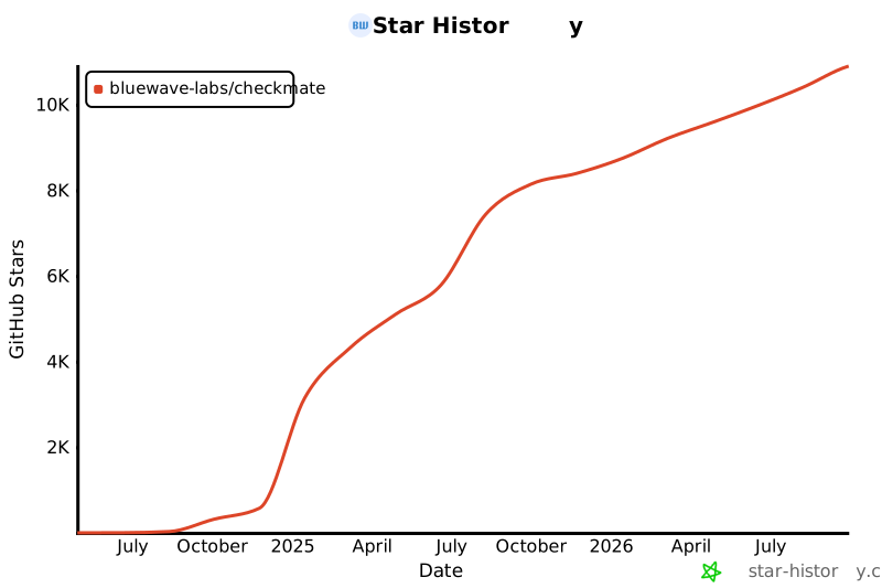](https://star-history.com/#bluewave-labs/Checkmate&Date)
|
||||
[](https://star-history.com/#bluewave-labs/bluewave-uptime&Date)
|
||||
|
||||
## Our sponsors
|
||||
|
||||
Thanks to [Gitbook](https://gitbook.io/) for giving us a free tier for their documentation platform, and [Poeditor](https://poeditor.com/) providing us a free account to use their i18n services. If you would like to sponsor Checkmate, please send an email to hello@bluewavelabs.ca
|
||||
|
||||
If you would like to sponsor a feature, [see this page](https://checkmate.so/sponsored-features).
|
||||
|
||||
Also check other developer and contributor-friendly projects of BlueWave:
|
||||
|
||||
- [VerifyWise](https://github.com/bluewave-labs/verifywise), the first open source AI governance platform.
|
||||
- [DataRoom](https://github.com/bluewave-labs/bluewave-dataroom), an secure file sharing application, aka dataroom.
|
||||
- [Guidefox](https://github.com/bluewave-labs/guidefox), an application that helps new users learn how to use your product via hints, tours, popups and banners.
|
||||
+1
-1
@@ -18,7 +18,7 @@
|
||||
<div id="root"></div>
|
||||
<script
|
||||
type="module"
|
||||
src="/src/main.tsx"
|
||||
src="/src/main.jsx"
|
||||
></script>
|
||||
</body>
|
||||
</html>
|
||||
Generated
+1795
-1775
File diff suppressed because it is too large.
Load diff
+8
-16
@@ -12,20 +12,16 @@
|
||||
"format": "prettier --write .",
|
||||
"format-check": "prettier --check ."
|
||||
},
|
||||
"lint-staged": {
|
||||
"**/*": "prettier --write"
|
||||
},
|
||||
"dependencies": {
|
||||
"@emotion/react": "^11.13.3",
|
||||
"@emotion/styled": "^11.13.0",
|
||||
"@hello-pangea/dnd": "^18.0.0",
|
||||
"@hookform/resolvers": "5.2.2",
|
||||
"@mui/lab": "7.0.0",
|
||||
"@mui/material": "7.3.7",
|
||||
"@mui/x-charts": "7.29.1",
|
||||
"@mui/x-date-pickers": "7.29.4",
|
||||
"@mui/lab": "6.0.0-dev.240424162023-9968b4889d",
|
||||
"@mui/material": "6.4.11",
|
||||
"@mui/x-charts": "^7.5.1",
|
||||
"@mui/x-date-pickers": "7.29.0",
|
||||
"@reduxjs/toolkit": "2.7.0",
|
||||
"@types/maplibre-gl": "^1.13.2",
|
||||
"axios": "^1.7.4",
|
||||
"dayjs": "1.11.13",
|
||||
"flag-icons": "7.3.2",
|
||||
@@ -34,16 +30,13 @@
|
||||
"i18next": "25.4.2",
|
||||
"joi": "17.13.3",
|
||||
"lucide-react": "^0.562.0",
|
||||
"maplibre-gl": "^5.19.0",
|
||||
"mui-color-input": "^7.0.0",
|
||||
"pretty-bytes": "^7.1.0",
|
||||
"mui-color-input": "^6.0.0",
|
||||
"pretty-ms": "^9.3.0",
|
||||
"react": "18.3.1",
|
||||
"react-dom": "^18.2.0",
|
||||
"react-hook-form": "^7.63.0",
|
||||
"react-hook-form": "7.63.0",
|
||||
"react-i18next": "^15.4.0",
|
||||
"react-icons": "5.5.0",
|
||||
"react-map-gl": "^8.1.0",
|
||||
"react-redux": "9.2.0",
|
||||
"react-router": "^6.23.0",
|
||||
"react-router-dom": "^6.23.1",
|
||||
@@ -52,7 +45,7 @@
|
||||
"redux-persist": "6.0.0",
|
||||
"swr": "^2.3.6",
|
||||
"vite-plugin-svgr": "^4.2.0",
|
||||
"zod": "^4.3.6"
|
||||
"zod": "4.1.11"
|
||||
},
|
||||
"devDependencies": {
|
||||
"@types/node": "24.5.2",
|
||||
@@ -63,9 +56,8 @@
|
||||
"eslint-plugin-react": "^7.34.1",
|
||||
"eslint-plugin-react-hooks": "^5.0.0",
|
||||
"eslint-plugin-react-refresh": "^0.4.6",
|
||||
"lint-staged": "^16.2.7",
|
||||
"prettier": "^3.3.3",
|
||||
"typescript": "5.9.3",
|
||||
"vite": "6.4.1"
|
||||
"vite": "6.3.6"
|
||||
}
|
||||
}
|
||||
@@ -0,0 +1,52 @@
|
||||
import { useEffect } from "react";
|
||||
import { useSelector } from "react-redux";
|
||||
import "react-toastify/dist/ReactToastify.css";
|
||||
import { ToastContainer } from "react-toastify";
|
||||
import { ThemeProvider } from "@emotion/react";
|
||||
import lightTheme from "./Utils/Theme/lightTheme";
|
||||
import darkTheme from "./Utils/Theme/darkTheme";
|
||||
import { CssBaseline, GlobalStyles } from "@mui/material";
|
||||
import { logger } from "./Utils/Logger"; // Import the logger
|
||||
import { networkService } from "./main";
|
||||
import { Routes } from "./Routes";
|
||||
import AppLayout from "@/Components/v1/Layouts/AppLayout";
|
||||
|
||||
function App() {
|
||||
const mode = useSelector((state) => state.ui.mode);
|
||||
|
||||
// Cleanup
|
||||
useEffect(() => {
|
||||
return () => {
|
||||
logger.cleanup();
|
||||
networkService.cleanup();
|
||||
};
|
||||
}, []);
|
||||
|
||||
const theme = mode === "light" ? lightTheme : darkTheme;
|
||||
|
||||
return (
|
||||
<ThemeProvider theme={theme}>
|
||||
<CssBaseline />
|
||||
<GlobalStyles
|
||||
styles={{
|
||||
body: {
|
||||
backgroundColor: theme.palette.background.main,
|
||||
},
|
||||
}}
|
||||
/>
|
||||
<AppLayout>
|
||||
<Routes />
|
||||
</AppLayout>
|
||||
<ToastContainer
|
||||
newestOnTop={true}
|
||||
theme={mode}
|
||||
style={{
|
||||
"--toastify-color-progress-light": "#7C8BA1",
|
||||
"--toastify-color-progress-dark": "#7C8BA1",
|
||||
}}
|
||||
/>
|
||||
</ThemeProvider>
|
||||
);
|
||||
}
|
||||
|
||||
export default App;
|
||||
@@ -1,56 +0,0 @@
|
||||
import { type CSSProperties } from "react";
|
||||
import { useSelector } from "react-redux";
|
||||
import "react-toastify/dist/ReactToastify.css";
|
||||
import { ToastContainer } from "react-toastify";
|
||||
import { ThemeProvider } from "@emotion/react";
|
||||
import { CssBaseline, GlobalStyles } from "@mui/material";
|
||||
import { SWRConfig } from "swr";
|
||||
import { Routes } from "./Routes";
|
||||
import AppLayout from "@/Components/layout/AppLayout";
|
||||
import type { RootState } from "@/Types/state";
|
||||
import { lightTheme, darkTheme } from "@/Utils/Theme/Theme";
|
||||
|
||||
const swrConfig = {
|
||||
dedupingInterval: 5000,
|
||||
revalidateOnFocus: false,
|
||||
revalidateOnReconnect: true,
|
||||
shouldRetryOnError: false,
|
||||
errorRetryCount: 2,
|
||||
errorRetryInterval: 1000,
|
||||
focusThrottleInterval: 5000,
|
||||
};
|
||||
|
||||
function App() {
|
||||
const mode = useSelector((state: RootState) => state.ui.mode);
|
||||
const theme = mode === "light" ? lightTheme : darkTheme;
|
||||
|
||||
return (
|
||||
<SWRConfig value={swrConfig}>
|
||||
<ThemeProvider theme={theme}>
|
||||
<CssBaseline />
|
||||
<GlobalStyles
|
||||
styles={{
|
||||
body: {
|
||||
backgroundColor: theme.palette.background.default,
|
||||
},
|
||||
}}
|
||||
/>
|
||||
<AppLayout>
|
||||
<Routes />
|
||||
</AppLayout>
|
||||
<ToastContainer
|
||||
newestOnTop={true}
|
||||
theme={mode}
|
||||
style={
|
||||
{
|
||||
"--toastify-color-progress-light": "#7C8BA1",
|
||||
"--toastify-color-progress-dark": "#7C8BA1",
|
||||
} as CSSProperties
|
||||
}
|
||||
/>
|
||||
</ThemeProvider>
|
||||
</SWRConfig>
|
||||
);
|
||||
}
|
||||
|
||||
export default App;
|
||||
@@ -0,0 +1,53 @@
|
||||
.wallet-adapter-dropdown {
|
||||
width: 100%;
|
||||
display: flex;
|
||||
flex-wrap: wrap;
|
||||
justify-content: center;
|
||||
align-items: center;
|
||||
gap: var(--env-var-spacing-1);
|
||||
}
|
||||
|
||||
.wallet-adapter-button {
|
||||
display: flex;
|
||||
align-items: center;
|
||||
justify-content: center;
|
||||
width: auto;
|
||||
height: var(--env-var-height-2) !important;
|
||||
font-size: var(--env-var-font-size-medium-plus) !important;
|
||||
font-weight: 500 !important;
|
||||
margin: 0;
|
||||
padding: calc(
|
||||
(var(--env-var-height-2) - var(--env-var-font-size-medium-plus) * 1.2) / 2
|
||||
)
|
||||
var(--env-var-spacing-1);
|
||||
white-space: nowrap;
|
||||
}
|
||||
|
||||
.wallet-adapter-modal-title {
|
||||
font-size: var(--font-size-h5) !important;
|
||||
}
|
||||
|
||||
/* Separator styling */
|
||||
.wallet-adapter-modal-divider {
|
||||
background-color: var(--border-color) !important;
|
||||
margin: var(--spacing-md) 0 !important;
|
||||
}
|
||||
|
||||
/* Responsive fixes */
|
||||
@media (max-width: 1200px) {
|
||||
.wallet-adapter-button {
|
||||
font-size: var(--env-var-font-size-medium) !important;
|
||||
padding: calc((var(--env-var-height-2) - var(--env-var-font-size-medium) * 1.2) / 2)
|
||||
var(--env-var-spacing-1-minus) !important;
|
||||
}
|
||||
}
|
||||
|
||||
@media (max-width: 900px) {
|
||||
.wallet-adapter-modal-wrapper {
|
||||
flex-direction: column !important;
|
||||
}
|
||||
|
||||
.wallet-adapter-modal-divider {
|
||||
margin: var(--spacing-sm) 0 !important;
|
||||
}
|
||||
}
|
||||
@@ -0,0 +1,50 @@
|
||||
// import { useMemo } from "react";
|
||||
// import { ConnectionProvider, WalletProvider } from "@solana/wallet-adapter-react";
|
||||
// import { WalletAdapterNetwork } from "@solana/wallet-adapter-base";
|
||||
// import {
|
||||
// UnsafeBurnerWalletAdapter,
|
||||
// PhantomWalletAdapter,
|
||||
// } from "@solana/wallet-adapter-wallets";
|
||||
|
||||
// import { WalletModalProvider } from "@solana/wallet-adapter-react-ui";
|
||||
// import { clusterApiUrl } from "@solana/web3.js";
|
||||
// import PropTypes from "prop-types";
|
||||
// import "./index.css";
|
||||
|
||||
// // Default styles that can be overridden by your app
|
||||
// import "@solana/wallet-adapter-react-ui/styles.css";
|
||||
|
||||
// export const Wallet = ({ children }) => {
|
||||
// // The network can be set to 'devnet', 'testnet', or 'mainnet-beta'.
|
||||
// const network = WalletAdapterNetwork.Mainnet;
|
||||
|
||||
// // You can also provide a custom RPC endpoint.
|
||||
// const endpoint = useMemo(() => clusterApiUrl(network), [network]);
|
||||
|
||||
// const wallets = useMemo(
|
||||
// () => [new PhantomWalletAdapter()],
|
||||
// // eslint-disable-next-line react-hooks/exhaustive-deps
|
||||
// [network]
|
||||
// );
|
||||
|
||||
// return (
|
||||
// <ConnectionProvider endpoint={endpoint}>
|
||||
// <WalletProvider
|
||||
// wallets={wallets}
|
||||
// autoConnect
|
||||
// >
|
||||
// <WalletModalProvider>{children}</WalletModalProvider>
|
||||
// </WalletProvider>
|
||||
// </ConnectionProvider>
|
||||
// );
|
||||
// };
|
||||
|
||||
// Wallet.propTypes = {
|
||||
// children: PropTypes.node,
|
||||
// };
|
||||
|
||||
const Wallet = ({ children }) => {
|
||||
return children;
|
||||
};
|
||||
|
||||
export default Wallet;
|
||||
@@ -1,155 +0,0 @@
|
||||
import Box from "@mui/material/Box";
|
||||
import Stack from "@mui/material/Stack";
|
||||
import Typography from "@mui/material/Typography";
|
||||
import { useTheme } from "@mui/material/styles";
|
||||
import type { ResponsiveStyleValue } from "@mui/system";
|
||||
import type { CheckSnapshot } from "@/Types/Check";
|
||||
import { HeatmapResponseTimeTooltip } from "./HeatmapResponseTimeTooltip";
|
||||
import { useMemo } from "react";
|
||||
import { useTranslation } from "react-i18next";
|
||||
|
||||
interface HistogramResponseTimeProps {
|
||||
checks: CheckSnapshot[];
|
||||
height?: ResponsiveStyleValue<number | string>;
|
||||
gap?: ResponsiveStyleValue<number | string>;
|
||||
showStats?: boolean;
|
||||
statsPosition?: "left" | "right";
|
||||
}
|
||||
|
||||
interface ResponseTimeStats {
|
||||
max: number | string;
|
||||
avg: number | string;
|
||||
}
|
||||
|
||||
const DEFAULT_HEIGHT = 50;
|
||||
|
||||
const calculateResponseTimeStats = (checks: CheckSnapshot[]): ResponseTimeStats => {
|
||||
if (!Array.isArray(checks) || checks.length === 0) {
|
||||
return { max: "-", avg: "-" };
|
||||
}
|
||||
|
||||
const validChecks = checks.filter((check) => check.originalResponseTime != null);
|
||||
if (validChecks.length === 0) {
|
||||
return { max: "-", avg: "-" };
|
||||
}
|
||||
|
||||
const responseTimes = validChecks.map((check) => check.originalResponseTime);
|
||||
const max = Math.max(...responseTimes);
|
||||
const avg = Math.round(
|
||||
responseTimes.reduce((sum, time) => sum + time, 0) / responseTimes.length
|
||||
);
|
||||
|
||||
return { max, avg };
|
||||
};
|
||||
|
||||
export const HistogramResponseTime = ({
|
||||
checks,
|
||||
height = DEFAULT_HEIGHT,
|
||||
gap,
|
||||
showStats = true,
|
||||
statsPosition = "right",
|
||||
}: HistogramResponseTimeProps) => {
|
||||
const theme = useTheme();
|
||||
const { t } = useTranslation();
|
||||
|
||||
const stats = useMemo(() => calculateResponseTimeStats(checks), [checks]);
|
||||
|
||||
if (!Array.isArray(checks) || checks.length === 0) return null;
|
||||
|
||||
const data =
|
||||
checks.length !== 25
|
||||
? [...checks, ...Array(25 - checks.length).fill({ status: "placeholder" })]
|
||||
: checks;
|
||||
|
||||
const chartHeight = typeof height === "number" ? `${height}px` : height;
|
||||
const gridGap = gap ?? theme.spacing(0.5);
|
||||
|
||||
const statsContent = showStats &&
|
||||
(typeof stats.max === "number" || typeof stats.avg === "number") && (
|
||||
<Stack
|
||||
justifyContent="center"
|
||||
alignItems={statsPosition === "left" ? "flex-end" : "flex-start"}
|
||||
minWidth={70}
|
||||
pr={statsPosition === "left" ? theme.spacing(8) : 0}
|
||||
pl={statsPosition === "right" ? theme.spacing(8) : 0}
|
||||
>
|
||||
<Typography variant="body2">
|
||||
{t("common.charts.histogram.avg", { value: stats.avg })}
|
||||
</Typography>
|
||||
<Typography variant="body2">
|
||||
{t("common.charts.histogram.max", { value: stats.max })}
|
||||
</Typography>
|
||||
</Stack>
|
||||
);
|
||||
|
||||
return (
|
||||
<Stack
|
||||
direction={statsPosition === "left" ? "row-reverse" : "row"}
|
||||
alignItems="center"
|
||||
sx={{ width: "100%" }}
|
||||
>
|
||||
<Box sx={{ flex: 1 }}>
|
||||
<Box
|
||||
sx={{
|
||||
width: "100%",
|
||||
display: "grid",
|
||||
gridTemplateColumns: "repeat(25, 1fr)",
|
||||
gap: gridGap,
|
||||
alignItems: "end",
|
||||
height: chartHeight,
|
||||
}}
|
||||
>
|
||||
{data.map((check, index) => {
|
||||
const isPlaceholder = (check as any).status === "placeholder";
|
||||
const heightPct = `${Math.max(0, Math.min(100, (check as any).responseTime ?? 0))}%`;
|
||||
const barColor =
|
||||
check.status === true
|
||||
? theme.palette.success.light
|
||||
: theme.palette.error.light;
|
||||
const bar = (
|
||||
<Box
|
||||
sx={{
|
||||
position: "relative",
|
||||
width: "100%",
|
||||
height: "100%",
|
||||
borderRadius: theme.spacing(1),
|
||||
bgcolor: theme.palette.action.hover,
|
||||
overflow: "hidden",
|
||||
}}
|
||||
>
|
||||
<Box
|
||||
sx={{
|
||||
position: "absolute",
|
||||
bottom: 0,
|
||||
left: 0,
|
||||
width: "100%",
|
||||
height: isPlaceholder ? 0 : heightPct,
|
||||
bgcolor: barColor,
|
||||
transition: "height 500ms cubic-bezier(0.4, 0, 0.2, 1)",
|
||||
}}
|
||||
/>
|
||||
</Box>
|
||||
);
|
||||
|
||||
return isPlaceholder ? (
|
||||
<Box
|
||||
key={index}
|
||||
sx={{ height: "100%" }}
|
||||
>
|
||||
{bar}
|
||||
</Box>
|
||||
) : (
|
||||
<HeatmapResponseTimeTooltip
|
||||
key={index}
|
||||
check={check}
|
||||
>
|
||||
{bar}
|
||||
</HeatmapResponseTimeTooltip>
|
||||
);
|
||||
})}
|
||||
</Box>
|
||||
</Box>
|
||||
{statsContent}
|
||||
</Stack>
|
||||
);
|
||||
};
|
||||
@@ -1,5 +0,0 @@
|
||||
export * from "./charts/HistogramResponseTime";
|
||||
export * from "./charts/HeatmapResponseTime";
|
||||
export * from "./charts/HeatmapResponseTimeTooltip";
|
||||
export * from "./controls/HeaderCreate";
|
||||
export * from "./controls/HeaderTimeRange";
|
||||
@@ -1,48 +0,0 @@
|
||||
import { Avatar as MuiAvatar } from "@mui/material";
|
||||
import { useSelector } from "react-redux";
|
||||
import { useEffect, useState } from "react";
|
||||
import { useTheme } from "@mui/material";
|
||||
import type { RootState } from "@/Types/state";
|
||||
|
||||
interface AvatarProps {
|
||||
src?: string;
|
||||
small?: boolean;
|
||||
sx?: object;
|
||||
onClick?: (event: React.MouseEvent<HTMLDivElement>) => void;
|
||||
}
|
||||
|
||||
export const Avatar = ({ src, small, sx, onClick = () => {} }: AvatarProps) => {
|
||||
const { user } = useSelector((state: RootState) => state.auth);
|
||||
const theme = useTheme();
|
||||
if (!user) return null;
|
||||
|
||||
const style = small ? { width: 32, height: 32 } : { width: 64, height: 64 };
|
||||
|
||||
const [image, setImage] = useState<string>();
|
||||
useEffect(() => {
|
||||
if (user.avatarImage) {
|
||||
setImage(`data:image/png;base64,${user.avatarImage}`);
|
||||
}
|
||||
}, [user?.avatarImage]);
|
||||
|
||||
return (
|
||||
<MuiAvatar
|
||||
onClick={onClick}
|
||||
alt={`${user?.firstName} ${user?.lastName}`}
|
||||
src={src ? src : user?.avatarImage ? image : undefined}
|
||||
sx={{
|
||||
color: theme.palette.primary.contrastText,
|
||||
fontSize: small ? "16px" : "22px",
|
||||
fontWeight: 400,
|
||||
backgroundColor: theme.palette.primary.main,
|
||||
display: "inline-flex",
|
||||
|
||||
...style,
|
||||
...sx,
|
||||
}}
|
||||
>
|
||||
{user.firstName?.charAt(0)}
|
||||
{user.lastName?.charAt(0) || ""}
|
||||
</MuiAvatar>
|
||||
);
|
||||
};
|
||||
@@ -1,140 +0,0 @@
|
||||
import MuiBreadcrumbs from "@mui/material/Breadcrumbs";
|
||||
import Typography from "@mui/material/Typography";
|
||||
import { Link, useLocation } from "react-router-dom";
|
||||
import { useTheme } from "@mui/material/styles";
|
||||
import { ChevronRight } from "lucide-react";
|
||||
import { useTranslation } from "react-i18next";
|
||||
import type { ReactNode } from "react";
|
||||
|
||||
const isId = (segment: string): boolean => {
|
||||
return segment.length === 24 || /^[a-f0-9-]{36}$/.test(segment);
|
||||
};
|
||||
|
||||
const actionSegments = ["create", "configure"];
|
||||
|
||||
const BreadcrumbWrapper = ({ children }: { children: ReactNode }) => {
|
||||
const theme = useTheme();
|
||||
return (
|
||||
<MuiBreadcrumbs
|
||||
separator={
|
||||
<ChevronRight
|
||||
size={16}
|
||||
strokeWidth={1.5}
|
||||
/>
|
||||
}
|
||||
sx={{
|
||||
fontSize: "14px",
|
||||
marginBottom: theme.spacing(6),
|
||||
"& .MuiBreadcrumbs-separator": {
|
||||
color: theme.palette.text.secondary,
|
||||
},
|
||||
}}
|
||||
>
|
||||
{children}
|
||||
</MuiBreadcrumbs>
|
||||
);
|
||||
};
|
||||
|
||||
export const Breadcrumb = ({
|
||||
breadcrumbOverride,
|
||||
}: {
|
||||
breadcrumbOverride?: string[] | undefined;
|
||||
}) => {
|
||||
const { t } = useTranslation();
|
||||
const theme = useTheme();
|
||||
const location = useLocation();
|
||||
|
||||
// If override is an empty array, hide entirely
|
||||
if (breadcrumbOverride !== undefined && breadcrumbOverride.length === 0) {
|
||||
return null;
|
||||
}
|
||||
|
||||
// If override has items, render them directly
|
||||
if (breadcrumbOverride !== undefined && breadcrumbOverride.length > 0) {
|
||||
return (
|
||||
<BreadcrumbWrapper>
|
||||
{breadcrumbOverride.map((item, index) => {
|
||||
const isLast = index === breadcrumbOverride.length - 1;
|
||||
return (
|
||||
<Typography
|
||||
key={index}
|
||||
sx={{
|
||||
fontSize: "14px",
|
||||
fontWeight: isLast ? 600 : 400,
|
||||
color: isLast ? theme.palette.primary.main : theme.palette.text.secondary,
|
||||
}}
|
||||
>
|
||||
{item}
|
||||
</Typography>
|
||||
);
|
||||
})}
|
||||
</BreadcrumbWrapper>
|
||||
);
|
||||
}
|
||||
|
||||
// Default behavior: use location pathname
|
||||
const segments = location.pathname.split("/").filter((x) => x);
|
||||
|
||||
if (segments.length === 0) {
|
||||
return null;
|
||||
}
|
||||
|
||||
// Build simplified breadcrumb: "uptime" or "uptime / details" or "uptime / create"
|
||||
const basePage = segments[0] || t("common.breadcrumbs.home");
|
||||
|
||||
const secondSegment = segments[1];
|
||||
const isActionPage = secondSegment && actionSegments.includes(secondSegment);
|
||||
const isDetailsPage = secondSegment && isId(secondSegment);
|
||||
const hasSubPage = isActionPage || isDetailsPage;
|
||||
|
||||
const getSubPageLabel = (): string => {
|
||||
if (isActionPage) {
|
||||
return secondSegment.charAt(0).toUpperCase() + secondSegment.slice(1);
|
||||
}
|
||||
return t("common.breadcrumbs.details");
|
||||
};
|
||||
|
||||
return (
|
||||
<BreadcrumbWrapper>
|
||||
{hasSubPage ? (
|
||||
<Link
|
||||
to={`/${basePage}`}
|
||||
style={{ textDecoration: "none" }}
|
||||
>
|
||||
<Typography
|
||||
sx={{
|
||||
fontSize: "14px",
|
||||
color: theme.palette.text.secondary,
|
||||
"&:hover": {
|
||||
color: theme.palette.primary.main,
|
||||
},
|
||||
}}
|
||||
>
|
||||
{basePage.charAt(0).toUpperCase() + basePage.slice(1)}
|
||||
</Typography>
|
||||
</Link>
|
||||
) : (
|
||||
<Typography
|
||||
sx={{
|
||||
fontSize: "14px",
|
||||
fontWeight: 600,
|
||||
color: theme.palette.primary.main,
|
||||
}}
|
||||
>
|
||||
{basePage.charAt(0).toUpperCase() + basePage.slice(1)}
|
||||
</Typography>
|
||||
)}
|
||||
{hasSubPage && (
|
||||
<Typography
|
||||
sx={{
|
||||
fontSize: "14px",
|
||||
fontWeight: 600,
|
||||
color: theme.palette.primary.main,
|
||||
}}
|
||||
>
|
||||
{getSubPageLabel()}
|
||||
</Typography>
|
||||
)}
|
||||
</BreadcrumbWrapper>
|
||||
);
|
||||
};
|
||||
@@ -1,155 +0,0 @@
|
||||
import { BaseChart } from "@/Components/design-elements";
|
||||
import Stack from "@mui/material/Stack";
|
||||
import Box from "@mui/material/Box";
|
||||
import Typography from "@mui/material/Typography";
|
||||
|
||||
import { useTheme } from "@mui/material/styles";
|
||||
import { useMemo, useState, useEffect } from "react";
|
||||
import { getInfraGaugeColor } from "@/Utils/MonitorUtils";
|
||||
|
||||
const MINIMUM_VALUE = 0;
|
||||
const MAXIMUM_VALUE = 100;
|
||||
|
||||
export const Gauge = ({
|
||||
isLoading = false,
|
||||
progress = 0,
|
||||
radius = 70,
|
||||
strokeWidth = 15,
|
||||
precision = 1,
|
||||
unit = "%",
|
||||
}: {
|
||||
isLoading?: boolean;
|
||||
progress?: number;
|
||||
radius?: number;
|
||||
strokeWidth?: number;
|
||||
precision?: number;
|
||||
unit?: string;
|
||||
}) => {
|
||||
const theme = useTheme();
|
||||
const progressWithinRange = Math.max(MINIMUM_VALUE, Math.min(progress, MAXIMUM_VALUE));
|
||||
|
||||
// Calculate the length of the stroke for the circle
|
||||
const { circumference, totalSize, strokeLength } = useMemo(
|
||||
() => ({
|
||||
circumference: 2 * Math.PI * radius,
|
||||
totalSize: radius * 2 + strokeWidth * 2,
|
||||
strokeLength: (progress / 100) * (2 * Math.PI * radius),
|
||||
}),
|
||||
[radius, strokeWidth, progress]
|
||||
);
|
||||
|
||||
const [offset, setOffset] = useState(circumference);
|
||||
useEffect(() => {
|
||||
setOffset(circumference);
|
||||
const timer = setTimeout(() => {
|
||||
setOffset(circumference - strokeLength);
|
||||
}, 100);
|
||||
|
||||
return () => clearTimeout(timer);
|
||||
}, [progress, circumference, strokeLength]);
|
||||
|
||||
const fillColor = getInfraGaugeColor(progressWithinRange, theme);
|
||||
|
||||
if (isLoading) {
|
||||
return;
|
||||
}
|
||||
|
||||
return (
|
||||
<Box
|
||||
display={"inline-block"}
|
||||
position={"relative"}
|
||||
width={radius}
|
||||
height={radius}
|
||||
bgcolor={theme.palette.background.paper}
|
||||
borderRadius={"50%"}
|
||||
>
|
||||
<svg
|
||||
viewBox={`0 0 ${totalSize} ${totalSize}`}
|
||||
width={radius}
|
||||
height={radius}
|
||||
>
|
||||
<circle
|
||||
stroke={theme.palette.secondary.main}
|
||||
strokeWidth={strokeWidth}
|
||||
fill="none"
|
||||
cx={totalSize / 2}
|
||||
cy={totalSize / 2}
|
||||
r={radius}
|
||||
/>
|
||||
<circle
|
||||
stroke={fillColor}
|
||||
strokeWidth={strokeWidth}
|
||||
strokeDasharray={`${circumference} ${circumference}`}
|
||||
strokeDashoffset={offset}
|
||||
fill="none"
|
||||
cx={totalSize / 2}
|
||||
cy={totalSize / 2}
|
||||
r={radius}
|
||||
style={{
|
||||
transform: "rotate(-90deg)",
|
||||
transformOrigin: "center",
|
||||
transition: "stroke-dashoffset 1.5s ease-in-out",
|
||||
}}
|
||||
/>
|
||||
</svg>
|
||||
|
||||
<Typography
|
||||
style={{
|
||||
position: "absolute",
|
||||
top: "50%",
|
||||
left: "50%",
|
||||
transform: "translate(-50%, -50%)",
|
||||
}}
|
||||
>
|
||||
{`${progressWithinRange.toFixed(precision)}${unit}`}
|
||||
</Typography>
|
||||
</Box>
|
||||
);
|
||||
};
|
||||
|
||||
export const DetailGauge = ({
|
||||
title,
|
||||
progress,
|
||||
upperLabel,
|
||||
upperValue,
|
||||
lowerLabel,
|
||||
lowerValue,
|
||||
}: {
|
||||
title: string;
|
||||
progress: number;
|
||||
upperLabel?: string;
|
||||
upperValue?: string | number;
|
||||
lowerLabel?: string;
|
||||
lowerValue?: string | number;
|
||||
}) => {
|
||||
const theme = useTheme();
|
||||
return (
|
||||
<BaseChart
|
||||
icon={null}
|
||||
title={title}
|
||||
maxWidth={225}
|
||||
>
|
||||
<Stack
|
||||
alignItems={"center"}
|
||||
mb={theme.spacing(4)}
|
||||
gap={theme.spacing(4)}
|
||||
>
|
||||
<Gauge progress={progress} />
|
||||
</Stack>
|
||||
<Stack
|
||||
direction={"row"}
|
||||
justifyContent={"space-between"}
|
||||
>
|
||||
<Typography>{upperLabel}</Typography>
|
||||
<Typography>{upperValue}</Typography>
|
||||
</Stack>
|
||||
<Stack
|
||||
direction={"row"}
|
||||
justifyContent={"space-between"}
|
||||
>
|
||||
<Typography>{lowerLabel}</Typography>
|
||||
<Typography>{lowerValue}</Typography>
|
||||
</Stack>
|
||||
</BaseChart>
|
||||
);
|
||||
};
|
||||
@@ -1,63 +0,0 @@
|
||||
import Box from "@mui/material/Box";
|
||||
import Stack from "@mui/material/Stack";
|
||||
import Typography from "@mui/material/Typography";
|
||||
import { useTheme } from "@mui/material/styles";
|
||||
import { useTranslation } from "react-i18next";
|
||||
import { WifiOff } from "lucide-react";
|
||||
import { useState, useEffect } from "react";
|
||||
|
||||
interface OfflineBannerProps {
|
||||
visible: boolean;
|
||||
}
|
||||
|
||||
export const OfflineBanner = ({ visible }: OfflineBannerProps) => {
|
||||
const theme = useTheme();
|
||||
const { t } = useTranslation();
|
||||
const [shouldRender, setShouldRender] = useState(visible);
|
||||
const [isAnimating, setIsAnimating] = useState(false);
|
||||
|
||||
useEffect(() => {
|
||||
if (visible) {
|
||||
setShouldRender(true);
|
||||
requestAnimationFrame(() => setIsAnimating(true));
|
||||
} else {
|
||||
setIsAnimating(false);
|
||||
const timer = setTimeout(() => setShouldRender(false), 1000);
|
||||
return () => clearTimeout(timer);
|
||||
}
|
||||
}, [visible]);
|
||||
|
||||
if (!shouldRender) return null;
|
||||
|
||||
return (
|
||||
<Box
|
||||
sx={{
|
||||
position: "fixed",
|
||||
top: isAnimating ? 0 : "-100%",
|
||||
left: 0,
|
||||
right: 0,
|
||||
zIndex: theme.zIndex.snackbar,
|
||||
backgroundColor: theme.palette.error.main,
|
||||
color: theme.palette.error.contrastText,
|
||||
px: theme.spacing(8),
|
||||
py: theme.spacing(4),
|
||||
transition: "top 1s ease-in-out",
|
||||
}}
|
||||
>
|
||||
<Stack
|
||||
direction="row"
|
||||
alignItems="center"
|
||||
justifyContent="center"
|
||||
gap={theme.spacing(4)}
|
||||
>
|
||||
<WifiOff size={20} />
|
||||
<Typography
|
||||
variant="body2"
|
||||
fontWeight={500}
|
||||
>
|
||||
{t("components.offlineBanner.serverUnreachable")}
|
||||
</Typography>
|
||||
</Stack>
|
||||
</Box>
|
||||
);
|
||||
};
|
||||
@@ -1,79 +0,0 @@
|
||||
import Stack from "@mui/material/Stack";
|
||||
import Box from "@mui/material/Box";
|
||||
import Typography from "@mui/material/Typography";
|
||||
import { useTheme } from "@mui/material/styles";
|
||||
import useMediaQuery from "@mui/material/useMediaQuery";
|
||||
import { LAYOUT } from "@/Utils/Theme/constants";
|
||||
export const SplitBox = ({
|
||||
left,
|
||||
right,
|
||||
}: {
|
||||
left: React.ReactNode;
|
||||
right: React.ReactNode;
|
||||
}) => {
|
||||
const theme = useTheme();
|
||||
const isSmall = useMediaQuery(theme.breakpoints.down("md"));
|
||||
return (
|
||||
<Stack
|
||||
direction={isSmall ? "column" : "row"}
|
||||
bgcolor={theme.palette.background.paper}
|
||||
border={1}
|
||||
borderColor={theme.palette.divider}
|
||||
borderRadius={theme.shape.borderRadius}
|
||||
>
|
||||
<Box
|
||||
padding={theme.spacing(LAYOUT.XXL)}
|
||||
borderRight={isSmall ? 0 : 1}
|
||||
borderBottom={isSmall ? 1 : 0}
|
||||
borderColor={theme.palette.divider}
|
||||
flex={0.7}
|
||||
sx={{
|
||||
background:
|
||||
theme.palette.mode === "dark"
|
||||
? "linear-gradient(135deg, rgba(255, 255, 255, 0.01) 0%, rgba(255, 255, 255, 0.02) 100%)"
|
||||
: "linear-gradient(135deg, rgba(0, 0, 0, 0.01) 0%, rgba(0, 0, 0, 0.02) 100%)",
|
||||
}}
|
||||
>
|
||||
{left}
|
||||
</Box>
|
||||
<Box
|
||||
flex={1}
|
||||
padding={theme.spacing(LAYOUT.XXL)}
|
||||
>
|
||||
{right}
|
||||
</Box>
|
||||
</Stack>
|
||||
);
|
||||
};
|
||||
|
||||
export const ConfigBox = ({
|
||||
title,
|
||||
subtitle,
|
||||
leftContent,
|
||||
rightContent,
|
||||
}: {
|
||||
title: string;
|
||||
subtitle: string;
|
||||
leftContent?: React.ReactNode;
|
||||
rightContent: React.ReactNode;
|
||||
}) => {
|
||||
const theme = useTheme();
|
||||
return (
|
||||
<SplitBox
|
||||
left={
|
||||
<Stack spacing={theme.spacing(LAYOUT.XS)}>
|
||||
<Typography
|
||||
textTransform={"capitalize"}
|
||||
component="h2"
|
||||
variant="h2"
|
||||
>
|
||||
{title}
|
||||
</Typography>
|
||||
<Typography component="p">{subtitle}</Typography>
|
||||
{leftContent}
|
||||
</Stack>
|
||||
}
|
||||
right={rightContent}
|
||||
/>
|
||||
);
|
||||
};
|
||||
@@ -1,186 +0,0 @@
|
||||
import Stack from "@mui/material/Stack";
|
||||
import Typography from "@mui/material/Typography";
|
||||
import Box from "@mui/material/Box";
|
||||
import { BaseBox } from "@/Components/design-elements";
|
||||
import { useTranslation } from "react-i18next";
|
||||
import type { SxProps } from "@mui/material";
|
||||
|
||||
import { useTheme } from "@mui/material/styles";
|
||||
|
||||
type StatusBoxProps = React.PropsWithChildren<{
|
||||
children: React.ReactNode;
|
||||
sx?: SxProps;
|
||||
}>;
|
||||
|
||||
export const BGBox = ({ children, sx }: StatusBoxProps) => {
|
||||
const theme = useTheme();
|
||||
return (
|
||||
<BaseBox
|
||||
sx={{
|
||||
backgroundColor: theme.palette.background.default,
|
||||
overflow: "hidden",
|
||||
position: "relative",
|
||||
flex: 1,
|
||||
padding: theme.spacing(4),
|
||||
...sx,
|
||||
}}
|
||||
>
|
||||
<Box
|
||||
position="absolute"
|
||||
top={0}
|
||||
left={0}
|
||||
right={0}
|
||||
bottom={0}
|
||||
sx={{
|
||||
pointerEvents: "none",
|
||||
backgroundImage: `
|
||||
linear-gradient(${theme.palette.divider} 1px, transparent 1px),
|
||||
linear-gradient(90deg, ${theme.palette.divider} 1px, transparent 1px)
|
||||
`,
|
||||
backgroundSize: "24px 24px",
|
||||
maskImage:
|
||||
"linear-gradient(135deg, rgba(0,0,0,0) 0%, rgba(0,0,0,0) 30%, rgba(0,0,0,0.4) 100%)",
|
||||
WebkitMaskImage:
|
||||
"linear-gradient(135deg, rgba(0,0,0,0) 0%, rgba(0,0,0,0) 30%, rgba(0,0,0,0.4) 100%)",
|
||||
}}
|
||||
/>
|
||||
{children}
|
||||
</BaseBox>
|
||||
);
|
||||
};
|
||||
|
||||
const StatusBox = ({
|
||||
label,
|
||||
n,
|
||||
color,
|
||||
sx,
|
||||
}: {
|
||||
label: string;
|
||||
n: number;
|
||||
color: string | undefined;
|
||||
sx?: SxProps;
|
||||
}) => {
|
||||
const theme = useTheme();
|
||||
return (
|
||||
<BGBox sx={sx}>
|
||||
<Stack spacing={theme.spacing(4)}>
|
||||
<Typography
|
||||
variant={"h2"}
|
||||
textTransform="uppercase"
|
||||
color={theme.palette.text.secondary}
|
||||
>
|
||||
{label}
|
||||
</Typography>
|
||||
<Typography
|
||||
variant="h1"
|
||||
color={color}
|
||||
>
|
||||
{n}
|
||||
</Typography>
|
||||
</Stack>
|
||||
</BGBox>
|
||||
);
|
||||
};
|
||||
|
||||
export const UpStatusBox = ({ n }: { n: number }) => {
|
||||
const theme = useTheme();
|
||||
const { t } = useTranslation();
|
||||
return (
|
||||
<StatusBox
|
||||
label={t("pages.common.monitors.status.up")}
|
||||
n={n}
|
||||
color={theme.palette.success.light}
|
||||
/>
|
||||
);
|
||||
};
|
||||
|
||||
export const DownStatusBox = ({ n }: { n: number }) => {
|
||||
const theme = useTheme();
|
||||
const { t } = useTranslation();
|
||||
return (
|
||||
<StatusBox
|
||||
label={t("pages.common.monitors.status.down")}
|
||||
n={n}
|
||||
color={theme.palette.error.light}
|
||||
/>
|
||||
);
|
||||
};
|
||||
|
||||
export const PausedStatusBox = ({ n }: { n: number }) => {
|
||||
const theme = useTheme();
|
||||
const { t } = useTranslation();
|
||||
return (
|
||||
<StatusBox
|
||||
label={t("pages.common.monitors.status.paused")}
|
||||
n={n}
|
||||
color={theme.palette.warning.light}
|
||||
/>
|
||||
);
|
||||
};
|
||||
export const MaintenanceStatusBox = ({ n }: { n: number }) => {
|
||||
const theme = useTheme();
|
||||
const { t } = useTranslation();
|
||||
return (
|
||||
<StatusBox
|
||||
label={t("pages.common.monitors.status.maintenance")}
|
||||
n={n}
|
||||
color={theme.palette.warning.light}
|
||||
/>
|
||||
);
|
||||
};
|
||||
export const InitializingStatusBox = ({ n }: { n: number }) => {
|
||||
const theme = useTheme();
|
||||
const { t } = useTranslation();
|
||||
return (
|
||||
<StatusBox
|
||||
label={t("pages.common.monitors.status.initializing")}
|
||||
n={n}
|
||||
color={theme.palette.warning.light}
|
||||
/>
|
||||
);
|
||||
};
|
||||
export const BreachedStatusBox = ({ n }: { n: number }) => {
|
||||
const theme = useTheme();
|
||||
const { t } = useTranslation();
|
||||
return (
|
||||
<StatusBox
|
||||
label={t("pages.common.monitors.status.breached")}
|
||||
n={n}
|
||||
color={theme.palette.warning.main}
|
||||
/>
|
||||
);
|
||||
};
|
||||
|
||||
export const TotalChecksBox = ({ n }: { n: number }) => {
|
||||
const theme = useTheme();
|
||||
const { t } = useTranslation();
|
||||
return (
|
||||
<StatusBox
|
||||
label={t("pages.common.monitors.status.total")}
|
||||
n={n}
|
||||
color={theme.palette.primary.light}
|
||||
/>
|
||||
);
|
||||
};
|
||||
export const DownChecksBox = ({ n }: { n: number }) => {
|
||||
const theme = useTheme();
|
||||
const { t } = useTranslation();
|
||||
return (
|
||||
<StatusBox
|
||||
label={t("pages.common.monitors.status.down")}
|
||||
n={n}
|
||||
color={theme.palette.error.light}
|
||||
/>
|
||||
);
|
||||
};
|
||||
export const UpChecksBox = ({ n }: { n: number }) => {
|
||||
const theme = useTheme();
|
||||
const { t } = useTranslation();
|
||||
return (
|
||||
<StatusBox
|
||||
label={t("pages.common.monitors.status.up")}
|
||||
n={n}
|
||||
color={theme.palette.success.light}
|
||||
/>
|
||||
);
|
||||
};
|
||||
@@ -1,32 +0,0 @@
|
||||
import Typography from "@mui/material/Typography";
|
||||
import { useTheme } from "@mui/material/styles";
|
||||
import { useTranslation } from "react-i18next";
|
||||
import type { PageSpeedStrategy } from "@/Types/Monitor";
|
||||
import { SPACING } from "@/Utils/Theme/constants";
|
||||
|
||||
interface StrategyBadgeProps {
|
||||
strategy: PageSpeedStrategy | undefined;
|
||||
variant?: "caption" | "body2";
|
||||
}
|
||||
|
||||
export const StrategyBadge = ({ strategy, variant = "body2" }: StrategyBadgeProps) => {
|
||||
const theme = useTheme();
|
||||
const { t } = useTranslation();
|
||||
|
||||
if (!strategy) {
|
||||
return null;
|
||||
}
|
||||
|
||||
return (
|
||||
<Typography
|
||||
variant={variant}
|
||||
px={SPACING.XXL}
|
||||
py={SPACING.SM}
|
||||
borderRadius={theme.shape.borderRadius}
|
||||
bgcolor={theme.palette.secondary.light}
|
||||
color={theme.palette.text.primary}
|
||||
>
|
||||
{t(`pages.pageSpeed.strategy.${strategy}`)}
|
||||
</Typography>
|
||||
);
|
||||
};
|
||||
@@ -1,64 +0,0 @@
|
||||
import MuiTabs from "@mui/material/Tabs";
|
||||
import type { TabsProps } from "@mui/material/Tabs";
|
||||
import { useTheme } from "@mui/material/styles";
|
||||
interface CustomTabsProps extends TabsProps {}
|
||||
|
||||
export const Tabs = (props: CustomTabsProps) => {
|
||||
const theme = useTheme();
|
||||
return (
|
||||
<MuiTabs
|
||||
sx={{
|
||||
minHeight: 34,
|
||||
borderBottom: `1px solid ${theme.palette.divider}`,
|
||||
"& .MuiTabs-indicator": {
|
||||
backgroundColor: theme.palette.primary.main,
|
||||
height: 2,
|
||||
bottom: 0,
|
||||
},
|
||||
"& .MuiTabs-flexContainer": {
|
||||
gap: theme.spacing(16),
|
||||
},
|
||||
}}
|
||||
{...props}
|
||||
>
|
||||
{props.children}
|
||||
</MuiTabs>
|
||||
);
|
||||
};
|
||||
|
||||
import MuiTab from "@mui/material/Tab";
|
||||
import type { TabProps } from "@mui/material/Tab";
|
||||
interface CustomTabProps extends TabProps {}
|
||||
|
||||
export const Tab = (props: CustomTabProps) => {
|
||||
const theme = useTheme();
|
||||
return (
|
||||
<MuiTab
|
||||
disableRipple
|
||||
iconPosition="start"
|
||||
sx={{
|
||||
textTransform: "none",
|
||||
fontSize: 14,
|
||||
fontWeight: 500,
|
||||
minHeight: 34,
|
||||
padding: theme.spacing(1, 0),
|
||||
paddingBottom: 0,
|
||||
minWidth: "auto",
|
||||
alignItems: "flex-start",
|
||||
color: theme.palette.text.secondary,
|
||||
"&.Mui-selected": {
|
||||
color: theme.palette.primary.main,
|
||||
fontWeight: 600,
|
||||
},
|
||||
"&:hover": {
|
||||
color: theme.palette.text.secondary,
|
||||
},
|
||||
"& .MuiTab-iconWrapper": {
|
||||
marginRight: theme.spacing(2),
|
||||
marginBottom: 0,
|
||||
},
|
||||
}}
|
||||
{...props}
|
||||
/>
|
||||
);
|
||||
};
|
||||
@@ -1,43 +0,0 @@
|
||||
import Typography from "@mui/material/Typography";
|
||||
import Stack from "@mui/material/Stack";
|
||||
import type { StackProps } from "@mui/material/Stack";
|
||||
import Link from "@mui/material/Link";
|
||||
import { Link as RouterLink } from "react-router-dom";
|
||||
|
||||
import { useTheme } from "@mui/material/styles";
|
||||
|
||||
interface TextLinkProps extends StackProps {
|
||||
text: string;
|
||||
linkText: string;
|
||||
href: string;
|
||||
target?: "_self" | "_blank" | "_parent" | "_top";
|
||||
}
|
||||
|
||||
export const TextLink = ({
|
||||
text,
|
||||
linkText,
|
||||
href,
|
||||
target = "_self",
|
||||
...props
|
||||
}: TextLinkProps) => {
|
||||
const theme = useTheme();
|
||||
|
||||
return (
|
||||
<Stack
|
||||
direction="row"
|
||||
gap={theme.spacing(4)}
|
||||
{...props}
|
||||
>
|
||||
<Typography>{text}</Typography>
|
||||
<Link
|
||||
color="primary"
|
||||
to={href}
|
||||
component={RouterLink}
|
||||
target={target}
|
||||
{...(target === "_blank" && { rel: "noopener noreferrer" })}
|
||||
>
|
||||
{linkText}
|
||||
</Link>
|
||||
</Stack>
|
||||
);
|
||||
};
|
||||
@@ -1,48 +0,0 @@
|
||||
import { MuiColorInput } from "mui-color-input";
|
||||
import type { MuiColorInputProps } from "mui-color-input";
|
||||
import { typographyLevels } from "@/Utils/Theme/Palette";
|
||||
import { useTheme } from "@mui/material";
|
||||
import Stack from "@mui/material/Stack";
|
||||
import { FieldLabel } from "@/Components/inputs/FieldLabel";
|
||||
|
||||
interface ColorPickerProps extends MuiColorInputProps {
|
||||
fieldLabel?: string;
|
||||
required?: boolean;
|
||||
}
|
||||
|
||||
export const ColorInput = ({ fieldLabel, required, ...props }: ColorPickerProps) => {
|
||||
const theme = useTheme();
|
||||
const input = (
|
||||
<MuiColorInput
|
||||
{...props}
|
||||
sx={{
|
||||
"& .MuiOutlinedInput-root": {
|
||||
borderRadius: theme.shape.borderRadius,
|
||||
height: 34,
|
||||
fontSize: typographyLevels.base,
|
||||
},
|
||||
"& .MuiOutlinedInput-notchedOutline": {
|
||||
borderColor: theme.palette.divider,
|
||||
},
|
||||
"&:hover .MuiOutlinedInput-notchedOutline": {
|
||||
borderColor: theme.palette.divider,
|
||||
},
|
||||
"& .MuiFormHelperText-root": {
|
||||
marginLeft: 0,
|
||||
marginRight: 0,
|
||||
marginTop: theme.spacing(1),
|
||||
},
|
||||
}}
|
||||
/>
|
||||
);
|
||||
if (fieldLabel) {
|
||||
return (
|
||||
<Stack spacing={theme.spacing(2)}>
|
||||
<FieldLabel required={required}>{fieldLabel}</FieldLabel>
|
||||
{input}
|
||||
</Stack>
|
||||
);
|
||||
}
|
||||
|
||||
return input;
|
||||
};
|
||||
@@ -1,100 +0,0 @@
|
||||
import { DatePicker } from "@mui/x-date-pickers/DatePicker";
|
||||
import type { DatePickerProps } from "@mui/x-date-pickers/DatePicker";
|
||||
import type { Dayjs } from "dayjs";
|
||||
import { useTheme } from "@mui/material/styles";
|
||||
import Stack from "@mui/material/Stack";
|
||||
import Typography from "@mui/material/Typography";
|
||||
import { FieldLabel } from "./FieldLabel";
|
||||
import { Calendar } from "lucide-react";
|
||||
import { AdapterDayjs } from "@mui/x-date-pickers/AdapterDayjs";
|
||||
import { LocalizationProvider } from "@mui/x-date-pickers";
|
||||
|
||||
interface DatePickerComponentProps extends Omit<DatePickerProps<Dayjs>, "label"> {
|
||||
fieldLabel?: string;
|
||||
required?: boolean;
|
||||
error?: boolean;
|
||||
helperText?: string;
|
||||
}
|
||||
|
||||
export const DatePickerComponent = ({
|
||||
fieldLabel,
|
||||
required,
|
||||
error,
|
||||
helperText,
|
||||
...props
|
||||
}: DatePickerComponentProps) => {
|
||||
const theme = useTheme();
|
||||
|
||||
const picker = (
|
||||
<LocalizationProvider dateAdapter={AdapterDayjs}>
|
||||
<DatePicker
|
||||
{...props}
|
||||
slots={{
|
||||
openPickerIcon: () => (
|
||||
<Calendar
|
||||
size={20}
|
||||
stroke={theme.palette.text.secondary}
|
||||
/>
|
||||
),
|
||||
...props.slots,
|
||||
}}
|
||||
slotProps={{
|
||||
switchViewButton: { sx: { display: "none" } },
|
||||
nextIconButton: { sx: { ml: theme.spacing(2) } },
|
||||
day: {
|
||||
sx: {
|
||||
"&.MuiPickersDay-root.Mui-disabled": {
|
||||
color: theme.palette.text.disabled,
|
||||
},
|
||||
},
|
||||
},
|
||||
field: {
|
||||
sx: {
|
||||
width: "fit-content",
|
||||
"& > .MuiOutlinedInput-root": {
|
||||
flexDirection: "row-reverse",
|
||||
},
|
||||
"& input": {
|
||||
minHeight: 34,
|
||||
p: 0,
|
||||
pl: theme.spacing(3),
|
||||
pr: theme.spacing(5),
|
||||
},
|
||||
"& fieldset": {
|
||||
borderColor: error ? theme.palette.error.main : theme.palette.divider,
|
||||
borderRadius: theme.shape.borderRadius,
|
||||
},
|
||||
"&:not(:has(.Mui-disabled)):not(:has(.Mui-error)) .MuiOutlinedInput-root:not(:has(input:focus)):hover fieldset":
|
||||
{
|
||||
borderColor: error ? theme.palette.error.main : theme.palette.divider,
|
||||
},
|
||||
},
|
||||
},
|
||||
inputAdornment: { sx: { ml: 0 } },
|
||||
openPickerButton: {
|
||||
sx: {
|
||||
py: 0,
|
||||
mr: 0,
|
||||
},
|
||||
},
|
||||
...props.slotProps,
|
||||
}}
|
||||
/>
|
||||
</LocalizationProvider>
|
||||
);
|
||||
|
||||
return (
|
||||
<Stack spacing={theme.spacing(2)}>
|
||||
{fieldLabel && <FieldLabel required={required}>{fieldLabel}</FieldLabel>}
|
||||
{picker}
|
||||
{helperText && (
|
||||
<Typography
|
||||
variant="caption"
|
||||
color={error ? "error" : "text.secondary"}
|
||||
>
|
||||
{helperText}
|
||||
</Typography>
|
||||
)}
|
||||
</Stack>
|
||||
);
|
||||
};
|
||||
@@ -1,78 +0,0 @@
|
||||
import Dialog from "@mui/material/Dialog";
|
||||
import type { DialogProps } from "@mui/material/Dialog";
|
||||
import DialogActions from "@mui/material/DialogActions";
|
||||
import DialogContent from "@mui/material/DialogContent";
|
||||
import DialogContentText from "@mui/material/DialogContentText";
|
||||
import DialogTitle from "@mui/material/DialogTitle";
|
||||
import { Button } from "@/Components/inputs";
|
||||
import { typographyLevels } from "@/Utils/Theme/Palette";
|
||||
import { useTranslation } from "react-i18next";
|
||||
import type { ReactNode } from "react";
|
||||
|
||||
export const DialogInput = ({
|
||||
open,
|
||||
title,
|
||||
content,
|
||||
onConfirm,
|
||||
onCancel,
|
||||
confirmColor = "primary",
|
||||
cancelColor = "error",
|
||||
loading = false,
|
||||
cancelText,
|
||||
confirmText,
|
||||
children,
|
||||
maxWidth,
|
||||
fullWidth = false,
|
||||
additionalButtons,
|
||||
}: {
|
||||
open: boolean;
|
||||
title?: string;
|
||||
content?: string;
|
||||
onConfirm?(item: any): any;
|
||||
onCancel?(item: any): any;
|
||||
confirmColor?: "error" | "primary";
|
||||
cancelColor?: "error" | "primary";
|
||||
loading?: boolean;
|
||||
cancelText?: string;
|
||||
confirmText?: string;
|
||||
children?: ReactNode;
|
||||
maxWidth?: DialogProps["maxWidth"];
|
||||
fullWidth?: boolean;
|
||||
additionalButtons?: ReactNode;
|
||||
}) => {
|
||||
const { t } = useTranslation();
|
||||
return (
|
||||
<Dialog
|
||||
open={open}
|
||||
maxWidth={maxWidth}
|
||||
fullWidth={fullWidth}
|
||||
>
|
||||
{title && <DialogTitle sx={{ fontSize: typographyLevels.l }}>{title}</DialogTitle>}
|
||||
<DialogContent>
|
||||
{content && <DialogContentText>{content}</DialogContentText>}
|
||||
{children}
|
||||
</DialogContent>
|
||||
<DialogActions>
|
||||
<Button
|
||||
loading={loading}
|
||||
variant="contained"
|
||||
color={cancelColor}
|
||||
onClick={onCancel}
|
||||
>
|
||||
{cancelText ?? t("common.buttons.cancel")}
|
||||
</Button>
|
||||
{additionalButtons}
|
||||
{onConfirm && (
|
||||
<Button
|
||||
loading={loading}
|
||||
variant="contained"
|
||||
color={confirmColor}
|
||||
onClick={onConfirm}
|
||||
>
|
||||
{confirmText ?? t("common.buttons.confirm")}
|
||||
</Button>
|
||||
)}
|
||||
</DialogActions>
|
||||
</Dialog>
|
||||
);
|
||||
};
|
||||
@@ -1,164 +0,0 @@
|
||||
import { Box, Stack, Typography, IconButton } from "@mui/material";
|
||||
import { useTheme } from "@mui/material/styles";
|
||||
import { Upload, X } from "lucide-react";
|
||||
import { useState, useRef, useCallback } from "react";
|
||||
import { useTranslation } from "react-i18next";
|
||||
|
||||
interface FileObject {
|
||||
src: string;
|
||||
name: string;
|
||||
file: File;
|
||||
}
|
||||
|
||||
interface ImageUploadProps {
|
||||
src?: string;
|
||||
onChange?: (file: FileObject | undefined) => void;
|
||||
maxSize?: number;
|
||||
accept?: string[];
|
||||
error?: string;
|
||||
}
|
||||
|
||||
export const ImageUpload = ({
|
||||
src,
|
||||
onChange,
|
||||
maxSize = 3 * 1024 * 1024,
|
||||
accept = ["jpg", "jpeg", "png"],
|
||||
error,
|
||||
}: ImageUploadProps) => {
|
||||
const theme = useTheme();
|
||||
const { t } = useTranslation();
|
||||
const inputRef = useRef<HTMLInputElement>(null);
|
||||
const [isDragging, setIsDragging] = useState(false);
|
||||
const [localError, setLocalError] = useState<string | null>(null);
|
||||
const [preview, setPreview] = useState<FileObject | null>(null);
|
||||
|
||||
const handleFile = useCallback(
|
||||
(file: File | undefined) => {
|
||||
if (!file) return;
|
||||
const isValidType = accept.some((type) => file.type.includes(type));
|
||||
const isValidSize = file.size <= maxSize;
|
||||
if (!isValidType) {
|
||||
setLocalError(t("components.imageUpload.errors.invalidFileFormat"));
|
||||
return;
|
||||
}
|
||||
if (!isValidSize) {
|
||||
setLocalError(t("components.imageUpload.errors.invalidFileSize"));
|
||||
return;
|
||||
}
|
||||
setLocalError(null);
|
||||
const fileObj: FileObject = {
|
||||
src: URL.createObjectURL(file),
|
||||
name: file.name,
|
||||
file,
|
||||
};
|
||||
setPreview(fileObj);
|
||||
onChange?.(fileObj);
|
||||
},
|
||||
[maxSize, accept, onChange, t]
|
||||
);
|
||||
|
||||
const handleClear = () => {
|
||||
setPreview(null);
|
||||
setLocalError(null);
|
||||
onChange?.(undefined);
|
||||
if (inputRef.current) inputRef.current.value = "";
|
||||
};
|
||||
|
||||
const displaySrc = src || preview?.src;
|
||||
const displayError = localError || error;
|
||||
|
||||
return (
|
||||
<Stack sx={{ width: "100%", maxWidth: 500 }}>
|
||||
{displaySrc ? (
|
||||
<Stack
|
||||
alignItems="center"
|
||||
gap={1}
|
||||
>
|
||||
<Box
|
||||
component="img"
|
||||
src={displaySrc}
|
||||
alt="Preview"
|
||||
sx={{ maxWidth: 250, maxHeight: 250, objectFit: "contain", borderRadius: 1 }}
|
||||
/>
|
||||
<IconButton
|
||||
size="small"
|
||||
onClick={handleClear}
|
||||
sx={{ color: theme.palette.error.main }}
|
||||
>
|
||||
<X size={18} />
|
||||
</IconButton>
|
||||
</Stack>
|
||||
) : (
|
||||
<Stack
|
||||
onDragOver={(e) => {
|
||||
e.preventDefault();
|
||||
setIsDragging(true);
|
||||
}}
|
||||
onDragLeave={() => setIsDragging(false)}
|
||||
onDrop={(e) => {
|
||||
e.preventDefault();
|
||||
setIsDragging(false);
|
||||
handleFile(e.dataTransfer.files?.[0]);
|
||||
}}
|
||||
alignItems="center"
|
||||
justifyContent="center"
|
||||
gap={1}
|
||||
sx={{
|
||||
position: "relative",
|
||||
width: "100%",
|
||||
minHeight: 150,
|
||||
border: "2px dashed",
|
||||
borderRadius: 1,
|
||||
borderColor: isDragging ? theme.palette.primary.main : theme.palette.divider,
|
||||
backgroundColor: isDragging ? theme.palette.action.hover : "transparent",
|
||||
transition: "0.2s",
|
||||
cursor: "pointer",
|
||||
"&:hover": {
|
||||
borderColor: theme.palette.primary.main,
|
||||
backgroundColor: theme.palette.action.hover,
|
||||
},
|
||||
}}
|
||||
>
|
||||
<input
|
||||
ref={inputRef}
|
||||
type="file"
|
||||
accept={accept.map((ext) => `.${ext}`).join(",")}
|
||||
onChange={(e) => handleFile(e.target.files?.[0])}
|
||||
style={{ position: "absolute", inset: 0, opacity: 0, cursor: "pointer" }}
|
||||
/>
|
||||
<Upload size={24} />
|
||||
<Typography
|
||||
variant="body2"
|
||||
color="text.secondary"
|
||||
>
|
||||
<Typography
|
||||
component="span"
|
||||
variant="body2"
|
||||
color="primary"
|
||||
fontWeight={500}
|
||||
>
|
||||
{t("components.imageUpload.clickToUpload")}
|
||||
</Typography>{" "}
|
||||
{t("components.imageUpload.orDragAndDrop")}
|
||||
</Typography>
|
||||
<Typography
|
||||
variant="caption"
|
||||
color="text.disabled"
|
||||
>
|
||||
{accept.join(", ").toUpperCase()} • {t("components.imageUpload.maxSize")}{" "}
|
||||
{Math.round(maxSize / 1024 / 1024)}MB
|
||||
</Typography>
|
||||
</Stack>
|
||||
)}
|
||||
{displayError && (
|
||||
<Typography
|
||||
variant="caption"
|
||||
color="error"
|
||||
sx={{ mt: 1 }}
|
||||
>
|
||||
{displayError}
|
||||
</Typography>
|
||||
)}
|
||||
</Stack>
|
||||
);
|
||||
};
|
||||
@@ -1,100 +0,0 @@
|
||||
import Stack from "@mui/material/Stack";
|
||||
import Box from "@mui/material/Box";
|
||||
import MenuItem from "@mui/material/MenuItem";
|
||||
import { Select } from "@/Components/inputs";
|
||||
import "flag-icons/css/flag-icons.min.css";
|
||||
|
||||
import { useTranslation } from "react-i18next";
|
||||
import { useTheme } from "@mui/material";
|
||||
import { useSelector } from "react-redux";
|
||||
import { useDispatch } from "react-redux";
|
||||
import { setLanguage } from "@/Features/UI/uiSlice";
|
||||
import type { RootState } from "@/Types/state";
|
||||
|
||||
const langMap: Record<string, string> = {
|
||||
cs: "cz",
|
||||
ja: "jp",
|
||||
uk: "ua",
|
||||
vi: "vn",
|
||||
};
|
||||
|
||||
export const LanguageSelector = () => {
|
||||
const { i18n } = useTranslation();
|
||||
const theme = useTheme();
|
||||
const { language = "en" } = useSelector((state: RootState) => state.ui);
|
||||
const dispatch = useDispatch();
|
||||
const handleChange = (event: any) => {
|
||||
const newLang = event.target.value;
|
||||
dispatch(setLanguage(newLang));
|
||||
};
|
||||
|
||||
const languages = Object.keys(i18n.options.resources || {});
|
||||
|
||||
return (
|
||||
<Select
|
||||
value={language}
|
||||
onChange={handleChange}
|
||||
size="small"
|
||||
// sx={{
|
||||
// minWidth: 80,
|
||||
// "& .MuiSelect-select": {
|
||||
// display: "flex",
|
||||
// alignItems: "center",
|
||||
// justifyContent: "center",
|
||||
// },
|
||||
// "& .MuiSelect-icon": {
|
||||
// alignSelf: "center",
|
||||
// },
|
||||
// }}
|
||||
>
|
||||
{languages.map((lang) => {
|
||||
let parsedLang = lang === "en" ? "gb" : lang;
|
||||
|
||||
if (parsedLang.includes("-")) {
|
||||
parsedLang = parsedLang.split("-")[1].toLowerCase();
|
||||
}
|
||||
|
||||
parsedLang = langMap[parsedLang] || parsedLang;
|
||||
|
||||
const flag = parsedLang ? `fi fi-${parsedLang}` : null;
|
||||
|
||||
return (
|
||||
<MenuItem
|
||||
key={lang}
|
||||
value={lang}
|
||||
sx={{
|
||||
display: "flex",
|
||||
justifyContent: "center",
|
||||
alignItems: "center",
|
||||
}}
|
||||
>
|
||||
<Stack
|
||||
direction="row"
|
||||
spacing={theme.spacing(2)}
|
||||
alignItems="center"
|
||||
justifyContent="center"
|
||||
>
|
||||
<Box
|
||||
component="span"
|
||||
sx={{
|
||||
display: "flex",
|
||||
alignItems: "center",
|
||||
}}
|
||||
>
|
||||
{flag && <span className={flag} />}
|
||||
</Box>
|
||||
<Box
|
||||
component="span"
|
||||
sx={{ textTransform: "uppercase" }}
|
||||
>
|
||||
{lang}
|
||||
</Box>
|
||||
</Stack>
|
||||
</MenuItem>
|
||||
);
|
||||
})}
|
||||
</Select>
|
||||
);
|
||||
};
|
||||
|
||||
export default LanguageSelector;
|
||||
@@ -1,88 +0,0 @@
|
||||
import Radio from "@mui/material/Radio";
|
||||
import type { RadioProps } from "@mui/material/Radio";
|
||||
import { useTheme } from "@mui/material/styles";
|
||||
import { Circle, CircleDot } from "lucide-react";
|
||||
import FormControlLabel from "@mui/material/FormControlLabel";
|
||||
import Typography from "@mui/material/Typography";
|
||||
|
||||
interface RadioInputProps extends RadioProps {}
|
||||
|
||||
export const RadioInput = ({ ...props }: RadioInputProps) => {
|
||||
const theme = useTheme();
|
||||
return (
|
||||
<Radio
|
||||
{...props}
|
||||
icon={
|
||||
<Circle
|
||||
size={16}
|
||||
strokeWidth={1.5}
|
||||
/>
|
||||
}
|
||||
checkedIcon={
|
||||
<CircleDot
|
||||
size={14}
|
||||
strokeWidth={1.5}
|
||||
/>
|
||||
}
|
||||
sx={{
|
||||
padding: 0,
|
||||
mt: theme.spacing(0.5),
|
||||
color: theme.palette.text.secondary,
|
||||
"&.Mui-checked": {
|
||||
color: theme.palette.primary.main,
|
||||
"& svg circle": {
|
||||
fill: theme.palette.primary.main,
|
||||
},
|
||||
},
|
||||
"& .MuiSvgIcon-root": {
|
||||
fontSize: 16,
|
||||
},
|
||||
"& svg": {
|
||||
stroke: "currentColor",
|
||||
},
|
||||
"& svg path, & svg line, & svg polyline, & svg rect, & svg circle": {
|
||||
stroke: "currentColor",
|
||||
fill: "none",
|
||||
},
|
||||
}}
|
||||
/>
|
||||
);
|
||||
};
|
||||
|
||||
export const RadioWithDescription = ({
|
||||
label,
|
||||
description,
|
||||
...props
|
||||
}: RadioInputProps & { label: string; description: string }) => {
|
||||
const theme = useTheme();
|
||||
return (
|
||||
<FormControlLabel
|
||||
control={<RadioInput {...props} />}
|
||||
label={
|
||||
<>
|
||||
<Typography component="p">{label}</Typography>
|
||||
<Typography
|
||||
component="h6"
|
||||
color={theme.palette.text.secondary}
|
||||
>
|
||||
{description}
|
||||
</Typography>
|
||||
</>
|
||||
}
|
||||
sx={{
|
||||
alignItems: "flex-start",
|
||||
p: theme.spacing(2.5),
|
||||
m: theme.spacing(-2.5),
|
||||
borderRadius: theme.shape.borderRadius,
|
||||
|
||||
"&:hover": {
|
||||
backgroundColor: theme.palette.background.paper,
|
||||
},
|
||||
"& .MuiButtonBase-root": {
|
||||
p: 0,
|
||||
mr: theme.spacing(6),
|
||||
},
|
||||
}}
|
||||
/>
|
||||
);
|
||||
};
|
||||
@@ -1,108 +0,0 @@
|
||||
import Typography from "@mui/material/Typography";
|
||||
import { forwardRef } from "react";
|
||||
import Slider from "@mui/material/Slider";
|
||||
import type { SliderProps } from "@mui/material/Slider";
|
||||
import { useTheme } from "@mui/material/styles";
|
||||
import Stack from "@mui/material/Stack";
|
||||
import { FieldLabel } from "./FieldLabel";
|
||||
import Box from "@mui/material/Box";
|
||||
import type { ResponsiveStyleValue } from "@mui/system";
|
||||
|
||||
interface SliderInputProps extends SliderProps {
|
||||
sx?: SliderProps["sx"];
|
||||
showValue?: boolean;
|
||||
formatDisplayValue?: (value: number) => string;
|
||||
}
|
||||
|
||||
export const SliderInput = forwardRef<HTMLSpanElement, SliderInputProps>(
|
||||
({ sx, showValue = false, formatDisplayValue, ...props }, ref) => {
|
||||
const theme = useTheme();
|
||||
const additionalSx = Array.isArray(sx) ? sx : sx ? [sx] : [];
|
||||
|
||||
const displayValue =
|
||||
showValue && formatDisplayValue && typeof props.value === "number"
|
||||
? formatDisplayValue(props.value)
|
||||
: props.value;
|
||||
|
||||
return (
|
||||
<Stack
|
||||
gap={theme.spacing(8)}
|
||||
direction={"row"}
|
||||
alignItems={"center"}
|
||||
>
|
||||
{showValue && <Typography>{displayValue}</Typography>}
|
||||
<Slider
|
||||
{...props}
|
||||
ref={ref}
|
||||
sx={[
|
||||
{
|
||||
"& .MuiSlider-track": {
|
||||
backgroundColor: theme.palette.primary.main,
|
||||
border: "none",
|
||||
},
|
||||
"& .MuiSlider-rail": {
|
||||
backgroundColor: theme.palette.grey[300],
|
||||
opacity: 1,
|
||||
},
|
||||
"& .MuiSlider-thumb": {
|
||||
backgroundColor: "#fff",
|
||||
"&:hover, &.Mui-focusVisible": {
|
||||
boxShadow: "none",
|
||||
},
|
||||
"&:active": {
|
||||
boxShadow: "none",
|
||||
},
|
||||
},
|
||||
"& .MuiSlider-valueLabel": {
|
||||
backgroundColor: theme.palette.primary.main,
|
||||
},
|
||||
},
|
||||
...additionalSx,
|
||||
]}
|
||||
/>
|
||||
</Stack>
|
||||
);
|
||||
}
|
||||
);
|
||||
|
||||
interface SliderWithLabelProps extends SliderProps {
|
||||
fieldLabel?: string;
|
||||
required?: boolean;
|
||||
showValue?: boolean;
|
||||
formatDisplayValue?: (value: number) => string;
|
||||
sliderMaxWidth?: ResponsiveStyleValue<number | string>;
|
||||
}
|
||||
|
||||
export const SliderWithLabel = forwardRef<HTMLSpanElement, SliderWithLabelProps>(
|
||||
(
|
||||
{
|
||||
fieldLabel,
|
||||
required,
|
||||
showValue = true,
|
||||
formatDisplayValue,
|
||||
value,
|
||||
sliderMaxWidth = "100%",
|
||||
...props
|
||||
},
|
||||
ref
|
||||
) => {
|
||||
const theme = useTheme();
|
||||
|
||||
const labelText = fieldLabel;
|
||||
|
||||
return (
|
||||
<Stack spacing={theme.spacing(2)}>
|
||||
{fieldLabel && <FieldLabel required={required}>{labelText}</FieldLabel>}
|
||||
<Box maxWidth={sliderMaxWidth}>
|
||||
<SliderInput
|
||||
{...props}
|
||||
showValue={showValue}
|
||||
formatDisplayValue={formatDisplayValue}
|
||||
value={value}
|
||||
ref={ref}
|
||||
/>
|
||||
</Box>
|
||||
</Stack>
|
||||
);
|
||||
}
|
||||
);
|
||||
@@ -1,47 +0,0 @@
|
||||
import { forwardRef } from "react";
|
||||
import Switch from "@mui/material/Switch";
|
||||
import type { SwitchProps } from "@mui/material/Switch";
|
||||
import { useTheme } from "@mui/material/styles";
|
||||
|
||||
interface SwitchComponentProps extends SwitchProps {
|
||||
dualOption?: boolean;
|
||||
}
|
||||
|
||||
export const SwitchComponent = forwardRef<HTMLInputElement, SwitchComponentProps>(
|
||||
function SwitchComponent({ sx, dualOption = false, ...props }, ref) {
|
||||
const theme = useTheme();
|
||||
const additionalSx = Array.isArray(sx) ? sx : sx ? [sx] : [];
|
||||
|
||||
return (
|
||||
<Switch
|
||||
{...props}
|
||||
slotProps={{
|
||||
input: {
|
||||
ref: ref,
|
||||
},
|
||||
}}
|
||||
sx={[
|
||||
{
|
||||
"& .MuiSwitch-switchBase": {
|
||||
"&.Mui-checked": {
|
||||
color: "#E0E0E0",
|
||||
"& + .MuiSwitch-track": {
|
||||
backgroundColor: theme.palette.primary.main,
|
||||
opacity: 1,
|
||||
border: 0,
|
||||
},
|
||||
},
|
||||
},
|
||||
...(dualOption && {
|
||||
"& .MuiSwitch-track": {
|
||||
backgroundColor: theme.palette.primary.main,
|
||||
opacity: 1,
|
||||
},
|
||||
}),
|
||||
},
|
||||
...additionalSx,
|
||||
]}
|
||||
/>
|
||||
);
|
||||
}
|
||||
);
|
||||
@@ -1,48 +0,0 @@
|
||||
import IconButton from "@mui/material/IconButton";
|
||||
|
||||
import { Moon, Sun } from "lucide-react";
|
||||
|
||||
import { setMode } from "@/Features/UI/uiSlice.js";
|
||||
import { useTheme } from "@mui/material";
|
||||
import { useDispatch, useSelector } from "react-redux";
|
||||
import type { RootState } from "@/Types/state";
|
||||
|
||||
export const SwitchTheme = () => {
|
||||
const mode = useSelector((state: RootState) => state.ui.mode);
|
||||
const dispatch = useDispatch();
|
||||
const theme = useTheme();
|
||||
|
||||
const handleChange = () => {
|
||||
dispatch(setMode(mode === "light" ? "dark" : "light"));
|
||||
};
|
||||
return (
|
||||
<IconButton
|
||||
id="theme-toggle"
|
||||
onClick={handleChange}
|
||||
sx={{
|
||||
display: "flex",
|
||||
alignItems: "center",
|
||||
justifyContent: "center",
|
||||
"& svg": {
|
||||
transition: "stroke 0.2s ease",
|
||||
},
|
||||
"&:hover svg path, &:hover svg line, &:hover svg polyline, &:hover svg rect, &:hover svg circle":
|
||||
{
|
||||
stroke: theme.palette.primary.main,
|
||||
},
|
||||
}}
|
||||
>
|
||||
{mode === "light" ? (
|
||||
<Moon
|
||||
size={16}
|
||||
strokeWidth={1.5}
|
||||
/>
|
||||
) : (
|
||||
<Sun
|
||||
size={16}
|
||||
strokeWidth={1.5}
|
||||
/>
|
||||
)}
|
||||
</IconButton>
|
||||
);
|
||||
};
|
||||
@@ -1,61 +0,0 @@
|
||||
import { MobileTimePicker } from "@mui/x-date-pickers/MobileTimePicker";
|
||||
import type { MobileTimePickerProps } from "@mui/x-date-pickers/MobileTimePicker";
|
||||
import type { Dayjs } from "dayjs";
|
||||
import { useTheme } from "@mui/material/styles";
|
||||
import Stack from "@mui/material/Stack";
|
||||
import { FieldLabel } from "./FieldLabel";
|
||||
import { AdapterDayjs } from "@mui/x-date-pickers/AdapterDayjs";
|
||||
import { LocalizationProvider } from "@mui/x-date-pickers";
|
||||
|
||||
interface TimePickerComponentProps extends Omit<MobileTimePickerProps<Dayjs>, "label"> {
|
||||
fieldLabel?: string;
|
||||
required?: boolean;
|
||||
}
|
||||
|
||||
export const TimePickerComponent = ({
|
||||
fieldLabel,
|
||||
required,
|
||||
...props
|
||||
}: TimePickerComponentProps) => {
|
||||
const theme = useTheme();
|
||||
|
||||
const picker = (
|
||||
<LocalizationProvider dateAdapter={AdapterDayjs}>
|
||||
<MobileTimePicker
|
||||
{...props}
|
||||
slotProps={{
|
||||
field: {
|
||||
sx: {
|
||||
width: "fit-content",
|
||||
"& input": {
|
||||
minHeight: 34,
|
||||
p: 0,
|
||||
px: theme.spacing(5),
|
||||
},
|
||||
"& fieldset": {
|
||||
borderColor: theme.palette.divider,
|
||||
borderRadius: theme.shape.borderRadius,
|
||||
},
|
||||
"&:not(:has(.Mui-disabled)):not(:has(.Mui-error)) .MuiOutlinedInput-root:not(:has(input:focus)):hover fieldset":
|
||||
{
|
||||
borderColor: theme.palette.divider,
|
||||
},
|
||||
},
|
||||
},
|
||||
...props.slotProps,
|
||||
}}
|
||||
/>
|
||||
</LocalizationProvider>
|
||||
);
|
||||
|
||||
if (fieldLabel) {
|
||||
return (
|
||||
<Stack spacing={theme.spacing(2)}>
|
||||
<FieldLabel required={required}>{fieldLabel}</FieldLabel>
|
||||
{picker}
|
||||
</Stack>
|
||||
);
|
||||
}
|
||||
|
||||
return picker;
|
||||
};
|
||||
@@ -1,54 +0,0 @@
|
||||
import Box from "@mui/material/Box";
|
||||
import { useState, useEffect, useRef } from "react";
|
||||
import { useTheme } from "@mui/material/styles";
|
||||
import { OfflineBanner } from "@/Components/design-elements";
|
||||
import { setServerUnreachableCallback, get } from "@/Utils/ApiClient";
|
||||
|
||||
interface AppLayoutProps {
|
||||
children: React.ReactNode;
|
||||
}
|
||||
|
||||
const AppLayout = ({ children }: AppLayoutProps) => {
|
||||
const theme = useTheme();
|
||||
const [serverUnreachable, setServerUnreachable] = useState(false);
|
||||
const retryIntervalRef = useRef<number | null>(null);
|
||||
|
||||
useEffect(() => {
|
||||
setServerUnreachableCallback(setServerUnreachable);
|
||||
}, []);
|
||||
|
||||
useEffect(() => {
|
||||
if (serverUnreachable) {
|
||||
retryIntervalRef.current = window.setInterval(async () => {
|
||||
try {
|
||||
await get("/health", { timeout: 5000 });
|
||||
} catch {
|
||||
// NO_OP
|
||||
}
|
||||
}, 5000);
|
||||
} else if (retryIntervalRef.current) {
|
||||
clearInterval(retryIntervalRef.current);
|
||||
retryIntervalRef.current = null;
|
||||
}
|
||||
|
||||
return () => {
|
||||
if (retryIntervalRef.current) {
|
||||
clearInterval(retryIntervalRef.current);
|
||||
}
|
||||
};
|
||||
}, [serverUnreachable]);
|
||||
|
||||
return (
|
||||
<Box
|
||||
sx={{
|
||||
minHeight: "100vh",
|
||||
backgroundColor: theme.palette.background.default,
|
||||
}}
|
||||
>
|
||||
<OfflineBanner visible={serverUnreachable} />
|
||||
{children}
|
||||
</Box>
|
||||
);
|
||||
};
|
||||
|
||||
export default AppLayout;
|
||||
@@ -1,44 +0,0 @@
|
||||
import { Sidebar } from "@/Components/sidebar";
|
||||
import { Outlet } from "react-router";
|
||||
import Stack from "@mui/material/Stack";
|
||||
import { useMediaQuery } from "@mui/material";
|
||||
import { useSidebar } from "@/Hooks/useSidebar";
|
||||
|
||||
import { useTheme } from "@mui/material";
|
||||
|
||||
const RootLayout = () => {
|
||||
const theme = useTheme();
|
||||
const isSmall = useMediaQuery(theme.breakpoints.down("md"));
|
||||
const { collapsedWidth } = useSidebar();
|
||||
|
||||
return (
|
||||
<Stack flexDirection="row">
|
||||
<Sidebar />
|
||||
<Stack
|
||||
flex={1}
|
||||
padding={6}
|
||||
overflow={"hidden"}
|
||||
sx={{
|
||||
backgroundColor:
|
||||
theme.palette.mode === "dark"
|
||||
? "rgba(255, 255, 255, 0.01)"
|
||||
: "rgba(0, 0, 0, 0.01)",
|
||||
display: "flex",
|
||||
alignItems: "center",
|
||||
paddingLeft: isSmall ? `${collapsedWidth + 12}px` : 12,
|
||||
}}
|
||||
>
|
||||
<Stack
|
||||
maxWidth={1280}
|
||||
width="100%"
|
||||
paddingY={theme.spacing(6)}
|
||||
flex={1}
|
||||
>
|
||||
<Outlet />
|
||||
</Stack>
|
||||
</Stack>
|
||||
</Stack>
|
||||
);
|
||||
};
|
||||
|
||||
export default RootLayout;
|
||||
@@ -1,203 +0,0 @@
|
||||
import { useRef, useEffect, useState } from "react";
|
||||
import { Box, Typography, Stack, useTheme, GlobalStyles } from "@mui/material";
|
||||
import Map, { Marker, Popup } from "react-map-gl/maplibre";
|
||||
import type { MapRef } from "react-map-gl/maplibre";
|
||||
import type { FlatGeoCheck } from "@/Types/GeoCheck";
|
||||
import "maplibre-gl/dist/maplibre-gl.css";
|
||||
|
||||
interface GeoChecksMapProps {
|
||||
geoChecks: FlatGeoCheck[];
|
||||
}
|
||||
|
||||
export const GeoChecksMap = ({ geoChecks }: GeoChecksMapProps) => {
|
||||
const mapRef = useRef<MapRef>(null);
|
||||
const [selectedCheck, setSelectedCheck] = useState<FlatGeoCheck | null>(null);
|
||||
const theme = useTheme();
|
||||
const isDarkMode = theme.palette.mode === "dark";
|
||||
|
||||
const mapPopupStyles = (
|
||||
<GlobalStyles
|
||||
styles={{
|
||||
".maplibregl-popup-content": {
|
||||
background: "transparent !important",
|
||||
padding: "0 !important",
|
||||
boxShadow: "none !important",
|
||||
},
|
||||
".maplibregl-popup-tip": {
|
||||
display: "none",
|
||||
},
|
||||
".maplibregl-ctrl-attrib": {
|
||||
display: "none",
|
||||
},
|
||||
".maplibregl-ctrl-logo": {
|
||||
display: "none",
|
||||
},
|
||||
".maplibregl-popup-close-button": {
|
||||
color: theme.palette.text.primary,
|
||||
background: "transparent",
|
||||
fontSize: "20px",
|
||||
padding: "4px",
|
||||
"&:hover": {
|
||||
backgroundColor: theme.palette.action.hover,
|
||||
},
|
||||
},
|
||||
}}
|
||||
/>
|
||||
);
|
||||
|
||||
useEffect(() => {
|
||||
if (geoChecks.length === 0 || !mapRef.current) return;
|
||||
|
||||
const bounds = geoChecks.reduce(
|
||||
(acc, check) => {
|
||||
return {
|
||||
minLng: Math.min(acc.minLng, check.location.longitude),
|
||||
maxLng: Math.max(acc.maxLng, check.location.longitude),
|
||||
minLat: Math.min(acc.minLat, check.location.latitude),
|
||||
maxLat: Math.max(acc.maxLat, check.location.latitude),
|
||||
};
|
||||
},
|
||||
{
|
||||
minLng: Infinity,
|
||||
maxLng: -Infinity,
|
||||
minLat: Infinity,
|
||||
maxLat: -Infinity,
|
||||
}
|
||||
);
|
||||
|
||||
if (bounds.minLng !== Infinity) {
|
||||
mapRef.current.fitBounds(
|
||||
[
|
||||
[bounds.minLng, bounds.minLat],
|
||||
[bounds.maxLng, bounds.maxLat],
|
||||
],
|
||||
{ padding: 50, duration: 1000 }
|
||||
);
|
||||
}
|
||||
}, [geoChecks]);
|
||||
|
||||
const getMarkerColor = (status: boolean): string => {
|
||||
return status ? theme.palette.success.main : theme.palette.error.main;
|
||||
};
|
||||
|
||||
const formatResponseTime = (timing: number): string => {
|
||||
return `${timing.toFixed(0)}ms`;
|
||||
};
|
||||
|
||||
return (
|
||||
<>
|
||||
{mapPopupStyles}
|
||||
<Box
|
||||
height={500}
|
||||
width={"100%"}
|
||||
borderRadius={theme.shape.borderRadius}
|
||||
overflow={"hidden"}
|
||||
>
|
||||
<Map
|
||||
ref={mapRef}
|
||||
initialViewState={{
|
||||
longitude: 0,
|
||||
latitude: 20,
|
||||
zoom: 1.5,
|
||||
}}
|
||||
style={{ height: "100%", width: "100%" }}
|
||||
mapStyle={
|
||||
isDarkMode
|
||||
? "https://basemaps.cartocdn.com/gl/dark-matter-gl-style/style.json"
|
||||
: "https://basemaps.cartocdn.com/gl/positron-gl-style/style.json"
|
||||
}
|
||||
>
|
||||
{geoChecks.map((check, index) => (
|
||||
<Marker
|
||||
key={`${check.id}-${index}`}
|
||||
longitude={check.location.longitude}
|
||||
latitude={check.location.latitude}
|
||||
anchor="bottom"
|
||||
onClick={(e: any) => {
|
||||
e.originalEvent.stopPropagation();
|
||||
setSelectedCheck(check);
|
||||
}}
|
||||
>
|
||||
<div
|
||||
style={{
|
||||
width: "10px",
|
||||
height: "10px",
|
||||
borderRadius: "50%",
|
||||
backgroundColor: getMarkerColor(check.status),
|
||||
boxShadow: "0 2px 4px rgba(0,0,0,0.3)",
|
||||
cursor: "pointer",
|
||||
}}
|
||||
/>
|
||||
</Marker>
|
||||
))}
|
||||
|
||||
{selectedCheck && (
|
||||
<Popup
|
||||
longitude={selectedCheck.location.longitude}
|
||||
latitude={selectedCheck.location.latitude}
|
||||
anchor="top"
|
||||
onClose={() => setSelectedCheck(null)}
|
||||
closeOnClick={false}
|
||||
>
|
||||
<Box
|
||||
sx={{
|
||||
minWidth: 200,
|
||||
p: theme.spacing(4),
|
||||
bgcolor: theme.palette.background.paper,
|
||||
borderWidth: 1,
|
||||
borderStyle: "solid",
|
||||
borderColor: theme.palette.divider,
|
||||
borderRadius: 1,
|
||||
}}
|
||||
>
|
||||
<Typography
|
||||
variant="subtitle1"
|
||||
fontWeight="bold"
|
||||
gutterBottom
|
||||
>
|
||||
{selectedCheck.location.city}, {selectedCheck.location.country}
|
||||
</Typography>
|
||||
<Stack spacing={0.5}>
|
||||
<Typography variant="body2">
|
||||
<Typography
|
||||
component="span"
|
||||
fontWeight="medium"
|
||||
>
|
||||
Status:
|
||||
</Typography>{" "}
|
||||
{selectedCheck.status ? "Up" : "Down"}
|
||||
</Typography>
|
||||
<Typography variant="body2">
|
||||
<Typography
|
||||
component="span"
|
||||
fontWeight="medium"
|
||||
>
|
||||
Status Code:
|
||||
</Typography>{" "}
|
||||
{selectedCheck.statusCode}
|
||||
</Typography>
|
||||
<Typography variant="body2">
|
||||
<Typography
|
||||
component="span"
|
||||
fontWeight="medium"
|
||||
>
|
||||
Response Time:
|
||||
</Typography>{" "}
|
||||
{formatResponseTime(selectedCheck.timings.total)}
|
||||
</Typography>
|
||||
<Typography
|
||||
variant="caption"
|
||||
color="text.secondary"
|
||||
sx={{ mt: 0.5 }}
|
||||
>
|
||||
{new Date(selectedCheck.createdAt).toLocaleString()}
|
||||
</Typography>
|
||||
</Stack>
|
||||
</Box>
|
||||
</Popup>
|
||||
)}
|
||||
</Map>
|
||||
</Box>
|
||||
</>
|
||||
);
|
||||
};
|
||||
@@ -1,54 +0,0 @@
|
||||
import Stack from "@mui/material/Stack";
|
||||
import { Tabs, Tab } from "@/Components/design-elements";
|
||||
import { useTheme } from "@mui/material/styles";
|
||||
import { useTranslation } from "react-i18next";
|
||||
import type { GeoContinent } from "@/Types/GeoCheck";
|
||||
|
||||
interface HeaderGeoTabsProps {
|
||||
geoCheckEnabled: boolean;
|
||||
locations: GeoContinent[] | undefined;
|
||||
selectedLocation: GeoContinent;
|
||||
onLocationChange: (location: GeoContinent) => void;
|
||||
}
|
||||
|
||||
export const HeaderGeoTabs = ({
|
||||
geoCheckEnabled,
|
||||
locations,
|
||||
selectedLocation,
|
||||
onLocationChange,
|
||||
}: HeaderGeoTabsProps) => {
|
||||
const { t } = useTranslation();
|
||||
const theme = useTheme();
|
||||
|
||||
if (!geoCheckEnabled || !locations || locations.length === 0) {
|
||||
return null;
|
||||
}
|
||||
|
||||
const handleChange = (_event: React.SyntheticEvent, newValue: GeoContinent) => {
|
||||
onLocationChange(newValue);
|
||||
};
|
||||
|
||||
return (
|
||||
<Stack
|
||||
spacing={{ xs: theme.spacing(8), md: 0 }}
|
||||
direction={{ xs: "column", md: "row" }}
|
||||
alignItems={"center"}
|
||||
justifyContent={"flex-start"}
|
||||
>
|
||||
<Tabs
|
||||
value={selectedLocation}
|
||||
onChange={handleChange}
|
||||
>
|
||||
{locations.map((location) => (
|
||||
<Tab
|
||||
key={location}
|
||||
label={t(
|
||||
`pages.createMonitor.form.geoChecks.option.locations.options.${location}`
|
||||
)}
|
||||
value={location}
|
||||
/>
|
||||
))}
|
||||
</Tabs>
|
||||
</Stack>
|
||||
);
|
||||
};
|
||||
@@ -1,35 +0,0 @@
|
||||
import {
|
||||
UpStatusBox,
|
||||
DownStatusBox,
|
||||
PausedStatusBox,
|
||||
InitializingStatusBox,
|
||||
BreachedStatusBox,
|
||||
} from "@/Components/design-elements";
|
||||
import Stack from "@mui/material/Stack";
|
||||
|
||||
import type { MonitorsSummary } from "@/Types/Monitor";
|
||||
import { useTheme } from "@mui/material";
|
||||
|
||||
interface MonitorsSummaryProps {
|
||||
summary: MonitorsSummary | null;
|
||||
showBreached?: boolean;
|
||||
}
|
||||
|
||||
export const HeaderMonitorsSummary = ({
|
||||
summary,
|
||||
showBreached = false,
|
||||
}: MonitorsSummaryProps) => {
|
||||
const theme = useTheme();
|
||||
return (
|
||||
<Stack
|
||||
direction={{ xs: "column", md: "row" }}
|
||||
gap={theme.spacing(8)}
|
||||
>
|
||||
<UpStatusBox n={summary?.upMonitors || 0} />
|
||||
<DownStatusBox n={summary?.downMonitors || 0} />
|
||||
{showBreached && <BreachedStatusBox n={summary?.breachedMonitors || 0} />}
|
||||
<PausedStatusBox n={summary?.pausedMonitors || 0} />
|
||||
<InitializingStatusBox n={summary?.initializingMonitors || 0} />
|
||||
</Stack>
|
||||
);
|
||||
};
|
||||
@@ -1,206 +0,0 @@
|
||||
import { BaseChart } from "@/Components/design-elements";
|
||||
import {
|
||||
AreaChart,
|
||||
Area,
|
||||
XAxis,
|
||||
YAxis,
|
||||
CartesianGrid,
|
||||
ResponsiveContainer,
|
||||
} from "recharts";
|
||||
import { Fragment, useId } from "react";
|
||||
import { XTick } from "@/Components/monitors";
|
||||
|
||||
import { useTheme } from "@mui/material/styles";
|
||||
import type { HardwareCheckStats } from "@/Types/Monitor";
|
||||
|
||||
const AREA_COLORS = [
|
||||
// Blues
|
||||
"#3182bd", // Deep blue
|
||||
"#6baed6", // Medium blue
|
||||
"#9ecae1", // Light blue
|
||||
|
||||
// Greens
|
||||
"#74c476", // Soft green
|
||||
"#a1d99b", // Light green
|
||||
"#c7e9c0", // Pale green
|
||||
|
||||
// Oranges
|
||||
"#fdae6b", // Warm orange
|
||||
"#fdd0a2", // Light orange
|
||||
"#feedde", // Pale orange
|
||||
|
||||
// Purples
|
||||
"#9467bd", // Lavender
|
||||
"#a55194", // Deep magenta
|
||||
"#c994c7", // Soft magenta
|
||||
|
||||
// Reds
|
||||
"#ff9896", // Soft red
|
||||
"#de2d26", // Deep red
|
||||
"#fc9272", // Medium red
|
||||
|
||||
// Cyans/Teals
|
||||
"#17becf", // Cyan
|
||||
"#7fcdbb", // Teal
|
||||
"#a1dab4", // Light teal
|
||||
|
||||
// Yellows
|
||||
"#fec44f", // Mustard
|
||||
"#fee391", // Light yellow
|
||||
"#ffffd4", // Pale yellow
|
||||
|
||||
// Additional colors
|
||||
"#e377c2", // Soft pink
|
||||
"#bcbd22", // Olive
|
||||
"#2ca02c", // Vibrant green
|
||||
];
|
||||
|
||||
const createGradient = ({
|
||||
id,
|
||||
startColor,
|
||||
endColor,
|
||||
startOpacity = 0.8,
|
||||
endOpacity = 0,
|
||||
direction = "vertical",
|
||||
}: {
|
||||
id: string;
|
||||
startColor: string;
|
||||
endColor: string;
|
||||
startOpacity?: number;
|
||||
endOpacity?: number;
|
||||
direction?: "vertical" | "horizontal";
|
||||
}) => (
|
||||
<defs>
|
||||
<linearGradient
|
||||
id={id}
|
||||
x1={direction === "vertical" ? "0" : "0"}
|
||||
y1={direction === "vertical" ? "0" : "0"}
|
||||
x2={direction === "vertical" ? "0" : "1"}
|
||||
y2={direction === "vertical" ? "1" : "0"}
|
||||
>
|
||||
<stop
|
||||
offset="0%"
|
||||
stopColor={startColor}
|
||||
stopOpacity={startOpacity}
|
||||
/>
|
||||
<stop
|
||||
offset="100%"
|
||||
stopColor={endColor}
|
||||
stopOpacity={endOpacity}
|
||||
/>
|
||||
</linearGradient>
|
||||
</defs>
|
||||
);
|
||||
|
||||
export const HistogramInfrastructure = ({
|
||||
dateRange,
|
||||
title,
|
||||
type,
|
||||
idx: _idx,
|
||||
checks,
|
||||
xKey,
|
||||
yDomain,
|
||||
dataKeys,
|
||||
gradient = false,
|
||||
gradientDirection = "vertical",
|
||||
gradientStartColor,
|
||||
gradientEndColor,
|
||||
strokeColor,
|
||||
fillColor,
|
||||
yAxisFormatter,
|
||||
}: {
|
||||
dateRange: string;
|
||||
title: string;
|
||||
type: string;
|
||||
idx: number | null;
|
||||
checks: HardwareCheckStats[];
|
||||
xKey: string;
|
||||
yDomain?: number[];
|
||||
dataKeys: string[];
|
||||
gradient?: boolean;
|
||||
gradientDirection?: "vertical" | "horizontal";
|
||||
gradientStartColor?: string;
|
||||
gradientEndColor?: string;
|
||||
strokeColor: string;
|
||||
fillColor?: string;
|
||||
yAxisFormatter?: (value: number) => string;
|
||||
}) => {
|
||||
const theme = useTheme();
|
||||
const uniqueId = useId();
|
||||
const data = checks;
|
||||
|
||||
let avgTemps: { bucketDate: string; avg_temp: number | null }[] = [];
|
||||
let tempYDomain: number[] = [];
|
||||
if (type === "temp") {
|
||||
avgTemps = data.map((check) => {
|
||||
const temps = check.avgTemperature || [];
|
||||
if (temps.length === 0) return { bucketDate: check.bucketDate, avg_temp: null };
|
||||
const totalTemp = temps.reduce((sum, temp) => sum + (temp || 0), 0);
|
||||
const avgTemp = totalTemp / temps.length;
|
||||
return { bucketDate: check.bucketDate, avg_temp: avgTemp };
|
||||
});
|
||||
|
||||
const maxTemp: number = avgTemps.reduce((max, item) => {
|
||||
return item.avg_temp && item.avg_temp > max ? item.avg_temp : max;
|
||||
}, 0);
|
||||
|
||||
tempYDomain = [0, Math.ceil((maxTemp * 1.3) / 10) * 10];
|
||||
}
|
||||
|
||||
return (
|
||||
<BaseChart
|
||||
icon={null}
|
||||
title={title}
|
||||
>
|
||||
<ResponsiveContainer
|
||||
width="100%"
|
||||
height={200}
|
||||
>
|
||||
<AreaChart data={type === "temp" ? avgTemps : data}>
|
||||
<XAxis
|
||||
dataKey={xKey}
|
||||
tick={(props) => (
|
||||
<XTick
|
||||
{...props}
|
||||
range={dateRange}
|
||||
/>
|
||||
)}
|
||||
/>
|
||||
<YAxis
|
||||
domain={type === "temp" ? tempYDomain : yDomain}
|
||||
tickFormatter={yAxisFormatter}
|
||||
/>
|
||||
|
||||
<CartesianGrid
|
||||
stroke={theme.palette.divider}
|
||||
strokeWidth={1}
|
||||
strokeOpacity={1}
|
||||
fill="transparent"
|
||||
vertical={false}
|
||||
/>
|
||||
{dataKeys?.map((dataKey, index) => {
|
||||
const gradientId = `gradient-${uniqueId}-${index}`;
|
||||
return (
|
||||
<Fragment key={`${dataKey}-${index}`}>
|
||||
{gradient === true &&
|
||||
createGradient({
|
||||
id: gradientId,
|
||||
startColor: gradientStartColor || AREA_COLORS[index],
|
||||
endColor: gradientEndColor || "transparent",
|
||||
direction: gradientDirection,
|
||||
})}
|
||||
<Area
|
||||
key={dataKey}
|
||||
type="monotone"
|
||||
dataKey={dataKey}
|
||||
stroke={strokeColor || AREA_COLORS[index]}
|
||||
fill={gradient === true ? `url(#${gradientId})` : fillColor}
|
||||
/>
|
||||
</Fragment>
|
||||
);
|
||||
})}
|
||||
</AreaChart>
|
||||
</ResponsiveContainer>
|
||||
</BaseChart>
|
||||
);
|
||||
};
|
||||
@@ -1,41 +0,0 @@
|
||||
import { Navigate } from "react-router-dom";
|
||||
import { useSelector } from "react-redux";
|
||||
import type { RootState } from "@/Types/state";
|
||||
import type { UserRole } from "@/Types/User";
|
||||
|
||||
interface ProtectedRouteProps {
|
||||
children: React.ReactNode;
|
||||
}
|
||||
|
||||
export const ProtectedRoute = ({ children }: ProtectedRouteProps) => {
|
||||
const authState = useSelector((state: RootState) => state.auth);
|
||||
|
||||
return authState.authToken ? (
|
||||
children
|
||||
) : (
|
||||
<Navigate
|
||||
to="/login"
|
||||
replace
|
||||
/>
|
||||
);
|
||||
};
|
||||
|
||||
interface RoleProtectedRouteProps {
|
||||
roles: UserRole[];
|
||||
children: React.ReactNode;
|
||||
}
|
||||
|
||||
export const RoleProtectedRoute = ({ roles, children }: RoleProtectedRouteProps) => {
|
||||
const authState = useSelector((state: RootState) => state.auth);
|
||||
const userRoles = authState?.user?.role || [];
|
||||
const canAccess = userRoles.some((role) => roles.includes(role));
|
||||
|
||||
return canAccess ? (
|
||||
children
|
||||
) : (
|
||||
<Navigate
|
||||
to="/uptime"
|
||||
replace
|
||||
/>
|
||||
);
|
||||
};
|
||||
@@ -1,189 +0,0 @@
|
||||
import Stack from "@mui/material/Stack";
|
||||
import Box from "@mui/material/Box";
|
||||
import Typography from "@mui/material/Typography";
|
||||
import IconButton from "@mui/material/IconButton";
|
||||
import Menu from "@mui/material/Menu";
|
||||
import MenuItem from "@mui/material/MenuItem";
|
||||
import { useTheme } from "@mui/material";
|
||||
import { SPACING, LAYOUT } from "@/Utils/Theme/constants";
|
||||
import { useSelector, useDispatch } from "react-redux";
|
||||
import { useTranslation } from "react-i18next";
|
||||
import { useState } from "react";
|
||||
import { useNavigate } from "react-router";
|
||||
import { MoreVertical, LogOut } from "lucide-react";
|
||||
import { Avatar, Icon } from "@/Components/design-elements";
|
||||
import { clearAuthState } from "@/Features/Auth/authSlice.js";
|
||||
import type { RootState } from "@/Types/state.js";
|
||||
|
||||
interface AuthFooterProps {
|
||||
collapsed: boolean;
|
||||
accountMenuItems: Array<{
|
||||
name: string;
|
||||
path: string;
|
||||
icon: React.ReactNode;
|
||||
}>;
|
||||
}
|
||||
|
||||
export const AuthFooter = ({ collapsed, accountMenuItems }: AuthFooterProps) => {
|
||||
const { t } = useTranslation();
|
||||
const theme = useTheme();
|
||||
const user = useSelector((state: RootState) => state.auth.user);
|
||||
const navigate = useNavigate();
|
||||
const dispatch = useDispatch();
|
||||
const [anchorEl, setAnchorEl] = useState<null | HTMLElement>(null);
|
||||
|
||||
const menuOpen = Boolean(anchorEl);
|
||||
const handleMenuOpen = (e: React.MouseEvent<HTMLElement>) =>
|
||||
setAnchorEl(e.currentTarget);
|
||||
const handleMenuClose = () => setAnchorEl(null);
|
||||
|
||||
const handleNavigate = (path: string) => {
|
||||
handleMenuClose();
|
||||
navigate(path);
|
||||
};
|
||||
|
||||
const handleLogout = () => {
|
||||
dispatch(clearAuthState());
|
||||
navigate("/login");
|
||||
};
|
||||
|
||||
const getRoleText = () => {
|
||||
const role = user?.role ?? "";
|
||||
if (role.includes("superadmin"))
|
||||
return t("components.sidebar.authFooter.roles.superAdmin");
|
||||
if (role.includes("admin")) return t("components.sidebar.authFooter.roles.admin");
|
||||
if (role.includes("user")) return t("components.sidebar.authFooter.roles.user");
|
||||
if (role.includes("demo")) return t("components.sidebar.authFooter.roles.demoUser");
|
||||
return role;
|
||||
};
|
||||
|
||||
const filteredMenuItems = accountMenuItems.filter((item) => {
|
||||
if (!user) return false;
|
||||
if (item.name === "Password" && user.role?.includes("demo")) return false;
|
||||
if (item.name === "Team" && !user.role?.includes("superadmin")) return false;
|
||||
return true;
|
||||
});
|
||||
|
||||
const menuItemSx = {
|
||||
gap: theme.spacing(LAYOUT.MD),
|
||||
borderRadius: theme.shape.borderRadius,
|
||||
pl: theme.spacing(LAYOUT.XS),
|
||||
"& svg": { stroke: theme.palette.text.secondary },
|
||||
};
|
||||
|
||||
return (
|
||||
<Stack
|
||||
direction="row"
|
||||
alignItems="center"
|
||||
py={theme.spacing(LAYOUT.XS)}
|
||||
px={theme.spacing(LAYOUT.MD)}
|
||||
gap={theme.spacing(LAYOUT.MD)}
|
||||
>
|
||||
<Avatar
|
||||
small
|
||||
onClick={collapsed ? handleMenuOpen : undefined}
|
||||
sx={{ cursor: collapsed ? "pointer" : "default" }}
|
||||
/>
|
||||
|
||||
{!collapsed && (
|
||||
<Stack
|
||||
direction="row"
|
||||
alignItems="center"
|
||||
gap={theme.spacing(SPACING.MD)}
|
||||
minWidth={0}
|
||||
flex={1}
|
||||
>
|
||||
<Stack
|
||||
minWidth={0}
|
||||
flex={1}
|
||||
>
|
||||
<Typography
|
||||
fontWeight={500}
|
||||
noWrap
|
||||
sx={{ color: theme.palette.text.primary }}
|
||||
>
|
||||
{user?.firstName} {user?.lastName}
|
||||
</Typography>
|
||||
<Typography
|
||||
noWrap
|
||||
sx={{ textTransform: "capitalize", color: theme.palette.text.secondary }}
|
||||
>
|
||||
{getRoleText()}
|
||||
</Typography>
|
||||
</Stack>
|
||||
<IconButton
|
||||
onClick={handleMenuOpen}
|
||||
sx={{
|
||||
"&:focus": { outline: "none" },
|
||||
"& svg": { stroke: theme.palette.text.secondary },
|
||||
}}
|
||||
>
|
||||
<Icon
|
||||
icon={MoreVertical}
|
||||
size={22}
|
||||
/>
|
||||
</IconButton>
|
||||
</Stack>
|
||||
)}
|
||||
|
||||
<Menu
|
||||
anchorEl={anchorEl}
|
||||
open={menuOpen}
|
||||
onClose={handleMenuClose}
|
||||
disableScrollLock
|
||||
anchorOrigin={{ vertical: "top", horizontal: "right" }}
|
||||
slotProps={{
|
||||
paper: {
|
||||
sx: {
|
||||
mt: theme.spacing(-LAYOUT.XS),
|
||||
ml: collapsed ? theme.spacing(SPACING.LG) : 0,
|
||||
},
|
||||
},
|
||||
}}
|
||||
MenuListProps={{ sx: { p: 2, "& li": { m: 0 } } }}
|
||||
sx={{ ml: theme.spacing(LAYOUT.XS) }}
|
||||
>
|
||||
{collapsed && (
|
||||
<Box
|
||||
px={2}
|
||||
pb={2}
|
||||
sx={{ pointerEvents: "none" }}
|
||||
>
|
||||
<Typography
|
||||
fontWeight={500}
|
||||
fontSize={13}
|
||||
>
|
||||
{user?.firstName} {user?.lastName}
|
||||
</Typography>
|
||||
<Typography
|
||||
fontSize={12}
|
||||
sx={{ textTransform: "capitalize" }}
|
||||
>
|
||||
{getRoleText()}
|
||||
</Typography>
|
||||
</Box>
|
||||
)}
|
||||
{filteredMenuItems.map((item) => (
|
||||
<MenuItem
|
||||
key={item.name}
|
||||
onClick={() => handleNavigate(item.path)}
|
||||
sx={menuItemSx}
|
||||
>
|
||||
{item.icon}
|
||||
{item.name}
|
||||
</MenuItem>
|
||||
))}
|
||||
<MenuItem
|
||||
onClick={handleLogout}
|
||||
sx={menuItemSx}
|
||||
>
|
||||
<Icon
|
||||
icon={LogOut}
|
||||
size={20}
|
||||
/>
|
||||
{t("components.sidebar.authFooter.logOut")}
|
||||
</MenuItem>
|
||||
</Menu>
|
||||
</Stack>
|
||||
);
|
||||
};
|
||||
@@ -1,120 +0,0 @@
|
||||
import { Icon } from "@/Components/design-elements";
|
||||
|
||||
import {
|
||||
Globe,
|
||||
Gauge,
|
||||
Link,
|
||||
Bell,
|
||||
FileText,
|
||||
AlertTriangle,
|
||||
Wifi,
|
||||
Wrench,
|
||||
Database,
|
||||
Settings,
|
||||
HelpCircle,
|
||||
MessageCircle,
|
||||
Code,
|
||||
User,
|
||||
Lock,
|
||||
Users,
|
||||
} from "lucide-react";
|
||||
|
||||
export const getMenu = (t: Function) => {
|
||||
return [
|
||||
{
|
||||
name: t("components.sidebar.menu.uptime"),
|
||||
path: "uptime",
|
||||
icon: <Icon icon={Globe} />,
|
||||
},
|
||||
{
|
||||
name: t("components.sidebar.menu.pagespeed"),
|
||||
path: "pagespeed",
|
||||
icon: <Icon icon={Gauge} />,
|
||||
},
|
||||
{
|
||||
name: t("components.sidebar.menu.infrastructure"),
|
||||
path: "infrastructure",
|
||||
icon: <Icon icon={Link} />,
|
||||
},
|
||||
{
|
||||
name: t("components.sidebar.menu.notifications"),
|
||||
path: "notifications",
|
||||
icon: <Icon icon={Bell} />,
|
||||
},
|
||||
{
|
||||
name: t("components.sidebar.menu.checks"),
|
||||
path: "checks",
|
||||
icon: <Icon icon={FileText} />,
|
||||
},
|
||||
{
|
||||
name: t("components.sidebar.menu.incidents"),
|
||||
path: "incidents",
|
||||
icon: <Icon icon={AlertTriangle} />,
|
||||
},
|
||||
{
|
||||
name: t("components.sidebar.menu.statusPages"),
|
||||
path: "status",
|
||||
icon: <Icon icon={Wifi} />,
|
||||
},
|
||||
{
|
||||
name: t("components.sidebar.menu.maintenance"),
|
||||
path: "maintenance",
|
||||
icon: <Icon icon={Wrench} />,
|
||||
},
|
||||
{
|
||||
name: t("components.sidebar.menu.logs"),
|
||||
path: "logs",
|
||||
icon: <Icon icon={Database} />,
|
||||
},
|
||||
{
|
||||
name: t("components.sidebar.menu.settings"),
|
||||
icon: <Icon icon={Settings} />,
|
||||
path: "settings",
|
||||
},
|
||||
];
|
||||
};
|
||||
|
||||
export const getBottomMenu = (t: Function) => {
|
||||
return [
|
||||
{
|
||||
name: t("components.sidebar.bottomMenu.support"),
|
||||
path: "support",
|
||||
icon: <Icon icon={HelpCircle} />,
|
||||
},
|
||||
{
|
||||
name: t("components.sidebar.bottomMenu.discussions"),
|
||||
path: "discussions",
|
||||
icon: <Icon icon={MessageCircle} />,
|
||||
},
|
||||
{
|
||||
name: t("components.sidebar.bottomMenu.docs"),
|
||||
path: "docs",
|
||||
icon: <Icon icon={FileText} />,
|
||||
},
|
||||
{
|
||||
name: t("components.sidebar.bottomMenu.changelog"),
|
||||
path: "changelog",
|
||||
icon: <Icon icon={Code} />,
|
||||
},
|
||||
];
|
||||
};
|
||||
|
||||
export const getAccountMenu = (t: Function) => {
|
||||
return [
|
||||
{
|
||||
name: t("components.sidebar.accountMenu.profile"),
|
||||
path: "account/profile",
|
||||
icon: <Icon icon={User} />,
|
||||
},
|
||||
{
|
||||
name: t("components.sidebar.accountMenu.password"),
|
||||
path: "account/password",
|
||||
icon: <Icon icon={Lock} />,
|
||||
},
|
||||
{
|
||||
name: t("components.sidebar.accountMenu.team"),
|
||||
path: "account/team",
|
||||
icon: <Icon icon={Users} />,
|
||||
},
|
||||
];
|
||||
};
|
||||
@@ -1,132 +0,0 @@
|
||||
import { useEffect } from "react";
|
||||
import Backdrop from "@mui/material/Backdrop";
|
||||
import Stack from "@mui/material/Stack";
|
||||
import List from "@mui/material/List";
|
||||
import Divider from "@mui/material/Divider";
|
||||
import { LAYOUT } from "@/Utils/Theme/constants";
|
||||
import { useSidebar } from "@/Hooks/useSidebar.js";
|
||||
import { Logo } from "@/Components/sidebar/Logo";
|
||||
import { getMenu, getBottomMenu, getAccountMenu } from "@/Components/sidebar/Menu";
|
||||
import { NavItem } from "@/Components/sidebar/NavItem";
|
||||
import { StarPrompt } from "@/Components/sidebar/StarPrompt";
|
||||
import { AuthFooter } from "@/Components/sidebar/Authfooter";
|
||||
|
||||
import { useNavigate, useLocation } from "react-router";
|
||||
import { useTranslation } from "react-i18next";
|
||||
import { useTheme, useMediaQuery } from "@mui/material";
|
||||
import { useDispatch } from "react-redux";
|
||||
import { setCollapsed } from "@/Features/UI/uiSlice";
|
||||
|
||||
const URL_MAP: Record<string, string> = {
|
||||
support: "https://discord.com/invite/NAb6H3UTjK",
|
||||
discussions: "https://github.com/bluewave-labs/checkmate/discussions",
|
||||
docs: "https://bluewavelabs.gitbook.io/checkmate",
|
||||
changelog: "https://github.com/bluewave-labs/checkmate/releases",
|
||||
};
|
||||
|
||||
export const Sidebar = () => {
|
||||
const dispatch = useDispatch();
|
||||
const navigate = useNavigate();
|
||||
const location = useLocation();
|
||||
const { t } = useTranslation();
|
||||
const { width, transition, collapsed } = useSidebar();
|
||||
const theme = useTheme();
|
||||
const isSmall = useMediaQuery(theme.breakpoints.down("md"));
|
||||
const menu = getMenu(t);
|
||||
const bottomMenu = getBottomMenu(t);
|
||||
const accountMenu = getAccountMenu(t);
|
||||
|
||||
useEffect(() => {
|
||||
dispatch(setCollapsed({ collapsed: isSmall }));
|
||||
}, [isSmall, dispatch]);
|
||||
|
||||
const handleNavClick = (path: string) => {
|
||||
const url = URL_MAP[path];
|
||||
if (url) {
|
||||
window.open(url, "_blank", "noreferrer");
|
||||
} else {
|
||||
navigate(`/${path}`);
|
||||
}
|
||||
if (isSmall) {
|
||||
dispatch(setCollapsed({ collapsed: true }));
|
||||
}
|
||||
};
|
||||
|
||||
return (
|
||||
<>
|
||||
<Backdrop
|
||||
open={!collapsed && isSmall}
|
||||
onClick={() => dispatch(setCollapsed({ collapsed: true }))}
|
||||
sx={{ zIndex: 999 }}
|
||||
/>
|
||||
<Stack
|
||||
component="aside"
|
||||
position={isSmall ? "fixed" : "sticky"}
|
||||
top={0}
|
||||
left={0}
|
||||
minHeight={"100vh"}
|
||||
maxHeight={"100vh"}
|
||||
paddingTop={theme.spacing(LAYOUT.SM)}
|
||||
paddingBottom={theme.spacing(LAYOUT.SM)}
|
||||
gap={theme.spacing(LAYOUT.SM)}
|
||||
borderRight={`1px solid ${theme.palette.divider}`}
|
||||
width={width}
|
||||
sx={{
|
||||
touchAction: "none",
|
||||
transition: transition,
|
||||
zIndex: 1000,
|
||||
backdropFilter: "blur(8px)",
|
||||
}}
|
||||
>
|
||||
<List
|
||||
component="nav"
|
||||
disablePadding
|
||||
sx={{
|
||||
px: theme.spacing(LAYOUT.SM),
|
||||
flex: 1,
|
||||
}}
|
||||
>
|
||||
<Logo
|
||||
pt={theme.spacing(LAYOUT.MD)}
|
||||
pb={theme.spacing(LAYOUT.MD)}
|
||||
/>
|
||||
{menu.map((item) => {
|
||||
const selected = location.pathname.startsWith(`/${item.path}`);
|
||||
return (
|
||||
<NavItem
|
||||
key={item.path}
|
||||
item={item}
|
||||
selected={selected}
|
||||
onClick={() => handleNavClick(item.path)}
|
||||
/>
|
||||
);
|
||||
})}
|
||||
</List>
|
||||
<StarPrompt />
|
||||
<List
|
||||
component="nav"
|
||||
disablePadding
|
||||
sx={{ px: theme.spacing(LAYOUT.SM) }}
|
||||
>
|
||||
{bottomMenu.map((item) => {
|
||||
const selected = location.pathname.startsWith(`/${item.path}`);
|
||||
return (
|
||||
<NavItem
|
||||
key={item.path}
|
||||
item={item}
|
||||
selected={selected}
|
||||
onClick={() => handleNavClick(item.path)}
|
||||
/>
|
||||
);
|
||||
})}
|
||||
</List>
|
||||
<Divider sx={{ borderColor: theme.palette.divider }} />
|
||||
|
||||
<AuthFooter
|
||||
collapsed={collapsed}
|
||||
accountMenuItems={accountMenu}
|
||||
/>
|
||||
</Stack>
|
||||
</>
|
||||
);
|
||||
};
|
||||
@@ -0,0 +1,228 @@
|
||||
// Components
|
||||
import IconButton from "@mui/material/IconButton";
|
||||
import Menu from "@mui/material/Menu";
|
||||
import MenuItem from "@mui/material/MenuItem";
|
||||
import Icon from "../Icon";
|
||||
import Dialog from "../Dialog/index.jsx";
|
||||
|
||||
// Utils
|
||||
import { useState } from "react";
|
||||
import { useTheme } from "@emotion/react";
|
||||
import { useNavigate } from "react-router-dom";
|
||||
import { createToast } from "../../../Utils/toastUtils.jsx";
|
||||
|
||||
import PropTypes from "prop-types";
|
||||
import { usePauseMonitor, useDeleteMonitor } from "../../../Hooks/monitorHooks.js";
|
||||
|
||||
const ActionsMenu = ({
|
||||
monitor,
|
||||
isAdmin,
|
||||
updateRowCallback,
|
||||
pauseCallback,
|
||||
setIsLoading = () => {},
|
||||
}) => {
|
||||
const [anchorEl, setAnchorEl] = useState(null);
|
||||
const [actions, setActions] = useState({});
|
||||
const [isOpen, setIsOpen] = useState(false);
|
||||
const theme = useTheme();
|
||||
const [pauseMonitor, isPausing, error] = usePauseMonitor();
|
||||
const [deleteMonitor, isDeleting] = useDeleteMonitor();
|
||||
|
||||
const handleRemove = async (event) => {
|
||||
event.preventDefault();
|
||||
event.stopPropagation();
|
||||
let monitor = { id: actions.id };
|
||||
await deleteMonitor({ monitor });
|
||||
updateRowCallback();
|
||||
};
|
||||
|
||||
const handlePause = async () => {
|
||||
try {
|
||||
setIsLoading(true);
|
||||
await pauseMonitor({ monitorId: monitor.id });
|
||||
pauseCallback();
|
||||
} catch (error) {
|
||||
createToast({ body: "Failed to pause monitor." });
|
||||
} finally {
|
||||
setIsLoading(false);
|
||||
}
|
||||
};
|
||||
|
||||
const openMenu = (event, id, url) => {
|
||||
event.preventDefault();
|
||||
event.stopPropagation();
|
||||
setAnchorEl(event.currentTarget);
|
||||
setActions({ id: id, url: url });
|
||||
};
|
||||
|
||||
const openRemove = (e) => {
|
||||
closeMenu(e);
|
||||
setIsOpen(true);
|
||||
};
|
||||
|
||||
const closeMenu = (e) => {
|
||||
e.stopPropagation();
|
||||
setAnchorEl(null);
|
||||
};
|
||||
|
||||
const navigate = useNavigate();
|
||||
return (
|
||||
<>
|
||||
<IconButton
|
||||
aria-label="monitor actions"
|
||||
onClick={(event) => {
|
||||
event.stopPropagation();
|
||||
openMenu(event, monitor.id, monitor.type === "ping" ? null : monitor.url);
|
||||
}}
|
||||
sx={{
|
||||
"&:focus": {
|
||||
outline: "none",
|
||||
},
|
||||
"& svg path": {
|
||||
stroke: theme.palette.primary.contrastTextTertiary,
|
||||
},
|
||||
}}
|
||||
>
|
||||
<Icon
|
||||
name="Settings"
|
||||
size={20}
|
||||
/>
|
||||
</IconButton>
|
||||
|
||||
<Menu
|
||||
className="actions-menu"
|
||||
anchorEl={anchorEl}
|
||||
open={Boolean(anchorEl)}
|
||||
onClose={(e) => closeMenu(e)}
|
||||
disableScrollLock
|
||||
slotProps={{
|
||||
paper: {
|
||||
sx: {
|
||||
"& ul": {
|
||||
p: theme.spacing(2.5),
|
||||
backgroundColor: theme.palette.primary.main,
|
||||
},
|
||||
"& li": { m: 0, color: theme.palette.primary.contrastTextSecondary },
|
||||
/*
|
||||
This should not be set automatically on the last of type
|
||||
"& li:last-of-type": {
|
||||
color: theme.palette.error.main,
|
||||
}, */
|
||||
},
|
||||
},
|
||||
}}
|
||||
>
|
||||
{actions.url !== null ? (
|
||||
<MenuItem
|
||||
onClick={(e) => {
|
||||
closeMenu(e);
|
||||
e.stopPropagation();
|
||||
window.open(actions.url, "_blank", "noreferrer");
|
||||
}}
|
||||
>
|
||||
Open site
|
||||
</MenuItem>
|
||||
) : (
|
||||
""
|
||||
)}
|
||||
<MenuItem
|
||||
onClick={(e) => {
|
||||
e.stopPropagation();
|
||||
navigate(`/uptime/${actions.id}`);
|
||||
}}
|
||||
>
|
||||
Details
|
||||
</MenuItem>
|
||||
{/* TODO - pass monitor id to Incidents page */}
|
||||
<MenuItem
|
||||
onClick={(e) => {
|
||||
e.stopPropagation();
|
||||
navigate(`/incidents/${actions.id}`);
|
||||
}}
|
||||
>
|
||||
Incidents
|
||||
</MenuItem>
|
||||
{isAdmin && (
|
||||
<MenuItem
|
||||
onClick={(e) => {
|
||||
e.stopPropagation();
|
||||
|
||||
navigate(`/uptime/configure/${actions.id}`);
|
||||
}}
|
||||
>
|
||||
Configure
|
||||
</MenuItem>
|
||||
)}
|
||||
{isAdmin && (
|
||||
<MenuItem
|
||||
onClick={(e) => {
|
||||
e.stopPropagation();
|
||||
navigate(`/uptime/create/${actions.id}`);
|
||||
}}
|
||||
>
|
||||
Clone
|
||||
</MenuItem>
|
||||
)}
|
||||
{isAdmin && (
|
||||
<MenuItem
|
||||
onClick={(e) => {
|
||||
closeMenu(e);
|
||||
|
||||
e.stopPropagation();
|
||||
handlePause(e);
|
||||
}}
|
||||
>
|
||||
{monitor?.isActive === true ? "Pause" : "Resume"}
|
||||
</MenuItem>
|
||||
)}
|
||||
{isAdmin && (
|
||||
<MenuItem
|
||||
onClick={(e) => {
|
||||
e.stopPropagation();
|
||||
openRemove(e);
|
||||
}}
|
||||
sx={{ "&.MuiButtonBase-root": { color: theme.palette.error.main } }}
|
||||
>
|
||||
Remove
|
||||
</MenuItem>
|
||||
)}
|
||||
</Menu>
|
||||
<Dialog
|
||||
open={isOpen}
|
||||
theme={theme}
|
||||
title="Do you really want to delete this monitor?"
|
||||
description="Once deleted, this monitor cannot be retrieved."
|
||||
/* Do we need stop propagation? */
|
||||
onCancel={(e) => {
|
||||
e.stopPropagation();
|
||||
setIsOpen(false);
|
||||
}}
|
||||
confirmationButtonLabel="Delete"
|
||||
/* Do we need stop propagation? */
|
||||
onConfirm={(e) => {
|
||||
console.log(e);
|
||||
e.stopPropagation();
|
||||
handleRemove(e);
|
||||
}}
|
||||
isLoading={isDeleting}
|
||||
modelTitle="modal-delete-monitor"
|
||||
modelDescription="delete-monitor-confirmation"
|
||||
/>
|
||||
</>
|
||||
);
|
||||
};
|
||||
|
||||
ActionsMenu.propTypes = {
|
||||
monitor: PropTypes.shape({
|
||||
id: PropTypes.string,
|
||||
url: PropTypes.string,
|
||||
type: PropTypes.string,
|
||||
isActive: PropTypes.bool,
|
||||
}).isRequired,
|
||||
isAdmin: PropTypes.bool,
|
||||
updateRowCallback: PropTypes.func,
|
||||
pauseCallback: PropTypes.func,
|
||||
setIsLoading: PropTypes.func,
|
||||
};
|
||||
|
||||
export default ActionsMenu;
|
||||
@@ -0,0 +1,9 @@
|
||||
.alert {
|
||||
margin: 0;
|
||||
width: fit-content;
|
||||
}
|
||||
.alert,
|
||||
.alert button,
|
||||
.alert .MuiTypography-root {
|
||||
font-size: var(--env-var-font-size-medium);
|
||||
}
|
||||
@@ -0,0 +1,138 @@
|
||||
import PropTypes from "prop-types";
|
||||
import { useTheme } from "@emotion/react";
|
||||
import { Box, Button, IconButton, Stack, Typography } from "@mui/material";
|
||||
import Icon from "../Icon";
|
||||
import "./index.css";
|
||||
|
||||
/**
|
||||
* Icons mapping for different alert variants.
|
||||
* @type {Object<string, JSX.Element>}
|
||||
*/
|
||||
|
||||
const icons = {
|
||||
info: (
|
||||
<Icon
|
||||
name="Info"
|
||||
size={24}
|
||||
/>
|
||||
),
|
||||
error: (
|
||||
<Icon
|
||||
name="AlertCircle"
|
||||
size={24}
|
||||
/>
|
||||
),
|
||||
warning: (
|
||||
<Icon
|
||||
name="AlertTriangle"
|
||||
size={24}
|
||||
/>
|
||||
),
|
||||
};
|
||||
|
||||
/**
|
||||
* @param {Object} props
|
||||
* @param {'info' | 'error' | 'warning'} props.variant - The type of alert.
|
||||
* @param {string} [props.title] - The title of the alert.
|
||||
* @param {string} [props.body] - The body text of the alert.
|
||||
* @param {boolean} [props.isToast] - Indicates if the alert is used as a toast notification.
|
||||
* @param {boolean} [props.hasIcon] - Whether to display an icon in the alert.
|
||||
* @param {function} props.onClick - Toast dismiss function.
|
||||
* @returns {JSX.Element}
|
||||
*/
|
||||
|
||||
const Alert = ({ variant, title, body, isToast, hasIcon = true, onClick }) => {
|
||||
const theme = useTheme();
|
||||
/* TODO
|
||||
Do we need other variants for alert?
|
||||
*/
|
||||
|
||||
const text = theme.palette.secondary.contrastText;
|
||||
const border = theme.palette.alert.contrastText;
|
||||
const bg = theme.palette.alert.main;
|
||||
const icon = icons[variant];
|
||||
|
||||
return (
|
||||
<Stack
|
||||
direction="row"
|
||||
justifyContent="flex-start"
|
||||
alignItems={hasIcon ? "" : "center"}
|
||||
className="alert row-stack"
|
||||
gap={theme.spacing(8)}
|
||||
sx={{
|
||||
padding: hasIcon ? theme.spacing(8) : `${theme.spacing(4)} ${theme.spacing(8)}`,
|
||||
backgroundColor: bg,
|
||||
border: `solid 1px ${border}`,
|
||||
borderRadius: theme.shape.borderRadius,
|
||||
}}
|
||||
>
|
||||
{hasIcon && <Box sx={{ color: text }}>{icon}</Box>}
|
||||
<Stack
|
||||
direction="column"
|
||||
gap="2px"
|
||||
sx={{ flex: 1 }}
|
||||
>
|
||||
{title && (
|
||||
<Typography sx={{ fontWeight: "700", color: `${text}` }}>{title}</Typography>
|
||||
)}
|
||||
{body && (
|
||||
<Typography sx={{ fontWeight: "400", color: `${text}` }}>{body}</Typography>
|
||||
)}
|
||||
{hasIcon && isToast && (
|
||||
<Button
|
||||
variant="text"
|
||||
color="info"
|
||||
onClick={onClick}
|
||||
sx={{
|
||||
fontWeight: "600",
|
||||
width: "fit-content",
|
||||
mt: theme.spacing(4),
|
||||
padding: 0,
|
||||
minWidth: 0,
|
||||
}}
|
||||
>
|
||||
Dismiss
|
||||
</Button>
|
||||
)}
|
||||
</Stack>
|
||||
{isToast && (
|
||||
<IconButton
|
||||
onClick={onClick}
|
||||
sx={{
|
||||
alignSelf: "flex-start",
|
||||
ml: "auto",
|
||||
mr: "-5px",
|
||||
mt: hasIcon ? "-5px" : 0,
|
||||
padding: "5px",
|
||||
"&:focus": {
|
||||
outline: "none",
|
||||
},
|
||||
}}
|
||||
>
|
||||
<Icon
|
||||
name="X"
|
||||
size={20}
|
||||
/>
|
||||
</IconButton>
|
||||
)}
|
||||
</Stack>
|
||||
);
|
||||
};
|
||||
|
||||
Alert.propTypes = {
|
||||
variant: PropTypes.oneOf(["info", "error", "warning"]).isRequired,
|
||||
title: PropTypes.string,
|
||||
body: PropTypes.oneOfType([PropTypes.string, PropTypes.object]),
|
||||
isToast: PropTypes.bool,
|
||||
hasIcon: PropTypes.bool,
|
||||
onClick: function (props, propName, componentName) {
|
||||
if (props.isToast && !props[propName]) {
|
||||
return new Error(
|
||||
`Prop '${propName}' is required when 'isToast' is true in '${componentName}'.`
|
||||
);
|
||||
}
|
||||
return null;
|
||||
},
|
||||
};
|
||||
|
||||
export default Alert;
|
||||
@@ -0,0 +1,68 @@
|
||||
import PropTypes from "prop-types";
|
||||
import { Box, Stack, useTheme } from "@mui/material";
|
||||
// import useUtils from "../../Pages/Uptime/utils";
|
||||
|
||||
/**
|
||||
* A component that renders a pulsating dot with a specified color.
|
||||
*
|
||||
* @component
|
||||
* @example
|
||||
* // Example usage:
|
||||
* <PulseDot color="#f00" />
|
||||
*
|
||||
* @param {Object} props
|
||||
* @param {string} props.color - The color of the dot.
|
||||
* @returns {JSX.Element} The PulseDot component.
|
||||
*/
|
||||
|
||||
const PulseDot = ({ color }) => {
|
||||
const theme = useTheme();
|
||||
// const { statusToTheme } = useUtils();
|
||||
/* TODO refactor so it gets status and gets theme color. Then uses theme.palette.[themeColor].lowContrast */
|
||||
/* const themeColor = statusToTheme[status]; */
|
||||
|
||||
return (
|
||||
<Stack
|
||||
width="26px"
|
||||
height="24px"
|
||||
alignItems="center"
|
||||
justifyContent="center"
|
||||
>
|
||||
<Box
|
||||
minWidth="18px"
|
||||
minHeight="18px"
|
||||
sx={{
|
||||
position: "relative",
|
||||
backgroundColor: color,
|
||||
borderRadius: "50%",
|
||||
"&::before": {
|
||||
content: `""`,
|
||||
position: "absolute",
|
||||
width: "100%",
|
||||
height: "100%",
|
||||
backgroundColor: "inherit",
|
||||
borderRadius: "50%",
|
||||
animation: "ripple 1.8s ease-out infinite",
|
||||
},
|
||||
"&::after": {
|
||||
content: `""`,
|
||||
position: "absolute",
|
||||
width: "7px",
|
||||
height: "7px",
|
||||
borderRadius: "50%",
|
||||
backgroundColor: theme.palette.accent.contrastText,
|
||||
top: "50%",
|
||||
left: "50%",
|
||||
transform: "translate(-50%, -50%)",
|
||||
},
|
||||
}}
|
||||
/>
|
||||
</Stack>
|
||||
);
|
||||
};
|
||||
|
||||
PulseDot.propTypes = {
|
||||
color: PropTypes.string.isRequired,
|
||||
};
|
||||
|
||||
export default PulseDot;
|
||||
@@ -0,0 +1,36 @@
|
||||
import Icon from "../Icon";
|
||||
import PropTypes from "prop-types";
|
||||
|
||||
const ArrowLeft = ({ type, color = "#667085", ...props }) => {
|
||||
if (type === "double") {
|
||||
return (
|
||||
<Icon
|
||||
name="ChevronsLeft"
|
||||
color={color}
|
||||
{...props}
|
||||
/>
|
||||
);
|
||||
} else if (type === "long") {
|
||||
return (
|
||||
<Icon
|
||||
name="ArrowLeft"
|
||||
color={color}
|
||||
{...props}
|
||||
/>
|
||||
);
|
||||
} else {
|
||||
return (
|
||||
<Icon
|
||||
name="ChevronLeft"
|
||||
color={color}
|
||||
{...props}
|
||||
/>
|
||||
);
|
||||
}
|
||||
};
|
||||
|
||||
ArrowLeft.propTypes = {
|
||||
color: PropTypes.string,
|
||||
type: PropTypes.oneOf(["double", "long", "default"]),
|
||||
};
|
||||
export default ArrowLeft;
|
||||
@@ -0,0 +1,29 @@
|
||||
import Icon from "../Icon";
|
||||
import PropTypes from "prop-types";
|
||||
|
||||
const ArrowRight = ({ type, color = "#667085", ...props }) => {
|
||||
if (type === "double") {
|
||||
return (
|
||||
<Icon
|
||||
name="ChevronsRight"
|
||||
color={color}
|
||||
{...props}
|
||||
/>
|
||||
);
|
||||
} else {
|
||||
return (
|
||||
<Icon
|
||||
name="ChevronRight"
|
||||
color={color}
|
||||
{...props}
|
||||
/>
|
||||
);
|
||||
}
|
||||
};
|
||||
|
||||
ArrowRight.propTypes = {
|
||||
type: PropTypes.oneOf(["double", "default"]),
|
||||
color: PropTypes.string,
|
||||
};
|
||||
|
||||
export default ArrowRight;
|
||||
Whitespace-only changes.
@@ -0,0 +1,73 @@
|
||||
import { Avatar as MuiAvatar } from "@mui/material";
|
||||
import PropTypes from "prop-types";
|
||||
import { useSelector } from "react-redux";
|
||||
import { useEffect, useState } from "react";
|
||||
import { useTheme } from "@emotion/react";
|
||||
/**
|
||||
* @component
|
||||
* @param {Object} props
|
||||
* @param {string} props.src - Path to image for avatar
|
||||
* @param {boolean} props.small - Specifies if avatar should be large
|
||||
* @param {Object} [props.sx] - Additional styles to apply to the button.
|
||||
* @returns {JSX.Element}
|
||||
* @example
|
||||
* // Render a red label
|
||||
* <Avatar src="assets/img" first="Alex" last="Holliday" small />
|
||||
*/
|
||||
|
||||
const Avatar = ({ src, small, sx, onClick = () => {} }) => {
|
||||
const { user } = useSelector((state) => state.auth);
|
||||
const theme = useTheme();
|
||||
|
||||
const style = small ? { width: 32, height: 32 } : { width: 64, height: 64 };
|
||||
const border = small ? 1 : 3;
|
||||
|
||||
const [image, setImage] = useState();
|
||||
useEffect(() => {
|
||||
if (user.avatarImage) {
|
||||
setImage(`data:image/png;base64,${user.avatarImage}`);
|
||||
}
|
||||
}, [user?.avatarImage]);
|
||||
|
||||
return (
|
||||
<MuiAvatar
|
||||
onClick={onClick}
|
||||
alt={`${user?.firstName} ${user?.lastName}`}
|
||||
/* TODO What is the /static/images/avatar/2.jpg ?*/
|
||||
src={src ? src : user?.avatarImage ? image : "/static/images/avatar/2.jpg"}
|
||||
sx={{
|
||||
fontSize: small ? "16px" : "22px",
|
||||
fontWeight: 400,
|
||||
color: theme.palette.accent.contrastText,
|
||||
backgroundColor: theme.palette.accent.main, // Same BG color as checkmate BG in sidebar
|
||||
display: "inline-flex",
|
||||
/*
|
||||
TODO not sure what this is for*/
|
||||
"&::before": {
|
||||
content: `""`,
|
||||
position: "absolute",
|
||||
top: 0,
|
||||
left: 0,
|
||||
width: `100%`,
|
||||
height: `100%`,
|
||||
border: `${border}px solid rgba(255,255,255,0.2)`,
|
||||
borderRadius: "50%",
|
||||
},
|
||||
...style,
|
||||
...sx,
|
||||
}}
|
||||
>
|
||||
{user.firstName?.charAt(0)}
|
||||
{user.lastName?.charAt(0) || ""}
|
||||
</MuiAvatar>
|
||||
);
|
||||
};
|
||||
|
||||
Avatar.propTypes = {
|
||||
src: PropTypes.string,
|
||||
small: PropTypes.bool,
|
||||
sx: PropTypes.object,
|
||||
onClick: PropTypes.func,
|
||||
};
|
||||
|
||||
export default Avatar;
|
||||
@@ -0,0 +1,22 @@
|
||||
.MuiBreadcrumbs-root {
|
||||
min-height: 34px;
|
||||
}
|
||||
.MuiBreadcrumbs-root svg {
|
||||
width: 16px;
|
||||
min-height: 16px;
|
||||
}
|
||||
.MuiBreadcrumbs-root .MuiBreadcrumbs-li a {
|
||||
font-size: var(--env-var-font-size-medium);
|
||||
font-weight: 400;
|
||||
}
|
||||
.MuiBreadcrumbs-root .MuiBreadcrumbs-li:not(:last-child) {
|
||||
cursor: pointer;
|
||||
}
|
||||
.MuiBreadcrumbs-root .MuiBreadcrumbs-li:last-child a {
|
||||
font-weight: 500;
|
||||
opacity: 1;
|
||||
cursor: default;
|
||||
}
|
||||
.MuiBreadcrumbs-root .MuiBreadcrumbs-separator {
|
||||
margin: 0;
|
||||
}
|
||||
@@ -0,0 +1,78 @@
|
||||
import PropTypes from "prop-types";
|
||||
import { Box, Breadcrumbs as MUIBreadcrumbs } from "@mui/material";
|
||||
import { useTheme } from "@emotion/react";
|
||||
import { useNavigate } from "react-router-dom";
|
||||
import ArrowRight from "../ArrowRight/index.jsx";
|
||||
import "./index.css";
|
||||
|
||||
/**
|
||||
* Breadcrumbs component that displays a list of breadcrumb items.
|
||||
*
|
||||
* @param {Object} props
|
||||
* @param {Array} props.list - Array of breadcrumb items. Each item should have `name` and `path` properties.
|
||||
* @param {string} props.list.name - The name to display for the breadcrumb.
|
||||
* @param {string} props.list.path - The path to navigate to when the breadcrumb is clicked.
|
||||
*
|
||||
* @returns {JSX.Element} The rendered Breadcrumbs component.
|
||||
*/
|
||||
|
||||
const Breadcrumbs = ({ list }) => {
|
||||
const theme = useTheme();
|
||||
const navigate = useNavigate();
|
||||
|
||||
return (
|
||||
<MUIBreadcrumbs
|
||||
separator={<ArrowRight />}
|
||||
aria-label="breadcrumb"
|
||||
px={theme.spacing(2)}
|
||||
py={theme.spacing(3.5)}
|
||||
width="fit-content"
|
||||
backgroundColor={theme.palette.secondary.main}
|
||||
borderRadius={theme.shape.borderRadius}
|
||||
lineHeight="18px"
|
||||
sx={{
|
||||
"& .MuiBreadcrumbs-li a": {
|
||||
transition: "background-color 0.2s ease-in-out, color 0.2s ease-in-out",
|
||||
},
|
||||
"& .MuiBreadcrumbs-li:not(:last-of-type):hover a": {
|
||||
backgroundColor: theme.palette.secondary.contrastText,
|
||||
color: theme.palette.secondary.main,
|
||||
},
|
||||
}}
|
||||
>
|
||||
{list.map((item, index) => {
|
||||
return (
|
||||
<Box
|
||||
component="a"
|
||||
key={`${item.name}-${index}`}
|
||||
px={theme.spacing(4)}
|
||||
pt={theme.spacing(2)}
|
||||
pb={theme.spacing(3)}
|
||||
borderRadius={theme.shape.borderRadius}
|
||||
onClick={() => navigate(item.path)}
|
||||
sx={{
|
||||
opacity: 0.8,
|
||||
textTransform: "capitalize",
|
||||
"&, &:hover": {
|
||||
color: theme.palette.secondary.contrastText,
|
||||
},
|
||||
}}
|
||||
>
|
||||
{item.name}
|
||||
</Box>
|
||||
);
|
||||
})}
|
||||
</MUIBreadcrumbs>
|
||||
);
|
||||
};
|
||||
|
||||
Breadcrumbs.propTypes = {
|
||||
list: PropTypes.arrayOf(
|
||||
PropTypes.shape({
|
||||
name: PropTypes.string.isRequired,
|
||||
path: PropTypes.string.isRequired,
|
||||
}).isRequired
|
||||
).isRequired,
|
||||
};
|
||||
|
||||
export default Breadcrumbs;
|
||||
@@ -0,0 +1,30 @@
|
||||
import React from "react";
|
||||
import Button from "@mui/material/Button";
|
||||
import { styled } from "@mui/material/styles";
|
||||
|
||||
const RoundGradientButton = styled(Button)(({ theme }) => ({
|
||||
position: "relative",
|
||||
border: "5px solid transparent",
|
||||
backgroundClip: "padding-box",
|
||||
borderRadius: 30,
|
||||
fontSize: "1.2rem",
|
||||
color: theme.palette.primary.contrastText,
|
||||
backgroundColor: theme.palette.background.main,
|
||||
|
||||
"&:after": {
|
||||
position: "absolute",
|
||||
top: -3,
|
||||
left: -3,
|
||||
right: -3,
|
||||
bottom: -3,
|
||||
background:
|
||||
theme.palette.mode === "dark"
|
||||
? "linear-gradient(90deg, #842bd2, #ff5451, #8c52ff)"
|
||||
: "linear-gradient(90deg, #842bd2, #ff5451, #8c52ff)",
|
||||
content: '""',
|
||||
zIndex: -1,
|
||||
borderRadius: 30,
|
||||
},
|
||||
}));
|
||||
|
||||
export default RoundGradientButton;
|
||||
@@ -0,0 +1,214 @@
|
||||
/**
|
||||
* CustomAreaChart component for rendering an area chart with optional gradient and custom ticks.
|
||||
*
|
||||
* @param {Object} props - The properties object.
|
||||
* @param {Array} props.data - The data array for the chart.
|
||||
* @param {Array} props.dataKeys - An array of data keys to be plotted as separate areas.
|
||||
* @param {string} props.xKey - The key for the x-axis data.
|
||||
* @param {string} [props.yKey] - The key for the y-axis data (optional).
|
||||
* @param {Object} [props.xTick] - Custom tick component for the x-axis.
|
||||
* @param {Object} [props.yTick] - Custom tick component for the y-axis.
|
||||
* @param {string} [props.strokeColor] - The base stroke color for the areas.
|
||||
* If not provided, uses a predefined color palette.
|
||||
* @param {string} [props.fillColor] - The base fill color for the areas.
|
||||
* @param {boolean} [props.gradient=false] - Whether to apply a gradient fill to the areas.
|
||||
* @param {string} [props.gradientDirection="vertical"] - The direction of the gradient.
|
||||
* @param {string} [props.gradientStartColor] - The start color of the gradient.
|
||||
* Defaults to the area's stroke color if not provided.
|
||||
* @param {string} [props.gradientEndColor] - The end color of the gradient.
|
||||
* @param {Object} [props.customTooltip] - Custom tooltip component for the chart.
|
||||
* @param {string|number} [props.height="100%"] - Height of the chart container.
|
||||
*
|
||||
* @returns {JSX.Element} The rendered area chart component.
|
||||
*
|
||||
* @example
|
||||
* // Single series chart
|
||||
* <CustomAreaChart
|
||||
* data={temperatureData}
|
||||
* dataKeys={["temperature"]}
|
||||
* xKey="date"
|
||||
* yKey="temperature"
|
||||
* gradient={true}
|
||||
* gradientStartColor="#ff6b6b"
|
||||
* gradientEndColor="#4ecdc4"
|
||||
* />
|
||||
*
|
||||
* @example
|
||||
* // Multi-series chart with custom tooltip
|
||||
* <CustomAreaChart
|
||||
* data={performanceData}
|
||||
* dataKeys={["cpu.usage", "memory.usage"]}
|
||||
* xKey="timestamp"
|
||||
* xTick={<CustomTimeTick />}
|
||||
* yTick={<PercentageTick />}
|
||||
* gradient={true}
|
||||
* customTooltip={({ active, payload, label }) => (
|
||||
* <CustomTooltip
|
||||
* label={label}
|
||||
* payload={payload}
|
||||
* active={active}
|
||||
* />
|
||||
* )}
|
||||
* />
|
||||
*/
|
||||
|
||||
import {
|
||||
AreaChart,
|
||||
Area,
|
||||
XAxis,
|
||||
YAxis,
|
||||
CartesianGrid,
|
||||
Tooltip,
|
||||
ResponsiveContainer,
|
||||
} from "recharts";
|
||||
import { createGradient } from "../Utils/gradientUtils.jsx";
|
||||
import PropTypes from "prop-types";
|
||||
import { useTheme } from "@mui/material";
|
||||
import { useId } from "react";
|
||||
import { Fragment } from "react";
|
||||
|
||||
const CustomAreaChart = ({
|
||||
data,
|
||||
dataKeys,
|
||||
xKey,
|
||||
xDomain,
|
||||
yKey,
|
||||
yDomain,
|
||||
xTick,
|
||||
yTick,
|
||||
strokeColor,
|
||||
fillColor,
|
||||
gradient = false,
|
||||
gradientDirection = "vertical",
|
||||
gradientStartColor,
|
||||
gradientEndColor,
|
||||
customTooltip,
|
||||
height = "100%",
|
||||
}) => {
|
||||
const theme = useTheme();
|
||||
const uniqueId = useId();
|
||||
|
||||
const AREA_COLORS = [
|
||||
// Blues
|
||||
"#3182bd", // Deep blue
|
||||
"#6baed6", // Medium blue
|
||||
"#9ecae1", // Light blue
|
||||
|
||||
// Greens
|
||||
"#74c476", // Soft green
|
||||
"#a1d99b", // Light green
|
||||
"#c7e9c0", // Pale green
|
||||
|
||||
// Oranges
|
||||
"#fdae6b", // Warm orange
|
||||
"#fdd0a2", // Light orange
|
||||
"#feedde", // Pale orange
|
||||
|
||||
// Purples
|
||||
"#9467bd", // Lavender
|
||||
"#a55194", // Deep magenta
|
||||
"#c994c7", // Soft magenta
|
||||
|
||||
// Reds
|
||||
"#ff9896", // Soft red
|
||||
"#de2d26", // Deep red
|
||||
"#fc9272", // Medium red
|
||||
|
||||
// Cyans/Teals
|
||||
"#17becf", // Cyan
|
||||
"#7fcdbb", // Teal
|
||||
"#a1dab4", // Light teal
|
||||
|
||||
// Yellows
|
||||
"#fec44f", // Mustard
|
||||
"#fee391", // Light yellow
|
||||
"#ffffd4", // Pale yellow
|
||||
|
||||
// Additional colors
|
||||
"#e377c2", // Soft pink
|
||||
"#bcbd22", // Olive
|
||||
"#2ca02c", // Vibrant green
|
||||
];
|
||||
|
||||
return (
|
||||
<ResponsiveContainer
|
||||
width="100%"
|
||||
height={height}
|
||||
// FE team HELP! Why does this overflow if set to 100%?
|
||||
>
|
||||
<AreaChart data={data}>
|
||||
<XAxis
|
||||
dataKey={xKey}
|
||||
{...(xDomain && { domain: xDomain })}
|
||||
{...(xTick && { tick: xTick })}
|
||||
/>
|
||||
<YAxis
|
||||
dataKey={yKey}
|
||||
{...(yDomain && { domain: yDomain })}
|
||||
{...(yTick && { tick: yTick })}
|
||||
/>
|
||||
|
||||
<CartesianGrid
|
||||
stroke={theme.palette.primary.lowContrast}
|
||||
strokeWidth={1}
|
||||
strokeOpacity={1}
|
||||
fill="transparent"
|
||||
vertical={false}
|
||||
/>
|
||||
{dataKeys.map((dataKey, index) => {
|
||||
const gradientId = `gradient-${uniqueId}-${index}`;
|
||||
|
||||
return (
|
||||
<Fragment key={dataKey}>
|
||||
{gradient === true &&
|
||||
createGradient({
|
||||
id: gradientId,
|
||||
startColor: gradientStartColor || AREA_COLORS[index],
|
||||
endColor: gradientEndColor,
|
||||
direction: gradientDirection,
|
||||
})}
|
||||
<Area
|
||||
yKey={dataKey}
|
||||
key={dataKey}
|
||||
type="monotone"
|
||||
dataKey={dataKey}
|
||||
stroke={strokeColor || AREA_COLORS[index]}
|
||||
fill={gradient === true ? `url(#${gradientId})` : fillColor}
|
||||
/>
|
||||
</Fragment>
|
||||
);
|
||||
})}
|
||||
{customTooltip ? (
|
||||
<Tooltip
|
||||
cursor={{ stroke: theme.palette.primary.lowContrast }}
|
||||
content={customTooltip}
|
||||
wrapperStyle={{ pointerEvents: "none" }}
|
||||
/>
|
||||
) : (
|
||||
<Tooltip />
|
||||
)}
|
||||
</AreaChart>
|
||||
</ResponsiveContainer>
|
||||
);
|
||||
};
|
||||
|
||||
CustomAreaChart.propTypes = {
|
||||
data: PropTypes.array.isRequired,
|
||||
dataKeys: PropTypes.array.isRequired,
|
||||
xTick: PropTypes.object, // Recharts takes an instance of component, so we can't pass the component itself
|
||||
yTick: PropTypes.object, // Recharts takes an instance of component, so we can't pass the component itself
|
||||
xKey: PropTypes.string.isRequired,
|
||||
xDomain: PropTypes.array,
|
||||
yKey: PropTypes.string,
|
||||
yDomain: PropTypes.array,
|
||||
fillColor: PropTypes.string,
|
||||
strokeColor: PropTypes.string,
|
||||
gradient: PropTypes.bool,
|
||||
gradientDirection: PropTypes.string,
|
||||
gradientStartColor: PropTypes.string,
|
||||
gradientEndColor: PropTypes.string,
|
||||
customTooltip: PropTypes.object,
|
||||
height: PropTypes.oneOfType([PropTypes.string, PropTypes.number]),
|
||||
};
|
||||
|
||||
export default CustomAreaChart;
|
||||
Whitespace-only changes.
@@ -0,0 +1,181 @@
|
||||
import { useTheme } from "@emotion/react";
|
||||
import { Box, Stack, Tooltip, Typography } from "@mui/material";
|
||||
import { formatDateWithTz } from "../../../../Utils/timeUtilsLegacy.js";
|
||||
import { useEffect, useState } from "react";
|
||||
import "./index.css";
|
||||
import { useSelector } from "react-redux";
|
||||
|
||||
/* TODO add prop validation and jsdocs */
|
||||
const BarChart = ({ checks = [] }) => {
|
||||
const theme = useTheme();
|
||||
const [animate, setAnimate] = useState(false);
|
||||
const uiTimezone = useSelector((state) => state.ui.timezone);
|
||||
|
||||
useEffect(() => {
|
||||
setAnimate(true);
|
||||
});
|
||||
|
||||
// set responseTime to average if there's only one check
|
||||
if (checks.length === 1) {
|
||||
checks[0] = { ...checks[0], responseTime: 50 };
|
||||
}
|
||||
|
||||
if (checks.length !== 25) {
|
||||
const placeholders = Array(25 - checks.length).fill("placeholder");
|
||||
checks = [...checks, ...placeholders];
|
||||
}
|
||||
|
||||
return (
|
||||
<Stack
|
||||
direction="row"
|
||||
flexWrap="nowrap"
|
||||
gap={theme.spacing(1.5)}
|
||||
height="50px"
|
||||
width="fit-content"
|
||||
onClick={(event) => event.stopPropagation()}
|
||||
sx={{
|
||||
cursor: "default",
|
||||
}}
|
||||
>
|
||||
{checks.map((check, index) =>
|
||||
check === "placeholder" ? (
|
||||
/* TODO what is the purpose of this box? */
|
||||
// CAIO_REVIEW the purpose of this box is to make sure there are always at least 25 bars
|
||||
// even if there are less than 25 checks
|
||||
<Box
|
||||
key={`${check}-${index}`}
|
||||
position="relative"
|
||||
width={theme.spacing(4.5)}
|
||||
height="100%"
|
||||
backgroundColor={theme.palette.primary.lowContrast}
|
||||
sx={{
|
||||
borderRadius: theme.spacing(1.5),
|
||||
}}
|
||||
/>
|
||||
) : (
|
||||
<Tooltip
|
||||
title={
|
||||
<>
|
||||
<Typography>
|
||||
{formatDateWithTz(
|
||||
check.updatedAt,
|
||||
"ddd, MMMM D, YYYY, HH:mm A",
|
||||
uiTimezone
|
||||
)}
|
||||
</Typography>
|
||||
<Box mt={theme.spacing(2)}>
|
||||
<Box
|
||||
display="inline-block"
|
||||
width={theme.spacing(4)}
|
||||
height={theme.spacing(4)}
|
||||
backgroundColor={
|
||||
check.status
|
||||
? theme.palette.success.lowContrast
|
||||
: theme.palette.error.lowContrast
|
||||
}
|
||||
sx={{ borderRadius: "50%" }}
|
||||
/>
|
||||
<Stack
|
||||
display="inline-flex"
|
||||
direction="row"
|
||||
justifyContent="space-between"
|
||||
ml={theme.spacing(2)}
|
||||
gap={theme.spacing(12)}
|
||||
>
|
||||
<Typography
|
||||
component="span"
|
||||
sx={{ opacity: 0.8 }}
|
||||
>
|
||||
Response Time
|
||||
</Typography>
|
||||
<Typography component="span">
|
||||
{check.originalResponseTime}
|
||||
<Typography
|
||||
component="span"
|
||||
sx={{ opacity: 0.8 }}
|
||||
>
|
||||
{" "}
|
||||
ms
|
||||
</Typography>
|
||||
</Typography>
|
||||
</Stack>
|
||||
</Box>
|
||||
</>
|
||||
}
|
||||
placement="top"
|
||||
key={`check-${check?.id}`}
|
||||
slotProps={{
|
||||
popper: {
|
||||
className: "bar-tooltip",
|
||||
modifiers: [
|
||||
{
|
||||
name: "offset",
|
||||
options: {
|
||||
offset: [0, -10],
|
||||
},
|
||||
},
|
||||
],
|
||||
sx: {
|
||||
"& .MuiTooltip-tooltip": {
|
||||
backgroundColor: theme.palette.secondary.main,
|
||||
border: 1,
|
||||
borderColor: theme.palette.primary.lowContrast,
|
||||
borderRadius: theme.shape.borderRadius,
|
||||
boxShadow: theme.shape.boxShadow,
|
||||
px: theme.spacing(4),
|
||||
py: theme.spacing(3),
|
||||
},
|
||||
"& .MuiTooltip-tooltip p": {
|
||||
/* TODO Font size should point to theme */
|
||||
fontSize: 12,
|
||||
color: theme.palette.secondary.contrastText,
|
||||
fontWeight: 500,
|
||||
},
|
||||
"& .MuiTooltip-tooltip span": {
|
||||
/* TODO Font size should point to theme */
|
||||
fontSize: 11,
|
||||
color: theme.palette.secondary.contrastText,
|
||||
fontWeight: 600,
|
||||
},
|
||||
},
|
||||
},
|
||||
}}
|
||||
>
|
||||
<Box
|
||||
position="relative"
|
||||
width="9px"
|
||||
height="100%"
|
||||
backgroundColor={theme.palette.primary.lowContrast}
|
||||
sx={{
|
||||
borderRadius: theme.spacing(1.5),
|
||||
/*
|
||||
TODO this doesn't seem to be used
|
||||
"&:hover > .MuiBox-root": {
|
||||
filter: "brightness(0.8)",
|
||||
}, */
|
||||
}}
|
||||
>
|
||||
<Box
|
||||
position="absolute"
|
||||
bottom={0}
|
||||
width="100%"
|
||||
height={`${animate ? check.responseTime : 0}%`}
|
||||
backgroundColor={
|
||||
check.status
|
||||
? theme.palette.success.lowContrast
|
||||
: theme.palette.error.lowContrast
|
||||
}
|
||||
sx={{
|
||||
borderRadius: theme.spacing(1.5),
|
||||
transition: "height 600ms cubic-bezier(0.4, 0, 0.2, 1)",
|
||||
}}
|
||||
/>
|
||||
</Box>
|
||||
</Tooltip>
|
||||
)
|
||||
)}
|
||||
</Stack>
|
||||
);
|
||||
};
|
||||
|
||||
export default BarChart;
|
||||
@@ -0,0 +1,106 @@
|
||||
// Components
|
||||
import { Typography, Stack } from "@mui/material";
|
||||
import PropTypes from "prop-types";
|
||||
import { useTheme } from "@emotion/react";
|
||||
import IconBox from "../../IconBox/index.jsx";
|
||||
|
||||
/**
|
||||
* `EmptyView` is a functional React component that displays an empty state view with an optional icon, header, and message.
|
||||
*
|
||||
* @component
|
||||
* @param {Object} props - The properties that define the `EmptyView` component.
|
||||
* @param {React.ReactNode} [props.icon] - An optional icon to display at the top of the empty view.
|
||||
* @param {string} [props.header] - An optional header text displayed next to the icon.
|
||||
* @param {string} [props.message="No Data"] - The message to be displayed in the empty view.
|
||||
* @param {'h1' | 'h2' | 'h3'} [props.headingLevel="h2"] - The heading level for the message text.
|
||||
* @param {string} [props.justifyContent="flex-start"] - The CSS `justify-content` value to align elements vertically.
|
||||
* @param {string} [props.height="100%"] - The height of the empty view container.
|
||||
*
|
||||
* @example
|
||||
* // Example usage of EmptyView component:
|
||||
* <EmptyView
|
||||
* icon={<SomeIcon />}
|
||||
* header="Average Response Time"
|
||||
* message="No Response Time Available"
|
||||
* headingLevel="h2"
|
||||
* justifyContent="center"
|
||||
* height="50%"
|
||||
* />
|
||||
*
|
||||
* @returns {React.Element} The `EmptyView` component with customizable icon, header, and message.
|
||||
*/
|
||||
|
||||
const EmptyView = ({
|
||||
icon,
|
||||
header,
|
||||
message = "No Data",
|
||||
headingLevel = "h2",
|
||||
justifyContent = "flex-start",
|
||||
height = "100%",
|
||||
}) => {
|
||||
const theme = useTheme();
|
||||
return (
|
||||
<Stack
|
||||
flex={1}
|
||||
direction="row"
|
||||
sx={{
|
||||
backgroundColor: theme.palette.primary.main,
|
||||
|
||||
border: 1,
|
||||
borderStyle: "solid",
|
||||
borderColor: theme.palette.primary.lowContrast,
|
||||
borderRadius: 2,
|
||||
borderTopRightRadius: 4,
|
||||
borderBottomRightRadius: 4,
|
||||
}}
|
||||
>
|
||||
<Stack
|
||||
flex={1}
|
||||
alignItems="center"
|
||||
sx={{
|
||||
padding: theme.spacing(8),
|
||||
justifyContent,
|
||||
gap: theme.spacing(8),
|
||||
height,
|
||||
"& h2": {
|
||||
color: theme.palette.primary.contrastTextSecondary,
|
||||
fontSize: 15,
|
||||
fontWeight: 500,
|
||||
},
|
||||
|
||||
"& tspan, & text": {
|
||||
fill: theme.palette.primary.contrastTextTertiary,
|
||||
},
|
||||
}}
|
||||
>
|
||||
<Stack
|
||||
alignSelf="flex-start"
|
||||
direction="row"
|
||||
alignItems="center"
|
||||
gap={theme.spacing(6)}
|
||||
>
|
||||
{icon && <IconBox>{icon}</IconBox>}
|
||||
{header && <Typography component="h2">{header}</Typography>}
|
||||
</Stack>
|
||||
<Stack
|
||||
flex={1}
|
||||
justifyContent="center"
|
||||
alignItems="center"
|
||||
>
|
||||
<Typography component={headingLevel}>{message}</Typography>
|
||||
</Stack>
|
||||
</Stack>
|
||||
</Stack>
|
||||
);
|
||||
};
|
||||
|
||||
EmptyView.propTypes = {
|
||||
message: PropTypes.string,
|
||||
icon: PropTypes.node,
|
||||
header: PropTypes.string,
|
||||
headingLevel: PropTypes.oneOf(["h1", "h2", "h3"]),
|
||||
justifyContent: PropTypes.string,
|
||||
height: PropTypes.string,
|
||||
};
|
||||
|
||||
export default EmptyView;
|
||||
@@ -0,0 +1,104 @@
|
||||
import { Stack, Typography } from "@mui/material";
|
||||
import { useTheme } from "@emotion/react";
|
||||
import IconBox from "../../IconBox/index.jsx";
|
||||
import EmptyView from "./EmptyView.jsx";
|
||||
import PropTypes from "prop-types";
|
||||
|
||||
const ChartBox = ({
|
||||
children,
|
||||
icon,
|
||||
header,
|
||||
height = "300px",
|
||||
justifyContent = "space-between",
|
||||
Legend,
|
||||
borderRadiusRight = 4,
|
||||
sx,
|
||||
noDataMessage,
|
||||
isEmpty = false,
|
||||
}) => {
|
||||
const theme = useTheme();
|
||||
if (isEmpty) {
|
||||
return (
|
||||
<EmptyView
|
||||
icon={icon}
|
||||
header={header}
|
||||
message={noDataMessage}
|
||||
/>
|
||||
);
|
||||
}
|
||||
return (
|
||||
<Stack
|
||||
flex={1}
|
||||
direction="row"
|
||||
sx={{
|
||||
backgroundColor: theme.palette.primary.main,
|
||||
|
||||
border: 1,
|
||||
borderStyle: "solid",
|
||||
borderColor: theme.palette.primary.lowContrast,
|
||||
borderRadius: 2,
|
||||
borderTopRightRadius: borderRadiusRight,
|
||||
borderBottomRightRadius: borderRadiusRight,
|
||||
}}
|
||||
>
|
||||
<Stack
|
||||
flex={1}
|
||||
sx={{
|
||||
padding: theme.spacing(8),
|
||||
justifyContent,
|
||||
gap: theme.spacing(8),
|
||||
height,
|
||||
minWidth: 250,
|
||||
"& h2": {
|
||||
color: theme.palette.primary.contrastTextSecondary,
|
||||
fontSize: 15,
|
||||
fontWeight: 500,
|
||||
},
|
||||
"& .MuiBox-root:not(.area-tooltip) p": {
|
||||
color: theme.palette.primary.contrastTextTertiary,
|
||||
fontSize: 13,
|
||||
},
|
||||
"& .MuiBox-root > span": {
|
||||
color: theme.palette.primary.contrastText,
|
||||
fontSize: 20,
|
||||
"& span": {
|
||||
opacity: 0.8,
|
||||
marginLeft: 2,
|
||||
fontSize: 15,
|
||||
},
|
||||
},
|
||||
|
||||
"& tspan, & text": {
|
||||
fill: theme.palette.primary.contrastTextTertiary,
|
||||
},
|
||||
"& path": {
|
||||
transition: "fill 300ms ease, stroke-width 400ms ease",
|
||||
},
|
||||
}}
|
||||
>
|
||||
<Stack
|
||||
alignSelf="flex-start"
|
||||
direction="row"
|
||||
alignItems="center"
|
||||
gap={theme.spacing(6)}
|
||||
>
|
||||
{icon && <IconBox>{icon}</IconBox>}
|
||||
{header && <Typography component="h2">{header}</Typography>}
|
||||
</Stack>
|
||||
{children}
|
||||
</Stack>
|
||||
{Legend && Legend}
|
||||
</Stack>
|
||||
);
|
||||
};
|
||||
|
||||
export default ChartBox;
|
||||
|
||||
ChartBox.propTypes = {
|
||||
children: PropTypes.node,
|
||||
icon: PropTypes.node,
|
||||
header: PropTypes.string,
|
||||
height: PropTypes.string,
|
||||
noDataMessage: PropTypes.string,
|
||||
isEmpty: PropTypes.bool,
|
||||
};
|
||||
@@ -0,0 +1,14 @@
|
||||
.radial-chart {
|
||||
position: relative;
|
||||
display: inline-block;
|
||||
}
|
||||
|
||||
.radial-chart-base {
|
||||
opacity: 0.3;
|
||||
}
|
||||
|
||||
.radial-chart-progress {
|
||||
transform: rotate(-90deg);
|
||||
transform-origin: center;
|
||||
transition: stroke-dashoffset 1.5s ease-in-out;
|
||||
}
|
||||
@@ -0,0 +1,148 @@
|
||||
import { useTheme } from "@emotion/react";
|
||||
import { useEffect, useState, useMemo } from "react";
|
||||
import Stack from "@mui/material/Stack";
|
||||
import { Box, Typography } from "@mui/material";
|
||||
import PropTypes from "prop-types";
|
||||
import "./index.css";
|
||||
import CircularProgress from "@mui/material/CircularProgress";
|
||||
|
||||
const MINIMUM_VALUE = 0;
|
||||
const MAXIMUM_VALUE = 100;
|
||||
|
||||
/**
|
||||
* A Performant SVG based circular gauge
|
||||
*
|
||||
* @component
|
||||
* @param {Object} props - Component properties
|
||||
* @param {number} [props.progress=0] - Progress percentage (0-100)
|
||||
* @param {number} [props.radius=60] - Radius of the gauge circle
|
||||
* @param {number} [props.strokeWidth=15] - Width of the gauge stroke
|
||||
* @param {number} [props.precision=1] - Precision of the progress percentage
|
||||
* @param {string} [props.unit="%"] - Unit of progress
|
||||
*
|
||||
* @example
|
||||
* <CustomGauge
|
||||
* progress={75}
|
||||
* radius={50}
|
||||
* strokeWidth={10}
|
||||
* />
|
||||
*
|
||||
* @returns {React.ReactElement} Rendered CustomGauge component
|
||||
*/
|
||||
const CustomGauge = ({
|
||||
isLoading = false,
|
||||
progress = 0,
|
||||
radius = 70,
|
||||
strokeWidth = 15,
|
||||
precision = 1,
|
||||
unit = "%",
|
||||
}) => {
|
||||
const theme = useTheme();
|
||||
// Calculate the length of the stroke for the circle
|
||||
const { circumference, totalSize, strokeLength } = useMemo(
|
||||
() => ({
|
||||
circumference: 2 * Math.PI * radius,
|
||||
totalSize: radius * 2 + strokeWidth * 2,
|
||||
strokeLength: (progress / 100) * (2 * Math.PI * radius),
|
||||
}),
|
||||
[radius, strokeWidth, progress]
|
||||
);
|
||||
|
||||
// Handle initial animation
|
||||
const [offset, setOffset] = useState(circumference);
|
||||
useEffect(() => {
|
||||
setOffset(circumference);
|
||||
const timer = setTimeout(() => {
|
||||
setOffset(circumference - strokeLength);
|
||||
}, 100);
|
||||
|
||||
return () => clearTimeout(timer);
|
||||
}, [progress, circumference, strokeLength]);
|
||||
|
||||
const progressWithinRange = Math.max(MINIMUM_VALUE, Math.min(progress, MAXIMUM_VALUE));
|
||||
|
||||
let fillColor;
|
||||
if (progressWithinRange < 50) {
|
||||
fillColor = theme.palette.success.main;
|
||||
} else if (progressWithinRange < 80) {
|
||||
fillColor = theme.palette.warning.lowContrast;
|
||||
} else {
|
||||
fillColor = theme.palette.error.lowContrast;
|
||||
}
|
||||
|
||||
if (isLoading) {
|
||||
return (
|
||||
<Stack
|
||||
className="radial-chart"
|
||||
width={radius}
|
||||
height={radius}
|
||||
alignItems="center"
|
||||
justifyContent="center"
|
||||
>
|
||||
<CircularProgress color="accent" />
|
||||
</Stack>
|
||||
);
|
||||
}
|
||||
|
||||
return (
|
||||
<Box
|
||||
className="radial-chart"
|
||||
width={radius}
|
||||
height={radius}
|
||||
sx={{ backgroundColor: theme.palette.primary.main, borderRadius: "50%" }}
|
||||
>
|
||||
<svg
|
||||
viewBox={`0 0 ${totalSize} ${totalSize}`}
|
||||
width={radius}
|
||||
height={radius}
|
||||
>
|
||||
<circle
|
||||
className="radial-chart-base"
|
||||
stroke={theme.palette.secondary.light}
|
||||
strokeWidth={strokeWidth}
|
||||
fill="none"
|
||||
cx={totalSize / 2} // Center the circle
|
||||
cy={totalSize / 2} // Center the circle
|
||||
r={radius}
|
||||
/>
|
||||
<circle
|
||||
className="radial-chart-progress"
|
||||
stroke={fillColor}
|
||||
strokeWidth={strokeWidth}
|
||||
strokeDasharray={`${circumference} ${circumference}`}
|
||||
strokeDashoffset={offset}
|
||||
strokeLinecap="round"
|
||||
fill="none"
|
||||
cx={totalSize / 2}
|
||||
cy={totalSize / 2}
|
||||
r={radius}
|
||||
/>
|
||||
</svg>
|
||||
|
||||
<Typography
|
||||
className="radial-chart-text"
|
||||
style={{
|
||||
position: "absolute",
|
||||
top: "50%",
|
||||
left: "50%",
|
||||
transform: "translate(-50%, -50%)",
|
||||
...theme.typography.h2,
|
||||
fill: theme.typography.h2.color,
|
||||
}}
|
||||
>
|
||||
{`${progressWithinRange.toFixed(precision)}${unit}`}
|
||||
</Typography>
|
||||
</Box>
|
||||
);
|
||||
};
|
||||
|
||||
export default CustomGauge;
|
||||
|
||||
CustomGauge.propTypes = {
|
||||
isLoading: PropTypes.bool,
|
||||
progress: PropTypes.number,
|
||||
radius: PropTypes.number,
|
||||
strokeWidth: PropTypes.number,
|
||||
precision: PropTypes.number,
|
||||
unit: PropTypes.string,
|
||||
};
|
||||
@@ -0,0 +1,181 @@
|
||||
// Components
|
||||
import { Stack, Box, Tooltip, Typography } from "@mui/material";
|
||||
|
||||
// Utils
|
||||
import { useTheme } from "@emotion/react";
|
||||
import { useState, useEffect } from "react";
|
||||
import PropTypes from "prop-types";
|
||||
import { formatDateWithTz } from "../../../../Utils/timeUtilsLegacy.js";
|
||||
import { useSelector } from "react-redux";
|
||||
|
||||
const PlaceholderCheck = ({ daysToShow }) => {
|
||||
const theme = useTheme();
|
||||
|
||||
return (
|
||||
<Box
|
||||
width={`calc(30vw / ${daysToShow})`}
|
||||
height="100%"
|
||||
backgroundColor={theme.palette.primary.lowContrast}
|
||||
sx={{
|
||||
borderRadius: theme.spacing(1.5),
|
||||
}}
|
||||
/>
|
||||
);
|
||||
};
|
||||
|
||||
PlaceholderCheck.propTypes = {
|
||||
daysToShow: PropTypes.number,
|
||||
};
|
||||
|
||||
const Check = ({ check, daysToShow }) => {
|
||||
const [animate, setAnimate] = useState(false);
|
||||
|
||||
const theme = useTheme();
|
||||
useEffect(() => {
|
||||
setAnimate(true);
|
||||
}, []);
|
||||
const uiTimezone = useSelector((state) => state.ui.timezone);
|
||||
|
||||
return (
|
||||
<Tooltip
|
||||
title={
|
||||
<>
|
||||
<Typography>
|
||||
{formatDateWithTz(check._id, "ddd, MMMM D, YYYY", uiTimezone)}
|
||||
</Typography>
|
||||
<Box mt={theme.spacing(2)}>
|
||||
<Stack
|
||||
display="inline-flex"
|
||||
direction="row"
|
||||
justifyContent="space-between"
|
||||
gap={theme.spacing(4)}
|
||||
>
|
||||
<Typography
|
||||
component="span"
|
||||
sx={{ opacity: 0.8 }}
|
||||
>
|
||||
Uptime percentage
|
||||
</Typography>
|
||||
<Typography component="span">
|
||||
{check.upPercentage.toFixed(2)}
|
||||
<Typography
|
||||
component="span"
|
||||
sx={{ opacity: 0.8 }}
|
||||
>
|
||||
{" "}
|
||||
%
|
||||
</Typography>
|
||||
</Typography>
|
||||
</Stack>
|
||||
</Box>
|
||||
</>
|
||||
}
|
||||
placement="top"
|
||||
key={`check-${check?._id}`}
|
||||
slotProps={{
|
||||
popper: {
|
||||
className: "bar-tooltip",
|
||||
modifiers: [
|
||||
{
|
||||
name: "offset",
|
||||
options: {
|
||||
offset: [0, -10],
|
||||
},
|
||||
},
|
||||
],
|
||||
sx: {
|
||||
"& .MuiTooltip-tooltip": {
|
||||
backgroundColor: theme.palette.secondary.main,
|
||||
border: 1,
|
||||
borderColor: theme.palette.primary.lowContrast,
|
||||
borderRadius: theme.shape.borderRadius,
|
||||
boxShadow: theme.shape.boxShadow,
|
||||
px: theme.spacing(4),
|
||||
py: theme.spacing(3),
|
||||
},
|
||||
"& .MuiTooltip-tooltip p": {
|
||||
/* TODO Font size should point to theme */
|
||||
fontSize: 12,
|
||||
color: theme.palette.secondary.contrastText,
|
||||
fontWeight: 500,
|
||||
},
|
||||
"& .MuiTooltip-tooltip span": {
|
||||
/* TODO Font size should point to theme */
|
||||
fontSize: 11,
|
||||
color: theme.palette.secondary.contrastText,
|
||||
fontWeight: 600,
|
||||
},
|
||||
},
|
||||
},
|
||||
}}
|
||||
>
|
||||
<Box
|
||||
position="relative"
|
||||
width={`calc(30vw / ${daysToShow})`}
|
||||
height="100%"
|
||||
backgroundColor={theme.palette.error.lowContrast}
|
||||
sx={{
|
||||
borderRadius: theme.spacing(1.5),
|
||||
}}
|
||||
>
|
||||
<Box
|
||||
position="absolute"
|
||||
bottom={0}
|
||||
width="100%"
|
||||
height={`${animate ? check.upPercentage : 0}%`}
|
||||
backgroundColor={theme.palette.success.lowContrast}
|
||||
sx={{
|
||||
borderRadius: theme.spacing(1.5),
|
||||
transition: "height 600ms cubic-bezier(0.4, 0, 0.2, 1)",
|
||||
}}
|
||||
/>
|
||||
</Box>
|
||||
</Tooltip>
|
||||
);
|
||||
};
|
||||
|
||||
Check.propTypes = {
|
||||
check: PropTypes.object,
|
||||
daysToShow: PropTypes.number,
|
||||
};
|
||||
|
||||
const DePINStatusPageBarChart = ({ checks = [], daysToShow = 30 }) => {
|
||||
if (checks.length !== daysToShow) {
|
||||
const placeholders = Array(daysToShow - checks.length).fill("placeholder");
|
||||
checks = [...checks, ...placeholders];
|
||||
}
|
||||
return (
|
||||
<Stack
|
||||
direction="row"
|
||||
justifyContent="space-between"
|
||||
width="100%"
|
||||
flexWrap="nowrap"
|
||||
height="50px"
|
||||
>
|
||||
{checks.map((check) => {
|
||||
if (check === "placeholder") {
|
||||
return (
|
||||
<PlaceholderCheck
|
||||
key={Math.random()}
|
||||
daysToShow={daysToShow}
|
||||
/>
|
||||
);
|
||||
}
|
||||
return (
|
||||
<Check
|
||||
key={Math.random()}
|
||||
check={check}
|
||||
daysToShow={daysToShow}
|
||||
/>
|
||||
);
|
||||
})}
|
||||
</Stack>
|
||||
);
|
||||
};
|
||||
|
||||
DePINStatusPageBarChart.propTypes = {
|
||||
checks: PropTypes.array,
|
||||
daysToShow: PropTypes.number,
|
||||
};
|
||||
|
||||
export default DePINStatusPageBarChart;
|
||||
@@ -0,0 +1,42 @@
|
||||
import { Stack, Typography } from "@mui/material";
|
||||
import { useTheme } from "@emotion/react";
|
||||
import IconBox from "../../IconBox/index.jsx";
|
||||
import PropTypes from "prop-types";
|
||||
|
||||
const LegendBox = ({ children, icon, header, sx }) => {
|
||||
const theme = useTheme();
|
||||
return (
|
||||
<Stack
|
||||
direction="column"
|
||||
gap={theme.spacing(4)}
|
||||
borderRadius={theme.spacing(8)}
|
||||
sx={{
|
||||
...sx,
|
||||
"& label": { pl: theme.spacing(6) },
|
||||
borderLeftStyle: "solid",
|
||||
borderLeftWidth: 1,
|
||||
borderLeftColor: theme.palette.primary.lowContrast,
|
||||
backgroundColor: theme.palette.primary.main,
|
||||
padding: theme.spacing(8),
|
||||
background: `linear-gradient(325deg, ${theme.palette.tertiary.main} 20%, ${theme.palette.primary.main} 45%)`,
|
||||
}}
|
||||
>
|
||||
<Stack
|
||||
direction="row"
|
||||
gap={theme.spacing(6)}
|
||||
>
|
||||
<IconBox>{icon}</IconBox>
|
||||
<Typography component="h2">{header}</Typography>
|
||||
</Stack>
|
||||
{children}
|
||||
</Stack>
|
||||
);
|
||||
};
|
||||
|
||||
LegendBox.propTypes = {
|
||||
children: PropTypes.node,
|
||||
icon: PropTypes.node,
|
||||
header: PropTypes.string,
|
||||
};
|
||||
|
||||
export default LegendBox;
|
||||
Whitespace-only changes.
@@ -0,0 +1,222 @@
|
||||
import PropTypes from "prop-types";
|
||||
import {
|
||||
AreaChart,
|
||||
Area,
|
||||
XAxis,
|
||||
Tooltip,
|
||||
CartesianGrid,
|
||||
ResponsiveContainer,
|
||||
Text,
|
||||
} from "recharts";
|
||||
import { Box, Stack, Typography } from "@mui/material";
|
||||
import { useTheme } from "@emotion/react";
|
||||
import { useMemo, useState } from "react";
|
||||
import { useSelector } from "react-redux";
|
||||
import { formatDateWithTz } from "../../../../Utils/timeUtilsLegacy.js";
|
||||
import {
|
||||
tooltipDateFormatLookup,
|
||||
tickDateFormatLookup,
|
||||
} from "../Utils/chartUtilFunctions.js";
|
||||
|
||||
import "./index.css";
|
||||
const CustomToolTip = ({ active, payload, label, dateRange }) => {
|
||||
const format = tooltipDateFormatLookup(dateRange);
|
||||
const uiTimezone = useSelector((state) => state.ui.timezone);
|
||||
const theme = useTheme();
|
||||
if (active && payload && payload.length) {
|
||||
const responseTime = payload[0]?.payload?.originalAvgResponseTime
|
||||
? payload[0]?.payload?.originalAvgResponseTime
|
||||
: (payload[0]?.payload?.avgResponseTime ?? 0);
|
||||
return (
|
||||
<Box
|
||||
className="area-tooltip"
|
||||
sx={{
|
||||
backgroundColor: theme.palette.primary.main,
|
||||
border: 1,
|
||||
borderColor: theme.palette.primary.lowContrast,
|
||||
borderRadius: theme.shape.borderRadius,
|
||||
py: theme.spacing(2),
|
||||
px: theme.spacing(4),
|
||||
}}
|
||||
>
|
||||
<Typography
|
||||
sx={{
|
||||
color: theme.palette.primary.contrastTextTertiary,
|
||||
fontSize: 12,
|
||||
fontWeight: 500,
|
||||
}}
|
||||
>
|
||||
{formatDateWithTz(label, format, uiTimezone)}
|
||||
</Typography>
|
||||
<Box mt={theme.spacing(1)}>
|
||||
<Box
|
||||
display="inline-block"
|
||||
width={theme.spacing(4)}
|
||||
height={theme.spacing(4)}
|
||||
backgroundColor={theme.palette.primary.main}
|
||||
sx={{ borderRadius: "50%" }}
|
||||
/>
|
||||
<Stack
|
||||
display="inline-flex"
|
||||
direction="row"
|
||||
justifyContent="space-between"
|
||||
ml={theme.spacing(3)}
|
||||
sx={{
|
||||
"& span": {
|
||||
color: theme.palette.primary.contrastTextTertiary,
|
||||
fontSize: 11,
|
||||
fontWeight: 500,
|
||||
},
|
||||
}}
|
||||
>
|
||||
<Typography
|
||||
component="span"
|
||||
sx={{ opacity: 0.8 }}
|
||||
>
|
||||
Response time:
|
||||
</Typography>
|
||||
<Typography
|
||||
ml={theme.spacing(4)}
|
||||
component="span"
|
||||
>
|
||||
{Math.floor(responseTime)}
|
||||
<Typography
|
||||
component="span"
|
||||
sx={{ opacity: 0.8 }}
|
||||
>
|
||||
{" "}
|
||||
ms
|
||||
</Typography>
|
||||
</Typography>
|
||||
</Stack>
|
||||
</Box>
|
||||
{/* Display original value */}
|
||||
</Box>
|
||||
);
|
||||
}
|
||||
return null;
|
||||
};
|
||||
|
||||
CustomToolTip.propTypes = {
|
||||
active: PropTypes.bool,
|
||||
payload: PropTypes.arrayOf(
|
||||
PropTypes.shape({
|
||||
value: PropTypes.number,
|
||||
payload: PropTypes.shape({
|
||||
_id: PropTypes.string,
|
||||
avgResponseTime: PropTypes.number,
|
||||
originalAvgResponseTime: PropTypes.number,
|
||||
}),
|
||||
})
|
||||
),
|
||||
label: PropTypes.oneOfType([PropTypes.string, PropTypes.number]),
|
||||
dateRange: PropTypes.string,
|
||||
};
|
||||
const CustomTick = ({ x, y, payload, dateRange }) => {
|
||||
const format = tickDateFormatLookup(dateRange);
|
||||
const theme = useTheme();
|
||||
const uiTimezone = useSelector((state) => state.ui.timezone);
|
||||
return (
|
||||
<Text
|
||||
x={x}
|
||||
y={y + 10}
|
||||
textAnchor="middle"
|
||||
fill={theme.palette.primary.contrastTextTertiary}
|
||||
fontSize={11}
|
||||
fontWeight={400}
|
||||
>
|
||||
{formatDateWithTz(payload?.value, format, uiTimezone)}
|
||||
</Text>
|
||||
);
|
||||
};
|
||||
|
||||
CustomTick.propTypes = {
|
||||
x: PropTypes.number,
|
||||
y: PropTypes.number,
|
||||
payload: PropTypes.object,
|
||||
index: PropTypes.number,
|
||||
dateRange: PropTypes.string,
|
||||
};
|
||||
|
||||
const MonitorDetailsAreaChart = ({ checks, dateRange }) => {
|
||||
const theme = useTheme();
|
||||
const memoizedChecks = useMemo(() => checks, [checks[0]]);
|
||||
const [isHovered, setIsHovered] = useState(false);
|
||||
return (
|
||||
<ResponsiveContainer
|
||||
width="100%"
|
||||
minWidth={25}
|
||||
height={220}
|
||||
>
|
||||
<AreaChart
|
||||
width="100%"
|
||||
height="100%"
|
||||
data={memoizedChecks}
|
||||
margin={{
|
||||
top: 10,
|
||||
right: 0,
|
||||
left: 0,
|
||||
bottom: 0,
|
||||
}}
|
||||
onMouseMove={() => setIsHovered(true)}
|
||||
onMouseLeave={() => setIsHovered(false)}
|
||||
>
|
||||
<CartesianGrid
|
||||
stroke={theme.palette.primary.lowContrast}
|
||||
strokeWidth={1}
|
||||
strokeOpacity={1}
|
||||
fill="transparent"
|
||||
vertical={false}
|
||||
/>
|
||||
<defs>
|
||||
<linearGradient
|
||||
id="colorUv"
|
||||
x1="0"
|
||||
y1="0"
|
||||
x2="0"
|
||||
y2="1"
|
||||
>
|
||||
<stop
|
||||
offset="0%"
|
||||
stopColor={theme.palette.accent.main}
|
||||
stopOpacity={0.8}
|
||||
/>
|
||||
<stop
|
||||
offset="100%"
|
||||
stopColor={theme.palette.accent.light}
|
||||
stopOpacity={0}
|
||||
/>
|
||||
</linearGradient>
|
||||
</defs>
|
||||
<XAxis
|
||||
stroke={theme.palette.primary.lowContrast}
|
||||
dataKey="_id"
|
||||
tick={<CustomTick dateRange={dateRange} />}
|
||||
axisLine={false}
|
||||
tickLine={false}
|
||||
height={20}
|
||||
/>
|
||||
<Tooltip
|
||||
cursor={{ stroke: theme.palette.primary.lowContrast }}
|
||||
content={<CustomToolTip dateRange={dateRange} />}
|
||||
wrapperStyle={{ pointerEvents: "none" }}
|
||||
/>
|
||||
<Area
|
||||
type="monotone"
|
||||
dataKey="avgResponseTime"
|
||||
stroke={theme.palette.accent.main} // CAIO_REVIEW
|
||||
fill="url(#colorUv)"
|
||||
strokeWidth={isHovered ? 2.5 : 1.5}
|
||||
activeDot={{ stroke: theme.palette.accent.main, r: 5 }} // CAIO_REVIEW
|
||||
/>
|
||||
</AreaChart>
|
||||
</ResponsiveContainer>
|
||||
);
|
||||
};
|
||||
|
||||
MonitorDetailsAreaChart.propTypes = {
|
||||
checks: PropTypes.array,
|
||||
dateRange: PropTypes.string,
|
||||
};
|
||||
|
||||
export default MonitorDetailsAreaChart;
|
||||
@@ -0,0 +1,217 @@
|
||||
import { useTheme } from "@emotion/react";
|
||||
import { Box, Stack, Tooltip, Typography } from "@mui/material";
|
||||
import { formatDateWithTz } from "../../../../Utils/timeUtilsLegacy.js";
|
||||
import { useEffect, useState, forwardRef } from "react";
|
||||
import { useSelector } from "react-redux";
|
||||
import PropTypes from "prop-types";
|
||||
|
||||
/**
|
||||
* A customizable Bar component that renders a colored bar with optional children.
|
||||
* @component
|
||||
*
|
||||
* @param {string} width The width of the bar (e.g., "100px").
|
||||
* @param {string} height The height of the bar (e.g., "50px").
|
||||
* @param {string} backgroundColor The background color of the bar (e.g., "#FF5733").
|
||||
* @param {string} [borderRadius] Optional border radius for the bar (e.g., "8px").
|
||||
* @param {node} children The content to be rendered inside the bar.
|
||||
* @returns {JSX.Element} The Bar component.
|
||||
*/
|
||||
|
||||
const Bar = forwardRef(
|
||||
({ width, height, backgroundColor, borderRadius, children, ...otherProps }, ref) => {
|
||||
const theme = useTheme();
|
||||
|
||||
return (
|
||||
<Box
|
||||
ref={ref}
|
||||
position="relative"
|
||||
width={width}
|
||||
height={height}
|
||||
backgroundColor={backgroundColor}
|
||||
sx={{
|
||||
borderRadius: borderRadius || theme.spacing(1.5),
|
||||
}}
|
||||
{...otherProps}
|
||||
>
|
||||
{children}
|
||||
</Box>
|
||||
);
|
||||
}
|
||||
);
|
||||
|
||||
Bar.displayName = "Bar";
|
||||
|
||||
Bar.propTypes = {
|
||||
width: PropTypes.oneOfType([PropTypes.string, PropTypes.object]).isRequired,
|
||||
height: PropTypes.string.isRequired,
|
||||
backgroundColor: PropTypes.string.isRequired,
|
||||
borderRadius: PropTypes.string,
|
||||
children: PropTypes.node,
|
||||
};
|
||||
|
||||
/* TODO add prop validation and jsdocs */
|
||||
const StatusPageBarChart = ({ checks = [] }) => {
|
||||
const theme = useTheme();
|
||||
const [animate, setAnimate] = useState(false);
|
||||
const uiTimezone = useSelector((state) => state.ui.timezone);
|
||||
|
||||
const barWidth = {
|
||||
xs: "calc(60% / 25)",
|
||||
xl: "calc(40% / 25)",
|
||||
};
|
||||
|
||||
useEffect(() => {
|
||||
setAnimate(true);
|
||||
}, []);
|
||||
|
||||
// set responseTime to average if there's only one check
|
||||
if (checks.length === 1) {
|
||||
checks[0] = { ...checks[0], responseTime: 50 };
|
||||
}
|
||||
|
||||
if (checks.length !== 25) {
|
||||
const placeholders = Array(25 - checks.length).fill("placeholder");
|
||||
checks = [...checks, ...placeholders];
|
||||
}
|
||||
|
||||
return (
|
||||
<Stack
|
||||
direction="row"
|
||||
justifyContent="space-between"
|
||||
width="100%"
|
||||
flexWrap="nowrap"
|
||||
height="50px"
|
||||
onClick={(event) => event.stopPropagation()}
|
||||
sx={{
|
||||
cursor: "default",
|
||||
}}
|
||||
>
|
||||
{checks.map((check, index) =>
|
||||
check === "placeholder" ? (
|
||||
/* TODO what is the purpose of this box? */
|
||||
// CAIO_REVIEW the purpose of this box is to make sure there are always at least 25 bars
|
||||
// even if there are less than 25 checks
|
||||
<Bar
|
||||
key={`${check}-${index}`}
|
||||
width={barWidth}
|
||||
height="100%"
|
||||
backgroundColor={theme.palette.primary.lowContrast}
|
||||
/>
|
||||
) : (
|
||||
<Tooltip
|
||||
title={
|
||||
<>
|
||||
<Typography>
|
||||
{formatDateWithTz(
|
||||
check.createdAt,
|
||||
"ddd, MMMM D, YYYY, HH:mm A",
|
||||
uiTimezone
|
||||
)}
|
||||
</Typography>
|
||||
<Box mt={theme.spacing(2)}>
|
||||
<Box
|
||||
display="inline-block"
|
||||
width={theme.spacing(4)}
|
||||
height={theme.spacing(4)}
|
||||
backgroundColor={
|
||||
check.status
|
||||
? theme.palette.success.lowContrast
|
||||
: theme.palette.error.lowContrast
|
||||
}
|
||||
sx={{ borderRadius: "50%" }}
|
||||
/>
|
||||
<Stack
|
||||
display="inline-flex"
|
||||
direction="row"
|
||||
justifyContent="space-between"
|
||||
ml={theme.spacing(2)}
|
||||
gap={theme.spacing(12)}
|
||||
>
|
||||
<Typography
|
||||
component="span"
|
||||
sx={{ opacity: 0.8 }}
|
||||
>
|
||||
Response Time
|
||||
</Typography>
|
||||
<Typography component="span">
|
||||
{check.originalResponseTime}
|
||||
<Typography
|
||||
component="span"
|
||||
sx={{ opacity: 0.8 }}
|
||||
>
|
||||
{" "}
|
||||
ms
|
||||
</Typography>
|
||||
</Typography>
|
||||
</Stack>
|
||||
</Box>
|
||||
</>
|
||||
}
|
||||
placement="top"
|
||||
key={`check-${check?.id}`}
|
||||
slotProps={{
|
||||
popper: {
|
||||
className: "bar-tooltip",
|
||||
modifiers: [
|
||||
{
|
||||
name: "offset",
|
||||
options: {
|
||||
offset: [0, -10],
|
||||
},
|
||||
},
|
||||
],
|
||||
sx: {
|
||||
"& .MuiTooltip-tooltip": {
|
||||
backgroundColor: theme.palette.secondary.main,
|
||||
border: 1,
|
||||
borderColor: theme.palette.primary.lowContrast,
|
||||
borderRadius: theme.shape.borderRadius,
|
||||
boxShadow: theme.shape.boxShadow,
|
||||
px: theme.spacing(4),
|
||||
py: theme.spacing(3),
|
||||
},
|
||||
"& .MuiTooltip-tooltip p": {
|
||||
/* TODO Font size should point to theme */
|
||||
fontSize: 12,
|
||||
color: theme.palette.secondary.contrastText,
|
||||
fontWeight: 500,
|
||||
},
|
||||
"& .MuiTooltip-tooltip span": {
|
||||
/* TODO Font size should point to theme */
|
||||
fontSize: 11,
|
||||
color: theme.palette.secondary.contrastText,
|
||||
fontWeight: 600,
|
||||
},
|
||||
},
|
||||
},
|
||||
}}
|
||||
>
|
||||
<Bar
|
||||
width={barWidth}
|
||||
height="100%"
|
||||
backgroundColor={theme.palette.primary.lowContrast}
|
||||
>
|
||||
<Box
|
||||
position="absolute"
|
||||
bottom={0}
|
||||
width="100%"
|
||||
height={`${animate ? check.responseTime : 0}%`}
|
||||
backgroundColor={
|
||||
check.status
|
||||
? theme.palette.success.lowContrast
|
||||
: theme.palette.error.lowContrast
|
||||
}
|
||||
sx={{
|
||||
borderRadius: theme.spacing(1.5),
|
||||
transition: "height 600ms cubic-bezier(0.4, 0, 0.2, 1)",
|
||||
}}
|
||||
/>
|
||||
</Bar>
|
||||
</Tooltip>
|
||||
)
|
||||
)}
|
||||
</Stack>
|
||||
);
|
||||
};
|
||||
|
||||
export default StatusPageBarChart;
|
||||
@@ -0,0 +1,27 @@
|
||||
export const tooltipDateFormatLookup = (dateRange) => {
|
||||
const dateFormatLookup = {
|
||||
recent: "ddd. MMMM D, YYYY, hh:mm A",
|
||||
day: "ddd. MMMM D, YYYY, hh:mm A",
|
||||
week: "ddd. MMMM D, YYYY, hh:mm A",
|
||||
month: "ddd. MMMM D, YYYY",
|
||||
};
|
||||
const format = dateFormatLookup[dateRange];
|
||||
if (format === undefined) {
|
||||
return "";
|
||||
}
|
||||
return format;
|
||||
};
|
||||
|
||||
export const tickDateFormatLookup = (dateRange) => {
|
||||
const tickFormatLookup = {
|
||||
recent: "h:mm A",
|
||||
day: "h:mm A",
|
||||
week: "MM/D, h:mm A",
|
||||
month: "ddd. M/D",
|
||||
};
|
||||
const format = tickFormatLookup[dateRange];
|
||||
if (format === undefined) {
|
||||
return "";
|
||||
}
|
||||
return format;
|
||||
};
|
||||
@@ -0,0 +1,337 @@
|
||||
import PropTypes from "prop-types";
|
||||
import { useSelector } from "react-redux";
|
||||
import { useTheme } from "@mui/material";
|
||||
import { Text } from "recharts";
|
||||
import { formatDateWithTz } from "../../../../Utils/timeUtilsLegacy.js";
|
||||
import { Box, Stack, Typography } from "@mui/material";
|
||||
import { tickDateFormatLookup, tooltipDateFormatLookup } from "./chartUtilFunctions.js";
|
||||
/**
|
||||
* Custom tick component for rendering time with timezone.
|
||||
*
|
||||
* @param {Object} props - The properties object.
|
||||
* @param {number} props.x - The x-coordinate for the tick.
|
||||
* @param {number} props.y - The y-coordinate for the tick.
|
||||
* @param {Object} props.payload - The payload object containing tick data.
|
||||
* @param {number} props.index - The index of the tick.
|
||||
* @returns {JSX.Element} The rendered tick component.
|
||||
*/
|
||||
export const TzTick = ({ x, y, payload, index, dateRange }) => {
|
||||
const theme = useTheme();
|
||||
const uiTimezone = useSelector((state) => state.ui.timezone);
|
||||
const format = tickDateFormatLookup(dateRange);
|
||||
return (
|
||||
<Text
|
||||
x={x}
|
||||
y={y + 10}
|
||||
textAnchor="middle"
|
||||
fill={theme.palette.primary.contrastTextTertiary}
|
||||
fontSize={11}
|
||||
fontWeight={400}
|
||||
>
|
||||
{formatDateWithTz(payload?.value, format, uiTimezone)}
|
||||
</Text>
|
||||
);
|
||||
};
|
||||
|
||||
TzTick.propTypes = {
|
||||
x: PropTypes.number,
|
||||
y: PropTypes.number,
|
||||
payload: PropTypes.object,
|
||||
index: PropTypes.number,
|
||||
dateRange: PropTypes.string,
|
||||
};
|
||||
|
||||
/**
|
||||
* Custom tick component for rendering percentage values.
|
||||
*
|
||||
* @param {Object} props - The properties object.
|
||||
* @param {number} props.x - The x-coordinate for the tick.
|
||||
* @param {number} props.y - The y-coordinate for the tick.
|
||||
* @param {Object} props.payload - The payload object containing tick data.
|
||||
* @param {number} props.index - The index of the tick.
|
||||
* @returns {JSX.Element|null} The rendered tick component or null for the first tick.
|
||||
*/
|
||||
export const PercentTick = ({ x, y, payload, index }) => {
|
||||
const theme = useTheme();
|
||||
if (index === 0) return null;
|
||||
return (
|
||||
<Text
|
||||
x={x - 20}
|
||||
y={y}
|
||||
textAnchor="middle"
|
||||
fill={theme.palette.primary.contrastTextTertiary}
|
||||
fontSize={11}
|
||||
fontWeight={400}
|
||||
>
|
||||
{`${(payload?.value * 100).toFixed()}%`}
|
||||
</Text>
|
||||
);
|
||||
};
|
||||
|
||||
PercentTick.propTypes = {
|
||||
x: PropTypes.number,
|
||||
y: PropTypes.number,
|
||||
payload: PropTypes.object,
|
||||
index: PropTypes.number,
|
||||
};
|
||||
|
||||
/**
|
||||
* Converts a decimal value to a formatted percentage string.
|
||||
*
|
||||
* @param {number} value - The decimal value to convert (e.g., 0.75)
|
||||
* @returns {string} Formatted percentage string (e.g., "75.00%") or original input if not a number
|
||||
*
|
||||
* @example
|
||||
* getFormattedPercentage(0.7543) // Returns "75.43%"
|
||||
* getFormattedPercentage(1) // Returns "100.00%"
|
||||
* getFormattedPercentage("test") // Returns "test"
|
||||
*/
|
||||
const getFormattedPercentage = (value) => {
|
||||
if (typeof value !== "number") return value;
|
||||
return `${(value * 100).toFixed(2)}%`;
|
||||
};
|
||||
|
||||
/**
|
||||
* Custom tick component for rendering network bytes per second.
|
||||
*
|
||||
* @param {Object} props - The properties object.
|
||||
* @param {number} props.x - The x-coordinate for the tick.
|
||||
* @param {number} props.y - The y-coordinate for the tick.
|
||||
* @param {Object} props.payload - The payload object containing tick data.
|
||||
* @param {number} props.index - The index of the tick.
|
||||
* @returns {JSX.Element|null} The rendered tick component or null for the first tick.
|
||||
*/
|
||||
export const NetworkTick = ({ x, y, payload, index, formatter }) => {
|
||||
const theme = useTheme();
|
||||
if (index === 0) return null;
|
||||
|
||||
if (formatter === undefined) {
|
||||
formatter = (value, space = false) => {
|
||||
if (typeof value !== "number") return value;
|
||||
// need to add space between value and unit
|
||||
return `${(value / 1024).toFixed(1)}${space ? " " : ""}Kbps`;
|
||||
};
|
||||
}
|
||||
|
||||
return (
|
||||
<Text
|
||||
x={x - 20}
|
||||
y={y}
|
||||
textAnchor="middle"
|
||||
fill={theme.palette.primary.contrastTextTertiary}
|
||||
fontSize={11}
|
||||
fontWeight={400}
|
||||
>
|
||||
{formatter(payload?.value, true)}
|
||||
</Text>
|
||||
);
|
||||
};
|
||||
|
||||
NetworkTick.propTypes = {
|
||||
x: PropTypes.number,
|
||||
y: PropTypes.number,
|
||||
payload: PropTypes.object,
|
||||
index: PropTypes.number,
|
||||
formatter: PropTypes.func,
|
||||
};
|
||||
|
||||
/**
|
||||
* Custom tooltip component for displaying infrastructure data.
|
||||
*
|
||||
* @param {Object} props - The properties object.
|
||||
* @param {boolean} props.active - Indicates if the tooltip is active.
|
||||
* @param {Array} props.payload - The payload array containing tooltip data.
|
||||
* @param {string} props.label - The label for the tooltip.
|
||||
* @param {string} props.yKey - The key for the y-axis data.
|
||||
* @param {string} props.yLabel - The label for the y-axis data.
|
||||
* @param {string} props.dotColor - The color of the dot in the tooltip.
|
||||
* @returns {JSX.Element|null} The rendered tooltip component or null if inactive.
|
||||
*/
|
||||
export const InfrastructureTooltip = ({
|
||||
active,
|
||||
payload,
|
||||
label,
|
||||
yKey,
|
||||
yIdx = -1,
|
||||
yLabel,
|
||||
dotColor,
|
||||
dateRange,
|
||||
formatter = getFormattedPercentage,
|
||||
}) => {
|
||||
const uiTimezone = useSelector((state) => state.ui.timezone);
|
||||
const theme = useTheme();
|
||||
|
||||
const format = tooltipDateFormatLookup(dateRange);
|
||||
if (active && payload && payload.length) {
|
||||
const [hardwareType, metric] = yKey.split(".");
|
||||
return (
|
||||
<Box
|
||||
className="area-tooltip"
|
||||
sx={{
|
||||
backgroundColor: theme.palette.primary.main,
|
||||
border: 1,
|
||||
borderColor: theme.palette.primary.lowContrast,
|
||||
borderRadius: theme.shape.borderRadius,
|
||||
py: theme.spacing(2),
|
||||
px: theme.spacing(4),
|
||||
}}
|
||||
>
|
||||
<Typography
|
||||
sx={{
|
||||
color: theme.palette.primary.contrastTextTertiary,
|
||||
fontSize: 12,
|
||||
fontWeight: 500,
|
||||
}}
|
||||
>
|
||||
{formatDateWithTz(label, format, uiTimezone)}
|
||||
</Typography>
|
||||
<Box mt={theme.spacing(1)}>
|
||||
<Box
|
||||
display="inline-block"
|
||||
width={theme.spacing(4)}
|
||||
height={theme.spacing(4)}
|
||||
backgroundColor={dotColor}
|
||||
sx={{ borderRadius: "50%" }}
|
||||
/>
|
||||
<Stack
|
||||
display="inline-flex"
|
||||
direction="row"
|
||||
justifyContent="space-between"
|
||||
ml={theme.spacing(3)}
|
||||
sx={{
|
||||
"& span": {
|
||||
color: theme.palette.primary.contrastTextTertiary,
|
||||
fontSize: 11,
|
||||
fontWeight: 500,
|
||||
},
|
||||
}}
|
||||
>
|
||||
<Typography
|
||||
component="span"
|
||||
sx={{ opacity: 0.8 }}
|
||||
>
|
||||
{yIdx >= 0
|
||||
? `${yLabel} ${formatter(payload[0].payload[hardwareType][yIdx][metric])}`
|
||||
: `${yLabel} ${formatter(payload[0].payload[yKey])}`}
|
||||
</Typography>
|
||||
</Stack>
|
||||
</Box>
|
||||
{/* Display original value */}
|
||||
</Box>
|
||||
);
|
||||
}
|
||||
return null;
|
||||
};
|
||||
|
||||
InfrastructureTooltip.propTypes = {
|
||||
active: PropTypes.bool,
|
||||
payload: PropTypes.array,
|
||||
label: PropTypes.oneOfType([
|
||||
PropTypes.instanceOf(Date),
|
||||
PropTypes.string,
|
||||
PropTypes.number,
|
||||
]),
|
||||
yKey: PropTypes.string,
|
||||
yIdx: PropTypes.number,
|
||||
yLabel: PropTypes.string,
|
||||
dotColor: PropTypes.string,
|
||||
dateRange: PropTypes.string,
|
||||
};
|
||||
|
||||
export const TemperatureTooltip = ({
|
||||
active,
|
||||
payload,
|
||||
label,
|
||||
keys,
|
||||
dotColor,
|
||||
dateRange,
|
||||
}) => {
|
||||
const uiTimezone = useSelector((state) => state.ui.timezone);
|
||||
const theme = useTheme();
|
||||
const format = tooltipDateFormatLookup(dateRange);
|
||||
const formatCoreKey = (key) => {
|
||||
return key.replace(/^core(\d+)$/, "Core $1");
|
||||
};
|
||||
if (active && payload && payload.length) {
|
||||
return (
|
||||
<Box
|
||||
className="area-tooltip"
|
||||
sx={{
|
||||
backgroundColor: theme.palette.primary.main,
|
||||
border: 1,
|
||||
borderColor: theme.palette.primary.lowContrast,
|
||||
borderRadius: theme.shape.borderRadius,
|
||||
py: theme.spacing(2),
|
||||
px: theme.spacing(4),
|
||||
}}
|
||||
>
|
||||
<Typography
|
||||
sx={{
|
||||
color: theme.palette.primary.contrastTextTertiary,
|
||||
fontSize: 12,
|
||||
fontWeight: 500,
|
||||
}}
|
||||
>
|
||||
{formatDateWithTz(label, format, uiTimezone)}
|
||||
</Typography>
|
||||
|
||||
<Stack direction="column">
|
||||
{keys.map((key) => {
|
||||
return (
|
||||
<Stack
|
||||
key={key}
|
||||
display="inline-flex"
|
||||
direction="row"
|
||||
justifyContent="space-between"
|
||||
ml={theme.spacing(3)}
|
||||
sx={{
|
||||
"& span": {
|
||||
color: theme.palette.primary.contrastTextTertiary,
|
||||
fontSize: 11,
|
||||
fontWeight: 500,
|
||||
},
|
||||
}}
|
||||
>
|
||||
<Stack
|
||||
direction="row"
|
||||
alignItems="center"
|
||||
gap={theme.spacing(2)}
|
||||
>
|
||||
<Box
|
||||
display="inline-block"
|
||||
width={theme.spacing(4)}
|
||||
height={theme.spacing(4)}
|
||||
backgroundColor={dotColor}
|
||||
sx={{ borderRadius: "50%" }}
|
||||
/>
|
||||
|
||||
<Typography
|
||||
component="span"
|
||||
sx={{ opacity: 0.8 }}
|
||||
>
|
||||
{`${formatCoreKey(key)}: ${payload[0].payload[key]} °C`}
|
||||
</Typography>
|
||||
</Stack>
|
||||
<Typography component="span"></Typography>
|
||||
</Stack>
|
||||
);
|
||||
})}
|
||||
</Stack>
|
||||
</Box>
|
||||
);
|
||||
}
|
||||
return null;
|
||||
};
|
||||
|
||||
TemperatureTooltip.propTypes = {
|
||||
active: PropTypes.bool,
|
||||
keys: PropTypes.array,
|
||||
payload: PropTypes.array,
|
||||
label: PropTypes.oneOfType([
|
||||
PropTypes.instanceOf(Date),
|
||||
PropTypes.string,
|
||||
PropTypes.number,
|
||||
]),
|
||||
dotColor: PropTypes.string,
|
||||
dateRange: PropTypes.string,
|
||||
};
|
||||
@@ -0,0 +1,47 @@
|
||||
/**
|
||||
* Creates an SVG gradient definition for use in charts
|
||||
* @param {Object} params - The gradient parameters
|
||||
* @param {string} [params.id="colorUv"] - Unique identifier for the gradient
|
||||
* @param {string} params.startColor - Starting color of the gradient (hex, rgb, or color name)
|
||||
* @param {string} params.endColor - Ending color of the gradient (hex, rgb, or color name)
|
||||
* @param {number} [params.startOpacity=0.8] - Starting opacity (0-1)
|
||||
* @param {number} [params.endOpacity=0] - Ending opacity (0-1)
|
||||
* @param {('vertical'|'horizontal')} [params.direction="vertical"] - Direction of the gradient
|
||||
* @returns {JSX.Element} SVG gradient definition element
|
||||
* @example
|
||||
* createCustomGradient({
|
||||
* startColor: "#1976D2",
|
||||
* endColor: "#42A5F5",
|
||||
* direction: "horizontal"
|
||||
* })
|
||||
*/
|
||||
|
||||
export const createGradient = ({
|
||||
id,
|
||||
startColor,
|
||||
endColor,
|
||||
startOpacity = 0.8,
|
||||
endOpacity = 0,
|
||||
direction = "vertical", // or "horizontal"
|
||||
}) => (
|
||||
<defs>
|
||||
<linearGradient
|
||||
id={id}
|
||||
x1={direction === "vertical" ? "0" : "0"}
|
||||
y1={direction === "vertical" ? "0" : "0"}
|
||||
x2={direction === "vertical" ? "0" : "1"}
|
||||
y2={direction === "vertical" ? "1" : "0"}
|
||||
>
|
||||
<stop
|
||||
offset="0%"
|
||||
stopColor={startColor}
|
||||
stopOpacity={startOpacity}
|
||||
/>
|
||||
<stop
|
||||
offset="100%"
|
||||
stopColor={endColor}
|
||||
stopOpacity={endOpacity}
|
||||
/>
|
||||
</linearGradient>
|
||||
</defs>
|
||||
);
|
||||
@@ -0,0 +1,80 @@
|
||||
import "./check.css";
|
||||
import PropTypes from "prop-types";
|
||||
import Icon from "../Icon";
|
||||
import { Box, Stack, Typography } from "@mui/material";
|
||||
import { useTheme } from "@emotion/react";
|
||||
|
||||
/**
|
||||
* `Check` is a functional React component that displays a check icon and a label.
|
||||
*
|
||||
* @component
|
||||
* @param {Object} props - The properties that define the `Check` component.
|
||||
* @param {string} props.text - The text to be displayed as the label next to the check icon.
|
||||
* @param {'info' | 'error' | 'success'} [props.variant='info'] - The variant of the check component, affecting its styling.
|
||||
* @param {boolean} [props.outlined] - Whether the check icon should be outlined or not.
|
||||
*
|
||||
* @example
|
||||
* // To use this component, import it and use it in your JSX like this:
|
||||
* <Check text="Your Text Here" />
|
||||
*
|
||||
* @returns {React.Element} The `Check` component with a check icon and a label, defined by the `text` prop.
|
||||
*/
|
||||
const Check = ({ text, noHighlightText, variant = "info", outlined = false }) => {
|
||||
const theme = useTheme();
|
||||
const colors = {
|
||||
success: theme.palette.success.main,
|
||||
error: theme.palette.error.main,
|
||||
info: theme.palette.info.border,
|
||||
};
|
||||
return (
|
||||
<Stack
|
||||
direction="row"
|
||||
className="check"
|
||||
gap={outlined ? theme.spacing(6) : theme.spacing(4)}
|
||||
alignItems="center"
|
||||
>
|
||||
{outlined ? (
|
||||
<Icon
|
||||
name="CheckCircle"
|
||||
size={20}
|
||||
/>
|
||||
) : (
|
||||
<Icon
|
||||
name="Check"
|
||||
size={16}
|
||||
color={colors[variant]}
|
||||
/>
|
||||
)}
|
||||
<Typography
|
||||
component="span"
|
||||
sx={{
|
||||
color:
|
||||
variant === "info"
|
||||
? theme.palette.primary.contrastTextSecondary
|
||||
: colors[variant],
|
||||
opacity: 0.9,
|
||||
fontWeight: 450,
|
||||
}}
|
||||
>
|
||||
{noHighlightText && (
|
||||
<Typography
|
||||
component="span"
|
||||
sx={{ color: "inherit" }}
|
||||
>
|
||||
{noHighlightText}
|
||||
</Typography>
|
||||
)}{" "}
|
||||
{text}
|
||||
</Typography>
|
||||
</Stack>
|
||||
);
|
||||
};
|
||||
|
||||
Check.propTypes = {
|
||||
text: PropTypes.oneOfType([PropTypes.string, PropTypes.element]),
|
||||
noHighlightText: PropTypes.string,
|
||||
variant: PropTypes.oneOf(["info", "error", "success"]),
|
||||
outlined: PropTypes.bool,
|
||||
};
|
||||
|
||||
export default Check;
|
||||
Whitespace-only changes.
@@ -0,0 +1,29 @@
|
||||
import { Box } from "@mui/material";
|
||||
import PropTypes from "prop-types";
|
||||
import { useTheme } from "@emotion/react";
|
||||
const CircularCount = ({ count }) => {
|
||||
const theme = useTheme();
|
||||
return (
|
||||
<Box
|
||||
component="span"
|
||||
color={theme.palette.tertiary.contrastText}
|
||||
border={2}
|
||||
borderColor={theme.palette.accent.main}
|
||||
backgroundColor={theme.palette.tertiary.main}
|
||||
sx={{
|
||||
padding: ".25em .75em",
|
||||
borderRadius: "50rem",
|
||||
fontSize: "12px",
|
||||
fontWeight: 500,
|
||||
}}
|
||||
>
|
||||
{count}
|
||||
</Box>
|
||||
);
|
||||
};
|
||||
|
||||
CircularCount.propTypes = {
|
||||
count: PropTypes.number,
|
||||
};
|
||||
|
||||
export default CircularCount;
|
||||
@@ -0,0 +1,220 @@
|
||||
import { useState } from "react";
|
||||
import { styled, alpha } from "@mui/material/styles";
|
||||
import Box from "@mui/material/Box";
|
||||
import AppBar from "@mui/material/AppBar";
|
||||
import Toolbar from "@mui/material/Toolbar";
|
||||
import Button from "@mui/material/Button";
|
||||
import IconButton from "@mui/material/IconButton";
|
||||
import Container from "@mui/material/Container";
|
||||
import MenuItem from "@mui/material/MenuItem";
|
||||
import Drawer from "@mui/material/Drawer";
|
||||
import Icon from "../Icon";
|
||||
import ThemeSwitch from "../ThemeSwitch/index.jsx";
|
||||
import { useTheme } from "@mui/material/styles";
|
||||
import { useSelector } from "react-redux";
|
||||
import { useLocation, useNavigate } from "react-router-dom";
|
||||
|
||||
const StyledToolbar = styled(Toolbar)(({ theme, mode }) => ({
|
||||
display: "flex",
|
||||
alignItems: "center",
|
||||
justifyContent: "space-between",
|
||||
flexShrink: 0,
|
||||
borderRadius: `calc(${theme.shape.borderRadius}px + 4px)`,
|
||||
backdropFilter: "blur(24px)",
|
||||
border: "1px solid",
|
||||
borderColor:
|
||||
mode === "light"
|
||||
? alpha(theme.palette.common.black, 0.1)
|
||||
: alpha(theme.palette.common.white, 0.1),
|
||||
backgroundColor:
|
||||
mode === "light"
|
||||
? alpha(theme.palette.common.white, 0.4)
|
||||
: alpha(theme.palette.common.black, 0.4),
|
||||
boxShadow: theme.shadows[3],
|
||||
padding: "8px 12px",
|
||||
}));
|
||||
|
||||
const StyledMenuItem = styled(MenuItem)(({ theme }) => ({
|
||||
fontSize: "1.1rem",
|
||||
margin: theme.spacing(4, 2),
|
||||
}));
|
||||
|
||||
const AppAppBar = () => {
|
||||
const [open, setOpen] = useState(false);
|
||||
const theme = useTheme();
|
||||
const mode = useSelector((state) => state.ui.mode);
|
||||
const location = useLocation();
|
||||
const navigate = useNavigate();
|
||||
|
||||
const logoSrc =
|
||||
mode === "light" ? "/images/prism-black.png" : "/images/prism-white.png";
|
||||
|
||||
const toggleDrawer = (newOpen) => () => {
|
||||
setOpen(newOpen);
|
||||
};
|
||||
|
||||
const handleScroll = (id) => {
|
||||
if (location.pathname === "/") {
|
||||
const element = document.getElementById(id);
|
||||
if (element) {
|
||||
element.scrollIntoView({ behavior: "smooth" });
|
||||
}
|
||||
} else {
|
||||
navigate(`/#${id}`);
|
||||
}
|
||||
};
|
||||
|
||||
return (
|
||||
<AppBar
|
||||
position="fixed"
|
||||
sx={{
|
||||
boxShadow: 0,
|
||||
bgcolor: "transparent",
|
||||
backgroundImage: "none",
|
||||
border: "none",
|
||||
mt: "calc(var(--template-frame-height, 0px) + 28px)",
|
||||
}}
|
||||
>
|
||||
<Container maxWidth="lg">
|
||||
<StyledToolbar
|
||||
variant="dense"
|
||||
disableGutters
|
||||
mode={mode}
|
||||
>
|
||||
<Box sx={{ flexGrow: 1, display: "flex", alignItems: "center", px: 0 }}>
|
||||
<img
|
||||
src={logoSrc}
|
||||
alt="Prism Logo"
|
||||
style={{
|
||||
height: "auto",
|
||||
width: "auto",
|
||||
marginRight: "10px",
|
||||
maxHeight: "32px",
|
||||
}}
|
||||
/>
|
||||
<Box sx={{ display: { xs: "none", md: "flex" } }}>
|
||||
<Button
|
||||
variant="text"
|
||||
color="info"
|
||||
size="large"
|
||||
onClick={() => handleScroll("features")}
|
||||
>
|
||||
Features
|
||||
</Button>
|
||||
<Button
|
||||
variant="text"
|
||||
color="info"
|
||||
size="large"
|
||||
onClick={() => handleScroll("highlights")}
|
||||
>
|
||||
Highlights
|
||||
</Button>
|
||||
<Button
|
||||
variant="text"
|
||||
color="info"
|
||||
size="large"
|
||||
onClick={() => handleScroll("faq")}
|
||||
>
|
||||
FAQ
|
||||
</Button>
|
||||
<Button
|
||||
variant="text"
|
||||
color="info"
|
||||
size="large"
|
||||
href="https://uprock.com/blog"
|
||||
>
|
||||
Blog
|
||||
</Button>
|
||||
</Box>
|
||||
</Box>
|
||||
<Box
|
||||
sx={{
|
||||
display: { xs: "none", md: "flex" },
|
||||
gap: 1,
|
||||
alignItems: "center",
|
||||
}}
|
||||
>
|
||||
{/* <Button color="primary" variant="text" size="small">
|
||||
Sign in
|
||||
</Button>
|
||||
<Button color="primary" variant="contained" size="small">
|
||||
Sign up
|
||||
</Button> */}
|
||||
</Box>
|
||||
<Box
|
||||
sx={{
|
||||
display: { xs: "flex", md: "none" },
|
||||
|
||||
gap: 1,
|
||||
}}
|
||||
>
|
||||
<IconButton
|
||||
aria-label="Menu button"
|
||||
onClick={toggleDrawer(true)}
|
||||
>
|
||||
<Icon
|
||||
name="Menu"
|
||||
size={24}
|
||||
color={theme.palette.text.primary}
|
||||
/>
|
||||
</IconButton>
|
||||
<Drawer
|
||||
anchor="top"
|
||||
open={open}
|
||||
onClose={toggleDrawer(false)}
|
||||
PaperProps={{
|
||||
sx: {
|
||||
top: 0,
|
||||
marginTop: 0,
|
||||
borderRadius: 0,
|
||||
backgroundColor: theme.palette.background.paper,
|
||||
},
|
||||
}}
|
||||
>
|
||||
<Box sx={{ p: 4, backgroundColor: theme.palette.background.main }}>
|
||||
<Box
|
||||
sx={{
|
||||
display: "flex",
|
||||
justifyContent: "flex-end",
|
||||
}}
|
||||
>
|
||||
<IconButton onClick={toggleDrawer(false)}>
|
||||
<Icon
|
||||
name="X"
|
||||
size={24}
|
||||
color={theme.palette.text.primary}
|
||||
/>
|
||||
</IconButton>
|
||||
</Box>
|
||||
|
||||
<StyledMenuItem>Features</StyledMenuItem>
|
||||
<StyledMenuItem>Testimonials</StyledMenuItem>
|
||||
<StyledMenuItem>Highlights</StyledMenuItem>
|
||||
<StyledMenuItem>FAQ</StyledMenuItem>
|
||||
<StyledMenuItem
|
||||
component="a"
|
||||
href="https://uprock.com/blog"
|
||||
>
|
||||
Blog
|
||||
</StyledMenuItem>
|
||||
{/* <MenuItem>
|
||||
<Button color="primary" variant="contained" fullWidth>
|
||||
Sign up
|
||||
</Button>
|
||||
</MenuItem>
|
||||
<MenuItem>
|
||||
<Button color="primary" variant="outlined" fullWidth>
|
||||
Sign in
|
||||
</Button>
|
||||
</MenuItem> */}
|
||||
</Box>
|
||||
</Drawer>
|
||||
</Box>
|
||||
<ThemeSwitch />
|
||||
</StyledToolbar>
|
||||
</Container>
|
||||
</AppBar>
|
||||
);
|
||||
};
|
||||
|
||||
export default AppAppBar;
|
||||
@@ -0,0 +1,255 @@
|
||||
import * as React from "react";
|
||||
import Box from "@mui/material/Box";
|
||||
import Container from "@mui/material/Container";
|
||||
import IconButton from "@mui/material/IconButton";
|
||||
import Link from "@mui/material/Link";
|
||||
import Stack from "@mui/material/Stack";
|
||||
import Typography from "@mui/material/Typography";
|
||||
import { FaFacebook, FaLinkedin, FaGithub, FaTwitter, FaEnvelope } from "react-icons/fa";
|
||||
|
||||
function Copyright() {
|
||||
return (
|
||||
<Typography sx={{ color: "text.secondary", mt: 1 }}>
|
||||
{"Copyright © "}
|
||||
<Link
|
||||
color="text.secondary"
|
||||
href="https://prism.uprock.com/"
|
||||
>
|
||||
UpRock
|
||||
</Link>
|
||||
|
||||
{new Date().getFullYear()}
|
||||
</Typography>
|
||||
);
|
||||
}
|
||||
|
||||
export default function Footer() {
|
||||
return (
|
||||
<Container
|
||||
sx={{
|
||||
display: "flex",
|
||||
flexDirection: "column",
|
||||
alignItems: "center",
|
||||
gap: { xs: 4, sm: 8 },
|
||||
py: { xs: 24, sm: 24 },
|
||||
px: { xs: 12, sm: 12 },
|
||||
textAlign: { sm: "center", md: "left" },
|
||||
}}
|
||||
>
|
||||
<Box
|
||||
sx={{
|
||||
display: "flex",
|
||||
justifyContent: "space-between",
|
||||
pt: { xs: 4, sm: 8 },
|
||||
width: "100%",
|
||||
borderColor: "divider",
|
||||
}}
|
||||
>
|
||||
<div>
|
||||
<Link
|
||||
color="text.secondary"
|
||||
href="https://uprock.com/privacy-policy"
|
||||
>
|
||||
Privacy Policy
|
||||
</Link>
|
||||
<Typography sx={{ display: "inline", mx: 0.5, opacity: 0.5 }}>
|
||||
•
|
||||
</Typography>
|
||||
<Link
|
||||
color="text.secondary"
|
||||
href="https://uprock.com/terms-of-use"
|
||||
>
|
||||
Terms of Service
|
||||
</Link>
|
||||
<Copyright />
|
||||
</div>
|
||||
<Stack
|
||||
direction="row"
|
||||
spacing={1}
|
||||
useFlexGap
|
||||
sx={{ justifyContent: "left", color: "text.secondary" }}
|
||||
>
|
||||
<IconButton
|
||||
color="inherit"
|
||||
size="small"
|
||||
href="mailto:prism@uprock.com?subject=Interested%20in%20UpRock%20Prism"
|
||||
aria-label="Contact Us"
|
||||
sx={{ alignSelf: "center" }}
|
||||
>
|
||||
<FaEnvelope />
|
||||
</IconButton>
|
||||
<IconButton
|
||||
color="inherit"
|
||||
size="small"
|
||||
href="https://facebook.com/uprockcom"
|
||||
aria-label="Facebook"
|
||||
sx={{ alignSelf: "center" }}
|
||||
>
|
||||
<FaFacebook />
|
||||
</IconButton>
|
||||
<IconButton
|
||||
color="inherit"
|
||||
size="small"
|
||||
href="https://x.com/uprockcom"
|
||||
aria-label="X"
|
||||
sx={{ alignSelf: "center" }}
|
||||
>
|
||||
<FaTwitter />
|
||||
</IconButton>
|
||||
<IconButton
|
||||
color="inherit"
|
||||
size="small"
|
||||
href="https://www.linkedin.com/company/uprock/"
|
||||
aria-label="LinkedIn"
|
||||
sx={{ alignSelf: "center" }}
|
||||
>
|
||||
<FaLinkedin />
|
||||
</IconButton>
|
||||
<IconButton
|
||||
color="inherit"
|
||||
size="small"
|
||||
href="https://github.com/uprockcom"
|
||||
aria-label="GitHub"
|
||||
sx={{ alignSelf: "center" }}
|
||||
>
|
||||
<FaGithub />
|
||||
</IconButton>
|
||||
</Stack>
|
||||
</Box>
|
||||
|
||||
<Box
|
||||
sx={{
|
||||
display: "flex",
|
||||
flexDirection: "column",
|
||||
alignItems: "center",
|
||||
mt: 4,
|
||||
}}
|
||||
>
|
||||
<Typography
|
||||
variant="h2"
|
||||
sx={{ color: "text.secondary" }}
|
||||
>
|
||||
Made with ❤️ by
|
||||
<Link
|
||||
href="https://uprock.com"
|
||||
color="inherit"
|
||||
sx={{ mx: 0.5 }}
|
||||
>
|
||||
UpRock
|
||||
</Link>
|
||||
&
|
||||
<Link
|
||||
href="https://bluewavelabs.ca"
|
||||
color="inherit"
|
||||
sx={{ mx: 0.5 }}
|
||||
>
|
||||
Bluewave Labs
|
||||
</Link>
|
||||
</Typography>
|
||||
<Box
|
||||
sx={{
|
||||
display: "flex",
|
||||
alignItems: "center",
|
||||
mt: 2,
|
||||
}}
|
||||
>
|
||||
<Typography
|
||||
variant="h2"
|
||||
sx={{ color: "text.secondary", mr: 1 }}
|
||||
>
|
||||
Built on
|
||||
</Typography>
|
||||
<svg
|
||||
id="Layer_1"
|
||||
xmlns="http://www.w3.org/2000/svg"
|
||||
xmlnsXlink="http://www.w3.org/1999/xlink"
|
||||
x="0px"
|
||||
y="0px"
|
||||
viewBox="0 0 397.7 311.7"
|
||||
xmlSpace="preserve"
|
||||
width="15"
|
||||
height="15"
|
||||
>
|
||||
<style type="text/css">
|
||||
{`.st0{fill:url(#SVGID_1_);}
|
||||
.st1{fill:url(#SVGID_2_);}
|
||||
.st2{fill:url(#SVGID_3_);}`}
|
||||
</style>
|
||||
<linearGradient
|
||||
id="SVGID_1_"
|
||||
gradientUnits="userSpaceOnUse"
|
||||
x1="360.8791"
|
||||
y1="351.4553"
|
||||
x2="141.213"
|
||||
y2="-69.2936"
|
||||
gradientTransform="matrix(1 0 0 -1 0 314)"
|
||||
>
|
||||
<stop
|
||||
offset="0"
|
||||
style={{ stopColor: "rgb(0, 255, 163)" }}
|
||||
/>
|
||||
<stop
|
||||
offset="1"
|
||||
style={{ stopColor: "rgb(220, 31, 255)" }}
|
||||
/>
|
||||
</linearGradient>
|
||||
<path
|
||||
className="st0"
|
||||
d="M64.6,237.9c2.4-2.4,5.7-3.8,9.2-3.8h317.4c5.8,0,8.7,7,4.6,11.1l-62.7,62.7c-2.4,2.4-5.7,3.8-9.2,3.8H6.5 c-5.8,0-8.7-7-4.6-11.1L64.6,237.9z"
|
||||
/>
|
||||
<linearGradient
|
||||
id="SVGID_2_"
|
||||
gradientUnits="userSpaceOnUse"
|
||||
x1="264.8291"
|
||||
y1="401.6014"
|
||||
x2="45.163"
|
||||
y2="-19.1475"
|
||||
gradientTransform="matrix(1 0 0 -1 0 314)"
|
||||
>
|
||||
<stop
|
||||
offset="0"
|
||||
style={{ stopColor: "rgb(0, 255, 163)" }}
|
||||
/>
|
||||
<stop
|
||||
offset="1"
|
||||
style={{ stopColor: "rgb(220, 31, 255)" }}
|
||||
/>
|
||||
</linearGradient>
|
||||
<path
|
||||
className="st1"
|
||||
d="M64.6,3.8C67.1,1.4,70.4,0,73.8,0h317.4c5.8,0,8.7,7,4.6,11.1l-62.7,62.7c-2.4,2.4-5.7,3.8-9.2,3.8H6.5 c-5.8,0-8.7-7-4.6-11.1L64.6,3.8z"
|
||||
/>
|
||||
<linearGradient
|
||||
id="SVGID_3_"
|
||||
gradientUnits="userSpaceOnUse"
|
||||
x1="312.5484"
|
||||
y1="376.688"
|
||||
x2="92.8822"
|
||||
y2="-44.061"
|
||||
gradientTransform="matrix(1 0 0 -1 0 314)"
|
||||
>
|
||||
<stop
|
||||
offset="0"
|
||||
style={{ stopColor: "rgb(0, 255, 163)" }}
|
||||
/>
|
||||
<stop
|
||||
offset="1"
|
||||
style={{ stopColor: "rgb(220, 31, 255)" }}
|
||||
/>
|
||||
</linearGradient>
|
||||
<path
|
||||
className="st2"
|
||||
d="M333.1,120.1c-2.4-2.4-5.7-3.8-9.2-3.8H6.5c-5.8,0-8.7,7-4.6,11.1l62.7,62.7c2.4,2.4,5.7,3.8,9.2,3.8h317.4 c5.8,0,8.7-7,4.6-11.1L333.1,120.1z"
|
||||
/>
|
||||
</svg>
|
||||
<Typography
|
||||
variant="h2"
|
||||
sx={{ color: "text.secondary", ml: 1 }}
|
||||
>
|
||||
Solana
|
||||
</Typography>
|
||||
</Box>
|
||||
</Box>
|
||||
</Container>
|
||||
);
|
||||
}
|
||||
@@ -0,0 +1,39 @@
|
||||
import { Stack, styled } from "@mui/material";
|
||||
|
||||
const ConfigBox = styled(Stack)(({ theme }) => ({
|
||||
display: "flex",
|
||||
flexDirection: "row",
|
||||
justifyContent: "space-between",
|
||||
backgroundColor: theme.palette.primary.main,
|
||||
border: 1,
|
||||
borderStyle: "solid",
|
||||
borderColor: theme.palette.primary.lowContrast,
|
||||
borderRadius: theme.spacing(2),
|
||||
"& > *": {
|
||||
paddingTop: theme.spacing(15),
|
||||
paddingBottom: theme.spacing(15),
|
||||
},
|
||||
"& > div:first-of-type": {
|
||||
flex: 0.7,
|
||||
borderRight: 1,
|
||||
borderRightStyle: "solid",
|
||||
borderRightColor: theme.palette.primary.lowContrast,
|
||||
paddingRight: theme.spacing(15),
|
||||
paddingLeft: theme.spacing(15),
|
||||
backgroundColor: theme.palette.tertiary.background,
|
||||
"& :is(h1, h2):first-of-type": {
|
||||
fontWeight: 600,
|
||||
marginBottom: theme.spacing(4),
|
||||
},
|
||||
},
|
||||
"& > div:last-of-type": {
|
||||
flex: 1,
|
||||
paddingRight: theme.spacing(20),
|
||||
paddingLeft: theme.spacing(20),
|
||||
},
|
||||
"& h1, & h2": {
|
||||
color: theme.palette.primary.contrastTextSecondary,
|
||||
},
|
||||
}));
|
||||
|
||||
export default ConfigBox;
|
||||
@@ -0,0 +1,58 @@
|
||||
import { Box, Stack, Typography } from "@mui/material";
|
||||
import PropTypes from "prop-types";
|
||||
import { useTheme } from "@emotion/react";
|
||||
import ConfigBox from "../ConfigBox/index.jsx";
|
||||
|
||||
/**
|
||||
* ConfigRow is a styled container used to layout content in a row format with specific padding, border, and spacing.
|
||||
* It serves as the wrapper for ConfigBox, with the left section displaying the title and description,
|
||||
* and the right section displaying the children.
|
||||
*
|
||||
* @component
|
||||
* @example
|
||||
* return (
|
||||
* <ConfigBox>
|
||||
* <div>Left content (Title + Description)</div>
|
||||
* <div>Right content (Children)</div>
|
||||
* </ConfigBox>
|
||||
* );
|
||||
*/
|
||||
|
||||
const ConfigRow = ({ title, description, children }) => {
|
||||
const theme = useTheme();
|
||||
|
||||
return (
|
||||
<ConfigBox>
|
||||
<Box>
|
||||
<Typography
|
||||
component="h2"
|
||||
variant="h2"
|
||||
>
|
||||
{title}
|
||||
</Typography>
|
||||
{description && (
|
||||
<Typography
|
||||
variant="body2"
|
||||
mt={theme.spacing(2)}
|
||||
>
|
||||
{description}
|
||||
</Typography>
|
||||
)}
|
||||
</Box>
|
||||
<Stack
|
||||
gap={theme.spacing(15)}
|
||||
mt={theme.spacing(4)}
|
||||
>
|
||||
{children}
|
||||
</Stack>
|
||||
</ConfigBox>
|
||||
);
|
||||
};
|
||||
|
||||
ConfigRow.propTypes = {
|
||||
title: PropTypes.string.isRequired,
|
||||
description: PropTypes.string,
|
||||
children: PropTypes.node,
|
||||
};
|
||||
|
||||
export default ConfigRow;
|
||||
@@ -0,0 +1,73 @@
|
||||
import { useId } from "react";
|
||||
import PropTypes from "prop-types";
|
||||
import { Modal, Stack, Typography } from "@mui/material";
|
||||
|
||||
const GenericDialog = ({ title, description, open, onClose, theme, children, width }) => {
|
||||
const titleId = useId();
|
||||
const descriptionId = useId();
|
||||
const ariaDescribedBy = description?.length > 0 ? descriptionId : "";
|
||||
return (
|
||||
<Modal
|
||||
aria-labelledby={titleId}
|
||||
aria-describedby={ariaDescribedBy}
|
||||
open={open}
|
||||
onClose={onClose}
|
||||
onClick={(e) => e.stopPropagation()}
|
||||
>
|
||||
<Stack
|
||||
gap={theme.spacing(2)}
|
||||
width={width}
|
||||
sx={{
|
||||
position: "absolute",
|
||||
top: "50%",
|
||||
left: "50%",
|
||||
transform: "translate(-50%, -50%)",
|
||||
minWidth: 400,
|
||||
bgcolor: theme.palette.primary.main,
|
||||
border: 1,
|
||||
borderColor: theme.palette.primary.lowContrast,
|
||||
borderRadius: theme.shape.borderRadius,
|
||||
boxShadow: 24,
|
||||
p: theme.spacing(15),
|
||||
"&:focus": {
|
||||
outline: "none",
|
||||
},
|
||||
}}
|
||||
>
|
||||
<Typography
|
||||
id={titleId}
|
||||
component="h2"
|
||||
fontSize={16}
|
||||
color={theme.palette.primary.contrastText}
|
||||
fontWeight={600}
|
||||
marginBottom={theme.spacing(4)}
|
||||
>
|
||||
{title}
|
||||
</Typography>
|
||||
{description && (
|
||||
<Typography
|
||||
id={descriptionId}
|
||||
color={theme.palette.primary.contrastTextTertiary}
|
||||
marginBottom={theme.spacing(4)}
|
||||
>
|
||||
{description}
|
||||
</Typography>
|
||||
)}
|
||||
{children}
|
||||
</Stack>
|
||||
</Modal>
|
||||
);
|
||||
};
|
||||
|
||||
GenericDialog.propTypes = {
|
||||
title: PropTypes.string.isRequired,
|
||||
description: PropTypes.string,
|
||||
open: PropTypes.bool.isRequired,
|
||||
onClose: PropTypes.func.isRequired,
|
||||
theme: PropTypes.object.isRequired,
|
||||
children: PropTypes.oneOfType([PropTypes.arrayOf(PropTypes.node), PropTypes.node])
|
||||
.isRequired,
|
||||
width: PropTypes.oneOfType([PropTypes.string, PropTypes.number, PropTypes.object]),
|
||||
};
|
||||
|
||||
export { GenericDialog };
|
||||
@@ -0,0 +1,63 @@
|
||||
import PropTypes from "prop-types";
|
||||
import { Button, Stack } from "@mui/material";
|
||||
import { GenericDialog } from "./genericDialog.jsx";
|
||||
import { useTheme } from "@emotion/react";
|
||||
import { useTranslation } from "react-i18next";
|
||||
|
||||
const Dialog = ({
|
||||
title,
|
||||
description,
|
||||
open,
|
||||
onCancel,
|
||||
confirmationButtonLabel,
|
||||
onConfirm,
|
||||
isLoading,
|
||||
}) => {
|
||||
const theme = useTheme();
|
||||
const { t } = useTranslation();
|
||||
|
||||
return (
|
||||
<GenericDialog
|
||||
title={title}
|
||||
description={description}
|
||||
open={open}
|
||||
onClose={onCancel}
|
||||
theme={theme}
|
||||
>
|
||||
<Stack
|
||||
direction="row"
|
||||
gap={theme.spacing(4)}
|
||||
mt={theme.spacing(12)}
|
||||
justifyContent="flex-end"
|
||||
>
|
||||
<Button
|
||||
variant="contained"
|
||||
color="secondary"
|
||||
onClick={onCancel}
|
||||
>
|
||||
{t("cancel", "Cancel")}
|
||||
</Button>
|
||||
<Button
|
||||
variant="contained"
|
||||
color="error"
|
||||
loading={isLoading}
|
||||
onClick={onConfirm}
|
||||
>
|
||||
{confirmationButtonLabel}
|
||||
</Button>
|
||||
</Stack>
|
||||
</GenericDialog>
|
||||
);
|
||||
};
|
||||
|
||||
Dialog.propTypes = {
|
||||
title: PropTypes.string.isRequired,
|
||||
description: PropTypes.string,
|
||||
open: PropTypes.bool.isRequired,
|
||||
onCancel: PropTypes.func.isRequired,
|
||||
confirmationButtonLabel: PropTypes.string.isRequired,
|
||||
onConfirm: PropTypes.func.isRequired,
|
||||
isLoading: PropTypes.bool,
|
||||
};
|
||||
|
||||
export default Dialog;
|
||||
@@ -0,0 +1,24 @@
|
||||
import PropTypes from "prop-types";
|
||||
|
||||
const Dot = ({ color = "gray", size = "4px", style }) => {
|
||||
return (
|
||||
<span
|
||||
style={{
|
||||
content: '""',
|
||||
width: size,
|
||||
height: size,
|
||||
borderRadius: "50%",
|
||||
backgroundColor: color,
|
||||
opacity: 0.8,
|
||||
...style,
|
||||
}}
|
||||
/>
|
||||
);
|
||||
};
|
||||
|
||||
Dot.propTypes = {
|
||||
color: PropTypes.string,
|
||||
size: PropTypes.string,
|
||||
};
|
||||
|
||||
export default Dot;
|
||||
@@ -0,0 +1,44 @@
|
||||
import { Button, Stack } from "@mui/material";
|
||||
import { useTheme } from "@mui/material/styles";
|
||||
import { useNavigate } from "react-router-dom";
|
||||
import { useTranslation } from "react-i18next";
|
||||
import PropTypes from "prop-types";
|
||||
|
||||
const FallbackActionButtons = ({ link, type }) => {
|
||||
const theme = useTheme();
|
||||
const navigate = useNavigate();
|
||||
const { t } = useTranslation();
|
||||
|
||||
return (
|
||||
<Stack
|
||||
gap={theme.spacing(10)}
|
||||
alignItems="center"
|
||||
>
|
||||
<Button
|
||||
variant="contained"
|
||||
color="accent"
|
||||
sx={{ fontWeight: 700 }}
|
||||
onClick={() => navigate(link)}
|
||||
>
|
||||
{t(`${type}.fallback.actionButton`)}
|
||||
</Button>
|
||||
{type === "uptimeMonitor" && (
|
||||
<Button
|
||||
variant="contained"
|
||||
color="accent"
|
||||
sx={{ alignSelf: "center" }}
|
||||
onClick={() => navigate("/uptime/bulk-import")}
|
||||
>
|
||||
{t("bulkImport.fallbackPage")}
|
||||
</Button>
|
||||
)}
|
||||
</Stack>
|
||||
);
|
||||
};
|
||||
FallbackActionButtons.propTypes = {
|
||||
title: PropTypes.string.isRequired,
|
||||
link: PropTypes.string.isRequired,
|
||||
type: PropTypes.string.isRequired,
|
||||
};
|
||||
|
||||
export default FallbackActionButtons;
|
||||
@@ -0,0 +1,39 @@
|
||||
import { useTheme } from "@emotion/react";
|
||||
import Box from "@mui/material/Box";
|
||||
import Background from "../../../assets/Images/background-grid.svg?react";
|
||||
import OutputAnimation from "../../../assets/Animations/output.gif";
|
||||
import DarkmodeOutput from "../../../assets/Animations/darkmodeOutput.gif";
|
||||
import { useSelector } from "react-redux";
|
||||
const FallbackBackground = () => {
|
||||
const theme = useTheme();
|
||||
const mode = useSelector((state) => state.ui.mode);
|
||||
return (
|
||||
<>
|
||||
<Box
|
||||
component="img"
|
||||
src={mode === "light" ? OutputAnimation : DarkmodeOutput}
|
||||
background="transparent"
|
||||
alt="Loading animation"
|
||||
sx={{
|
||||
zIndex: 1,
|
||||
border: "none",
|
||||
borderRadius: theme.spacing(8),
|
||||
width: "100%",
|
||||
transform: "scale(0.6667)",
|
||||
}}
|
||||
/>
|
||||
<Box
|
||||
className="background-pattern-svg"
|
||||
sx={{
|
||||
"& svg g g:last-of-type path": {
|
||||
stroke: theme.palette.primary.lowContrast,
|
||||
},
|
||||
}}
|
||||
>
|
||||
<Background style={{ width: "100%" }} />
|
||||
</Box>
|
||||
</>
|
||||
);
|
||||
};
|
||||
|
||||
export default FallbackBackground;
|
||||
@@ -0,0 +1,35 @@
|
||||
import PropTypes from "prop-types";
|
||||
import { useTheme } from "@mui/material/styles";
|
||||
import Box from "@mui/material/Box";
|
||||
import Stack from "@mui/material/Stack";
|
||||
import Check from "../Check/Check.jsx";
|
||||
const FallbackCheckList = ({ checks, type }) => {
|
||||
const theme = useTheme();
|
||||
return (
|
||||
<Box
|
||||
sx={{
|
||||
display: "flex",
|
||||
flexWrap: "wrap",
|
||||
gap: theme.spacing(2),
|
||||
alignItems: "flex-start",
|
||||
maxWidth: { xs: "90%", md: "80%", lg: "75%" },
|
||||
}}
|
||||
>
|
||||
{checks?.map((check, index) => (
|
||||
<Check
|
||||
text={check}
|
||||
key={`${type.trim().split(" ")[0]}-${index}`}
|
||||
outlined={true}
|
||||
/>
|
||||
))}
|
||||
</Box>
|
||||
);
|
||||
};
|
||||
|
||||
FallbackCheckList.propTypes = {
|
||||
checks: PropTypes.arrayOf(PropTypes.string).isRequired,
|
||||
title: PropTypes.string.isRequired,
|
||||
type: PropTypes.string.isRequired,
|
||||
};
|
||||
|
||||
export default FallbackCheckList;
|
||||
@@ -0,0 +1,44 @@
|
||||
import { useTheme } from "@emotion/react";
|
||||
import { Box, Stack } from "@mui/material";
|
||||
import PropTypes from "prop-types";
|
||||
|
||||
const FallbackContainer = ({ children, type }) => {
|
||||
const theme = useTheme();
|
||||
return (
|
||||
<Box
|
||||
border={1}
|
||||
borderColor={theme.palette.tertiary.border}
|
||||
borderRadius={theme.shape.borderRadius}
|
||||
backgroundColor={theme.palette.tertiary.background}
|
||||
overflow="hidden"
|
||||
sx={{
|
||||
display: "flex",
|
||||
borderStyle: "dashed",
|
||||
height: "fit-content",
|
||||
minHeight: "60vh",
|
||||
width: {
|
||||
sm: "90%",
|
||||
md: "70%",
|
||||
lg: "50%",
|
||||
xl: "40%",
|
||||
},
|
||||
padding: `${theme.spacing(20)} ${theme.spacing(10)}`,
|
||||
}}
|
||||
>
|
||||
<Stack
|
||||
className={`fallback__${type?.trim().split(" ")[0]}`}
|
||||
alignItems="center"
|
||||
gap={theme.spacing(20)}
|
||||
>
|
||||
{children}
|
||||
</Stack>
|
||||
</Box>
|
||||
);
|
||||
};
|
||||
|
||||
FallbackContainer.propTypes = {
|
||||
children: PropTypes.node,
|
||||
type: PropTypes.string,
|
||||
};
|
||||
|
||||
export default FallbackContainer;
|
||||
@@ -0,0 +1,69 @@
|
||||
import Box from "@mui/material/Box";
|
||||
import { useTheme } from "@mui/material/styles";
|
||||
import Link from "@mui/material/Link";
|
||||
import { Link as RouterLink } from "react-router-dom";
|
||||
import { useTranslation } from "react-i18next";
|
||||
import Alert from "../Alert/index.jsx";
|
||||
import PropTypes from "prop-types";
|
||||
|
||||
const renderWarningMessage = (t) => {
|
||||
return (
|
||||
<>
|
||||
{t("pageSpeedWarning")}{" "}
|
||||
<Link
|
||||
component={RouterLink}
|
||||
to="/settings"
|
||||
sx={{
|
||||
textDecoration: "underline",
|
||||
color: "inherit",
|
||||
fontWeight: "inherit",
|
||||
"&:hover": {
|
||||
textDecoration: "underline",
|
||||
},
|
||||
}}
|
||||
>
|
||||
{t("pageSpeedLearnMoreLink")}
|
||||
</Link>{" "}
|
||||
{t("pageSpeedAddApiKey")}
|
||||
</>
|
||||
);
|
||||
};
|
||||
|
||||
const FallbackPageSpeedWarning = ({ settingsData }) => {
|
||||
const theme = useTheme();
|
||||
const { t } = useTranslation();
|
||||
return (
|
||||
<Box sx={{ width: "80%", maxWidth: "600px", zIndex: 1 }}>
|
||||
<Box
|
||||
sx={{
|
||||
"& .alert.row-stack": {
|
||||
backgroundColor: theme.palette.warningSecondary.main,
|
||||
borderColor: theme.palette.warningSecondary.lowContrast,
|
||||
"& .MuiTypography-root": {
|
||||
color: theme.palette.warningSecondary.contrastText,
|
||||
},
|
||||
"& .MuiBox-root > svg": {
|
||||
color: theme.palette.warningSecondary.contrastText,
|
||||
},
|
||||
},
|
||||
}}
|
||||
>
|
||||
{settingsData?.pagespeedKeySet === false && (
|
||||
<Alert
|
||||
variant="warning"
|
||||
hasIcon={true}
|
||||
body={renderWarningMessage(t)}
|
||||
/>
|
||||
)}
|
||||
</Box>
|
||||
</Box>
|
||||
);
|
||||
};
|
||||
|
||||
FallbackPageSpeedWarning.propTypes = {
|
||||
settingsData: PropTypes.shape({
|
||||
pagespeedKeySet: PropTypes.bool,
|
||||
}),
|
||||
};
|
||||
|
||||
export default FallbackPageSpeedWarning;
|
||||
@@ -0,0 +1,21 @@
|
||||
import { useTheme } from "@mui/material/styles";
|
||||
import { Typography } from "@mui/material";
|
||||
import PropTypes from "prop-types";
|
||||
|
||||
const FallbackTitle = ({ title }) => {
|
||||
const theme = useTheme();
|
||||
return (
|
||||
<Typography
|
||||
alignSelf="center"
|
||||
component="h1"
|
||||
marginY={theme.spacing(4)}
|
||||
color={theme.palette.primary.contrastText}
|
||||
>
|
||||
{title}
|
||||
</Typography>
|
||||
);
|
||||
};
|
||||
FallbackTitle.propTypes = {
|
||||
title: PropTypes.string.isRequired,
|
||||
};
|
||||
export default FallbackTitle;
|
||||
@@ -0,0 +1,40 @@
|
||||
[class*="fallback__"] {
|
||||
width: fit-content;
|
||||
margin: auto;
|
||||
}
|
||||
|
||||
[class*="fallback__"] h1.MuiTypography-root {
|
||||
font-size: var(--env-var-font-size-large);
|
||||
font-weight: 600;
|
||||
}
|
||||
|
||||
[class*="fallback__"] button.MuiButtonBase-root,
|
||||
[class*="fallback__"] .check {
|
||||
width: max-content;
|
||||
}
|
||||
|
||||
[class*="fallback__"] button.MuiButtonBase-root {
|
||||
min-height: 34px;
|
||||
}
|
||||
|
||||
[class*="fallback__"] .check span.MuiTypography-root,
|
||||
[class*="fallback__"] button.MuiButtonBase-root {
|
||||
font-size: var(--env-var-font-size-medium);
|
||||
}
|
||||
|
||||
[class*="fallback__"] .background-pattern-svg {
|
||||
position: absolute;
|
||||
top: 0;
|
||||
left: 50%;
|
||||
transform: translate(-50%, -50%);
|
||||
z-index: 0;
|
||||
|
||||
width: 100%;
|
||||
max-width: 800px;
|
||||
height: 100%;
|
||||
max-height: 800px;
|
||||
|
||||
background-position: center;
|
||||
background-size: cover;
|
||||
background-repeat: no-repeat;
|
||||
}
|
||||
@@ -0,0 +1,75 @@
|
||||
import PropTypes from "prop-types";
|
||||
import { useTheme } from "@emotion/react";
|
||||
import { Box, Stack } from "@mui/material";
|
||||
import "./index.css";
|
||||
import FallbackTitle from "./FallbackTitle.jsx";
|
||||
import FallbackCheckList from "./FallbackCheckList.jsx";
|
||||
import FallbackActionButtons from "./FallBackActionButtons.jsx";
|
||||
import FallbackBackground from "./FallbackBackground.jsx";
|
||||
import FallbackContainer from "./FallbackContainer.jsx";
|
||||
/**
|
||||
* Fallback component to display a fallback UI with a title, a list of checks, and a navigation button.
|
||||
*
|
||||
* @param {Object} props - The component props.
|
||||
* @param {string} props.title - The title to be displayed in the fallback UI.
|
||||
* @param {string} props.type - The type of the fallback (e.g., "pageSpeed", "notifications").
|
||||
* @param {Array<string>} props.checks - An array of strings representing the checks to display.
|
||||
* @param {string} [props.link="/"] - The link to navigate to.
|
||||
* @param {boolean} [props.showPageSpeedWarning=false] - Whether to show the PageSpeed API warning.
|
||||
* @returns {JSX.Element} The rendered fallback UI.
|
||||
*/
|
||||
|
||||
const Fallback = ({ title, checks, link = "/", isAdmin, type, children }) => {
|
||||
const theme = useTheme();
|
||||
return (
|
||||
<Box
|
||||
position="relative"
|
||||
sx={{
|
||||
height: "100%",
|
||||
width: "100%",
|
||||
display: "flex",
|
||||
justifyContent: "center",
|
||||
alignItems: "center",
|
||||
}}
|
||||
>
|
||||
<FallbackContainer type={type}>
|
||||
<FallbackBackground />
|
||||
<Stack
|
||||
gap={theme.spacing(5)}
|
||||
zIndex={1}
|
||||
alignItems="center"
|
||||
>
|
||||
<FallbackTitle title={title} />
|
||||
<FallbackCheckList
|
||||
checks={checks}
|
||||
title={title}
|
||||
type={type}
|
||||
/>
|
||||
</Stack>
|
||||
{isAdmin && (
|
||||
<Stack
|
||||
gap={theme.spacing(10)}
|
||||
alignItems="center"
|
||||
>
|
||||
<FallbackActionButtons
|
||||
title={title}
|
||||
link={link}
|
||||
type={type}
|
||||
/>
|
||||
{children}
|
||||
</Stack>
|
||||
)}
|
||||
</FallbackContainer>
|
||||
</Box>
|
||||
);
|
||||
};
|
||||
Fallback.propTypes = {
|
||||
title: PropTypes.string.isRequired,
|
||||
checks: PropTypes.arrayOf(PropTypes.string).isRequired,
|
||||
link: PropTypes.string,
|
||||
isAdmin: PropTypes.bool,
|
||||
showPageSpeedWarning: PropTypes.bool,
|
||||
type: PropTypes.string.isRequired,
|
||||
children: PropTypes.node,
|
||||
};
|
||||
export default Fallback;
|
||||
@@ -0,0 +1,100 @@
|
||||
import { Checkbox, FormControl, ListItemText, MenuItem, Select } from "@mui/material";
|
||||
import { useTheme } from "@emotion/react";
|
||||
import PropTypes from "prop-types";
|
||||
import Icon from "../Icon";
|
||||
|
||||
/**
|
||||
* A reusable filter header component that displays a dropdown menu with selectable options.
|
||||
*
|
||||
* @component
|
||||
* @param {Object} props - The component props.
|
||||
* @param {string} props.header - The header text to display when no options are selected.
|
||||
* @param {Array} props.options - An array of options to display in the dropdown menu. Each option should have a `value` and `label`.
|
||||
* @param {Array} [props.value] - The currently selected values.
|
||||
* @param {Function} props.onChange - The callback function to handle changes in the selected values.
|
||||
* @param {boolean} [props.multiple=true] - Whether multiple options can be selected.
|
||||
* @returns {JSX.Element} The rendered FilterHeader component.
|
||||
*/
|
||||
|
||||
const FilterHeader = ({ header, options, value, onChange, multiple = true }) => {
|
||||
const theme = useTheme();
|
||||
|
||||
const controlledValue = value === undefined ? [] : value; // Ensure value is always treated as an array for controlled component purposes
|
||||
|
||||
return (
|
||||
<FormControl
|
||||
sx={{ minWidth: "10%" }}
|
||||
size="small"
|
||||
>
|
||||
<Select
|
||||
multiple={multiple}
|
||||
IconComponent={(props) => (
|
||||
<Icon
|
||||
{...props}
|
||||
name="PlusCircle"
|
||||
size={18}
|
||||
/>
|
||||
)}
|
||||
displayEmpty
|
||||
value={controlledValue}
|
||||
onChange={onChange}
|
||||
renderValue={(selected) => {
|
||||
if (!selected?.length) {
|
||||
return header;
|
||||
}
|
||||
|
||||
return (
|
||||
header +
|
||||
" | " +
|
||||
selected
|
||||
.map((value) => options.find((option) => option.value === value)?.label)
|
||||
.filter(Boolean)
|
||||
.join(", ")
|
||||
);
|
||||
}}
|
||||
MenuProps={{
|
||||
anchorOrigin: {
|
||||
vertical: "bottom",
|
||||
horizontal: "left",
|
||||
},
|
||||
transformOrigin: {
|
||||
vertical: "top",
|
||||
horizontal: "left",
|
||||
},
|
||||
}}
|
||||
>
|
||||
{options.map((option) => (
|
||||
<MenuItem
|
||||
key={option.value}
|
||||
value={option.value}
|
||||
sx={{
|
||||
height: theme.spacing(17),
|
||||
padding: 0,
|
||||
}}
|
||||
>
|
||||
<Checkbox
|
||||
checked={controlledValue.includes(option.value)}
|
||||
size="small"
|
||||
/>
|
||||
<ListItemText primary={option.label} />
|
||||
</MenuItem>
|
||||
))}
|
||||
</Select>
|
||||
</FormControl>
|
||||
);
|
||||
};
|
||||
|
||||
FilterHeader.propTypes = {
|
||||
header: PropTypes.string.isRequired,
|
||||
options: PropTypes.arrayOf(
|
||||
PropTypes.shape({
|
||||
value: PropTypes.string.isRequired,
|
||||
label: PropTypes.string.isRequired,
|
||||
})
|
||||
).isRequired,
|
||||
value: PropTypes.arrayOf(PropTypes.string),
|
||||
onChange: PropTypes.func.isRequired,
|
||||
multiple: PropTypes.bool,
|
||||
};
|
||||
|
||||
export default FilterHeader;
|
||||
@@ -0,0 +1,23 @@
|
||||
import { Typography } from "@mui/material";
|
||||
import { useTheme } from "@emotion/react";
|
||||
import { useTranslation } from "react-i18next";
|
||||
|
||||
const NetworkError = () => {
|
||||
const theme = useTheme();
|
||||
const { t } = useTranslation();
|
||||
|
||||
return (
|
||||
<>
|
||||
<Typography
|
||||
variant="h1"
|
||||
marginY={theme.spacing(4)}
|
||||
color={theme.palette.primary.contrastTextTertiary}
|
||||
>
|
||||
{t("common.toasts.networkError")}
|
||||
</Typography>
|
||||
<Typography>{t("common.toasts.checkConnection")}</Typography>
|
||||
</>
|
||||
);
|
||||
};
|
||||
|
||||
export default NetworkError;
|
||||
@@ -0,0 +1,85 @@
|
||||
import { useTheme } from "@emotion/react";
|
||||
import { Box, Stack } from "@mui/material";
|
||||
import OutputAnimation from "../../../assets/Animations/output.gif";
|
||||
import DarkmodeOutput from "../../../assets/Animations/darkmodeOutput.gif";
|
||||
import Background from "../../../assets/Images/background-grid.svg?react";
|
||||
import { useSelector } from "react-redux";
|
||||
|
||||
/**
|
||||
* Fallback component to display a fallback UI for network errors
|
||||
*
|
||||
* @returns {JSX.Element} The rendered fallback UI.
|
||||
*/
|
||||
|
||||
const GenericFallback = ({ children }) => {
|
||||
const theme = useTheme();
|
||||
const mode = useSelector((state) => state.ui.mode);
|
||||
|
||||
return (
|
||||
<Box
|
||||
padding={theme.spacing(16)}
|
||||
position="relative"
|
||||
border={1}
|
||||
borderColor={theme.palette.primary.lowContrast}
|
||||
borderRadius={theme.shape.borderRadius}
|
||||
backgroundColor={theme.palette.primary.main}
|
||||
overflow="hidden"
|
||||
sx={{
|
||||
borderStyle: "dashed",
|
||||
}}
|
||||
>
|
||||
<Stack
|
||||
alignItems="center"
|
||||
gap={theme.spacing(20)}
|
||||
sx={{
|
||||
width: "fit-content",
|
||||
margin: "auto",
|
||||
marginTop: "100px",
|
||||
}}
|
||||
>
|
||||
<Box
|
||||
component="img"
|
||||
src={mode === "light" ? OutputAnimation : DarkmodeOutput}
|
||||
alt="Loading animation"
|
||||
sx={{
|
||||
zIndex: 1,
|
||||
border: "none",
|
||||
borderRadius: theme.spacing(8),
|
||||
width: "100%",
|
||||
backgroundColor: "transparent",
|
||||
}}
|
||||
/>
|
||||
<Box
|
||||
sx={{
|
||||
"& svg g g:last-of-type path": {
|
||||
stroke: theme.palette.primary.lowContrast,
|
||||
},
|
||||
position: "absolute",
|
||||
top: "0",
|
||||
left: "50%",
|
||||
transform: "translate(-50%, -50%)",
|
||||
width: "100%",
|
||||
maxWidth: "800px",
|
||||
height: "100%",
|
||||
maxHeight: "800px",
|
||||
backgroundPosition: "center",
|
||||
backgroundSize: "cover",
|
||||
backgroundRepeat: "no-repeat",
|
||||
}}
|
||||
>
|
||||
<Background style={{ width: "100%" }} />
|
||||
</Box>
|
||||
<Stack
|
||||
gap={theme.spacing(4)}
|
||||
alignItems="center"
|
||||
maxWidth={"300px"}
|
||||
zIndex={1}
|
||||
>
|
||||
{children}
|
||||
</Stack>
|
||||
</Stack>
|
||||
</Box>
|
||||
);
|
||||
};
|
||||
|
||||
export default GenericFallback;
|
||||
@@ -0,0 +1,49 @@
|
||||
import { useEffect, useState } from "react";
|
||||
import { useNavigate } from "react-router-dom";
|
||||
|
||||
import { logger } from "../../../Utils/Logger.js";
|
||||
import { networkService } from "../../../main.jsx";
|
||||
|
||||
const withAdminCheck = (WrappedComponent) => {
|
||||
const WithAdminCheck = (props) => {
|
||||
const navigate = useNavigate();
|
||||
const [isChecking, setIsChecking] = useState(true);
|
||||
const [superAdminExists, setSuperAdminExists] = useState(false);
|
||||
|
||||
useEffect(() => {
|
||||
networkService
|
||||
.doesSuperAdminExist()
|
||||
.then((response) => {
|
||||
if (response?.data?.data === true) {
|
||||
navigate("/login");
|
||||
} else {
|
||||
setSuperAdminExists(false);
|
||||
}
|
||||
})
|
||||
.catch((error) => {
|
||||
logger.error(error);
|
||||
})
|
||||
.finally(() => {
|
||||
setIsChecking(false);
|
||||
});
|
||||
}, [navigate]);
|
||||
|
||||
if (isChecking) {
|
||||
return null;
|
||||
}
|
||||
|
||||
return (
|
||||
<WrappedComponent
|
||||
{...props}
|
||||
superAdminExists={superAdminExists}
|
||||
/>
|
||||
);
|
||||
};
|
||||
const wrappedComponentName =
|
||||
WrappedComponent.displayName || WrappedComponent.name || "Component";
|
||||
WithAdminCheck.displayName = `WithAdminCheck(${wrappedComponentName})`;
|
||||
|
||||
return WithAdminCheck;
|
||||
};
|
||||
|
||||
export default withAdminCheck;
|
||||
@@ -0,0 +1,32 @@
|
||||
import { Typography } from "@mui/material";
|
||||
import PropTypes from "prop-types";
|
||||
|
||||
/**
|
||||
* A heading component that renders text with a specific heading level.
|
||||
*
|
||||
* @param {Object} props - The properties passed to the Heading component.
|
||||
* @param {('h1'|'h2'|'h3')} props.component - The heading level for the component.
|
||||
* @param {Object} props.style - Custom styles to apply to the heading.
|
||||
* @param {string} props.children - The content to display inside the heading.
|
||||
* @returns {JSX.Element} The Typography component with specified heading properties.
|
||||
*/
|
||||
|
||||
function Heading({ component, style, children }) {
|
||||
return (
|
||||
<Typography
|
||||
component={component}
|
||||
variant="h2"
|
||||
fontWeight={600}
|
||||
style={style}
|
||||
>
|
||||
{children}
|
||||
</Typography>
|
||||
);
|
||||
}
|
||||
|
||||
Heading.propTypes = {
|
||||
component: PropTypes.oneOf(["h1", "h2", "h3"]).isRequired,
|
||||
style: PropTypes.object,
|
||||
children: PropTypes.string.isRequired,
|
||||
};
|
||||
export { Heading };
|
||||
@@ -0,0 +1,73 @@
|
||||
import { Stack, Typography } from "@mui/material";
|
||||
import PropTypes from "prop-types";
|
||||
import { useTheme } from "@emotion/react";
|
||||
import Dot from "../Dot/index.jsx";
|
||||
import { StatusLabel } from "@/Components/v1/Label/index.jsx";
|
||||
/**
|
||||
* Host component.
|
||||
* This subcomponent receives a params object and displays the host details.
|
||||
*
|
||||
* @component
|
||||
* @param {Object} params - An object containing the following properties:
|
||||
* @param {string} params.url - The URL of the host.
|
||||
* @param {string} params.title - The name of the host.
|
||||
* @param {string} params.percentageColor - The color of the percentage text.
|
||||
* @param {number} params.percentage - The percentage to display.
|
||||
* @returns {React.ElementType} Returns a div element with the host details.
|
||||
*/
|
||||
const Host = ({ url, title, percentageColor, percentage, showURL, status }) => {
|
||||
const theme = useTheme();
|
||||
return (
|
||||
<Stack>
|
||||
<Stack
|
||||
direction="row"
|
||||
position="relative"
|
||||
alignItems="center"
|
||||
gap={theme.spacing(4)}
|
||||
>
|
||||
<Typography
|
||||
component="span"
|
||||
sx={{
|
||||
fontWeight: 500,
|
||||
}}
|
||||
>
|
||||
{title}
|
||||
</Typography>
|
||||
|
||||
{percentageColor && percentage && (
|
||||
<>
|
||||
<Dot />
|
||||
<Typography
|
||||
component="span"
|
||||
sx={{
|
||||
fontWeight: 500,
|
||||
color: percentageColor,
|
||||
}}
|
||||
>
|
||||
{percentage}%
|
||||
</Typography>
|
||||
{status && (
|
||||
<StatusLabel
|
||||
status={status}
|
||||
text={status}
|
||||
customStyles={{ textTransform: "capitalize" }}
|
||||
/>
|
||||
)}
|
||||
</>
|
||||
)}
|
||||
</Stack>
|
||||
{showURL && <span style={{ opacity: 0.6 }}>{url}</span>}
|
||||
</Stack>
|
||||
);
|
||||
};
|
||||
|
||||
Host.propTypes = {
|
||||
title: PropTypes.string,
|
||||
percentageColor: PropTypes.string,
|
||||
percentage: PropTypes.string,
|
||||
url: PropTypes.string,
|
||||
showURL: PropTypes.bool,
|
||||
status: PropTypes.string,
|
||||
};
|
||||
|
||||
export default Host;
|
||||
@@ -0,0 +1,67 @@
|
||||
import PropTypes from "prop-types";
|
||||
import { useTheme } from "@mui/material";
|
||||
import { BaseLabel } from "../Label/index.jsx";
|
||||
|
||||
/**
|
||||
* @component
|
||||
* @param {Object} props
|
||||
* @param {number} props.status - The http status for the label
|
||||
* @param {Styles} props.customStyles - CSS Styles passed from parent component
|
||||
* @returns {JSX.Element}
|
||||
* @example
|
||||
* // Render a http status label
|
||||
* <HttpStatusLabel status={404} />
|
||||
*/
|
||||
|
||||
const DEFAULT_CODE = 9999; // Default code for unknown status
|
||||
|
||||
const handleStatusCode = (status) => {
|
||||
if (status) {
|
||||
return status;
|
||||
}
|
||||
return DEFAULT_CODE;
|
||||
};
|
||||
|
||||
const getRoundedStatusCode = (status) => {
|
||||
return Math.floor(status / 100) * 100;
|
||||
};
|
||||
|
||||
const HttpStatusLabel = ({ status, customStyles }) => {
|
||||
const theme = useTheme();
|
||||
const colors = {
|
||||
400: {
|
||||
color: theme.palette.warning.main,
|
||||
borderColor: theme.palette.warning.lowContrast,
|
||||
},
|
||||
500: {
|
||||
color: theme.palette.error.main,
|
||||
borderColor: theme.palette.error.lowContrast,
|
||||
},
|
||||
default: {
|
||||
color: theme.palette.primary.contrastText,
|
||||
borderColor: theme.palette.primary.contrastText,
|
||||
},
|
||||
};
|
||||
|
||||
const statusCode = handleStatusCode(status);
|
||||
|
||||
const { borderColor, color } =
|
||||
colors[getRoundedStatusCode(statusCode)] || colors.default;
|
||||
return (
|
||||
<BaseLabel
|
||||
label={String(statusCode)}
|
||||
styles={{
|
||||
color: color,
|
||||
borderColor: borderColor,
|
||||
...customStyles,
|
||||
}}
|
||||
/>
|
||||
);
|
||||
};
|
||||
|
||||
HttpStatusLabel.propTypes = {
|
||||
status: PropTypes.number,
|
||||
customStyles: PropTypes.object,
|
||||
};
|
||||
|
||||
export { HttpStatusLabel };
|
||||
+2
-3
@@ -1,9 +1,8 @@
|
||||
import i18n from "@/Utils/i18n.js";
|
||||
import i18n from "../../../Utils/i18n.js";
|
||||
import { useSelector } from "react-redux";
|
||||
import { useEffect } from "react";
|
||||
import type { RootState } from "@/store";
|
||||
const I18nLoader = () => {
|
||||
const language = useSelector((state: RootState) => state.ui.language ?? "en");
|
||||
const language = useSelector((state) => state.ui.language ?? "en");
|
||||
|
||||
useEffect(() => {
|
||||
if (language && i18n.language !== language) {
|
||||
@@ -0,0 +1,120 @@
|
||||
/**
|
||||
* Maps legacy icon names to Lucide icon names
|
||||
* Use: import { iconMap } from './iconMap'; LucideIcons[iconMap['monitors']]
|
||||
*/
|
||||
export const iconMap = {
|
||||
// Navigation/Sidebar icons
|
||||
monitors: "Globe",
|
||||
incidents: "AlertTriangle",
|
||||
integrations: "Link",
|
||||
"page-speed": "Gauge",
|
||||
settings: "Settings",
|
||||
notifications: "Bell",
|
||||
maintenance: "Wrench",
|
||||
"status-pages": "Wifi",
|
||||
docs: "FileText",
|
||||
discussions: "MessageCircle",
|
||||
support: "HelpCircle",
|
||||
changeLog: "Code",
|
||||
logs: "Database",
|
||||
|
||||
// User icons
|
||||
user: "User",
|
||||
"user-two": "Users",
|
||||
"user-edit": "UserPen",
|
||||
groups: "Users",
|
||||
lock: "Lock",
|
||||
key: "Key",
|
||||
logout: "LogOut",
|
||||
|
||||
// Action icons
|
||||
edit: "Pencil",
|
||||
"trash-bin": "Trash2",
|
||||
search: "Search",
|
||||
"close-icon": "X",
|
||||
check: "Check",
|
||||
"check-icon": "CheckCircle",
|
||||
"check-outlined": "CheckCircle",
|
||||
|
||||
// Arrow icons
|
||||
"left-arrow": "ChevronLeft",
|
||||
"right-arrow": "ChevronRight",
|
||||
"up-arrow": "ChevronUp",
|
||||
"down-arrow": "ChevronDown",
|
||||
"left-arrow-double": "ChevronsLeft",
|
||||
"right-arrow-double": "ChevronsRight",
|
||||
"left-arrow-long": "ArrowLeft",
|
||||
"top-right-arrow": "ArrowUpRight",
|
||||
"open-in-new-page": "ExternalLink",
|
||||
"selector-vertical": "ChevronsUpDown",
|
||||
|
||||
// Status/Alert icons
|
||||
"alert-icon": "Bell",
|
||||
"warning-icon": "AlertCircle",
|
||||
"history-icon": "History",
|
||||
|
||||
// Data/Chart icons
|
||||
dashboard: "LayoutGrid",
|
||||
"monitor-graph-line": "TrendingUp",
|
||||
"response-time-icon": "TrendingUp",
|
||||
"uptime-icon": "Activity",
|
||||
"speedometer-icon": "Gauge",
|
||||
"spedometer-icon": "Gauge",
|
||||
"ruler-icon": "Ruler",
|
||||
"performance-report": "Layers",
|
||||
"average-response-icon": "BarChart3",
|
||||
"distributed-uptime": "Network",
|
||||
|
||||
// Misc icons
|
||||
calendar: "Calendar",
|
||||
"calendar-check": "CalendarCheck",
|
||||
"clock-snooze": "Clock",
|
||||
mail: "Mail",
|
||||
email: "Mail",
|
||||
folder: "Folder",
|
||||
"dots-vertical": "MoreVertical",
|
||||
"pause-icon": "PauseCircle",
|
||||
"resume-icon": "PlayCircle",
|
||||
"checkbox-filled": "CheckSquare",
|
||||
"checkbox-outline": "Square",
|
||||
"radio-checked": "Circle",
|
||||
"cpu-chip": "Cpu",
|
||||
certificate: "Award",
|
||||
"interval-check": "RefreshCw",
|
||||
};
|
||||
|
||||
/**
|
||||
* MUI icon to Lucide mapping
|
||||
*/
|
||||
export const muiToLucideMap = {
|
||||
AddCircleOutline: "PlusCircle",
|
||||
ArrowDownwardRounded: "ArrowDown",
|
||||
ArrowUpwardRounded: "ArrowUp",
|
||||
ArrowDropDown: "ChevronDown",
|
||||
ArrowOutward: "ExternalLink",
|
||||
CheckCircle: "CheckCircle2",
|
||||
Clear: "X",
|
||||
Close: "X",
|
||||
CloseRounded: "X",
|
||||
CloudUpload: "Upload",
|
||||
Delete: "Trash2",
|
||||
DeleteOutlineRounded: "Trash2",
|
||||
Email: "Mail",
|
||||
ErrorOutline: "AlertTriangle",
|
||||
ErrorOutlineOutlined: "AlertTriangle",
|
||||
Image: "ImageIcon",
|
||||
InfoOutlined: "Info",
|
||||
KeyboardArrowDown: "ChevronDown",
|
||||
Menu: "Menu",
|
||||
PauseCircleOutline: "PauseCircle",
|
||||
PauseOutlined: "Pause",
|
||||
PlayArrowOutlined: "Play",
|
||||
PlayCircleOutlineRounded: "PlayCircle",
|
||||
RadioButtonChecked: "Circle",
|
||||
ReorderRounded: "GripVertical",
|
||||
SettingsOutlined: "Settings",
|
||||
Share: "Share2",
|
||||
Visibility: "Eye",
|
||||
VisibilityOff: "EyeOff",
|
||||
WarningAmberOutlined: "AlertTriangle",
|
||||
};
|
||||
@@ -0,0 +1,198 @@
|
||||
import { useTheme } from "@mui/material";
|
||||
import PropTypes from "prop-types";
|
||||
import {
|
||||
Activity,
|
||||
AlertCircle,
|
||||
AlertTriangle,
|
||||
ArrowDown,
|
||||
ArrowLeft,
|
||||
ArrowUp,
|
||||
ArrowUpRight,
|
||||
Bell,
|
||||
Calendar,
|
||||
Check,
|
||||
CheckCircle,
|
||||
CheckCircle2,
|
||||
CheckSquare,
|
||||
ChevronDown,
|
||||
ChevronLeft,
|
||||
ChevronRight,
|
||||
ChevronsLeft,
|
||||
ChevronsRight,
|
||||
ChevronsUpDown,
|
||||
Circle,
|
||||
CircleDot,
|
||||
Clock,
|
||||
Code,
|
||||
Cpu,
|
||||
Database,
|
||||
ExternalLink,
|
||||
Eye,
|
||||
EyeOff,
|
||||
FileText,
|
||||
Gauge,
|
||||
Globe,
|
||||
GripVertical,
|
||||
HelpCircle,
|
||||
History,
|
||||
Image as ImageIcon,
|
||||
Info,
|
||||
Key,
|
||||
Layers,
|
||||
Link,
|
||||
Lock,
|
||||
LogOut,
|
||||
Mail,
|
||||
Menu,
|
||||
MessageCircle,
|
||||
MoreVertical,
|
||||
Pause,
|
||||
PauseCircle,
|
||||
Play,
|
||||
PlayCircle,
|
||||
PlusCircle,
|
||||
RefreshCw,
|
||||
Ruler,
|
||||
Search,
|
||||
Settings,
|
||||
Square,
|
||||
Trash2,
|
||||
TrendingUp,
|
||||
Upload,
|
||||
User,
|
||||
Users,
|
||||
Wifi,
|
||||
Wrench,
|
||||
X,
|
||||
} from "lucide-react";
|
||||
|
||||
/**
|
||||
* Map of icon names to Lucide icon components.
|
||||
* Only icons explicitly imported here will be included in the bundle (tree-shaking).
|
||||
* To add a new icon: import it above and add it to this object.
|
||||
*/
|
||||
const iconComponents = {
|
||||
Activity,
|
||||
AlertCircle,
|
||||
AlertTriangle,
|
||||
ArrowDown,
|
||||
ArrowLeft,
|
||||
ArrowUp,
|
||||
ArrowUpRight,
|
||||
Bell,
|
||||
Calendar,
|
||||
Check,
|
||||
CheckCircle,
|
||||
CheckCircle2,
|
||||
CheckSquare,
|
||||
ChevronDown,
|
||||
ChevronLeft,
|
||||
ChevronRight,
|
||||
ChevronsLeft,
|
||||
ChevronsRight,
|
||||
ChevronsUpDown,
|
||||
Circle,
|
||||
CircleDot,
|
||||
Clock,
|
||||
Code,
|
||||
Cpu,
|
||||
Database,
|
||||
ExternalLink,
|
||||
Eye,
|
||||
EyeOff,
|
||||
FileText,
|
||||
Gauge,
|
||||
Globe,
|
||||
GripVertical,
|
||||
HelpCircle,
|
||||
History,
|
||||
Image: ImageIcon,
|
||||
Info,
|
||||
Key,
|
||||
Layers,
|
||||
Link,
|
||||
Lock,
|
||||
LogOut,
|
||||
Mail,
|
||||
Menu,
|
||||
MessageCircle,
|
||||
MoreVertical,
|
||||
Pause,
|
||||
PauseCircle,
|
||||
Play,
|
||||
PlayCircle,
|
||||
PlusCircle,
|
||||
RefreshCw,
|
||||
Ruler,
|
||||
Search,
|
||||
Settings,
|
||||
Square,
|
||||
Trash2,
|
||||
TrendingUp,
|
||||
Upload,
|
||||
User,
|
||||
Users,
|
||||
Wifi,
|
||||
Wrench,
|
||||
X,
|
||||
};
|
||||
|
||||
/**
|
||||
* Theme-aware icon component wrapping Lucide icons
|
||||
*
|
||||
* @param {string} name - Lucide icon name (e.g., "Bell", "Check", "ArrowLeft")
|
||||
* @param {number} size - Icon size in pixels (default: 20)
|
||||
* @param {string} color - Direct color value OR theme path like "primary.contrastText"
|
||||
* @param {number} strokeWidth - Stroke width (default: 1.5)
|
||||
* @param {string} fill - Fill color (default: "none")
|
||||
*/
|
||||
const Icon = ({ name, size = 20, color, strokeWidth = 1.5, fill = "none", ...props }) => {
|
||||
const theme = useTheme();
|
||||
|
||||
// Resolve color from theme path or use direct value
|
||||
const resolveColor = (colorValue) => {
|
||||
if (!colorValue) {
|
||||
return theme.palette.primary.contrastTextTertiary; // Default icon color
|
||||
}
|
||||
|
||||
// If it's a theme path like "primary.contrastText"
|
||||
if (typeof colorValue === "string" && colorValue.includes(".")) {
|
||||
const parts = colorValue.split(".");
|
||||
let resolved = theme.palette;
|
||||
for (const part of parts) {
|
||||
resolved = resolved?.[part];
|
||||
}
|
||||
return resolved || colorValue;
|
||||
}
|
||||
|
||||
// Direct color value
|
||||
return colorValue;
|
||||
};
|
||||
|
||||
const LucideIcon = iconComponents[name];
|
||||
|
||||
if (!LucideIcon) {
|
||||
console.warn(`Icon "${name}" not found in Icon component`);
|
||||
return null;
|
||||
}
|
||||
|
||||
return (
|
||||
<LucideIcon
|
||||
size={size}
|
||||
color={resolveColor(color)}
|
||||
strokeWidth={strokeWidth}
|
||||
fill={fill}
|
||||
{...props}
|
||||
/>
|
||||
);
|
||||
};
|
||||
|
||||
Icon.propTypes = {
|
||||
name: PropTypes.string.isRequired,
|
||||
size: PropTypes.number,
|
||||
color: PropTypes.string,
|
||||
strokeWidth: PropTypes.number,
|
||||
fill: PropTypes.string,
|
||||
};
|
||||
|
||||
export default Icon;
|
||||
@@ -0,0 +1,77 @@
|
||||
import { Box, styled } from "@mui/material";
|
||||
import PropTypes from "prop-types";
|
||||
|
||||
/**
|
||||
* IconBox - A styled box component for rendering icons with consistent sizing and styling
|
||||
*
|
||||
* @component
|
||||
* @param {Object} [props] - Configuration options for the IconBox
|
||||
* @param {number} [props.height=34] - Height of the icon box
|
||||
* @param {number} [props.width=34] - Width of the icon box
|
||||
* @param {number} [props.minWidth=34] - Minimum width of the icon box
|
||||
* @param {number} [props.borderRadius=4] - Border radius of the icon box
|
||||
* @param {number} [props.svgWidth=20] - Width of the SVG icon
|
||||
* @param {number} [props.svgHeight=20] - Height of the SVG icon
|
||||
*
|
||||
* @example
|
||||
* // Basic usage
|
||||
* <IconBox>
|
||||
* <SomeIcon />
|
||||
* </IconBox>
|
||||
*
|
||||
* @example
|
||||
* // Customized usage
|
||||
* <IconBox
|
||||
* height={40}
|
||||
* width={40}
|
||||
* svgWidth={24}
|
||||
* svgHeight={24}
|
||||
* >
|
||||
* <CustomIcon />
|
||||
* </IconBox>
|
||||
*
|
||||
* @returns {React.ReactElement} A styled box containing an icon
|
||||
*/
|
||||
const IconBox = styled(Box)(
|
||||
({
|
||||
theme,
|
||||
height = 34,
|
||||
width = 34,
|
||||
minWidth = 34,
|
||||
borderRadius = 4,
|
||||
svgWidth = 20,
|
||||
svgHeight = 20,
|
||||
}) => ({
|
||||
height: height,
|
||||
minWidth: minWidth,
|
||||
width: width,
|
||||
position: "relative",
|
||||
border: 1,
|
||||
borderStyle: "solid",
|
||||
borderColor: theme.palette.primary.lowContrast,
|
||||
borderRadius: borderRadius,
|
||||
backgroundColor: theme.palette.tertiary.main,
|
||||
"& svg": {
|
||||
position: "absolute",
|
||||
top: "50%",
|
||||
left: "50%",
|
||||
transform: "translate(-50%, -50%)",
|
||||
width: svgWidth,
|
||||
height: svgHeight,
|
||||
"& path": {
|
||||
stroke: theme.palette.primary.contrastTextTertiary,
|
||||
},
|
||||
},
|
||||
})
|
||||
);
|
||||
|
||||
IconBox.propTypes = {
|
||||
height: PropTypes.number,
|
||||
width: PropTypes.number,
|
||||
minWidth: PropTypes.number,
|
||||
borderRadius: PropTypes.number,
|
||||
svgWidth: PropTypes.number,
|
||||
svgHeight: PropTypes.number,
|
||||
};
|
||||
|
||||
export default IconBox;
|
||||
@@ -0,0 +1,72 @@
|
||||
import { Box } from "@mui/material";
|
||||
import PropTypes from "prop-types";
|
||||
|
||||
const isValidBase64Image = (data) => {
|
||||
return /^[A-Za-z0-9+/=]+$/.test(data);
|
||||
};
|
||||
|
||||
const Image = ({
|
||||
shouldRender = true,
|
||||
src,
|
||||
alt,
|
||||
width = "auto",
|
||||
height = "auto",
|
||||
minWidth = "auto",
|
||||
minHeight = "auto",
|
||||
maxWidth = "auto",
|
||||
maxHeight = "auto",
|
||||
base64,
|
||||
placeholder,
|
||||
sx,
|
||||
}) => {
|
||||
if (shouldRender === false) {
|
||||
return null;
|
||||
}
|
||||
|
||||
if (typeof src !== "undefined" && typeof base64 !== "undefined") {
|
||||
console.warn("base64 takes precedence over src and overwrites it");
|
||||
}
|
||||
|
||||
if (typeof base64 !== "undefined" && isValidBase64Image(base64)) {
|
||||
src = `data:image/png;base64,${base64}`;
|
||||
}
|
||||
|
||||
if (
|
||||
typeof src === "undefined" &&
|
||||
typeof base64 === "undefined" &&
|
||||
typeof placeholder !== "undefined"
|
||||
) {
|
||||
src = placeholder;
|
||||
}
|
||||
|
||||
return (
|
||||
<Box
|
||||
component="img"
|
||||
src={src}
|
||||
alt={alt}
|
||||
minWidth={minWidth}
|
||||
minHeight={minHeight}
|
||||
maxWidth={maxWidth}
|
||||
maxHeight={maxHeight}
|
||||
width={width}
|
||||
height={height}
|
||||
sx={{ ...sx }}
|
||||
/>
|
||||
);
|
||||
};
|
||||
|
||||
Image.propTypes = {
|
||||
shouldRender: PropTypes.bool,
|
||||
src: PropTypes.string,
|
||||
alt: PropTypes.string.isRequired,
|
||||
width: PropTypes.string,
|
||||
height: PropTypes.string,
|
||||
minWidth: PropTypes.string,
|
||||
minHeight: PropTypes.string,
|
||||
maxWidth: PropTypes.string,
|
||||
maxHeight: PropTypes.string,
|
||||
base64: PropTypes.string,
|
||||
sx: PropTypes.object,
|
||||
};
|
||||
|
||||
export default Image;
|
||||
@@ -0,0 +1,42 @@
|
||||
import { RowContainer } from "../StandardContainer/index.jsx";
|
||||
import { Stack, Typography } from "@mui/material";
|
||||
import Image from "../Image/index.jsx";
|
||||
|
||||
import { useTheme } from "@mui/material/styles";
|
||||
|
||||
const InfoBox = ({
|
||||
img,
|
||||
icon: Icon,
|
||||
alt,
|
||||
heading,
|
||||
headingLevel = 2,
|
||||
subHeading,
|
||||
subHeadingLevel = "",
|
||||
sx,
|
||||
}) => {
|
||||
const theme = useTheme();
|
||||
return (
|
||||
<RowContainer sx={{ ...sx }}>
|
||||
{img && (
|
||||
<Image
|
||||
src={img}
|
||||
height={"30px"}
|
||||
width={"30px"}
|
||||
alt={alt}
|
||||
sx={{ marginRight: theme.spacing(8) }}
|
||||
/>
|
||||
)}
|
||||
{Icon && (
|
||||
<Icon sx={{ width: "30px", height: "30px", marginRight: theme.spacing(8) }} />
|
||||
)}
|
||||
<Stack>
|
||||
<Typography variant={`h${headingLevel}`}>{heading}</Typography>
|
||||
<Typography variant={subHeadingLevel ? `h${subHeadingLevel}` : "body1"}>
|
||||
{subHeading}
|
||||
</Typography>
|
||||
</Stack>
|
||||
</RowContainer>
|
||||
);
|
||||
};
|
||||
|
||||
export default InfoBox;
|
||||
Loaded 100 of 768 files, more files were not shown because too many files have changed in this diff.
Show more
Reference in new issue
Block a user