Compare commits
14
Commits
| Author | SHA1 | Date | |
|---|---|---|---|
 gorkem-bwl |
249e109b7b | ||
|
gorkem-bwl
|
a23e4de1d3 | ||
|
gorkem-bwl
|
3b858de2b5 | ||
|
gorkem-bwl
|
d25ce9e498 | ||
|
gorkem-bwl
|
b7c9e2710a | ||
|
gorkem-bwl
|
bfdf28a2cc | ||
|
gorkem-bwl
|
4ca24c794e | ||
|
gorkem-bwl
|
7f9d2f275e | ||
|
gorkem-bwl
|
1966134647 | ||
|
gorkem-bwl
|
7646d11ea0 | ||
|
gorkem-bwl
|
c10d9be0f0 | ||
|
gorkem-bwl
|
27c3a9e12b | ||
|
gorkem-bwl
|
134c2ebbf4 | ||
|
gorkem-bwl
|
e39b44db6c |
No files matched your search
@@ -107,7 +107,6 @@ jobs:
|
||||
context: .
|
||||
file: ./docker/dist-arm/server.Dockerfile
|
||||
push: true
|
||||
no-cache: true
|
||||
tags: |
|
||||
ghcr.io/bluewave-labs/checkmate-backend-mono-multiarch:${{ steps.extract_tag.outputs.version }}
|
||||
platforms: linux/amd64,linux/arm64
|
||||
|
||||
@@ -102,7 +102,6 @@ jobs:
|
||||
context: .
|
||||
file: ./docker/dist-arm/server.Dockerfile
|
||||
push: true
|
||||
no-cache: true
|
||||
tags: |
|
||||
ghcr.io/bluewave-labs/checkmate-backend-mono-multiarch:latest
|
||||
platforms: linux/amd64,linux/arm64
|
||||
|
||||
+105
-105
@@ -1,120 +1,120 @@
|
||||
# name: POEditor Translation Synchronization
|
||||
name: POEditor Translation Synchronization
|
||||
|
||||
# on:
|
||||
# # For manual triggering
|
||||
# workflow_dispatch:
|
||||
# inputs:
|
||||
# languages:
|
||||
# description: "Languages to synchronize (comma separated, e.g.: tr,en,es)"
|
||||
# required: false
|
||||
# default: "ar,zh-tw,cs,en,fi,fr,de,pt-br,ru,es,tr,ja,zh-cn,th"
|
||||
# format:
|
||||
# description: "Export format (key_value_json or json)"
|
||||
# required: false
|
||||
# default: "key_value_json"
|
||||
on:
|
||||
# For manual triggering
|
||||
workflow_dispatch:
|
||||
inputs:
|
||||
languages:
|
||||
description: "Languages to synchronize (comma separated, e.g.: tr,en,es)"
|
||||
required: false
|
||||
default: "ar,zh-tw,cs,en,fi,fr,de,pt-br,ru,es,tr,ja,zh-cn,th"
|
||||
format:
|
||||
description: "Export format (key_value_json or json)"
|
||||
required: false
|
||||
default: "key_value_json"
|
||||
|
||||
# permissions:
|
||||
# contents: write
|
||||
# pull-requests: write
|
||||
permissions:
|
||||
contents: write
|
||||
pull-requests: write
|
||||
|
||||
# jobs:
|
||||
# sync-translations:
|
||||
# runs-on: ubuntu-latest
|
||||
# permissions:
|
||||
# contents: write
|
||||
# issues: write
|
||||
# pull-requests: write
|
||||
jobs:
|
||||
sync-translations:
|
||||
runs-on: ubuntu-latest
|
||||
permissions:
|
||||
contents: write
|
||||
issues: write
|
||||
pull-requests: write
|
||||
|
||||
# steps:
|
||||
# - name: Checkout code
|
||||
# uses: actions/checkout@v3
|
||||
# with:
|
||||
# token: ${{ secrets.GITHUB_TOKEN }}
|
||||
# fetch-depth: 0
|
||||
steps:
|
||||
- name: Checkout code
|
||||
uses: actions/checkout@v3
|
||||
with:
|
||||
token: ${{ secrets.GITHUB_TOKEN }}
|
||||
fetch-depth: 0
|
||||
|
||||
# - name: Setup Node.js
|
||||
# uses: actions/setup-node@v3
|
||||
# with:
|
||||
# node-version: "22"
|
||||
- name: Setup Node.js
|
||||
uses: actions/setup-node@v3
|
||||
with:
|
||||
node-version: "22"
|
||||
|
||||
# - name: Create package.json for scripts
|
||||
# run: |
|
||||
# mkdir -p .github/scripts
|
||||
# cat > .github/scripts/package.json << EOF
|
||||
# {
|
||||
# "name": "poeditor-scripts",
|
||||
# "version": "1.0.0",
|
||||
# "private": true,
|
||||
# "type": "module",
|
||||
# "dependencies": {
|
||||
# "axios": "^1.6.0",
|
||||
# "fs-extra": "^11.1.1"
|
||||
# }
|
||||
# }
|
||||
# EOF
|
||||
- name: Create package.json for scripts
|
||||
run: |
|
||||
mkdir -p .github/scripts
|
||||
cat > .github/scripts/package.json << EOF
|
||||
{
|
||||
"name": "poeditor-scripts",
|
||||
"version": "1.0.0",
|
||||
"private": true,
|
||||
"type": "module",
|
||||
"dependencies": {
|
||||
"axios": "^1.6.0",
|
||||
"fs-extra": "^11.1.1"
|
||||
}
|
||||
}
|
||||
EOF
|
||||
|
||||
# - name: Install dependencies
|
||||
# run: |
|
||||
# cd .github/scripts
|
||||
# npm install
|
||||
- name: Install dependencies
|
||||
run: |
|
||||
cd .github/scripts
|
||||
npm install
|
||||
|
||||
# - name: Download translations from POEditor
|
||||
# env:
|
||||
# POEDITOR_API: ${{ secrets.POEDITOR_API }}
|
||||
# POEDITOR_PROJECT_ID: ${{ secrets.POEDITOR_PROJECT_ID }}
|
||||
# LANGUAGES: ${{ github.event.inputs.languages || 'tr,en' }}
|
||||
# EXPORT_FORMAT: ${{ github.event.inputs.format || 'key_value_json' }}
|
||||
# run: |
|
||||
# mkdir -p temp
|
||||
# node .github/scripts/download-translations.js
|
||||
- name: Download translations from POEditor
|
||||
env:
|
||||
POEDITOR_API: ${{ secrets.POEDITOR_API }}
|
||||
POEDITOR_PROJECT_ID: ${{ secrets.POEDITOR_PROJECT_ID }}
|
||||
LANGUAGES: ${{ github.event.inputs.languages || 'tr,en' }}
|
||||
EXPORT_FORMAT: ${{ github.event.inputs.format || 'key_value_json' }}
|
||||
run: |
|
||||
mkdir -p temp
|
||||
node .github/scripts/download-translations.js
|
||||
|
||||
# - name: Verify translation files
|
||||
# run: |
|
||||
# echo "Verifying translation files..."
|
||||
# for file in temp/*.json; do
|
||||
# echo "Checking $file"
|
||||
# if [ ! -s "$file" ]; then
|
||||
# echo "Error: $file is empty or does not exist"
|
||||
# exit 1
|
||||
# fi
|
||||
# # Validate JSON format
|
||||
# cat "$file" | jq . > /dev/null || { echo "Error: $file is not valid JSON"; exit 1; }
|
||||
# done
|
||||
# echo "All translation files are valid"
|
||||
- name: Verify translation files
|
||||
run: |
|
||||
echo "Verifying translation files..."
|
||||
for file in temp/*.json; do
|
||||
echo "Checking $file"
|
||||
if [ ! -s "$file" ]; then
|
||||
echo "Error: $file is empty or does not exist"
|
||||
exit 1
|
||||
fi
|
||||
# Validate JSON format
|
||||
cat "$file" | jq . > /dev/null || { echo "Error: $file is not valid JSON"; exit 1; }
|
||||
done
|
||||
echo "All translation files are valid"
|
||||
|
||||
# - name: Copy translations to project
|
||||
# run: |
|
||||
# mkdir -p client/src/locales
|
||||
# cp -r temp/* client/src/locales/
|
||||
# echo "Translation files copied to client/src/locales/"
|
||||
- name: Copy translations to project
|
||||
run: |
|
||||
mkdir -p client/src/locales
|
||||
cp -r temp/* client/src/locales/
|
||||
echo "Translation files copied to client/src/locales/"
|
||||
|
||||
# - name: Get current date
|
||||
# id: date
|
||||
# run: echo "date=$(date +'%Y-%m-%d %H:%M:%S')" >> $GITHUB_OUTPUT
|
||||
- name: Get current date
|
||||
id: date
|
||||
run: echo "date=$(date +'%Y-%m-%d %H:%M:%S')" >> $GITHUB_OUTPUT
|
||||
|
||||
# - name: Format client code
|
||||
# run: |
|
||||
# cd client
|
||||
# npm ci
|
||||
# npm run format
|
||||
- name: Format client code
|
||||
run: |
|
||||
cd client
|
||||
npm ci
|
||||
npm run format
|
||||
|
||||
# - name: Create Pull Request
|
||||
# uses: peter-evans/create-pull-request@v7
|
||||
# with:
|
||||
# token: ${{ secrets.GITHUB_TOKEN }}
|
||||
# commit-message: "feat: translations updated from POEditor"
|
||||
# title: "🌐 Updated Translations from POEditor"
|
||||
# body: |
|
||||
# This PR contains the latest translations from POEditor.
|
||||
- name: Create Pull Request
|
||||
uses: peter-evans/create-pull-request@v7
|
||||
with:
|
||||
token: ${{ secrets.GITHUB_TOKEN }}
|
||||
commit-message: "feat: translations updated from POEditor"
|
||||
title: "🌐 Updated Translations from POEditor"
|
||||
body: |
|
||||
This PR contains the latest translations from POEditor.
|
||||
|
||||
# 📅 Update Date: ${{ steps.date.outputs.date }}
|
||||
# 🔄 Updated Languages: ${{ github.event.inputs.languages || 'tr,en' }}
|
||||
📅 Update Date: ${{ steps.date.outputs.date }}
|
||||
🔄 Updated Languages: ${{ github.event.inputs.languages || 'tr,en' }}
|
||||
|
||||
# ⚠️ Please review the translations and approve the PR if everything looks correct.
|
||||
# branch: translation-update-${{ github.run_number }}
|
||||
# delete-branch: true
|
||||
# base: develop
|
||||
# add-paths: |
|
||||
# client/src/locales/*.json
|
||||
# committer: GitHub Action <github-actions[bot]@users.noreply.github.com>
|
||||
# author: GitHub Action <github-actions[bot]@users.noreply.github.com>
|
||||
⚠️ Please review the translations and approve the PR if everything looks correct.
|
||||
branch: translation-update-${{ github.run_number }}
|
||||
delete-branch: true
|
||||
base: develop
|
||||
add-paths: |
|
||||
client/src/locales/*.json
|
||||
committer: GitHub Action <github-actions[bot]@users.noreply.github.com>
|
||||
author: GitHub Action <github-actions[bot]@users.noreply.github.com>
|
||||
+1
-5
@@ -3,10 +3,6 @@
|
||||
.VSCodeCounter
|
||||
*.sh
|
||||
mongo
|
||||
timescaledb
|
||||
node_modules/
|
||||
docs/architecture
|
||||
docs/reviews
|
||||
docs/todo
|
||||
docs/frontend
|
||||
docs/timescale
|
||||
docs/reviews
|
||||
@@ -29,6 +29,7 @@ Checkmate has been stress-tested with 1000+ active monitors without any particul
|
||||
- [📦 Demo](#demo)
|
||||
- [🔗 User's guide](#users-guide)
|
||||
- [🛠️ Installation](#installation)
|
||||
- [🏁 Translations](#translations)
|
||||
- [🚀 Performance](#performance)
|
||||
- [💚 Questions & Ideas](#questions--ideas)
|
||||
- [🧩 Features](#features)
|
||||
@@ -41,21 +42,17 @@ Checkmate has been stress-tested with 1000+ active monitors without any particul
|
||||
|
||||
## Demo
|
||||
|
||||
You can see the latest build of [Checkmate](https://checkmate-demo.bluewavelabs.ca/) in action. The username is demouser@demo.com and the password is Demouser1! (just a note that we update the demo server from time to time, so if it doesn't work for you, please ping us on the Discussions channel).
|
||||
You can see the latest build of [Checkmate](https://checkmate-demo.bluewavelabs.ca/) in action. The username is uptimedemo@demo.com and the password is Demouser1! (just a note that we update the demo server from time to time, so if it doesn't work for you, please ping us on the Discussions channel).
|
||||
|
||||
## User's guide
|
||||
|
||||
Usage instructions can be found [here](https://checkmate.so/docs).
|
||||
|
||||
## Prerequisites
|
||||
- [Docker](https://www.docker.com/) installed
|
||||
- [Git](https://git-scm.com/) installed
|
||||
Usage instructions can be found [here](https://docs.checkmate.so/checkmate-2.1). It's still WIP and some of the information there might be outdated as we continuously add features weekly. Rest assured, we are doing our best! :)
|
||||
|
||||
## Installation
|
||||
|
||||
See installation instructions in [Checkmate documentation portal](https://checkmate.so/docs).
|
||||
See installation instructions in [Checkmate documentation portal](https://docs.checkmate.so/checkmate-2.1/users-guide/quickstart).
|
||||
|
||||
Alternatively, you can also use [Coolify](https://coolify.io/), [Elestio](https://elest.io/open-source/checkmate), [K8s](./charts/helm/checkmate/INSTALLATION.md), [Sive Host](https://sive.host) (South Africa), [Cloudzy](https://cloudzy.com/marketplace/checkmate) or [Pikapods](https://www.pikapods.com/) to quickly spin off a Checkmate instance. If you would like to monitor your server infrastructure, you'll need [Capture agent](https://github.com/bluewave-labs/capture). Capture repository also contains the installation instructions.
|
||||
Alternatively, you can also use [Elestio](https://elest.io/open-source/checkmate), [K8s](./charts/helm/checkmate/INSTALLATION.md), [Sive Host](https://sive.host) (South Africa) or [Pikapods](https://www.pikapods.com/) to quickly spin off a Checkmate instance. If you would like to monitor your server infrastructure, you'll need [Capture agent](https://github.com/bluewave-labs/capture). Capture repository also contains the installation instructions.
|
||||
|
||||
### Using a Custom CA
|
||||
|
||||
@@ -63,6 +60,11 @@ If you need to monitor internal HTTPS endpoints with certificates from private C
|
||||
|
||||
For more documentation, see the [docs directory](./docs/).
|
||||
|
||||
|
||||
## Translations
|
||||
|
||||
If you would like to use Checkmate in your language, please [go to this page](https://poeditor.com/join/project/lRUoGZFCsJ) and register for the language you would like to translate Checkmate to.
|
||||
|
||||
## Performance
|
||||
|
||||
Thanks to extensive optimizations, Checkmate operates with an exceptionally small memory footprint, requiring minimal memory and CPU resources. Here’s the memory usage of a Node.js instance running on a server that monitors 323 servers every minute:
|
||||
@@ -78,7 +80,7 @@ You can see the memory footprint of MongoDB and Redis on the same server (398Mb
|
||||
If you have any questions, suggestions or comments, you have several options:
|
||||
|
||||
- [Discord channel](https://discord.gg/NAb6H3UTjK) (preferred)
|
||||
- [GitHub Discussions](https://github.com/bluewave-labs/Checkmate/discussions) (we check here from time to time)
|
||||
- [GitHub Discussions](https://github.com/bluewave-labs/bluewave-uptime/discussions) (we check here from time to time)
|
||||
|
||||
Feel free to ask questions or share your ideas - we'd love to hear from you!
|
||||
|
||||
@@ -155,20 +157,27 @@ Here's how you can contribute:
|
||||
|
||||
0. Star this repo :)
|
||||
1. Check [Contributor's guideline](https://github.com/bluewave-labs/Checkmate/blob/develop/CONTRIBUTING.md). First timers are encouraged to check `good-first-issue` tag.
|
||||
2. Read a detailed structure of [Checkmate](https://deepwiki.com/bluewave-labs/Checkmate) if you would like to deep dive into the architecture.
|
||||
3. Open an issue if you believe you've encountered a bug.
|
||||
4. Check for good-first-issue's if you are a newcomer.
|
||||
5. Make a pull request to add new features/make quality-of-life improvements/fix bugs.
|
||||
6. Check out this interactive walkthrough of the `Checkmate` codebase on CodeCanvas [here](https://www.code-canvas.com/?session=unauthenticatedGithub&repo=Checkmate&owner=bluewave-labs&branch=develop&OnboardingTutorial=true). To refine existing dataflow simulation or create new ones, follow the quick tutorial [here](https://docs.code-canvas.com/updating-diagram).
|
||||
2. Check [project structure](https://docs.checkmate.so/checkmate-2.1/developers-guide/general-project-structure) and [high level overview](https://bluewavelabs.gitbook.io/checkmate/developers-guide/high-level-overview).
|
||||
3. Read a detailed structure of [Checkmate](https://deepwiki.com/bluewave-labs/Checkmate) if you would like to deep dive into the architecture.
|
||||
4. Open an issue if you believe you've encountered a bug.
|
||||
5. Check for good-first-issue's if you are a newcomer.
|
||||
6. Make a pull request to add new features/make quality-of-life improvements/fix bugs.
|
||||
7. Check out this interactive walkthrough of the `Checkmate` codebase on CodeCanvas [here](https://www.code-canvas.com/?session=unauthenticatedGithub&repo=Checkmate&owner=bluewave-labs&branch=develop&OnboardingTutorial=true). To refine existing dataflow simulation or create new ones, follow the quick tutorial [here](https://docs.code-canvas.com/updating-diagram).
|
||||
|
||||
<a href="https://github.com/bluewave-labs/checkmate/graphs/contributors">
|
||||
<img src="https://contrib.rocks/image?repo=bluewave-labs/checkmate" />
|
||||
</a>
|
||||
|
||||
[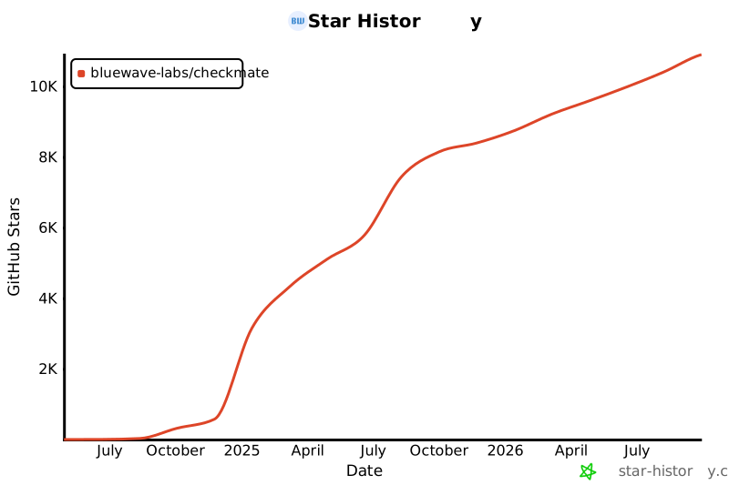](https://star-history.com/#bluewave-labs/Checkmate&Date)
|
||||
[](https://star-history.com/#bluewave-labs/bluewave-uptime&Date)
|
||||
|
||||
## Our sponsors
|
||||
|
||||
Thanks to [Gitbook](https://gitbook.io/) for giving us a free tier for their documentation platform, and [Poeditor](https://poeditor.com/) providing us a free account to use their i18n services. If you would like to sponsor Checkmate, please send an email to hello@bluewavelabs.ca
|
||||
|
||||
If you would like to sponsor a feature, [see this page](https://checkmate.so/sponsored-features).
|
||||
|
||||
Also check other developer and contributor-friendly projects of BlueWave:
|
||||
|
||||
- [VerifyWise](https://github.com/bluewave-labs/verifywise), the first open source AI governance platform.
|
||||
- [DataRoom](https://github.com/bluewave-labs/bluewave-dataroom), an secure file sharing application, aka dataroom.
|
||||
- [Guidefox](https://github.com/bluewave-labs/guidefox), an application that helps new users learn how to use your product via hints, tours, popups and banners.
|
||||
Generated
+123
-690
File diff suppressed because it is too large.
Load diff
+3
-6
@@ -13,7 +13,7 @@
|
||||
"format-check": "prettier --check ."
|
||||
},
|
||||
"lint-staged": {
|
||||
"**/*": "prettier --write"
|
||||
"**/*": "npm run format"
|
||||
},
|
||||
"dependencies": {
|
||||
"@emotion/react": "^11.13.3",
|
||||
@@ -25,7 +25,6 @@
|
||||
"@mui/x-charts": "7.29.1",
|
||||
"@mui/x-date-pickers": "7.29.4",
|
||||
"@reduxjs/toolkit": "2.7.0",
|
||||
"@types/maplibre-gl": "^1.13.2",
|
||||
"axios": "^1.7.4",
|
||||
"dayjs": "1.11.13",
|
||||
"flag-icons": "7.3.2",
|
||||
@@ -34,7 +33,6 @@
|
||||
"i18next": "25.4.2",
|
||||
"joi": "17.13.3",
|
||||
"lucide-react": "^0.562.0",
|
||||
"maplibre-gl": "^5.19.0",
|
||||
"mui-color-input": "^7.0.0",
|
||||
"pretty-bytes": "^7.1.0",
|
||||
"pretty-ms": "^9.3.0",
|
||||
@@ -43,7 +41,6 @@
|
||||
"react-hook-form": "^7.63.0",
|
||||
"react-i18next": "^15.4.0",
|
||||
"react-icons": "5.5.0",
|
||||
"react-map-gl": "^8.1.0",
|
||||
"react-redux": "9.2.0",
|
||||
"react-router": "^6.23.0",
|
||||
"react-router-dom": "^6.23.1",
|
||||
@@ -52,7 +49,7 @@
|
||||
"redux-persist": "6.0.0",
|
||||
"swr": "^2.3.6",
|
||||
"vite-plugin-svgr": "^4.2.0",
|
||||
"zod": "^4.3.6"
|
||||
"zod": "^4.1.11"
|
||||
},
|
||||
"devDependencies": {
|
||||
"@types/node": "24.5.2",
|
||||
@@ -66,6 +63,6 @@
|
||||
"lint-staged": "^16.2.7",
|
||||
"prettier": "^3.3.3",
|
||||
"typescript": "5.9.3",
|
||||
"vite": "6.4.1"
|
||||
"vite": "6.3.6"
|
||||
}
|
||||
}
|
||||
@@ -1,258 +0,0 @@
|
||||
/**
|
||||
* Locale Migration Script
|
||||
*
|
||||
* Restructures all non-English locale files to match en.json's nested key structure.
|
||||
* Recovers translations via safe key-matching strategies, uses English placeholders
|
||||
* for unmatched keys.
|
||||
*
|
||||
* Usage: npx tsx client/scripts/migrate-locales.ts
|
||||
*
|
||||
* SAFETY: en.json is NEVER modified. Originals are backed up before overwriting.
|
||||
*/
|
||||
|
||||
import fs from "fs";
|
||||
import path from "path";
|
||||
|
||||
const LOCALES_DIR = path.resolve(import.meta.dirname, "../src/locales");
|
||||
const BACKUP_DIR = path.join(LOCALES_DIR, "backup");
|
||||
const REPORT_PATH = path.join(LOCALES_DIR, "migration-report.json");
|
||||
|
||||
// ── Helpers ──────────────────────────────────────────────────────────────────
|
||||
|
||||
/** Flatten a nested object into { "a.b.c": value } pairs */
|
||||
function flattenKeys(obj: Record<string, unknown>, prefix = ""): Record<string, string> {
|
||||
const result: Record<string, string> = {};
|
||||
for (const [key, value] of Object.entries(obj)) {
|
||||
const fullPath = prefix ? `${prefix}.${key}` : key;
|
||||
if (typeof value === "object" && value !== null && !Array.isArray(value)) {
|
||||
Object.assign(result, flattenKeys(value as Record<string, unknown>, fullPath));
|
||||
} else {
|
||||
result[fullPath] = String(value);
|
||||
}
|
||||
}
|
||||
return result;
|
||||
}
|
||||
|
||||
/** Set a value at a dot-separated path in a nested object */
|
||||
function setNestedValue(
|
||||
obj: Record<string, unknown>,
|
||||
keyPath: string,
|
||||
value: string
|
||||
): void {
|
||||
const parts = keyPath.split(".");
|
||||
let current = obj;
|
||||
for (let i = 0; i < parts.length - 1; i++) {
|
||||
const part = parts[i];
|
||||
if (!(part in current) || typeof current[part] !== "object") {
|
||||
current[part] = {};
|
||||
}
|
||||
current = current[part] as Record<string, unknown>;
|
||||
}
|
||||
current[parts[parts.length - 1]] = value;
|
||||
}
|
||||
|
||||
// ── Build mapping indexes from en.json ───────────────────────────────────────
|
||||
|
||||
function buildIndexes(enFlat: Record<string, string>) {
|
||||
const enKeys = Object.keys(enFlat);
|
||||
|
||||
// last segment -> en key paths
|
||||
const lastSegIndex: Record<string, string[]> = {};
|
||||
// last 2 segments -> en key paths
|
||||
const suffixIndex: Record<string, string[]> = {};
|
||||
|
||||
for (const keyPath of enKeys) {
|
||||
const parts = keyPath.split(".");
|
||||
const lastSeg = parts[parts.length - 1].toLowerCase();
|
||||
if (!lastSegIndex[lastSeg]) lastSegIndex[lastSeg] = [];
|
||||
lastSegIndex[lastSeg].push(keyPath);
|
||||
|
||||
if (parts.length >= 2) {
|
||||
const suffix = parts.slice(-2).join(".").toLowerCase();
|
||||
if (!suffixIndex[suffix]) suffixIndex[suffix] = [];
|
||||
suffixIndex[suffix].push(keyPath);
|
||||
}
|
||||
}
|
||||
|
||||
return { lastSegIndex, suffixIndex };
|
||||
}
|
||||
|
||||
// ── Mapping logic ────────────────────────────────────────────────────────────
|
||||
|
||||
type MatchStrategy = "exact" | "suffix-2" | "unique-name" | "english-placeholder";
|
||||
|
||||
interface KeyMatch {
|
||||
enKey: string;
|
||||
value: string;
|
||||
strategy: MatchStrategy;
|
||||
}
|
||||
|
||||
function buildMigratedLocale(
|
||||
enFlat: Record<string, string>,
|
||||
langFlat: Record<string, string>,
|
||||
indexes: ReturnType<typeof buildIndexes>
|
||||
): { matches: KeyMatch[]; result: Record<string, unknown> } {
|
||||
const { lastSegIndex, suffixIndex } = indexes;
|
||||
const matches: KeyMatch[] = [];
|
||||
const result: Record<string, unknown> = {};
|
||||
|
||||
// Build reverse lookup: for each orphan key in lang, index by last segment and suffix
|
||||
const langByLastSeg: Record<string, { key: string; value: string }[]> = {};
|
||||
const langBySuffix: Record<string, { key: string; value: string }[]> = {};
|
||||
|
||||
for (const [langKey, langValue] of Object.entries(langFlat)) {
|
||||
const parts = langKey.split(".");
|
||||
const lastSeg = parts[parts.length - 1].toLowerCase();
|
||||
if (!langByLastSeg[lastSeg]) langByLastSeg[lastSeg] = [];
|
||||
langByLastSeg[lastSeg].push({ key: langKey, value: langValue });
|
||||
|
||||
if (parts.length >= 2) {
|
||||
const suffix = parts.slice(-2).join(".").toLowerCase();
|
||||
if (!langBySuffix[suffix]) langBySuffix[suffix] = [];
|
||||
langBySuffix[suffix].push({ key: langKey, value: langValue });
|
||||
}
|
||||
}
|
||||
|
||||
for (const enKey of Object.keys(enFlat)) {
|
||||
const enValue = enFlat[enKey];
|
||||
const parts = enKey.split(".");
|
||||
const lastSeg = parts[parts.length - 1].toLowerCase();
|
||||
const suffix = parts.length >= 2 ? parts.slice(-2).join(".").toLowerCase() : null;
|
||||
|
||||
// Strategy 1: Exact path match
|
||||
if (langFlat[enKey] !== undefined) {
|
||||
const value = langFlat[enKey];
|
||||
setNestedValue(result, enKey, value);
|
||||
matches.push({ enKey, value, strategy: "exact" });
|
||||
continue;
|
||||
}
|
||||
|
||||
// Strategy 2: 2-segment suffix match (lang key suffix matches en key suffix, both unique)
|
||||
if (suffix) {
|
||||
const enCandidates = suffixIndex[suffix];
|
||||
const langCandidates = langBySuffix[suffix];
|
||||
if (
|
||||
enCandidates &&
|
||||
enCandidates.length === 1 &&
|
||||
langCandidates &&
|
||||
langCandidates.length === 1
|
||||
) {
|
||||
const value = langCandidates[0].value;
|
||||
setNestedValue(result, enKey, value);
|
||||
matches.push({ enKey, value, strategy: "suffix-2" });
|
||||
continue;
|
||||
}
|
||||
}
|
||||
|
||||
// Strategy 3: Unique last-segment match
|
||||
const enCandidates = lastSegIndex[lastSeg];
|
||||
const langCandidates = langByLastSeg[lastSeg];
|
||||
if (
|
||||
enCandidates &&
|
||||
enCandidates.length === 1 &&
|
||||
langCandidates &&
|
||||
langCandidates.length === 1
|
||||
) {
|
||||
const value = langCandidates[0].value;
|
||||
setNestedValue(result, enKey, value);
|
||||
matches.push({ enKey, value, strategy: "unique-name" });
|
||||
continue;
|
||||
}
|
||||
|
||||
// No match — use English placeholder
|
||||
setNestedValue(result, enKey, enValue);
|
||||
matches.push({ enKey, value: enValue, strategy: "english-placeholder" });
|
||||
}
|
||||
|
||||
return { matches, result };
|
||||
}
|
||||
|
||||
// ── Main ─────────────────────────────────────────────────────────────────────
|
||||
|
||||
function main() {
|
||||
// Load en.json
|
||||
const enPath = path.join(LOCALES_DIR, "en.json");
|
||||
const en = JSON.parse(fs.readFileSync(enPath, "utf8"));
|
||||
const enFlat = flattenKeys(en);
|
||||
const enKeyCount = Object.keys(enFlat).length;
|
||||
const indexes = buildIndexes(enFlat);
|
||||
|
||||
console.log(`English: ${enKeyCount} keys (source of truth — NOT modified)\n`);
|
||||
|
||||
// Find all non-English locale files
|
||||
const localeFiles = fs
|
||||
.readdirSync(LOCALES_DIR)
|
||||
.filter(
|
||||
(f: string) =>
|
||||
f.endsWith(".json") && f !== "en.json" && f !== "migration-report.json"
|
||||
);
|
||||
|
||||
if (localeFiles.length === 0) {
|
||||
console.log("No locale files to migrate.");
|
||||
return;
|
||||
}
|
||||
|
||||
// Create backup directory
|
||||
if (!fs.existsSync(BACKUP_DIR)) {
|
||||
fs.mkdirSync(BACKUP_DIR, { recursive: true });
|
||||
}
|
||||
|
||||
const report: Record<
|
||||
string,
|
||||
{
|
||||
total: number;
|
||||
exact: number;
|
||||
suffix: number;
|
||||
uniqueName: number;
|
||||
placeholder: number;
|
||||
}
|
||||
> = {};
|
||||
|
||||
for (const file of localeFiles) {
|
||||
const lang = file.replace(".json", "");
|
||||
const filePath = path.join(LOCALES_DIR, file);
|
||||
|
||||
// Backup original
|
||||
const backupPath = path.join(BACKUP_DIR, file);
|
||||
fs.copyFileSync(filePath, backupPath);
|
||||
|
||||
// Load and flatten
|
||||
const langData = JSON.parse(fs.readFileSync(filePath, "utf8"));
|
||||
const langFlat = flattenKeys(langData);
|
||||
|
||||
// Migrate
|
||||
const { matches, result } = buildMigratedLocale(enFlat, langFlat, indexes);
|
||||
|
||||
// Write migrated file
|
||||
fs.writeFileSync(filePath, JSON.stringify(result, null, "\t") + "\n", "utf8");
|
||||
|
||||
// Compute stats
|
||||
const stats = {
|
||||
total: enKeyCount,
|
||||
exact: matches.filter((m) => m.strategy === "exact").length,
|
||||
suffix: matches.filter((m) => m.strategy === "suffix-2").length,
|
||||
uniqueName: matches.filter((m) => m.strategy === "unique-name").length,
|
||||
placeholder: matches.filter((m) => m.strategy === "english-placeholder").length,
|
||||
};
|
||||
report[lang] = stats;
|
||||
|
||||
const translated = stats.exact + stats.suffix + stats.uniqueName;
|
||||
const pct = ((translated / enKeyCount) * 100).toFixed(1);
|
||||
console.log(
|
||||
`${lang.padEnd(8)} ${String(translated).padStart(4)} translated (${pct}%) | ` +
|
||||
`exact: ${stats.exact} suffix: ${stats.suffix} name: ${stats.uniqueName} ` +
|
||||
`placeholder: ${stats.placeholder}`
|
||||
);
|
||||
}
|
||||
|
||||
// Write report
|
||||
fs.writeFileSync(REPORT_PATH, JSON.stringify(report, null, "\t") + "\n", "utf8");
|
||||
|
||||
const totalLangs = localeFiles.length;
|
||||
console.log(
|
||||
`\nMigrated ${totalLangs} locale files. Originals backed up to locales/backup/`
|
||||
);
|
||||
console.log(`Report written to ${REPORT_PATH}`);
|
||||
}
|
||||
|
||||
main();
|
||||
+28
-38
@@ -3,53 +3,43 @@ import { useSelector } from "react-redux";
|
||||
import "react-toastify/dist/ReactToastify.css";
|
||||
import { ToastContainer } from "react-toastify";
|
||||
import { ThemeProvider } from "@emotion/react";
|
||||
import lightTheme from "./Utils/Theme/lightTheme";
|
||||
import darkTheme from "./Utils/Theme/darkTheme";
|
||||
import { CssBaseline, GlobalStyles } from "@mui/material";
|
||||
import { SWRConfig } from "swr";
|
||||
import { Routes } from "./Routes";
|
||||
import AppLayout from "@/Components/layout/AppLayout";
|
||||
import AppLayout from "@/Components/v2/layout/AppLayout";
|
||||
import type { RootState } from "@/Types/state";
|
||||
import { lightTheme, darkTheme } from "@/Utils/Theme/Theme";
|
||||
|
||||
const swrConfig = {
|
||||
dedupingInterval: 5000,
|
||||
revalidateOnFocus: false,
|
||||
revalidateOnReconnect: true,
|
||||
shouldRetryOnError: false,
|
||||
errorRetryCount: 2,
|
||||
errorRetryInterval: 1000,
|
||||
focusThrottleInterval: 5000,
|
||||
};
|
||||
|
||||
function App() {
|
||||
const mode = useSelector((state: RootState) => state.ui.mode);
|
||||
|
||||
const theme = mode === "light" ? lightTheme : darkTheme;
|
||||
|
||||
return (
|
||||
<SWRConfig value={swrConfig}>
|
||||
<ThemeProvider theme={theme}>
|
||||
<CssBaseline />
|
||||
<GlobalStyles
|
||||
styles={{
|
||||
body: {
|
||||
backgroundColor: theme.palette.background.default,
|
||||
},
|
||||
}}
|
||||
/>
|
||||
<AppLayout>
|
||||
<Routes />
|
||||
</AppLayout>
|
||||
<ToastContainer
|
||||
newestOnTop={true}
|
||||
theme={mode}
|
||||
style={
|
||||
{
|
||||
"--toastify-color-progress-light": "#7C8BA1",
|
||||
"--toastify-color-progress-dark": "#7C8BA1",
|
||||
} as CSSProperties
|
||||
}
|
||||
/>
|
||||
</ThemeProvider>
|
||||
</SWRConfig>
|
||||
<ThemeProvider theme={theme}>
|
||||
<CssBaseline />
|
||||
<GlobalStyles
|
||||
styles={{
|
||||
body: {
|
||||
// @ts-ignore
|
||||
backgroundColor: theme.palette.background.main,
|
||||
},
|
||||
}}
|
||||
/>
|
||||
<AppLayout>
|
||||
<Routes />
|
||||
</AppLayout>
|
||||
<ToastContainer
|
||||
newestOnTop={true}
|
||||
theme={mode}
|
||||
style={
|
||||
{
|
||||
"--toastify-color-progress-light": "#7C8BA1",
|
||||
"--toastify-color-progress-dark": "#7C8BA1",
|
||||
} as CSSProperties
|
||||
}
|
||||
/>
|
||||
</ThemeProvider>
|
||||
);
|
||||
}
|
||||
|
||||
|
||||
@@ -1,5 +0,0 @@
|
||||
export * from "./charts/HistogramResponseTime";
|
||||
export * from "./charts/HeatmapResponseTime";
|
||||
export * from "./charts/HeatmapResponseTimeTooltip";
|
||||
export * from "./controls/HeaderCreate";
|
||||
export * from "./controls/HeaderTimeRange";
|
||||
@@ -1,203 +0,0 @@
|
||||
import { useRef, useEffect, useState } from "react";
|
||||
import { Box, Typography, Stack, useTheme, GlobalStyles } from "@mui/material";
|
||||
import Map, { Marker, Popup } from "react-map-gl/maplibre";
|
||||
import type { MapRef } from "react-map-gl/maplibre";
|
||||
import type { FlatGeoCheck } from "@/Types/GeoCheck";
|
||||
import "maplibre-gl/dist/maplibre-gl.css";
|
||||
|
||||
interface GeoChecksMapProps {
|
||||
geoChecks: FlatGeoCheck[];
|
||||
}
|
||||
|
||||
export const GeoChecksMap = ({ geoChecks }: GeoChecksMapProps) => {
|
||||
const mapRef = useRef<MapRef>(null);
|
||||
const [selectedCheck, setSelectedCheck] = useState<FlatGeoCheck | null>(null);
|
||||
const theme = useTheme();
|
||||
const isDarkMode = theme.palette.mode === "dark";
|
||||
|
||||
const mapPopupStyles = (
|
||||
<GlobalStyles
|
||||
styles={{
|
||||
".maplibregl-popup-content": {
|
||||
background: "transparent !important",
|
||||
padding: "0 !important",
|
||||
boxShadow: "none !important",
|
||||
},
|
||||
".maplibregl-popup-tip": {
|
||||
display: "none",
|
||||
},
|
||||
".maplibregl-ctrl-attrib": {
|
||||
display: "none",
|
||||
},
|
||||
".maplibregl-ctrl-logo": {
|
||||
display: "none",
|
||||
},
|
||||
".maplibregl-popup-close-button": {
|
||||
color: theme.palette.text.primary,
|
||||
background: "transparent",
|
||||
fontSize: "20px",
|
||||
padding: "4px",
|
||||
"&:hover": {
|
||||
backgroundColor: theme.palette.action.hover,
|
||||
},
|
||||
},
|
||||
}}
|
||||
/>
|
||||
);
|
||||
|
||||
useEffect(() => {
|
||||
if (geoChecks.length === 0 || !mapRef.current) return;
|
||||
|
||||
const bounds = geoChecks.reduce(
|
||||
(acc, check) => {
|
||||
return {
|
||||
minLng: Math.min(acc.minLng, check.location.longitude),
|
||||
maxLng: Math.max(acc.maxLng, check.location.longitude),
|
||||
minLat: Math.min(acc.minLat, check.location.latitude),
|
||||
maxLat: Math.max(acc.maxLat, check.location.latitude),
|
||||
};
|
||||
},
|
||||
{
|
||||
minLng: Infinity,
|
||||
maxLng: -Infinity,
|
||||
minLat: Infinity,
|
||||
maxLat: -Infinity,
|
||||
}
|
||||
);
|
||||
|
||||
if (bounds.minLng !== Infinity) {
|
||||
mapRef.current.fitBounds(
|
||||
[
|
||||
[bounds.minLng, bounds.minLat],
|
||||
[bounds.maxLng, bounds.maxLat],
|
||||
],
|
||||
{ padding: 50, duration: 1000 }
|
||||
);
|
||||
}
|
||||
}, [geoChecks]);
|
||||
|
||||
const getMarkerColor = (status: boolean): string => {
|
||||
return status ? theme.palette.success.main : theme.palette.error.main;
|
||||
};
|
||||
|
||||
const formatResponseTime = (timing: number): string => {
|
||||
return `${timing.toFixed(0)}ms`;
|
||||
};
|
||||
|
||||
return (
|
||||
<>
|
||||
{mapPopupStyles}
|
||||
<Box
|
||||
height={500}
|
||||
width={"100%"}
|
||||
borderRadius={theme.shape.borderRadius}
|
||||
overflow={"hidden"}
|
||||
>
|
||||
<Map
|
||||
ref={mapRef}
|
||||
initialViewState={{
|
||||
longitude: 0,
|
||||
latitude: 20,
|
||||
zoom: 1.5,
|
||||
}}
|
||||
style={{ height: "100%", width: "100%" }}
|
||||
mapStyle={
|
||||
isDarkMode
|
||||
? "https://basemaps.cartocdn.com/gl/dark-matter-gl-style/style.json"
|
||||
: "https://basemaps.cartocdn.com/gl/positron-gl-style/style.json"
|
||||
}
|
||||
>
|
||||
{geoChecks.map((check, index) => (
|
||||
<Marker
|
||||
key={`${check.id}-${index}`}
|
||||
longitude={check.location.longitude}
|
||||
latitude={check.location.latitude}
|
||||
anchor="bottom"
|
||||
onClick={(e: any) => {
|
||||
e.originalEvent.stopPropagation();
|
||||
setSelectedCheck(check);
|
||||
}}
|
||||
>
|
||||
<div
|
||||
style={{
|
||||
width: "10px",
|
||||
height: "10px",
|
||||
borderRadius: "50%",
|
||||
backgroundColor: getMarkerColor(check.status),
|
||||
boxShadow: "0 2px 4px rgba(0,0,0,0.3)",
|
||||
cursor: "pointer",
|
||||
}}
|
||||
/>
|
||||
</Marker>
|
||||
))}
|
||||
|
||||
{selectedCheck && (
|
||||
<Popup
|
||||
longitude={selectedCheck.location.longitude}
|
||||
latitude={selectedCheck.location.latitude}
|
||||
anchor="top"
|
||||
onClose={() => setSelectedCheck(null)}
|
||||
closeOnClick={false}
|
||||
>
|
||||
<Box
|
||||
sx={{
|
||||
minWidth: 200,
|
||||
p: theme.spacing(4),
|
||||
bgcolor: theme.palette.background.paper,
|
||||
borderWidth: 1,
|
||||
borderStyle: "solid",
|
||||
borderColor: theme.palette.divider,
|
||||
borderRadius: 1,
|
||||
}}
|
||||
>
|
||||
<Typography
|
||||
variant="subtitle1"
|
||||
fontWeight="bold"
|
||||
gutterBottom
|
||||
>
|
||||
{selectedCheck.location.city}, {selectedCheck.location.country}
|
||||
</Typography>
|
||||
<Stack spacing={0.5}>
|
||||
<Typography variant="body2">
|
||||
<Typography
|
||||
component="span"
|
||||
fontWeight="medium"
|
||||
>
|
||||
Status:
|
||||
</Typography>{" "}
|
||||
{selectedCheck.status ? "Up" : "Down"}
|
||||
</Typography>
|
||||
<Typography variant="body2">
|
||||
<Typography
|
||||
component="span"
|
||||
fontWeight="medium"
|
||||
>
|
||||
Status Code:
|
||||
</Typography>{" "}
|
||||
{selectedCheck.statusCode}
|
||||
</Typography>
|
||||
<Typography variant="body2">
|
||||
<Typography
|
||||
component="span"
|
||||
fontWeight="medium"
|
||||
>
|
||||
Response Time:
|
||||
</Typography>{" "}
|
||||
{formatResponseTime(selectedCheck.timings.total)}
|
||||
</Typography>
|
||||
<Typography
|
||||
variant="caption"
|
||||
color="text.secondary"
|
||||
sx={{ mt: 0.5 }}
|
||||
>
|
||||
{new Date(selectedCheck.createdAt).toLocaleString()}
|
||||
</Typography>
|
||||
</Stack>
|
||||
</Box>
|
||||
</Popup>
|
||||
)}
|
||||
</Map>
|
||||
</Box>
|
||||
</>
|
||||
);
|
||||
};
|
||||
@@ -1,54 +0,0 @@
|
||||
import Stack from "@mui/material/Stack";
|
||||
import { Tabs, Tab } from "@/Components/design-elements";
|
||||
import { useTheme } from "@mui/material/styles";
|
||||
import { useTranslation } from "react-i18next";
|
||||
import type { GeoContinent } from "@/Types/GeoCheck";
|
||||
|
||||
interface HeaderGeoTabsProps {
|
||||
geoCheckEnabled: boolean;
|
||||
locations: GeoContinent[] | undefined;
|
||||
selectedLocation: GeoContinent;
|
||||
onLocationChange: (location: GeoContinent) => void;
|
||||
}
|
||||
|
||||
export const HeaderGeoTabs = ({
|
||||
geoCheckEnabled,
|
||||
locations,
|
||||
selectedLocation,
|
||||
onLocationChange,
|
||||
}: HeaderGeoTabsProps) => {
|
||||
const { t } = useTranslation();
|
||||
const theme = useTheme();
|
||||
|
||||
if (!geoCheckEnabled || !locations || locations.length === 0) {
|
||||
return null;
|
||||
}
|
||||
|
||||
const handleChange = (_event: React.SyntheticEvent, newValue: GeoContinent) => {
|
||||
onLocationChange(newValue);
|
||||
};
|
||||
|
||||
return (
|
||||
<Stack
|
||||
spacing={{ xs: theme.spacing(8), md: 0 }}
|
||||
direction={{ xs: "column", md: "row" }}
|
||||
alignItems={"center"}
|
||||
justifyContent={"flex-start"}
|
||||
>
|
||||
<Tabs
|
||||
value={selectedLocation}
|
||||
onChange={handleChange}
|
||||
>
|
||||
{locations.map((location) => (
|
||||
<Tab
|
||||
key={location}
|
||||
label={t(
|
||||
`pages.createMonitor.form.geoChecks.option.locations.options.${location}`
|
||||
)}
|
||||
value={location}
|
||||
/>
|
||||
))}
|
||||
</Tabs>
|
||||
</Stack>
|
||||
);
|
||||
};
|
||||
@@ -0,0 +1,29 @@
|
||||
import Icon from "../Icon";
|
||||
import PropTypes from "prop-types";
|
||||
|
||||
const ArrowRight = ({ type, color = "#667085", ...props }) => {
|
||||
if (type === "double") {
|
||||
return (
|
||||
<Icon
|
||||
name="ChevronsRight"
|
||||
color={color}
|
||||
{...props}
|
||||
/>
|
||||
);
|
||||
} else {
|
||||
return (
|
||||
<Icon
|
||||
name="ChevronRight"
|
||||
color={color}
|
||||
{...props}
|
||||
/>
|
||||
);
|
||||
}
|
||||
};
|
||||
|
||||
ArrowRight.propTypes = {
|
||||
type: PropTypes.oneOf(["double", "default"]),
|
||||
color: PropTypes.string,
|
||||
};
|
||||
|
||||
export default ArrowRight;
|
||||
@@ -0,0 +1,21 @@
|
||||
.MuiBreadcrumbs-root {
|
||||
min-height: 34px;
|
||||
}
|
||||
.MuiBreadcrumbs-root svg {
|
||||
width: 16px;
|
||||
min-height: 16px;
|
||||
}
|
||||
.MuiBreadcrumbs-root .MuiBreadcrumbs-li a {
|
||||
font-weight: 400;
|
||||
}
|
||||
.MuiBreadcrumbs-root .MuiBreadcrumbs-li:not(:last-child) {
|
||||
cursor: pointer;
|
||||
}
|
||||
.MuiBreadcrumbs-root .MuiBreadcrumbs-li:last-child a {
|
||||
font-weight: 500;
|
||||
opacity: 1;
|
||||
cursor: default;
|
||||
}
|
||||
.MuiBreadcrumbs-root .MuiBreadcrumbs-separator {
|
||||
margin: 0;
|
||||
}
|
||||
@@ -0,0 +1,78 @@
|
||||
import PropTypes from "prop-types";
|
||||
import { Box, Breadcrumbs as MUIBreadcrumbs } from "@mui/material";
|
||||
import { useTheme } from "@emotion/react";
|
||||
import { useNavigate } from "react-router-dom";
|
||||
import ArrowRight from "../ArrowRight/index.jsx";
|
||||
import "./index.css";
|
||||
|
||||
/**
|
||||
* Breadcrumbs component that displays a list of breadcrumb items.
|
||||
*
|
||||
* @param {Object} props
|
||||
* @param {Array} props.list - Array of breadcrumb items. Each item should have `name` and `path` properties.
|
||||
* @param {string} props.list.name - The name to display for the breadcrumb.
|
||||
* @param {string} props.list.path - The path to navigate to when the breadcrumb is clicked.
|
||||
*
|
||||
* @returns {JSX.Element} The rendered Breadcrumbs component.
|
||||
*/
|
||||
|
||||
const Breadcrumbs = ({ list }) => {
|
||||
const theme = useTheme();
|
||||
const navigate = useNavigate();
|
||||
|
||||
return (
|
||||
<MUIBreadcrumbs
|
||||
separator={<ArrowRight />}
|
||||
aria-label="breadcrumb"
|
||||
px={theme.spacing(2)}
|
||||
py={theme.spacing(3.5)}
|
||||
width="fit-content"
|
||||
backgroundColor={theme.palette.secondary.main}
|
||||
borderRadius={theme.shape.borderRadius}
|
||||
lineHeight="18px"
|
||||
sx={{
|
||||
"& .MuiBreadcrumbs-li a": {
|
||||
transition: "background-color 0.2s ease-in-out, color 0.2s ease-in-out",
|
||||
},
|
||||
"& .MuiBreadcrumbs-li:not(:last-of-type):hover a": {
|
||||
backgroundColor: theme.palette.secondary.contrastText,
|
||||
color: theme.palette.secondary.main,
|
||||
},
|
||||
}}
|
||||
>
|
||||
{list.map((item, index) => {
|
||||
return (
|
||||
<Box
|
||||
component="a"
|
||||
key={`${item.name}-${index}`}
|
||||
px={theme.spacing(4)}
|
||||
pt={theme.spacing(2)}
|
||||
pb={theme.spacing(3)}
|
||||
borderRadius={theme.shape.borderRadius}
|
||||
onClick={() => navigate(item.path)}
|
||||
sx={{
|
||||
opacity: 0.8,
|
||||
textTransform: "capitalize",
|
||||
"&, &:hover": {
|
||||
color: theme.palette.secondary.contrastText,
|
||||
},
|
||||
}}
|
||||
>
|
||||
{item.name}
|
||||
</Box>
|
||||
);
|
||||
})}
|
||||
</MUIBreadcrumbs>
|
||||
);
|
||||
};
|
||||
|
||||
Breadcrumbs.propTypes = {
|
||||
list: PropTypes.arrayOf(
|
||||
PropTypes.shape({
|
||||
name: PropTypes.string.isRequired,
|
||||
path: PropTypes.string.isRequired,
|
||||
}).isRequired
|
||||
).isRequired,
|
||||
};
|
||||
|
||||
export default Breadcrumbs;
|
||||
@@ -0,0 +1,39 @@
|
||||
import { Stack, styled } from "@mui/material";
|
||||
|
||||
const ConfigBox = styled(Stack)(({ theme }) => ({
|
||||
display: "flex",
|
||||
flexDirection: "row",
|
||||
justifyContent: "space-between",
|
||||
backgroundColor: theme.palette.primary.main,
|
||||
border: 1,
|
||||
borderStyle: "solid",
|
||||
borderColor: theme.palette.primary.lowContrast,
|
||||
borderRadius: theme.spacing(2),
|
||||
"& > *": {
|
||||
paddingTop: theme.spacing(15),
|
||||
paddingBottom: theme.spacing(15),
|
||||
},
|
||||
"& > div:first-of-type": {
|
||||
flex: 0.7,
|
||||
borderRight: 1,
|
||||
borderRightStyle: "solid",
|
||||
borderRightColor: theme.palette.primary.lowContrast,
|
||||
paddingRight: theme.spacing(15),
|
||||
paddingLeft: theme.spacing(15),
|
||||
backgroundColor: theme.palette.tertiary.background,
|
||||
"& :is(h1, h2):first-of-type": {
|
||||
fontWeight: 600,
|
||||
marginBottom: theme.spacing(4),
|
||||
},
|
||||
},
|
||||
"& > div:last-of-type": {
|
||||
flex: 1,
|
||||
paddingRight: theme.spacing(20),
|
||||
paddingLeft: theme.spacing(20),
|
||||
},
|
||||
"& h1, & h2": {
|
||||
color: theme.palette.primary.contrastTextSecondary,
|
||||
},
|
||||
}));
|
||||
|
||||
export default ConfigBox;
|
||||
@@ -0,0 +1,73 @@
|
||||
import { useId } from "react";
|
||||
import PropTypes from "prop-types";
|
||||
import { Modal, Stack, Typography } from "@mui/material";
|
||||
|
||||
const GenericDialog = ({ title, description, open, onClose, theme, children, width }) => {
|
||||
const titleId = useId();
|
||||
const descriptionId = useId();
|
||||
const ariaDescribedBy = description?.length > 0 ? descriptionId : "";
|
||||
return (
|
||||
<Modal
|
||||
aria-labelledby={titleId}
|
||||
aria-describedby={ariaDescribedBy}
|
||||
open={open}
|
||||
onClose={onClose}
|
||||
onClick={(e) => e.stopPropagation()}
|
||||
>
|
||||
<Stack
|
||||
gap={theme.spacing(2)}
|
||||
width={width}
|
||||
sx={{
|
||||
position: "absolute",
|
||||
top: "50%",
|
||||
left: "50%",
|
||||
transform: "translate(-50%, -50%)",
|
||||
minWidth: 400,
|
||||
bgcolor: theme.palette.primary.main,
|
||||
border: 1,
|
||||
borderColor: theme.palette.primary.lowContrast,
|
||||
borderRadius: theme.shape.borderRadius,
|
||||
boxShadow: 24,
|
||||
p: theme.spacing(15),
|
||||
"&:focus": {
|
||||
outline: "none",
|
||||
},
|
||||
}}
|
||||
>
|
||||
<Typography
|
||||
id={titleId}
|
||||
component="h2"
|
||||
fontSize={16}
|
||||
color={theme.palette.primary.contrastText}
|
||||
fontWeight={600}
|
||||
marginBottom={theme.spacing(4)}
|
||||
>
|
||||
{title}
|
||||
</Typography>
|
||||
{description && (
|
||||
<Typography
|
||||
id={descriptionId}
|
||||
color={theme.palette.primary.contrastTextTertiary}
|
||||
marginBottom={theme.spacing(4)}
|
||||
>
|
||||
{description}
|
||||
</Typography>
|
||||
)}
|
||||
{children}
|
||||
</Stack>
|
||||
</Modal>
|
||||
);
|
||||
};
|
||||
|
||||
GenericDialog.propTypes = {
|
||||
title: PropTypes.string.isRequired,
|
||||
description: PropTypes.string,
|
||||
open: PropTypes.bool.isRequired,
|
||||
onClose: PropTypes.func.isRequired,
|
||||
theme: PropTypes.object.isRequired,
|
||||
children: PropTypes.oneOfType([PropTypes.arrayOf(PropTypes.node), PropTypes.node])
|
||||
.isRequired,
|
||||
width: PropTypes.oneOfType([PropTypes.string, PropTypes.number, PropTypes.object]),
|
||||
};
|
||||
|
||||
export { GenericDialog };
|
||||
@@ -0,0 +1,63 @@
|
||||
import PropTypes from "prop-types";
|
||||
import { Button, Stack } from "@mui/material";
|
||||
import { GenericDialog } from "./genericDialog.jsx";
|
||||
import { useTheme } from "@emotion/react";
|
||||
import { useTranslation } from "react-i18next";
|
||||
|
||||
const Dialog = ({
|
||||
title,
|
||||
description,
|
||||
open,
|
||||
onCancel,
|
||||
confirmationButtonLabel,
|
||||
onConfirm,
|
||||
isLoading,
|
||||
}) => {
|
||||
const theme = useTheme();
|
||||
const { t } = useTranslation();
|
||||
|
||||
return (
|
||||
<GenericDialog
|
||||
title={title}
|
||||
description={description}
|
||||
open={open}
|
||||
onClose={onCancel}
|
||||
theme={theme}
|
||||
>
|
||||
<Stack
|
||||
direction="row"
|
||||
gap={theme.spacing(4)}
|
||||
mt={theme.spacing(12)}
|
||||
justifyContent="flex-end"
|
||||
>
|
||||
<Button
|
||||
variant="contained"
|
||||
color="secondary"
|
||||
onClick={onCancel}
|
||||
>
|
||||
{t("cancel", "Cancel")}
|
||||
</Button>
|
||||
<Button
|
||||
variant="contained"
|
||||
color="error"
|
||||
loading={isLoading}
|
||||
onClick={onConfirm}
|
||||
>
|
||||
{confirmationButtonLabel}
|
||||
</Button>
|
||||
</Stack>
|
||||
</GenericDialog>
|
||||
);
|
||||
};
|
||||
|
||||
Dialog.propTypes = {
|
||||
title: PropTypes.string.isRequired,
|
||||
description: PropTypes.string,
|
||||
open: PropTypes.bool.isRequired,
|
||||
onCancel: PropTypes.func.isRequired,
|
||||
confirmationButtonLabel: PropTypes.string.isRequired,
|
||||
onConfirm: PropTypes.func.isRequired,
|
||||
isLoading: PropTypes.bool,
|
||||
};
|
||||
|
||||
export default Dialog;
|
||||
@@ -0,0 +1,120 @@
|
||||
/**
|
||||
* Maps legacy icon names to Lucide icon names
|
||||
* Use: import { iconMap } from './iconMap'; LucideIcons[iconMap['monitors']]
|
||||
*/
|
||||
export const iconMap = {
|
||||
// Navigation/Sidebar icons
|
||||
monitors: "Globe",
|
||||
incidents: "AlertTriangle",
|
||||
integrations: "Link",
|
||||
"page-speed": "Gauge",
|
||||
settings: "Settings",
|
||||
notifications: "Bell",
|
||||
maintenance: "Wrench",
|
||||
"status-pages": "Wifi",
|
||||
docs: "FileText",
|
||||
discussions: "MessageCircle",
|
||||
support: "HelpCircle",
|
||||
changeLog: "Code",
|
||||
logs: "Database",
|
||||
|
||||
// User icons
|
||||
user: "User",
|
||||
"user-two": "Users",
|
||||
"user-edit": "UserPen",
|
||||
groups: "Users",
|
||||
lock: "Lock",
|
||||
key: "Key",
|
||||
logout: "LogOut",
|
||||
|
||||
// Action icons
|
||||
edit: "Pencil",
|
||||
"trash-bin": "Trash2",
|
||||
search: "Search",
|
||||
"close-icon": "X",
|
||||
check: "Check",
|
||||
"check-icon": "CheckCircle",
|
||||
"check-outlined": "CheckCircle",
|
||||
|
||||
// Arrow icons
|
||||
"left-arrow": "ChevronLeft",
|
||||
"right-arrow": "ChevronRight",
|
||||
"up-arrow": "ChevronUp",
|
||||
"down-arrow": "ChevronDown",
|
||||
"left-arrow-double": "ChevronsLeft",
|
||||
"right-arrow-double": "ChevronsRight",
|
||||
"left-arrow-long": "ArrowLeft",
|
||||
"top-right-arrow": "ArrowUpRight",
|
||||
"open-in-new-page": "ExternalLink",
|
||||
"selector-vertical": "ChevronsUpDown",
|
||||
|
||||
// Status/Alert icons
|
||||
"alert-icon": "Bell",
|
||||
"warning-icon": "AlertCircle",
|
||||
"history-icon": "History",
|
||||
|
||||
// Data/Chart icons
|
||||
dashboard: "LayoutGrid",
|
||||
"monitor-graph-line": "TrendingUp",
|
||||
"response-time-icon": "TrendingUp",
|
||||
"uptime-icon": "Activity",
|
||||
"speedometer-icon": "Gauge",
|
||||
"spedometer-icon": "Gauge",
|
||||
"ruler-icon": "Ruler",
|
||||
"performance-report": "Layers",
|
||||
"average-response-icon": "BarChart3",
|
||||
"distributed-uptime": "Network",
|
||||
|
||||
// Misc icons
|
||||
calendar: "Calendar",
|
||||
"calendar-check": "CalendarCheck",
|
||||
"clock-snooze": "Clock",
|
||||
mail: "Mail",
|
||||
email: "Mail",
|
||||
folder: "Folder",
|
||||
"dots-vertical": "MoreVertical",
|
||||
"pause-icon": "PauseCircle",
|
||||
"resume-icon": "PlayCircle",
|
||||
"checkbox-filled": "CheckSquare",
|
||||
"checkbox-outline": "Square",
|
||||
"radio-checked": "Circle",
|
||||
"cpu-chip": "Cpu",
|
||||
certificate: "Award",
|
||||
"interval-check": "RefreshCw",
|
||||
};
|
||||
|
||||
/**
|
||||
* MUI icon to Lucide mapping
|
||||
*/
|
||||
export const muiToLucideMap = {
|
||||
AddCircleOutline: "PlusCircle",
|
||||
ArrowDownwardRounded: "ArrowDown",
|
||||
ArrowUpwardRounded: "ArrowUp",
|
||||
ArrowDropDown: "ChevronDown",
|
||||
ArrowOutward: "ExternalLink",
|
||||
CheckCircle: "CheckCircle2",
|
||||
Clear: "X",
|
||||
Close: "X",
|
||||
CloseRounded: "X",
|
||||
CloudUpload: "Upload",
|
||||
Delete: "Trash2",
|
||||
DeleteOutlineRounded: "Trash2",
|
||||
Email: "Mail",
|
||||
ErrorOutline: "AlertTriangle",
|
||||
ErrorOutlineOutlined: "AlertTriangle",
|
||||
Image: "ImageIcon",
|
||||
InfoOutlined: "Info",
|
||||
KeyboardArrowDown: "ChevronDown",
|
||||
Menu: "Menu",
|
||||
PauseCircleOutline: "PauseCircle",
|
||||
PauseOutlined: "Pause",
|
||||
PlayArrowOutlined: "Play",
|
||||
PlayCircleOutlineRounded: "PlayCircle",
|
||||
RadioButtonChecked: "Circle",
|
||||
ReorderRounded: "GripVertical",
|
||||
SettingsOutlined: "Settings",
|
||||
Share: "Share2",
|
||||
Visibility: "Eye",
|
||||
VisibilityOff: "EyeOff",
|
||||
WarningAmberOutlined: "AlertTriangle",
|
||||
};
|
||||
@@ -0,0 +1,198 @@
|
||||
import { useTheme } from "@mui/material";
|
||||
import PropTypes from "prop-types";
|
||||
import {
|
||||
Activity,
|
||||
AlertCircle,
|
||||
AlertTriangle,
|
||||
ArrowDown,
|
||||
ArrowLeft,
|
||||
ArrowUp,
|
||||
ArrowUpRight,
|
||||
Bell,
|
||||
Calendar,
|
||||
Check,
|
||||
CheckCircle,
|
||||
CheckCircle2,
|
||||
CheckSquare,
|
||||
ChevronDown,
|
||||
ChevronLeft,
|
||||
ChevronRight,
|
||||
ChevronsLeft,
|
||||
ChevronsRight,
|
||||
ChevronsUpDown,
|
||||
Circle,
|
||||
CircleDot,
|
||||
Clock,
|
||||
Code,
|
||||
Cpu,
|
||||
Database,
|
||||
ExternalLink,
|
||||
Eye,
|
||||
EyeOff,
|
||||
FileText,
|
||||
Gauge,
|
||||
Globe,
|
||||
GripVertical,
|
||||
HelpCircle,
|
||||
History,
|
||||
Image as ImageIcon,
|
||||
Info,
|
||||
Key,
|
||||
Layers,
|
||||
Link,
|
||||
Lock,
|
||||
LogOut,
|
||||
Mail,
|
||||
Menu,
|
||||
MessageCircle,
|
||||
MoreVertical,
|
||||
Pause,
|
||||
PauseCircle,
|
||||
Play,
|
||||
PlayCircle,
|
||||
PlusCircle,
|
||||
RefreshCw,
|
||||
Ruler,
|
||||
Search,
|
||||
Settings,
|
||||
Square,
|
||||
Trash2,
|
||||
TrendingUp,
|
||||
Upload,
|
||||
User,
|
||||
Users,
|
||||
Wifi,
|
||||
Wrench,
|
||||
X,
|
||||
} from "lucide-react";
|
||||
|
||||
/**
|
||||
* Map of icon names to Lucide icon components.
|
||||
* Only icons explicitly imported here will be included in the bundle (tree-shaking).
|
||||
* To add a new icon: import it above and add it to this object.
|
||||
*/
|
||||
const iconComponents = {
|
||||
Activity,
|
||||
AlertCircle,
|
||||
AlertTriangle,
|
||||
ArrowDown,
|
||||
ArrowLeft,
|
||||
ArrowUp,
|
||||
ArrowUpRight,
|
||||
Bell,
|
||||
Calendar,
|
||||
Check,
|
||||
CheckCircle,
|
||||
CheckCircle2,
|
||||
CheckSquare,
|
||||
ChevronDown,
|
||||
ChevronLeft,
|
||||
ChevronRight,
|
||||
ChevronsLeft,
|
||||
ChevronsRight,
|
||||
ChevronsUpDown,
|
||||
Circle,
|
||||
CircleDot,
|
||||
Clock,
|
||||
Code,
|
||||
Cpu,
|
||||
Database,
|
||||
ExternalLink,
|
||||
Eye,
|
||||
EyeOff,
|
||||
FileText,
|
||||
Gauge,
|
||||
Globe,
|
||||
GripVertical,
|
||||
HelpCircle,
|
||||
History,
|
||||
Image: ImageIcon,
|
||||
Info,
|
||||
Key,
|
||||
Layers,
|
||||
Link,
|
||||
Lock,
|
||||
LogOut,
|
||||
Mail,
|
||||
Menu,
|
||||
MessageCircle,
|
||||
MoreVertical,
|
||||
Pause,
|
||||
PauseCircle,
|
||||
Play,
|
||||
PlayCircle,
|
||||
PlusCircle,
|
||||
RefreshCw,
|
||||
Ruler,
|
||||
Search,
|
||||
Settings,
|
||||
Square,
|
||||
Trash2,
|
||||
TrendingUp,
|
||||
Upload,
|
||||
User,
|
||||
Users,
|
||||
Wifi,
|
||||
Wrench,
|
||||
X,
|
||||
};
|
||||
|
||||
/**
|
||||
* Theme-aware icon component wrapping Lucide icons
|
||||
*
|
||||
* @param {string} name - Lucide icon name (e.g., "Bell", "Check", "ArrowLeft")
|
||||
* @param {number} size - Icon size in pixels (default: 20)
|
||||
* @param {string} color - Direct color value OR theme path like "primary.contrastText"
|
||||
* @param {number} strokeWidth - Stroke width (default: 1.5)
|
||||
* @param {string} fill - Fill color (default: "none")
|
||||
*/
|
||||
const Icon = ({ name, size = 20, color, strokeWidth = 1.5, fill = "none", ...props }) => {
|
||||
const theme = useTheme();
|
||||
|
||||
// Resolve color from theme path or use direct value
|
||||
const resolveColor = (colorValue) => {
|
||||
if (!colorValue) {
|
||||
return theme.palette.primary.contrastTextTertiary; // Default icon color
|
||||
}
|
||||
|
||||
// If it's a theme path like "primary.contrastText"
|
||||
if (typeof colorValue === "string" && colorValue.includes(".")) {
|
||||
const parts = colorValue.split(".");
|
||||
let resolved = theme.palette;
|
||||
for (const part of parts) {
|
||||
resolved = resolved?.[part];
|
||||
}
|
||||
return resolved || colorValue;
|
||||
}
|
||||
|
||||
// Direct color value
|
||||
return colorValue;
|
||||
};
|
||||
|
||||
const LucideIcon = iconComponents[name];
|
||||
|
||||
if (!LucideIcon) {
|
||||
console.warn(`Icon "${name}" not found in Icon component`);
|
||||
return null;
|
||||
}
|
||||
|
||||
return (
|
||||
<LucideIcon
|
||||
size={size}
|
||||
color={resolveColor(color)}
|
||||
strokeWidth={strokeWidth}
|
||||
fill={fill}
|
||||
{...props}
|
||||
/>
|
||||
);
|
||||
};
|
||||
|
||||
Icon.propTypes = {
|
||||
name: PropTypes.string.isRequired,
|
||||
size: PropTypes.number,
|
||||
color: PropTypes.string,
|
||||
strokeWidth: PropTypes.number,
|
||||
fill: PropTypes.string,
|
||||
};
|
||||
|
||||
export default Icon;
|
||||
@@ -0,0 +1,116 @@
|
||||
import PropTypes from "prop-types";
|
||||
import { FormControlLabel, Checkbox as MuiCheckbox } from "@mui/material";
|
||||
import { useTheme } from "@emotion/react";
|
||||
import Icon from "../../Icon";
|
||||
|
||||
/**
|
||||
* Checkbox Component
|
||||
*
|
||||
* A customized checkbox component using Material-UI that supports custom sizing,
|
||||
* disabled states, and custom icons.
|
||||
*
|
||||
* @component
|
||||
* @param {Object} props - Component properties
|
||||
* @param {string} props.id - Unique identifier for the checkbox input
|
||||
* @param {string} [props.name] - Optional name attribute for the checkbox
|
||||
* @param {(string|React.ReactNode)} props.label - Label text or node for the checkbox
|
||||
* @param {('small'|'medium'|'large')} [props.size='medium'] - Size of the checkbox icon
|
||||
* @param {boolean} props.isChecked - Current checked state of the checkbox
|
||||
* @param {string} [props.value] - Optional value associated with the checkbox
|
||||
* @param {Function} [props.onChange] - Callback function triggered when checkbox state changes
|
||||
* @param {boolean} [props.isDisabled] - Determines if the checkbox is disabled
|
||||
*
|
||||
* @returns {React.ReactElement} Rendered Checkbox component
|
||||
*
|
||||
* @example
|
||||
* // Basic usage
|
||||
* <Checkbox
|
||||
* id="terms-checkbox"
|
||||
* label="I agree to terms"
|
||||
* isChecked={agreed}
|
||||
* onChange={handleAgree}
|
||||
* />
|
||||
*
|
||||
* @example
|
||||
* // With custom size and disabled state
|
||||
* <Checkbox
|
||||
* id="advanced-checkbox"
|
||||
* label="Advanced Option"
|
||||
* size="large"
|
||||
* isChecked={isAdvanced}
|
||||
* isDisabled={!canModify}
|
||||
* onChange={handleAdvancedToggle}
|
||||
* />
|
||||
*/
|
||||
const Checkbox = ({
|
||||
id,
|
||||
name,
|
||||
label,
|
||||
size = "medium",
|
||||
isChecked,
|
||||
value,
|
||||
onChange,
|
||||
isDisabled,
|
||||
}) => {
|
||||
/* TODO move sizes to theme */
|
||||
const sizes = { small: "14px", medium: "16px", large: "18px" };
|
||||
const theme = useTheme();
|
||||
return (
|
||||
<FormControlLabel
|
||||
className="checkbox-wrapper"
|
||||
control={
|
||||
<MuiCheckbox
|
||||
checked={isDisabled ? false : isChecked}
|
||||
name={name}
|
||||
value={value}
|
||||
onChange={onChange}
|
||||
icon={<Icon name="Square" />}
|
||||
checkedIcon={<Icon name="CheckSquare" />}
|
||||
inputProps={{
|
||||
"aria-label": "controlled checkbox",
|
||||
id: id,
|
||||
}}
|
||||
sx={{
|
||||
"&:hover": { backgroundColor: "transparent" },
|
||||
"& svg": { width: sizes[size], height: sizes[size] },
|
||||
}}
|
||||
/>
|
||||
}
|
||||
label={label}
|
||||
disabled={isDisabled}
|
||||
sx={{
|
||||
borderRadius: theme.shape.borderRadius,
|
||||
p: theme.spacing(2.5),
|
||||
"& .MuiButtonBase-root": {
|
||||
width: theme.spacing(10),
|
||||
p: 0,
|
||||
mr: theme.spacing(6),
|
||||
},
|
||||
"&:not(:has(.Mui-disabled)):hover": {
|
||||
backgroundColor: theme.palette.tertiary.main,
|
||||
},
|
||||
"& span.MuiTypography-root": {
|
||||
fontSize: 13,
|
||||
color: theme.palette.primary.contrastTextTertiary,
|
||||
},
|
||||
".MuiFormControlLabel-label.Mui-disabled": {
|
||||
color: theme.palette.primary.contrastTextTertiary,
|
||||
opacity: 0.25,
|
||||
},
|
||||
}}
|
||||
/>
|
||||
);
|
||||
};
|
||||
|
||||
Checkbox.propTypes = {
|
||||
id: PropTypes.string,
|
||||
name: PropTypes.string,
|
||||
label: PropTypes.oneOfType([PropTypes.string, PropTypes.node]).isRequired,
|
||||
size: PropTypes.oneOf(["small", "medium", "large"]),
|
||||
isChecked: PropTypes.bool.isRequired,
|
||||
value: PropTypes.oneOfType([PropTypes.string, PropTypes.bool]),
|
||||
onChange: PropTypes.func,
|
||||
isDisabled: PropTypes.bool,
|
||||
};
|
||||
|
||||
export default Checkbox;
|
||||
@@ -0,0 +1,63 @@
|
||||
import PropTypes from "prop-types";
|
||||
import { Stack, Typography } from "@mui/material";
|
||||
import { useTheme } from "@emotion/react";
|
||||
import { MuiColorInput } from "mui-color-input";
|
||||
|
||||
/**
|
||||
*
|
||||
* @param {*} id The ID of the component
|
||||
* @param {*} value The color value of the component
|
||||
* @param {*} error The error of the component
|
||||
* @param {*} onChange The Change handler function
|
||||
* @param {*} onBlur The Blur handler function
|
||||
* @returns The ColorPicker component
|
||||
* Example usage:
|
||||
* <ColorPicker
|
||||
* id="color"
|
||||
* value={form.color}
|
||||
* error={errors["color"]}
|
||||
* onChange={handleColorChange}
|
||||
* onBlur={handleBlur}
|
||||
* >
|
||||
* </ColorPicker>
|
||||
*/
|
||||
const ColorPicker = ({ id, name, value, error, onChange, onBlur }) => {
|
||||
const theme = useTheme();
|
||||
return (
|
||||
<Stack gap={theme.spacing(4)}>
|
||||
<MuiColorInput
|
||||
format="hex"
|
||||
name={name}
|
||||
type="color-picker"
|
||||
value={value}
|
||||
id={id}
|
||||
onChange={(color) => onChange({ target: { name, value: color } })}
|
||||
onBlur={onBlur}
|
||||
/>
|
||||
{error && (
|
||||
<Typography
|
||||
component="span"
|
||||
className="input-error"
|
||||
color={theme.palette.error.main}
|
||||
mt={theme.spacing(2)}
|
||||
sx={{
|
||||
opacity: 0.8,
|
||||
}}
|
||||
>
|
||||
{error}
|
||||
</Typography>
|
||||
)}
|
||||
</Stack>
|
||||
);
|
||||
};
|
||||
|
||||
ColorPicker.propTypes = {
|
||||
id: PropTypes.string.isRequired,
|
||||
value: PropTypes.string,
|
||||
error: PropTypes.string,
|
||||
onChange: PropTypes.func.isRequired,
|
||||
onBlur: PropTypes.func,
|
||||
name: PropTypes.string,
|
||||
};
|
||||
|
||||
export default ColorPicker;
|
||||
@@ -0,0 +1,51 @@
|
||||
import { Stack, Typography } from "@mui/material";
|
||||
import PropTypes from "prop-types";
|
||||
import { useTheme } from "@emotion/react";
|
||||
|
||||
const DEFAULT_GAP = 6;
|
||||
const FieldWrapper = ({
|
||||
label,
|
||||
children,
|
||||
gap,
|
||||
labelMb,
|
||||
labelFontWeight = 500,
|
||||
labelVariant = "h3",
|
||||
labelSx = {},
|
||||
sx = {},
|
||||
}) => {
|
||||
const theme = useTheme();
|
||||
return (
|
||||
<Stack
|
||||
gap={gap ?? theme.spacing(DEFAULT_GAP)}
|
||||
sx={sx}
|
||||
>
|
||||
{label && (
|
||||
<Typography
|
||||
component={labelVariant}
|
||||
color={theme.palette.primary.contrastTextSecondary}
|
||||
fontWeight={labelFontWeight}
|
||||
sx={{
|
||||
...(labelMb !== undefined && { mb: theme.spacing(labelMb) }),
|
||||
...labelSx,
|
||||
}}
|
||||
>
|
||||
{label}
|
||||
</Typography>
|
||||
)}
|
||||
{children}
|
||||
</Stack>
|
||||
);
|
||||
};
|
||||
|
||||
FieldWrapper.propTypes = {
|
||||
label: PropTypes.node,
|
||||
children: PropTypes.node.isRequired,
|
||||
gap: PropTypes.oneOfType([PropTypes.string, PropTypes.number, PropTypes.object]),
|
||||
labelMb: PropTypes.number,
|
||||
labelFontWeight: PropTypes.number,
|
||||
labelVariant: PropTypes.string,
|
||||
labelSx: PropTypes.object,
|
||||
sx: PropTypes.object,
|
||||
};
|
||||
|
||||
export default FieldWrapper;
|
||||
@@ -0,0 +1,249 @@
|
||||
// Components
|
||||
import { Box, Stack, Typography } from "@mui/material";
|
||||
import Icon from "../../Icon";
|
||||
import Image from "../../Image/index.jsx";
|
||||
import TextField from "@mui/material/TextField";
|
||||
import IconButton from "@mui/material/IconButton";
|
||||
import ProgressUpload from "../../ProgressBars/index.jsx";
|
||||
|
||||
// Utils
|
||||
import PropTypes from "prop-types";
|
||||
import { useCallback, useState, useRef, useEffect } from "react";
|
||||
import { useTheme } from "@emotion/react";
|
||||
import { useTranslation } from "react-i18next";
|
||||
|
||||
/**
|
||||
* ImageUpload component allows users to upload images with drag-and-drop functionality.
|
||||
* It supports file size and format validation.
|
||||
*
|
||||
* @component
|
||||
* @param {Object} props - Component props
|
||||
* @param {boolean} [props.previewIsRound=false] - Determines if the image preview should be round
|
||||
* @param {string} [props.src] - Source URL of the image to display
|
||||
* @param {function} props.onChange - Callback function to handle file change, takes a file as an argument
|
||||
* @param {number} [props.maxSize=3145728] - Maximum file size allowed in bytes (default is 3MB)
|
||||
* @param {Array<string>} [props.accept=['jpg', 'jpeg', 'png']] - Array of accepted file formats
|
||||
* @param {Object} [props.errors] - Object containing error messages
|
||||
* @returns {JSX.Element} The rendered component
|
||||
*/
|
||||
const ImageUpload = ({
|
||||
previewIsRound = false,
|
||||
src,
|
||||
onChange,
|
||||
maxSize = 3 * 1024 * 1024,
|
||||
accept = ["jpg", "jpeg", "png"],
|
||||
error,
|
||||
}) => {
|
||||
const theme = useTheme();
|
||||
const { t } = useTranslation();
|
||||
const [uploadComplete, setUploadComplete] = useState(false);
|
||||
const [completedFile, setCompletedFile] = useState(null);
|
||||
const [file, setFile] = useState(null);
|
||||
const [progress, setProgress] = useState({ value: 0, isLoading: false });
|
||||
const intervalRef = useRef(null);
|
||||
const [localError, setLocalError] = useState(null);
|
||||
const [isDragging, setIsDragging] = useState(false);
|
||||
|
||||
const roundStyle = previewIsRound ? { borderRadius: "50%" } : {};
|
||||
|
||||
const handleImageChange = useCallback(
|
||||
(file) => {
|
||||
if (!file) return;
|
||||
|
||||
const isValidType = accept.some((type) => file.type.includes(type));
|
||||
const isValidSize = file.size <= maxSize;
|
||||
|
||||
if (!isValidType) {
|
||||
setLocalError(t("invalidFileFormat"));
|
||||
return;
|
||||
}
|
||||
if (!isValidSize) {
|
||||
setLocalError(t("invalidFileSize"));
|
||||
return;
|
||||
}
|
||||
|
||||
setLocalError(null);
|
||||
|
||||
const previewFile = {
|
||||
src: URL.createObjectURL(file),
|
||||
name: file.name,
|
||||
file,
|
||||
};
|
||||
|
||||
setFile(previewFile);
|
||||
setProgress({ value: 0, isLoading: true });
|
||||
|
||||
intervalRef.current = setInterval(() => {
|
||||
setProgress((prev) => {
|
||||
const buffer = 12;
|
||||
if (prev.value + buffer >= 100) {
|
||||
clearInterval(intervalRef.current);
|
||||
setUploadComplete(true);
|
||||
setCompletedFile(previewFile);
|
||||
return { value: 100, isLoading: false };
|
||||
}
|
||||
return { value: prev.value + buffer, isLoading: true };
|
||||
});
|
||||
}, 120);
|
||||
},
|
||||
[maxSize, accept]
|
||||
);
|
||||
|
||||
useEffect(() => {
|
||||
if (uploadComplete && completedFile) {
|
||||
onChange?.(completedFile);
|
||||
setUploadComplete(false);
|
||||
setCompletedFile(null);
|
||||
}
|
||||
}, [uploadComplete, completedFile, onChange]);
|
||||
|
||||
return (
|
||||
<>
|
||||
{src ? (
|
||||
<Stack
|
||||
direction="row"
|
||||
justifyContent="center"
|
||||
>
|
||||
<Image
|
||||
alt="Uploaded preview"
|
||||
src={src}
|
||||
width="250px"
|
||||
height="250px"
|
||||
sx={{ ...roundStyle }}
|
||||
/>
|
||||
</Stack>
|
||||
) : (
|
||||
<>
|
||||
<Box
|
||||
className="image-field-wrapper"
|
||||
mt={theme.spacing(8)}
|
||||
onDragEnter={() => setIsDragging(true)}
|
||||
onDragLeave={() => setIsDragging(false)}
|
||||
onDrop={() => setIsDragging(false)}
|
||||
sx={{
|
||||
position: "relative",
|
||||
height: "fit-content",
|
||||
border: "dashed",
|
||||
borderRadius: theme.shape.borderRadius,
|
||||
borderColor: isDragging
|
||||
? theme.palette.primary.main
|
||||
: theme.palette.primary.lowContrast,
|
||||
backgroundColor: isDragging ? "hsl(215, 87%, 51%, 0.05)" : "transparent",
|
||||
borderWidth: "2px",
|
||||
transition: "0.2s",
|
||||
"&:hover": {
|
||||
borderColor: theme.palette.primary.main,
|
||||
backgroundColor: "hsl(215, 87%, 51%, 0.05)",
|
||||
},
|
||||
}}
|
||||
>
|
||||
<TextField
|
||||
type="file"
|
||||
onChange={(e) => handleImageChange(e?.target?.files?.[0])}
|
||||
sx={{
|
||||
width: "100%",
|
||||
"& .MuiInputBase-input[type='file']": {
|
||||
opacity: 0,
|
||||
cursor: "pointer",
|
||||
maxWidth: "500px",
|
||||
minHeight: "175px",
|
||||
zIndex: 1,
|
||||
},
|
||||
"& fieldset": {
|
||||
padding: 0,
|
||||
border: "none",
|
||||
},
|
||||
}}
|
||||
/>
|
||||
<Stack
|
||||
alignItems="center"
|
||||
gap="4px"
|
||||
sx={{
|
||||
position: "absolute",
|
||||
top: "50%",
|
||||
left: "50%",
|
||||
transform: "translate(-50%, -50%)",
|
||||
zIndex: 0,
|
||||
width: "100%",
|
||||
}}
|
||||
>
|
||||
<IconButton
|
||||
sx={{
|
||||
pointerEvents: "none",
|
||||
borderRadius: theme.shape.borderRadius,
|
||||
border: `solid ${theme.shape.borderThick}px ${theme.palette.primary.lowContrast}`,
|
||||
boxShadow: theme.shape.boxShadow,
|
||||
}}
|
||||
>
|
||||
<Icon
|
||||
name="Upload"
|
||||
size={24}
|
||||
/>
|
||||
</IconButton>
|
||||
<Typography
|
||||
component="h2"
|
||||
color={theme.palette.primary.contrastTextTertiary}
|
||||
>
|
||||
<Typography
|
||||
component="span"
|
||||
fontSize="inherit"
|
||||
color="info"
|
||||
fontWeight={500}
|
||||
>
|
||||
{t("ClickUpload")}
|
||||
</Typography>{" "}
|
||||
or {t("DragandDrop")}
|
||||
</Typography>
|
||||
<Typography
|
||||
component="p"
|
||||
color={theme.palette.primary.contrastTextTertiary}
|
||||
sx={{ opacity: 0.6 }}
|
||||
>
|
||||
({t("MaxSize")}: {Math.round(maxSize / 1024 / 1024)}MB)
|
||||
</Typography>
|
||||
</Stack>
|
||||
</Box>
|
||||
{(localError || progress.isLoading || progress.value !== 0) && (
|
||||
<ProgressUpload
|
||||
icon={
|
||||
<Icon
|
||||
name="Image"
|
||||
size={20}
|
||||
/>
|
||||
}
|
||||
label={file?.name || "Upload failed"}
|
||||
size={file?.size}
|
||||
progress={progress.value}
|
||||
onClick={() => {
|
||||
clearInterval(intervalRef.current);
|
||||
setFile(null);
|
||||
setProgress({ value: 0, isLoading: false });
|
||||
setLocalError(null);
|
||||
onChange(undefined);
|
||||
}}
|
||||
error={localError || error}
|
||||
/>
|
||||
)}
|
||||
<Typography
|
||||
component="p"
|
||||
color={theme.palette.primary.contrastTextTertiary}
|
||||
sx={{ opacity: 0.6 }}
|
||||
>
|
||||
{t("SupportedFormats")}: {accept.join(", ").toUpperCase()}
|
||||
</Typography>
|
||||
</>
|
||||
)}
|
||||
</>
|
||||
);
|
||||
};
|
||||
|
||||
ImageUpload.propTypes = {
|
||||
previewIsRound: PropTypes.bool,
|
||||
src: PropTypes.string,
|
||||
onChange: PropTypes.func,
|
||||
maxSize: PropTypes.number,
|
||||
accept: PropTypes.array,
|
||||
error: PropTypes.string,
|
||||
};
|
||||
|
||||
export default ImageUpload;
|
||||
Whitespace-only changes.
@@ -0,0 +1,117 @@
|
||||
import PropTypes from "prop-types";
|
||||
import { FormControlLabel, Radio as MUIRadio, Typography } from "@mui/material";
|
||||
import { useTheme } from "@emotion/react";
|
||||
import Icon from "../../Icon";
|
||||
import "./index.css";
|
||||
|
||||
/**
|
||||
* Radio component.
|
||||
*
|
||||
* @component
|
||||
* @example
|
||||
* // Usage:
|
||||
* <Radio
|
||||
* title="Radio Button Title"
|
||||
* desc="Radio Button Description"
|
||||
* size="small"
|
||||
* />
|
||||
*
|
||||
* @param {Object} props - The component
|
||||
* @param {string} id - The id of the radio button.
|
||||
* @param {string} title - The title of the radio button.
|
||||
* @param {string} [desc] - The description of the radio button.
|
||||
* @param {string} [size="small"] - The size of the radio button.
|
||||
* @returns {JSX.Element} - The rendered Radio component.
|
||||
*/
|
||||
|
||||
const Radio = ({
|
||||
name,
|
||||
checked,
|
||||
value,
|
||||
id,
|
||||
size,
|
||||
title,
|
||||
desc,
|
||||
onChange,
|
||||
labelSpacing,
|
||||
}) => {
|
||||
const theme = useTheme();
|
||||
|
||||
return (
|
||||
<FormControlLabel
|
||||
className="custom-radio-button"
|
||||
name={name}
|
||||
checked={checked}
|
||||
value={value}
|
||||
control={
|
||||
<MUIRadio
|
||||
id={id}
|
||||
size={size}
|
||||
checkedIcon={
|
||||
<Icon
|
||||
name="CircleDot"
|
||||
size={16}
|
||||
/>
|
||||
}
|
||||
sx={{
|
||||
color: "transparent",
|
||||
width: 16,
|
||||
height: 16,
|
||||
boxShadow: `inset 0 0 0 1px ${theme.palette.secondary.main}`,
|
||||
"&:not(.Mui-checked)": {
|
||||
boxShadow: `inset 0 0 0 1px ${theme.palette.primary.contrastText}70`, // Use theme text color for the outline
|
||||
},
|
||||
mt: theme.spacing(0.5),
|
||||
}}
|
||||
/>
|
||||
}
|
||||
onChange={onChange}
|
||||
label={
|
||||
<>
|
||||
<Typography
|
||||
component="p"
|
||||
mb={
|
||||
labelSpacing !== undefined ? theme.spacing(labelSpacing) : theme.spacing(2)
|
||||
}
|
||||
>
|
||||
{title}
|
||||
</Typography>
|
||||
<Typography
|
||||
component="h6"
|
||||
mt={theme.spacing(1)}
|
||||
color={theme.palette.primary.contrastTextSecondary}
|
||||
>
|
||||
{desc}
|
||||
</Typography>
|
||||
</>
|
||||
}
|
||||
labelPlacement="end"
|
||||
sx={{
|
||||
alignItems: "flex-start",
|
||||
p: theme.spacing(2.5),
|
||||
m: theme.spacing(-2.5),
|
||||
borderRadius: theme.shape.borderRadius,
|
||||
"&:hover": {
|
||||
backgroundColor: theme.palette.tertiary.main,
|
||||
},
|
||||
"& .MuiButtonBase-root": {
|
||||
p: 0,
|
||||
mr: theme.spacing(6),
|
||||
},
|
||||
}}
|
||||
/>
|
||||
);
|
||||
};
|
||||
|
||||
Radio.propTypes = {
|
||||
title: PropTypes.string,
|
||||
desc: PropTypes.string,
|
||||
size: PropTypes.string,
|
||||
name: PropTypes.string,
|
||||
checked: PropTypes.bool,
|
||||
value: PropTypes.string,
|
||||
id: PropTypes.string,
|
||||
onChange: PropTypes.func,
|
||||
};
|
||||
|
||||
export default Radio;
|
||||
@@ -0,0 +1,315 @@
|
||||
import PropTypes from "prop-types";
|
||||
import {
|
||||
Box,
|
||||
ListItem,
|
||||
Autocomplete,
|
||||
TextField,
|
||||
Typography,
|
||||
Checkbox,
|
||||
} from "@mui/material";
|
||||
import { useTheme } from "@emotion/react";
|
||||
import Icon from "../../Icon";
|
||||
import React, { useEffect } from "react";
|
||||
import { useTranslation } from "react-i18next";
|
||||
import FieldWrapper from "../FieldWrapper/index.jsx";
|
||||
|
||||
/**
|
||||
* Search component using Material UI's Autocomplete.
|
||||
*
|
||||
* @param {Object} props
|
||||
* @param {string} props.id - Unique identifier for the Autocomplete component
|
||||
* @param {Array<Object>} props.options - Options to display in the Autocomplete dropdown
|
||||
* @param {string} props.filteredBy - Key to access the option label from the options
|
||||
* @param {string} props.value - Current input value for the Autocomplete
|
||||
* @param {Function} props.handleChange - Function to call when the input changes
|
||||
* @param {Function} Prop.onBlur - Function to call when the input is blured
|
||||
* @param {Object} props.sx - Additional styles to apply to the component
|
||||
* @param {string} props.unit - Label to identify type of options
|
||||
* @returns {JSX.Element} The rendered Search component
|
||||
*/
|
||||
|
||||
const SearchAdornment = () => {
|
||||
const theme = useTheme();
|
||||
return (
|
||||
<Box height={16}>
|
||||
<Icon
|
||||
name="Search"
|
||||
size={16}
|
||||
color="primary.contrastTextTertiary"
|
||||
strokeWidth={1.2}
|
||||
/>
|
||||
</Box>
|
||||
);
|
||||
};
|
||||
|
||||
//TODO keep search state inside of component.
|
||||
const Search = ({
|
||||
label,
|
||||
id,
|
||||
options,
|
||||
filteredBy,
|
||||
secondaryLabel,
|
||||
value,
|
||||
inputValue,
|
||||
handleInputChange,
|
||||
handleChange,
|
||||
sx,
|
||||
multiple = false,
|
||||
isAdorned = true,
|
||||
error,
|
||||
disabled,
|
||||
startAdornment,
|
||||
endAdornment,
|
||||
onBlur,
|
||||
//FieldWrapper's props
|
||||
gap,
|
||||
labelMb,
|
||||
labelFontWeight,
|
||||
labelVariant,
|
||||
labelSx = {},
|
||||
unit = "option",
|
||||
maxWidth = "100%",
|
||||
}) => {
|
||||
const theme = useTheme();
|
||||
const { t } = useTranslation();
|
||||
const [selectAll, setSelectAll] = React.useState(false);
|
||||
|
||||
const [open, setOpen] = React.useState(false);
|
||||
const enhancedOptions = React.useMemo(() => {
|
||||
return multiple && isAdorned
|
||||
? [
|
||||
{
|
||||
[filteredBy]: t("selectAll"),
|
||||
isSelectAll: true,
|
||||
_id: "select_all",
|
||||
id: "select_all",
|
||||
},
|
||||
...options,
|
||||
]
|
||||
: options;
|
||||
}, [multiple, isAdorned, options, filteredBy]);
|
||||
const isOptionSelected = (option) => {
|
||||
if (!multiple && !isAdorned) return false;
|
||||
if (Array.isArray(value)) {
|
||||
return value.some((item) => (item._id ?? item.id) === (option._id ?? option.id));
|
||||
}
|
||||
return false;
|
||||
};
|
||||
const handleSelectAll = (isSelectAll) => {
|
||||
const newValue = isSelectAll ? [...options] : [];
|
||||
handleChange(newValue);
|
||||
setSelectAll(isSelectAll);
|
||||
};
|
||||
useEffect(() => {
|
||||
const allSelected =
|
||||
Array.isArray(value) && Array.isArray(options) && value.length === options.length;
|
||||
if (selectAll !== allSelected) setSelectAll(allSelected);
|
||||
}, [value, options]);
|
||||
return (
|
||||
<Autocomplete
|
||||
onBlur={onBlur}
|
||||
multiple={multiple}
|
||||
id={id}
|
||||
value={value}
|
||||
open={open}
|
||||
onOpen={() => setOpen(true)}
|
||||
onClose={(event, reason) => {
|
||||
if (reason === "blur" || reason === "escape") {
|
||||
setOpen(false);
|
||||
}
|
||||
}}
|
||||
inputValue={inputValue}
|
||||
onInputChange={(_, newValue) => {
|
||||
handleInputChange(newValue);
|
||||
}}
|
||||
onChange={(_, newValue) => {
|
||||
if (multiple && isAdorned) {
|
||||
const hasSelectAllSelected =
|
||||
Array.isArray(newValue) && newValue.some((item) => item.isSelectAll);
|
||||
if (hasSelectAllSelected) {
|
||||
handleSelectAll(!selectAll);
|
||||
} else {
|
||||
handleChange(newValue);
|
||||
setSelectAll(Array.isArray(newValue) && newValue.length === options.length);
|
||||
}
|
||||
} else {
|
||||
handleChange(newValue);
|
||||
setOpen(false);
|
||||
}
|
||||
}}
|
||||
fullWidth
|
||||
freeSolo
|
||||
disabled={disabled}
|
||||
disableClearable
|
||||
options={enhancedOptions}
|
||||
getOptionLabel={(option) => option[filteredBy]}
|
||||
isOptionEqualToValue={(option, value) =>
|
||||
(option._id ?? option.id) === (value?._id ?? value?.id)
|
||||
} // Compare by unique identifier
|
||||
renderInput={(params) => (
|
||||
<FieldWrapper
|
||||
label={label}
|
||||
labelMb={labelMb}
|
||||
labelVariant={labelVariant}
|
||||
labelFontWeight={labelFontWeight}
|
||||
labelSx={labelSx}
|
||||
gap={gap}
|
||||
sx={{
|
||||
...sx,
|
||||
}}
|
||||
>
|
||||
<TextField
|
||||
{...params}
|
||||
error={Boolean(error)}
|
||||
placeholder="Type to search"
|
||||
slotProps={{
|
||||
input: {
|
||||
...params.InputProps,
|
||||
...(isAdorned && { startAdornment: <SearchAdornment /> }),
|
||||
...(startAdornment && { startAdornment: startAdornment }),
|
||||
...(endAdornment && { endAdornment: endAdornment }),
|
||||
},
|
||||
}}
|
||||
sx={{}}
|
||||
/>
|
||||
{error && (
|
||||
<Typography
|
||||
component="span"
|
||||
className="input-error"
|
||||
color={theme.palette.error.main}
|
||||
mt={theme.spacing(2)}
|
||||
sx={{
|
||||
opacity: 0.8,
|
||||
}}
|
||||
>
|
||||
{error}
|
||||
</Typography>
|
||||
)}
|
||||
</FieldWrapper>
|
||||
)}
|
||||
filterOptions={(options, { inputValue }) => {
|
||||
if (inputValue.trim() === "" && multiple && isAdorned) {
|
||||
return enhancedOptions;
|
||||
}
|
||||
const filtered = options.filter((option) =>
|
||||
option[filteredBy].toLowerCase().includes(inputValue.toLowerCase())
|
||||
);
|
||||
|
||||
if (filtered.length === 0) {
|
||||
return [
|
||||
{
|
||||
[filteredBy]: t("general.noOptionsFound", { unit: unit }),
|
||||
noOptions: true,
|
||||
},
|
||||
];
|
||||
}
|
||||
return filtered;
|
||||
}}
|
||||
getOptionKey={(option) => {
|
||||
return option._id ?? option.id;
|
||||
}}
|
||||
renderOption={(props, option) => {
|
||||
const { key, ...optionProps } = props;
|
||||
const hasSecondaryLabel = secondaryLabel && option[secondaryLabel] !== undefined;
|
||||
const port = option["port"];
|
||||
const selected = isOptionSelected(option);
|
||||
return (
|
||||
<ListItem
|
||||
key={key}
|
||||
{...optionProps}
|
||||
sx={
|
||||
option.noOptions
|
||||
? {
|
||||
pointerEvents: "none",
|
||||
backgroundColor: theme.palette.primary.main,
|
||||
}
|
||||
: option.isSelectAll
|
||||
? {
|
||||
fontWeight: "bold",
|
||||
backgroundColor: theme.palette.primary.light,
|
||||
"&:hover": {
|
||||
backgroundColor: theme.palette.primary.light,
|
||||
},
|
||||
}
|
||||
: {}
|
||||
}
|
||||
>
|
||||
{multiple && isAdorned && !option.noOptions && (
|
||||
<Checkbox
|
||||
checked={option.isSelectAll ? selectAll : selected}
|
||||
sx={{
|
||||
color: theme.palette.primary.contrastTextSecondary,
|
||||
"&.Mui-checked": {
|
||||
color: theme.palette.secondary.main,
|
||||
},
|
||||
padding: 0,
|
||||
}}
|
||||
/>
|
||||
)}
|
||||
{option[filteredBy] +
|
||||
(hasSecondaryLabel
|
||||
? ` (${option[secondaryLabel]}${port ? `: ${port}` : ""})`
|
||||
: "")}
|
||||
</ListItem>
|
||||
);
|
||||
}}
|
||||
slotProps={{
|
||||
popper: {
|
||||
keepMounted: true,
|
||||
sx: {
|
||||
"& ul": { p: 2, backgroundColor: theme.palette.primary.main },
|
||||
"& li.MuiAutocomplete-option": {
|
||||
color: theme.palette.primary.contrastTextSecondary,
|
||||
px: 4,
|
||||
borderRadius: theme.shape.borderRadius,
|
||||
},
|
||||
|
||||
"& .MuiAutocomplete-listbox .MuiAutocomplete-option[aria-selected='true'], & .MuiAutocomplete-listbox .MuiAutocomplete-option[aria-selected='true'].Mui-focused, & .MuiAutocomplete-listbox .MuiAutocomplete-option[aria-selected='true']:hover":
|
||||
{
|
||||
backgroundColor: theme.palette.primary.lowContrast,
|
||||
color: "red",
|
||||
},
|
||||
"& li.MuiAutocomplete-option:hover:not([aria-selected='true'])": {
|
||||
color: theme.palette.secondary.contrastText,
|
||||
backgroundColor: theme.palette.secondary.main,
|
||||
},
|
||||
"& .MuiAutocomplete-noOptions": {
|
||||
px: theme.spacing(6),
|
||||
py: theme.spacing(5),
|
||||
},
|
||||
},
|
||||
},
|
||||
}}
|
||||
sx={{
|
||||
/* height: 34,*/
|
||||
"&.MuiAutocomplete-root .MuiAutocomplete-input": {
|
||||
padding: `0 ${theme.spacing(5)}`,
|
||||
},
|
||||
...sx,
|
||||
}}
|
||||
/>
|
||||
);
|
||||
};
|
||||
|
||||
Search.propTypes = {
|
||||
label: PropTypes.string,
|
||||
id: PropTypes.string,
|
||||
multiple: PropTypes.bool,
|
||||
options: PropTypes.array.isRequired,
|
||||
filteredBy: PropTypes.string.isRequired,
|
||||
secondaryLabel: PropTypes.string,
|
||||
value: PropTypes.oneOfType([PropTypes.array, PropTypes.object]),
|
||||
inputValue: PropTypes.string.isRequired,
|
||||
handleInputChange: PropTypes.func.isRequired,
|
||||
handleChange: PropTypes.func,
|
||||
isAdorned: PropTypes.bool,
|
||||
sx: PropTypes.object,
|
||||
error: PropTypes.string,
|
||||
disabled: PropTypes.bool,
|
||||
startAdornment: PropTypes.object,
|
||||
endAdornment: PropTypes.object,
|
||||
onBlur: PropTypes.func,
|
||||
unit: PropTypes.string,
|
||||
};
|
||||
|
||||
export default Search;
|
||||
@@ -0,0 +1,7 @@
|
||||
.select-wrapper .select-component > .MuiSelect-select {
|
||||
padding: 0 10px;
|
||||
min-height: 34px;
|
||||
display: flex;
|
||||
align-items: center;
|
||||
line-height: 1;
|
||||
}
|
||||
@@ -0,0 +1,213 @@
|
||||
import PropTypes from "prop-types";
|
||||
import { useTheme } from "@emotion/react";
|
||||
import { MenuItem, Select as MuiSelect, Stack, Typography } from "@mui/material";
|
||||
import Icon from "../../Icon";
|
||||
import FieldWrapper from "../FieldWrapper/index.jsx";
|
||||
|
||||
import "./index.css";
|
||||
|
||||
/**
|
||||
* @component
|
||||
* @param {object} props
|
||||
* @param {string} props.id - The ID attribute for the select element.
|
||||
* @param {string} props.placeholder - The label of the select element.
|
||||
* @param {string} props.placeholder - The placeholder text when no option is selected.
|
||||
* @param {boolean} props.isHidden - Whether the placeholder should be hidden.
|
||||
* @param {(string | number | boolean)} props.value - The currently selected value.
|
||||
* @param {object[]} props.items - The array of items to populate in the select dropdown.
|
||||
* @param {(string | number | boolean)} props.items._id - The unique identifier of each item.
|
||||
* @param {string} props.items.name - The display name of each item.
|
||||
* @param {function} props.onChange - The function to handle onChange event.
|
||||
* @param {object} props.sx - The custom styles object for MUI Select component.
|
||||
* @param {number} props.maxWidth - Maximum width in pixels for the select component. Enables responsive text truncation.
|
||||
* @returns {JSX.Element}
|
||||
*
|
||||
* @example
|
||||
* const frequencies = [
|
||||
* { _id: 1, name: "1 minute" },
|
||||
* { _id: 2, name: "2 minutes" },
|
||||
* { _id: 3, name: "3 minutes" },
|
||||
* ];
|
||||
*
|
||||
* <Select
|
||||
* id="frequency-id"
|
||||
* name="my-name"
|
||||
* label="Check frequency"
|
||||
* placeholder="Select frequency"
|
||||
* value={value}
|
||||
* onChange={handleChange}
|
||||
* items={frequencies}
|
||||
* />
|
||||
*/
|
||||
|
||||
const Select = ({
|
||||
id,
|
||||
label,
|
||||
placeholder,
|
||||
isHidden,
|
||||
value,
|
||||
items,
|
||||
onChange,
|
||||
onBlur,
|
||||
sx,
|
||||
error = false,
|
||||
name = "",
|
||||
labelControlSpacing = 6,
|
||||
maxWidth,
|
||||
//FieldWrapper's props
|
||||
labelMb,
|
||||
labelFontWeight,
|
||||
labelVariant,
|
||||
labelSx = {},
|
||||
fieldWrapperSx = {},
|
||||
}) => {
|
||||
const theme = useTheme();
|
||||
const getItemValue = (item) => item?._id ?? item?.id;
|
||||
const itemStyles = {
|
||||
color: theme.palette.primary.contrastTextTertiary,
|
||||
borderRadius: theme.shape.borderRadius,
|
||||
margin: theme.spacing(2),
|
||||
};
|
||||
|
||||
const responsiveMaxWidth = {
|
||||
xs: `${maxWidth * 0.5}px`,
|
||||
sm: `${maxWidth * 0.75}px`,
|
||||
md: `${maxWidth * 0.9}px`,
|
||||
lg: `${maxWidth}px`,
|
||||
};
|
||||
|
||||
return (
|
||||
<FieldWrapper
|
||||
label={label}
|
||||
labelMb={labelMb}
|
||||
labelVariant={labelVariant}
|
||||
labelFontWeight={labelFontWeight}
|
||||
labelSx={labelSx}
|
||||
gap={labelControlSpacing}
|
||||
sx={{
|
||||
...fieldWrapperSx,
|
||||
}}
|
||||
>
|
||||
<MuiSelect
|
||||
className="select-component"
|
||||
value={value}
|
||||
onChange={onChange}
|
||||
onBlur={onBlur}
|
||||
displayEmpty
|
||||
error={error}
|
||||
name={name}
|
||||
inputProps={{ id: id }}
|
||||
IconComponent={(props) => (
|
||||
<Icon
|
||||
name="ChevronDown"
|
||||
size={20}
|
||||
{...props}
|
||||
/>
|
||||
)}
|
||||
MenuProps={{ disableScrollLock: true }}
|
||||
sx={{
|
||||
fontSize: 13,
|
||||
minWidth: "125px",
|
||||
...(maxWidth && { maxWidth: responsiveMaxWidth }),
|
||||
"& fieldset": {
|
||||
borderRadius: theme.shape.borderRadius,
|
||||
borderColor: theme.palette.primary.lowContrast,
|
||||
},
|
||||
"&:not(.Mui-focused):hover fieldset": {
|
||||
borderColor: theme.palette.primary.lowContrast,
|
||||
},
|
||||
"& svg path": {
|
||||
fill: theme.palette.primary.contrastTextTertiary,
|
||||
},
|
||||
"& .MuiSelect-select": {
|
||||
padding: "0",
|
||||
minHeight: "34px",
|
||||
display: "flex",
|
||||
alignItems: "center",
|
||||
lineHeight: 1,
|
||||
},
|
||||
...sx,
|
||||
}}
|
||||
renderValue={(selected) => {
|
||||
const selectedItem = items.find((item) => getItemValue(item) === selected);
|
||||
const displayName = selectedItem ? selectedItem.name : placeholder;
|
||||
return (
|
||||
<Typography
|
||||
sx={{
|
||||
overflow: "hidden",
|
||||
textOverflow: "ellipsis",
|
||||
whiteSpace: "nowrap",
|
||||
}}
|
||||
title={displayName}
|
||||
>
|
||||
{displayName}
|
||||
</Typography>
|
||||
);
|
||||
}}
|
||||
>
|
||||
{placeholder && (
|
||||
<MenuItem
|
||||
className="select-placeholder"
|
||||
value="0"
|
||||
sx={{
|
||||
display: isHidden ? "none" : "flex",
|
||||
visibility: isHidden ? "none" : "visible",
|
||||
...itemStyles,
|
||||
}}
|
||||
>
|
||||
{placeholder}
|
||||
</MenuItem>
|
||||
)}
|
||||
{items
|
||||
.map((item) => {
|
||||
const itemValue = getItemValue(item);
|
||||
if (itemValue === undefined || itemValue === null) {
|
||||
return null;
|
||||
}
|
||||
return (
|
||||
<MenuItem
|
||||
value={itemValue}
|
||||
key={`${id}-${itemValue}`}
|
||||
sx={{
|
||||
...itemStyles,
|
||||
}}
|
||||
>
|
||||
{item.name}
|
||||
</MenuItem>
|
||||
);
|
||||
})
|
||||
.filter(Boolean)}
|
||||
</MuiSelect>
|
||||
</FieldWrapper>
|
||||
);
|
||||
};
|
||||
|
||||
Select.propTypes = {
|
||||
id: PropTypes.string,
|
||||
name: PropTypes.string,
|
||||
label: PropTypes.string,
|
||||
placeholder: PropTypes.string,
|
||||
isHidden: PropTypes.bool,
|
||||
error: PropTypes.bool,
|
||||
value: PropTypes.oneOfType([PropTypes.string, PropTypes.number, PropTypes.bool])
|
||||
.isRequired,
|
||||
items: PropTypes.arrayOf(
|
||||
PropTypes.shape({
|
||||
_id: PropTypes.oneOfType([PropTypes.string, PropTypes.number, PropTypes.bool]),
|
||||
id: PropTypes.oneOfType([PropTypes.string, PropTypes.number, PropTypes.bool]),
|
||||
|
||||
name: PropTypes.string.isRequired,
|
||||
})
|
||||
).isRequired,
|
||||
onChange: PropTypes.func.isRequired,
|
||||
onBlur: PropTypes.func,
|
||||
sx: PropTypes.object,
|
||||
labelControlSpacing: PropTypes.number,
|
||||
/**
|
||||
* Maximum width in pixels. Used to control text truncation and element width.
|
||||
* Responsive breakpoints will be calculated as percentages of this value.
|
||||
*/
|
||||
maxWidth: PropTypes.number,
|
||||
};
|
||||
|
||||
export default Select;
|
||||
@@ -0,0 +1,74 @@
|
||||
import { Stack, Typography, InputAdornment, IconButton } from "@mui/material";
|
||||
import { useTheme } from "@mui/material/styles";
|
||||
import PropTypes from "prop-types";
|
||||
import Icon from "../../../Icon";
|
||||
|
||||
export const HttpAdornment = ({ https }) => {
|
||||
const theme = useTheme();
|
||||
return (
|
||||
<Stack
|
||||
direction="row"
|
||||
alignItems="center"
|
||||
height="100%"
|
||||
sx={{
|
||||
borderRight: `solid 1px ${theme.palette.primary.lowContrast}`,
|
||||
backgroundColor: theme.palette.tertiary.main,
|
||||
pl: theme.spacing(6),
|
||||
}}
|
||||
>
|
||||
<Typography
|
||||
component="h5"
|
||||
color={theme.palette.primary.contrastTextSecondary}
|
||||
sx={{ lineHeight: 1, opacity: 0.8 }}
|
||||
>
|
||||
{https ? "https" : "http"}
|
||||
</Typography>
|
||||
</Stack>
|
||||
);
|
||||
};
|
||||
|
||||
HttpAdornment.propTypes = {
|
||||
https: PropTypes.bool.isRequired,
|
||||
prefix: PropTypes.string,
|
||||
};
|
||||
|
||||
export const PasswordEndAdornment = ({ fieldType, setFieldType }) => {
|
||||
const theme = useTheme();
|
||||
return (
|
||||
<InputAdornment position="end">
|
||||
<IconButton
|
||||
aria-label="toggle password visibility"
|
||||
onClick={() => setFieldType(fieldType === "password" ? "text" : "password")}
|
||||
sx={{
|
||||
color: theme.palette.primary.lowContrast,
|
||||
padding: theme.spacing(1),
|
||||
"&:focus-visible": {
|
||||
outline: `2px solid ${theme.palette.primary.main}`,
|
||||
outlineOffset: `2px`,
|
||||
},
|
||||
"& .MuiTouchRipple-root": {
|
||||
pointerEvents: "none",
|
||||
display: "none",
|
||||
},
|
||||
}}
|
||||
>
|
||||
{fieldType === "password" ? (
|
||||
<Icon
|
||||
name="EyeOff"
|
||||
size={20}
|
||||
/>
|
||||
) : (
|
||||
<Icon
|
||||
name="Eye"
|
||||
size={20}
|
||||
/>
|
||||
)}
|
||||
</IconButton>
|
||||
</InputAdornment>
|
||||
);
|
||||
};
|
||||
|
||||
PasswordEndAdornment.propTypes = {
|
||||
fieldType: PropTypes.string,
|
||||
setFieldType: PropTypes.func,
|
||||
};
|
||||
@@ -0,0 +1,181 @@
|
||||
import { Stack, TextField, Typography } from "@mui/material";
|
||||
import { useTheme } from "@emotion/react";
|
||||
import { forwardRef, useState, cloneElement } from "react";
|
||||
import PropTypes from "prop-types";
|
||||
import FieldWrapper from "../FieldWrapper/index.jsx";
|
||||
|
||||
const getSx = (theme, type, maxWidth) => {
|
||||
const sx = {
|
||||
maxWidth: maxWidth,
|
||||
|
||||
"& .MuiFormHelperText-root": {
|
||||
position: "absolute",
|
||||
bottom: `-${theme.spacing(24)}`,
|
||||
minHeight: theme.spacing(24),
|
||||
},
|
||||
};
|
||||
|
||||
if (type === "url") {
|
||||
return {
|
||||
...sx,
|
||||
"& .MuiInputBase-root": { padding: 0 },
|
||||
"& .MuiStack-root": {
|
||||
borderTopLeftRadius: theme.shape.borderRadius,
|
||||
borderBottomLeftRadius: theme.shape.borderRadius,
|
||||
},
|
||||
};
|
||||
}
|
||||
return sx;
|
||||
};
|
||||
|
||||
const Required = () => {
|
||||
const theme = useTheme();
|
||||
return (
|
||||
<Typography
|
||||
component="span"
|
||||
ml={theme.spacing(1)}
|
||||
color={theme.palette.error.main}
|
||||
>
|
||||
*
|
||||
</Typography>
|
||||
);
|
||||
};
|
||||
|
||||
const Optional = ({ optionalLabel }) => {
|
||||
const theme = useTheme();
|
||||
return (
|
||||
<Typography
|
||||
component="span"
|
||||
fontSize="inherit"
|
||||
fontWeight={400}
|
||||
ml={theme.spacing(2)}
|
||||
sx={{ opacity: 0.6 }}
|
||||
>
|
||||
{optionalLabel || "(optional)"}
|
||||
</Typography>
|
||||
);
|
||||
};
|
||||
|
||||
Optional.propTypes = {
|
||||
optionalLabel: PropTypes.string,
|
||||
};
|
||||
|
||||
const TextInput = forwardRef(
|
||||
(
|
||||
{
|
||||
id,
|
||||
name,
|
||||
type,
|
||||
value,
|
||||
placeholder,
|
||||
isRequired,
|
||||
isOptional,
|
||||
optionalLabel,
|
||||
onChange,
|
||||
onBlur,
|
||||
error = false,
|
||||
helperText = null,
|
||||
startAdornment = null,
|
||||
endAdornment = null,
|
||||
label = null,
|
||||
maxWidth = "100%",
|
||||
flex,
|
||||
marginTop,
|
||||
marginRight,
|
||||
marginBottom,
|
||||
marginLeft,
|
||||
disabled = false,
|
||||
hidden = false,
|
||||
//FieldWrapper's props
|
||||
gap,
|
||||
labelMb,
|
||||
labelFontWeight,
|
||||
labelVariant,
|
||||
labelSx = {},
|
||||
sx = {},
|
||||
},
|
||||
ref
|
||||
) => {
|
||||
const [fieldType, setFieldType] = useState(type);
|
||||
const theme = useTheme();
|
||||
const labelContent = label && (
|
||||
<>
|
||||
{label}
|
||||
{isRequired && <Required />}
|
||||
{isOptional && <Optional optionalLabel={optionalLabel} />}
|
||||
</>
|
||||
);
|
||||
return (
|
||||
<FieldWrapper
|
||||
label={labelContent}
|
||||
labelMb={labelMb}
|
||||
labelVariant={labelVariant}
|
||||
labelFontWeight={labelFontWeight}
|
||||
labelSx={labelSx}
|
||||
gap={gap}
|
||||
sx={{
|
||||
flex,
|
||||
display: hidden ? "none" : "",
|
||||
mt: marginTop,
|
||||
mr: marginRight,
|
||||
mb: marginBottom,
|
||||
ml: marginLeft,
|
||||
...sx,
|
||||
}}
|
||||
>
|
||||
<TextField
|
||||
id={id}
|
||||
name={name}
|
||||
type={fieldType}
|
||||
value={value}
|
||||
placeholder={placeholder}
|
||||
onChange={onChange}
|
||||
onBlur={onBlur}
|
||||
error={error}
|
||||
helperText={helperText}
|
||||
inputRef={ref}
|
||||
sx={getSx(theme, type, maxWidth)}
|
||||
slotProps={{
|
||||
input: {
|
||||
startAdornment: startAdornment,
|
||||
endAdornment: endAdornment
|
||||
? cloneElement(endAdornment, { fieldType, setFieldType })
|
||||
: null,
|
||||
},
|
||||
}}
|
||||
disabled={disabled}
|
||||
/>
|
||||
</FieldWrapper>
|
||||
);
|
||||
}
|
||||
);
|
||||
|
||||
TextInput.displayName = "TextInput";
|
||||
|
||||
TextInput.propTypes = {
|
||||
type: PropTypes.string,
|
||||
id: PropTypes.string,
|
||||
name: PropTypes.string,
|
||||
value: PropTypes.oneOfType([PropTypes.string, PropTypes.number]),
|
||||
placeholder: PropTypes.string,
|
||||
isRequired: PropTypes.bool,
|
||||
isOptional: PropTypes.bool,
|
||||
optionalLabel: PropTypes.string,
|
||||
onChange: PropTypes.func,
|
||||
onBlur: PropTypes.func,
|
||||
error: PropTypes.bool,
|
||||
helperText: PropTypes.string,
|
||||
startAdornment: PropTypes.node,
|
||||
endAdornment: PropTypes.node,
|
||||
label: PropTypes.string,
|
||||
maxWidth: PropTypes.string,
|
||||
flex: PropTypes.number,
|
||||
marginTop: PropTypes.string,
|
||||
marginRight: PropTypes.string,
|
||||
marginBottom: PropTypes.string,
|
||||
marginLeft: PropTypes.string,
|
||||
disabled: PropTypes.bool,
|
||||
hidden: PropTypes.bool,
|
||||
};
|
||||
|
||||
export default TextInput;
|
||||
@@ -0,0 +1,73 @@
|
||||
import { Link as MuiLink, useTheme } from "@mui/material";
|
||||
import { Link as RouterLink } from "react-router-dom";
|
||||
|
||||
import PropTypes from "prop-types";
|
||||
|
||||
/**
|
||||
* @component
|
||||
* @param {Object} props
|
||||
* @param {'primary' | 'secondary' | 'tertiary' | 'error'} props.level - The level of the link
|
||||
* @param {string} props.label - The label of the link
|
||||
* @param {string} props.url - The URL of the link
|
||||
* @returns {JSX.Element}
|
||||
*/
|
||||
|
||||
const Link = ({ level, label, url, external = true }) => {
|
||||
const theme = useTheme();
|
||||
|
||||
const levelConfig = {
|
||||
primary: {
|
||||
color: theme.palette.primary.contrastTextTertiary,
|
||||
sx: {
|
||||
":hover": {
|
||||
color: theme.palette.primary.contrastTextSecondary,
|
||||
},
|
||||
},
|
||||
},
|
||||
secondary: {
|
||||
color: theme.palette.primary.contrastTextSecondary,
|
||||
sx: {
|
||||
":hover": {
|
||||
color: theme.palette.primary.contrastTextSecondary,
|
||||
},
|
||||
},
|
||||
},
|
||||
tertiary: {
|
||||
color: theme.palette.primary.contrastTextTertiary,
|
||||
sx: {
|
||||
textDecoration: "underline",
|
||||
textDecorationStyle: "dashed",
|
||||
textDecorationColor: theme.palette.primary.main,
|
||||
textUnderlineOffset: "1px",
|
||||
":hover": {
|
||||
color: theme.palette.primary.contrastTextTertiary,
|
||||
textDecorationColor: theme.palette.primary.main,
|
||||
backgroundColor: theme.palette.primary.lowContrast,
|
||||
},
|
||||
},
|
||||
},
|
||||
error: {},
|
||||
};
|
||||
const { sx, color } = levelConfig[level];
|
||||
return (
|
||||
<MuiLink
|
||||
component={external ? "a" : RouterLink}
|
||||
to={external ? undefined : url}
|
||||
href={external ? url : undefined}
|
||||
sx={{ width: "fit-content", ...sx }}
|
||||
color={color}
|
||||
{...(external && { target: "_blank", rel: "noreferrer" })}
|
||||
>
|
||||
{label}
|
||||
</MuiLink>
|
||||
);
|
||||
};
|
||||
|
||||
Link.propTypes = {
|
||||
url: PropTypes.string.isRequired,
|
||||
level: PropTypes.oneOf(["primary", "secondary", "tertiary", "error"]),
|
||||
label: PropTypes.string.isRequired,
|
||||
external: PropTypes.bool,
|
||||
};
|
||||
|
||||
export default Link;
|
||||
Whitespace-only changes.
@@ -0,0 +1,38 @@
|
||||
import Typography from "@mui/material/Typography";
|
||||
import Stack from "@mui/material/Stack";
|
||||
import Link from "@mui/material/Link";
|
||||
import PropTypes from "prop-types";
|
||||
import { useTheme } from "@emotion/react";
|
||||
import { Link as RouterLink } from "react-router-dom";
|
||||
|
||||
const TextLink = ({ text, linkText, href, state, target = "_self" }) => {
|
||||
const theme = useTheme();
|
||||
|
||||
return (
|
||||
<Stack
|
||||
direction="row"
|
||||
gap={theme.spacing(4)}
|
||||
>
|
||||
<Typography>{text}</Typography>
|
||||
<Link
|
||||
color="accent"
|
||||
to={href}
|
||||
component={RouterLink}
|
||||
target={target}
|
||||
state={state}
|
||||
>
|
||||
{linkText}
|
||||
</Link>
|
||||
</Stack>
|
||||
);
|
||||
};
|
||||
|
||||
TextLink.propTypes = {
|
||||
text: PropTypes.string,
|
||||
linkText: PropTypes.string,
|
||||
href: PropTypes.string,
|
||||
state: PropTypes.object,
|
||||
target: PropTypes.string,
|
||||
};
|
||||
|
||||
export default TextLink;
|
||||
@@ -0,0 +1,34 @@
|
||||
import Stack from "@mui/material/Stack";
|
||||
import Typography from "@mui/material/Typography";
|
||||
|
||||
import { useTheme } from "@emotion/react";
|
||||
import PropTypes from "prop-types";
|
||||
|
||||
const ToastBody = ({ body }) => {
|
||||
const theme = useTheme();
|
||||
|
||||
if (Array.isArray(body)) {
|
||||
return (
|
||||
<Stack gap={theme.spacing(2)}>
|
||||
{body.map((item, idx) => (
|
||||
<Typography
|
||||
key={`item-${idx}`}
|
||||
color={theme.palette.secondary.contrastText}
|
||||
>
|
||||
{item}
|
||||
</Typography>
|
||||
))}
|
||||
</Stack>
|
||||
);
|
||||
} else if (typeof body === "string") {
|
||||
return <Typography color={theme.palette.secondary.contrastText}>{body}</Typography>;
|
||||
}
|
||||
|
||||
return null;
|
||||
};
|
||||
|
||||
ToastBody.propTypes = {
|
||||
body: PropTypes.oneOfType([PropTypes.string, PropTypes.array]),
|
||||
};
|
||||
|
||||
export default ToastBody;
|
||||
@@ -0,0 +1,114 @@
|
||||
import Stack from "@mui/material/Stack";
|
||||
import IconButton from "@mui/material/IconButton";
|
||||
import Typography from "@mui/material/Typography";
|
||||
import Button from "@mui/material/Button";
|
||||
import ToastBody from "./body.jsx";
|
||||
import Icon from "../Icon";
|
||||
|
||||
// Utils
|
||||
import { useTheme } from "@emotion/react";
|
||||
import PropTypes from "prop-types";
|
||||
|
||||
const icons = {
|
||||
info: (
|
||||
<Icon
|
||||
name="Info"
|
||||
size={24}
|
||||
/>
|
||||
),
|
||||
error: (
|
||||
<Icon
|
||||
name="AlertCircle"
|
||||
size={24}
|
||||
/>
|
||||
),
|
||||
warning: (
|
||||
<Icon
|
||||
name="AlertTriangle"
|
||||
size={24}
|
||||
/>
|
||||
),
|
||||
};
|
||||
|
||||
const Toast = ({ variant, title, body, onClick, hasDismiss, hasIcon }) => {
|
||||
const theme = useTheme();
|
||||
const icon = icons[variant];
|
||||
|
||||
return (
|
||||
<Stack
|
||||
gap={theme.spacing(2)}
|
||||
paddingTop={theme.spacing(4)}
|
||||
paddingRight={theme.spacing(8)}
|
||||
paddingBottom={theme.spacing(4)}
|
||||
paddingLeft={theme.spacing(8)}
|
||||
backgroundColor={theme.palette.alert.main}
|
||||
border={`solid 1px ${theme.palette.alert.contrastText}`}
|
||||
borderRadius={theme.shape.borderRadius}
|
||||
>
|
||||
<Stack
|
||||
direction="row"
|
||||
gap={theme.spacing(8)}
|
||||
justifyContent="space-between"
|
||||
alignItems="center"
|
||||
>
|
||||
{hasIcon && icon}
|
||||
{title && (
|
||||
<Typography
|
||||
fontWeight="700"
|
||||
color={theme.palette.secondary.contrastText}
|
||||
>
|
||||
{title}
|
||||
</Typography>
|
||||
)}
|
||||
{title && (
|
||||
<IconButton onClick={onClick}>
|
||||
<Icon
|
||||
name="X"
|
||||
size={20}
|
||||
/>
|
||||
</IconButton>
|
||||
)}
|
||||
</Stack>
|
||||
|
||||
<Stack
|
||||
direction="row"
|
||||
gap={theme.spacing(2)}
|
||||
alignItems="center"
|
||||
>
|
||||
<ToastBody body={body} />
|
||||
{!title && (
|
||||
<IconButton onClick={onClick}>
|
||||
<Icon
|
||||
name="X"
|
||||
size={20}
|
||||
/>
|
||||
</IconButton>
|
||||
)}
|
||||
</Stack>
|
||||
{hasDismiss && (
|
||||
<Button
|
||||
variant="text"
|
||||
color="info"
|
||||
onClick={onClick}
|
||||
sx={{
|
||||
fontWeight: "600",
|
||||
width: "fit-content",
|
||||
}}
|
||||
>
|
||||
Dismiss
|
||||
</Button>
|
||||
)}
|
||||
</Stack>
|
||||
);
|
||||
};
|
||||
|
||||
export default Toast;
|
||||
|
||||
Toast.propTypes = {
|
||||
variant: PropTypes.string.isRequired,
|
||||
title: PropTypes.string,
|
||||
body: PropTypes.oneOfType([PropTypes.string, PropTypes.array]),
|
||||
hasDismiss: PropTypes.bool,
|
||||
hasIcon: PropTypes.bool,
|
||||
onClick: PropTypes.func,
|
||||
};
|
||||
File renamed without changes.
+2
-2
@@ -2,7 +2,7 @@ import Box from "@mui/material/Box";
|
||||
import { useTheme } from "@mui/material/styles";
|
||||
import type { CheckSnapshot } from "@/Types/Check";
|
||||
import { getResponseColor } from "@/Utils/DataUtils";
|
||||
import { HeatmapResponseTimeTooltip } from "@/Components/common/charts/HeatmapResponseTimeTooltip";
|
||||
import { HeatmapResponseTimeTooltip } from "@/Components/v2/common/charts/HeatmapResponseTimeTooltip";
|
||||
import type { SxProps } from "@mui/material/styles";
|
||||
import type { ResponsiveStyleValue } from "@mui/system";
|
||||
|
||||
@@ -32,7 +32,7 @@ export const HeatmapResponseTime = ({
|
||||
|
||||
if (!checks || checks.length === 0) return null;
|
||||
|
||||
const latestChecks = checks.slice(-25);
|
||||
const latestChecks = checks.slice(-25).reverse();
|
||||
|
||||
let data: Array<CheckSnapshot | PlaceholderCheck>;
|
||||
if (latestChecks.length !== 25) {
|
||||
+1
-2
@@ -57,8 +57,7 @@ export const HeatmapResponseTimeTooltip = ({
|
||||
{formatDateWithTz(check?.createdAt, "ddd, MMMM D, YYYY, HH:mm A", uiTimezone)}
|
||||
</Typography>
|
||||
<Typography>
|
||||
{t("common.labels.responseTime")}:{" "}
|
||||
{check?.originalResponseTime?.toFixed() ?? "N/A"} ms
|
||||
{t("common.labels.responseTime")}: {check.originalResponseTime.toFixed()} ms
|
||||
</Typography>
|
||||
<Typography textTransform={"capitalize"}>
|
||||
Status:{" "}
|
||||
File renamed without changes.
File renamed without changes.
+1
-1
@@ -1,7 +1,7 @@
|
||||
import Stack from "@mui/material/Stack";
|
||||
import Box from "@mui/material/Box";
|
||||
import Typography from "@mui/material/Typography";
|
||||
import { ToggleButtonGroup, ToggleButton } from "@/Components/inputs";
|
||||
import { ToggleButtonGroup, ToggleButton } from "@/Components/v2/inputs";
|
||||
import { useTheme } from "@mui/material/styles";
|
||||
import CircularProgress from "@mui/material/CircularProgress";
|
||||
import { useTranslation } from "react-i18next";
|
||||
@@ -0,0 +1,5 @@
|
||||
export * from "../common/charts/HistogramResponseTime";
|
||||
export * from "../common/charts/HeatmapResponseTime";
|
||||
export * from "../common/charts/HeatmapResponseTimeTooltip";
|
||||
export * from "../common/controls/HeaderCreate";
|
||||
export * from "../common/controls/HeaderTimeRange";
|
||||
File renamed without changes.
File renamed without changes.
+4
-5
@@ -1,8 +1,7 @@
|
||||
import { BaseBox } from ".";
|
||||
import { BaseBox } from "../design-elements";
|
||||
import Stack from "@mui/material/Stack";
|
||||
import Box from "@mui/material/Box";
|
||||
import Typography from "@mui/material/Typography";
|
||||
import { LAYOUT } from "@/Utils/Theme/constants";
|
||||
import type { ResponsiveStyleValue } from "@mui/system";
|
||||
|
||||
import { useTheme } from "@mui/material/styles";
|
||||
@@ -27,7 +26,7 @@ export const BaseChart = ({
|
||||
return (
|
||||
<BaseBox
|
||||
sx={{
|
||||
padding: padding ?? theme.spacing(LAYOUT.MD),
|
||||
padding: padding ?? theme.spacing(8),
|
||||
display: "flex",
|
||||
flex: 1,
|
||||
width: width,
|
||||
@@ -35,13 +34,13 @@ export const BaseChart = ({
|
||||
}}
|
||||
>
|
||||
<Stack
|
||||
gap={theme.spacing(LAYOUT.MD)}
|
||||
gap={theme.spacing(8)}
|
||||
flex={1}
|
||||
>
|
||||
<Stack
|
||||
direction="row"
|
||||
alignItems={"center"}
|
||||
gap={theme.spacing(LAYOUT.XS)}
|
||||
gap={theme.spacing(4)}
|
||||
>
|
||||
{icon && (
|
||||
<BaseBox
|
||||
+7
-8
@@ -3,14 +3,13 @@ import Stack from "@mui/material/Stack";
|
||||
import Box from "@mui/material/Box";
|
||||
import Alert from "@mui/material/Alert";
|
||||
import Link from "@mui/material/Link";
|
||||
import { LAYOUT, SPACING } from "@/Utils/Theme/constants";
|
||||
import {
|
||||
ErrorFallback,
|
||||
EmptyFallback,
|
||||
EmptyMonitorFallback,
|
||||
BaseFallback,
|
||||
} from "@/Components/design-elements/Fallback";
|
||||
import { Breadcrumb } from "@/Components/design-elements/Breadcrumb";
|
||||
} from "@/Components/v2/design-elements/Fallback";
|
||||
import { Breadcrumb } from "@/Components/v2/design-elements/Breadcrumb";
|
||||
import CircularProgress from "@mui/material/CircularProgress";
|
||||
import { HeaderAuthControls } from "@/Pages/Auth/components/HeaderAuthControls";
|
||||
|
||||
@@ -92,7 +91,7 @@ export const BasePage = ({
|
||||
|
||||
return (
|
||||
<Stack
|
||||
spacing={theme.spacing(LAYOUT.LG)}
|
||||
spacing={theme.spacing(10)}
|
||||
{...props}
|
||||
>
|
||||
<Breadcrumb breadcrumbOverride={breadcrumbOverride} />
|
||||
@@ -221,7 +220,7 @@ export const BaseAuthPage = ({
|
||||
return (
|
||||
<BasePage
|
||||
breadcrumbOverride={[]}
|
||||
gap={theme.spacing(LAYOUT.MD)}
|
||||
gap={theme.spacing(8)}
|
||||
alignItems={"center"}
|
||||
justifyContent={"center"}
|
||||
minHeight="100vh"
|
||||
@@ -230,7 +229,7 @@ export const BaseAuthPage = ({
|
||||
>
|
||||
<HeaderAuthControls
|
||||
hideLogo
|
||||
py={theme.spacing(LAYOUT.XS)}
|
||||
py={theme.spacing(4)}
|
||||
position={"absolute"}
|
||||
top={0}
|
||||
left={0}
|
||||
@@ -244,14 +243,14 @@ export const BaseAuthPage = ({
|
||||
<Stack alignItems={"center"}>
|
||||
<Typography
|
||||
variant="h1"
|
||||
mb={theme.spacing(SPACING.LG)}
|
||||
mb={theme.spacing(2)}
|
||||
>
|
||||
{title}
|
||||
</Typography>
|
||||
<Typography variant="h2">{subtitle}</Typography>
|
||||
</Stack>
|
||||
<Stack
|
||||
gap={theme.spacing(LAYOUT.MD)}
|
||||
gap={theme.spacing(8)}
|
||||
width={{
|
||||
xs: "80%",
|
||||
md: "25%",
|
||||
File renamed without changes.
+1
-2
@@ -2,7 +2,6 @@ import Stack from "@mui/material/Stack";
|
||||
import Typography from "@mui/material/Typography";
|
||||
import { Check } from "lucide-react";
|
||||
import { useTheme } from "@mui/material/styles";
|
||||
import { LAYOUT } from "@/Utils/Theme/constants";
|
||||
|
||||
export const BulletPointCheck = ({
|
||||
text,
|
||||
@@ -22,7 +21,7 @@ export const BulletPointCheck = ({
|
||||
return (
|
||||
<Stack
|
||||
direction="row"
|
||||
gap={theme.spacing(LAYOUT.SM)}
|
||||
gap={theme.spacing(6)}
|
||||
alignItems="center"
|
||||
>
|
||||
<Check
|
||||
File renamed without changes.
+14
-10
@@ -1,8 +1,7 @@
|
||||
import Stack from "@mui/material/Stack";
|
||||
import Typography from "@mui/material/Typography";
|
||||
import { BulletPointCheck, SkeletonCard } from "@/Components/design-elements";
|
||||
import { Button } from "@/Components/inputs";
|
||||
import { SPACING, LAYOUT } from "@/Utils/Theme/constants";
|
||||
import { BulletPointCheck, SkeletonCard } from "@/Components/v2/design-elements";
|
||||
import { Button } from "@/Components/v2/inputs";
|
||||
|
||||
import { useNavigate } from "react-router";
|
||||
import useMediaQuery from "@mui/material/useMediaQuery";
|
||||
@@ -28,7 +27,7 @@ export const BaseFallback = ({ children, ...props }: BaseFallbackProps) => {
|
||||
lg: "50%",
|
||||
xl: "40%",
|
||||
}}
|
||||
padding={{ xs: theme.spacing(LAYOUT.MD), md: theme.spacing(LAYOUT.XXL) }}
|
||||
padding={{ xs: theme.spacing(8), md: theme.spacing(16) }}
|
||||
bgcolor={theme.palette.background.paper}
|
||||
border={1}
|
||||
borderColor={theme.palette.divider}
|
||||
@@ -56,7 +55,7 @@ export const ErrorFallback = ({
|
||||
<BaseFallback>
|
||||
<Typography
|
||||
variant="h1"
|
||||
marginY={theme.spacing(LAYOUT.XS)}
|
||||
marginY={theme.spacing(4)}
|
||||
color={theme.palette.text.secondary}
|
||||
>
|
||||
{title}
|
||||
@@ -82,15 +81,20 @@ export const EmptyFallback = ({
|
||||
return (
|
||||
<BaseFallback>
|
||||
<Stack
|
||||
gap={theme.spacing(LAYOUT.MD)}
|
||||
gap={theme.spacing(10)}
|
||||
zIndex={1}
|
||||
alignItems="center"
|
||||
>
|
||||
<Typography component="h1">{title}</Typography>
|
||||
<Typography
|
||||
component="h1"
|
||||
color={theme.palette.primary.contrastText}
|
||||
>
|
||||
{title}
|
||||
</Typography>
|
||||
<Stack
|
||||
sx={{
|
||||
flexWrap: "wrap",
|
||||
gap: theme.spacing(SPACING.MD),
|
||||
gap: theme.spacing(2),
|
||||
maxWidth: "1100px",
|
||||
width: "100%",
|
||||
}}
|
||||
@@ -135,7 +139,7 @@ export const EmptyMonitorFallback = ({
|
||||
return (
|
||||
<BaseFallback>
|
||||
<Stack
|
||||
gap={theme.spacing(LAYOUT.MD)}
|
||||
gap={theme.spacing(10)}
|
||||
zIndex={1}
|
||||
alignItems="center"
|
||||
>
|
||||
@@ -148,7 +152,7 @@ export const EmptyMonitorFallback = ({
|
||||
<Stack
|
||||
sx={{
|
||||
flexWrap: "wrap",
|
||||
gap: theme.spacing(SPACING.MD),
|
||||
gap: theme.spacing(2),
|
||||
maxWidth: "1100px",
|
||||
width: "100%",
|
||||
}}
|
||||
+1
-1
@@ -1,4 +1,4 @@
|
||||
import { BaseChart } from "@/Components/design-elements";
|
||||
import { BaseChart } from "@/Components/v2/design-elements";
|
||||
import Stack from "@mui/material/Stack";
|
||||
import Box from "@mui/material/Box";
|
||||
import Typography from "@mui/material/Typography";
|
||||
File renamed without changes.
+3
-2
@@ -1,11 +1,11 @@
|
||||
import type { Monitor } from "@/Types/Monitor";
|
||||
import Stack from "@mui/material/Stack";
|
||||
import Typography from "@mui/material/Typography";
|
||||
import { PulseDot, Dot } from "@/Components/design-elements";
|
||||
import { PulseDot, Dot } from "@/Components/v2/design-elements";
|
||||
import { getStatusColor, formatUrl } from "@/Utils/MonitorUtils";
|
||||
import { useTheme } from "@mui/material/styles";
|
||||
import prettyMilliseconds from "pretty-ms";
|
||||
import { typographyLevels } from "@/Utils/Theme/Palette";
|
||||
import { typographyLevels } from "@/Utils/Theme/v2Palette";
|
||||
import useMediaQuery from "@mui/material/useMediaQuery";
|
||||
export const MonitorStatus = ({ monitor }: { monitor: Monitor }) => {
|
||||
const theme = useTheme();
|
||||
@@ -19,6 +19,7 @@ export const MonitorStatus = ({ monitor }: { monitor: Monitor }) => {
|
||||
<Typography
|
||||
fontSize={typographyLevels.xl}
|
||||
fontWeight={500}
|
||||
color={theme.palette.primary.contrastText}
|
||||
overflow={"hidden"}
|
||||
textOverflow={"ellipsis"}
|
||||
whiteSpace={"nowrap"}
|
||||
File renamed without changes.
File renamed without changes.
File renamed without changes.
+4
-5
@@ -3,7 +3,6 @@ import Box from "@mui/material/Box";
|
||||
import Typography from "@mui/material/Typography";
|
||||
import { useTheme } from "@mui/material/styles";
|
||||
import useMediaQuery from "@mui/material/useMediaQuery";
|
||||
import { LAYOUT } from "@/Utils/Theme/constants";
|
||||
export const SplitBox = ({
|
||||
left,
|
||||
right,
|
||||
@@ -19,10 +18,10 @@ export const SplitBox = ({
|
||||
bgcolor={theme.palette.background.paper}
|
||||
border={1}
|
||||
borderColor={theme.palette.divider}
|
||||
borderRadius={theme.shape.borderRadius}
|
||||
borderRadius={theme.spacing(2)}
|
||||
>
|
||||
<Box
|
||||
padding={theme.spacing(LAYOUT.XXL)}
|
||||
padding={theme.spacing(15)}
|
||||
borderRight={isSmall ? 0 : 1}
|
||||
borderBottom={isSmall ? 1 : 0}
|
||||
borderColor={theme.palette.divider}
|
||||
@@ -38,7 +37,7 @@ export const SplitBox = ({
|
||||
</Box>
|
||||
<Box
|
||||
flex={1}
|
||||
padding={theme.spacing(LAYOUT.XXL)}
|
||||
padding={theme.spacing(15)}
|
||||
>
|
||||
{right}
|
||||
</Box>
|
||||
@@ -61,7 +60,7 @@ export const ConfigBox = ({
|
||||
return (
|
||||
<SplitBox
|
||||
left={
|
||||
<Stack spacing={theme.spacing(LAYOUT.XS)}>
|
||||
<Stack spacing={theme.spacing(4)}>
|
||||
<Typography
|
||||
textTransform={"capitalize"}
|
||||
component="h2"
|
||||
+2
-2
@@ -4,8 +4,8 @@ import Box from "@mui/material/Box";
|
||||
import { useTheme } from "@mui/material/styles";
|
||||
import { lighten } from "@mui/material/styles";
|
||||
import useMediaQuery from "@mui/material/useMediaQuery";
|
||||
import type { PaletteKey } from "@/Utils/Theme/Theme";
|
||||
import { BaseBox, TooltipWithInfo } from "@/Components/design-elements";
|
||||
import type { PaletteKey } from "@/Utils/Theme/v2Theme";
|
||||
import { BaseBox, TooltipWithInfo } from "@/Components/v2/design-elements";
|
||||
import type { SxProps } from "@mui/material";
|
||||
|
||||
type GradientBox = React.PropsWithChildren<{
|
||||
+1
-1
@@ -1,7 +1,7 @@
|
||||
import Stack from "@mui/material/Stack";
|
||||
import Typography from "@mui/material/Typography";
|
||||
import Box from "@mui/material/Box";
|
||||
import { BaseBox } from "@/Components/design-elements";
|
||||
import { BaseBox } from "@/Components/v2/design-elements";
|
||||
import { useTranslation } from "react-i18next";
|
||||
import type { SxProps } from "@mui/material";
|
||||
|
||||
+1
-1
@@ -1,5 +1,5 @@
|
||||
import Box from "@mui/material/Box";
|
||||
import { BaseBox } from "@/Components/design-elements";
|
||||
import { BaseBox } from "@/Components/v2/design-elements";
|
||||
import Typography from "@mui/material/Typography";
|
||||
|
||||
import type { MonitorStatus } from "@/Types/Monitor";
|
||||
+10
-11
@@ -29,7 +29,6 @@ import type { TablePaginationOwnProps } from "@mui/material/TablePagination";
|
||||
import { useTranslation } from "react-i18next";
|
||||
import { useState, Fragment, useEffect } from "react";
|
||||
import { useTheme } from "@mui/material/styles";
|
||||
import { SPACING, LAYOUT } from "@/Utils/Theme/constants";
|
||||
import type { SxProps, Theme } from "@mui/material/styles";
|
||||
import useMediaQuery from "@mui/material/useMediaQuery";
|
||||
|
||||
@@ -91,20 +90,20 @@ export function DataTable<
|
||||
// Return stack of cards for small screens
|
||||
if (isSmall && cardsOnSmallScreens) {
|
||||
return (
|
||||
<Stack spacing={theme.spacing(LAYOUT.XS)}>
|
||||
<Stack spacing={theme.spacing(4)}>
|
||||
{data.map((row) => {
|
||||
const key = row.id || row._id || Math.random();
|
||||
keys.push(key);
|
||||
return (
|
||||
<Stack
|
||||
onClick={() => (onRowClick ? onRowClick(row) : null)}
|
||||
spacing={theme.spacing(LAYOUT.XS)}
|
||||
spacing={theme.spacing(4)}
|
||||
sx={{
|
||||
borderStyle: "solid",
|
||||
borderWidth: 1,
|
||||
borderColor: theme.palette.divider,
|
||||
borderRadius: theme.shape.borderRadius,
|
||||
padding: theme.spacing(LAYOUT.XS),
|
||||
padding: theme.spacing(4),
|
||||
cursor: onRowClick ? "pointer" : "default",
|
||||
}}
|
||||
key={key}
|
||||
@@ -156,7 +155,7 @@ export function DataTable<
|
||||
<Table
|
||||
sx={{
|
||||
"&.MuiTable-root :is(.MuiTableHead-root, .MuiTableBody-root) :is(th, td)": {
|
||||
paddingLeft: theme.spacing(LAYOUT.MD),
|
||||
paddingLeft: theme.spacing(8),
|
||||
},
|
||||
"& .MuiTableCell-root": {
|
||||
borderBottom: `1px solid ${theme.palette.divider}`,
|
||||
@@ -169,13 +168,13 @@ export function DataTable<
|
||||
color: theme.palette.text.secondary,
|
||||
fontWeight: 500,
|
||||
textTransform: "uppercase",
|
||||
padding: `${theme.spacing(SPACING.LG)} ${theme.spacing(LAYOUT.MD)}`,
|
||||
padding: `${theme.spacing(2)} ${theme.spacing(8)}`,
|
||||
fontSize: theme.typography.fontSize,
|
||||
},
|
||||
"& :is(td)": {
|
||||
backgroundColor: theme.palette.background.paper,
|
||||
color: theme.palette.text.secondary,
|
||||
padding: `${theme.spacing(LAYOUT.MD)} ${theme.spacing(LAYOUT.MD)}`,
|
||||
padding: `${theme.spacing(7)} ${theme.spacing(8)}`,
|
||||
fontSize: theme.typography.fontSize,
|
||||
overflowX: "hidden",
|
||||
},
|
||||
@@ -515,7 +514,7 @@ export const Pagination = ({ ...props }: PaginationProps) => {
|
||||
display: "grid",
|
||||
gridTemplateColumns: "1fr 1fr",
|
||||
gridAutoRows: "auto",
|
||||
rowGap: theme.spacing(SPACING.SM),
|
||||
rowGap: theme.spacing(1),
|
||||
alignItems: "center",
|
||||
justifyItems: "center",
|
||||
paddingLeft: 0,
|
||||
@@ -557,8 +556,8 @@ const EmptyView = ({ text, positive }: { text?: string; positive?: boolean }) =>
|
||||
alignItems={"center"}
|
||||
justifyContent={"center"}
|
||||
sx={{
|
||||
py: theme.spacing(LAYOUT.XL),
|
||||
px: theme.spacing(LAYOUT.XS),
|
||||
py: theme.spacing(12),
|
||||
px: theme.spacing(4),
|
||||
borderWidth: 1,
|
||||
borderStyle: "solid",
|
||||
borderColor: theme.palette.divider,
|
||||
@@ -575,7 +574,7 @@ const EmptyView = ({ text, positive }: { text?: string; positive?: boolean }) =>
|
||||
display: "flex",
|
||||
alignItems: "center",
|
||||
justifyContent: "center",
|
||||
mb: theme.spacing(SPACING.LG),
|
||||
mb: theme.spacing(2),
|
||||
}}
|
||||
>
|
||||
<Icon
|
||||
File renamed without changes.
+1
-2
@@ -10,7 +10,7 @@ interface TextLinkProps extends StackProps {
|
||||
text: string;
|
||||
linkText: string;
|
||||
href: string;
|
||||
target?: "_self" | "_blank" | "_parent" | "_top";
|
||||
target?: string;
|
||||
}
|
||||
|
||||
export const TextLink = ({
|
||||
@@ -34,7 +34,6 @@ export const TextLink = ({
|
||||
to={href}
|
||||
component={RouterLink}
|
||||
target={target}
|
||||
{...(target === "_blank" && { rel: "noopener noreferrer" })}
|
||||
>
|
||||
{linkText}
|
||||
</Link>
|
||||
File renamed without changes.
File renamed without changes.
File renamed without changes.
+1
-1
@@ -1,6 +1,6 @@
|
||||
import Autocomplete from "@mui/material/Autocomplete";
|
||||
import type { AutocompleteProps } from "@mui/material/Autocomplete";
|
||||
import { TextField, Checkbox } from "@/Components/inputs";
|
||||
import { TextField, Checkbox } from "@/Components/v2/inputs";
|
||||
import ListItem from "@mui/material/ListItem";
|
||||
import Stack from "@mui/material/Stack";
|
||||
import { useTheme } from "@mui/material/styles";
|
||||
File renamed without changes.
File renamed without changes.
+2
-2
@@ -1,9 +1,9 @@
|
||||
import { MuiColorInput } from "mui-color-input";
|
||||
import type { MuiColorInputProps } from "mui-color-input";
|
||||
import { typographyLevels } from "@/Utils/Theme/Palette";
|
||||
import { typographyLevels } from "@/Utils/Theme/v2Palette";
|
||||
import { useTheme } from "@mui/material";
|
||||
import Stack from "@mui/material/Stack";
|
||||
import { FieldLabel } from "@/Components/inputs/FieldLabel";
|
||||
import { FieldLabel } from "@/Components/v2/inputs/FieldLabel";
|
||||
|
||||
interface ColorPickerProps extends MuiColorInputProps {
|
||||
fieldLabel?: string;
|
||||
File renamed without changes.
+2
-2
@@ -4,8 +4,8 @@ import DialogActions from "@mui/material/DialogActions";
|
||||
import DialogContent from "@mui/material/DialogContent";
|
||||
import DialogContentText from "@mui/material/DialogContentText";
|
||||
import DialogTitle from "@mui/material/DialogTitle";
|
||||
import { Button } from "@/Components/inputs";
|
||||
import { typographyLevels } from "@/Utils/Theme/Palette";
|
||||
import { Button } from "@/Components/v2/inputs";
|
||||
import { typographyLevels } from "@/Utils/Theme/v2Palette";
|
||||
import { useTranslation } from "react-i18next";
|
||||
import type { ReactNode } from "react";
|
||||
|
||||
File renamed without changes.
File renamed without changes.
+1
-1
@@ -1,7 +1,7 @@
|
||||
import Stack from "@mui/material/Stack";
|
||||
import Box from "@mui/material/Box";
|
||||
import MenuItem from "@mui/material/MenuItem";
|
||||
import { Select } from "@/Components/inputs";
|
||||
import { Select } from "@/Components/v2/inputs";
|
||||
import "flag-icons/css/flag-icons.min.css";
|
||||
|
||||
import { useTranslation } from "react-i18next";
|
||||
File renamed without changes.
File renamed without changes.
+3
-19
@@ -11,26 +11,20 @@ import type { ResponsiveStyleValue } from "@mui/system";
|
||||
interface SliderInputProps extends SliderProps {
|
||||
sx?: SliderProps["sx"];
|
||||
showValue?: boolean;
|
||||
formatDisplayValue?: (value: number) => string;
|
||||
}
|
||||
|
||||
export const SliderInput = forwardRef<HTMLSpanElement, SliderInputProps>(
|
||||
({ sx, showValue = false, formatDisplayValue, ...props }, ref) => {
|
||||
({ sx, showValue = false, ...props }, ref) => {
|
||||
const theme = useTheme();
|
||||
const additionalSx = Array.isArray(sx) ? sx : sx ? [sx] : [];
|
||||
|
||||
const displayValue =
|
||||
showValue && formatDisplayValue && typeof props.value === "number"
|
||||
? formatDisplayValue(props.value)
|
||||
: props.value;
|
||||
|
||||
return (
|
||||
<Stack
|
||||
gap={theme.spacing(8)}
|
||||
direction={"row"}
|
||||
alignItems={"center"}
|
||||
>
|
||||
{showValue && <Typography>{displayValue}</Typography>}
|
||||
{showValue && <Typography>{props.value}</Typography>}
|
||||
<Slider
|
||||
{...props}
|
||||
ref={ref}
|
||||
@@ -69,21 +63,12 @@ interface SliderWithLabelProps extends SliderProps {
|
||||
fieldLabel?: string;
|
||||
required?: boolean;
|
||||
showValue?: boolean;
|
||||
formatDisplayValue?: (value: number) => string;
|
||||
sliderMaxWidth?: ResponsiveStyleValue<number | string>;
|
||||
}
|
||||
|
||||
export const SliderWithLabel = forwardRef<HTMLSpanElement, SliderWithLabelProps>(
|
||||
(
|
||||
{
|
||||
fieldLabel,
|
||||
required,
|
||||
showValue = true,
|
||||
formatDisplayValue,
|
||||
value,
|
||||
sliderMaxWidth = "100%",
|
||||
...props
|
||||
},
|
||||
{ fieldLabel, required, showValue = true, value, sliderMaxWidth = "100%", ...props },
|
||||
ref
|
||||
) => {
|
||||
const theme = useTheme();
|
||||
@@ -97,7 +82,6 @@ export const SliderWithLabel = forwardRef<HTMLSpanElement, SliderWithLabelProps>
|
||||
<SliderInput
|
||||
{...props}
|
||||
showValue={showValue}
|
||||
formatDisplayValue={formatDisplayValue}
|
||||
value={value}
|
||||
ref={ref}
|
||||
/>
|
||||
File renamed without changes.
File renamed without changes.
+1
-1
@@ -1,7 +1,7 @@
|
||||
import { forwardRef } from "react";
|
||||
import TextField from "@mui/material/TextField";
|
||||
import type { TextFieldProps } from "@mui/material";
|
||||
import { typographyLevels } from "@/Utils/Theme/Palette";
|
||||
import { typographyLevels } from "@/Utils/Theme/v2Palette";
|
||||
import { useTheme } from "@mui/material/styles";
|
||||
import Stack from "@mui/material/Stack";
|
||||
import { FieldLabel } from "./FieldLabel";
|
||||
File renamed without changes.
File renamed without changes.
File renamed without changes.
+19
-4
@@ -1,7 +1,11 @@
|
||||
import Box from "@mui/material/Box";
|
||||
import { useState, useEffect, useRef } from "react";
|
||||
import { useTheme } from "@mui/material/styles";
|
||||
import { OfflineBanner } from "@/Components/design-elements";
|
||||
import { ThemeProvider, useTheme } from "@mui/material/styles";
|
||||
import { useSelector } from "react-redux";
|
||||
import BackgroundSVG from "@/assets/Images/background.svg";
|
||||
import type { RootState } from "@/Types/state";
|
||||
import { lightTheme, darkTheme } from "@/Utils/Theme/v2Theme";
|
||||
import { OfflineBanner } from "@/Components/v2/design-elements";
|
||||
import { setServerUnreachableCallback, get } from "@/Utils/ApiClient";
|
||||
|
||||
interface AppLayoutProps {
|
||||
@@ -10,6 +14,9 @@ interface AppLayoutProps {
|
||||
|
||||
const AppLayout = ({ children }: AppLayoutProps) => {
|
||||
const theme = useTheme();
|
||||
const mode = useSelector((state: RootState) => state.ui.mode);
|
||||
const v2theme = mode === "dark" ? darkTheme : lightTheme;
|
||||
|
||||
const [serverUnreachable, setServerUnreachable] = useState(false);
|
||||
const retryIntervalRef = useRef<number | null>(null);
|
||||
|
||||
@@ -42,10 +49,18 @@ const AppLayout = ({ children }: AppLayoutProps) => {
|
||||
<Box
|
||||
sx={{
|
||||
minHeight: "100vh",
|
||||
backgroundColor: theme.palette.background.default,
|
||||
// @ts-expect-error custom palette property
|
||||
backgroundColor: theme.palette.primaryBackground.main,
|
||||
backgroundImage: mode === "dark" ? `url("${BackgroundSVG}")` : "none",
|
||||
backgroundSize: "100% 100%",
|
||||
backgroundPosition: "center",
|
||||
backgroundRepeat: "no-repeat",
|
||||
color: theme.palette.primary.contrastText,
|
||||
}}
|
||||
>
|
||||
<OfflineBanner visible={serverUnreachable} />
|
||||
<ThemeProvider theme={v2theme}>
|
||||
<OfflineBanner visible={serverUnreachable} />
|
||||
</ThemeProvider>
|
||||
{children}
|
||||
</Box>
|
||||
);
|
||||
+10
-3
@@ -1,19 +1,26 @@
|
||||
import { Sidebar } from "@/Components/sidebar";
|
||||
import { Sidebar } from "@/Components/v2/sidebar";
|
||||
import { Outlet } from "react-router";
|
||||
import Stack from "@mui/material/Stack";
|
||||
import { useMediaQuery } from "@mui/material";
|
||||
import { useSidebar } from "@/Hooks/useSidebar";
|
||||
|
||||
import { useTheme } from "@mui/material";
|
||||
import { useSelector } from "react-redux";
|
||||
import type { RootState } from "@/Types/state";
|
||||
import { lightTheme, darkTheme } from "@/Utils/Theme/v2Theme";
|
||||
import { ThemeProvider, useTheme } from "@mui/material";
|
||||
|
||||
const RootLayout = () => {
|
||||
const mode = useSelector((state: RootState) => state.ui.mode);
|
||||
const v2theme = mode === "dark" ? darkTheme : lightTheme;
|
||||
const theme = useTheme();
|
||||
const isSmall = useMediaQuery(theme.breakpoints.down("md"));
|
||||
const { collapsedWidth } = useSidebar();
|
||||
|
||||
return (
|
||||
<Stack flexDirection="row">
|
||||
<Sidebar />
|
||||
<ThemeProvider theme={v2theme}>
|
||||
<Sidebar />
|
||||
</ThemeProvider>
|
||||
<Stack
|
||||
flex={1}
|
||||
padding={6}
|
||||
+4
-15
@@ -1,22 +1,12 @@
|
||||
import Stack from "@mui/material/Stack";
|
||||
import { Select, Button } from "@/Components/inputs";
|
||||
import { Select, Button } from "@/Components/v2/inputs";
|
||||
import MenuItem from "@mui/material/MenuItem";
|
||||
import useMediaQuery from "@mui/material/useMediaQuery";
|
||||
|
||||
import type { MonitorType } from "@/Types/Monitor";
|
||||
import { Typography, useTheme } from "@mui/material";
|
||||
import { useTranslation } from "react-i18next";
|
||||
|
||||
const types = ["http", "ping", "port", "docker", "game", "grpc", "websocket"];
|
||||
const typeDisplayNames: Record<string, string> = {
|
||||
http: "HTTP",
|
||||
ping: "Ping",
|
||||
port: "Port",
|
||||
docker: "Docker",
|
||||
game: "Game",
|
||||
grpc: "gRPC",
|
||||
websocket: "WebSocket",
|
||||
};
|
||||
const types = ["http", "ping", "port", "docker", "game"];
|
||||
const statuses = ["up", "down"];
|
||||
const states = ["active", "paused"];
|
||||
|
||||
@@ -40,7 +30,6 @@ export const ControlsFilter = ({
|
||||
onClearFilters: () => void;
|
||||
}) => {
|
||||
const theme = useTheme();
|
||||
const { t } = useTranslation();
|
||||
const isSmall = useMediaQuery(theme.breakpoints.down("md"));
|
||||
const isFilterActive =
|
||||
(selectedTypes?.length ?? 0) > 0 || selectedStatus !== "" || selectedState !== "";
|
||||
@@ -61,7 +50,7 @@ export const ControlsFilter = ({
|
||||
key={type}
|
||||
value={type}
|
||||
>
|
||||
<Typography>{typeDisplayNames[type] ?? type}</Typography>
|
||||
<Typography textTransform={"capitalize"}>{type}</Typography>
|
||||
</MenuItem>
|
||||
))}
|
||||
</Select>
|
||||
@@ -99,7 +88,7 @@ export const ControlsFilter = ({
|
||||
variant="contained"
|
||||
onClick={onClearFilters}
|
||||
>
|
||||
{t("common.buttons.clearFilters")}
|
||||
Clear Filters
|
||||
</Button>
|
||||
)}
|
||||
</Stack>
|
||||
+2
-2
@@ -1,6 +1,6 @@
|
||||
import Stack from "@mui/material/Stack";
|
||||
import { Icon, MonitorStatus } from "@/Components/design-elements";
|
||||
import { Button } from "@/Components/inputs";
|
||||
import { Icon, MonitorStatus } from "@/Components/v2/design-elements";
|
||||
import { Button } from "@/Components/v2/inputs";
|
||||
import { Settings, Pause, Play, Mail, Bug, Trash } from "lucide-react";
|
||||
|
||||
import { useTranslation } from "react-i18next";
|
||||
+1
-1
@@ -4,7 +4,7 @@ import {
|
||||
PausedStatusBox,
|
||||
InitializingStatusBox,
|
||||
BreachedStatusBox,
|
||||
} from "@/Components/design-elements";
|
||||
} from "@/Components/v2/design-elements";
|
||||
import Stack from "@mui/material/Stack";
|
||||
|
||||
import type { MonitorsSummary } from "@/Types/Monitor";
|
||||
+1
-1
@@ -1,5 +1,5 @@
|
||||
import Stack from "@mui/material/Stack";
|
||||
import { StatBox } from "@/Components/design-elements";
|
||||
import { StatBox } from "@/Components/v2/design-elements";
|
||||
|
||||
import prettyMilliseconds from "pretty-ms";
|
||||
import { useTheme } from "@mui/material/styles";
|
||||
+1
-1
@@ -1,4 +1,4 @@
|
||||
import { BaseChart, BaseBox } from "@/Components/design-elements";
|
||||
import { BaseChart, BaseBox } from "@/Components/v2/design-elements";
|
||||
import { Clock } from "lucide-react";
|
||||
import {
|
||||
AreaChart,
|
||||
+2
-2
@@ -1,4 +1,4 @@
|
||||
import { BaseChart } from "@/Components/design-elements";
|
||||
import { BaseChart } from "@/Components/v2/design-elements";
|
||||
import {
|
||||
AreaChart,
|
||||
Area,
|
||||
@@ -8,7 +8,7 @@ import {
|
||||
ResponsiveContainer,
|
||||
} from "recharts";
|
||||
import { Fragment, useId } from "react";
|
||||
import { XTick } from "@/Components/monitors";
|
||||
import { XTick } from "@/Components/v2/monitors";
|
||||
|
||||
import { useTheme } from "@mui/material/styles";
|
||||
import type { HardwareCheckStats } from "@/Types/Monitor";
|
||||
+1
-1
@@ -1,6 +1,6 @@
|
||||
import Stack from "@mui/material/Stack";
|
||||
import { Area, AreaChart, CartesianGrid, ResponsiveContainer, Tooltip } from "recharts";
|
||||
import { HistogramPageSpeedTooltip } from "@/Components/monitors/charts/HistogramPageSpeedTooltip";
|
||||
import { HistogramPageSpeedTooltip } from "@/Components/v2/monitors/charts/HistogramPageSpeedTooltip";
|
||||
import { useTheme } from "@mui/material/styles";
|
||||
import type { CheckSnapshot } from "@/Types/Check";
|
||||
import type { MonitorStatus } from "@/Types/Monitor";
|
||||
+6
-6
@@ -1,6 +1,6 @@
|
||||
import { BaseChart } from "@/Components/design-elements";
|
||||
import { BaseChart } from "@/Components/v2/design-elements";
|
||||
import { TrendingUp } from "lucide-react";
|
||||
import { XTick } from "@/Components/monitors";
|
||||
import { XTick } from "@/Components/v2/monitors/";
|
||||
import {
|
||||
XAxis,
|
||||
AreaChart,
|
||||
@@ -9,10 +9,10 @@ import {
|
||||
CartesianGrid,
|
||||
ResponsiveContainer,
|
||||
} from "recharts";
|
||||
import { HistogramPageSpeedScoresTooltip } from "@/Components/monitors";
|
||||
import { HistogramPageSpeedScoresTooltip } from "@/Components/v2/monitors";
|
||||
|
||||
import { useTheme } from "@mui/material/styles";
|
||||
import type { PageSpeedGroupedCheck } from "@/Types/Check";
|
||||
import type { CheckSnapshot } from "@/Types/Check";
|
||||
import type { Palette } from "@mui/material/styles";
|
||||
type PaletteColorKey = Extract<
|
||||
keyof Palette,
|
||||
@@ -52,7 +52,7 @@ export const HistogramPageSpeedDetails = ({
|
||||
checks,
|
||||
range,
|
||||
}: {
|
||||
checks: PageSpeedGroupedCheck[];
|
||||
checks: CheckSnapshot[];
|
||||
range: string;
|
||||
}) => {
|
||||
const theme = useTheme();
|
||||
@@ -73,7 +73,7 @@ export const HistogramPageSpeedDetails = ({
|
||||
>
|
||||
<AreaChart data={checks}>
|
||||
<XAxis
|
||||
dataKey={"bucketDate"}
|
||||
dataKey={"createdAt"}
|
||||
tick={(props) => (
|
||||
<XTick
|
||||
{...props}
|
||||
+7
-8
@@ -2,9 +2,8 @@ import Box from "@mui/material/Box";
|
||||
import Stack from "@mui/material/Stack";
|
||||
import Typography from "@mui/material/Typography";
|
||||
import { useTheme } from "@mui/material/styles";
|
||||
import { SPACING, LAYOUT } from "@/Utils/Theme/constants";
|
||||
import { formatDateWithTz } from "@/Utils/TimeUtils";
|
||||
import type { ConfigItem } from "@/Components/monitors";
|
||||
import type { ConfigItem } from "@/Components/v2/monitors";
|
||||
import type { TooltipProps } from "recharts";
|
||||
import { useSelector } from "react-redux";
|
||||
import type { RootState } from "@/Types/state";
|
||||
@@ -31,8 +30,8 @@ export const HistogramPageSpeedScoresTooltip = ({
|
||||
border: 1,
|
||||
borderColor: theme.palette.divider,
|
||||
borderRadius: theme.shape.borderRadius,
|
||||
py: theme.spacing(SPACING.LG),
|
||||
px: theme.spacing(LAYOUT.XS),
|
||||
py: theme.spacing(2),
|
||||
px: theme.spacing(4),
|
||||
}}
|
||||
>
|
||||
<Typography
|
||||
@@ -55,12 +54,12 @@ export const HistogramPageSpeedScoresTooltip = ({
|
||||
key={`${key}-tooltip`}
|
||||
direction="row"
|
||||
alignItems="center"
|
||||
gap={theme.spacing(SPACING.XXL)}
|
||||
mt={theme.spacing(SPACING.SM)}
|
||||
gap={theme.spacing(3)}
|
||||
mt={theme.spacing(1)}
|
||||
>
|
||||
<Box
|
||||
width={theme.spacing(LAYOUT.XS)}
|
||||
height={theme.spacing(LAYOUT.XS)}
|
||||
width={theme.spacing(4)}
|
||||
height={theme.spacing(4)}
|
||||
sx={{ borderRadius: "50%", backgroundColor: dotColor }}
|
||||
/>
|
||||
<Typography
|
||||
File renamed without changes.
+1
-1
@@ -1,6 +1,6 @@
|
||||
import Stack from "@mui/material/Stack";
|
||||
import Typography from "@mui/material/Typography";
|
||||
import { BaseChart } from "@/Components/design-elements";
|
||||
import { BaseChart } from "@/Components/v2/design-elements";
|
||||
import { useTheme } from "@mui/material/styles";
|
||||
import { useSelector } from "react-redux";
|
||||
import { formatDateWithTz } from "@/Utils/TimeUtils";
|
||||
+1
-1
@@ -1,4 +1,4 @@
|
||||
import { BaseChart } from "@/Components/design-elements";
|
||||
import { BaseChart } from "@/Components/v2/design-elements";
|
||||
import { FileText } from "lucide-react";
|
||||
import type { CheckAudits, CheckSnapshot } from "@/Types/Check";
|
||||
import { Pie, PieChart, ResponsiveContainer, Label } from "recharts";
|
||||
+1
-1
@@ -1,7 +1,7 @@
|
||||
import Stack from "@mui/material/Stack";
|
||||
import Box from "@mui/material/Box";
|
||||
import { BarChart3 } from "lucide-react";
|
||||
import { BaseChart } from "@/Components/design-elements";
|
||||
import { BaseChart } from "@/Components/v2/design-elements";
|
||||
import Typography from "@mui/material/Typography";
|
||||
|
||||
import type { CheckSnapshot } from "@/Types/Check";
|
||||
Loaded 100 of 472 files, more files were not shown because too many files have changed in this diff.
Show more
Reference in new issue
Block a user