Compare commits
| Author | SHA1 | Date | |
|---|---|---|---|
 Alexander Holliday |
5b9a159d86 | ||
|
Alexander Holliday
|
2a9db50e32 | ||
|
Alexander Holliday
|
79d0f00826 | ||
 Dr. Gorkem Cetin |
07e82edab7 | ||
|
Dr. Gorkem Cetin
|
ba0a19d5fe | ||
|
Dr. Gorkem Cetin
|
88590301c0 | ||
|
Alexander Holliday
|
7c5930faff | ||
|
Alexander Holliday
|
99a9013526 |
No files matched your search
+1
-1
@@ -1,3 +1,3 @@
|
||||
Client/node_modules/
|
||||
Server/node_modules/
|
||||
Server/*.env
|
||||
*.env
|
||||
@@ -1,8 +1,6 @@
|
||||
**(when sending your PR, only remove this line. Do not remove any lines below. Check all the items before sending your PR)**
|
||||
|
||||
## Describe your changes
|
||||
|
||||
Briefly describe the changes you made and their purpose.
|
||||
Provide a brief description of the changes you’ve made and their purpose.
|
||||
|
||||
## Issue number
|
||||
|
||||
@@ -10,13 +8,7 @@ Mention the issue number(s) this PR addresses (e.g., #123).
|
||||
|
||||
## Please ensure all items are checked off before requesting a review:
|
||||
|
||||
- [ ] I deployed the application locally.
|
||||
- [ ] I have performed a self-review and testing of my code.
|
||||
- [ ] I have performed a self-review of my code.
|
||||
- [ ] I have included the issue # in the PR.
|
||||
- [ ] I have labelled the PR correctly.
|
||||
- [ ] The issue I am working on is assigned to me.
|
||||
- [ ] I didn't use any hardcoded values (otherwise it will not scale, and will make it difficult to maintain consistency across the application).
|
||||
- [ ] I made sure font sizes, color choices etc are all referenced from the theme.
|
||||
- [ ] My PR is granular and targeted to one specific feature.
|
||||
- [ ] I took a screenshot or a video and attached to this PR if there is a UI change.
|
||||
|
||||
- [ ] My PR is granular and targeted to one specific feature only.
|
||||
Generated
+141
-152
@@ -11,24 +11,24 @@
|
||||
"@emotion/react": "^11.13.3",
|
||||
"@emotion/styled": "^11.13.0",
|
||||
"@fontsource/roboto": "^5.0.13",
|
||||
"@mui/icons-material": "6.2.1",
|
||||
"@mui/lab": "6.0.0-beta.20",
|
||||
"@mui/material": "6.2.1",
|
||||
"@mui/icons-material": "6.1.10",
|
||||
"@mui/lab": "6.0.0-beta.18",
|
||||
"@mui/material": "6.1.10",
|
||||
"@mui/x-charts": "^7.5.1",
|
||||
"@mui/x-data-grid": "7.23.3",
|
||||
"@mui/x-date-pickers": "7.23.3",
|
||||
"@reduxjs/toolkit": "2.5.0",
|
||||
"@mui/x-data-grid": "7.23.0",
|
||||
"@mui/x-date-pickers": "7.23.0",
|
||||
"@reduxjs/toolkit": "2.4.0",
|
||||
"axios": "^1.7.4",
|
||||
"dayjs": "1.11.13",
|
||||
"joi": "17.13.3",
|
||||
"jwt-decode": "^4.0.0",
|
||||
"react": "^18.2.0",
|
||||
"react-dom": "^18.2.0",
|
||||
"react-redux": "9.2.0",
|
||||
"react-redux": "9.1.2",
|
||||
"react-router": "^6.23.0",
|
||||
"react-router-dom": "^6.23.1",
|
||||
"react-toastify": "^10.0.5",
|
||||
"recharts": "2.15.0",
|
||||
"recharts": "2.14.1",
|
||||
"redux-persist": "6.0.0",
|
||||
"vite-plugin-svgr": "^4.2.0"
|
||||
},
|
||||
@@ -352,9 +352,9 @@
|
||||
}
|
||||
},
|
||||
"node_modules/@emotion/cache": {
|
||||
"version": "11.14.0",
|
||||
"resolved": "https://registry.npmjs.org/@emotion/cache/-/cache-11.14.0.tgz",
|
||||
"integrity": "sha512-L/B1lc/TViYk4DcpGxtAVbx0ZyiKM5ktoIyafGkH6zg/tj+mA+NE//aPYKG0k8kCHSHVJrpLpcAlOBEXQ3SavA==",
|
||||
"version": "11.13.5",
|
||||
"resolved": "https://registry.npmjs.org/@emotion/cache/-/cache-11.13.5.tgz",
|
||||
"integrity": "sha512-Z3xbtJ+UcK76eWkagZ1onvn/wAVb1GOMuR15s30Fm2wrMgC7jzpnO2JZXr4eujTTqoQFUrZIw/rT0c6Zzjca1g==",
|
||||
"license": "MIT",
|
||||
"dependencies": {
|
||||
"@emotion/memoize": "^0.9.0",
|
||||
@@ -386,16 +386,16 @@
|
||||
"license": "MIT"
|
||||
},
|
||||
"node_modules/@emotion/react": {
|
||||
"version": "11.14.0",
|
||||
"resolved": "https://registry.npmjs.org/@emotion/react/-/react-11.14.0.tgz",
|
||||
"integrity": "sha512-O000MLDBDdk/EohJPFUqvnp4qnHeYkVP5B0xEG0D/L7cOKP9kefu2DXn8dj74cQfsEzUqh+sr1RzFqiL1o+PpA==",
|
||||
"version": "11.13.5",
|
||||
"resolved": "https://registry.npmjs.org/@emotion/react/-/react-11.13.5.tgz",
|
||||
"integrity": "sha512-6zeCUxUH+EPF1s+YF/2hPVODeV/7V07YU5x+2tfuRL8MdW6rv5vb2+CBEGTGwBdux0OIERcOS+RzxeK80k2DsQ==",
|
||||
"license": "MIT",
|
||||
"dependencies": {
|
||||
"@babel/runtime": "^7.18.3",
|
||||
"@emotion/babel-plugin": "^11.13.5",
|
||||
"@emotion/cache": "^11.14.0",
|
||||
"@emotion/cache": "^11.13.5",
|
||||
"@emotion/serialize": "^1.3.3",
|
||||
"@emotion/use-insertion-effect-with-fallbacks": "^1.2.0",
|
||||
"@emotion/use-insertion-effect-with-fallbacks": "^1.1.0",
|
||||
"@emotion/utils": "^1.4.2",
|
||||
"@emotion/weak-memoize": "^0.4.0",
|
||||
"hoist-non-react-statics": "^3.3.1"
|
||||
@@ -429,16 +429,16 @@
|
||||
"license": "MIT"
|
||||
},
|
||||
"node_modules/@emotion/styled": {
|
||||
"version": "11.14.0",
|
||||
"resolved": "https://registry.npmjs.org/@emotion/styled/-/styled-11.14.0.tgz",
|
||||
"integrity": "sha512-XxfOnXFffatap2IyCeJyNov3kiDQWoR08gPUQxvbL7fxKryGBKUZUkG6Hz48DZwVrJSVh9sJboyV1Ds4OW6SgA==",
|
||||
"version": "11.13.5",
|
||||
"resolved": "https://registry.npmjs.org/@emotion/styled/-/styled-11.13.5.tgz",
|
||||
"integrity": "sha512-gnOQ+nGLPvDXgIx119JqGalys64lhMdnNQA9TMxhDA4K0Hq5+++OE20Zs5GxiCV9r814xQ2K5WmtofSpHVW6BQ==",
|
||||
"license": "MIT",
|
||||
"dependencies": {
|
||||
"@babel/runtime": "^7.18.3",
|
||||
"@emotion/babel-plugin": "^11.13.5",
|
||||
"@emotion/is-prop-valid": "^1.3.0",
|
||||
"@emotion/serialize": "^1.3.3",
|
||||
"@emotion/use-insertion-effect-with-fallbacks": "^1.2.0",
|
||||
"@emotion/use-insertion-effect-with-fallbacks": "^1.1.0",
|
||||
"@emotion/utils": "^1.4.2"
|
||||
},
|
||||
"peerDependencies": {
|
||||
@@ -458,9 +458,9 @@
|
||||
"license": "MIT"
|
||||
},
|
||||
"node_modules/@emotion/use-insertion-effect-with-fallbacks": {
|
||||
"version": "1.2.0",
|
||||
"resolved": "https://registry.npmjs.org/@emotion/use-insertion-effect-with-fallbacks/-/use-insertion-effect-with-fallbacks-1.2.0.tgz",
|
||||
"integrity": "sha512-yJMtVdH59sxi/aVJBpk9FQq+OR8ll5GT8oWd57UpeaKEVGab41JWaCFA7FRLoMLloOZF/c/wsPoe+bfGmRKgDg==",
|
||||
"version": "1.1.0",
|
||||
"resolved": "https://registry.npmjs.org/@emotion/use-insertion-effect-with-fallbacks/-/use-insertion-effect-with-fallbacks-1.1.0.tgz",
|
||||
"integrity": "sha512-+wBOcIV5snwGgI2ya3u99D7/FJquOIniQT1IKyDsBmEgwvpxMNeS65Oib7OnE2d2aY+3BU4OiH+0Wchf8yk3Hw==",
|
||||
"license": "MIT",
|
||||
"peerDependencies": {
|
||||
"react": ">=16.8.0"
|
||||
@@ -1071,15 +1071,15 @@
|
||||
}
|
||||
},
|
||||
"node_modules/@mui/base": {
|
||||
"version": "5.0.0-beta.67",
|
||||
"resolved": "https://registry.npmjs.org/@mui/base/-/base-5.0.0-beta.67.tgz",
|
||||
"integrity": "sha512-pwjibXqBrSw1Z1fZEIhWJnMJHSvh3BLz0pZcrX/x01B/BVf6QUbFlGVV/k8KCsZ9sPzln1l8bBJ+ynIIE9LtjA==",
|
||||
"version": "5.0.0-beta.64",
|
||||
"resolved": "https://registry.npmjs.org/@mui/base/-/base-5.0.0-beta.64.tgz",
|
||||
"integrity": "sha512-nu663PoZs/Pee0fkPYkjUADfT+AAi2QWvvHghDhLeSx8sa3i+GGaOoUsFmB4CPlyYqWfq9hRGA7H1T3d6VrGgw==",
|
||||
"license": "MIT",
|
||||
"dependencies": {
|
||||
"@babel/runtime": "^7.26.0",
|
||||
"@floating-ui/react-dom": "^2.1.1",
|
||||
"@mui/types": "^7.2.20",
|
||||
"@mui/utils": "^6.2.1",
|
||||
"@mui/types": "^7.2.19",
|
||||
"@mui/utils": "^6.1.10",
|
||||
"@popperjs/core": "^2.11.8",
|
||||
"clsx": "^2.1.1",
|
||||
"prop-types": "^15.8.1"
|
||||
@@ -1092,9 +1092,9 @@
|
||||
"url": "https://opencollective.com/mui-org"
|
||||
},
|
||||
"peerDependencies": {
|
||||
"@types/react": "^17.0.0 || ^18.0.0 || ^19.0.0",
|
||||
"react": "^17.0.0 || ^18.0.0 || ^19.0.0",
|
||||
"react-dom": "^17.0.0 || ^18.0.0 || ^19.0.0"
|
||||
"@types/react": "^17.0.0 || ^18.0.0",
|
||||
"react": "^17.0.0 || ^18.0.0",
|
||||
"react-dom": "^17.0.0 || ^18.0.0"
|
||||
},
|
||||
"peerDependenciesMeta": {
|
||||
"@types/react": {
|
||||
@@ -1103,9 +1103,9 @@
|
||||
}
|
||||
},
|
||||
"node_modules/@mui/core-downloads-tracker": {
|
||||
"version": "6.2.1",
|
||||
"resolved": "https://registry.npmjs.org/@mui/core-downloads-tracker/-/core-downloads-tracker-6.2.1.tgz",
|
||||
"integrity": "sha512-U/8vS1+1XiHBnnRRESSG1gvr6JDHdPjrpnW6KEebkAQWBn6wrpbSF/XSZ8/vJIRXH5NyDmMHi4Ro5Q70//JKhA==",
|
||||
"version": "6.1.10",
|
||||
"resolved": "https://registry.npmjs.org/@mui/core-downloads-tracker/-/core-downloads-tracker-6.1.10.tgz",
|
||||
"integrity": "sha512-LY5wdiLCBDY7u+Od8UmFINZFGN/5ZU90fhAslf/ZtfP+5RhuY45f679pqYIxe0y54l6Gkv9PFOc8Cs10LDTBYg==",
|
||||
"license": "MIT",
|
||||
"funding": {
|
||||
"type": "opencollective",
|
||||
@@ -1113,9 +1113,9 @@
|
||||
}
|
||||
},
|
||||
"node_modules/@mui/icons-material": {
|
||||
"version": "6.2.1",
|
||||
"resolved": "https://registry.npmjs.org/@mui/icons-material/-/icons-material-6.2.1.tgz",
|
||||
"integrity": "sha512-bP0XtW+t5KFL+wjfQp2UctN/8CuWqF1qaxbYuCAsJhL+AzproM8gGOh2n8sNBcrjbVckzDNqaXqxdpn+OmoWug==",
|
||||
"version": "6.1.10",
|
||||
"resolved": "https://registry.npmjs.org/@mui/icons-material/-/icons-material-6.1.10.tgz",
|
||||
"integrity": "sha512-G6P1BCSt6EQDcKca47KwvKjlqgOXFbp2I3oWiOlFgKYTANBH89yk7ttMQ5ysqNxSYAB+4TdM37MlPYp4+FkVrQ==",
|
||||
"license": "MIT",
|
||||
"dependencies": {
|
||||
"@babel/runtime": "^7.26.0"
|
||||
@@ -1128,7 +1128,7 @@
|
||||
"url": "https://opencollective.com/mui-org"
|
||||
},
|
||||
"peerDependencies": {
|
||||
"@mui/material": "^6.2.1",
|
||||
"@mui/material": "^6.1.10",
|
||||
"@types/react": "^17.0.0 || ^18.0.0 || ^19.0.0",
|
||||
"react": "^17.0.0 || ^18.0.0 || ^19.0.0"
|
||||
},
|
||||
@@ -1139,16 +1139,16 @@
|
||||
}
|
||||
},
|
||||
"node_modules/@mui/lab": {
|
||||
"version": "6.0.0-beta.20",
|
||||
"resolved": "https://registry.npmjs.org/@mui/lab/-/lab-6.0.0-beta.20.tgz",
|
||||
"integrity": "sha512-Sg3aTrSSsfXcSHwKhnZbXmz7kUZzvXww3vO4p8U/DbMVSGJxll1GRpKNQkFLpZy2y7ZBTgKaZTbPYw4Q6UKrsA==",
|
||||
"version": "6.0.0-beta.18",
|
||||
"resolved": "https://registry.npmjs.org/@mui/lab/-/lab-6.0.0-beta.18.tgz",
|
||||
"integrity": "sha512-O7jNn36Jb0530NOZeFLj33RGB57x3kfyiYOaj5sL/j/Pmq9T0tonKMkoW/AUCucmBa7RuEzEYMyqBpfqminebA==",
|
||||
"license": "MIT",
|
||||
"dependencies": {
|
||||
"@babel/runtime": "^7.26.0",
|
||||
"@mui/base": "5.0.0-beta.67",
|
||||
"@mui/system": "^6.2.1",
|
||||
"@mui/types": "^7.2.20",
|
||||
"@mui/utils": "^6.2.1",
|
||||
"@mui/base": "5.0.0-beta.64",
|
||||
"@mui/system": "^6.1.10",
|
||||
"@mui/types": "^7.2.19",
|
||||
"@mui/utils": "^6.1.10",
|
||||
"clsx": "^2.1.1",
|
||||
"prop-types": "^15.8.1"
|
||||
},
|
||||
@@ -1162,8 +1162,8 @@
|
||||
"peerDependencies": {
|
||||
"@emotion/react": "^11.5.0",
|
||||
"@emotion/styled": "^11.3.0",
|
||||
"@mui/material": "^6.2.1",
|
||||
"@mui/material-pigment-css": "^6.2.1",
|
||||
"@mui/material": "^6.1.10",
|
||||
"@mui/material-pigment-css": "^6.1.10",
|
||||
"@types/react": "^17.0.0 || ^18.0.0 || ^19.0.0",
|
||||
"react": "^17.0.0 || ^18.0.0 || ^19.0.0",
|
||||
"react-dom": "^17.0.0 || ^18.0.0 || ^19.0.0"
|
||||
@@ -1184,22 +1184,22 @@
|
||||
}
|
||||
},
|
||||
"node_modules/@mui/material": {
|
||||
"version": "6.2.1",
|
||||
"resolved": "https://registry.npmjs.org/@mui/material/-/material-6.2.1.tgz",
|
||||
"integrity": "sha512-7VlKGsRKsy1bOSOPaSNgpkzaL+0C7iWAVKd2KYyAvhR9fTLJtiAMpq+KuzgEh1so2mtvQERN0tZVIceWMiIesw==",
|
||||
"version": "6.1.10",
|
||||
"resolved": "https://registry.npmjs.org/@mui/material/-/material-6.1.10.tgz",
|
||||
"integrity": "sha512-txnwYObY4N9ugv5T2n5h1KcbISegZ6l65w1/7tpSU5OB6MQCU94YkP8n/3slDw2KcEfRk4+4D8EUGfhSPMODEQ==",
|
||||
"license": "MIT",
|
||||
"dependencies": {
|
||||
"@babel/runtime": "^7.26.0",
|
||||
"@mui/core-downloads-tracker": "^6.2.1",
|
||||
"@mui/system": "^6.2.1",
|
||||
"@mui/types": "^7.2.20",
|
||||
"@mui/utils": "^6.2.1",
|
||||
"@mui/core-downloads-tracker": "^6.1.10",
|
||||
"@mui/system": "^6.1.10",
|
||||
"@mui/types": "^7.2.19",
|
||||
"@mui/utils": "^6.1.10",
|
||||
"@popperjs/core": "^2.11.8",
|
||||
"@types/react-transition-group": "^4.4.12",
|
||||
"@types/react-transition-group": "^4.4.11",
|
||||
"clsx": "^2.1.1",
|
||||
"csstype": "^3.1.3",
|
||||
"prop-types": "^15.8.1",
|
||||
"react-is": "^19.0.0",
|
||||
"react-is": "^18.3.1",
|
||||
"react-transition-group": "^4.4.5"
|
||||
},
|
||||
"engines": {
|
||||
@@ -1212,7 +1212,7 @@
|
||||
"peerDependencies": {
|
||||
"@emotion/react": "^11.5.0",
|
||||
"@emotion/styled": "^11.3.0",
|
||||
"@mui/material-pigment-css": "^6.2.1",
|
||||
"@mui/material-pigment-css": "^6.1.10",
|
||||
"@types/react": "^17.0.0 || ^18.0.0 || ^19.0.0",
|
||||
"react": "^17.0.0 || ^18.0.0 || ^19.0.0",
|
||||
"react-dom": "^17.0.0 || ^18.0.0 || ^19.0.0"
|
||||
@@ -1232,20 +1232,14 @@
|
||||
}
|
||||
}
|
||||
},
|
||||
"node_modules/@mui/material/node_modules/react-is": {
|
||||
"version": "19.0.0",
|
||||
"resolved": "https://registry.npmjs.org/react-is/-/react-is-19.0.0.tgz",
|
||||
"integrity": "sha512-H91OHcwjZsbq3ClIDHMzBShc1rotbfACdWENsmEf0IFvZ3FgGPtdHMcsv45bQ1hAbgdfiA8SnxTKfDS+x/8m2g==",
|
||||
"license": "MIT"
|
||||
},
|
||||
"node_modules/@mui/private-theming": {
|
||||
"version": "6.2.1",
|
||||
"resolved": "https://registry.npmjs.org/@mui/private-theming/-/private-theming-6.2.1.tgz",
|
||||
"integrity": "sha512-u1y0gpcfrRRxCcIdVeU5eIvkinA82Q8ft178WUNYuoFQrsOrXdlBdZlRVi+eYuUFp1iXI55Cud7sMZZtETix5Q==",
|
||||
"version": "6.1.10",
|
||||
"resolved": "https://registry.npmjs.org/@mui/private-theming/-/private-theming-6.1.10.tgz",
|
||||
"integrity": "sha512-DqgsH0XFEweeG3rQfVkqTkeXcj/E76PGYWag8flbPdV8IYdMo+DfVdFlZK8JEjsaIVD2Eu1kJg972XnH5pfnBQ==",
|
||||
"license": "MIT",
|
||||
"dependencies": {
|
||||
"@babel/runtime": "^7.26.0",
|
||||
"@mui/utils": "^6.2.1",
|
||||
"@mui/utils": "^6.1.10",
|
||||
"prop-types": "^15.8.1"
|
||||
},
|
||||
"engines": {
|
||||
@@ -1266,9 +1260,9 @@
|
||||
}
|
||||
},
|
||||
"node_modules/@mui/styled-engine": {
|
||||
"version": "6.2.1",
|
||||
"resolved": "https://registry.npmjs.org/@mui/styled-engine/-/styled-engine-6.2.1.tgz",
|
||||
"integrity": "sha512-6R3OgYw6zgCZWFYYMfxDqpGfJA78mUTOIlUDmmJlr60ogVNCrM87X0pqx5TbZ2OwUyxlJxN9qFgRr+J9H6cOBg==",
|
||||
"version": "6.1.10",
|
||||
"resolved": "https://registry.npmjs.org/@mui/styled-engine/-/styled-engine-6.1.10.tgz",
|
||||
"integrity": "sha512-+NV9adKZYhslJ270iPjf2yzdVJwav7CIaXcMlPSi1Xy1S/zRe5xFgZ6BEoMdmGRpr34lIahE8H1acXP2myrvRw==",
|
||||
"license": "MIT",
|
||||
"dependencies": {
|
||||
"@babel/runtime": "^7.26.0",
|
||||
@@ -1300,16 +1294,16 @@
|
||||
}
|
||||
},
|
||||
"node_modules/@mui/system": {
|
||||
"version": "6.2.1",
|
||||
"resolved": "https://registry.npmjs.org/@mui/system/-/system-6.2.1.tgz",
|
||||
"integrity": "sha512-0lc8CbBP4WAAF+SmGMFJI9bpIyQvW3zvwIDzLsb26FIB/4Z0pO7qGe8mkAl0RM63Vb37899qxnThhHKgAAdy6w==",
|
||||
"version": "6.1.10",
|
||||
"resolved": "https://registry.npmjs.org/@mui/system/-/system-6.1.10.tgz",
|
||||
"integrity": "sha512-5YNIqxETR23SIkyP7MY2fFnXmplX/M4wNi2R+10AVRd3Ub+NLctWY/Vs5vq1oAMF0eSDLhRTGUjaUe+IGSfWqg==",
|
||||
"license": "MIT",
|
||||
"dependencies": {
|
||||
"@babel/runtime": "^7.26.0",
|
||||
"@mui/private-theming": "^6.2.1",
|
||||
"@mui/styled-engine": "^6.2.1",
|
||||
"@mui/types": "^7.2.20",
|
||||
"@mui/utils": "^6.2.1",
|
||||
"@mui/private-theming": "^6.1.10",
|
||||
"@mui/styled-engine": "^6.1.10",
|
||||
"@mui/types": "^7.2.19",
|
||||
"@mui/utils": "^6.1.10",
|
||||
"clsx": "^2.1.1",
|
||||
"csstype": "^3.1.3",
|
||||
"prop-types": "^15.8.1"
|
||||
@@ -1340,9 +1334,9 @@
|
||||
}
|
||||
},
|
||||
"node_modules/@mui/types": {
|
||||
"version": "7.2.20",
|
||||
"resolved": "https://registry.npmjs.org/@mui/types/-/types-7.2.20.tgz",
|
||||
"integrity": "sha512-straFHD7L8v05l/N5vcWk+y7eL9JF0C2mtph/y4BPm3gn2Eh61dDwDB65pa8DLss3WJfDXYC7Kx5yjP0EmXpgw==",
|
||||
"version": "7.2.19",
|
||||
"resolved": "https://registry.npmjs.org/@mui/types/-/types-7.2.19.tgz",
|
||||
"integrity": "sha512-6XpZEM/Q3epK9RN8ENoXuygnqUQxE+siN/6rGRi2iwJPgBUR25mphYQ9ZI87plGh58YoZ5pp40bFvKYOCDJ3tA==",
|
||||
"license": "MIT",
|
||||
"peerDependencies": {
|
||||
"@types/react": "^17.0.0 || ^18.0.0 || ^19.0.0"
|
||||
@@ -1354,17 +1348,17 @@
|
||||
}
|
||||
},
|
||||
"node_modules/@mui/utils": {
|
||||
"version": "6.2.1",
|
||||
"resolved": "https://registry.npmjs.org/@mui/utils/-/utils-6.2.1.tgz",
|
||||
"integrity": "sha512-ubLqGIMhKUH2TF/Um+wRzYXgAooQw35th+DPemGrTpgrZHpOgcnUDIDbwsk1e8iQiuJ3mV/ErTtcQrecmlj5cg==",
|
||||
"version": "6.1.10",
|
||||
"resolved": "https://registry.npmjs.org/@mui/utils/-/utils-6.1.10.tgz",
|
||||
"integrity": "sha512-1ETuwswGjUiAf2dP9TkBy8p49qrw2wXa+RuAjNTRE5+91vtXJ1HKrs7H9s8CZd1zDlQVzUcUAPm9lpQwF5ogTw==",
|
||||
"license": "MIT",
|
||||
"dependencies": {
|
||||
"@babel/runtime": "^7.26.0",
|
||||
"@mui/types": "^7.2.20",
|
||||
"@types/prop-types": "^15.7.14",
|
||||
"@mui/types": "^7.2.19",
|
||||
"@types/prop-types": "^15.7.13",
|
||||
"clsx": "^2.1.1",
|
||||
"prop-types": "^15.8.1",
|
||||
"react-is": "^19.0.0"
|
||||
"react-is": "^18.3.1"
|
||||
},
|
||||
"engines": {
|
||||
"node": ">=14.0.0"
|
||||
@@ -1383,16 +1377,10 @@
|
||||
}
|
||||
}
|
||||
},
|
||||
"node_modules/@mui/utils/node_modules/react-is": {
|
||||
"version": "19.0.0",
|
||||
"resolved": "https://registry.npmjs.org/react-is/-/react-is-19.0.0.tgz",
|
||||
"integrity": "sha512-H91OHcwjZsbq3ClIDHMzBShc1rotbfACdWENsmEf0IFvZ3FgGPtdHMcsv45bQ1hAbgdfiA8SnxTKfDS+x/8m2g==",
|
||||
"license": "MIT"
|
||||
},
|
||||
"node_modules/@mui/x-charts": {
|
||||
"version": "7.23.2",
|
||||
"resolved": "https://registry.npmjs.org/@mui/x-charts/-/x-charts-7.23.2.tgz",
|
||||
"integrity": "sha512-wLeogvQZZtyrAOdG06mDzIQSHBSAB09Uy16AYRUcMxVObi7Fs0i3TJUMpQHMYz1/1DvE1u8zstDgVpVfk8/iCA==",
|
||||
"version": "7.23.0",
|
||||
"resolved": "https://registry.npmjs.org/@mui/x-charts/-/x-charts-7.23.0.tgz",
|
||||
"integrity": "sha512-lXG+vRMFvisFaj93LlglZij7e5NEHptXQG0x9EshSI8uIm8HN9Xp77qIdE95xLyltImakuFCeJaEk9oaRMBTpA==",
|
||||
"license": "MIT",
|
||||
"dependencies": {
|
||||
"@babel/runtime": "^7.25.7",
|
||||
@@ -1448,9 +1436,9 @@
|
||||
}
|
||||
},
|
||||
"node_modules/@mui/x-data-grid": {
|
||||
"version": "7.23.3",
|
||||
"resolved": "https://registry.npmjs.org/@mui/x-data-grid/-/x-data-grid-7.23.3.tgz",
|
||||
"integrity": "sha512-EiM5kut6N/0o0iEYx8A7M3fJqknAa1kcPvGhlX3hH50ERLDeuJaqoKzvRYLBbYKWydHIc+0hHIFcK5oQTXLenw==",
|
||||
"version": "7.23.0",
|
||||
"resolved": "https://registry.npmjs.org/@mui/x-data-grid/-/x-data-grid-7.23.0.tgz",
|
||||
"integrity": "sha512-nypSz/7j0HPvW7tRPcZAlQADOiRAE4jTIcxwwJUPLtU17EPJOiw1iB29SRYtUThw4f3aXETPAeT4fzgagpuiKg==",
|
||||
"license": "MIT",
|
||||
"dependencies": {
|
||||
"@babel/runtime": "^7.25.7",
|
||||
@@ -1485,9 +1473,9 @@
|
||||
}
|
||||
},
|
||||
"node_modules/@mui/x-date-pickers": {
|
||||
"version": "7.23.3",
|
||||
"resolved": "https://registry.npmjs.org/@mui/x-date-pickers/-/x-date-pickers-7.23.3.tgz",
|
||||
"integrity": "sha512-bjTYX/QzD5ZhVZNNnastMUS3j2Hy4p4IXmJgPJ0vKvQBvUdfEO+ZF42r3PJNNde0FVT1MmTzkmdTlz0JZ6ukdw==",
|
||||
"version": "7.23.0",
|
||||
"resolved": "https://registry.npmjs.org/@mui/x-date-pickers/-/x-date-pickers-7.23.0.tgz",
|
||||
"integrity": "sha512-Db9ElibVYHluXLVsRLfFwlYkL6/3NNE5AosSZiTx+Gw7uix/Z3pdjyHeA3ab65fU1tCk08XHY0PU6LQFifYB2g==",
|
||||
"license": "MIT",
|
||||
"dependencies": {
|
||||
"@babel/runtime": "^7.25.7",
|
||||
@@ -1691,9 +1679,9 @@
|
||||
}
|
||||
},
|
||||
"node_modules/@reduxjs/toolkit": {
|
||||
"version": "2.5.0",
|
||||
"resolved": "https://registry.npmjs.org/@reduxjs/toolkit/-/toolkit-2.5.0.tgz",
|
||||
"integrity": "sha512-awNe2oTodsZ6LmRqmkFhtb/KH03hUhxOamEQy411m3Njj3BbFvoBovxo4Q1cBWnV1ErprVj9MlF0UPXkng0eyg==",
|
||||
"version": "2.4.0",
|
||||
"resolved": "https://registry.npmjs.org/@reduxjs/toolkit/-/toolkit-2.4.0.tgz",
|
||||
"integrity": "sha512-wJZEuSKj14tvNfxiIiJws0tQN77/rDqucBq528ApebMIRHyWpCanJVQRxQ8WWZC19iCDKxDsGlbAir3F1layxA==",
|
||||
"license": "MIT",
|
||||
"dependencies": {
|
||||
"immer": "^10.0.3",
|
||||
@@ -1702,7 +1690,7 @@
|
||||
"reselect": "^5.1.0"
|
||||
},
|
||||
"peerDependencies": {
|
||||
"react": "^16.9.0 || ^17.0.0 || ^18 || ^19",
|
||||
"react": "^16.9.0 || ^17.0.0 || ^18",
|
||||
"react-redux": "^7.2.1 || ^8.1.3 || ^9.0.0"
|
||||
},
|
||||
"peerDependenciesMeta": {
|
||||
@@ -2366,15 +2354,15 @@
|
||||
"license": "MIT"
|
||||
},
|
||||
"node_modules/@types/prop-types": {
|
||||
"version": "15.7.14",
|
||||
"resolved": "https://registry.npmjs.org/@types/prop-types/-/prop-types-15.7.14.tgz",
|
||||
"integrity": "sha512-gNMvNH49DJ7OJYv+KAKn0Xp45p8PLl6zo2YnvDIbTd4J6MER2BmWN49TG7n9LvkyihINxeKW8+3bfS2yDC9dzQ==",
|
||||
"version": "15.7.13",
|
||||
"resolved": "https://registry.npmjs.org/@types/prop-types/-/prop-types-15.7.13.tgz",
|
||||
"integrity": "sha512-hCZTSvwbzWGvhqxp/RqVqwU999pBf2vp7hzIjiYOsl8wqOmUxkQ6ddw1cV3l8811+kdUFus/q4d1Y3E3SyEifA==",
|
||||
"license": "MIT"
|
||||
},
|
||||
"node_modules/@types/react": {
|
||||
"version": "18.3.18",
|
||||
"resolved": "https://registry.npmjs.org/@types/react/-/react-18.3.18.tgz",
|
||||
"integrity": "sha512-t4yC+vtgnkYjNSKlFx1jkAhH8LgTo2N/7Qvi83kdEaUtMDiwpbLAktKDaAMlRcJ5eSxZkH74eEGt1ky31d7kfQ==",
|
||||
"version": "18.3.13",
|
||||
"resolved": "https://registry.npmjs.org/@types/react/-/react-18.3.13.tgz",
|
||||
"integrity": "sha512-ii/gswMmOievxAJed4PAHT949bpYjPKXvXo1v6cRB/kqc2ZR4n+SgyCyvyc5Fec5ez8VnUumI1Vk7j6fRyRogg==",
|
||||
"license": "MIT",
|
||||
"dependencies": {
|
||||
"@types/prop-types": "*",
|
||||
@@ -2382,28 +2370,28 @@
|
||||
}
|
||||
},
|
||||
"node_modules/@types/react-dom": {
|
||||
"version": "18.3.5",
|
||||
"resolved": "https://registry.npmjs.org/@types/react-dom/-/react-dom-18.3.5.tgz",
|
||||
"integrity": "sha512-P4t6saawp+b/dFrUr2cvkVsfvPguwsxtH6dNIYRllMsefqFzkZk5UIjzyDOv5g1dXIPdG4Sp1yCR4Z6RCUsG/Q==",
|
||||
"version": "18.3.1",
|
||||
"resolved": "https://registry.npmjs.org/@types/react-dom/-/react-dom-18.3.1.tgz",
|
||||
"integrity": "sha512-qW1Mfv8taImTthu4KoXgDfLuk4bydU6Q/TkADnDWWHwi4NX4BR+LWfTp2sVmTqRrsHvyDDTelgelxJ+SsejKKQ==",
|
||||
"dev": true,
|
||||
"license": "MIT",
|
||||
"peerDependencies": {
|
||||
"@types/react": "^18.0.0"
|
||||
"dependencies": {
|
||||
"@types/react": "*"
|
||||
}
|
||||
},
|
||||
"node_modules/@types/react-transition-group": {
|
||||
"version": "4.4.12",
|
||||
"resolved": "https://registry.npmjs.org/@types/react-transition-group/-/react-transition-group-4.4.12.tgz",
|
||||
"integrity": "sha512-8TV6R3h2j7a91c+1DXdJi3Syo69zzIZbz7Lg5tORM5LEJG7X/E6a1V3drRyBRZq7/utz7A+c4OgYLiLcYGHG6w==",
|
||||
"version": "4.4.11",
|
||||
"resolved": "https://registry.npmjs.org/@types/react-transition-group/-/react-transition-group-4.4.11.tgz",
|
||||
"integrity": "sha512-RM05tAniPZ5DZPzzNFP+DmrcOdD0efDUxMy3145oljWSl3x9ZV5vhme98gTxFrj2lhXvmGNnUiuDyJgY9IKkNA==",
|
||||
"license": "MIT",
|
||||
"peerDependencies": {
|
||||
"dependencies": {
|
||||
"@types/react": "*"
|
||||
}
|
||||
},
|
||||
"node_modules/@types/use-sync-external-store": {
|
||||
"version": "0.0.6",
|
||||
"resolved": "https://registry.npmjs.org/@types/use-sync-external-store/-/use-sync-external-store-0.0.6.tgz",
|
||||
"integrity": "sha512-zFDAD+tlpf2r4asuHEj0XH6pY6i0g5NeAHPn+15wk3BV6JA69eERFXC1gyGThDkVa1zCyKr5jox1+2LbV/AMLg==",
|
||||
"version": "0.0.3",
|
||||
"resolved": "https://registry.npmjs.org/@types/use-sync-external-store/-/use-sync-external-store-0.0.3.tgz",
|
||||
"integrity": "sha512-EwmlvuaxPNej9+T4v5AuBPJa2x2UOJVdjCtDHgcDqitUeOtjnJKJ+apYjVcAoBEMjKW1VVFGZLUb5+qqa09XFA==",
|
||||
"license": "MIT"
|
||||
},
|
||||
"node_modules/@ungap/structured-clone": {
|
||||
@@ -3563,9 +3551,9 @@
|
||||
}
|
||||
},
|
||||
"node_modules/eslint-plugin-react-hooks": {
|
||||
"version": "5.1.0",
|
||||
"resolved": "https://registry.npmjs.org/eslint-plugin-react-hooks/-/eslint-plugin-react-hooks-5.1.0.tgz",
|
||||
"integrity": "sha512-mpJRtPgHN2tNAvZ35AMfqeB3Xqeo273QxrHJsbBEPWODRM4r0yB6jfoROqKEYrOn27UtRPpcpHc2UqyBSuUNTw==",
|
||||
"version": "5.0.0",
|
||||
"resolved": "https://registry.npmjs.org/eslint-plugin-react-hooks/-/eslint-plugin-react-hooks-5.0.0.tgz",
|
||||
"integrity": "sha512-hIOwI+5hYGpJEc4uPRmz2ulCjAGD/N13Lukkh8cLV0i2IRk/bdZDYjgLVHj+U9Z704kLIdIO6iueGvxNur0sgw==",
|
||||
"dev": true,
|
||||
"license": "MIT",
|
||||
"engines": {
|
||||
@@ -4899,15 +4887,16 @@
|
||||
"license": "MIT"
|
||||
},
|
||||
"node_modules/nanoid": {
|
||||
"version": "3.3.8",
|
||||
"resolved": "https://registry.npmjs.org/nanoid/-/nanoid-3.3.8.tgz",
|
||||
"integrity": "sha512-WNLf5Sd8oZxOm+TzppcYk8gVOgP+l58xNy58D0nbUnOxOWRWvlcCV4kUF7ltmI6PsrLl/BgKEyS4mqsGChFN0w==",
|
||||
"version": "3.3.7",
|
||||
"resolved": "https://registry.npmjs.org/nanoid/-/nanoid-3.3.7.tgz",
|
||||
"integrity": "sha512-eSRppjcPIatRIMC1U6UngP8XFcz8MQWGQdt1MTBQ7NaAmvXDfvNxbvWV3x2y6CdEUciCSsDHDQZbhYaB8QEo2g==",
|
||||
"funding": [
|
||||
{
|
||||
"type": "github",
|
||||
"url": "https://github.com/sponsors/ai"
|
||||
}
|
||||
],
|
||||
"license": "MIT",
|
||||
"bin": {
|
||||
"nanoid": "bin/nanoid.cjs"
|
||||
},
|
||||
@@ -5344,17 +5333,17 @@
|
||||
"license": "MIT"
|
||||
},
|
||||
"node_modules/react-redux": {
|
||||
"version": "9.2.0",
|
||||
"resolved": "https://registry.npmjs.org/react-redux/-/react-redux-9.2.0.tgz",
|
||||
"integrity": "sha512-ROY9fvHhwOD9ySfrF0wmvu//bKCQ6AeZZq1nJNtbDC+kk5DuSuNX/n6YWYF/SYy7bSba4D4FSz8DJeKY/S/r+g==",
|
||||
"version": "9.1.2",
|
||||
"resolved": "https://registry.npmjs.org/react-redux/-/react-redux-9.1.2.tgz",
|
||||
"integrity": "sha512-0OA4dhM1W48l3uzmv6B7TXPCGmokUU4p1M44DGN2/D9a1FjVPukVjER1PcPX97jIg6aUeLq1XJo1IpfbgULn0w==",
|
||||
"license": "MIT",
|
||||
"dependencies": {
|
||||
"@types/use-sync-external-store": "^0.0.6",
|
||||
"use-sync-external-store": "^1.4.0"
|
||||
"@types/use-sync-external-store": "^0.0.3",
|
||||
"use-sync-external-store": "^1.0.0"
|
||||
},
|
||||
"peerDependencies": {
|
||||
"@types/react": "^18.2.25 || ^19",
|
||||
"react": "^18.0 || ^19",
|
||||
"@types/react": "^18.2.25",
|
||||
"react": "^18.0",
|
||||
"redux": "^5.0.0"
|
||||
},
|
||||
"peerDependenciesMeta": {
|
||||
@@ -5377,9 +5366,9 @@
|
||||
}
|
||||
},
|
||||
"node_modules/react-router": {
|
||||
"version": "6.28.1",
|
||||
"resolved": "https://registry.npmjs.org/react-router/-/react-router-6.28.1.tgz",
|
||||
"integrity": "sha512-2omQTA3rkMljmrvvo6WtewGdVh45SpL9hGiCI9uUrwGGfNFDIvGK4gYJsKlJoNVi6AQZcopSCballL+QGOm7fA==",
|
||||
"version": "6.28.0",
|
||||
"resolved": "https://registry.npmjs.org/react-router/-/react-router-6.28.0.tgz",
|
||||
"integrity": "sha512-HrYdIFqdrnhDw0PqG/AKjAqEqM7AvxCz0DQ4h2W8k6nqmc5uRBYDag0SBxx9iYz5G8gnuNVLzUe13wl9eAsXXg==",
|
||||
"license": "MIT",
|
||||
"dependencies": {
|
||||
"@remix-run/router": "1.21.0"
|
||||
@@ -5392,13 +5381,13 @@
|
||||
}
|
||||
},
|
||||
"node_modules/react-router-dom": {
|
||||
"version": "6.28.1",
|
||||
"resolved": "https://registry.npmjs.org/react-router-dom/-/react-router-dom-6.28.1.tgz",
|
||||
"integrity": "sha512-YraE27C/RdjcZwl5UCqF/ffXnZDxpJdk9Q6jw38SZHjXs7NNdpViq2l2c7fO7+4uWaEfcwfGCv3RSg4e1By/fQ==",
|
||||
"version": "6.28.0",
|
||||
"resolved": "https://registry.npmjs.org/react-router-dom/-/react-router-dom-6.28.0.tgz",
|
||||
"integrity": "sha512-kQ7Unsl5YdyOltsPGl31zOjLrDv+m2VcIEcIHqYYD3Lp0UppLjrzcfJqDJwXxFw3TH/yvapbnUvPlAj7Kx5nbg==",
|
||||
"license": "MIT",
|
||||
"dependencies": {
|
||||
"@remix-run/router": "1.21.0",
|
||||
"react-router": "6.28.1"
|
||||
"react-router": "6.28.0"
|
||||
},
|
||||
"engines": {
|
||||
"node": ">=14.0.0"
|
||||
@@ -5453,9 +5442,9 @@
|
||||
}
|
||||
},
|
||||
"node_modules/recharts": {
|
||||
"version": "2.15.0",
|
||||
"resolved": "https://registry.npmjs.org/recharts/-/recharts-2.15.0.tgz",
|
||||
"integrity": "sha512-cIvMxDfpAmqAmVgc4yb7pgm/O1tmmkl/CjrvXuW+62/+7jj/iF9Ykm+hb/UJt42TREHMyd3gb+pkgoa2MxgDIw==",
|
||||
"version": "2.14.1",
|
||||
"resolved": "https://registry.npmjs.org/recharts/-/recharts-2.14.1.tgz",
|
||||
"integrity": "sha512-xtWulflkA+/xu4/QClBdtZYN30dbvTHjxjkh5XTMrH/CQ3WGDDPHHa/LLKCbgoqz0z3UaSH2/blV1i6VNMeh1g==",
|
||||
"license": "MIT",
|
||||
"dependencies": {
|
||||
"clsx": "^2.0.0",
|
||||
@@ -5471,8 +5460,8 @@
|
||||
"node": ">=14"
|
||||
},
|
||||
"peerDependencies": {
|
||||
"react": "^16.0.0 || ^17.0.0 || ^18.0.0 || ^19.0.0",
|
||||
"react-dom": "^16.0.0 || ^17.0.0 || ^18.0.0 || ^19.0.0"
|
||||
"react": "^16.0.0 || ^17.0.0 || ^18.0.0",
|
||||
"react-dom": "^16.0.0 || ^17.0.0 || ^18.0.0"
|
||||
}
|
||||
},
|
||||
"node_modules/recharts-scale": {
|
||||
@@ -6174,12 +6163,12 @@
|
||||
}
|
||||
},
|
||||
"node_modules/use-sync-external-store": {
|
||||
"version": "1.4.0",
|
||||
"resolved": "https://registry.npmjs.org/use-sync-external-store/-/use-sync-external-store-1.4.0.tgz",
|
||||
"integrity": "sha512-9WXSPC5fMv61vaupRkCKCxsPxBocVnwakBEkMIHHpkTTg6icbJtg6jzgtLDm4bl3cSHAca52rYWih0k4K3PfHw==",
|
||||
"version": "1.2.2",
|
||||
"resolved": "https://registry.npmjs.org/use-sync-external-store/-/use-sync-external-store-1.2.2.tgz",
|
||||
"integrity": "sha512-PElTlVMwpblvbNqQ82d2n6RjStvdSoNe9FG28kNfz3WiXilJm4DdNkEzRhCZuIDwY8U08WVihhGR5iRqAwfDiw==",
|
||||
"license": "MIT",
|
||||
"peerDependencies": {
|
||||
"react": "^16.8.0 || ^17.0.0 || ^18.0.0 || ^19.0.0"
|
||||
"react": "^16.8.0 || ^17.0.0 || ^18.0.0"
|
||||
}
|
||||
},
|
||||
"node_modules/victory-vendor": {
|
||||
|
||||
+8
-8
@@ -14,24 +14,24 @@
|
||||
"@emotion/react": "^11.13.3",
|
||||
"@emotion/styled": "^11.13.0",
|
||||
"@fontsource/roboto": "^5.0.13",
|
||||
"@mui/icons-material": "6.2.1",
|
||||
"@mui/lab": "6.0.0-beta.20",
|
||||
"@mui/material": "6.2.1",
|
||||
"@mui/icons-material": "6.1.10",
|
||||
"@mui/lab": "6.0.0-beta.18",
|
||||
"@mui/material": "6.1.10",
|
||||
"@mui/x-charts": "^7.5.1",
|
||||
"@mui/x-data-grid": "7.23.3",
|
||||
"@mui/x-date-pickers": "7.23.3",
|
||||
"@reduxjs/toolkit": "2.5.0",
|
||||
"@mui/x-data-grid": "7.23.0",
|
||||
"@mui/x-date-pickers": "7.23.0",
|
||||
"@reduxjs/toolkit": "2.4.0",
|
||||
"axios": "^1.7.4",
|
||||
"dayjs": "1.11.13",
|
||||
"joi": "17.13.3",
|
||||
"jwt-decode": "^4.0.0",
|
||||
"react": "^18.2.0",
|
||||
"react-dom": "^18.2.0",
|
||||
"react-redux": "9.2.0",
|
||||
"react-redux": "9.1.2",
|
||||
"react-router": "^6.23.0",
|
||||
"react-router-dom": "^6.23.1",
|
||||
"react-toastify": "^10.0.5",
|
||||
"recharts": "2.15.0",
|
||||
"recharts": "2.14.1",
|
||||
"redux-persist": "6.0.0",
|
||||
"vite-plugin-svgr": "^4.2.0"
|
||||
},
|
||||
|
||||
+195
-3
@@ -1,8 +1,37 @@
|
||||
import { useEffect } from "react";
|
||||
import { Routes, Route, Navigate } from "react-router-dom";
|
||||
import { useSelector } from "react-redux";
|
||||
import { useDispatch } from "react-redux";
|
||||
import "react-toastify/dist/ReactToastify.css";
|
||||
import { ToastContainer } from "react-toastify";
|
||||
import NotFound from "./Pages/NotFound";
|
||||
import Login from "./Pages/Auth/Login";
|
||||
import Register from "./Pages/Auth/Register/Register";
|
||||
import Account from "./Pages/Account";
|
||||
import Monitors from "./Pages/Monitors/Home";
|
||||
import CreateMonitor from "./Pages/Monitors/CreateMonitor";
|
||||
import CreateInfrastructureMonitor from "./Pages/Infrastructure/CreateMonitor";
|
||||
import Incidents from "./Pages/Incidents";
|
||||
import Status from "./Pages/Status";
|
||||
import Integrations from "./Pages/Integrations";
|
||||
import Settings from "./Pages/Settings";
|
||||
import ForgotPassword from "./Pages/Auth/ForgotPassword";
|
||||
import CheckEmail from "./Pages/Auth/CheckEmail";
|
||||
import SetNewPassword from "./Pages/Auth/SetNewPassword";
|
||||
import NewPasswordConfirmed from "./Pages/Auth/NewPasswordConfirmed";
|
||||
import ProtectedRoute from "./Components/ProtectedRoute";
|
||||
import Details from "./Pages/Monitors/Details";
|
||||
import AdvancedSettings from "./Pages/AdvancedSettings";
|
||||
import Maintenance from "./Pages/Maintenance";
|
||||
import Configure from "./Pages/Monitors/Configure";
|
||||
import PageSpeed from "./Pages/PageSpeed";
|
||||
import CreatePageSpeed from "./Pages/PageSpeed/CreatePageSpeed";
|
||||
import CreateNewMaintenanceWindow from "./Pages/Maintenance/CreateMaintenance";
|
||||
import PageSpeedDetails from "./Pages/PageSpeed/Details";
|
||||
import PageSpeedConfigure from "./Pages/PageSpeed/Configure";
|
||||
import HomeLayout from "./Components/Layouts/HomeLayout";
|
||||
import withAdminCheck from "./Components/HOC/withAdminCheck";
|
||||
import withAdminProp from "./Components/HOC/withAdminProp";
|
||||
import { ThemeProvider } from "@emotion/react";
|
||||
import lightTheme from "./Utils/Theme/lightTheme";
|
||||
import darkTheme from "./Utils/Theme/darkTheme";
|
||||
@@ -10,9 +39,18 @@ import { CssBaseline, GlobalStyles } from "@mui/material";
|
||||
import { getAppSettings } from "./Features/Settings/settingsSlice";
|
||||
import { logger } from "./Utils/Logger"; // Import the logger
|
||||
import { networkService } from "./main";
|
||||
import { Routes } from "./Routes";
|
||||
|
||||
import { Infrastructure } from "./Pages/Infrastructure";
|
||||
import InfrastructureDetails from "./Pages/Infrastructure/Details";
|
||||
function App() {
|
||||
const AdminCheckedRegister = withAdminCheck(Register);
|
||||
const MonitorsWithAdminProp = withAdminProp(Monitors);
|
||||
const MonitorDetailsWithAdminProp = withAdminProp(Details);
|
||||
const PageSpeedWithAdminProp = withAdminProp(PageSpeed);
|
||||
const PageSpeedDetailsWithAdminProp = withAdminProp(PageSpeedDetails);
|
||||
const MaintenanceWithAdminProp = withAdminProp(Maintenance);
|
||||
const SettingsWithAdminProp = withAdminProp(Settings);
|
||||
const AdvancedSettingsWithAdminProp = withAdminProp(AdvancedSettings);
|
||||
const InfrastructureDetailsWithAdminProp = withAdminProp(InfrastructureDetails);
|
||||
const mode = useSelector((state) => state.ui.mode);
|
||||
const { authToken } = useSelector((state) => state.auth);
|
||||
const dispatch = useDispatch();
|
||||
@@ -44,7 +82,161 @@ function App() {
|
||||
};
|
||||
}}
|
||||
/>
|
||||
<Routes />
|
||||
{/* Extract Routes to Routes */}
|
||||
<Routes>
|
||||
<Route
|
||||
exact
|
||||
path="/"
|
||||
element={<HomeLayout />}
|
||||
>
|
||||
<Route
|
||||
exact
|
||||
path="/"
|
||||
element={<Navigate to="/monitors" />}
|
||||
/>
|
||||
<Route
|
||||
path="/monitors"
|
||||
element={<ProtectedRoute Component={MonitorsWithAdminProp} />}
|
||||
/>
|
||||
<Route
|
||||
path="/monitors/create/:monitorId?"
|
||||
element={<ProtectedRoute Component={CreateMonitor} />}
|
||||
/>
|
||||
<Route
|
||||
path="/monitors/:monitorId/"
|
||||
element={<ProtectedRoute Component={MonitorDetailsWithAdminProp} />}
|
||||
/>
|
||||
<Route
|
||||
path="/monitors/configure/:monitorId/"
|
||||
element={<ProtectedRoute Component={Configure} />}
|
||||
/>
|
||||
<Route
|
||||
path="pagespeed"
|
||||
element={<ProtectedRoute Component={PageSpeedWithAdminProp} />}
|
||||
/>
|
||||
<Route
|
||||
path="pagespeed/create"
|
||||
element={<ProtectedRoute Component={CreatePageSpeed} />}
|
||||
/>
|
||||
<Route
|
||||
path="pagespeed/:monitorId"
|
||||
element={<ProtectedRoute Component={PageSpeedDetailsWithAdminProp} />}
|
||||
/>
|
||||
<Route
|
||||
path="pagespeed/configure/:monitorId"
|
||||
element={<ProtectedRoute Component={PageSpeedConfigure} />}
|
||||
/>
|
||||
<Route
|
||||
path="infrastructure"
|
||||
element={<ProtectedRoute Component={Infrastructure} />}
|
||||
/>
|
||||
<Route
|
||||
path="infrastructure/create"
|
||||
element={<ProtectedRoute Component={CreateInfrastructureMonitor} />}
|
||||
/>
|
||||
<Route
|
||||
path="infrastructure/:monitorId"
|
||||
element={<ProtectedRoute Component={InfrastructureDetailsWithAdminProp} />}
|
||||
/>
|
||||
|
||||
<Route
|
||||
path="incidents/:monitorId?"
|
||||
element={<ProtectedRoute Component={Incidents} />}
|
||||
/>
|
||||
|
||||
<Route
|
||||
path="status"
|
||||
element={<ProtectedRoute Component={Status} />}
|
||||
/>
|
||||
<Route
|
||||
path="integrations"
|
||||
element={<ProtectedRoute Component={Integrations} />}
|
||||
/>
|
||||
<Route
|
||||
path="maintenance"
|
||||
element={<ProtectedRoute Component={MaintenanceWithAdminProp} />}
|
||||
/>
|
||||
<Route
|
||||
path="/maintenance/create/:maintenanceWindowId?"
|
||||
element={<CreateNewMaintenanceWindow />}
|
||||
/>
|
||||
<Route
|
||||
path="settings"
|
||||
element={<ProtectedRoute Component={SettingsWithAdminProp} />}
|
||||
/>
|
||||
<Route
|
||||
path="advanced-settings"
|
||||
element={<ProtectedRoute Component={AdvancedSettingsWithAdminProp} />}
|
||||
/>
|
||||
<Route
|
||||
path="account/profile"
|
||||
element={
|
||||
<ProtectedRoute
|
||||
Component={Account}
|
||||
open="profile"
|
||||
/>
|
||||
}
|
||||
/>
|
||||
<Route
|
||||
path="account/password"
|
||||
element={
|
||||
<ProtectedRoute
|
||||
Component={Account}
|
||||
open="password"
|
||||
/>
|
||||
}
|
||||
/>
|
||||
<Route
|
||||
path="account/team"
|
||||
element={
|
||||
<ProtectedRoute
|
||||
Component={Account}
|
||||
open="team"
|
||||
/>
|
||||
}
|
||||
/>
|
||||
</Route>
|
||||
|
||||
<Route
|
||||
exact
|
||||
path="/login"
|
||||
element={<Login />}
|
||||
/>
|
||||
|
||||
<Route
|
||||
exact
|
||||
path="/register"
|
||||
element={<AdminCheckedRegister />}
|
||||
/>
|
||||
|
||||
<Route
|
||||
exact
|
||||
path="/register/:token"
|
||||
element={<Register />}
|
||||
/>
|
||||
|
||||
<Route
|
||||
path="*"
|
||||
element={<NotFound />}
|
||||
/>
|
||||
|
||||
<Route
|
||||
path="/forgot-password"
|
||||
element={<ForgotPassword />}
|
||||
/>
|
||||
<Route
|
||||
path="/check-email"
|
||||
element={<CheckEmail />}
|
||||
/>
|
||||
<Route
|
||||
path="/set-new-password/:token"
|
||||
element={<SetNewPassword />}
|
||||
/>
|
||||
<Route
|
||||
path="/new-password-confirmed"
|
||||
element={<NewPasswordConfirmed />}
|
||||
/>
|
||||
</Routes>
|
||||
<ToastContainer />
|
||||
</ThemeProvider>
|
||||
);
|
||||
|
||||
@@ -2,7 +2,28 @@ import { Avatar as MuiAvatar } from "@mui/material";
|
||||
import PropTypes from "prop-types";
|
||||
import { useSelector } from "react-redux";
|
||||
import { useEffect, useState } from "react";
|
||||
import { useTheme } from "@emotion/react";
|
||||
|
||||
/**
|
||||
* Generates a color based on the input string.
|
||||
* @param {string} string - The input string to generate the color from.
|
||||
* @returns {string}
|
||||
*/
|
||||
const stringToColor = (string) => {
|
||||
let hash = 0;
|
||||
let i;
|
||||
for (i = 0; i < string.length; i += 1) {
|
||||
hash = string.charCodeAt(i) + ((hash << 5) - hash);
|
||||
}
|
||||
|
||||
let color = "#";
|
||||
for (i = 0; i < 3; i += 1) {
|
||||
const value = (hash >> (i * 8)) & 0xff;
|
||||
color += `00${value.toString(16)}`.slice(-2);
|
||||
}
|
||||
|
||||
return color;
|
||||
};
|
||||
|
||||
/**
|
||||
* @component
|
||||
* @param {Object} props
|
||||
@@ -17,7 +38,6 @@ import { useTheme } from "@emotion/react";
|
||||
|
||||
const Avatar = ({ src, small, sx }) => {
|
||||
const { user } = useSelector((state) => state.auth);
|
||||
const theme = useTheme();
|
||||
|
||||
const style = small ? { width: 32, height: 32 } : { width: 64, height: 64 };
|
||||
const border = small ? 1 : 3;
|
||||
@@ -37,7 +57,7 @@ const Avatar = ({ src, small, sx }) => {
|
||||
fontSize: small ? "16px" : "22px",
|
||||
color: "white",
|
||||
fontWeight: 400,
|
||||
backgroundColor: theme.palette.primary.main, // Same BG color as checkmate BG in sidebar
|
||||
backgroundColor: stringToColor(`${user?.firstName} ${user?.lastName}`),
|
||||
display: "inline-flex",
|
||||
"&::before": {
|
||||
content: `""`,
|
||||
@@ -54,7 +74,7 @@ const Avatar = ({ src, small, sx }) => {
|
||||
}}
|
||||
>
|
||||
{user.firstName?.charAt(0)}
|
||||
{user.lastName?.charAt(0) || ''}
|
||||
{user.lastName?.charAt(0)}
|
||||
</MuiAvatar>
|
||||
);
|
||||
};
|
||||
|
||||
@@ -115,7 +115,7 @@ TablePaginationActions.propTypes = {
|
||||
* @param {boolean} [props.paginated=false] - Flag to enable pagination.
|
||||
* @param {boolean} [props.reversed=false] - Flag to enable reverse order.
|
||||
* @param {number} props.rowsPerPage- Number of rows per page (table).
|
||||
* @param {string} props.emptyMessage - Message to display when there is no data.
|
||||
*
|
||||
* @example
|
||||
* const data = {
|
||||
* cols: [
|
||||
@@ -149,7 +149,7 @@ TablePaginationActions.propTypes = {
|
||||
* <BasicTable data={data} rows={rows} paginated={true} />
|
||||
*/
|
||||
|
||||
const BasicTable = ({ data, paginated, reversed, table, emptyMessage = "No data" }) => {
|
||||
const BasicTable = ({ data, paginated, reversed, table }) => {
|
||||
const DEFAULT_ROWS_PER_PAGE = 5;
|
||||
const theme = useTheme();
|
||||
const dispatch = useDispatch();
|
||||
@@ -216,9 +216,7 @@ const BasicTable = ({ data, paginated, reversed, table, emptyMessage = "No data"
|
||||
sx={{
|
||||
cursor: row.handleClick ? "pointer" : "default",
|
||||
"&:hover": {
|
||||
filter: "brightness(.75)",
|
||||
opacity: 0.75,
|
||||
transition: "filter 0.3s ease, opacity 0.3s ease",
|
||||
backgroundColor: theme.palette.background.accent,
|
||||
},
|
||||
}}
|
||||
key={row.id}
|
||||
@@ -230,16 +228,6 @@ const BasicTable = ({ data, paginated, reversed, table, emptyMessage = "No data"
|
||||
</TableRow>
|
||||
);
|
||||
})}
|
||||
{displayData.length === 0 && (
|
||||
<TableRow>
|
||||
<TableCell
|
||||
sx={{ textAlign: "center" }}
|
||||
colSpan={data.cols.length}
|
||||
>
|
||||
{emptyMessage}
|
||||
</TableCell>
|
||||
</TableRow>
|
||||
)}
|
||||
</TableBody>
|
||||
</Table>
|
||||
</TableContainer>
|
||||
@@ -329,7 +317,6 @@ BasicTable.propTypes = {
|
||||
reversed: PropTypes.bool,
|
||||
rowPerPage: PropTypes.number,
|
||||
table: PropTypes.string,
|
||||
emptyMessage: PropTypes.string,
|
||||
};
|
||||
|
||||
export default BasicTable;
|
||||
@@ -0,0 +1,25 @@
|
||||
import { useSelector } from "react-redux";
|
||||
|
||||
const withAdminProp = (WrappedComponent) => {
|
||||
const WithAdminProp = (props) => {
|
||||
const { user } = useSelector((state) => state.auth);
|
||||
const isAdmin =
|
||||
(user?.role?.includes("admin") ?? false) ||
|
||||
(user?.role?.includes("superadmin") ?? false);
|
||||
|
||||
return (
|
||||
<WrappedComponent
|
||||
{...props}
|
||||
isAdmin={isAdmin}
|
||||
/>
|
||||
);
|
||||
};
|
||||
|
||||
const wrappedComponentName =
|
||||
WrappedComponent.displayName || WrappedComponent.name || "Component";
|
||||
WithAdminProp.displayName = `WithAdminProp(${wrappedComponentName})`;
|
||||
|
||||
return WithAdminProp;
|
||||
};
|
||||
|
||||
export default withAdminProp;
|
||||
@@ -1,77 +0,0 @@
|
||||
import { Box, styled } from "@mui/material";
|
||||
import PropTypes from "prop-types";
|
||||
|
||||
/**
|
||||
* IconBox - A styled box component for rendering icons with consistent sizing and styling
|
||||
*
|
||||
* @component
|
||||
* @param {Object} [props] - Configuration options for the IconBox
|
||||
* @param {number} [props.height=34] - Height of the icon box
|
||||
* @param {number} [props.width=34] - Width of the icon box
|
||||
* @param {number} [props.minWidth=34] - Minimum width of the icon box
|
||||
* @param {number} [props.borderRadius=4] - Border radius of the icon box
|
||||
* @param {number} [props.svgWidth=20] - Width of the SVG icon
|
||||
* @param {number} [props.svgHeight=20] - Height of the SVG icon
|
||||
*
|
||||
* @example
|
||||
* // Basic usage
|
||||
* <IconBox>
|
||||
* <SomeIcon />
|
||||
* </IconBox>
|
||||
*
|
||||
* @example
|
||||
* // Customized usage
|
||||
* <IconBox
|
||||
* height={40}
|
||||
* width={40}
|
||||
* svgWidth={24}
|
||||
* svgHeight={24}
|
||||
* >
|
||||
* <CustomIcon />
|
||||
* </IconBox>
|
||||
*
|
||||
* @returns {React.ReactElement} A styled box containing an icon
|
||||
*/
|
||||
const IconBox = styled(Box)(
|
||||
({
|
||||
theme,
|
||||
height = 34,
|
||||
width = 34,
|
||||
minWidth = 34,
|
||||
borderRadius = 4,
|
||||
svgWidth = 20,
|
||||
svgHeight = 20,
|
||||
}) => ({
|
||||
height: height,
|
||||
minWidth: minWidth,
|
||||
width: width,
|
||||
position: "relative",
|
||||
border: 1,
|
||||
borderStyle: "solid",
|
||||
borderColor: theme.palette.border.dark,
|
||||
borderRadius: borderRadius,
|
||||
backgroundColor: theme.palette.background.accent,
|
||||
"& svg": {
|
||||
position: "absolute",
|
||||
top: "50%",
|
||||
left: "50%",
|
||||
transform: "translate(-50%, -50%)",
|
||||
width: svgWidth,
|
||||
height: svgHeight,
|
||||
"& path": {
|
||||
stroke: theme.palette.text.tertiary,
|
||||
},
|
||||
},
|
||||
})
|
||||
);
|
||||
|
||||
IconBox.propTypes = {
|
||||
height: PropTypes.number,
|
||||
width: PropTypes.number,
|
||||
minWidth: PropTypes.number,
|
||||
borderRadius: PropTypes.number,
|
||||
svgWidth: PropTypes.number,
|
||||
svgHeight: PropTypes.number,
|
||||
};
|
||||
|
||||
export default IconBox;
|
||||
@@ -3,50 +3,33 @@ import { FormControlLabel, Checkbox as MuiCheckbox } from "@mui/material";
|
||||
import { useTheme } from "@emotion/react";
|
||||
import CheckboxOutline from "../../../assets/icons/checkbox-outline.svg?react";
|
||||
import CheckboxFilled from "../../../assets/icons/checkbox-filled.svg?react";
|
||||
|
||||
import "./index.css";
|
||||
|
||||
/**
|
||||
* Checkbox Component
|
||||
* @param {Object} props
|
||||
* @param {string} props.id - The id attribute for the checkbox input.
|
||||
* @param {string} props.label - The label to display next to the checkbox.
|
||||
* @param {('small' | 'medium' | 'large')} - The size of the checkbox.
|
||||
* @param {boolean} props.isChecked - Whether the checkbox is checked or not.
|
||||
* @param {string} [props.value] - The value of the checkbox input.
|
||||
* @param {function} [props.onChange] - The function to call when the checkbox value changes.
|
||||
* @param {boolean} [props.isDisabled] - Whether the checkbox is disabled or not.
|
||||
*
|
||||
* A customized checkbox component using Material-UI that supports custom sizing,
|
||||
* disabled states, and custom icons.
|
||||
*
|
||||
* @component
|
||||
* @param {Object} props - Component properties
|
||||
* @param {string} props.id - Unique identifier for the checkbox input
|
||||
* @param {string} [props.name] - Optional name attribute for the checkbox
|
||||
* @param {(string|React.ReactNode)} props.label - Label text or node for the checkbox
|
||||
* @param {('small'|'medium'|'large')} [props.size='medium'] - Size of the checkbox icon
|
||||
* @param {boolean} props.isChecked - Current checked state of the checkbox
|
||||
* @param {string} [props.value] - Optional value associated with the checkbox
|
||||
* @param {Function} [props.onChange] - Callback function triggered when checkbox state changes
|
||||
* @param {boolean} [props.isDisabled] - Determines if the checkbox is disabled
|
||||
*
|
||||
* @returns {React.ReactElement} Rendered Checkbox component
|
||||
* @returns {JSX.Element}
|
||||
*
|
||||
* @example
|
||||
* // Basic usage
|
||||
* <Checkbox
|
||||
* id="terms-checkbox"
|
||||
* label="I agree to terms"
|
||||
* isChecked={agreed}
|
||||
* onChange={handleAgree}
|
||||
* />
|
||||
*
|
||||
* @example
|
||||
* // With custom size and disabled state
|
||||
* <Checkbox
|
||||
* id="advanced-checkbox"
|
||||
* label="Advanced Option"
|
||||
* size="large"
|
||||
* isChecked={isAdvanced}
|
||||
* isDisabled={!canModify}
|
||||
* onChange={handleAdvancedToggle}
|
||||
* id="checkbox-id"
|
||||
* label="Ping monitoring"
|
||||
* isChecked={checks.type === "ping"}
|
||||
* value="ping"
|
||||
* onChange={handleChange}
|
||||
* />
|
||||
*/
|
||||
|
||||
const Checkbox = ({
|
||||
id,
|
||||
name,
|
||||
label,
|
||||
size = "medium",
|
||||
isChecked,
|
||||
@@ -63,7 +46,6 @@ const Checkbox = ({
|
||||
control={
|
||||
<MuiCheckbox
|
||||
checked={isDisabled ? false : isChecked}
|
||||
name={name}
|
||||
value={value}
|
||||
onChange={onChange}
|
||||
icon={<CheckboxOutline />}
|
||||
@@ -72,7 +54,7 @@ const Checkbox = ({
|
||||
"aria-label": "controlled checkbox",
|
||||
id: id,
|
||||
}}
|
||||
sx={{
|
||||
sx={{
|
||||
"&:hover": { backgroundColor: "transparent" },
|
||||
"& svg": { width: sizes[size], height: sizes[size] },
|
||||
alignSelf: "flex-start",
|
||||
@@ -107,7 +89,6 @@ const Checkbox = ({
|
||||
|
||||
Checkbox.propTypes = {
|
||||
id: PropTypes.string.isRequired,
|
||||
name: PropTypes.string,
|
||||
label: PropTypes.oneOfType([PropTypes.string, PropTypes.node]).isRequired,
|
||||
size: PropTypes.oneOf(["small", "medium", "large"]),
|
||||
isChecked: PropTypes.bool.isRequired,
|
||||
|
||||
@@ -42,9 +42,6 @@ const Radio = (props) => {
|
||||
width: 16,
|
||||
height: 16,
|
||||
boxShadow: `inset 0 0 0 1px ${theme.palette.secondary.main}`,
|
||||
"&:not(.Mui-checked)": {
|
||||
boxShadow: `inset 0 0 0 1px ${theme.palette.text.primary}70`, // Use theme text color for the outline
|
||||
},
|
||||
mt: theme.spacing(0.5),
|
||||
}}
|
||||
/>
|
||||
|
||||
@@ -40,7 +40,6 @@ const SearchAdornment = () => {
|
||||
|
||||
//TODO keep search state inside of component
|
||||
const Search = ({
|
||||
label,
|
||||
id,
|
||||
options,
|
||||
filteredBy,
|
||||
@@ -77,14 +76,6 @@ const Search = ({
|
||||
getOptionLabel={(option) => option[filteredBy]}
|
||||
renderInput={(params) => (
|
||||
<Stack>
|
||||
<Typography
|
||||
component="h3"
|
||||
fontSize={"var(--env-var-font-size-medium)"}
|
||||
color={theme.palette.text.secondary}
|
||||
fontWeight={500}
|
||||
>
|
||||
{label}
|
||||
</Typography>
|
||||
<TextField
|
||||
{...params}
|
||||
error={Boolean(error)}
|
||||
@@ -102,9 +93,6 @@ const Search = ({
|
||||
{
|
||||
borderColor: theme.palette.border.light,
|
||||
},
|
||||
"& .MuiOutlinedInput-root": {
|
||||
paddingY: 0,
|
||||
},
|
||||
}}
|
||||
/>
|
||||
{error && (
|
||||
|
||||
@@ -49,7 +49,6 @@ const Select = ({
|
||||
onBlur,
|
||||
sx,
|
||||
name = "",
|
||||
labelControlSpacing = 2,
|
||||
}) => {
|
||||
const theme = useTheme();
|
||||
const itemStyles = {
|
||||
@@ -58,10 +57,10 @@ const Select = ({
|
||||
borderRadius: theme.shape.borderRadius,
|
||||
margin: theme.spacing(2),
|
||||
};
|
||||
|
||||
|
||||
return (
|
||||
<Stack
|
||||
gap={theme.spacing(labelControlSpacing)}
|
||||
gap={theme.spacing(2)}
|
||||
className="select-wrapper"
|
||||
>
|
||||
{label && (
|
||||
@@ -145,7 +144,6 @@ Select.propTypes = {
|
||||
onChange: PropTypes.func.isRequired,
|
||||
onBlur: PropTypes.func,
|
||||
sx: PropTypes.object,
|
||||
labelControlSpacing: PropTypes.number,
|
||||
};
|
||||
|
||||
export default Select;
|
||||
@@ -141,9 +141,9 @@ const StatusLabel = ({ status, text, customStyles }) => {
|
||||
borderColor: theme.palette.warning.light,
|
||||
},
|
||||
pending: {
|
||||
dotColor: theme.palette.text.secondary,
|
||||
bgColor: theme.palette.background.main,
|
||||
borderColor: theme.palette.border.dark,
|
||||
dotColor: theme.palette.warning.main,
|
||||
bgColor: theme.palette.warning.dark,
|
||||
borderColor: theme.palette.warning.light,
|
||||
},
|
||||
"cannot resolve": {
|
||||
dotColor: theme.palette.unresolved.main,
|
||||
|
||||
@@ -3,20 +3,21 @@ import { useSelector } from "react-redux";
|
||||
import PropTypes from "prop-types";
|
||||
|
||||
/**
|
||||
* ProtectedRoute is a wrapper component that ensures only authenticated users
|
||||
* can access the wrapped content. It checks authentication status (e.g., from Redux or Context).
|
||||
* If the user is authenticated, it renders the children; otherwise, it redirects to the login page.
|
||||
* ProtectedRoute is a higher-order component that wraps the `Route` component from `react-router-dom`
|
||||
* to create a protected route. It uses Redux to check if the user is authenticated. If the user is
|
||||
* authenticated, it renders the component passed to it; otherwise, it redirects the user to the login page.
|
||||
*
|
||||
* @param {Object} props - The props passed to the ProtectedRoute component.
|
||||
* @param {React.ReactNode} props.children - The children to render if the user is authenticated.
|
||||
* @returns {React.ReactElement} The children wrapped in a protected route or a redirect to the login page.
|
||||
* @param {React.ComponentType} props.Component - The component to render if the user is authenticated.
|
||||
* @param {Object} rest - The remaining props passed to the Route component.
|
||||
* @returns {React.ReactElement} A Route component that conditionally renders the passed Component or redirects to the login page.
|
||||
*/
|
||||
|
||||
const ProtectedRoute = ({ children }) => {
|
||||
const ProtectedRoute = ({ Component, ...rest }) => {
|
||||
const authState = useSelector((state) => state.auth);
|
||||
|
||||
return authState.authToken ? (
|
||||
children
|
||||
<Component {...rest} />
|
||||
) : (
|
||||
<Navigate
|
||||
to="/login"
|
||||
@@ -26,7 +27,7 @@ const ProtectedRoute = ({ children }) => {
|
||||
};
|
||||
|
||||
ProtectedRoute.propTypes = {
|
||||
children: PropTypes.element.isRequired,
|
||||
Component: PropTypes.elementType.isRequired,
|
||||
};
|
||||
|
||||
export default ProtectedRoute;
|
||||
@@ -21,13 +21,13 @@ import { useDispatch, useSelector } from "react-redux";
|
||||
import { clearAuthState } from "../../Features/Auth/authSlice";
|
||||
import { toggleSidebar } from "../../Features/UI/uiSlice";
|
||||
import { clearUptimeMonitorState } from "../../Features/UptimeMonitors/uptimeMonitorsSlice";
|
||||
import ThemeSwitch from "../ThemeSwitch";
|
||||
import Avatar from "../Avatar";
|
||||
import LockSvg from "../../assets/icons/lock.svg?react";
|
||||
import UserSvg from "../../assets/icons/user.svg?react";
|
||||
import TeamSvg from "../../assets/icons/user-two.svg?react";
|
||||
import LogoutSvg from "../../assets/icons/logout.svg?react";
|
||||
import Support from "../../assets/icons/support.svg?react";
|
||||
import Dashboard from "../../assets/icons/dashboard.svg?react";
|
||||
import Account from "../../assets/icons/user-edit.svg?react";
|
||||
import Maintenance from "../../assets/icons/maintenance.svg?react";
|
||||
import Monitors from "../../assets/icons/monitors.svg?react";
|
||||
@@ -43,12 +43,11 @@ import DotsVertical from "../../assets/icons/dots-vertical.svg?react";
|
||||
import ChangeLog from "../../assets/icons/changeLog.svg?react";
|
||||
import Docs from "../../assets/icons/docs.svg?react";
|
||||
import Folder from "../../assets/icons/folder.svg?react";
|
||||
import ChatBubbleOutlineRoundedIcon from "@mui/icons-material/ChatBubbleOutlineRounded";
|
||||
|
||||
import "./index.css";
|
||||
|
||||
const menu = [
|
||||
{ name: "Uptime", path: "uptime", icon: <Monitors /> },
|
||||
{ name: "Monitors", path: "monitors", icon: <Monitors /> },
|
||||
{ name: "Pagespeed", path: "pagespeed", icon: <PageSpeed /> },
|
||||
{ name: "Infrastructure", path: "infrastructure", icon: <Integrations /> },
|
||||
{ name: "Incidents", path: "incidents", icon: <Incidents /> },
|
||||
@@ -64,31 +63,20 @@ const menu = [
|
||||
{ name: "Team", path: "account/team", icon: <TeamSvg /> },
|
||||
],
|
||||
},
|
||||
{
|
||||
name: "Settings",
|
||||
icon: <Settings />,
|
||||
path: "settings",
|
||||
},
|
||||
{
|
||||
name: "Other",
|
||||
icon: <Folder />,
|
||||
nested: [
|
||||
{ name: "Settings", path: "settings", icon: <Settings /> },
|
||||
{ name: "Support", path: "support", icon: <Support /> },
|
||||
{
|
||||
name: "Discussions",
|
||||
path: "discussions",
|
||||
icon: <ChatBubbleOutlineRoundedIcon />,
|
||||
},
|
||||
{ name: "Docs", path: "docs", icon: <Docs /> },
|
||||
{ name: "Changelog", path: "changelog", icon: <ChangeLog /> },
|
||||
],
|
||||
},
|
||||
];
|
||||
|
||||
/* TODO this could be a key in nested Path would be the link */
|
||||
const URL_MAP = {
|
||||
support: "https://discord.com/invite/NAb6H3UTjK",
|
||||
discussions: "https://github.com/bluewave-labs/checkmate/discussions",
|
||||
support: "https://github.com/bluewave-labs/bluewave-uptime/issues",
|
||||
docs: "https://bluewavelabs.gitbook.io/checkmate",
|
||||
changelog: "https://github.com/bluewave-labs/bluewave-uptime/releases",
|
||||
};
|
||||
@@ -189,7 +177,13 @@ function Sidebar() {
|
||||
direction="row"
|
||||
alignItems="center"
|
||||
gap={theme.spacing(4)}
|
||||
onClick={() => navigate("/")}
|
||||
onClick={() =>
|
||||
window.open(
|
||||
"https://github.com/bluewave-labs/bluewave-uptime",
|
||||
"_blank",
|
||||
"noreferrer"
|
||||
)
|
||||
}
|
||||
sx={{ cursor: "pointer" }}
|
||||
>
|
||||
<Stack
|
||||
@@ -268,11 +262,7 @@ function Sidebar() {
|
||||
Menu
|
||||
</ListSubheader>
|
||||
}
|
||||
sx={{
|
||||
px: theme.spacing(6),
|
||||
height: "100%",
|
||||
overflow: "hidden",
|
||||
}}
|
||||
sx={{ px: theme.spacing(6) }}
|
||||
>
|
||||
{menu.map((item) =>
|
||||
item.path ? (
|
||||
@@ -557,35 +547,28 @@ function Sidebar() {
|
||||
{authState.user?.role}
|
||||
</Typography>
|
||||
</Box>
|
||||
<Stack
|
||||
flexDirection={"row"}
|
||||
marginLeft={"auto"}
|
||||
columnGap={theme.spacing(2)}
|
||||
<Tooltip
|
||||
title="Controls"
|
||||
disableInteractive
|
||||
>
|
||||
<ThemeSwitch />
|
||||
<Tooltip
|
||||
title="Controls"
|
||||
disableInteractive
|
||||
<IconButton
|
||||
sx={{
|
||||
ml: "auto",
|
||||
mr: "-8px",
|
||||
"&:focus": { outline: "none" },
|
||||
"& svg": {
|
||||
width: "20px",
|
||||
height: "20px",
|
||||
},
|
||||
"& svg path": {
|
||||
stroke: theme.palette.other.icon,
|
||||
},
|
||||
}}
|
||||
onClick={(event) => openPopup(event, "logout")}
|
||||
>
|
||||
<DotsVertical />
|
||||
</IconButton>
|
||||
</Tooltip>
|
||||
</Stack>
|
||||
<DotsVertical />
|
||||
</IconButton>
|
||||
</Tooltip>
|
||||
</>
|
||||
)}
|
||||
<Menu
|
||||
|
||||
@@ -1,74 +0,0 @@
|
||||
import { Box, Typography } from "@mui/material";
|
||||
import { useTheme } from "@mui/material/styles";
|
||||
import PropTypes from "prop-types";
|
||||
|
||||
/**
|
||||
* StatBox Component
|
||||
*
|
||||
* A reusable component that displays a statistic with a heading and subheading
|
||||
* in a styled box with a gradient background.
|
||||
*
|
||||
* @component
|
||||
* @param {Object} props - The component props
|
||||
* @param {string} props.heading - The primary heading/title of the statistic
|
||||
* @param {string|React.ReactNode} props.subHeading - The value or description of the statistic
|
||||
* @param {Object} [props.sx] - Additional custom styling to be applied to the box
|
||||
*
|
||||
* @example
|
||||
* return (
|
||||
* <StatBox
|
||||
* heading="Total Users"
|
||||
* subHeading="1,234"
|
||||
* sx={{ width: 300 }}
|
||||
* />
|
||||
* )
|
||||
*
|
||||
* @returns {React.ReactElement} A styled box containing the statistic
|
||||
*/
|
||||
|
||||
const StatBox = ({ heading, subHeading, sx }) => {
|
||||
const theme = useTheme();
|
||||
return (
|
||||
<Box
|
||||
sx={{
|
||||
padding: `${theme.spacing(4)} ${theme.spacing(8)}`,
|
||||
minWidth: 200,
|
||||
width: 225,
|
||||
border: 1,
|
||||
borderStyle: "solid",
|
||||
borderColor: theme.palette.border.light,
|
||||
borderRadius: 4,
|
||||
backgroundColor: theme.palette.background.main,
|
||||
background: `linear-gradient(340deg, ${theme.palette.background.accent} 20%, ${theme.palette.background.main} 45%)`,
|
||||
"& h2": {
|
||||
fontSize: 13,
|
||||
fontWeight: 500,
|
||||
color: theme.palette.text.secondary,
|
||||
textTransform: "uppercase",
|
||||
},
|
||||
"& p": {
|
||||
fontSize: 18,
|
||||
color: theme.palette.text.primary,
|
||||
marginTop: theme.spacing(2),
|
||||
"& span": {
|
||||
color: theme.palette.text.tertiary,
|
||||
marginLeft: theme.spacing(2),
|
||||
fontSize: 15,
|
||||
},
|
||||
},
|
||||
...sx,
|
||||
}}
|
||||
>
|
||||
<Typography component="h2">{heading}</Typography>
|
||||
<Typography>{subHeading}</Typography>
|
||||
</Box>
|
||||
);
|
||||
};
|
||||
|
||||
StatBox.propTypes = {
|
||||
heading: PropTypes.string.isRequired,
|
||||
subHeading: PropTypes.node.isRequired,
|
||||
sx: PropTypes.object,
|
||||
};
|
||||
|
||||
export default StatBox;
|
||||
@@ -28,9 +28,6 @@ const PasswordPanel = () => {
|
||||
const theme = useTheme();
|
||||
const dispatch = useDispatch();
|
||||
|
||||
|
||||
const SPACING_GAP = theme.spacing(12);
|
||||
|
||||
//redux state
|
||||
const { authToken, isLoading } = useSelector((state) => state.auth);
|
||||
|
||||
@@ -142,7 +139,7 @@ const PasswordPanel = () => {
|
||||
direction="row"
|
||||
justifyContent={"flex-start"}
|
||||
alignItems={"center"}
|
||||
gap={SPACING_GAP}
|
||||
gap={theme.spacing(8)}
|
||||
flexWrap={"wrap"}
|
||||
>
|
||||
<Typography
|
||||
@@ -167,7 +164,7 @@ const PasswordPanel = () => {
|
||||
<Stack
|
||||
direction="row"
|
||||
alignItems={"center"}
|
||||
gap={SPACING_GAP}
|
||||
gap={theme.spacing(8)}
|
||||
flexWrap={"wrap"}
|
||||
>
|
||||
<Typography
|
||||
@@ -193,7 +190,7 @@ const PasswordPanel = () => {
|
||||
<Stack
|
||||
direction="row"
|
||||
alignItems={"center"}
|
||||
gap={SPACING_GAP}
|
||||
gap={theme.spacing(8)}
|
||||
flexWrap={"wrap"}
|
||||
>
|
||||
<Typography
|
||||
|
||||
@@ -29,8 +29,6 @@ import Dialog from "../../Dialog";
|
||||
const ProfilePanel = () => {
|
||||
const theme = useTheme();
|
||||
const dispatch = useDispatch();
|
||||
|
||||
const SPACING_GAP = theme.spacing(12);
|
||||
|
||||
//redux state
|
||||
const { user, authToken, isLoading } = useSelector((state) => state.auth);
|
||||
@@ -225,9 +223,9 @@ const ProfilePanel = () => {
|
||||
className="edit-profile-form"
|
||||
noValidate
|
||||
spellCheck="false"
|
||||
gap={SPACING_GAP}
|
||||
gap={theme.spacing(20)}
|
||||
>
|
||||
<Stack direction="row" gap={SPACING_GAP}>
|
||||
<Stack direction="row">
|
||||
<Box flex={0.9}>
|
||||
<Typography component="h1">First name</Typography>
|
||||
</Box>
|
||||
@@ -242,7 +240,7 @@ const ProfilePanel = () => {
|
||||
flex={1}
|
||||
/>
|
||||
</Stack>
|
||||
<Stack direction="row" gap={SPACING_GAP}>
|
||||
<Stack direction="row">
|
||||
<Box flex={0.9}>
|
||||
<Typography component="h1">Last name</Typography>
|
||||
</Box>
|
||||
@@ -257,7 +255,7 @@ const ProfilePanel = () => {
|
||||
flex={1}
|
||||
/>
|
||||
</Stack>
|
||||
<Stack direction="row" gap={SPACING_GAP}>
|
||||
<Stack direction="row">
|
||||
<Stack flex={0.9}>
|
||||
<Typography component="h1">Email</Typography>
|
||||
<Typography
|
||||
@@ -277,7 +275,7 @@ const ProfilePanel = () => {
|
||||
flex={1}
|
||||
/>
|
||||
</Stack>
|
||||
<Stack direction="row" gap={SPACING_GAP}>
|
||||
<Stack direction="row">
|
||||
<Stack flex={0.9}>
|
||||
<Typography component="h1">Your photo</Typography>
|
||||
<Typography
|
||||
@@ -363,7 +361,7 @@ const ProfilePanel = () => {
|
||||
component="p"
|
||||
sx={{ opacity: 0.6 }}
|
||||
>
|
||||
Note that deleting your account will remove all data from the server. This
|
||||
Note that deleting your account will remove all data from our system. This
|
||||
is permanent and non-recoverable.
|
||||
</Typography>
|
||||
</Box>
|
||||
|
||||
@@ -30,8 +30,6 @@ const TeamPanel = () => {
|
||||
|
||||
const theme = useTheme();
|
||||
|
||||
const SPACING_GAP = theme.spacing(12);
|
||||
|
||||
const { authToken, user } = useSelector((state) => state.auth);
|
||||
//TODO
|
||||
// const [orgStates, setOrgStates] = useState({
|
||||
@@ -64,7 +62,7 @@ const TeamPanel = () => {
|
||||
};
|
||||
|
||||
fetchTeam();
|
||||
}, [authToken]);
|
||||
}, [user]);
|
||||
|
||||
useEffect(() => {
|
||||
let team = members;
|
||||
@@ -81,6 +79,8 @@ const TeamPanel = () => {
|
||||
{ id: 1, name: "NAME" },
|
||||
{ id: 2, name: "EMAIL" },
|
||||
{ id: 3, name: "ROLE" },
|
||||
// FEATURE STILL TO BE IMPLEMENTED
|
||||
// { id: 4, name: "ACTION" },
|
||||
],
|
||||
rows: team?.map((member, idx) => {
|
||||
const roles = member.role.map((role) => roleMap[role]).join(",");
|
||||
@@ -102,19 +102,45 @@ const TeamPanel = () => {
|
||||
},
|
||||
{ id: idx + 1, data: member.email },
|
||||
{
|
||||
// TODO - Add select dropdown
|
||||
id: idx + 2,
|
||||
data: roles,
|
||||
},
|
||||
// FEATURE STILL TO BE IMPLEMENTED
|
||||
// {
|
||||
// // TODO - Add delete onClick
|
||||
// id: idx + 3,
|
||||
// data: (
|
||||
// <IconButton
|
||||
// aria-label="remove member"
|
||||
// sx={{
|
||||
// "&:focus": {
|
||||
// outline: "none",
|
||||
// },
|
||||
// }}
|
||||
// >
|
||||
// <Remove />
|
||||
// </IconButton>
|
||||
// ),
|
||||
// },
|
||||
],
|
||||
};
|
||||
}),
|
||||
};
|
||||
|
||||
setTableData(data);
|
||||
}, [filter, members, roleMap, theme]);
|
||||
}, [members, filter]);
|
||||
useEffect(() => {
|
||||
setIsDisabled(Object.keys(errors).length !== 0 || toInvite.email === "");
|
||||
}, [errors, toInvite.email]);
|
||||
|
||||
// RENAME ORGANIZATION
|
||||
// const toggleEdit = () => {
|
||||
// setOrgStates((prev) => ({ ...prev, isEdit: !prev.isEdit }));
|
||||
// };
|
||||
// const handleRename = () => {};
|
||||
|
||||
// INVITE MEMBER
|
||||
const [isOpen, setIsOpen] = useState(false);
|
||||
|
||||
const handleChange = (event) => {
|
||||
@@ -198,11 +224,58 @@ const TeamPanel = () => {
|
||||
},
|
||||
}}
|
||||
>
|
||||
{/* FEATURE STILL TO BE IMPLEMENTED */}
|
||||
{/* <Stack component="form">
|
||||
<Box sx={{ alignSelf: "flex-start" }}>
|
||||
<Typography component="h1">Organization name</Typography>
|
||||
</Box>
|
||||
<Stack
|
||||
direction="row"
|
||||
justifyContent="flex-end"
|
||||
alignItems="center"
|
||||
sx={{ height: "34px" }}
|
||||
>
|
||||
<TextField
|
||||
value={orgStates.name}
|
||||
onChange={(event) =>
|
||||
setOrgStates((prev) => ({
|
||||
...prev,
|
||||
name: event.target.value,
|
||||
}))
|
||||
}
|
||||
disabled={!orgStates.isEdit}
|
||||
sx={{
|
||||
color: theme.palette.otherColors.bluishGray,
|
||||
"& .Mui-disabled": {
|
||||
WebkitTextFillColor: "initial !important",
|
||||
},
|
||||
"& .Mui-disabled fieldset": {
|
||||
borderColor: "transparent !important",
|
||||
},
|
||||
}}
|
||||
inputProps={{
|
||||
sx: { textAlign: "end", padding: theme.spacing(4) },
|
||||
}}
|
||||
/>
|
||||
<Button
|
||||
level={orgStates.isEdit ? "secondary" : "tertiary"}
|
||||
label={orgStates.isEdit ? "Save" : ""}
|
||||
img={!orgStates.isEdit ? <EditSvg /> : ""}
|
||||
onClick={() => toggleEdit()}
|
||||
sx={{
|
||||
minWidth: 0,
|
||||
paddingX: theme.spacing(4),
|
||||
ml: orgStates.isEdit ? theme.spacing(4) : 0,
|
||||
}}
|
||||
/>
|
||||
</Stack>
|
||||
</Stack>
|
||||
<Divider aria-hidden="true" sx={{ marginY: theme.spacing(4) }} /> */}
|
||||
<Stack
|
||||
component="form"
|
||||
noValidate
|
||||
spellCheck="false"
|
||||
gap={SPACING_GAP}
|
||||
gap={theme.spacing(12)}
|
||||
>
|
||||
<Typography component="h1">Team members</Typography>
|
||||
<Stack
|
||||
@@ -253,7 +326,6 @@ const TeamPanel = () => {
|
||||
paginated={false}
|
||||
reversed={true}
|
||||
table={"team"}
|
||||
emptyMessage={"There are no team members with this role"}
|
||||
/>
|
||||
</Stack>
|
||||
|
||||
@@ -267,7 +339,7 @@ const TeamPanel = () => {
|
||||
theme={theme}
|
||||
>
|
||||
<TextInput
|
||||
marginBottom={SPACING_GAP}
|
||||
marginBottom={theme.spacing(12)}
|
||||
type="email"
|
||||
id="input-team-member"
|
||||
placeholder="Email"
|
||||
|
||||
@@ -1,98 +0,0 @@
|
||||
import { useTheme } from "@mui/material";
|
||||
import "./index.css";
|
||||
|
||||
const SunAndMoonIcon = () => {
|
||||
const theme = useTheme();
|
||||
|
||||
return (
|
||||
<svg
|
||||
className="sun-and-moon"
|
||||
aria-hidden="true"
|
||||
width="24"
|
||||
height="24"
|
||||
viewBox="0 0 24 24"
|
||||
>
|
||||
<mask
|
||||
className="moon"
|
||||
id="moon-mask"
|
||||
>
|
||||
<rect
|
||||
x="0"
|
||||
y="0"
|
||||
width="100%"
|
||||
height="100%"
|
||||
fill="#fff"
|
||||
/>
|
||||
<circle
|
||||
cx="24"
|
||||
cy="10"
|
||||
r="6"
|
||||
fill="#000"
|
||||
/>
|
||||
</mask>
|
||||
<circle
|
||||
className="sun"
|
||||
cx="12"
|
||||
cy="12"
|
||||
r="6"
|
||||
fill={theme.palette.text.secondary}
|
||||
mask="url(#moon-mask)"
|
||||
/>
|
||||
<g
|
||||
className="sun-beams"
|
||||
stroke={theme.palette.text.secondary}
|
||||
>
|
||||
<line
|
||||
x1="12"
|
||||
y1="1"
|
||||
x2="12"
|
||||
y2="3"
|
||||
/>
|
||||
<line
|
||||
x1="12"
|
||||
y1="21"
|
||||
x2="12"
|
||||
y2="23"
|
||||
/>
|
||||
<line
|
||||
x1="4.22"
|
||||
y1="4.22"
|
||||
x2="5.64"
|
||||
y2="5.64"
|
||||
/>
|
||||
<line
|
||||
x1="18.36"
|
||||
y1="18.36"
|
||||
x2="19.78"
|
||||
y2="19.78"
|
||||
/>
|
||||
<line
|
||||
x1="1"
|
||||
y1="12"
|
||||
x2="3"
|
||||
y2="12"
|
||||
/>
|
||||
<line
|
||||
x1="21"
|
||||
y1="12"
|
||||
x2="23"
|
||||
y2="12"
|
||||
/>
|
||||
<line
|
||||
x1="4.22"
|
||||
y1="19.78"
|
||||
x2="5.64"
|
||||
y2="18.36"
|
||||
/>
|
||||
<line
|
||||
x1="18.36"
|
||||
y1="5.64"
|
||||
x2="19.78"
|
||||
y2="4.22"
|
||||
/>
|
||||
</g>
|
||||
</svg>
|
||||
);
|
||||
};
|
||||
|
||||
export default SunAndMoonIcon;
|
||||
@@ -1,64 +0,0 @@
|
||||
.sun-and-moon > :is(.moon, .sun, .sun-beams) {
|
||||
transform-origin: center;
|
||||
}
|
||||
|
||||
.theme-toggle .sun-and-moon > .sun-beams {
|
||||
stroke-width: 2px;
|
||||
}
|
||||
|
||||
.theme-dark .sun-and-moon > .sun {
|
||||
transform: scale(1.75);
|
||||
}
|
||||
|
||||
.theme-dark .sun-and-moon > .sun-beams {
|
||||
opacity: 0;
|
||||
}
|
||||
|
||||
.theme-dark .sun-and-moon > .moon > circle {
|
||||
transform: translateX(-7px);
|
||||
}
|
||||
|
||||
@supports (cx: 1) {
|
||||
.theme-dark .sun-and-moon > .moon > circle {
|
||||
cx: 17;
|
||||
transform: translateX(0);
|
||||
}
|
||||
}
|
||||
|
||||
@media (prefers-reduced-motion: no-preference) {
|
||||
.sun-and-moon > .sun {
|
||||
transition: transform 0.5s cubic-bezier(0.68, -0.55, 0.27, 1.55);
|
||||
}
|
||||
|
||||
.sun-and-moon > .sun-beams {
|
||||
transition:
|
||||
transform 0.5s cubic-bezier(0.68, -0.55, 0.27, 1.55),
|
||||
opacity 0.5s cubic-bezier(0.25, 0.1, 0.25, 1);
|
||||
}
|
||||
|
||||
.sun-and-moon .moon > circle {
|
||||
transition: transform 0.25s cubic-bezier(0.4, 0, 0.2, 1);
|
||||
}
|
||||
|
||||
@supports (cx: 1) {
|
||||
.sun-and-moon .moon > circle {
|
||||
transition: cx 0.25s cubic-bezier(0.4, 0, 0.2, 1);
|
||||
}
|
||||
}
|
||||
|
||||
.theme-dark .sun-and-moon > .sun {
|
||||
transition-timing-function: cubic-bezier(0.25, 0.1, 0.25, 1);
|
||||
transition-duration: 0.25s;
|
||||
transform: scale(1.75);
|
||||
}
|
||||
|
||||
.theme-dark .sun-and-moon > .sun-beams {
|
||||
transition-duration: 0.15s;
|
||||
transform: rotateZ(-25deg);
|
||||
}
|
||||
|
||||
.theme-dark .sun-and-moon > .moon > circle {
|
||||
transition-duration: 0.5s;
|
||||
transition-delay: 0.25s;
|
||||
}
|
||||
}
|
||||
@@ -1,47 +0,0 @@
|
||||
/**
|
||||
* ThemeSwitch Component
|
||||
* Dark and Light Theme Switch
|
||||
* Original Code: https://web.dev/patterns/theming/theme-switch
|
||||
* License: Apache License 2.0
|
||||
* Copyright © Google LLC
|
||||
*
|
||||
* This code has been adapted for use in this project.
|
||||
* Apache License: https://www.apache.org/licenses/LICENSE-2.0
|
||||
*/
|
||||
|
||||
import { IconButton } from "@mui/material";
|
||||
import SunAndMoonIcon from "./SunAndMoonIcon";
|
||||
import { useDispatch, useSelector } from "react-redux";
|
||||
import { setMode } from "../../Features/UI/uiSlice";
|
||||
import "./index.css";
|
||||
|
||||
const ThemeSwitch = ({ width = 48, height = 48 }) => {
|
||||
const mode = useSelector((state) => state.ui.mode);
|
||||
const dispatch = useDispatch();
|
||||
|
||||
const toggleTheme = () => {
|
||||
dispatch(setMode(mode === "light" ? "dark" : "light"));
|
||||
};
|
||||
|
||||
return (
|
||||
<IconButton
|
||||
id="theme-toggle"
|
||||
title="Toggles light & dark"
|
||||
className={`theme-${mode}`}
|
||||
aria-label="auto"
|
||||
aria-live="polite"
|
||||
onClick={toggleTheme}
|
||||
sx={{
|
||||
width,
|
||||
height,
|
||||
display: "flex",
|
||||
alignItems: "center",
|
||||
justifyContent: "center",
|
||||
}}
|
||||
>
|
||||
<SunAndMoonIcon />
|
||||
</IconButton>
|
||||
);
|
||||
};
|
||||
|
||||
export default ThemeSwitch;
|
||||
@@ -92,7 +92,6 @@ const Account = ({ open = "profile" }) => {
|
||||
paddingY: theme.spacing(4),
|
||||
fontWeight: 400,
|
||||
marginRight: theme.spacing(8),
|
||||
borderBottom: "2px solid transparent",
|
||||
"&:focus": {
|
||||
borderBottom: `2px solid ${theme.palette.border.light}`,
|
||||
},
|
||||
|
||||
File renamed without changes.
@@ -0,0 +1,359 @@
|
||||
import { useTheme } from "@emotion/react";
|
||||
import { Box, Stack, Typography } from "@mui/material";
|
||||
import TextInput from "../../Components/Inputs/TextInput";
|
||||
import Link from "../../Components/Link";
|
||||
import "./index.css";
|
||||
import { useDispatch, useSelector } from "react-redux";
|
||||
import { createToast } from "../../Utils/toastUtils";
|
||||
import PropTypes from "prop-types";
|
||||
import LoadingButton from "@mui/lab/LoadingButton";
|
||||
import { ConfigBox } from "../Settings/styled";
|
||||
import { useNavigate } from "react-router";
|
||||
import { getAppSettings, updateAppSettings } from "../../Features/Settings/settingsSlice";
|
||||
import { useState, useEffect } from "react";
|
||||
import Select from "../../Components/Inputs/Select";
|
||||
import { advancedSettingsValidation } from "../../Validation/validation";
|
||||
import { buildErrors, hasValidationErrors } from "../../Validation/error";
|
||||
|
||||
const AdvancedSettings = ({ isAdmin }) => {
|
||||
const navigate = useNavigate();
|
||||
|
||||
useEffect(() => {
|
||||
if (!isAdmin) {
|
||||
navigate("/");
|
||||
}
|
||||
}, [navigate, isAdmin]);
|
||||
const [errors, setErrors] = useState({});
|
||||
const theme = useTheme();
|
||||
const { authToken } = useSelector((state) => state.auth);
|
||||
const dispatch = useDispatch();
|
||||
const settings = useSelector((state) => state.settings);
|
||||
const [localSettings, setLocalSettings] = useState({
|
||||
apiBaseUrl: "",
|
||||
logLevel: "debug",
|
||||
systemEmailHost: "",
|
||||
systemEmailPort: "",
|
||||
systemEmailAddress: "",
|
||||
systemEmailPassword: "",
|
||||
jwtTTLNum: 99,
|
||||
jwtTTLUnits: "days",
|
||||
jwtTTL: "99d",
|
||||
dbType: "",
|
||||
redisHost: "",
|
||||
redisPort: "",
|
||||
pagespeedApiKey: "",
|
||||
});
|
||||
|
||||
const parseJWTTTL = (data) => {
|
||||
if (data.jwtTTL) {
|
||||
const len = data.jwtTTL.length;
|
||||
data.jwtTTLNum = data.jwtTTL.substring(0, len - 1);
|
||||
data.jwtTTLUnits = unitItems.filter(
|
||||
(itm) => itm._id == data.jwtTTL.substring(len - 1)
|
||||
)[0].name;
|
||||
}
|
||||
};
|
||||
|
||||
useEffect(() => {
|
||||
const getSettings = async () => {
|
||||
const action = await dispatch(getAppSettings({ authToken }));
|
||||
if (action.payload.success) {
|
||||
parseJWTTTL(action.payload.data);
|
||||
setLocalSettings(action.payload.data);
|
||||
} else {
|
||||
createToast({ body: "Failed to get settings" });
|
||||
}
|
||||
};
|
||||
getSettings();
|
||||
}, [authToken, dispatch]);
|
||||
|
||||
const logItems = [
|
||||
{ _id: 1, name: "none" },
|
||||
{ _id: 2, name: "debug" },
|
||||
{ _id: 3, name: "error" },
|
||||
{ _id: 4, name: "warn" },
|
||||
];
|
||||
|
||||
const logItemLookup = {
|
||||
none: 1,
|
||||
debug: 2,
|
||||
error: 3,
|
||||
warn: 4,
|
||||
};
|
||||
|
||||
const unitItemLookup = {
|
||||
days: "d",
|
||||
hours: "h",
|
||||
};
|
||||
const unitItems = Object.keys(unitItemLookup).map((key) => ({
|
||||
_id: unitItemLookup[key],
|
||||
name: key,
|
||||
}));
|
||||
|
||||
const handleLogLevel = (e) => {
|
||||
const id = e.target.value;
|
||||
const newLogLevel = logItems.find((item) => item._id === id).name;
|
||||
setLocalSettings({ ...localSettings, logLevel: newLogLevel });
|
||||
};
|
||||
|
||||
const handleJWTTTLUnits = (e) => {
|
||||
const id = e.target.value;
|
||||
const newUnits = unitItems.find((item) => item._id === id).name;
|
||||
setLocalSettings({ ...localSettings, jwtTTLUnits: newUnits });
|
||||
};
|
||||
|
||||
const handleBlur = (event) => {
|
||||
const { value, id } = event.target;
|
||||
const { error } = advancedSettingsValidation.validate(
|
||||
{ [id]: value },
|
||||
{
|
||||
abortEarly: false,
|
||||
}
|
||||
);
|
||||
setErrors((prev) => {
|
||||
return buildErrors(prev, id, error);
|
||||
});
|
||||
};
|
||||
const handleChange = (event) => {
|
||||
const { value, id } = event.target;
|
||||
setLocalSettings({ ...localSettings, [id]: value });
|
||||
};
|
||||
|
||||
const handleSave = async () => {
|
||||
localSettings.jwtTTL =
|
||||
localSettings.jwtTTLNum + unitItemLookup[localSettings.jwtTTLUnits];
|
||||
if (hasValidationErrors(localSettings, advancedSettingsValidation, setErrors)) {
|
||||
return;
|
||||
}
|
||||
const action = await dispatch(
|
||||
updateAppSettings({ settings: localSettings, authToken })
|
||||
);
|
||||
let body = "";
|
||||
if (action.payload.success) {
|
||||
parseJWTTTL(action.payload.data);
|
||||
setLocalSettings(action.payload.data);
|
||||
body = "Settings saved successfully";
|
||||
} else {
|
||||
body = "Failed to save settings";
|
||||
}
|
||||
createToast({ body });
|
||||
};
|
||||
|
||||
return (
|
||||
<Box
|
||||
className="settings"
|
||||
style={{
|
||||
paddingBottom: 0,
|
||||
}}
|
||||
>
|
||||
<Stack
|
||||
component="form"
|
||||
gap={theme.spacing(12)}
|
||||
noValidate
|
||||
spellCheck="false"
|
||||
>
|
||||
<ConfigBox>
|
||||
<Box>
|
||||
<Typography component="h1">Client settings</Typography>
|
||||
<Typography sx={{ mt: theme.spacing(2) }}>
|
||||
Modify client settings here.
|
||||
</Typography>
|
||||
</Box>
|
||||
<Stack gap={theme.spacing(20)}>
|
||||
<TextInput
|
||||
id="apiBaseUrl"
|
||||
label="API URL Host"
|
||||
value={localSettings.apiBaseUrl}
|
||||
onChange={handleChange}
|
||||
onBlur={handleBlur}
|
||||
error={errors.apiBaseUrl ? true : false}
|
||||
helperText={errors.apiBaseUrl}
|
||||
/>
|
||||
<Select
|
||||
id="logLevel"
|
||||
label="Log level"
|
||||
name="logLevel"
|
||||
items={logItems}
|
||||
value={logItemLookup[localSettings.logLevel]}
|
||||
onChange={handleLogLevel}
|
||||
onBlur={handleBlur}
|
||||
error={errors.logLevel}
|
||||
/>
|
||||
</Stack>
|
||||
</ConfigBox>
|
||||
<ConfigBox>
|
||||
<Box>
|
||||
<Typography component="h1">Email settings</Typography>
|
||||
<Typography sx={{ mt: theme.spacing(2) }}>
|
||||
Set your host email settings here. These settings are used for sending
|
||||
system emails.
|
||||
</Typography>
|
||||
</Box>
|
||||
<Stack gap={theme.spacing(20)}>
|
||||
<TextInput
|
||||
type="text"
|
||||
id="systemEmailHost"
|
||||
label="System email host"
|
||||
name="systemEmailHost"
|
||||
value={localSettings.systemEmailHost}
|
||||
onChange={handleChange}
|
||||
onBlur={handleBlur}
|
||||
error={errors.systemEmailHost ? true : false}
|
||||
helperText={errors.systemEmailHost}
|
||||
/>
|
||||
<TextInput
|
||||
type="number"
|
||||
id="systemEmailPort"
|
||||
label="System email port"
|
||||
name="systemEmailPort"
|
||||
value={localSettings.systemEmailPort?.toString()}
|
||||
onChange={handleChange}
|
||||
onBlur={handleBlur}
|
||||
error={errors.systemEmailPort ? true : false}
|
||||
helperText={errors.systemEmailPort}
|
||||
/>
|
||||
<TextInput
|
||||
type="email"
|
||||
id="systemEmailAddress"
|
||||
label="System email address"
|
||||
name="systemEmailAddress"
|
||||
value={localSettings.systemEmailAddress}
|
||||
onChange={handleChange}
|
||||
onBlur={handleBlur}
|
||||
error={errors.systemEmailAddress ? true : false}
|
||||
helperText={errors.systemEmailAddress}
|
||||
/>
|
||||
<TextInput
|
||||
type="text"
|
||||
id="systemEmailPassword"
|
||||
label="System email password"
|
||||
name="systemEmailPassword"
|
||||
value={localSettings.systemEmailPassword}
|
||||
onChange={handleChange}
|
||||
onBlur={handleBlur}
|
||||
error={errors.systemEmailPassword ? true : false}
|
||||
helperText={errors.systemEmailPassword}
|
||||
/>
|
||||
</Stack>
|
||||
</ConfigBox>
|
||||
<ConfigBox>
|
||||
<Box>
|
||||
<Typography component="h1">Server settings</Typography>
|
||||
<Typography sx={{ mt: theme.spacing(2) }}>
|
||||
Modify server settings here.
|
||||
</Typography>
|
||||
</Box>
|
||||
<Stack gap={theme.spacing(20)}>
|
||||
<Stack
|
||||
direction="row"
|
||||
gap={theme.spacing(10)}
|
||||
>
|
||||
<TextInput
|
||||
type="number"
|
||||
id="jwtTTLNum"
|
||||
label="JWT time to live"
|
||||
name="jwtTTLNum"
|
||||
value={localSettings.jwtTTLNum.toString()}
|
||||
onChange={handleChange}
|
||||
onBlur={handleBlur}
|
||||
error={errors.jwtTTLNum ? true : false}
|
||||
helperText={errors.jwtTTLNum}
|
||||
/>
|
||||
<Select
|
||||
id="jwtTTLUnits"
|
||||
label="JWT TTL Units"
|
||||
name="jwtTTLUnits"
|
||||
placeholder="Select time"
|
||||
isHidden={true}
|
||||
items={unitItems}
|
||||
value={unitItemLookup[localSettings.jwtTTLUnits]}
|
||||
onChange={handleJWTTTLUnits}
|
||||
onBlur={handleBlur}
|
||||
error={errors.jwtTTLUnits}
|
||||
/>
|
||||
</Stack>
|
||||
<TextInput
|
||||
type="text"
|
||||
id="dbType"
|
||||
label="Database type"
|
||||
name="dbType"
|
||||
value={localSettings.dbType}
|
||||
onChange={handleChange}
|
||||
onBlur={handleBlur}
|
||||
error={errors.dbType ? true : false}
|
||||
helperText={errors.dbType}
|
||||
/>
|
||||
<TextInput
|
||||
type="text"
|
||||
id="redisHost"
|
||||
label="Redis host"
|
||||
name="redisHost"
|
||||
value={localSettings.redisHost}
|
||||
onChange={handleChange}
|
||||
onBlur={handleBlur}
|
||||
error={errors.redisHost ? true : false}
|
||||
helperText={errors.redisHost}
|
||||
/>
|
||||
<TextInput
|
||||
type="number"
|
||||
id="redisPort"
|
||||
label="Redis port"
|
||||
name="redisPort"
|
||||
value={localSettings.redisPort?.toString()}
|
||||
onChange={handleChange}
|
||||
onBlur={handleBlur}
|
||||
error={errors.redisPort ? true : false}
|
||||
helperText={errors.redisPort}
|
||||
/>
|
||||
<TextInput
|
||||
type="text"
|
||||
id="pagespeedApiKey"
|
||||
label="PageSpeed API key"
|
||||
name="pagespeedApiKey"
|
||||
value={localSettings.pagespeedApiKey}
|
||||
onChange={handleChange}
|
||||
onBlur={handleBlur}
|
||||
error={errors.pagespeedApiKey ? true : false}
|
||||
helperText={errors.pagespeedApiKey}
|
||||
/>
|
||||
</Stack>
|
||||
</ConfigBox>
|
||||
<ConfigBox>
|
||||
<Box>
|
||||
<Typography component="h1">About</Typography>
|
||||
</Box>
|
||||
<Box>
|
||||
<Typography component="h2">BlueWave Uptime v1.0.0</Typography>
|
||||
<Typography sx={{ mt: theme.spacing(2), mb: theme.spacing(6), opacity: 0.6 }}>
|
||||
Developed by Bluewave Labs.
|
||||
</Typography>
|
||||
<Link
|
||||
level="secondary"
|
||||
url="https://github.com/bluewave-labs"
|
||||
label="https://github.com/bluewave-labs"
|
||||
/>
|
||||
</Box>
|
||||
</ConfigBox>
|
||||
<Stack
|
||||
direction="row"
|
||||
justifyContent="flex-end"
|
||||
>
|
||||
<LoadingButton
|
||||
loading={settings.isLoading || settings.authIsLoading}
|
||||
variant="contained"
|
||||
color="primary"
|
||||
sx={{ px: theme.spacing(12), mt: theme.spacing(20) }}
|
||||
onClick={handleSave}
|
||||
>
|
||||
Save
|
||||
</LoadingButton>
|
||||
</Stack>
|
||||
</Stack>
|
||||
</Box>
|
||||
);
|
||||
};
|
||||
|
||||
AdvancedSettings.propTypes = {
|
||||
isAdmin: PropTypes.bool,
|
||||
};
|
||||
export default AdvancedSettings;
|
||||
@@ -5,10 +5,10 @@ import { useDispatch } from "react-redux";
|
||||
import { useNavigate } from "react-router";
|
||||
import { createToast } from "../../Utils/toastUtils";
|
||||
import { forgotPassword } from "../../Features/Auth/authSlice";
|
||||
import { IconBox } from "./styled";
|
||||
import Background from "../../assets/Images/background-grid.svg?react";
|
||||
import EmailIcon from "../../assets/icons/email.svg?react";
|
||||
import Logo from "../../assets/icons/bwu-icon.svg?react";
|
||||
import IconBox from "../../Components/IconBox";
|
||||
import "./index.css";
|
||||
|
||||
const CheckEmail = () => {
|
||||
@@ -144,22 +144,9 @@ const CheckEmail = () => {
|
||||
textAlign="center"
|
||||
>
|
||||
<Box>
|
||||
<Stack
|
||||
direction="row"
|
||||
justifyContent="center"
|
||||
>
|
||||
<IconBox
|
||||
height={48}
|
||||
width={48}
|
||||
minWidth={48}
|
||||
borderRadius={12}
|
||||
svgWidth={24}
|
||||
svgHeight={24}
|
||||
mb={theme.spacing(4)}
|
||||
>
|
||||
<EmailIcon alt="email icon" />
|
||||
</IconBox>
|
||||
</Stack>
|
||||
<IconBox>
|
||||
<EmailIcon alt="email icon" />
|
||||
</IconBox>
|
||||
<Typography component="h1">Check your email</Typography>
|
||||
<Typography>
|
||||
We sent a password reset link to{" "}
|
||||
|
||||
@@ -6,12 +6,12 @@ import { forgotPassword } from "../../Features/Auth/authSlice";
|
||||
import { useEffect, useState } from "react";
|
||||
import { credentials } from "../../Validation/validation";
|
||||
import { useNavigate } from "react-router-dom";
|
||||
import { IconBox } from "./styled";
|
||||
import TextInput from "../../Components/Inputs/TextInput";
|
||||
import Logo from "../../assets/icons/bwu-icon.svg?react";
|
||||
import Key from "../../assets/icons/key.svg?react";
|
||||
import Background from "../../assets/Images/background-grid.svg?react";
|
||||
import LoadingButton from "@mui/lab/LoadingButton";
|
||||
import IconBox from "../../Components/IconBox";
|
||||
import "./index.css";
|
||||
|
||||
const ForgotPassword = () => {
|
||||
@@ -146,22 +146,9 @@ const ForgotPassword = () => {
|
||||
textAlign="center"
|
||||
>
|
||||
<Box>
|
||||
<Stack
|
||||
direction="row"
|
||||
justifyContent="center"
|
||||
>
|
||||
<IconBox
|
||||
height={48}
|
||||
width={48}
|
||||
minWidth={48}
|
||||
borderRadius={12}
|
||||
svgWidth={24}
|
||||
svgHeight={24}
|
||||
mb={theme.spacing(4)}
|
||||
>
|
||||
<Key alt="password key icon" />
|
||||
</IconBox>
|
||||
</Stack>
|
||||
<IconBox>
|
||||
<Key alt="password key icon" />
|
||||
</IconBox>
|
||||
<Typography component="h1">Forgot password?</Typography>
|
||||
<Typography>No worries, we'll send you reset instructions.</Typography>
|
||||
</Box>
|
||||
|
||||
@@ -0,0 +1,562 @@
|
||||
import { useState, useEffect, useRef } from "react";
|
||||
import { useNavigate } from "react-router-dom";
|
||||
import { Box, Button, Stack, Typography } from "@mui/material";
|
||||
import { useTheme } from "@emotion/react";
|
||||
import { credentials } from "../../Validation/validation";
|
||||
import { login } from "../../Features/Auth/authSlice";
|
||||
import LoadingButton from "@mui/lab/LoadingButton";
|
||||
import { useDispatch, useSelector } from "react-redux";
|
||||
import { createToast } from "../../Utils/toastUtils";
|
||||
import { networkService } from "../../main";
|
||||
import TextInput from "../../Components/Inputs/TextInput";
|
||||
import { PasswordEndAdornment } from "../../Components/Inputs/TextInput/Adornments";
|
||||
import Background from "../../assets/Images/background-grid.svg?react";
|
||||
import Logo from "../../assets/icons/bwu-icon.svg?react";
|
||||
import Mail from "../../assets/icons/mail.svg?react";
|
||||
import ArrowBackRoundedIcon from "@mui/icons-material/ArrowBackRounded";
|
||||
import PropTypes from "prop-types";
|
||||
import { logger } from "../../Utils/Logger";
|
||||
import "./index.css";
|
||||
const DEMO = import.meta.env.VITE_APP_DEMO;
|
||||
|
||||
/**
|
||||
* Displays the initial landing page.
|
||||
*
|
||||
* @param {Object} props
|
||||
* @param {Function} props.onContinue - Callback function to handle "Continue with Email" button click.
|
||||
* @returns {JSX.Element}
|
||||
*/
|
||||
const LandingPage = ({ onContinue }) => {
|
||||
const theme = useTheme();
|
||||
|
||||
return (
|
||||
<>
|
||||
<Stack
|
||||
gap={{ xs: theme.spacing(8), sm: theme.spacing(12) }}
|
||||
alignItems="center"
|
||||
textAlign="center"
|
||||
>
|
||||
<Box>
|
||||
<Typography component="h1">Log In</Typography>
|
||||
<Typography>We are pleased to see you again!</Typography>
|
||||
</Box>
|
||||
<Box width="100%">
|
||||
<Button
|
||||
variant="outlined"
|
||||
color="info"
|
||||
onClick={onContinue}
|
||||
sx={{
|
||||
width: "100%",
|
||||
"& svg": {
|
||||
mr: theme.spacing(4),
|
||||
"& path": {
|
||||
stroke: theme.palette.other.icon,
|
||||
},
|
||||
},
|
||||
"&:focus-visible": {
|
||||
outline: `2px solid ${theme.palette.primary.main}`,
|
||||
outlineOffset: `2px`,
|
||||
},
|
||||
}}
|
||||
>
|
||||
<Mail />
|
||||
Continue with Email
|
||||
</Button>
|
||||
</Box>
|
||||
<Box maxWidth={400}>
|
||||
<Typography className="tos-p">
|
||||
By continuing, you agree to our{" "}
|
||||
<Typography
|
||||
component="span"
|
||||
onClick={() => {
|
||||
window.open(
|
||||
"https://bluewavelabs.ca/terms-of-service-open-source",
|
||||
"_blank",
|
||||
"noreferrer"
|
||||
);
|
||||
}}
|
||||
sx={{
|
||||
"&:hover": {
|
||||
color: theme.palette.text.tertiary,
|
||||
},
|
||||
}}
|
||||
>
|
||||
Terms of Service
|
||||
</Typography>{" "}
|
||||
and{" "}
|
||||
<Typography
|
||||
component="span"
|
||||
onClick={() => {
|
||||
window.open(
|
||||
"https://bluewavelabs.ca/privacy-policy-open-source",
|
||||
"_blank",
|
||||
"noreferrer"
|
||||
);
|
||||
}}
|
||||
sx={{
|
||||
"&:hover": {
|
||||
color: theme.palette.text.tertiary,
|
||||
},
|
||||
}}
|
||||
>
|
||||
Privacy Policy.
|
||||
</Typography>
|
||||
</Typography>
|
||||
</Box>
|
||||
</Stack>
|
||||
</>
|
||||
);
|
||||
};
|
||||
|
||||
LandingPage.propTypes = {
|
||||
onContinue: PropTypes.func.isRequired,
|
||||
};
|
||||
|
||||
/**
|
||||
* Renders the first step of the login process.
|
||||
*
|
||||
* @param {Object} props
|
||||
* @param {Object} props.form - Form state object.
|
||||
* @param {Object} props.errors - Object containing form validation errors.
|
||||
* @param {Function} props.onSubmit - Callback function to handle form submission.
|
||||
* @param {Function} props.onChange - Callback function to handle form input changes.
|
||||
* @param {Function} props.onBack - Callback function to handle "Back" button click.
|
||||
* @returns {JSX.Element}
|
||||
*/
|
||||
const StepOne = ({ form, errors, onSubmit, onChange, onBack }) => {
|
||||
const theme = useTheme();
|
||||
const inputRef = useRef(null);
|
||||
|
||||
useEffect(() => {
|
||||
if (inputRef.current) {
|
||||
inputRef.current.focus();
|
||||
}
|
||||
}, []);
|
||||
|
||||
return (
|
||||
<>
|
||||
<Stack
|
||||
gap={{ xs: theme.spacing(12), sm: theme.spacing(16) }}
|
||||
textAlign="center"
|
||||
>
|
||||
<Box>
|
||||
<Typography component="h1">Log In</Typography>
|
||||
<Typography>Enter your email address</Typography>
|
||||
</Box>
|
||||
<Box
|
||||
textAlign="left"
|
||||
component="form"
|
||||
noValidate
|
||||
spellCheck={false}
|
||||
onSubmit={onSubmit}
|
||||
display="grid"
|
||||
gap={{ xs: theme.spacing(12), sm: theme.spacing(16) }}
|
||||
>
|
||||
<TextInput
|
||||
type="email"
|
||||
id="login-email-input"
|
||||
label="Email"
|
||||
isRequired={true}
|
||||
placeholder="jordan.ellis@domain.com"
|
||||
autoComplete="email"
|
||||
value={form.email}
|
||||
onInput={(e) => (e.target.value = e.target.value.toLowerCase())}
|
||||
onChange={onChange}
|
||||
error={errors.email ? true : false}
|
||||
helperText={errors.email}
|
||||
ref={inputRef}
|
||||
/>
|
||||
<Stack
|
||||
direction="row"
|
||||
justifyContent="space-between"
|
||||
>
|
||||
<Button
|
||||
variant="outlined"
|
||||
color="info"
|
||||
onClick={onBack}
|
||||
sx={{
|
||||
px: theme.spacing(5),
|
||||
"& svg.MuiSvgIcon-root": {
|
||||
mr: theme.spacing(3),
|
||||
},
|
||||
"&:focus-visible": {
|
||||
outline: `2px solid ${theme.palette.primary.main}`,
|
||||
outlineOffset: `2px`,
|
||||
},
|
||||
}}
|
||||
>
|
||||
<ArrowBackRoundedIcon />
|
||||
Back
|
||||
</Button>
|
||||
<Button
|
||||
variant="contained"
|
||||
color="primary"
|
||||
type="submit"
|
||||
disabled={errors.email && true}
|
||||
sx={{
|
||||
width: "30%",
|
||||
"&.Mui-focusVisible": {
|
||||
outline: `2px solid ${theme.palette.primary.main}`,
|
||||
outlineOffset: `2px`,
|
||||
boxShadow: `none`,
|
||||
},
|
||||
}}
|
||||
>
|
||||
Continue
|
||||
</Button>
|
||||
</Stack>
|
||||
</Box>
|
||||
</Stack>
|
||||
</>
|
||||
);
|
||||
};
|
||||
|
||||
StepOne.propTypes = {
|
||||
form: PropTypes.object.isRequired,
|
||||
errors: PropTypes.object.isRequired,
|
||||
onSubmit: PropTypes.func.isRequired,
|
||||
onChange: PropTypes.func.isRequired,
|
||||
onBack: PropTypes.func.isRequired,
|
||||
};
|
||||
|
||||
/**
|
||||
* Renders the second step of the login process, including a password input field.
|
||||
*
|
||||
* @param {Object} props
|
||||
* @param {Object} props.form - Form state object.
|
||||
* @param {Object} props.errors - Object containing form validation errors.
|
||||
* @param {Function} props.onSubmit - Callback function to handle form submission.
|
||||
* @param {Function} props.onChange - Callback function to handle form input changes.
|
||||
* @param {Function} props.onBack - Callback function to handle "Back" button click.
|
||||
* @returns {JSX.Element}
|
||||
*/
|
||||
const StepTwo = ({ form, errors, onSubmit, onChange, onBack }) => {
|
||||
const theme = useTheme();
|
||||
const navigate = useNavigate();
|
||||
const inputRef = useRef(null);
|
||||
const authState = useSelector((state) => state.auth);
|
||||
|
||||
useEffect(() => {
|
||||
if (inputRef.current) {
|
||||
inputRef.current.focus();
|
||||
}
|
||||
}, []);
|
||||
|
||||
const handleNavigate = () => {
|
||||
if (form.email !== "" && !errors.email) {
|
||||
sessionStorage.setItem("email", form.email);
|
||||
}
|
||||
navigate("/forgot-password");
|
||||
};
|
||||
|
||||
return (
|
||||
<>
|
||||
<Stack
|
||||
gap={{ xs: theme.spacing(12), sm: theme.spacing(16) }}
|
||||
position="relative"
|
||||
textAlign="center"
|
||||
>
|
||||
<Box>
|
||||
<Typography component="h1">Log In</Typography>
|
||||
<Typography>Enter your password</Typography>
|
||||
</Box>
|
||||
<Box
|
||||
component="form"
|
||||
noValidate
|
||||
spellCheck={false}
|
||||
onSubmit={onSubmit}
|
||||
textAlign="left"
|
||||
mb={theme.spacing(5)}
|
||||
sx={{
|
||||
display: "grid",
|
||||
gap: { xs: theme.spacing(12), sm: theme.spacing(16) },
|
||||
}}
|
||||
>
|
||||
<TextInput
|
||||
type="password"
|
||||
id="login-password-input"
|
||||
label="Password"
|
||||
isRequired={true}
|
||||
placeholder="••••••••••"
|
||||
autoComplete="current-password"
|
||||
value={form.password}
|
||||
onChange={onChange}
|
||||
error={errors.password ? true : false}
|
||||
helperText={errors.password}
|
||||
ref={inputRef}
|
||||
endAdornment={<PasswordEndAdornment />}
|
||||
/>
|
||||
<Stack
|
||||
direction="row"
|
||||
justifyContent="space-between"
|
||||
>
|
||||
<Button
|
||||
variant="outlined"
|
||||
color="info"
|
||||
onClick={onBack}
|
||||
sx={{
|
||||
px: theme.spacing(5),
|
||||
"& svg.MuiSvgIcon-root": {
|
||||
mr: theme.spacing(3),
|
||||
},
|
||||
"&:focus-visible": {
|
||||
outline: `2px solid ${theme.palette.primary.main}`,
|
||||
outlineOffset: `2px`,
|
||||
},
|
||||
}}
|
||||
>
|
||||
<ArrowBackRoundedIcon />
|
||||
Back
|
||||
</Button>
|
||||
<LoadingButton
|
||||
variant="contained"
|
||||
color="primary"
|
||||
type="submit"
|
||||
loading={authState.isLoading}
|
||||
disabled={errors.password && true}
|
||||
sx={{
|
||||
width: "30%",
|
||||
"&.Mui-focusVisible": {
|
||||
outline: `2px solid ${theme.palette.primary.main}`,
|
||||
outlineOffset: `2px`,
|
||||
boxShadow: `none`,
|
||||
},
|
||||
}}
|
||||
>
|
||||
Continue
|
||||
</LoadingButton>
|
||||
</Stack>
|
||||
</Box>
|
||||
<Box
|
||||
textAlign="center"
|
||||
sx={{
|
||||
position: "absolute",
|
||||
bottom: 0,
|
||||
left: "50%",
|
||||
transform: `translate(-50%, 150%)`,
|
||||
}}
|
||||
>
|
||||
<Typography
|
||||
className="forgot-p"
|
||||
display="inline-block"
|
||||
color={theme.palette.primary.main}
|
||||
>
|
||||
Forgot password?
|
||||
</Typography>
|
||||
<Typography
|
||||
component="span"
|
||||
color={theme.palette.primary.main}
|
||||
ml={theme.spacing(2)}
|
||||
sx={{ userSelect: "none" }}
|
||||
onClick={handleNavigate}
|
||||
>
|
||||
Reset password
|
||||
</Typography>
|
||||
</Box>
|
||||
</Stack>
|
||||
</>
|
||||
);
|
||||
};
|
||||
|
||||
StepTwo.propTypes = {
|
||||
form: PropTypes.object.isRequired,
|
||||
errors: PropTypes.object.isRequired,
|
||||
onSubmit: PropTypes.func.isRequired,
|
||||
onChange: PropTypes.func.isRequired,
|
||||
onBack: PropTypes.func.isRequired,
|
||||
};
|
||||
|
||||
const Login = () => {
|
||||
const dispatch = useDispatch();
|
||||
const navigate = useNavigate();
|
||||
const theme = useTheme();
|
||||
|
||||
const authState = useSelector((state) => state.auth);
|
||||
const { authToken } = authState;
|
||||
|
||||
const idMap = {
|
||||
"login-email-input": "email",
|
||||
"login-password-input": "password",
|
||||
};
|
||||
|
||||
const [form, setForm] = useState({
|
||||
email: DEMO !== undefined ? "uptimedemo@demo.com" : "",
|
||||
password: DEMO !== undefined ? "Demouser1!" : "",
|
||||
});
|
||||
const [errors, setErrors] = useState({});
|
||||
const [step, setStep] = useState(0);
|
||||
|
||||
useEffect(() => {
|
||||
if (authToken) {
|
||||
navigate("/monitors");
|
||||
return;
|
||||
}
|
||||
networkService
|
||||
.doesSuperAdminExist()
|
||||
.then((response) => {
|
||||
if (response.data.data === false) {
|
||||
navigate("/register");
|
||||
}
|
||||
})
|
||||
.catch((error) => {
|
||||
logger.error(error);
|
||||
});
|
||||
}, [authToken, navigate]);
|
||||
|
||||
const handleChange = (event) => {
|
||||
const { value, id } = event.target;
|
||||
const name = idMap[id];
|
||||
setForm((prev) => ({
|
||||
...prev,
|
||||
[name]: value,
|
||||
}));
|
||||
|
||||
const { error } = credentials.validate({ [name]: value }, { abortEarly: false });
|
||||
|
||||
setErrors((prev) => {
|
||||
const prevErrors = { ...prev };
|
||||
if (error) prevErrors[name] = error.details[0].message;
|
||||
else delete prevErrors[name];
|
||||
return prevErrors;
|
||||
});
|
||||
};
|
||||
|
||||
const handleSubmit = async (event) => {
|
||||
event.preventDefault();
|
||||
|
||||
if (step === 1) {
|
||||
const { error } = credentials.validate(
|
||||
{ email: form.email },
|
||||
{ abortEarly: false }
|
||||
);
|
||||
if (error) {
|
||||
setErrors((prev) => ({ ...prev, email: error.details[0].message }));
|
||||
createToast({ body: error.details[0].message });
|
||||
} else {
|
||||
setStep(2);
|
||||
}
|
||||
} else if (step === 2) {
|
||||
const { error } = credentials.validate(form, { abortEarly: false });
|
||||
|
||||
if (error) {
|
||||
// validation errors
|
||||
const newErrors = {};
|
||||
error.details.forEach((err) => {
|
||||
newErrors[err.path[0]] = err.message;
|
||||
});
|
||||
setErrors(newErrors);
|
||||
createToast({
|
||||
body:
|
||||
error.details && error.details.length > 0
|
||||
? error.details[0].message
|
||||
: "Error validating data.",
|
||||
});
|
||||
} else {
|
||||
const action = await dispatch(login(form));
|
||||
if (action.payload.success) {
|
||||
navigate("/monitors");
|
||||
createToast({
|
||||
body: "Welcome back! You're successfully logged in.",
|
||||
});
|
||||
} else {
|
||||
if (action.payload) {
|
||||
if (action.payload.msg === "Incorrect password")
|
||||
setErrors({
|
||||
password: "The password you provided does not match our records",
|
||||
});
|
||||
// dispatch errors
|
||||
createToast({
|
||||
body: action.payload.msg,
|
||||
});
|
||||
} else {
|
||||
// unknown errors
|
||||
createToast({
|
||||
body: "Unknown error.",
|
||||
});
|
||||
}
|
||||
}
|
||||
}
|
||||
}
|
||||
};
|
||||
|
||||
return (
|
||||
<Stack
|
||||
className="login-page auth"
|
||||
overflow="hidden"
|
||||
sx={{
|
||||
"& h1": {
|
||||
color: theme.palette.primary.main,
|
||||
fontWeight: 600,
|
||||
fontSize: 28,
|
||||
},
|
||||
"& p": { fontSize: 14, color: theme.palette.text.accent },
|
||||
"& span": { fontSize: "inherit" },
|
||||
}}
|
||||
>
|
||||
<Box
|
||||
className="background-pattern-svg"
|
||||
sx={{
|
||||
"& svg g g:last-of-type path": {
|
||||
stroke: theme.palette.border.light,
|
||||
},
|
||||
}}
|
||||
>
|
||||
<Background style={{ width: "100%" }} />
|
||||
</Box>
|
||||
<Stack
|
||||
direction="row"
|
||||
alignItems="center"
|
||||
px={theme.spacing(12)}
|
||||
gap={theme.spacing(4)}
|
||||
>
|
||||
<Logo style={{ borderRadius: theme.shape.borderRadius }} />
|
||||
<Typography sx={{ userSelect: "none" }}>BlueWave Uptime</Typography>
|
||||
</Stack>
|
||||
<Stack
|
||||
width="100%"
|
||||
maxWidth={600}
|
||||
flex={1}
|
||||
justifyContent="center"
|
||||
px={{ xs: theme.spacing(12), lg: theme.spacing(20) }}
|
||||
pb={theme.spacing(20)}
|
||||
mx="auto"
|
||||
sx={{
|
||||
"& > .MuiStack-root": {
|
||||
border: 1,
|
||||
borderRadius: theme.spacing(5),
|
||||
borderColor: theme.palette.border.light,
|
||||
backgroundColor: theme.palette.background.main,
|
||||
padding: {
|
||||
xs: theme.spacing(12),
|
||||
sm: theme.spacing(20),
|
||||
},
|
||||
},
|
||||
}}
|
||||
>
|
||||
{step === 0 ? (
|
||||
<LandingPage onContinue={() => setStep(1)} />
|
||||
) : step === 1 ? (
|
||||
<StepOne
|
||||
form={form}
|
||||
errors={errors}
|
||||
onSubmit={handleSubmit}
|
||||
onChange={handleChange}
|
||||
onBack={() => setStep(0)}
|
||||
/>
|
||||
) : (
|
||||
step === 2 && (
|
||||
<StepTwo
|
||||
form={form}
|
||||
errors={errors}
|
||||
onSubmit={handleSubmit}
|
||||
onChange={handleChange}
|
||||
onBack={() => setStep(1)}
|
||||
/>
|
||||
)
|
||||
)}
|
||||
</Stack>
|
||||
</Stack>
|
||||
);
|
||||
};
|
||||
|
||||
export default Login;
|
||||
@@ -1,96 +0,0 @@
|
||||
import { useRef, useEffect } from "react";
|
||||
import { Box, Button, Stack, Typography } from "@mui/material";
|
||||
import { useTheme } from "@emotion/react";
|
||||
import TextInput from "../../../../Components/Inputs/TextInput";
|
||||
import PropTypes from "prop-types";
|
||||
|
||||
/**
|
||||
* Renders the email step of the login process which includes an email field.
|
||||
*
|
||||
* @param {Object} props
|
||||
* @param {Object} props.form - Form state object.
|
||||
* @param {Object} props.errors - Object containing form validation errors.
|
||||
* @param {Function} props.onSubmit - Callback function to handle form submission.
|
||||
* @param {Function} props.onChange - Callback function to handle form input changes.
|
||||
* @param {Function} props.onBack - Callback function to handle "Back" button click.
|
||||
* @returns {JSX.Element}
|
||||
*/
|
||||
const EmailStep = ({ form, errors, onSubmit, onChange }) => {
|
||||
const theme = useTheme();
|
||||
const inputRef = useRef(null);
|
||||
|
||||
useEffect(() => {
|
||||
if (inputRef.current) {
|
||||
inputRef.current.focus();
|
||||
}
|
||||
}, []);
|
||||
|
||||
return (
|
||||
<>
|
||||
<Stack
|
||||
gap={{ xs: theme.spacing(12), sm: theme.spacing(16) }}
|
||||
textAlign="center"
|
||||
position="relative"
|
||||
>
|
||||
<Box>
|
||||
<Typography component="h1">Log In</Typography>
|
||||
<Typography>Enter your email address</Typography>
|
||||
</Box>
|
||||
<Box
|
||||
textAlign="left"
|
||||
component="form"
|
||||
noValidate
|
||||
spellCheck={false}
|
||||
onSubmit={onSubmit}
|
||||
display="grid"
|
||||
gap={{ xs: theme.spacing(12), sm: theme.spacing(16) }}
|
||||
>
|
||||
<TextInput
|
||||
type="email"
|
||||
id="login-email-input"
|
||||
label="Email"
|
||||
isRequired={true}
|
||||
placeholder="jordan.ellis@domain.com"
|
||||
autoComplete="email"
|
||||
value={form.email}
|
||||
onInput={(e) => (e.target.value = e.target.value.toLowerCase())}
|
||||
onChange={onChange}
|
||||
error={errors.email ? true : false}
|
||||
helperText={errors.email}
|
||||
ref={inputRef}
|
||||
/>
|
||||
<Stack
|
||||
direction="row"
|
||||
justifyContent="flex-end"
|
||||
>
|
||||
<Button
|
||||
variant="contained"
|
||||
color="primary"
|
||||
type="submit"
|
||||
disabled={errors.email && true}
|
||||
sx={{
|
||||
width: "30%",
|
||||
"&.Mui-focusVisible": {
|
||||
outline: `2px solid ${theme.palette.primary.main}`,
|
||||
outlineOffset: `2px`,
|
||||
boxShadow: `none`,
|
||||
},
|
||||
}}
|
||||
>
|
||||
Continue
|
||||
</Button>
|
||||
</Stack>
|
||||
</Box>
|
||||
</Stack>
|
||||
</>
|
||||
);
|
||||
};
|
||||
|
||||
EmailStep.propTypes = {
|
||||
form: PropTypes.object.isRequired,
|
||||
errors: PropTypes.object.isRequired,
|
||||
onSubmit: PropTypes.func.isRequired,
|
||||
onChange: PropTypes.func.isRequired,
|
||||
};
|
||||
|
||||
export default EmailStep;
|
||||
@@ -1,43 +0,0 @@
|
||||
import { Box, Typography, useTheme } from "@mui/material";
|
||||
import PropTypes from "prop-types";
|
||||
import { useNavigate } from "react-router";
|
||||
|
||||
const ForgotPasswordLabel = ({ email, errorEmail }) => {
|
||||
const theme = useTheme();
|
||||
const navigate = useNavigate();
|
||||
|
||||
const handleNavigate = () => {
|
||||
if (email !== "" && !errorEmail) {
|
||||
sessionStorage.setItem("email", email);
|
||||
}
|
||||
navigate("/forgot-password");
|
||||
};
|
||||
|
||||
return (
|
||||
<Box textAlign="center">
|
||||
<Typography
|
||||
className="forgot-p"
|
||||
display="inline-block"
|
||||
color={theme.palette.primary.main}
|
||||
>
|
||||
Forgot password?
|
||||
</Typography>
|
||||
<Typography
|
||||
component="span"
|
||||
color={theme.palette.primary.main}
|
||||
ml={theme.spacing(2)}
|
||||
sx={{ userSelect: "none" }}
|
||||
onClick={handleNavigate}
|
||||
>
|
||||
Reset password
|
||||
</Typography>
|
||||
</Box>
|
||||
);
|
||||
};
|
||||
|
||||
ForgotPasswordLabel.proptype = {
|
||||
email: PropTypes.string.isRequired,
|
||||
emailError: PropTypes.string.isRequired,
|
||||
};
|
||||
|
||||
export default ForgotPasswordLabel;
|
||||
@@ -1,124 +0,0 @@
|
||||
import { useRef, useEffect } from "react";
|
||||
import { Box, Button, Stack, Typography } from "@mui/material";
|
||||
import { useTheme } from "@emotion/react";
|
||||
import LoadingButton from "@mui/lab/LoadingButton";
|
||||
import { useSelector } from "react-redux";
|
||||
import TextInput from "../../../../Components/Inputs/TextInput";
|
||||
import { PasswordEndAdornment } from "../../../../Components/Inputs/TextInput/Adornments";
|
||||
import ArrowBackRoundedIcon from "@mui/icons-material/ArrowBackRounded";
|
||||
import PropTypes from "prop-types";
|
||||
|
||||
/**
|
||||
* Renders the password step of the login process, including a password input field.
|
||||
*
|
||||
* @param {Object} props
|
||||
* @param {Object} props.form - Form state object.
|
||||
* @param {Object} props.errors - Object containing form validation errors.
|
||||
* @param {Function} props.onSubmit - Callback function to handle form submission.
|
||||
* @param {Function} props.onChange - Callback function to handle form input changes.
|
||||
* @param {Function} props.onBack - Callback function to handle "Back" button click.
|
||||
* @returns {JSX.Element}
|
||||
*/
|
||||
const PasswordStep = ({ form, errors, onSubmit, onChange, onBack }) => {
|
||||
const theme = useTheme();
|
||||
const inputRef = useRef(null);
|
||||
const authState = useSelector((state) => state.auth);
|
||||
|
||||
useEffect(() => {
|
||||
if (inputRef.current) {
|
||||
inputRef.current.focus();
|
||||
}
|
||||
}, []);
|
||||
|
||||
return (
|
||||
<>
|
||||
<Stack
|
||||
gap={{ xs: theme.spacing(12), sm: theme.spacing(16) }}
|
||||
position="relative"
|
||||
textAlign="center"
|
||||
>
|
||||
<Box>
|
||||
<Typography component="h1">Log In</Typography>
|
||||
<Typography>Enter your password</Typography>
|
||||
</Box>
|
||||
<Box
|
||||
component="form"
|
||||
noValidate
|
||||
spellCheck={false}
|
||||
onSubmit={onSubmit}
|
||||
textAlign="left"
|
||||
mb={theme.spacing(5)}
|
||||
sx={{
|
||||
display: "grid",
|
||||
gap: { xs: theme.spacing(12), sm: theme.spacing(16) },
|
||||
}}
|
||||
>
|
||||
<TextInput
|
||||
type="password"
|
||||
id="login-password-input"
|
||||
label="Password"
|
||||
isRequired={true}
|
||||
placeholder="••••••••••"
|
||||
autoComplete="current-password"
|
||||
value={form.password}
|
||||
onChange={onChange}
|
||||
error={errors.password ? true : false}
|
||||
helperText={errors.password}
|
||||
ref={inputRef}
|
||||
endAdornment={<PasswordEndAdornment />}
|
||||
/>
|
||||
<Stack
|
||||
direction="row"
|
||||
justifyContent="space-between"
|
||||
>
|
||||
<Button
|
||||
variant="outlined"
|
||||
color="info"
|
||||
onClick={onBack}
|
||||
sx={{
|
||||
px: theme.spacing(5),
|
||||
"& svg.MuiSvgIcon-root": {
|
||||
mr: theme.spacing(3),
|
||||
},
|
||||
"&:focus-visible": {
|
||||
outline: `2px solid ${theme.palette.primary.main}`,
|
||||
outlineOffset: `2px`,
|
||||
},
|
||||
}}
|
||||
>
|
||||
<ArrowBackRoundedIcon />
|
||||
Back
|
||||
</Button>
|
||||
<LoadingButton
|
||||
variant="contained"
|
||||
color="primary"
|
||||
type="submit"
|
||||
loading={authState.isLoading}
|
||||
disabled={errors.password && true}
|
||||
sx={{
|
||||
width: "30%",
|
||||
"&.Mui-focusVisible": {
|
||||
outline: `2px solid ${theme.palette.primary.main}`,
|
||||
outlineOffset: `2px`,
|
||||
boxShadow: `none`,
|
||||
},
|
||||
}}
|
||||
>
|
||||
Continue
|
||||
</LoadingButton>
|
||||
</Stack>
|
||||
</Box>
|
||||
</Stack>
|
||||
</>
|
||||
);
|
||||
};
|
||||
|
||||
PasswordStep.propTypes = {
|
||||
form: PropTypes.object.isRequired,
|
||||
errors: PropTypes.object.isRequired,
|
||||
onSubmit: PropTypes.func.isRequired,
|
||||
onChange: PropTypes.func.isRequired,
|
||||
onBack: PropTypes.func.isRequired,
|
||||
};
|
||||
|
||||
export default PasswordStep;
|
||||
@@ -1,223 +0,0 @@
|
||||
import { useState, useEffect } from "react";
|
||||
import { useNavigate } from "react-router-dom";
|
||||
import { Box, Stack, Typography } from "@mui/material";
|
||||
import { useTheme } from "@emotion/react";
|
||||
import { credentials } from "../../../Validation/validation";
|
||||
import { login } from "../../../Features/Auth/authSlice";
|
||||
import { useDispatch, useSelector } from "react-redux";
|
||||
import { createToast } from "../../../Utils/toastUtils";
|
||||
import { networkService } from "../../../main";
|
||||
import Background from "../../../assets/Images/background-grid.svg?react";
|
||||
import Logo from "../../../assets/icons/bwu-icon.svg?react";
|
||||
import { logger } from "../../../Utils/Logger";
|
||||
import "../index.css";
|
||||
import EmailStep from "./Components/EmailStep";
|
||||
import PasswordStep from "./Components/PasswordStep";
|
||||
import ThemeSwitch from "../../../Components/ThemeSwitch";
|
||||
import ForgotPasswordLabel from "./Components/ForgotPasswordLabel";
|
||||
|
||||
const DEMO = import.meta.env.VITE_APP_DEMO;
|
||||
|
||||
/**
|
||||
* Displays the login page.
|
||||
*/
|
||||
|
||||
const Login = () => {
|
||||
const dispatch = useDispatch();
|
||||
const navigate = useNavigate();
|
||||
const theme = useTheme();
|
||||
|
||||
const authState = useSelector((state) => state.auth);
|
||||
const { authToken } = authState;
|
||||
|
||||
const idMap = {
|
||||
"login-email-input": "email",
|
||||
"login-password-input": "password",
|
||||
};
|
||||
|
||||
const [form, setForm] = useState({
|
||||
email: DEMO !== undefined ? "uptimedemo@demo.com" : "",
|
||||
password: DEMO !== undefined ? "Demouser1!" : "",
|
||||
});
|
||||
const [errors, setErrors] = useState({});
|
||||
const [step, setStep] = useState(0);
|
||||
|
||||
useEffect(() => {
|
||||
if (authToken) {
|
||||
navigate("/uptime");
|
||||
return;
|
||||
}
|
||||
networkService
|
||||
.doesSuperAdminExist()
|
||||
.then((response) => {
|
||||
if (response.data.data === false) {
|
||||
navigate("/register");
|
||||
}
|
||||
})
|
||||
.catch((error) => {
|
||||
logger.error(error);
|
||||
});
|
||||
}, [authToken, navigate]);
|
||||
|
||||
const handleChange = (event) => {
|
||||
const { value, id } = event.target;
|
||||
const name = idMap[id];
|
||||
setForm((prev) => ({
|
||||
...prev,
|
||||
[name]: value,
|
||||
}));
|
||||
|
||||
const { error } = credentials.validate({ [name]: value }, { abortEarly: false });
|
||||
|
||||
setErrors((prev) => {
|
||||
const prevErrors = { ...prev };
|
||||
if (error) prevErrors[name] = error.details[0].message;
|
||||
else delete prevErrors[name];
|
||||
return prevErrors;
|
||||
});
|
||||
};
|
||||
|
||||
const handleSubmit = async (event) => {
|
||||
event.preventDefault();
|
||||
|
||||
if (step === 0) {
|
||||
const { error } = credentials.validate(
|
||||
{ email: form.email },
|
||||
{ abortEarly: false }
|
||||
);
|
||||
if (error) {
|
||||
setErrors((prev) => ({ ...prev, email: error.details[0].message }));
|
||||
createToast({ body: error.details[0].message });
|
||||
} else {
|
||||
setStep(1);
|
||||
}
|
||||
} else if (step === 1) {
|
||||
const { error } = credentials.validate(form, { abortEarly: false });
|
||||
|
||||
if (error) {
|
||||
// validation errors
|
||||
const newErrors = {};
|
||||
error.details.forEach((err) => {
|
||||
newErrors[err.path[0]] = err.message;
|
||||
});
|
||||
setErrors(newErrors);
|
||||
createToast({
|
||||
body:
|
||||
error.details && error.details.length > 0
|
||||
? error.details[0].message
|
||||
: "Error validating data.",
|
||||
});
|
||||
} else {
|
||||
const action = await dispatch(login(form));
|
||||
if (action.payload.success) {
|
||||
navigate("/uptime");
|
||||
createToast({
|
||||
body: "Welcome back! You're successfully logged in.",
|
||||
});
|
||||
} else {
|
||||
if (action.payload) {
|
||||
if (action.payload.msg === "Incorrect password")
|
||||
setErrors({
|
||||
password: "The password you provided does not match our records",
|
||||
});
|
||||
// dispatch errors
|
||||
createToast({
|
||||
body: action.payload.msg,
|
||||
});
|
||||
} else {
|
||||
// unknown errors
|
||||
createToast({
|
||||
body: "Unknown error.",
|
||||
});
|
||||
}
|
||||
}
|
||||
}
|
||||
}
|
||||
};
|
||||
|
||||
return (
|
||||
<Stack
|
||||
className="login-page auth"
|
||||
overflow="hidden"
|
||||
sx={{
|
||||
"& h1": {
|
||||
color: theme.palette.primary.main,
|
||||
fontWeight: 600,
|
||||
fontSize: 28,
|
||||
},
|
||||
"& p": { fontSize: 14, color: theme.palette.text.accent },
|
||||
"& span": { fontSize: "inherit" },
|
||||
}}
|
||||
>
|
||||
<Box
|
||||
className="background-pattern-svg"
|
||||
sx={{
|
||||
"& svg g g:last-of-type path": {
|
||||
stroke: theme.palette.border.light,
|
||||
},
|
||||
}}
|
||||
>
|
||||
<Background style={{ width: "100%" }} />
|
||||
</Box>
|
||||
<Stack
|
||||
direction="row"
|
||||
alignItems="center"
|
||||
px={theme.spacing(12)}
|
||||
gap={theme.spacing(4)}
|
||||
>
|
||||
<Logo style={{ borderRadius: theme.shape.borderRadius }} />
|
||||
<Typography sx={{ userSelect: "none" }}>BlueWave Uptime</Typography>
|
||||
</Stack>
|
||||
<Stack
|
||||
width="100%"
|
||||
maxWidth={600}
|
||||
flex={1}
|
||||
justifyContent="center"
|
||||
px={{ xs: theme.spacing(12), lg: theme.spacing(20) }}
|
||||
pb={theme.spacing(20)}
|
||||
mx="auto"
|
||||
rowGap={theme.spacing(8)}
|
||||
sx={{
|
||||
"& > .MuiStack-root": {
|
||||
border: 1,
|
||||
borderRadius: theme.spacing(5),
|
||||
borderColor: theme.palette.border.light,
|
||||
backgroundColor: theme.palette.background.main,
|
||||
padding: {
|
||||
xs: theme.spacing(12),
|
||||
sm: theme.spacing(20),
|
||||
},
|
||||
},
|
||||
}}
|
||||
>
|
||||
{step === 0 ? (
|
||||
<EmailStep
|
||||
form={form}
|
||||
errors={errors}
|
||||
onSubmit={handleSubmit}
|
||||
onChange={handleChange}
|
||||
/>
|
||||
) : (
|
||||
step === 1 && (
|
||||
<PasswordStep
|
||||
form={form}
|
||||
errors={errors}
|
||||
onSubmit={handleSubmit}
|
||||
onChange={handleChange}
|
||||
onBack={() => setStep(0)}
|
||||
/>
|
||||
)
|
||||
)}
|
||||
<ForgotPasswordLabel
|
||||
email={form.email}
|
||||
errorEmail={errors.email}
|
||||
/>
|
||||
<Box marginX={"auto"}>
|
||||
<ThemeSwitch />
|
||||
</Box>
|
||||
</Stack>
|
||||
</Stack>
|
||||
);
|
||||
};
|
||||
|
||||
export default Login;
|
||||
@@ -4,10 +4,10 @@ import { useNavigate } from "react-router";
|
||||
import { useDispatch } from "react-redux";
|
||||
import { clearAuthState } from "../../Features/Auth/authSlice";
|
||||
import { clearUptimeMonitorState } from "../../Features/UptimeMonitors/uptimeMonitorsSlice";
|
||||
import { IconBox } from "./styled";
|
||||
import Background from "../../assets/Images/background-grid.svg?react";
|
||||
import ConfirmIcon from "../../assets/icons/check-outlined.svg?react";
|
||||
import Logo from "../../assets/icons/bwu-icon.svg?react";
|
||||
import IconBox from "../../Components/IconBox";
|
||||
import "./index.css";
|
||||
|
||||
const NewPasswordConfirmed = () => {
|
||||
@@ -80,22 +80,9 @@ const NewPasswordConfirmed = () => {
|
||||
textAlign="center"
|
||||
>
|
||||
<Box>
|
||||
<Stack
|
||||
direction="row"
|
||||
justifyContent="center"
|
||||
>
|
||||
<IconBox
|
||||
height={48}
|
||||
width={48}
|
||||
minWidth={48}
|
||||
borderRadius={12}
|
||||
svgWidth={24}
|
||||
svgHeight={24}
|
||||
mb={theme.spacing(4)}
|
||||
>
|
||||
<ConfirmIcon alt="password confirm icon" />
|
||||
</IconBox>
|
||||
</Stack>
|
||||
<IconBox>
|
||||
<ConfirmIcon alt="password confirm icon" />
|
||||
</IconBox>
|
||||
<Typography component="h1">Password reset</Typography>
|
||||
<Typography mb={theme.spacing(2)}>
|
||||
Your password has been successfully reset. Click below to log in magically.
|
||||
@@ -104,7 +91,7 @@ const NewPasswordConfirmed = () => {
|
||||
<Button
|
||||
variant="contained"
|
||||
color="primary"
|
||||
onClick={() => navigate("/uptime")}
|
||||
onClick={() => navigate("/monitors")}
|
||||
sx={{
|
||||
width: "100%",
|
||||
maxWidth: 400,
|
||||
|
||||
@@ -237,7 +237,7 @@ const Register = ({ isSuperAdmin }) => {
|
||||
if (action.payload.success) {
|
||||
const authToken = action.payload.data;
|
||||
localStorage.setItem("token", authToken);
|
||||
navigate("/uptime");
|
||||
navigate("/monitors");
|
||||
createToast({
|
||||
body: "Welcome! Your account was created successfully.",
|
||||
});
|
||||
|
||||
@@ -31,6 +31,7 @@ function StepThree({ onSubmit, onBack }) {
|
||||
}, []);
|
||||
|
||||
const { handleChange, feedbacks, form, errors } = useValidatePassword();
|
||||
console.log(errors);
|
||||
return (
|
||||
<>
|
||||
<Stack
|
||||
|
||||
@@ -11,7 +11,8 @@ import { credentials } from "../../Validation/validation";
|
||||
import Check from "../../Components/Check/Check";
|
||||
import TextInput from "../../Components/Inputs/TextInput";
|
||||
import { PasswordEndAdornment } from "../../Components/Inputs/TextInput/Adornments";
|
||||
import IconBox from "../../Components/IconBox";
|
||||
|
||||
import { IconBox } from "./styled";
|
||||
import LockIcon from "../../assets/icons/lock.svg?react";
|
||||
import Logo from "../../assets/icons/bwu-icon.svg?react";
|
||||
import Background from "../../assets/Images/background-grid.svg?react";
|
||||
@@ -125,22 +126,9 @@ const SetNewPassword = () => {
|
||||
textAlign="center"
|
||||
>
|
||||
<Box>
|
||||
<Stack
|
||||
direction="row"
|
||||
justifyContent="center"
|
||||
>
|
||||
<IconBox
|
||||
height={48}
|
||||
width={48}
|
||||
minWidth={48}
|
||||
borderRadius={12}
|
||||
svgWidth={24}
|
||||
svgHeight={24}
|
||||
mb={theme.spacing(4)}
|
||||
>
|
||||
<LockIcon alt="lock icon" />
|
||||
</IconBox>
|
||||
</Stack>
|
||||
<IconBox>
|
||||
<LockIcon alt="lock icon" />
|
||||
</IconBox>
|
||||
<Typography component="h1">Set new password</Typography>
|
||||
<Typography>
|
||||
Your new password must be different to previously used passwords.
|
||||
|
||||
@@ -0,0 +1,26 @@
|
||||
import { Box, styled } from "@mui/material";
|
||||
|
||||
export const IconBox = styled(Box)(({ theme }) => ({
|
||||
height: 48,
|
||||
minWidth: 48,
|
||||
width: 48,
|
||||
position: "relative",
|
||||
border: 1,
|
||||
borderStyle: "solid",
|
||||
borderColor: theme.palette.border.dark,
|
||||
borderRadius: 12,
|
||||
backgroundColor: theme.palette.background.accent,
|
||||
margin: "auto",
|
||||
marginBottom: 8,
|
||||
"& svg": {
|
||||
position: "absolute",
|
||||
top: "50%",
|
||||
left: "50%",
|
||||
transform: "translate(-50%, -50%)",
|
||||
width: 24,
|
||||
height: 24,
|
||||
"& path": {
|
||||
stroke: theme.palette.text.tertiary,
|
||||
},
|
||||
},
|
||||
}));
|
||||
@@ -5,58 +5,32 @@ import { useTheme } from "@emotion/react";
|
||||
import PropTypes from "prop-types";
|
||||
|
||||
/**
|
||||
* CustomThreshold Component
|
||||
* `CustomThreshold` is a functional React component that displays a
|
||||
* group of CheckBox with a label and its correspondant threshold input field.
|
||||
*
|
||||
* A reusable component that renders a checkbox with an associated numeric input field
|
||||
* and an optional unit label. The input field can be enabled/disabled based on checkbox state.
|
||||
* @param {{ checkboxId: any; checkboxLabel: any; onCheckboxChange: any; fieldId: any; onFieldChange: any; onFieldBlur: any; alertUnit: any; infrastructureMonitor: any; errors: any; }} param0
|
||||
* @param {string} param0.checkboxId - The text is the id of the checkbox.
|
||||
* @param {string} param0.checkboxLabel - The text to be displayed as the label next to the check icon.
|
||||
* @param {func} param0.onCheckboxChange - The function to invoke when checkbox is checked or unchecked.
|
||||
* @param {string} param0.fieldId - The text is the id of the input field.
|
||||
* @param {func} param0.onFieldChange - The function to invoke when input field is changed.
|
||||
* @param {func} param0.onFieldBlur - The function to invoke when input field is losing focus.
|
||||
* @param {string} param0.alertUnit the threshold unit such as usage percentage '%' etc
|
||||
* @param {object} param0.infrastructureMonitor the form object of the create infrastrcuture monitor page
|
||||
* @param {object} param0.errors the object that holds all the errors of the form page
|
||||
* @returns A compound React component that renders the custom threshold alert section
|
||||
*
|
||||
* @component
|
||||
* @param {Object} props - Component properties
|
||||
* @param {string} [props.checkboxId] - Optional unique identifier for the checkbox
|
||||
* @param {string} [props.checkboxName] - Optional name attribute for the checkbox
|
||||
* @param {string} props.checkboxLabel - Label text for the checkbox
|
||||
* @param {boolean} props.isChecked - Current checked state of the checkbox
|
||||
* @param {Function} props.onCheckboxChange - Callback function when checkbox is toggled
|
||||
* @param {string} props.fieldId - Unique identifier for the input field
|
||||
* @param {string} [props.fieldName] - Optional name attribute for the input field
|
||||
* @param {string} props.fieldValue - Current value of the input field
|
||||
* @param {Function} props.onFieldChange - Callback function when input field value changes
|
||||
* @param {Function} props.onFieldBlur - Callback function when input field loses focus
|
||||
* @param {string} props.alertUnit - Unit label displayed next to the input field
|
||||
* @param {Object} props.errors - Object containing validation errors for the field
|
||||
* @param {Object} props.infrastructureMonitor - Infrastructure monitor configuration object
|
||||
*
|
||||
* @returns {React.ReactElement} Rendered CustomThreshold component
|
||||
*
|
||||
* @example
|
||||
* <CustomThreshold
|
||||
* checkboxId="cpu-threshold"
|
||||
* checkboxName="cpu_threshold"
|
||||
* checkboxLabel="Enable CPU Threshold"
|
||||
* isChecked={true}
|
||||
* onCheckboxChange={handleCheckboxToggle}
|
||||
* fieldId="cpu-threshold-value"
|
||||
* fieldName="cpu_threshold_value"
|
||||
* fieldValue="80"
|
||||
* onFieldChange={handleFieldChange}
|
||||
* onFieldBlur={handleFieldBlur}
|
||||
* alertUnit="%"
|
||||
* errors={{}}
|
||||
* infrastructureMonitor={monitorConfig}
|
||||
* />
|
||||
*/
|
||||
|
||||
export const CustomThreshold = ({
|
||||
checkboxId,
|
||||
checkboxName,
|
||||
checkboxLabel,
|
||||
onCheckboxChange,
|
||||
isChecked,
|
||||
fieldId,
|
||||
fieldName,
|
||||
fieldValue,
|
||||
onFieldChange,
|
||||
onFieldBlur,
|
||||
alertUnit,
|
||||
infrastructureMonitor,
|
||||
errors,
|
||||
}) => {
|
||||
const theme = useTheme();
|
||||
@@ -72,9 +46,8 @@ export const CustomThreshold = ({
|
||||
<Box>
|
||||
<Checkbox
|
||||
id={checkboxId}
|
||||
name={checkboxName}
|
||||
label={checkboxLabel}
|
||||
isChecked={isChecked}
|
||||
isChecked={infrastructureMonitor[checkboxId]}
|
||||
onChange={onCheckboxChange}
|
||||
/>
|
||||
</Box>
|
||||
@@ -88,12 +61,11 @@ export const CustomThreshold = ({
|
||||
maxWidth="var(--env-var-width-4)"
|
||||
type="number"
|
||||
id={fieldId}
|
||||
name={fieldName}
|
||||
value={fieldValue}
|
||||
value={infrastructureMonitor[fieldId]}
|
||||
onBlur={onFieldBlur}
|
||||
onChange={onFieldChange}
|
||||
error={errors[fieldId] ? true : false}
|
||||
disabled={!isChecked}
|
||||
disabled={!infrastructureMonitor[checkboxId]}
|
||||
/>
|
||||
|
||||
<Typography
|
||||
@@ -108,14 +80,10 @@ export const CustomThreshold = ({
|
||||
};
|
||||
|
||||
CustomThreshold.propTypes = {
|
||||
checkboxId: PropTypes.string,
|
||||
checkboxName: PropTypes.string,
|
||||
checkboxId: PropTypes.string.isRequired,
|
||||
checkboxLabel: PropTypes.string.isRequired,
|
||||
isChecked: PropTypes.bool.isRequired,
|
||||
onCheckboxChange: PropTypes.func.isRequired,
|
||||
fieldId: PropTypes.string.isRequired,
|
||||
fieldName: PropTypes.string,
|
||||
fieldValue: PropTypes.string.isRequired,
|
||||
onFieldChange: PropTypes.func.isRequired,
|
||||
onFieldBlur: PropTypes.func.isRequired,
|
||||
alertUnit: PropTypes.string.isRequired,
|
||||
|
||||
@@ -1,62 +1,27 @@
|
||||
// React, Redux, Router
|
||||
import { useTheme } from "@emotion/react";
|
||||
import { useNavigate } from "react-router-dom";
|
||||
import { useState } from "react";
|
||||
import { useSelector, useDispatch } from "react-redux";
|
||||
|
||||
// Utility and Network
|
||||
import { infrastructureMonitorValidation } from "../../../Validation/validation";
|
||||
import { createInfrastructureMonitor } from "../../../Features/InfrastructureMonitors/infrastructureMonitorsSlice";
|
||||
import { capitalizeFirstLetter } from "../../../Utils/stringUtils";
|
||||
|
||||
// MUI
|
||||
import { Box, Stack, Typography, Button, ButtonGroup } from "@mui/material";
|
||||
import { Box, Stack, Typography } from "@mui/material";
|
||||
import LoadingButton from "@mui/lab/LoadingButton";
|
||||
|
||||
//Components
|
||||
import Breadcrumbs from "../../../Components/Breadcrumbs";
|
||||
import Link from "../../../Components/Link";
|
||||
import ConfigBox from "../../../Components/ConfigBox";
|
||||
import TextInput from "../../../Components/Inputs/TextInput";
|
||||
import { HttpAdornment } from "../../../Components/Inputs/TextInput/Adornments";
|
||||
import { useSelector, useDispatch } from "react-redux";
|
||||
import { infrastructureMonitorValidation } from "../../../Validation/validation";
|
||||
import { parseDomainName } from "../../../Utils/monitorUtils";
|
||||
import {
|
||||
createInfrastructureMonitor,
|
||||
checkInfrastructureEndpointResolution,
|
||||
} from "../../../Features/InfrastructureMonitors/infrastructureMonitorsSlice";
|
||||
import { useNavigate } from "react-router-dom";
|
||||
import { useTheme } from "@emotion/react";
|
||||
import { createToast } from "../../../Utils/toastUtils";
|
||||
import Checkbox from "../../../Components/Inputs/Checkbox";
|
||||
import Link from "../../../Components/Link";
|
||||
import { ConfigBox } from "../../Monitors/styled";
|
||||
import TextInput from "../../../Components/Inputs/TextInput";
|
||||
import Select from "../../../Components/Inputs/Select";
|
||||
import { CustomThreshold } from "./CustomThreshold";
|
||||
|
||||
const SELECT_VALUES = [
|
||||
{ _id: 0.25, name: "15 seconds" },
|
||||
{ _id: 0.5, name: "30 seconds" },
|
||||
{ _id: 1, name: "1 minute" },
|
||||
{ _id: 2, name: "2 minutes" },
|
||||
{ _id: 5, name: "5 minutes" },
|
||||
{ _id: 10, name: "10 minutes" },
|
||||
];
|
||||
|
||||
const METRICS = ["cpu", "memory", "disk", "temperature"];
|
||||
const METRIC_PREFIX = "usage_";
|
||||
const MS_PER_MINUTE = 60000;
|
||||
|
||||
const hasAlertError = (errors) => {
|
||||
return Object.keys(errors).filter((k) => k.startsWith(METRIC_PREFIX)).length > 0;
|
||||
};
|
||||
|
||||
const getAlertError = (errors) => {
|
||||
return Object.keys(errors).find((key) => key.startsWith(METRIC_PREFIX))
|
||||
? errors[Object.keys(errors).find((key) => key.startsWith(METRIC_PREFIX))]
|
||||
: null;
|
||||
};
|
||||
import Checkbox from "../../../Components/Inputs/Checkbox";
|
||||
import Breadcrumbs from "../../../Components/Breadcrumbs";
|
||||
import { buildErrors, hasValidationErrors } from "../../../Validation/error";
|
||||
import { capitalizeFirstLetter } from "../../../Utils/stringUtils";
|
||||
import { CustomThreshold } from "../CreateMonitor/CustomThreshold";
|
||||
|
||||
const CreateInfrastructureMonitor = () => {
|
||||
const theme = useTheme();
|
||||
const { user, authToken } = useSelector((state) => state.auth);
|
||||
const monitorState = useSelector((state) => state.infrastructureMonitor);
|
||||
const dispatch = useDispatch();
|
||||
const navigate = useNavigate();
|
||||
|
||||
// State
|
||||
const [errors, setErrors] = useState({});
|
||||
const [https, setHttps] = useState(false);
|
||||
const [infrastructureMonitor, setInfrastructureMonitor] = useState({
|
||||
url: "",
|
||||
name: "",
|
||||
@@ -73,73 +38,118 @@ const CreateInfrastructureMonitor = () => {
|
||||
secret: "",
|
||||
});
|
||||
|
||||
// Handlers
|
||||
const handleCreateInfrastructureMonitor = async (event) => {
|
||||
event.preventDefault();
|
||||
const MS_PER_MINUTE = 60000;
|
||||
const THRESHOLD_FIELD_PREFIX = "usage_";
|
||||
const HARDWARE_MONITOR_TYPES = ["cpu", "memory", "disk", "temperature"];
|
||||
const { user, authToken } = useSelector((state) => state.auth);
|
||||
const monitorState = useSelector((state) => state.infrastructureMonitor);
|
||||
const dispatch = useDispatch();
|
||||
const navigate = useNavigate();
|
||||
const theme = useTheme();
|
||||
|
||||
// Build the form
|
||||
let form = {
|
||||
url: `http${https ? "s" : ""}://` + infrastructureMonitor.url,
|
||||
name:
|
||||
infrastructureMonitor.name === ""
|
||||
? infrastructureMonitor.url
|
||||
: infrastructureMonitor.name,
|
||||
interval: infrastructureMonitor.interval * MS_PER_MINUTE,
|
||||
cpu: infrastructureMonitor.cpu,
|
||||
...(infrastructureMonitor.cpu
|
||||
? { usage_cpu: infrastructureMonitor.usage_cpu }
|
||||
: {}),
|
||||
memory: infrastructureMonitor.memory,
|
||||
...(infrastructureMonitor.memory
|
||||
? { usage_memory: infrastructureMonitor.usage_memory }
|
||||
: {}),
|
||||
disk: infrastructureMonitor.disk,
|
||||
...(infrastructureMonitor.disk
|
||||
? { usage_disk: infrastructureMonitor.usage_disk }
|
||||
: {}),
|
||||
temperature: infrastructureMonitor.temperature,
|
||||
...(infrastructureMonitor.temperature
|
||||
? { usage_temperature: infrastructureMonitor.usage_temperature }
|
||||
: {}),
|
||||
secret: infrastructureMonitor.secret,
|
||||
};
|
||||
const idMap = {
|
||||
"notify-email-default": "notification-email",
|
||||
};
|
||||
|
||||
const { error } = infrastructureMonitorValidation.validate(form, {
|
||||
abortEarly: false,
|
||||
const [errors, setErrors] = useState({});
|
||||
|
||||
const alertErrKeyLen = Object.keys(errors).filter((k) =>
|
||||
k.startsWith(THRESHOLD_FIELD_PREFIX)
|
||||
).length;
|
||||
|
||||
const handleCustomAlertCheckChange = (event) => {
|
||||
const { value, id } = event.target;
|
||||
setInfrastructureMonitor((prev) => {
|
||||
const newState = {
|
||||
[id]: prev[id] == undefined && value == "on" ? true : !prev[id],
|
||||
};
|
||||
return {
|
||||
...prev,
|
||||
...newState,
|
||||
[THRESHOLD_FIELD_PREFIX + id]: newState[id]
|
||||
? prev[THRESHOLD_FIELD_PREFIX + id]
|
||||
: "",
|
||||
};
|
||||
});
|
||||
// Remove the error if unchecked
|
||||
setErrors((prev) => {
|
||||
return buildErrors(prev, [THRESHOLD_FIELD_PREFIX + id]);
|
||||
});
|
||||
};
|
||||
|
||||
if (error) {
|
||||
const newErrors = {};
|
||||
error.details.forEach((err) => {
|
||||
newErrors[err.path[0]] = err.message;
|
||||
});
|
||||
setErrors(newErrors);
|
||||
createToast({ body: "Please check the form for errors." });
|
||||
return;
|
||||
const handleBlur = (event, appendID) => {
|
||||
event.preventDefault();
|
||||
const { value, id } = event.target;
|
||||
|
||||
let name = idMap[id] ?? id;
|
||||
if (name === "url" && infrastructureMonitor.name === "") {
|
||||
setInfrastructureMonitor((prev) => ({
|
||||
...prev,
|
||||
name: parseDomainName(value),
|
||||
}));
|
||||
}
|
||||
|
||||
// Build the thresholds for the form
|
||||
const {
|
||||
cpu,
|
||||
usage_cpu,
|
||||
memory,
|
||||
usage_memory,
|
||||
disk,
|
||||
usage_disk,
|
||||
temperature,
|
||||
usage_temperature,
|
||||
...rest
|
||||
} = form;
|
||||
if (id?.startsWith("notify-email-")) return;
|
||||
const { error } = infrastructureMonitorValidation.validate(
|
||||
{ [id ?? appendID]: value },
|
||||
{
|
||||
abortEarly: false,
|
||||
}
|
||||
);
|
||||
setErrors((prev) => {
|
||||
return buildErrors(prev, id ?? appendID, error);
|
||||
});
|
||||
};
|
||||
|
||||
const thresholds = {
|
||||
...(cpu ? { usage_cpu: usage_cpu / 100 } : {}),
|
||||
...(memory ? { usage_memory: usage_memory / 100 } : {}),
|
||||
...(disk ? { usage_disk: usage_disk / 100 } : {}),
|
||||
...(temperature ? { usage_temperature: usage_temperature / 100 } : {}),
|
||||
};
|
||||
const handleChange = (event, appendedId) => {
|
||||
event.preventDefault();
|
||||
const { value, id } = event.target;
|
||||
let name = appendedId ?? idMap[id] ?? id;
|
||||
if (name.includes("notification-")) {
|
||||
name = name.replace("notification-", "");
|
||||
let hasNotif = infrastructureMonitor.notifications.some(
|
||||
(notification) => notification.type === name
|
||||
);
|
||||
setInfrastructureMonitor((prev) => {
|
||||
const notifs = [...prev.notifications];
|
||||
if (hasNotif) {
|
||||
return {
|
||||
...prev,
|
||||
notifications: notifs.filter((notif) => notif.type !== name),
|
||||
};
|
||||
} else {
|
||||
return {
|
||||
...prev,
|
||||
notifications: [
|
||||
...notifs,
|
||||
name === "email"
|
||||
? { type: name, address: value }
|
||||
: // TODO - phone number
|
||||
{ type: name, phone: value },
|
||||
],
|
||||
};
|
||||
}
|
||||
});
|
||||
} else {
|
||||
setInfrastructureMonitor((prev) => ({
|
||||
...prev,
|
||||
[name]: value,
|
||||
}));
|
||||
}
|
||||
};
|
||||
|
||||
const generatePayload = (form) => {
|
||||
let thresholds = {};
|
||||
Object.keys(form)
|
||||
.filter((k) => k.startsWith(THRESHOLD_FIELD_PREFIX))
|
||||
.map((k) => {
|
||||
if (form[k]) thresholds[k] = form[k] / 100;
|
||||
delete form[k];
|
||||
delete form[k.substring(THRESHOLD_FIELD_PREFIX.length)];
|
||||
});
|
||||
|
||||
form = {
|
||||
...rest,
|
||||
...form,
|
||||
description: form.name,
|
||||
teamId: user.teamId,
|
||||
userId: user._id,
|
||||
@@ -147,76 +157,61 @@ const CreateInfrastructureMonitor = () => {
|
||||
notifications: infrastructureMonitor.notifications,
|
||||
thresholds,
|
||||
};
|
||||
return form;
|
||||
};
|
||||
const handleCreateInfrastructureMonitor = async (event) => {
|
||||
event.preventDefault();
|
||||
let form = {
|
||||
...infrastructureMonitor,
|
||||
name:
|
||||
infrastructureMonitor.name === ""
|
||||
? infrastructureMonitor.url
|
||||
: infrastructureMonitor.name,
|
||||
interval: infrastructureMonitor.interval * MS_PER_MINUTE,
|
||||
};
|
||||
|
||||
const action = await dispatch(
|
||||
createInfrastructureMonitor({ authToken, monitor: form })
|
||||
);
|
||||
if (action.meta.requestStatus === "fulfilled") {
|
||||
createToast({ body: "Infrastructure monitor created successfully!" });
|
||||
navigate("/infrastructure");
|
||||
delete form.notifications;
|
||||
if (hasValidationErrors(form, infrastructureMonitorValidation, setErrors)) {
|
||||
return;
|
||||
} else {
|
||||
createToast({ body: "Failed to create monitor." });
|
||||
}
|
||||
};
|
||||
|
||||
const handleChange = (event) => {
|
||||
const { value, name } = event.target;
|
||||
setInfrastructureMonitor({
|
||||
...infrastructureMonitor,
|
||||
[name]: value,
|
||||
});
|
||||
|
||||
const { error } = infrastructureMonitorValidation.validate(
|
||||
{ [name]: value },
|
||||
{ abortEarly: false }
|
||||
);
|
||||
setErrors((prev) => ({
|
||||
...prev,
|
||||
...(error ? { [name]: error.details[0].message } : { [name]: undefined }),
|
||||
}));
|
||||
};
|
||||
|
||||
const handleCheckboxChange = (event) => {
|
||||
const { name } = event.target;
|
||||
const { checked } = event.target;
|
||||
setInfrastructureMonitor({
|
||||
...infrastructureMonitor,
|
||||
[name]: checked,
|
||||
});
|
||||
};
|
||||
|
||||
const handleNotifications = (event, type) => {
|
||||
const { value } = event.target;
|
||||
let notifications = [...infrastructureMonitor.notifications];
|
||||
const notificationExists = notifications.some((notification) => {
|
||||
if (notification.type === type && notification.address === value) {
|
||||
return true;
|
||||
const checkEndpointAction = await dispatch(
|
||||
checkInfrastructureEndpointResolution({ authToken, monitorURL: form.url })
|
||||
);
|
||||
if (checkEndpointAction.meta.requestStatus === "rejected") {
|
||||
createToast({
|
||||
body: "The endpoint you entered doesn't resolve. Check the URL again.",
|
||||
});
|
||||
setErrors({ url: "The entered URL is not reachable." });
|
||||
return;
|
||||
}
|
||||
const action = await dispatch(
|
||||
createInfrastructureMonitor({ authToken, monitor: generatePayload(form) })
|
||||
);
|
||||
if (action.meta.requestStatus === "fulfilled") {
|
||||
createToast({ body: "Infrastructure monitor created successfully!" });
|
||||
navigate("/infrastructure");
|
||||
} else {
|
||||
createToast({ body: "Failed to create monitor." });
|
||||
}
|
||||
return false;
|
||||
});
|
||||
if (notificationExists) {
|
||||
notifications = notifications.filter((notification) => {
|
||||
if (notification.type === type && notification.address === value) {
|
||||
return false;
|
||||
}
|
||||
return true;
|
||||
});
|
||||
} else {
|
||||
notifications.push({ type, address: value });
|
||||
}
|
||||
|
||||
setInfrastructureMonitor((prev) => ({
|
||||
...prev,
|
||||
notifications,
|
||||
}));
|
||||
};
|
||||
|
||||
//select values
|
||||
const frequencies = [
|
||||
{ _id: 0.25, name: "15 seconds" },
|
||||
{ _id: 0.5, name: "30 seconds" },
|
||||
{ _id: 1, name: "1 minute" },
|
||||
{ _id: 2, name: "2 minutes" },
|
||||
{ _id: 5, name: "5 minutes" },
|
||||
{ _id: 10, name: "10 minutes" },
|
||||
];
|
||||
|
||||
return (
|
||||
<Box className="create-infrastructure-monitor">
|
||||
<Breadcrumbs
|
||||
list={[
|
||||
{ name: "Infrastructure monitors", path: "/infrastructure" },
|
||||
{ name: "create", path: `/infrastructure/create` },
|
||||
{ name: "Infrastructure monitors", path: "infrastructure" },
|
||||
{ name: "create", path: `infrastructure/create` },
|
||||
]}
|
||||
/>
|
||||
<Stack
|
||||
@@ -244,75 +239,56 @@ const CreateInfrastructureMonitor = () => {
|
||||
fontSize="inherit"
|
||||
fontWeight="inherit"
|
||||
>
|
||||
monitor
|
||||
infrastructure monitor
|
||||
</Typography>
|
||||
</Typography>
|
||||
<ConfigBox>
|
||||
<Stack gap={theme.spacing(6)}>
|
||||
<Typography component="h2">General settings</Typography>
|
||||
<Typography component="p">
|
||||
Here you can select the URL of the host, together with the friendly name and
|
||||
authorization secret to connect to the server agent.
|
||||
</Typography>
|
||||
<Typography component="p">
|
||||
The server you are monitoring must be running the{" "}
|
||||
<Link
|
||||
level="primary"
|
||||
url="https://github.com/bluewave-labs/checkmate-agent"
|
||||
label="Checkmate Monitoring Agent"
|
||||
/>
|
||||
</Typography>
|
||||
</Stack>
|
||||
<Box>
|
||||
<Stack gap={theme.spacing(6)}>
|
||||
<Typography component="h2">General settings</Typography>
|
||||
<Typography component="p">
|
||||
Here you can select the URL of the host, together with the friendly name
|
||||
and authorization secret to connect to the server agent.
|
||||
</Typography>
|
||||
<Typography component="p">
|
||||
The server you are monitoring must be running the{" "}
|
||||
<Link
|
||||
level="primary"
|
||||
url="https://github.com/bluewave-labs/checkmate-agent"
|
||||
label="Checkmate Monitoring Agent"
|
||||
/>
|
||||
</Typography>
|
||||
</Stack>
|
||||
</Box>
|
||||
<Stack gap={theme.spacing(15)}>
|
||||
<TextInput
|
||||
type="url"
|
||||
type="text"
|
||||
id="url"
|
||||
name="url"
|
||||
startAdornment={<HttpAdornment https={https} />}
|
||||
placeholder={"localhost:59232/api/v1/metrics"}
|
||||
label="Server URL"
|
||||
https={https}
|
||||
placeholder="https://"
|
||||
value={infrastructureMonitor.url}
|
||||
onBlur={handleBlur}
|
||||
onChange={handleChange}
|
||||
error={errors["url"] ? true : false}
|
||||
helperText={errors["url"]}
|
||||
/>
|
||||
<Box>
|
||||
<Typography component="p">Protocol</Typography>
|
||||
<ButtonGroup>
|
||||
<Button
|
||||
variant="group"
|
||||
filled={https.toString()}
|
||||
onClick={() => setHttps(true)}
|
||||
>
|
||||
HTTPS
|
||||
</Button>
|
||||
<Button
|
||||
variant="group"
|
||||
filled={(!https).toString()}
|
||||
onClick={() => setHttps(false)}
|
||||
>
|
||||
HTTP
|
||||
</Button>
|
||||
</ButtonGroup>
|
||||
</Box>
|
||||
<TextInput
|
||||
type="text"
|
||||
id="name"
|
||||
name="name"
|
||||
label="Display name"
|
||||
placeholder="Google"
|
||||
isOptional={true}
|
||||
value={infrastructureMonitor.name}
|
||||
onBlur={handleBlur}
|
||||
onChange={handleChange}
|
||||
error={errors["name"]}
|
||||
/>
|
||||
<TextInput
|
||||
type="text"
|
||||
id="secret"
|
||||
name="secret"
|
||||
label="Authorization secret"
|
||||
value={infrastructureMonitor.secret}
|
||||
onBlur={handleBlur}
|
||||
onChange={handleChange}
|
||||
error={errors["secret"] ? true : false}
|
||||
helperText={errors["secret"]}
|
||||
@@ -327,6 +303,7 @@ const CreateInfrastructureMonitor = () => {
|
||||
</Typography>
|
||||
</Box>
|
||||
<Stack gap={theme.spacing(6)}>
|
||||
<Typography component="p">When there is a new incident,</Typography>
|
||||
<Checkbox
|
||||
id="notify-email-default"
|
||||
label={`Notify via email (to ${user.email})`}
|
||||
@@ -334,10 +311,12 @@ const CreateInfrastructureMonitor = () => {
|
||||
(notification) => notification.type === "email"
|
||||
)}
|
||||
value={user?.email}
|
||||
onChange={(event) => handleNotifications(event, "email")}
|
||||
onChange={(e) => handleChange(e)}
|
||||
onBlur={handleBlur}
|
||||
/>
|
||||
</Stack>
|
||||
</ConfigBox>
|
||||
|
||||
<ConfigBox>
|
||||
<Box>
|
||||
<Typography component="h2">Customize alerts</Typography>
|
||||
@@ -347,31 +326,25 @@ const CreateInfrastructureMonitor = () => {
|
||||
</Typography>
|
||||
</Box>
|
||||
<Stack gap={theme.spacing(6)}>
|
||||
{METRICS.map((metric) => {
|
||||
return (
|
||||
<CustomThreshold
|
||||
key={metric}
|
||||
infrastructureMonitor={infrastructureMonitor}
|
||||
errors={errors}
|
||||
checkboxId={metric}
|
||||
checkboxName={metric}
|
||||
checkboxLabel={
|
||||
metric !== "cpu"
|
||||
? capitalizeFirstLetter(metric)
|
||||
: metric.toUpperCase()
|
||||
}
|
||||
onCheckboxChange={handleCheckboxChange}
|
||||
isChecked={infrastructureMonitor[metric]}
|
||||
fieldId={METRIC_PREFIX + metric}
|
||||
fieldName={METRIC_PREFIX + metric}
|
||||
fieldValue={infrastructureMonitor[METRIC_PREFIX + metric]}
|
||||
onFieldChange={handleChange}
|
||||
alertUnit={metric == "temperature" ? "°C" : "%"}
|
||||
/>
|
||||
);
|
||||
})}
|
||||
{/* Error text */}
|
||||
{hasAlertError(errors) && (
|
||||
{HARDWARE_MONITOR_TYPES.map((type, idx) => (
|
||||
<CustomThreshold
|
||||
key={idx}
|
||||
checkboxId={type}
|
||||
checkboxLabel={
|
||||
type !== "cpu" ? capitalizeFirstLetter(type) : type.toUpperCase()
|
||||
}
|
||||
onCheckboxChange={handleCustomAlertCheckChange}
|
||||
fieldId={THRESHOLD_FIELD_PREFIX + type}
|
||||
fieldValue={infrastructureMonitor[THRESHOLD_FIELD_PREFIX + type] ?? ""}
|
||||
onFieldChange={handleChange}
|
||||
onFieldBlur={handleBlur}
|
||||
// TODO: need BE, maybe in another PR
|
||||
alertUnit={type == "temperature" ? "°C" : "%"}
|
||||
infrastructureMonitor={infrastructureMonitor}
|
||||
errors={errors}
|
||||
/>
|
||||
))}
|
||||
{alertErrKeyLen > 0 && (
|
||||
<Typography
|
||||
component="span"
|
||||
className="input-error"
|
||||
@@ -381,7 +354,14 @@ const CreateInfrastructureMonitor = () => {
|
||||
opacity: 0.8,
|
||||
}}
|
||||
>
|
||||
{getAlertError(errors)}
|
||||
{
|
||||
errors[
|
||||
THRESHOLD_FIELD_PREFIX +
|
||||
HARDWARE_MONITOR_TYPES.filter(
|
||||
(type) => errors[THRESHOLD_FIELD_PREFIX + type]
|
||||
)[0]
|
||||
]
|
||||
}
|
||||
</Typography>
|
||||
)}
|
||||
</Stack>
|
||||
@@ -393,11 +373,11 @@ const CreateInfrastructureMonitor = () => {
|
||||
<Stack gap={theme.spacing(12)}>
|
||||
<Select
|
||||
id="interval"
|
||||
name="interval"
|
||||
label="Check frequency"
|
||||
value={infrastructureMonitor.interval || 15}
|
||||
onChange={handleChange}
|
||||
items={SELECT_VALUES}
|
||||
onChange={(e) => handleChange(e, "interval")}
|
||||
onBlur={(e) => handleBlur(e, "interval")}
|
||||
items={frequencies}
|
||||
/>
|
||||
</Stack>
|
||||
</ConfigBox>
|
||||
|
||||
@@ -21,7 +21,8 @@ const Empty = ({ styles }) => {
|
||||
textAlign="center"
|
||||
color={theme.palette.text.secondary}
|
||||
>
|
||||
Hang tight! Data is loading
|
||||
Hang tight! When we receive data, we'll show it here. Please check back in a few
|
||||
minutes.
|
||||
</Typography>
|
||||
</Stack>
|
||||
</Box>
|
||||
|
||||
@@ -8,7 +8,7 @@ import AreaChart from "../../../Components/Charts/AreaChart";
|
||||
import { useSelector } from "react-redux";
|
||||
import { networkService } from "../../../main";
|
||||
import PulseDot from "../../../Components/Animated/PulseDot";
|
||||
import useUtils from "../../Uptime/utils";
|
||||
import useUtils from "../../Monitors/utils";
|
||||
import { useNavigate } from "react-router-dom";
|
||||
import Empty from "./empty";
|
||||
import { logger } from "../../../Utils/Logger";
|
||||
@@ -20,7 +20,6 @@ import {
|
||||
TemperatureTooltip,
|
||||
} from "../../../Components/Charts/Utils/chartUtils";
|
||||
import PropTypes from "prop-types";
|
||||
import StatBox from "../../../Components/StatBox";
|
||||
|
||||
const BASE_BOX_PADDING_VERTICAL = 4;
|
||||
const BASE_BOX_PADDING_HORIZONTAL = 8;
|
||||
@@ -30,50 +29,18 @@ const TYPOGRAPHY_PADDING = 8;
|
||||
* @param {number} bytes - Number of bytes to convert
|
||||
* @returns {number} Converted value in gigabytes
|
||||
*/
|
||||
const formatBytes = (bytes, space = false) => {
|
||||
if (bytes === undefined || bytes === null)
|
||||
return (
|
||||
<>
|
||||
{0}
|
||||
{space ? " " : ""}
|
||||
<Typography component="span">GB</Typography>
|
||||
</>
|
||||
);
|
||||
if (typeof bytes !== "number")
|
||||
return (
|
||||
<>
|
||||
{0}
|
||||
{space ? " " : ""}
|
||||
<Typography component="span">GB</Typography>
|
||||
</>
|
||||
);
|
||||
if (bytes === 0)
|
||||
return (
|
||||
<>
|
||||
{0}
|
||||
{space ? " " : ""}
|
||||
<Typography component="span">GB</Typography>
|
||||
</>
|
||||
);
|
||||
const formatBytes = (bytes) => {
|
||||
if (bytes === undefined || bytes === null) return "0 GB";
|
||||
if (typeof bytes !== "number") return "0 GB";
|
||||
if (bytes === 0) return "0 GB";
|
||||
|
||||
const GB = bytes / (1024 * 1024 * 1024);
|
||||
const MB = bytes / (1024 * 1024);
|
||||
|
||||
if (GB >= 1) {
|
||||
return (
|
||||
<>
|
||||
{Number(GB.toFixed(0))}
|
||||
{space ? " " : ""}
|
||||
<Typography component="span">GB</Typography>
|
||||
</>
|
||||
);
|
||||
return `${Number(GB.toFixed(0))} GB`;
|
||||
} else {
|
||||
return (
|
||||
<>
|
||||
{Number(MB.toFixed(0))}
|
||||
<Typography component="span">MB</Typography>
|
||||
</>
|
||||
);
|
||||
return `${Number(MB.toFixed(0))} MB`;
|
||||
}
|
||||
};
|
||||
|
||||
@@ -126,6 +93,27 @@ BaseBox.propTypes = {
|
||||
sx: PropTypes.object,
|
||||
};
|
||||
|
||||
/**
|
||||
* Renders a statistic box with a heading and subheading
|
||||
* @param {Object} props - Component properties
|
||||
* @param {string} props.heading - Primary heading text
|
||||
* @param {string} props.subHeading - Secondary heading text
|
||||
* @returns {React.ReactElement} Stat box component
|
||||
*/
|
||||
const StatBox = ({ heading, subHeading }) => {
|
||||
return (
|
||||
<BaseBox>
|
||||
<Typography component="h2">{heading}</Typography>
|
||||
<Typography>{subHeading}</Typography>
|
||||
</BaseBox>
|
||||
);
|
||||
};
|
||||
|
||||
StatBox.propTypes = {
|
||||
heading: PropTypes.string.isRequired,
|
||||
subHeading: PropTypes.string.isRequired,
|
||||
};
|
||||
|
||||
/**
|
||||
* Renders a gauge box with usage visualization
|
||||
* @param {Object} props - Component properties
|
||||
@@ -205,7 +193,7 @@ const InfrastructureDetails = () => {
|
||||
const [monitor, setMonitor] = useState(null);
|
||||
const { authToken } = useSelector((state) => state.auth);
|
||||
const [dateRange, setDateRange] = useState("all");
|
||||
const { statusColor, statusStyles, determineState } = useUtils();
|
||||
const { statusColor, determineState } = useUtils();
|
||||
// These calculations are needed because ResponsiveContainer
|
||||
// doesn't take padding of parent/siblings into account
|
||||
// when calculating height.
|
||||
@@ -217,7 +205,7 @@ const InfrastructureDetails = () => {
|
||||
(chartContainerHeight - totalChartContainerPadding - totalTypographyPadding) * 0.95;
|
||||
// end height calculations
|
||||
|
||||
const buildStatBoxes = (checks, uptime) => {
|
||||
const buildStatBoxes = (checks) => {
|
||||
let latestCheck = checks[0] ?? null;
|
||||
if (latestCheck === null) return [];
|
||||
|
||||
@@ -236,51 +224,25 @@ const InfrastructureDetails = () => {
|
||||
const platform = latestCheck?.host?.platform ?? null;
|
||||
const osPlatform = os === null && platform === null ? null : `${os} ${platform}`;
|
||||
return [
|
||||
{
|
||||
id: 7,
|
||||
sx: statusStyles[determineState(monitor)],
|
||||
heading: "Status",
|
||||
subHeading: monitor?.status === true ? "Active" : "Inactive",
|
||||
},
|
||||
{
|
||||
id: 0,
|
||||
heading: "CPU (Physical)",
|
||||
subHeading: (
|
||||
<>
|
||||
{physicalCores}
|
||||
<Typography component="span">cores</Typography>
|
||||
</>
|
||||
),
|
||||
subHeading: `${physicalCores} cores`,
|
||||
},
|
||||
{
|
||||
id: 1,
|
||||
heading: "CPU (Logical)",
|
||||
subHeading: (
|
||||
<>
|
||||
{logicalCores}
|
||||
<Typography component="span">cores</Typography>
|
||||
</>
|
||||
),
|
||||
subHeading: `${logicalCores} cores`,
|
||||
},
|
||||
{
|
||||
id: 2,
|
||||
heading: "CPU Frequency",
|
||||
subHeading: (
|
||||
<>
|
||||
{(cpuFrequency / 1000).toFixed(2)}
|
||||
<Typography component="span">Ghz</Typography>
|
||||
</>
|
||||
),
|
||||
subHeading: `${(cpuFrequency / 1000).toFixed(2)} Ghz`,
|
||||
},
|
||||
{
|
||||
id: 3,
|
||||
heading: "Average CPU Temperature",
|
||||
subHeading: (
|
||||
<>
|
||||
{cpuTemperature.toFixed(2)}
|
||||
<Typography component="span">C</Typography>
|
||||
</>
|
||||
),
|
||||
subHeading: `${cpuTemperature.toFixed(2)} C`,
|
||||
},
|
||||
{
|
||||
id: 4,
|
||||
@@ -292,17 +254,12 @@ const InfrastructureDetails = () => {
|
||||
heading: "Disk",
|
||||
subHeading: formatBytes(diskTotalBytes),
|
||||
},
|
||||
{ id: 6, heading: "Uptime", subHeading: "100%" },
|
||||
{
|
||||
id: 6,
|
||||
heading: "Uptime",
|
||||
subHeading: (
|
||||
<>
|
||||
{(uptime * 100).toFixed(2)}
|
||||
<Typography component="span">%</Typography>
|
||||
</>
|
||||
),
|
||||
id: 7,
|
||||
heading: "Status",
|
||||
subHeading: monitor?.status === true ? "Active" : "Inactive",
|
||||
},
|
||||
|
||||
{
|
||||
id: 8,
|
||||
heading: "OS",
|
||||
@@ -326,16 +283,16 @@ const InfrastructureDetails = () => {
|
||||
{
|
||||
type: "memory",
|
||||
value: decimalToPercentage(memoryUsagePercent),
|
||||
heading: "Memory usage",
|
||||
heading: "Memory Usage",
|
||||
metricOne: "Used",
|
||||
valueOne: formatBytes(memoryUsedBytes, true),
|
||||
valueOne: formatBytes(memoryUsedBytes),
|
||||
metricTwo: "Total",
|
||||
valueTwo: formatBytes(memoryTotalBytes, true),
|
||||
valueTwo: formatBytes(memoryTotalBytes),
|
||||
},
|
||||
{
|
||||
type: "cpu",
|
||||
value: decimalToPercentage(cpuUsagePercent),
|
||||
heading: "CPU usage",
|
||||
heading: "CPU Usage",
|
||||
metricOne: "Cores",
|
||||
valueOne: cpuPhysicalCores ?? 0,
|
||||
metricTwo: "Frequency",
|
||||
@@ -347,9 +304,9 @@ const InfrastructureDetails = () => {
|
||||
value: decimalToPercentage(disk.usage_percent),
|
||||
heading: `Disk${idx} usage`,
|
||||
metricOne: "Used",
|
||||
valueOne: formatBytes(disk.total_bytes - disk.free_bytes, true),
|
||||
valueOne: formatBytes(disk.total_bytes - disk.free_bytes),
|
||||
metricTwo: "Total",
|
||||
valueTwo: formatBytes(disk.total_bytes, true),
|
||||
valueTwo: formatBytes(disk.total_bytes),
|
||||
})),
|
||||
];
|
||||
};
|
||||
@@ -407,7 +364,7 @@ const InfrastructureDetails = () => {
|
||||
heading: "Memory usage",
|
||||
strokeColor: theme.palette.primary.main,
|
||||
gradientStartColor: theme.palette.primary.main,
|
||||
yLabel: "Memory usage",
|
||||
yLabel: "Memory Usage",
|
||||
yDomain: [0, 1],
|
||||
yTick: <PercentTick />,
|
||||
xTick: <TzTick />,
|
||||
@@ -415,7 +372,7 @@ const InfrastructureDetails = () => {
|
||||
<InfrastructureTooltip
|
||||
dotColor={theme.palette.primary.main}
|
||||
yKey={"memory.usage_percent"}
|
||||
yLabel={"Memory usage"}
|
||||
yLabel={"Memory Usage"}
|
||||
/>
|
||||
),
|
||||
},
|
||||
@@ -426,7 +383,7 @@ const InfrastructureDetails = () => {
|
||||
heading: "CPU usage",
|
||||
strokeColor: theme.palette.success.main,
|
||||
gradientStartColor: theme.palette.success.main,
|
||||
yLabel: "CPU usage",
|
||||
yLabel: "CPU Usage",
|
||||
yDomain: [0, 1],
|
||||
yTick: <PercentTick />,
|
||||
xTick: <TzTick />,
|
||||
@@ -434,7 +391,7 @@ const InfrastructureDetails = () => {
|
||||
<InfrastructureTooltip
|
||||
dotColor={theme.palette.success.main}
|
||||
yKey={"cpu.usage_percent"}
|
||||
yLabel={"CPU usage"}
|
||||
yLabel={"CPU Usage"}
|
||||
/>
|
||||
),
|
||||
},
|
||||
@@ -509,10 +466,7 @@ const InfrastructureDetails = () => {
|
||||
fetchData();
|
||||
}, [authToken, monitorId, dateRange, navigate]);
|
||||
|
||||
const statBoxConfigs = buildStatBoxes(
|
||||
monitor?.checks ?? [],
|
||||
monitor?.uptimePercentage ?? "Unknown"
|
||||
);
|
||||
const statBoxConfigs = buildStatBoxes(monitor?.checks ?? []);
|
||||
const gaugeBoxConfigs = buildGaugeBoxConfigs(monitor?.checks ?? []);
|
||||
const areaChartConfigs = buildAreaChartConfigs(monitor?.checks ?? []);
|
||||
|
||||
|
||||
@@ -109,6 +109,88 @@ const InfrastructureMenu = ({ monitor, isAdmin, updateCallback }) => {
|
||||
},
|
||||
}}
|
||||
>
|
||||
{/*
|
||||
Open site action. Not necessary for infrastructure?
|
||||
|
||||
{actions.url !== null ? (
|
||||
<MenuItem
|
||||
onClick={(e) => {
|
||||
closeMenu(e);
|
||||
e.stopPropagation();
|
||||
window.open(actions.url, "_blank", "noreferrer");
|
||||
}}
|
||||
>
|
||||
Open site
|
||||
</MenuItem>
|
||||
) : (
|
||||
""
|
||||
)}
|
||||
*/}
|
||||
<MenuItem onClick={() => openDetails(monitor.id)}>Details</MenuItem>
|
||||
{/*
|
||||
Incidents. Necessary?
|
||||
<MenuItem
|
||||
onClick={(e) => {
|
||||
e.stopPropagation();
|
||||
navigate(`/incidents/${actions.id}`);
|
||||
}}
|
||||
>
|
||||
Incidents
|
||||
</MenuItem> */}
|
||||
{/*
|
||||
Configure. Necessary?
|
||||
{isAdmin && (
|
||||
<MenuItem
|
||||
onClick={(e) => {
|
||||
e.stopPropagation();
|
||||
|
||||
navigate(`/monitors/configure/${actions.id}`);
|
||||
}}
|
||||
>
|
||||
Configure
|
||||
</MenuItem>
|
||||
)} */}
|
||||
{/*
|
||||
Clone. Necessary?
|
||||
{isAdmin && (
|
||||
<MenuItem
|
||||
onClick={(e) => {
|
||||
e.stopPropagation();
|
||||
navigate(`/monitors/create/${actions.id}`);
|
||||
}}
|
||||
>
|
||||
Clone
|
||||
</MenuItem>
|
||||
)} */}
|
||||
{/*
|
||||
Pause. Necessary?
|
||||
const handlePause = async () => {
|
||||
try {
|
||||
const action = await dispatch(
|
||||
pauseUptimeMonitor({ authToken, monitorId: monitor._id })
|
||||
);
|
||||
if (pauseUptimeMonitor.fulfilled.match(action)) {
|
||||
updateCallback();
|
||||
const state = action?.payload?.data.isActive === false ? "paused" : "resumed";
|
||||
createToast({ body: `Monitor ${state} successfully.` });
|
||||
} else {
|
||||
throw new Error(action?.error?.message ?? "Failed to pause monitor.");
|
||||
}
|
||||
} catch (error) {
|
||||
logger.error("Error pausing monitor:", monitor._id, error);
|
||||
createToast({ body: "Failed to pause monitor." });
|
||||
}
|
||||
};
|
||||
{isAdmin && (
|
||||
<MenuItem
|
||||
onClick={(e) => {
|
||||
e.stopPropagation();
|
||||
handlePause(e);
|
||||
}}
|
||||
>
|
||||
{monitor?.isActive === true ? "Pause" : "Resume"}
|
||||
</MenuItem>
|
||||
)} */}
|
||||
{isAdmin && <MenuItem onClick={openRemove}>Remove</MenuItem>}
|
||||
</Menu>
|
||||
<Dialog
|
||||
|
||||
@@ -2,7 +2,7 @@ import { useEffect, useState } from "react";
|
||||
import { useNavigate } from "react-router-dom";
|
||||
import { /* useDispatch, */ useSelector } from "react-redux";
|
||||
import { useTheme } from "@emotion/react";
|
||||
import useUtils from "../Uptime/utils.jsx";
|
||||
import useUtils from "../Monitors/utils";
|
||||
import { jwtDecode } from "jwt-decode";
|
||||
import SkeletonLayout from "./skeleton";
|
||||
import Fallback from "../../Components/Fallback";
|
||||
@@ -28,7 +28,7 @@ import { Pagination } from "./components/TablePagination";
|
||||
// import { getInfrastructureMonitorsByTeamId } from "../../Features/InfrastructureMonitors/infrastructureMonitorsSlice";
|
||||
import { networkService } from "../../Utils/NetworkService.js";
|
||||
import CustomGauge from "../../Components/Charts/CustomGauge/index.jsx";
|
||||
import Host from "../Uptime/Home/host.jsx";
|
||||
import Host from "../Monitors/Home/host.jsx";
|
||||
import { useIsAdmin } from "../../Hooks/useIsAdmin.js";
|
||||
import { InfrastructureMenu } from "./components/Menu";
|
||||
|
||||
@@ -191,26 +191,31 @@ function Infrastructure() {
|
||||
<SkeletonLayout />
|
||||
) : monitorState.monitors?.length !== 0 ? (
|
||||
<Stack gap={theme.spacing(8)}>
|
||||
<Box>
|
||||
<Breadcrumbs list={BREADCRUMBS} />
|
||||
<Stack
|
||||
direction="row"
|
||||
justifyContent="end"
|
||||
alignItems="center"
|
||||
mt={theme.spacing(5)}
|
||||
<Breadcrumbs list={BREADCRUMBS} />
|
||||
<Stack
|
||||
direction="row"
|
||||
sx={{
|
||||
justifyContent: "end",
|
||||
alignItems: "center",
|
||||
gap: "1rem",
|
||||
flexWrap: "wrap",
|
||||
marginBottom: "2rem",
|
||||
}}
|
||||
>
|
||||
{/*
|
||||
This will be removed from here, but keeping the commented code to remind me to add a max width to the greeting component
|
||||
<Box style={{ maxWidth: "65ch" }}>
|
||||
<Greeting type="uptime" />
|
||||
</Box> */}
|
||||
<Button
|
||||
variant="contained"
|
||||
color="primary"
|
||||
onClick={navigateToCreate}
|
||||
sx={{ fontWeight: 500 }}
|
||||
>
|
||||
{isAdmin && (
|
||||
<Button
|
||||
variant="contained"
|
||||
color="primary"
|
||||
onClick={navigateToCreate}
|
||||
sx={{ fontWeight: 500, whiteSpace: "nowrap" }}
|
||||
>
|
||||
Create new
|
||||
</Button>
|
||||
)}
|
||||
</Stack>
|
||||
</Box>
|
||||
Create infrastructure monitor
|
||||
</Button>
|
||||
</Stack>
|
||||
<Stack
|
||||
sx={{
|
||||
gap: "1rem",
|
||||
|
||||
@@ -2,7 +2,7 @@ import { Box, Button, Stack, Typography } from "@mui/material";
|
||||
import { useSelector } from "react-redux";
|
||||
import { useTheme } from "@emotion/react";
|
||||
import { useEffect, useState } from "react";
|
||||
import ConfigBox from "../../../Components/ConfigBox";
|
||||
import { ConfigBox } from "./styled";
|
||||
import { AdapterDayjs } from "@mui/x-date-pickers/AdapterDayjs";
|
||||
import { LocalizationProvider } from "@mui/x-date-pickers";
|
||||
import { DatePicker } from "@mui/x-date-pickers/DatePicker";
|
||||
@@ -321,27 +321,18 @@ const CreateMaintenance = () => {
|
||||
Your pings won't be sent during this time frame
|
||||
</Typography>
|
||||
</Box>
|
||||
<ConfigBox>
|
||||
<Box>
|
||||
<Typography
|
||||
component="h2"
|
||||
variant="h2"
|
||||
>
|
||||
General Settings
|
||||
</Typography>
|
||||
</Box>
|
||||
<Stack gap={theme.spacing(15)}>
|
||||
<TextInput
|
||||
id="name"
|
||||
label="Friendly name"
|
||||
placeholder="Maintenance at __ : __ for ___ minutes"
|
||||
value={form.name}
|
||||
onChange={(event) => {
|
||||
handleFormChange("name", event.target.value);
|
||||
}}
|
||||
error={errors["name"] ? true : false}
|
||||
helperText={errors["name"]}
|
||||
/>
|
||||
<ConfigBox direction="row">
|
||||
<Typography
|
||||
component="h2"
|
||||
variant="h2"
|
||||
>
|
||||
General Settings
|
||||
</Typography>
|
||||
<Box
|
||||
px={theme.spacing(14)}
|
||||
borderLeft={1}
|
||||
borderLeftColor={theme.palette.border.light}
|
||||
>
|
||||
<Select
|
||||
id="repeat"
|
||||
name="maintenance-repeat"
|
||||
@@ -355,12 +346,15 @@ const CreateMaintenance = () => {
|
||||
}}
|
||||
items={repeatConfig}
|
||||
/>
|
||||
<Stack>
|
||||
<Stack
|
||||
gap={theme.spacing(2)}
|
||||
mt={theme.spacing(16)}
|
||||
>
|
||||
<Typography component="h3">Date</Typography>
|
||||
<LocalizationProvider dateAdapter={AdapterDayjs}>
|
||||
<DatePicker
|
||||
id="startDate"
|
||||
disablePast
|
||||
label="Date"
|
||||
disableHighlightToday
|
||||
value={form.startDate}
|
||||
slots={{ openPickerIcon: CalendarIcon }}
|
||||
@@ -409,64 +403,72 @@ const CreateMaintenance = () => {
|
||||
/>
|
||||
</LocalizationProvider>
|
||||
</Stack>
|
||||
</Stack>
|
||||
</Box>
|
||||
</ConfigBox>
|
||||
<ConfigBox>
|
||||
<Box>
|
||||
<Typography
|
||||
component="h2"
|
||||
variant="h2"
|
||||
>
|
||||
Start time
|
||||
</Typography>
|
||||
<Typography>All dates and times are in GMT+0 time zone.</Typography>
|
||||
</Box>
|
||||
<Stack gap={theme.spacing(15)}>
|
||||
<LocalizationProvider dateAdapter={AdapterDayjs}>
|
||||
<MobileTimePicker
|
||||
id="startTime"
|
||||
label="Start time"
|
||||
value={form.startTime}
|
||||
onChange={(newTime) => {
|
||||
handleTimeChange("startTime", newTime);
|
||||
}}
|
||||
slotProps={{
|
||||
nextIconButton: { sx: { ml: theme.spacing(2) } },
|
||||
field: {
|
||||
sx: {
|
||||
width: "fit-content",
|
||||
"& > .MuiOutlinedInput-root": {
|
||||
flexDirection: "row-reverse",
|
||||
},
|
||||
"& input": {
|
||||
height: 34,
|
||||
p: 0,
|
||||
pl: theme.spacing(5),
|
||||
},
|
||||
"& fieldset": {
|
||||
borderColor: theme.palette.border.dark,
|
||||
borderRadius: theme.shape.borderRadius,
|
||||
},
|
||||
"&:not(:has(.Mui-disabled)):not(:has(.Mui-error)) .MuiOutlinedInput-root:not(:has(input:focus)):hover fieldset":
|
||||
{
|
||||
borderColor: theme.palette.border.dark,
|
||||
<Stack direction="row">
|
||||
<Box>
|
||||
<Typography
|
||||
component="h2"
|
||||
variant="h2"
|
||||
>
|
||||
Start time
|
||||
</Typography>
|
||||
<Typography>All dates and times are in GMT+0 time zone.</Typography>
|
||||
</Box>
|
||||
<Stack direction="row">
|
||||
<LocalizationProvider dateAdapter={AdapterDayjs}>
|
||||
<MobileTimePicker
|
||||
id="startTime"
|
||||
value={form.startTime}
|
||||
onChange={(newTime) => {
|
||||
handleTimeChange("startTime", newTime);
|
||||
}}
|
||||
slotProps={{
|
||||
nextIconButton: { sx: { ml: theme.spacing(2) } },
|
||||
field: {
|
||||
sx: {
|
||||
width: "fit-content",
|
||||
"& > .MuiOutlinedInput-root": {
|
||||
flexDirection: "row-reverse",
|
||||
},
|
||||
"& input": {
|
||||
height: 34,
|
||||
p: 0,
|
||||
pl: theme.spacing(5),
|
||||
},
|
||||
"& fieldset": {
|
||||
borderColor: theme.palette.border.dark,
|
||||
borderRadius: theme.shape.borderRadius,
|
||||
},
|
||||
"&:not(:has(.Mui-disabled)):not(:has(.Mui-error)) .MuiOutlinedInput-root:not(:has(input:focus)):hover fieldset":
|
||||
{
|
||||
borderColor: theme.palette.border.dark,
|
||||
},
|
||||
},
|
||||
},
|
||||
},
|
||||
}}
|
||||
error={errors["startTime"]}
|
||||
/>
|
||||
</LocalizationProvider>
|
||||
|
||||
}}
|
||||
error={errors["startTime"]}
|
||||
/>
|
||||
</LocalizationProvider>
|
||||
</Stack>
|
||||
</Stack>
|
||||
<Stack direction="row">
|
||||
<Box>
|
||||
<Typography
|
||||
component="h2"
|
||||
variant="h2"
|
||||
>
|
||||
Duration
|
||||
</Typography>
|
||||
</Box>
|
||||
<Stack
|
||||
direction="row"
|
||||
alignItems="end"
|
||||
spacing={theme.spacing(8)}
|
||||
>
|
||||
<TextInput
|
||||
type="number"
|
||||
id="duration"
|
||||
label="Duration"
|
||||
value={form.duration}
|
||||
onChange={(event) => {
|
||||
handleFormChange("duration", event.target.value);
|
||||
@@ -489,34 +491,66 @@ const CreateMaintenance = () => {
|
||||
</Stack>
|
||||
</Stack>
|
||||
</ConfigBox>
|
||||
|
||||
<ConfigBox>
|
||||
<Box>
|
||||
<Typography
|
||||
component="h2"
|
||||
variant="h2"
|
||||
>
|
||||
Monitors to apply maintenance window to
|
||||
</Typography>
|
||||
</Box>
|
||||
<Stack gap={theme.spacing(15)}>
|
||||
<Search
|
||||
id={"monitors"}
|
||||
label="Add monitors"
|
||||
multiple={true}
|
||||
isAdorned={false}
|
||||
options={monitors ? monitors : []}
|
||||
filteredBy="name"
|
||||
secondaryLabel={"type"}
|
||||
inputValue={search}
|
||||
value={form.monitors}
|
||||
handleInputChange={handleSearch}
|
||||
handleChange={handleSelectMonitors}
|
||||
error={errors["monitors"]}
|
||||
disabled={maintenanceWindowId !== undefined}
|
||||
/>
|
||||
</Stack>
|
||||
</ConfigBox>
|
||||
<Box>
|
||||
<Typography
|
||||
component="h2"
|
||||
variant="h2"
|
||||
fontSize={16}
|
||||
my={theme.spacing(6)}
|
||||
>
|
||||
Monitor related settings
|
||||
</Typography>
|
||||
<ConfigBox>
|
||||
<Stack direction="row">
|
||||
<Box>
|
||||
<Typography
|
||||
component="h2"
|
||||
variant="h2"
|
||||
>
|
||||
Friendly name
|
||||
</Typography>
|
||||
</Box>
|
||||
<Box>
|
||||
<TextInput
|
||||
id="name"
|
||||
placeholder="Maintenance at __ : __ for ___ minutes"
|
||||
value={form.name}
|
||||
onChange={(event) => {
|
||||
handleFormChange("name", event.target.value);
|
||||
}}
|
||||
error={errors["name"] ? true : false}
|
||||
helperText={errors["name"]}
|
||||
/>
|
||||
</Box>
|
||||
</Stack>
|
||||
<Stack direction="row">
|
||||
<Box>
|
||||
<Typography
|
||||
component="h2"
|
||||
variant="h2"
|
||||
>
|
||||
Add monitors
|
||||
</Typography>
|
||||
</Box>
|
||||
<Box>
|
||||
<Search
|
||||
id={"monitors"}
|
||||
multiple={true}
|
||||
isAdorned={false}
|
||||
options={monitors ? monitors : []}
|
||||
filteredBy="name"
|
||||
secondaryLabel={"type"}
|
||||
inputValue={search}
|
||||
value={form.monitors}
|
||||
handleInputChange={handleSearch}
|
||||
handleChange={handleSelectMonitors}
|
||||
error={errors["monitors"]}
|
||||
disabled={maintenanceWindowId !== undefined}
|
||||
/>
|
||||
</Box>
|
||||
</Stack>
|
||||
</ConfigBox>
|
||||
</Box>
|
||||
<Box
|
||||
ml="auto"
|
||||
display="inline-block"
|
||||
|
||||
@@ -0,0 +1,25 @@
|
||||
import { Stack, styled } from "@mui/material";
|
||||
|
||||
export const ConfigBox = styled(Stack)(({ theme }) => ({
|
||||
border: 1,
|
||||
borderStyle: "solid",
|
||||
borderColor: theme.palette.border.light,
|
||||
borderRadius: theme.spacing(2),
|
||||
backgroundColor: theme.palette.background.main,
|
||||
"& > *": { padding: theme.spacing(14) },
|
||||
"& > :first-of-type, & > .MuiStack-root > div:first-of-type": {
|
||||
flex: 0.6,
|
||||
},
|
||||
"& > div:last-of-type, & > .MuiStack-root > div:last-of-type": {
|
||||
flex: 1,
|
||||
},
|
||||
"& > .MuiStack-root > div:first-of-type": { paddingRight: theme.spacing(14) },
|
||||
"& > .MuiStack-root > div:last-of-type": {
|
||||
paddingLeft: theme.spacing(14),
|
||||
},
|
||||
"& h2": { fontSize: 13.5, fontWeight: 500 },
|
||||
"& h3, & p": {
|
||||
color: theme.palette.text.tertiary,
|
||||
},
|
||||
"& h3": { fontWeight: 500 },
|
||||
}));
|
||||
@@ -8,14 +8,13 @@ import { useSelector } from "react-redux";
|
||||
import { networkService } from "../../main";
|
||||
import Breadcrumbs from "../../Components/Breadcrumbs";
|
||||
import { useNavigate } from "react-router-dom";
|
||||
import { useIsAdmin } from "../../Hooks/useIsAdmin";
|
||||
|
||||
const Maintenance = () => {
|
||||
const Maintenance = ({ isAdmin }) => {
|
||||
const theme = useTheme();
|
||||
const navigate = useNavigate();
|
||||
const { authToken } = useSelector((state) => state.auth);
|
||||
const { rowsPerPage } = useSelector((state) => state.ui.maintenance);
|
||||
const isAdmin = useIsAdmin();
|
||||
|
||||
const [maintenanceWindows, setMaintenanceWindows] = useState([]);
|
||||
const [maintenanceWindowCount, setMaintenanceWindowCount] = useState(0);
|
||||
const [page, setPage] = useState(0);
|
||||
@@ -100,7 +99,7 @@ const Maintenance = () => {
|
||||
"Stop sending alerts in maintenance windows",
|
||||
]}
|
||||
link="/maintenance/create"
|
||||
isAdmin={isAdmin}
|
||||
isAdmin={true}
|
||||
/>
|
||||
)}
|
||||
</Box>
|
||||
|
||||
File renamed without changes.
+6
-8
@@ -6,7 +6,7 @@ import { Box, Stack, Tooltip, Typography } from "@mui/material";
|
||||
import { monitorValidation } from "../../../Validation/validation";
|
||||
import { createToast } from "../../../Utils/toastUtils";
|
||||
import { logger } from "../../../Utils/Logger";
|
||||
import ConfigBox from "../../../Components/ConfigBox";
|
||||
import { ConfigBox } from "../styled";
|
||||
import {
|
||||
updateUptimeMonitor,
|
||||
pauseUptimeMonitor,
|
||||
@@ -141,8 +141,6 @@ const Configure = () => {
|
||||
if (pauseUptimeMonitor.fulfilled.match(action)) {
|
||||
const monitor = action.payload.data;
|
||||
setMonitor(monitor);
|
||||
const state = action?.payload?.data.isActive === false ? "paused" : "resumed";
|
||||
createToast({ body: `Monitor ${state} successfully.` });
|
||||
} else if (pauseUptimeMonitor.rejected.match(action)) {
|
||||
throw new Error(action.error.message);
|
||||
}
|
||||
@@ -168,7 +166,7 @@ const Configure = () => {
|
||||
event.preventDefault();
|
||||
const action = await dispatch(deleteUptimeMonitor({ authToken, monitor }));
|
||||
if (action.meta.requestStatus === "fulfilled") {
|
||||
navigate("/uptime");
|
||||
navigate("/monitors");
|
||||
} else {
|
||||
createToast({ body: "Failed to delete monitor." });
|
||||
}
|
||||
@@ -209,9 +207,9 @@ const Configure = () => {
|
||||
<>
|
||||
<Breadcrumbs
|
||||
list={[
|
||||
{ name: "uptime", path: "/uptime" },
|
||||
{ name: "details", path: `/uptime/${monitorId}` },
|
||||
{ name: "configure", path: `/uptime/configure/${monitorId}` },
|
||||
{ name: "monitors", path: "/monitors" },
|
||||
{ name: "details", path: `/monitors/${monitorId}` },
|
||||
{ name: "configure", path: `/monitors/configure/${monitorId}` },
|
||||
]}
|
||||
/>
|
||||
<Stack
|
||||
@@ -284,7 +282,7 @@ const Configure = () => {
|
||||
},
|
||||
}}
|
||||
>
|
||||
Editing...
|
||||
Editting...
|
||||
</Typography>
|
||||
</Stack>
|
||||
</Box>
|
||||
File renamed without changes.
File renamed without changes.
+7
-4
@@ -17,13 +17,14 @@ import LoadingButton from "@mui/lab/LoadingButton";
|
||||
|
||||
//Components
|
||||
import Breadcrumbs from "../../../Components/Breadcrumbs";
|
||||
import { ConfigBox } from "../styled";
|
||||
import TextInput from "../../../Components/Inputs/TextInput";
|
||||
import { HttpAdornment } from "../../../Components/Inputs/TextInput/Adornments";
|
||||
import { createToast } from "../../../Utils/toastUtils";
|
||||
import Radio from "../../../Components/Inputs/Radio";
|
||||
import Checkbox from "../../../Components/Inputs/Checkbox";
|
||||
import Select from "../../../Components/Inputs/Select";
|
||||
import ConfigBox from "../../../Components/ConfigBox";
|
||||
|
||||
const CreateMonitor = () => {
|
||||
const MS_PER_MINUTE = 60000;
|
||||
const SELECT_VALUES = [
|
||||
@@ -59,8 +60,8 @@ const CreateMonitor = () => {
|
||||
const theme = useTheme();
|
||||
const { monitorId } = useParams();
|
||||
const crumbs = [
|
||||
{ name: "uptime", path: "/uptime" },
|
||||
{ name: "create", path: `/uptime/create` },
|
||||
{ name: "monitors", path: "/monitors" },
|
||||
{ name: "create", path: `/monitors/create` },
|
||||
];
|
||||
|
||||
// State
|
||||
@@ -124,7 +125,7 @@ const CreateMonitor = () => {
|
||||
const action = await dispatch(createUptimeMonitor({ authToken, monitor: form }));
|
||||
if (action.meta.requestStatus === "fulfilled") {
|
||||
createToast({ body: "Monitor created successfully!" });
|
||||
navigate("/uptime");
|
||||
navigate("/monitors");
|
||||
} else {
|
||||
createToast({ body: "Failed to create monitor." });
|
||||
}
|
||||
@@ -344,6 +345,8 @@ const CreateMonitor = () => {
|
||||
</Typography>
|
||||
</Box>
|
||||
<Stack gap={theme.spacing(6)}>
|
||||
<Typography component="p">When there is a new incident,</Typography>
|
||||
|
||||
<Checkbox
|
||||
id="notify-email-default"
|
||||
label={`Notify via email (to ${user.email})`}
|
||||
+1
-1
@@ -262,7 +262,7 @@ const ResponseGaugeChart = ({ data }) => {
|
||||
}
|
||||
: {
|
||||
category: "Poor",
|
||||
main: theme.palette.error.light,
|
||||
main: theme.palette.error.contrastText,
|
||||
bg: theme.palette.error.dark,
|
||||
};
|
||||
|
||||
File renamed without changes.
Whitespace-only changes.
+29
-31
@@ -26,23 +26,20 @@ import HistoryIcon from "../../../assets/icons/history-icon.svg?react";
|
||||
import PaginationTable from "./PaginationTable";
|
||||
import Breadcrumbs from "../../../Components/Breadcrumbs";
|
||||
import PulseDot from "../../../Components/Animated/PulseDot";
|
||||
import { ChartBox } from "./styled";
|
||||
import { StatBox, ChartBox, IconBox } from "./styled";
|
||||
import { DownBarChart, ResponseGaugeChart, UpBarChart } from "./Charts";
|
||||
import SkeletonLayout from "./skeleton";
|
||||
import "./index.css";
|
||||
import useUtils from "../utils";
|
||||
import { formatDateWithTz } from "../../../Utils/timeUtils";
|
||||
import { useIsAdmin } from "../../../Hooks/useIsAdmin";
|
||||
import IconBox from "../../../Components/IconBox";
|
||||
import StatBox from "../../../Components/StatBox";
|
||||
|
||||
/**
|
||||
* Details page component displaying monitor details and related information.
|
||||
* @component
|
||||
*/
|
||||
const DetailsPage = () => {
|
||||
const DetailsPage = ({ isAdmin }) => {
|
||||
const theme = useTheme();
|
||||
const { statusColor, statusStyles, statusMsg, determineState } = useUtils();
|
||||
const isAdmin = useIsAdmin();
|
||||
const [monitor, setMonitor] = useState({});
|
||||
const { monitorId } = useParams();
|
||||
const { authToken } = useSelector((state) => state.auth);
|
||||
@@ -103,7 +100,7 @@ const DetailsPage = () => {
|
||||
}
|
||||
};
|
||||
fetchCertificate();
|
||||
}, [authToken, monitorId, monitor, uiTimezone, dateFormat]);
|
||||
}, [authToken, monitorId, monitor]);
|
||||
|
||||
const splitDuration = (duration) => {
|
||||
const { time, format } = formatDurationSplit(duration);
|
||||
@@ -120,17 +117,18 @@ const DetailsPage = () => {
|
||||
const [hoveredUptimeData, setHoveredUptimeData] = useState(null);
|
||||
const [hoveredIncidentsData, setHoveredIncidentsData] = useState(null);
|
||||
|
||||
const BREADCRUMBS = [
|
||||
{ name: "uptime", path: "/uptime" },
|
||||
{ name: "details", path: `/uptime/${monitorId}` },
|
||||
];
|
||||
return (
|
||||
<Box className="monitor-details">
|
||||
{loading ? (
|
||||
<SkeletonLayout />
|
||||
) : (
|
||||
<>
|
||||
<Breadcrumbs list={BREADCRUMBS} />
|
||||
<Breadcrumbs
|
||||
list={[
|
||||
{ name: "monitors", path: "/monitors" },
|
||||
{ name: "details", path: `/monitors/${monitorId}` },
|
||||
]}
|
||||
/>
|
||||
<Stack
|
||||
gap={theme.spacing(10)}
|
||||
mt={theme.spacing(10)}
|
||||
@@ -264,7 +262,7 @@ const DetailsPage = () => {
|
||||
<Button
|
||||
variant="contained"
|
||||
color="secondary"
|
||||
onClick={() => navigate(`/uptime/configure/${monitorId}`)}
|
||||
onClick={() => navigate(`/monitors/configure/${monitorId}`)}
|
||||
sx={{
|
||||
px: theme.spacing(5),
|
||||
"& svg": {
|
||||
@@ -284,24 +282,24 @@ const DetailsPage = () => {
|
||||
direction="row"
|
||||
gap={theme.spacing(8)}
|
||||
>
|
||||
<StatBox
|
||||
sx={statusStyles[determineState(monitor)]}
|
||||
heading={"active for"}
|
||||
subHeading={splitDuration(monitor?.uptimeDuration)}
|
||||
/>
|
||||
<StatBox
|
||||
heading="last check"
|
||||
subHeading={splitDuration(monitor?.lastChecked)}
|
||||
/>
|
||||
<StatBox
|
||||
heading="last response time"
|
||||
subHeading={
|
||||
<>
|
||||
{monitor?.latestResponseTime}
|
||||
<Typography component="span">{"ms"}</Typography>
|
||||
</>
|
||||
}
|
||||
/>
|
||||
<StatBox sx={statusStyles[determineState(monitor)]}>
|
||||
<Typography component="h2">active for</Typography>
|
||||
<Typography>{splitDuration(monitor?.uptimeDuration)}</Typography>
|
||||
</StatBox>
|
||||
<StatBox>
|
||||
<Typography component="h2">last check</Typography>
|
||||
<Typography>
|
||||
{splitDuration(monitor?.lastChecked)}
|
||||
<Typography component="span">ago</Typography>
|
||||
</Typography>
|
||||
</StatBox>
|
||||
<StatBox>
|
||||
<Typography component="h2">last response time</Typography>
|
||||
<Typography>
|
||||
{monitor?.latestResponseTime}
|
||||
<Typography component="span">ms</Typography>
|
||||
</Typography>
|
||||
</StatBox>
|
||||
</Stack>
|
||||
<Box>
|
||||
<Stack
|
||||
File renamed without changes.
@@ -0,0 +1,96 @@
|
||||
import { Box, Stack, styled } from "@mui/material";
|
||||
|
||||
export const ChartBox = styled(Stack)(({ theme }) => ({
|
||||
flex: "1 30%",
|
||||
gap: theme.spacing(8),
|
||||
height: 300,
|
||||
minWidth: 250,
|
||||
padding: theme.spacing(8),
|
||||
border: 1,
|
||||
borderStyle: "solid",
|
||||
borderColor: theme.palette.border.light,
|
||||
borderRadius: 4,
|
||||
backgroundColor: theme.palette.background.main,
|
||||
"& h2": {
|
||||
color: theme.palette.text.secondary,
|
||||
fontSize: 15,
|
||||
fontWeight: 500,
|
||||
},
|
||||
"& .MuiBox-root:not(.area-tooltip) p": {
|
||||
color: theme.palette.text.tertiary,
|
||||
fontSize: 13,
|
||||
},
|
||||
"& .MuiBox-root > span": {
|
||||
color: theme.palette.text.primary,
|
||||
fontSize: 20,
|
||||
"& span": {
|
||||
opacity: 0.8,
|
||||
marginLeft: 2,
|
||||
fontSize: 15,
|
||||
},
|
||||
},
|
||||
"& .MuiStack-root": {
|
||||
flexDirection: "row",
|
||||
gap: theme.spacing(6),
|
||||
},
|
||||
"& .MuiStack-root:first-of-type": {
|
||||
alignItems: "center",
|
||||
},
|
||||
"& tspan, & text": {
|
||||
fill: theme.palette.text.tertiary,
|
||||
},
|
||||
"& path": {
|
||||
transition: "fill 300ms ease, stroke-width 400ms ease",
|
||||
},
|
||||
}));
|
||||
|
||||
export const IconBox = styled(Box)(({ theme }) => ({
|
||||
height: 34,
|
||||
minWidth: 34,
|
||||
width: 34,
|
||||
position: "relative",
|
||||
border: 1,
|
||||
borderStyle: "solid",
|
||||
borderColor: theme.palette.border.dark,
|
||||
borderRadius: 4,
|
||||
backgroundColor: theme.palette.background.accent,
|
||||
"& svg": {
|
||||
position: "absolute",
|
||||
top: "50%",
|
||||
left: "50%",
|
||||
transform: "translate(-50%, -50%)",
|
||||
width: 20,
|
||||
height: 20,
|
||||
"& path": {
|
||||
stroke: theme.palette.text.tertiary,
|
||||
},
|
||||
},
|
||||
}));
|
||||
|
||||
export const StatBox = styled(Box)(({ theme }) => ({
|
||||
padding: `${theme.spacing(4)} ${theme.spacing(8)}`,
|
||||
minWidth: 200,
|
||||
width: 225,
|
||||
border: 1,
|
||||
borderStyle: "solid",
|
||||
borderColor: theme.palette.border.light,
|
||||
borderRadius: 4,
|
||||
backgroundColor: theme.palette.background.main,
|
||||
background: `linear-gradient(340deg, ${theme.palette.background.accent} 20%, ${theme.palette.background.main} 45%)`,
|
||||
"& h2": {
|
||||
fontSize: 13,
|
||||
fontWeight: 500,
|
||||
color: theme.palette.text.secondary,
|
||||
textTransform: "uppercase",
|
||||
},
|
||||
"& p": {
|
||||
fontSize: 18,
|
||||
color: theme.palette.text.primary,
|
||||
marginTop: theme.spacing(2),
|
||||
"& span": {
|
||||
color: theme.palette.text.tertiary,
|
||||
marginLeft: theme.spacing(2),
|
||||
fontSize: 15,
|
||||
},
|
||||
},
|
||||
}));
|
||||
+3
-5
@@ -1,13 +1,13 @@
|
||||
import { useTheme } from "@emotion/react";
|
||||
import { Box, Stack } from "@mui/material";
|
||||
import Search from "../../../../Components/Inputs/Search";
|
||||
import MemoizedMonitorTable from "../UptimeTable";
|
||||
import MemoizedMonitorTable from "../MonitorTable";
|
||||
import { useState } from "react";
|
||||
import useDebounce from "../../../../Utils/debounce";
|
||||
import PropTypes from "prop-types";
|
||||
import { Heading } from "../../../../Components/Heading";
|
||||
|
||||
const CurrentMonitoring = ({ totalMonitors, monitors, isAdmin, handlePause }) => {
|
||||
const CurrentMonitoring = ({ totalMonitors, monitors, isAdmin }) => {
|
||||
const theme = useTheme();
|
||||
const [search, setSearch] = useState("");
|
||||
const [isSearching, setIsSearching] = useState(false);
|
||||
@@ -26,7 +26,7 @@ const CurrentMonitoring = ({ totalMonitors, monitors, isAdmin, handlePause }) =>
|
||||
alignItems="center"
|
||||
mb={theme.spacing(8)}
|
||||
>
|
||||
<Heading component="h2">Uptime monitors</Heading>
|
||||
<Heading component="h2">Actively monitoring</Heading>
|
||||
|
||||
<Box
|
||||
className="current-monitors-counter"
|
||||
@@ -55,14 +55,12 @@ const CurrentMonitoring = ({ totalMonitors, monitors, isAdmin, handlePause }) =>
|
||||
filter={debouncedFilter}
|
||||
setIsSearching={setIsSearching}
|
||||
isSearching={isSearching}
|
||||
handlePause={handlePause}
|
||||
/>
|
||||
</Box>
|
||||
);
|
||||
};
|
||||
|
||||
CurrentMonitoring.propTypes = {
|
||||
handlePause: PropTypes.func,
|
||||
totalMonitors: PropTypes.number,
|
||||
monitors: PropTypes.array,
|
||||
isAdmin: PropTypes.bool,
|
||||
File renamed without changes.
+6
-11
@@ -32,7 +32,7 @@ import ArrowUpwardRoundedIcon from "@mui/icons-material/ArrowUpwardRounded";
|
||||
|
||||
import { Pagination } from "../../../Infrastructure/components/TablePagination";
|
||||
|
||||
const MonitorTable = ({ isAdmin, filter, setIsSearching, isSearching, handlePause }) => {
|
||||
const MonitorTable = ({ isAdmin, filter, setIsSearching, isSearching }) => {
|
||||
const theme = useTheme();
|
||||
const navigate = useNavigate();
|
||||
const dispatch = useDispatch();
|
||||
@@ -48,7 +48,7 @@ const MonitorTable = ({ isAdmin, filter, setIsSearching, isSearching, handlePaus
|
||||
const [sort, setSort] = useState({});
|
||||
const prevFilter = useRef(filter);
|
||||
|
||||
const handleRowUpdate = () => {
|
||||
const handleActionMenuDelete = () => {
|
||||
setUpdateTrigger((prev) => !prev);
|
||||
};
|
||||
|
||||
@@ -144,7 +144,7 @@ const MonitorTable = ({ isAdmin, filter, setIsSearching, isSearching, handlePaus
|
||||
setMonitors(res?.data?.data?.monitors ?? []);
|
||||
setMonitorCount(res?.data?.data?.monitorCount ?? 0);
|
||||
};
|
||||
/* TODO Apply component basic table? */
|
||||
|
||||
return (
|
||||
<Box position="relative">
|
||||
{isSearching && (
|
||||
@@ -264,13 +264,11 @@ const MonitorTable = ({ isAdmin, filter, setIsSearching, isSearching, handlePaus
|
||||
sx={{
|
||||
cursor: "pointer",
|
||||
"&:hover": {
|
||||
filter: "brightness(.75)",
|
||||
opacity: 0.75,
|
||||
transition: "filter 0.3s ease, opacity 0.3s ease",
|
||||
backgroundColor: theme.palette.background.accent,
|
||||
},
|
||||
}}
|
||||
onClick={() => {
|
||||
navigate(`/uptime/${monitor._id}`);
|
||||
navigate(`/monitors/${monitor._id}`);
|
||||
}}
|
||||
>
|
||||
<TableCell>
|
||||
@@ -299,8 +297,7 @@ const MonitorTable = ({ isAdmin, filter, setIsSearching, isSearching, handlePaus
|
||||
<ActionsMenu
|
||||
monitor={monitor}
|
||||
isAdmin={isAdmin}
|
||||
updateRowCallback={handleRowUpdate}
|
||||
pauseCallback={handlePause}
|
||||
updateCallback={handleActionMenuDelete}
|
||||
/>
|
||||
</TableCell>
|
||||
</TableRow>
|
||||
@@ -328,8 +325,6 @@ MonitorTable.propTypes = {
|
||||
filter: PropTypes.string,
|
||||
setIsSearching: PropTypes.func,
|
||||
isSearching: PropTypes.bool,
|
||||
setMonitorUpdateTrigger: PropTypes.func,
|
||||
handlePause: PropTypes.func,
|
||||
};
|
||||
|
||||
const MemoizedMonitorTable = memo(MonitorTable);
|
||||
File renamed without changes.
+6
-7
@@ -14,7 +14,7 @@ import Settings from "../../../assets/icons/settings-bold.svg?react";
|
||||
import PropTypes from "prop-types";
|
||||
import Dialog from "../../../Components/Dialog";
|
||||
|
||||
const ActionsMenu = ({ monitor, isAdmin, updateRowCallback, pauseCallback }) => {
|
||||
const ActionsMenu = ({ monitor, isAdmin, updateCallback }) => {
|
||||
const [anchorEl, setAnchorEl] = useState(null);
|
||||
const [actions, setActions] = useState({});
|
||||
const [isOpen, setIsOpen] = useState(false);
|
||||
@@ -47,9 +47,9 @@ const ActionsMenu = ({ monitor, isAdmin, updateRowCallback, pauseCallback }) =>
|
||||
pauseUptimeMonitor({ authToken, monitorId: monitor._id })
|
||||
);
|
||||
if (pauseUptimeMonitor.fulfilled.match(action)) {
|
||||
updateCallback();
|
||||
const state = action?.payload?.data.isActive === false ? "paused" : "resumed";
|
||||
createToast({ body: `Monitor ${state} successfully.` });
|
||||
pauseCallback();
|
||||
} else {
|
||||
throw new Error(action?.error?.message ?? "Failed to pause monitor.");
|
||||
}
|
||||
@@ -131,7 +131,7 @@ const ActionsMenu = ({ monitor, isAdmin, updateRowCallback, pauseCallback }) =>
|
||||
<MenuItem
|
||||
onClick={(e) => {
|
||||
e.stopPropagation();
|
||||
navigate(`/uptime/${actions.id}`);
|
||||
navigate(`/monitors/${actions.id}`);
|
||||
}}
|
||||
>
|
||||
Details
|
||||
@@ -150,7 +150,7 @@ const ActionsMenu = ({ monitor, isAdmin, updateRowCallback, pauseCallback }) =>
|
||||
onClick={(e) => {
|
||||
e.stopPropagation();
|
||||
|
||||
navigate(`/uptime/configure/${actions.id}`);
|
||||
navigate(`/monitors/configure/${actions.id}`);
|
||||
}}
|
||||
>
|
||||
Configure
|
||||
@@ -160,7 +160,7 @@ const ActionsMenu = ({ monitor, isAdmin, updateRowCallback, pauseCallback }) =>
|
||||
<MenuItem
|
||||
onClick={(e) => {
|
||||
e.stopPropagation();
|
||||
navigate(`/uptime/create/${actions.id}`);
|
||||
navigate(`/monitors/create/${actions.id}`);
|
||||
}}
|
||||
>
|
||||
Clone
|
||||
@@ -219,8 +219,7 @@ ActionsMenu.propTypes = {
|
||||
isActive: PropTypes.bool,
|
||||
}).isRequired,
|
||||
isAdmin: PropTypes.bool,
|
||||
updateRowCallback: PropTypes.func,
|
||||
pauseCallback: PropTypes.func,
|
||||
updateCallback: PropTypes.func,
|
||||
};
|
||||
|
||||
export default ActionsMenu;
|
||||
+1
-1
@@ -41,7 +41,7 @@ const Fallback = ({ isAdmin }) => {
|
||||
variant="contained"
|
||||
color="primary"
|
||||
onClick={() => {
|
||||
navigate("/uptime/create");
|
||||
navigate("/monitors/create");
|
||||
}}
|
||||
sx={{ mt: theme.spacing(12) }}
|
||||
>
|
||||
File renamed without changes.
File renamed without changes.
@@ -1,5 +1,5 @@
|
||||
import "./index.css";
|
||||
import { useEffect, useState } from "react";
|
||||
import { useEffect } from "react";
|
||||
import { useSelector, useDispatch } from "react-redux";
|
||||
import { getUptimeMonitorsByTeamId } from "../../../Features/UptimeMonitors/uptimeMonitorsSlice";
|
||||
import { useNavigate } from "react-router-dom";
|
||||
@@ -12,32 +12,23 @@ import StatusBox from "./StatusBox";
|
||||
import Breadcrumbs from "../../../Components/Breadcrumbs";
|
||||
import Greeting from "../../../Utils/greeting";
|
||||
import { CurrentMonitoring } from "./CurrentMonitoring";
|
||||
import { useIsAdmin } from "../../../Hooks/useIsAdmin";
|
||||
|
||||
const BREADCRUMBS = [{ name: `Uptime`, path: "/uptime" }];
|
||||
|
||||
const UptimeMonitors = () => {
|
||||
const Monitors = ({ isAdmin }) => {
|
||||
const theme = useTheme();
|
||||
const navigate = useNavigate();
|
||||
const isAdmin = useIsAdmin();
|
||||
const uptimeMonitorsState = useSelector((state) => state.uptimeMonitors);
|
||||
const monitorState = useSelector((state) => state.uptimeMonitors);
|
||||
const authState = useSelector((state) => state.auth);
|
||||
const dispatch = useDispatch({});
|
||||
const [monitorUpdateTrigger, setMonitorUpdateTrigger] = useState(false);
|
||||
|
||||
const handlePause = () => {
|
||||
setMonitorUpdateTrigger((prev) => !prev);
|
||||
};
|
||||
|
||||
useEffect(() => {
|
||||
dispatch(getUptimeMonitorsByTeamId(authState.authToken));
|
||||
}, [authState.authToken, dispatch, monitorUpdateTrigger]);
|
||||
}, [authState.authToken, dispatch]);
|
||||
|
||||
//TODO bring fetching to this component, like on pageSpeed
|
||||
|
||||
const loading = uptimeMonitorsState?.isLoading;
|
||||
const loading = monitorState?.isLoading;
|
||||
|
||||
const totalMonitors = uptimeMonitorsState?.monitorsSummary?.monitorCounts?.total;
|
||||
const totalMonitors = monitorState?.monitorsSummary?.monitorCounts?.total;
|
||||
|
||||
const hasMonitors = totalMonitors > 0;
|
||||
const noMonitors = !hasMonitors;
|
||||
@@ -49,34 +40,34 @@ const UptimeMonitors = () => {
|
||||
gap={theme.spacing(8)}
|
||||
>
|
||||
<Box>
|
||||
<Breadcrumbs list={BREADCRUMBS} />
|
||||
<Breadcrumbs list={[{ name: `monitors`, path: "/monitors" }]} />
|
||||
<Stack
|
||||
direction="row"
|
||||
justifyContent="end"
|
||||
justifyContent="space-between"
|
||||
alignItems="center"
|
||||
mt={theme.spacing(5)}
|
||||
gap={theme.spacing(6)}
|
||||
>
|
||||
<Greeting type="uptime" />
|
||||
{canAddMonitor && (
|
||||
<Button
|
||||
variant="contained"
|
||||
color="primary"
|
||||
onClick={() => {
|
||||
navigate("/uptime/create");
|
||||
navigate("/monitors/create");
|
||||
}}
|
||||
sx={{ fontWeight: 500, whiteSpace: "nowrap" }}
|
||||
sx={{ fontWeight: 500 }}
|
||||
>
|
||||
Create new
|
||||
Create monitor
|
||||
</Button>
|
||||
)}
|
||||
</Stack>
|
||||
<Greeting type="uptime" />
|
||||
</Box>
|
||||
{noMonitors && <Fallback isAdmin={isAdmin} />}
|
||||
{loading ? (
|
||||
<SkeletonLayout />
|
||||
) : (
|
||||
<>
|
||||
{noMonitors && <Fallback isAdmin={isAdmin} />}
|
||||
{hasMonitors && (
|
||||
<>
|
||||
<Stack
|
||||
@@ -86,22 +77,21 @@ const UptimeMonitors = () => {
|
||||
>
|
||||
<StatusBox
|
||||
title="up"
|
||||
value={uptimeMonitorsState?.monitorsSummary?.monitorCounts?.up ?? 0}
|
||||
value={monitorState?.monitorsSummary?.monitorCounts?.up ?? 0}
|
||||
/>
|
||||
<StatusBox
|
||||
title="down"
|
||||
value={uptimeMonitorsState?.monitorsSummary?.monitorCounts?.down ?? 0}
|
||||
value={monitorState?.monitorsSummary?.monitorCounts?.down ?? 0}
|
||||
/>
|
||||
<StatusBox
|
||||
title="paused"
|
||||
value={uptimeMonitorsState?.monitorsSummary?.monitorCounts?.paused ?? 0}
|
||||
value={monitorState?.monitorsSummary?.monitorCounts?.paused ?? 0}
|
||||
/>
|
||||
</Stack>
|
||||
<CurrentMonitoring
|
||||
isAdmin={isAdmin}
|
||||
monitors={uptimeMonitorsState.monitorsSummary.monitors}
|
||||
monitors={monitorState.monitorsSummary.monitors}
|
||||
totalMonitors={totalMonitors}
|
||||
handlePause={handlePause}
|
||||
/>
|
||||
</>
|
||||
)}
|
||||
@@ -111,7 +101,7 @@ const UptimeMonitors = () => {
|
||||
);
|
||||
};
|
||||
|
||||
UptimeMonitors.propTypes = {
|
||||
Monitors.propTypes = {
|
||||
isAdmin: PropTypes.bool,
|
||||
};
|
||||
export default UptimeMonitors;
|
||||
export default Monitors;
|
||||
File renamed without changes.
@@ -1,15 +1,12 @@
|
||||
import { Stack, styled } from "@mui/material";
|
||||
|
||||
const ConfigBox = styled(Stack)(({ theme }) => ({
|
||||
display: "flex",
|
||||
export const ConfigBox = styled(Stack)(({ theme }) => ({
|
||||
flexDirection: "row",
|
||||
justifyContent: "space-between",
|
||||
gap: theme.spacing(20),
|
||||
backgroundColor: theme.palette.background.main,
|
||||
border: 1,
|
||||
borderStyle: "solid",
|
||||
borderColor: theme.palette.border.light,
|
||||
borderRadius: theme.spacing(2),
|
||||
backgroundColor: theme.palette.background.main,
|
||||
"& > *": {
|
||||
paddingTop: theme.spacing(12),
|
||||
paddingBottom: theme.spacing(18),
|
||||
@@ -27,12 +24,15 @@ const ConfigBox = styled(Stack)(({ theme }) => ({
|
||||
paddingRight: theme.spacing(20),
|
||||
paddingLeft: theme.spacing(18),
|
||||
},
|
||||
"& h1, & h2": {
|
||||
"& h2": {
|
||||
color: theme.palette.text.secondary,
|
||||
fontSize: 15,
|
||||
fontWeight: 600,
|
||||
},
|
||||
"& p": {
|
||||
"& h3, & p": {
|
||||
color: theme.palette.text.tertiary,
|
||||
},
|
||||
"& p": {
|
||||
fontSize: 13,
|
||||
},
|
||||
}));
|
||||
|
||||
export default ConfigBox;
|
||||
File renamed without changes.
@@ -13,7 +13,7 @@ import {
|
||||
import { monitorValidation } from "../../../Validation/validation";
|
||||
import { createToast } from "../../../Utils/toastUtils";
|
||||
import { logger } from "../../../Utils/Logger";
|
||||
import ConfigBox from "../../../Components/ConfigBox";
|
||||
import { ConfigBox } from "../../Monitors/styled";
|
||||
import TextInput from "../../../Components/Inputs/TextInput";
|
||||
import Select from "../../../Components/Inputs/Select";
|
||||
import Checkbox from "../../../Components/Inputs/Checkbox";
|
||||
@@ -23,7 +23,7 @@ import PulseDot from "../../../Components/Animated/PulseDot";
|
||||
import LoadingButton from "@mui/lab/LoadingButton";
|
||||
import PlayCircleOutlineRoundedIcon from "@mui/icons-material/PlayCircleOutlineRounded";
|
||||
import SkeletonLayout from "./skeleton";
|
||||
import useUtils from "../../Uptime/utils";
|
||||
import useUtils from "../../Monitors/utils";
|
||||
import "./index.css";
|
||||
import Dialog from "../../../Components/Dialog";
|
||||
|
||||
@@ -135,8 +135,6 @@ const PageSpeedConfigure = () => {
|
||||
if (pausePageSpeed.fulfilled.match(action)) {
|
||||
const monitor = action.payload.data;
|
||||
setMonitor(monitor);
|
||||
const state = action?.payload?.data.isActive === false ? "paused" : "resumed";
|
||||
createToast({ body: `Monitor ${state} successfully.` });
|
||||
} else if (pausePageSpeed.rejected.match(action)) {
|
||||
throw new Error(action.error.message);
|
||||
}
|
||||
|
||||
@@ -1,50 +1,42 @@
|
||||
// React, Redux, Router
|
||||
import { useNavigate } from "react-router-dom";
|
||||
import { useState } from "react";
|
||||
import { Box, Button, ButtonGroup, Stack, Typography } from "@mui/material";
|
||||
import LoadingButton from "@mui/lab/LoadingButton";
|
||||
import { useSelector, useDispatch } from "react-redux";
|
||||
|
||||
// Utility and Network
|
||||
import { monitorValidation } from "../../../Validation/validation";
|
||||
import { useNavigate } from "react-router-dom";
|
||||
import { useTheme } from "@emotion/react";
|
||||
import {
|
||||
createPageSpeed,
|
||||
checkEndpointResolution,
|
||||
} from "../../../Features/PageSpeedMonitor/pageSpeedMonitorSlice";
|
||||
import { parseDomainName } from "../../../Utils/monitorUtils";
|
||||
|
||||
// MUI
|
||||
import { useTheme } from "@emotion/react";
|
||||
import { Box, Stack, Typography, Button, ButtonGroup } from "@mui/material";
|
||||
import LoadingButton from "@mui/lab/LoadingButton";
|
||||
|
||||
//Components
|
||||
import Breadcrumbs from "../../../Components/Breadcrumbs";
|
||||
import { createToast } from "../../../Utils/toastUtils";
|
||||
import { logger } from "../../../Utils/Logger";
|
||||
import { ConfigBox } from "../../Monitors/styled";
|
||||
import Radio from "../../../Components/Inputs/Radio";
|
||||
import TextInput from "../../../Components/Inputs/TextInput";
|
||||
import { HttpAdornment } from "../../../Components/Inputs/TextInput/Adornments";
|
||||
import ConfigBox from "../../../Components/ConfigBox";
|
||||
import { createToast } from "../../../Utils/toastUtils";
|
||||
import Radio from "../../../Components/Inputs/Radio";
|
||||
import Checkbox from "../../../Components/Inputs/Checkbox";
|
||||
import Select from "../../../Components/Inputs/Select";
|
||||
|
||||
const MS_PER_MINUTE = 60000;
|
||||
|
||||
const CRUMBS = [
|
||||
{ name: "pagespeed", path: "/pagespeed" },
|
||||
{ name: "create", path: `/pagespeed/create` },
|
||||
];
|
||||
|
||||
const SELECT_VALUES = [
|
||||
{ _id: 3, name: "3 minutes" },
|
||||
{ _id: 5, name: "5 minutes" },
|
||||
{ _id: 10, name: "10 minutes" },
|
||||
{ _id: 20, name: "20 minutes" },
|
||||
{ _id: 60, name: "1 hour" },
|
||||
{ _id: 1440, name: "1 day" },
|
||||
{ _id: 10080, name: "1 week" },
|
||||
];
|
||||
import Checkbox from "../../../Components/Inputs/Checkbox";
|
||||
import Breadcrumbs from "../../../Components/Breadcrumbs";
|
||||
import { parseDomainName } from "../../../Utils/monitorUtils";
|
||||
import "./index.css";
|
||||
|
||||
const CreatePageSpeed = () => {
|
||||
// State
|
||||
const MS_PER_MINUTE = 60000;
|
||||
const { user, authToken } = useSelector((state) => state.auth);
|
||||
const { isLoading } = useSelector((state) => state.pageSpeedMonitors);
|
||||
const dispatch = useDispatch();
|
||||
const navigate = useNavigate();
|
||||
const theme = useTheme();
|
||||
|
||||
const idMap = {
|
||||
"monitor-url": "url",
|
||||
"monitor-name": "name",
|
||||
"monitor-checks-http": "type",
|
||||
"monitor-checks-ping": "type",
|
||||
"notify-email-default": "notification-email",
|
||||
};
|
||||
|
||||
const [monitor, setMonitor] = useState({
|
||||
url: "",
|
||||
name: "",
|
||||
@@ -52,20 +44,71 @@ const CreatePageSpeed = () => {
|
||||
notifications: [],
|
||||
interval: 3,
|
||||
});
|
||||
|
||||
const [https, setHttps] = useState(true);
|
||||
const [errors, setErrors] = useState({});
|
||||
const { user, authToken } = useSelector((state) => state.auth);
|
||||
const { isLoading } = useSelector((state) => state.pageSpeedMonitors);
|
||||
|
||||
// Setup
|
||||
const dispatch = useDispatch();
|
||||
const navigate = useNavigate();
|
||||
const theme = useTheme();
|
||||
const handleChange = (event, name) => {
|
||||
const { value, id } = event.target;
|
||||
if (!name) name = idMap[id];
|
||||
|
||||
if (name.includes("notification-")) {
|
||||
name = name.replace("notification-", "");
|
||||
let hasNotif = monitor.notifications.some(
|
||||
(notification) => notification.type === name
|
||||
);
|
||||
setMonitor((prev) => {
|
||||
const notifs = [...prev.notifications];
|
||||
if (hasNotif) {
|
||||
return {
|
||||
...prev,
|
||||
notifications: notifs.filter((notif) => notif.type !== name),
|
||||
};
|
||||
} else {
|
||||
return {
|
||||
...prev,
|
||||
notifications: [
|
||||
...notifs,
|
||||
name === "email"
|
||||
? { type: name, address: value }
|
||||
: // TODO - phone number
|
||||
{ type: name, phone: value },
|
||||
],
|
||||
};
|
||||
}
|
||||
});
|
||||
} else {
|
||||
setMonitor((prev) => ({
|
||||
...prev,
|
||||
[name]: value,
|
||||
}));
|
||||
|
||||
const { error } = monitorValidation.validate(
|
||||
{ [name]: value },
|
||||
{ abortEarly: false }
|
||||
);
|
||||
|
||||
setErrors((prev) => {
|
||||
const updatedErrors = { ...prev };
|
||||
if (error) updatedErrors[name] = error.details[0].message;
|
||||
else delete updatedErrors[name];
|
||||
return updatedErrors;
|
||||
});
|
||||
}
|
||||
};
|
||||
|
||||
const onUrlBlur = (event) => {
|
||||
const { value } = event.target;
|
||||
if (monitor.name === "") {
|
||||
setMonitor((prev) => ({
|
||||
...prev,
|
||||
name: parseDomainName(value),
|
||||
}));
|
||||
}
|
||||
};
|
||||
|
||||
// Handlers
|
||||
const handleCreateMonitor = async (event) => {
|
||||
event.preventDefault();
|
||||
//obj to submit
|
||||
let form = {
|
||||
url: `http${https ? "s" : ""}://` + monitor.url,
|
||||
name: monitor.name === "" ? monitor.url : monitor.name,
|
||||
@@ -83,97 +126,46 @@ const CreatePageSpeed = () => {
|
||||
newErrors[err.path[0]] = err.message;
|
||||
});
|
||||
setErrors(newErrors);
|
||||
createToast({ body: "Please check the form for errors." });
|
||||
return;
|
||||
}
|
||||
|
||||
const checkEndpointAction = await dispatch(
|
||||
checkEndpointResolution({ authToken, monitorURL: form.url })
|
||||
);
|
||||
|
||||
if (checkEndpointAction.meta.requestStatus === "rejected") {
|
||||
createToast({
|
||||
body: "The endpoint you entered doesn't resolve. Check the URL again.",
|
||||
});
|
||||
setErrors({ url: "The entered URL is not reachable." });
|
||||
return;
|
||||
}
|
||||
|
||||
form = {
|
||||
...form,
|
||||
description: form.name,
|
||||
teamId: user.teamId,
|
||||
userId: user._id,
|
||||
notifications: monitor.notifications,
|
||||
};
|
||||
|
||||
const action = await dispatch(createPageSpeed({ authToken, monitor: form }));
|
||||
if (action.meta.requestStatus === "fulfilled") {
|
||||
createToast({ body: "Monitor created successfully!" });
|
||||
navigate("/pagespeed");
|
||||
createToast({ body: "Error validation data." });
|
||||
} else {
|
||||
createToast({ body: "Failed to create monitor." });
|
||||
}
|
||||
};
|
||||
|
||||
const handleChange = (event) => {
|
||||
const { value, name } = event.target;
|
||||
setMonitor({
|
||||
...monitor,
|
||||
[name]: value,
|
||||
});
|
||||
|
||||
const { error } = monitorValidation.validate(
|
||||
{ [name]: value },
|
||||
{ abortEarly: false }
|
||||
);
|
||||
|
||||
setErrors((prev) => ({
|
||||
...prev,
|
||||
...(error ? { [name]: error.details[0].message } : { [name]: undefined }),
|
||||
}));
|
||||
};
|
||||
|
||||
const handleNotifications = (event, type) => {
|
||||
const { value } = event.target;
|
||||
let notifications = [...monitor.notifications];
|
||||
const notificationExists = notifications.some((notification) => {
|
||||
if (notification.type === type && notification.address === value) {
|
||||
return true;
|
||||
}
|
||||
return false;
|
||||
});
|
||||
if (notificationExists) {
|
||||
notifications = notifications.filter((notification) => {
|
||||
if (notification.type === type && notification.address === value) {
|
||||
return false;
|
||||
}
|
||||
return true;
|
||||
});
|
||||
} else {
|
||||
notifications.push({ type, address: value });
|
||||
}
|
||||
|
||||
setMonitor((prev) => ({
|
||||
...prev,
|
||||
notifications,
|
||||
}));
|
||||
};
|
||||
|
||||
const handleBlur = (event) => {
|
||||
const { name } = event.target;
|
||||
if (name === "url") {
|
||||
const { value } = event.target;
|
||||
if (monitor.name !== "") {
|
||||
const checkEndpointAction = await dispatch(
|
||||
checkEndpointResolution({ authToken, monitorURL: form.url })
|
||||
);
|
||||
if (checkEndpointAction.meta.requestStatus === "rejected") {
|
||||
createToast({
|
||||
body: "The endpoint you entered doesn't resolve. Check the URL again.",
|
||||
});
|
||||
setErrors({ url: "The entered URL is not reachable." });
|
||||
return;
|
||||
}
|
||||
setMonitor((prev) => ({
|
||||
...prev,
|
||||
name: parseDomainName(value),
|
||||
}));
|
||||
|
||||
form = {
|
||||
...form,
|
||||
description: form.name,
|
||||
teamId: user.teamId,
|
||||
userId: user._id,
|
||||
notifications: monitor.notifications,
|
||||
};
|
||||
const action = await dispatch(createPageSpeed({ authToken, monitor: form }));
|
||||
if (action.meta.requestStatus === "fulfilled") {
|
||||
createToast({ body: "Monitor created successfully!" });
|
||||
navigate("/pagespeed");
|
||||
} else {
|
||||
createToast({ body: "Failed to create monitor." });
|
||||
}
|
||||
}
|
||||
};
|
||||
|
||||
//select values
|
||||
const frequencies = [
|
||||
{ _id: 3, name: "3 minutes" },
|
||||
{ _id: 5, name: "5 minutes" },
|
||||
{ _id: 10, name: "10 minutes" },
|
||||
{ _id: 20, name: "20 minutes" },
|
||||
{ _id: 60, name: "1 hour" },
|
||||
{ _id: 1440, name: "1 day" },
|
||||
{ _id: 10080, name: "1 week" },
|
||||
];
|
||||
return (
|
||||
<Box
|
||||
className="create-monitor"
|
||||
@@ -183,7 +175,12 @@ const CreatePageSpeed = () => {
|
||||
},
|
||||
}}
|
||||
>
|
||||
<Breadcrumbs list={CRUMBS} />
|
||||
<Breadcrumbs
|
||||
list={[
|
||||
{ name: "pagespeed", path: "/pagespeed" },
|
||||
{ name: "create", path: `/pagespeed/create` },
|
||||
]}
|
||||
/>
|
||||
<Stack
|
||||
component="form"
|
||||
className="create-monitor-form"
|
||||
@@ -209,7 +206,7 @@ const CreatePageSpeed = () => {
|
||||
fontWeight="inherit"
|
||||
color={theme.palette.text.secondary}
|
||||
>
|
||||
PageSpeed monitor
|
||||
pagespeed monitor
|
||||
</Typography>
|
||||
</Typography>
|
||||
<ConfigBox>
|
||||
@@ -222,21 +219,19 @@ const CreatePageSpeed = () => {
|
||||
<Stack gap={theme.spacing(15)}>
|
||||
<TextInput
|
||||
type={"url"}
|
||||
name="url"
|
||||
id="monitor-url"
|
||||
label="URL to monitor"
|
||||
startAdornment={<HttpAdornment https={https} />}
|
||||
placeholder="google.com"
|
||||
value={monitor.url}
|
||||
onChange={handleChange}
|
||||
onBlur={handleBlur}
|
||||
onBlur={onUrlBlur}
|
||||
error={errors["url"] ? true : false}
|
||||
helperText={errors["url"]}
|
||||
/>
|
||||
<TextInput
|
||||
type="text"
|
||||
id="monitor-name"
|
||||
name="name"
|
||||
label="Display name"
|
||||
isOptional={true}
|
||||
placeholder="Google"
|
||||
@@ -258,11 +253,12 @@ const CreatePageSpeed = () => {
|
||||
<Stack gap={theme.spacing(6)}>
|
||||
<Radio
|
||||
id="monitor-checks-http"
|
||||
title="PageSpeed"
|
||||
desc="Use the Lighthouse PageSpeed API to monitor your website"
|
||||
title="Website monitoring"
|
||||
desc="Use HTTP(s) to monitor your website or API endpoint."
|
||||
size="small"
|
||||
value="http"
|
||||
checked={monitor.type === "pagespeed"}
|
||||
onChange={(event) => handleChange(event)}
|
||||
/>
|
||||
<ButtonGroup sx={{ ml: "32px" }}>
|
||||
<Button
|
||||
@@ -273,8 +269,8 @@ const CreatePageSpeed = () => {
|
||||
HTTPS
|
||||
</Button>
|
||||
<Button
|
||||
variant="group" // Why does this work?
|
||||
filled={(!https).toString()} // There's nothing in the docs about this either
|
||||
variant="group"
|
||||
filled={(!https).toString()}
|
||||
onClick={() => setHttps(false)}
|
||||
>
|
||||
HTTP
|
||||
@@ -305,6 +301,14 @@ const CreatePageSpeed = () => {
|
||||
</Box>
|
||||
<Stack gap={theme.spacing(6)}>
|
||||
<Typography component="p">When there is a new incident,</Typography>
|
||||
<Checkbox
|
||||
id="notify-sms"
|
||||
label="Notify via SMS (coming soon)"
|
||||
isChecked={false}
|
||||
value=""
|
||||
onChange={() => logger.warn("disabled")}
|
||||
isDisabled={true}
|
||||
/>
|
||||
<Checkbox
|
||||
id="notify-email-default"
|
||||
label={`Notify via email (to ${user.email})`}
|
||||
@@ -312,8 +316,34 @@ const CreatePageSpeed = () => {
|
||||
(notification) => notification.type === "email"
|
||||
)}
|
||||
value={user?.email}
|
||||
onChange={(event) => handleNotifications(event, "email")}
|
||||
onChange={(event) => handleChange(event)}
|
||||
/>
|
||||
<Checkbox
|
||||
id="notify-email"
|
||||
label="Also notify via email to multiple addresses (coming soon)"
|
||||
isChecked={false}
|
||||
value=""
|
||||
onChange={() => logger.warn("disabled")}
|
||||
isDisabled={true}
|
||||
/>
|
||||
{monitor.notifications.some(
|
||||
(notification) => notification.type === "emails"
|
||||
) ? (
|
||||
<Box mx={theme.spacing(16)}>
|
||||
<TextInput
|
||||
id="notify-email-list"
|
||||
type="text"
|
||||
placeholder="name@gmail.com"
|
||||
value=""
|
||||
onChange={() => logger.warn("disabled")}
|
||||
/>
|
||||
<Typography mt={theme.spacing(4)}>
|
||||
You can separate multiple emails with a comma
|
||||
</Typography>
|
||||
</Box>
|
||||
) : (
|
||||
""
|
||||
)}
|
||||
</Stack>
|
||||
</ConfigBox>
|
||||
<ConfigBox>
|
||||
@@ -323,11 +353,10 @@ const CreatePageSpeed = () => {
|
||||
<Stack gap={theme.spacing(12)}>
|
||||
<Select
|
||||
id="monitor-interval"
|
||||
name="interval"
|
||||
label="Check frequency"
|
||||
value={monitor.interval || 3}
|
||||
onChange={handleChange}
|
||||
items={SELECT_VALUES}
|
||||
onChange={(event) => handleChange(event, "interval")}
|
||||
items={frequencies}
|
||||
/>
|
||||
</Stack>
|
||||
</ConfigBox>
|
||||
@@ -339,7 +368,7 @@ const CreatePageSpeed = () => {
|
||||
variant="contained"
|
||||
color="primary"
|
||||
onClick={handleCreateMonitor}
|
||||
disabled={!Object.values(errors).every((value) => value === undefined)}
|
||||
disabled={Object.keys(errors).length !== 0 && true}
|
||||
loading={isLoading}
|
||||
>
|
||||
Create monitor
|
||||
@@ -349,4 +378,5 @@ const CreatePageSpeed = () => {
|
||||
</Box>
|
||||
);
|
||||
};
|
||||
|
||||
export default CreatePageSpeed;
|
||||
@@ -101,21 +101,21 @@ PieValueLabel.propTypes = {
|
||||
highlighted: PropTypes.bool.isRequired,
|
||||
};
|
||||
|
||||
/**
|
||||
* Weight constants for different performance metrics.
|
||||
* @type {Object}
|
||||
*/
|
||||
const weights = {
|
||||
fcp: 10,
|
||||
si: 10,
|
||||
lcp: 25,
|
||||
tbt: 30,
|
||||
cls: 25,
|
||||
};
|
||||
|
||||
const PieChart = ({ audits }) => {
|
||||
const theme = useTheme();
|
||||
|
||||
/**
|
||||
* Weight constants for different performance metrics.
|
||||
* @type {Object}
|
||||
*/
|
||||
const weights = {
|
||||
fcp: 10,
|
||||
si: 10,
|
||||
lcp: 25,
|
||||
tbt: 30,
|
||||
cls: 25,
|
||||
};
|
||||
|
||||
/**
|
||||
* Retrieves color properties based on the performance value.
|
||||
*
|
||||
@@ -128,7 +128,7 @@ const PieChart = ({ audits }) => {
|
||||
stroke: theme.palette.success.main,
|
||||
strokeBg: theme.palette.success.light,
|
||||
text: theme.palette.success.contrastText,
|
||||
bg: theme.palette.success.light,
|
||||
bg: theme.palette.success.dark,
|
||||
};
|
||||
else if (value >= 50 && value < 90)
|
||||
return {
|
||||
|
||||
@@ -5,7 +5,7 @@ import { useTheme } from "@emotion/react";
|
||||
import { useNavigate, useParams } from "react-router-dom";
|
||||
import { useSelector } from "react-redux";
|
||||
import { formatDurationRounded, formatDurationSplit } from "../../../Utils/timeUtils";
|
||||
import { ChartBox } from "./styled";
|
||||
import { ChartBox, IconBox, StatBox } from "./styled";
|
||||
import { logger } from "../../../Utils/Logger";
|
||||
import { networkService } from "../../../main";
|
||||
import SkeletonLayout from "./skeleton";
|
||||
@@ -19,16 +19,12 @@ import PulseDot from "../../../Components/Animated/PulseDot";
|
||||
import PagespeedDetailsAreaChart from "./Charts/AreaChart";
|
||||
import Checkbox from "../../../Components/Inputs/Checkbox";
|
||||
import PieChart from "./Charts/PieChart";
|
||||
import useUtils from "../../Uptime/utils";
|
||||
import useUtils from "../../Monitors/utils";
|
||||
import "./index.css";
|
||||
import { useIsAdmin } from "../../../Hooks/useIsAdmin";
|
||||
import StatBox from "../../../Components/StatBox";
|
||||
import IconBox from "../../../Components/IconBox";
|
||||
|
||||
const PageSpeedDetails = () => {
|
||||
const PageSpeedDetails = ({ isAdmin }) => {
|
||||
const theme = useTheme();
|
||||
const navigate = useNavigate();
|
||||
const isAdmin = useIsAdmin();
|
||||
const { statusColor, pagespeedStatusMsg, determineState } = useUtils();
|
||||
const [monitor, setMonitor] = useState({});
|
||||
const [audits, setAudits] = useState({});
|
||||
@@ -189,24 +185,20 @@ const PageSpeedDetails = () => {
|
||||
direction="row"
|
||||
gap={theme.spacing(8)}
|
||||
>
|
||||
<StatBox
|
||||
heading="checks since"
|
||||
subHeading={
|
||||
<>
|
||||
{splitDuration(monitor?.uptimeDuration)}
|
||||
<Typography component="span">ago</Typography>
|
||||
</>
|
||||
}
|
||||
/>
|
||||
<StatBox
|
||||
heading="last check"
|
||||
subHeading={
|
||||
<>
|
||||
{splitDuration(monitor?.lastChecked)}
|
||||
<Typography component="span">ago</Typography>
|
||||
</>
|
||||
}
|
||||
/>
|
||||
<StatBox>
|
||||
<Typography component="h2">checks since</Typography>
|
||||
<Typography>
|
||||
{splitDuration(monitor?.uptimeDuration)}
|
||||
<Typography component="span">ago</Typography>
|
||||
</Typography>
|
||||
</StatBox>
|
||||
<StatBox>
|
||||
<Typography component="h2">last check</Typography>
|
||||
<Typography>
|
||||
{splitDuration(monitor?.lastChecked)}
|
||||
<Typography component="span">ago</Typography>
|
||||
</Typography>
|
||||
</StatBox>
|
||||
</Stack>
|
||||
<Box>
|
||||
<Typography
|
||||
@@ -294,7 +286,6 @@ const PageSpeedDetails = () => {
|
||||
</Box>
|
||||
<ChartBox
|
||||
flex={1}
|
||||
/* TODO apply 1fr 1fr for columns, and auto 1fr for Rows */
|
||||
sx={{ gridTemplateColumns: "50% 50%", gridTemplateRows: "15% 85%" }}
|
||||
>
|
||||
<Stack
|
||||
|
||||
@@ -1,8 +1,8 @@
|
||||
import { Stack, styled } from "@mui/material";
|
||||
import { Box, Stack, styled } from "@mui/material";
|
||||
|
||||
export const ChartBox = styled(Stack)(({ theme }) => ({
|
||||
display: "grid",
|
||||
minHeight: 300,
|
||||
height: 300,
|
||||
minWidth: 250,
|
||||
border: 1,
|
||||
borderStyle: "solid",
|
||||
@@ -40,3 +40,54 @@ export const ChartBox = styled(Stack)(({ theme }) => ({
|
||||
transition: "stroke-width 400ms ease",
|
||||
},
|
||||
}));
|
||||
|
||||
export const IconBox = styled(Box)(({ theme }) => ({
|
||||
height: 34,
|
||||
minWidth: 34,
|
||||
width: 34,
|
||||
position: "relative",
|
||||
border: 1,
|
||||
borderStyle: "solid",
|
||||
borderColor: theme.palette.border.dark,
|
||||
borderRadius: 4,
|
||||
backgroundColor: theme.palette.background.accent,
|
||||
"& svg": {
|
||||
position: "absolute",
|
||||
top: "50%",
|
||||
left: "50%",
|
||||
transform: "translate(-50%, -50%)",
|
||||
width: 20,
|
||||
height: 20,
|
||||
"& path": {
|
||||
stroke: theme.palette.text.tertiary,
|
||||
},
|
||||
},
|
||||
}));
|
||||
|
||||
export const StatBox = styled(Box)(({ theme }) => ({
|
||||
padding: `${theme.spacing(4)} ${theme.spacing(8)}`,
|
||||
minWidth: 200,
|
||||
width: 225,
|
||||
border: 1,
|
||||
borderStyle: "solid",
|
||||
borderColor: theme.palette.border.light,
|
||||
borderRadius: 4,
|
||||
backgroundColor: theme.palette.background.main,
|
||||
background: `linear-gradient(340deg, ${theme.palette.background.accent} 20%, ${theme.palette.background.main} 45%)`,
|
||||
"& h2": {
|
||||
fontSize: 13,
|
||||
fontWeight: 500,
|
||||
color: theme.palette.text.secondary,
|
||||
textTransform: "uppercase",
|
||||
},
|
||||
"& p": {
|
||||
fontSize: 18,
|
||||
color: theme.palette.text.primary,
|
||||
marginTop: theme.spacing(2),
|
||||
"& span": {
|
||||
color: theme.palette.text.tertiary,
|
||||
marginLeft: theme.spacing(2),
|
||||
fontSize: 15,
|
||||
},
|
||||
},
|
||||
}));
|
||||
@@ -4,12 +4,13 @@ import { StatusLabel } from "../../Components/Label";
|
||||
import { Box, Grid, Stack, Typography } from "@mui/material";
|
||||
import { useNavigate } from "react-router";
|
||||
import { useTheme } from "@emotion/react";
|
||||
import { IconBox } from "./Details/styled";
|
||||
import { Area, AreaChart, CartesianGrid, ResponsiveContainer, Tooltip } from "recharts";
|
||||
import { useSelector } from "react-redux";
|
||||
import { formatDateWithTz, formatDurationSplit } from "../../Utils/timeUtils";
|
||||
import useUtils from "../Uptime/utils";
|
||||
import useUtils from "../Monitors/utils";
|
||||
import { useState } from "react";
|
||||
import IconBox from "../../Components/IconBox";
|
||||
|
||||
/**
|
||||
* CustomToolTip displays a tooltip with formatted date and score information.
|
||||
* @param {Object} props
|
||||
|
||||
@@ -11,17 +11,15 @@ import Breadcrumbs from "../../Components/Breadcrumbs";
|
||||
import SkeletonLayout from "./skeleton";
|
||||
import Card from "./card";
|
||||
import { networkService } from "../../main";
|
||||
import { Heading } from "../../Components/Heading";
|
||||
import { useIsAdmin } from "../../Hooks/useIsAdmin";
|
||||
const PageSpeed = () => {
|
||||
|
||||
const PageSpeed = ({ isAdmin }) => {
|
||||
const theme = useTheme();
|
||||
const dispatch = useDispatch();
|
||||
const navigate = useNavigate();
|
||||
const isAdmin = useIsAdmin();
|
||||
|
||||
const { user, authToken } = useSelector((state) => state.auth);
|
||||
const [isLoading, setIsLoading] = useState(true);
|
||||
const [monitors, setMonitors] = useState([]);
|
||||
const [monitorCount, setMonitorCount] = useState(0);
|
||||
useEffect(() => {
|
||||
dispatch(getPageSpeedByTeamId(authToken));
|
||||
}, [authToken, dispatch]);
|
||||
@@ -46,7 +44,6 @@ const PageSpeed = () => {
|
||||
});
|
||||
if (res?.data?.data?.monitors) {
|
||||
setMonitors(res.data.data.monitors);
|
||||
setMonitorCount(res.data.data.monitorCount);
|
||||
}
|
||||
} catch (error) {
|
||||
console.log(error);
|
||||
@@ -56,7 +53,7 @@ const PageSpeed = () => {
|
||||
};
|
||||
|
||||
fetchMonitors();
|
||||
}, [authToken, user.teamId]);
|
||||
}, []);
|
||||
|
||||
// will show skeletons only on initial load
|
||||
// since monitor state is being added to redux persist, there's no reason to display skeletons on every render
|
||||
@@ -79,8 +76,8 @@ const PageSpeed = () => {
|
||||
{isActuallyLoading ? (
|
||||
<SkeletonLayout />
|
||||
) : monitors?.length !== 0 ? (
|
||||
<Stack gap={theme.spacing(8)}>
|
||||
<Box>
|
||||
<Box>
|
||||
<Box mb={theme.spacing(12)}>
|
||||
<Breadcrumbs list={[{ name: `pagespeed`, path: "/pagespeed" }]} />
|
||||
<Stack
|
||||
direction="row"
|
||||
@@ -93,34 +90,13 @@ const PageSpeed = () => {
|
||||
variant="contained"
|
||||
color="primary"
|
||||
onClick={() => navigate("/pagespeed/create")}
|
||||
sx={{ fontWeight: 500, whiteSpace: "nowrap" }}
|
||||
sx={{ whiteSpace: "nowrap" }}
|
||||
>
|
||||
Create new
|
||||
</Button>
|
||||
)}
|
||||
</Stack>
|
||||
</Box>
|
||||
<Stack
|
||||
direction="row"
|
||||
sx={{
|
||||
alignItems: "center",
|
||||
gap: ".25rem",
|
||||
flexWrap: "wrap",
|
||||
}}
|
||||
>
|
||||
<Heading component="h2">PageSpeed monitors</Heading>
|
||||
{/* TODO Correct the class current-monitors-counter, there are some unnecessary things there */}
|
||||
<Box
|
||||
component="span"
|
||||
className="current-monitors-counter"
|
||||
color={theme.palette.text.primary}
|
||||
border={1}
|
||||
borderColor={theme.palette.border.light}
|
||||
backgroundColor={theme.palette.background.accent}
|
||||
>
|
||||
{monitorCount}
|
||||
</Box>
|
||||
</Stack>
|
||||
<Grid
|
||||
container
|
||||
spacing={theme.spacing(12)}
|
||||
@@ -132,7 +108,7 @@ const PageSpeed = () => {
|
||||
/>
|
||||
))}
|
||||
</Grid>
|
||||
</Stack>
|
||||
</Box>
|
||||
) : (
|
||||
<Fallback
|
||||
title="pagespeed monitor"
|
||||
|
||||
@@ -18,16 +18,16 @@ import LoadingButton from "@mui/lab/LoadingButton";
|
||||
import { setTimezone, setMode } from "../../Features/UI/uiSlice";
|
||||
import timezones from "../../Utils/timezones.json";
|
||||
import { useState, useEffect } from "react";
|
||||
import { ConfigBox } from "./styled";
|
||||
import { networkService } from "../../main";
|
||||
import { settingsValidation } from "../../Validation/validation";
|
||||
import { useNavigate } from "react-router";
|
||||
import Dialog from "../../Components/Dialog";
|
||||
import { useIsAdmin } from "../../Hooks/useIsAdmin";
|
||||
import ConfigBox from "../../Components/ConfigBox";
|
||||
|
||||
const SECONDS_PER_DAY = 86400;
|
||||
|
||||
const Settings = () => {
|
||||
const Settings = ({ isAdmin }) => {
|
||||
const theme = useTheme();
|
||||
const isAdmin = useIsAdmin();
|
||||
const { user, authToken } = useSelector((state) => state.auth);
|
||||
const { checkTTL } = user;
|
||||
const { isLoading } = useSelector((state) => state.uptimeMonitors);
|
||||
@@ -43,6 +43,7 @@ const Settings = () => {
|
||||
const deleteStatsMonitorsInitState = { deleteMonitors: false, deleteStats: false };
|
||||
const [isOpen, setIsOpen] = useState(deleteStatsMonitorsInitState);
|
||||
const dispatch = useDispatch();
|
||||
const navigate = useNavigate();
|
||||
|
||||
//Fetching latest release version from github
|
||||
useEffect(() => {
|
||||
@@ -321,7 +322,28 @@ const Settings = () => {
|
||||
/>
|
||||
</ConfigBox>
|
||||
)}
|
||||
|
||||
{isAdmin && (
|
||||
<ConfigBox>
|
||||
<Box>
|
||||
<Typography component="h1">Advanced settings</Typography>
|
||||
<Typography sx={{ mt: theme.spacing(2) }}>
|
||||
Click here to modify advanced settings
|
||||
</Typography>
|
||||
</Box>
|
||||
<Stack gap={theme.spacing(20)}>
|
||||
<Box>
|
||||
<Button
|
||||
variant="contained"
|
||||
onClick={() => {
|
||||
navigate("/advanced-settings");
|
||||
}}
|
||||
>
|
||||
Advanced Settings
|
||||
</Button>
|
||||
</Box>
|
||||
</Stack>
|
||||
</ConfigBox>
|
||||
)}
|
||||
<ConfigBox>
|
||||
<Box>
|
||||
<Typography component="h1">About</Typography>
|
||||
|
||||
@@ -0,0 +1,28 @@
|
||||
import { Stack, styled } from "@mui/material";
|
||||
|
||||
export const ConfigBox = styled(Stack)(({ theme }) => ({
|
||||
display: "flex",
|
||||
flexDirection: "row",
|
||||
justifyContent: "space-between",
|
||||
gap: theme.spacing(20),
|
||||
paddingTop: theme.spacing(12),
|
||||
paddingInline: theme.spacing(15),
|
||||
paddingBottom: theme.spacing(25),
|
||||
backgroundColor: theme.palette.background.main,
|
||||
border: 1,
|
||||
borderStyle: "solid",
|
||||
borderColor: theme.palette.border.light,
|
||||
borderRadius: theme.spacing(2),
|
||||
"& > div:first-of-type": {
|
||||
flex: 0.7,
|
||||
},
|
||||
"& > div:last-of-type": {
|
||||
flex: 1,
|
||||
},
|
||||
"& h1, & h2": {
|
||||
color: theme.palette.text.secondary,
|
||||
},
|
||||
"& p": {
|
||||
color: theme.palette.text.tertiary,
|
||||
},
|
||||
}));
|
||||
@@ -1,45 +0,0 @@
|
||||
import { Stack, styled } from "@mui/material";
|
||||
|
||||
export const ChartBox = styled(Stack)(({ theme }) => ({
|
||||
flex: "1 30%",
|
||||
gap: theme.spacing(8),
|
||||
height: 300,
|
||||
minWidth: 250,
|
||||
padding: theme.spacing(8),
|
||||
border: 1,
|
||||
borderStyle: "solid",
|
||||
borderColor: theme.palette.border.light,
|
||||
borderRadius: 4,
|
||||
backgroundColor: theme.palette.background.main,
|
||||
"& h2": {
|
||||
color: theme.palette.text.secondary,
|
||||
fontSize: 15,
|
||||
fontWeight: 500,
|
||||
},
|
||||
"& .MuiBox-root:not(.area-tooltip) p": {
|
||||
color: theme.palette.text.tertiary,
|
||||
fontSize: 13,
|
||||
},
|
||||
"& .MuiBox-root > span": {
|
||||
color: theme.palette.text.primary,
|
||||
fontSize: 20,
|
||||
"& span": {
|
||||
opacity: 0.8,
|
||||
marginLeft: 2,
|
||||
fontSize: 15,
|
||||
},
|
||||
},
|
||||
"& .MuiStack-root": {
|
||||
flexDirection: "row",
|
||||
gap: theme.spacing(6),
|
||||
},
|
||||
"& .MuiStack-root:first-of-type": {
|
||||
alignItems: "center",
|
||||
},
|
||||
"& tspan, & text": {
|
||||
fill: theme.palette.text.tertiary,
|
||||
},
|
||||
"& path": {
|
||||
transition: "fill 300ms ease, stroke-width 400ms ease",
|
||||
},
|
||||
}));
|
||||
@@ -1,171 +0,0 @@
|
||||
import { Navigate, Route, Routes as LibRoutes } from "react-router";
|
||||
import HomeLayout from "../Components/Layouts/HomeLayout";
|
||||
import { Infrastructure } from "../Pages/Infrastructure";
|
||||
import InfrastructureDetails from "../Pages/Infrastructure/Details";
|
||||
import NotFound from "../Pages/NotFound";
|
||||
import Login from "../Pages/Auth/Login/Login";
|
||||
import Register from "../Pages/Auth/Register/Register";
|
||||
import Account from "../Pages/Account";
|
||||
import Monitors from "../Pages/Uptime/Home";
|
||||
import CreateMonitor from "../Pages/Uptime/CreateUptime";
|
||||
import CreateInfrastructureMonitor from "../Pages/Infrastructure/CreateMonitor";
|
||||
import Incidents from "../Pages/Incidents";
|
||||
import Status from "../Pages/Status";
|
||||
import Integrations from "../Pages/Integrations";
|
||||
import Settings from "../Pages/Settings";
|
||||
import ForgotPassword from "../Pages/Auth/ForgotPassword";
|
||||
import CheckEmail from "../Pages/Auth/CheckEmail";
|
||||
import SetNewPassword from "../Pages/Auth/SetNewPassword";
|
||||
import NewPasswordConfirmed from "../Pages/Auth/NewPasswordConfirmed";
|
||||
import ProtectedRoute from "../Components/ProtectedRoute";
|
||||
import Details from "../Pages/Uptime/Details";
|
||||
import Maintenance from "../Pages/Maintenance";
|
||||
import Configure from "../Pages/Uptime/Configure";
|
||||
import PageSpeed from "../Pages/PageSpeed";
|
||||
import CreatePageSpeed from "../Pages/PageSpeed/CreatePageSpeed";
|
||||
import CreateNewMaintenanceWindow from "../Pages/Maintenance/CreateMaintenance";
|
||||
import PageSpeedDetails from "../Pages/PageSpeed/Details";
|
||||
import PageSpeedConfigure from "../Pages/PageSpeed/Configure";
|
||||
import withAdminCheck from "../Components/HOC/withAdminCheck";
|
||||
|
||||
const Routes = () => {
|
||||
const AdminCheckedRegister = withAdminCheck(Register);
|
||||
return (
|
||||
<LibRoutes>
|
||||
<Route
|
||||
path="/"
|
||||
element={
|
||||
<ProtectedRoute>
|
||||
<HomeLayout />
|
||||
</ProtectedRoute>
|
||||
}
|
||||
>
|
||||
<Route
|
||||
path="/"
|
||||
element={<Navigate to="/uptime" />}
|
||||
/>
|
||||
<Route
|
||||
path="/uptime"
|
||||
element={<Monitors />}
|
||||
/>
|
||||
<Route
|
||||
path="/uptime/create/:monitorId?"
|
||||
element={<CreateMonitor />}
|
||||
/>
|
||||
<Route
|
||||
path="/uptime/:monitorId/"
|
||||
element={<Details />}
|
||||
/>
|
||||
<Route
|
||||
path="/uptime/configure/:monitorId/"
|
||||
element={<Configure />}
|
||||
/>
|
||||
<Route
|
||||
path="pagespeed"
|
||||
element={<PageSpeed />}
|
||||
/>
|
||||
<Route
|
||||
path="pagespeed/create"
|
||||
element={<CreatePageSpeed />}
|
||||
/>
|
||||
<Route
|
||||
path="pagespeed/:monitorId"
|
||||
element={<PageSpeedDetails />}
|
||||
/>
|
||||
<Route
|
||||
path="pagespeed/configure/:monitorId"
|
||||
element={<PageSpeedConfigure />}
|
||||
/>
|
||||
<Route
|
||||
path="infrastructure"
|
||||
element={<Infrastructure />}
|
||||
/>
|
||||
<Route
|
||||
path="infrastructure/create"
|
||||
element={<CreateInfrastructureMonitor />}
|
||||
/>
|
||||
<Route
|
||||
path="infrastructure/:monitorId"
|
||||
element={<InfrastructureDetails />}
|
||||
/>
|
||||
<Route
|
||||
path="incidents/:monitorId?"
|
||||
element={<Incidents />}
|
||||
/>
|
||||
|
||||
<Route
|
||||
path="status"
|
||||
element={<Status />}
|
||||
/>
|
||||
<Route
|
||||
path="integrations"
|
||||
element={<Integrations />}
|
||||
/>
|
||||
<Route
|
||||
path="maintenance"
|
||||
element={<Maintenance />}
|
||||
/>
|
||||
<Route
|
||||
path="/maintenance/create/:maintenanceWindowId?"
|
||||
element={<CreateNewMaintenanceWindow />}
|
||||
/>
|
||||
<Route
|
||||
path="settings"
|
||||
element={<Settings />}
|
||||
/>
|
||||
<Route
|
||||
path="account/profile"
|
||||
element={<Account open={"profile"} />}
|
||||
/>
|
||||
<Route
|
||||
path="account/password"
|
||||
element={<Account open={"password"} />}
|
||||
/>
|
||||
<Route
|
||||
path="account/team"
|
||||
element={<Account open={"team"} />}
|
||||
/>
|
||||
</Route>
|
||||
|
||||
<Route
|
||||
path="/login"
|
||||
element={<Login />}
|
||||
/>
|
||||
|
||||
<Route
|
||||
path="/register"
|
||||
element={<AdminCheckedRegister />}
|
||||
/>
|
||||
|
||||
<Route
|
||||
exact
|
||||
path="/register/:token"
|
||||
element={<Register />}
|
||||
/>
|
||||
|
||||
<Route
|
||||
path="/forgot-password"
|
||||
element={<ForgotPassword />}
|
||||
/>
|
||||
<Route
|
||||
path="/check-email"
|
||||
element={<CheckEmail />}
|
||||
/>
|
||||
<Route
|
||||
path="/set-new-password/:token"
|
||||
element={<SetNewPassword />}
|
||||
/>
|
||||
<Route
|
||||
path="/new-password-confirmed"
|
||||
element={<NewPasswordConfirmed />}
|
||||
/>
|
||||
|
||||
<Route
|
||||
path="*"
|
||||
element={<NotFound />}
|
||||
/>
|
||||
</LibRoutes>
|
||||
);
|
||||
};
|
||||
|
||||
export { Routes };
|
||||
@@ -46,7 +46,6 @@ const paletteColors = {
|
||||
green50: "#D4F4E1",
|
||||
green150: "#45BB7A",
|
||||
green400: "#079455",
|
||||
green500: "#07B467",
|
||||
green800: "#1C4428",
|
||||
green900: "#12261E",
|
||||
red50: "#F9ECED",
|
||||
@@ -97,10 +96,10 @@ const semanticColors = {
|
||||
},
|
||||
contrastText: {
|
||||
light: paletteColors.green50,
|
||||
dark: paletteColors.green50,
|
||||
dark: paletteColors.green900,
|
||||
},
|
||||
light: {
|
||||
light: paletteColors.green500,
|
||||
light: paletteColors.green50,
|
||||
dark: paletteColors.green800,
|
||||
},
|
||||
dark: {
|
||||
@@ -108,12 +107,6 @@ const semanticColors = {
|
||||
dark: paletteColors.green900,
|
||||
},
|
||||
},
|
||||
neutral: {
|
||||
contrastText: {
|
||||
light: paletteColors.blueGray900,
|
||||
dark: paletteColors.gray100,
|
||||
},
|
||||
},
|
||||
error: {
|
||||
main: {
|
||||
light: paletteColors.red300,
|
||||
|
||||
@@ -8,7 +8,6 @@ const {
|
||||
success,
|
||||
error,
|
||||
warning,
|
||||
neutral,
|
||||
gradient: {
|
||||
color1: { dark: color1 },
|
||||
color2: { dark: color2 },
|
||||
@@ -52,9 +51,6 @@ const palette = {
|
||||
contrastText: warning.contrastText.dark,
|
||||
dark: warning.dark.dark,
|
||||
},
|
||||
neutral: {
|
||||
contrastText: neutral.contrastText.dark,
|
||||
},
|
||||
/* From this part on, try to create semantic structure, not feature based structure */
|
||||
percentage: {
|
||||
uptimePoor: error.main.dark,
|
||||
|
||||
@@ -47,8 +47,7 @@ const baseTheme = (palette) => ({
|
||||
{
|
||||
props: (props) => props.variant === "group",
|
||||
style: {
|
||||
/* color: theme.palette.secondary.contrastText, */
|
||||
color: theme.palette.neutral.contrastText,
|
||||
color: theme.palette.secondary.contrastText,
|
||||
backgroundColor: theme.palette.background.main,
|
||||
border: 1,
|
||||
borderStyle: "solid",
|
||||
@@ -238,11 +237,6 @@ const baseTheme = (palette) => ({
|
||||
WebkitTextFillColor: "unset",
|
||||
},
|
||||
},
|
||||
"& .MuiInputBase-input:-webkit-autofill": {
|
||||
transition: "background-color 5000s ease-in-out 0s",
|
||||
WebkitBoxShadow: `0 0 0px 1000px ${theme.palette.background.main} inset`,
|
||||
WebkitTextFillColor: theme.palette.text.primary,
|
||||
},
|
||||
"& .MuiInputBase-input.MuiOutlinedInput-input": {
|
||||
padding: "0 var(--env-var-spacing-1-minus) !important",
|
||||
},
|
||||
|
||||
@@ -13,7 +13,6 @@ const {
|
||||
success,
|
||||
error,
|
||||
warning,
|
||||
neutral,
|
||||
gradient: {
|
||||
color1: { light: color1 },
|
||||
color2: { light: color2 },
|
||||
@@ -58,9 +57,6 @@ const palette = {
|
||||
contrastText: warning.contrastText.light,
|
||||
dark: warning.dark.light,
|
||||
},
|
||||
neutral: {
|
||||
contrastText: neutral.contrastText.light,
|
||||
},
|
||||
/* From this part on, try to create semantic structure, not feature based structure */
|
||||
percentage: {
|
||||
uptimePoor: error.main.light,
|
||||
|
||||
@@ -91,24 +91,10 @@ const credentials = joi.object({
|
||||
});
|
||||
|
||||
const monitorValidation = joi.object({
|
||||
url: joi
|
||||
.string()
|
||||
.trim()
|
||||
.custom((value, helpers) => {
|
||||
const urlRegex =
|
||||
/^(https?:\/\/)?(([0-9]{1,3}\.){3}[0-9]{1,3}|[\da-z\.-]+)(\.[a-z\.]{2,6})?(:(\d+))?([\/\w \.-]*)*\/?$/i;
|
||||
|
||||
if (!urlRegex.test(value)) {
|
||||
return helpers.error("string.invalidUrl");
|
||||
}
|
||||
|
||||
return value;
|
||||
})
|
||||
.messages({
|
||||
"string.empty": "This field is required.",
|
||||
"string.uri": "The URL you provided is not valid.",
|
||||
"string.invalidUrl": "Please enter a valid URL with optional port",
|
||||
}),
|
||||
url: joi.string().uri({ allowRelative: true }).trim().messages({
|
||||
"string.empty": "This field is required.",
|
||||
"string.uri": "The URL you provided is not valid.",
|
||||
}),
|
||||
name: joi.string().trim().max(50).allow("").messages({
|
||||
"string.max": "This field should not exceed the 50 characters limit.",
|
||||
}),
|
||||
@@ -190,24 +176,10 @@ const advancedSettingsValidation = joi.object({
|
||||
});
|
||||
|
||||
const infrastructureMonitorValidation = joi.object({
|
||||
url: joi
|
||||
.string()
|
||||
.trim()
|
||||
.custom((value, helpers) => {
|
||||
const urlRegex =
|
||||
/^(https?:\/\/)?(([0-9]{1,3}\.){3}[0-9]{1,3}|[\da-z\.-]+)(\.[a-z\.]{2,6})?(:(\d+))?([\/\w \.-]*)*\/?$/i;
|
||||
|
||||
if (!urlRegex.test(value)) {
|
||||
return helpers.error("string.invalidUrl");
|
||||
}
|
||||
|
||||
return value;
|
||||
})
|
||||
.messages({
|
||||
"string.empty": "This field is required.",
|
||||
"string.uri": "The URL you provided is not valid.",
|
||||
"string.invalidUrl": "Please enter a valid URL with optional port",
|
||||
}),
|
||||
url: joi.string().uri({ allowRelative: true }).trim().messages({
|
||||
"string.empty": "This field is required.",
|
||||
"string.uri": "The URL you provided is not valid.",
|
||||
}),
|
||||
name: joi.string().trim().max(50).allow("").messages({
|
||||
"string.max": "This field should not exceed the 50 characters limit.",
|
||||
}),
|
||||
|
||||
@@ -1,7 +1,6 @@
|
||||
services:
|
||||
client:
|
||||
image: uptime_client:latest
|
||||
restart: always
|
||||
ports:
|
||||
- "5173:5173"
|
||||
|
||||
@@ -9,7 +8,6 @@ services:
|
||||
- server
|
||||
server:
|
||||
image: uptime_server:latest
|
||||
restart: always
|
||||
ports:
|
||||
- "5000:5000"
|
||||
env_file:
|
||||
@@ -19,14 +17,12 @@ services:
|
||||
- mongodb
|
||||
redis:
|
||||
image: uptime_redis:latest
|
||||
restart: always
|
||||
ports:
|
||||
- "6379:6379"
|
||||
volumes:
|
||||
- ./redis/data:/data
|
||||
mongodb:
|
||||
image: uptime_database_mongo:latest
|
||||
restart: always
|
||||
command: ["mongod", "--quiet"]
|
||||
ports:
|
||||
- "27017:27017"
|
||||
|
||||
Vendored
-4
@@ -1,7 +1,6 @@
|
||||
services:
|
||||
client:
|
||||
image: bluewaveuptime/uptime_client:latest
|
||||
restart: always
|
||||
environment:
|
||||
UPTIME_APP_API_BASE_URL: "http://localhost:5000/api/v1"
|
||||
ports:
|
||||
@@ -11,7 +10,6 @@ services:
|
||||
- server
|
||||
server:
|
||||
image: bluewaveuptime/uptime_server:latest
|
||||
restart: always
|
||||
ports:
|
||||
- "5000:5000"
|
||||
depends_on:
|
||||
@@ -24,14 +22,12 @@ services:
|
||||
# - /var/run/docker.sock:/var/run/docker.sock:ro
|
||||
redis:
|
||||
image: bluewaveuptime/uptime_redis:latest
|
||||
restart: always
|
||||
ports:
|
||||
- "6379:6379"
|
||||
volumes:
|
||||
- ./redis/data:/data
|
||||
mongodb:
|
||||
image: bluewaveuptime/uptime_database_mongo:latest
|
||||
restart: always
|
||||
volumes:
|
||||
- ./mongo/data:/data/db
|
||||
command: ["mongod", "--quiet"]
|
||||
|
||||
+1
-1
@@ -2,7 +2,7 @@ server {
|
||||
listen 80;
|
||||
listen [::]:80;
|
||||
|
||||
server_name checkmate-demo.bluewavelabs.ca;
|
||||
server_name uptime-demo.bluewavelabs.ca;
|
||||
server_tokens off;
|
||||
|
||||
location /.well-known/acme-challenge/ {
|
||||
|
||||
@@ -1,9 +1,8 @@
|
||||
services:
|
||||
client:
|
||||
image: uptime_client:latest
|
||||
restart: always
|
||||
environment:
|
||||
UPTIME_APP_API_BASE_URL: "https://checkmate-demo.bluewavelabs.ca/api/v1"
|
||||
UPTIME_APP_API_BASE_URL: "https://uptime-demo.bluewavelabs.ca/api/v1"
|
||||
ports:
|
||||
- "80:80"
|
||||
- "443:443"
|
||||
@@ -16,13 +15,11 @@ services:
|
||||
|
||||
certbot:
|
||||
image: certbot/certbot:latest
|
||||
restart: always
|
||||
volumes:
|
||||
- ./certbot/www/:/var/www/certbot/:rw
|
||||
- ./certbot/conf/:/etc/letsencrypt/:rw
|
||||
server:
|
||||
image: uptime_server:latest
|
||||
restart: always
|
||||
ports:
|
||||
- "5000:5000"
|
||||
env_file:
|
||||
@@ -32,14 +29,12 @@ services:
|
||||
- mongodb
|
||||
redis:
|
||||
image: uptime_redis:latest
|
||||
restart: always
|
||||
ports:
|
||||
- "6379:6379"
|
||||
volumes:
|
||||
- ./redis/data:/data
|
||||
mongodb:
|
||||
image: uptime_database_mongo:latest
|
||||
restart: always
|
||||
command: ["mongod", "--quiet", "--auth"]
|
||||
ports:
|
||||
- "27017:27017"
|
||||
|
||||
@@ -1,7 +1,5 @@
|
||||
FROM node:20-alpine
|
||||
|
||||
ENV NODE_OPTIONS="--max-old-space-size=2048"
|
||||
|
||||
WORKDIR /app
|
||||
|
||||
COPY ./Server/package*.json ./
|
||||
|
||||
@@ -1,9 +1,8 @@
|
||||
services:
|
||||
client:
|
||||
image: uptime_client:latest
|
||||
restart: always
|
||||
environment:
|
||||
UPTIME_APP_API_BASE_URL: "https://checkmate-test.bluewavelabs.ca/api/v1"
|
||||
UPTIME_APP_API_BASE_URL: "https://uptime-demo.bluewavelabs.ca/api/v1"
|
||||
ports:
|
||||
- "80:80"
|
||||
- "443:443"
|
||||
@@ -16,13 +15,11 @@ services:
|
||||
|
||||
certbot:
|
||||
image: certbot/certbot:latest
|
||||
restart: always
|
||||
volumes:
|
||||
- ./certbot/www/:/var/www/certbot/:rw
|
||||
- ./certbot/conf/:/etc/letsencrypt/:rw
|
||||
server:
|
||||
image: uptime_server:latest
|
||||
restart: always
|
||||
ports:
|
||||
- "5000:5000"
|
||||
env_file:
|
||||
@@ -32,7 +29,6 @@ services:
|
||||
- mongodb
|
||||
redis:
|
||||
image: uptime_redis:latest
|
||||
restart: always
|
||||
ports:
|
||||
- "6379:6379"
|
||||
volumes:
|
||||
|
||||
@@ -2,7 +2,7 @@ services:
|
||||
client:
|
||||
image: uptime_client:latest
|
||||
environment:
|
||||
UPTIME_APP_API_BASE_URL: "https://checkmate-demo.bluewavelabs.ca/api/v1"
|
||||
UPTIME_APP_API_BASE_URL: "https://uptime-demo.bluewavelabs.ca/api/v1"
|
||||
ports:
|
||||
- "80:80"
|
||||
- "443:443"
|
||||
|
||||
@@ -2,7 +2,7 @@ server {
|
||||
listen 80;
|
||||
listen [::]:80;
|
||||
|
||||
server_name checkmate-demo.bluewavelabs.ca;
|
||||
server_name uptime-demo.bluewavelabs.ca;
|
||||
server_tokens off;
|
||||
|
||||
location /.well-known/acme-challenge/ {
|
||||
@@ -38,10 +38,10 @@ server {
|
||||
listen 443 default_server ssl http2;
|
||||
listen [::]:443 ssl http2;
|
||||
|
||||
server_name checkmate-demo.bluewavelabs.ca;
|
||||
server_name uptime-demo.bluewavelabs.ca;
|
||||
|
||||
ssl_certificate /etc/nginx/ssl/live/checkmate-demo.bluewavelabs.ca/fullchain.pem;
|
||||
ssl_certificate_key /etc/nginx/ssl/live/checkmate-demo.bluewavelabs.ca/privkey.pem;
|
||||
ssl_certificate /etc/nginx/ssl/live/uptime-demo.bluewavelabs.ca/fullchain.pem;
|
||||
ssl_certificate_key /etc/nginx/ssl/live/uptime-demo.bluewavelabs.ca/privkey.pem;
|
||||
|
||||
location / {
|
||||
root /usr/share/nginx/html;
|
||||
|
||||
@@ -1,49 +1,35 @@
|
||||
**Need support or have a suggestion? Check our [Discord channel](https://discord.gg/NAb6H3UTjK) or [Discussions](https://github.com/bluewave-labs/checkmate/discussions) forum.**
|
||||
|
||||
**Checkmate is on [GitHub trending](https://github.com/trending) and #1 trending for JavaScript apps on Fri Dec 13th & 15th**
|
||||
|
||||
**If you would like to support us, please consider giving it a ⭐, and think about contributing or providing feedback.**
|
||||
|
||||

|
||||
|
||||
|
||||

|
||||

|
||||

|
||||

|
||||

|
||||

|
||||

|
||||

|
||||

|
||||

|
||||

|
||||

|
||||

|
||||

|
||||
|
||||
<h1 align="center"><a href="https://bluewavelabs.ca" target="_blank">Checkmate</a></h1>
|
||||
|
||||
<p align="center"><strong>An open source server and infrastructure monitoring application</strong></p>
|
||||
<p align="center"><strong>An open source server monitoring application</strong></p>
|
||||
|
||||

|
||||
(yes, we have a light theme as well, but this looks better on readme.md)
|
||||
|
||||
Checkmate is an open source monitoring tool used to track the operational status and performance of servers and websites. It regularly checks whether a server/website is accessible and performs optimally, providing real-time alerts and reports on the monitored services' availability, downtime, and response time.
|
||||
|
||||
Checkmate also has an agent, called [Capture](https://github.com/bluewave-labs/capture), to retrieve data from remote servers. While Capture is not required to run Checkmate, it provides additional insigths about your servers' CPU, RAM, disk and temperature status.
|
||||
|
||||
Checkmate has ben stress tested with 1000+ active monitors without any particular issues or performance bottlenecks.
|
||||
|
||||
We **love** what we are building here, and we contibuously learn a few things about Reactjs, Nodejs, MongoDB and Docker while building Checkmate.
|
||||
Checkmate is an open source uptime manager, server & Docker monitoring tool used to track the operational status and performance of servers and websites. It regularly checks whether a server/website is accessible and performs optimally, providing real-time alerts and reports on the monitored services' availability, downtime, and response time. Checkmate also has an agent, called [Capture](https://github.com/bluewave-labs/capture), to retrieve data from remote servers. While Capture is not required to run Checkmate, it provides additional insigths about your servers' CPU, RAM, disk and temperature status.
|
||||
|
||||
## 📦 Demo
|
||||
|
||||
See [Checkmate](https://checkmate-demo.bluewavelabs.ca/) in action. The username is uptimedemo@demo.com and the password is Demouser1! (just a note that we update the demo server from time to time, so if it doesn't work for you, please ping us on Discussions channel).
|
||||
See [Checkmate](https://checkmate-demo.bluewavelabs.ca/) in action. The username is uptimedemo@demo.com and the password is Demouser1!
|
||||
|
||||
## 🔗 User's guide
|
||||
|
||||
Usage instructions can be found [here](https://bluewavelabs.gitbook.io/checkmate). It's still WIP and some of the information there might be outdated. Rest assured, we are doing our best! :)
|
||||
Usage instructions can be found [here](https://bluewavelabs.gitbook.io/checkmate).
|
||||
|
||||
## 🛠️ Installation
|
||||
|
||||
See installation instructions in [Checkmate documentation portal](https://bluewavelabs.gitbook.io/checkmate/quickstart). Alternatively, you can also use [Coolify](https://coolify.io/) for a one click Docker deployment. If you would like to monitor your server infrastructure, you'll need [Capture agent](https://github.com/bluewave-labs/capture). Capture repository also contains the installation instructions.
|
||||
See installation instructions in [Checkmate documentation portal](https://bluewavelabs.gitbook.io/checkmate/quickstart).
|
||||
|
||||
## 💚 Questions & ideas
|
||||
|
||||
If you have any questions, suggestions or comments, please use our [Discord channel](https://discord.gg/NAb6H3UTjK). We've also launched our [Discussions](https://github.com/bluewave-labs/bluewave-uptime/discussions) page! Feel free to ask questions or share your ideas—we'd love to hear from you!
|
||||
We've just launched our [Discussions](https://github.com/bluewave-labs/bluewave-uptime/discussions) page! Feel free to ask questions or share your ideas—we'd love to hear from you!
|
||||
|
||||
## 🧩 Features
|
||||
|
||||
@@ -52,29 +38,19 @@ If you have any questions, suggestions or comments, please use our [Discord chan
|
||||
- Page speed monitoring
|
||||
- Infrastructure monitoring (memory, disk usage, CPU performance etc) - requires [Capture](https://github.com/bluewave-labs/capture)
|
||||
- Docker monitoring
|
||||
- Port monitoring
|
||||
- Ping monitoring
|
||||
- Incidents at a glance
|
||||
- E-mail notifications
|
||||
- Scheduled maintenance
|
||||
- Can monitor 1000+ servers at the same time on a moderate server
|
||||
|
||||
**Short term roadmap:**
|
||||
|
||||
- Global (distributed) uptime checking on Solana network
|
||||
- Status pages
|
||||
- Better notification options (think Discord, Telegram, Slack)
|
||||
- More configuration options
|
||||
- DNS monitoring
|
||||
- SSL monitoring
|
||||
- Port monitoring
|
||||
|
||||
## 🏗️ Screenshots
|
||||
|
||||

|
||||
|
||||

|
||||
|
||||

|
||||
- Status pages
|
||||
- Better notification options
|
||||
- More configuration options
|
||||
|
||||
## 🏗️ Tech stack
|
||||
|
||||
@@ -82,37 +58,33 @@ If you have any questions, suggestions or comments, please use our [Discord chan
|
||||
- [MUI (React framework)](https://mui.com/)
|
||||
- [Node.js](https://nodejs.org/en)
|
||||
- [MongoDB](https://mongodb.com)
|
||||
- Lots of other open source components!
|
||||
|
||||
## 🤝 Contributing
|
||||
|
||||
We pride ourselves on building strong connections with contributors at every level. Despite being a young project, Checkmate has already earned 2700 stars and attracted almost 40 contributors from around the globe. So, don’t hold back — jump in, contribute and learn with us!
|
||||
We are known for our great relationship with outside contributors. Checkmate is a young project, but we already have 600+ stars and 30+ contributors from all over the world. The last thing you should do here is to be shy.
|
||||
|
||||
Here's how you can contribute:
|
||||
|
||||
0. Star this repo :)
|
||||
1. Check [Contributor's guideline](https://github.com/bluewave-labs/bluewave-uptime/blob/master/CONTRIBUTING.md). First timers are encouraged to check `good-first-issue` tag.
|
||||
2. Optionally, read [project structure](https://bluewavelabs.gitbook.io/checkmate/developers-guide/general-project-structure) and [high level overview](https://bluewavelabs.gitbook.io/checkmate/developers-guide/high-level-overview).
|
||||
3. Have a look at our Figma designs [here](https://www.figma.com/design/RPSfaw66HjzSwzntKcgDUV/Uptime-Genie?node-id=0-1&t=WqOFv9jqNTFGItpL-1) if you are going to use one of our designs. We encourage you to copy to your own Figma page, then work on it as it is read-only.
|
||||
4. Open an issue if you believe you've encountered a bug.
|
||||
5. Check for good-first-issue's if you are a newcomer.
|
||||
6. Make a pull request to add new features/make quality-of-life improvements/fix bugs.
|
||||
- Check [Contributor's guideline](https://github.com/bluewave-labs/bluewave-uptime/blob/master/CONTRIBUTING.md).
|
||||
- Have a look at our Figma designs [here](https://www.figma.com/design/RPSfaw66HjzSwzntKcgDUV/Uptime-Genie?node-id=0-1&t=WqOFv9jqNTFGItpL-1). We encourage you to copy to your own Figma page, then work on it as it is read-only.
|
||||
- Open an issue if you believe you've encountered a bug
|
||||
- Check for good-first-issue's if you are a newcomer
|
||||
- Make a pull request to add new features/make quality-of-life improvements/fix bugs.
|
||||
|
||||
<!-- <a href="https://github.com/bluewave-labs/checkmate/graphs/contributors">
|
||||
<img src="https://contrib.rocks/image?repo=bluewave-labs/checkmate" />
|
||||
<a href="https://github.com/bluewave-labs/bluewave-uptime/graphs/contributors">
|
||||
<img src="https://contrib.rocks/image?repo=bluewave-labs/bluewave-uptime" />
|
||||
</a>
|
||||
|
||||
Made with [contrib.rocks](https://contrib.rocks).
|
||||
-->
|
||||
|
||||
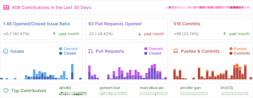
|
||||
|
||||
[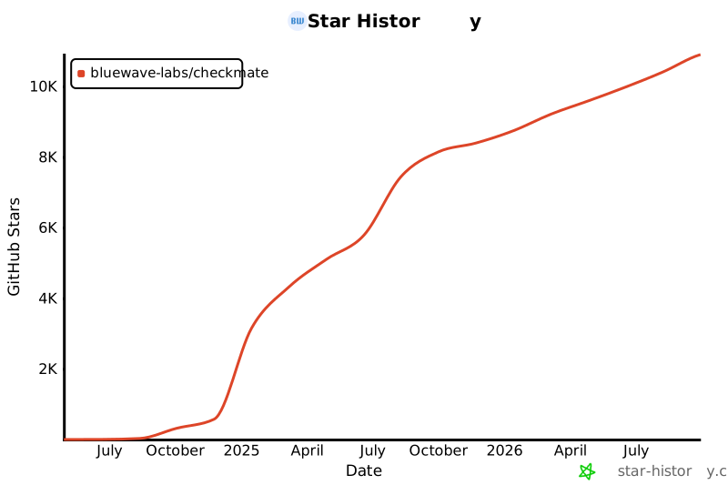](https://star-history.com/#bluewave-labs/bluewave-uptime&Date)
|
||||
[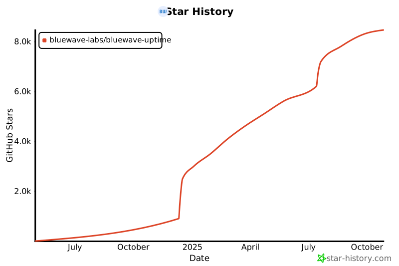](https://star-history.com/#bluewave-labs/bluewave-uptime&Date)
|
||||
|
||||
Also check other developer and contributor-friendly projects of BlueWave:
|
||||
|
||||
- [BlueWave DataRoom](https://github.com/bluewave-labs/bluewave-dataroom), an secure file sharing application, aka dataroom.
|
||||
- [BlueWave HRM](https://github.com/bluewave-labs/bluewave-hrm), a complete Human Resource Management platform.
|
||||
- [BlueWave Onboarding](https://github.com/bluewave-labs/bluewave-onboarding), an application that helps new users learn how to use your product via hints, tours, popups and banners.
|
||||
- [VerifyWise](https://github.com/bluewave-labs/verifywise), the first open source AI governance platform.
|
||||
- [BlueWave HRM](https://github.com/bluewave-labs/bluewave-hrm)
|
||||
- [BlueWave Onboarding](https://github.com/bluewave-labs/bluewave-onboarding)
|
||||
- [BlueWave DataRoom](https://github.com/bluewave-labs/bluewave-dataroom)
|
||||
- [VerifyWise](https://github.com/bluewave-labs/verifywise)
|
||||
|
||||
@@ -281,11 +281,10 @@ const editUser = async (req, res, next) => {
|
||||
const user = await req.db.getUserByEmail(email);
|
||||
// Compare passwords
|
||||
const match = await user.comparePassword(req.body.password);
|
||||
// If not a match, throw a 403
|
||||
// 403 instead of 401 to avoid triggering axios interceptor
|
||||
// If not a match, throw a 401
|
||||
if (!match) {
|
||||
const error = new Error(errorMessages.AUTH_INCORRECT_PASSWORD);
|
||||
error.status = 403;
|
||||
error.status = 401;
|
||||
next(error);
|
||||
return;
|
||||
}
|
||||
@@ -361,7 +360,7 @@ const requestRecovery = async (req, res, next) => {
|
||||
url,
|
||||
},
|
||||
email,
|
||||
"Checkmate Password Reset"
|
||||
"Bluewave Uptime Password Reset"
|
||||
);
|
||||
|
||||
return res.status(200).json({
|
||||
|
||||
@@ -332,7 +332,6 @@ const deleteMonitor = async (req, res, next) => {
|
||||
await req.db.deleteChecks(monitor._id);
|
||||
await req.db.deletePageSpeedChecksByMonitorId(monitor._id);
|
||||
await req.db.deleteNotificationsByMonitorId(monitor._id);
|
||||
await req.db.deleteHardwareChecksByMonitorId(monitor._id);
|
||||
} catch (error) {
|
||||
logger.error({
|
||||
message: `Error deleting associated records for monitor ${monitor._id} with name ${monitor.name}`,
|
||||
|
||||
@@ -124,10 +124,7 @@ import {
|
||||
//****************************************
|
||||
// Hardware Checks
|
||||
//****************************************
|
||||
import {
|
||||
createHardwareCheck,
|
||||
deleteHardwareChecksByMonitorId,
|
||||
} from "./modules/hardwareCheckModule.js";
|
||||
import { createHardwareCheck } from "./modules/hardwareCheckModule.js";
|
||||
|
||||
//****************************************
|
||||
// Checks
|
||||
@@ -216,7 +213,6 @@ export default {
|
||||
createPageSpeedCheck,
|
||||
deletePageSpeedChecksByMonitorId,
|
||||
createHardwareCheck,
|
||||
deleteHardwareChecksByMonitorId,
|
||||
createMaintenanceWindow,
|
||||
getMaintenanceWindowsByTeamId,
|
||||
getMaintenanceWindowById,
|
||||
|
||||
@@ -19,41 +19,22 @@ const createHardwareCheck = async (hardwareCheckData) => {
|
||||
return null;
|
||||
}
|
||||
|
||||
let newUptimePercentage;
|
||||
if (monitor.uptimePercentage === undefined) {
|
||||
newUptimePercentage = status === true ? 1 : 0;
|
||||
monitor.uptimePercentage = status === true ? 1 : 0;
|
||||
} else {
|
||||
newUptimePercentage =
|
||||
monitor.uptimePercentage =
|
||||
(monitor.uptimePercentage * (n - 1) + (status === true ? 1 : 0)) / n;
|
||||
}
|
||||
|
||||
await Monitor.findOneAndUpdate(
|
||||
{ _id: monitorId },
|
||||
{ uptimePercentage: newUptimePercentage }
|
||||
);
|
||||
|
||||
await monitor.save();
|
||||
const hardwareCheck = await new HardwareCheck({
|
||||
...hardwareCheckData,
|
||||
}).save();
|
||||
return hardwareCheck;
|
||||
} catch (error) {
|
||||
console.log("error creating hardware check", error);
|
||||
error.service = SERVICE_NAME;
|
||||
error.method = "createHardwareCheck";
|
||||
throw error;
|
||||
}
|
||||
};
|
||||
|
||||
const deleteHardwareChecksByMonitorId = async (monitorId) => {
|
||||
try {
|
||||
const result = await HardwareCheck.deleteMany({ monitorId });
|
||||
console.log("deleted hardware checks", result);
|
||||
return result.deletedCount;
|
||||
} catch (error) {
|
||||
error.service = SERVICE_NAME;
|
||||
error.method = "deleteHardwareChecksByMonitorId";
|
||||
throw error;
|
||||
}
|
||||
};
|
||||
|
||||
export { createHardwareCheck, deleteHardwareChecksByMonitorId };
|
||||
export { createHardwareCheck };
|
||||
@@ -1,29 +0,0 @@
|
||||
import globals from "globals";
|
||||
import pluginJs from "@eslint/js";
|
||||
import mochaPlugin from "eslint-plugin-mocha";
|
||||
|
||||
/*
|
||||
Please do not forget to look at the latest eslint configurations and rules.
|
||||
ESlint v9 configuration is different than v8.
|
||||
"https://eslint.org/docs/latest/use/configure/"
|
||||
*/
|
||||
|
||||
/** @type {import('eslint').Linter.Config[]} */
|
||||
export default [
|
||||
{
|
||||
languageOptions: {
|
||||
globals: {
|
||||
...globals.node, // Add Node.js globals
|
||||
},
|
||||
ecmaVersion: 2023,
|
||||
sourceType: "module",
|
||||
},
|
||||
},
|
||||
pluginJs.configs.recommended, // Core JS rules
|
||||
mochaPlugin.configs.flat.recommended, // Mocha rules
|
||||
{
|
||||
rules: {
|
||||
"mocha/max-top-level-suites": "warn", // Warn if there are too many top-level suites instead of failing
|
||||
},
|
||||
},
|
||||
];
|
||||
Loaded 100 of 119 files, more files were not shown because too many files have changed in this diff.
Show more
Reference in new issue
Block a user