Compare commits
5
Commits
| Author | SHA1 | Date | |
|---|---|---|---|
 gorkem-bwl |
9ad1e261a4 | ||
|
gorkem-bwl
|
05442af050 | ||
|
gorkem-bwl
|
25d538504c | ||
|
gorkem-bwl
|
e823533809 | ||
|
gorkem-bwl
|
a03996d54b |
No files matched your search
@@ -1,2 +0,0 @@
|
||||
* text=auto
|
||||
* text eol=lf
|
||||
@@ -1,28 +1,27 @@
|
||||
**(Please remove this line only before submitting your PR. Ensure that all relevant items are checked before submission.)**
|
||||
**(Please remove this line only before submitting your PR. Ensure that all relevant items are checked before submission.)**
|
||||
|
||||
## Describe your changes
|
||||
|
||||
Briefly describe the changes you made and their purpose.
|
||||
Briefly describe the changes you made and their purpose.
|
||||
|
||||
## Write your issue number after "Fixes "
|
||||
|
||||
Fixes #123
|
||||
Fixes #123
|
||||
|
||||
## Please ensure all items are checked off before requesting a review. "Checked off" means you need to add an "x" character between brackets so they turn into checkmarks.
|
||||
|
||||
- [ ] (Do not skip this or your PR will be closed) I deployed the application locally.
|
||||
- [ ] (Do not skip this or your PR will be closed) I have performed a self-reviewing and testing of my code.
|
||||
- [ ] (Do not skip this or your PR will be closed) I have performed a self-review and testing of my code.
|
||||
- [ ] I have included the issue # in the PR.
|
||||
- [ ] I have added i18n support to visible strings (instead of `<div>Add</div>`, use):
|
||||
|
||||
- [ ] I have added i18n support to visible strings (instead of `<div>Add</div>`, use):
|
||||
```Javascript
|
||||
const { t } = useTranslation();
|
||||
<div>{t('add')}</div>
|
||||
```
|
||||
|
||||
- [ ] I have **not** included any files that are not related to my pull request, including package-lock and package-json if dependencies have not changed
|
||||
- [ ] I didn't use any hardcoded values (otherwise it will not scale, and will make it difficult to maintain consistency across the application).
|
||||
- [ ] I made sure font sizes, color choices etc are all referenced from the theme. I don't have any hardcoded dimensions.
|
||||
- [ ] My PR is granular and targeted to one specific feature.
|
||||
- [ ] I ran `npm run format` in server and client directories, which automatically formats your code.
|
||||
- [ ] I took a screenshot or a video and attached to this PR if there is a UI change.
|
||||
|
||||
@@ -1,23 +0,0 @@
|
||||
name: Test Check (Server)
|
||||
on:
|
||||
pull_request:
|
||||
workflow_dispatch:
|
||||
|
||||
jobs:
|
||||
test-server:
|
||||
runs-on: ubuntu-latest
|
||||
steps:
|
||||
- uses: actions/checkout@v4
|
||||
|
||||
- name: Set up Node
|
||||
uses: actions/setup-node@v4
|
||||
with:
|
||||
node-version: 22
|
||||
|
||||
- name: Install server dependencies
|
||||
working-directory: server
|
||||
run: npm install
|
||||
|
||||
- name: Run server tests
|
||||
working-directory: server
|
||||
run: npm test
|
||||
@@ -107,7 +107,6 @@ jobs:
|
||||
context: .
|
||||
file: ./docker/dist-arm/server.Dockerfile
|
||||
push: true
|
||||
no-cache: true
|
||||
tags: |
|
||||
ghcr.io/bluewave-labs/checkmate-backend-mono-multiarch:${{ steps.extract_tag.outputs.version }}
|
||||
platforms: linux/amd64,linux/arm64
|
||||
|
||||
@@ -102,7 +102,6 @@ jobs:
|
||||
context: .
|
||||
file: ./docker/dist-arm/server.Dockerfile
|
||||
push: true
|
||||
no-cache: true
|
||||
tags: |
|
||||
ghcr.io/bluewave-labs/checkmate-backend-mono-multiarch:latest
|
||||
platforms: linux/amd64,linux/arm64
|
||||
|
||||
+104
-122
@@ -1,138 +1,120 @@
|
||||
name: POEditor Translation Synchronization (disabled)
|
||||
|
||||
# This workflow is intentionally disabled — kept for reference only.
|
||||
# The full definition is preserved commented-out below. To re-enable,
|
||||
# delete the stub job and uncomment the section starting at `on:`.
|
||||
name: POEditor Translation Synchronization
|
||||
|
||||
on:
|
||||
workflow_dispatch:
|
||||
# For manual triggering
|
||||
workflow_dispatch:
|
||||
inputs:
|
||||
languages:
|
||||
description: "Languages to synchronize (comma separated, e.g.: tr,en,es)"
|
||||
required: false
|
||||
default: "ar,zh-tw,cs,en,fi,fr,de,pt-br,ru,es,tr,ja,zh-cn,th"
|
||||
format:
|
||||
description: "Export format (key_value_json or json)"
|
||||
required: false
|
||||
default: "key_value_json"
|
||||
|
||||
permissions:
|
||||
contents: write
|
||||
pull-requests: write
|
||||
|
||||
jobs:
|
||||
disabled:
|
||||
if: false
|
||||
runs-on: ubuntu-latest
|
||||
steps:
|
||||
- run: echo "This workflow is disabled. See comments below for the original definition."
|
||||
sync-translations:
|
||||
runs-on: ubuntu-latest
|
||||
permissions:
|
||||
contents: write
|
||||
issues: write
|
||||
pull-requests: write
|
||||
|
||||
# ---------------------------------------------------------------------------
|
||||
# Original (disabled) workflow below. Do not uncomment if you don't know what you're doing.
|
||||
# ---------------------------------------------------------------------------
|
||||
steps:
|
||||
- name: Checkout code
|
||||
uses: actions/checkout@v3
|
||||
with:
|
||||
token: ${{ secrets.GITHUB_TOKEN }}
|
||||
fetch-depth: 0
|
||||
|
||||
# on:
|
||||
# # For manual triggering
|
||||
# workflow_dispatch:
|
||||
# inputs:
|
||||
# languages:
|
||||
# description: "Languages to synchronize (comma separated, e.g.: tr,en,es)"
|
||||
# required: false
|
||||
# default: "ar,zh-tw,cs,en,fi,fr,de,pt-br,ru,es,tr,ja,zh-cn,th"
|
||||
# format:
|
||||
# description: "Export format (key_value_json or json)"
|
||||
# required: false
|
||||
# default: "key_value_json"
|
||||
- name: Setup Node.js
|
||||
uses: actions/setup-node@v3
|
||||
with:
|
||||
node-version: "22"
|
||||
|
||||
# permissions:
|
||||
# contents: write
|
||||
# pull-requests: write
|
||||
- name: Create package.json for scripts
|
||||
run: |
|
||||
mkdir -p .github/scripts
|
||||
cat > .github/scripts/package.json << EOF
|
||||
{
|
||||
"name": "poeditor-scripts",
|
||||
"version": "1.0.0",
|
||||
"private": true,
|
||||
"type": "module",
|
||||
"dependencies": {
|
||||
"axios": "^1.6.0",
|
||||
"fs-extra": "^11.1.1"
|
||||
}
|
||||
}
|
||||
EOF
|
||||
|
||||
# jobs:
|
||||
# sync-translations:
|
||||
# runs-on: ubuntu-latest
|
||||
# permissions:
|
||||
# contents: write
|
||||
# issues: write
|
||||
# pull-requests: write
|
||||
- name: Install dependencies
|
||||
run: |
|
||||
cd .github/scripts
|
||||
npm install
|
||||
|
||||
# steps:
|
||||
# - name: Checkout code
|
||||
# uses: actions/checkout@v3
|
||||
# with:
|
||||
# token: ${{ secrets.GITHUB_TOKEN }}
|
||||
# fetch-depth: 0
|
||||
- name: Download translations from POEditor
|
||||
env:
|
||||
POEDITOR_API: ${{ secrets.POEDITOR_API }}
|
||||
POEDITOR_PROJECT_ID: ${{ secrets.POEDITOR_PROJECT_ID }}
|
||||
LANGUAGES: ${{ github.event.inputs.languages || 'tr,en' }}
|
||||
EXPORT_FORMAT: ${{ github.event.inputs.format || 'key_value_json' }}
|
||||
run: |
|
||||
mkdir -p temp
|
||||
node .github/scripts/download-translations.js
|
||||
|
||||
# - name: Setup Node.js
|
||||
# uses: actions/setup-node@v3
|
||||
# with:
|
||||
# node-version: "22"
|
||||
- name: Verify translation files
|
||||
run: |
|
||||
echo "Verifying translation files..."
|
||||
for file in temp/*.json; do
|
||||
echo "Checking $file"
|
||||
if [ ! -s "$file" ]; then
|
||||
echo "Error: $file is empty or does not exist"
|
||||
exit 1
|
||||
fi
|
||||
# Validate JSON format
|
||||
cat "$file" | jq . > /dev/null || { echo "Error: $file is not valid JSON"; exit 1; }
|
||||
done
|
||||
echo "All translation files are valid"
|
||||
|
||||
# - name: Create package.json for scripts
|
||||
# run: |
|
||||
# mkdir -p .github/scripts
|
||||
# cat > .github/scripts/package.json << EOF
|
||||
# {
|
||||
# "name": "poeditor-scripts",
|
||||
# "version": "1.0.0",
|
||||
# "private": true,
|
||||
# "type": "module",
|
||||
# "dependencies": {
|
||||
# "axios": "^1.6.0",
|
||||
# "fs-extra": "^11.1.1"
|
||||
# }
|
||||
# }
|
||||
# EOF
|
||||
- name: Copy translations to project
|
||||
run: |
|
||||
mkdir -p client/src/locales
|
||||
cp -r temp/* client/src/locales/
|
||||
echo "Translation files copied to client/src/locales/"
|
||||
|
||||
# - name: Install dependencies
|
||||
# run: |
|
||||
# cd .github/scripts
|
||||
# npm install
|
||||
- name: Get current date
|
||||
id: date
|
||||
run: echo "date=$(date +'%Y-%m-%d %H:%M:%S')" >> $GITHUB_OUTPUT
|
||||
|
||||
# - name: Download translations from POEditor
|
||||
# env:
|
||||
# POEDITOR_API: ${{ secrets.POEDITOR_API }}
|
||||
# POEDITOR_PROJECT_ID: ${{ secrets.POEDITOR_PROJECT_ID }}
|
||||
# LANGUAGES: ${{ github.event.inputs.languages || 'tr,en' }}
|
||||
# EXPORT_FORMAT: ${{ github.event.inputs.format || 'key_value_json' }}
|
||||
# run: |
|
||||
# mkdir -p temp
|
||||
# node .github/scripts/download-translations.js
|
||||
- name: Format client code
|
||||
run: |
|
||||
cd client
|
||||
npm ci
|
||||
npm run format
|
||||
|
||||
# - name: Verify translation files
|
||||
# run: |
|
||||
# echo "Verifying translation files..."
|
||||
# for file in temp/*.json; do
|
||||
# echo "Checking $file"
|
||||
# if [ ! -s "$file" ]; then
|
||||
# echo "Error: $file is empty or does not exist"
|
||||
# exit 1
|
||||
# fi
|
||||
# # Validate JSON format
|
||||
# cat "$file" | jq . > /dev/null || { echo "Error: $file is not valid JSON"; exit 1; }
|
||||
# done
|
||||
# echo "All translation files are valid"
|
||||
- name: Create Pull Request
|
||||
uses: peter-evans/create-pull-request@v7
|
||||
with:
|
||||
token: ${{ secrets.GITHUB_TOKEN }}
|
||||
commit-message: "feat: translations updated from POEditor"
|
||||
title: "🌐 Updated Translations from POEditor"
|
||||
body: |
|
||||
This PR contains the latest translations from POEditor.
|
||||
|
||||
# - name: Copy translations to project
|
||||
# run: |
|
||||
# mkdir -p client/src/locales
|
||||
# cp -r temp/* client/src/locales/
|
||||
# echo "Translation files copied to client/src/locales/"
|
||||
📅 Update Date: ${{ steps.date.outputs.date }}
|
||||
🔄 Updated Languages: ${{ github.event.inputs.languages || 'tr,en' }}
|
||||
|
||||
# - name: Get current date
|
||||
# id: date
|
||||
# run: echo "date=$(date +'%Y-%m-%d %H:%M:%S')" >> $GITHUB_OUTPUT
|
||||
|
||||
# - name: Format client code
|
||||
# run: |
|
||||
# cd client
|
||||
# npm ci
|
||||
# npm run format
|
||||
|
||||
# - name: Create Pull Request
|
||||
# uses: peter-evans/create-pull-request@v7
|
||||
# with:
|
||||
# token: ${{ secrets.GITHUB_TOKEN }}
|
||||
# commit-message: "feat: translations updated from POEditor"
|
||||
# title: "🌐 Updated Translations from POEditor"
|
||||
# body: |
|
||||
# This PR contains the latest translations from POEditor.
|
||||
|
||||
# 📅 Update Date: ${{ steps.date.outputs.date }}
|
||||
# 🔄 Updated Languages: ${{ github.event.inputs.languages || 'tr,en' }}
|
||||
|
||||
# ⚠️ Please review the translations and approve the PR if everything looks correct.
|
||||
# branch: translation-update-${{ github.run_number }}
|
||||
# delete-branch: true
|
||||
# base: develop
|
||||
# add-paths: |
|
||||
# client/src/locales/*.json
|
||||
# committer: GitHub Action <github-actions[bot]@users.noreply.github.com>
|
||||
# author: GitHub Action <github-actions[bot]@users.noreply.github.com>
|
||||
⚠️ Please review the translations and approve the PR if everything looks correct.
|
||||
branch: translation-update-${{ github.run_number }}
|
||||
delete-branch: true
|
||||
base: develop
|
||||
add-paths: |
|
||||
client/src/locales/*.json
|
||||
committer: GitHub Action <github-actions[bot]@users.noreply.github.com>
|
||||
author: GitHub Action <github-actions[bot]@users.noreply.github.com>
|
||||
@@ -2,7 +2,7 @@ name: Demo deploy
|
||||
|
||||
on:
|
||||
push:
|
||||
branches: [ "demo" ]
|
||||
branches: ["demo"]
|
||||
workflow_dispatch:
|
||||
jobs:
|
||||
docker-build-and-push-client:
|
||||
@@ -84,8 +84,7 @@ jobs:
|
||||
script: |
|
||||
cd checkmate
|
||||
git pull
|
||||
cd docker/unified
|
||||
cd docker/prod
|
||||
docker compose down
|
||||
docker compose pull
|
||||
docker compose up -d
|
||||
docker system prune -af
|
||||
@@ -2,7 +2,7 @@ name: Staging deploy
|
||||
|
||||
on:
|
||||
push:
|
||||
branches: [ "develop" ]
|
||||
branches: ["develop"]
|
||||
|
||||
jobs:
|
||||
docker-build-and-push-client:
|
||||
@@ -78,14 +78,13 @@ jobs:
|
||||
- name: SSH into server and restart container using Docker Compose
|
||||
uses: appleboy/ssh-action@v1.2.2
|
||||
with:
|
||||
host: ${{ secrets.DEMO_SERVER_HOST }}
|
||||
username: ${{ secrets.DEMO_SERVER_USER }}
|
||||
key: ${{ secrets.DEMO_SERVER_SSH_KEY }}
|
||||
host: ${{ secrets.STAGING_SERVER_HOST }}
|
||||
username: ${{ secrets.STAGING_SERVER_USER }}
|
||||
key: ${{ secrets.STAGING_SERVER_SSH_KEY }}
|
||||
script: |
|
||||
cd checkmate
|
||||
git pull
|
||||
cd docker/unified
|
||||
cd docker/staging
|
||||
docker compose down
|
||||
docker compose pull
|
||||
docker compose up -d
|
||||
docker system prune -af
|
||||
+1
-8
@@ -1,10 +1,3 @@
|
||||
.idea
|
||||
.vscode
|
||||
.VSCodeCounter
|
||||
*.sh
|
||||
mongo
|
||||
node_modules/
|
||||
docs/architecture
|
||||
docs/reviews
|
||||
docs/todo
|
||||
docs/frontend
|
||||
.VSCodeCounter
|
||||
@@ -1,4 +0,0 @@
|
||||
#!/bin/sh
|
||||
echo "Running lint-staged..."
|
||||
cd client && npx lint-staged && cd ..
|
||||
cd server && npx lint-staged && cd ..
|
||||
@@ -1,195 +0,0 @@
|
||||
# CLAUDE.md
|
||||
|
||||
This file provides guidance to Claude Code (claude.ai/code) when working with code in this repository.
|
||||
|
||||
## Project Overview
|
||||
|
||||
Checkmate is an open-source uptime and infrastructure monitoring application. It monitors server hardware, uptime, response times, and incidents with real-time alerts. The companion agent [Capture](https://github.com/bluewave-labs/capture) provides infrastructure metrics (CPU, RAM, disk, temperature).
|
||||
|
||||
## Development Commands
|
||||
|
||||
### Client (React/Vite)
|
||||
```bash
|
||||
cd client
|
||||
npm install
|
||||
npm run dev # Start dev server at http://localhost:5173
|
||||
npm run build # TypeScript check + production build
|
||||
npm run lint # ESLint (strict, max-warnings 0)
|
||||
npm run format # Prettier formatting
|
||||
npm run format-check # Check formatting
|
||||
```
|
||||
|
||||
### Server (Node.js/Express)
|
||||
```bash
|
||||
cd server
|
||||
npm install
|
||||
npm run dev # Start with hot-reload (nodemon + tsx) at http://localhost:52345
|
||||
npm run build # TypeScript compile + path alias resolution
|
||||
npm run test # Run Mocha tests with c8 coverage
|
||||
npm run lint # ESLint v9
|
||||
npm run lint-fix # Auto-fix lint issues
|
||||
npm run format # Prettier formatting
|
||||
```
|
||||
|
||||
### Docker Development
|
||||
```bash
|
||||
cd docker/dev
|
||||
./build_images.sh
|
||||
docker run -d -p 27017:27017 -v uptime_mongo_data:/data/db --name uptime_database_mongo mongo:6.0
|
||||
```
|
||||
|
||||
## Environment Setup
|
||||
|
||||
### Server `.env` (minimum required)
|
||||
```env
|
||||
CLIENT_HOST="http://localhost:5173"
|
||||
JWT_SECRET="my_secret_key_change_this"
|
||||
DB_CONNECTION_STRING="mongodb://localhost:27017/uptime_db"
|
||||
TOKEN_TTL="99d"
|
||||
ORIGIN="localhost"
|
||||
LOG_LEVEL="debug"
|
||||
```
|
||||
|
||||
### Client `.env`
|
||||
```env
|
||||
VITE_APP_API_BASE_URL="http://localhost:52345/api/v1"
|
||||
VITE_APP_LOG_LEVEL="debug"
|
||||
```
|
||||
|
||||
## Architecture
|
||||
|
||||
### Monorepo Structure
|
||||
- `/client` - React 18 + TypeScript + Vite + MUI frontend
|
||||
- `/server` - Node.js 20+ + Express + TypeScript backend
|
||||
- `/docker` - Multi-environment Docker configs (dev, staging, prod, arm, mono)
|
||||
|
||||
### Backend Layers
|
||||
```
|
||||
server/src/
|
||||
├── controllers/ # Route handlers (authController, monitorController, etc.)
|
||||
├── service/ # Business logic
|
||||
│ ├── business/ # Core monitoring logic
|
||||
│ ├── infrastructure/ # Server/system utilities
|
||||
│ └── system/ # App-level settings
|
||||
├── db/
|
||||
│ ├── models/ # Mongoose schemas (Monitor, Check, Incident, User, etc.)
|
||||
│ ├── migration/ # Database migrations (run on startup)
|
||||
│ └── modules/ # Database-specific modules
|
||||
├── middleware/v1/ # verifyJWT, rateLimiter, sanitization, responseHandler
|
||||
├── routes/v1/ # API route definitions
|
||||
├── validation/ # Joi input validation schemas
|
||||
└── repositories/ # Data access layer
|
||||
```
|
||||
|
||||
### Frontend Structure
|
||||
```
|
||||
client/src/
|
||||
├── Components/ # Reusable UI components
|
||||
├── Pages/ # Page components (Auth, Uptime, Infrastructure, Incidents, etc.)
|
||||
├── Features/ # Redux slices (Auth, UI)
|
||||
├── Hooks/ # Custom React hooks
|
||||
├── Utils/ # Utilities (NetworkService.js is main API client)
|
||||
├── Validation/ # Input validation
|
||||
└── locales/ # i18n translations
|
||||
```
|
||||
|
||||
### API
|
||||
- Base URL: `/api/v1`
|
||||
- Documentation: `http://localhost:52345/api-docs` (Swagger UI)
|
||||
- OpenAPI spec: `/server/openapi.json`
|
||||
|
||||
### Key Technologies
|
||||
- **State Management**: Redux Toolkit + Redux-Persist
|
||||
- **Data Fetching**: SWR + Axios
|
||||
- **Database**: MongoDB with Mongoose ODM
|
||||
- **Queue/Cache**: Redis + BullMQ + Pulse (cron scheduling)
|
||||
- **i18n**: i18next + react-i18next (translations via PoEditor)
|
||||
|
||||
---
|
||||
|
||||
## Backend Architecture Patterns
|
||||
|
||||
### Repository Pattern & Separation of Concerns
|
||||
|
||||
The backend enforces a strict three-layer separation between HTTP handling, business logic, and data access:
|
||||
|
||||
```
|
||||
Request → Controller → Service → Repository → MongoDB (Mongoose)
|
||||
```
|
||||
|
||||
- **Controllers** (`/controllers`) handle HTTP concerns only: parsing request params, calling the appropriate service, and returning a response via the `responseHandler` middleware. They contain no business logic.
|
||||
- **Services** (`/service/business`) contain all business logic: deciding whether an incident should be created, whether a notification should fire, what state a monitor is in, etc.
|
||||
- **Repositories** (`/repositories`) are the sole layer that talks to MongoDB through Mongoose. They expose clean, reusable query methods (e.g. `findByMonitorId`, `createCheck`) so that services never construct raw DB queries directly.
|
||||
|
||||
This separation makes each layer independently testable and keeps Mongoose-specific code out of business logic. When adding a new feature, the pattern to follow is: add a repository method for any new DB query, call it from a service, and expose it via a controller route.
|
||||
|
||||
### Monitoring Flow: From Check to Notification
|
||||
|
||||
Background monitoring runs on a scheduled queue, not on the HTTP request cycle. The high-level flow for uptime monitoring is:
|
||||
|
||||
```
|
||||
Pulse (cron) → BullMQ Job → StatusService
|
||||
├── performs HTTP/port/ping check
|
||||
├── saves Check via CheckRepository
|
||||
├── evaluates monitor state change
|
||||
│ └── calls IncidentService (create / resolve incident)
|
||||
└── calls NotificationService (email, Slack, Discord, webhook)
|
||||
```
|
||||
|
||||
1. **Pulse** (cron scheduler) enqueues a job into a **BullMQ** queue for each active monitor at its configured interval.
|
||||
2. A **BullMQ worker** picks up the job and calls `StatusService`, which performs the actual check (HTTP request, TCP port probe, ping, etc.).
|
||||
3. The result is persisted as a `Check` document via the repository layer.
|
||||
4. `StatusService` compares the new result against the monitor's previous state. If the monitor transitions from up → down (or down → up), it delegates to `IncidentService` to open or resolve an `Incident` document.
|
||||
5. On a state change, `NotificationService` reads the monitor's configured `Notification` documents and dispatches alerts to all enabled channels (email, Discord, Slack, webhooks).
|
||||
|
||||
### Queue System (BullMQ + Redis)
|
||||
|
||||
Redis serves two roles: job queue storage for BullMQ and ephemeral caching. BullMQ manages concurrency, retries, and backpressure for monitoring jobs, ensuring checks are processed reliably even under load.
|
||||
|
||||
- Each monitor type (HTTP, port, ping, infrastructure) maps to its own queue worker so failures in one type don't block others.
|
||||
- Job scheduling interval is driven by the `interval` field on the `Monitor` model.
|
||||
- Failed jobs are retried with configurable backoff before being moved to a dead-letter state.
|
||||
- Redis is also used to cache frequently read data (e.g. aggregated stats) to reduce MongoDB query pressure.
|
||||
|
||||
When working on anything related to check scheduling, incident lifecycle, or notifications, trace the flow starting from the relevant BullMQ worker rather than from the controller layer.
|
||||
|
||||
---
|
||||
|
||||
## Code Conventions
|
||||
|
||||
### Internationalization
|
||||
All user-facing strings must use the translation function:
|
||||
```javascript
|
||||
t('your.key') // Never hardcode UI strings
|
||||
```
|
||||
|
||||
### Branching
|
||||
- Always branch from `develop` (not master)
|
||||
- Use descriptive names: `feat/add-alerts`, `fix/login-error`
|
||||
- PRs target `develop` branch
|
||||
|
||||
### Formatting
|
||||
- **Client**: Prettier with `printWidth: 90`, tabs, double quotes
|
||||
- **Server**: Prettier with `printWidth: 150`, tabs, double quotes
|
||||
- Both use ESLint with strict settings
|
||||
|
||||
### Testing
|
||||
Server tests use Mocha + Chai + Sinon:
|
||||
```bash
|
||||
npm test # Run all tests with coverage
|
||||
npm test -- --grep "pattern" # Run specific tests
|
||||
```
|
||||
Test files: `server/tests/**/*.test.js`
|
||||
|
||||
## Database Models
|
||||
|
||||
Key Mongoose models in `/server/src/db/models/`:
|
||||
- **Monitor** - Monitoring configuration (website, infrastructure, port, etc.)
|
||||
- **Check** - Individual monitoring check results
|
||||
- **Incident** - Downtime incidents
|
||||
- **User** - User accounts
|
||||
- **Team** - Team/workspace management
|
||||
- **StatusPage** - Public status pages
|
||||
- **Notification** - Alert configuration (email, Discord, Slack, webhooks)
|
||||
- **MaintenanceWindow** - Scheduled maintenance periods
|
||||
- **AppSettings** - Global application settings
|
||||
+69
-69
@@ -1,69 +1,69 @@
|
||||
# Contributor Covenant Code of Conduct
|
||||
|
||||
## Our Pledge
|
||||
|
||||
We as members, contributors, and leaders pledge to make participation in the **checkmate** project and community a harassment-free experience for everyone, regardless of age, body size, visible or invisible disability, ethnicity, gender identity and expression, level of experience, education, socio-economic status, nationality, personal appearance, race, religion, or sexual identity and orientation.
|
||||
|
||||
We pledge to act and interact in ways that contribute to an open, welcoming, diverse, inclusive, and healthy community, especially during Hacktoberfest, where we encourage new contributors to join and feel supported.
|
||||
|
||||
## Our Standards
|
||||
|
||||
Examples of behavior that contributes to a positive environment for our community include:
|
||||
|
||||
- Demonstrating empathy and kindness toward other people
|
||||
- Being respectful of differing opinions, viewpoints, and experiences
|
||||
- Giving and gracefully accepting constructive feedback
|
||||
- Accepting responsibility and apologizing to those affected by our mistakes, and learning from the experience
|
||||
- Focusing on what is best not just for us as individuals, but for the overall community
|
||||
|
||||
Examples of unacceptable behavior include:
|
||||
|
||||
- The use of sexualized language or imagery, and sexual attention or advances of any kind
|
||||
- Trolling, insulting or derogatory comments, and personal or political attacks
|
||||
- Public or private harassment
|
||||
- Publishing others' private information, such as a physical or email address, without their explicit permission
|
||||
- Other conduct which could reasonably be considered inappropriate in a professional setting
|
||||
|
||||
## Our Responsibilities
|
||||
|
||||
Project maintainers are responsible for clarifying and enforcing our standards of acceptable behavior and will take appropriate and fair corrective action in response to any behavior that they deem inappropriate, threatening, offensive, or harmful.
|
||||
|
||||
Project maintainers have the right and responsibility to remove, edit, or reject comments, commits, code, wiki edits, issues, and other contributions that are not aligned with this Code of Conduct, especially during Hacktoberfest to ensure a positive experience for all contributors.
|
||||
|
||||
## Scope
|
||||
|
||||
This Code of Conduct applies within all project spaces, and it also applies when an individual is officially representing the project or its community in public spaces. Examples of representing our project include using an official project email address, posting via an official social media account, or acting as an appointed representative at an online or offline event.
|
||||
|
||||
## Enforcement
|
||||
|
||||
Instances of abusive, harassing, or otherwise unacceptable behavior may be reported by contacting the project team at hello@bluewavelabs.ca. All complaints will be reviewed and investigated promptly and fairly.
|
||||
|
||||
All project team members are obligated to respect the privacy and security of the reporter of any incident.
|
||||
|
||||
## Enforcement Guidelines
|
||||
|
||||
Project maintainers will follow these Community Impact Guidelines in determining the consequences for any action they deem in violation of this Code of Conduct:
|
||||
|
||||
### 1. Correction
|
||||
**Community Impact**: Use of inappropriate language or other behavior deemed unprofessional or unwelcome in the community.
|
||||
**Consequence**: A private, written warning from project maintainers, providing clarity around the nature of the violation and an explanation of why the behavior was inappropriate. A public apology may be requested.
|
||||
|
||||
### 2. Warning
|
||||
**Community Impact**: A violation through a single incident or series of actions.
|
||||
**Consequence**: A warning with consequences for continued behavior. No interaction with the people involved, including unsolicited interaction with those enforcing the Code of Conduct, for a specified period of time. This includes avoiding interactions in community spaces as well as external channels like social media. Violating these terms may lead to a temporary or permanent ban.
|
||||
|
||||
### 3. Temporary Ban
|
||||
**Community Impact**: A serious violation of community standards, including sustained inappropriate behavior.
|
||||
**Consequence**: A temporary ban from any sort of interaction or public communication with the community for a specified period of time. No public or private interaction with the people involved, including unsolicited interaction with those enforcing the Code of Conduct, is allowed during this period. Violating these terms may lead to a permanent ban.
|
||||
|
||||
### 4. Permanent Ban
|
||||
**Community Impact**: Demonstrating a pattern of violation of community standards, including sustained inappropriate behavior, harassment of an individual, or aggression toward or disparagement of classes of individuals.
|
||||
**Consequence**: A permanent ban from any sort of public interaction within the community.
|
||||
|
||||
## Attribution
|
||||
|
||||
This Code of Conduct is adapted from the [Contributor Covenant](https://www.contributor-covenant.org), version 2.0, available at https://www.contributor-covenant.org/version/2/0/code_of_conduct.html.
|
||||
|
||||
---
|
||||
|
||||
By following this Code of Conduct, we can ensure a welcoming and inclusive environment, encouraging new contributors to engage with the project and the community. Thank you for helping make **checkmate** a positive space for all!
|
||||
# Contributor Covenant Code of Conduct
|
||||
|
||||
## Our Pledge
|
||||
|
||||
We as members, contributors, and leaders pledge to make participation in the **bluewave-uptime** project and community a harassment-free experience for everyone, regardless of age, body size, visible or invisible disability, ethnicity, gender identity and expression, level of experience, education, socio-economic status, nationality, personal appearance, race, religion, or sexual identity and orientation.
|
||||
|
||||
We pledge to act and interact in ways that contribute to an open, welcoming, diverse, inclusive, and healthy community, especially during Hacktoberfest, where we encourage new contributors to join and feel supported.
|
||||
|
||||
## Our Standards
|
||||
|
||||
Examples of behavior that contributes to a positive environment for our community include:
|
||||
|
||||
- Demonstrating empathy and kindness toward other people
|
||||
- Being respectful of differing opinions, viewpoints, and experiences
|
||||
- Giving and gracefully accepting constructive feedback
|
||||
- Accepting responsibility and apologizing to those affected by our mistakes, and learning from the experience
|
||||
- Focusing on what is best not just for us as individuals, but for the overall community
|
||||
|
||||
Examples of unacceptable behavior include:
|
||||
|
||||
- The use of sexualized language or imagery, and sexual attention or advances of any kind
|
||||
- Trolling, insulting or derogatory comments, and personal or political attacks
|
||||
- Public or private harassment
|
||||
- Publishing others' private information, such as a physical or email address, without their explicit permission
|
||||
- Other conduct which could reasonably be considered inappropriate in a professional setting
|
||||
|
||||
## Our Responsibilities
|
||||
|
||||
Project maintainers are responsible for clarifying and enforcing our standards of acceptable behavior and will take appropriate and fair corrective action in response to any behavior that they deem inappropriate, threatening, offensive, or harmful.
|
||||
|
||||
Project maintainers have the right and responsibility to remove, edit, or reject comments, commits, code, wiki edits, issues, and other contributions that are not aligned with this Code of Conduct, especially during Hacktoberfest to ensure a positive experience for all contributors.
|
||||
|
||||
## Scope
|
||||
|
||||
This Code of Conduct applies within all project spaces, and it also applies when an individual is officially representing the project or its community in public spaces. Examples of representing our project include using an official project email address, posting via an official social media account, or acting as an appointed representative at an online or offline event.
|
||||
|
||||
## Enforcement
|
||||
|
||||
Instances of abusive, harassing, or otherwise unacceptable behavior may be reported by contacting the project team at hello@bluewavelabs.ca. All complaints will be reviewed and investigated promptly and fairly.
|
||||
|
||||
All project team members are obligated to respect the privacy and security of the reporter of any incident.
|
||||
|
||||
## Enforcement Guidelines
|
||||
|
||||
Project maintainers will follow these Community Impact Guidelines in determining the consequences for any action they deem in violation of this Code of Conduct:
|
||||
|
||||
### 1. Correction
|
||||
**Community Impact**: Use of inappropriate language or other behavior deemed unprofessional or unwelcome in the community.
|
||||
**Consequence**: A private, written warning from project maintainers, providing clarity around the nature of the violation and an explanation of why the behavior was inappropriate. A public apology may be requested.
|
||||
|
||||
### 2. Warning
|
||||
**Community Impact**: A violation through a single incident or series of actions.
|
||||
**Consequence**: A warning with consequences for continued behavior. No interaction with the people involved, including unsolicited interaction with those enforcing the Code of Conduct, for a specified period of time. This includes avoiding interactions in community spaces as well as external channels like social media. Violating these terms may lead to a temporary or permanent ban.
|
||||
|
||||
### 3. Temporary Ban
|
||||
**Community Impact**: A serious violation of community standards, including sustained inappropriate behavior.
|
||||
**Consequence**: A temporary ban from any sort of interaction or public communication with the community for a specified period of time. No public or private interaction with the people involved, including unsolicited interaction with those enforcing the Code of Conduct, is allowed during this period. Violating these terms may lead to a permanent ban.
|
||||
|
||||
### 4. Permanent Ban
|
||||
**Community Impact**: Demonstrating a pattern of violation of community standards, including sustained inappropriate behavior, harassment of an individual, or aggression toward or disparagement of classes of individuals.
|
||||
**Consequence**: A permanent ban from any sort of public interaction within the community.
|
||||
|
||||
## Attribution
|
||||
|
||||
This Code of Conduct is adapted from the [Contributor Covenant](https://www.contributor-covenant.org), version 2.0, available at https://www.contributor-covenant.org/version/2/0/code_of_conduct.html.
|
||||
|
||||
---
|
||||
|
||||
By following this Code of Conduct, we can ensure a welcoming and inclusive environment, encouraging new contributors to engage with the project and the community. Thank you for helping make **bluewave-uptime** a positive space for all!
|
||||
+4
-35
@@ -10,31 +10,6 @@ PS: **We work closely with contributors on our [Discord channel](https://discord
|
||||
|
||||
---
|
||||
|
||||
|
||||
## 🚀 Quick Setup Checklist
|
||||
|
||||
Before you dive in, make sure you have these installed:
|
||||
|
||||
```bash
|
||||
# Check Node.js (v20+ required)
|
||||
node --version
|
||||
|
||||
# Check npm
|
||||
npm --version
|
||||
|
||||
# Check Docker
|
||||
docker --version
|
||||
|
||||
# Check Git
|
||||
git --version
|
||||
```
|
||||
|
||||
**New to contributing?** Start here:
|
||||
1. Pick a [`good-first-issue`](https://github.com/bluewave-labs/checkmate/issues?q=is%3Aissue+is%3Aopen+label%3A%22good+first+issue%22)
|
||||
2. Comment that you'd like to work on it
|
||||
3. Follow the [setup guide](#set-up-checkmate-locally) below
|
||||
4. Join our [Discord](https://discord.com/invite/NAb6H3UTjK) if you get stuck
|
||||
|
||||
## Table of contents
|
||||
|
||||
- [How do I...?](#how-do-i)
|
||||
@@ -91,31 +66,25 @@ cd Checkmate
|
||||
Navigate to the Docker dev directory:
|
||||
|
||||
```bash
|
||||
cd docker/dev
|
||||
cd server/docker/dev
|
||||
```
|
||||
|
||||
Build the Docker images:
|
||||
|
||||
Linux:
|
||||
```bash
|
||||
./build_images.sh
|
||||
```
|
||||
|
||||
Windows:
|
||||
```bash
|
||||
./build_images.bat
|
||||
```
|
||||
|
||||
Run MongoDB container:
|
||||
|
||||
```bash
|
||||
docker run -d -p 27017:27017 -v uptime_mongo_data:/data/db --name uptime_database_mongo mongo:6.0
|
||||
docker run -d -p 27017:27017 -v $(pwd)/mongo/data:/data/db --name uptime_database_mongo uptime_database_mongo
|
||||
```
|
||||
|
||||
Navigate back to the root directory:
|
||||
|
||||
```bash
|
||||
cd ../..
|
||||
cd ../../..
|
||||
```
|
||||
|
||||
#### Step 3: Set Up the Backend (Server)
|
||||
@@ -192,7 +161,7 @@ Start the frontend:
|
||||
npm run dev
|
||||
```
|
||||
|
||||
The client will run at `http://localhost:5173`.
|
||||
The client will run at `http://localhost:5173`.
|
||||
|
||||
#### Step 5: Access the Application
|
||||
|
||||
|
||||
-11325
File diff suppressed because it is too large.
Load diff
+1
-1
@@ -33,4 +33,4 @@ Ensure you execute `npm run format` before submitting your pull requests in both
|
||||
|
||||
### Keep PRs focused
|
||||
|
||||
It may be tempting to address a bug you suddenly remembered or make some tiny adjustments in some component that bothers you, but don’t! Keep all commits in your pull request fully focused on the specific feature you are working on. Open up another PR if you want to fix a bug or work on another feature.
|
||||
It may be tempting to address a bug you suddenly remembered or make some tiny adjustments in some component that bothers you, but don’t! Keep all commits in your pull request fully focused on the specific feature you are working on. Open up another PR if you want to fix a big or work on another feature.
|
||||
+1
-1
@@ -76,7 +76,7 @@ También puedes ver el consumo de memoria de MongoDB y Redis en el mismo servido
|
||||
Si tienes alguna pregunta, sugerencia o comentario, tienes varias opciones:
|
||||
|
||||
- [Canal de Discord](https://discord.gg/NAb6H3UTjK)
|
||||
- [Discusiones en GitHub](https://github.com/bluewave-labs/checkmate/discussions)
|
||||
- [Discusiones en GitHub](https://github.com/bluewave-labs/bluewave-uptime/discussions)
|
||||
- [Grupo en Reddit](https://www.reddit.com/r/CheckmateMonitoring/)
|
||||
|
||||
¡No dudes en hacer preguntas o compartir tus ideas, nos encantaría saber de ti!
|
||||
|
||||
@@ -14,8 +14,6 @@
|
||||
|
||||
<p align="center"><strong>An open source uptime and infrastructure monitoring application</strong></p>
|
||||
|
||||
[](https://www.pikapods.com/pods?run=checkmate)
|
||||
|
||||
<img width="1660" alt="image" src="https://github.com/user-attachments/assets/b748f36d-a271-4965-ad0a-18bf153bbee7" />
|
||||
|
||||
This repository contains both the frontend and the backend of Checkmate, an open-source, self-hosted monitoring tool for tracking server hardware, uptime, response times, and incidents in real-time with beautiful visualizations. Checkmate regularly checks whether a server/website is accessible and performs optimally, providing real-time alerts and reports on the monitored services' availability, downtime, and response time.
|
||||
@@ -31,6 +29,7 @@ Checkmate has been stress-tested with 1000+ active monitors without any particul
|
||||
- [📦 Demo](#demo)
|
||||
- [🔗 User's guide](#users-guide)
|
||||
- [🛠️ Installation](#installation)
|
||||
- [🏁 Translations](#translations)
|
||||
- [🚀 Performance](#performance)
|
||||
- [💚 Questions & Ideas](#questions--ideas)
|
||||
- [🧩 Features](#features)
|
||||
@@ -43,23 +42,17 @@ Checkmate has been stress-tested with 1000+ active monitors without any particul
|
||||
|
||||
## Demo
|
||||
|
||||
You can see the latest build of [Checkmate](https://demo.checkmate.so/) in action.
|
||||
|
||||
The username is demouser@demo.com and the password is Demouser1! (just a note that we update the demo server from time to time, so if it doesn't work for you, please ping us on the Discussions channel).
|
||||
You can see the latest build of [Checkmate](https://checkmate-demo.bluewavelabs.ca/) in action. The username is uptimedemo@demo.com and the password is Demouser1! (just a note that we update the demo server from time to time, so if it doesn't work for you, please ping us on the Discussions channel).
|
||||
|
||||
## User's guide
|
||||
|
||||
Usage instructions can be found [here](https://checkmate.so/docs).
|
||||
|
||||
## Prerequisites
|
||||
- [Docker](https://www.docker.com/) installed
|
||||
- [Git](https://git-scm.com/) installed
|
||||
Usage instructions can be found [here](https://docs.checkmate.so/checkmate-2.1). It's still WIP and some of the information there might be outdated as we continuously add features weekly. Rest assured, we are doing our best! :)
|
||||
|
||||
## Installation
|
||||
|
||||
See installation instructions in [Checkmate documentation portal](https://checkmate.so/docs).
|
||||
See installation instructions in [Checkmate documentation portal](https://docs.checkmate.so/checkmate-2.1/users-guide/quickstart).
|
||||
|
||||
Alternatively, you can also use [Coolify](https://coolify.io/), [Elestio](https://elest.io/open-source/checkmate), [K8s](./charts/helm/checkmate/INSTALLATION.md), [Sive Host](https://sive.host) (South Africa), [Cloudzy](https://cloudzy.com/marketplace/checkmate) or [Pikapods](https://www.pikapods.com/) to quickly spin off a Checkmate instance. If you would like to monitor your server infrastructure, you'll need [Capture agent](https://github.com/bluewave-labs/capture). Capture repository also contains the installation instructions.
|
||||
Alternatively, you can also use [Coolify](https://coolify.io/), [Elestio](https://elest.io/open-source/checkmate), [K8s](./charts/helm/checkmate/INSTALLATION.md), [Sive Host](https://sive.host) (South Africa) or [Pikapods](https://www.pikapods.com/) to quickly spin off a Checkmate instance. If you would like to monitor your server infrastructure, you'll need [Capture agent](https://github.com/bluewave-labs/capture). Capture repository also contains the installation instructions.
|
||||
|
||||
### Using a Custom CA
|
||||
|
||||
@@ -67,6 +60,11 @@ If you need to monitor internal HTTPS endpoints with certificates from private C
|
||||
|
||||
For more documentation, see the [docs directory](./docs/).
|
||||
|
||||
|
||||
## Translations
|
||||
|
||||
If you would like to use Checkmate in your language, please [go to this page](https://poeditor.com/join/project/lRUoGZFCsJ) and register for the language you would like to translate Checkmate to.
|
||||
|
||||
## Performance
|
||||
|
||||
Thanks to extensive optimizations, Checkmate operates with an exceptionally small memory footprint, requiring minimal memory and CPU resources. Here’s the memory usage of a Node.js instance running on a server that monitors 323 servers every minute:
|
||||
@@ -81,8 +79,9 @@ You can see the memory footprint of MongoDB and Redis on the same server (398Mb
|
||||
|
||||
If you have any questions, suggestions or comments, you have several options:
|
||||
|
||||
- [Discord channel](https://discord.gg/NAb6H3UTjK) (preferred)
|
||||
- [GitHub Discussions](https://github.com/bluewave-labs/Checkmate/discussions) (we check here from time to time)
|
||||
- [Discord channel](https://discord.gg/NAb6H3UTjK)
|
||||
- [GitHub Discussions](https://github.com/bluewave-labs/bluewave-uptime/discussions)
|
||||
- [Reddit group](https://www.reddit.com/r/CheckmateMonitoring/)
|
||||
|
||||
Feel free to ask questions or share your ideas - we'd love to hear from you!
|
||||
|
||||
@@ -92,7 +91,6 @@ Feel free to ask questions or share your ideas - we'd love to hear from you!
|
||||
- Website monitoring
|
||||
- Page speed monitoring
|
||||
- Infrastructure monitoring (memory, disk usage, CPU performance, network etc) - requires [Capture](https://github.com/bluewave-labs/capture) agent
|
||||
- Selective disk monitoring with mountpoint selection
|
||||
- Docker monitoring
|
||||
- Ping monitoring
|
||||
- SSL monitoring
|
||||
@@ -114,15 +112,6 @@ Feel free to ask questions or share your ideas - we'd love to hear from you!
|
||||
|
||||
If you would like to sponsor an additional feature, [see this page](https://checkmate.so/sponsored-features).
|
||||
|
||||
## Monitor Lifecycle
|
||||
|
||||
1. A monitor executes a check (HTTP / ping / port / hardware via Capture agent)
|
||||
2. The result is stored (success/failure + response time)
|
||||
3. Recent check results are evaluated against the monitor's configured status change threshold
|
||||
4. If the monitor's status change threshold is met and the current status is not equal to the previous status, the monitor's state changes (e.g. `initializing`, `up`, `down`, `breached`)
|
||||
5. Upon a state change: an incident is either created or resolved, depending on the monitor's current status
|
||||
6. Notifications are triggered based on configuration
|
||||
|
||||
## Screenshots
|
||||
|
||||
<p>
|
||||
@@ -158,7 +147,7 @@ If you would like to sponsor an additional feature, [see this page](https://chec
|
||||
|
||||
## Contributing
|
||||
|
||||
We are [Alex](http://github.com/ajhollid) (team lead), [Gorkem](http://github.com/gorkem-bwl/), [Aryaman](https://github.com/Br0wnHammer), [Mert](https://github.com/mertssmnoglu) and [Karen](https://github.com/karenvicent) helping individuals and businesses monitor their infra and servers.
|
||||
We are [Alex](http://github.com/ajhollid) (team lead), [Gorkem](http://github.com/gorkem-bwl/), [Owaise](http://github.com/Owaiseimdad), [Aryaman](https://github.com/Br0wnHammer), [Mert](https://github.com/mertssmnoglu) and [Karen](https://github.com/karenvicent) helping individuals and businesses monitor their infra and servers.
|
||||
|
||||
We pride ourselves on building strong connections with contributors at every level. Despite being a young project, Checkmate has already earned 7000+ stars and attracted 90+ contributors from around the globe.
|
||||
|
||||
@@ -168,20 +157,26 @@ Here's how you can contribute:
|
||||
|
||||
0. Star this repo :)
|
||||
1. Check [Contributor's guideline](https://github.com/bluewave-labs/Checkmate/blob/develop/CONTRIBUTING.md). First timers are encouraged to check `good-first-issue` tag.
|
||||
2. Read a detailed structure of [Checkmate](https://deepwiki.com/bluewave-labs/Checkmate) if you would like to deep dive into the architecture.
|
||||
3. Open an issue if you believe you've encountered a bug.
|
||||
4. Check for good-first-issue's if you are a newcomer.
|
||||
5. Make a pull request to add new features/make quality-of-life improvements/fix bugs.
|
||||
6. Check out this interactive walkthrough of the `Checkmate` codebase on CodeCanvas [here](https://www.code-canvas.com/?session=unauthenticatedGithub&repo=Checkmate&owner=bluewave-labs&branch=develop&OnboardingTutorial=true). To refine existing dataflow simulation or create new ones, follow the quick tutorial [here](https://docs.code-canvas.com/updating-diagram).
|
||||
2. Check [project structure](https://docs.checkmate.so/checkmate-2.1/developers-guide/general-project-structure) and [high level overview](https://bluewavelabs.gitbook.io/checkmate/developers-guide/high-level-overview).
|
||||
3. Read a detailed structure of [Checkmate](https://deepwiki.com/bluewave-labs/Checkmate) if you would like to deep dive into the architecture.
|
||||
4. Open an issue if you believe you've encountered a bug.
|
||||
5. Check for good-first-issue's if you are a newcomer.
|
||||
6. Make a pull request to add new features/make quality-of-life improvements/fix bugs.
|
||||
|
||||
<a href="https://github.com/bluewave-labs/checkmate/graphs/contributors">
|
||||
<img src="https://contrib.rocks/image?repo=bluewave-labs/checkmate" />
|
||||
</a>
|
||||
|
||||
[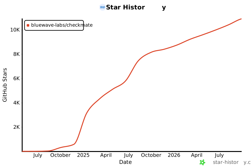](https://star-history.com/#bluewave-labs/Checkmate&Date)
|
||||
[](https://star-history.com/#bluewave-labs/bluewave-uptime&Date)
|
||||
|
||||
## Our sponsors
|
||||
|
||||
Thanks to [Gitbook](https://gitbook.io/) for giving us a free tier for their documentation platform, and [Poeditor](https://poeditor.com/) providing us a free account to use their i18n services. If you would like to sponsor Checkmate, please send an email to hello@bluewavelabs.ca
|
||||
|
||||
If you would like to sponsor a feature, [see this page](https://checkmate.so/sponsored-features).
|
||||
|
||||
Also check other developer and contributor-friendly projects of BlueWave:
|
||||
|
||||
- [VerifyWise](https://github.com/bluewave-labs/verifywise), the first open source AI governance platform.
|
||||
- [DataRoom](https://github.com/bluewave-labs/bluewave-dataroom), an secure file sharing application, aka dataroom.
|
||||
- [Guidefox](https://github.com/bluewave-labs/guidefox), an application that helps new users learn how to use your product via hints, tours, popups and banners.
|
||||
@@ -21,12 +21,7 @@ cd checkmate/charts/helm/checkmate
|
||||
Edit `values.yaml` to update:
|
||||
- `client.ingress.host` and `server.ingress.host` with your domain names
|
||||
- `server.protocol` (usually http or https)
|
||||
- **If upgrading**: Migrate persistence settings from flat structure to nested:
|
||||
- Old: `persistence.mongodbSize` → New: `persistence.mongo.size`
|
||||
- Old: `persistence.redisSize` → New: `persistence.redis.size`
|
||||
- Add: `persistence.mongo.storageClass` and `persistence.redis.storageClass` (leave empty for default)
|
||||
- Secrets under the `secrets` section (`JWT_SECRET`, email credentials, API keys, etc.) — replace all change_me values
|
||||
- **For TLS/HTTPS**: Configure ingress TLS settings (see section below)
|
||||
|
||||
### 3. Deploy the Helm chart
|
||||
```bash
|
||||
@@ -42,75 +37,3 @@ kubectl get svc
|
||||
```
|
||||
|
||||
Once all pods are `Running` and `Ready`, you can access Checkmate via the configured ingress hosts.
|
||||
|
||||
## Enabling TLS/HTTPS with cert-manager
|
||||
|
||||
If you have [cert-manager](https://cert-manager.io/) installed in your cluster, you can enable automatic TLS certificate provisioning using Let's Encrypt or other certificate issuers.
|
||||
|
||||
### Prerequisites
|
||||
- cert-manager installed in your cluster
|
||||
- A ClusterIssuer or Issuer configured (e.g., `letsencrypt-prod`)
|
||||
|
||||
### Configuration
|
||||
|
||||
Edit `values.yaml` to enable TLS (and update protocols to https):
|
||||
|
||||
```yaml
|
||||
client:
|
||||
protocol: https
|
||||
ingress:
|
||||
enabled: true
|
||||
host: checkmate.example.com
|
||||
className: nginx
|
||||
annotations:
|
||||
cert-manager.io/cluster-issuer: "letsencrypt-prod"
|
||||
tls:
|
||||
enabled: true
|
||||
secretName: checkmate-client-tls
|
||||
|
||||
server:
|
||||
protocol: https
|
||||
ingress:
|
||||
enabled: true
|
||||
host: checkmate.example.com
|
||||
className: nginx
|
||||
annotations:
|
||||
cert-manager.io/cluster-issuer: "letsencrypt-prod"
|
||||
tls:
|
||||
enabled: true
|
||||
secretName: checkmate-server-tls
|
||||
```
|
||||
|
||||
### Alternative: Using --set flags
|
||||
|
||||
You can also enable TLS during installation using Helm's `--set` flags:
|
||||
|
||||
```bash
|
||||
helm install checkmate ./charts/helm/checkmate \
|
||||
--set client.protocol=https \
|
||||
--set server.protocol=https \
|
||||
--set client.ingress.annotations."cert-manager\.io/cluster-issuer"="letsencrypt-prod" \
|
||||
--set client.ingress.tls.enabled=true \
|
||||
--set client.ingress.tls.secretName=checkmate-client-tls \
|
||||
--set server.ingress.annotations."cert-manager\.io/cluster-issuer"="letsencrypt-prod" \
|
||||
--set server.ingress.tls.enabled=true \
|
||||
--set server.ingress.tls.secretName=checkmate-server-tls
|
||||
```
|
||||
|
||||
### Verification
|
||||
|
||||
After deployment, cert-manager will automatically create the TLS secrets. You can verify the certificate status:
|
||||
|
||||
```bash
|
||||
# Check certificates
|
||||
kubectl get certificates
|
||||
|
||||
# Check certificate details
|
||||
kubectl describe certificate checkmate-client-tls
|
||||
kubectl describe certificate checkmate-server-tls
|
||||
|
||||
# Verify the secrets were created
|
||||
kubectl get secrets | grep checkmate-tls
|
||||
```
|
||||
|
||||
The ingress will automatically use these secrets to enable HTTPS access to your Checkmate instance.
|
||||
@@ -0,0 +1,12 @@
|
||||
{{- if eq .Values.client.ingress.host "change_me" }}
|
||||
{{- fail "client.ingress.host must be overridden and not set to 'change_me'" }}
|
||||
{{- end }}
|
||||
|
||||
{{- if eq .Values.server.ingress.host "change_me" }}
|
||||
{{- fail "server.ingress.host must be overridden and not set to 'change_me'" }}
|
||||
{{- end }}
|
||||
|
||||
{{- $protocol := .Values.server.protocol }}
|
||||
{{- if not (or (eq $protocol "http") (eq $protocol "https")) }}
|
||||
{{- fail "server.protocol must be either 'http' or 'https'" }}
|
||||
{{- end }}
|
||||
@@ -11,12 +11,6 @@ metadata:
|
||||
{{- end }}
|
||||
spec:
|
||||
ingressClassName: {{ .Values.client.ingress.className }}
|
||||
{{- if .Values.client.ingress.tls.enabled }}
|
||||
tls:
|
||||
- hosts:
|
||||
- {{ .Values.client.ingress.host }}
|
||||
secretName: {{ default (printf "%s-client-tls" .Release.Name) .Values.client.ingress.tls.secretName }}
|
||||
{{- end }}
|
||||
rules:
|
||||
- host: {{ .Values.client.ingress.host }}
|
||||
http:
|
||||
|
||||
@@ -37,8 +37,8 @@ spec:
|
||||
- metadata:
|
||||
name: checkmate-mongo-persistent-storage
|
||||
spec:
|
||||
storageClassName: {{ .Values.persistence.mongo.storageClass | quote }}
|
||||
storageClassName: "gp3"
|
||||
accessModes: ["ReadWriteOnce"]
|
||||
resources:
|
||||
requests:
|
||||
storage: {{ .Values.persistence.mongo.size | default "5Gi" | quote }}
|
||||
storage: {{ .Values.persistence.mongodbSize }}
|
||||
@@ -1,48 +0,0 @@
|
||||
{{- if eq .Values.client.ingress.host "change_me" }}
|
||||
{{- fail "client.ingress.host must be overridden and not set to 'change_me'" }}
|
||||
{{- end }}
|
||||
|
||||
{{- if eq .Values.server.ingress.host "change_me" }}
|
||||
{{- fail "server.ingress.host must be overridden and not set to 'change_me'" }}
|
||||
{{- end }}
|
||||
|
||||
{{- $serverProtocol := .Values.server.protocol }}
|
||||
{{- if not (or (eq $serverProtocol "http") (eq $serverProtocol "https")) }}
|
||||
{{- fail "server.protocol must be either 'http' or 'https'" }}
|
||||
{{- end }}
|
||||
|
||||
{{- $clientProtocol := .Values.client.protocol }}
|
||||
{{- if not (or (eq $clientProtocol "http") (eq $clientProtocol "https")) }}
|
||||
{{- fail "client.protocol must be either 'http' or 'https'" }}
|
||||
{{- end }}
|
||||
|
||||
{{/* Enforce protocol when TLS is enabled to avoid mixed-content */}}
|
||||
{{- if and .Values.client.ingress.tls.enabled (ne $clientProtocol "https") }}
|
||||
{{- fail "client.ingress.tls.enabled is true but client.protocol is not 'https'. Set client.protocol: https to avoid mixed content." }}
|
||||
{{- end }}
|
||||
|
||||
{{- if and .Values.server.ingress.tls.enabled (ne $serverProtocol "https") }}
|
||||
{{- fail "server.ingress.tls.enabled is true but server.protocol is not 'https'. Set server.protocol: https to ensure correct API base URL." }}
|
||||
{{- end }}
|
||||
|
||||
{{/* If client runs on https, API must also be https to avoid mixed content */}}
|
||||
{{- if and (eq $clientProtocol "https") (ne $serverProtocol "https") }}
|
||||
{{- fail "client.protocol is 'https' but server.protocol is not. Set server.protocol: https to prevent browser mixed-content issues." }}
|
||||
{{- end }}
|
||||
|
||||
{{/* Fail early if TLS enabled without cert-manager annotations (cluster-issuer or issuer) */}}
|
||||
{{- $cAnn := .Values.client.ingress.annotations | default dict }}
|
||||
{{- $sAnn := .Values.server.ingress.annotations | default dict }}
|
||||
|
||||
{{- $clientHasIssuer := or (hasKey $cAnn "cert-manager.io/cluster-issuer") (hasKey $cAnn "cert-manager.io/issuer") }}
|
||||
{{- $serverHasIssuer := or (hasKey $sAnn "cert-manager.io/cluster-issuer") (hasKey $sAnn "cert-manager.io/issuer") }}
|
||||
|
||||
{{- if and .Values.client.ingress.tls.enabled (not $clientHasIssuer) }}
|
||||
{{- fail "client.ingress.tls.enabled is true but no cert-manager issuer annotation found. Add 'cert-manager.io/cluster-issuer' or 'cert-manager.io/issuer'." }}
|
||||
{{- end }}
|
||||
|
||||
{{- if and .Values.server.ingress.tls.enabled (not $serverHasIssuer) }}
|
||||
{{- fail "server.ingress.tls.enabled is true but no cert-manager issuer annotation found. Add 'cert-manager.io/cluster-issuer' or 'cert-manager.io/issuer'." }}
|
||||
{{- end }}
|
||||
|
||||
{{/* Secret name can be omitted; we default to <release>-client|server-tls in templates */}}
|
||||
@@ -25,9 +25,9 @@ spec:
|
||||
- metadata:
|
||||
name: checkmate-redis-persistent-storage
|
||||
spec:
|
||||
storageClassName: {{ .Values.persistence.redis.storageClass | quote }}
|
||||
storageClassName: "gp3"
|
||||
accessModes: ["ReadWriteOnce"]
|
||||
resources:
|
||||
requests:
|
||||
storage: {{ .Values.persistence.redis.size | default "1Gi" | quote }}
|
||||
storage: {{ .Values.persistence.redisSize }}
|
||||
{{- end }}
|
||||
@@ -18,12 +18,6 @@ metadata:
|
||||
#nginx.ingress.kubernetes.io/cors-allow-credentials: "true"*/}}
|
||||
spec:
|
||||
ingressClassName: {{ .Values.server.ingress.className }}
|
||||
{{- if .Values.server.ingress.tls.enabled }}
|
||||
tls:
|
||||
- hosts:
|
||||
- {{ .Values.server.ingress.host }}
|
||||
secretName: {{ default (printf "%s-server-tls" .Release.Name) .Values.server.ingress.tls.secretName }}
|
||||
{{- end }}
|
||||
rules:
|
||||
- host: {{ .Values.server.ingress.host }}
|
||||
http:
|
||||
|
||||
@@ -7,15 +7,6 @@ client:
|
||||
host: change_me
|
||||
className: nginx
|
||||
annotations: {}
|
||||
# Example annotations for cert-manager:
|
||||
# annotations:
|
||||
# cert-manager.io/cluster-issuer: "letsencrypt-prod"
|
||||
tls:
|
||||
enabled: false
|
||||
# secretName: {{ .Release.Name }}-client-tls # Optional; defaults to <release>-client-tls if omitted
|
||||
# Note: when enabling TLS, also set client.protocol: https and add
|
||||
# a cert-manager issuer annotation (e.g. cert-manager.io/cluster-issuer: "letsencrypt-prod").
|
||||
# The secret will be automatically created by cert-manager when using the cert-manager.io/cluster-issuer annotation
|
||||
|
||||
server:
|
||||
image: ghcr.io/bluewave-labs/checkmate-backend:v3.2.0
|
||||
@@ -26,15 +17,6 @@ server:
|
||||
host: change_me
|
||||
className: nginx
|
||||
annotations: {}
|
||||
# Example annotations for cert-manager:
|
||||
# annotations:
|
||||
# cert-manager.io/cluster-issuer: "letsencrypt-prod"
|
||||
tls:
|
||||
enabled: false
|
||||
# secretName: {{ .Release.Name }}-server-tls # Optional; defaults to <release>-server-tls if omitted
|
||||
# Note: when enabling TLS, also set server.protocol: https and add
|
||||
# a cert-manager issuer annotation (e.g. cert-manager.io/cluster-issuer: "letsencrypt-prod").
|
||||
# The secret will be automatically created by cert-manager when using the cert-manager.io/cluster-issuer annotation
|
||||
|
||||
redis:
|
||||
enabled: false
|
||||
@@ -62,9 +44,5 @@ secrets:
|
||||
# REFRESH_TOKEN_TTL: 99d
|
||||
|
||||
persistence:
|
||||
mongo:
|
||||
size: 5Gi
|
||||
storageClass: ""
|
||||
redis:
|
||||
size: 1Gi
|
||||
storageClass: ""
|
||||
mongodbSize: 5Gi
|
||||
redisSize: 1Gi
|
||||
+1
-2
@@ -28,5 +28,4 @@ dist-ssr
|
||||
|
||||
# Scripts
|
||||
*.sh
|
||||
!env.sh
|
||||
.env.development
|
||||
!env.sh
|
||||
+1
-1
@@ -18,7 +18,7 @@
|
||||
<div id="root"></div>
|
||||
<script
|
||||
type="module"
|
||||
src="/src/main.tsx"
|
||||
src="/src/main.jsx"
|
||||
></script>
|
||||
</body>
|
||||
</html>
|
||||
Generated
+1688
-2255
File diff suppressed because it is too large.
Load diff
+11
-19
@@ -12,20 +12,17 @@
|
||||
"format": "prettier --write .",
|
||||
"format-check": "prettier --check ."
|
||||
},
|
||||
"lint-staged": {
|
||||
"**/*": "prettier --write"
|
||||
},
|
||||
"dependencies": {
|
||||
"@emotion/react": "^11.13.3",
|
||||
"@emotion/styled": "^11.13.0",
|
||||
"@hello-pangea/dnd": "^18.0.0",
|
||||
"@hookform/resolvers": "5.2.2",
|
||||
"@mui/lab": "7.0.0",
|
||||
"@mui/material": "7.3.7",
|
||||
"@mui/x-charts": "7.29.1",
|
||||
"@mui/x-date-pickers": "7.29.4",
|
||||
"@mui/icons-material": "6.4.11",
|
||||
"@mui/lab": "6.0.0-dev.240424162023-9968b4889d",
|
||||
"@mui/material": "6.4.11",
|
||||
"@mui/x-charts": "^7.5.1",
|
||||
"@mui/x-date-pickers": "7.29.0",
|
||||
"@reduxjs/toolkit": "2.7.0",
|
||||
"@types/maplibre-gl": "^1.13.2",
|
||||
"axios": "^1.7.4",
|
||||
"dayjs": "1.11.13",
|
||||
"flag-icons": "7.3.2",
|
||||
@@ -33,26 +30,22 @@
|
||||
"human-interval": "2.0.1",
|
||||
"i18next": "25.4.2",
|
||||
"joi": "17.13.3",
|
||||
"lucide-react": "^0.562.0",
|
||||
"maplibre-gl": "^5.19.0",
|
||||
"mui-color-input": "^7.0.0",
|
||||
"pretty-bytes": "^7.1.0",
|
||||
"pretty-ms": "^9.3.0",
|
||||
"mui-color-input": "^6.0.0",
|
||||
"pretty-ms": "9.3.0",
|
||||
"react": "18.3.1",
|
||||
"react-dom": "^18.2.0",
|
||||
"react-hook-form": "^7.63.0",
|
||||
"react-hook-form": "7.63.0",
|
||||
"react-i18next": "^15.4.0",
|
||||
"react-icons": "5.5.0",
|
||||
"react-map-gl": "^8.1.0",
|
||||
"react-redux": "9.2.0",
|
||||
"react-router": "^6.23.0",
|
||||
"react-router-dom": "^6.23.1",
|
||||
"react-toastify": "^10.0.5",
|
||||
"recharts": "2.15.2",
|
||||
"redux-persist": "6.0.0",
|
||||
"swr": "^2.3.6",
|
||||
"swr": "2.3.6",
|
||||
"vite-plugin-svgr": "^4.2.0",
|
||||
"zod": "^4.3.6"
|
||||
"zod": "4.1.11"
|
||||
},
|
||||
"devDependencies": {
|
||||
"@types/node": "24.5.2",
|
||||
@@ -63,9 +56,8 @@
|
||||
"eslint-plugin-react": "^7.34.1",
|
||||
"eslint-plugin-react-hooks": "^5.0.0",
|
||||
"eslint-plugin-react-refresh": "^0.4.6",
|
||||
"lint-staged": "^16.2.7",
|
||||
"prettier": "^3.3.3",
|
||||
"typescript": "5.9.3",
|
||||
"vite": "6.4.1"
|
||||
"vite": "6.3.6"
|
||||
}
|
||||
}
|
||||
@@ -1,258 +0,0 @@
|
||||
/**
|
||||
* Locale Migration Script
|
||||
*
|
||||
* Restructures all non-English locale files to match en.json's nested key structure.
|
||||
* Recovers translations via safe key-matching strategies, uses English placeholders
|
||||
* for unmatched keys.
|
||||
*
|
||||
* Usage: npx tsx client/scripts/migrate-locales.ts
|
||||
*
|
||||
* SAFETY: en.json is NEVER modified. Originals are backed up before overwriting.
|
||||
*/
|
||||
|
||||
import fs from "fs";
|
||||
import path from "path";
|
||||
|
||||
const LOCALES_DIR = path.resolve(import.meta.dirname, "../src/locales");
|
||||
const BACKUP_DIR = path.join(LOCALES_DIR, "backup");
|
||||
const REPORT_PATH = path.join(LOCALES_DIR, "migration-report.json");
|
||||
|
||||
// ── Helpers ──────────────────────────────────────────────────────────────────
|
||||
|
||||
/** Flatten a nested object into { "a.b.c": value } pairs */
|
||||
function flattenKeys(obj: Record<string, unknown>, prefix = ""): Record<string, string> {
|
||||
const result: Record<string, string> = {};
|
||||
for (const [key, value] of Object.entries(obj)) {
|
||||
const fullPath = prefix ? `${prefix}.${key}` : key;
|
||||
if (typeof value === "object" && value !== null && !Array.isArray(value)) {
|
||||
Object.assign(result, flattenKeys(value as Record<string, unknown>, fullPath));
|
||||
} else {
|
||||
result[fullPath] = String(value);
|
||||
}
|
||||
}
|
||||
return result;
|
||||
}
|
||||
|
||||
/** Set a value at a dot-separated path in a nested object */
|
||||
function setNestedValue(
|
||||
obj: Record<string, unknown>,
|
||||
keyPath: string,
|
||||
value: string
|
||||
): void {
|
||||
const parts = keyPath.split(".");
|
||||
let current = obj;
|
||||
for (let i = 0; i < parts.length - 1; i++) {
|
||||
const part = parts[i];
|
||||
if (!(part in current) || typeof current[part] !== "object") {
|
||||
current[part] = {};
|
||||
}
|
||||
current = current[part] as Record<string, unknown>;
|
||||
}
|
||||
current[parts[parts.length - 1]] = value;
|
||||
}
|
||||
|
||||
// ── Build mapping indexes from en.json ───────────────────────────────────────
|
||||
|
||||
function buildIndexes(enFlat: Record<string, string>) {
|
||||
const enKeys = Object.keys(enFlat);
|
||||
|
||||
// last segment -> en key paths
|
||||
const lastSegIndex: Record<string, string[]> = {};
|
||||
// last 2 segments -> en key paths
|
||||
const suffixIndex: Record<string, string[]> = {};
|
||||
|
||||
for (const keyPath of enKeys) {
|
||||
const parts = keyPath.split(".");
|
||||
const lastSeg = parts[parts.length - 1].toLowerCase();
|
||||
if (!lastSegIndex[lastSeg]) lastSegIndex[lastSeg] = [];
|
||||
lastSegIndex[lastSeg].push(keyPath);
|
||||
|
||||
if (parts.length >= 2) {
|
||||
const suffix = parts.slice(-2).join(".").toLowerCase();
|
||||
if (!suffixIndex[suffix]) suffixIndex[suffix] = [];
|
||||
suffixIndex[suffix].push(keyPath);
|
||||
}
|
||||
}
|
||||
|
||||
return { lastSegIndex, suffixIndex };
|
||||
}
|
||||
|
||||
// ── Mapping logic ────────────────────────────────────────────────────────────
|
||||
|
||||
type MatchStrategy = "exact" | "suffix-2" | "unique-name" | "english-placeholder";
|
||||
|
||||
interface KeyMatch {
|
||||
enKey: string;
|
||||
value: string;
|
||||
strategy: MatchStrategy;
|
||||
}
|
||||
|
||||
function buildMigratedLocale(
|
||||
enFlat: Record<string, string>,
|
||||
langFlat: Record<string, string>,
|
||||
indexes: ReturnType<typeof buildIndexes>
|
||||
): { matches: KeyMatch[]; result: Record<string, unknown> } {
|
||||
const { lastSegIndex, suffixIndex } = indexes;
|
||||
const matches: KeyMatch[] = [];
|
||||
const result: Record<string, unknown> = {};
|
||||
|
||||
// Build reverse lookup: for each orphan key in lang, index by last segment and suffix
|
||||
const langByLastSeg: Record<string, { key: string; value: string }[]> = {};
|
||||
const langBySuffix: Record<string, { key: string; value: string }[]> = {};
|
||||
|
||||
for (const [langKey, langValue] of Object.entries(langFlat)) {
|
||||
const parts = langKey.split(".");
|
||||
const lastSeg = parts[parts.length - 1].toLowerCase();
|
||||
if (!langByLastSeg[lastSeg]) langByLastSeg[lastSeg] = [];
|
||||
langByLastSeg[lastSeg].push({ key: langKey, value: langValue });
|
||||
|
||||
if (parts.length >= 2) {
|
||||
const suffix = parts.slice(-2).join(".").toLowerCase();
|
||||
if (!langBySuffix[suffix]) langBySuffix[suffix] = [];
|
||||
langBySuffix[suffix].push({ key: langKey, value: langValue });
|
||||
}
|
||||
}
|
||||
|
||||
for (const enKey of Object.keys(enFlat)) {
|
||||
const enValue = enFlat[enKey];
|
||||
const parts = enKey.split(".");
|
||||
const lastSeg = parts[parts.length - 1].toLowerCase();
|
||||
const suffix = parts.length >= 2 ? parts.slice(-2).join(".").toLowerCase() : null;
|
||||
|
||||
// Strategy 1: Exact path match
|
||||
if (langFlat[enKey] !== undefined) {
|
||||
const value = langFlat[enKey];
|
||||
setNestedValue(result, enKey, value);
|
||||
matches.push({ enKey, value, strategy: "exact" });
|
||||
continue;
|
||||
}
|
||||
|
||||
// Strategy 2: 2-segment suffix match (lang key suffix matches en key suffix, both unique)
|
||||
if (suffix) {
|
||||
const enCandidates = suffixIndex[suffix];
|
||||
const langCandidates = langBySuffix[suffix];
|
||||
if (
|
||||
enCandidates &&
|
||||
enCandidates.length === 1 &&
|
||||
langCandidates &&
|
||||
langCandidates.length === 1
|
||||
) {
|
||||
const value = langCandidates[0].value;
|
||||
setNestedValue(result, enKey, value);
|
||||
matches.push({ enKey, value, strategy: "suffix-2" });
|
||||
continue;
|
||||
}
|
||||
}
|
||||
|
||||
// Strategy 3: Unique last-segment match
|
||||
const enCandidates = lastSegIndex[lastSeg];
|
||||
const langCandidates = langByLastSeg[lastSeg];
|
||||
if (
|
||||
enCandidates &&
|
||||
enCandidates.length === 1 &&
|
||||
langCandidates &&
|
||||
langCandidates.length === 1
|
||||
) {
|
||||
const value = langCandidates[0].value;
|
||||
setNestedValue(result, enKey, value);
|
||||
matches.push({ enKey, value, strategy: "unique-name" });
|
||||
continue;
|
||||
}
|
||||
|
||||
// No match — use English placeholder
|
||||
setNestedValue(result, enKey, enValue);
|
||||
matches.push({ enKey, value: enValue, strategy: "english-placeholder" });
|
||||
}
|
||||
|
||||
return { matches, result };
|
||||
}
|
||||
|
||||
// ── Main ─────────────────────────────────────────────────────────────────────
|
||||
|
||||
function main() {
|
||||
// Load en.json
|
||||
const enPath = path.join(LOCALES_DIR, "en.json");
|
||||
const en = JSON.parse(fs.readFileSync(enPath, "utf8"));
|
||||
const enFlat = flattenKeys(en);
|
||||
const enKeyCount = Object.keys(enFlat).length;
|
||||
const indexes = buildIndexes(enFlat);
|
||||
|
||||
console.log(`English: ${enKeyCount} keys (source of truth — NOT modified)\n`);
|
||||
|
||||
// Find all non-English locale files
|
||||
const localeFiles = fs
|
||||
.readdirSync(LOCALES_DIR)
|
||||
.filter(
|
||||
(f: string) =>
|
||||
f.endsWith(".json") && f !== "en.json" && f !== "migration-report.json"
|
||||
);
|
||||
|
||||
if (localeFiles.length === 0) {
|
||||
console.log("No locale files to migrate.");
|
||||
return;
|
||||
}
|
||||
|
||||
// Create backup directory
|
||||
if (!fs.existsSync(BACKUP_DIR)) {
|
||||
fs.mkdirSync(BACKUP_DIR, { recursive: true });
|
||||
}
|
||||
|
||||
const report: Record<
|
||||
string,
|
||||
{
|
||||
total: number;
|
||||
exact: number;
|
||||
suffix: number;
|
||||
uniqueName: number;
|
||||
placeholder: number;
|
||||
}
|
||||
> = {};
|
||||
|
||||
for (const file of localeFiles) {
|
||||
const lang = file.replace(".json", "");
|
||||
const filePath = path.join(LOCALES_DIR, file);
|
||||
|
||||
// Backup original
|
||||
const backupPath = path.join(BACKUP_DIR, file);
|
||||
fs.copyFileSync(filePath, backupPath);
|
||||
|
||||
// Load and flatten
|
||||
const langData = JSON.parse(fs.readFileSync(filePath, "utf8"));
|
||||
const langFlat = flattenKeys(langData);
|
||||
|
||||
// Migrate
|
||||
const { matches, result } = buildMigratedLocale(enFlat, langFlat, indexes);
|
||||
|
||||
// Write migrated file
|
||||
fs.writeFileSync(filePath, JSON.stringify(result, null, "\t") + "\n", "utf8");
|
||||
|
||||
// Compute stats
|
||||
const stats = {
|
||||
total: enKeyCount,
|
||||
exact: matches.filter((m) => m.strategy === "exact").length,
|
||||
suffix: matches.filter((m) => m.strategy === "suffix-2").length,
|
||||
uniqueName: matches.filter((m) => m.strategy === "unique-name").length,
|
||||
placeholder: matches.filter((m) => m.strategy === "english-placeholder").length,
|
||||
};
|
||||
report[lang] = stats;
|
||||
|
||||
const translated = stats.exact + stats.suffix + stats.uniqueName;
|
||||
const pct = ((translated / enKeyCount) * 100).toFixed(1);
|
||||
console.log(
|
||||
`${lang.padEnd(8)} ${String(translated).padStart(4)} translated (${pct}%) | ` +
|
||||
`exact: ${stats.exact} suffix: ${stats.suffix} name: ${stats.uniqueName} ` +
|
||||
`placeholder: ${stats.placeholder}`
|
||||
);
|
||||
}
|
||||
|
||||
// Write report
|
||||
fs.writeFileSync(REPORT_PATH, JSON.stringify(report, null, "\t") + "\n", "utf8");
|
||||
|
||||
const totalLangs = localeFiles.length;
|
||||
console.log(
|
||||
`\nMigrated ${totalLangs} locale files. Originals backed up to locales/backup/`
|
||||
);
|
||||
console.log(`Report written to ${REPORT_PATH}`);
|
||||
}
|
||||
|
||||
main();
|
||||
@@ -0,0 +1,36 @@
|
||||
import { useEffect } from "react";
|
||||
import { useSelector } from "react-redux";
|
||||
import "react-toastify/dist/ReactToastify.css";
|
||||
import { ToastContainer } from "react-toastify";
|
||||
import { ThemeProvider } from "@emotion/react";
|
||||
import lightTheme from "./Utils/Theme/lightTheme";
|
||||
import darkTheme from "./Utils/Theme/darkTheme";
|
||||
import { CssBaseline, GlobalStyles } from "@mui/material";
|
||||
import { logger } from "./Utils/Logger"; // Import the logger
|
||||
import { networkService } from "./main";
|
||||
import { Routes } from "./Routes";
|
||||
import AppLayout from "@/Components/v1/Layouts/AppLayout";
|
||||
|
||||
function App() {
|
||||
const mode = useSelector((state) => state.ui.mode);
|
||||
|
||||
// Cleanup
|
||||
useEffect(() => {
|
||||
return () => {
|
||||
logger.cleanup();
|
||||
networkService.cleanup();
|
||||
};
|
||||
}, []);
|
||||
|
||||
return (
|
||||
<ThemeProvider theme={mode === "light" ? lightTheme : darkTheme}>
|
||||
<CssBaseline />
|
||||
<AppLayout>
|
||||
<Routes />
|
||||
</AppLayout>
|
||||
<ToastContainer />
|
||||
</ThemeProvider>
|
||||
);
|
||||
}
|
||||
|
||||
export default App;
|
||||
@@ -1,56 +0,0 @@
|
||||
import { type CSSProperties } from "react";
|
||||
import { useSelector } from "react-redux";
|
||||
import "react-toastify/dist/ReactToastify.css";
|
||||
import { ToastContainer } from "react-toastify";
|
||||
import { ThemeProvider } from "@emotion/react";
|
||||
import { CssBaseline, GlobalStyles } from "@mui/material";
|
||||
import { SWRConfig } from "swr";
|
||||
import { Routes } from "./Routes";
|
||||
import AppLayout from "@/Components/layout/AppLayout";
|
||||
import type { RootState } from "@/Types/state";
|
||||
import { lightTheme, darkTheme } from "@/Utils/Theme/Theme";
|
||||
|
||||
const swrConfig = {
|
||||
dedupingInterval: 5000,
|
||||
revalidateOnFocus: false,
|
||||
revalidateOnReconnect: true,
|
||||
shouldRetryOnError: false,
|
||||
errorRetryCount: 2,
|
||||
errorRetryInterval: 1000,
|
||||
focusThrottleInterval: 5000,
|
||||
};
|
||||
|
||||
function App() {
|
||||
const mode = useSelector((state: RootState) => state.ui.mode);
|
||||
const theme = mode === "light" ? lightTheme : darkTheme;
|
||||
|
||||
return (
|
||||
<SWRConfig value={swrConfig}>
|
||||
<ThemeProvider theme={theme}>
|
||||
<CssBaseline />
|
||||
<GlobalStyles
|
||||
styles={{
|
||||
body: {
|
||||
backgroundColor: theme.palette.background.default,
|
||||
},
|
||||
}}
|
||||
/>
|
||||
<AppLayout>
|
||||
<Routes />
|
||||
</AppLayout>
|
||||
<ToastContainer
|
||||
newestOnTop={true}
|
||||
theme={mode}
|
||||
style={
|
||||
{
|
||||
"--toastify-color-progress-light": "#7C8BA1",
|
||||
"--toastify-color-progress-dark": "#7C8BA1",
|
||||
} as CSSProperties
|
||||
}
|
||||
/>
|
||||
</ThemeProvider>
|
||||
</SWRConfig>
|
||||
);
|
||||
}
|
||||
|
||||
export default App;
|
||||
@@ -16,7 +16,7 @@ const langMap = {
|
||||
const LanguageSelector = () => {
|
||||
const { i18n } = useTranslation();
|
||||
const theme = useTheme();
|
||||
const { language = "en" } = useSelector((state) => state.ui);
|
||||
const { language } = useSelector((state) => state.ui);
|
||||
const dispatch = useDispatch();
|
||||
const handleChange = (event) => {
|
||||
const newLang = event.target.value;
|
||||
|
||||
@@ -0,0 +1,53 @@
|
||||
.wallet-adapter-dropdown {
|
||||
width: 100%;
|
||||
display: flex;
|
||||
flex-wrap: wrap;
|
||||
justify-content: center;
|
||||
align-items: center;
|
||||
gap: var(--env-var-spacing-1);
|
||||
}
|
||||
|
||||
.wallet-adapter-button {
|
||||
display: flex;
|
||||
align-items: center;
|
||||
justify-content: center;
|
||||
width: auto;
|
||||
height: var(--env-var-height-2) !important;
|
||||
font-size: var(--env-var-font-size-medium-plus) !important;
|
||||
font-weight: 500 !important;
|
||||
margin: 0;
|
||||
padding: calc(
|
||||
(var(--env-var-height-2) - var(--env-var-font-size-medium-plus) * 1.2) / 2
|
||||
)
|
||||
var(--env-var-spacing-1);
|
||||
white-space: nowrap;
|
||||
}
|
||||
|
||||
.wallet-adapter-modal-title {
|
||||
font-size: var(--font-size-h5) !important;
|
||||
}
|
||||
|
||||
/* Separator styling */
|
||||
.wallet-adapter-modal-divider {
|
||||
background-color: var(--border-color) !important;
|
||||
margin: var(--spacing-md) 0 !important;
|
||||
}
|
||||
|
||||
/* Responsive fixes */
|
||||
@media (max-width: 1200px) {
|
||||
.wallet-adapter-button {
|
||||
font-size: var(--env-var-font-size-medium) !important;
|
||||
padding: calc((var(--env-var-height-2) - var(--env-var-font-size-medium) * 1.2) / 2)
|
||||
var(--env-var-spacing-1-minus) !important;
|
||||
}
|
||||
}
|
||||
|
||||
@media (max-width: 900px) {
|
||||
.wallet-adapter-modal-wrapper {
|
||||
flex-direction: column !important;
|
||||
}
|
||||
|
||||
.wallet-adapter-modal-divider {
|
||||
margin: var(--spacing-sm) 0 !important;
|
||||
}
|
||||
}
|
||||
@@ -0,0 +1,50 @@
|
||||
// import { useMemo } from "react";
|
||||
// import { ConnectionProvider, WalletProvider } from "@solana/wallet-adapter-react";
|
||||
// import { WalletAdapterNetwork } from "@solana/wallet-adapter-base";
|
||||
// import {
|
||||
// UnsafeBurnerWalletAdapter,
|
||||
// PhantomWalletAdapter,
|
||||
// } from "@solana/wallet-adapter-wallets";
|
||||
|
||||
// import { WalletModalProvider } from "@solana/wallet-adapter-react-ui";
|
||||
// import { clusterApiUrl } from "@solana/web3.js";
|
||||
// import PropTypes from "prop-types";
|
||||
// import "./index.css";
|
||||
|
||||
// // Default styles that can be overridden by your app
|
||||
// import "@solana/wallet-adapter-react-ui/styles.css";
|
||||
|
||||
// export const Wallet = ({ children }) => {
|
||||
// // The network can be set to 'devnet', 'testnet', or 'mainnet-beta'.
|
||||
// const network = WalletAdapterNetwork.Mainnet;
|
||||
|
||||
// // You can also provide a custom RPC endpoint.
|
||||
// const endpoint = useMemo(() => clusterApiUrl(network), [network]);
|
||||
|
||||
// const wallets = useMemo(
|
||||
// () => [new PhantomWalletAdapter()],
|
||||
// // eslint-disable-next-line react-hooks/exhaustive-deps
|
||||
// [network]
|
||||
// );
|
||||
|
||||
// return (
|
||||
// <ConnectionProvider endpoint={endpoint}>
|
||||
// <WalletProvider
|
||||
// wallets={wallets}
|
||||
// autoConnect
|
||||
// >
|
||||
// <WalletModalProvider>{children}</WalletModalProvider>
|
||||
// </WalletProvider>
|
||||
// </ConnectionProvider>
|
||||
// );
|
||||
// };
|
||||
|
||||
// Wallet.propTypes = {
|
||||
// children: PropTypes.node,
|
||||
// };
|
||||
|
||||
const Wallet = ({ children }) => {
|
||||
return children;
|
||||
};
|
||||
|
||||
export default Wallet;
|
||||
@@ -1,140 +0,0 @@
|
||||
import Box from "@mui/material/Box";
|
||||
import { useTheme } from "@mui/material/styles";
|
||||
import type { CheckSnapshot } from "@/Types/Check";
|
||||
import { getResponseColor } from "@/Utils/DataUtils";
|
||||
import { HeatmapResponseTimeTooltip } from "@/Components/common/charts/HeatmapResponseTimeTooltip";
|
||||
import type { SxProps } from "@mui/material/styles";
|
||||
import type { ResponsiveStyleValue } from "@mui/system";
|
||||
|
||||
interface PlaceholderCheck {
|
||||
status: "placeholder";
|
||||
responseTime: 0;
|
||||
createdAt: "";
|
||||
}
|
||||
|
||||
interface HeatmapResponseTimeProps {
|
||||
checks: CheckSnapshot[];
|
||||
gap?: ResponsiveStyleValue<number | string>;
|
||||
availabilityCellSx?: SxProps;
|
||||
responseCellSx?: SxProps;
|
||||
}
|
||||
|
||||
export const HeatmapResponseTime = ({
|
||||
checks,
|
||||
gap,
|
||||
availabilityCellSx,
|
||||
responseCellSx,
|
||||
}: HeatmapResponseTimeProps) => {
|
||||
const theme = useTheme();
|
||||
if (!gap) {
|
||||
gap = theme.spacing(0.5);
|
||||
}
|
||||
|
||||
if (!checks || checks.length === 0) return null;
|
||||
|
||||
const latestChecks = checks.slice(-25);
|
||||
|
||||
let data: Array<CheckSnapshot | PlaceholderCheck>;
|
||||
if (latestChecks.length !== 25) {
|
||||
const placeholders = Array(25 - latestChecks.length).fill({
|
||||
status: "placeholder" as const,
|
||||
});
|
||||
data = [...latestChecks, ...placeholders];
|
||||
} else {
|
||||
data = latestChecks;
|
||||
}
|
||||
return (
|
||||
<Box sx={{ width: "100%" }}>
|
||||
<Box
|
||||
sx={{
|
||||
width: "100%",
|
||||
display: "grid",
|
||||
gridTemplateColumns: "repeat(25, 1fr)",
|
||||
gap: gap,
|
||||
alignItems: "stretch",
|
||||
}}
|
||||
>
|
||||
{data.map((check, index) => {
|
||||
const statusBg =
|
||||
check.status === "placeholder"
|
||||
? theme.palette.action.hover
|
||||
: check.status === true
|
||||
? theme.palette.success.light
|
||||
: theme.palette.error.light;
|
||||
const respBg =
|
||||
check.status === "placeholder"
|
||||
? theme.palette.action.hover
|
||||
: getResponseColor(check.responseTime || 0, {
|
||||
start: theme.palette.success.main,
|
||||
mid: theme.palette.warning.main,
|
||||
end: theme.palette.error.main,
|
||||
});
|
||||
const statusBorder =
|
||||
check.status === "placeholder"
|
||||
? theme.palette.divider
|
||||
: check.status === true
|
||||
? theme.palette.success.main
|
||||
: theme.palette.error.main;
|
||||
|
||||
return (
|
||||
<HeatmapResponseTimeTooltip
|
||||
key={`${check}-${index}`}
|
||||
check={check}
|
||||
>
|
||||
<Box
|
||||
sx={{
|
||||
display: "grid",
|
||||
gridTemplateRows: "auto auto",
|
||||
}}
|
||||
>
|
||||
<Box
|
||||
sx={{
|
||||
display: "flex",
|
||||
flexDirection: "column",
|
||||
gap: theme.spacing(2),
|
||||
}}
|
||||
>
|
||||
<Box
|
||||
sx={{
|
||||
position: "relative",
|
||||
width: "100%",
|
||||
aspectRatio: "10",
|
||||
}}
|
||||
>
|
||||
<Box
|
||||
sx={{
|
||||
position: "absolute",
|
||||
inset: 0,
|
||||
bgcolor: statusBg,
|
||||
borderRadius: theme.spacing(0.5),
|
||||
...availabilityCellSx,
|
||||
}}
|
||||
/>
|
||||
<Box
|
||||
sx={{
|
||||
position: "absolute",
|
||||
inset: 0,
|
||||
pointerEvents: "none",
|
||||
borderRadius: theme.spacing(0.5),
|
||||
boxShadow: `inset 0 0 0 2px ${statusBorder}`,
|
||||
}}
|
||||
/>
|
||||
</Box>
|
||||
<Box
|
||||
sx={{
|
||||
width: "100%",
|
||||
aspectRatio: "1 / 1",
|
||||
bgcolor: respBg,
|
||||
borderRadius: theme.spacing(0.5),
|
||||
...responseCellSx,
|
||||
}}
|
||||
/>
|
||||
</Box>
|
||||
</Box>
|
||||
</HeatmapResponseTimeTooltip>
|
||||
);
|
||||
})}
|
||||
</Box>
|
||||
</Box>
|
||||
);
|
||||
};
|
||||
@@ -1,77 +0,0 @@
|
||||
import Stack from "@mui/material/Stack";
|
||||
import Tooltip from "@mui/material/Tooltip";
|
||||
import Typography from "@mui/material/Typography";
|
||||
import { formatDateWithTz } from "@/Utils/TimeUtils";
|
||||
import type { CheckSnapshot } from "@/Types/Check";
|
||||
import { useTheme } from "@mui/material/styles";
|
||||
import { useSelector } from "react-redux";
|
||||
import type { RootState } from "@/Types/state";
|
||||
import { useTranslation } from "react-i18next";
|
||||
|
||||
type HeatmapCheck =
|
||||
| CheckSnapshot
|
||||
| { status: "placeholder"; responseTime: 0; createdAt: "" };
|
||||
|
||||
export const HeatmapResponseTimeTooltip = ({
|
||||
children,
|
||||
check,
|
||||
}: {
|
||||
children: React.ReactElement;
|
||||
check: HeatmapCheck;
|
||||
}) => {
|
||||
const { t } = useTranslation();
|
||||
const uiTimezone = useSelector((state: RootState) => state.ui.timezone);
|
||||
const theme = useTheme();
|
||||
|
||||
const getColor = (status: boolean) => {
|
||||
if (status === true) return theme.palette.success.light;
|
||||
if (status === false) return theme.palette.error.light;
|
||||
};
|
||||
|
||||
if (check.status === "placeholder") {
|
||||
return children;
|
||||
}
|
||||
|
||||
return (
|
||||
<Tooltip
|
||||
slotProps={{
|
||||
tooltip: {
|
||||
sx: {
|
||||
backgroundColor: "transparent",
|
||||
color: "inherit",
|
||||
boxShadow: "none",
|
||||
},
|
||||
},
|
||||
}}
|
||||
title={
|
||||
<Stack
|
||||
sx={{
|
||||
backgroundColor: theme.palette.secondary.main,
|
||||
border: 1,
|
||||
borderColor: theme.palette.divider,
|
||||
borderRadius: theme.shape.borderRadius,
|
||||
p: theme.spacing(4),
|
||||
}}
|
||||
>
|
||||
<Typography>
|
||||
{formatDateWithTz(check?.createdAt, "ddd, MMMM D, YYYY, HH:mm A", uiTimezone)}
|
||||
</Typography>
|
||||
<Typography>
|
||||
{t("common.labels.responseTime")}:{" "}
|
||||
{check?.originalResponseTime?.toFixed() ?? "N/A"} ms
|
||||
</Typography>
|
||||
<Typography textTransform={"capitalize"}>
|
||||
Status:{" "}
|
||||
<span style={{ color: getColor(check?.status) }}>
|
||||
{check?.status === true
|
||||
? t("pages.common.monitors.status.up")
|
||||
: t("pages.common.monitors.status.down")}
|
||||
</span>
|
||||
</Typography>
|
||||
</Stack>
|
||||
}
|
||||
>
|
||||
{children}
|
||||
</Tooltip>
|
||||
);
|
||||
};
|
||||
@@ -1,155 +0,0 @@
|
||||
import Box from "@mui/material/Box";
|
||||
import Stack from "@mui/material/Stack";
|
||||
import Typography from "@mui/material/Typography";
|
||||
import { useTheme } from "@mui/material/styles";
|
||||
import type { ResponsiveStyleValue } from "@mui/system";
|
||||
import type { CheckSnapshot } from "@/Types/Check";
|
||||
import { HeatmapResponseTimeTooltip } from "./HeatmapResponseTimeTooltip";
|
||||
import { useMemo } from "react";
|
||||
import { useTranslation } from "react-i18next";
|
||||
|
||||
interface HistogramResponseTimeProps {
|
||||
checks: CheckSnapshot[];
|
||||
height?: ResponsiveStyleValue<number | string>;
|
||||
gap?: ResponsiveStyleValue<number | string>;
|
||||
showStats?: boolean;
|
||||
statsPosition?: "left" | "right";
|
||||
}
|
||||
|
||||
interface ResponseTimeStats {
|
||||
max: number | string;
|
||||
avg: number | string;
|
||||
}
|
||||
|
||||
const DEFAULT_HEIGHT = 50;
|
||||
|
||||
const calculateResponseTimeStats = (checks: CheckSnapshot[]): ResponseTimeStats => {
|
||||
if (!Array.isArray(checks) || checks.length === 0) {
|
||||
return { max: "-", avg: "-" };
|
||||
}
|
||||
|
||||
const validChecks = checks.filter((check) => check.originalResponseTime != null);
|
||||
if (validChecks.length === 0) {
|
||||
return { max: "-", avg: "-" };
|
||||
}
|
||||
|
||||
const responseTimes = validChecks.map((check) => check.originalResponseTime);
|
||||
const max = Math.max(...responseTimes);
|
||||
const avg = Math.round(
|
||||
responseTimes.reduce((sum, time) => sum + time, 0) / responseTimes.length
|
||||
);
|
||||
|
||||
return { max, avg };
|
||||
};
|
||||
|
||||
export const HistogramResponseTime = ({
|
||||
checks,
|
||||
height = DEFAULT_HEIGHT,
|
||||
gap,
|
||||
showStats = true,
|
||||
statsPosition = "right",
|
||||
}: HistogramResponseTimeProps) => {
|
||||
const theme = useTheme();
|
||||
const { t } = useTranslation();
|
||||
|
||||
const stats = useMemo(() => calculateResponseTimeStats(checks), [checks]);
|
||||
|
||||
if (!Array.isArray(checks) || checks.length === 0) return null;
|
||||
|
||||
const data =
|
||||
checks.length !== 25
|
||||
? [...checks, ...Array(25 - checks.length).fill({ status: "placeholder" })]
|
||||
: checks;
|
||||
|
||||
const chartHeight = typeof height === "number" ? `${height}px` : height;
|
||||
const gridGap = gap ?? theme.spacing(0.5);
|
||||
|
||||
const statsContent = showStats &&
|
||||
(typeof stats.max === "number" || typeof stats.avg === "number") && (
|
||||
<Stack
|
||||
justifyContent="center"
|
||||
alignItems={statsPosition === "left" ? "flex-end" : "flex-start"}
|
||||
minWidth={70}
|
||||
pr={statsPosition === "left" ? theme.spacing(8) : 0}
|
||||
pl={statsPosition === "right" ? theme.spacing(8) : 0}
|
||||
>
|
||||
<Typography variant="body2">
|
||||
{t("common.charts.histogram.avg", { value: stats.avg })}
|
||||
</Typography>
|
||||
<Typography variant="body2">
|
||||
{t("common.charts.histogram.max", { value: stats.max })}
|
||||
</Typography>
|
||||
</Stack>
|
||||
);
|
||||
|
||||
return (
|
||||
<Stack
|
||||
direction={statsPosition === "left" ? "row-reverse" : "row"}
|
||||
alignItems="center"
|
||||
sx={{ width: "100%" }}
|
||||
>
|
||||
<Box sx={{ flex: 1 }}>
|
||||
<Box
|
||||
sx={{
|
||||
width: "100%",
|
||||
display: "grid",
|
||||
gridTemplateColumns: "repeat(25, 1fr)",
|
||||
gap: gridGap,
|
||||
alignItems: "end",
|
||||
height: chartHeight,
|
||||
}}
|
||||
>
|
||||
{data.map((check, index) => {
|
||||
const isPlaceholder = (check as any).status === "placeholder";
|
||||
const heightPct = `${Math.max(0, Math.min(100, (check as any).responseTime ?? 0))}%`;
|
||||
const barColor =
|
||||
check.status === true
|
||||
? theme.palette.success.light
|
||||
: theme.palette.error.light;
|
||||
const bar = (
|
||||
<Box
|
||||
sx={{
|
||||
position: "relative",
|
||||
width: "100%",
|
||||
height: "100%",
|
||||
borderRadius: theme.spacing(1),
|
||||
bgcolor: theme.palette.action.hover,
|
||||
overflow: "hidden",
|
||||
}}
|
||||
>
|
||||
<Box
|
||||
sx={{
|
||||
position: "absolute",
|
||||
bottom: 0,
|
||||
left: 0,
|
||||
width: "100%",
|
||||
height: isPlaceholder ? 0 : heightPct,
|
||||
bgcolor: barColor,
|
||||
transition: "height 500ms cubic-bezier(0.4, 0, 0.2, 1)",
|
||||
}}
|
||||
/>
|
||||
</Box>
|
||||
);
|
||||
|
||||
return isPlaceholder ? (
|
||||
<Box
|
||||
key={index}
|
||||
sx={{ height: "100%" }}
|
||||
>
|
||||
{bar}
|
||||
</Box>
|
||||
) : (
|
||||
<HeatmapResponseTimeTooltip
|
||||
key={index}
|
||||
check={check}
|
||||
>
|
||||
{bar}
|
||||
</HeatmapResponseTimeTooltip>
|
||||
);
|
||||
})}
|
||||
</Box>
|
||||
</Box>
|
||||
{statsContent}
|
||||
</Stack>
|
||||
);
|
||||
};
|
||||
@@ -1,47 +0,0 @@
|
||||
import { Stack } from "@mui/material";
|
||||
import { useNavigate } from "react-router-dom";
|
||||
import { ButtonInput } from "../../inputs/Button";
|
||||
import { useTranslation } from "react-i18next";
|
||||
|
||||
interface HeaderCreateProps {
|
||||
label?: string;
|
||||
path: string;
|
||||
isLoading?: boolean;
|
||||
isAdmin?: boolean;
|
||||
}
|
||||
|
||||
export const HeaderCreate = ({
|
||||
label,
|
||||
path,
|
||||
isLoading = false,
|
||||
isAdmin = false,
|
||||
}: HeaderCreateProps) => {
|
||||
const navigate = useNavigate();
|
||||
const { t } = useTranslation();
|
||||
|
||||
if (!isAdmin) {
|
||||
return null;
|
||||
}
|
||||
|
||||
const handleClick = () => {
|
||||
navigate(path);
|
||||
};
|
||||
|
||||
return (
|
||||
<Stack
|
||||
direction="row"
|
||||
justifyContent="flex-end"
|
||||
alignItems="center"
|
||||
width="100%"
|
||||
>
|
||||
<ButtonInput
|
||||
variant="contained"
|
||||
color="primary"
|
||||
onClick={handleClick}
|
||||
loading={isLoading}
|
||||
>
|
||||
{label || t("common.buttons.create")}
|
||||
</ButtonInput>
|
||||
</Stack>
|
||||
);
|
||||
};
|
||||
@@ -1,82 +0,0 @@
|
||||
import Stack from "@mui/material/Stack";
|
||||
import Box from "@mui/material/Box";
|
||||
import Typography from "@mui/material/Typography";
|
||||
import { ToggleButtonGroup, ToggleButton } from "@/Components/inputs";
|
||||
import { useTheme } from "@mui/material/styles";
|
||||
import CircularProgress from "@mui/material/CircularProgress";
|
||||
import { useTranslation } from "react-i18next";
|
||||
import { useMediaQuery } from "@mui/material";
|
||||
|
||||
interface MonitorTimeFrameHeaderProps {
|
||||
isLoading?: boolean;
|
||||
hasDateRange?: boolean;
|
||||
dateRange: string;
|
||||
setDateRange: (dateRange: string) => void;
|
||||
}
|
||||
|
||||
export const HeaderTimeRange = ({
|
||||
isLoading = false,
|
||||
hasDateRange = true,
|
||||
dateRange,
|
||||
setDateRange,
|
||||
}: MonitorTimeFrameHeaderProps) => {
|
||||
const theme = useTheme();
|
||||
const { t } = useTranslation();
|
||||
const isSmallScreen = useMediaQuery(theme.breakpoints.down("md"));
|
||||
const handleChange = (
|
||||
_event: React.MouseEvent<HTMLElement>,
|
||||
newValue: string | null
|
||||
) => {
|
||||
if (newValue !== null) {
|
||||
setDateRange(newValue);
|
||||
}
|
||||
};
|
||||
|
||||
let timeFramePicker = null;
|
||||
|
||||
if (hasDateRange) {
|
||||
timeFramePicker = (
|
||||
<ToggleButtonGroup
|
||||
orientation={isSmallScreen ? "vertical" : "horizontal"}
|
||||
value={dateRange}
|
||||
exclusive
|
||||
onChange={handleChange}
|
||||
size="small"
|
||||
fullWidth={isSmallScreen}
|
||||
>
|
||||
<ToggleButton value="recent">
|
||||
{t("components.headerTimeRange.labels.recent")}
|
||||
</ToggleButton>
|
||||
<ToggleButton value="day">
|
||||
{t("components.headerTimeRange.labels.day")}
|
||||
</ToggleButton>
|
||||
<ToggleButton value="week">
|
||||
{t("components.headerTimeRange.labels.week")}
|
||||
</ToggleButton>
|
||||
<ToggleButton value="month">
|
||||
{t("components.headerTimeRange.labels.month")}
|
||||
</ToggleButton>
|
||||
</ToggleButtonGroup>
|
||||
);
|
||||
}
|
||||
|
||||
return (
|
||||
<Stack
|
||||
direction={{ xs: "column", md: "row" }}
|
||||
justifyContent="flex-end"
|
||||
alignItems="center"
|
||||
gap={theme.spacing(4)}
|
||||
>
|
||||
<Box
|
||||
width={16}
|
||||
height={16}
|
||||
>
|
||||
{isLoading && <CircularProgress size={16} />}
|
||||
</Box>
|
||||
<Typography variant="body2">
|
||||
{t(`components.headerTimeRange.description.${dateRange}`)}
|
||||
</Typography>
|
||||
{timeFramePicker}
|
||||
</Stack>
|
||||
);
|
||||
};
|
||||
@@ -1,5 +0,0 @@
|
||||
export * from "./charts/HistogramResponseTime";
|
||||
export * from "./charts/HeatmapResponseTime";
|
||||
export * from "./charts/HeatmapResponseTimeTooltip";
|
||||
export * from "./controls/HeaderCreate";
|
||||
export * from "./controls/HeaderTimeRange";
|
||||
@@ -1,48 +0,0 @@
|
||||
import { Avatar as MuiAvatar } from "@mui/material";
|
||||
import { useSelector } from "react-redux";
|
||||
import { useEffect, useState } from "react";
|
||||
import { useTheme } from "@mui/material";
|
||||
import type { RootState } from "@/Types/state";
|
||||
|
||||
interface AvatarProps {
|
||||
src?: string;
|
||||
small?: boolean;
|
||||
sx?: object;
|
||||
onClick?: (event: React.MouseEvent<HTMLDivElement>) => void;
|
||||
}
|
||||
|
||||
export const Avatar = ({ src, small, sx, onClick = () => {} }: AvatarProps) => {
|
||||
const { user } = useSelector((state: RootState) => state.auth);
|
||||
const theme = useTheme();
|
||||
if (!user) return null;
|
||||
|
||||
const style = small ? { width: 32, height: 32 } : { width: 64, height: 64 };
|
||||
|
||||
const [image, setImage] = useState<string>();
|
||||
useEffect(() => {
|
||||
if (user.avatarImage) {
|
||||
setImage(`data:image/png;base64,${user.avatarImage}`);
|
||||
}
|
||||
}, [user?.avatarImage]);
|
||||
|
||||
return (
|
||||
<MuiAvatar
|
||||
onClick={onClick}
|
||||
alt={`${user?.firstName} ${user?.lastName}`}
|
||||
src={src ? src : user?.avatarImage ? image : undefined}
|
||||
sx={{
|
||||
color: theme.palette.primary.contrastText,
|
||||
fontSize: small ? "16px" : "22px",
|
||||
fontWeight: 400,
|
||||
backgroundColor: theme.palette.primary.main,
|
||||
display: "inline-flex",
|
||||
|
||||
...style,
|
||||
...sx,
|
||||
}}
|
||||
>
|
||||
{user.firstName?.charAt(0)}
|
||||
{user.lastName?.charAt(0) || ""}
|
||||
</MuiAvatar>
|
||||
);
|
||||
};
|
||||
@@ -1,19 +0,0 @@
|
||||
import Box, { type BoxProps } from "@mui/material/Box";
|
||||
import { useTheme } from "@mui/material/styles";
|
||||
|
||||
export const BaseBox = ({ sx, ...rest }: BoxProps) => {
|
||||
const theme = useTheme();
|
||||
return (
|
||||
<Box
|
||||
{...rest}
|
||||
sx={{
|
||||
backgroundColor: theme.palette.background.paper,
|
||||
border: 1,
|
||||
borderStyle: "solid",
|
||||
borderColor: theme.palette.divider,
|
||||
borderRadius: theme.shape.borderRadius,
|
||||
...sx,
|
||||
}}
|
||||
/>
|
||||
);
|
||||
};
|
||||
@@ -1,73 +0,0 @@
|
||||
import { BaseBox } from ".";
|
||||
import Stack from "@mui/material/Stack";
|
||||
import Box from "@mui/material/Box";
|
||||
import Typography from "@mui/material/Typography";
|
||||
import { LAYOUT } from "@/Utils/Theme/constants";
|
||||
import type { ResponsiveStyleValue } from "@mui/system";
|
||||
|
||||
import { useTheme } from "@mui/material/styles";
|
||||
|
||||
type BaseChartProps = React.PropsWithChildren<{
|
||||
icon: React.ReactNode;
|
||||
title: string;
|
||||
width?: number | string;
|
||||
maxWidth?: number | string;
|
||||
padding?: number | string | ResponsiveStyleValue<number | string>;
|
||||
}>;
|
||||
|
||||
export const BaseChart = ({
|
||||
children,
|
||||
icon,
|
||||
title,
|
||||
width = "100%",
|
||||
maxWidth = "100%",
|
||||
padding,
|
||||
}: BaseChartProps) => {
|
||||
const theme = useTheme();
|
||||
return (
|
||||
<BaseBox
|
||||
sx={{
|
||||
padding: padding ?? theme.spacing(LAYOUT.MD),
|
||||
display: "flex",
|
||||
flex: 1,
|
||||
width: width,
|
||||
maxWidth: maxWidth,
|
||||
}}
|
||||
>
|
||||
<Stack
|
||||
gap={theme.spacing(LAYOUT.MD)}
|
||||
flex={1}
|
||||
>
|
||||
<Stack
|
||||
direction="row"
|
||||
alignItems={"center"}
|
||||
gap={theme.spacing(LAYOUT.XS)}
|
||||
>
|
||||
{icon && (
|
||||
<BaseBox
|
||||
sx={{
|
||||
display: "flex",
|
||||
alignItems: "center",
|
||||
justifyContent: "center",
|
||||
width: 34,
|
||||
height: 34,
|
||||
backgroundColor: theme.palette.action.hover,
|
||||
"& svg": {
|
||||
width: 20,
|
||||
height: 20,
|
||||
"& path": {
|
||||
stroke: theme.palette.text.secondary,
|
||||
},
|
||||
},
|
||||
}}
|
||||
>
|
||||
{icon}
|
||||
</BaseBox>
|
||||
)}
|
||||
<Typography variant="h2">{title}</Typography>
|
||||
</Stack>
|
||||
<Box flex={1}>{children}</Box>
|
||||
</Stack>
|
||||
</BaseBox>
|
||||
);
|
||||
};
|
||||
@@ -1,265 +0,0 @@
|
||||
import Logo from "@/assets/icons/checkmate-icon.svg?react";
|
||||
import Stack from "@mui/material/Stack";
|
||||
import Box from "@mui/material/Box";
|
||||
import Alert from "@mui/material/Alert";
|
||||
import Link from "@mui/material/Link";
|
||||
import { LAYOUT, SPACING } from "@/Utils/Theme/constants";
|
||||
import {
|
||||
ErrorFallback,
|
||||
EmptyFallback,
|
||||
EmptyMonitorFallback,
|
||||
BaseFallback,
|
||||
} from "@/Components/design-elements/Fallback";
|
||||
import { Breadcrumb } from "@/Components/design-elements/Breadcrumb";
|
||||
import CircularProgress from "@mui/material/CircularProgress";
|
||||
import { HeaderAuthControls } from "@/Pages/Auth/components/HeaderAuthControls";
|
||||
|
||||
import type { StackProps } from "@mui/material/Stack";
|
||||
import { useTheme } from "@mui/material/styles";
|
||||
import { Trans, useTranslation } from "react-i18next";
|
||||
import { Link as RouterLink } from "react-router-dom";
|
||||
import { Typography } from "@mui/material";
|
||||
|
||||
export const PageSpeedKeyPriorityFallback = () => {
|
||||
return (
|
||||
<BaseFallback>
|
||||
<Alert
|
||||
severity="warning"
|
||||
sx={{
|
||||
width: "100%",
|
||||
maxWidth: 600,
|
||||
}}
|
||||
>
|
||||
<Typography>
|
||||
<Trans
|
||||
i18nKey="common.alerts.pageSpeedApiKey.content"
|
||||
components={{
|
||||
settingsLink: (
|
||||
<Link
|
||||
component={RouterLink}
|
||||
to="/settings"
|
||||
color="inherit"
|
||||
fontWeight="inherit"
|
||||
/>
|
||||
),
|
||||
}}
|
||||
/>
|
||||
</Typography>
|
||||
</Alert>
|
||||
</BaseFallback>
|
||||
);
|
||||
};
|
||||
|
||||
interface BasePageProps extends StackProps {
|
||||
loading?: boolean;
|
||||
error?: boolean;
|
||||
children: React.ReactNode;
|
||||
breadcrumbOverride?: string[];
|
||||
}
|
||||
|
||||
export const BasePage = ({
|
||||
loading,
|
||||
error,
|
||||
children,
|
||||
breadcrumbOverride,
|
||||
...props
|
||||
}: BasePageProps) => {
|
||||
const theme = useTheme();
|
||||
|
||||
if (loading) {
|
||||
return (
|
||||
<Stack
|
||||
alignItems="center"
|
||||
justifyContent="center"
|
||||
sx={{ height: "100%" }}
|
||||
>
|
||||
<CircularProgress
|
||||
color="primary"
|
||||
size={28}
|
||||
/>
|
||||
</Stack>
|
||||
);
|
||||
}
|
||||
|
||||
if (error) {
|
||||
return (
|
||||
<ErrorFallback
|
||||
title="Something went wrong..."
|
||||
subtitle="Please try again later"
|
||||
/>
|
||||
);
|
||||
}
|
||||
|
||||
return (
|
||||
<Stack
|
||||
spacing={theme.spacing(LAYOUT.LG)}
|
||||
{...props}
|
||||
>
|
||||
<Breadcrumb breadcrumbOverride={breadcrumbOverride} />
|
||||
{children}
|
||||
</Stack>
|
||||
);
|
||||
};
|
||||
|
||||
interface BasePageWithStatesProps extends StackProps {
|
||||
loading: boolean;
|
||||
error: any;
|
||||
totalCount: number;
|
||||
bullets: string[] | unknown;
|
||||
page: string;
|
||||
actionButtonText: string;
|
||||
actionLink: string;
|
||||
children: React.ReactNode;
|
||||
}
|
||||
|
||||
export const BasePageWithStates = ({
|
||||
loading,
|
||||
error,
|
||||
totalCount,
|
||||
page,
|
||||
bullets,
|
||||
actionButtonText,
|
||||
actionLink,
|
||||
children,
|
||||
...props
|
||||
}: BasePageWithStatesProps) => {
|
||||
const showLoading = loading && totalCount === 0;
|
||||
|
||||
if (!loading && totalCount === 0) {
|
||||
return (
|
||||
<EmptyFallback
|
||||
bullets={bullets}
|
||||
title={page}
|
||||
actionButtonText={actionButtonText}
|
||||
actionLink={actionLink}
|
||||
/>
|
||||
);
|
||||
}
|
||||
|
||||
return (
|
||||
<BasePage
|
||||
loading={showLoading}
|
||||
error={error}
|
||||
{...props}
|
||||
>
|
||||
{children}
|
||||
</BasePage>
|
||||
);
|
||||
};
|
||||
|
||||
interface MonitorBasePageWithStatesProps extends StackProps {
|
||||
loading: boolean;
|
||||
error: any;
|
||||
totalCount: number;
|
||||
page: string;
|
||||
actionLink?: string;
|
||||
children: React.ReactNode;
|
||||
priorityFallback?: React.ReactNode;
|
||||
}
|
||||
|
||||
export const MonitorBasePageWithStates = ({
|
||||
loading,
|
||||
error,
|
||||
totalCount,
|
||||
page,
|
||||
actionLink,
|
||||
children,
|
||||
priorityFallback,
|
||||
...props
|
||||
}: MonitorBasePageWithStatesProps) => {
|
||||
const { t } = useTranslation();
|
||||
|
||||
const showLoading = loading && totalCount === 0;
|
||||
|
||||
if (priorityFallback) {
|
||||
return (
|
||||
<BasePage
|
||||
loading={loading}
|
||||
error={error}
|
||||
{...props}
|
||||
>
|
||||
<Stack height={"100%"}>{priorityFallback}</Stack>
|
||||
</BasePage>
|
||||
);
|
||||
}
|
||||
|
||||
if (!loading && totalCount === 0) {
|
||||
return (
|
||||
<EmptyMonitorFallback
|
||||
page={page}
|
||||
title={t(`pages.${page}.fallback.title`)}
|
||||
bullets={t(`pages.${page}.fallback.checks`, { returnObjects: true })}
|
||||
actionButtonText={t(`pages.${page}.fallback.actionButton`)}
|
||||
actionLink={actionLink || ""}
|
||||
/>
|
||||
);
|
||||
}
|
||||
|
||||
return (
|
||||
<BasePage
|
||||
loading={showLoading}
|
||||
error={error}
|
||||
{...props}
|
||||
>
|
||||
{children}
|
||||
</BasePage>
|
||||
);
|
||||
};
|
||||
|
||||
interface BaseAuthPageProps extends React.PropsWithChildren, StackProps {
|
||||
title: string;
|
||||
subtitle: string;
|
||||
}
|
||||
|
||||
export const BaseAuthPage = ({
|
||||
title,
|
||||
subtitle,
|
||||
children,
|
||||
...props
|
||||
}: BaseAuthPageProps) => {
|
||||
const theme = useTheme();
|
||||
return (
|
||||
<BasePage
|
||||
breadcrumbOverride={[]}
|
||||
gap={theme.spacing(LAYOUT.MD)}
|
||||
alignItems={"center"}
|
||||
justifyContent={"center"}
|
||||
minHeight="100vh"
|
||||
position={"relative"}
|
||||
{...props}
|
||||
>
|
||||
<HeaderAuthControls
|
||||
hideLogo
|
||||
py={theme.spacing(LAYOUT.XS)}
|
||||
position={"absolute"}
|
||||
top={0}
|
||||
left={0}
|
||||
/>
|
||||
<Box width={{ xs: 60, sm: 70, md: 80 }}>
|
||||
<Logo
|
||||
width={"100%"}
|
||||
height={"100%"}
|
||||
/>
|
||||
</Box>
|
||||
<Stack alignItems={"center"}>
|
||||
<Typography
|
||||
variant="h1"
|
||||
mb={theme.spacing(SPACING.LG)}
|
||||
>
|
||||
{title}
|
||||
</Typography>
|
||||
<Typography variant="h2">{subtitle}</Typography>
|
||||
</Stack>
|
||||
<Stack
|
||||
gap={theme.spacing(LAYOUT.MD)}
|
||||
width={{
|
||||
xs: "80%",
|
||||
md: "25%",
|
||||
lg: "15%",
|
||||
}}
|
||||
>
|
||||
{children}
|
||||
</Stack>
|
||||
</BasePage>
|
||||
);
|
||||
};
|
||||
@@ -1,140 +0,0 @@
|
||||
import MuiBreadcrumbs from "@mui/material/Breadcrumbs";
|
||||
import Typography from "@mui/material/Typography";
|
||||
import { Link, useLocation } from "react-router-dom";
|
||||
import { useTheme } from "@mui/material/styles";
|
||||
import { ChevronRight } from "lucide-react";
|
||||
import { useTranslation } from "react-i18next";
|
||||
import type { ReactNode } from "react";
|
||||
|
||||
const isId = (segment: string): boolean => {
|
||||
return segment.length === 24 || /^[a-f0-9-]{36}$/.test(segment);
|
||||
};
|
||||
|
||||
const actionSegments = ["create", "configure"];
|
||||
|
||||
const BreadcrumbWrapper = ({ children }: { children: ReactNode }) => {
|
||||
const theme = useTheme();
|
||||
return (
|
||||
<MuiBreadcrumbs
|
||||
separator={
|
||||
<ChevronRight
|
||||
size={16}
|
||||
strokeWidth={1.5}
|
||||
/>
|
||||
}
|
||||
sx={{
|
||||
fontSize: "14px",
|
||||
marginBottom: theme.spacing(6),
|
||||
"& .MuiBreadcrumbs-separator": {
|
||||
color: theme.palette.text.secondary,
|
||||
},
|
||||
}}
|
||||
>
|
||||
{children}
|
||||
</MuiBreadcrumbs>
|
||||
);
|
||||
};
|
||||
|
||||
export const Breadcrumb = ({
|
||||
breadcrumbOverride,
|
||||
}: {
|
||||
breadcrumbOverride?: string[] | undefined;
|
||||
}) => {
|
||||
const { t } = useTranslation();
|
||||
const theme = useTheme();
|
||||
const location = useLocation();
|
||||
|
||||
// If override is an empty array, hide entirely
|
||||
if (breadcrumbOverride !== undefined && breadcrumbOverride.length === 0) {
|
||||
return null;
|
||||
}
|
||||
|
||||
// If override has items, render them directly
|
||||
if (breadcrumbOverride !== undefined && breadcrumbOverride.length > 0) {
|
||||
return (
|
||||
<BreadcrumbWrapper>
|
||||
{breadcrumbOverride.map((item, index) => {
|
||||
const isLast = index === breadcrumbOverride.length - 1;
|
||||
return (
|
||||
<Typography
|
||||
key={index}
|
||||
sx={{
|
||||
fontSize: "14px",
|
||||
fontWeight: isLast ? 600 : 400,
|
||||
color: isLast ? theme.palette.primary.main : theme.palette.text.secondary,
|
||||
}}
|
||||
>
|
||||
{item}
|
||||
</Typography>
|
||||
);
|
||||
})}
|
||||
</BreadcrumbWrapper>
|
||||
);
|
||||
}
|
||||
|
||||
// Default behavior: use location pathname
|
||||
const segments = location.pathname.split("/").filter((x) => x);
|
||||
|
||||
if (segments.length === 0) {
|
||||
return null;
|
||||
}
|
||||
|
||||
// Build simplified breadcrumb: "uptime" or "uptime / details" or "uptime / create"
|
||||
const basePage = segments[0] || t("common.breadcrumbs.home");
|
||||
|
||||
const secondSegment = segments[1];
|
||||
const isActionPage = secondSegment && actionSegments.includes(secondSegment);
|
||||
const isDetailsPage = secondSegment && isId(secondSegment);
|
||||
const hasSubPage = isActionPage || isDetailsPage;
|
||||
|
||||
const getSubPageLabel = (): string => {
|
||||
if (isActionPage) {
|
||||
return secondSegment.charAt(0).toUpperCase() + secondSegment.slice(1);
|
||||
}
|
||||
return t("common.breadcrumbs.details");
|
||||
};
|
||||
|
||||
return (
|
||||
<BreadcrumbWrapper>
|
||||
{hasSubPage ? (
|
||||
<Link
|
||||
to={`/${basePage}`}
|
||||
style={{ textDecoration: "none" }}
|
||||
>
|
||||
<Typography
|
||||
sx={{
|
||||
fontSize: "14px",
|
||||
color: theme.palette.text.secondary,
|
||||
"&:hover": {
|
||||
color: theme.palette.primary.main,
|
||||
},
|
||||
}}
|
||||
>
|
||||
{basePage.charAt(0).toUpperCase() + basePage.slice(1)}
|
||||
</Typography>
|
||||
</Link>
|
||||
) : (
|
||||
<Typography
|
||||
sx={{
|
||||
fontSize: "14px",
|
||||
fontWeight: 600,
|
||||
color: theme.palette.primary.main,
|
||||
}}
|
||||
>
|
||||
{basePage.charAt(0).toUpperCase() + basePage.slice(1)}
|
||||
</Typography>
|
||||
)}
|
||||
{hasSubPage && (
|
||||
<Typography
|
||||
sx={{
|
||||
fontSize: "14px",
|
||||
fontWeight: 600,
|
||||
color: theme.palette.primary.main,
|
||||
}}
|
||||
>
|
||||
{getSubPageLabel()}
|
||||
</Typography>
|
||||
)}
|
||||
</BreadcrumbWrapper>
|
||||
);
|
||||
};
|
||||
@@ -1,176 +0,0 @@
|
||||
import Stack from "@mui/material/Stack";
|
||||
import Typography from "@mui/material/Typography";
|
||||
import { BulletPointCheck, SkeletonCard } from "@/Components/design-elements";
|
||||
import { Button } from "@/Components/inputs";
|
||||
import { SPACING, LAYOUT } from "@/Utils/Theme/constants";
|
||||
|
||||
import { useNavigate } from "react-router";
|
||||
import useMediaQuery from "@mui/material/useMediaQuery";
|
||||
import { useTheme } from "@mui/material/styles";
|
||||
import type { StackProps } from "@mui/material/Stack";
|
||||
|
||||
interface BaseFallbackProps extends StackProps {
|
||||
children: React.ReactNode;
|
||||
}
|
||||
|
||||
export const BaseFallback = ({ children, ...props }: BaseFallbackProps) => {
|
||||
const theme = useTheme();
|
||||
const isSmall = useMediaQuery(theme.breakpoints.down("md"));
|
||||
|
||||
return (
|
||||
<Stack
|
||||
alignItems={"center"}
|
||||
margin={isSmall ? "inherit" : "auto"}
|
||||
marginTop={isSmall ? "33%" : "10%"}
|
||||
width={{
|
||||
sm: "90%",
|
||||
md: "70%",
|
||||
lg: "50%",
|
||||
xl: "40%",
|
||||
}}
|
||||
padding={{ xs: theme.spacing(LAYOUT.MD), md: theme.spacing(LAYOUT.XXL) }}
|
||||
bgcolor={theme.palette.background.paper}
|
||||
border={1}
|
||||
borderColor={theme.palette.divider}
|
||||
borderRadius={theme.shape.borderRadius}
|
||||
sx={{
|
||||
borderStyle: "dashed",
|
||||
}}
|
||||
{...props}
|
||||
>
|
||||
<SkeletonCard showHalo={true} />
|
||||
{children}
|
||||
</Stack>
|
||||
);
|
||||
};
|
||||
|
||||
export const ErrorFallback = ({
|
||||
title,
|
||||
subtitle,
|
||||
}: {
|
||||
title: string;
|
||||
subtitle: string;
|
||||
}) => {
|
||||
const theme = useTheme();
|
||||
return (
|
||||
<BaseFallback>
|
||||
<Typography
|
||||
variant="h1"
|
||||
marginY={theme.spacing(LAYOUT.XS)}
|
||||
color={theme.palette.text.secondary}
|
||||
>
|
||||
{title}
|
||||
</Typography>
|
||||
<Typography>{subtitle}</Typography>
|
||||
</BaseFallback>
|
||||
);
|
||||
};
|
||||
|
||||
export const EmptyFallback = ({
|
||||
title,
|
||||
bullets,
|
||||
actionButtonText,
|
||||
actionLink,
|
||||
}: {
|
||||
title: string;
|
||||
bullets: any;
|
||||
actionButtonText: string;
|
||||
actionLink: string;
|
||||
}) => {
|
||||
const theme = useTheme();
|
||||
const navigate = useNavigate();
|
||||
return (
|
||||
<BaseFallback>
|
||||
<Stack
|
||||
gap={theme.spacing(LAYOUT.MD)}
|
||||
zIndex={1}
|
||||
alignItems="center"
|
||||
>
|
||||
<Typography component="h1">{title}</Typography>
|
||||
<Stack
|
||||
sx={{
|
||||
flexWrap: "wrap",
|
||||
gap: theme.spacing(SPACING.MD),
|
||||
maxWidth: "1100px",
|
||||
width: "100%",
|
||||
}}
|
||||
>
|
||||
{Array.isArray(bullets) &&
|
||||
bullets?.map((bullet: string) => (
|
||||
<BulletPointCheck
|
||||
text={bullet}
|
||||
key={`${bullet}-${Math.random()}`}
|
||||
/>
|
||||
))}
|
||||
</Stack>
|
||||
<Stack>
|
||||
<Button
|
||||
variant="contained"
|
||||
color="primary"
|
||||
onClick={() => navigate(actionLink)}
|
||||
>
|
||||
{actionButtonText}
|
||||
</Button>
|
||||
</Stack>
|
||||
</Stack>
|
||||
</BaseFallback>
|
||||
);
|
||||
};
|
||||
|
||||
export const EmptyMonitorFallback = ({
|
||||
page,
|
||||
title,
|
||||
bullets,
|
||||
actionButtonText,
|
||||
actionLink,
|
||||
}: {
|
||||
page: string;
|
||||
title: string;
|
||||
bullets: any;
|
||||
actionButtonText: string;
|
||||
actionLink: string;
|
||||
}) => {
|
||||
const theme = useTheme();
|
||||
const navigate = useNavigate();
|
||||
return (
|
||||
<BaseFallback>
|
||||
<Stack
|
||||
gap={theme.spacing(LAYOUT.MD)}
|
||||
zIndex={1}
|
||||
alignItems="center"
|
||||
>
|
||||
<Typography
|
||||
component="h1"
|
||||
color={theme.palette.primary.contrastText}
|
||||
>
|
||||
{title}
|
||||
</Typography>
|
||||
<Stack
|
||||
sx={{
|
||||
flexWrap: "wrap",
|
||||
gap: theme.spacing(SPACING.MD),
|
||||
maxWidth: "1100px",
|
||||
width: "100%",
|
||||
}}
|
||||
>
|
||||
{Array.isArray(bullets) &&
|
||||
bullets?.map((bullet: string, index: number) => (
|
||||
<BulletPointCheck
|
||||
text={bullet}
|
||||
key={`${(page + "Monitors").trim().split(" ")[0]}-${index}`}
|
||||
/>
|
||||
))}
|
||||
</Stack>
|
||||
<Stack>
|
||||
<Button
|
||||
variant="contained"
|
||||
color="primary"
|
||||
onClick={() => navigate(actionLink)}
|
||||
>
|
||||
{actionButtonText}
|
||||
</Button>
|
||||
</Stack>
|
||||
</Stack>
|
||||
</BaseFallback>
|
||||
);
|
||||
};
|
||||
@@ -1,155 +0,0 @@
|
||||
import { BaseChart } from "@/Components/design-elements";
|
||||
import Stack from "@mui/material/Stack";
|
||||
import Box from "@mui/material/Box";
|
||||
import Typography from "@mui/material/Typography";
|
||||
|
||||
import { useTheme } from "@mui/material/styles";
|
||||
import { useMemo, useState, useEffect } from "react";
|
||||
import { getInfraGaugeColor } from "@/Utils/MonitorUtils";
|
||||
|
||||
const MINIMUM_VALUE = 0;
|
||||
const MAXIMUM_VALUE = 100;
|
||||
|
||||
export const Gauge = ({
|
||||
isLoading = false,
|
||||
progress = 0,
|
||||
radius = 70,
|
||||
strokeWidth = 15,
|
||||
precision = 1,
|
||||
unit = "%",
|
||||
}: {
|
||||
isLoading?: boolean;
|
||||
progress?: number;
|
||||
radius?: number;
|
||||
strokeWidth?: number;
|
||||
precision?: number;
|
||||
unit?: string;
|
||||
}) => {
|
||||
const theme = useTheme();
|
||||
const progressWithinRange = Math.max(MINIMUM_VALUE, Math.min(progress, MAXIMUM_VALUE));
|
||||
|
||||
// Calculate the length of the stroke for the circle
|
||||
const { circumference, totalSize, strokeLength } = useMemo(
|
||||
() => ({
|
||||
circumference: 2 * Math.PI * radius,
|
||||
totalSize: radius * 2 + strokeWidth * 2,
|
||||
strokeLength: (progress / 100) * (2 * Math.PI * radius),
|
||||
}),
|
||||
[radius, strokeWidth, progress]
|
||||
);
|
||||
|
||||
const [offset, setOffset] = useState(circumference);
|
||||
useEffect(() => {
|
||||
setOffset(circumference);
|
||||
const timer = setTimeout(() => {
|
||||
setOffset(circumference - strokeLength);
|
||||
}, 100);
|
||||
|
||||
return () => clearTimeout(timer);
|
||||
}, [progress, circumference, strokeLength]);
|
||||
|
||||
const fillColor = getInfraGaugeColor(progressWithinRange, theme);
|
||||
|
||||
if (isLoading) {
|
||||
return;
|
||||
}
|
||||
|
||||
return (
|
||||
<Box
|
||||
display={"inline-block"}
|
||||
position={"relative"}
|
||||
width={radius}
|
||||
height={radius}
|
||||
bgcolor={theme.palette.background.paper}
|
||||
borderRadius={"50%"}
|
||||
>
|
||||
<svg
|
||||
viewBox={`0 0 ${totalSize} ${totalSize}`}
|
||||
width={radius}
|
||||
height={radius}
|
||||
>
|
||||
<circle
|
||||
stroke={theme.palette.secondary.main}
|
||||
strokeWidth={strokeWidth}
|
||||
fill="none"
|
||||
cx={totalSize / 2}
|
||||
cy={totalSize / 2}
|
||||
r={radius}
|
||||
/>
|
||||
<circle
|
||||
stroke={fillColor}
|
||||
strokeWidth={strokeWidth}
|
||||
strokeDasharray={`${circumference} ${circumference}`}
|
||||
strokeDashoffset={offset}
|
||||
fill="none"
|
||||
cx={totalSize / 2}
|
||||
cy={totalSize / 2}
|
||||
r={radius}
|
||||
style={{
|
||||
transform: "rotate(-90deg)",
|
||||
transformOrigin: "center",
|
||||
transition: "stroke-dashoffset 1.5s ease-in-out",
|
||||
}}
|
||||
/>
|
||||
</svg>
|
||||
|
||||
<Typography
|
||||
style={{
|
||||
position: "absolute",
|
||||
top: "50%",
|
||||
left: "50%",
|
||||
transform: "translate(-50%, -50%)",
|
||||
}}
|
||||
>
|
||||
{`${progressWithinRange.toFixed(precision)}${unit}`}
|
||||
</Typography>
|
||||
</Box>
|
||||
);
|
||||
};
|
||||
|
||||
export const DetailGauge = ({
|
||||
title,
|
||||
progress,
|
||||
upperLabel,
|
||||
upperValue,
|
||||
lowerLabel,
|
||||
lowerValue,
|
||||
}: {
|
||||
title: string;
|
||||
progress: number;
|
||||
upperLabel?: string;
|
||||
upperValue?: string | number;
|
||||
lowerLabel?: string;
|
||||
lowerValue?: string | number;
|
||||
}) => {
|
||||
const theme = useTheme();
|
||||
return (
|
||||
<BaseChart
|
||||
icon={null}
|
||||
title={title}
|
||||
maxWidth={225}
|
||||
>
|
||||
<Stack
|
||||
alignItems={"center"}
|
||||
mb={theme.spacing(4)}
|
||||
gap={theme.spacing(4)}
|
||||
>
|
||||
<Gauge progress={progress} />
|
||||
</Stack>
|
||||
<Stack
|
||||
direction={"row"}
|
||||
justifyContent={"space-between"}
|
||||
>
|
||||
<Typography>{upperLabel}</Typography>
|
||||
<Typography>{upperValue}</Typography>
|
||||
</Stack>
|
||||
<Stack
|
||||
direction={"row"}
|
||||
justifyContent={"space-between"}
|
||||
>
|
||||
<Typography>{lowerLabel}</Typography>
|
||||
<Typography>{lowerValue}</Typography>
|
||||
</Stack>
|
||||
</BaseChart>
|
||||
);
|
||||
};
|
||||
@@ -1,19 +0,0 @@
|
||||
import type { LucideIcon } from "lucide-react";
|
||||
|
||||
interface IconProps {
|
||||
icon: LucideIcon;
|
||||
size?: number;
|
||||
strokeWidth?: number;
|
||||
stroke?: string;
|
||||
}
|
||||
|
||||
const Icon = ({ icon: Icon, size = 20, strokeWidth = 1.5 }: IconProps) => {
|
||||
return (
|
||||
<Icon
|
||||
size={size}
|
||||
strokeWidth={strokeWidth}
|
||||
/>
|
||||
);
|
||||
};
|
||||
|
||||
export default Icon;
|
||||
@@ -1,63 +0,0 @@
|
||||
import Box from "@mui/material/Box";
|
||||
import Stack from "@mui/material/Stack";
|
||||
import Typography from "@mui/material/Typography";
|
||||
import { useTheme } from "@mui/material/styles";
|
||||
import { useTranslation } from "react-i18next";
|
||||
import { WifiOff } from "lucide-react";
|
||||
import { useState, useEffect } from "react";
|
||||
|
||||
interface OfflineBannerProps {
|
||||
visible: boolean;
|
||||
}
|
||||
|
||||
export const OfflineBanner = ({ visible }: OfflineBannerProps) => {
|
||||
const theme = useTheme();
|
||||
const { t } = useTranslation();
|
||||
const [shouldRender, setShouldRender] = useState(visible);
|
||||
const [isAnimating, setIsAnimating] = useState(false);
|
||||
|
||||
useEffect(() => {
|
||||
if (visible) {
|
||||
setShouldRender(true);
|
||||
requestAnimationFrame(() => setIsAnimating(true));
|
||||
} else {
|
||||
setIsAnimating(false);
|
||||
const timer = setTimeout(() => setShouldRender(false), 1000);
|
||||
return () => clearTimeout(timer);
|
||||
}
|
||||
}, [visible]);
|
||||
|
||||
if (!shouldRender) return null;
|
||||
|
||||
return (
|
||||
<Box
|
||||
sx={{
|
||||
position: "fixed",
|
||||
top: isAnimating ? 0 : "-100%",
|
||||
left: 0,
|
||||
right: 0,
|
||||
zIndex: theme.zIndex.snackbar,
|
||||
backgroundColor: theme.palette.error.main,
|
||||
color: theme.palette.error.contrastText,
|
||||
px: theme.spacing(8),
|
||||
py: theme.spacing(4),
|
||||
transition: "top 1s ease-in-out",
|
||||
}}
|
||||
>
|
||||
<Stack
|
||||
direction="row"
|
||||
alignItems="center"
|
||||
justifyContent="center"
|
||||
gap={theme.spacing(4)}
|
||||
>
|
||||
<WifiOff size={20} />
|
||||
<Typography
|
||||
variant="body2"
|
||||
fontWeight={500}
|
||||
>
|
||||
{t("components.offlineBanner.serverUnreachable")}
|
||||
</Typography>
|
||||
</Stack>
|
||||
</Box>
|
||||
);
|
||||
};
|
||||
@@ -1,147 +0,0 @@
|
||||
import { Box, Stack, useTheme } from "@mui/material";
|
||||
|
||||
interface SkeletonCardProps {
|
||||
width?: number | string | { xs?: number | string; md?: number | string };
|
||||
showHalo?: boolean;
|
||||
}
|
||||
|
||||
export const SkeletonCard = ({
|
||||
width = { xs: 130, md: 216 },
|
||||
showHalo = true,
|
||||
}: SkeletonCardProps) => {
|
||||
const theme = useTheme();
|
||||
const pulseAnimation = {
|
||||
"@keyframes pulse": {
|
||||
"0%, 100%": { opacity: 1 },
|
||||
"50%": { opacity: 0.72 },
|
||||
},
|
||||
};
|
||||
|
||||
const floatAnimation = {
|
||||
"@keyframes float": {
|
||||
"0%, 100%": { transform: "rotate(5deg) translate(12px, -20px)" },
|
||||
"50%": { transform: "rotate(5deg) translate(12px, -24px)" },
|
||||
},
|
||||
};
|
||||
|
||||
const cardStyle = {
|
||||
width: width,
|
||||
height: 57,
|
||||
borderRadius: theme.shape.borderRadius,
|
||||
background:
|
||||
theme.palette.mode === "dark"
|
||||
? theme.palette.secondary.dark
|
||||
: theme.palette.background.paper,
|
||||
boxShadow:
|
||||
theme.palette.mode === "dark"
|
||||
? "0 8px 30px rgba(0,0,0,.3), 0 0 0 1px rgba(255,255,255,.05) inset"
|
||||
: "0 8px 30px rgba(0,0,0,.08), 0 0 0 1px rgba(0,0,0,.05) inset",
|
||||
display: "flex",
|
||||
gap: theme.spacing(5),
|
||||
alignItems: "center",
|
||||
padding: theme.spacing(5),
|
||||
};
|
||||
|
||||
const blockStyle = {
|
||||
width: 55,
|
||||
height: 34,
|
||||
borderRadius: theme.shape.borderRadius,
|
||||
background: theme.palette.secondary.main,
|
||||
border: `1px solid ${theme.palette.divider}`,
|
||||
animation: "pulse 1.6s ease-in-out infinite",
|
||||
...pulseAnimation,
|
||||
};
|
||||
|
||||
const lineStyle = {
|
||||
height: 7,
|
||||
borderRadius: theme.shape.borderRadius,
|
||||
background: theme.palette.secondary.main,
|
||||
border: `1px solid ${theme.palette.divider}`,
|
||||
animation: "pulse 1.6s ease-in-out infinite",
|
||||
...pulseAnimation,
|
||||
};
|
||||
|
||||
return (
|
||||
<Box
|
||||
position={"relative"}
|
||||
mt={20}
|
||||
mb={20}
|
||||
>
|
||||
{showHalo && (
|
||||
<Box
|
||||
sx={{
|
||||
position: "absolute",
|
||||
inset: 0,
|
||||
display: "grid",
|
||||
placeItems: "center",
|
||||
pointerEvents: "none",
|
||||
"&::before": {
|
||||
content: '""',
|
||||
width: "260px",
|
||||
height: "260px",
|
||||
borderRadius: "999px",
|
||||
background:
|
||||
theme.palette.mode === "dark" ? "rgba(255, 255, 255, 0.05)" : "#fff",
|
||||
filter: "blur(60px)",
|
||||
opacity: 0.9,
|
||||
},
|
||||
}}
|
||||
aria-hidden="true"
|
||||
/>
|
||||
)}
|
||||
|
||||
{/* Card stack */}
|
||||
<Box sx={{ position: "relative", zIndex: 1 }}>
|
||||
{/* Front card (now at bottom) */}
|
||||
<Box sx={cardStyle}>
|
||||
<Box sx={blockStyle} />
|
||||
<Stack sx={{ flex: 1, gap: "12px" }}>
|
||||
{/* Empty space to maintain card height */}
|
||||
</Stack>
|
||||
</Box>
|
||||
|
||||
{/* Back card A */}
|
||||
<Box
|
||||
sx={{
|
||||
...cardStyle,
|
||||
transform: "rotate(-4deg) translate(-12px, -12px)",
|
||||
filter: "blur(.2px)",
|
||||
position: "absolute",
|
||||
left: 0,
|
||||
top: 0,
|
||||
}}
|
||||
aria-hidden="true"
|
||||
>
|
||||
<Box sx={blockStyle} />
|
||||
<Stack sx={{ flex: 1, gap: "12px" }}>
|
||||
<Box sx={{ ...lineStyle, width: "60%" }} />
|
||||
<Box sx={{ ...lineStyle, width: "80%" }} />
|
||||
<Box sx={{ ...lineStyle, width: "40%" }} />
|
||||
</Stack>
|
||||
</Box>
|
||||
|
||||
{/* Back card B */}
|
||||
<Box
|
||||
sx={{
|
||||
...cardStyle,
|
||||
transform: "rotate(5deg) translate(12px, -20px)",
|
||||
filter: "blur(.3px)",
|
||||
position: "absolute",
|
||||
left: 0,
|
||||
top: 0,
|
||||
animation: "float 3s ease-in-out 5",
|
||||
...floatAnimation,
|
||||
}}
|
||||
aria-hidden="true"
|
||||
>
|
||||
<Box sx={blockStyle} />
|
||||
<Stack sx={{ flex: 1, gap: "12px" }}>
|
||||
<Box sx={{ ...lineStyle, width: "60%" }} />
|
||||
<Box sx={{ ...lineStyle, width: "80%" }} />
|
||||
<Box sx={{ ...lineStyle, width: "40%" }} />
|
||||
</Stack>
|
||||
</Box>
|
||||
</Box>
|
||||
</Box>
|
||||
);
|
||||
};
|
||||
@@ -1,86 +0,0 @@
|
||||
import Stack from "@mui/material/Stack";
|
||||
import Typography from "@mui/material/Typography";
|
||||
import Box from "@mui/material/Box";
|
||||
import { useTheme } from "@mui/material/styles";
|
||||
import { lighten } from "@mui/material/styles";
|
||||
import useMediaQuery from "@mui/material/useMediaQuery";
|
||||
import type { PaletteKey } from "@/Utils/Theme/Theme";
|
||||
import { BaseBox, TooltipWithInfo } from "@/Components/design-elements";
|
||||
import type { SxProps } from "@mui/material";
|
||||
|
||||
type GradientBox = React.PropsWithChildren<{
|
||||
palette?: PaletteKey;
|
||||
sx?: SxProps;
|
||||
}>;
|
||||
|
||||
export const GradientBox = ({ children, palette, sx }: GradientBox) => {
|
||||
const theme = useTheme();
|
||||
const isSmall = useMediaQuery(theme.breakpoints.down("md"));
|
||||
const isLight = theme.palette.mode === "light";
|
||||
const paper = theme.palette.background.paper;
|
||||
const paperStart = lighten(paper, isLight ? 0.06 : 0.08);
|
||||
const paperEnd = paper;
|
||||
const bg = palette
|
||||
? `linear-gradient(135deg, ${theme.palette[palette].light} 0%, ${theme.palette[palette].main} 100%)`
|
||||
: `linear-gradient(135deg, ${paperStart} 0%, ${paperEnd} 100%)`;
|
||||
|
||||
return (
|
||||
<BaseBox
|
||||
sx={{
|
||||
padding: `${theme.spacing(4)} ${theme.spacing(8)}`,
|
||||
width: isSmall ? `100%` : `calc(25% - (3 * ${theme.spacing(8)} / 4))`,
|
||||
background: bg,
|
||||
...sx,
|
||||
}}
|
||||
>
|
||||
{children}
|
||||
</BaseBox>
|
||||
);
|
||||
};
|
||||
|
||||
type StatBoxProps = React.PropsWithChildren<{
|
||||
title: string;
|
||||
subtitle: string;
|
||||
palette?: PaletteKey;
|
||||
sx?: SxProps;
|
||||
tooltip?: string;
|
||||
onClick?: () => void;
|
||||
}>;
|
||||
|
||||
export const StatBox = ({
|
||||
title,
|
||||
subtitle,
|
||||
palette,
|
||||
children,
|
||||
sx,
|
||||
tooltip,
|
||||
onClick,
|
||||
}: StatBoxProps) => {
|
||||
const theme = useTheme();
|
||||
const textColor = palette ? theme.palette[palette].contrastText : "inherit";
|
||||
|
||||
return (
|
||||
<GradientBox
|
||||
palette={palette}
|
||||
sx={{
|
||||
...(sx as object),
|
||||
...(onClick ? { cursor: "pointer", "&:hover": { opacity: 0.95 } } : {}),
|
||||
}}
|
||||
>
|
||||
<Stack onClick={onClick}>
|
||||
<Box sx={{ display: "flex", alignItems: "center", gap: theme.spacing(2) }}>
|
||||
<Typography color={textColor}>{title}</Typography>
|
||||
{tooltip && (
|
||||
<TooltipWithInfo
|
||||
title={tooltip}
|
||||
iconColor={textColor as string}
|
||||
iconSize={14}
|
||||
/>
|
||||
)}
|
||||
</Box>
|
||||
<Typography color={textColor}>{subtitle}</Typography>
|
||||
{children}
|
||||
</Stack>
|
||||
</GradientBox>
|
||||
);
|
||||
};
|
||||
@@ -1,186 +0,0 @@
|
||||
import Stack from "@mui/material/Stack";
|
||||
import Typography from "@mui/material/Typography";
|
||||
import Box from "@mui/material/Box";
|
||||
import { BaseBox } from "@/Components/design-elements";
|
||||
import { useTranslation } from "react-i18next";
|
||||
import type { SxProps } from "@mui/material";
|
||||
|
||||
import { useTheme } from "@mui/material/styles";
|
||||
|
||||
type StatusBoxProps = React.PropsWithChildren<{
|
||||
children: React.ReactNode;
|
||||
sx?: SxProps;
|
||||
}>;
|
||||
|
||||
export const BGBox = ({ children, sx }: StatusBoxProps) => {
|
||||
const theme = useTheme();
|
||||
return (
|
||||
<BaseBox
|
||||
sx={{
|
||||
backgroundColor: theme.palette.background.default,
|
||||
overflow: "hidden",
|
||||
position: "relative",
|
||||
flex: 1,
|
||||
padding: theme.spacing(4),
|
||||
...sx,
|
||||
}}
|
||||
>
|
||||
<Box
|
||||
position="absolute"
|
||||
top={0}
|
||||
left={0}
|
||||
right={0}
|
||||
bottom={0}
|
||||
sx={{
|
||||
pointerEvents: "none",
|
||||
backgroundImage: `
|
||||
linear-gradient(${theme.palette.divider} 1px, transparent 1px),
|
||||
linear-gradient(90deg, ${theme.palette.divider} 1px, transparent 1px)
|
||||
`,
|
||||
backgroundSize: "24px 24px",
|
||||
maskImage:
|
||||
"linear-gradient(135deg, rgba(0,0,0,0) 0%, rgba(0,0,0,0) 30%, rgba(0,0,0,0.4) 100%)",
|
||||
WebkitMaskImage:
|
||||
"linear-gradient(135deg, rgba(0,0,0,0) 0%, rgba(0,0,0,0) 30%, rgba(0,0,0,0.4) 100%)",
|
||||
}}
|
||||
/>
|
||||
{children}
|
||||
</BaseBox>
|
||||
);
|
||||
};
|
||||
|
||||
const StatusBox = ({
|
||||
label,
|
||||
n,
|
||||
color,
|
||||
sx,
|
||||
}: {
|
||||
label: string;
|
||||
n: number;
|
||||
color: string | undefined;
|
||||
sx?: SxProps;
|
||||
}) => {
|
||||
const theme = useTheme();
|
||||
return (
|
||||
<BGBox sx={sx}>
|
||||
<Stack spacing={theme.spacing(4)}>
|
||||
<Typography
|
||||
variant={"h2"}
|
||||
textTransform="uppercase"
|
||||
color={theme.palette.text.secondary}
|
||||
>
|
||||
{label}
|
||||
</Typography>
|
||||
<Typography
|
||||
variant="h1"
|
||||
color={color}
|
||||
>
|
||||
{n}
|
||||
</Typography>
|
||||
</Stack>
|
||||
</BGBox>
|
||||
);
|
||||
};
|
||||
|
||||
export const UpStatusBox = ({ n }: { n: number }) => {
|
||||
const theme = useTheme();
|
||||
const { t } = useTranslation();
|
||||
return (
|
||||
<StatusBox
|
||||
label={t("pages.common.monitors.status.up")}
|
||||
n={n}
|
||||
color={theme.palette.success.light}
|
||||
/>
|
||||
);
|
||||
};
|
||||
|
||||
export const DownStatusBox = ({ n }: { n: number }) => {
|
||||
const theme = useTheme();
|
||||
const { t } = useTranslation();
|
||||
return (
|
||||
<StatusBox
|
||||
label={t("pages.common.monitors.status.down")}
|
||||
n={n}
|
||||
color={theme.palette.error.light}
|
||||
/>
|
||||
);
|
||||
};
|
||||
|
||||
export const PausedStatusBox = ({ n }: { n: number }) => {
|
||||
const theme = useTheme();
|
||||
const { t } = useTranslation();
|
||||
return (
|
||||
<StatusBox
|
||||
label={t("pages.common.monitors.status.paused")}
|
||||
n={n}
|
||||
color={theme.palette.warning.light}
|
||||
/>
|
||||
);
|
||||
};
|
||||
export const MaintenanceStatusBox = ({ n }: { n: number }) => {
|
||||
const theme = useTheme();
|
||||
const { t } = useTranslation();
|
||||
return (
|
||||
<StatusBox
|
||||
label={t("pages.common.monitors.status.maintenance")}
|
||||
n={n}
|
||||
color={theme.palette.warning.light}
|
||||
/>
|
||||
);
|
||||
};
|
||||
export const InitializingStatusBox = ({ n }: { n: number }) => {
|
||||
const theme = useTheme();
|
||||
const { t } = useTranslation();
|
||||
return (
|
||||
<StatusBox
|
||||
label={t("pages.common.monitors.status.initializing")}
|
||||
n={n}
|
||||
color={theme.palette.warning.light}
|
||||
/>
|
||||
);
|
||||
};
|
||||
export const BreachedStatusBox = ({ n }: { n: number }) => {
|
||||
const theme = useTheme();
|
||||
const { t } = useTranslation();
|
||||
return (
|
||||
<StatusBox
|
||||
label={t("pages.common.monitors.status.breached")}
|
||||
n={n}
|
||||
color={theme.palette.warning.main}
|
||||
/>
|
||||
);
|
||||
};
|
||||
|
||||
export const TotalChecksBox = ({ n }: { n: number }) => {
|
||||
const theme = useTheme();
|
||||
const { t } = useTranslation();
|
||||
return (
|
||||
<StatusBox
|
||||
label={t("pages.common.monitors.status.total")}
|
||||
n={n}
|
||||
color={theme.palette.primary.light}
|
||||
/>
|
||||
);
|
||||
};
|
||||
export const DownChecksBox = ({ n }: { n: number }) => {
|
||||
const theme = useTheme();
|
||||
const { t } = useTranslation();
|
||||
return (
|
||||
<StatusBox
|
||||
label={t("pages.common.monitors.status.down")}
|
||||
n={n}
|
||||
color={theme.palette.error.light}
|
||||
/>
|
||||
);
|
||||
};
|
||||
export const UpChecksBox = ({ n }: { n: number }) => {
|
||||
const theme = useTheme();
|
||||
const { t } = useTranslation();
|
||||
return (
|
||||
<StatusBox
|
||||
label={t("pages.common.monitors.status.up")}
|
||||
n={n}
|
||||
color={theme.palette.success.light}
|
||||
/>
|
||||
);
|
||||
};
|
||||
@@ -1,95 +0,0 @@
|
||||
import Box from "@mui/material/Box";
|
||||
import { BaseBox } from "@/Components/design-elements";
|
||||
import Typography from "@mui/material/Typography";
|
||||
|
||||
import type { MonitorStatus } from "@/Types/Monitor";
|
||||
import type { SxProps } from "@mui/material/styles";
|
||||
import { getStatusPalette, getValuePalette } from "@/Utils/MonitorUtils";
|
||||
import { useTheme } from "@mui/material/styles";
|
||||
import { useTranslation } from "react-i18next";
|
||||
|
||||
export const ValueTypes = ["positive", "negative", "neutral"] as const;
|
||||
export type ValueType = (typeof ValueTypes)[number];
|
||||
|
||||
export const StatusLabel = ({ status, sx }: { status: MonitorStatus; sx?: SxProps }) => {
|
||||
const { t } = useTranslation();
|
||||
const theme = useTheme();
|
||||
const palette = getStatusPalette(status);
|
||||
|
||||
const determineStatus = (status: MonitorStatus): string => {
|
||||
if (status === "up") {
|
||||
return t("pages.common.monitors.status.up");
|
||||
} else if (status === "down") {
|
||||
return t("pages.common.monitors.status.down");
|
||||
} else if (status === "breached") {
|
||||
return t("pages.common.monitors.status.breached");
|
||||
} else if (status === "maintenance") {
|
||||
return t("pages.common.monitors.status.maintenance");
|
||||
} else if (status === "paused") {
|
||||
return t("pages.common.monitors.status.paused");
|
||||
} else if (status === "initializing") {
|
||||
return t("pages.common.monitors.status.initializing");
|
||||
}
|
||||
|
||||
return t("pages.common.monitors.status.initializing");
|
||||
};
|
||||
|
||||
return (
|
||||
<BaseBox
|
||||
sx={{
|
||||
display: "inline-flex",
|
||||
flexDirection: "row",
|
||||
alignItems: "center",
|
||||
justifyContent: "center",
|
||||
padding: theme.spacing(3, 5),
|
||||
color: theme.palette[palette].main,
|
||||
borderColor:
|
||||
theme.palette.mode === "dark"
|
||||
? "rgba(255, 255, 255, 0.08)"
|
||||
: "rgba(0, 0, 0, 0.08)",
|
||||
...sx,
|
||||
}}
|
||||
>
|
||||
<Box
|
||||
width={7}
|
||||
height={7}
|
||||
bgcolor={theme.palette[palette].light}
|
||||
borderRadius="50%"
|
||||
marginRight="5px"
|
||||
/>
|
||||
<Typography textTransform={"capitalize"}>{determineStatus(status)}</Typography>
|
||||
</BaseBox>
|
||||
);
|
||||
};
|
||||
|
||||
export const ValueLabel = ({ value, text }: { value: ValueType; text: string }) => {
|
||||
const theme = useTheme();
|
||||
const palette = getValuePalette(value);
|
||||
const transformedText = text.charAt(0).toUpperCase() + text.slice(1).toLowerCase();
|
||||
|
||||
return (
|
||||
<BaseBox
|
||||
sx={{
|
||||
display: "inline-flex",
|
||||
flexDirection: "row",
|
||||
alignItems: "center",
|
||||
justifyContent: "center",
|
||||
padding: theme.spacing(3, 5),
|
||||
color: theme.palette[palette].main,
|
||||
borderColor:
|
||||
theme.palette.mode === "dark"
|
||||
? "rgba(255, 255, 255, 0.08)"
|
||||
: "rgba(0, 0, 0, 0.08)",
|
||||
}}
|
||||
>
|
||||
<Box
|
||||
width={7}
|
||||
height={7}
|
||||
bgcolor={theme.palette[palette].light}
|
||||
borderRadius="50%"
|
||||
marginRight="5px"
|
||||
/>
|
||||
<Typography>{transformedText}</Typography>
|
||||
</BaseBox>
|
||||
);
|
||||
};
|
||||
@@ -1,596 +0,0 @@
|
||||
import Stack from "@mui/material/Stack";
|
||||
import Grid2 from "@mui/material/Grid";
|
||||
import Box from "@mui/material/Box";
|
||||
import Typography from "@mui/material/Typography";
|
||||
import Paper from "@mui/material/Paper";
|
||||
import Table from "@mui/material/Table";
|
||||
import TableBody from "@mui/material/TableBody";
|
||||
import TableCell from "@mui/material/TableCell";
|
||||
import TableContainer from "@mui/material/TableContainer";
|
||||
import TableHead from "@mui/material/TableHead";
|
||||
import TableRow from "@mui/material/TableRow";
|
||||
import Collapse from "@mui/material/Collapse";
|
||||
import Tooltip from "@mui/material/Tooltip";
|
||||
|
||||
import IconButton from "@mui/material/IconButton";
|
||||
import {
|
||||
ChevronsLeft,
|
||||
ChevronsRight,
|
||||
ChevronLeft,
|
||||
ChevronRight,
|
||||
Coffee,
|
||||
Ellipsis,
|
||||
PartyPopper,
|
||||
} from "lucide-react";
|
||||
|
||||
import TablePagination from "@mui/material/TablePagination";
|
||||
import type { TablePaginationOwnProps } from "@mui/material/TablePagination";
|
||||
|
||||
import { useTranslation } from "react-i18next";
|
||||
import { useState, Fragment, useEffect } from "react";
|
||||
import { useTheme } from "@mui/material/styles";
|
||||
import { SPACING, LAYOUT } from "@/Utils/Theme/constants";
|
||||
import type { SxProps, Theme } from "@mui/material/styles";
|
||||
import useMediaQuery from "@mui/material/useMediaQuery";
|
||||
|
||||
export type Header<T> = {
|
||||
id: number | string;
|
||||
content: React.ReactNode;
|
||||
onClick?: (event: React.MouseEvent<HTMLTableCellElement | null>, row: T) => void;
|
||||
render: (row: T) => React.ReactNode;
|
||||
};
|
||||
|
||||
type DataTableProps<T extends { id?: string | number; _id?: string | number }> = {
|
||||
headers: Header<T>[];
|
||||
data: T[];
|
||||
onRowClick?: (row: T) => void;
|
||||
cardsOnSmallScreens?: boolean;
|
||||
expandableRows?: boolean;
|
||||
renderExpandedContent?: (row: T) => React.ReactNode;
|
||||
emptyViewText?: string;
|
||||
emptyViewPositive?: boolean;
|
||||
getRowSx?: (row: T) => SxProps<Theme>;
|
||||
};
|
||||
|
||||
export function DataTable<
|
||||
T extends {
|
||||
id?: string | number;
|
||||
_id?: string | number;
|
||||
onRowClick?: (row: T) => void;
|
||||
},
|
||||
>({
|
||||
headers,
|
||||
data,
|
||||
onRowClick,
|
||||
cardsOnSmallScreens = true,
|
||||
expandableRows = false,
|
||||
renderExpandedContent,
|
||||
emptyViewText,
|
||||
emptyViewPositive,
|
||||
getRowSx,
|
||||
}: DataTableProps<T>) {
|
||||
const theme = useTheme();
|
||||
const [expanded, setExpanded] = useState<(string | number) | null>(null);
|
||||
const handleExpand = (row: T) => {
|
||||
const key = row.id || row._id || null;
|
||||
setExpanded(expanded === key ? null : key);
|
||||
};
|
||||
|
||||
const isSmall = useMediaQuery(theme.breakpoints.down("md"));
|
||||
|
||||
if (data.length === 0 || headers.length === 0) {
|
||||
return (
|
||||
<EmptyView
|
||||
text={emptyViewText}
|
||||
positive={emptyViewPositive}
|
||||
/>
|
||||
);
|
||||
}
|
||||
|
||||
const keys = [];
|
||||
// Return stack of cards for small screens
|
||||
if (isSmall && cardsOnSmallScreens) {
|
||||
return (
|
||||
<Stack spacing={theme.spacing(LAYOUT.XS)}>
|
||||
{data.map((row) => {
|
||||
const key = row.id || row._id || Math.random();
|
||||
keys.push(key);
|
||||
return (
|
||||
<Stack
|
||||
onClick={() => (onRowClick ? onRowClick(row) : null)}
|
||||
spacing={theme.spacing(LAYOUT.XS)}
|
||||
sx={{
|
||||
borderStyle: "solid",
|
||||
borderWidth: 1,
|
||||
borderColor: theme.palette.divider,
|
||||
borderRadius: theme.shape.borderRadius,
|
||||
padding: theme.spacing(LAYOUT.XS),
|
||||
cursor: onRowClick ? "pointer" : "default",
|
||||
}}
|
||||
key={key}
|
||||
>
|
||||
{headers.map((header) => {
|
||||
return (
|
||||
<Grid2
|
||||
container
|
||||
key={header.id}
|
||||
>
|
||||
<Grid2
|
||||
size={5}
|
||||
display={"flex"}
|
||||
alignItems={"center"}
|
||||
>
|
||||
<Typography
|
||||
component="div"
|
||||
color={theme.palette.text.primary}
|
||||
>
|
||||
{header.content}
|
||||
</Typography>
|
||||
</Grid2>
|
||||
<Grid2
|
||||
size={7}
|
||||
display="flex"
|
||||
alignItems={"center"}
|
||||
>
|
||||
{header.render(row)}{" "}
|
||||
</Grid2>
|
||||
</Grid2>
|
||||
);
|
||||
})}
|
||||
{expandableRows && renderExpandedContent && renderExpandedContent(row) && (
|
||||
<Grid2 size={12}>{renderExpandedContent(row)}</Grid2>
|
||||
)}
|
||||
</Stack>
|
||||
);
|
||||
})}
|
||||
</Stack>
|
||||
);
|
||||
}
|
||||
|
||||
return (
|
||||
<TableContainer
|
||||
component={Paper}
|
||||
elevation={0}
|
||||
sx={{ boxShadow: "none", overflowX: "hidden" }}
|
||||
>
|
||||
<Table
|
||||
sx={{
|
||||
"&.MuiTable-root :is(.MuiTableHead-root, .MuiTableBody-root) :is(th, td)": {
|
||||
paddingLeft: theme.spacing(LAYOUT.MD),
|
||||
},
|
||||
"& .MuiTableCell-root": {
|
||||
borderBottom: `1px solid ${theme.palette.divider}`,
|
||||
},
|
||||
"& .MuiTableHead-root .MuiTableRow-root": {
|
||||
height: "28px",
|
||||
},
|
||||
"& :is(th)": {
|
||||
backgroundColor: theme.palette.background.paper,
|
||||
color: theme.palette.text.secondary,
|
||||
fontWeight: 500,
|
||||
textTransform: "uppercase",
|
||||
padding: `${theme.spacing(SPACING.LG)} ${theme.spacing(LAYOUT.MD)}`,
|
||||
fontSize: theme.typography.fontSize,
|
||||
},
|
||||
"& :is(td)": {
|
||||
backgroundColor: theme.palette.background.paper,
|
||||
color: theme.palette.text.secondary,
|
||||
padding: `${theme.spacing(LAYOUT.MD)} ${theme.spacing(LAYOUT.MD)}`,
|
||||
fontSize: theme.typography.fontSize,
|
||||
overflowX: "hidden",
|
||||
},
|
||||
"& .MuiTableBody-root .MuiTableRow-root:last-child .MuiTableCell-root": {
|
||||
borderBottom: "none",
|
||||
},
|
||||
}}
|
||||
>
|
||||
<TableHead>
|
||||
<TableRow>
|
||||
{headers.map((header, idx) => {
|
||||
return (
|
||||
<TableCell
|
||||
align={idx === 0 ? "left" : "center"}
|
||||
key={header.id}
|
||||
>
|
||||
{header.content}
|
||||
</TableCell>
|
||||
);
|
||||
})}
|
||||
</TableRow>
|
||||
</TableHead>
|
||||
<TableBody>
|
||||
{data.map((row) => {
|
||||
const key = row.id || row._id || Math.random();
|
||||
const isExpanded = expanded === key;
|
||||
|
||||
return (
|
||||
<Fragment key={key}>
|
||||
<TableRow
|
||||
sx={{
|
||||
cursor: onRowClick ? "pointer" : "default",
|
||||
...(getRowSx?.(row) as object),
|
||||
}}
|
||||
onClick={() => {
|
||||
if (expandableRows) handleExpand(row);
|
||||
else if (onRowClick) onRowClick(row);
|
||||
}}
|
||||
>
|
||||
{headers.map((header, index) => {
|
||||
return (
|
||||
<TableCell
|
||||
align={index === 0 ? "left" : "center"}
|
||||
key={header.id}
|
||||
onClick={
|
||||
header.onClick ? (e) => header.onClick!(e, row) : undefined
|
||||
}
|
||||
>
|
||||
{header.render(row)}
|
||||
</TableCell>
|
||||
);
|
||||
})}
|
||||
</TableRow>
|
||||
{expandableRows &&
|
||||
renderExpandedContent &&
|
||||
renderExpandedContent(row) && (
|
||||
<TableRow>
|
||||
<TableCell
|
||||
colSpan={headers.length}
|
||||
style={{
|
||||
borderBottom: isExpanded ? undefined : "none",
|
||||
paddingTop: 0,
|
||||
paddingBottom: 0,
|
||||
}}
|
||||
>
|
||||
<Collapse
|
||||
in={isExpanded}
|
||||
timeout="auto"
|
||||
unmountOnExit
|
||||
>
|
||||
<Box sx={{ pt: 4, pb: 4 }}>{renderExpandedContent(row)}</Box>
|
||||
</Collapse>
|
||||
</TableCell>
|
||||
</TableRow>
|
||||
)}
|
||||
</Fragment>
|
||||
);
|
||||
})}
|
||||
</TableBody>
|
||||
</Table>
|
||||
</TableContainer>
|
||||
);
|
||||
}
|
||||
|
||||
interface TablePaginationActionsProps {
|
||||
count: number;
|
||||
page: number;
|
||||
rowsPerPage: number;
|
||||
onPageChange: (event: React.MouseEvent<HTMLButtonElement>, newPage: number) => void;
|
||||
}
|
||||
|
||||
function TablePaginationActions(props: TablePaginationActionsProps) {
|
||||
const theme = useTheme();
|
||||
const { count, page, rowsPerPage, onPageChange } = props;
|
||||
|
||||
const handleFirstPageButtonClick = (event: React.MouseEvent<HTMLButtonElement>) => {
|
||||
onPageChange(event, 0);
|
||||
};
|
||||
|
||||
const handleBackButtonClick = (event: React.MouseEvent<HTMLButtonElement>) => {
|
||||
onPageChange(event, page - 1);
|
||||
};
|
||||
|
||||
const handleNextButtonClick = (event: React.MouseEvent<HTMLButtonElement>) => {
|
||||
onPageChange(event, page + 1);
|
||||
};
|
||||
|
||||
const handleLastPageButtonClick = (event: React.MouseEvent<HTMLButtonElement>) => {
|
||||
onPageChange(event, Math.max(0, Math.ceil(count / rowsPerPage) - 1));
|
||||
};
|
||||
|
||||
return (
|
||||
<Box
|
||||
sx={{ flexShrink: 0, ml: { xs: 0, md: 2.5 } }}
|
||||
className="table-pagination-actions"
|
||||
>
|
||||
<IconButton
|
||||
onClick={handleFirstPageButtonClick}
|
||||
disabled={page === 0}
|
||||
aria-label="first page"
|
||||
>
|
||||
{theme.direction === "rtl" ? (
|
||||
<ChevronsRight
|
||||
size={20}
|
||||
strokeWidth={1.5}
|
||||
/>
|
||||
) : (
|
||||
<ChevronsLeft
|
||||
size={20}
|
||||
strokeWidth={1.5}
|
||||
/>
|
||||
)}
|
||||
</IconButton>
|
||||
<IconButton
|
||||
onClick={handleBackButtonClick}
|
||||
disabled={page === 0}
|
||||
aria-label="previous page"
|
||||
>
|
||||
{theme.direction === "rtl" ? (
|
||||
<ChevronRight
|
||||
size={20}
|
||||
strokeWidth={1.5}
|
||||
/>
|
||||
) : (
|
||||
<ChevronLeft
|
||||
size={20}
|
||||
strokeWidth={1.5}
|
||||
/>
|
||||
)}
|
||||
</IconButton>
|
||||
<IconButton
|
||||
onClick={handleNextButtonClick}
|
||||
disabled={page >= Math.ceil(count / rowsPerPage) - 1}
|
||||
aria-label="next page"
|
||||
>
|
||||
{theme.direction === "rtl" ? (
|
||||
<ChevronLeft
|
||||
size={20}
|
||||
strokeWidth={1.5}
|
||||
/>
|
||||
) : (
|
||||
<ChevronRight
|
||||
size={20}
|
||||
strokeWidth={1.5}
|
||||
/>
|
||||
)}
|
||||
</IconButton>
|
||||
<IconButton
|
||||
onClick={handleLastPageButtonClick}
|
||||
disabled={page >= Math.ceil(count / rowsPerPage) - 1}
|
||||
aria-label="last page"
|
||||
>
|
||||
{theme.direction === "rtl" ? (
|
||||
<ChevronsLeft
|
||||
size={20}
|
||||
strokeWidth={1.5}
|
||||
/>
|
||||
) : (
|
||||
<ChevronsRight
|
||||
size={20}
|
||||
strokeWidth={1.5}
|
||||
/>
|
||||
)}
|
||||
</IconButton>
|
||||
</Box>
|
||||
);
|
||||
}
|
||||
|
||||
interface HasMoreTablePaginationActionsProps {
|
||||
hasMore?: boolean;
|
||||
page: number;
|
||||
onPageChange: (event: React.MouseEvent<HTMLButtonElement>, newPage: number) => void;
|
||||
}
|
||||
function HasMoreTablePaginationActions(props: HasMoreTablePaginationActionsProps) {
|
||||
const theme = useTheme();
|
||||
const { hasMore, page, onPageChange } = props;
|
||||
|
||||
const handleFirstPageButtonClick = (event: React.MouseEvent<HTMLButtonElement>) => {
|
||||
onPageChange(event, 0);
|
||||
};
|
||||
|
||||
const handleBackButtonClick = (event: React.MouseEvent<HTMLButtonElement>) => {
|
||||
onPageChange(event, page - 1);
|
||||
};
|
||||
|
||||
const handleNextButtonClick = (event: React.MouseEvent<HTMLButtonElement>) => {
|
||||
onPageChange(event, page + 1);
|
||||
};
|
||||
|
||||
return (
|
||||
<Box
|
||||
sx={{ flexShrink: 0, ml: { xs: 0, md: 2.5 } }}
|
||||
className="table-pagination-actions"
|
||||
>
|
||||
<IconButton
|
||||
onClick={handleFirstPageButtonClick}
|
||||
disabled={page === 0}
|
||||
aria-label="first page"
|
||||
>
|
||||
{theme.direction === "rtl" ? (
|
||||
<ChevronsRight
|
||||
size={20}
|
||||
strokeWidth={1.5}
|
||||
/>
|
||||
) : (
|
||||
<ChevronsLeft
|
||||
size={20}
|
||||
strokeWidth={1.5}
|
||||
/>
|
||||
)}
|
||||
</IconButton>
|
||||
<IconButton
|
||||
onClick={handleBackButtonClick}
|
||||
disabled={page === 0}
|
||||
aria-label="previous page"
|
||||
>
|
||||
{theme.direction === "rtl" ? (
|
||||
<ChevronRight
|
||||
size={20}
|
||||
strokeWidth={1.5}
|
||||
/>
|
||||
) : (
|
||||
<ChevronLeft
|
||||
size={20}
|
||||
strokeWidth={1.5}
|
||||
/>
|
||||
)}
|
||||
</IconButton>
|
||||
<IconButton
|
||||
onClick={handleNextButtonClick}
|
||||
disabled={hasMore === false}
|
||||
aria-label="next page"
|
||||
>
|
||||
{theme.direction === "rtl" ? (
|
||||
<ChevronLeft
|
||||
size={20}
|
||||
strokeWidth={1.5}
|
||||
/>
|
||||
) : (
|
||||
<ChevronRight
|
||||
size={20}
|
||||
strokeWidth={1.5}
|
||||
/>
|
||||
)}
|
||||
</IconButton>
|
||||
<Tooltip title={hasMore === true ? "More pages available" : "No more pages"}>
|
||||
<IconButton
|
||||
disabled={hasMore === false}
|
||||
aria-label="next page"
|
||||
>
|
||||
<Ellipsis
|
||||
size={20}
|
||||
strokeWidth={1.5}
|
||||
/>
|
||||
</IconButton>
|
||||
</Tooltip>
|
||||
</Box>
|
||||
);
|
||||
}
|
||||
|
||||
interface PaginationProps extends TablePaginationOwnProps {
|
||||
component?: React.ElementType;
|
||||
hasMore?: boolean;
|
||||
itemsOnPage?: number;
|
||||
}
|
||||
|
||||
export const Pagination = ({ ...props }: PaginationProps) => {
|
||||
const { hasMore, itemsOnPage, ...rest } = props;
|
||||
const isSmall = useMediaQuery((theme: any) => theme.breakpoints.down("sm"));
|
||||
const theme = useTheme();
|
||||
|
||||
useEffect(() => {
|
||||
if (
|
||||
typeof itemsOnPage === "number" &&
|
||||
itemsOnPage === 0 &&
|
||||
rest.count > 0 &&
|
||||
rest.page > 0 &&
|
||||
rest.onPageChange
|
||||
) {
|
||||
rest.onPageChange(null, rest.page - 1);
|
||||
}
|
||||
}, [itemsOnPage, rest.count, rest.page, rest.onPageChange]);
|
||||
|
||||
const labelDisplayedRows = ({
|
||||
from,
|
||||
to,
|
||||
count,
|
||||
}: {
|
||||
from: number;
|
||||
to: number;
|
||||
count: number;
|
||||
}) => {
|
||||
if (hasMore) {
|
||||
return to === 0 ? "" : `${from}–${to}`;
|
||||
}
|
||||
return `${from}–${to} of ${count}`;
|
||||
};
|
||||
|
||||
return (
|
||||
<TablePagination
|
||||
ActionsComponent={(props) =>
|
||||
typeof hasMore === "boolean" ? (
|
||||
<HasMoreTablePaginationActions
|
||||
{...props}
|
||||
hasMore={hasMore}
|
||||
/>
|
||||
) : (
|
||||
<TablePaginationActions {...props} />
|
||||
)
|
||||
}
|
||||
rowsPerPageOptions={[5, 10, 25]}
|
||||
labelDisplayedRows={labelDisplayedRows}
|
||||
{...rest}
|
||||
sx={{
|
||||
"& .MuiTablePagination-toolbar": isSmall
|
||||
? {
|
||||
display: "grid",
|
||||
gridTemplateColumns: "1fr 1fr",
|
||||
gridAutoRows: "auto",
|
||||
rowGap: theme.spacing(SPACING.SM),
|
||||
alignItems: "center",
|
||||
justifyItems: "center",
|
||||
paddingLeft: 0,
|
||||
paddingRight: 0,
|
||||
}
|
||||
: { display: "flex", alignItems: "center" },
|
||||
"& .MuiTablePagination-selectLabel": {
|
||||
gridColumn: "1",
|
||||
gridRow: "1",
|
||||
justifySelf: "center",
|
||||
},
|
||||
"& .MuiTablePagination-select": {
|
||||
gridColumn: "2",
|
||||
gridRow: "1",
|
||||
justifySelf: "center",
|
||||
},
|
||||
"& .MuiTablePagination-displayedRows": isSmall
|
||||
? { gridColumn: "1 / span 2", gridRow: "2", justifySelf: "center" }
|
||||
: {},
|
||||
"& .table-pagination-actions": isSmall
|
||||
? { gridColumn: "1 / span 2", gridRow: "3", justifySelf: "center" }
|
||||
: {},
|
||||
"& .MuiSelect-select": {
|
||||
border: 1,
|
||||
borderColor: theme.palette.divider,
|
||||
borderRadius: theme.shape.borderRadius,
|
||||
},
|
||||
}}
|
||||
/>
|
||||
);
|
||||
};
|
||||
|
||||
const EmptyView = ({ text, positive }: { text?: string; positive?: boolean }) => {
|
||||
const theme = useTheme();
|
||||
const { t } = useTranslation();
|
||||
const Icon = positive ? PartyPopper : Coffee;
|
||||
return (
|
||||
<Stack
|
||||
alignItems={"center"}
|
||||
justifyContent={"center"}
|
||||
sx={{
|
||||
py: theme.spacing(LAYOUT.XL),
|
||||
px: theme.spacing(LAYOUT.XS),
|
||||
borderWidth: 1,
|
||||
borderStyle: "solid",
|
||||
borderColor: theme.palette.divider,
|
||||
borderRadius: theme.shape.borderRadius,
|
||||
textAlign: "center",
|
||||
}}
|
||||
>
|
||||
<Box
|
||||
sx={{
|
||||
width: 64,
|
||||
height: 64,
|
||||
borderRadius: "50%",
|
||||
backgroundColor: theme.palette.action.hover,
|
||||
display: "flex",
|
||||
alignItems: "center",
|
||||
justifyContent: "center",
|
||||
mb: theme.spacing(SPACING.LG),
|
||||
}}
|
||||
>
|
||||
<Icon
|
||||
size={28}
|
||||
strokeWidth={1}
|
||||
color={theme.palette.text.secondary}
|
||||
/>
|
||||
</Box>
|
||||
<Typography
|
||||
variant="subtitle1"
|
||||
color={theme.palette.text.primary}
|
||||
sx={{ fontWeight: 500 }}
|
||||
>
|
||||
{text ?? t("common.table.empty")}
|
||||
</Typography>
|
||||
</Stack>
|
||||
);
|
||||
};
|
||||
@@ -1,64 +0,0 @@
|
||||
import MuiTabs from "@mui/material/Tabs";
|
||||
import type { TabsProps } from "@mui/material/Tabs";
|
||||
import { useTheme } from "@mui/material/styles";
|
||||
interface CustomTabsProps extends TabsProps {}
|
||||
|
||||
export const Tabs = (props: CustomTabsProps) => {
|
||||
const theme = useTheme();
|
||||
return (
|
||||
<MuiTabs
|
||||
sx={{
|
||||
minHeight: 34,
|
||||
borderBottom: `1px solid ${theme.palette.divider}`,
|
||||
"& .MuiTabs-indicator": {
|
||||
backgroundColor: theme.palette.primary.main,
|
||||
height: 2,
|
||||
bottom: 0,
|
||||
},
|
||||
"& .MuiTabs-flexContainer": {
|
||||
gap: theme.spacing(16),
|
||||
},
|
||||
}}
|
||||
{...props}
|
||||
>
|
||||
{props.children}
|
||||
</MuiTabs>
|
||||
);
|
||||
};
|
||||
|
||||
import MuiTab from "@mui/material/Tab";
|
||||
import type { TabProps } from "@mui/material/Tab";
|
||||
interface CustomTabProps extends TabProps {}
|
||||
|
||||
export const Tab = (props: CustomTabProps) => {
|
||||
const theme = useTheme();
|
||||
return (
|
||||
<MuiTab
|
||||
disableRipple
|
||||
iconPosition="start"
|
||||
sx={{
|
||||
textTransform: "none",
|
||||
fontSize: 14,
|
||||
fontWeight: 500,
|
||||
minHeight: 34,
|
||||
padding: theme.spacing(1, 0),
|
||||
paddingBottom: 0,
|
||||
minWidth: "auto",
|
||||
alignItems: "flex-start",
|
||||
color: theme.palette.text.secondary,
|
||||
"&.Mui-selected": {
|
||||
color: theme.palette.primary.main,
|
||||
fontWeight: 600,
|
||||
},
|
||||
"&:hover": {
|
||||
color: theme.palette.text.secondary,
|
||||
},
|
||||
"& .MuiTab-iconWrapper": {
|
||||
marginRight: theme.spacing(2),
|
||||
marginBottom: 0,
|
||||
},
|
||||
}}
|
||||
{...props}
|
||||
/>
|
||||
);
|
||||
};
|
||||
@@ -1,79 +0,0 @@
|
||||
import MuiTooltip from "@mui/material/Tooltip";
|
||||
import { useTheme } from "@mui/material/styles";
|
||||
import { Info } from "lucide-react";
|
||||
|
||||
import type { TooltipProps } from "@mui/material/Tooltip";
|
||||
|
||||
type StyledTooltipProps = TooltipProps;
|
||||
|
||||
export const Tooltip = ({ placement = "top", ...props }: StyledTooltipProps) => {
|
||||
const theme = useTheme();
|
||||
|
||||
return (
|
||||
<MuiTooltip
|
||||
title={props.title}
|
||||
placement={placement}
|
||||
slotProps={{
|
||||
tooltip: {
|
||||
sx: {
|
||||
background:
|
||||
theme.palette.mode === "dark"
|
||||
? "linear-gradient(135deg, #1a1a2e 0%, #16213e 100%)"
|
||||
: "linear-gradient(135deg, #2c3e50 0%, #1a252f 100%)",
|
||||
backgroundColor: "transparent",
|
||||
color: "#ffffff",
|
||||
fontSize: "13px",
|
||||
padding: `${theme.spacing(4)} ${theme.spacing(5)}`,
|
||||
borderRadius: `${theme.shape.borderRadius}px`,
|
||||
boxShadow: "0 8px 24px rgba(0, 0, 0, 0.4)",
|
||||
},
|
||||
},
|
||||
}}
|
||||
>
|
||||
{props.children}
|
||||
</MuiTooltip>
|
||||
);
|
||||
};
|
||||
|
||||
export interface TooltipWithInfoProps extends Omit<StyledTooltipProps, "children"> {
|
||||
iconSize?: number;
|
||||
iconColor?: string;
|
||||
}
|
||||
|
||||
export const TooltipWithInfo = ({
|
||||
iconSize = 14,
|
||||
iconColor,
|
||||
...props
|
||||
}: TooltipWithInfoProps) => {
|
||||
const theme = useTheme();
|
||||
|
||||
const defaultColor = theme.palette.text.secondary;
|
||||
|
||||
return (
|
||||
<Tooltip {...props}>
|
||||
<span
|
||||
style={{
|
||||
display: "inline-flex",
|
||||
alignItems: "center",
|
||||
cursor: "help",
|
||||
}}
|
||||
>
|
||||
<Info
|
||||
size={iconSize}
|
||||
strokeWidth={1.5}
|
||||
style={{
|
||||
opacity: 0.7,
|
||||
color: iconColor || defaultColor,
|
||||
transition: "opacity 0.2s ease",
|
||||
}}
|
||||
onMouseEnter={(e) => {
|
||||
e.currentTarget.style.opacity = "1";
|
||||
}}
|
||||
onMouseLeave={(e) => {
|
||||
e.currentTarget.style.opacity = "0.7";
|
||||
}}
|
||||
/>
|
||||
</span>
|
||||
</Tooltip>
|
||||
);
|
||||
};
|
||||
@@ -1,23 +0,0 @@
|
||||
export * from "./Breadcrumb";
|
||||
export * from "./BasePage";
|
||||
export * from "./Fallback";
|
||||
export * from "./SkeletonCard";
|
||||
export * from "./BulletPointCheck";
|
||||
export * from "./StatusBox";
|
||||
export * from "./BaseBox";
|
||||
export * from "./Table";
|
||||
export { DataTable as Table } from "./Table";
|
||||
export * from "./StatusLabel";
|
||||
export * from "./PulseDot";
|
||||
export * from "./Dot";
|
||||
export * from "./MonitorStatus";
|
||||
export { default as Icon } from "./Icon";
|
||||
export * from "./Tooltip";
|
||||
export * from "./StatBox";
|
||||
export * from "./BaseChart";
|
||||
export * from "./Gauge";
|
||||
export * from "./Tabs";
|
||||
export * from "./SplitBox";
|
||||
export * from "./TextLink";
|
||||
export * from "./OfflineBanner";
|
||||
export * from "./Avatar";
|
||||
@@ -1,88 +0,0 @@
|
||||
import Autocomplete from "@mui/material/Autocomplete";
|
||||
import type { AutocompleteProps } from "@mui/material/Autocomplete";
|
||||
import { TextField, Checkbox } from "@/Components/inputs";
|
||||
import ListItem from "@mui/material/ListItem";
|
||||
import Stack from "@mui/material/Stack";
|
||||
import { useTheme } from "@mui/material/styles";
|
||||
import { FieldLabel } from "./FieldLabel";
|
||||
import { ChevronDown } from "lucide-react";
|
||||
|
||||
type AutoCompleteInputProps = Omit<
|
||||
AutocompleteProps<any, boolean, boolean, boolean>,
|
||||
"renderInput"
|
||||
> & {
|
||||
renderInput?: AutocompleteProps<any, boolean, boolean, boolean>["renderInput"];
|
||||
fieldLabel?: string;
|
||||
required?: boolean;
|
||||
};
|
||||
|
||||
export const AutoCompleteInput = ({
|
||||
fieldLabel,
|
||||
required,
|
||||
renderInput,
|
||||
...props
|
||||
}: AutoCompleteInputProps) => {
|
||||
const theme = useTheme();
|
||||
const multiple = props.multiple;
|
||||
|
||||
const defaultRenderInput = (params: any) => (
|
||||
<TextField
|
||||
{...params}
|
||||
placeholder="Type to search"
|
||||
/>
|
||||
);
|
||||
|
||||
const autocomplete = (
|
||||
<Autocomplete
|
||||
{...props}
|
||||
disableCloseOnSelect={!!multiple}
|
||||
popupIcon={
|
||||
<ChevronDown
|
||||
size={18}
|
||||
strokeWidth={1.5}
|
||||
style={{ marginRight: theme.spacing(3) }}
|
||||
/>
|
||||
}
|
||||
renderInput={renderInput || defaultRenderInput}
|
||||
getOptionKey={(option) => option.id}
|
||||
renderTags={() => null}
|
||||
renderOption={(props, option, { selected }) => {
|
||||
const { key, ...optionProps } = props;
|
||||
return (
|
||||
<ListItem
|
||||
key={key}
|
||||
{...optionProps}
|
||||
>
|
||||
<Stack
|
||||
direction={"row"}
|
||||
alignItems={"center"}
|
||||
gap={theme.spacing(2)}
|
||||
>
|
||||
{multiple && <Checkbox checked={selected} />}
|
||||
{option.name}
|
||||
</Stack>
|
||||
</ListItem>
|
||||
);
|
||||
}}
|
||||
sx={{
|
||||
"&.MuiAutocomplete-root .MuiAutocomplete-input": {
|
||||
padding: `0 ${theme.spacing(5)}`,
|
||||
},
|
||||
"& .MuiInputBase-root .MuiAutocomplete-endAdornment": {
|
||||
right: theme.spacing(3),
|
||||
},
|
||||
}}
|
||||
/>
|
||||
);
|
||||
|
||||
if (fieldLabel) {
|
||||
return (
|
||||
<Stack spacing={theme.spacing(2)}>
|
||||
<FieldLabel required={required}>{fieldLabel}</FieldLabel>
|
||||
{autocomplete}
|
||||
</Stack>
|
||||
);
|
||||
}
|
||||
|
||||
return autocomplete;
|
||||
};
|
||||
@@ -1,37 +0,0 @@
|
||||
import Button from "@mui/material/Button";
|
||||
import type { ButtonProps } from "@mui/material/Button";
|
||||
import { useTheme } from "@mui/material/styles";
|
||||
|
||||
export const ButtonInput = ({ sx, ...props }: ButtonProps) => {
|
||||
const theme = useTheme();
|
||||
const outlinedSx =
|
||||
props.variant === "outlined"
|
||||
? {
|
||||
color: theme.palette.text.primary,
|
||||
borderColor: theme.palette.divider,
|
||||
"&:hover": {
|
||||
borderColor: theme.palette.text.secondary,
|
||||
},
|
||||
}
|
||||
: {};
|
||||
return (
|
||||
<Button
|
||||
{...props}
|
||||
sx={{
|
||||
textTransform: "none",
|
||||
height: 34,
|
||||
fontWeight: 400,
|
||||
borderRadius: 2,
|
||||
whiteSpace: "nowrap",
|
||||
textOverflow: "ellipsis",
|
||||
overflow: "hidden",
|
||||
boxShadow: "none",
|
||||
"&:hover": {
|
||||
boxShadow: "none",
|
||||
},
|
||||
...outlinedSx,
|
||||
...sx,
|
||||
}}
|
||||
/>
|
||||
);
|
||||
};
|
||||
@@ -1,56 +0,0 @@
|
||||
import { forwardRef } from "react";
|
||||
import Checkbox from "@mui/material/Checkbox";
|
||||
import type { CheckboxProps } from "@mui/material/Checkbox";
|
||||
import { Square, SquareCheck } from "lucide-react";
|
||||
import { useTheme } from "@mui/material/styles";
|
||||
|
||||
type CheckboxInputProps = CheckboxProps & {
|
||||
label?: string;
|
||||
};
|
||||
export const CheckboxInput = forwardRef<HTMLInputElement, CheckboxInputProps>(
|
||||
function CheckboxInput(
|
||||
{ sx, ...props }: CheckboxInputProps,
|
||||
ref: React.Ref<HTMLInputElement>
|
||||
) {
|
||||
const theme = useTheme();
|
||||
return (
|
||||
<Checkbox
|
||||
{...props}
|
||||
aria-label={props.label}
|
||||
slotProps={{
|
||||
input: {
|
||||
ref: ref,
|
||||
},
|
||||
}}
|
||||
icon={
|
||||
<Square
|
||||
size={16}
|
||||
strokeWidth={1.5}
|
||||
/>
|
||||
}
|
||||
checkedIcon={
|
||||
<SquareCheck
|
||||
size={16}
|
||||
strokeWidth={1.5}
|
||||
/>
|
||||
}
|
||||
sx={{
|
||||
color: theme.palette.text.secondary,
|
||||
"&.Mui-checked": {
|
||||
color: theme.palette.primary.main,
|
||||
},
|
||||
"&:hover": { backgroundColor: "transparent" },
|
||||
"& svg": {
|
||||
stroke: "currentColor",
|
||||
},
|
||||
"& svg path, & svg line, & svg polyline, & svg rect": {
|
||||
stroke: "currentColor",
|
||||
fill: "none",
|
||||
},
|
||||
|
||||
...sx,
|
||||
}}
|
||||
/>
|
||||
);
|
||||
}
|
||||
);
|
||||
@@ -1,48 +0,0 @@
|
||||
import { MuiColorInput } from "mui-color-input";
|
||||
import type { MuiColorInputProps } from "mui-color-input";
|
||||
import { typographyLevels } from "@/Utils/Theme/Palette";
|
||||
import { useTheme } from "@mui/material";
|
||||
import Stack from "@mui/material/Stack";
|
||||
import { FieldLabel } from "@/Components/inputs/FieldLabel";
|
||||
|
||||
interface ColorPickerProps extends MuiColorInputProps {
|
||||
fieldLabel?: string;
|
||||
required?: boolean;
|
||||
}
|
||||
|
||||
export const ColorInput = ({ fieldLabel, required, ...props }: ColorPickerProps) => {
|
||||
const theme = useTheme();
|
||||
const input = (
|
||||
<MuiColorInput
|
||||
{...props}
|
||||
sx={{
|
||||
"& .MuiOutlinedInput-root": {
|
||||
borderRadius: theme.shape.borderRadius,
|
||||
height: 34,
|
||||
fontSize: typographyLevels.base,
|
||||
},
|
||||
"& .MuiOutlinedInput-notchedOutline": {
|
||||
borderColor: theme.palette.divider,
|
||||
},
|
||||
"&:hover .MuiOutlinedInput-notchedOutline": {
|
||||
borderColor: theme.palette.divider,
|
||||
},
|
||||
"& .MuiFormHelperText-root": {
|
||||
marginLeft: 0,
|
||||
marginRight: 0,
|
||||
marginTop: theme.spacing(1),
|
||||
},
|
||||
}}
|
||||
/>
|
||||
);
|
||||
if (fieldLabel) {
|
||||
return (
|
||||
<Stack spacing={theme.spacing(2)}>
|
||||
<FieldLabel required={required}>{fieldLabel}</FieldLabel>
|
||||
{input}
|
||||
</Stack>
|
||||
);
|
||||
}
|
||||
|
||||
return input;
|
||||
};
|
||||
@@ -1,100 +0,0 @@
|
||||
import { DatePicker } from "@mui/x-date-pickers/DatePicker";
|
||||
import type { DatePickerProps } from "@mui/x-date-pickers/DatePicker";
|
||||
import type { Dayjs } from "dayjs";
|
||||
import { useTheme } from "@mui/material/styles";
|
||||
import Stack from "@mui/material/Stack";
|
||||
import Typography from "@mui/material/Typography";
|
||||
import { FieldLabel } from "./FieldLabel";
|
||||
import { Calendar } from "lucide-react";
|
||||
import { AdapterDayjs } from "@mui/x-date-pickers/AdapterDayjs";
|
||||
import { LocalizationProvider } from "@mui/x-date-pickers";
|
||||
|
||||
interface DatePickerComponentProps extends Omit<DatePickerProps<Dayjs>, "label"> {
|
||||
fieldLabel?: string;
|
||||
required?: boolean;
|
||||
error?: boolean;
|
||||
helperText?: string;
|
||||
}
|
||||
|
||||
export const DatePickerComponent = ({
|
||||
fieldLabel,
|
||||
required,
|
||||
error,
|
||||
helperText,
|
||||
...props
|
||||
}: DatePickerComponentProps) => {
|
||||
const theme = useTheme();
|
||||
|
||||
const picker = (
|
||||
<LocalizationProvider dateAdapter={AdapterDayjs}>
|
||||
<DatePicker
|
||||
{...props}
|
||||
slots={{
|
||||
openPickerIcon: () => (
|
||||
<Calendar
|
||||
size={20}
|
||||
stroke={theme.palette.text.secondary}
|
||||
/>
|
||||
),
|
||||
...props.slots,
|
||||
}}
|
||||
slotProps={{
|
||||
switchViewButton: { sx: { display: "none" } },
|
||||
nextIconButton: { sx: { ml: theme.spacing(2) } },
|
||||
day: {
|
||||
sx: {
|
||||
"&.MuiPickersDay-root.Mui-disabled": {
|
||||
color: theme.palette.text.disabled,
|
||||
},
|
||||
},
|
||||
},
|
||||
field: {
|
||||
sx: {
|
||||
width: "fit-content",
|
||||
"& > .MuiOutlinedInput-root": {
|
||||
flexDirection: "row-reverse",
|
||||
},
|
||||
"& input": {
|
||||
minHeight: 34,
|
||||
p: 0,
|
||||
pl: theme.spacing(3),
|
||||
pr: theme.spacing(5),
|
||||
},
|
||||
"& fieldset": {
|
||||
borderColor: error ? theme.palette.error.main : theme.palette.divider,
|
||||
borderRadius: theme.shape.borderRadius,
|
||||
},
|
||||
"&:not(:has(.Mui-disabled)):not(:has(.Mui-error)) .MuiOutlinedInput-root:not(:has(input:focus)):hover fieldset":
|
||||
{
|
||||
borderColor: error ? theme.palette.error.main : theme.palette.divider,
|
||||
},
|
||||
},
|
||||
},
|
||||
inputAdornment: { sx: { ml: 0 } },
|
||||
openPickerButton: {
|
||||
sx: {
|
||||
py: 0,
|
||||
mr: 0,
|
||||
},
|
||||
},
|
||||
...props.slotProps,
|
||||
}}
|
||||
/>
|
||||
</LocalizationProvider>
|
||||
);
|
||||
|
||||
return (
|
||||
<Stack spacing={theme.spacing(2)}>
|
||||
{fieldLabel && <FieldLabel required={required}>{fieldLabel}</FieldLabel>}
|
||||
{picker}
|
||||
{helperText && (
|
||||
<Typography
|
||||
variant="caption"
|
||||
color={error ? "error" : "text.secondary"}
|
||||
>
|
||||
{helperText}
|
||||
</Typography>
|
||||
)}
|
||||
</Stack>
|
||||
);
|
||||
};
|
||||
@@ -1,78 +0,0 @@
|
||||
import Dialog from "@mui/material/Dialog";
|
||||
import type { DialogProps } from "@mui/material/Dialog";
|
||||
import DialogActions from "@mui/material/DialogActions";
|
||||
import DialogContent from "@mui/material/DialogContent";
|
||||
import DialogContentText from "@mui/material/DialogContentText";
|
||||
import DialogTitle from "@mui/material/DialogTitle";
|
||||
import { Button } from "@/Components/inputs";
|
||||
import { typographyLevels } from "@/Utils/Theme/Palette";
|
||||
import { useTranslation } from "react-i18next";
|
||||
import type { ReactNode } from "react";
|
||||
|
||||
export const DialogInput = ({
|
||||
open,
|
||||
title,
|
||||
content,
|
||||
onConfirm,
|
||||
onCancel,
|
||||
confirmColor = "primary",
|
||||
cancelColor = "error",
|
||||
loading = false,
|
||||
cancelText,
|
||||
confirmText,
|
||||
children,
|
||||
maxWidth,
|
||||
fullWidth = false,
|
||||
additionalButtons,
|
||||
}: {
|
||||
open: boolean;
|
||||
title?: string;
|
||||
content?: string;
|
||||
onConfirm?(item: any): any;
|
||||
onCancel?(item: any): any;
|
||||
confirmColor?: "error" | "primary";
|
||||
cancelColor?: "error" | "primary";
|
||||
loading?: boolean;
|
||||
cancelText?: string;
|
||||
confirmText?: string;
|
||||
children?: ReactNode;
|
||||
maxWidth?: DialogProps["maxWidth"];
|
||||
fullWidth?: boolean;
|
||||
additionalButtons?: ReactNode;
|
||||
}) => {
|
||||
const { t } = useTranslation();
|
||||
return (
|
||||
<Dialog
|
||||
open={open}
|
||||
maxWidth={maxWidth}
|
||||
fullWidth={fullWidth}
|
||||
>
|
||||
{title && <DialogTitle sx={{ fontSize: typographyLevels.l }}>{title}</DialogTitle>}
|
||||
<DialogContent>
|
||||
{content && <DialogContentText>{content}</DialogContentText>}
|
||||
{children}
|
||||
</DialogContent>
|
||||
<DialogActions>
|
||||
<Button
|
||||
loading={loading}
|
||||
variant="contained"
|
||||
color={cancelColor}
|
||||
onClick={onCancel}
|
||||
>
|
||||
{cancelText ?? t("common.buttons.cancel")}
|
||||
</Button>
|
||||
{additionalButtons}
|
||||
{onConfirm && (
|
||||
<Button
|
||||
loading={loading}
|
||||
variant="contained"
|
||||
color={confirmColor}
|
||||
onClick={onConfirm}
|
||||
>
|
||||
{confirmText ?? t("common.buttons.confirm")}
|
||||
</Button>
|
||||
)}
|
||||
</DialogActions>
|
||||
</Dialog>
|
||||
);
|
||||
};
|
||||
@@ -1,40 +0,0 @@
|
||||
import Typography from "@mui/material/Typography";
|
||||
import { useTheme } from "@mui/material/styles";
|
||||
|
||||
interface FieldLabelProps {
|
||||
children: React.ReactNode;
|
||||
required?: boolean;
|
||||
htmlFor?: string;
|
||||
}
|
||||
|
||||
export const FieldLabel = ({ children, required = false, htmlFor }: FieldLabelProps) => {
|
||||
const theme = useTheme();
|
||||
if (children === " ") {
|
||||
children = "\u00A0";
|
||||
}
|
||||
return (
|
||||
<Typography
|
||||
component="label"
|
||||
htmlFor={htmlFor}
|
||||
sx={{
|
||||
fontSize: "14px",
|
||||
fontWeight: 500,
|
||||
color: theme.palette.text.secondary,
|
||||
marginBottom: theme.spacing(2),
|
||||
display: "block",
|
||||
}}
|
||||
>
|
||||
{children}
|
||||
{required && (
|
||||
<span
|
||||
style={{
|
||||
color: theme.palette.error.main,
|
||||
marginLeft: theme.spacing(2),
|
||||
}}
|
||||
>
|
||||
*
|
||||
</span>
|
||||
)}
|
||||
</Typography>
|
||||
);
|
||||
};
|
||||
@@ -1,164 +0,0 @@
|
||||
import { Box, Stack, Typography, IconButton } from "@mui/material";
|
||||
import { useTheme } from "@mui/material/styles";
|
||||
import { Upload, X } from "lucide-react";
|
||||
import { useState, useRef, useCallback } from "react";
|
||||
import { useTranslation } from "react-i18next";
|
||||
|
||||
interface FileObject {
|
||||
src: string;
|
||||
name: string;
|
||||
file: File;
|
||||
}
|
||||
|
||||
interface ImageUploadProps {
|
||||
src?: string;
|
||||
onChange?: (file: FileObject | undefined) => void;
|
||||
maxSize?: number;
|
||||
accept?: string[];
|
||||
error?: string;
|
||||
}
|
||||
|
||||
export const ImageUpload = ({
|
||||
src,
|
||||
onChange,
|
||||
maxSize = 3 * 1024 * 1024,
|
||||
accept = ["jpg", "jpeg", "png"],
|
||||
error,
|
||||
}: ImageUploadProps) => {
|
||||
const theme = useTheme();
|
||||
const { t } = useTranslation();
|
||||
const inputRef = useRef<HTMLInputElement>(null);
|
||||
const [isDragging, setIsDragging] = useState(false);
|
||||
const [localError, setLocalError] = useState<string | null>(null);
|
||||
const [preview, setPreview] = useState<FileObject | null>(null);
|
||||
|
||||
const handleFile = useCallback(
|
||||
(file: File | undefined) => {
|
||||
if (!file) return;
|
||||
const isValidType = accept.some((type) => file.type.includes(type));
|
||||
const isValidSize = file.size <= maxSize;
|
||||
if (!isValidType) {
|
||||
setLocalError(t("components.imageUpload.errors.invalidFileFormat"));
|
||||
return;
|
||||
}
|
||||
if (!isValidSize) {
|
||||
setLocalError(t("components.imageUpload.errors.invalidFileSize"));
|
||||
return;
|
||||
}
|
||||
setLocalError(null);
|
||||
const fileObj: FileObject = {
|
||||
src: URL.createObjectURL(file),
|
||||
name: file.name,
|
||||
file,
|
||||
};
|
||||
setPreview(fileObj);
|
||||
onChange?.(fileObj);
|
||||
},
|
||||
[maxSize, accept, onChange, t]
|
||||
);
|
||||
|
||||
const handleClear = () => {
|
||||
setPreview(null);
|
||||
setLocalError(null);
|
||||
onChange?.(undefined);
|
||||
if (inputRef.current) inputRef.current.value = "";
|
||||
};
|
||||
|
||||
const displaySrc = src || preview?.src;
|
||||
const displayError = localError || error;
|
||||
|
||||
return (
|
||||
<Stack sx={{ width: "100%", maxWidth: 500 }}>
|
||||
{displaySrc ? (
|
||||
<Stack
|
||||
alignItems="center"
|
||||
gap={1}
|
||||
>
|
||||
<Box
|
||||
component="img"
|
||||
src={displaySrc}
|
||||
alt="Preview"
|
||||
sx={{ maxWidth: 250, maxHeight: 250, objectFit: "contain", borderRadius: 1 }}
|
||||
/>
|
||||
<IconButton
|
||||
size="small"
|
||||
onClick={handleClear}
|
||||
sx={{ color: theme.palette.error.main }}
|
||||
>
|
||||
<X size={18} />
|
||||
</IconButton>
|
||||
</Stack>
|
||||
) : (
|
||||
<Stack
|
||||
onDragOver={(e) => {
|
||||
e.preventDefault();
|
||||
setIsDragging(true);
|
||||
}}
|
||||
onDragLeave={() => setIsDragging(false)}
|
||||
onDrop={(e) => {
|
||||
e.preventDefault();
|
||||
setIsDragging(false);
|
||||
handleFile(e.dataTransfer.files?.[0]);
|
||||
}}
|
||||
alignItems="center"
|
||||
justifyContent="center"
|
||||
gap={1}
|
||||
sx={{
|
||||
position: "relative",
|
||||
width: "100%",
|
||||
minHeight: 150,
|
||||
border: "2px dashed",
|
||||
borderRadius: 1,
|
||||
borderColor: isDragging ? theme.palette.primary.main : theme.palette.divider,
|
||||
backgroundColor: isDragging ? theme.palette.action.hover : "transparent",
|
||||
transition: "0.2s",
|
||||
cursor: "pointer",
|
||||
"&:hover": {
|
||||
borderColor: theme.palette.primary.main,
|
||||
backgroundColor: theme.palette.action.hover,
|
||||
},
|
||||
}}
|
||||
>
|
||||
<input
|
||||
ref={inputRef}
|
||||
type="file"
|
||||
accept={accept.map((ext) => `.${ext}`).join(",")}
|
||||
onChange={(e) => handleFile(e.target.files?.[0])}
|
||||
style={{ position: "absolute", inset: 0, opacity: 0, cursor: "pointer" }}
|
||||
/>
|
||||
<Upload size={24} />
|
||||
<Typography
|
||||
variant="body2"
|
||||
color="text.secondary"
|
||||
>
|
||||
<Typography
|
||||
component="span"
|
||||
variant="body2"
|
||||
color="primary"
|
||||
fontWeight={500}
|
||||
>
|
||||
{t("components.imageUpload.clickToUpload")}
|
||||
</Typography>{" "}
|
||||
{t("components.imageUpload.orDragAndDrop")}
|
||||
</Typography>
|
||||
<Typography
|
||||
variant="caption"
|
||||
color="text.disabled"
|
||||
>
|
||||
{accept.join(", ").toUpperCase()} • {t("components.imageUpload.maxSize")}{" "}
|
||||
{Math.round(maxSize / 1024 / 1024)}MB
|
||||
</Typography>
|
||||
</Stack>
|
||||
)}
|
||||
{displayError && (
|
||||
<Typography
|
||||
variant="caption"
|
||||
color="error"
|
||||
sx={{ mt: 1 }}
|
||||
>
|
||||
{displayError}
|
||||
</Typography>
|
||||
)}
|
||||
</Stack>
|
||||
);
|
||||
};
|
||||
@@ -1,100 +0,0 @@
|
||||
import Stack from "@mui/material/Stack";
|
||||
import Box from "@mui/material/Box";
|
||||
import MenuItem from "@mui/material/MenuItem";
|
||||
import { Select } from "@/Components/inputs";
|
||||
import "flag-icons/css/flag-icons.min.css";
|
||||
|
||||
import { useTranslation } from "react-i18next";
|
||||
import { useTheme } from "@mui/material";
|
||||
import { useSelector } from "react-redux";
|
||||
import { useDispatch } from "react-redux";
|
||||
import { setLanguage } from "@/Features/UI/uiSlice";
|
||||
import type { RootState } from "@/Types/state";
|
||||
|
||||
const langMap: Record<string, string> = {
|
||||
cs: "cz",
|
||||
ja: "jp",
|
||||
uk: "ua",
|
||||
vi: "vn",
|
||||
};
|
||||
|
||||
export const LanguageSelector = () => {
|
||||
const { i18n } = useTranslation();
|
||||
const theme = useTheme();
|
||||
const { language = "en" } = useSelector((state: RootState) => state.ui);
|
||||
const dispatch = useDispatch();
|
||||
const handleChange = (event: any) => {
|
||||
const newLang = event.target.value;
|
||||
dispatch(setLanguage(newLang));
|
||||
};
|
||||
|
||||
const languages = Object.keys(i18n.options.resources || {});
|
||||
|
||||
return (
|
||||
<Select
|
||||
value={language}
|
||||
onChange={handleChange}
|
||||
size="small"
|
||||
// sx={{
|
||||
// minWidth: 80,
|
||||
// "& .MuiSelect-select": {
|
||||
// display: "flex",
|
||||
// alignItems: "center",
|
||||
// justifyContent: "center",
|
||||
// },
|
||||
// "& .MuiSelect-icon": {
|
||||
// alignSelf: "center",
|
||||
// },
|
||||
// }}
|
||||
>
|
||||
{languages.map((lang) => {
|
||||
let parsedLang = lang === "en" ? "gb" : lang;
|
||||
|
||||
if (parsedLang.includes("-")) {
|
||||
parsedLang = parsedLang.split("-")[1].toLowerCase();
|
||||
}
|
||||
|
||||
parsedLang = langMap[parsedLang] || parsedLang;
|
||||
|
||||
const flag = parsedLang ? `fi fi-${parsedLang}` : null;
|
||||
|
||||
return (
|
||||
<MenuItem
|
||||
key={lang}
|
||||
value={lang}
|
||||
sx={{
|
||||
display: "flex",
|
||||
justifyContent: "center",
|
||||
alignItems: "center",
|
||||
}}
|
||||
>
|
||||
<Stack
|
||||
direction="row"
|
||||
spacing={theme.spacing(2)}
|
||||
alignItems="center"
|
||||
justifyContent="center"
|
||||
>
|
||||
<Box
|
||||
component="span"
|
||||
sx={{
|
||||
display: "flex",
|
||||
alignItems: "center",
|
||||
}}
|
||||
>
|
||||
{flag && <span className={flag} />}
|
||||
</Box>
|
||||
<Box
|
||||
component="span"
|
||||
sx={{ textTransform: "uppercase" }}
|
||||
>
|
||||
{lang}
|
||||
</Box>
|
||||
</Stack>
|
||||
</MenuItem>
|
||||
);
|
||||
})}
|
||||
</Select>
|
||||
);
|
||||
};
|
||||
|
||||
export default LanguageSelector;
|
||||
@@ -1,110 +0,0 @@
|
||||
import Select from "@mui/material/Select";
|
||||
import type { SelectProps } from "@mui/material/Select";
|
||||
import React, { forwardRef } from "react";
|
||||
import { useTheme } from "@mui/material/styles";
|
||||
import Stack from "@mui/material/Stack";
|
||||
import { FieldLabel } from "./FieldLabel";
|
||||
import { ChevronDown } from "lucide-react";
|
||||
import Typography from "@mui/material/Typography";
|
||||
|
||||
interface SelectInputProps<T> extends Omit<SelectProps<T>, "label"> {
|
||||
fieldLabel?: string;
|
||||
required?: boolean;
|
||||
placeholder?: string;
|
||||
placeholderColor?: string;
|
||||
}
|
||||
|
||||
const SelectInputInner = <T,>(
|
||||
{ fieldLabel, required, placeholder, placeholderColor, ...props }: SelectInputProps<T>,
|
||||
ref: React.ForwardedRef<HTMLDivElement>
|
||||
) => {
|
||||
const theme = useTheme();
|
||||
const emptyPlaceholderColor = placeholderColor || theme.palette.text.disabled;
|
||||
|
||||
const renderValue = (selected: unknown) => {
|
||||
const isMultiple = Boolean((props as { multiple?: boolean }).multiple);
|
||||
const isEmpty = isMultiple
|
||||
? !Array.isArray(selected) || selected.length === 0
|
||||
: selected === undefined || selected === null || selected === "";
|
||||
|
||||
if (isEmpty && placeholder) {
|
||||
return <Typography sx={{ color: emptyPlaceholderColor }}>{placeholder}</Typography>;
|
||||
}
|
||||
|
||||
if (isMultiple) {
|
||||
const items: string[] = Array.isArray(selected) ? selected : [];
|
||||
const capitalized = items.map(
|
||||
(item) => item.charAt(0).toUpperCase() + item.slice(1)
|
||||
);
|
||||
return <Typography>{capitalized.join(" | ")}</Typography>;
|
||||
}
|
||||
|
||||
const nodes = React.Children.toArray(props.children as React.ReactNode);
|
||||
for (const node of nodes) {
|
||||
if (!React.isValidElement(node)) continue;
|
||||
const el = node as React.ReactElement<{
|
||||
value?: unknown;
|
||||
children?: React.ReactNode;
|
||||
}>;
|
||||
if (el.props?.value === selected) {
|
||||
return (el.props.children ?? selected) as React.ReactNode;
|
||||
}
|
||||
}
|
||||
return selected as React.ReactNode;
|
||||
};
|
||||
|
||||
const select = (
|
||||
<Select<T>
|
||||
{...props}
|
||||
ref={ref}
|
||||
displayEmpty
|
||||
renderValue={renderValue}
|
||||
inputProps={{
|
||||
...(props.inputProps || {}),
|
||||
"aria-placeholder": placeholder,
|
||||
}}
|
||||
IconComponent={() => (
|
||||
<ChevronDown
|
||||
size={18}
|
||||
strokeWidth={1.5}
|
||||
style={{ marginRight: theme.spacing(3) }}
|
||||
/>
|
||||
)}
|
||||
sx={{
|
||||
height: "34px",
|
||||
"& .MuiSelect-select": {
|
||||
display: "flex",
|
||||
alignItems: "center",
|
||||
height: "100%",
|
||||
boxSizing: "border-box",
|
||||
},
|
||||
"& .MuiSelect-icon": {
|
||||
right: theme.spacing(3),
|
||||
},
|
||||
"& .MuiOutlinedInput-notchedOutline": {
|
||||
borderRadius: theme.shape.borderRadius,
|
||||
borderColor: theme.palette.divider,
|
||||
},
|
||||
"&:hover .MuiOutlinedInput-notchedOutline": {
|
||||
borderColor: theme.palette.divider,
|
||||
},
|
||||
...props.sx,
|
||||
}}
|
||||
/>
|
||||
);
|
||||
|
||||
if (fieldLabel) {
|
||||
return (
|
||||
<Stack spacing={theme.spacing(2)}>
|
||||
<FieldLabel required={required}>{fieldLabel}</FieldLabel>
|
||||
{select}
|
||||
</Stack>
|
||||
);
|
||||
}
|
||||
|
||||
return select;
|
||||
};
|
||||
|
||||
export const SelectInput = forwardRef(SelectInputInner) as <T>(
|
||||
props: SelectInputProps<T> & { ref?: React.ForwardedRef<HTMLDivElement> }
|
||||
) => React.ReactElement;
|
||||
@@ -1,108 +0,0 @@
|
||||
import Typography from "@mui/material/Typography";
|
||||
import { forwardRef } from "react";
|
||||
import Slider from "@mui/material/Slider";
|
||||
import type { SliderProps } from "@mui/material/Slider";
|
||||
import { useTheme } from "@mui/material/styles";
|
||||
import Stack from "@mui/material/Stack";
|
||||
import { FieldLabel } from "./FieldLabel";
|
||||
import Box from "@mui/material/Box";
|
||||
import type { ResponsiveStyleValue } from "@mui/system";
|
||||
|
||||
interface SliderInputProps extends SliderProps {
|
||||
sx?: SliderProps["sx"];
|
||||
showValue?: boolean;
|
||||
formatDisplayValue?: (value: number) => string;
|
||||
}
|
||||
|
||||
export const SliderInput = forwardRef<HTMLSpanElement, SliderInputProps>(
|
||||
({ sx, showValue = false, formatDisplayValue, ...props }, ref) => {
|
||||
const theme = useTheme();
|
||||
const additionalSx = Array.isArray(sx) ? sx : sx ? [sx] : [];
|
||||
|
||||
const displayValue =
|
||||
showValue && formatDisplayValue && typeof props.value === "number"
|
||||
? formatDisplayValue(props.value)
|
||||
: props.value;
|
||||
|
||||
return (
|
||||
<Stack
|
||||
gap={theme.spacing(8)}
|
||||
direction={"row"}
|
||||
alignItems={"center"}
|
||||
>
|
||||
{showValue && <Typography>{displayValue}</Typography>}
|
||||
<Slider
|
||||
{...props}
|
||||
ref={ref}
|
||||
sx={[
|
||||
{
|
||||
"& .MuiSlider-track": {
|
||||
backgroundColor: theme.palette.primary.main,
|
||||
border: "none",
|
||||
},
|
||||
"& .MuiSlider-rail": {
|
||||
backgroundColor: theme.palette.grey[300],
|
||||
opacity: 1,
|
||||
},
|
||||
"& .MuiSlider-thumb": {
|
||||
backgroundColor: "#fff",
|
||||
"&:hover, &.Mui-focusVisible": {
|
||||
boxShadow: "none",
|
||||
},
|
||||
"&:active": {
|
||||
boxShadow: "none",
|
||||
},
|
||||
},
|
||||
"& .MuiSlider-valueLabel": {
|
||||
backgroundColor: theme.palette.primary.main,
|
||||
},
|
||||
},
|
||||
...additionalSx,
|
||||
]}
|
||||
/>
|
||||
</Stack>
|
||||
);
|
||||
}
|
||||
);
|
||||
|
||||
interface SliderWithLabelProps extends SliderProps {
|
||||
fieldLabel?: string;
|
||||
required?: boolean;
|
||||
showValue?: boolean;
|
||||
formatDisplayValue?: (value: number) => string;
|
||||
sliderMaxWidth?: ResponsiveStyleValue<number | string>;
|
||||
}
|
||||
|
||||
export const SliderWithLabel = forwardRef<HTMLSpanElement, SliderWithLabelProps>(
|
||||
(
|
||||
{
|
||||
fieldLabel,
|
||||
required,
|
||||
showValue = true,
|
||||
formatDisplayValue,
|
||||
value,
|
||||
sliderMaxWidth = "100%",
|
||||
...props
|
||||
},
|
||||
ref
|
||||
) => {
|
||||
const theme = useTheme();
|
||||
|
||||
const labelText = fieldLabel;
|
||||
|
||||
return (
|
||||
<Stack spacing={theme.spacing(2)}>
|
||||
{fieldLabel && <FieldLabel required={required}>{labelText}</FieldLabel>}
|
||||
<Box maxWidth={sliderMaxWidth}>
|
||||
<SliderInput
|
||||
{...props}
|
||||
showValue={showValue}
|
||||
formatDisplayValue={formatDisplayValue}
|
||||
value={value}
|
||||
ref={ref}
|
||||
/>
|
||||
</Box>
|
||||
</Stack>
|
||||
);
|
||||
}
|
||||
);
|
||||
@@ -1,47 +0,0 @@
|
||||
import { forwardRef } from "react";
|
||||
import Switch from "@mui/material/Switch";
|
||||
import type { SwitchProps } from "@mui/material/Switch";
|
||||
import { useTheme } from "@mui/material/styles";
|
||||
|
||||
interface SwitchComponentProps extends SwitchProps {
|
||||
dualOption?: boolean;
|
||||
}
|
||||
|
||||
export const SwitchComponent = forwardRef<HTMLInputElement, SwitchComponentProps>(
|
||||
function SwitchComponent({ sx, dualOption = false, ...props }, ref) {
|
||||
const theme = useTheme();
|
||||
const additionalSx = Array.isArray(sx) ? sx : sx ? [sx] : [];
|
||||
|
||||
return (
|
||||
<Switch
|
||||
{...props}
|
||||
slotProps={{
|
||||
input: {
|
||||
ref: ref,
|
||||
},
|
||||
}}
|
||||
sx={[
|
||||
{
|
||||
"& .MuiSwitch-switchBase": {
|
||||
"&.Mui-checked": {
|
||||
color: "#E0E0E0",
|
||||
"& + .MuiSwitch-track": {
|
||||
backgroundColor: theme.palette.primary.main,
|
||||
opacity: 1,
|
||||
border: 0,
|
||||
},
|
||||
},
|
||||
},
|
||||
...(dualOption && {
|
||||
"& .MuiSwitch-track": {
|
||||
backgroundColor: theme.palette.primary.main,
|
||||
opacity: 1,
|
||||
},
|
||||
}),
|
||||
},
|
||||
...additionalSx,
|
||||
]}
|
||||
/>
|
||||
);
|
||||
}
|
||||
);
|
||||
@@ -1,48 +0,0 @@
|
||||
import IconButton from "@mui/material/IconButton";
|
||||
|
||||
import { Moon, Sun } from "lucide-react";
|
||||
|
||||
import { setMode } from "@/Features/UI/uiSlice.js";
|
||||
import { useTheme } from "@mui/material";
|
||||
import { useDispatch, useSelector } from "react-redux";
|
||||
import type { RootState } from "@/Types/state";
|
||||
|
||||
export const SwitchTheme = () => {
|
||||
const mode = useSelector((state: RootState) => state.ui.mode);
|
||||
const dispatch = useDispatch();
|
||||
const theme = useTheme();
|
||||
|
||||
const handleChange = () => {
|
||||
dispatch(setMode(mode === "light" ? "dark" : "light"));
|
||||
};
|
||||
return (
|
||||
<IconButton
|
||||
id="theme-toggle"
|
||||
onClick={handleChange}
|
||||
sx={{
|
||||
display: "flex",
|
||||
alignItems: "center",
|
||||
justifyContent: "center",
|
||||
"& svg": {
|
||||
transition: "stroke 0.2s ease",
|
||||
},
|
||||
"&:hover svg path, &:hover svg line, &:hover svg polyline, &:hover svg rect, &:hover svg circle":
|
||||
{
|
||||
stroke: theme.palette.primary.main,
|
||||
},
|
||||
}}
|
||||
>
|
||||
{mode === "light" ? (
|
||||
<Moon
|
||||
size={16}
|
||||
strokeWidth={1.5}
|
||||
/>
|
||||
) : (
|
||||
<Sun
|
||||
size={16}
|
||||
strokeWidth={1.5}
|
||||
/>
|
||||
)}
|
||||
</IconButton>
|
||||
);
|
||||
};
|
||||
@@ -1,56 +0,0 @@
|
||||
import { forwardRef } from "react";
|
||||
import TextField from "@mui/material/TextField";
|
||||
import type { TextFieldProps } from "@mui/material";
|
||||
import { typographyLevels } from "@/Utils/Theme/Palette";
|
||||
import { useTheme } from "@mui/material/styles";
|
||||
import Stack from "@mui/material/Stack";
|
||||
import { FieldLabel } from "./FieldLabel";
|
||||
|
||||
interface TextInputProps extends Omit<TextFieldProps, "label"> {
|
||||
fieldLabel?: string;
|
||||
required?: boolean;
|
||||
}
|
||||
|
||||
export const TextInput = forwardRef<HTMLInputElement, TextInputProps>(function TextInput(
|
||||
{ fieldLabel, required, ...props },
|
||||
ref
|
||||
) {
|
||||
const theme = useTheme();
|
||||
|
||||
const input = (
|
||||
<TextField
|
||||
{...props}
|
||||
inputRef={ref}
|
||||
sx={{
|
||||
"& .MuiOutlinedInput-root": {
|
||||
borderRadius: theme.shape.borderRadius,
|
||||
height: 34,
|
||||
fontSize: typographyLevels.base,
|
||||
},
|
||||
"& .MuiOutlinedInput-notchedOutline": {
|
||||
borderColor: theme.palette.divider,
|
||||
},
|
||||
"&:hover .MuiOutlinedInput-notchedOutline": {
|
||||
borderColor: theme.palette.divider,
|
||||
},
|
||||
"& .MuiFormHelperText-root": {
|
||||
marginLeft: 0,
|
||||
marginRight: 0,
|
||||
marginTop: theme.spacing(1),
|
||||
},
|
||||
}}
|
||||
/>
|
||||
);
|
||||
|
||||
if (fieldLabel) {
|
||||
return (
|
||||
<Stack spacing={theme.spacing(2)}>
|
||||
<FieldLabel required={required}>{fieldLabel}</FieldLabel>
|
||||
{input}
|
||||
</Stack>
|
||||
);
|
||||
}
|
||||
|
||||
return input;
|
||||
});
|
||||
TextInput.displayName = "TextInput";
|
||||
@@ -1,61 +0,0 @@
|
||||
import { MobileTimePicker } from "@mui/x-date-pickers/MobileTimePicker";
|
||||
import type { MobileTimePickerProps } from "@mui/x-date-pickers/MobileTimePicker";
|
||||
import type { Dayjs } from "dayjs";
|
||||
import { useTheme } from "@mui/material/styles";
|
||||
import Stack from "@mui/material/Stack";
|
||||
import { FieldLabel } from "./FieldLabel";
|
||||
import { AdapterDayjs } from "@mui/x-date-pickers/AdapterDayjs";
|
||||
import { LocalizationProvider } from "@mui/x-date-pickers";
|
||||
|
||||
interface TimePickerComponentProps extends Omit<MobileTimePickerProps<Dayjs>, "label"> {
|
||||
fieldLabel?: string;
|
||||
required?: boolean;
|
||||
}
|
||||
|
||||
export const TimePickerComponent = ({
|
||||
fieldLabel,
|
||||
required,
|
||||
...props
|
||||
}: TimePickerComponentProps) => {
|
||||
const theme = useTheme();
|
||||
|
||||
const picker = (
|
||||
<LocalizationProvider dateAdapter={AdapterDayjs}>
|
||||
<MobileTimePicker
|
||||
{...props}
|
||||
slotProps={{
|
||||
field: {
|
||||
sx: {
|
||||
width: "fit-content",
|
||||
"& input": {
|
||||
minHeight: 34,
|
||||
p: 0,
|
||||
px: theme.spacing(5),
|
||||
},
|
||||
"& fieldset": {
|
||||
borderColor: theme.palette.divider,
|
||||
borderRadius: theme.shape.borderRadius,
|
||||
},
|
||||
"&:not(:has(.Mui-disabled)):not(:has(.Mui-error)) .MuiOutlinedInput-root:not(:has(input:focus)):hover fieldset":
|
||||
{
|
||||
borderColor: theme.palette.divider,
|
||||
},
|
||||
},
|
||||
},
|
||||
...props.slotProps,
|
||||
}}
|
||||
/>
|
||||
</LocalizationProvider>
|
||||
);
|
||||
|
||||
if (fieldLabel) {
|
||||
return (
|
||||
<Stack spacing={theme.spacing(2)}>
|
||||
<FieldLabel required={required}>{fieldLabel}</FieldLabel>
|
||||
{picker}
|
||||
</Stack>
|
||||
);
|
||||
}
|
||||
|
||||
return picker;
|
||||
};
|
||||
@@ -1,52 +0,0 @@
|
||||
import ToggleButton from "@mui/material/ToggleButton";
|
||||
import ToggleButtonGroup from "@mui/material/ToggleButtonGroup";
|
||||
import type { ToggleButtonProps } from "@mui/material/ToggleButton";
|
||||
import type { ToggleButtonGroupProps } from "@mui/material/ToggleButtonGroup";
|
||||
import { useTheme } from "@mui/material/styles";
|
||||
|
||||
export const ToggleButtonInput = ({ sx, ...props }: ToggleButtonProps) => {
|
||||
return (
|
||||
<ToggleButton
|
||||
{...props}
|
||||
sx={{
|
||||
px: 8,
|
||||
textTransform: "none",
|
||||
height: 34,
|
||||
fontWeight: 400,
|
||||
whiteSpace: "nowrap",
|
||||
textOverflow: "ellipsis",
|
||||
overflow: "hidden",
|
||||
boxShadow: "none",
|
||||
"&:hover": {
|
||||
boxShadow: "none",
|
||||
},
|
||||
...sx,
|
||||
}}
|
||||
/>
|
||||
);
|
||||
};
|
||||
|
||||
export const ToggleButtonGroupInput = ({ sx, ...props }: ToggleButtonGroupProps) => {
|
||||
const theme = useTheme();
|
||||
return (
|
||||
<ToggleButtonGroup
|
||||
{...props}
|
||||
sx={{
|
||||
"& .MuiToggleButtonGroup-grouped": {
|
||||
borderColor: theme.palette.divider,
|
||||
|
||||
borderRadius: 0,
|
||||
"&:first-of-type": {
|
||||
borderTopLeftRadius: 2,
|
||||
borderBottomLeftRadius: 2,
|
||||
},
|
||||
"&:last-of-type": {
|
||||
borderTopRightRadius: 2,
|
||||
borderBottomRightRadius: 2,
|
||||
},
|
||||
},
|
||||
...sx,
|
||||
}}
|
||||
/>
|
||||
);
|
||||
};
|
||||
@@ -1,20 +0,0 @@
|
||||
export { ButtonInput as Button } from "./Button";
|
||||
export * from "./FieldLabel";
|
||||
export { SelectInput as Select } from "./Select";
|
||||
export { CheckboxInput as Checkbox } from "./Checkbox";
|
||||
export { AutoCompleteInput as Autocomplete } from "./AutoComplete";
|
||||
export { TextInput as TextField } from "./TextInput";
|
||||
export {
|
||||
ToggleButtonInput as ToggleButton,
|
||||
ToggleButtonGroupInput as ToggleButtonGroup,
|
||||
} from "./ToggleButton";
|
||||
export { DialogInput as Dialog } from "./Dialog";
|
||||
export * from "./Radio";
|
||||
export * from "./Switch";
|
||||
export * from "./Slider";
|
||||
export * from "./ImageUpload";
|
||||
export * from "./ColorPicker";
|
||||
export { DatePickerComponent as DatePicker } from "./DatePicker";
|
||||
export { TimePickerComponent as TimePicker } from "./TimePicker";
|
||||
export * from "./LanguageSelector";
|
||||
export * from "./SwitchTheme";
|
||||
@@ -1,54 +0,0 @@
|
||||
import Box from "@mui/material/Box";
|
||||
import { useState, useEffect, useRef } from "react";
|
||||
import { useTheme } from "@mui/material/styles";
|
||||
import { OfflineBanner } from "@/Components/design-elements";
|
||||
import { setServerUnreachableCallback, get } from "@/Utils/ApiClient";
|
||||
|
||||
interface AppLayoutProps {
|
||||
children: React.ReactNode;
|
||||
}
|
||||
|
||||
const AppLayout = ({ children }: AppLayoutProps) => {
|
||||
const theme = useTheme();
|
||||
const [serverUnreachable, setServerUnreachable] = useState(false);
|
||||
const retryIntervalRef = useRef<number | null>(null);
|
||||
|
||||
useEffect(() => {
|
||||
setServerUnreachableCallback(setServerUnreachable);
|
||||
}, []);
|
||||
|
||||
useEffect(() => {
|
||||
if (serverUnreachable) {
|
||||
retryIntervalRef.current = window.setInterval(async () => {
|
||||
try {
|
||||
await get("/health", { timeout: 5000 });
|
||||
} catch {
|
||||
// NO_OP
|
||||
}
|
||||
}, 5000);
|
||||
} else if (retryIntervalRef.current) {
|
||||
clearInterval(retryIntervalRef.current);
|
||||
retryIntervalRef.current = null;
|
||||
}
|
||||
|
||||
return () => {
|
||||
if (retryIntervalRef.current) {
|
||||
clearInterval(retryIntervalRef.current);
|
||||
}
|
||||
};
|
||||
}, [serverUnreachable]);
|
||||
|
||||
return (
|
||||
<Box
|
||||
sx={{
|
||||
minHeight: "100vh",
|
||||
backgroundColor: theme.palette.background.default,
|
||||
}}
|
||||
>
|
||||
<OfflineBanner visible={serverUnreachable} />
|
||||
{children}
|
||||
</Box>
|
||||
);
|
||||
};
|
||||
|
||||
export default AppLayout;
|
||||
@@ -1,44 +0,0 @@
|
||||
import { Sidebar } from "@/Components/sidebar";
|
||||
import { Outlet } from "react-router";
|
||||
import Stack from "@mui/material/Stack";
|
||||
import { useMediaQuery } from "@mui/material";
|
||||
import { useSidebar } from "@/Hooks/useSidebar";
|
||||
|
||||
import { useTheme } from "@mui/material";
|
||||
|
||||
const RootLayout = () => {
|
||||
const theme = useTheme();
|
||||
const isSmall = useMediaQuery(theme.breakpoints.down("md"));
|
||||
const { collapsedWidth } = useSidebar();
|
||||
|
||||
return (
|
||||
<Stack flexDirection="row">
|
||||
<Sidebar />
|
||||
<Stack
|
||||
flex={1}
|
||||
padding={6}
|
||||
overflow={"hidden"}
|
||||
sx={{
|
||||
backgroundColor:
|
||||
theme.palette.mode === "dark"
|
||||
? "rgba(255, 255, 255, 0.01)"
|
||||
: "rgba(0, 0, 0, 0.01)",
|
||||
display: "flex",
|
||||
alignItems: "center",
|
||||
paddingLeft: isSmall ? `${collapsedWidth + 12}px` : 12,
|
||||
}}
|
||||
>
|
||||
<Stack
|
||||
maxWidth={1280}
|
||||
width="100%"
|
||||
paddingY={theme.spacing(6)}
|
||||
flex={1}
|
||||
>
|
||||
<Outlet />
|
||||
</Stack>
|
||||
</Stack>
|
||||
</Stack>
|
||||
);
|
||||
};
|
||||
|
||||
export default RootLayout;
|
||||
@@ -1,107 +0,0 @@
|
||||
import Stack from "@mui/material/Stack";
|
||||
import { Select, Button } from "@/Components/inputs";
|
||||
import MenuItem from "@mui/material/MenuItem";
|
||||
import useMediaQuery from "@mui/material/useMediaQuery";
|
||||
|
||||
import type { MonitorType } from "@/Types/Monitor";
|
||||
import { Typography, useTheme } from "@mui/material";
|
||||
import { useTranslation } from "react-i18next";
|
||||
|
||||
const types = ["http", "ping", "port", "docker", "game", "grpc", "websocket"];
|
||||
const typeDisplayNames: Record<string, string> = {
|
||||
http: "HTTP",
|
||||
ping: "Ping",
|
||||
port: "Port",
|
||||
docker: "Docker",
|
||||
game: "Game",
|
||||
grpc: "gRPC",
|
||||
websocket: "WebSocket",
|
||||
};
|
||||
const statuses = ["up", "down"];
|
||||
const states = ["active", "paused"];
|
||||
|
||||
export const ControlsFilter = ({
|
||||
showTypes = true,
|
||||
selectedTypes,
|
||||
setSelectedTypes,
|
||||
selectedStatus,
|
||||
setSelectedStatus,
|
||||
selectedState,
|
||||
setSelectedState,
|
||||
onClearFilters,
|
||||
}: {
|
||||
showTypes?: boolean;
|
||||
selectedTypes?: MonitorType[];
|
||||
setSelectedTypes?: React.Dispatch<React.SetStateAction<MonitorType[]>>;
|
||||
selectedStatus: string;
|
||||
setSelectedStatus: React.Dispatch<React.SetStateAction<string>>;
|
||||
selectedState: string;
|
||||
setSelectedState: React.Dispatch<React.SetStateAction<string>>;
|
||||
onClearFilters: () => void;
|
||||
}) => {
|
||||
const theme = useTheme();
|
||||
const { t } = useTranslation();
|
||||
const isSmall = useMediaQuery(theme.breakpoints.down("md"));
|
||||
const isFilterActive =
|
||||
(selectedTypes?.length ?? 0) > 0 || selectedStatus !== "" || selectedState !== "";
|
||||
return (
|
||||
<Stack
|
||||
direction={isSmall ? "column" : "row"}
|
||||
gap={theme.spacing(2)}
|
||||
>
|
||||
{showTypes && setSelectedTypes && (
|
||||
<Select
|
||||
multiple
|
||||
placeholder="Type"
|
||||
value={selectedTypes ?? []}
|
||||
onChange={(e) => setSelectedTypes(e.target.value as MonitorType[])}
|
||||
>
|
||||
{types.map((type) => (
|
||||
<MenuItem
|
||||
key={type}
|
||||
value={type}
|
||||
>
|
||||
<Typography>{typeDisplayNames[type] ?? type}</Typography>
|
||||
</MenuItem>
|
||||
))}
|
||||
</Select>
|
||||
)}
|
||||
<Select
|
||||
placeholder="Status"
|
||||
value={selectedStatus}
|
||||
onChange={(e) => setSelectedStatus(e.target.value)}
|
||||
>
|
||||
{statuses.map((status) => (
|
||||
<MenuItem
|
||||
key={status}
|
||||
value={status}
|
||||
>
|
||||
<Typography textTransform={"capitalize"}>{status}</Typography>
|
||||
</MenuItem>
|
||||
))}
|
||||
</Select>
|
||||
<Select
|
||||
placeholder="State"
|
||||
value={selectedState}
|
||||
onChange={(e) => setSelectedState(e.target.value)}
|
||||
>
|
||||
{states.map((state) => (
|
||||
<MenuItem
|
||||
key={state}
|
||||
value={state}
|
||||
>
|
||||
<Typography textTransform={"capitalize"}>{state}</Typography>
|
||||
</MenuItem>
|
||||
))}
|
||||
</Select>
|
||||
{isFilterActive && (
|
||||
<Button
|
||||
variant="contained"
|
||||
onClick={onClearFilters}
|
||||
>
|
||||
{t("common.buttons.clearFilters")}
|
||||
</Button>
|
||||
)}
|
||||
</Stack>
|
||||
);
|
||||
};
|
||||
@@ -1,203 +0,0 @@
|
||||
import { useRef, useEffect, useState } from "react";
|
||||
import { Box, Typography, Stack, useTheme, GlobalStyles } from "@mui/material";
|
||||
import Map, { Marker, Popup } from "react-map-gl/maplibre";
|
||||
import type { MapRef } from "react-map-gl/maplibre";
|
||||
import type { FlatGeoCheck } from "@/Types/GeoCheck";
|
||||
import "maplibre-gl/dist/maplibre-gl.css";
|
||||
|
||||
interface GeoChecksMapProps {
|
||||
geoChecks: FlatGeoCheck[];
|
||||
}
|
||||
|
||||
export const GeoChecksMap = ({ geoChecks }: GeoChecksMapProps) => {
|
||||
const mapRef = useRef<MapRef>(null);
|
||||
const [selectedCheck, setSelectedCheck] = useState<FlatGeoCheck | null>(null);
|
||||
const theme = useTheme();
|
||||
const isDarkMode = theme.palette.mode === "dark";
|
||||
|
||||
const mapPopupStyles = (
|
||||
<GlobalStyles
|
||||
styles={{
|
||||
".maplibregl-popup-content": {
|
||||
background: "transparent !important",
|
||||
padding: "0 !important",
|
||||
boxShadow: "none !important",
|
||||
},
|
||||
".maplibregl-popup-tip": {
|
||||
display: "none",
|
||||
},
|
||||
".maplibregl-ctrl-attrib": {
|
||||
display: "none",
|
||||
},
|
||||
".maplibregl-ctrl-logo": {
|
||||
display: "none",
|
||||
},
|
||||
".maplibregl-popup-close-button": {
|
||||
color: theme.palette.text.primary,
|
||||
background: "transparent",
|
||||
fontSize: "20px",
|
||||
padding: "4px",
|
||||
"&:hover": {
|
||||
backgroundColor: theme.palette.action.hover,
|
||||
},
|
||||
},
|
||||
}}
|
||||
/>
|
||||
);
|
||||
|
||||
useEffect(() => {
|
||||
if (geoChecks.length === 0 || !mapRef.current) return;
|
||||
|
||||
const bounds = geoChecks.reduce(
|
||||
(acc, check) => {
|
||||
return {
|
||||
minLng: Math.min(acc.minLng, check.location.longitude),
|
||||
maxLng: Math.max(acc.maxLng, check.location.longitude),
|
||||
minLat: Math.min(acc.minLat, check.location.latitude),
|
||||
maxLat: Math.max(acc.maxLat, check.location.latitude),
|
||||
};
|
||||
},
|
||||
{
|
||||
minLng: Infinity,
|
||||
maxLng: -Infinity,
|
||||
minLat: Infinity,
|
||||
maxLat: -Infinity,
|
||||
}
|
||||
);
|
||||
|
||||
if (bounds.minLng !== Infinity) {
|
||||
mapRef.current.fitBounds(
|
||||
[
|
||||
[bounds.minLng, bounds.minLat],
|
||||
[bounds.maxLng, bounds.maxLat],
|
||||
],
|
||||
{ padding: 50, duration: 1000 }
|
||||
);
|
||||
}
|
||||
}, [geoChecks]);
|
||||
|
||||
const getMarkerColor = (status: boolean): string => {
|
||||
return status ? theme.palette.success.main : theme.palette.error.main;
|
||||
};
|
||||
|
||||
const formatResponseTime = (timing: number): string => {
|
||||
return `${timing.toFixed(0)}ms`;
|
||||
};
|
||||
|
||||
return (
|
||||
<>
|
||||
{mapPopupStyles}
|
||||
<Box
|
||||
height={500}
|
||||
width={"100%"}
|
||||
borderRadius={theme.shape.borderRadius}
|
||||
overflow={"hidden"}
|
||||
>
|
||||
<Map
|
||||
ref={mapRef}
|
||||
initialViewState={{
|
||||
longitude: 0,
|
||||
latitude: 20,
|
||||
zoom: 1.5,
|
||||
}}
|
||||
style={{ height: "100%", width: "100%" }}
|
||||
mapStyle={
|
||||
isDarkMode
|
||||
? "https://basemaps.cartocdn.com/gl/dark-matter-gl-style/style.json"
|
||||
: "https://basemaps.cartocdn.com/gl/positron-gl-style/style.json"
|
||||
}
|
||||
>
|
||||
{geoChecks.map((check, index) => (
|
||||
<Marker
|
||||
key={`${check.id}-${index}`}
|
||||
longitude={check.location.longitude}
|
||||
latitude={check.location.latitude}
|
||||
anchor="bottom"
|
||||
onClick={(e: any) => {
|
||||
e.originalEvent.stopPropagation();
|
||||
setSelectedCheck(check);
|
||||
}}
|
||||
>
|
||||
<div
|
||||
style={{
|
||||
width: "10px",
|
||||
height: "10px",
|
||||
borderRadius: "50%",
|
||||
backgroundColor: getMarkerColor(check.status),
|
||||
boxShadow: "0 2px 4px rgba(0,0,0,0.3)",
|
||||
cursor: "pointer",
|
||||
}}
|
||||
/>
|
||||
</Marker>
|
||||
))}
|
||||
|
||||
{selectedCheck && (
|
||||
<Popup
|
||||
longitude={selectedCheck.location.longitude}
|
||||
latitude={selectedCheck.location.latitude}
|
||||
anchor="top"
|
||||
onClose={() => setSelectedCheck(null)}
|
||||
closeOnClick={false}
|
||||
>
|
||||
<Box
|
||||
sx={{
|
||||
minWidth: 200,
|
||||
p: theme.spacing(4),
|
||||
bgcolor: theme.palette.background.paper,
|
||||
borderWidth: 1,
|
||||
borderStyle: "solid",
|
||||
borderColor: theme.palette.divider,
|
||||
borderRadius: 1,
|
||||
}}
|
||||
>
|
||||
<Typography
|
||||
variant="subtitle1"
|
||||
fontWeight="bold"
|
||||
gutterBottom
|
||||
>
|
||||
{selectedCheck.location.city}, {selectedCheck.location.country}
|
||||
</Typography>
|
||||
<Stack spacing={0.5}>
|
||||
<Typography variant="body2">
|
||||
<Typography
|
||||
component="span"
|
||||
fontWeight="medium"
|
||||
>
|
||||
Status:
|
||||
</Typography>{" "}
|
||||
{selectedCheck.status ? "Up" : "Down"}
|
||||
</Typography>
|
||||
<Typography variant="body2">
|
||||
<Typography
|
||||
component="span"
|
||||
fontWeight="medium"
|
||||
>
|
||||
Status Code:
|
||||
</Typography>{" "}
|
||||
{selectedCheck.statusCode}
|
||||
</Typography>
|
||||
<Typography variant="body2">
|
||||
<Typography
|
||||
component="span"
|
||||
fontWeight="medium"
|
||||
>
|
||||
Response Time:
|
||||
</Typography>{" "}
|
||||
{formatResponseTime(selectedCheck.timings.total)}
|
||||
</Typography>
|
||||
<Typography
|
||||
variant="caption"
|
||||
color="text.secondary"
|
||||
sx={{ mt: 0.5 }}
|
||||
>
|
||||
{new Date(selectedCheck.createdAt).toLocaleString()}
|
||||
</Typography>
|
||||
</Stack>
|
||||
</Box>
|
||||
</Popup>
|
||||
)}
|
||||
</Map>
|
||||
</Box>
|
||||
</>
|
||||
);
|
||||
};
|
||||
@@ -1,54 +0,0 @@
|
||||
import Stack from "@mui/material/Stack";
|
||||
import { Tabs, Tab } from "@/Components/design-elements";
|
||||
import { useTheme } from "@mui/material/styles";
|
||||
import { useTranslation } from "react-i18next";
|
||||
import type { GeoContinent } from "@/Types/GeoCheck";
|
||||
|
||||
interface HeaderGeoTabsProps {
|
||||
geoCheckEnabled: boolean;
|
||||
locations: GeoContinent[] | undefined;
|
||||
selectedLocation: GeoContinent;
|
||||
onLocationChange: (location: GeoContinent) => void;
|
||||
}
|
||||
|
||||
export const HeaderGeoTabs = ({
|
||||
geoCheckEnabled,
|
||||
locations,
|
||||
selectedLocation,
|
||||
onLocationChange,
|
||||
}: HeaderGeoTabsProps) => {
|
||||
const { t } = useTranslation();
|
||||
const theme = useTheme();
|
||||
|
||||
if (!geoCheckEnabled || !locations || locations.length === 0) {
|
||||
return null;
|
||||
}
|
||||
|
||||
const handleChange = (_event: React.SyntheticEvent, newValue: GeoContinent) => {
|
||||
onLocationChange(newValue);
|
||||
};
|
||||
|
||||
return (
|
||||
<Stack
|
||||
spacing={{ xs: theme.spacing(8), md: 0 }}
|
||||
direction={{ xs: "column", md: "row" }}
|
||||
alignItems={"center"}
|
||||
justifyContent={"flex-start"}
|
||||
>
|
||||
<Tabs
|
||||
value={selectedLocation}
|
||||
onChange={handleChange}
|
||||
>
|
||||
{locations.map((location) => (
|
||||
<Tab
|
||||
key={location}
|
||||
label={t(
|
||||
`pages.createMonitor.form.geoChecks.option.locations.options.${location}`
|
||||
)}
|
||||
value={location}
|
||||
/>
|
||||
))}
|
||||
</Tabs>
|
||||
</Stack>
|
||||
);
|
||||
};
|
||||
@@ -1,176 +0,0 @@
|
||||
import Stack from "@mui/material/Stack";
|
||||
import { Icon, MonitorStatus } from "@/Components/design-elements";
|
||||
import { Button } from "@/Components/inputs";
|
||||
import { Settings, Pause, Play, Mail, Bug, Trash } from "lucide-react";
|
||||
|
||||
import { useTranslation } from "react-i18next";
|
||||
import { useNavigate } from "react-router-dom";
|
||||
import { useTheme } from "@mui/material/styles";
|
||||
import { usePost } from "@/Hooks/UseApi";
|
||||
|
||||
import type { Monitor } from "@/Types/Monitor.js";
|
||||
interface BaseHeaderProps {
|
||||
monitor: Monitor;
|
||||
}
|
||||
|
||||
const BaseHeader = ({ monitor, children }: React.PropsWithChildren<BaseHeaderProps>) => {
|
||||
const theme = useTheme();
|
||||
return (
|
||||
<Stack
|
||||
spacing={{ xs: theme.spacing(8), md: 0 }}
|
||||
direction={{ xs: "column", md: "row" }}
|
||||
alignItems={"center"}
|
||||
justifyContent={"space-between"}
|
||||
>
|
||||
<MonitorStatus monitor={monitor} />
|
||||
{children}
|
||||
</Stack>
|
||||
);
|
||||
};
|
||||
|
||||
interface HeaderMonitorControlsProps {
|
||||
path: string;
|
||||
monitor?: Monitor | null;
|
||||
isAdmin: boolean;
|
||||
refetch: Function;
|
||||
}
|
||||
|
||||
export const HeaderMonitorControls = ({
|
||||
path,
|
||||
monitor,
|
||||
isAdmin,
|
||||
refetch,
|
||||
}: HeaderMonitorControlsProps) => {
|
||||
const { t } = useTranslation();
|
||||
const theme = useTheme();
|
||||
const navigate = useNavigate();
|
||||
const {
|
||||
post,
|
||||
loading: isPosting,
|
||||
// error: postError,
|
||||
} = usePost<any, Monitor>();
|
||||
|
||||
if (!monitor) {
|
||||
return null;
|
||||
}
|
||||
return (
|
||||
<BaseHeader monitor={monitor}>
|
||||
<Stack
|
||||
width={{ xs: "100%", md: "auto" }}
|
||||
direction={{ xs: "column", md: "row" }}
|
||||
gap={theme.spacing(2)}
|
||||
>
|
||||
<Button
|
||||
variant="contained"
|
||||
color="secondary"
|
||||
loading={isPosting}
|
||||
startIcon={<Icon icon={Mail} />}
|
||||
onClick={async () => {
|
||||
await post(`/notifications/test/all`, { monitorId: monitor.id });
|
||||
}}
|
||||
sx={{
|
||||
whiteSpace: "nowrap",
|
||||
}}
|
||||
>
|
||||
{t("common.buttons.testNotifications")}
|
||||
</Button>
|
||||
<Button
|
||||
variant="contained"
|
||||
color="secondary"
|
||||
startIcon={<Icon icon={Bug} />}
|
||||
onClick={() => {
|
||||
navigate(`/incidents/${monitor?.id}`);
|
||||
}}
|
||||
>
|
||||
{t("common.buttons.incidents")}
|
||||
</Button>
|
||||
{isAdmin && (
|
||||
<Button
|
||||
variant="contained"
|
||||
color="secondary"
|
||||
loading={isPosting}
|
||||
startIcon={monitor?.isActive ? <Icon icon={Pause} /> : <Icon icon={Play} />}
|
||||
onClick={async () => {
|
||||
await post(`/monitors/pause/${monitor.id}`, {});
|
||||
await refetch();
|
||||
}}
|
||||
>
|
||||
{monitor?.isActive ? t("common.buttons.pause") : t("common.buttons.resume")}
|
||||
</Button>
|
||||
)}
|
||||
{isAdmin && (
|
||||
<Button
|
||||
variant="contained"
|
||||
color="secondary"
|
||||
startIcon={<Icon icon={Settings} />}
|
||||
onClick={() => navigate(`/${path}/configure/${monitor.id}`)}
|
||||
>
|
||||
{t("common.buttons.configure")}
|
||||
</Button>
|
||||
)}
|
||||
</Stack>
|
||||
</BaseHeader>
|
||||
);
|
||||
};
|
||||
|
||||
interface HeaderDeleteControlsProps {
|
||||
monitor?: Monitor | null;
|
||||
isAdmin: boolean;
|
||||
refetch: Function;
|
||||
onDelete?: () => void;
|
||||
}
|
||||
|
||||
export const HeaderDeleteControls = ({
|
||||
monitor,
|
||||
isAdmin,
|
||||
refetch,
|
||||
onDelete,
|
||||
}: HeaderDeleteControlsProps) => {
|
||||
const { t } = useTranslation();
|
||||
const theme = useTheme();
|
||||
const {
|
||||
post,
|
||||
loading: isPosting,
|
||||
// error: postError,
|
||||
} = usePost<any, Monitor>();
|
||||
|
||||
if (!monitor) {
|
||||
return null;
|
||||
}
|
||||
return (
|
||||
<BaseHeader monitor={monitor}>
|
||||
<Stack
|
||||
width={{ xs: "100%", md: "auto" }}
|
||||
direction={{ xs: "column", md: "row" }}
|
||||
gap={theme.spacing(2)}
|
||||
>
|
||||
{isAdmin && (
|
||||
<Button
|
||||
variant="contained"
|
||||
color="secondary"
|
||||
loading={isPosting}
|
||||
startIcon={monitor?.isActive ? <Icon icon={Pause} /> : <Icon icon={Play} />}
|
||||
onClick={async () => {
|
||||
await post(`/monitors/pause/${monitor.id}`, {});
|
||||
await refetch();
|
||||
}}
|
||||
>
|
||||
{monitor?.isActive ? t("common.buttons.pause") : t("common.buttons.resume")}
|
||||
</Button>
|
||||
)}
|
||||
{isAdmin && (
|
||||
<Button
|
||||
variant="contained"
|
||||
color="error"
|
||||
startIcon={<Icon icon={Trash} />}
|
||||
onClick={() => {
|
||||
onDelete?.();
|
||||
}}
|
||||
>
|
||||
{t("common.buttons.delete")}
|
||||
</Button>
|
||||
)}
|
||||
</Stack>
|
||||
</BaseHeader>
|
||||
);
|
||||
};
|
||||
@@ -1,35 +0,0 @@
|
||||
import {
|
||||
UpStatusBox,
|
||||
DownStatusBox,
|
||||
PausedStatusBox,
|
||||
InitializingStatusBox,
|
||||
BreachedStatusBox,
|
||||
} from "@/Components/design-elements";
|
||||
import Stack from "@mui/material/Stack";
|
||||
|
||||
import type { MonitorsSummary } from "@/Types/Monitor";
|
||||
import { useTheme } from "@mui/material";
|
||||
|
||||
interface MonitorsSummaryProps {
|
||||
summary: MonitorsSummary | null;
|
||||
showBreached?: boolean;
|
||||
}
|
||||
|
||||
export const HeaderMonitorsSummary = ({
|
||||
summary,
|
||||
showBreached = false,
|
||||
}: MonitorsSummaryProps) => {
|
||||
const theme = useTheme();
|
||||
return (
|
||||
<Stack
|
||||
direction={{ xs: "column", md: "row" }}
|
||||
gap={theme.spacing(8)}
|
||||
>
|
||||
<UpStatusBox n={summary?.upMonitors || 0} />
|
||||
<DownStatusBox n={summary?.downMonitors || 0} />
|
||||
{showBreached && <BreachedStatusBox n={summary?.breachedMonitors || 0} />}
|
||||
<PausedStatusBox n={summary?.pausedMonitors || 0} />
|
||||
<InitializingStatusBox n={summary?.initializingMonitors || 0} />
|
||||
</Stack>
|
||||
);
|
||||
};
|
||||
@@ -1,81 +0,0 @@
|
||||
import Stack from "@mui/material/Stack";
|
||||
import { StatBox } from "@/Components/design-elements";
|
||||
|
||||
import prettyMilliseconds from "pretty-ms";
|
||||
import { useTheme } from "@mui/material/styles";
|
||||
import type { MonitorStats, Monitor } from "@/Types/Monitor";
|
||||
import { getStatusPalette } from "@/Utils/MonitorUtils";
|
||||
import { useTranslation } from "react-i18next";
|
||||
|
||||
interface MonitorStatBoxesProps {
|
||||
monitor?: Monitor;
|
||||
monitorStats: MonitorStats | null;
|
||||
certificateExpiry?: string;
|
||||
}
|
||||
|
||||
export const MonitorStatBoxes = ({
|
||||
monitor,
|
||||
monitorStats,
|
||||
certificateExpiry,
|
||||
}: MonitorStatBoxesProps) => {
|
||||
const theme = useTheme();
|
||||
const { t } = useTranslation();
|
||||
if (!monitorStats || !monitor) {
|
||||
return null;
|
||||
}
|
||||
|
||||
const timeOfLastFailure = monitorStats?.timeOfLastFailure || 0;
|
||||
const timeSinceLastFailure = timeOfLastFailure > 0 ? Date.now() - timeOfLastFailure : 0;
|
||||
|
||||
// Determine time since last check
|
||||
const timeOfLastCheck = monitorStats?.lastCheckTimestamp || 0;
|
||||
const timeSinceLastCheck = Date.now() - timeOfLastCheck || 0;
|
||||
|
||||
const options = {
|
||||
secondsDecimalDigits: 0,
|
||||
millisecondsDecimalDigits: 0,
|
||||
};
|
||||
|
||||
const streakTime = prettyMilliseconds(timeSinceLastFailure, options);
|
||||
|
||||
const lastCheckTime = prettyMilliseconds(timeSinceLastCheck, options);
|
||||
const isActive =
|
||||
monitor?.status === "up" ||
|
||||
monitor?.status === "paused" ||
|
||||
monitor?.status === "maintenance" ||
|
||||
monitor?.status === "initializing" ||
|
||||
monitor?.status === "breached";
|
||||
const palette = getStatusPalette(monitor?.status);
|
||||
|
||||
return (
|
||||
<Stack
|
||||
direction={{ xs: "column", md: "row" }}
|
||||
gap={theme.spacing(8)}
|
||||
>
|
||||
<StatBox
|
||||
palette={palette}
|
||||
title={
|
||||
isActive
|
||||
? t("pages.common.monitors.statBoxes.activeFor")
|
||||
: t("pages.common.monitors.statBoxes.serviceIsDown")
|
||||
}
|
||||
subtitle={isActive ? streakTime : ""}
|
||||
/>
|
||||
<StatBox
|
||||
title={t("pages.common.monitors.statBoxes.lastCheck")}
|
||||
subtitle={lastCheckTime}
|
||||
/>
|
||||
<StatBox
|
||||
title={t("pages.common.monitors.statBoxes.lastResponseTime")}
|
||||
subtitle={prettyMilliseconds(monitorStats?.lastResponseTime ?? 0)}
|
||||
/>
|
||||
|
||||
{monitor?.type === "http" && (
|
||||
<StatBox
|
||||
title={t("pages.common.monitors.statBoxes.certificateExpiry")}
|
||||
subtitle={certificateExpiry || "N/A"}
|
||||
/>
|
||||
)}
|
||||
</Stack>
|
||||
);
|
||||
};
|
||||
@@ -1,206 +0,0 @@
|
||||
import { BaseChart } from "@/Components/design-elements";
|
||||
import {
|
||||
AreaChart,
|
||||
Area,
|
||||
XAxis,
|
||||
YAxis,
|
||||
CartesianGrid,
|
||||
ResponsiveContainer,
|
||||
} from "recharts";
|
||||
import { Fragment, useId } from "react";
|
||||
import { XTick } from "@/Components/monitors";
|
||||
|
||||
import { useTheme } from "@mui/material/styles";
|
||||
import type { HardwareCheckStats } from "@/Types/Monitor";
|
||||
|
||||
const AREA_COLORS = [
|
||||
// Blues
|
||||
"#3182bd", // Deep blue
|
||||
"#6baed6", // Medium blue
|
||||
"#9ecae1", // Light blue
|
||||
|
||||
// Greens
|
||||
"#74c476", // Soft green
|
||||
"#a1d99b", // Light green
|
||||
"#c7e9c0", // Pale green
|
||||
|
||||
// Oranges
|
||||
"#fdae6b", // Warm orange
|
||||
"#fdd0a2", // Light orange
|
||||
"#feedde", // Pale orange
|
||||
|
||||
// Purples
|
||||
"#9467bd", // Lavender
|
||||
"#a55194", // Deep magenta
|
||||
"#c994c7", // Soft magenta
|
||||
|
||||
// Reds
|
||||
"#ff9896", // Soft red
|
||||
"#de2d26", // Deep red
|
||||
"#fc9272", // Medium red
|
||||
|
||||
// Cyans/Teals
|
||||
"#17becf", // Cyan
|
||||
"#7fcdbb", // Teal
|
||||
"#a1dab4", // Light teal
|
||||
|
||||
// Yellows
|
||||
"#fec44f", // Mustard
|
||||
"#fee391", // Light yellow
|
||||
"#ffffd4", // Pale yellow
|
||||
|
||||
// Additional colors
|
||||
"#e377c2", // Soft pink
|
||||
"#bcbd22", // Olive
|
||||
"#2ca02c", // Vibrant green
|
||||
];
|
||||
|
||||
const createGradient = ({
|
||||
id,
|
||||
startColor,
|
||||
endColor,
|
||||
startOpacity = 0.8,
|
||||
endOpacity = 0,
|
||||
direction = "vertical",
|
||||
}: {
|
||||
id: string;
|
||||
startColor: string;
|
||||
endColor: string;
|
||||
startOpacity?: number;
|
||||
endOpacity?: number;
|
||||
direction?: "vertical" | "horizontal";
|
||||
}) => (
|
||||
<defs>
|
||||
<linearGradient
|
||||
id={id}
|
||||
x1={direction === "vertical" ? "0" : "0"}
|
||||
y1={direction === "vertical" ? "0" : "0"}
|
||||
x2={direction === "vertical" ? "0" : "1"}
|
||||
y2={direction === "vertical" ? "1" : "0"}
|
||||
>
|
||||
<stop
|
||||
offset="0%"
|
||||
stopColor={startColor}
|
||||
stopOpacity={startOpacity}
|
||||
/>
|
||||
<stop
|
||||
offset="100%"
|
||||
stopColor={endColor}
|
||||
stopOpacity={endOpacity}
|
||||
/>
|
||||
</linearGradient>
|
||||
</defs>
|
||||
);
|
||||
|
||||
export const HistogramInfrastructure = ({
|
||||
dateRange,
|
||||
title,
|
||||
type,
|
||||
idx: _idx,
|
||||
checks,
|
||||
xKey,
|
||||
yDomain,
|
||||
dataKeys,
|
||||
gradient = false,
|
||||
gradientDirection = "vertical",
|
||||
gradientStartColor,
|
||||
gradientEndColor,
|
||||
strokeColor,
|
||||
fillColor,
|
||||
yAxisFormatter,
|
||||
}: {
|
||||
dateRange: string;
|
||||
title: string;
|
||||
type: string;
|
||||
idx: number | null;
|
||||
checks: HardwareCheckStats[];
|
||||
xKey: string;
|
||||
yDomain?: number[];
|
||||
dataKeys: string[];
|
||||
gradient?: boolean;
|
||||
gradientDirection?: "vertical" | "horizontal";
|
||||
gradientStartColor?: string;
|
||||
gradientEndColor?: string;
|
||||
strokeColor: string;
|
||||
fillColor?: string;
|
||||
yAxisFormatter?: (value: number) => string;
|
||||
}) => {
|
||||
const theme = useTheme();
|
||||
const uniqueId = useId();
|
||||
const data = checks;
|
||||
|
||||
let avgTemps: { bucketDate: string; avg_temp: number | null }[] = [];
|
||||
let tempYDomain: number[] = [];
|
||||
if (type === "temp") {
|
||||
avgTemps = data.map((check) => {
|
||||
const temps = check.avgTemperature || [];
|
||||
if (temps.length === 0) return { bucketDate: check.bucketDate, avg_temp: null };
|
||||
const totalTemp = temps.reduce((sum, temp) => sum + (temp || 0), 0);
|
||||
const avgTemp = totalTemp / temps.length;
|
||||
return { bucketDate: check.bucketDate, avg_temp: avgTemp };
|
||||
});
|
||||
|
||||
const maxTemp: number = avgTemps.reduce((max, item) => {
|
||||
return item.avg_temp && item.avg_temp > max ? item.avg_temp : max;
|
||||
}, 0);
|
||||
|
||||
tempYDomain = [0, Math.ceil((maxTemp * 1.3) / 10) * 10];
|
||||
}
|
||||
|
||||
return (
|
||||
<BaseChart
|
||||
icon={null}
|
||||
title={title}
|
||||
>
|
||||
<ResponsiveContainer
|
||||
width="100%"
|
||||
height={200}
|
||||
>
|
||||
<AreaChart data={type === "temp" ? avgTemps : data}>
|
||||
<XAxis
|
||||
dataKey={xKey}
|
||||
tick={(props) => (
|
||||
<XTick
|
||||
{...props}
|
||||
range={dateRange}
|
||||
/>
|
||||
)}
|
||||
/>
|
||||
<YAxis
|
||||
domain={type === "temp" ? tempYDomain : yDomain}
|
||||
tickFormatter={yAxisFormatter}
|
||||
/>
|
||||
|
||||
<CartesianGrid
|
||||
stroke={theme.palette.divider}
|
||||
strokeWidth={1}
|
||||
strokeOpacity={1}
|
||||
fill="transparent"
|
||||
vertical={false}
|
||||
/>
|
||||
{dataKeys?.map((dataKey, index) => {
|
||||
const gradientId = `gradient-${uniqueId}-${index}`;
|
||||
return (
|
||||
<Fragment key={`${dataKey}-${index}`}>
|
||||
{gradient === true &&
|
||||
createGradient({
|
||||
id: gradientId,
|
||||
startColor: gradientStartColor || AREA_COLORS[index],
|
||||
endColor: gradientEndColor || "transparent",
|
||||
direction: gradientDirection,
|
||||
})}
|
||||
<Area
|
||||
key={dataKey}
|
||||
type="monotone"
|
||||
dataKey={dataKey}
|
||||
stroke={strokeColor || AREA_COLORS[index]}
|
||||
fill={gradient === true ? `url(#${gradientId})` : fillColor}
|
||||
/>
|
||||
</Fragment>
|
||||
);
|
||||
})}
|
||||
</AreaChart>
|
||||
</ResponsiveContainer>
|
||||
</BaseChart>
|
||||
);
|
||||
};
|
||||
@@ -1,106 +0,0 @@
|
||||
import Stack from "@mui/material/Stack";
|
||||
import { Area, AreaChart, CartesianGrid, ResponsiveContainer, Tooltip } from "recharts";
|
||||
import { HistogramPageSpeedTooltip } from "@/Components/monitors/charts/HistogramPageSpeedTooltip";
|
||||
import { useTheme } from "@mui/material/styles";
|
||||
import type { CheckSnapshot } from "@/Types/Check";
|
||||
import type { MonitorStatus } from "@/Types/Monitor";
|
||||
|
||||
import { getStatusColor } from "@/Utils/MonitorUtils";
|
||||
|
||||
const processData = (checks: CheckSnapshot[]) => {
|
||||
if (checks.length === 0) return [];
|
||||
const formattedData: { score: number; date: string }[] = [];
|
||||
|
||||
const calculateScore = (entry: CheckSnapshot) => {
|
||||
const accessibility = entry?.accessibility || 0;
|
||||
const bestPractices = entry?.bestPractices || 0;
|
||||
const performance = entry?.performance || 0;
|
||||
const seo = entry?.seo || 0;
|
||||
return Math.floor((accessibility + bestPractices + performance + seo) / 4);
|
||||
};
|
||||
|
||||
checks.forEach((entry) => {
|
||||
const score = calculateScore(entry);
|
||||
const date = entry.createdAt;
|
||||
formattedData.push({ score, date });
|
||||
});
|
||||
|
||||
return formattedData;
|
||||
};
|
||||
|
||||
export const HistogramPageSpeed = ({
|
||||
checks,
|
||||
status,
|
||||
}: {
|
||||
checks: CheckSnapshot[];
|
||||
status: MonitorStatus;
|
||||
}) => {
|
||||
const theme = useTheme();
|
||||
const scores = processData(checks ?? []);
|
||||
const color = getStatusColor(status, theme);
|
||||
return (
|
||||
<Stack
|
||||
direction="row"
|
||||
flexWrap="nowrap"
|
||||
gap={theme.spacing(1.5)}
|
||||
height="100px"
|
||||
maxWidth="400px"
|
||||
width="100%"
|
||||
onClick={(event) => event.stopPropagation()}
|
||||
overflow={"hidden"}
|
||||
sx={{
|
||||
cursor: "default",
|
||||
position: "relative",
|
||||
}}
|
||||
>
|
||||
<ResponsiveContainer
|
||||
width="100%"
|
||||
height={"100%"}
|
||||
>
|
||||
<AreaChart
|
||||
data={scores}
|
||||
margin={{ top: 10, bottom: -5 }}
|
||||
style={{ cursor: "pointer" }}
|
||||
>
|
||||
<CartesianGrid
|
||||
stroke={theme.palette.divider}
|
||||
strokeWidth={1}
|
||||
strokeOpacity={1}
|
||||
fill="transparent"
|
||||
vertical={false}
|
||||
/>
|
||||
<Tooltip
|
||||
cursor={{ stroke: theme.palette.divider }}
|
||||
content={<HistogramPageSpeedTooltip />}
|
||||
/>
|
||||
<defs>
|
||||
<linearGradient
|
||||
id={`pagespeed-chart-${status}`}
|
||||
x1="0"
|
||||
y1="0"
|
||||
x2="0"
|
||||
y2="1"
|
||||
>
|
||||
<stop
|
||||
offset="0%"
|
||||
stopColor={color}
|
||||
stopOpacity={0.8}
|
||||
/>
|
||||
<stop
|
||||
offset="100%"
|
||||
stopColor={color}
|
||||
stopOpacity={0}
|
||||
/>
|
||||
</linearGradient>
|
||||
</defs>
|
||||
<Area
|
||||
type="monotone"
|
||||
dataKey="score"
|
||||
stroke={color}
|
||||
fill={`url(#pagespeed-chart-${status})`}
|
||||
/>
|
||||
</AreaChart>
|
||||
</ResponsiveContainer>
|
||||
</Stack>
|
||||
);
|
||||
};
|
||||
@@ -1,144 +0,0 @@
|
||||
import { BaseChart } from "@/Components/design-elements";
|
||||
import { TrendingUp } from "lucide-react";
|
||||
import { XTick } from "@/Components/monitors";
|
||||
import {
|
||||
XAxis,
|
||||
AreaChart,
|
||||
Area,
|
||||
Tooltip,
|
||||
CartesianGrid,
|
||||
ResponsiveContainer,
|
||||
} from "recharts";
|
||||
import { HistogramPageSpeedScoresTooltip } from "@/Components/monitors";
|
||||
|
||||
import { useTheme } from "@mui/material/styles";
|
||||
import type { PageSpeedGroupedCheck } from "@/Types/Check";
|
||||
import type { Palette } from "@mui/material/styles";
|
||||
type PaletteColorKey = Extract<
|
||||
keyof Palette,
|
||||
"primary" | "error" | "success" | "warning"
|
||||
>;
|
||||
|
||||
export interface ConfigItem {
|
||||
id: string;
|
||||
text: string;
|
||||
palette: PaletteColorKey;
|
||||
}
|
||||
|
||||
const config: Record<string, ConfigItem> = {
|
||||
seo: {
|
||||
id: "seo",
|
||||
text: "SEO",
|
||||
palette: "primary",
|
||||
},
|
||||
performance: {
|
||||
id: "performance",
|
||||
text: "performance",
|
||||
palette: "success",
|
||||
},
|
||||
bestPractices: {
|
||||
id: "bestPractices",
|
||||
text: "best practices",
|
||||
palette: "warning",
|
||||
},
|
||||
accessibility: {
|
||||
id: "accessibility",
|
||||
text: "accessibility",
|
||||
palette: "error",
|
||||
},
|
||||
};
|
||||
|
||||
export const HistogramPageSpeedDetails = ({
|
||||
checks,
|
||||
range,
|
||||
}: {
|
||||
checks: PageSpeedGroupedCheck[];
|
||||
range: string;
|
||||
}) => {
|
||||
const theme = useTheme();
|
||||
return (
|
||||
<BaseChart
|
||||
icon={
|
||||
<TrendingUp
|
||||
size={20}
|
||||
strokeWidth={1.5}
|
||||
/>
|
||||
}
|
||||
title="Score history"
|
||||
>
|
||||
<ResponsiveContainer
|
||||
width="100%"
|
||||
minWidth={25}
|
||||
height={215}
|
||||
>
|
||||
<AreaChart data={checks}>
|
||||
<XAxis
|
||||
dataKey={"bucketDate"}
|
||||
tick={(props) => (
|
||||
<XTick
|
||||
{...props}
|
||||
range={range}
|
||||
/>
|
||||
)}
|
||||
/>
|
||||
<CartesianGrid
|
||||
stroke={theme.palette.divider}
|
||||
strokeWidth={1}
|
||||
strokeOpacity={1}
|
||||
fill="transparent"
|
||||
vertical={false}
|
||||
/>
|
||||
<Tooltip
|
||||
cursor={{ stroke: theme.palette.divider }}
|
||||
content={<HistogramPageSpeedScoresTooltip config={config} />}
|
||||
/>
|
||||
<defs>
|
||||
{Object.values(config).map(({ id, palette }) => {
|
||||
const startColor = theme.palette[palette].main;
|
||||
const endColor = theme.palette[palette].light;
|
||||
|
||||
return (
|
||||
<linearGradient
|
||||
id={id}
|
||||
x1="0"
|
||||
y1="0"
|
||||
x2="0"
|
||||
y2="1"
|
||||
key={id}
|
||||
>
|
||||
<stop
|
||||
offset="0%"
|
||||
stopColor={startColor}
|
||||
stopOpacity={0.8}
|
||||
/>
|
||||
<stop
|
||||
offset="100%"
|
||||
stopColor={endColor}
|
||||
stopOpacity={0}
|
||||
/>
|
||||
</linearGradient>
|
||||
);
|
||||
})}
|
||||
</defs>
|
||||
{Object.keys(config).map((key) => {
|
||||
const { palette } = config[key];
|
||||
const strokeColor = theme.palette[palette].main;
|
||||
const bgColor = theme.palette.primary.main;
|
||||
|
||||
return (
|
||||
<Area
|
||||
connectNulls
|
||||
key={key}
|
||||
dataKey={key}
|
||||
stackId={1}
|
||||
stroke={strokeColor}
|
||||
fill={`url(#${config[key].id})`}
|
||||
activeDot={{ stroke: bgColor, fill: strokeColor, r: 4.5 }}
|
||||
/>
|
||||
);
|
||||
})}
|
||||
</AreaChart>
|
||||
</ResponsiveContainer>
|
||||
</BaseChart>
|
||||
);
|
||||
};
|
||||
@@ -1,80 +0,0 @@
|
||||
import Box from "@mui/material/Box";
|
||||
import Stack from "@mui/material/Stack";
|
||||
import Typography from "@mui/material/Typography";
|
||||
import { useTheme } from "@mui/material/styles";
|
||||
import { SPACING, LAYOUT } from "@/Utils/Theme/constants";
|
||||
import { formatDateWithTz } from "@/Utils/TimeUtils";
|
||||
import type { ConfigItem } from "@/Components/monitors";
|
||||
import type { TooltipProps } from "recharts";
|
||||
import { useSelector } from "react-redux";
|
||||
import type { RootState } from "@/Types/state";
|
||||
|
||||
interface HistogramPageSpeedScoresTooltipProps extends Partial<
|
||||
TooltipProps<number, string>
|
||||
> {
|
||||
config: Record<string, ConfigItem>;
|
||||
}
|
||||
export const HistogramPageSpeedScoresTooltip = ({
|
||||
active,
|
||||
payload,
|
||||
label,
|
||||
config,
|
||||
}: HistogramPageSpeedScoresTooltipProps) => {
|
||||
const theme = useTheme();
|
||||
const uiTimezone = useSelector((state: RootState) => state.ui.timezone);
|
||||
|
||||
if (active && payload && payload.length) {
|
||||
return (
|
||||
<Box
|
||||
sx={{
|
||||
backgroundColor: theme.palette.background.paper,
|
||||
border: 1,
|
||||
borderColor: theme.palette.divider,
|
||||
borderRadius: theme.shape.borderRadius,
|
||||
py: theme.spacing(SPACING.LG),
|
||||
px: theme.spacing(LAYOUT.XS),
|
||||
}}
|
||||
>
|
||||
<Typography
|
||||
sx={{
|
||||
color: theme.palette.text.secondary,
|
||||
fontSize: 12,
|
||||
fontWeight: 500,
|
||||
}}
|
||||
>
|
||||
{formatDateWithTz(label, "ddd, MMMM D, YYYY, h:mm A", uiTimezone)}
|
||||
</Typography>
|
||||
{Object.keys(config)
|
||||
.reverse()
|
||||
.map((key) => {
|
||||
const { palette } = config[key];
|
||||
const dotColor = theme.palette[palette].main;
|
||||
|
||||
return (
|
||||
<Stack
|
||||
key={`${key}-tooltip`}
|
||||
direction="row"
|
||||
alignItems="center"
|
||||
gap={theme.spacing(SPACING.XXL)}
|
||||
mt={theme.spacing(SPACING.SM)}
|
||||
>
|
||||
<Box
|
||||
width={theme.spacing(LAYOUT.XS)}
|
||||
height={theme.spacing(LAYOUT.XS)}
|
||||
sx={{ borderRadius: "50%", backgroundColor: dotColor }}
|
||||
/>
|
||||
<Typography
|
||||
textTransform="capitalize"
|
||||
sx={{ opacity: 0.8 }}
|
||||
>
|
||||
{config[key].text}
|
||||
</Typography>
|
||||
<Typography>{Math.floor(payload[0].payload[key])}</Typography>
|
||||
</Stack>
|
||||
);
|
||||
})}
|
||||
</Box>
|
||||
);
|
||||
}
|
||||
return null;
|
||||
};
|
||||
@@ -1,39 +0,0 @@
|
||||
import Stack from "@mui/material/Stack";
|
||||
import Typography from "@mui/material/Typography";
|
||||
import { formatDateWithTz } from "@/Utils/TimeUtils";
|
||||
import type { TooltipProps } from "recharts";
|
||||
import { useTheme } from "@mui/material/styles";
|
||||
import { useSelector } from "react-redux";
|
||||
import type { RootState } from "@/Types/state";
|
||||
|
||||
export const HistogramPageSpeedTooltip = ({
|
||||
active,
|
||||
payload,
|
||||
}: TooltipProps<number, string>) => {
|
||||
const uiTimezone = useSelector((state: RootState) => state.ui.timezone);
|
||||
const theme = useTheme();
|
||||
|
||||
if (!active || !payload || payload.length === 0) {
|
||||
return null;
|
||||
}
|
||||
|
||||
const data = payload[0]?.payload;
|
||||
|
||||
return (
|
||||
<Stack
|
||||
alignItems="flex-start"
|
||||
sx={{
|
||||
backgroundColor: theme.palette.secondary.main,
|
||||
border: 1,
|
||||
borderColor: theme.palette.divider,
|
||||
borderRadius: theme.shape.borderRadius,
|
||||
p: theme.spacing(4),
|
||||
}}
|
||||
>
|
||||
<Typography>
|
||||
{formatDateWithTz(data?.date, "ddd, MMMM D, YYYY, HH:mm A", uiTimezone)}
|
||||
</Typography>
|
||||
<Typography>Score: {data?.score}</Typography>
|
||||
</Stack>
|
||||
);
|
||||
};
|
||||
@@ -1,166 +0,0 @@
|
||||
import Stack from "@mui/material/Stack";
|
||||
import Typography from "@mui/material/Typography";
|
||||
import { BaseChart } from "@/Components/design-elements";
|
||||
import { useTheme } from "@mui/material/styles";
|
||||
import { useSelector } from "react-redux";
|
||||
import { formatDateWithTz } from "@/Utils/TimeUtils";
|
||||
import { useTranslation } from "react-i18next";
|
||||
import { ResponsiveContainer, BarChart, XAxis, Bar, Cell, Tooltip } from "recharts";
|
||||
import { getResponseTimeColor } from "@/Utils/MonitorUtils";
|
||||
import type { GroupedCheck } from "@/Types/Check";
|
||||
import type { RootState } from "@/Types/state";
|
||||
|
||||
interface XLabelProps {
|
||||
p1: GroupedCheck;
|
||||
p2: GroupedCheck;
|
||||
range: string;
|
||||
}
|
||||
|
||||
const XLabel = ({ p1, p2, range }: XLabelProps) => {
|
||||
const theme = useTheme();
|
||||
const uiTimezone = useSelector((state: RootState) => state.ui.timezone);
|
||||
const dateFormat = range === "day" ? "MMM D, h:mm A" : "MMM D";
|
||||
return (
|
||||
<>
|
||||
<text
|
||||
x={0}
|
||||
y="100%"
|
||||
dy={-3}
|
||||
textAnchor="start"
|
||||
fontSize={11}
|
||||
fill={theme.palette.text.secondary}
|
||||
>
|
||||
{formatDateWithTz(p1.bucketDate, dateFormat, uiTimezone)}
|
||||
</text>
|
||||
<text
|
||||
x="100%"
|
||||
y="100%"
|
||||
dy={-3}
|
||||
textAnchor="end"
|
||||
fontSize={11}
|
||||
fill={theme.palette.text.secondary}
|
||||
>
|
||||
{formatDateWithTz(p2.bucketDate, dateFormat, uiTimezone)}
|
||||
</text>
|
||||
</>
|
||||
);
|
||||
};
|
||||
|
||||
interface HistogramStatusProps {
|
||||
title: string;
|
||||
icon: React.ReactNode;
|
||||
checks?: GroupedCheck[];
|
||||
range: string;
|
||||
}
|
||||
|
||||
export const HistogramStatus = ({
|
||||
title,
|
||||
icon,
|
||||
checks = [],
|
||||
range,
|
||||
}: HistogramStatusProps) => {
|
||||
const { t } = useTranslation();
|
||||
const theme = useTheme();
|
||||
const CustomTooltip = ({
|
||||
active,
|
||||
payload,
|
||||
}: {
|
||||
active?: boolean;
|
||||
payload?: Array<{ payload: GroupedCheck }>;
|
||||
}) => {
|
||||
const uiTimezone = useSelector((state: RootState) => state.ui.timezone);
|
||||
if (!active || !payload?.length) return null;
|
||||
const d = payload[0]?.payload;
|
||||
const avg = d?.avgResponseTime ?? 0;
|
||||
const titleText = t("common.charts.labels.averageResponseTime");
|
||||
const fmt = range === "30d" ? "MMM D, YYYY" : "ddd, MMM D, YYYY, h:mm A";
|
||||
let dateLabel = "";
|
||||
if (d?.bucketDate) {
|
||||
const base = new Date(d.bucketDate);
|
||||
const midBucket =
|
||||
range === "30d" ? new Date(base.getTime() + 12 * 60 * 60 * 1000) : base;
|
||||
dateLabel = formatDateWithTz(midBucket.toISOString(), fmt, uiTimezone);
|
||||
}
|
||||
return (
|
||||
<Stack
|
||||
sx={{
|
||||
p: 1,
|
||||
bgcolor: "background.paper",
|
||||
border: 1,
|
||||
borderColor: "divider",
|
||||
borderRadius: 1,
|
||||
}}
|
||||
>
|
||||
{dateLabel ? (
|
||||
<Typography
|
||||
sx={{ color: "text.secondary" }}
|
||||
variant="caption"
|
||||
>
|
||||
{dateLabel}
|
||||
</Typography>
|
||||
) : null}
|
||||
<Typography variant="caption">{titleText}</Typography>
|
||||
<Typography variant="body2">{Math.floor(avg)} ms</Typography>
|
||||
</Stack>
|
||||
);
|
||||
};
|
||||
|
||||
const totalChecks = checks.reduce((acc, check) => acc + (check.totalChecks || 0), 0);
|
||||
|
||||
return (
|
||||
<BaseChart
|
||||
icon={icon}
|
||||
title={title}
|
||||
>
|
||||
<Stack gap={theme.spacing(8)}>
|
||||
<Stack
|
||||
position="relative"
|
||||
direction="row"
|
||||
justifyContent="space-between"
|
||||
>
|
||||
<Stack>
|
||||
<Typography>Total checks: {totalChecks}</Typography>
|
||||
</Stack>
|
||||
</Stack>
|
||||
<ResponsiveContainer
|
||||
width="100%"
|
||||
height={155}
|
||||
>
|
||||
<BarChart data={checks}>
|
||||
<XAxis
|
||||
stroke={theme.palette.divider}
|
||||
height={15}
|
||||
tick={false}
|
||||
label={
|
||||
<XLabel
|
||||
p1={checks[0]}
|
||||
p2={checks[checks.length - 1]}
|
||||
range={range}
|
||||
/>
|
||||
}
|
||||
/>
|
||||
<Tooltip
|
||||
cursor={false}
|
||||
content={<CustomTooltip />}
|
||||
/>
|
||||
<Bar
|
||||
dataKey="avgResponseTime"
|
||||
maxBarSize={7}
|
||||
background={{ fill: "transparent" }}
|
||||
>
|
||||
{checks?.map((groupedCheck, index) => {
|
||||
const fillColor = getResponseTimeColor(groupedCheck.avgResponseTime);
|
||||
return (
|
||||
<Cell
|
||||
key={groupedCheck.bucketDate || `check-${index}`}
|
||||
fill={theme.palette[fillColor].main}
|
||||
/>
|
||||
);
|
||||
})}
|
||||
</Bar>
|
||||
</BarChart>
|
||||
</ResponsiveContainer>
|
||||
</Stack>
|
||||
</BaseChart>
|
||||
);
|
||||
};
|
||||
@@ -1,161 +0,0 @@
|
||||
import { BaseChart } from "@/Components/design-elements";
|
||||
import { FileText } from "lucide-react";
|
||||
import type { CheckAudits, CheckSnapshot } from "@/Types/Check";
|
||||
import { Pie, PieChart, ResponsiveContainer, Label } from "recharts";
|
||||
import Typography from "@mui/material/Typography";
|
||||
import Box from "@mui/material/Box";
|
||||
import { getPageSpeedPalette } from "@/Utils/MonitorUtils";
|
||||
import { useTheme } from "@mui/material/styles";
|
||||
import { alpha } from "@mui/material/styles";
|
||||
import { useState } from "react";
|
||||
import Tooltip from "@mui/material/Tooltip";
|
||||
import { useTranslation } from "react-i18next";
|
||||
|
||||
const CenterLabel = ({ viewBox, value }: any) => {
|
||||
const { cx, cy } = viewBox;
|
||||
return (
|
||||
<foreignObject
|
||||
x={cx - 25}
|
||||
y={cy - 10}
|
||||
width={50}
|
||||
height={50}
|
||||
>
|
||||
<Typography
|
||||
variant="h1"
|
||||
align="center"
|
||||
>
|
||||
{value}
|
||||
</Typography>
|
||||
</foreignObject>
|
||||
);
|
||||
};
|
||||
|
||||
export const PiePageSpeed = ({ latestCheck }: { latestCheck?: CheckSnapshot }) => {
|
||||
const { t } = useTranslation();
|
||||
const theme = useTheme();
|
||||
const [hoverTitle, setHoverTitle] = useState<string | null>(null);
|
||||
|
||||
if (!latestCheck) return null;
|
||||
const LABELS: Record<string, string> = {
|
||||
FCP: t("pages.pageSpeed.charts.common.fcp"),
|
||||
SI: t("pages.pageSpeed.charts.common.si"),
|
||||
LCP: t("pages.pageSpeed.charts.common.lcp"),
|
||||
TBT: t("pages.pageSpeed.charts.common.tbt"),
|
||||
CLS: t("pages.pageSpeed.charts.common.cls"),
|
||||
};
|
||||
const metrics: { key: keyof CheckAudits; color: string; weight: number }[] = [
|
||||
{ key: "fcp", color: alpha("#1DE9B6", 0.6), weight: 0.1 },
|
||||
{ key: "si", color: alpha("#7C4DFF", 0.6), weight: 0.1 },
|
||||
{ key: "lcp", color: alpha("#FFB200", 0.6), weight: 0.25 },
|
||||
{ key: "tbt", color: alpha("#00AFFE", 0.6), weight: 0.3 },
|
||||
{ key: "cls", color: alpha("#FF4181", 0.6), weight: 0.25 },
|
||||
];
|
||||
|
||||
const scores = metrics.flatMap(({ key, color, weight }) => {
|
||||
const audit = latestCheck?.audits?.[key];
|
||||
const val = Math.floor((audit?.score ?? 0) * 100);
|
||||
const inverse = 100 - val;
|
||||
return [
|
||||
{
|
||||
name: `${key.toUpperCase()} Inverse`,
|
||||
value: inverse * weight,
|
||||
fill: "transparent",
|
||||
stroke: color,
|
||||
weight,
|
||||
},
|
||||
{
|
||||
name: key.toUpperCase(),
|
||||
value: val * weight,
|
||||
fill: color,
|
||||
stroke: color,
|
||||
weight,
|
||||
},
|
||||
];
|
||||
});
|
||||
|
||||
const totalScore =
|
||||
(latestCheck.audits?.fcp?.score || 0) * 0.1 +
|
||||
(latestCheck.audits?.si?.score || 0) * 0.1 +
|
||||
(latestCheck.audits?.lcp?.score || 0) * 0.25 +
|
||||
(latestCheck.audits?.tbt?.score || 0) * 0.3 +
|
||||
(latestCheck.audits?.cls?.score || 0) * 0.25;
|
||||
const pageSpeedPalette = getPageSpeedPalette(Math.floor(totalScore * 100));
|
||||
|
||||
const score = [
|
||||
{
|
||||
value: 100,
|
||||
fill: alpha(theme.palette[pageSpeedPalette].light || "#ffffff", 0.6),
|
||||
stroke: "none",
|
||||
},
|
||||
];
|
||||
|
||||
return (
|
||||
<BaseChart
|
||||
icon={
|
||||
<FileText
|
||||
size={20}
|
||||
strokeWidth={1.5}
|
||||
/>
|
||||
}
|
||||
title={t("pages.pageSpeed.charts.pie.title")}
|
||||
>
|
||||
<Tooltip
|
||||
open={Boolean(hoverTitle)}
|
||||
title={hoverTitle || ""}
|
||||
arrow
|
||||
followCursor
|
||||
placement="top"
|
||||
>
|
||||
<Box
|
||||
sx={{
|
||||
"& .recharts-wrapper:focus, & .recharts-surface:focus": {
|
||||
outline: "none",
|
||||
},
|
||||
"& .recharts-wrapper *:focus": { outline: "none" },
|
||||
"& svg:focus, & g:focus, & path:focus": { outline: "none" },
|
||||
position: "relative",
|
||||
}}
|
||||
>
|
||||
<ResponsiveContainer
|
||||
width="100%"
|
||||
height={250}
|
||||
>
|
||||
<PieChart>
|
||||
<Pie
|
||||
data={score}
|
||||
dataKey="value"
|
||||
cx="50%"
|
||||
cy="50%"
|
||||
outerRadius="65%"
|
||||
>
|
||||
<Label
|
||||
position={"center"}
|
||||
content={<CenterLabel value={Math.floor(totalScore * 100)} />}
|
||||
/>
|
||||
</Pie>
|
||||
<Pie
|
||||
data={scores}
|
||||
innerRadius="70%"
|
||||
outerRadius="80%"
|
||||
label={({ name, value }) => `${name}: ${Math.round(value)}`}
|
||||
dataKey="value"
|
||||
stroke="none"
|
||||
onMouseEnter={(_, index: number) => {
|
||||
const d = scores[index];
|
||||
if (!d) return;
|
||||
const isInverse = String(d.name).includes("Inverse");
|
||||
const pair = isInverse && scores[index + 1] ? scores[index + 1] : d;
|
||||
const base = String(pair.name).replace(" Inverse", "");
|
||||
const full = LABELS[base] ?? base;
|
||||
const displayVal = Math.round(Number(pair.value) || 0);
|
||||
setHoverTitle(`${full}: ${displayVal}`);
|
||||
}}
|
||||
onMouseLeave={() => setHoverTitle(null)}
|
||||
/>
|
||||
</PieChart>
|
||||
</ResponsiveContainer>
|
||||
</Box>
|
||||
</Tooltip>
|
||||
</BaseChart>
|
||||
);
|
||||
};
|
||||
@@ -1,105 +0,0 @@
|
||||
import Stack from "@mui/material/Stack";
|
||||
import Box from "@mui/material/Box";
|
||||
import { BarChart3 } from "lucide-react";
|
||||
import { BaseChart } from "@/Components/design-elements";
|
||||
import Typography from "@mui/material/Typography";
|
||||
|
||||
import type { CheckSnapshot } from "@/Types/Check";
|
||||
import { useTranslation } from "react-i18next";
|
||||
import { getPageSpeedPalette } from "@/Utils/MonitorUtils";
|
||||
import { useTheme } from "@mui/material/styles";
|
||||
|
||||
const MetricBox = ({
|
||||
label,
|
||||
value,
|
||||
weight,
|
||||
}: {
|
||||
label: string;
|
||||
value: number;
|
||||
weight: number;
|
||||
}) => {
|
||||
const { t } = useTranslation();
|
||||
const theme = useTheme();
|
||||
const palette = getPageSpeedPalette(value);
|
||||
return (
|
||||
<Stack
|
||||
direction={"row"}
|
||||
sx={{
|
||||
border: 1,
|
||||
borderStyle: "solid",
|
||||
borderColor: theme.palette.divider,
|
||||
borderRadius: theme.shape.borderRadius,
|
||||
}}
|
||||
>
|
||||
<Stack
|
||||
flex={1}
|
||||
p={theme.spacing(4)}
|
||||
>
|
||||
<Typography textTransform={"uppercase"}>{label}</Typography>
|
||||
<Stack
|
||||
direction="row"
|
||||
justifyContent={"space-between"}
|
||||
>
|
||||
<Typography>{`${value}%`}</Typography>
|
||||
<Typography>{`${t("pages.pageSpeed.charts.legend.weight")}: ${weight}%`}</Typography>
|
||||
</Stack>
|
||||
</Stack>
|
||||
<Box
|
||||
width={4}
|
||||
bgcolor={theme.palette[palette].light}
|
||||
sx={{
|
||||
borderTopRightRadius: theme.shape.borderRadius,
|
||||
borderBottomRightRadius: theme.shape.borderRadius,
|
||||
}}
|
||||
/>
|
||||
</Stack>
|
||||
);
|
||||
};
|
||||
|
||||
export const PiePageSpeedLegend = ({ latestCheck }: { latestCheck?: CheckSnapshot }) => {
|
||||
const theme = useTheme();
|
||||
const { t } = useTranslation();
|
||||
|
||||
if (!latestCheck) {
|
||||
return null;
|
||||
}
|
||||
return (
|
||||
<BaseChart
|
||||
icon={
|
||||
<BarChart3
|
||||
size={20}
|
||||
strokeWidth={1.5}
|
||||
/>
|
||||
}
|
||||
title={t("pages.pageSpeed.charts.legend.title")}
|
||||
>
|
||||
<Stack gap={theme.spacing(4)}>
|
||||
<MetricBox
|
||||
label={t("pages.pageSpeed.charts.common.si")}
|
||||
value={Math.floor((latestCheck.audits?.si?.score || 0) * 100)}
|
||||
weight={10}
|
||||
/>
|
||||
<MetricBox
|
||||
label={t("pages.pageSpeed.charts.common.fcp")}
|
||||
value={Math.floor((latestCheck.audits?.fcp?.score || 0) * 100)}
|
||||
weight={10}
|
||||
/>
|
||||
<MetricBox
|
||||
label={t("pages.pageSpeed.charts.common.cls")}
|
||||
value={Math.floor((latestCheck.audits?.cls?.score || 0) * 100)}
|
||||
weight={25}
|
||||
/>
|
||||
<MetricBox
|
||||
label={t("pages.pageSpeed.charts.common.tbt")}
|
||||
value={Math.floor((latestCheck.audits?.tbt?.score || 0) * 100)}
|
||||
weight={30}
|
||||
/>
|
||||
<MetricBox
|
||||
label={t("pages.pageSpeed.charts.common.lcp")}
|
||||
value={Math.floor((latestCheck.audits?.lcp?.score || 0) * 100)}
|
||||
weight={25}
|
||||
/>
|
||||
</Stack>
|
||||
</BaseChart>
|
||||
);
|
||||
};
|
||||
@@ -1,16 +0,0 @@
|
||||
export * from "./ControlsFilter";
|
||||
export * from "./MonitorStatBoxes";
|
||||
export * from "./HeaderMonitorControls";
|
||||
export * from "./HeaderGeoTabs";
|
||||
export * from "./GeoChecksMap";
|
||||
export * from "./charts/HistogramStatus";
|
||||
export * from "./charts/RadialAvgResponse";
|
||||
export * from "./charts/HistogramDetails";
|
||||
export * from "./charts/HistogramPageSpeed";
|
||||
export * from "./charts/HistogramPageSpeedTooltip";
|
||||
export * from "./charts/PiePageSpeed";
|
||||
export * from "./charts/PiePageSpeedLegend";
|
||||
export * from "./charts/HistogramPageSpeedDetails";
|
||||
export * from "./charts/HistogramPageSpeedDetailsTooltip";
|
||||
export * from "./charts/HistogramInfrastructure";
|
||||
export * from "./HeaderMonitorsSummary";
|
||||
@@ -1,41 +0,0 @@
|
||||
import { Navigate } from "react-router-dom";
|
||||
import { useSelector } from "react-redux";
|
||||
import type { RootState } from "@/Types/state";
|
||||
import type { UserRole } from "@/Types/User";
|
||||
|
||||
interface ProtectedRouteProps {
|
||||
children: React.ReactNode;
|
||||
}
|
||||
|
||||
export const ProtectedRoute = ({ children }: ProtectedRouteProps) => {
|
||||
const authState = useSelector((state: RootState) => state.auth);
|
||||
|
||||
return authState.authToken ? (
|
||||
children
|
||||
) : (
|
||||
<Navigate
|
||||
to="/login"
|
||||
replace
|
||||
/>
|
||||
);
|
||||
};
|
||||
|
||||
interface RoleProtectedRouteProps {
|
||||
roles: UserRole[];
|
||||
children: React.ReactNode;
|
||||
}
|
||||
|
||||
export const RoleProtectedRoute = ({ roles, children }: RoleProtectedRouteProps) => {
|
||||
const authState = useSelector((state: RootState) => state.auth);
|
||||
const userRoles = authState?.user?.role || [];
|
||||
const canAccess = userRoles.some((role) => roles.includes(role));
|
||||
|
||||
return canAccess ? (
|
||||
children
|
||||
) : (
|
||||
<Navigate
|
||||
to="/uptime"
|
||||
replace
|
||||
/>
|
||||
);
|
||||
};
|
||||
@@ -1,189 +0,0 @@
|
||||
import Stack from "@mui/material/Stack";
|
||||
import Box from "@mui/material/Box";
|
||||
import Typography from "@mui/material/Typography";
|
||||
import IconButton from "@mui/material/IconButton";
|
||||
import Menu from "@mui/material/Menu";
|
||||
import MenuItem from "@mui/material/MenuItem";
|
||||
import { useTheme } from "@mui/material";
|
||||
import { SPACING, LAYOUT } from "@/Utils/Theme/constants";
|
||||
import { useSelector, useDispatch } from "react-redux";
|
||||
import { useTranslation } from "react-i18next";
|
||||
import { useState } from "react";
|
||||
import { useNavigate } from "react-router";
|
||||
import { MoreVertical, LogOut } from "lucide-react";
|
||||
import { Avatar, Icon } from "@/Components/design-elements";
|
||||
import { clearAuthState } from "@/Features/Auth/authSlice.js";
|
||||
import type { RootState } from "@/Types/state.js";
|
||||
|
||||
interface AuthFooterProps {
|
||||
collapsed: boolean;
|
||||
accountMenuItems: Array<{
|
||||
name: string;
|
||||
path: string;
|
||||
icon: React.ReactNode;
|
||||
}>;
|
||||
}
|
||||
|
||||
export const AuthFooter = ({ collapsed, accountMenuItems }: AuthFooterProps) => {
|
||||
const { t } = useTranslation();
|
||||
const theme = useTheme();
|
||||
const user = useSelector((state: RootState) => state.auth.user);
|
||||
const navigate = useNavigate();
|
||||
const dispatch = useDispatch();
|
||||
const [anchorEl, setAnchorEl] = useState<null | HTMLElement>(null);
|
||||
|
||||
const menuOpen = Boolean(anchorEl);
|
||||
const handleMenuOpen = (e: React.MouseEvent<HTMLElement>) =>
|
||||
setAnchorEl(e.currentTarget);
|
||||
const handleMenuClose = () => setAnchorEl(null);
|
||||
|
||||
const handleNavigate = (path: string) => {
|
||||
handleMenuClose();
|
||||
navigate(path);
|
||||
};
|
||||
|
||||
const handleLogout = () => {
|
||||
dispatch(clearAuthState());
|
||||
navigate("/login");
|
||||
};
|
||||
|
||||
const getRoleText = () => {
|
||||
const role = user?.role ?? "";
|
||||
if (role.includes("superadmin"))
|
||||
return t("components.sidebar.authFooter.roles.superAdmin");
|
||||
if (role.includes("admin")) return t("components.sidebar.authFooter.roles.admin");
|
||||
if (role.includes("user")) return t("components.sidebar.authFooter.roles.user");
|
||||
if (role.includes("demo")) return t("components.sidebar.authFooter.roles.demoUser");
|
||||
return role;
|
||||
};
|
||||
|
||||
const filteredMenuItems = accountMenuItems.filter((item) => {
|
||||
if (!user) return false;
|
||||
if (item.name === "Password" && user.role?.includes("demo")) return false;
|
||||
if (item.name === "Team" && !user.role?.includes("superadmin")) return false;
|
||||
return true;
|
||||
});
|
||||
|
||||
const menuItemSx = {
|
||||
gap: theme.spacing(LAYOUT.MD),
|
||||
borderRadius: theme.shape.borderRadius,
|
||||
pl: theme.spacing(LAYOUT.XS),
|
||||
"& svg": { stroke: theme.palette.text.secondary },
|
||||
};
|
||||
|
||||
return (
|
||||
<Stack
|
||||
direction="row"
|
||||
alignItems="center"
|
||||
py={theme.spacing(LAYOUT.XS)}
|
||||
px={theme.spacing(LAYOUT.MD)}
|
||||
gap={theme.spacing(LAYOUT.MD)}
|
||||
>
|
||||
<Avatar
|
||||
small
|
||||
onClick={collapsed ? handleMenuOpen : undefined}
|
||||
sx={{ cursor: collapsed ? "pointer" : "default" }}
|
||||
/>
|
||||
|
||||
{!collapsed && (
|
||||
<Stack
|
||||
direction="row"
|
||||
alignItems="center"
|
||||
gap={theme.spacing(SPACING.MD)}
|
||||
minWidth={0}
|
||||
flex={1}
|
||||
>
|
||||
<Stack
|
||||
minWidth={0}
|
||||
flex={1}
|
||||
>
|
||||
<Typography
|
||||
fontWeight={500}
|
||||
noWrap
|
||||
sx={{ color: theme.palette.text.primary }}
|
||||
>
|
||||
{user?.firstName} {user?.lastName}
|
||||
</Typography>
|
||||
<Typography
|
||||
noWrap
|
||||
sx={{ textTransform: "capitalize", color: theme.palette.text.secondary }}
|
||||
>
|
||||
{getRoleText()}
|
||||
</Typography>
|
||||
</Stack>
|
||||
<IconButton
|
||||
onClick={handleMenuOpen}
|
||||
sx={{
|
||||
"&:focus": { outline: "none" },
|
||||
"& svg": { stroke: theme.palette.text.secondary },
|
||||
}}
|
||||
>
|
||||
<Icon
|
||||
icon={MoreVertical}
|
||||
size={22}
|
||||
/>
|
||||
</IconButton>
|
||||
</Stack>
|
||||
)}
|
||||
|
||||
<Menu
|
||||
anchorEl={anchorEl}
|
||||
open={menuOpen}
|
||||
onClose={handleMenuClose}
|
||||
disableScrollLock
|
||||
anchorOrigin={{ vertical: "top", horizontal: "right" }}
|
||||
slotProps={{
|
||||
paper: {
|
||||
sx: {
|
||||
mt: theme.spacing(-LAYOUT.XS),
|
||||
ml: collapsed ? theme.spacing(SPACING.LG) : 0,
|
||||
},
|
||||
},
|
||||
}}
|
||||
MenuListProps={{ sx: { p: 2, "& li": { m: 0 } } }}
|
||||
sx={{ ml: theme.spacing(LAYOUT.XS) }}
|
||||
>
|
||||
{collapsed && (
|
||||
<Box
|
||||
px={2}
|
||||
pb={2}
|
||||
sx={{ pointerEvents: "none" }}
|
||||
>
|
||||
<Typography
|
||||
fontWeight={500}
|
||||
fontSize={13}
|
||||
>
|
||||
{user?.firstName} {user?.lastName}
|
||||
</Typography>
|
||||
<Typography
|
||||
fontSize={12}
|
||||
sx={{ textTransform: "capitalize" }}
|
||||
>
|
||||
{getRoleText()}
|
||||
</Typography>
|
||||
</Box>
|
||||
)}
|
||||
{filteredMenuItems.map((item) => (
|
||||
<MenuItem
|
||||
key={item.name}
|
||||
onClick={() => handleNavigate(item.path)}
|
||||
sx={menuItemSx}
|
||||
>
|
||||
{item.icon}
|
||||
{item.name}
|
||||
</MenuItem>
|
||||
))}
|
||||
<MenuItem
|
||||
onClick={handleLogout}
|
||||
sx={menuItemSx}
|
||||
>
|
||||
<Icon
|
||||
icon={LogOut}
|
||||
size={20}
|
||||
/>
|
||||
{t("components.sidebar.authFooter.logOut")}
|
||||
</MenuItem>
|
||||
</Menu>
|
||||
</Stack>
|
||||
);
|
||||
};
|
||||
@@ -1,120 +0,0 @@
|
||||
import { Icon } from "@/Components/design-elements";
|
||||
|
||||
import {
|
||||
Globe,
|
||||
Gauge,
|
||||
Link,
|
||||
Bell,
|
||||
FileText,
|
||||
AlertTriangle,
|
||||
Wifi,
|
||||
Wrench,
|
||||
Database,
|
||||
Settings,
|
||||
HelpCircle,
|
||||
MessageCircle,
|
||||
Code,
|
||||
User,
|
||||
Lock,
|
||||
Users,
|
||||
} from "lucide-react";
|
||||
|
||||
export const getMenu = (t: Function) => {
|
||||
return [
|
||||
{
|
||||
name: t("components.sidebar.menu.uptime"),
|
||||
path: "uptime",
|
||||
icon: <Icon icon={Globe} />,
|
||||
},
|
||||
{
|
||||
name: t("components.sidebar.menu.pagespeed"),
|
||||
path: "pagespeed",
|
||||
icon: <Icon icon={Gauge} />,
|
||||
},
|
||||
{
|
||||
name: t("components.sidebar.menu.infrastructure"),
|
||||
path: "infrastructure",
|
||||
icon: <Icon icon={Link} />,
|
||||
},
|
||||
{
|
||||
name: t("components.sidebar.menu.notifications"),
|
||||
path: "notifications",
|
||||
icon: <Icon icon={Bell} />,
|
||||
},
|
||||
{
|
||||
name: t("components.sidebar.menu.checks"),
|
||||
path: "checks",
|
||||
icon: <Icon icon={FileText} />,
|
||||
},
|
||||
{
|
||||
name: t("components.sidebar.menu.incidents"),
|
||||
path: "incidents",
|
||||
icon: <Icon icon={AlertTriangle} />,
|
||||
},
|
||||
{
|
||||
name: t("components.sidebar.menu.statusPages"),
|
||||
path: "status",
|
||||
icon: <Icon icon={Wifi} />,
|
||||
},
|
||||
{
|
||||
name: t("components.sidebar.menu.maintenance"),
|
||||
path: "maintenance",
|
||||
icon: <Icon icon={Wrench} />,
|
||||
},
|
||||
{
|
||||
name: t("components.sidebar.menu.logs"),
|
||||
path: "logs",
|
||||
icon: <Icon icon={Database} />,
|
||||
},
|
||||
{
|
||||
name: t("components.sidebar.menu.settings"),
|
||||
icon: <Icon icon={Settings} />,
|
||||
path: "settings",
|
||||
},
|
||||
];
|
||||
};
|
||||
|
||||
export const getBottomMenu = (t: Function) => {
|
||||
return [
|
||||
{
|
||||
name: t("components.sidebar.bottomMenu.support"),
|
||||
path: "support",
|
||||
icon: <Icon icon={HelpCircle} />,
|
||||
},
|
||||
{
|
||||
name: t("components.sidebar.bottomMenu.discussions"),
|
||||
path: "discussions",
|
||||
icon: <Icon icon={MessageCircle} />,
|
||||
},
|
||||
{
|
||||
name: t("components.sidebar.bottomMenu.docs"),
|
||||
path: "docs",
|
||||
icon: <Icon icon={FileText} />,
|
||||
},
|
||||
{
|
||||
name: t("components.sidebar.bottomMenu.changelog"),
|
||||
path: "changelog",
|
||||
icon: <Icon icon={Code} />,
|
||||
},
|
||||
];
|
||||
};
|
||||
|
||||
export const getAccountMenu = (t: Function) => {
|
||||
return [
|
||||
{
|
||||
name: t("components.sidebar.accountMenu.profile"),
|
||||
path: "account/profile",
|
||||
icon: <Icon icon={User} />,
|
||||
},
|
||||
{
|
||||
name: t("components.sidebar.accountMenu.password"),
|
||||
path: "account/password",
|
||||
icon: <Icon icon={Lock} />,
|
||||
},
|
||||
{
|
||||
name: t("components.sidebar.accountMenu.team"),
|
||||
path: "account/team",
|
||||
icon: <Icon icon={Users} />,
|
||||
},
|
||||
];
|
||||
};
|
||||
@@ -1,132 +0,0 @@
|
||||
import { useEffect } from "react";
|
||||
import Backdrop from "@mui/material/Backdrop";
|
||||
import Stack from "@mui/material/Stack";
|
||||
import List from "@mui/material/List";
|
||||
import Divider from "@mui/material/Divider";
|
||||
import { LAYOUT } from "@/Utils/Theme/constants";
|
||||
import { useSidebar } from "@/Hooks/useSidebar.js";
|
||||
import { Logo } from "@/Components/sidebar/Logo";
|
||||
import { getMenu, getBottomMenu, getAccountMenu } from "@/Components/sidebar/Menu";
|
||||
import { NavItem } from "@/Components/sidebar/NavItem";
|
||||
import { StarPrompt } from "@/Components/sidebar/StarPrompt";
|
||||
import { AuthFooter } from "@/Components/sidebar/Authfooter";
|
||||
|
||||
import { useNavigate, useLocation } from "react-router";
|
||||
import { useTranslation } from "react-i18next";
|
||||
import { useTheme, useMediaQuery } from "@mui/material";
|
||||
import { useDispatch } from "react-redux";
|
||||
import { setCollapsed } from "@/Features/UI/uiSlice";
|
||||
|
||||
const URL_MAP: Record<string, string> = {
|
||||
support: "https://discord.com/invite/NAb6H3UTjK",
|
||||
discussions: "https://github.com/bluewave-labs/checkmate/discussions",
|
||||
docs: "https://bluewavelabs.gitbook.io/checkmate",
|
||||
changelog: "https://github.com/bluewave-labs/checkmate/releases",
|
||||
};
|
||||
|
||||
export const Sidebar = () => {
|
||||
const dispatch = useDispatch();
|
||||
const navigate = useNavigate();
|
||||
const location = useLocation();
|
||||
const { t } = useTranslation();
|
||||
const { width, transition, collapsed } = useSidebar();
|
||||
const theme = useTheme();
|
||||
const isSmall = useMediaQuery(theme.breakpoints.down("md"));
|
||||
const menu = getMenu(t);
|
||||
const bottomMenu = getBottomMenu(t);
|
||||
const accountMenu = getAccountMenu(t);
|
||||
|
||||
useEffect(() => {
|
||||
dispatch(setCollapsed({ collapsed: isSmall }));
|
||||
}, [isSmall, dispatch]);
|
||||
|
||||
const handleNavClick = (path: string) => {
|
||||
const url = URL_MAP[path];
|
||||
if (url) {
|
||||
window.open(url, "_blank", "noreferrer");
|
||||
} else {
|
||||
navigate(`/${path}`);
|
||||
}
|
||||
if (isSmall) {
|
||||
dispatch(setCollapsed({ collapsed: true }));
|
||||
}
|
||||
};
|
||||
|
||||
return (
|
||||
<>
|
||||
<Backdrop
|
||||
open={!collapsed && isSmall}
|
||||
onClick={() => dispatch(setCollapsed({ collapsed: true }))}
|
||||
sx={{ zIndex: 999 }}
|
||||
/>
|
||||
<Stack
|
||||
component="aside"
|
||||
position={isSmall ? "fixed" : "sticky"}
|
||||
top={0}
|
||||
left={0}
|
||||
minHeight={"100vh"}
|
||||
maxHeight={"100vh"}
|
||||
paddingTop={theme.spacing(LAYOUT.SM)}
|
||||
paddingBottom={theme.spacing(LAYOUT.SM)}
|
||||
gap={theme.spacing(LAYOUT.SM)}
|
||||
borderRight={`1px solid ${theme.palette.divider}`}
|
||||
width={width}
|
||||
sx={{
|
||||
touchAction: "none",
|
||||
transition: transition,
|
||||
zIndex: 1000,
|
||||
backdropFilter: "blur(8px)",
|
||||
}}
|
||||
>
|
||||
<List
|
||||
component="nav"
|
||||
disablePadding
|
||||
sx={{
|
||||
px: theme.spacing(LAYOUT.SM),
|
||||
flex: 1,
|
||||
}}
|
||||
>
|
||||
<Logo
|
||||
pt={theme.spacing(LAYOUT.MD)}
|
||||
pb={theme.spacing(LAYOUT.MD)}
|
||||
/>
|
||||
{menu.map((item) => {
|
||||
const selected = location.pathname.startsWith(`/${item.path}`);
|
||||
return (
|
||||
<NavItem
|
||||
key={item.path}
|
||||
item={item}
|
||||
selected={selected}
|
||||
onClick={() => handleNavClick(item.path)}
|
||||
/>
|
||||
);
|
||||
})}
|
||||
</List>
|
||||
<StarPrompt />
|
||||
<List
|
||||
component="nav"
|
||||
disablePadding
|
||||
sx={{ px: theme.spacing(LAYOUT.SM) }}
|
||||
>
|
||||
{bottomMenu.map((item) => {
|
||||
const selected = location.pathname.startsWith(`/${item.path}`);
|
||||
return (
|
||||
<NavItem
|
||||
key={item.path}
|
||||
item={item}
|
||||
selected={selected}
|
||||
onClick={() => handleNavClick(item.path)}
|
||||
/>
|
||||
);
|
||||
})}
|
||||
</List>
|
||||
<Divider sx={{ borderColor: theme.palette.divider }} />
|
||||
|
||||
<AuthFooter
|
||||
collapsed={collapsed}
|
||||
accountMenuItems={accountMenu}
|
||||
/>
|
||||
</Stack>
|
||||
</>
|
||||
);
|
||||
};
|
||||
@@ -0,0 +1,224 @@
|
||||
// Components
|
||||
import IconButton from "@mui/material/IconButton";
|
||||
import Menu from "@mui/material/Menu";
|
||||
import MenuItem from "@mui/material/MenuItem";
|
||||
import Settings from "../../../assets/icons/settings-bold.svg?react";
|
||||
import Dialog from "../Dialog/index.jsx";
|
||||
|
||||
// Utils
|
||||
import { useState } from "react";
|
||||
import { useTheme } from "@emotion/react";
|
||||
import { useNavigate } from "react-router-dom";
|
||||
import { createToast } from "../../../Utils/toastUtils.jsx";
|
||||
|
||||
import PropTypes from "prop-types";
|
||||
import { usePauseMonitor, useDeleteMonitor } from "../../../Hooks/v1/monitorHooks.js";
|
||||
|
||||
const ActionsMenu = ({
|
||||
monitor,
|
||||
isAdmin,
|
||||
updateRowCallback,
|
||||
pauseCallback,
|
||||
setIsLoading = () => {},
|
||||
}) => {
|
||||
const [anchorEl, setAnchorEl] = useState(null);
|
||||
const [actions, setActions] = useState({});
|
||||
const [isOpen, setIsOpen] = useState(false);
|
||||
const theme = useTheme();
|
||||
const [pauseMonitor, isPausing, error] = usePauseMonitor();
|
||||
const [deleteMonitor, isDeleting] = useDeleteMonitor();
|
||||
|
||||
const handleRemove = async (event) => {
|
||||
event.preventDefault();
|
||||
event.stopPropagation();
|
||||
let monitor = { _id: actions.id };
|
||||
await deleteMonitor({ monitor });
|
||||
updateRowCallback();
|
||||
};
|
||||
|
||||
const handlePause = async () => {
|
||||
try {
|
||||
setIsLoading(true);
|
||||
await pauseMonitor({ monitorId: monitor._id });
|
||||
pauseCallback();
|
||||
} catch (error) {
|
||||
createToast({ body: "Failed to pause monitor." });
|
||||
} finally {
|
||||
setIsLoading(false);
|
||||
}
|
||||
};
|
||||
|
||||
const openMenu = (event, id, url) => {
|
||||
event.preventDefault();
|
||||
event.stopPropagation();
|
||||
setAnchorEl(event.currentTarget);
|
||||
setActions({ id: id, url: url });
|
||||
};
|
||||
|
||||
const openRemove = (e) => {
|
||||
closeMenu(e);
|
||||
setIsOpen(true);
|
||||
};
|
||||
|
||||
const closeMenu = (e) => {
|
||||
e.stopPropagation();
|
||||
setAnchorEl(null);
|
||||
};
|
||||
|
||||
const navigate = useNavigate();
|
||||
return (
|
||||
<>
|
||||
<IconButton
|
||||
aria-label="monitor actions"
|
||||
onClick={(event) => {
|
||||
event.stopPropagation();
|
||||
openMenu(event, monitor._id, monitor.type === "ping" ? null : monitor.url);
|
||||
}}
|
||||
sx={{
|
||||
"&:focus": {
|
||||
outline: "none",
|
||||
},
|
||||
"& svg path": {
|
||||
stroke: theme.palette.primary.contrastTextTertiary,
|
||||
},
|
||||
}}
|
||||
>
|
||||
<Settings />
|
||||
</IconButton>
|
||||
|
||||
<Menu
|
||||
className="actions-menu"
|
||||
anchorEl={anchorEl}
|
||||
open={Boolean(anchorEl)}
|
||||
onClose={(e) => closeMenu(e)}
|
||||
disableScrollLock
|
||||
slotProps={{
|
||||
paper: {
|
||||
sx: {
|
||||
"& ul": {
|
||||
p: theme.spacing(2.5),
|
||||
backgroundColor: theme.palette.primary.main,
|
||||
},
|
||||
"& li": { m: 0, color: theme.palette.primary.contrastTextSecondary },
|
||||
/*
|
||||
This should not be set automatically on the last of type
|
||||
"& li:last-of-type": {
|
||||
color: theme.palette.error.main,
|
||||
}, */
|
||||
},
|
||||
},
|
||||
}}
|
||||
>
|
||||
{actions.url !== null ? (
|
||||
<MenuItem
|
||||
onClick={(e) => {
|
||||
closeMenu(e);
|
||||
e.stopPropagation();
|
||||
window.open(actions.url, "_blank", "noreferrer");
|
||||
}}
|
||||
>
|
||||
Open site
|
||||
</MenuItem>
|
||||
) : (
|
||||
""
|
||||
)}
|
||||
<MenuItem
|
||||
onClick={(e) => {
|
||||
e.stopPropagation();
|
||||
navigate(`/uptime/${actions.id}`);
|
||||
}}
|
||||
>
|
||||
Details
|
||||
</MenuItem>
|
||||
{/* TODO - pass monitor id to Incidents page */}
|
||||
<MenuItem
|
||||
onClick={(e) => {
|
||||
e.stopPropagation();
|
||||
navigate(`/incidents/${actions.id}`);
|
||||
}}
|
||||
>
|
||||
Incidents
|
||||
</MenuItem>
|
||||
{isAdmin && (
|
||||
<MenuItem
|
||||
onClick={(e) => {
|
||||
e.stopPropagation();
|
||||
|
||||
navigate(`/uptime/configure/${actions.id}`);
|
||||
}}
|
||||
>
|
||||
Configure
|
||||
</MenuItem>
|
||||
)}
|
||||
{isAdmin && (
|
||||
<MenuItem
|
||||
onClick={(e) => {
|
||||
e.stopPropagation();
|
||||
navigate(`/uptime/create/${actions.id}`);
|
||||
}}
|
||||
>
|
||||
Clone
|
||||
</MenuItem>
|
||||
)}
|
||||
{isAdmin && (
|
||||
<MenuItem
|
||||
onClick={(e) => {
|
||||
closeMenu(e);
|
||||
|
||||
e.stopPropagation();
|
||||
handlePause(e);
|
||||
}}
|
||||
>
|
||||
{monitor?.isActive === true ? "Pause" : "Resume"}
|
||||
</MenuItem>
|
||||
)}
|
||||
{isAdmin && (
|
||||
<MenuItem
|
||||
onClick={(e) => {
|
||||
e.stopPropagation();
|
||||
openRemove(e);
|
||||
}}
|
||||
sx={{ "&.MuiButtonBase-root": { color: theme.palette.error.main } }}
|
||||
>
|
||||
Remove
|
||||
</MenuItem>
|
||||
)}
|
||||
</Menu>
|
||||
<Dialog
|
||||
open={isOpen}
|
||||
theme={theme}
|
||||
title="Do you really want to delete this monitor?"
|
||||
description="Once deleted, this monitor cannot be retrieved."
|
||||
/* Do we need stop propagation? */
|
||||
onCancel={(e) => {
|
||||
e.stopPropagation();
|
||||
setIsOpen(false);
|
||||
}}
|
||||
confirmationButtonLabel="Delete"
|
||||
/* Do we need stop propagation? */
|
||||
onConfirm={(e) => {
|
||||
e.stopPropagation();
|
||||
handleRemove(e);
|
||||
}}
|
||||
isLoading={isDeleting}
|
||||
modelTitle="modal-delete-monitor"
|
||||
modelDescription="delete-monitor-confirmation"
|
||||
/>
|
||||
</>
|
||||
);
|
||||
};
|
||||
|
||||
ActionsMenu.propTypes = {
|
||||
monitor: PropTypes.shape({
|
||||
_id: PropTypes.string,
|
||||
url: PropTypes.string,
|
||||
type: PropTypes.string,
|
||||
isActive: PropTypes.bool,
|
||||
}).isRequired,
|
||||
isAdmin: PropTypes.bool,
|
||||
updateRowCallback: PropTypes.func,
|
||||
pauseCallback: PropTypes.func,
|
||||
setIsLoading: PropTypes.func,
|
||||
};
|
||||
|
||||
export default ActionsMenu;
|
||||
@@ -0,0 +1,9 @@
|
||||
.alert {
|
||||
margin: 0;
|
||||
width: fit-content;
|
||||
}
|
||||
.alert,
|
||||
.alert button,
|
||||
.alert .MuiTypography-root {
|
||||
font-size: var(--env-var-font-size-medium);
|
||||
}
|
||||
@@ -0,0 +1,127 @@
|
||||
import PropTypes from "prop-types";
|
||||
import { useTheme } from "@emotion/react";
|
||||
import { Box, Button, IconButton, Stack, Typography } from "@mui/material";
|
||||
import InfoOutlinedIcon from "@mui/icons-material/InfoOutlined";
|
||||
import ErrorOutlineOutlinedIcon from "@mui/icons-material/ErrorOutlineOutlined";
|
||||
import WarningAmberOutlinedIcon from "@mui/icons-material/WarningAmberOutlined";
|
||||
import CloseIcon from "@mui/icons-material/Close";
|
||||
import "./index.css";
|
||||
|
||||
/**
|
||||
* Icons mapping for different alert variants.
|
||||
* @type {Object<string, JSX.Element>}
|
||||
*/
|
||||
|
||||
const icons = {
|
||||
info: <InfoOutlinedIcon />,
|
||||
error: <ErrorOutlineOutlinedIcon />,
|
||||
warning: <WarningAmberOutlinedIcon />,
|
||||
};
|
||||
|
||||
/**
|
||||
* @param {Object} props
|
||||
* @param {'info' | 'error' | 'warning'} props.variant - The type of alert.
|
||||
* @param {string} [props.title] - The title of the alert.
|
||||
* @param {string} [props.body] - The body text of the alert.
|
||||
* @param {boolean} [props.isToast] - Indicates if the alert is used as a toast notification.
|
||||
* @param {boolean} [props.hasIcon] - Whether to display an icon in the alert.
|
||||
* @param {function} props.onClick - Toast dismiss function.
|
||||
* @returns {JSX.Element}
|
||||
*/
|
||||
|
||||
const Alert = ({ variant, title, body, isToast, hasIcon = true, onClick }) => {
|
||||
const theme = useTheme();
|
||||
/* TODO
|
||||
Do we need other variants for alert?
|
||||
*/
|
||||
|
||||
const text = theme.palette.secondary.contrastText;
|
||||
const border = theme.palette.alert.contrastText;
|
||||
const bg = theme.palette.alert.main;
|
||||
const icon = icons[variant];
|
||||
|
||||
return (
|
||||
<Stack
|
||||
direction="row"
|
||||
justifyContent="flex-start"
|
||||
alignItems={hasIcon ? "" : "center"}
|
||||
className="alert row-stack"
|
||||
gap={theme.spacing(8)}
|
||||
sx={{
|
||||
padding: hasIcon ? theme.spacing(8) : `${theme.spacing(4)} ${theme.spacing(8)}`,
|
||||
backgroundColor: bg,
|
||||
border: `solid 1px ${border}`,
|
||||
borderRadius: theme.shape.borderRadius,
|
||||
}}
|
||||
>
|
||||
{hasIcon && <Box sx={{ color: text }}>{icon}</Box>}
|
||||
<Stack
|
||||
direction="column"
|
||||
gap="2px"
|
||||
sx={{ flex: 1 }}
|
||||
>
|
||||
{title && (
|
||||
<Typography sx={{ fontWeight: "700", color: `${text}` }}>{title}</Typography>
|
||||
)}
|
||||
{body && (
|
||||
<Typography sx={{ fontWeight: "400", color: `${text}` }}>{body}</Typography>
|
||||
)}
|
||||
{hasIcon && isToast && (
|
||||
<Button
|
||||
variant="text"
|
||||
color="info"
|
||||
onClick={onClick}
|
||||
sx={{
|
||||
fontWeight: "600",
|
||||
width: "fit-content",
|
||||
mt: theme.spacing(4),
|
||||
padding: 0,
|
||||
minWidth: 0,
|
||||
}}
|
||||
>
|
||||
Dismiss
|
||||
</Button>
|
||||
)}
|
||||
</Stack>
|
||||
{isToast && (
|
||||
<IconButton
|
||||
onClick={onClick}
|
||||
sx={{
|
||||
alignSelf: "flex-start",
|
||||
ml: "auto",
|
||||
mr: "-5px",
|
||||
mt: hasIcon ? "-5px" : 0,
|
||||
padding: "5px",
|
||||
"&:focus": {
|
||||
outline: "none",
|
||||
},
|
||||
}}
|
||||
>
|
||||
<CloseIcon
|
||||
sx={{
|
||||
fontSize: "20px",
|
||||
}}
|
||||
/>
|
||||
</IconButton>
|
||||
)}
|
||||
</Stack>
|
||||
);
|
||||
};
|
||||
|
||||
Alert.propTypes = {
|
||||
variant: PropTypes.oneOf(["info", "error", "warning"]).isRequired,
|
||||
title: PropTypes.string,
|
||||
body: PropTypes.oneOfType([PropTypes.string, PropTypes.object]),
|
||||
isToast: PropTypes.bool,
|
||||
hasIcon: PropTypes.bool,
|
||||
onClick: function (props, propName, componentName) {
|
||||
if (props.isToast && !props[propName]) {
|
||||
return new Error(
|
||||
`Prop '${propName}' is required when 'isToast' is true in '${componentName}'.`
|
||||
);
|
||||
}
|
||||
return null;
|
||||
},
|
||||
};
|
||||
|
||||
export default Alert;
|
||||
@@ -0,0 +1,68 @@
|
||||
import PropTypes from "prop-types";
|
||||
import { Box, Stack, useTheme } from "@mui/material";
|
||||
// import useUtils from "../../Pages/Uptime/utils";
|
||||
|
||||
/**
|
||||
* A component that renders a pulsating dot with a specified color.
|
||||
*
|
||||
* @component
|
||||
* @example
|
||||
* // Example usage:
|
||||
* <PulseDot color="#f00" />
|
||||
*
|
||||
* @param {Object} props
|
||||
* @param {string} props.color - The color of the dot.
|
||||
* @returns {JSX.Element} The PulseDot component.
|
||||
*/
|
||||
|
||||
const PulseDot = ({ color }) => {
|
||||
const theme = useTheme();
|
||||
// const { statusToTheme } = useUtils();
|
||||
/* TODO refactor so it gets status and gets theme color. Then uses theme.palette.[themeColor].lowContrast */
|
||||
/* const themeColor = statusToTheme[status]; */
|
||||
|
||||
return (
|
||||
<Stack
|
||||
width="26px"
|
||||
height="24px"
|
||||
alignItems="center"
|
||||
justifyContent="center"
|
||||
>
|
||||
<Box
|
||||
minWidth="18px"
|
||||
minHeight="18px"
|
||||
sx={{
|
||||
position: "relative",
|
||||
backgroundColor: color,
|
||||
borderRadius: "50%",
|
||||
"&::before": {
|
||||
content: `""`,
|
||||
position: "absolute",
|
||||
width: "100%",
|
||||
height: "100%",
|
||||
backgroundColor: "inherit",
|
||||
borderRadius: "50%",
|
||||
animation: "ripple 1.8s ease-out infinite",
|
||||
},
|
||||
"&::after": {
|
||||
content: `""`,
|
||||
position: "absolute",
|
||||
width: "7px",
|
||||
height: "7px",
|
||||
borderRadius: "50%",
|
||||
backgroundColor: theme.palette.accent.contrastText,
|
||||
top: "50%",
|
||||
left: "50%",
|
||||
transform: "translate(-50%, -50%)",
|
||||
},
|
||||
}}
|
||||
/>
|
||||
</Stack>
|
||||
);
|
||||
};
|
||||
|
||||
PulseDot.propTypes = {
|
||||
color: PropTypes.string.isRequired,
|
||||
};
|
||||
|
||||
export default PulseDot;
|
||||
Loaded 100 of 1119 files, more files were not shown because too many files have changed in this diff.
Show more
Reference in new issue
Block a user