Compare commits
19
Commits
| Author | SHA1 | Date | |
|---|---|---|---|
 gorkem-bwl |
f85903adc9 | ||
|
gorkem-bwl
|
a7895cce32 | ||
|
gorkem-bwl
|
8e4e9dd87c | ||
|
gorkem-bwl
|
0d25973efb | ||
|
gorkem-bwl
|
e69f40fdd0 | ||
|
gorkem-bwl
|
9aa2594df7 | ||
 ashu130698 |
9027707c92 | ||
|
ashu130698
|
9e69d863df | ||
|
ashu130698
|
c740fb1aca | ||
|
ashu130698
|
3c05b9df98 | ||
|
ashu130698
|
d5d79a1eda | ||
|
ashu130698
|
2097bc477a | ||
|
ashu130698
|
744d8c8dcf | ||
|
ashu130698
|
7a5ee6ba05 | ||
|
ashu130698
|
eeee6db94e | ||
|
ashu130698
|
656c04d0e4 | ||
|
ashu130698
|
010ef9661f | ||
|
ashu130698
|
ff0ef928a6 | ||
|
ashu130698
|
eb29a725c2 |
No files matched your search
@@ -1,6 +0,0 @@
|
||||
**/node_modules
|
||||
**/dist
|
||||
**/.env
|
||||
**/*.env
|
||||
.git
|
||||
docker/dev/mongo/data
|
||||
+1
-1
@@ -1 +1 @@
|
||||
|
||||
* @ajhollid @mohicody @Br0wnHammer @Owaiseimdad @karenvicent @shanikauwu1
|
||||
@@ -1,103 +0,0 @@
|
||||
name: Build image
|
||||
|
||||
on:
|
||||
push:
|
||||
branches: ["develop", "master"]
|
||||
tags: ["v*"]
|
||||
workflow_dispatch:
|
||||
|
||||
concurrency:
|
||||
group: ${{ github.workflow }}-${{ github.ref }}
|
||||
cancel-in-progress: true
|
||||
|
||||
jobs:
|
||||
build-and-push:
|
||||
runs-on: ubuntu-latest
|
||||
permissions:
|
||||
contents: read
|
||||
packages: write
|
||||
steps:
|
||||
- name: Checkout code
|
||||
uses: actions/checkout@v4
|
||||
|
||||
- name: Set up QEMU
|
||||
uses: docker/setup-qemu-action@v3
|
||||
|
||||
- name: Set up Docker Buildx
|
||||
uses: docker/setup-buildx-action@v3
|
||||
|
||||
- name: Log in to GitHub Container Registry
|
||||
uses: docker/login-action@v3
|
||||
with:
|
||||
registry: ghcr.io
|
||||
username: ${{ github.actor }}
|
||||
password: ${{ secrets.GITHUB_TOKEN }}
|
||||
|
||||
# checkmate-backend-mono is a transitional alias so existing deployments
|
||||
# keep receiving updates; drop it after one release cycle.
|
||||
- name: Docker metadata
|
||||
id: meta
|
||||
uses: docker/metadata-action@v5
|
||||
with:
|
||||
images: |
|
||||
ghcr.io/${{ github.repository_owner }}/checkmate
|
||||
ghcr.io/${{ github.repository_owner }}/checkmate-backend-mono
|
||||
flavor: |
|
||||
latest=false
|
||||
tags: |
|
||||
type=ref,event=branch
|
||||
type=ref,event=tag
|
||||
type=semver,pattern={{version}}
|
||||
type=raw,value=latest,enable=${{ startsWith(github.ref, 'refs/tags/v') }}
|
||||
|
||||
- name: Build and push multi-arch image
|
||||
uses: docker/build-push-action@v6
|
||||
with:
|
||||
context: .
|
||||
file: ./docker/Dockerfile
|
||||
push: true
|
||||
platforms: linux/amd64,linux/arm64
|
||||
tags: ${{ steps.meta.outputs.tags }}
|
||||
labels: ${{ steps.meta.outputs.labels }}
|
||||
cache-from: type=gha
|
||||
cache-to: type=gha,mode=max
|
||||
|
||||
# The hosted staging/prod instances share one host and one compose file; each
|
||||
# deploy pulls and recreates only its own service.
|
||||
deploy-staging:
|
||||
needs: build-and-push
|
||||
if: github.ref == 'refs/heads/develop'
|
||||
runs-on: ubuntu-latest
|
||||
steps:
|
||||
- name: Deploy staging.checkmate.so
|
||||
uses: appleboy/ssh-action@v1.2.2
|
||||
with:
|
||||
host: ${{ secrets.DEMO_SERVER_HOST }}
|
||||
username: ${{ secrets.DEMO_SERVER_USER }}
|
||||
key: ${{ secrets.DEMO_SERVER_SSH_KEY }}
|
||||
script: |
|
||||
cd checkmate
|
||||
git pull
|
||||
cd docs/hosting/checkmate-so
|
||||
docker compose pull checkmate-staging
|
||||
docker compose up -d checkmate-staging
|
||||
docker system prune -af
|
||||
|
||||
deploy-prod:
|
||||
needs: build-and-push
|
||||
if: github.ref == 'refs/heads/master'
|
||||
runs-on: ubuntu-latest
|
||||
steps:
|
||||
- name: Deploy demo.checkmate.so
|
||||
uses: appleboy/ssh-action@v1.2.2
|
||||
with:
|
||||
host: ${{ secrets.DEMO_SERVER_HOST }}
|
||||
username: ${{ secrets.DEMO_SERVER_USER }}
|
||||
key: ${{ secrets.DEMO_SERVER_SSH_KEY }}
|
||||
script: |
|
||||
cd checkmate
|
||||
git pull
|
||||
cd docs/hosting/checkmate-so
|
||||
docker compose pull checkmate-demo
|
||||
docker compose up -d checkmate-demo
|
||||
docker system prune -af
|
||||
@@ -12,7 +12,7 @@ jobs:
|
||||
- name: Set up Node
|
||||
uses: actions/setup-node@v4
|
||||
with:
|
||||
node-version: 24
|
||||
node-version: 22
|
||||
|
||||
- name: Install client dependencies
|
||||
working-directory: client
|
||||
@@ -29,7 +29,7 @@ jobs:
|
||||
- name: Set up Node
|
||||
uses: actions/setup-node@v4
|
||||
with:
|
||||
node-version: 24
|
||||
node-version: 22
|
||||
|
||||
- name: Install server dependencies
|
||||
working-directory: server
|
||||
|
||||
@@ -12,7 +12,7 @@ jobs:
|
||||
- name: Set up Node
|
||||
uses: actions/setup-node@v4
|
||||
with:
|
||||
node-version: 24
|
||||
node-version: 22
|
||||
|
||||
- name: Install client dependencies
|
||||
working-directory: client
|
||||
@@ -30,7 +30,7 @@ jobs:
|
||||
- name: Set up Node
|
||||
uses: actions/setup-node@v4
|
||||
with:
|
||||
node-version: 24
|
||||
node-version: 22
|
||||
|
||||
- name: Install server dependencies
|
||||
working-directory: server
|
||||
|
||||
@@ -1,22 +0,0 @@
|
||||
name: Lockfile Check (Client & Server)
|
||||
on:
|
||||
pull_request:
|
||||
workflow_dispatch:
|
||||
|
||||
jobs:
|
||||
check-lockfiles:
|
||||
runs-on: ubuntu-latest
|
||||
steps:
|
||||
- uses: actions/checkout@v4
|
||||
|
||||
# Validate with the same node image the production build uses, so a lock
|
||||
# that passes here cannot fail the image build's npm ci.
|
||||
- name: Resolve node image from Dockerfile
|
||||
id: node-image
|
||||
run: echo "image=$(grep -m1 -o 'node:[^ ]*' docker/Dockerfile)" >> "$GITHUB_OUTPUT"
|
||||
|
||||
- name: Check server lockfile
|
||||
run: docker run --rm -v "$PWD/server":/w -w /w ${{ steps.node-image.outputs.image }} npm ci --dry-run
|
||||
|
||||
- name: Check client lockfile
|
||||
run: docker run --rm -v "$PWD/client":/w -w /w ${{ steps.node-image.outputs.image }} npm ci --dry-run
|
||||
@@ -12,7 +12,7 @@ jobs:
|
||||
- name: Set up Node
|
||||
uses: actions/setup-node@v4
|
||||
with:
|
||||
node-version: 24
|
||||
node-version: 22
|
||||
|
||||
- name: Install server dependencies
|
||||
working-directory: server
|
||||
|
||||
@@ -0,0 +1,148 @@
|
||||
name: Deploy images on release
|
||||
|
||||
on:
|
||||
push:
|
||||
tags:
|
||||
- "v*"
|
||||
workflow_dispatch:
|
||||
jobs:
|
||||
docker-build-and-push-client:
|
||||
runs-on: ubuntu-latest
|
||||
steps:
|
||||
- name: Checkout code
|
||||
uses: actions/checkout@v4
|
||||
with:
|
||||
fetch-depth: 0
|
||||
|
||||
- name: Extract version from tag
|
||||
id: extract_tag
|
||||
run: echo "version=${GITHUB_REF#refs/tags/}" >> "$GITHUB_OUTPUT"
|
||||
|
||||
- name: Log in to GitHub Container Registry
|
||||
uses: docker/login-action@v3
|
||||
with:
|
||||
registry: ghcr.io
|
||||
username: ${{ github.actor }}
|
||||
password: ${{ secrets.GITHUB_TOKEN }}
|
||||
|
||||
- name: Build Client Docker image
|
||||
run: |
|
||||
docker build \
|
||||
-t ghcr.io/bluewave-labs/checkmate-client:${{ steps.extract_tag.outputs.version }} \
|
||||
-f ./docker/dist/client.Dockerfile \
|
||||
--label org.opencontainers.image.source=https://github.com/bluewave-labs/checkmate \
|
||||
.
|
||||
|
||||
- name: Push Client Docker image
|
||||
run: |
|
||||
docker push ghcr.io/bluewave-labs/checkmate-client:${{ steps.extract_tag.outputs.version }}
|
||||
|
||||
docker-build-and-push-server:
|
||||
needs: docker-build-and-push-client
|
||||
runs-on: ubuntu-latest
|
||||
steps:
|
||||
- name: Checkout code
|
||||
uses: actions/checkout@v4
|
||||
|
||||
- name: Extract version
|
||||
id: extract_tag
|
||||
run: echo "version=${GITHUB_REF#refs/tags/}" >> "$GITHUB_OUTPUT"
|
||||
|
||||
- name: Log in to GitHub Container Registry
|
||||
uses: docker/login-action@v3
|
||||
with:
|
||||
registry: ghcr.io
|
||||
username: ${{ github.actor }}
|
||||
password: ${{ secrets.GITHUB_TOKEN }}
|
||||
|
||||
- name: Build Server Docker image
|
||||
run: |
|
||||
docker build \
|
||||
-t ghcr.io/bluewave-labs/checkmate-backend:${{ steps.extract_tag.outputs.version }} \
|
||||
-f ./docker/dist/server.Dockerfile \
|
||||
--label org.opencontainers.image.source=https://github.com/bluewave-labs/checkmate \
|
||||
.
|
||||
|
||||
- name: Push Server Docker image
|
||||
run: |
|
||||
docker push ghcr.io/bluewave-labs/checkmate-backend:${{ steps.extract_tag.outputs.version }}
|
||||
|
||||
- name: Build Mongo Docker image
|
||||
run: |
|
||||
docker build \
|
||||
-t ghcr.io/bluewave-labs/checkmate-mongo:${{ steps.extract_tag.outputs.version }} \
|
||||
-f ./docker/dist/mongoDB.Dockerfile \
|
||||
--label org.opencontainers.image.source=https://github.com/bluewave-labs/checkmate \
|
||||
.
|
||||
|
||||
- name: Push MongoDB Docker image
|
||||
run: |
|
||||
docker push ghcr.io/bluewave-labs/checkmate-mongo:${{ steps.extract_tag.outputs.version }}
|
||||
|
||||
docker-build-and-push-server-mono-multiarch:
|
||||
runs-on: ubuntu-latest
|
||||
steps:
|
||||
- name: Checkout code
|
||||
uses: actions/checkout@v4
|
||||
with:
|
||||
fetch-depth: 0
|
||||
|
||||
- name: Set up Docker Buildx
|
||||
uses: docker/setup-buildx-action@v3
|
||||
|
||||
- name: Extract version
|
||||
id: extract_tag
|
||||
run: echo "version=${GITHUB_REF#refs/tags/}" >> "$GITHUB_OUTPUT"
|
||||
|
||||
- name: Log in to GitHub Container Registry
|
||||
uses: docker/login-action@v3
|
||||
with:
|
||||
registry: ghcr.io
|
||||
username: ${{ github.actor }}
|
||||
password: ${{ secrets.GITHUB_TOKEN }}
|
||||
|
||||
- name: Build and push multi-arch Docker image
|
||||
uses: docker/build-push-action@v5
|
||||
with:
|
||||
context: .
|
||||
file: ./docker/dist-arm/server.Dockerfile
|
||||
push: true
|
||||
no-cache: true
|
||||
tags: |
|
||||
ghcr.io/bluewave-labs/checkmate-backend-mono-multiarch:${{ steps.extract_tag.outputs.version }}
|
||||
platforms: linux/amd64,linux/arm64
|
||||
labels: |
|
||||
org.opencontainers.image.source=https://github.com/bluewave-labs/checkmate
|
||||
build-args: |
|
||||
VITE_APP_VERSION=${{ steps.extract_tag.outputs.version }}
|
||||
|
||||
docker-build-and-push-server-mono:
|
||||
runs-on: ubuntu-latest
|
||||
steps:
|
||||
- name: Checkout code
|
||||
uses: actions/checkout@v4
|
||||
with:
|
||||
fetch-depth: 0
|
||||
|
||||
- name: Extract version
|
||||
id: extract_tag
|
||||
run: echo "version=${GITHUB_REF#refs/tags/}" >> "$GITHUB_OUTPUT"
|
||||
|
||||
- name: Log in to GitHub Container Registry
|
||||
uses: docker/login-action@v3
|
||||
with:
|
||||
registry: ghcr.io
|
||||
username: ${{ github.actor }}
|
||||
password: ${{ secrets.GITHUB_TOKEN }}
|
||||
|
||||
- name: Build Server Docker image
|
||||
run: |
|
||||
docker build \
|
||||
-t ghcr.io/bluewave-labs/checkmate-backend-mono:${{ steps.extract_tag.outputs.version }} \
|
||||
-f ./docker/dist-mono/server.Dockerfile \
|
||||
--label org.opencontainers.image.source=https://github.com/bluewave-labs/checkmate \
|
||||
--build-arg VITE_APP_VERSION=${{ steps.extract_tag.outputs.version }} \
|
||||
.
|
||||
|
||||
- name: Push Server Docker image
|
||||
run: docker push ghcr.io/bluewave-labs/checkmate-backend-mono:${{ steps.extract_tag.outputs.version }}
|
||||
@@ -0,0 +1,143 @@
|
||||
name: Deploy images
|
||||
|
||||
on:
|
||||
push:
|
||||
branches: ["master"]
|
||||
workflow_dispatch:
|
||||
jobs:
|
||||
docker-build-and-push-client:
|
||||
runs-on: ubuntu-latest
|
||||
steps:
|
||||
- name: Checkout code
|
||||
uses: actions/checkout@v4
|
||||
with:
|
||||
fetch-depth: 0
|
||||
|
||||
- name: Log in to GitHub Container Registry
|
||||
uses: docker/login-action@v3
|
||||
with:
|
||||
registry: ghcr.io
|
||||
username: ${{ github.actor }}
|
||||
password: ${{ secrets.GITHUB_TOKEN }}
|
||||
|
||||
- name: Get version
|
||||
id: vars
|
||||
run: echo "VERSION=$(git describe --tags --abbrev=0)" >> $GITHUB_ENV
|
||||
- name: Build Client Docker image
|
||||
run: |
|
||||
docker build \
|
||||
-t ghcr.io/bluewave-labs/checkmate-client:latest \
|
||||
-f ./docker/dist/client.Dockerfile \
|
||||
--label org.opencontainers.image.source=https://github.com/bluewave-labs/checkmate \
|
||||
--build-arg VITE_APP_VERSION=${{ env.VERSION }} \
|
||||
.
|
||||
|
||||
- name: Push Client Docker image
|
||||
run: |
|
||||
docker push ghcr.io/bluewave-labs/checkmate-client:latest
|
||||
|
||||
docker-build-and-push-server:
|
||||
needs: docker-build-and-push-client
|
||||
runs-on: ubuntu-latest
|
||||
steps:
|
||||
- name: Checkout code
|
||||
uses: actions/checkout@v4
|
||||
|
||||
- name: Log in to GitHub Container Registry
|
||||
uses: docker/login-action@v3
|
||||
with:
|
||||
registry: ghcr.io
|
||||
username: ${{ github.actor }}
|
||||
password: ${{ secrets.GITHUB_TOKEN }}
|
||||
|
||||
- name: Build Server Docker image
|
||||
run: |
|
||||
docker build \
|
||||
-t ghcr.io/bluewave-labs/checkmate-backend:latest \
|
||||
-f ./docker/dist/server.Dockerfile \
|
||||
--label org.opencontainers.image.source=https://github.com/bluewave-labs/checkmate \
|
||||
.
|
||||
|
||||
- name: Push Server Docker image
|
||||
run: |
|
||||
docker push ghcr.io/bluewave-labs/checkmate-backend:latest
|
||||
|
||||
- name: Build Mongo Docker image
|
||||
run: |
|
||||
docker build \
|
||||
-t ghcr.io/bluewave-labs/checkmate-mongo:latest \
|
||||
-f ./docker/dist/mongoDB.Dockerfile \
|
||||
--label org.opencontainers.image.source=https://github.com/bluewave-labs/checkmate \
|
||||
.
|
||||
|
||||
- name: Push MongoDB Docker image
|
||||
run: |
|
||||
docker push ghcr.io/bluewave-labs/checkmate-mongo:latest
|
||||
|
||||
docker-build-and-push-server-mono-multiarch:
|
||||
runs-on: ubuntu-latest
|
||||
steps:
|
||||
- name: Checkout code
|
||||
uses: actions/checkout@v4
|
||||
with:
|
||||
fetch-depth: 0
|
||||
|
||||
- name: Set up Docker Buildx
|
||||
uses: docker/setup-buildx-action@v3
|
||||
|
||||
- name: Log in to GitHub Container Registry
|
||||
uses: docker/login-action@v3
|
||||
with:
|
||||
registry: ghcr.io
|
||||
username: ${{ github.actor }}
|
||||
password: ${{ secrets.GITHUB_TOKEN }}
|
||||
|
||||
- name: Get version
|
||||
id: vars
|
||||
run: echo "VERSION=$(git describe --tags --abbrev=0)" >> $GITHUB_ENV
|
||||
|
||||
- name: Build and push multi-arch Docker image
|
||||
uses: docker/build-push-action@v5
|
||||
with:
|
||||
context: .
|
||||
file: ./docker/dist-arm/server.Dockerfile
|
||||
push: true
|
||||
no-cache: true
|
||||
tags: |
|
||||
ghcr.io/bluewave-labs/checkmate-backend-mono-multiarch:latest
|
||||
platforms: linux/amd64,linux/arm64
|
||||
labels: |
|
||||
org.opencontainers.image.source=https://github.com/bluewave-labs/checkmate
|
||||
build-args: |
|
||||
VITE_APP_VERSION=${{ env.VERSION }}
|
||||
|
||||
docker-build-and-push-server-mono:
|
||||
runs-on: ubuntu-latest
|
||||
steps:
|
||||
- name: Checkout code
|
||||
uses: actions/checkout@v4
|
||||
with:
|
||||
fetch-depth: 0
|
||||
|
||||
- name: Log in to GitHub Container Registry
|
||||
uses: docker/login-action@v3
|
||||
with:
|
||||
registry: ghcr.io
|
||||
username: ${{ github.actor }}
|
||||
password: ${{ secrets.GITHUB_TOKEN }}
|
||||
|
||||
- name: Get version
|
||||
id: vars
|
||||
run: echo "VERSION=$(git describe --tags --abbrev=0)" >> $GITHUB_ENV
|
||||
|
||||
- name: Build Server Docker image
|
||||
run: |
|
||||
docker build \
|
||||
-t ghcr.io/bluewave-labs/checkmate-backend-mono:latest \
|
||||
-f ./docker/dist-mono/server.Dockerfile \
|
||||
--label org.opencontainers.image.source=https://github.com/bluewave-labs/checkmate \
|
||||
--build-arg VITE_APP_VERSION=${{ env.VERSION }} \
|
||||
.
|
||||
|
||||
- name: Push Server Docker image
|
||||
run: docker push ghcr.io/bluewave-labs/checkmate-backend-mono:latest
|
||||
@@ -0,0 +1,138 @@
|
||||
name: POEditor Translation Synchronization (disabled)
|
||||
|
||||
# This workflow is intentionally disabled — kept for reference only.
|
||||
# The full definition is preserved commented-out below. To re-enable,
|
||||
# delete the stub job and uncomment the section starting at `on:`.
|
||||
|
||||
on:
|
||||
workflow_dispatch:
|
||||
|
||||
jobs:
|
||||
disabled:
|
||||
if: false
|
||||
runs-on: ubuntu-latest
|
||||
steps:
|
||||
- run: echo "This workflow is disabled. See comments below for the original definition."
|
||||
|
||||
# ---------------------------------------------------------------------------
|
||||
# Original (disabled) workflow below. Do not uncomment if you don't know what you're doing.
|
||||
# ---------------------------------------------------------------------------
|
||||
|
||||
# on:
|
||||
# # For manual triggering
|
||||
# workflow_dispatch:
|
||||
# inputs:
|
||||
# languages:
|
||||
# description: "Languages to synchronize (comma separated, e.g.: tr,en,es)"
|
||||
# required: false
|
||||
# default: "ar,zh-tw,cs,en,fi,fr,de,pt-br,ru,es,tr,ja,zh-cn,th"
|
||||
# format:
|
||||
# description: "Export format (key_value_json or json)"
|
||||
# required: false
|
||||
# default: "key_value_json"
|
||||
|
||||
# permissions:
|
||||
# contents: write
|
||||
# pull-requests: write
|
||||
|
||||
# jobs:
|
||||
# sync-translations:
|
||||
# runs-on: ubuntu-latest
|
||||
# permissions:
|
||||
# contents: write
|
||||
# issues: write
|
||||
# pull-requests: write
|
||||
|
||||
# steps:
|
||||
# - name: Checkout code
|
||||
# uses: actions/checkout@v3
|
||||
# with:
|
||||
# token: ${{ secrets.GITHUB_TOKEN }}
|
||||
# fetch-depth: 0
|
||||
|
||||
# - name: Setup Node.js
|
||||
# uses: actions/setup-node@v3
|
||||
# with:
|
||||
# node-version: "22"
|
||||
|
||||
# - name: Create package.json for scripts
|
||||
# run: |
|
||||
# mkdir -p .github/scripts
|
||||
# cat > .github/scripts/package.json << EOF
|
||||
# {
|
||||
# "name": "poeditor-scripts",
|
||||
# "version": "1.0.0",
|
||||
# "private": true,
|
||||
# "type": "module",
|
||||
# "dependencies": {
|
||||
# "axios": "^1.6.0",
|
||||
# "fs-extra": "^11.1.1"
|
||||
# }
|
||||
# }
|
||||
# EOF
|
||||
|
||||
# - name: Install dependencies
|
||||
# run: |
|
||||
# cd .github/scripts
|
||||
# npm install
|
||||
|
||||
# - name: Download translations from POEditor
|
||||
# env:
|
||||
# POEDITOR_API: ${{ secrets.POEDITOR_API }}
|
||||
# POEDITOR_PROJECT_ID: ${{ secrets.POEDITOR_PROJECT_ID }}
|
||||
# LANGUAGES: ${{ github.event.inputs.languages || 'tr,en' }}
|
||||
# EXPORT_FORMAT: ${{ github.event.inputs.format || 'key_value_json' }}
|
||||
# run: |
|
||||
# mkdir -p temp
|
||||
# node .github/scripts/download-translations.js
|
||||
|
||||
# - name: Verify translation files
|
||||
# run: |
|
||||
# echo "Verifying translation files..."
|
||||
# for file in temp/*.json; do
|
||||
# echo "Checking $file"
|
||||
# if [ ! -s "$file" ]; then
|
||||
# echo "Error: $file is empty or does not exist"
|
||||
# exit 1
|
||||
# fi
|
||||
# # Validate JSON format
|
||||
# cat "$file" | jq . > /dev/null || { echo "Error: $file is not valid JSON"; exit 1; }
|
||||
# done
|
||||
# echo "All translation files are valid"
|
||||
|
||||
# - name: Copy translations to project
|
||||
# run: |
|
||||
# mkdir -p client/src/locales
|
||||
# cp -r temp/* client/src/locales/
|
||||
# echo "Translation files copied to client/src/locales/"
|
||||
|
||||
# - name: Get current date
|
||||
# id: date
|
||||
# run: echo "date=$(date +'%Y-%m-%d %H:%M:%S')" >> $GITHUB_OUTPUT
|
||||
|
||||
# - name: Format client code
|
||||
# run: |
|
||||
# cd client
|
||||
# npm ci
|
||||
# npm run format
|
||||
|
||||
# - name: Create Pull Request
|
||||
# uses: peter-evans/create-pull-request@v7
|
||||
# with:
|
||||
# token: ${{ secrets.GITHUB_TOKEN }}
|
||||
# commit-message: "feat: translations updated from POEditor"
|
||||
# title: "🌐 Updated Translations from POEditor"
|
||||
# body: |
|
||||
# This PR contains the latest translations from POEditor.
|
||||
|
||||
# 📅 Update Date: ${{ steps.date.outputs.date }}
|
||||
# 🔄 Updated Languages: ${{ github.event.inputs.languages || 'tr,en' }}
|
||||
|
||||
# ⚠️ Please review the translations and approve the PR if everything looks correct.
|
||||
# branch: translation-update-${{ github.run_number }}
|
||||
# delete-branch: true
|
||||
# base: develop
|
||||
# add-paths: |
|
||||
# client/src/locales/*.json
|
||||
# committer: GitHub Action <github-actions[bot]@users.noreply.github.com>
|
||||
# author: GitHub Action <github-actions[bot]@users.noreply.github.com>
|
||||
@@ -0,0 +1,91 @@
|
||||
name: Demo deploy
|
||||
|
||||
on:
|
||||
push:
|
||||
branches: [ "demo" ]
|
||||
workflow_dispatch:
|
||||
jobs:
|
||||
docker-build-and-push-client:
|
||||
runs-on: ubuntu-latest
|
||||
steps:
|
||||
- name: Checkout code
|
||||
uses: actions/checkout@v4
|
||||
with:
|
||||
fetch-depth: 0
|
||||
|
||||
- name: Log in to GitHub Container Registry
|
||||
uses: docker/login-action@v3
|
||||
with:
|
||||
registry: ghcr.io
|
||||
username: ${{ github.actor }}
|
||||
password: ${{ secrets.GITHUB_TOKEN }}
|
||||
|
||||
- name: Get version
|
||||
id: vars
|
||||
run: echo "VERSION=$(git describe --tags --abbrev=0)" >> $GITHUB_ENV
|
||||
- name: Build Client Docker image
|
||||
run: |
|
||||
docker build \
|
||||
-t ghcr.io/bluewave-labs/checkmate:frontend-demo \
|
||||
-f ./docker/prod/client.Dockerfile \
|
||||
--label org.opencontainers.image.source=https://github.com/bluewave-labs/checkmate \
|
||||
--build-arg VITE_APP_VERSION=${{ env.VERSION }} \
|
||||
.
|
||||
|
||||
- name: Push Client Docker image
|
||||
run: docker push ghcr.io/bluewave-labs/checkmate:frontend-demo
|
||||
|
||||
docker-build-and-push-server:
|
||||
needs: docker-build-and-push-client
|
||||
runs-on: ubuntu-latest
|
||||
steps:
|
||||
- name: Checkout code
|
||||
uses: actions/checkout@v4
|
||||
|
||||
- name: Log in to GitHub Container Registry
|
||||
uses: docker/login-action@v3
|
||||
with:
|
||||
registry: ghcr.io
|
||||
username: ${{ github.actor }}
|
||||
password: ${{ secrets.GITHUB_TOKEN }}
|
||||
|
||||
- name: Build Server Docker image
|
||||
run: |
|
||||
docker build \
|
||||
-t ghcr.io/bluewave-labs/checkmate:backend-demo \
|
||||
-f ./docker/prod/server.Dockerfile \
|
||||
--label org.opencontainers.image.source=https://github.com/bluewave-labs/checkmate \
|
||||
.
|
||||
|
||||
- name: Push Server Docker image
|
||||
run: docker push ghcr.io/bluewave-labs/checkmate:backend-demo
|
||||
|
||||
- name: Build Mongo Docker image
|
||||
run: |
|
||||
docker build \
|
||||
-t ghcr.io/bluewave-labs/checkmate:mongo-demo \
|
||||
-f ./docker/prod/mongoDB.Dockerfile \
|
||||
--label org.opencontainers.image.source=https://github.com/bluewave-labs/checkmate \
|
||||
.
|
||||
|
||||
- name: Push MongoDB Docker image
|
||||
run: docker push ghcr.io/bluewave-labs/checkmate:mongo-demo
|
||||
|
||||
deploy-to-demo:
|
||||
needs: docker-build-and-push-server
|
||||
runs-on: ubuntu-latest
|
||||
steps:
|
||||
- name: SSH into server and restart container using Docker Compose
|
||||
uses: appleboy/ssh-action@v1.2.2
|
||||
with:
|
||||
host: ${{ secrets.DEMO_SERVER_HOST }}
|
||||
username: ${{ secrets.DEMO_SERVER_USER }}
|
||||
key: ${{ secrets.DEMO_SERVER_SSH_KEY }}
|
||||
script: |
|
||||
cd checkmate
|
||||
git pull
|
||||
cd docker/unified
|
||||
docker compose down
|
||||
docker compose pull
|
||||
docker compose up -d
|
||||
docker system prune -af
|
||||
@@ -0,0 +1,91 @@
|
||||
name: Staging deploy
|
||||
|
||||
on:
|
||||
push:
|
||||
branches: [ "develop" ]
|
||||
|
||||
jobs:
|
||||
docker-build-and-push-client:
|
||||
runs-on: ubuntu-latest
|
||||
steps:
|
||||
- name: Checkout code
|
||||
uses: actions/checkout@v4
|
||||
with:
|
||||
fetch-depth: 0
|
||||
|
||||
- name: Log in to GitHub Container Registry
|
||||
uses: docker/login-action@v3
|
||||
with:
|
||||
registry: ghcr.io
|
||||
username: ${{ github.actor }}
|
||||
password: ${{ secrets.GITHUB_TOKEN }}
|
||||
|
||||
- name: Get version
|
||||
id: vars
|
||||
run: echo "VERSION=$(git describe --tags --abbrev=0)" >> $GITHUB_ENV
|
||||
- name: Build Client Docker image
|
||||
run: |
|
||||
docker build \
|
||||
-t ghcr.io/bluewave-labs/checkmate:frontend-staging \
|
||||
-f ./docker/staging/client.Dockerfile \
|
||||
--label org.opencontainers.image.source=https://github.com/bluewave-labs/checkmate \
|
||||
--build-arg VITE_APP_VERSION=${{ env.VERSION }} \
|
||||
.
|
||||
|
||||
- name: Push Client Docker image
|
||||
run: docker push ghcr.io/bluewave-labs/checkmate:frontend-staging
|
||||
|
||||
docker-build-and-push-server:
|
||||
needs: docker-build-and-push-client
|
||||
runs-on: ubuntu-latest
|
||||
steps:
|
||||
- name: Checkout code
|
||||
uses: actions/checkout@v4
|
||||
|
||||
- name: Log in to GitHub Container Registry
|
||||
uses: docker/login-action@v3
|
||||
with:
|
||||
registry: ghcr.io
|
||||
username: ${{ github.actor }}
|
||||
password: ${{ secrets.GITHUB_TOKEN }}
|
||||
|
||||
- name: Build Server Docker image
|
||||
run: |
|
||||
docker build \
|
||||
-t ghcr.io/bluewave-labs/checkmate:backend-staging \
|
||||
-f ./docker/staging/server.Dockerfile \
|
||||
--label org.opencontainers.image.source=https://github.com/bluewave-labs/checkmate \
|
||||
.
|
||||
|
||||
- name: Push Server Docker image
|
||||
run: docker push ghcr.io/bluewave-labs/checkmate:backend-staging
|
||||
|
||||
- name: Build Mongo Docker image
|
||||
run: |
|
||||
docker build \
|
||||
-t ghcr.io/bluewave-labs/checkmate:mongo-staging \
|
||||
-f ./docker/staging/mongoDB.Dockerfile \
|
||||
--label org.opencontainers.image.source=https://github.com/bluewave-labs/checkmate \
|
||||
.
|
||||
|
||||
- name: Push MongoDB Docker image
|
||||
run: docker push ghcr.io/bluewave-labs/checkmate:mongo-staging
|
||||
|
||||
deploy-to-staging:
|
||||
needs: docker-build-and-push-server
|
||||
runs-on: ubuntu-latest
|
||||
steps:
|
||||
- name: SSH into server and restart container using Docker Compose
|
||||
uses: appleboy/ssh-action@v1.2.2
|
||||
with:
|
||||
host: ${{ secrets.DEMO_SERVER_HOST }}
|
||||
username: ${{ secrets.DEMO_SERVER_USER }}
|
||||
key: ${{ secrets.DEMO_SERVER_SSH_KEY }}
|
||||
script: |
|
||||
cd checkmate
|
||||
git pull
|
||||
cd docker/unified
|
||||
docker compose down
|
||||
docker compose pull
|
||||
docker compose up -d
|
||||
docker system prune -af
|
||||
@@ -0,0 +1,113 @@
|
||||
name: Upload Translations to POEditor on PR Merge
|
||||
|
||||
on:
|
||||
pull_request:
|
||||
types: [closed]
|
||||
branches:
|
||||
- develop
|
||||
paths:
|
||||
- "client/src/locales/**"
|
||||
|
||||
jobs:
|
||||
upload-translations:
|
||||
# Only run if the PR was merged (not just closed) or manually triggered
|
||||
if: github.event.pull_request.merged == true
|
||||
runs-on: ubuntu-latest
|
||||
|
||||
steps:
|
||||
- name: Checkout code
|
||||
uses: actions/checkout@v3
|
||||
with:
|
||||
fetch-depth: 0 # Fetch all history to get changed files
|
||||
|
||||
- name: Setup Node.js
|
||||
uses: actions/setup-node@v3
|
||||
with:
|
||||
node-version: "22"
|
||||
|
||||
- name: Create package.json for scripts
|
||||
run: |
|
||||
mkdir -p .github/scripts
|
||||
cat > .github/scripts/package.json << EOF
|
||||
{
|
||||
"name": "poeditor-scripts",
|
||||
"version": "1.0.0",
|
||||
"private": true,
|
||||
"type": "module",
|
||||
"dependencies": {
|
||||
"axios": "^1.6.0",
|
||||
"fs-extra": "^11.1.1",
|
||||
"form-data": "^4.0.0"
|
||||
}
|
||||
}
|
||||
EOF
|
||||
|
||||
- name: Install dependencies
|
||||
run: |
|
||||
cd .github/scripts
|
||||
npm install
|
||||
|
||||
- name: Get changed locale files
|
||||
id: changed-files
|
||||
if: github.event_name == 'pull_request'
|
||||
run: |
|
||||
# Get base and head commits
|
||||
BASE_SHA=${{ github.event.pull_request.base.sha }}
|
||||
HEAD_SHA=${{ github.event.pull_request.head.sha }}
|
||||
|
||||
echo "Base SHA: $BASE_SHA"
|
||||
echo "Head SHA: $HEAD_SHA"
|
||||
|
||||
# Get list of changed files in client/src/locales directory
|
||||
CHANGED_FILES=$(git diff --name-only $BASE_SHA..$HEAD_SHA -- 'client/src/locales/*.json' || git ls-files 'client/src/locales/*.json')
|
||||
|
||||
if [ -z "$CHANGED_FILES" ]; then
|
||||
echo "No changes detected in locale files"
|
||||
echo "CHANGED_FILES=" >> $GITHUB_ENV
|
||||
else
|
||||
echo "Changed files:"
|
||||
echo "$CHANGED_FILES"
|
||||
echo "CHANGED_FILES<<EOF" >> $GITHUB_ENV
|
||||
echo "$CHANGED_FILES" >> $GITHUB_ENV
|
||||
echo "EOF" >> $GITHUB_ENV
|
||||
fi
|
||||
|
||||
- name: Upload changed translations to POEditor
|
||||
if: env.CHANGED_FILES != ''
|
||||
env:
|
||||
POEDITOR_API: ${{ secrets.POEDITOR_API }}
|
||||
POEDITOR_PROJECT_ID: ${{ secrets.POEDITOR_PROJECT_ID }}
|
||||
run: |
|
||||
# Process each changed file
|
||||
for FILE in $CHANGED_FILES; do
|
||||
if [[ -f "$FILE" ]]; then
|
||||
# Extract language code from filename (e.g., client/src/locales/en.json -> en)
|
||||
FILENAME=$(basename "$FILE")
|
||||
|
||||
# Special case: map gb.json to en language code
|
||||
if [ "$FILENAME" == "gb.json" ]; then
|
||||
LANG="en"
|
||||
echo "Found gb.json, mapping to language code 'en'"
|
||||
else
|
||||
LANG=$(basename "$FILE" .json)
|
||||
fi
|
||||
|
||||
echo "Processing $FILE for language $LANG"
|
||||
|
||||
# Upload to POEditor
|
||||
LANGUAGE=$LANG FILE_PATH=$FILE node .github/scripts/upload-translations.js
|
||||
fi
|
||||
done
|
||||
|
||||
- name: Notify on success
|
||||
if: success() && env.CHANGED_FILES != ''
|
||||
run: |
|
||||
echo "Successfully uploaded translation files to POEditor."
|
||||
if [ "${{ github.event_name }}" == "workflow_dispatch" ]; then
|
||||
echo "Manual trigger comment: ${{ github.event.inputs.comment }}"
|
||||
fi
|
||||
|
||||
- name: Notify on no changes
|
||||
if: env.CHANGED_FILES == ''
|
||||
run: |
|
||||
echo "No translation files were found to upload."
|
||||
@@ -35,9 +35,9 @@ npm run format # Prettier formatting
|
||||
|
||||
### Docker Development
|
||||
```bash
|
||||
docker build -f docker/Dockerfile -t checkmate . # build the mono image (server + built client)
|
||||
docker compose -f docker/dev/docker-compose.yaml up # local full stack (builds image, runs mongo + worker)
|
||||
docker run -d -p 27017:27017 -v uptime_mongo_data:/data/db --name uptime_database_mongo mongo:8.0 # just a dev database
|
||||
cd docker/dev
|
||||
./build_images.sh
|
||||
docker run -d -p 27017:27017 -v uptime_mongo_data:/data/db --name uptime_database_mongo mongo:6.0
|
||||
```
|
||||
|
||||
## Environment Setup
|
||||
@@ -62,29 +62,25 @@ VITE_APP_LOG_LEVEL="debug"
|
||||
|
||||
### Monorepo Structure
|
||||
- `/client` - React 18 + TypeScript + Vite + MUI frontend
|
||||
- `/server` - Node.js 24+ + Express + TypeScript backend
|
||||
- `/server` - Node.js 20+ + Express + TypeScript backend
|
||||
- `/docker` - Multi-environment Docker configs (dev, staging, prod, arm, mono)
|
||||
|
||||
### Backend Layers
|
||||
```
|
||||
server/src/
|
||||
├── api/ # HTTP layer
|
||||
│ ├── controllers/ # Route handlers (authController, monitorController, etc.)
|
||||
│ ├── middleware/ # verifyJWT, rateLimiter, sanitization, responseHandler
|
||||
│ ├── routes/ # API route definitions
|
||||
│ └── validation/ # Zod request-payload schemas
|
||||
├── domain/ # Business logic + data access, one folder per entity
|
||||
│ ├── monitors/ # e.g. monitor.service.ts, monitor.repository.ts, monitor.type.ts
|
||||
│ ├── checks/
|
||||
│ ├── incidents/
|
||||
│ └── … # users, teams, status-pages, notifications, etc.
|
||||
├── service/ # Cross-cutting services (e.g. infrastructure/)
|
||||
├── config/ # App config wiring (controllers, routes, services, envValidation)
|
||||
├── controllers/ # Route handlers (authController, monitorController, etc.)
|
||||
├── service/ # Business logic
|
||||
│ ├── business/ # Core monitoring logic
|
||||
│ ├── infrastructure/ # Server/system utilities
|
||||
│ └── system/ # App-level settings
|
||||
├── db/
|
||||
│ └── migration/ # Database migrations (run on startup)
|
||||
├── templates/ # Email/notification templates
|
||||
├── types/ # Shared const tuples + derived types
|
||||
└── utils/ # Shared utilities
|
||||
│ ├── models/ # Mongoose schemas (Monitor, Check, Incident, User, etc.)
|
||||
│ ├── migration/ # Database migrations (run on startup)
|
||||
│ └── modules/ # Database-specific modules
|
||||
├── middleware/v1/ # verifyJWT, rateLimiter, sanitization, responseHandler
|
||||
├── routes/v1/ # API route definitions
|
||||
├── validation/ # Joi input validation schemas
|
||||
└── repositories/ # Data access layer
|
||||
```
|
||||
|
||||
### Frontend Structure
|
||||
@@ -109,7 +105,7 @@ client/src/
|
||||
- **Data Fetching**: SWR + Axios
|
||||
- **Database**: MongoDB with Mongoose ODM
|
||||
- **Queue/Cache**: Redis + BullMQ + Pulse (cron scheduling)
|
||||
- **i18n**: i18next + react-i18next (non-English locales are machine translated, not managed through a translation service)
|
||||
- **i18n**: i18next + react-i18next (translations via PoEditor)
|
||||
|
||||
---
|
||||
|
||||
|
||||
+25
-31
@@ -88,10 +88,34 @@ cd Checkmate
|
||||
|
||||
#### Step 2: Set Up Docker Containers (MongoDB)
|
||||
|
||||
Navigate to the Docker dev directory:
|
||||
|
||||
```bash
|
||||
cd docker/dev
|
||||
```
|
||||
|
||||
Build the Docker images:
|
||||
|
||||
Linux:
|
||||
```bash
|
||||
./build_images.sh
|
||||
```
|
||||
|
||||
Windows:
|
||||
```bash
|
||||
./build_images.bat
|
||||
```
|
||||
|
||||
Run MongoDB container:
|
||||
|
||||
```bash
|
||||
docker run -d -p 27017:27017 -v uptime_mongo_data:/data/db --name uptime_database_mongo mongo:8.0
|
||||
docker run -d -p 27017:27017 -v uptime_mongo_data:/data/db --name uptime_database_mongo mongo:6.0
|
||||
```
|
||||
|
||||
Navigate back to the root directory:
|
||||
|
||||
```bash
|
||||
cd ../..
|
||||
```
|
||||
|
||||
#### Step 3: Set Up the Backend (Server)
|
||||
@@ -127,7 +151,6 @@ LOG_LEVEL="debug"
|
||||
- `ORIGIN`: Origin for CORS purposes
|
||||
- `TOKEN_TTL`: Token time to live (in vercel/ms format)
|
||||
- `LOG_LEVEL`: Debug level (debug, info, warn, error)
|
||||
- `QUEUE_TYPE`: Job queue implementation (`superSimpleQueue` or `lessSimpleQueue`, optional, default: `superSimpleQueue`)
|
||||
|
||||
Start the backend server:
|
||||
|
||||
@@ -232,35 +255,6 @@ docker rm uptime_database_mongo
|
||||
|
||||
Start with [good first issues](https://github.com/bluewave-labs/checkmate/issues?q=is%3Aissue+is%3Aopen+label%3A%22good+first+issue%22).
|
||||
|
||||
### Improve the documentation?
|
||||
|
||||
Documentation contributions are very welcome — fixing a typo, clarifying a step, or adding a missing example is a valuable PR.
|
||||
|
||||
- Small edits (typos, wording, formatting): open a PR directly against `develop`.
|
||||
- Larger changes (restructuring a section, adding a new guide): open an issue first so we can align on scope, then a PR.
|
||||
- Screenshots are helpful when documenting UI behaviour.
|
||||
- README translations live in `docs/translations/`. If you're adding a new language, please also add a flag + link to the language bar in the root `README.md` and every existing translated README so they stay in sync.
|
||||
|
||||
### Help with translations?
|
||||
|
||||
The application uses `i18next` with one JSON file per language under `client/src/locales/` (`en.json` is the source of truth). English source strings are the definitive copy; other languages are generated as one-time machine translations that anyone is welcome to refine.
|
||||
|
||||
**To improve an existing language:**
|
||||
|
||||
1. Edit the relevant `client/src/locales/<code>.json` file directly.
|
||||
2. Keep the JSON key structure identical to `en.json` — only translate the string values.
|
||||
3. Open a PR against `develop`. No language-selector code changes are needed.
|
||||
|
||||
**To add a new language:**
|
||||
|
||||
1. Add `client/src/locales/<code>.json` with the same key structure as `en.json`, translated. If you can't translate every key, leave unfamiliar strings in English rather than removing keys — i18next falls back to the key path when a value is missing.
|
||||
2. Add the display name to `languageNames` in `client/src/Components/inputs/LanguageSelector.tsx` (e.g. `it: "Italiano"`). The selector picks up any language present in `resources` automatically.
|
||||
3. Open a PR against `develop`.
|
||||
|
||||
If translating a whole file is more than you want to take on, open an issue asking us to add the language and we'll generate an initial machine-translated file that you (or others) can refine over time.
|
||||
|
||||
**Note:** an older workflow that synced translations with PoEditor is still in the repo but no longer authoritative. Please treat the `.json` files in `client/src/locales/` as the source of truth.
|
||||
|
||||
### Submit a pull request?
|
||||
|
||||
Follow the [pull request checklist](#pull-request-checklist). Your PR should:
|
||||
|
||||
+172
@@ -0,0 +1,172 @@
|
||||
<p align=center> <a href="https://trendshift.io/repositories/12443" target="_blank"><img src="https://trendshift.io/api/badge/repositories/12443" alt="bluewave-labs%2Fcheckmate | Trendshift" style="width: 250px; height: 55px;" width="250" height="55"/></a></p>
|
||||
|
||||

|
||||

|
||||

|
||||

|
||||

|
||||

|
||||

|
||||
[](https://www.bestpractices.dev/projects/9901)
|
||||
[](https://deepwiki.com/bluewave-labs/checkmate)
|
||||
|
||||
<h1 align="center"><a href="https://bluewavelabs.ca" target="_blank">Checkmate</a></h1>
|
||||
|
||||
<p align="center"><strong>Una aplicación de código abierto para monitoreo de infraestructura y tiempo de actividad</strong></p>
|
||||
|
||||
<img width="1660" alt="image" src="https://github.com/user-attachments/assets/b748f36d-a271-4965-ad0a-18bf153bbee7" />
|
||||
|
||||
Este repositorio contiene tanto el frontend como el backend de Checkmate, una herramienta de monitoreo de código abierto y autoalojada para rastrear hardware de servidores, tiempo de actividad, tiempos de respuesta e incidentes en tiempo real con visualizaciones atractivas. Checkmate revisa regularmente si un servidor o sitio web es accesible y funciona de manera óptima, proporcionando alertas e informes en tiempo real sobre la disponibilidad, el tiempo de inactividad y el tiempo de respuesta de los servicios monitoreados.
|
||||
|
||||
Checkmate también tiene un agente llamado [Capture](https://github.com/bluewave-labs/capture), para recuperar datos de servidores remotos. Aunque Capture no es obligatorio para ejecutar Checkmate, proporciona información adicional sobre el estado de la CPU, RAM, disco y temperatura de tus servidores.
|
||||
|
||||
Checkmate ha sido probado con más de 1000 monitores activos sin problemas ni cuellos de botella de rendimiento.
|
||||
|
||||
**Si deseas patrocinar una función, [visita este enlace](https://checkmate.so/sponsored-features).**
|
||||
|
||||
## 📚 Tabla de contenidos
|
||||
|
||||
- [📦 Demo](#demo)
|
||||
- [🔗 Guía del usuario](#guía-del-usuario)
|
||||
- [🛠️ Instalación](#instalación)
|
||||
- [🏁 Traducciones](#traducciones)
|
||||
- [🚀 Rendimiento](#rendimiento)
|
||||
- [💚 Preguntas e ideas](#preguntas-e-ideas)
|
||||
- [🧩 Características](#características)
|
||||
- [🏗️ Capturas de pantalla](#capturas-de-pantalla)
|
||||
- [🏗️ Tecnologías](#tecnologías)
|
||||
- [🔗 Enlaces útiles](#enlaces-útiles)
|
||||
- [🤝 Contribuciones](#contribuciones)
|
||||
- [💰 Patrocinadores](#patrocinadores)
|
||||
|
||||
...
|
||||
|
||||
**[Texto truncado para mantener la longitud del mensaje manejable]**
|
||||
|
||||
## Demo
|
||||
|
||||
Puedes ver la última versión de [Checkmate](https://checkmate-demo.bluewavelabs.ca/) en acción. El usuario es uptimedemo@demo.com y la contraseña es Demouser1! (ten en cuenta que actualizamos el servidor de demostración de vez en cuando, así que si no funciona para ti, por favor contáctanos en el canal de Discusiones).
|
||||
|
||||
## Guía del usuario
|
||||
|
||||
Las instrucciones de uso se pueden encontrar [aquí](https://checkmate.so/docs). Todavía está en desarrollo y parte de la información puede estar desactualizada ya que continuamente añadimos funciones cada semana. ¡Ten por seguro que estamos haciendo lo mejor posible! :)
|
||||
|
||||
## Instalación
|
||||
|
||||
Consulta las instrucciones de instalación en el [portal de documentación de Checkmate](https://checkmate.so/docs/getting-started/installation).
|
||||
|
||||
Alternativamente, también puedes usar [Coolify](https://coolify.io/), [Elestio](https://elest.io/open-source/checkmate), [K8s](./charts/helm/checkmate/INSTALLATION.md) o [Pikapods](https://www.pikapods.com/) para desplegar rápidamente una instancia de Checkmate. Si deseas monitorear tu infraestructura de servidores, necesitarás el agente [Capture](https://github.com/bluewave-labs/capture). El repositorio de Capture también contiene las instrucciones de instalación.
|
||||
|
||||
## Traducciones
|
||||
|
||||
Si deseas usar Checkmate en tu idioma, por favor [ve a esta página](https://poeditor.com/join/project/lRUoGZFCsJ) y regístrate para el idioma al que te gustaría traducir Checkmate.
|
||||
|
||||
## Rendimiento
|
||||
|
||||
Gracias a extensas optimizaciones, Checkmate opera con un uso de memoria excepcionalmente bajo, requiriendo recursos mínimos de memoria y CPU. Aquí está el uso de memoria de una instancia de Node.js ejecutándose en un servidor que monitorea 323 servidores cada minuto:
|
||||
|
||||

|
||||
|
||||
También puedes ver el consumo de memoria de MongoDB y Redis en el mismo servidor (398Mb y 15Mb) para la misma cantidad de servidores:
|
||||
|
||||

|
||||
|
||||
## Preguntas e Ideas
|
||||
|
||||
Si tienes alguna pregunta, sugerencia o comentario, tienes varias opciones:
|
||||
|
||||
- [Canal de Discord](https://discord.gg/NAb6H3UTjK)
|
||||
- [Discusiones en GitHub](https://github.com/bluewave-labs/checkmate/discussions)
|
||||
- [Grupo en Reddit](https://www.reddit.com/r/CheckmateMonitoring/)
|
||||
|
||||
¡No dudes en hacer preguntas o compartir tus ideas, nos encantaría saber de ti!
|
||||
|
||||
## Características
|
||||
|
||||
- Completamente de código abierto, desplegable en tus propios servidores o dispositivos personales (por ejemplo, Raspberry Pi 4 o 5)
|
||||
- Monitoreo de sitios web
|
||||
- Monitoreo de velocidad de carga
|
||||
- Monitoreo de infraestructura (memoria, uso de disco, rendimiento de CPU, etc) - requiere el agente [Capture](https://github.com/bluewave-labs/capture)
|
||||
- Monitoreo de Docker
|
||||
- Monitoreo con ping
|
||||
- Monitoreo de certificados SSL
|
||||
- Monitoreo de puertos
|
||||
- Incidentes en una sola vista
|
||||
- Páginas de estado
|
||||
- Notificaciones por correo, Webhooks, Discord, Telegram, Slack
|
||||
- Mantenimiento programado
|
||||
- Monitoreo de consultas JSON
|
||||
- Soporte para múltiples idiomas
|
||||
|
||||
**Hoja de ruta a corto plazo:** ([Milestone 2.2](https://github.com/bluewave-labs/Checkmate/milestone/8))
|
||||
|
||||
- Mejores notificaciones
|
||||
- Monitoreo de red
|
||||
- ...y algunas funciones más
|
||||
|
||||
## Capturas de pantalla
|
||||
|
||||
<p>
|
||||
<img width="1628" alt="image" src="https://github.com/user-attachments/assets/2eff6464-0738-4a32-9312-26e1e8e86275" />
|
||||
</p>
|
||||
<p>
|
||||
<img width="1656" alt="image" src="https://github.com/user-attachments/assets/616c3563-c2a7-4ee4-af6c-7e6068955d1a" />
|
||||
</p>
|
||||
<p>
|
||||
<img width="1652" alt="image" src="https://github.com/user-attachments/assets/7912d7cf-0d0e-4f26-aa5c-2ad7170b5c99" />
|
||||
</p>
|
||||
<p>
|
||||
<img width="1652" alt="image" src="https://github.com/user-attachments/assets/08c2c6ac-3a2f-44d1-a229-d1746a3f9d16" />
|
||||
</p>
|
||||
|
||||
## Tecnologías
|
||||
|
||||
- [ReactJs](https://react.dev/)
|
||||
- [MUI (framework de React)](https://mui.com/)
|
||||
- [Node.js](https://nodejs.org/en)
|
||||
- [MongoDB](https://mongodb.com)
|
||||
- [Recharts](https://recharts.org)
|
||||
- ¡Y muchos otros componentes de código abierto!
|
||||
|
||||
## Enlaces útiles
|
||||
|
||||
- Si deseas apoyarnos, por favor considera darle una ⭐ y haz clic en "watch".
|
||||
- ¿Tienes una pregunta o sugerencia para la hoja de ruta? Revisa nuestro [canal de Discord](https://discord.gg/NAb6H3UTjK) o el foro de [Discusiones](https://github.com/bluewave-labs/checkmate/discussions).
|
||||
- ¿Quieres saber cuándo hay una nueva versión? Usa [Newreleases](https://newreleases.io/), un servicio gratuito para seguir lanzamientos.
|
||||
- Mira un video de instalación y uso de Checkmate [aquí](https://www.youtube.com/watch?v=GfFOc0xHIwY)
|
||||
|
||||
## Contribuciones
|
||||
|
||||
Somos [Alex](http://github.com/ajhollid) (líder de equipo), [Vishnu](http://github.com/vishnusn77), [Mohadeseh](http://github.com/mohicody), [Gorkem](http://github.com/gorkem-bwl/), [Owaise](http://github.com/Owaiseimdad), [Aryaman](https://github.com/Br0wnHammer) y [Mert](https://github.com/mertssmnoglu), ayudando a personas y empresas a monitorear su infraestructura y servidores.
|
||||
|
||||
Nos enorgullecemos de construir conexiones fuertes con contribuyentes de todos los niveles. A pesar de ser un proyecto joven, Checkmate ya ha ganado más de 7000 estrellas y ha atraído a más de 90 contribuyentes de todo el mundo.
|
||||
|
||||
Nuestro repositorio ha sido marcado con estrella por empleados de **Google, Microsoft, Intel, Cisco, Tencent, Electronic Arts, ByteDance, JP Morgan Chase, Deloitte, Accenture, Foxconn, Broadcom, China Telecom, Barclays, Capgemini, Wipro, Cloudflare, Dassault Systèmes y NEC**, ¡así que no te detengas — participa, contribuye y aprende con nosotros!
|
||||
|
||||
Cómo contribuir:
|
||||
|
||||
0. Dale una estrella al repositorio :)
|
||||
1. Revisa la [guía para contribuidores](https://github.com/bluewave-labs/Checkmate/blob/develop/CONTRIBUTING.md). Se anima a los nuevos a revisar las etiquetas `good-first-issue`.
|
||||
2. Consulta la [estructura del proyecto](https://deepwiki.com/bluewave-labs/Checkmate#system-architecture) y la [visión general](https://deepwiki.com/bluewave-labs/Checkmate#overview).
|
||||
3. Lee una estructura detallada de [Checkmate](https://deepwiki.com/bluewave-labs/Checkmate) si deseas profundizar en la arquitectura.
|
||||
4. Abre un issue si crees que has encontrado un error.
|
||||
5. Revisa los issues con la etiqueta `good-first-issue` si eres nuevo.
|
||||
6. Haz un pull request para añadir nuevas funciones, mejoras o correcciones.
|
||||
|
||||
<a href="https://github.com/bluewave-labs/checkmate/graphs/contributors">
|
||||
<img src="https://contrib.rocks/image?repo=bluewave-labs/checkmate" />
|
||||
</a>
|
||||
|
||||
[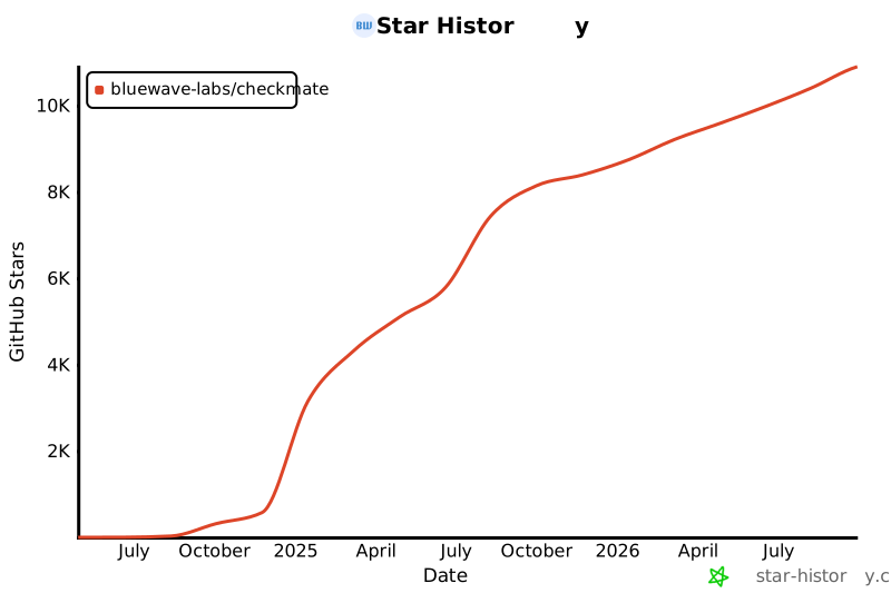](https://star-history.com/#bluewave-labs/bluewave-uptime&Date)
|
||||
|
||||
## Patrocinadores
|
||||
|
||||
Gracias a [Gitbook](https://gitbook.io/) por darnos una cuenta gratuita para su plataforma de documentación, y a [Poeditor](https://poeditor.com/) por proporcionarnos una cuenta gratuita para servicios de traducción. Si deseas patrocinar Checkmate, por favor envía un correo a hello@bluewavelabs.ca
|
||||
|
||||
Si deseas patrocinar una función, [visita esta página](https://checkmate.so/sponsored-features).
|
||||
|
||||
También puedes revisar otros proyectos de BlueWave orientados a desarrolladores y contribuidores:
|
||||
|
||||
- [VerifyWise](https://github.com/bluewave-labs/verifywise), la primera plataforma de gobernanza de IA de código abierto.
|
||||
- [DataRoom](https://github.com/bluewave-labs/bluewave-dataroom), una aplicación de intercambio de archivos seguro, también conocida como dataroom.
|
||||
- [Guidefox](https://github.com/bluewave-labs/guidefox), una app que ayuda a nuevos usuarios a aprender a usar tu producto mediante pistas, tours, popups y banners.
|
||||
@@ -1,26 +1,5 @@
|
||||
<p align=center> <a href="https://trendshift.io/repositories/12443" target="_blank"><img src="https://trendshift.io/api/badge/repositories/12443" alt="bluewave-labs%2Fcheckmate | Trendshift" style="width: 250px; height: 55px;" width="250" height="55"/></a></p>
|
||||
|
||||
<p align="center">
|
||||
🇺🇸 <a href="README.md">English</a> |
|
||||
🇸🇦 <a href="docs/translations/README.ar.md">العربية</a> |
|
||||
🇪🇸 <a href="docs/translations/README.ca.md">Català</a> |
|
||||
🇨🇿 <a href="docs/translations/README.cs.md">Čeština</a> |
|
||||
🇩🇪 <a href="docs/translations/README.de.md">Deutsch</a> |
|
||||
🇪🇸 <a href="docs/translations/README.es.md">Español</a> |
|
||||
🇫🇮 <a href="docs/translations/README.fi.md">Suomi</a> |
|
||||
🇫🇷 <a href="docs/translations/README.fr.md">Français</a> |
|
||||
🇮🇹 <a href="docs/translations/README.it.md">Italiano</a> |
|
||||
🇯🇵 <a href="docs/translations/README.ja.md">日本語</a> |
|
||||
🇧🇷 <a href="docs/translations/README.pt-BR.md">Português (Brasil)</a> |
|
||||
🇷🇺 <a href="docs/translations/README.ru.md">Русский</a> |
|
||||
🇹🇭 <a href="docs/translations/README.th.md">ไทย</a> |
|
||||
🇹🇷 <a href="docs/translations/README.tr.md">Türkçe</a> |
|
||||
🇺🇦 <a href="docs/translations/README.uk.md">Українська</a> |
|
||||
🇻🇳 <a href="docs/translations/README.vi.md">Tiếng Việt</a> |
|
||||
🇨🇳 <a href="docs/translations/README.zh-CN.md">简体中文</a> |
|
||||
🇹🇼 <a href="docs/translations/README.zh-TW.md">繁體中文</a>
|
||||
</p>
|
||||
|
||||
|
||||

|
||||

|
||||

|
||||
@@ -32,12 +11,12 @@
|
||||
|
||||
<h1 align="center"><a href="https://bluewavelabs.ca" target="_blank">Checkmate</a></h1>
|
||||
|
||||
<p align="center"><strong>An open source uptime and infrastructure monitoring application</strong>
|
||||
<p align="center"><strong>An open source uptime and infrastructure monitoring application</strong></p>
|
||||
|
||||
[](https://www.pikapods.com/pods?run=checkmate)
|
||||
|
||||
<img width="1461" height="853" alt="image" src="https://github.com/user-attachments/assets/d5ee1a4e-9db9-47cc-ad47-e1ba88a9d796" />
|
||||
</p>
|
||||
<img width="1703" height="1041" alt="image" src="https://github.com/user-attachments/assets/0f4dcf38-9b42-4b84-8633-ff34778df1a8" />
|
||||
|
||||
<br>
|
||||
|
||||
|
||||
@@ -61,14 +40,12 @@ Checkmate has been stress-tested with 1000+ active monitors without any particul
|
||||
- [🤝 Contributing](#contributing)
|
||||
|
||||
|
||||
<a id="demo"></a>
|
||||
## Demo
|
||||
|
||||
You can see the latest build of [Checkmate](https://demo.checkmate.so/) in action.
|
||||
|
||||
The username is demouser@demo.com and the password is Demouser1! (just a note that we update the demo server from time to time, so if it doesn't work for you, please ping us on the Discussions channel).
|
||||
|
||||
<a id="users-guide"></a>
|
||||
## User's guide
|
||||
|
||||
Usage instructions can be found [here](https://checkmate.so/docs).
|
||||
@@ -77,185 +54,28 @@ Usage instructions can be found [here](https://checkmate.so/docs).
|
||||
- [Docker](https://www.docker.com/) installed
|
||||
- [Git](https://git-scm.com/) installed
|
||||
|
||||
<a id="installation"></a>
|
||||
## Installation
|
||||
|
||||
The quickest way to run Checkmate is the reference Docker Compose file. It starts two services: the all-in-one Checkmate application image (`ghcr.io/bluewave-labs/checkmate`) and a separate MongoDB service.
|
||||
See installation instructions in [Checkmate documentation portal](https://checkmate.so/docs).
|
||||
|
||||
> **What “all-in-one” means:** the Checkmate application is packaged in a single image; MongoDB is not embedded in that image and remains required. The reference Compose file starts MongoDB for you. For custom deployments, configure `DB_CONNECTION_STRING` to use an external MongoDB instance.
|
||||
|
||||
```bash
|
||||
curl -O https://raw.githubusercontent.com/bluewave-labs/checkmate/master/docker/docker-compose.yaml
|
||||
JWT_SECRET="$(openssl rand -hex 32)" docker compose up -d
|
||||
```
|
||||
|
||||
Then open http://localhost:52345. If the app is reached at another origin (domain or LAN IP), set `CLIENT_HOST` accordingly. To build the image yourself, run `docker build -f docker/Dockerfile -t checkmate .` from a checkout. For TLS, put any reverse proxy (Caddy, Traefik, nginx) in front of port 52345.
|
||||
|
||||
There are also 1-click installation options like [Repocloud](https://repocloud.io/details/Checkmate),
|
||||
[Pikapods](https://www.pikapods.com/), [Coolify](https://coolify.io/), [Elestio](https://elest.io/open-source/checkmate), [Easypanel](https://easypanel.io/templates/checkmate), [K8s](./charts/helm/checkmate/INSTALLATION.md), [Sive Host](https://sive.host) or [Cloudzy](https://cloudzy.com/marketplace/checkmate). Note that the Helm chart has not yet been migrated to the all-in-one image: it still deploys the legacy `checkmate-client`, `checkmate-backend` and `checkmate-mongo` images, pinned at v3.8.1.
|
||||
|
||||
|
||||
### Configuration
|
||||
|
||||
The image is configured entirely through environment variables on the server container:
|
||||
|
||||
| Variable | Required | Description |
|
||||
|---|---|---|
|
||||
| `DB_CONNECTION_STRING` | Yes | MongoDB connection string, e.g. `mongodb://mongodb:27017/uptime_db` |
|
||||
| `JWT_SECRET` | Yes | Secret used to sign auth tokens; generate one with `openssl rand -hex 32` |
|
||||
| `CLIENT_HOST` | Yes | The URL users reach the app at, e.g. `https://checkmate.example.com`; used for CORS and for links in notifications and emails |
|
||||
| `ENCRYPTION_KEY` | No | Encrypts stored Docker TLS client keys at rest; generate one with `openssl rand -base64 32`. Comma-separated list: the first key encrypts, every key decrypts. Must be identical on the API and every worker. To rotate without downtime, deploy `OLD_KEY,NEW_KEY` everywhere, then `NEW_KEY,OLD_KEY` everywhere, wait for the worker to re-encrypt every row, then drop `OLD_KEY`. |
|
||||
| `PORT` | No | Port the API and web client are served on (default `52345`) |
|
||||
| `HEALTH_PORT` | No | Port for the `/livez`, `/readyz` and `/metrics` endpoints, served by any process that runs the job worker (default `52346`) |
|
||||
| `NODE_ENV` | No | `development`, `production` or `test` (default `development`). `development` disables the general API rate limiter; set `production` on real deployments |
|
||||
| `LOG_LEVEL` | No | Server log level: `error`, `warn`, `info`, or `debug` (default `debug`) |
|
||||
| `TOKEN_TTL` | No | Lifetime of issued auth tokens, e.g. `12h` or `7d` (default `99d`) |
|
||||
| `QUEUE_MODE` | No | `primary` (default) runs the API, the web client and the job scheduler; `worker` runs a job-processing worker only, with no API |
|
||||
| `QUEUE_PRIMARY_PROCESSES` | No | `true` (default) or `false`. Whether a `primary` node also processes monitoring jobs itself; set `false` when dedicated `worker` nodes handle all checks. Ignored in `worker` mode |
|
||||
| `STATUS_PAGE_THEMES_ENABLED` | No | `true` (default) or `false`. When `false`, status pages ignore theme settings and always render the default theme |
|
||||
|
||||
The web client needs no configuration by default: it calls the API on the same origin it was served from (`/api/v1`). For setups where the defaults don't apply — for example, the API is reached through a different origin than the page — the server renders overrides into the client at runtime via these optional variables:
|
||||
|
||||
| Variable | Description |
|
||||
|---|---|
|
||||
| `CLIENT_CONFIG_API_BASE_URL` | Full base URL the client calls the API at, e.g. `https://api.example.com/api/v1`; defaults to same-origin `/api/v1` |
|
||||
| `CLIENT_CONFIG_CLIENT_HOST` | Origin used when the client builds absolute links (invites, status pages); defaults to the browser's current origin |
|
||||
| `CLIENT_CONFIG_LOG_LEVEL` | Browser console log level: `error`, `warn`, `info`, or `debug` (default `error`) |
|
||||
|
||||
> **Upgrading from an older image?** The `UPTIME_APP_*` variables (`UPTIME_APP_API_BASE_URL`, `UPTIME_APP_CLIENT_HOST`, `UPTIME_APP_LOG_LEVEL`) are no longer read. In most setups no replacement is needed — the same-origin defaults cover them; if you pointed the client at a different origin, use the `CLIENT_CONFIG_*` equivalents above. The `checkmate-client`, `checkmate-backend`, `checkmate-mongo`, and `checkmate-backend-mono-multiarch` images are no longer updated — switch to `ghcr.io/bluewave-labs/checkmate`, keeping your existing MongoDB service and data volume.
|
||||
|
||||
See full installation instructions in the [Checkmate documentation portal](https://checkmate.so/docs).
|
||||
|
||||
Alternatively, you can also use [Coolify](https://coolify.io/), [Elestio](https://elest.io/open-source/checkmate), [K8s](./charts/helm/checkmate/INSTALLATION.md) (legacy images, pinned at v3.8.1), [Sive Host](https://sive.host) (South Africa), [Cloudzy](https://cloudzy.com/marketplace/checkmate) or [Pikapods](https://www.pikapods.com/) to quickly spin off a Checkmate instance. If you would like to monitor your server infrastructure, you'll need [Capture agent](https://github.com/bluewave-labs/capture). Capture repository also contains the installation instructions.
|
||||
Alternatively, you can also use [Coolify](https://coolify.io/), [Elestio](https://elest.io/open-source/checkmate), [K8s](./charts/helm/checkmate/INSTALLATION.md), [Sive Host](https://sive.host) (South Africa), [Cloudzy](https://cloudzy.com/marketplace/checkmate) or [Pikapods](https://www.pikapods.com/) to quickly spin off a Checkmate instance. If you would like to monitor your server infrastructure, you'll need [Capture agent](https://github.com/bluewave-labs/capture). Capture repository also contains the installation instructions.
|
||||
|
||||
### Using a Custom CA
|
||||
|
||||
If you need to monitor internal HTTPS endpoints with certificates from private Certificate Authorities (like Smallstep), see our [Custom CA Trust Guide](./docs/custom-ca-trust.md) for Docker configuration options.
|
||||
|
||||
### Docker monitors
|
||||
|
||||
A Docker monitor reports on every container running on a host. It can connect to the Docker daemon directly or read container metrics from a Capture agent. Direct monitors use the daemon's ping response for availability and record container state, health, CPU and memory usage, restart count, published ports and mounts. Enabling **Collect container logs** additionally stores the latest 200 log lines per container on every direct check; logs are kept for 7 days.
|
||||
|
||||
The **Docker host** field accepts three forms:
|
||||
|
||||
| Host | Example | Notes |
|
||||
|---|---|---|
|
||||
| Local socket | `unix:///var/run/docker.sock` | Also accepts a bare absolute path such as `/var/run/docker.sock`. Use this for the daemon on the same machine Checkmate runs on. |
|
||||
| Remote daemon | `tcp://docker.example.com:2376` | Always uses mutual TLS; the port defaults to `2376`. Unencrypted daemons on `2375` are not supported. |
|
||||
| Capture agent | `https://capture.example.com/api/v1/metrics/docker` | Enter the full endpoint ending in `/metrics/docker` and its authorization secret. Checkmate requests `all=true` so stopped containers are included. |
|
||||
|
||||
Capture-backed monitors normalize Capture's container state, health, CPU, memory, start time and exposed ports into the same Docker pages. Capture does not currently provide restart counts, mounts, published host-port bindings or container logs, so those values are shown as unavailable. Capture also reports a container whose health check is still starting as healthy, so the `starting` health state only appears on direct monitors, and stopped containers carry no CPU or memory metrics.
|
||||
|
||||
**Monitoring the local socket.** The reference Compose file does not mount the socket, so add it and grant the container the host's `docker` group. The image runs as an unprivileged user and cannot read the socket otherwise. Find the group id with `stat -c %g /var/run/docker.sock`, then:
|
||||
|
||||
```yaml
|
||||
services:
|
||||
checkmate:
|
||||
volumes:
|
||||
- /var/run/docker.sock:/var/run/docker.sock:ro
|
||||
group_add:
|
||||
- "989" # the gid printed by stat
|
||||
```
|
||||
|
||||
**Monitoring a remote daemon.** Set the host to `tcp://host:port` and fill in the **TLS credentials** section of the monitor form with the same PEM files you would pass to `docker --tlsverify`:
|
||||
|
||||
- **CA certificate**: the CA that signed the daemon's server certificate. Required unless **Ignore TLS/SSL errors** is on, which skips verifying the daemon's identity.
|
||||
- **Client certificate**: the certificate the daemon uses to authenticate Checkmate.
|
||||
- **Client key**: the matching private key, unencrypted (no passphrase). Checkmate checks that it matches the certificate, encrypts it with `ENCRYPTION_KEY`, and never shows it again. Leave the field blank when editing to keep the stored key.
|
||||
|
||||
TLS Docker monitors require `ENCRYPTION_KEY` to be set on the server (see [Configuration](#configuration)). Saving one without it fails with an error telling you so. If the key is ever removed or rotated incorrectly, affected checks fail with a decryption error until it is restored.
|
||||
|
||||
If the daemon's certificate is signed by a private CA that you also want the rest of Checkmate to trust, see the [Custom CA Trust Guide](./docs/custom-ca-trust.md); for Docker monitors alone, the **CA certificate** field is enough.
|
||||
|
||||
### Securing the Docker daemon with TLS
|
||||
|
||||
The Docker daemon does not enable TLS by default. Follow these steps on the Docker host to generate a CA, a server certificate, and a client certificate for Checkmate. This is the procedure from [Docker's own guide](https://docs.docker.com/engine/security/protect-access/), condensed. Replace `docker.example.com` and `203.0.113.10` with your daemon's DNS name and IP.
|
||||
|
||||
**1. Create a CA.** The CA key gets a passphrase; keep it offline once the certificates are issued.
|
||||
|
||||
```bash
|
||||
openssl genrsa -aes256 -out ca-key.pem 4096
|
||||
openssl req -new -x509 -days 365 -key ca-key.pem -sha256 -subj "/CN=docker-ca" -out ca.pem
|
||||
```
|
||||
|
||||
**2. Create the server certificate.** The subject alternative names must cover every name or address Checkmate will use to reach the daemon.
|
||||
|
||||
```bash
|
||||
openssl genrsa -out server-key.pem 4096
|
||||
openssl req -subj "/CN=docker.example.com" -sha256 -new -key server-key.pem -out server.csr
|
||||
cat > server-ext.cnf <<EOF
|
||||
subjectAltName = DNS:docker.example.com,IP:203.0.113.10
|
||||
extendedKeyUsage = serverAuth
|
||||
EOF
|
||||
openssl x509 -req -days 365 -sha256 -in server.csr -CA ca.pem -CAkey ca-key.pem -CAcreateserial \
|
||||
-out server-cert.pem -extfile server-ext.cnf
|
||||
```
|
||||
|
||||
**3. Create the client certificate for Checkmate.** Do not add a passphrase to this key; Checkmate cannot use encrypted private keys.
|
||||
|
||||
```bash
|
||||
openssl genrsa -out key.pem 4096
|
||||
openssl req -subj "/CN=checkmate" -new -key key.pem -out client.csr
|
||||
echo "extendedKeyUsage = clientAuth" > client-ext.cnf
|
||||
openssl x509 -req -days 365 -sha256 -in client.csr -CA ca.pem -CAkey ca-key.pem -CAcreateserial \
|
||||
-out cert.pem -extfile client-ext.cnf
|
||||
rm client.csr server.csr server-ext.cnf client-ext.cnf
|
||||
chmod 0400 ca-key.pem key.pem server-key.pem
|
||||
chmod 0444 ca.pem server-cert.pem cert.pem
|
||||
```
|
||||
|
||||
**4. Point the daemon at the certificates.** Move `ca.pem`, `server-cert.pem` and `server-key.pem` to `/etc/docker/certs/` and configure `/etc/docker/daemon.json`:
|
||||
|
||||
```json
|
||||
{
|
||||
"hosts": ["unix:///var/run/docker.sock", "tcp://0.0.0.0:2376"],
|
||||
"tls": true,
|
||||
"tlsverify": true,
|
||||
"tlscacert": "/etc/docker/certs/ca.pem",
|
||||
"tlscert": "/etc/docker/certs/server-cert.pem",
|
||||
"tlskey": "/etc/docker/certs/server-key.pem"
|
||||
}
|
||||
```
|
||||
|
||||
On distributions where the systemd unit already passes `-H fd://` (Debian, Ubuntu and derivatives), the daemon refuses to start with `hosts` set in both places. Remove the flag from the unit with an override, then restart:
|
||||
|
||||
```bash
|
||||
sudo systemctl edit docker.service
|
||||
```
|
||||
|
||||
```ini
|
||||
[Service]
|
||||
ExecStart=
|
||||
ExecStart=/usr/bin/dockerd
|
||||
```
|
||||
|
||||
```bash
|
||||
sudo systemctl daemon-reload && sudo systemctl restart docker
|
||||
```
|
||||
|
||||
Open port `2376` on the host firewall only to the machine running Checkmate.
|
||||
|
||||
**5. Verify from the Checkmate host**, then paste `ca.pem`, `cert.pem` and `key.pem` into the monitor form:
|
||||
|
||||
```bash
|
||||
docker --tlsverify --tlscacert=ca.pem --tlscert=cert.pem --tlskey=key.pem \
|
||||
-H=docker.example.com:2376 version
|
||||
```
|
||||
|
||||
For more documentation, see the [docs directory](./docs/).
|
||||
|
||||
<a id="performance"></a>
|
||||
## Performance
|
||||
|
||||
Thanks to extensive optimizations, Checkmate operates with an exceptionally small memory footprint, requiring minimal memory and CPU resources. Here’s the memory usage of a Node.js instance running on a server that monitors 323 servers every minute:
|
||||
|
||||

|
||||
|
||||
You can see the memory footprint of MongoDB on the same server (398Mb) for the same amount of servers:
|
||||
You can see the memory footprint of MongoDB and Redis on the same server (398Mb and 15Mb) for the same amount of servers:
|
||||
|
||||

|
||||
|
||||
<a id="questions--ideas"></a>
|
||||
## Questions & Ideas
|
||||
|
||||
If you have any questions, suggestions or comments, you have several options:
|
||||
@@ -265,20 +85,19 @@ If you have any questions, suggestions or comments, you have several options:
|
||||
|
||||
Feel free to ask questions or share your ideas - we'd love to hear from you!
|
||||
|
||||
<a id="features"></a>
|
||||
## Features
|
||||
|
||||
- Completely open source, deployable on your servers or home devices (e.g Raspberry Pi 4 or 5)
|
||||
- Several monitoring options: HTTP (with SSL certificate expiry), Ping, Port, DNS, Docker, gRPC, WebSocket, Game server
|
||||
- Several monitoring options: Uptime, Docker, Ping, SSL, Port, Game server
|
||||
- Page speed monitoring
|
||||
- Infrastructure monitoring (memory, disk usage, CPU performance, network etc) - requires [Capture](https://github.com/bluewave-labs/capture) agent
|
||||
- Selective disk monitoring with mountpoint selection
|
||||
- Incidents at a glance
|
||||
- Status pages with 5 beautiful themes
|
||||
- E-mail, Webhooks, Discord, Slack, PagerDuty, Matrix, Rocket.Chat, Microsoft Teams, Telegram, Pushover, ntfy, SignalGrid, Twilio (SMS) notifications
|
||||
- Status pages with 4 beautiful themes
|
||||
- E-mail, Webhooks, Discord, Slack, PagerDuty, Matrix, Microsoft Teams, Telegram, Pushover, Twilio (SMS) notifications
|
||||
- Scheduled maintenance
|
||||
- JSON query monitoring
|
||||
- Multi-language support for Arabic, Catalan, Chinese (Simplified), Chinese (Traditional, Taiwan), Czech, English, Finnish, French, German, Italian, Japanese, Polish, Portuguese (Brazil), Russian, Spanish, Thai, Turkish, Ukrainian, and Vietnamese
|
||||
- Multi-language support for Arabic, Chinese (Simplified), Chinese (Traditional, Taiwan), Czech, English, Finnish, French, German, Japanese, Portuguese (Brazil), Russian, Spanish, Thai, Turkish, Ukrainian, and Vietnamese
|
||||
|
||||
|
||||
## Monitor Lifecycle
|
||||
@@ -290,7 +109,6 @@ Feel free to ask questions or share your ideas - we'd love to hear from you!
|
||||
5. Upon a state change: an incident is either created or resolved, depending on the monitor's current status
|
||||
6. Notifications are triggered based on configuration
|
||||
|
||||
<a id="screenshots"></a>
|
||||
## Screenshots
|
||||
|
||||
<p>
|
||||
@@ -308,7 +126,6 @@ Feel free to ask questions or share your ideas - we'd love to hear from you!
|
||||
|
||||
|
||||
|
||||
<a id="tech-stack"></a>
|
||||
## Tech stack
|
||||
|
||||
- [ReactJs](https://react.dev/)
|
||||
@@ -318,7 +135,6 @@ Feel free to ask questions or share your ideas - we'd love to hear from you!
|
||||
- [Recharts](https://recharts.org)
|
||||
- Lots of other open source components!
|
||||
|
||||
<a id="a-few-links"></a>
|
||||
## A few links
|
||||
|
||||
- If you would like to support us, please consider giving it a ⭐ and click on "watch".
|
||||
@@ -326,12 +142,11 @@ Feel free to ask questions or share your ideas - we'd love to hear from you!
|
||||
- Need a ping when there's a new release? Use [Newreleases](https://newreleases.io/), a free service to track releases.
|
||||
- Watch a Checkmate [installation and usage video](https://www.youtube.com/watch?v=GfFOc0xHIwY)
|
||||
|
||||
<a id="contributing"></a>
|
||||
## Contributing
|
||||
|
||||
We are [Alex](http://github.com/ajhollid) (team lead), [Gorkem](http://github.com/gorkem-bwl/), [Aryaman](https://github.com/Br0wnHammer), [Malena](https://github.com/malenacaroline) and [Mert](https://github.com/mertssmnoglu) helping individuals and businesses monitor their infra and servers.
|
||||
We are [Alex](http://github.com/ajhollid) (team lead), [Gorkem](http://github.com/gorkem-bwl/), [Aryaman](https://github.com/Br0wnHammer), [Mert](https://github.com/mertssmnoglu) and [Karen](https://github.com/karenvicent) helping individuals and businesses monitor their infra and servers.
|
||||
|
||||
We pride ourselves on building strong connections with contributors at every level. Despite being a young project, Checkmate has already earned almost 11K stars and attracted 150+ contributors from around the globe.
|
||||
We pride ourselves on building strong connections with contributors at every level. Despite being a young project, Checkmate has already earned 7000+ stars and attracted 90+ contributors from around the globe.
|
||||
|
||||
Our repo is starred by employees from **Google, Microsoft, Intel, Cisco, Tencent, Electronic Arts, ByteDance, JP Morgan Chase, Deloitte, Accenture, Foxconn, Broadcom, China Telecom, Barclays, Capgemini, Wipro, Cloudflare, Dassault Systèmes and NEC**, so don’t hold back — jump in, contribute and learn with us!
|
||||
|
||||
|
||||
@@ -2,9 +2,5 @@ apiVersion: v2
|
||||
name: checkmate-chart
|
||||
description: A Helm chart for Checkmate App
|
||||
type: application
|
||||
version: 0.2.0
|
||||
# DO NOT bump appVersion past v3.8.1 until this chart is migrated to the all-in-one
|
||||
# image (ghcr.io/bluewave-labs/checkmate). The checkmate-client / checkmate-backend /
|
||||
# checkmate-mongo images this chart references are frozen at v3.8.1 — later versions
|
||||
# are never published, so a bumped chart will fail to pull.
|
||||
appVersion: "v3.8.1" # "v" prefix: published image tags are v-prefixed (ghcr.io/.../checkmate-*:v3.8.1)
|
||||
version: 0.1.0
|
||||
appVersion: "2.3"
|
||||
@@ -19,11 +19,12 @@ cd checkmate/charts/helm/checkmate
|
||||
|
||||
### 2. Customize values.yaml
|
||||
Edit `values.yaml` to update:
|
||||
- `client.ingress.host` and `api.ingress.host` with your domain names
|
||||
- `api.protocol` (usually http or https)
|
||||
- `client.ingress.host` and `server.ingress.host` with your domain names
|
||||
- `server.protocol` (usually http or https)
|
||||
- **If upgrading**: Migrate persistence settings from flat structure to nested:
|
||||
- Old: `persistence.mongodbSize` → New: `persistence.mongo.size`
|
||||
- Add: `persistence.mongo.storageClass` (leave empty for default)
|
||||
- Old: `persistence.redisSize` → New: `persistence.redis.size`
|
||||
- Add: `persistence.mongo.storageClass` and `persistence.redis.storageClass` (leave empty for default)
|
||||
- Secrets under the `secrets` section (`JWT_SECRET`, email credentials, API keys, etc.) — replace all change_me values
|
||||
- **For TLS/HTTPS**: Configure ingress TLS settings (see section below)
|
||||
|
||||
@@ -31,7 +32,7 @@ Edit `values.yaml` to update:
|
||||
```bash
|
||||
helm install checkmate ./charts/helm/checkmate
|
||||
```
|
||||
This will deploy the client, api, and MongoDB components.
|
||||
This will deploy the client, server, MongoDB, and Redis components.
|
||||
|
||||
### 4. Verify the deployment
|
||||
Check pods and services:
|
||||
@@ -42,137 +43,6 @@ kubectl get svc
|
||||
|
||||
Once all pods are `Running` and `Ready`, you can access Checkmate via the configured ingress hosts.
|
||||
|
||||
## Upgrading from a previous release
|
||||
|
||||
This release renames the `server.*` value block to `api.*` and drops the (unused) bundled Redis.
|
||||
Read this before running `helm upgrade` on an existing install.
|
||||
|
||||
### `server.*` → `api.*` (values rename)
|
||||
|
||||
The value block formerly named `server` is now `api` (`server.image` → `api.image`,
|
||||
`server.ingress.host` → `api.ingress.host`, `server.protocol` → `api.protocol`, `server.resources`,
|
||||
`server.affinity`, `server.tolerations`, `server.ingress.*`, etc.).
|
||||
|
||||
**Your existing `server.*` overrides keep working** — the chart merges any legacy `server.*` values on
|
||||
top of the `api.*` defaults (legacy wins where set), so an unchanged values file upgrades cleanly. The
|
||||
shim is transitional; migrate your overrides to `api.*` at your convenience and drop the `server:`
|
||||
block. If you set **both** `server.*` and `api.*` for the same field, the legacy `server.*` value wins —
|
||||
don't mix them.
|
||||
|
||||
### Resource renames cause a replace, not a rename
|
||||
|
||||
The Kubernetes objects are renamed alongside the values:
|
||||
|
||||
| Old object | New object |
|
||||
| --- | --- |
|
||||
| Deployment/Service `checkmate-server` | `checkmate-api` |
|
||||
| Ingress `checkmate-server-ingress` | `checkmate-api-ingress` |
|
||||
| ConfigMap `checkmate-server-nginx-cm` | `checkmate-client-nginx-cm` |
|
||||
|
||||
Helm deletes the old objects and creates the new ones on upgrade. Expect a brief API restart and a
|
||||
**new ClusterIP** for the API Service — update anything outside the chart that referenced the
|
||||
`checkmate-server` Service by name. MongoDB data (its PVC) is untouched.
|
||||
|
||||
### Redis removed
|
||||
|
||||
The bundled Redis StatefulSet/Service and the `redis.*` / `persistence.redis.*` values are gone — the
|
||||
scheduler runs in-process and never used them. Default installs (`redis.enabled: false`) are
|
||||
unaffected. If you had explicitly set `redis.enabled: true`, **the Redis StatefulSet and its PVC are
|
||||
deleted on upgrade** — back up anything you stored there first. Leftover `redis:` / `persistence.redis:`
|
||||
keys in your values file are harmless (ignored).
|
||||
|
||||
### New secret defaults
|
||||
|
||||
`NODE_ENV: production`, `LOG_LEVEL: info`, and `TOKEN_TTL: 99d` are now part of the default `secrets`
|
||||
block and merge into your install unless you override them. Set them explicitly if you relied on
|
||||
different values (e.g. a non-production `NODE_ENV`).
|
||||
|
||||
### Image tags follow the chart's `appVersion`
|
||||
|
||||
Each tier's `image` value is now the repository **without a tag**; the tag defaults to the chart's
|
||||
`appVersion`, so the client, api, worker, and mongodb images all move together when you upgrade the
|
||||
chart. You can still pin per tier:
|
||||
|
||||
```yaml
|
||||
api:
|
||||
image: ghcr.io/bluewave-labs/checkmate-backend # repo only
|
||||
tag: "" # empty → Chart.appVersion; set e.g. "v3.1.0" to pin, or "latest" for a dev tag
|
||||
```
|
||||
|
||||
- `<tier>.tag` overrides the version for that tier. The `worker` tier inherits `api.tag` (and
|
||||
`api.image`) unless you set `worker.tag` / `worker.image`.
|
||||
- If you put a **full `repo:tag`** in `image` (e.g. a legacy `server.image: …:v3.2.0` override), it is
|
||||
used verbatim and the `tag` field is ignored — so existing pinned values keep working unchanged.
|
||||
|
||||
**Prefer a pinned tag over `latest`.** With the default `imagePullPolicy: IfNotPresent`, `latest` is
|
||||
cached per node and never refreshed, and `helm rollback` can't move a floating tag — pin a version (or
|
||||
let it default to `appVersion`) for reproducible, rollback-able deploys.
|
||||
|
||||
## Scaling: the worker tier & autoscaling
|
||||
|
||||
By default the chart runs a single all-in-one API pod that both schedules **and** processes monitoring
|
||||
jobs (`worker.enabled: false`). For larger deployments you can split processing onto a dedicated,
|
||||
horizontally-scalable worker tier.
|
||||
|
||||
### Topology
|
||||
|
||||
| `worker.enabled` | API (`checkmate-api`) | Worker (`checkmate-worker`) |
|
||||
| --- | --- | --- |
|
||||
| `false` (default) | schedules **and** processes jobs (`QUEUE_PRIMARY_PROCESSES=true`) | not deployed |
|
||||
| `true` | schedules + serves the API only (`QUEUE_PRIMARY_PROCESSES=false`, derived) | processes all jobs |
|
||||
|
||||
`QUEUE_PRIMARY_PROCESSES` is **derived** from `worker.enabled` — you never set it directly, so the API
|
||||
and worker tier can never both process (or both ignore) the queue.
|
||||
|
||||
### Enabling the worker tier
|
||||
|
||||
```yaml
|
||||
worker:
|
||||
enabled: true
|
||||
replicas: 2 # used only when autoscaling.enabled = false
|
||||
```
|
||||
|
||||
The worker takes **no inbound traffic** (no Service): the kubelet probes pod IPs directly on
|
||||
`HEALTH_PORT` (`/livez`, `/readyz`), and graceful shutdown drains in-flight jobs before exit.
|
||||
|
||||
> **Invariant:** `worker.terminationGracePeriodSeconds` (default `30`) **must stay greater than the
|
||||
> server drain timeout (25s)**. Lower it and Kubernetes SIGKILLs workers mid-drain, losing in-flight
|
||||
> checks.
|
||||
|
||||
> **Caveat:** with the worker tier enabled the API no longer processes jobs, so if **all** workers are
|
||||
> down nothing processes. The `autoscaling.minReplicaCount: 1` floor plus liveness restarts mitigate
|
||||
> this; full failover to the API would need leader election (not supported).
|
||||
|
||||
### Autoscaling with KEDA
|
||||
|
||||
Backlog-driven autoscaling is **off by default** and requires the
|
||||
[KEDA operator](https://keda.sh/) installed in-cluster. Enable it with:
|
||||
|
||||
```yaml
|
||||
worker:
|
||||
enabled: true
|
||||
autoscaling:
|
||||
enabled: true
|
||||
minReplicaCount: 1 # processing floor — never 0, or checks silently stall
|
||||
maxReplicaCount: 10
|
||||
backlogPerReplica: 50 # target due-job backlog per worker
|
||||
mongo:
|
||||
dbName: uptime_db # MUST match the database in DB_CONNECTION_STRING
|
||||
```
|
||||
|
||||
A KEDA `ScaledObject` queries MongoDB directly for the due-check backlog and scales the worker
|
||||
Deployment between `minReplicaCount` and `maxReplicaCount`. When autoscaling is on, the Deployment
|
||||
omits `replicas` so it doesn't fight the HPA KEDA creates. Make sure `autoscaling.mongo.dbName`
|
||||
matches the database name in your `DB_CONNECTION_STRING`, or the scaler counts the wrong DB (always 0
|
||||
backlog → never scales up).
|
||||
|
||||
#### Fallback: Prometheus-adapter HPA (not shipped)
|
||||
|
||||
If your KEDA/Mongo versions reject the `$$NOW`/`$toLong` query, or you already run Prometheus, scrape
|
||||
the worker's `/metrics` (`checkmate_worker_due_backlog`), expose it via prometheus-adapter, and target
|
||||
it with a standard `HorizontalPodAutoscaler`. The manifest is left to the operator; the app computes
|
||||
`now` in code on this path, so the query coercion is unnecessary.
|
||||
|
||||
## Enabling TLS/HTTPS with cert-manager
|
||||
|
||||
If you have [cert-manager](https://cert-manager.io/) installed in your cluster, you can enable automatic TLS certificate provisioning using Let's Encrypt or other certificate issuers.
|
||||
@@ -198,7 +68,7 @@ client:
|
||||
enabled: true
|
||||
secretName: checkmate-client-tls
|
||||
|
||||
api:
|
||||
server:
|
||||
protocol: https
|
||||
ingress:
|
||||
enabled: true
|
||||
@@ -208,7 +78,7 @@ api:
|
||||
cert-manager.io/cluster-issuer: "letsencrypt-prod"
|
||||
tls:
|
||||
enabled: true
|
||||
secretName: checkmate-api-tls
|
||||
secretName: checkmate-server-tls
|
||||
```
|
||||
|
||||
### Alternative: Using --set flags
|
||||
@@ -218,13 +88,13 @@ You can also enable TLS during installation using Helm's `--set` flags:
|
||||
```bash
|
||||
helm install checkmate ./charts/helm/checkmate \
|
||||
--set client.protocol=https \
|
||||
--set api.protocol=https \
|
||||
--set server.protocol=https \
|
||||
--set client.ingress.annotations."cert-manager\.io/cluster-issuer"="letsencrypt-prod" \
|
||||
--set client.ingress.tls.enabled=true \
|
||||
--set client.ingress.tls.secretName=checkmate-client-tls \
|
||||
--set api.ingress.annotations."cert-manager\.io/cluster-issuer"="letsencrypt-prod" \
|
||||
--set api.ingress.tls.enabled=true \
|
||||
--set api.ingress.tls.secretName=checkmate-api-tls
|
||||
--set server.ingress.annotations."cert-manager\.io/cluster-issuer"="letsencrypt-prod" \
|
||||
--set server.ingress.tls.enabled=true \
|
||||
--set server.ingress.tls.secretName=checkmate-server-tls
|
||||
```
|
||||
|
||||
### Verification
|
||||
@@ -237,7 +107,7 @@ kubectl get certificates
|
||||
|
||||
# Check certificate details
|
||||
kubectl describe certificate checkmate-client-tls
|
||||
kubectl describe certificate checkmate-api-tls
|
||||
kubectl describe certificate checkmate-server-tls
|
||||
|
||||
# Verify the secrets were created
|
||||
kubectl get secrets | grep checkmate-tls
|
||||
|
||||
@@ -1,35 +0,0 @@
|
||||
{{- /*
|
||||
Back-compat shim: the `server.*` value block was renamed to `api.*`. Existing installs that
|
||||
still pass a legacy `server:` block keep working — this returns the effective API values with any
|
||||
legacy `server.*` overrides merged on top of the `api.*` defaults (legacy wins where set).
|
||||
|
||||
New installs have no `server:` key, so this is a no-op deepCopy of `.Values.api`. Consume it as:
|
||||
{{- $api := include "checkmate.api" . | fromYaml -}}
|
||||
then reference `$api.*` instead of `.Values.api.*`.
|
||||
*/}}
|
||||
{{- define "checkmate.api" -}}
|
||||
{{- $api := deepCopy .Values.api -}}
|
||||
{{- with .Values.server -}}
|
||||
{{- $api = mergeOverwrite $api (deepCopy .) -}}
|
||||
{{- end -}}
|
||||
{{- $api | toYaml -}}
|
||||
{{- end -}}
|
||||
|
||||
{{- /*
|
||||
Resolve a full image reference from a repo + optional tag. `appVersion` is the single source of
|
||||
truth for tags: bumping Chart.appVersion moves every tier at once. Call as:
|
||||
{{ include "checkmate.image" (dict "image" $repo "tag" $tag "root" $) }}
|
||||
|
||||
If `image` already carries a tag (a ":" in its final path segment) it is used verbatim — this keeps
|
||||
legacy `server.image: repo:tag` overrides working and lets anyone pin a full ref (e.g. tag "latest").
|
||||
A ":" only in the registry segment (a registry port like "reg:5000/x") is ignored, so a tag is still
|
||||
appended. Otherwise the tag is `tag` if set, else the chart's appVersion.
|
||||
*/}}
|
||||
{{- define "checkmate.image" -}}
|
||||
{{- $lastSegment := .image | splitList "/" | last -}}
|
||||
{{- if contains ":" $lastSegment -}}
|
||||
{{- .image -}}
|
||||
{{- else -}}
|
||||
{{- printf "%s:%s" .image (.tag | default .root.Chart.AppVersion) -}}
|
||||
{{- end -}}
|
||||
{{- end -}}
|
||||
@@ -1,65 +0,0 @@
|
||||
{{- $api := include "checkmate.api" . | fromYaml -}}
|
||||
apiVersion: apps/v1
|
||||
kind: Deployment
|
||||
metadata:
|
||||
name: checkmate-api
|
||||
spec:
|
||||
replicas: 1 # single scheduler — seeds/reconciles the jobs collection
|
||||
selector:
|
||||
matchLabels:
|
||||
app: checkmate-api
|
||||
template:
|
||||
metadata:
|
||||
labels:
|
||||
app: checkmate-api
|
||||
spec:
|
||||
{{- with $api.affinity }}
|
||||
affinity:
|
||||
{{- tpl ( . | toYaml) $ | nindent 8 }}
|
||||
{{- end }}
|
||||
{{- with $api.tolerations }}
|
||||
tolerations:
|
||||
{{- tpl ( . | toYaml) $ | nindent 8 }}
|
||||
{{- end }}
|
||||
containers:
|
||||
- name: api
|
||||
image: {{ include "checkmate.image" (dict "image" $api.image "tag" $api.tag "root" $) }}
|
||||
imagePullPolicy: {{ $api.imagePullPolicy }}
|
||||
ports:
|
||||
- name: http
|
||||
containerPort: {{ $api.port }}
|
||||
envFrom:
|
||||
- secretRef:
|
||||
name: checkmate-secrets
|
||||
# Probes hit the Express /api/v1/health endpoint — proves the HTTP server is responsive.
|
||||
# NOTE: this does NOT detect a wedged job loop when queuePrimaryProcesses=true (the API is
|
||||
# also a worker). Worker-aware health for that mode is a follow-up — see worker-health-checks.md §7.5.
|
||||
livenessProbe:
|
||||
httpGet:
|
||||
path: /api/v1/health
|
||||
port: http
|
||||
initialDelaySeconds: {{ $api.probes.liveness.initialDelaySeconds }}
|
||||
periodSeconds: {{ $api.probes.liveness.periodSeconds }}
|
||||
timeoutSeconds: {{ $api.probes.liveness.timeoutSeconds }}
|
||||
failureThreshold: {{ $api.probes.liveness.failureThreshold }}
|
||||
readinessProbe:
|
||||
httpGet:
|
||||
path: /api/v1/health
|
||||
port: http
|
||||
initialDelaySeconds: {{ $api.probes.readiness.initialDelaySeconds }}
|
||||
periodSeconds: {{ $api.probes.readiness.periodSeconds }}
|
||||
timeoutSeconds: {{ $api.probes.readiness.timeoutSeconds }}
|
||||
failureThreshold: {{ $api.probes.readiness.failureThreshold }}
|
||||
{{- with $api.resources }}
|
||||
resources:
|
||||
{{- tpl ( . | toYaml) $ | nindent 12 }}
|
||||
{{- end }}
|
||||
env:
|
||||
- name: CLIENT_HOST
|
||||
value: "{{ .Values.client.protocol }}://{{ .Values.client.ingress.host }}"
|
||||
- name: QUEUE_MODE
|
||||
value: "primary"
|
||||
# Derived: when a worker tier is deployed the API only schedules (false); otherwise it is
|
||||
# all-in-one and processes jobs itself (true). Keeps the two from ever competing for jobs.
|
||||
- name: QUEUE_PRIMARY_PROCESSES
|
||||
value: {{ not .Values.worker.enabled | quote }}
|
||||
@@ -1,10 +0,0 @@
|
||||
{{- $api := include "checkmate.api" . | fromYaml -}}
|
||||
apiVersion: v1
|
||||
kind: Service
|
||||
metadata:
|
||||
name: checkmate-api
|
||||
spec:
|
||||
selector:
|
||||
app: checkmate-api
|
||||
ports:
|
||||
- port: {{ $api.port }}
|
||||
+3
-5
@@ -1,4 +1,3 @@
|
||||
{{- $api := include "checkmate.api" . | fromYaml -}}
|
||||
apiVersion: apps/v1
|
||||
kind: Deployment
|
||||
metadata:
|
||||
@@ -23,13 +22,12 @@ spec:
|
||||
{{- end }}
|
||||
containers:
|
||||
- name: client
|
||||
image: {{ include "checkmate.image" (dict "image" .Values.client.image "tag" .Values.client.tag "root" $) }}
|
||||
imagePullPolicy: {{ .Values.client.imagePullPolicy }}
|
||||
image: {{ .Values.client.image }}
|
||||
ports:
|
||||
- containerPort: {{ .Values.client.port }}
|
||||
env:
|
||||
- name: UPTIME_APP_API_BASE_URL
|
||||
value: "{{ $api.protocol }}://{{ $api.ingress.host }}/api/v1"
|
||||
value: "{{ .Values.server.protocol }}://{{ .Values.server.ingress.host }}/api/v1"
|
||||
- name: UPTIME_APP_CLIENT_HOST
|
||||
value: "{{ .Values.client.protocol }}://{{ .Values.client.ingress.host }}"
|
||||
volumeMounts:
|
||||
@@ -43,4 +41,4 @@ spec:
|
||||
volumes:
|
||||
- name: config-volume
|
||||
configMap:
|
||||
name: checkmate-client-nginx-cm
|
||||
name: checkmate-server-nginx-cm
|
||||
File renamed without changes.
File renamed without changes.
File renamed without changes.
+2
-5
@@ -22,8 +22,7 @@ spec:
|
||||
{{- end }}
|
||||
containers:
|
||||
- name: mongodb
|
||||
image: {{ include "checkmate.image" (dict "image" .Values.mongodb.image "tag" .Values.mongodb.tag "root" $) }}
|
||||
imagePullPolicy: {{ .Values.mongodb.imagePullPolicy }}
|
||||
image: {{ .Values.mongodb.image }}
|
||||
ports:
|
||||
- containerPort: {{ .Values.mongodb.port }}
|
||||
command: ["mongod", "--quiet", "--bind_ip_all"]
|
||||
@@ -38,9 +37,7 @@ spec:
|
||||
- metadata:
|
||||
name: checkmate-mongo-persistent-storage
|
||||
spec:
|
||||
{{- with .Values.persistence.mongo.storageClass }}
|
||||
storageClassName: {{ . | quote }} {{/* omitted when empty so the cluster's default StorageClass applies */}}
|
||||
{{- end }}
|
||||
storageClassName: {{ .Values.persistence.mongo.storageClass | quote }}
|
||||
accessModes: ["ReadWriteOnce"]
|
||||
resources:
|
||||
requests:
|
||||
@@ -1,15 +1,14 @@
|
||||
{{- $api := include "checkmate.api" . | fromYaml -}}
|
||||
{{- if eq .Values.client.ingress.host "change_me" }}
|
||||
{{- fail "client.ingress.host must be overridden and not set to 'change_me'" }}
|
||||
{{- end }}
|
||||
|
||||
{{- if eq $api.ingress.host "change_me" }}
|
||||
{{- fail "api.ingress.host (or legacy server.ingress.host) must be overridden and not set to 'change_me'" }}
|
||||
{{- if eq .Values.server.ingress.host "change_me" }}
|
||||
{{- fail "server.ingress.host must be overridden and not set to 'change_me'" }}
|
||||
{{- end }}
|
||||
|
||||
{{- $apiProtocol := $api.protocol }}
|
||||
{{- if not (or (eq $apiProtocol "http") (eq $apiProtocol "https")) }}
|
||||
{{- fail "api.protocol must be either 'http' or 'https'" }}
|
||||
{{- $serverProtocol := .Values.server.protocol }}
|
||||
{{- if not (or (eq $serverProtocol "http") (eq $serverProtocol "https")) }}
|
||||
{{- fail "server.protocol must be either 'http' or 'https'" }}
|
||||
{{- end }}
|
||||
|
||||
{{- $clientProtocol := .Values.client.protocol }}
|
||||
@@ -22,33 +21,28 @@
|
||||
{{- fail "client.ingress.tls.enabled is true but client.protocol is not 'https'. Set client.protocol: https to avoid mixed content." }}
|
||||
{{- end }}
|
||||
|
||||
{{- if and $api.ingress.tls.enabled (ne $apiProtocol "https") }}
|
||||
{{- fail "api.ingress.tls.enabled is true but api.protocol is not 'https'. Set api.protocol: https to ensure correct API base URL." }}
|
||||
{{- if and .Values.server.ingress.tls.enabled (ne $serverProtocol "https") }}
|
||||
{{- fail "server.ingress.tls.enabled is true but server.protocol is not 'https'. Set server.protocol: https to ensure correct API base URL." }}
|
||||
{{- end }}
|
||||
|
||||
{{/* If client runs on https, API must also be https to avoid mixed content */}}
|
||||
{{- if and (eq $clientProtocol "https") (ne $apiProtocol "https") }}
|
||||
{{- fail "client.protocol is 'https' but api.protocol is not. Set api.protocol: https to prevent browser mixed-content issues." }}
|
||||
{{- if and (eq $clientProtocol "https") (ne $serverProtocol "https") }}
|
||||
{{- fail "client.protocol is 'https' but server.protocol is not. Set server.protocol: https to prevent browser mixed-content issues." }}
|
||||
{{- end }}
|
||||
|
||||
{{/* Fail early if TLS enabled without cert-manager annotations (cluster-issuer or issuer) */}}
|
||||
{{- $cAnn := .Values.client.ingress.annotations | default dict }}
|
||||
{{- $aAnn := $api.ingress.annotations | default dict }}
|
||||
{{- $sAnn := .Values.server.ingress.annotations | default dict }}
|
||||
|
||||
{{- $clientHasIssuer := or (hasKey $cAnn "cert-manager.io/cluster-issuer") (hasKey $cAnn "cert-manager.io/issuer") }}
|
||||
{{- $apiHasIssuer := or (hasKey $aAnn "cert-manager.io/cluster-issuer") (hasKey $aAnn "cert-manager.io/issuer") }}
|
||||
{{- $serverHasIssuer := or (hasKey $sAnn "cert-manager.io/cluster-issuer") (hasKey $sAnn "cert-manager.io/issuer") }}
|
||||
|
||||
{{- if and .Values.client.ingress.tls.enabled (not $clientHasIssuer) }}
|
||||
{{- fail "client.ingress.tls.enabled is true but no cert-manager issuer annotation found. Add 'cert-manager.io/cluster-issuer' or 'cert-manager.io/issuer'." }}
|
||||
{{- end }}
|
||||
|
||||
{{- if and $api.ingress.tls.enabled (not $apiHasIssuer) }}
|
||||
{{- fail "api.ingress.tls.enabled is true but no cert-manager issuer annotation found. Add 'cert-manager.io/cluster-issuer' or 'cert-manager.io/issuer'." }}
|
||||
{{- if and .Values.server.ingress.tls.enabled (not $serverHasIssuer) }}
|
||||
{{- fail "server.ingress.tls.enabled is true but no cert-manager issuer annotation found. Add 'cert-manager.io/cluster-issuer' or 'cert-manager.io/issuer'." }}
|
||||
{{- end }}
|
||||
|
||||
{{/* Worker grace period must exceed the server drain timeout (25s) or workers are SIGKILLed mid-drain */}}
|
||||
{{- if and .Values.worker.enabled (le (int .Values.worker.terminationGracePeriodSeconds) 25) }}
|
||||
{{- fail "worker.terminationGracePeriodSeconds must be greater than 25 (the server drain timeout) or workers are killed mid-drain" }}
|
||||
{{- end }}
|
||||
|
||||
{{/* Secret name can be omitted; we default to <release>-client|api-tls in templates */}}
|
||||
{{/* Secret name can be omitted; we default to <release>-client|server-tls in templates */}}
|
||||
@@ -0,0 +1,11 @@
|
||||
{{- if .Values.redis.enabled }}
|
||||
apiVersion: v1
|
||||
kind: Service
|
||||
metadata:
|
||||
name: checkmate-redis
|
||||
spec:
|
||||
selector:
|
||||
app: checkmate-redis
|
||||
ports:
|
||||
- port: {{ .Values.redis.port }}
|
||||
{{- end }}
|
||||
@@ -0,0 +1,33 @@
|
||||
{{- if .Values.redis.enabled }}
|
||||
apiVersion: apps/v1
|
||||
kind: StatefulSet
|
||||
metadata:
|
||||
name: checkmate-redis
|
||||
spec:
|
||||
replicas: 1
|
||||
selector:
|
||||
matchLabels:
|
||||
app: checkmate-redis
|
||||
template:
|
||||
metadata:
|
||||
labels:
|
||||
app: checkmate-redis
|
||||
spec:
|
||||
containers:
|
||||
- name: redis
|
||||
image: {{ .Values.redis.image }}
|
||||
ports:
|
||||
- containerPort: {{ .Values.redis.port }}
|
||||
volumeMounts:
|
||||
- name: redis-data
|
||||
mountPath: /data
|
||||
volumeClaimTemplates:
|
||||
- metadata:
|
||||
name: checkmate-redis-persistent-storage
|
||||
spec:
|
||||
storageClassName: {{ .Values.persistence.redis.storageClass | quote }}
|
||||
accessModes: ["ReadWriteOnce"]
|
||||
resources:
|
||||
requests:
|
||||
storage: {{ .Values.persistence.redis.size | default "1Gi" | quote }}
|
||||
{{- end }}
|
||||
@@ -4,14 +4,6 @@
|
||||
{{- fail "secrets.JWT_SECRET must be overridden and cannot be 'change_me'" }}
|
||||
{{- end }}
|
||||
|
||||
{{- /*
|
||||
The bundled Mongo service ("checkmate-mongodb") lives in .Release.Namespace. App pods reach it
|
||||
by bare name, but the KEDA operator runs in its own namespace and a bare name is NXDOMAIN there,
|
||||
so worker autoscaling fails to query the backlog. Qualify the in-cluster host to its FQDN here so
|
||||
the one connection string resolves from every namespace. External/already-qualified hosts are not
|
||||
matched (the char after the host name is "." for an FQDN, which the pattern excludes).
|
||||
*/}}
|
||||
{{- $mongoFqdn := printf "checkmate-mongodb.%s.svc.cluster.local" .Release.Namespace }}
|
||||
apiVersion: v1
|
||||
kind: Secret
|
||||
metadata:
|
||||
@@ -19,9 +11,5 @@ metadata:
|
||||
type: Opaque
|
||||
stringData:
|
||||
{{- range $key, $value := $secrets }}
|
||||
{{- if eq $key "DB_CONNECTION_STRING" }}
|
||||
{{ $key }}: {{ regexReplaceAll "(//|@)checkmate-mongodb([:/,]|$)" $value (printf "${1}%s${2}" $mongoFqdn) | quote }}
|
||||
{{- else }}
|
||||
{{ $key }}: {{ $value | quote }}
|
||||
{{- end }}
|
||||
{{- end }}
|
||||
@@ -0,0 +1,37 @@
|
||||
apiVersion: apps/v1
|
||||
kind: Deployment
|
||||
metadata:
|
||||
name: checkmate-server
|
||||
spec:
|
||||
replicas: 1
|
||||
selector:
|
||||
matchLabels:
|
||||
app: checkmate-server
|
||||
template:
|
||||
metadata:
|
||||
labels:
|
||||
app: checkmate-server
|
||||
spec:
|
||||
{{- with .Values.server.affinity }}
|
||||
affinity:
|
||||
{{- tpl ( . | toYaml) $ | nindent 8 }}
|
||||
{{- end }}
|
||||
{{- with .Values.server.tolerations }}
|
||||
tolerations:
|
||||
{{- tpl ( . | toYaml) $ | nindent 8 }}
|
||||
{{- end }}
|
||||
containers:
|
||||
- name: server
|
||||
image: {{ .Values.server.image }}
|
||||
ports:
|
||||
- containerPort: {{ .Values.server.port }}
|
||||
envFrom:
|
||||
- secretRef:
|
||||
name: checkmate-secrets
|
||||
{{- with .Values.server.resources }}
|
||||
resources:
|
||||
{{- tpl ( . | toYaml) $ | nindent 12 }}
|
||||
{{- end }}
|
||||
env:
|
||||
- name: CLIENT_HOST
|
||||
value: "{{ .Values.client.protocol }}://{{ .Values.client.ingress.host }}"
|
||||
+11
-12
@@ -1,12 +1,11 @@
|
||||
{{- $api := include "checkmate.api" . | fromYaml -}}
|
||||
{{- if $api.ingress.enabled }}
|
||||
{{- if .Values.server.ingress.enabled }}
|
||||
apiVersion: networking.k8s.io/v1
|
||||
kind: Ingress
|
||||
metadata:
|
||||
name: checkmate-api-ingress
|
||||
{{- if $api.ingress.annotations }}
|
||||
name: checkmate-server-ingress
|
||||
{{- if .Values.server.ingress.annotations }}
|
||||
annotations:
|
||||
{{- range $key, $value := $api.ingress.annotations }}
|
||||
{{- range $key, $value := .Values.server.ingress.annotations }}
|
||||
{{ $key }}: {{ $value | quote }}
|
||||
{{- end }}
|
||||
{{- end }}
|
||||
@@ -18,22 +17,22 @@ metadata:
|
||||
#nginx.ingress.kubernetes.io/cors-allow-headers: "DNT,User-Agent,X-Requested-With,If-Modified-Since,Cache-Control,Content-Type,Range,Authorization"
|
||||
#nginx.ingress.kubernetes.io/cors-allow-credentials: "true"*/}}
|
||||
spec:
|
||||
ingressClassName: {{ $api.ingress.className }}
|
||||
{{- if $api.ingress.tls.enabled }}
|
||||
ingressClassName: {{ .Values.server.ingress.className }}
|
||||
{{- if .Values.server.ingress.tls.enabled }}
|
||||
tls:
|
||||
- hosts:
|
||||
- {{ $api.ingress.host }}
|
||||
secretName: {{ default (printf "%s-api-tls" .Release.Name) $api.ingress.tls.secretName }}
|
||||
- {{ .Values.server.ingress.host }}
|
||||
secretName: {{ default (printf "%s-server-tls" .Release.Name) .Values.server.ingress.tls.secretName }}
|
||||
{{- end }}
|
||||
rules:
|
||||
- host: {{ $api.ingress.host }}
|
||||
- host: {{ .Values.server.ingress.host }}
|
||||
http:
|
||||
paths:
|
||||
- path: /api/v1
|
||||
pathType: Prefix
|
||||
backend:
|
||||
service:
|
||||
name: checkmate-api
|
||||
name: checkmate-server
|
||||
port:
|
||||
number: {{ $api.port }}
|
||||
number: {{ .Values.server.port }}
|
||||
{{- end }}
|
||||
+4
-5
@@ -1,8 +1,7 @@
|
||||
{{- $api := include "checkmate.api" . | fromYaml -}}
|
||||
apiVersion: v1
|
||||
kind: ConfigMap
|
||||
kind: ConfigMap
|
||||
metadata:
|
||||
name: checkmate-client-nginx-cm
|
||||
name: checkmate-server-nginx-cm
|
||||
data:
|
||||
default.conf: |
|
||||
server {
|
||||
@@ -23,7 +22,7 @@ data:
|
||||
}
|
||||
|
||||
# location /api/ {
|
||||
# proxy_pass http://{{ $api.ingress.host }}:5000/api/;
|
||||
# proxy_pass http://{{ .Values.server.ingress.host }}:5000/api/;
|
||||
# proxy_http_version 1.1;
|
||||
# proxy_set_header Host $host;
|
||||
# proxy_set_header X-Real-IP $remote_addr;
|
||||
@@ -32,7 +31,7 @@ data:
|
||||
# }
|
||||
|
||||
location /api-docs/ {
|
||||
proxy_pass http://{{ $api.ingress.host }}:5000/api-docs/;
|
||||
proxy_pass http://{{ .Values.server.ingress.host }}:5000/api-docs/;
|
||||
proxy_http_version 1.1;
|
||||
proxy_set_header Host $host;
|
||||
proxy_set_header X-Real-IP $remote_addr;
|
||||
@@ -0,0 +1,9 @@
|
||||
apiVersion: v1
|
||||
kind: Service
|
||||
metadata:
|
||||
name: checkmate-server
|
||||
spec:
|
||||
selector:
|
||||
app: checkmate-server
|
||||
ports:
|
||||
- port: {{ .Values.server.port }}
|
||||
@@ -1,66 +0,0 @@
|
||||
{{- $api := include "checkmate.api" . | fromYaml -}}
|
||||
{{- if .Values.worker.enabled }}
|
||||
apiVersion: apps/v1
|
||||
kind: Deployment
|
||||
metadata:
|
||||
name: checkmate-worker
|
||||
spec:
|
||||
{{- if not .Values.worker.autoscaling.enabled }}
|
||||
replicas: {{ .Values.worker.replicas }} # omitted when autoscaling owns the replica count
|
||||
{{- end }}
|
||||
selector:
|
||||
matchLabels:
|
||||
app: checkmate-worker
|
||||
template:
|
||||
metadata:
|
||||
labels:
|
||||
app: checkmate-worker
|
||||
spec:
|
||||
terminationGracePeriodSeconds: {{ .Values.worker.terminationGracePeriodSeconds }}
|
||||
{{- with .Values.worker.affinity }}
|
||||
affinity:
|
||||
{{- tpl ( . | toYaml) $ | nindent 8 }}
|
||||
{{- end }}
|
||||
{{- with .Values.worker.tolerations }}
|
||||
tolerations:
|
||||
{{- tpl ( . | toYaml) $ | nindent 8 }}
|
||||
{{- end }}
|
||||
containers:
|
||||
- name: worker
|
||||
image: {{ include "checkmate.image" (dict "image" (.Values.worker.image | default $api.image) "tag" (.Values.worker.tag | default $api.tag) "root" $) }}
|
||||
imagePullPolicy: {{ .Values.worker.imagePullPolicy | default $api.imagePullPolicy }}
|
||||
ports:
|
||||
- name: health
|
||||
containerPort: {{ .Values.worker.healthPort }}
|
||||
envFrom:
|
||||
- secretRef:
|
||||
name: checkmate-secrets # DB_CONNECTION_STRING (+ JWT_SECRET/CLIENT_HOST for validateEnv)
|
||||
env:
|
||||
# Secret default CLIENT_HOST is the non-URL "change_me"; override like the API so validateEnv passes.
|
||||
- name: CLIENT_HOST
|
||||
value: "{{ .Values.client.protocol }}://{{ .Values.client.ingress.host }}"
|
||||
- name: QUEUE_MODE
|
||||
value: "worker"
|
||||
- name: HEALTH_PORT
|
||||
value: {{ .Values.worker.healthPort | quote }}
|
||||
livenessProbe:
|
||||
httpGet:
|
||||
path: /livez
|
||||
port: health
|
||||
initialDelaySeconds: {{ .Values.worker.probes.liveness.initialDelaySeconds }}
|
||||
periodSeconds: {{ .Values.worker.probes.liveness.periodSeconds }}
|
||||
timeoutSeconds: {{ .Values.worker.probes.liveness.timeoutSeconds }}
|
||||
failureThreshold: {{ .Values.worker.probes.liveness.failureThreshold }}
|
||||
readinessProbe:
|
||||
httpGet:
|
||||
path: /readyz
|
||||
port: health
|
||||
initialDelaySeconds: {{ .Values.worker.probes.readiness.initialDelaySeconds }}
|
||||
periodSeconds: {{ .Values.worker.probes.readiness.periodSeconds }}
|
||||
timeoutSeconds: {{ .Values.worker.probes.readiness.timeoutSeconds }}
|
||||
failureThreshold: {{ .Values.worker.probes.readiness.failureThreshold }}
|
||||
{{- with .Values.worker.resources }}
|
||||
resources:
|
||||
{{- tpl ( . | toYaml) $ | nindent 12 }}
|
||||
{{- end }}
|
||||
{{- end }}
|
||||
@@ -1,30 +0,0 @@
|
||||
{{- if and .Values.worker.enabled .Values.worker.autoscaling.enabled }}
|
||||
apiVersion: keda.sh/v1alpha1
|
||||
kind: ScaledObject
|
||||
metadata:
|
||||
name: checkmate-worker
|
||||
spec:
|
||||
scaleTargetRef:
|
||||
name: checkmate-worker
|
||||
minReplicaCount: {{ .Values.worker.autoscaling.minReplicaCount }} # floor: never 0 — a cold gap stops checks
|
||||
maxReplicaCount: {{ .Values.worker.autoscaling.maxReplicaCount }}
|
||||
cooldownPeriod: {{ .Values.worker.autoscaling.cooldownPeriod }}
|
||||
advanced:
|
||||
horizontalPodAutoscalerConfig:
|
||||
behavior:
|
||||
scaleDown:
|
||||
stabilizationWindowSeconds: {{ .Values.worker.autoscaling.stabilizationWindowSeconds }}
|
||||
triggers:
|
||||
- type: mongodb
|
||||
metadata:
|
||||
dbName: {{ .Values.worker.autoscaling.mongo.dbName | quote }}
|
||||
collection: {{ .Values.worker.autoscaling.mongo.collection | quote }}
|
||||
# The Phase 2 countDueBacklog predicate, time-relativized with $$NOW (epoch-ms via $toLong):
|
||||
query: >-
|
||||
{ "type": "check", "isActive": true,
|
||||
"$expr": { "$lte": ["$nextScheduledAt", { "$toLong": "$$NOW" }] },
|
||||
"$or": [ { "lockedUntil": null },
|
||||
{ "$expr": { "$lt": ["$lockedUntil", { "$toLong": "$$NOW" }] } } ] }
|
||||
queryValue: {{ .Values.worker.autoscaling.backlogPerReplica | quote }}
|
||||
connectionStringFromEnv: DB_CONNECTION_STRING # resolved from the worker's checkmate-secrets
|
||||
{{- end }}
|
||||
@@ -1,7 +1,5 @@
|
||||
client:
|
||||
image: ghcr.io/bluewave-labs/checkmate-client
|
||||
tag: "" # defaults to Chart.appVersion; set a full repo:tag in `image` to pin (e.g. a :latest dev tag)
|
||||
imagePullPolicy: IfNotPresent # IfNotPresent so kind-loaded :latest images are used (not pulled)
|
||||
image: ghcr.io/bluewave-labs/checkmate-client:v3.2.0
|
||||
port: 80
|
||||
protocol: http
|
||||
ingress:
|
||||
@@ -19,24 +17,10 @@ client:
|
||||
# a cert-manager issuer annotation (e.g. cert-manager.io/cluster-issuer: "letsencrypt-prod").
|
||||
# The secret will be automatically created by cert-manager when using the cert-manager.io/cluster-issuer annotation
|
||||
|
||||
api:
|
||||
image: ghcr.io/bluewave-labs/checkmate-backend
|
||||
tag: "" # defaults to Chart.appVersion; set a full repo:tag in `image` to pin (e.g. a :latest dev tag)
|
||||
imagePullPolicy: IfNotPresent # IfNotPresent so kind-loaded :latest images are used (not pulled)
|
||||
server:
|
||||
image: ghcr.io/bluewave-labs/checkmate-backend:v3.2.0
|
||||
port: 52345
|
||||
protocol: http
|
||||
# Liveness/readiness probes hit GET /api/v1/health on the api port (proves the HTTP server is up).
|
||||
probes:
|
||||
liveness:
|
||||
initialDelaySeconds: 10
|
||||
periodSeconds: 10
|
||||
timeoutSeconds: 3
|
||||
failureThreshold: 3
|
||||
readiness:
|
||||
initialDelaySeconds: 5
|
||||
periodSeconds: 10
|
||||
timeoutSeconds: 3
|
||||
failureThreshold: 3
|
||||
ingress:
|
||||
enabled: true
|
||||
host: change_me
|
||||
@@ -47,62 +31,40 @@ api:
|
||||
# cert-manager.io/cluster-issuer: "letsencrypt-prod"
|
||||
tls:
|
||||
enabled: false
|
||||
# secretName: {{ .Release.Name }}-api-tls # Optional; defaults to <release>-api-tls if omitted
|
||||
# Note: when enabling TLS, also set api.protocol: https and add
|
||||
# secretName: {{ .Release.Name }}-server-tls # Optional; defaults to <release>-server-tls if omitted
|
||||
# Note: when enabling TLS, also set server.protocol: https and add
|
||||
# a cert-manager issuer annotation (e.g. cert-manager.io/cluster-issuer: "letsencrypt-prod").
|
||||
# The secret will be automatically created by cert-manager when using the cert-manager.io/cluster-issuer annotation
|
||||
|
||||
mongodb:
|
||||
image: ghcr.io/bluewave-labs/checkmate-mongo
|
||||
tag: "" # defaults to Chart.appVersion; set a full repo:tag in `image` to pin
|
||||
imagePullPolicy: IfNotPresent # IfNotPresent so kind-loaded :latest images are used (not pulled)
|
||||
port: 27017
|
||||
|
||||
worker:
|
||||
# Off by default; existing installs are unchanged. When true, a dedicated worker processes all
|
||||
# jobs and the API stops processing (QUEUE_PRIMARY_PROCESSES is derived as false). When false, the
|
||||
# API is all-in-one and processes jobs itself.
|
||||
redis:
|
||||
enabled: false
|
||||
image: "" # defaults to api.image when empty, same as API image
|
||||
tag: "" # defaults to api.tag (-> Chart.appVersion) when empty
|
||||
imagePullPolicy: "" # defaults to api.imagePullPolicy when empty
|
||||
replicas: 1 # used only when autoscaling.enabled = false
|
||||
healthPort: 52346 # HEALTH_PORT; serves /livez /readyz /metrics
|
||||
terminationGracePeriodSeconds: 30 # MUST stay > the server drain timeout (25s) or workers are killed mid-drain
|
||||
resources: {}
|
||||
affinity: {}
|
||||
tolerations: {}
|
||||
probes:
|
||||
liveness: # /livez — failureThreshold>=3 so one slow tick never restarts mid-job
|
||||
initialDelaySeconds: 10
|
||||
periodSeconds: 10
|
||||
timeoutSeconds: 3
|
||||
failureThreshold: 3
|
||||
readiness: # /readyz — flips to 503 on drain
|
||||
initialDelaySeconds: 5
|
||||
periodSeconds: 10
|
||||
timeoutSeconds: 3
|
||||
failureThreshold: 3
|
||||
autoscaling:
|
||||
enabled: false # requires the KEDA operator installed in-cluster
|
||||
minReplicaCount: 1 # processing floor — never 0 (a cold gap silently stops checks)
|
||||
maxReplicaCount: 10
|
||||
backlogPerReplica: 50 # KEDA queryValue: target due-backlog per worker
|
||||
cooldownPeriod: 300 # seconds before scaling an idle target down
|
||||
stabilizationWindowSeconds: 300 # damp the interval-boundary herd
|
||||
mongo:
|
||||
dbName: uptime_db # must match DB_CONNECTION_STRING's database
|
||||
collection: jobs
|
||||
image: redis:7.2
|
||||
port: 6379
|
||||
|
||||
mongodb:
|
||||
image: ghcr.io/bluewave-labs/checkmate-mongo:v3.2.0
|
||||
port: 27017
|
||||
|
||||
secrets:
|
||||
JWT_SECRET: change_me
|
||||
DB_CONNECTION_STRING: mongodb://checkmate-mongodb:27017/uptime_db
|
||||
# REFRESH_TOKEN_SECRET: change_me
|
||||
# SYSTEM_EMAIL_ADDRESS: test@example.com
|
||||
# SYSTEM_EMAIL_PASSWORD: change_me
|
||||
# SYSTEM_EMAIL_HOST: smtp.example.com
|
||||
# SYSTEM_EMAIL_PORT: "587"
|
||||
# PAGESPEED_API_KEY: change_me
|
||||
DB_CONNECTION_STRING: mongodb://checkmate-mongodb.namespace.svc:27017/uptime_db
|
||||
CLIENT_HOST: change_me
|
||||
NODE_ENV: production
|
||||
LOG_LEVEL: info
|
||||
TOKEN_TTL: 99d
|
||||
# REDIS_HOST: redis
|
||||
# REDIS_PORT: "6379"
|
||||
# DB_TYPE: MongoDB
|
||||
# TOKEN_TTL: 99d
|
||||
# REFRESH_TOKEN_TTL: 99d
|
||||
|
||||
persistence:
|
||||
mongo:
|
||||
size: 5Gi
|
||||
storageClass: ""
|
||||
redis:
|
||||
size: 1Gi
|
||||
storageClass: ""
|
||||
@@ -1,6 +1,4 @@
|
||||
# Production builds use same-origin defaults: API at /api/v1, client host from
|
||||
# window.location.origin. The empty values below override any local .env so a
|
||||
# production build never bakes in a developer's localhost URLs.
|
||||
VITE_APP_API_BASE_URL=
|
||||
VITE_APP_CLIENT_HOST=
|
||||
VITE_APP_LOG_LEVEL=
|
||||
VITE_APP_API_BASE_URL=UPTIME_APP_API_BASE_URL
|
||||
VITE_APP_API_V2_BASE_URL=UPTIME_APP_API_V2_BASE_URL
|
||||
VITE_APP_CLIENT_HOST=UPTIME_APP_CLIENT_HOST
|
||||
VITE_APP_LOG_LEVEL=UPTIME_APP_LOG_LEVEL
|
||||
@@ -28,4 +28,5 @@ dist-ssr
|
||||
|
||||
# Scripts
|
||||
*.sh
|
||||
!env.sh
|
||||
.env.development
|
||||
Executable
+8
@@ -0,0 +1,8 @@
|
||||
#!/bin/sh
|
||||
for i in $(env | grep UPTIME_APP_)
|
||||
do
|
||||
key=$(echo $i | cut -d '=' -f 1)
|
||||
value=$(echo $i | cut -d '=' -f 2-)
|
||||
echo $key=$value
|
||||
find /usr/share/nginx/html -type f \( -name '*.js' -o -name '*.css' \) -exec sed -i "s|${key}|${value}|g" '{}' +
|
||||
done
|
||||
@@ -12,7 +12,6 @@
|
||||
/>
|
||||
|
||||
<title>Checkmate</title>
|
||||
<script src="/config.js"></script>
|
||||
</head>
|
||||
|
||||
<body>
|
||||
|
||||
Generated
+189
-541
File diff suppressed because it is too large.
Load diff
+4
-13
@@ -1,14 +1,9 @@
|
||||
{
|
||||
"name": "client",
|
||||
"private": true,
|
||||
"version": "3.12.0",
|
||||
"engines": {
|
||||
"node": ">=24",
|
||||
"npm": ">=11"
|
||||
},
|
||||
"version": "3.7.1",
|
||||
"type": "module",
|
||||
"scripts": {
|
||||
"lockfile": "docker run --rm -v \"$PWD\":/w -w /w $(grep -m1 -o 'node:[^ ]*' ../docker/Dockerfile) npm install --package-lock-only",
|
||||
"dev": "vite",
|
||||
"build": "tsc -b && vite build",
|
||||
"build-dev": "tsc -b && vite build --mode development",
|
||||
@@ -16,17 +11,14 @@
|
||||
"lint-strict": "eslint . --ext js,jsx,ts,tsx --report-unused-disable-directives --max-warnings 0",
|
||||
"preview": "vite preview",
|
||||
"format": "prettier --write .",
|
||||
"format-check": "prettier --check .",
|
||||
"compile": "tsc -b"
|
||||
"format-check": "prettier --check ."
|
||||
},
|
||||
"lint-staged": {
|
||||
"**/*": "prettier --write --ignore-unknown"
|
||||
"**/*": "prettier --write"
|
||||
},
|
||||
"dependencies": {
|
||||
"@csstools/css-tokenizer": "^3.0.4",
|
||||
"@emotion/react": "^11.13.3",
|
||||
"@emotion/styled": "^11.13.0",
|
||||
"@fontsource-variable/geist": "^5.3.0",
|
||||
"@hello-pangea/dnd": "^18.0.0",
|
||||
"@hookform/resolvers": "5.2.2",
|
||||
"@mui/lab": "7.0.0",
|
||||
@@ -40,7 +32,7 @@
|
||||
"html2canvas": "^1.4.1",
|
||||
"human-interval": "2.0.1",
|
||||
"i18next": "25.4.2",
|
||||
"joi": "17.13.4",
|
||||
"joi": "17.13.3",
|
||||
"lucide-react": "^0.562.0",
|
||||
"maplibre-gl": "^5.19.0",
|
||||
"mui-color-input": "^7.0.0",
|
||||
@@ -74,7 +66,6 @@
|
||||
"eslint-plugin-react-hooks": "^5.0.0",
|
||||
"eslint-plugin-react-refresh": "^0.4.6",
|
||||
"lint-staged": "^16.2.7",
|
||||
"mongoose": "9.6.2",
|
||||
"prettier": "^3.3.3",
|
||||
"typescript": "5.9.3",
|
||||
"vite": "^6.4.2"
|
||||
|
||||
@@ -1,4 +0,0 @@
|
||||
// Fallback so /config.js always resolves (e.g. under the Vite dev server). In
|
||||
// the Docker image the server shadows this path and renders the real config
|
||||
// from its CLIENT_CONFIG_* environment variables.
|
||||
window.__CHECKMATE_CONFIG__ = {};
|
||||
@@ -3,7 +3,6 @@ import Menu from "@mui/material/Menu";
|
||||
import MenuItem from "@mui/material/MenuItem";
|
||||
import IconButton from "@mui/material/IconButton";
|
||||
import { Settings } from "lucide-react";
|
||||
import { useTheme } from "@mui/material/styles";
|
||||
|
||||
export type ActionMenuItem = {
|
||||
id: number | string;
|
||||
@@ -13,7 +12,6 @@ export type ActionMenuItem = {
|
||||
};
|
||||
|
||||
export const ActionsMenu = ({ items }: { items: ActionMenuItem[] }) => {
|
||||
const theme = useTheme();
|
||||
const [anchorEl, setAnchorEl] = useState<null | any>(null);
|
||||
const open = Boolean(anchorEl);
|
||||
|
||||
@@ -29,14 +27,7 @@ export const ActionsMenu = ({ items }: { items: ActionMenuItem[] }) => {
|
||||
|
||||
return (
|
||||
<div>
|
||||
<IconButton
|
||||
onClick={handleClick}
|
||||
sx={{
|
||||
"&:hover": {
|
||||
backgroundColor: theme.palette.action.controlHover,
|
||||
},
|
||||
}}
|
||||
>
|
||||
<IconButton onClick={handleClick}>
|
||||
<Settings
|
||||
size={20}
|
||||
strokeWidth={1.5}
|
||||
|
||||
@@ -1,7 +1,7 @@
|
||||
import Stack from "@mui/material/Stack";
|
||||
import Tooltip from "@mui/material/Tooltip";
|
||||
import Typography from "@mui/material/Typography";
|
||||
import { formatDateWithTz, formatMs } from "@/Utils/TimeUtils";
|
||||
import { formatDateWithTz } from "@/Utils/TimeUtils";
|
||||
import type { CheckSnapshot } from "@/Types/Check";
|
||||
import { useTheme } from "@mui/material/styles";
|
||||
import { useSelector } from "react-redux";
|
||||
@@ -58,7 +58,7 @@ export const HeatmapResponseTimeTooltip = ({
|
||||
</Typography>
|
||||
<Typography>
|
||||
{t("common.labels.responseTime")}:{" "}
|
||||
{check?.responseTime ? formatMs(check.responseTime) : "N/A"}
|
||||
{check?.originalResponseTime?.toFixed() ?? "N/A"} ms
|
||||
</Typography>
|
||||
<Typography textTransform={"capitalize"}>
|
||||
Status:{" "}
|
||||
|
||||
@@ -8,8 +8,6 @@ import { HeatmapResponseTimeTooltip } from "./HeatmapResponseTimeTooltip";
|
||||
import { useMemo } from "react";
|
||||
import { useTranslation } from "react-i18next";
|
||||
import { MAX_RECENT_CHECKS } from "@/Types/Monitor";
|
||||
import { computeBarHeights } from "@/Utils/DataUtils";
|
||||
import { formatMs } from "@/Utils/TimeUtils";
|
||||
|
||||
interface HistogramResponseTimeProps {
|
||||
checks: CheckSnapshot[];
|
||||
@@ -20,25 +18,25 @@ interface HistogramResponseTimeProps {
|
||||
}
|
||||
|
||||
interface ResponseTimeStats {
|
||||
max: string | null;
|
||||
avg: string | null;
|
||||
max: number | string;
|
||||
avg: number | string;
|
||||
}
|
||||
|
||||
const DEFAULT_HEIGHT = 50;
|
||||
|
||||
const calculateResponseTimeStats = (checks: CheckSnapshot[]): ResponseTimeStats => {
|
||||
if (!Array.isArray(checks) || checks.length === 0) {
|
||||
return { max: null, avg: null };
|
||||
return { max: "-", avg: "-" };
|
||||
}
|
||||
|
||||
const validChecks = checks.filter((check) => check.responseTime != null);
|
||||
const validChecks = checks.filter((check) => check.originalResponseTime != null);
|
||||
if (validChecks.length === 0) {
|
||||
return { max: null, avg: null };
|
||||
return { max: "-", avg: "-" };
|
||||
}
|
||||
|
||||
const responseTimes = validChecks.map((check) => check.responseTime);
|
||||
const max = formatMs(Math.max(...responseTimes));
|
||||
const avg = formatMs(
|
||||
const responseTimes = validChecks.map((check) => check.originalResponseTime);
|
||||
const max = Math.max(...responseTimes);
|
||||
const avg = Math.round(
|
||||
responseTimes.reduce((sum, time) => sum + time, 0) / responseTimes.length
|
||||
);
|
||||
|
||||
@@ -56,7 +54,7 @@ export const HistogramResponseTime = ({
|
||||
const { t } = useTranslation();
|
||||
|
||||
const stats = useMemo(() => calculateResponseTimeStats(checks), [checks]);
|
||||
const barHeights = useMemo(() => computeBarHeights(checks), [checks]);
|
||||
|
||||
if (!Array.isArray(checks) || checks.length === 0) return null;
|
||||
|
||||
const data =
|
||||
@@ -70,28 +68,23 @@ export const HistogramResponseTime = ({
|
||||
const chartHeight = typeof height === "number" ? `${height}px` : height;
|
||||
const gridGap = gap ?? theme.spacing(0.5);
|
||||
|
||||
const statsContent = showStats && (stats.max !== null || stats.avg !== null) && (
|
||||
<Stack
|
||||
justifyContent="center"
|
||||
alignItems={statsPosition === "left" ? "flex-end" : "flex-start"}
|
||||
width={110}
|
||||
pr={statsPosition === "left" ? theme.spacing(8) : 0}
|
||||
pl={statsPosition === "right" ? theme.spacing(8) : 0}
|
||||
>
|
||||
<Typography
|
||||
variant="body2"
|
||||
noWrap
|
||||
const statsContent = showStats &&
|
||||
(typeof stats.max === "number" || typeof stats.avg === "number") && (
|
||||
<Stack
|
||||
justifyContent="center"
|
||||
alignItems={statsPosition === "left" ? "flex-end" : "flex-start"}
|
||||
minWidth={70}
|
||||
pr={statsPosition === "left" ? theme.spacing(8) : 0}
|
||||
pl={statsPosition === "right" ? theme.spacing(8) : 0}
|
||||
>
|
||||
{t("common.charts.histogram.avg", { value: stats.avg })}
|
||||
</Typography>
|
||||
<Typography
|
||||
variant="body2"
|
||||
noWrap
|
||||
>
|
||||
{t("common.charts.histogram.max", { value: stats.max })}
|
||||
</Typography>
|
||||
</Stack>
|
||||
);
|
||||
<Typography variant="body2">
|
||||
{t("common.charts.histogram.avg", { value: stats.avg })}
|
||||
</Typography>
|
||||
<Typography variant="body2">
|
||||
{t("common.charts.histogram.max", { value: stats.max })}
|
||||
</Typography>
|
||||
</Stack>
|
||||
);
|
||||
|
||||
return (
|
||||
<Stack
|
||||
@@ -112,7 +105,7 @@ export const HistogramResponseTime = ({
|
||||
>
|
||||
{data.map((check, index) => {
|
||||
const isPlaceholder = (check as any).status === "placeholder";
|
||||
const heightPct = `${barHeights[index] ?? 0}%`;
|
||||
const heightPct = `${Math.max(0, Math.min(100, (check as any).responseTime ?? 0))}%`;
|
||||
const barColor =
|
||||
check.status === true
|
||||
? theme.palette.success.light
|
||||
|
||||
@@ -6,13 +6,12 @@ import { useTheme } from "@mui/material/styles";
|
||||
import CircularProgress from "@mui/material/CircularProgress";
|
||||
import { useTranslation } from "react-i18next";
|
||||
import { useMediaQuery } from "@mui/material";
|
||||
import type { DateRange } from "@/Types/Query";
|
||||
|
||||
interface MonitorTimeFrameHeaderProps {
|
||||
isLoading?: boolean;
|
||||
hasDateRange?: boolean;
|
||||
dateRange: DateRange;
|
||||
setDateRange: (dateRange: DateRange) => void;
|
||||
dateRange: string;
|
||||
setDateRange: (dateRange: string) => void;
|
||||
}
|
||||
|
||||
export const HeaderTimeRange = ({
|
||||
@@ -26,7 +25,7 @@ export const HeaderTimeRange = ({
|
||||
const isSmallScreen = useMediaQuery(theme.breakpoints.down("md"));
|
||||
const handleChange = (
|
||||
_event: React.MouseEvent<HTMLElement>,
|
||||
newValue: DateRange | null
|
||||
newValue: string | null
|
||||
) => {
|
||||
if (newValue !== null) {
|
||||
setDateRange(newValue);
|
||||
|
||||
@@ -1,12 +1,10 @@
|
||||
import Box, { type BoxProps } from "@mui/material/Box";
|
||||
import { useTheme } from "@mui/material/styles";
|
||||
import { forwardRef } from "react";
|
||||
|
||||
export const BaseBox = forwardRef<HTMLDivElement, BoxProps>(({ sx, ...rest }, ref) => {
|
||||
export const BaseBox = ({ sx, ...rest }: BoxProps) => {
|
||||
const theme = useTheme();
|
||||
return (
|
||||
<Box
|
||||
ref={ref}
|
||||
{...rest}
|
||||
sx={{
|
||||
backgroundColor: theme.palette.background.paper,
|
||||
@@ -18,6 +16,4 @@ export const BaseBox = forwardRef<HTMLDivElement, BoxProps>(({ sx, ...rest }, re
|
||||
}}
|
||||
/>
|
||||
);
|
||||
});
|
||||
|
||||
BaseBox.displayName = "BaseBox";
|
||||
};
|
||||
@@ -10,66 +10,39 @@ import { useTheme } from "@mui/material/styles";
|
||||
type BaseChartProps = React.PropsWithChildren<{
|
||||
icon?: React.ReactNode;
|
||||
title: string;
|
||||
rightTitle?: string;
|
||||
width?: number | string;
|
||||
maxWidth?: number | string;
|
||||
flexBasis?: number | string;
|
||||
padding?: number | string | ResponsiveStyleValue<number | string>;
|
||||
onClick?: () => void;
|
||||
}>;
|
||||
|
||||
export const BaseChart = ({
|
||||
children,
|
||||
title,
|
||||
rightTitle,
|
||||
width = "100%",
|
||||
maxWidth = "100%",
|
||||
flexBasis = "0%",
|
||||
padding,
|
||||
onClick,
|
||||
}: BaseChartProps) => {
|
||||
const theme = useTheme();
|
||||
return (
|
||||
<BaseBox
|
||||
onClick={onClick}
|
||||
sx={{
|
||||
padding: padding ?? theme.spacing(LAYOUT.MD),
|
||||
display: "flex",
|
||||
flex: 1,
|
||||
flexBasis,
|
||||
width: width,
|
||||
maxWidth: maxWidth,
|
||||
...(onClick && {
|
||||
cursor: "pointer",
|
||||
"& .recharts-wrapper": { cursor: "pointer !important" },
|
||||
}),
|
||||
}}
|
||||
>
|
||||
<Stack
|
||||
gap={theme.spacing(LAYOUT.MD)}
|
||||
flex={1}
|
||||
>
|
||||
<Stack
|
||||
direction="row"
|
||||
justifyContent={"space-between"}
|
||||
<Typography
|
||||
variant="eyebrow"
|
||||
color="text.secondary"
|
||||
>
|
||||
<Typography
|
||||
variant="eyebrow"
|
||||
color="text.secondary"
|
||||
sx={{ overflowWrap: "anywhere" }}
|
||||
>
|
||||
{title}
|
||||
</Typography>
|
||||
{rightTitle && (
|
||||
<Typography
|
||||
variant="eyebrow"
|
||||
color="text.secondary"
|
||||
sx={{ overflowWrap: "anywhere" }}
|
||||
>
|
||||
{rightTitle}
|
||||
</Typography>
|
||||
)}
|
||||
</Stack>
|
||||
{title}
|
||||
</Typography>
|
||||
<Box flex={1}>{children}</Box>
|
||||
</Stack>
|
||||
</BaseBox>
|
||||
|
||||
@@ -83,17 +83,12 @@ export const Breadcrumb = ({
|
||||
const basePage = segments[0] || t("common.breadcrumbs.home");
|
||||
|
||||
const secondSegment = segments[1];
|
||||
const thirdSegment = segments[2];
|
||||
const isActionPage = secondSegment && actionSegments.includes(secondSegment);
|
||||
const isDetailsPage = secondSegment && isId(secondSegment);
|
||||
// page/section/:id routes such as docker/host/:monitorId
|
||||
const isSectionDetailsPage = Boolean(
|
||||
secondSegment && !isId(secondSegment) && thirdSegment && isId(thirdSegment)
|
||||
);
|
||||
const hasSubPage = isActionPage || isDetailsPage || isSectionDetailsPage;
|
||||
const hasSubPage = isActionPage || isDetailsPage;
|
||||
|
||||
const getSubPageLabel = (): string => {
|
||||
if (isActionPage || isSectionDetailsPage) {
|
||||
if (isActionPage) {
|
||||
return secondSegment.charAt(0).toUpperCase() + secondSegment.slice(1);
|
||||
}
|
||||
return t("common.breadcrumbs.details");
|
||||
|
||||
@@ -1,28 +1,18 @@
|
||||
import type { CSSProperties } from "react";
|
||||
|
||||
export const DotSizes = ["xs", "sm", "md", "lg"] as const;
|
||||
export type DotSize = (typeof DotSizes)[number];
|
||||
|
||||
const DOT_SIZE_PX: Record<DotSize, string> = {
|
||||
xs: "2px",
|
||||
sm: "4px",
|
||||
md: "8px",
|
||||
lg: "12px",
|
||||
};
|
||||
|
||||
interface DotProps {
|
||||
color?: string;
|
||||
size?: DotSize;
|
||||
size?: string;
|
||||
style?: CSSProperties;
|
||||
}
|
||||
|
||||
export const Dot = ({ color = "gray", size = "sm", style }: DotProps) => {
|
||||
export const Dot = ({ color = "gray", size = "4px", style }: DotProps) => {
|
||||
return (
|
||||
<span
|
||||
style={{
|
||||
content: '""',
|
||||
width: DOT_SIZE_PX[size],
|
||||
height: DOT_SIZE_PX[size],
|
||||
width: size,
|
||||
height: size,
|
||||
borderRadius: "50%",
|
||||
backgroundColor: color,
|
||||
opacity: 0.8,
|
||||
|
||||
@@ -1,36 +1,30 @@
|
||||
import { BaseChart } from "@/Components/design-elements";
|
||||
import Stack from "@mui/material/Stack";
|
||||
import Box, { type BoxProps } from "@mui/material/Box";
|
||||
import Box from "@mui/material/Box";
|
||||
import Typography from "@mui/material/Typography";
|
||||
|
||||
import { useTheme } from "@mui/material/styles";
|
||||
import { forwardRef, useMemo, useState, useEffect } from "react";
|
||||
import { useMemo, useState, useEffect } from "react";
|
||||
import { getInfraGaugeColor } from "@/Utils/MonitorUtils";
|
||||
|
||||
const MINIMUM_VALUE = 0;
|
||||
const MAXIMUM_VALUE = 100;
|
||||
|
||||
interface GaugeProps extends Omit<BoxProps, "color"> {
|
||||
export const Gauge = ({
|
||||
isLoading = false,
|
||||
progress = 0,
|
||||
radius = 70,
|
||||
strokeWidth = 15,
|
||||
precision = 1,
|
||||
unit = "%",
|
||||
}: {
|
||||
isLoading?: boolean;
|
||||
progress?: number;
|
||||
radius?: number;
|
||||
strokeWidth?: number;
|
||||
precision?: number;
|
||||
unit?: string;
|
||||
}
|
||||
|
||||
export const Gauge = forwardRef<HTMLDivElement, GaugeProps>(function Gauge(
|
||||
{
|
||||
isLoading = false,
|
||||
progress = 0,
|
||||
radius = 70,
|
||||
strokeWidth = 15,
|
||||
precision = 1,
|
||||
unit = "%",
|
||||
...rest
|
||||
},
|
||||
ref
|
||||
) {
|
||||
}) => {
|
||||
const theme = useTheme();
|
||||
const progressWithinRange = Math.max(MINIMUM_VALUE, Math.min(progress, MAXIMUM_VALUE));
|
||||
|
||||
@@ -39,9 +33,9 @@ export const Gauge = forwardRef<HTMLDivElement, GaugeProps>(function Gauge(
|
||||
() => ({
|
||||
circumference: 2 * Math.PI * radius,
|
||||
totalSize: radius * 2 + strokeWidth * 2,
|
||||
strokeLength: (progressWithinRange / 100) * (2 * Math.PI * radius),
|
||||
strokeLength: (progress / 100) * (2 * Math.PI * radius),
|
||||
}),
|
||||
[radius, strokeWidth, progressWithinRange]
|
||||
[radius, strokeWidth, progress]
|
||||
);
|
||||
|
||||
const [offset, setOffset] = useState(circumference);
|
||||
@@ -52,24 +46,22 @@ export const Gauge = forwardRef<HTMLDivElement, GaugeProps>(function Gauge(
|
||||
}, 100);
|
||||
|
||||
return () => clearTimeout(timer);
|
||||
}, [circumference, strokeLength]);
|
||||
}, [progress, circumference, strokeLength]);
|
||||
|
||||
const fillColor = getInfraGaugeColor(progressWithinRange, theme);
|
||||
|
||||
if (isLoading) {
|
||||
return null;
|
||||
return;
|
||||
}
|
||||
|
||||
return (
|
||||
<Box
|
||||
ref={ref}
|
||||
display={"inline-block"}
|
||||
position={"relative"}
|
||||
width={radius}
|
||||
height={radius}
|
||||
bgcolor={theme.palette.background.paper}
|
||||
borderRadius={"50%"}
|
||||
{...rest}
|
||||
>
|
||||
<svg
|
||||
viewBox={`0 0 ${totalSize} ${totalSize}`}
|
||||
@@ -113,7 +105,7 @@ export const Gauge = forwardRef<HTMLDivElement, GaugeProps>(function Gauge(
|
||||
</Typography>
|
||||
</Box>
|
||||
);
|
||||
});
|
||||
};
|
||||
|
||||
export const DetailGauge = ({
|
||||
title,
|
||||
@@ -123,7 +115,6 @@ export const DetailGauge = ({
|
||||
lowerLabel,
|
||||
lowerValue,
|
||||
maxWidth = 225,
|
||||
flexBasis = "0%",
|
||||
}: {
|
||||
title: string;
|
||||
progress: number;
|
||||
@@ -132,7 +123,6 @@ export const DetailGauge = ({
|
||||
lowerLabel?: string;
|
||||
lowerValue?: string | number;
|
||||
maxWidth?: number;
|
||||
flexBasis?: number | string;
|
||||
}) => {
|
||||
const theme = useTheme();
|
||||
return (
|
||||
@@ -140,7 +130,6 @@ export const DetailGauge = ({
|
||||
icon={null}
|
||||
title={title}
|
||||
maxWidth={maxWidth}
|
||||
flexBasis={flexBasis}
|
||||
>
|
||||
<Stack
|
||||
alignItems={"center"}
|
||||
|
||||
@@ -5,15 +5,13 @@ interface IconProps {
|
||||
size?: number;
|
||||
strokeWidth?: number;
|
||||
stroke?: string;
|
||||
color?: string;
|
||||
}
|
||||
|
||||
const Icon = ({ icon: Icon, size = 16, strokeWidth = 1.5, color }: IconProps) => {
|
||||
const Icon = ({ icon: Icon, size = 20, strokeWidth = 1.5 }: IconProps) => {
|
||||
return (
|
||||
<Icon
|
||||
size={size}
|
||||
strokeWidth={strokeWidth}
|
||||
color={color}
|
||||
/>
|
||||
);
|
||||
};
|
||||
|
||||
@@ -4,15 +4,12 @@ import Typography from "@mui/material/Typography";
|
||||
import { PulseDot, Dot, StrategyBadge } from "@/Components/design-elements";
|
||||
import { getStatusColor, formatUrl } from "@/Utils/MonitorUtils";
|
||||
import { useTheme } from "@mui/material/styles";
|
||||
import prettyMilliseconds from "pretty-ms";
|
||||
import { typographyLevels } from "@/Utils/Theme/Palette";
|
||||
import useMediaQuery from "@mui/material/useMediaQuery";
|
||||
import { LAYOUT } from "@/Utils/Theme/constants";
|
||||
import { formatDuration } from "@/Utils/TimeUtils";
|
||||
import { useTranslation } from "react-i18next";
|
||||
|
||||
export const MonitorStatus = ({ monitor }: { monitor: Monitor }) => {
|
||||
const theme = useTheme();
|
||||
const { t, i18n } = useTranslation();
|
||||
const isSmall = useMediaQuery(theme.breakpoints.down("md"));
|
||||
|
||||
if (!monitor) {
|
||||
@@ -55,12 +52,7 @@ export const MonitorStatus = ({ monitor }: { monitor: Monitor }) => {
|
||||
<>
|
||||
<Dot />
|
||||
<Typography>
|
||||
{t("pages.common.monitors.statBoxes.checkingEvery", {
|
||||
interval: formatDuration(monitor.interval, {
|
||||
long: true,
|
||||
locale: i18n.resolvedLanguage,
|
||||
}),
|
||||
})}
|
||||
Checking every {prettyMilliseconds(monitor?.interval, { verbose: true })}
|
||||
</Typography>
|
||||
</>
|
||||
)}
|
||||
|
||||
@@ -37,8 +37,8 @@ export const OfflineBanner = ({ visible }: OfflineBannerProps) => {
|
||||
left: 0,
|
||||
right: 0,
|
||||
zIndex: theme.zIndex.snackbar,
|
||||
backgroundColor: theme.palette.error.dark,
|
||||
color: "#FFFFFF",
|
||||
backgroundColor: theme.palette.error.main,
|
||||
color: theme.palette.error.contrastText,
|
||||
px: theme.spacing(8),
|
||||
py: theme.spacing(4),
|
||||
transition: "top 1s ease-in-out",
|
||||
|
||||
@@ -6,7 +6,6 @@ import { Link as RouterLink } from "react-router-dom";
|
||||
import { useTranslation } from "react-i18next";
|
||||
import { useTheme } from "@mui/material/styles";
|
||||
import { ChevronLeft, HelpCircle, FileText, Code } from "lucide-react";
|
||||
import { INPUT_BASE_HEIGHT } from "@/Utils/Theme/constants";
|
||||
|
||||
import type { ReactNode } from "react";
|
||||
|
||||
@@ -110,7 +109,7 @@ export const PageHeader = ({
|
||||
fontSize: 14,
|
||||
color: theme.palette.text.secondary,
|
||||
lineHeight: 1.55,
|
||||
maxWidth: "108ch",
|
||||
maxWidth: 640,
|
||||
}}
|
||||
>
|
||||
{description}
|
||||
@@ -143,7 +142,7 @@ export const PageHeader = ({
|
||||
alignItems: "center",
|
||||
justifyContent: "center",
|
||||
width: 36,
|
||||
height: INPUT_BASE_HEIGHT,
|
||||
height: 32,
|
||||
color: theme.palette.text.secondary,
|
||||
borderRight:
|
||||
idx < linkItems.length - 1
|
||||
|
||||
@@ -1,5 +1,4 @@
|
||||
import { Box, Stack, useTheme } from "@mui/material";
|
||||
import { INPUT_BASE_HEIGHT } from "@/Utils/Theme/constants";
|
||||
|
||||
interface SkeletonCardProps {
|
||||
width?: number | string | { xs?: number | string; md?: number | string };
|
||||
@@ -45,7 +44,7 @@ export const SkeletonCard = ({
|
||||
|
||||
const blockStyle = {
|
||||
width: 55,
|
||||
height: INPUT_BASE_HEIGHT,
|
||||
height: 34,
|
||||
borderRadius: theme.shape.borderRadius,
|
||||
background: theme.palette.secondary.main,
|
||||
border: `1px solid ${theme.palette.divider}`,
|
||||
|
||||
@@ -2,7 +2,7 @@ import Stack from "@mui/material/Stack";
|
||||
import Typography from "@mui/material/Typography";
|
||||
import Box from "@mui/material/Box";
|
||||
import { useTheme } from "@mui/material/styles";
|
||||
import { darken, lighten } from "@mui/material/styles";
|
||||
import { lighten } from "@mui/material/styles";
|
||||
import useMediaQuery from "@mui/material/useMediaQuery";
|
||||
import type { PaletteKey } from "@/Utils/Theme/Theme";
|
||||
import { BaseBox, TooltipWithInfo } from "@/Components/design-elements";
|
||||
@@ -11,18 +11,17 @@ import type { SxProps } from "@mui/material";
|
||||
type GradientBox = React.PropsWithChildren<{
|
||||
palette?: PaletteKey;
|
||||
sx?: SxProps;
|
||||
interactive?: boolean;
|
||||
}>;
|
||||
|
||||
export const GradientBox = ({ children, palette, sx, interactive }: GradientBox) => {
|
||||
export const GradientBox = ({ children, palette, sx }: GradientBox) => {
|
||||
const theme = useTheme();
|
||||
const isSmall = useMediaQuery(theme.breakpoints.down("md"));
|
||||
const isLight = theme.palette.mode === "light";
|
||||
const paper = theme.palette.background.paper;
|
||||
const paperStart = isLight ? darken(paper, 0.02) : lighten(paper, 0.08);
|
||||
const paperStart = lighten(paper, isLight ? 0.06 : 0.08);
|
||||
const paperEnd = paper;
|
||||
const bg = palette
|
||||
? `linear-gradient(135deg, ${lighten(theme.palette[palette].main, 0.12)} 0%, ${theme.palette[palette].main} 100%)`
|
||||
? `linear-gradient(135deg, ${theme.palette[palette].light} 0%, ${theme.palette[palette].main} 100%)`
|
||||
: `linear-gradient(135deg, ${paperStart} 0%, ${paperEnd} 100%)`;
|
||||
|
||||
return (
|
||||
@@ -31,12 +30,6 @@ export const GradientBox = ({ children, palette, sx, interactive }: GradientBox)
|
||||
padding: `${theme.spacing(4)} ${theme.spacing(8)}`,
|
||||
width: isSmall ? `100%` : `calc(25% - (3 * ${theme.spacing(8)} / 4))`,
|
||||
background: bg,
|
||||
...(interactive && {
|
||||
cursor: "pointer",
|
||||
"&:hover": {
|
||||
backgroundImage: `linear-gradient(${theme.palette.action.rowHover}, ${theme.palette.action.rowHover}), ${bg}`,
|
||||
},
|
||||
}),
|
||||
...sx,
|
||||
}}
|
||||
>
|
||||
@@ -69,8 +62,10 @@ export const StatBox = ({
|
||||
return (
|
||||
<GradientBox
|
||||
palette={palette}
|
||||
interactive={Boolean(onClick)}
|
||||
sx={{ ...(sx as object) }}
|
||||
sx={{
|
||||
...(sx as object),
|
||||
...(onClick ? { cursor: "pointer", "&:hover": { opacity: 0.95 } } : {}),
|
||||
}}
|
||||
>
|
||||
<Stack onClick={onClick}>
|
||||
<Box sx={{ display: "flex", alignItems: "center", gap: theme.spacing(2) }}>
|
||||
|
||||
@@ -5,7 +5,7 @@ import { BaseBox } from "@/Components/design-elements";
|
||||
import { useTranslation } from "react-i18next";
|
||||
import type { SxProps } from "@mui/material";
|
||||
|
||||
import { alpha, useTheme } from "@mui/material/styles";
|
||||
import { useTheme } from "@mui/material/styles";
|
||||
|
||||
type StatusBoxProps = React.PropsWithChildren<{
|
||||
children: React.ReactNode;
|
||||
@@ -34,8 +34,8 @@ export const BGBox = ({ children, sx }: StatusBoxProps) => {
|
||||
sx={{
|
||||
pointerEvents: "none",
|
||||
backgroundImage: `
|
||||
linear-gradient(${alpha(theme.palette.divider, 0.4)} 1px, transparent 1px),
|
||||
linear-gradient(90deg, ${alpha(theme.palette.divider, 0.4)} 1px, transparent 1px)
|
||||
linear-gradient(${theme.palette.divider} 1px, transparent 1px),
|
||||
linear-gradient(90deg, ${theme.palette.divider} 1px, transparent 1px)
|
||||
`,
|
||||
backgroundSize: "24px 24px",
|
||||
maskImage:
|
||||
|
||||
@@ -1,19 +1,12 @@
|
||||
import Box from "@mui/material/Box";
|
||||
import { BaseBox } from "@/Components/design-elements";
|
||||
import Typography from "@mui/material/Typography";
|
||||
import Stack from "@mui/material/Stack";
|
||||
|
||||
import type { MonitorStatus } from "@/Types/Monitor";
|
||||
import type { SxProps } from "@mui/material/styles";
|
||||
import {
|
||||
getDockerStatePalette,
|
||||
getStatusPalette,
|
||||
getValuePalette,
|
||||
} from "@/Utils/MonitorUtils";
|
||||
import { getStatusPalette, getValuePalette } from "@/Utils/MonitorUtils";
|
||||
import { useTheme } from "@mui/material/styles";
|
||||
import { useTranslation } from "react-i18next";
|
||||
import type { DockerContainerState } from "@/Types/Check";
|
||||
import { SPACING } from "@/Utils/Theme/constants";
|
||||
|
||||
export const ValueTypes = ["positive", "negative", "neutral"] as const;
|
||||
export type ValueType = (typeof ValueTypes)[number];
|
||||
@@ -100,53 +93,3 @@ export const ValueLabel = ({ value, text }: { value: ValueType; text: string })
|
||||
</BaseBox>
|
||||
);
|
||||
};
|
||||
|
||||
export const ColoredLabel = ({ text, color }: { text: string; color: string }) => {
|
||||
const theme = useTheme();
|
||||
|
||||
return (
|
||||
<BaseBox
|
||||
sx={{
|
||||
width: "fit-content",
|
||||
padding: theme.spacing(1, 3),
|
||||
color: color,
|
||||
borderColor: color,
|
||||
}}
|
||||
>
|
||||
<Typography>{text}</Typography>
|
||||
</BaseBox>
|
||||
);
|
||||
};
|
||||
|
||||
export const DockerStateLabel = ({
|
||||
state,
|
||||
name,
|
||||
image,
|
||||
}: {
|
||||
state: DockerContainerState;
|
||||
name: string;
|
||||
image: string;
|
||||
}) => {
|
||||
const palette = getDockerStatePalette(state);
|
||||
const theme = useTheme();
|
||||
|
||||
return (
|
||||
<Stack
|
||||
direction="row"
|
||||
gap={SPACING.LG}
|
||||
alignItems={"center"}
|
||||
>
|
||||
<Box
|
||||
width={7}
|
||||
height={7}
|
||||
bgcolor={theme.palette[palette].light}
|
||||
borderRadius="50%"
|
||||
marginRight="5px"
|
||||
/>
|
||||
<Stack>
|
||||
<Typography>{name}</Typography>
|
||||
<Typography variant="body2">{image}</Typography>
|
||||
</Stack>
|
||||
</Stack>
|
||||
);
|
||||
};
|
||||
@@ -1,42 +0,0 @@
|
||||
import Stack from "@mui/material/Stack";
|
||||
import Box from "@mui/material/Box";
|
||||
import { useTheme, alpha } from "@mui/material/styles";
|
||||
import { LAYOUT } from "@/Utils/Theme/constants";
|
||||
|
||||
interface StepProgressProps {
|
||||
steps: number;
|
||||
current: number;
|
||||
}
|
||||
|
||||
export const StepProgress = ({ steps, current }: StepProgressProps) => {
|
||||
const theme = useTheme();
|
||||
const activeBg = `linear-gradient(135deg, ${theme.palette.primary.light} 0%, ${theme.palette.primary.main} 100%)`;
|
||||
const completedBg = `linear-gradient(135deg, ${alpha(theme.palette.primary.light, 0.5)} 0%, ${alpha(theme.palette.primary.main, 0.5)} 100%)`;
|
||||
|
||||
const getSegmentBackground = (index: number) => {
|
||||
if (index < current) return completedBg;
|
||||
if (index === current) return activeBg;
|
||||
return theme.palette.divider;
|
||||
};
|
||||
|
||||
return (
|
||||
<Stack
|
||||
direction="row"
|
||||
gap={theme.spacing(LAYOUT.XS)}
|
||||
width="100%"
|
||||
>
|
||||
{Array.from({ length: steps }).map((_, index) => (
|
||||
<Box
|
||||
key={index}
|
||||
flex={1}
|
||||
height={theme.spacing(LAYOUT.XXS)}
|
||||
borderRadius={theme.shape.borderRadius}
|
||||
sx={{
|
||||
background: getSegmentBackground(index),
|
||||
transition: "background 0.2s ease",
|
||||
}}
|
||||
/>
|
||||
))}
|
||||
</Stack>
|
||||
);
|
||||
};
|
||||
@@ -52,7 +52,6 @@ type DataTableProps<T extends { id?: string | number; _id?: string | number }> =
|
||||
emptyViewText?: string;
|
||||
emptyViewPositive?: boolean;
|
||||
getRowSx?: (row: T) => SxProps<Theme>;
|
||||
isRowSelected?: (row: T) => boolean;
|
||||
};
|
||||
|
||||
export function DataTable<
|
||||
@@ -71,7 +70,6 @@ export function DataTable<
|
||||
emptyViewText,
|
||||
emptyViewPositive,
|
||||
getRowSx,
|
||||
isRowSelected,
|
||||
}: DataTableProps<T>) {
|
||||
const theme = useTheme();
|
||||
const [expanded, setExpanded] = useState<(string | number) | null>(null);
|
||||
@@ -82,22 +80,6 @@ export function DataTable<
|
||||
|
||||
const isSmall = useMediaQuery(theme.breakpoints.down("md"));
|
||||
|
||||
const hasTextSelectionWithin = (element: Element) => {
|
||||
const selection = window.getSelection();
|
||||
if (!selection || selection.isCollapsed || !selection.toString().trim()) {
|
||||
return false;
|
||||
}
|
||||
return (
|
||||
selection.anchorNode !== null &&
|
||||
element.contains(
|
||||
selection.anchorNode.nodeType === Node.TEXT_NODE
|
||||
? selection.anchorNode.parentNode
|
||||
: selection.anchorNode
|
||||
)
|
||||
);
|
||||
};
|
||||
const isInteractive = Boolean(onRowClick) || expandableRows;
|
||||
|
||||
if (data.length === 0 || headers.length === 0) {
|
||||
return (
|
||||
<EmptyView
|
||||
@@ -117,10 +99,7 @@ export function DataTable<
|
||||
keys.push(key);
|
||||
return (
|
||||
<Stack
|
||||
onClick={(e) => {
|
||||
if (hasTextSelectionWithin(e.currentTarget)) return;
|
||||
if (onRowClick) onRowClick(row);
|
||||
}}
|
||||
onClick={() => (onRowClick ? onRowClick(row) : null)}
|
||||
spacing={theme.spacing(LAYOUT.XS)}
|
||||
sx={{
|
||||
borderStyle: "solid",
|
||||
@@ -129,11 +108,6 @@ export function DataTable<
|
||||
borderRadius: theme.shape.borderRadius,
|
||||
padding: theme.spacing(LAYOUT.XS),
|
||||
cursor: onRowClick ? "pointer" : "default",
|
||||
...(onRowClick && {
|
||||
"&:hover": {
|
||||
backgroundColor: theme.palette.action.rowHover,
|
||||
},
|
||||
}),
|
||||
}}
|
||||
key={key}
|
||||
>
|
||||
@@ -168,7 +142,7 @@ export function DataTable<
|
||||
>
|
||||
<Typography
|
||||
component="div"
|
||||
color={theme.palette.text.primary}
|
||||
color={theme.palette.text.secondary}
|
||||
>
|
||||
{header.mobileLabel ?? header.content}
|
||||
</Typography>
|
||||
@@ -217,7 +191,7 @@ export function DataTable<
|
||||
"& :is(th)": {
|
||||
backgroundColor: theme.palette.background.paper,
|
||||
color: theme.palette.text.secondary,
|
||||
fontWeight: 600,
|
||||
fontWeight: 500,
|
||||
textTransform: "uppercase",
|
||||
letterSpacing: "0.08em",
|
||||
padding: `${theme.spacing(SPACING.LG)} ${theme.spacing(LAYOUT.MD)}`,
|
||||
@@ -253,29 +227,15 @@ export function DataTable<
|
||||
{data.map((row) => {
|
||||
const key = row.id || row._id || Math.random();
|
||||
const isExpanded = expanded === key;
|
||||
const selected = isRowSelected?.(row);
|
||||
|
||||
return (
|
||||
<Fragment key={key}>
|
||||
<TableRow
|
||||
sx={{
|
||||
cursor: isInteractive ? "pointer" : "default",
|
||||
...(isInteractive && {
|
||||
"&:hover .MuiTableCell-root": {
|
||||
backgroundColor: selected
|
||||
? theme.palette.action.selectedHover
|
||||
: theme.palette.action.rowHover,
|
||||
},
|
||||
}),
|
||||
...(selected && {
|
||||
"& .MuiTableCell-root": {
|
||||
backgroundColor: theme.palette.action.selected,
|
||||
},
|
||||
}),
|
||||
cursor: onRowClick ? "pointer" : "default",
|
||||
...(getRowSx?.(row) as object),
|
||||
}}
|
||||
onClick={(e) => {
|
||||
if (hasTextSelectionWithin(e.currentTarget)) return;
|
||||
onClick={() => {
|
||||
if (expandableRows) handleExpand(row);
|
||||
else if (onRowClick) onRowClick(row);
|
||||
}}
|
||||
@@ -332,12 +292,6 @@ interface TablePaginationActionsProps {
|
||||
onPageChange: (event: React.MouseEvent<HTMLButtonElement>, newPage: number) => void;
|
||||
}
|
||||
|
||||
const controlHoverSx = (theme: Theme): SxProps<Theme> => ({
|
||||
"&:hover": {
|
||||
backgroundColor: theme.palette.action.controlHover,
|
||||
},
|
||||
});
|
||||
|
||||
function TablePaginationActions(props: TablePaginationActionsProps) {
|
||||
const theme = useTheme();
|
||||
const { count, page, rowsPerPage, onPageChange } = props;
|
||||
@@ -367,7 +321,6 @@ function TablePaginationActions(props: TablePaginationActionsProps) {
|
||||
onClick={handleFirstPageButtonClick}
|
||||
disabled={page === 0}
|
||||
aria-label="first page"
|
||||
sx={controlHoverSx(theme)}
|
||||
>
|
||||
{theme.direction === "rtl" ? (
|
||||
<ChevronsRight
|
||||
@@ -385,7 +338,6 @@ function TablePaginationActions(props: TablePaginationActionsProps) {
|
||||
onClick={handleBackButtonClick}
|
||||
disabled={page === 0}
|
||||
aria-label="previous page"
|
||||
sx={controlHoverSx(theme)}
|
||||
>
|
||||
{theme.direction === "rtl" ? (
|
||||
<ChevronRight
|
||||
@@ -403,7 +355,6 @@ function TablePaginationActions(props: TablePaginationActionsProps) {
|
||||
onClick={handleNextButtonClick}
|
||||
disabled={page >= Math.ceil(count / rowsPerPage) - 1}
|
||||
aria-label="next page"
|
||||
sx={controlHoverSx(theme)}
|
||||
>
|
||||
{theme.direction === "rtl" ? (
|
||||
<ChevronLeft
|
||||
@@ -421,7 +372,6 @@ function TablePaginationActions(props: TablePaginationActionsProps) {
|
||||
onClick={handleLastPageButtonClick}
|
||||
disabled={page >= Math.ceil(count / rowsPerPage) - 1}
|
||||
aria-label="last page"
|
||||
sx={controlHoverSx(theme)}
|
||||
>
|
||||
{theme.direction === "rtl" ? (
|
||||
<ChevronsLeft
|
||||
@@ -469,7 +419,6 @@ function HasMoreTablePaginationActions(props: HasMoreTablePaginationActionsProps
|
||||
onClick={handleFirstPageButtonClick}
|
||||
disabled={page === 0}
|
||||
aria-label="first page"
|
||||
sx={controlHoverSx(theme)}
|
||||
>
|
||||
{theme.direction === "rtl" ? (
|
||||
<ChevronsRight
|
||||
@@ -487,7 +436,6 @@ function HasMoreTablePaginationActions(props: HasMoreTablePaginationActionsProps
|
||||
onClick={handleBackButtonClick}
|
||||
disabled={page === 0}
|
||||
aria-label="previous page"
|
||||
sx={controlHoverSx(theme)}
|
||||
>
|
||||
{theme.direction === "rtl" ? (
|
||||
<ChevronRight
|
||||
@@ -505,7 +453,6 @@ function HasMoreTablePaginationActions(props: HasMoreTablePaginationActionsProps
|
||||
onClick={handleNextButtonClick}
|
||||
disabled={hasMore === false}
|
||||
aria-label="next page"
|
||||
sx={controlHoverSx(theme)}
|
||||
>
|
||||
{theme.direction === "rtl" ? (
|
||||
<ChevronLeft
|
||||
@@ -523,7 +470,6 @@ function HasMoreTablePaginationActions(props: HasMoreTablePaginationActionsProps
|
||||
<IconButton
|
||||
disabled={hasMore === false}
|
||||
aria-label="next page"
|
||||
sx={controlHoverSx(theme)}
|
||||
>
|
||||
<Ellipsis
|
||||
size={20}
|
||||
|
||||
@@ -1,8 +1,6 @@
|
||||
import MuiTabs from "@mui/material/Tabs";
|
||||
import type { TabsProps } from "@mui/material/Tabs";
|
||||
import { useTheme } from "@mui/material/styles";
|
||||
import { typographyLevels } from "@/Utils/Theme/Palette";
|
||||
import { INPUT_BASE_HEIGHT } from "@/Utils/Theme/constants";
|
||||
interface CustomTabsProps extends TabsProps {}
|
||||
|
||||
export const Tabs = (props: CustomTabsProps) => {
|
||||
@@ -10,7 +8,7 @@ export const Tabs = (props: CustomTabsProps) => {
|
||||
return (
|
||||
<MuiTabs
|
||||
sx={{
|
||||
minHeight: INPUT_BASE_HEIGHT,
|
||||
minHeight: 34,
|
||||
borderBottom: `1px solid ${theme.palette.divider}`,
|
||||
"& .MuiTabs-indicator": {
|
||||
backgroundColor: theme.palette.primary.main,
|
||||
@@ -40,9 +38,9 @@ export const Tab = (props: CustomTabProps) => {
|
||||
iconPosition="start"
|
||||
sx={{
|
||||
textTransform: "none",
|
||||
fontSize: typographyLevels.m,
|
||||
fontSize: 14,
|
||||
fontWeight: 500,
|
||||
minHeight: INPUT_BASE_HEIGHT,
|
||||
minHeight: 34,
|
||||
padding: theme.spacing(1, 0),
|
||||
paddingBottom: 0,
|
||||
minWidth: "auto",
|
||||
@@ -50,6 +48,7 @@ export const Tab = (props: CustomTabProps) => {
|
||||
color: theme.palette.text.secondary,
|
||||
"&.Mui-selected": {
|
||||
color: theme.palette.primary.main,
|
||||
fontWeight: 600,
|
||||
},
|
||||
"&:hover": {
|
||||
color: theme.palette.text.secondary,
|
||||
|
||||
@@ -6,11 +6,7 @@ import type { TooltipProps } from "@mui/material/Tooltip";
|
||||
|
||||
type StyledTooltipProps = TooltipProps;
|
||||
|
||||
export const Tooltip = ({
|
||||
placement = "top",
|
||||
slotProps,
|
||||
...props
|
||||
}: StyledTooltipProps) => {
|
||||
export const Tooltip = ({ placement = "top", ...props }: StyledTooltipProps) => {
|
||||
const theme = useTheme();
|
||||
|
||||
return (
|
||||
@@ -31,7 +27,6 @@ export const Tooltip = ({
|
||||
boxShadow: theme.shadows[6],
|
||||
},
|
||||
},
|
||||
...slotProps,
|
||||
}}
|
||||
>
|
||||
{props.children}
|
||||
|
||||
@@ -27,4 +27,3 @@ export * from "./OfflineBanner";
|
||||
export * from "./Avatar";
|
||||
export * from "./StatusCodeLabel";
|
||||
export * from "./StrategyBadge";
|
||||
export * from "./StepProgress";
|
||||
@@ -6,7 +6,6 @@ import Stack from "@mui/material/Stack";
|
||||
import { useTheme } from "@mui/material/styles";
|
||||
import { FieldLabel } from "./FieldLabel";
|
||||
import { ChevronDown } from "lucide-react";
|
||||
import { useTranslation } from "react-i18next";
|
||||
|
||||
type AutoCompleteInputProps = Omit<
|
||||
AutocompleteProps<any, boolean, boolean, boolean>,
|
||||
@@ -15,38 +14,27 @@ type AutoCompleteInputProps = Omit<
|
||||
renderInput?: AutocompleteProps<any, boolean, boolean, boolean>["renderInput"];
|
||||
fieldLabel?: string;
|
||||
required?: boolean;
|
||||
renderOptionContent?: (option: any) => React.ReactNode;
|
||||
placeholder?: string;
|
||||
error?: boolean;
|
||||
helperText?: string;
|
||||
};
|
||||
|
||||
export const AutoCompleteInput = ({
|
||||
fieldLabel,
|
||||
required,
|
||||
renderInput,
|
||||
renderOptionContent,
|
||||
placeholder,
|
||||
error,
|
||||
helperText,
|
||||
...props
|
||||
}: AutoCompleteInputProps) => {
|
||||
const theme = useTheme();
|
||||
const { t } = useTranslation();
|
||||
const multiple = props.multiple;
|
||||
const { renderOption: customRenderOption, ...autocompleteProps } = props;
|
||||
|
||||
const defaultRenderInput = (params: any) => (
|
||||
<TextField
|
||||
{...params}
|
||||
placeholder={placeholder ?? t("common.form.autocomplete.placeholder")}
|
||||
error={error}
|
||||
helperText={helperText}
|
||||
placeholder="Type to search"
|
||||
/>
|
||||
);
|
||||
|
||||
const autocomplete = (
|
||||
<Autocomplete
|
||||
{...autocompleteProps}
|
||||
{...props}
|
||||
disableCloseOnSelect={!!multiple}
|
||||
popupIcon={
|
||||
<ChevronDown
|
||||
@@ -58,28 +46,24 @@ export const AutoCompleteInput = ({
|
||||
renderInput={renderInput || defaultRenderInput}
|
||||
getOptionKey={(option) => option.id}
|
||||
renderTags={() => null}
|
||||
renderOption={
|
||||
customRenderOption ||
|
||||
((props, option, { selected }) => {
|
||||
const { key, ...optionProps } = props;
|
||||
return (
|
||||
<ListItem
|
||||
key={key}
|
||||
{...optionProps}
|
||||
renderOption={(props, option, { selected }) => {
|
||||
const { key, ...optionProps } = props;
|
||||
return (
|
||||
<ListItem
|
||||
key={key}
|
||||
{...optionProps}
|
||||
>
|
||||
<Stack
|
||||
direction={"row"}
|
||||
alignItems={"center"}
|
||||
gap={theme.spacing(2)}
|
||||
>
|
||||
<Stack
|
||||
direction={"row"}
|
||||
alignItems={"center"}
|
||||
gap={theme.spacing(2)}
|
||||
width="100%"
|
||||
>
|
||||
{multiple && <Checkbox checked={selected} />}
|
||||
{renderOptionContent ? renderOptionContent(option) : option.name}
|
||||
</Stack>
|
||||
</ListItem>
|
||||
);
|
||||
})
|
||||
}
|
||||
{multiple && <Checkbox checked={selected} />}
|
||||
{option.name}
|
||||
</Stack>
|
||||
</ListItem>
|
||||
);
|
||||
}}
|
||||
sx={{
|
||||
"&.MuiAutocomplete-root .MuiAutocomplete-input": {
|
||||
padding: `0 ${theme.spacing(5)}`,
|
||||
|
||||
@@ -1,7 +1,7 @@
|
||||
import Button from "@mui/material/Button";
|
||||
import type { ButtonProps } from "@mui/material/Button";
|
||||
import { useTheme, darken } from "@mui/material/styles";
|
||||
import { INPUT_BASE_HEIGHT, HOVER } from "@/Utils/Theme/constants";
|
||||
import { HOVER } from "@/Utils/Theme/constants";
|
||||
|
||||
const PALETTE_COLORS = [
|
||||
"primary",
|
||||
@@ -43,8 +43,7 @@ export const ButtonInput = ({ sx, ...props }: ButtonProps) => {
|
||||
{...props}
|
||||
sx={{
|
||||
textTransform: "none",
|
||||
height: INPUT_BASE_HEIGHT,
|
||||
lineHeight: 1.2,
|
||||
height: 34,
|
||||
fontWeight: 400,
|
||||
borderRadius: 2,
|
||||
whiteSpace: "nowrap",
|
||||
|
||||
@@ -1,7 +1,7 @@
|
||||
import { forwardRef } from "react";
|
||||
import Checkbox from "@mui/material/Checkbox";
|
||||
import type { CheckboxProps } from "@mui/material/Checkbox";
|
||||
import { Square, SquareCheck, SquareMinus } from "lucide-react";
|
||||
import { Square, SquareCheck } from "lucide-react";
|
||||
import { useTheme } from "@mui/material/styles";
|
||||
|
||||
type CheckboxInputProps = CheckboxProps & {
|
||||
@@ -34,15 +34,9 @@ export const CheckboxInput = forwardRef<HTMLInputElement, CheckboxInputProps>(
|
||||
strokeWidth={1.5}
|
||||
/>
|
||||
}
|
||||
indeterminateIcon={
|
||||
<SquareMinus
|
||||
size={16}
|
||||
strokeWidth={1.5}
|
||||
/>
|
||||
}
|
||||
sx={{
|
||||
color: theme.palette.text.secondary,
|
||||
"&.Mui-checked, &.MuiCheckbox-indeterminate": {
|
||||
"&.Mui-checked": {
|
||||
color: theme.palette.primary.main,
|
||||
},
|
||||
"&:hover": { backgroundColor: "transparent" },
|
||||
|
||||
@@ -4,7 +4,6 @@ import { typographyLevels } from "@/Utils/Theme/Palette";
|
||||
import { useTheme } from "@mui/material";
|
||||
import Stack from "@mui/material/Stack";
|
||||
import { FieldLabel } from "@/Components/inputs/FieldLabel";
|
||||
import { INPUT_BASE_HEIGHT } from "@/Utils/Theme/constants";
|
||||
|
||||
interface ColorPickerProps extends MuiColorInputProps {
|
||||
fieldLabel?: string;
|
||||
@@ -19,7 +18,7 @@ export const ColorInput = ({ fieldLabel, required, ...props }: ColorPickerProps)
|
||||
sx={{
|
||||
"& .MuiOutlinedInput-root": {
|
||||
borderRadius: theme.shape.borderRadius,
|
||||
height: INPUT_BASE_HEIGHT,
|
||||
height: 34,
|
||||
fontSize: typographyLevels.base,
|
||||
},
|
||||
"& .MuiOutlinedInput-notchedOutline": {
|
||||
|
||||
@@ -8,7 +8,6 @@ import { FieldLabel } from "./FieldLabel";
|
||||
import { Calendar } from "lucide-react";
|
||||
import { AdapterDayjs } from "@mui/x-date-pickers/AdapterDayjs";
|
||||
import { LocalizationProvider } from "@mui/x-date-pickers";
|
||||
import { INPUT_BASE_HEIGHT } from "@/Utils/Theme/constants";
|
||||
|
||||
interface DatePickerComponentProps extends Omit<DatePickerProps<Dayjs>, "label"> {
|
||||
fieldLabel?: string;
|
||||
@@ -56,7 +55,7 @@ export const DatePickerComponent = ({
|
||||
flexDirection: "row-reverse",
|
||||
},
|
||||
"& input": {
|
||||
minHeight: INPUT_BASE_HEIGHT,
|
||||
minHeight: 34,
|
||||
p: 0,
|
||||
pl: theme.spacing(3),
|
||||
pr: theme.spacing(5),
|
||||
@@ -67,9 +66,7 @@ export const DatePickerComponent = ({
|
||||
},
|
||||
"&:not(:has(.Mui-disabled)):not(:has(.Mui-error)) .MuiOutlinedInput-root:not(:has(input:focus)):hover fieldset":
|
||||
{
|
||||
borderColor: error
|
||||
? theme.palette.error.main
|
||||
: theme.palette.text.disabled,
|
||||
borderColor: error ? theme.palette.error.main : theme.palette.divider,
|
||||
},
|
||||
},
|
||||
},
|
||||
|
||||
@@ -13,9 +13,7 @@ export const languageNames: Record<string, string> = {
|
||||
ca: "Català",
|
||||
es: "Español",
|
||||
fr: "Français",
|
||||
it: "Italiano",
|
||||
"pt-BR": "Português (BR)",
|
||||
pl: "Polski",
|
||||
cs: "Čeština",
|
||||
fi: "Suomi",
|
||||
tr: "Türkçe",
|
||||
|
||||
@@ -42,9 +42,6 @@ export const RadioWithDescription = ({
|
||||
"& .MuiButtonBase-root": {
|
||||
mr: theme.spacing(6),
|
||||
},
|
||||
"&:has(.Mui-focusVisible)": {
|
||||
backgroundColor: theme.palette.action.hover,
|
||||
},
|
||||
}}
|
||||
/>
|
||||
);
|
||||
|
||||
@@ -6,17 +6,15 @@ import Stack from "@mui/material/Stack";
|
||||
import { FieldLabel } from "./FieldLabel";
|
||||
import { ChevronDown } from "lucide-react";
|
||||
import Typography from "@mui/material/Typography";
|
||||
import { INPUT_BASE_HEIGHT } from "@/Utils/Theme/constants";
|
||||
|
||||
interface SelectInputProps<T> extends Omit<SelectProps<T>, "label"> {
|
||||
fieldLabel?: string;
|
||||
required?: boolean;
|
||||
placeholder?: string;
|
||||
helperText?: string;
|
||||
}
|
||||
|
||||
const SelectInputInner = <T,>(
|
||||
{ fieldLabel, required, placeholder, helperText, ...props }: SelectInputProps<T>,
|
||||
{ fieldLabel, required, placeholder, ...props }: SelectInputProps<T>,
|
||||
ref: React.ForwardedRef<HTMLDivElement>
|
||||
) => {
|
||||
const theme = useTheme();
|
||||
@@ -29,7 +27,7 @@ const SelectInputInner = <T,>(
|
||||
: selected === undefined || selected === null || selected === "";
|
||||
|
||||
if (isEmpty && placeholder) {
|
||||
return <Typography color={emptyPlaceholderColor}>{placeholder}</Typography>;
|
||||
return <Typography sx={{ color: emptyPlaceholderColor }}>{placeholder}</Typography>;
|
||||
}
|
||||
|
||||
if (isMultiple) {
|
||||
@@ -72,7 +70,7 @@ const SelectInputInner = <T,>(
|
||||
/>
|
||||
)}
|
||||
sx={{
|
||||
height: `${INPUT_BASE_HEIGHT}px`,
|
||||
height: "34px",
|
||||
"& .MuiSelect-select": {
|
||||
display: "flex",
|
||||
alignItems: "center",
|
||||
@@ -84,27 +82,21 @@ const SelectInputInner = <T,>(
|
||||
},
|
||||
"& .MuiOutlinedInput-notchedOutline": {
|
||||
borderRadius: theme.shape.borderRadius,
|
||||
borderColor: theme.palette.divider,
|
||||
},
|
||||
"&:hover .MuiOutlinedInput-notchedOutline": {
|
||||
borderColor: theme.palette.divider,
|
||||
},
|
||||
...props.sx,
|
||||
}}
|
||||
/>
|
||||
);
|
||||
|
||||
const helper = helperText ? (
|
||||
<Typography
|
||||
variant="caption"
|
||||
color={props.error ? theme.palette.error.main : theme.palette.text.secondary}
|
||||
>
|
||||
{helperText}
|
||||
</Typography>
|
||||
) : null;
|
||||
|
||||
if (fieldLabel || helper) {
|
||||
if (fieldLabel) {
|
||||
return (
|
||||
<Stack spacing={theme.spacing(2)}>
|
||||
{fieldLabel && <FieldLabel required={required}>{fieldLabel}</FieldLabel>}
|
||||
<FieldLabel required={required}>{fieldLabel}</FieldLabel>
|
||||
{select}
|
||||
{helper}
|
||||
</Stack>
|
||||
);
|
||||
}
|
||||
|
||||
@@ -5,7 +5,7 @@ import { typographyLevels } from "@/Utils/Theme/Palette";
|
||||
import { useTheme } from "@mui/material/styles";
|
||||
import Stack from "@mui/material/Stack";
|
||||
import { FieldLabel } from "./FieldLabel";
|
||||
import { INPUT_BASE_HEIGHT, LAYOUT } from "@/Utils/Theme/constants";
|
||||
import { LAYOUT } from "@/Utils/Theme/constants";
|
||||
|
||||
interface TextInputProps extends Omit<TextFieldProps, "label"> {
|
||||
fieldLabel?: string;
|
||||
@@ -22,10 +22,16 @@ export const TextInput = forwardRef<HTMLInputElement, TextInputProps>(function T
|
||||
width: "100%",
|
||||
"& .MuiOutlinedInput-root": {
|
||||
borderRadius: theme.shape.borderRadius,
|
||||
height: props.multiline ? "auto" : INPUT_BASE_HEIGHT,
|
||||
height: 34,
|
||||
fontSize: typographyLevels.base,
|
||||
overflow: "hidden",
|
||||
},
|
||||
"& .MuiOutlinedInput-notchedOutline": {
|
||||
borderColor: theme.palette.divider,
|
||||
},
|
||||
"&:hover .MuiOutlinedInput-notchedOutline": {
|
||||
borderColor: theme.palette.divider,
|
||||
},
|
||||
"& .MuiFormHelperText-root": {
|
||||
marginLeft: 0,
|
||||
marginRight: 0,
|
||||
@@ -33,7 +39,7 @@ export const TextInput = forwardRef<HTMLInputElement, TextInputProps>(function T
|
||||
},
|
||||
"& input:-webkit-autofill, & input:-webkit-autofill:hover, & input:-webkit-autofill:focus, & input:-webkit-autofill:active":
|
||||
{
|
||||
WebkitBoxShadow: `0 0 0 100px ${theme.palette.background.paper} inset !important`,
|
||||
WebkitBoxShadow: `0 0 0 100px ${theme.palette.background.default} inset !important`,
|
||||
WebkitTextFillColor: `${theme.palette.text.primary} !important`,
|
||||
caretColor: theme.palette.text.primary,
|
||||
transition: "background-color 5000s ease-in-out 0s",
|
||||
|
||||
@@ -3,24 +3,18 @@ import type { MobileTimePickerProps } from "@mui/x-date-pickers/MobileTimePicker
|
||||
import type { Dayjs } from "dayjs";
|
||||
import { useTheme } from "@mui/material/styles";
|
||||
import Stack from "@mui/material/Stack";
|
||||
import Typography from "@mui/material/Typography";
|
||||
import { FieldLabel } from "./FieldLabel";
|
||||
import { AdapterDayjs } from "@mui/x-date-pickers/AdapterDayjs";
|
||||
import { LocalizationProvider } from "@mui/x-date-pickers";
|
||||
import { INPUT_BASE_HEIGHT } from "@/Utils/Theme/constants";
|
||||
|
||||
interface TimePickerComponentProps extends Omit<MobileTimePickerProps<Dayjs>, "label"> {
|
||||
fieldLabel?: string;
|
||||
required?: boolean;
|
||||
error?: boolean;
|
||||
helperText?: string;
|
||||
}
|
||||
|
||||
export const TimePickerComponent = ({
|
||||
fieldLabel,
|
||||
required,
|
||||
error,
|
||||
helperText,
|
||||
...props
|
||||
}: TimePickerComponentProps) => {
|
||||
const theme = useTheme();
|
||||
@@ -34,17 +28,17 @@ export const TimePickerComponent = ({
|
||||
sx: {
|
||||
width: "fit-content",
|
||||
"& input": {
|
||||
minHeight: INPUT_BASE_HEIGHT,
|
||||
minHeight: 34,
|
||||
p: 0,
|
||||
px: theme.spacing(5),
|
||||
},
|
||||
"& fieldset": {
|
||||
borderColor: error ? theme.palette.error.main : theme.palette.divider,
|
||||
borderColor: theme.palette.divider,
|
||||
borderRadius: theme.shape.borderRadius,
|
||||
},
|
||||
"&:not(:has(.Mui-disabled)):not(:has(.Mui-error)) .MuiOutlinedInput-root:not(:has(input:focus)):hover fieldset":
|
||||
{
|
||||
borderColor: error ? theme.palette.error.main : theme.palette.divider,
|
||||
borderColor: theme.palette.divider,
|
||||
},
|
||||
},
|
||||
},
|
||||
@@ -54,18 +48,14 @@ export const TimePickerComponent = ({
|
||||
</LocalizationProvider>
|
||||
);
|
||||
|
||||
return (
|
||||
<Stack spacing={theme.spacing(2)}>
|
||||
{fieldLabel && <FieldLabel required={required}>{fieldLabel}</FieldLabel>}
|
||||
{picker}
|
||||
{helperText && (
|
||||
<Typography
|
||||
variant="caption"
|
||||
color={error ? "error" : "text.secondary"}
|
||||
>
|
||||
{helperText}
|
||||
</Typography>
|
||||
)}
|
||||
</Stack>
|
||||
);
|
||||
if (fieldLabel) {
|
||||
return (
|
||||
<Stack spacing={theme.spacing(2)}>
|
||||
<FieldLabel required={required}>{fieldLabel}</FieldLabel>
|
||||
{picker}
|
||||
</Stack>
|
||||
);
|
||||
}
|
||||
|
||||
return picker;
|
||||
};
|
||||
@@ -4,7 +4,6 @@ import type { ToggleButtonProps } from "@mui/material/ToggleButton";
|
||||
import type { ToggleButtonGroupProps } from "@mui/material/ToggleButtonGroup";
|
||||
import { useTheme } from "@mui/material/styles";
|
||||
import { alpha } from "@mui/material/styles";
|
||||
import { INPUT_BASE_HEIGHT } from "@/Utils/Theme/constants";
|
||||
|
||||
export const ToggleButtonInput = ({ sx, ...props }: ToggleButtonProps) => {
|
||||
const theme = useTheme();
|
||||
@@ -21,7 +20,7 @@ export const ToggleButtonInput = ({ sx, ...props }: ToggleButtonProps) => {
|
||||
sx={{
|
||||
px: 8,
|
||||
textTransform: "none",
|
||||
height: INPUT_BASE_HEIGHT,
|
||||
height: 34,
|
||||
fontWeight: 400,
|
||||
whiteSpace: "nowrap",
|
||||
textOverflow: "ellipsis",
|
||||
@@ -35,6 +34,7 @@ export const ToggleButtonInput = ({ sx, ...props }: ToggleButtonProps) => {
|
||||
"&.Mui-selected": {
|
||||
backgroundColor: selectedBg,
|
||||
color: theme.palette.text.primary,
|
||||
fontWeight: 500,
|
||||
"&:hover": {
|
||||
backgroundColor: selectedHoverBg,
|
||||
},
|
||||
|
||||
@@ -1,63 +0,0 @@
|
||||
import {
|
||||
Controller,
|
||||
useFormContext,
|
||||
type FieldPath,
|
||||
type FieldValues,
|
||||
} from "react-hook-form";
|
||||
import { Autocomplete } from "@/Components/inputs";
|
||||
import type { AutocompleteProps } from "@mui/material/Autocomplete";
|
||||
|
||||
export interface AutocompleteOption {
|
||||
id: string | number;
|
||||
name: string;
|
||||
}
|
||||
|
||||
interface FormAutocompleteProps<T extends FieldValues, O extends AutocompleteOption> {
|
||||
name: FieldPath<T>;
|
||||
options: O[];
|
||||
fieldLabel?: string;
|
||||
placeholder?: string;
|
||||
filterOptions?: AutocompleteProps<O, false, false, false>["filterOptions"];
|
||||
getOptionDisabled?: AutocompleteProps<O, false, false, false>["getOptionDisabled"];
|
||||
disableClearable?: boolean;
|
||||
}
|
||||
|
||||
export const FormAutocompleteField = <
|
||||
T extends FieldValues,
|
||||
O extends AutocompleteOption,
|
||||
>({
|
||||
name,
|
||||
options,
|
||||
fieldLabel,
|
||||
placeholder,
|
||||
filterOptions,
|
||||
getOptionDisabled,
|
||||
disableClearable,
|
||||
}: FormAutocompleteProps<T, O>) => {
|
||||
const { control } = useFormContext<T>();
|
||||
return (
|
||||
<Controller
|
||||
name={name}
|
||||
control={control}
|
||||
render={({ field, fieldState }) => (
|
||||
<Autocomplete
|
||||
options={options}
|
||||
getOptionLabel={(option) => option.name}
|
||||
isOptionEqualToValue={(option, value) => option.id === value.id}
|
||||
value={options.find((o) => o.id === field.value) ?? null}
|
||||
onChange={(_: unknown, newValue: O | null) => {
|
||||
if (newValue === null && disableClearable) return;
|
||||
field.onChange(newValue?.id ?? "");
|
||||
}}
|
||||
fieldLabel={fieldLabel}
|
||||
placeholder={placeholder}
|
||||
filterOptions={filterOptions}
|
||||
getOptionDisabled={getOptionDisabled}
|
||||
disableClearable={disableClearable}
|
||||
error={!!fieldState.error}
|
||||
helperText={fieldState.error?.message ?? ""}
|
||||
/>
|
||||
)}
|
||||
/>
|
||||
);
|
||||
};
|
||||
@@ -1,38 +0,0 @@
|
||||
import {
|
||||
Controller,
|
||||
useFormContext,
|
||||
type FieldPath,
|
||||
type FieldValues,
|
||||
} from "react-hook-form";
|
||||
import FormControlLabel from "@mui/material/FormControlLabel";
|
||||
import { Checkbox } from "@/Components/inputs";
|
||||
|
||||
interface FormCheckboxFieldProps<T extends FieldValues> {
|
||||
name: FieldPath<T>;
|
||||
label: string;
|
||||
}
|
||||
|
||||
export const FormCheckboxField = <T extends FieldValues>({
|
||||
name,
|
||||
label,
|
||||
}: FormCheckboxFieldProps<T>) => {
|
||||
const { control } = useFormContext<T>();
|
||||
|
||||
return (
|
||||
<Controller
|
||||
name={name}
|
||||
control={control}
|
||||
render={({ field }) => (
|
||||
<FormControlLabel
|
||||
control={
|
||||
<Checkbox
|
||||
checked={field.value ?? false}
|
||||
onChange={(e) => field.onChange(e.target.checked)}
|
||||
/>
|
||||
}
|
||||
label={label}
|
||||
/>
|
||||
)}
|
||||
/>
|
||||
);
|
||||
};
|
||||
@@ -1,35 +0,0 @@
|
||||
import {
|
||||
Controller,
|
||||
useFormContext,
|
||||
type FieldPath,
|
||||
type FieldValues,
|
||||
} from "react-hook-form";
|
||||
import { ColorInput } from "@/Components/inputs";
|
||||
|
||||
interface FormColorFieldProps<T extends FieldValues> {
|
||||
name: FieldPath<T>;
|
||||
fieldLabel?: string;
|
||||
}
|
||||
|
||||
export const FormColorField = <T extends FieldValues>({
|
||||
name,
|
||||
fieldLabel,
|
||||
}: FormColorFieldProps<T>) => {
|
||||
const { control } = useFormContext<T>();
|
||||
return (
|
||||
<Controller
|
||||
name={name}
|
||||
control={control}
|
||||
render={({ field, fieldState }) => (
|
||||
<ColorInput
|
||||
format="hex"
|
||||
value={field.value}
|
||||
onChange={field.onChange}
|
||||
fieldLabel={fieldLabel}
|
||||
error={!!fieldState.error}
|
||||
helperText={fieldState.error?.message ?? ""}
|
||||
/>
|
||||
)}
|
||||
/>
|
||||
);
|
||||
};
|
||||
@@ -1,81 +0,0 @@
|
||||
import {
|
||||
Controller,
|
||||
useFormContext,
|
||||
type FieldPath,
|
||||
type FieldValues,
|
||||
} from "react-hook-form";
|
||||
import dayjs, { type Dayjs } from "dayjs";
|
||||
import { DatePicker, TimePicker } from "@/Components/inputs";
|
||||
|
||||
export interface FormPickerFieldProps<T extends FieldValues> {
|
||||
name: FieldPath<T>;
|
||||
fieldLabel?: string;
|
||||
format?: string;
|
||||
onValueChange?: (value: string) => void; // e.g. () => trigger("startDate")
|
||||
}
|
||||
|
||||
interface DayjsPickerProps {
|
||||
fieldLabel?: string;
|
||||
value: Dayjs | null;
|
||||
onChange: (value: Dayjs | null) => void;
|
||||
error?: boolean;
|
||||
helperText?: string;
|
||||
}
|
||||
|
||||
interface FormDayjsPickerFieldProps<
|
||||
T extends FieldValues,
|
||||
> extends FormPickerFieldProps<T> {
|
||||
picker: React.ComponentType<DayjsPickerProps>;
|
||||
format: string;
|
||||
}
|
||||
|
||||
const FormDayjsPickerField = <T extends FieldValues>({
|
||||
name,
|
||||
fieldLabel,
|
||||
format,
|
||||
onValueChange,
|
||||
picker: Picker,
|
||||
}: FormDayjsPickerFieldProps<T>) => {
|
||||
const { control } = useFormContext<T>();
|
||||
return (
|
||||
<Controller
|
||||
name={name}
|
||||
control={control}
|
||||
render={({ field, fieldState }) => (
|
||||
<Picker
|
||||
fieldLabel={fieldLabel}
|
||||
value={field.value ? dayjs(field.value, format) : null}
|
||||
onChange={(value) => {
|
||||
const next = value ? value.format(format) : "";
|
||||
field.onChange(next);
|
||||
onValueChange?.(next);
|
||||
}}
|
||||
error={!!fieldState.error}
|
||||
helperText={fieldState.error?.message}
|
||||
/>
|
||||
)}
|
||||
/>
|
||||
);
|
||||
};
|
||||
|
||||
export const FormDatePickerField = <T extends FieldValues>({
|
||||
format = "YYYY-MM-DD",
|
||||
...rest
|
||||
}: FormPickerFieldProps<T>) => (
|
||||
<FormDayjsPickerField
|
||||
{...rest}
|
||||
format={format}
|
||||
picker={DatePicker}
|
||||
/>
|
||||
);
|
||||
|
||||
export const FormTimePickerField = <T extends FieldValues>({
|
||||
format = "HH:mm",
|
||||
...rest
|
||||
}: FormPickerFieldProps<T>) => (
|
||||
<FormDayjsPickerField
|
||||
{...rest}
|
||||
format={format}
|
||||
picker={TimePicker}
|
||||
/>
|
||||
);
|
||||
@@ -1,187 +0,0 @@
|
||||
import { useMemo } from "react";
|
||||
import {
|
||||
Controller,
|
||||
useFormContext,
|
||||
type FieldPath,
|
||||
type FieldValues,
|
||||
} from "react-hook-form";
|
||||
import Stack from "@mui/material/Stack";
|
||||
import Typography from "@mui/material/Typography";
|
||||
import IconButton from "@mui/material/IconButton";
|
||||
import { useTheme } from "@mui/material/styles";
|
||||
import { Trash2, GripVertical } from "lucide-react";
|
||||
import { DragDropContext, Droppable, Draggable } from "@hello-pangea/dnd";
|
||||
import type { DropResult } from "@hello-pangea/dnd";
|
||||
import { useTranslation } from "react-i18next";
|
||||
import { Autocomplete } from "@/Components/inputs";
|
||||
import { SPACING, LAYOUT } from "@/Utils/Theme/constants";
|
||||
|
||||
export interface MultiSelectOption {
|
||||
id: string | number;
|
||||
name: string;
|
||||
}
|
||||
|
||||
interface FormMultiSelectFieldProps<T extends FieldValues, O extends MultiSelectOption> {
|
||||
name: FieldPath<T>;
|
||||
options: O[];
|
||||
fieldLabel?: string;
|
||||
placeholder?: string;
|
||||
description?: string;
|
||||
renderRow?: (option: O) => React.ReactNode;
|
||||
renderOptionContent?: (option: O) => React.ReactNode;
|
||||
sortable?: boolean;
|
||||
}
|
||||
|
||||
export const FormMultiSelectField = <T extends FieldValues, O extends MultiSelectOption>({
|
||||
name,
|
||||
options,
|
||||
fieldLabel,
|
||||
placeholder,
|
||||
description,
|
||||
renderRow,
|
||||
renderOptionContent,
|
||||
sortable = false,
|
||||
}: FormMultiSelectFieldProps<T, O>) => {
|
||||
const { control } = useFormContext<T>();
|
||||
const theme = useTheme();
|
||||
const { t } = useTranslation();
|
||||
const optionsById = useMemo(
|
||||
() => new Map<O["id"], O>(options.map((o) => [o.id, o])),
|
||||
[options]
|
||||
);
|
||||
return (
|
||||
<Controller
|
||||
name={name}
|
||||
control={control}
|
||||
render={({ field, fieldState }) => {
|
||||
const selectedIds: O["id"][] = field.value ?? [];
|
||||
const selected = selectedIds
|
||||
.map((id) => optionsById.get(id))
|
||||
.filter((o): o is O => o !== undefined);
|
||||
|
||||
const handleDragEnd = (result: DropResult) => {
|
||||
if (!result.destination) return;
|
||||
const reordered = selected.map((o) => o.id);
|
||||
const [moved] = reordered.splice(result.source.index, 1);
|
||||
reordered.splice(result.destination.index, 0, moved);
|
||||
const unresolved = selectedIds.filter((id) => !optionsById.has(id));
|
||||
field.onChange([...reordered, ...unresolved]);
|
||||
};
|
||||
|
||||
const rowContent = (option: O) =>
|
||||
renderRow ? (
|
||||
renderRow(option)
|
||||
) : (
|
||||
<Typography flexGrow={1}>{option.name}</Typography>
|
||||
);
|
||||
|
||||
const removeButton = (option: O) => (
|
||||
<IconButton
|
||||
size="small"
|
||||
onClick={() => {
|
||||
field.onChange(selectedIds.filter((id) => id !== option.id));
|
||||
}}
|
||||
aria-label={t("common.buttons.removeItem", { item: option.name })}
|
||||
>
|
||||
<Trash2 size={16} />
|
||||
</IconButton>
|
||||
);
|
||||
|
||||
return (
|
||||
<Stack spacing={theme.spacing(LAYOUT.MD)}>
|
||||
<Autocomplete
|
||||
multiple
|
||||
autoHighlight
|
||||
options={options}
|
||||
value={selected}
|
||||
getOptionLabel={(option) => option.name}
|
||||
isOptionEqualToValue={(option, value) => option.id === value.id}
|
||||
onChange={(_: unknown, newValue: O[]) => {
|
||||
// The Autocomplete only sees resolved options, so ids missing
|
||||
// from options must be re-appended or they'd be silently
|
||||
// dropped (e.g. a role excluded from the selectable list).
|
||||
const unresolved = selectedIds.filter((id) => !optionsById.has(id));
|
||||
field.onChange([...newValue.map((o) => o.id), ...unresolved]);
|
||||
}}
|
||||
fieldLabel={fieldLabel}
|
||||
placeholder={selected.length > 0 ? "" : placeholder}
|
||||
renderOptionContent={renderOptionContent}
|
||||
error={!!fieldState.error}
|
||||
helperText={fieldState.error?.message ?? ""}
|
||||
/>
|
||||
{description && (
|
||||
<Typography
|
||||
component="span"
|
||||
color={theme.palette.text.secondary}
|
||||
sx={{ opacity: 0.8 }}
|
||||
>
|
||||
{description}
|
||||
</Typography>
|
||||
)}
|
||||
{sortable
|
||||
? selected.length > 0 && (
|
||||
<DragDropContext onDragEnd={handleDragEnd}>
|
||||
<Droppable droppableId={`${name}-list`}>
|
||||
{(provided) => (
|
||||
<Stack
|
||||
{...provided.droppableProps}
|
||||
ref={provided.innerRef}
|
||||
>
|
||||
{selected.map((option, index) => (
|
||||
<Draggable
|
||||
key={option.id}
|
||||
draggableId={String(option.id)}
|
||||
index={index}
|
||||
>
|
||||
{(provided) => (
|
||||
<Stack
|
||||
ref={provided.innerRef}
|
||||
{...provided.draggableProps}
|
||||
{...provided.dragHandleProps}
|
||||
direction="row"
|
||||
alignItems="center"
|
||||
spacing={theme.spacing(LAYOUT.XS)}
|
||||
padding={theme.spacing(LAYOUT.XS)}
|
||||
marginTop={theme.spacing(SPACING.LG)}
|
||||
borderRadius={1}
|
||||
border={`1px solid ${theme.palette.divider}`}
|
||||
sx={{
|
||||
cursor: "grab",
|
||||
"&:active": { cursor: "grabbing" },
|
||||
}}
|
||||
>
|
||||
<GripVertical size={20} />
|
||||
{rowContent(option)}
|
||||
{removeButton(option)}
|
||||
</Stack>
|
||||
)}
|
||||
</Draggable>
|
||||
))}
|
||||
{provided.placeholder}
|
||||
</Stack>
|
||||
)}
|
||||
</Droppable>
|
||||
</DragDropContext>
|
||||
)
|
||||
: selected.map((option) => (
|
||||
<Stack
|
||||
key={option.id}
|
||||
direction="row"
|
||||
alignItems="center"
|
||||
spacing={theme.spacing(LAYOUT.XS)}
|
||||
padding={theme.spacing(LAYOUT.XS)}
|
||||
marginTop={theme.spacing(SPACING.LG)}
|
||||
borderRadius={1}
|
||||
border={`1px solid ${theme.palette.divider}`}
|
||||
width="100%"
|
||||
>
|
||||
{rowContent(option)}
|
||||
{removeButton(option)}
|
||||
</Stack>
|
||||
))}
|
||||
</Stack>
|
||||
);
|
||||
}}
|
||||
/>
|
||||
);
|
||||
};
|
||||
@@ -1,46 +0,0 @@
|
||||
import {
|
||||
Controller,
|
||||
useFormContext,
|
||||
type FieldPath,
|
||||
type FieldValues,
|
||||
} from "react-hook-form";
|
||||
import { TextField } from "@/Components/inputs";
|
||||
|
||||
interface FormNumberFieldProps<T extends FieldValues> extends Omit<
|
||||
React.ComponentProps<typeof TextField>,
|
||||
"name" | "error" | "helperText" | "type"
|
||||
> {
|
||||
name: FieldPath<T>;
|
||||
emptyValue?: number; // what an empty input writes to the form; 0 keeps today's sentinel
|
||||
}
|
||||
|
||||
export const FormNumberField = <T extends FieldValues>({
|
||||
name,
|
||||
emptyValue = 0,
|
||||
...rest
|
||||
}: FormNumberFieldProps<T>) => {
|
||||
const { control } = useFormContext<T>();
|
||||
return (
|
||||
<Controller
|
||||
name={name}
|
||||
control={control}
|
||||
render={({ field, fieldState }) => (
|
||||
<TextField
|
||||
{...field}
|
||||
type="number"
|
||||
value={
|
||||
field.value === undefined || field.value === emptyValue ? "" : field.value
|
||||
}
|
||||
onChange={(e) => {
|
||||
const val = e.target.value;
|
||||
field.onChange(val === "" ? emptyValue : Number(val));
|
||||
}}
|
||||
error={!!fieldState.error}
|
||||
helperText={fieldState.error?.message ?? ""}
|
||||
fullWidth
|
||||
{...rest}
|
||||
/>
|
||||
)}
|
||||
/>
|
||||
);
|
||||
};
|
||||
@@ -1,54 +0,0 @@
|
||||
import { RadioGroup, useTheme } from "@mui/material";
|
||||
import FormControl from "@mui/material/FormControl";
|
||||
import {
|
||||
Controller,
|
||||
useFormContext,
|
||||
type FieldPath,
|
||||
type FieldValues,
|
||||
} from "react-hook-form";
|
||||
import { LAYOUT } from "@/Utils/Theme/constants";
|
||||
import { RadioWithDescription } from "@/Components/inputs/Radio";
|
||||
import { FieldLabel } from "@/Components/inputs/FieldLabel";
|
||||
export interface FormRadioOption {
|
||||
value: string;
|
||||
label: string;
|
||||
description: string;
|
||||
}
|
||||
|
||||
interface FormRadioGroupProps<T extends FieldValues> {
|
||||
name: FieldPath<T>;
|
||||
options: FormRadioOption[];
|
||||
fieldLabel?: string;
|
||||
}
|
||||
export const FormRadioGroup = <T extends FieldValues>({
|
||||
name,
|
||||
options,
|
||||
fieldLabel,
|
||||
}: FormRadioGroupProps<T>) => {
|
||||
const { control } = useFormContext<T>();
|
||||
const theme = useTheme();
|
||||
return (
|
||||
<Controller
|
||||
name={name}
|
||||
control={control}
|
||||
render={({ field, fieldState }) => (
|
||||
<FormControl error={!!fieldState.error}>
|
||||
{fieldLabel && <FieldLabel>{fieldLabel}</FieldLabel>}
|
||||
<RadioGroup
|
||||
{...field}
|
||||
sx={{ gap: theme.spacing(LAYOUT.MD) }}
|
||||
>
|
||||
{options.map((option) => (
|
||||
<RadioWithDescription
|
||||
key={option.value}
|
||||
value={option.value}
|
||||
label={option.label}
|
||||
description={option.description}
|
||||
/>
|
||||
))}
|
||||
</RadioGroup>
|
||||
</FormControl>
|
||||
)}
|
||||
/>
|
||||
);
|
||||
};
|
||||
@@ -1,61 +0,0 @@
|
||||
import {
|
||||
Controller,
|
||||
useFormContext,
|
||||
type FieldValues,
|
||||
type FieldPath,
|
||||
} from "react-hook-form";
|
||||
import MenuItem from "@mui/material/MenuItem";
|
||||
import { Select } from "@/Components/inputs";
|
||||
|
||||
export interface FormSelectOption {
|
||||
value: string | number;
|
||||
label: string;
|
||||
}
|
||||
|
||||
interface FormSelectProps<T extends FieldValues> extends Omit<
|
||||
React.ComponentProps<typeof Select>,
|
||||
"name" | "error" | "value" | "onChange"
|
||||
> {
|
||||
name: FieldPath<T>;
|
||||
options: FormSelectOption[];
|
||||
fallbackValue?: string | number; // display value while the field is undefined
|
||||
onValueChange?: (value: string | number) => void; // side effects, see Notes
|
||||
}
|
||||
|
||||
export const FormSelectField = <T extends FieldValues>({
|
||||
name,
|
||||
options,
|
||||
fallbackValue,
|
||||
onValueChange,
|
||||
...rest
|
||||
}: FormSelectProps<T>) => {
|
||||
const { control } = useFormContext<T>();
|
||||
return (
|
||||
<Controller
|
||||
name={name}
|
||||
control={control}
|
||||
render={({ field, fieldState }) => (
|
||||
<Select
|
||||
{...field}
|
||||
value={field.value ?? fallbackValue ?? ""}
|
||||
onChange={(e) => {
|
||||
field.onChange(e.target.value);
|
||||
onValueChange?.(e.target.value as string | number);
|
||||
}}
|
||||
error={!!fieldState.error}
|
||||
{...rest}
|
||||
helperText={fieldState.error?.message ?? rest.helperText}
|
||||
>
|
||||
{options.map((option) => (
|
||||
<MenuItem
|
||||
key={option.value}
|
||||
value={option.value}
|
||||
>
|
||||
{option.label}
|
||||
</MenuItem>
|
||||
))}
|
||||
</Select>
|
||||
)}
|
||||
/>
|
||||
);
|
||||
};
|
||||
@@ -1,34 +0,0 @@
|
||||
import {
|
||||
Controller,
|
||||
useFormContext,
|
||||
type FieldPath,
|
||||
type FieldValues,
|
||||
} from "react-hook-form";
|
||||
import { SliderWithLabel } from "@/Components/inputs";
|
||||
|
||||
interface FormSliderProps<T extends FieldValues> extends Omit<
|
||||
React.ComponentProps<typeof SliderWithLabel>,
|
||||
"name" | "value" | "onChange"
|
||||
> {
|
||||
name: FieldPath<T>;
|
||||
}
|
||||
|
||||
export const FormSliderField = <T extends FieldValues>({
|
||||
name,
|
||||
...rest
|
||||
}: FormSliderProps<T>) => {
|
||||
const { control } = useFormContext<T>();
|
||||
return (
|
||||
<Controller
|
||||
name={name}
|
||||
control={control}
|
||||
render={({ field }) => (
|
||||
<SliderWithLabel
|
||||
{...field}
|
||||
sliderMaxWidth={{ xs: "100%", md: "50%" }}
|
||||
{...rest}
|
||||
/>
|
||||
)}
|
||||
/>
|
||||
);
|
||||
};
|
||||
@@ -1,59 +0,0 @@
|
||||
import {
|
||||
Controller,
|
||||
useFormContext,
|
||||
type FieldPath,
|
||||
type FieldValues,
|
||||
} from "react-hook-form";
|
||||
import Stack from "@mui/material/Stack";
|
||||
import Typography from "@mui/material/Typography";
|
||||
import { useTheme } from "@mui/material/styles";
|
||||
import { SwitchComponent } from "@/Components/inputs";
|
||||
import { SPACING } from "@/Utils/Theme/constants";
|
||||
|
||||
interface FormSwitchProps<T extends FieldValues> {
|
||||
name: FieldPath<T>;
|
||||
label: string;
|
||||
labelPlacement?: "start" | "end"; // left | right
|
||||
}
|
||||
|
||||
export const FormSwitchField = <T extends FieldValues>({
|
||||
name,
|
||||
label,
|
||||
labelPlacement = "end",
|
||||
}: FormSwitchProps<T>) => {
|
||||
const { control } = useFormContext<T>();
|
||||
const theme = useTheme();
|
||||
|
||||
return (
|
||||
<Controller
|
||||
name={name}
|
||||
control={control}
|
||||
render={({ field }) => (
|
||||
<Stack
|
||||
direction="row"
|
||||
alignItems="center"
|
||||
spacing={labelPlacement === "start" ? undefined : theme.spacing(SPACING.LG)}
|
||||
justifyContent={labelPlacement === "start" ? "space-between" : undefined}
|
||||
>
|
||||
{labelPlacement === "start" ? (
|
||||
<>
|
||||
<Typography>{label}</Typography>
|
||||
<SwitchComponent
|
||||
checked={field.value ?? false}
|
||||
onChange={(e) => field.onChange(e.target.checked)}
|
||||
/>
|
||||
</>
|
||||
) : (
|
||||
<>
|
||||
<SwitchComponent
|
||||
checked={field.value ?? false}
|
||||
onChange={(e) => field.onChange(e.target.checked)}
|
||||
/>
|
||||
<Typography>{label}</Typography>
|
||||
</>
|
||||
)}
|
||||
</Stack>
|
||||
)}
|
||||
/>
|
||||
);
|
||||
};
|
||||
@@ -1,40 +0,0 @@
|
||||
import {
|
||||
Controller,
|
||||
useFormContext,
|
||||
type FieldPath,
|
||||
type FieldValues,
|
||||
} from "react-hook-form";
|
||||
|
||||
import { TextField } from "@/Components/inputs";
|
||||
|
||||
interface FormTextFieldProps<T extends FieldValues> extends Omit<
|
||||
React.ComponentProps<typeof TextField>,
|
||||
"name" | "error" | "helperText"
|
||||
> {
|
||||
name: FieldPath<T>;
|
||||
helperText?: string;
|
||||
}
|
||||
|
||||
export const FormTextField = <T extends FieldValues>({
|
||||
name,
|
||||
...rest
|
||||
}: FormTextFieldProps<T>) => {
|
||||
const { control } = useFormContext<T>();
|
||||
return (
|
||||
<Controller
|
||||
name={name}
|
||||
control={control}
|
||||
render={({ field, fieldState }) => (
|
||||
<TextField
|
||||
{...field}
|
||||
type="text"
|
||||
{...rest}
|
||||
value={field.value ?? ""}
|
||||
error={!!fieldState.error}
|
||||
helperText={fieldState.error?.message ?? rest.helperText ?? ""}
|
||||
fullWidth
|
||||
/>
|
||||
)}
|
||||
/>
|
||||
);
|
||||
};
|
||||
@@ -18,13 +18,15 @@ const RootLayout = () => {
|
||||
flex={1}
|
||||
padding={6}
|
||||
overflow={"hidden"}
|
||||
bgcolor={
|
||||
theme.palette.mode === "dark"
|
||||
? "rgba(255, 255, 255, 0.01)"
|
||||
: "rgba(124, 116, 116, 0.01)"
|
||||
}
|
||||
alignItems="center"
|
||||
paddingLeft={isSmall ? `${collapsedWidth + 12}px` : 12}
|
||||
sx={{
|
||||
backgroundColor:
|
||||
theme.palette.mode === "dark"
|
||||
? "rgba(255, 255, 255, 0.01)"
|
||||
: "rgba(0, 0, 0, 0.01)",
|
||||
display: "flex",
|
||||
alignItems: "center",
|
||||
paddingLeft: isSmall ? `${collapsedWidth + 12}px` : 12,
|
||||
}}
|
||||
>
|
||||
<Stack
|
||||
maxWidth={1280}
|
||||
|
||||
@@ -0,0 +1,138 @@
|
||||
import React, { useState, useEffect } from "react";
|
||||
import { useTranslation } from "react-i18next";
|
||||
import { useTheme } from "@mui/material/styles";
|
||||
import { Dialog, Select, RadioWithDescription } from "@/Components/inputs";
|
||||
import { SPACING, LAYOUT } from "@/Utils/Theme/constants";
|
||||
import Stack from "@mui/material/Stack";
|
||||
import RadioGroup from "@mui/material/RadioGroup";
|
||||
import MenuItem from "@mui/material/MenuItem";
|
||||
import Typography from "@mui/material/Typography";
|
||||
import Alert from "@mui/material/Alert";
|
||||
import { useGet, usePatch } from "@/Hooks/UseApi";
|
||||
import type { Notification } from "@/Types/Notification";
|
||||
|
||||
interface BulkEditNotificationsModalProps {
|
||||
open: boolean;
|
||||
onClose: () => void;
|
||||
selectedMonitors: string[];
|
||||
onComplete: (success: boolean) => void;
|
||||
}
|
||||
|
||||
export const BulkEditNotificationsModal: React.FC<BulkEditNotificationsModalProps> = ({
|
||||
open,
|
||||
onClose,
|
||||
selectedMonitors,
|
||||
onComplete,
|
||||
}) => {
|
||||
const { t } = useTranslation();
|
||||
const theme = useTheme();
|
||||
|
||||
const [action, setAction] = useState<"add" | "remove" | "set">("add");
|
||||
const [notificationIds, setNotificationIds] = useState<string[]>([]);
|
||||
|
||||
// Fetch available notifications
|
||||
const { data: notifications } = useGet<Notification[]>(
|
||||
"/notifications/team",
|
||||
undefined,
|
||||
{
|
||||
keepPreviousData: true,
|
||||
}
|
||||
);
|
||||
|
||||
const { patch, loading: isPatching, error } = usePatch();
|
||||
|
||||
// Reset state when modal opens
|
||||
useEffect(() => {
|
||||
if (open) {
|
||||
setAction("add");
|
||||
setNotificationIds([]);
|
||||
}
|
||||
}, [open]);
|
||||
|
||||
const handleConfirm = async () => {
|
||||
const res = await patch("/monitors/notifications", {
|
||||
monitorIds: selectedMonitors,
|
||||
notificationIds,
|
||||
action,
|
||||
});
|
||||
|
||||
onComplete(!!res);
|
||||
};
|
||||
|
||||
// Prevent submitting empty arrays unless the action is 'set'
|
||||
const isMissingSelection = action !== "set" && notificationIds.length === 0;
|
||||
|
||||
return (
|
||||
<Dialog
|
||||
open={open}
|
||||
title={t("pages.common.monitors.bulkEdit.title")}
|
||||
onCancel={onClose}
|
||||
onConfirm={isMissingSelection ? undefined : handleConfirm}
|
||||
loading={isPatching}
|
||||
maxWidth="sm"
|
||||
fullWidth
|
||||
>
|
||||
<Stack
|
||||
spacing={theme.spacing(LAYOUT.XS)}
|
||||
mt={theme.spacing(SPACING.LG)}
|
||||
>
|
||||
{error && <Alert severity="error">{error}</Alert>}
|
||||
<Typography variant="body1">
|
||||
{t("pages.common.monitors.bulkEdit.selectedText", {
|
||||
count: selectedMonitors.length,
|
||||
})}
|
||||
</Typography>
|
||||
|
||||
<RadioGroup
|
||||
value={action}
|
||||
onChange={(e) => {
|
||||
const val = e.target.value;
|
||||
if (val === "add" || val === "remove" || val === "set") {
|
||||
setAction(val);
|
||||
}
|
||||
}}
|
||||
>
|
||||
<RadioWithDescription
|
||||
value="add"
|
||||
label={t("pages.common.monitors.bulkEdit.actionAdd")}
|
||||
description={t("pages.common.monitors.bulkEdit.actionAddDesc")}
|
||||
/>
|
||||
<RadioWithDescription
|
||||
value="remove"
|
||||
label={t("pages.common.monitors.bulkEdit.actionRemove")}
|
||||
description={t("pages.common.monitors.bulkEdit.actionRemoveDesc")}
|
||||
/>
|
||||
<RadioWithDescription
|
||||
value="set"
|
||||
label={t("pages.common.monitors.bulkEdit.actionSet")}
|
||||
description={t("pages.common.monitors.bulkEdit.actionSetDesc")}
|
||||
/>
|
||||
</RadioGroup>
|
||||
|
||||
<Select
|
||||
multiple
|
||||
value={notificationIds}
|
||||
onChange={(e) => {
|
||||
const val = e.target.value;
|
||||
if (typeof val === "string") {
|
||||
setNotificationIds(val.split(","));
|
||||
} else if (Array.isArray(val)) {
|
||||
setNotificationIds(val.filter((v) => typeof v === "string"));
|
||||
}
|
||||
}}
|
||||
fieldLabel={t("pages.common.monitors.bulkEdit.selectLabel")}
|
||||
placeholder={t("pages.common.monitors.bulkEdit.selectPlaceholder")}
|
||||
>
|
||||
{notifications?.map((n) => (
|
||||
<MenuItem
|
||||
key={n.id}
|
||||
value={n.id}
|
||||
>
|
||||
{n.notificationName} ({n.type.toUpperCase()})
|
||||
</MenuItem>
|
||||
))}
|
||||
</Select>
|
||||
</Stack>
|
||||
</Dialog>
|
||||
);
|
||||
};
|
||||
@@ -1,19 +1,18 @@
|
||||
import Stack from "@mui/material/Stack";
|
||||
import { Select, Autocomplete, Button, TextField } from "@/Components/inputs";
|
||||
import { ColoredLabel } from "@/Components/design-elements";
|
||||
import { Select, Button } from "@/Components/inputs";
|
||||
import MenuItem from "@mui/material/MenuItem";
|
||||
import useMediaQuery from "@mui/material/useMediaQuery";
|
||||
|
||||
import type { MonitorType } from "@/Types/Monitor";
|
||||
import type { Tag } from "@/Types/Tag";
|
||||
import { Typography, useTheme } from "@mui/material";
|
||||
import { useTranslation } from "react-i18next";
|
||||
|
||||
const types = ["http", "ping", "port", "game", "grpc", "websocket"];
|
||||
const types = ["http", "ping", "port", "docker", "game", "grpc", "websocket"];
|
||||
const typeDisplayNames: Record<string, string> = {
|
||||
http: "HTTP",
|
||||
ping: "Ping",
|
||||
port: "Port",
|
||||
docker: "Docker",
|
||||
game: "Game",
|
||||
grpc: "gRPC",
|
||||
websocket: "WebSocket",
|
||||
@@ -29,34 +28,22 @@ export const ControlsFilter = ({
|
||||
setSelectedStatus,
|
||||
selectedState,
|
||||
setSelectedState,
|
||||
tagOptions,
|
||||
selectedTags,
|
||||
setSelectedTags,
|
||||
onClearFilters,
|
||||
}: {
|
||||
showTypes?: boolean;
|
||||
selectedTypes?: MonitorType[];
|
||||
setSelectedTypes?: React.Dispatch<React.SetStateAction<MonitorType[]>>;
|
||||
selectedStatus?: string;
|
||||
setSelectedStatus?: React.Dispatch<React.SetStateAction<string>>;
|
||||
selectedState?: string;
|
||||
setSelectedState?: React.Dispatch<React.SetStateAction<string>>;
|
||||
tagOptions?: Tag[];
|
||||
selectedTags?: string[];
|
||||
setSelectedTags?: React.Dispatch<React.SetStateAction<string[]>>;
|
||||
selectedStatus: string;
|
||||
setSelectedStatus: React.Dispatch<React.SetStateAction<string>>;
|
||||
selectedState: string;
|
||||
setSelectedState: React.Dispatch<React.SetStateAction<string>>;
|
||||
onClearFilters: () => void;
|
||||
}) => {
|
||||
const theme = useTheme();
|
||||
const { t } = useTranslation();
|
||||
const isSmall = useMediaQuery(theme.breakpoints.down("md"));
|
||||
const isFilterActive =
|
||||
(selectedTypes?.length ?? 0) > 0 ||
|
||||
Boolean(selectedStatus) ||
|
||||
Boolean(selectedState) ||
|
||||
(selectedTags?.length ?? 0) > 0;
|
||||
const selectedTagObjects = (tagOptions ?? []).filter((tag) =>
|
||||
(selectedTags ?? []).includes(tag.id)
|
||||
);
|
||||
(selectedTypes?.length ?? 0) > 0 || selectedStatus !== "" || selectedState !== "";
|
||||
return (
|
||||
<Stack
|
||||
direction={isSmall ? "column" : "row"}
|
||||
@@ -79,68 +66,34 @@ export const ControlsFilter = ({
|
||||
))}
|
||||
</Select>
|
||||
)}
|
||||
{setSelectedStatus && (
|
||||
<Select
|
||||
placeholder="Status"
|
||||
value={selectedStatus ?? ""}
|
||||
onChange={(e) => setSelectedStatus(e.target.value)}
|
||||
>
|
||||
{statuses.map((status) => (
|
||||
<MenuItem
|
||||
key={status}
|
||||
value={status}
|
||||
>
|
||||
<Typography textTransform={"capitalize"}>{status}</Typography>
|
||||
</MenuItem>
|
||||
))}
|
||||
</Select>
|
||||
)}
|
||||
{setSelectedState && (
|
||||
<Select
|
||||
placeholder="State"
|
||||
value={selectedState ?? ""}
|
||||
onChange={(e) => setSelectedState(e.target.value)}
|
||||
>
|
||||
{states.map((state) => (
|
||||
<MenuItem
|
||||
key={state}
|
||||
value={state}
|
||||
>
|
||||
<Typography textTransform={"capitalize"}>{state}</Typography>
|
||||
</MenuItem>
|
||||
))}
|
||||
</Select>
|
||||
)}
|
||||
{tagOptions && setSelectedTags && (
|
||||
<Autocomplete
|
||||
multiple
|
||||
options={tagOptions}
|
||||
value={selectedTagObjects}
|
||||
getOptionLabel={(option) => option.name}
|
||||
onChange={(_: unknown, newValue: Tag[]) => {
|
||||
setSelectedTags(newValue.map((tag) => tag.id));
|
||||
}}
|
||||
isOptionEqualToValue={(option, value) => option.id === value.id}
|
||||
renderOptionContent={(option) => (
|
||||
<ColoredLabel
|
||||
text={option.name}
|
||||
color={option.color}
|
||||
/>
|
||||
)}
|
||||
renderInput={(params) => (
|
||||
<TextField
|
||||
{...params}
|
||||
placeholder={t("common.table.headers.tags")}
|
||||
/>
|
||||
)}
|
||||
slotProps={{
|
||||
popper: {
|
||||
sx: { width: "fit-content !important", minWidth: 280 },
|
||||
},
|
||||
}}
|
||||
sx={{ minWidth: 180 }}
|
||||
/>
|
||||
)}
|
||||
<Select
|
||||
placeholder="Status"
|
||||
value={selectedStatus}
|
||||
onChange={(e) => setSelectedStatus(e.target.value)}
|
||||
>
|
||||
{statuses.map((status) => (
|
||||
<MenuItem
|
||||
key={status}
|
||||
value={status}
|
||||
>
|
||||
<Typography textTransform={"capitalize"}>{status}</Typography>
|
||||
</MenuItem>
|
||||
))}
|
||||
</Select>
|
||||
<Select
|
||||
placeholder="State"
|
||||
value={selectedState}
|
||||
onChange={(e) => setSelectedState(e.target.value)}
|
||||
>
|
||||
{states.map((state) => (
|
||||
<MenuItem
|
||||
key={state}
|
||||
value={state}
|
||||
>
|
||||
<Typography textTransform={"capitalize"}>{state}</Typography>
|
||||
</MenuItem>
|
||||
))}
|
||||
</Select>
|
||||
{isFilterActive && (
|
||||
<Button
|
||||
variant="contained"
|
||||
|
||||
@@ -6,7 +6,6 @@ import type { FlatGeoCheck } from "@/Types/GeoCheck";
|
||||
import { useTranslation } from "react-i18next";
|
||||
import { formatStatusCode } from "@/Utils/statusCode";
|
||||
import "maplibre-gl/dist/maplibre-gl.css";
|
||||
import { formatMs } from "@/Utils/TimeUtils";
|
||||
|
||||
interface GeoChecksMapProps {
|
||||
geoChecks: FlatGeoCheck[];
|
||||
@@ -84,6 +83,10 @@ export const GeoChecksMap = ({ geoChecks }: GeoChecksMapProps) => {
|
||||
return status ? theme.palette.success.main : theme.palette.error.main;
|
||||
};
|
||||
|
||||
const formatResponseTime = (timing: number): string => {
|
||||
return `${timing.toFixed(0)}ms`;
|
||||
};
|
||||
|
||||
return (
|
||||
<>
|
||||
{mapPopupStyles}
|
||||
@@ -183,7 +186,7 @@ export const GeoChecksMap = ({ geoChecks }: GeoChecksMapProps) => {
|
||||
>
|
||||
Response Time:
|
||||
</Typography>{" "}
|
||||
{formatMs(selectedCheck.timings.total)}
|
||||
{formatResponseTime(selectedCheck.timings.total)}
|
||||
</Typography>
|
||||
<Typography
|
||||
variant="caption"
|
||||
|
||||
@@ -60,22 +60,20 @@ export const HeaderMonitorControls = ({
|
||||
direction={{ xs: "column", md: "row" }}
|
||||
gap={theme.spacing(2)}
|
||||
>
|
||||
{isAdmin && (
|
||||
<Button
|
||||
variant="contained"
|
||||
color="secondary"
|
||||
loading={isPosting}
|
||||
startIcon={<Icon icon={Mail} />}
|
||||
onClick={async () => {
|
||||
await post(`/notifications/test/all`, { monitorId: monitor.id });
|
||||
}}
|
||||
sx={{
|
||||
whiteSpace: "nowrap",
|
||||
}}
|
||||
>
|
||||
{t("common.buttons.testNotifications")}
|
||||
</Button>
|
||||
)}
|
||||
<Button
|
||||
variant="contained"
|
||||
color="secondary"
|
||||
loading={isPosting}
|
||||
startIcon={<Icon icon={Mail} />}
|
||||
onClick={async () => {
|
||||
await post(`/notifications/test/all`, { monitorId: monitor.id });
|
||||
}}
|
||||
sx={{
|
||||
whiteSpace: "nowrap",
|
||||
}}
|
||||
>
|
||||
{t("common.buttons.testNotifications")}
|
||||
</Button>
|
||||
<Button
|
||||
variant="contained"
|
||||
color="secondary"
|
||||
|
||||
@@ -1,156 +0,0 @@
|
||||
import { HeaderCreate } from "@/Components/common";
|
||||
import { ColoredLabel, MonitorBasePageWithStates } from "@/Components/design-elements";
|
||||
import { BulkActionsBar } from "@/Components/monitors/BulkActionsBar";
|
||||
import { ControlsFilter } from "@/Components/monitors/ControlsFilter";
|
||||
import { HeaderMonitorsSummary } from "@/Components/monitors/HeaderMonitorsSummary";
|
||||
import { useIsAdmin } from "@/Hooks/useIsAdmin";
|
||||
import type { MonitorListController } from "@/Hooks/useMonitorListController";
|
||||
import { useMediaQuery, useTheme } from "@mui/material";
|
||||
import { SPACING } from "@/Utils/Theme/constants";
|
||||
|
||||
import Stack from "@mui/material/Stack";
|
||||
import Typography from "@mui/material/Typography";
|
||||
import { TextField, Button, Dialog } from "@/Components/inputs";
|
||||
import type { ReactNode } from "react";
|
||||
import { useTranslation } from "react-i18next";
|
||||
import { Pause, Play } from "lucide-react";
|
||||
|
||||
interface MonitorListPageProps {
|
||||
headerKey: string;
|
||||
page: string;
|
||||
actionLink: string;
|
||||
controller: MonitorListController;
|
||||
bulkActions?: boolean;
|
||||
showTypeFilter?: boolean;
|
||||
summaryProps?: { showBreached?: boolean };
|
||||
priorityFallback?: ReactNode;
|
||||
extraLoading?: boolean;
|
||||
extraError?: unknown;
|
||||
children: ReactNode;
|
||||
}
|
||||
|
||||
// Base monitor list page, all monitors pages are nearly identical, but with different tables.
|
||||
|
||||
export const MonitorListPage = ({
|
||||
headerKey,
|
||||
page,
|
||||
actionLink,
|
||||
controller,
|
||||
bulkActions,
|
||||
showTypeFilter,
|
||||
summaryProps,
|
||||
priorityFallback,
|
||||
extraLoading,
|
||||
extraError,
|
||||
children,
|
||||
}: MonitorListPageProps) => {
|
||||
const { t } = useTranslation();
|
||||
const theme = useTheme();
|
||||
const isSmall = useMediaQuery(theme.breakpoints.down("md"));
|
||||
const isAdmin = useIsAdmin();
|
||||
const isLoading = controller.isLoading || Boolean(extraLoading);
|
||||
|
||||
return (
|
||||
<MonitorBasePageWithStates
|
||||
headerKey={headerKey}
|
||||
loading={isLoading}
|
||||
error={controller.error || extraError}
|
||||
totalCount={controller.effectiveTotalCount}
|
||||
page={page}
|
||||
actionLink={actionLink}
|
||||
priorityFallback={priorityFallback}
|
||||
>
|
||||
<HeaderCreate
|
||||
path={actionLink}
|
||||
isLoading={isLoading}
|
||||
isAdmin={isAdmin}
|
||||
/>
|
||||
<HeaderMonitorsSummary
|
||||
summary={controller.summary}
|
||||
{...summaryProps}
|
||||
/>
|
||||
<Stack
|
||||
direction={isSmall ? "column" : "row"}
|
||||
justifyContent={isSmall ? "flex-start" : "space-between"}
|
||||
gap={theme.spacing(4)}
|
||||
>
|
||||
<ControlsFilter
|
||||
{...(showTypeFilter === false
|
||||
? { showTypes: false }
|
||||
: {
|
||||
selectedTypes: controller.selectedTypes,
|
||||
setSelectedTypes: controller.setSelectedTypes,
|
||||
})}
|
||||
selectedStatus={controller.selectedStatus}
|
||||
setSelectedStatus={controller.setSelectedStatus}
|
||||
selectedState={controller.selectedState}
|
||||
setSelectedState={controller.setSelectedState}
|
||||
tagOptions={controller.tags ?? []}
|
||||
selectedTags={controller.selectedTags}
|
||||
setSelectedTags={controller.setSelectedTags}
|
||||
onClearFilters={controller.handleClearFilters}
|
||||
/>
|
||||
<TextField
|
||||
placeholder={t("pages.uptime.filters.search.placeholder")}
|
||||
value={controller.search}
|
||||
onChange={(event) => {
|
||||
controller.setSearch(event.target.value);
|
||||
}}
|
||||
/>
|
||||
</Stack>
|
||||
{controller.selectedTags.length > 0 && (
|
||||
<Stack
|
||||
direction={isSmall ? "column" : "row"}
|
||||
alignItems={isSmall ? "flex-start" : "center"}
|
||||
flexWrap="wrap"
|
||||
gap={theme.spacing(SPACING.XL)}
|
||||
>
|
||||
<Typography color={theme.palette.text.secondary}>
|
||||
{t("pages.uptime.filters.activeTags")}
|
||||
</Typography>
|
||||
{controller.selectedTags.map((tagId) => {
|
||||
const tag = controller.tags?.find((t) => t.id === tagId);
|
||||
if (!tag) return null;
|
||||
return (
|
||||
<ColoredLabel
|
||||
key={tag.id}
|
||||
text={tag.name}
|
||||
color={tag.color}
|
||||
/>
|
||||
);
|
||||
})}
|
||||
</Stack>
|
||||
)}
|
||||
{bulkActions && !isLoading && (
|
||||
<BulkActionsBar
|
||||
selectedCount={controller.selectedRows.length}
|
||||
onCancel={controller.handleCancelSelection}
|
||||
>
|
||||
<Button
|
||||
size="small"
|
||||
startIcon={<Play size={16} />}
|
||||
onClick={controller.handleBulkResume}
|
||||
>
|
||||
{t("common.buttons.resume")}
|
||||
</Button>
|
||||
<Button
|
||||
size="small"
|
||||
startIcon={<Pause size={16} />}
|
||||
onClick={controller.handleBulkPause}
|
||||
>
|
||||
{t("common.buttons.pause")}
|
||||
</Button>
|
||||
</BulkActionsBar>
|
||||
)}
|
||||
{children}
|
||||
<Dialog
|
||||
open={controller.isDialogOpen}
|
||||
title={t("common.dialogs.delete.title")}
|
||||
content={t("common.dialogs.delete.description")}
|
||||
onConfirm={controller.handleConfirmDelete}
|
||||
onCancel={controller.handleCancelDelete}
|
||||
loading={controller.isDeleting}
|
||||
/>
|
||||
</MonitorBasePageWithStates>
|
||||
);
|
||||
};
|
||||
@@ -1,27 +1,25 @@
|
||||
import Stack from "@mui/material/Stack";
|
||||
import { StatBox } from "@/Components/design-elements";
|
||||
|
||||
import prettyMilliseconds from "pretty-ms";
|
||||
import { useTheme } from "@mui/material/styles";
|
||||
import type { MonitorStats, Monitor } from "@/Types/Monitor";
|
||||
import { getStatusPalette } from "@/Utils/MonitorUtils";
|
||||
import { useTranslation } from "react-i18next";
|
||||
import { formatMs, formatDuration } from "@/Utils/TimeUtils";
|
||||
|
||||
interface MonitorStatBoxesProps {
|
||||
monitor?: Monitor;
|
||||
monitorStats: MonitorStats | null;
|
||||
certificateExpiry?: string;
|
||||
domainExpiry?: string;
|
||||
}
|
||||
|
||||
export const MonitorStatBoxes = ({
|
||||
monitor,
|
||||
monitorStats,
|
||||
certificateExpiry,
|
||||
domainExpiry,
|
||||
}: MonitorStatBoxesProps) => {
|
||||
const theme = useTheme();
|
||||
const { t, i18n } = useTranslation();
|
||||
const { t } = useTranslation();
|
||||
if (!monitorStats || !monitor) {
|
||||
return null;
|
||||
}
|
||||
@@ -29,16 +27,18 @@ export const MonitorStatBoxes = ({
|
||||
const timeOfLastFailure = monitorStats?.timeOfLastFailure || 0;
|
||||
const timeSinceLastFailure = timeOfLastFailure > 0 ? Date.now() - timeOfLastFailure : 0;
|
||||
|
||||
// Determine time since last check
|
||||
const timeOfLastCheck = monitorStats?.lastCheckTimestamp || 0;
|
||||
const timeSinceLastCheck = Date.now() - timeOfLastCheck || 0;
|
||||
|
||||
const streakTime = formatDuration(timeSinceLastFailure);
|
||||
const lastCheckTime = timeOfLastCheck
|
||||
? formatDuration(Date.now() - timeOfLastCheck, {
|
||||
long: true,
|
||||
relative: true,
|
||||
locale: i18n.resolvedLanguage,
|
||||
})
|
||||
: t("common.labels.na");
|
||||
const options = {
|
||||
secondsDecimalDigits: 0,
|
||||
millisecondsDecimalDigits: 0,
|
||||
};
|
||||
|
||||
const streakTime = prettyMilliseconds(timeSinceLastFailure, options);
|
||||
|
||||
const lastCheckTime = prettyMilliseconds(timeSinceLastCheck, options);
|
||||
const isActive =
|
||||
monitor?.status === "up" ||
|
||||
monitor?.status === "paused" ||
|
||||
@@ -67,20 +67,14 @@ export const MonitorStatBoxes = ({
|
||||
/>
|
||||
<StatBox
|
||||
title={t("pages.common.monitors.statBoxes.lastResponseTime")}
|
||||
subtitle={formatMs(monitorStats?.lastResponseTime ?? 0)}
|
||||
subtitle={prettyMilliseconds(monitorStats?.lastResponseTime ?? 0)}
|
||||
/>
|
||||
|
||||
{monitor?.type === "http" && (
|
||||
<>
|
||||
<StatBox
|
||||
title={t("pages.common.monitors.statBoxes.certificateExpiry")}
|
||||
subtitle={certificateExpiry || "N/A"}
|
||||
/>
|
||||
<StatBox
|
||||
title={t("pages.common.monitors.statBoxes.domainExpiry")}
|
||||
subtitle={domainExpiry || "N/A"}
|
||||
/>
|
||||
</>
|
||||
<StatBox
|
||||
title={t("pages.common.monitors.statBoxes.certificateExpiry")}
|
||||
subtitle={certificateExpiry || "N/A"}
|
||||
/>
|
||||
)}
|
||||
</Stack>
|
||||
);
|
||||
|
||||
@@ -1,113 +0,0 @@
|
||||
export const computeYAxisCap = (values: number[]): number | undefined => {
|
||||
const sorted = values.slice().sort((a, b) => a - b);
|
||||
if (sorted.length < 2) return undefined;
|
||||
const p95 = sorted[Math.min(sorted.length - 1, Math.floor(sorted.length * 0.95))];
|
||||
return p95 > 0 ? Math.ceil(p95 * 2) : undefined;
|
||||
};
|
||||
|
||||
export const PHASE_KEYS = [
|
||||
"avgDns",
|
||||
"avgTcp",
|
||||
"avgTls",
|
||||
"avgRequest",
|
||||
"avgFirstByte",
|
||||
"avgDownload",
|
||||
] as const;
|
||||
|
||||
export const PHASE_COLOR_KEYS = {
|
||||
avgDns: "dns",
|
||||
avgTcp: "tcp",
|
||||
avgTls: "tls",
|
||||
avgRequest: "request",
|
||||
avgFirstByte: "firstByte",
|
||||
avgDownload: "download",
|
||||
} as const;
|
||||
|
||||
// i18n keys, resolved with t() at render
|
||||
export const PHASE_LABEL_KEYS: Record<(typeof PHASE_KEYS)[number], string> = {
|
||||
avgDns: "common.charts.phases.dns",
|
||||
avgTcp: "common.charts.phases.tcp",
|
||||
avgTls: "common.charts.phases.tls",
|
||||
avgRequest: "common.charts.phases.request",
|
||||
avgFirstByte: "common.charts.phases.firstByte",
|
||||
avgDownload: "common.charts.phases.download",
|
||||
};
|
||||
|
||||
export const AREA_COLORS = [
|
||||
// Blues
|
||||
"#3182bd", // Deep blue
|
||||
"#6baed6", // Medium blue
|
||||
"#9ecae1", // Light blue
|
||||
|
||||
// Greens
|
||||
"#74c476", // Soft green
|
||||
"#a1d99b", // Light green
|
||||
"#c7e9c0", // Pale green
|
||||
|
||||
// Oranges
|
||||
"#fdae6b", // Warm orange
|
||||
"#fdd0a2", // Light orange
|
||||
"#feedde", // Pale orange
|
||||
|
||||
// Purples
|
||||
"#9467bd", // Lavender
|
||||
"#a55194", // Deep magenta
|
||||
"#c994c7", // Soft magenta
|
||||
|
||||
// Reds
|
||||
"#ff9896", // Soft red
|
||||
"#de2d26", // Deep red
|
||||
"#fc9272", // Medium red
|
||||
|
||||
// Cyans/Teals
|
||||
"#17becf", // Cyan
|
||||
"#7fcdbb", // Teal
|
||||
"#a1dab4", // Light teal
|
||||
|
||||
// Yellows
|
||||
"#fec44f", // Mustard
|
||||
"#fee391", // Light yellow
|
||||
"#ffffd4", // Pale yellow
|
||||
|
||||
// Additional colors
|
||||
"#e377c2", // Soft pink
|
||||
"#bcbd22", // Olive
|
||||
"#2ca02c", // Vibrant green
|
||||
];
|
||||
|
||||
export const createGradient = ({
|
||||
id,
|
||||
startColor,
|
||||
endColor,
|
||||
startOpacity = 0.8,
|
||||
endOpacity = 0,
|
||||
direction = "vertical",
|
||||
}: {
|
||||
id: string;
|
||||
startColor: string;
|
||||
endColor: string;
|
||||
startOpacity?: number;
|
||||
endOpacity?: number;
|
||||
direction?: "vertical" | "horizontal";
|
||||
}) => (
|
||||
<defs>
|
||||
<linearGradient
|
||||
id={id}
|
||||
x1={direction === "vertical" ? "0" : "0"}
|
||||
y1={direction === "vertical" ? "0" : "0"}
|
||||
x2={direction === "vertical" ? "0" : "1"}
|
||||
y2={direction === "vertical" ? "1" : "0"}
|
||||
>
|
||||
<stop
|
||||
offset="0%"
|
||||
stopColor={startColor}
|
||||
stopOpacity={startOpacity}
|
||||
/>
|
||||
<stop
|
||||
offset="100%"
|
||||
stopColor={endColor}
|
||||
stopOpacity={endOpacity}
|
||||
/>
|
||||
</linearGradient>
|
||||
</defs>
|
||||
);
|
||||
@@ -1,39 +1,53 @@
|
||||
import Stack from "@mui/material/Stack";
|
||||
import { BaseChart, BaseBox } from "@/Components/design-elements";
|
||||
import { Clock } from "lucide-react";
|
||||
import { Dot } from "@/Components/design-elements";
|
||||
import {
|
||||
AreaChart,
|
||||
Area,
|
||||
XAxis,
|
||||
YAxis,
|
||||
Tooltip,
|
||||
CartesianGrid,
|
||||
ResponsiveContainer,
|
||||
Text,
|
||||
} from "recharts";
|
||||
import type { TooltipProps } from "recharts";
|
||||
import type { NameType, ValueType } from "recharts/types/component/DefaultTooltipContent";
|
||||
import Typography from "@mui/material/Typography";
|
||||
import { XTick } from "@/Components/monitors/charts/XTick";
|
||||
|
||||
import { useSelector } from "react-redux";
|
||||
import { useTranslation } from "react-i18next";
|
||||
import { formatDateWithTz, formatMs, tooltipDateFormatLookup } from "@/Utils/TimeUtils";
|
||||
import {
|
||||
formatDateWithTz,
|
||||
tickDateFormatLookup,
|
||||
tooltipDateFormatLookup,
|
||||
} from "@/Utils/TimeUtils";
|
||||
import { useTheme } from "@mui/material/styles";
|
||||
import type { Theme } from "@mui/material/styles";
|
||||
import type { GroupedCheck, GroupedUptimeCheck } from "@/Types/Check";
|
||||
import type { GroupedCheck } from "@/Types/Check";
|
||||
import type { RootState } from "@/Types/state";
|
||||
import { computeYAxisCap } from "@/Components/monitors/charts/ChartUtils";
|
||||
|
||||
import { useMemo, useState } from "react";
|
||||
import { LAYOUT, SPACING } from "@/Utils/Theme/constants";
|
||||
import {
|
||||
PHASE_COLOR_KEYS,
|
||||
PHASE_KEYS,
|
||||
PHASE_LABEL_KEYS,
|
||||
} from "@/Components/monitors/charts/ChartUtils";
|
||||
type XTickProps = {
|
||||
x: number;
|
||||
y: number;
|
||||
payload: { value: string };
|
||||
range: string;
|
||||
};
|
||||
|
||||
type DetailsCheck = GroupedCheck &
|
||||
Partial<Pick<GroupedUptimeCheck, (typeof PHASE_KEYS)[number]>>;
|
||||
export const XTick = ({ x, y, payload, range }: XTickProps) => {
|
||||
const format = tickDateFormatLookup(range);
|
||||
const theme = useTheme();
|
||||
const uiTimezone = useSelector((state: RootState) => state.ui.timezone);
|
||||
return (
|
||||
<Text
|
||||
x={x}
|
||||
y={y + 10}
|
||||
textAnchor="middle"
|
||||
fill={theme.palette.text.secondary}
|
||||
fontSize={11}
|
||||
fontWeight={400}
|
||||
>
|
||||
{formatDateWithTz(payload?.value, format, uiTimezone)}
|
||||
</Text>
|
||||
);
|
||||
};
|
||||
|
||||
type ResponseTimeToolTipProps = TooltipProps<ValueType, NameType> & {
|
||||
range: string;
|
||||
@@ -49,65 +63,17 @@ const ResponseTimeToolTip = ({
|
||||
theme,
|
||||
uiTimezone,
|
||||
}: ResponseTimeToolTipProps) => {
|
||||
const { t } = useTranslation();
|
||||
if (!label) return null;
|
||||
if (!payload) return null;
|
||||
if (!active) return null;
|
||||
|
||||
const format = tooltipDateFormatLookup(range);
|
||||
const responseTime = payload[0]?.payload?.avgResponseTime ?? 0;
|
||||
console.log(payload);
|
||||
const responseTime = Math.floor(payload[0]?.payload?.originalAvgResponseTime || 0);
|
||||
return (
|
||||
<BaseBox sx={{ py: theme.spacing(2), px: theme.spacing(4) }}>
|
||||
<Typography>{formatDateWithTz(String(label), format, uiTimezone)}</Typography>
|
||||
<Typography>
|
||||
{t("common.charts.histogram.responseTime", {
|
||||
value: formatMs(responseTime),
|
||||
})}
|
||||
</Typography>
|
||||
</BaseBox>
|
||||
);
|
||||
};
|
||||
|
||||
type TimingPhaseToolTipProps = TooltipProps<ValueType, NameType> & {
|
||||
range: string;
|
||||
theme: Theme;
|
||||
uiTimezone: string;
|
||||
};
|
||||
|
||||
const TimingPhasesToolTip = ({
|
||||
active,
|
||||
payload,
|
||||
range,
|
||||
theme,
|
||||
uiTimezone,
|
||||
}: TimingPhaseToolTipProps) => {
|
||||
const { t } = useTranslation();
|
||||
if (!active || !payload?.length) return null;
|
||||
const bucket = payload[0].payload as GroupedUptimeCheck;
|
||||
const total = PHASE_KEYS.reduce((sum, key) => sum + bucket[key], 0);
|
||||
const format = tooltipDateFormatLookup(range);
|
||||
return (
|
||||
<BaseBox sx={{ py: theme.spacing(2), px: theme.spacing(4) }}>
|
||||
<Typography>{formatDateWithTz(bucket.bucketDate, format, uiTimezone)}</Typography>
|
||||
<Typography>
|
||||
{t("common.charts.histogram.total", { value: formatMs(total) })}
|
||||
</Typography>
|
||||
{PHASE_KEYS.map((key) => (
|
||||
<Stack
|
||||
alignItems={"center"}
|
||||
direction="row"
|
||||
key={key}
|
||||
gap={SPACING.LG}
|
||||
>
|
||||
<Dot
|
||||
size="lg"
|
||||
color={theme.palette.chart.phases[PHASE_COLOR_KEYS[key]]}
|
||||
/>
|
||||
<Typography>
|
||||
{t(PHASE_LABEL_KEYS[key])}: {formatMs(bucket[key])}
|
||||
</Typography>
|
||||
</Stack>
|
||||
))}
|
||||
<Typography>Response time: {responseTime} ms</Typography>
|
||||
</BaseBox>
|
||||
);
|
||||
};
|
||||
@@ -116,28 +82,11 @@ export const HistogramDetails = ({
|
||||
checks,
|
||||
range,
|
||||
}: {
|
||||
checks: DetailsCheck[];
|
||||
checks: GroupedCheck[];
|
||||
range: string;
|
||||
}) => {
|
||||
const [showTimingPhases, setShowTimingPhases] = useState(false);
|
||||
const [hoveredPhase, setHoveredPhase] = useState<string | null>(null);
|
||||
|
||||
const { t } = useTranslation();
|
||||
const theme = useTheme();
|
||||
const uiTimezone = useSelector((state: RootState) => state.ui.timezone);
|
||||
const yMax = useMemo(() => {
|
||||
const totals = checks.map((check) => {
|
||||
const phaseSum = PHASE_KEYS.reduce((sum, key) => sum + (check[key] ?? 0), 0);
|
||||
return Math.max(check.avgResponseTime ?? 0, phaseSum);
|
||||
});
|
||||
return computeYAxisCap(totals);
|
||||
}, [checks]);
|
||||
|
||||
const hasTimingPhases = useMemo(
|
||||
() => (checks ?? []).some((check) => PHASE_KEYS.some((key) => (check[key] ?? 0) > 0)),
|
||||
[checks]
|
||||
);
|
||||
|
||||
return (
|
||||
<BaseChart
|
||||
icon={
|
||||
@@ -146,15 +95,7 @@ export const HistogramDetails = ({
|
||||
strokeWidth={1.5}
|
||||
/>
|
||||
}
|
||||
title={
|
||||
showTimingPhases
|
||||
? t("common.charts.labels.timingPhases")
|
||||
: t("common.charts.labels.responseTime")
|
||||
}
|
||||
onClick={() => {
|
||||
if (!hasTimingPhases) return;
|
||||
setShowTimingPhases((prev) => !prev);
|
||||
}}
|
||||
title="Response times"
|
||||
>
|
||||
<ResponsiveContainer
|
||||
width="100%"
|
||||
@@ -187,34 +128,7 @@ export const HistogramDetails = ({
|
||||
stopOpacity={0}
|
||||
/>
|
||||
</linearGradient>
|
||||
{PHASE_KEYS.map((key) => (
|
||||
<linearGradient
|
||||
key={key}
|
||||
id={`phaseGradient-${key}`}
|
||||
x1="0"
|
||||
y1="0"
|
||||
x2="0"
|
||||
y2="1"
|
||||
>
|
||||
<stop
|
||||
offset="0%"
|
||||
stopColor={theme.palette.chart.phases[PHASE_COLOR_KEYS[key]]}
|
||||
stopOpacity={0.8}
|
||||
/>
|
||||
<stop
|
||||
offset="100%"
|
||||
stopColor={theme.palette.chart.phases[PHASE_COLOR_KEYS[key]]}
|
||||
stopOpacity={0.2}
|
||||
/>
|
||||
</linearGradient>
|
||||
))}
|
||||
</defs>
|
||||
<YAxis
|
||||
hide
|
||||
// scale="sqrt"
|
||||
domain={[0, yMax ?? "auto"]}
|
||||
allowDataOverflow
|
||||
/>
|
||||
<XAxis
|
||||
axisLine={false}
|
||||
tickLine={false}
|
||||
@@ -227,99 +141,24 @@ export const HistogramDetails = ({
|
||||
)}
|
||||
/>
|
||||
|
||||
{showTimingPhases ? (
|
||||
<Tooltip
|
||||
content={(props) => (
|
||||
<TimingPhasesToolTip
|
||||
{...props}
|
||||
range={range}
|
||||
theme={theme}
|
||||
uiTimezone={uiTimezone}
|
||||
/>
|
||||
)}
|
||||
/>
|
||||
) : (
|
||||
<Tooltip
|
||||
content={(props) => (
|
||||
<ResponseTimeToolTip
|
||||
{...props}
|
||||
range={range}
|
||||
theme={theme}
|
||||
uiTimezone={uiTimezone}
|
||||
/>
|
||||
)}
|
||||
/>
|
||||
)}
|
||||
{!showTimingPhases && (
|
||||
<Area
|
||||
type="monotone"
|
||||
dataKey="avgResponseTime"
|
||||
stroke={theme.palette.primary.main}
|
||||
fill="url(#colorUv)"
|
||||
/>
|
||||
)}
|
||||
{hasTimingPhases &&
|
||||
showTimingPhases &&
|
||||
PHASE_KEYS.map((key) => {
|
||||
const dimmed = hoveredPhase !== null && hoveredPhase !== key;
|
||||
return (
|
||||
<Area
|
||||
key={key}
|
||||
type="monotone"
|
||||
stackId={1}
|
||||
dataKey={key}
|
||||
stroke={theme.palette.chart.phases[PHASE_COLOR_KEYS[key]]}
|
||||
fill={`url(#phaseGradient-${key})`}
|
||||
fillOpacity={dimmed ? 0.2 : undefined}
|
||||
strokeOpacity={dimmed ? 0.2 : undefined}
|
||||
/>
|
||||
);
|
||||
})}
|
||||
<Tooltip
|
||||
content={(props) => (
|
||||
<ResponseTimeToolTip
|
||||
{...props}
|
||||
range={range}
|
||||
theme={theme}
|
||||
uiTimezone={uiTimezone}
|
||||
/>
|
||||
)}
|
||||
/>
|
||||
<Area
|
||||
type="monotone"
|
||||
dataKey="avgResponseTime"
|
||||
stroke={theme.palette.primary.main}
|
||||
fill="url(#colorUv)"
|
||||
/>
|
||||
</AreaChart>
|
||||
</ResponsiveContainer>
|
||||
<Stack
|
||||
justifyContent={"center"}
|
||||
gap={LAYOUT.XS}
|
||||
direction={"row"}
|
||||
flexWrap={"wrap"}
|
||||
>
|
||||
{showTimingPhases ? (
|
||||
PHASE_KEYS.map((key) => {
|
||||
return (
|
||||
<Stack
|
||||
direction="row"
|
||||
alignItems="center"
|
||||
gap={SPACING.LG}
|
||||
key={key}
|
||||
onMouseEnter={() => setHoveredPhase(key)}
|
||||
onMouseLeave={() => setHoveredPhase(null)}
|
||||
>
|
||||
<Dot
|
||||
color={theme.palette.chart.phases[PHASE_COLOR_KEYS[key]]}
|
||||
size="lg"
|
||||
/>
|
||||
<Typography lineHeight={1}>{t(PHASE_LABEL_KEYS[key])}</Typography>
|
||||
</Stack>
|
||||
);
|
||||
})
|
||||
) : (
|
||||
<Stack
|
||||
direction="row"
|
||||
alignItems="center"
|
||||
gap={SPACING.LG}
|
||||
onMouseEnter={() => setHoveredPhase("avgResponseTime")}
|
||||
onMouseLeave={() => setHoveredPhase(null)}
|
||||
>
|
||||
<Dot
|
||||
color={theme.palette.primary.main}
|
||||
size="lg"
|
||||
/>
|
||||
<Typography lineHeight={1}>
|
||||
{t("common.charts.labels.totalResponseTime")}
|
||||
</Typography>
|
||||
</Stack>
|
||||
)}
|
||||
</Stack>
|
||||
</BaseChart>
|
||||
);
|
||||
};
|
||||
@@ -1,132 +0,0 @@
|
||||
import { BaseChart, BaseBox } from "@/Components/design-elements";
|
||||
import { Area, AreaChart, CartesianGrid, ResponsiveContainer, Tooltip } from "recharts";
|
||||
import Typography from "@mui/material/Typography";
|
||||
|
||||
// Types
|
||||
import type { DockerContainerStats } from "@/Types/Monitor";
|
||||
import type { TooltipProps } from "recharts";
|
||||
import type { NameType, ValueType } from "recharts/types/component/DefaultTooltipContent";
|
||||
import type { Theme } from "@mui/material/styles";
|
||||
import type { RootState } from "@/Types/state";
|
||||
|
||||
// Hooks
|
||||
import { useTheme } from "@mui/material";
|
||||
import { Fragment, useId } from "react";
|
||||
import { useTranslation } from "react-i18next";
|
||||
import { useSelector } from "react-redux";
|
||||
|
||||
// Utils
|
||||
import { createGradient } from "@/Components/monitors/charts/ChartUtils";
|
||||
import { tooltipDateFormatLookup, formatDateWithTz } from "@/Utils/TimeUtils";
|
||||
import type { DateRange } from "@/Types/Query";
|
||||
|
||||
type DockerHistogramToolTipProps = TooltipProps<ValueType, NameType> & {
|
||||
dataKey: string;
|
||||
range: string;
|
||||
theme: Theme;
|
||||
uiTimezone: string;
|
||||
valueFormatter: (value: number) => string;
|
||||
labelKey: string;
|
||||
};
|
||||
|
||||
const DockerHistogramToolTip = ({
|
||||
dataKey,
|
||||
active,
|
||||
payload,
|
||||
range,
|
||||
theme,
|
||||
uiTimezone,
|
||||
valueFormatter,
|
||||
labelKey,
|
||||
}: DockerHistogramToolTipProps) => {
|
||||
const { t } = useTranslation();
|
||||
if (!payload) return null;
|
||||
if (!active) return null;
|
||||
const format = tooltipDateFormatLookup(range);
|
||||
const ts = payload[0].payload?._id ?? null;
|
||||
const dataPoint = payload[0].payload?.[dataKey] ?? null;
|
||||
|
||||
return (
|
||||
<BaseBox sx={{ py: theme.spacing(2), px: theme.spacing(4) }}>
|
||||
<Typography>{formatDateWithTz(ts, format, uiTimezone)}</Typography>
|
||||
<Typography>{t(labelKey, { value: valueFormatter(dataPoint) })}</Typography>
|
||||
</BaseBox>
|
||||
);
|
||||
};
|
||||
interface HistogramDockerContainerProps {
|
||||
title: string;
|
||||
rightTitle: string;
|
||||
stats: DockerContainerStats;
|
||||
dataKey: string;
|
||||
strokeColor: string;
|
||||
gradientStartColor: string;
|
||||
range: DateRange;
|
||||
formatter: (value: number) => string;
|
||||
labelKey: string;
|
||||
}
|
||||
|
||||
export const HistogramDockerContainer = ({
|
||||
title,
|
||||
rightTitle,
|
||||
stats,
|
||||
dataKey,
|
||||
strokeColor,
|
||||
gradientStartColor,
|
||||
range,
|
||||
formatter,
|
||||
labelKey,
|
||||
}: HistogramDockerContainerProps) => {
|
||||
const uniqueId = useId();
|
||||
const theme = useTheme();
|
||||
const gradientId = `gradient-${uniqueId}`;
|
||||
const uiTimezone = useSelector((state: RootState) => state.ui.timezone);
|
||||
return (
|
||||
<BaseChart
|
||||
icon="null"
|
||||
title={title}
|
||||
rightTitle={rightTitle}
|
||||
>
|
||||
<ResponsiveContainer
|
||||
width="100%"
|
||||
height={200}
|
||||
>
|
||||
<AreaChart data={stats.aggregate}>
|
||||
<CartesianGrid
|
||||
strokeWidth={1}
|
||||
stroke={theme.palette.divider}
|
||||
strokeOpacity={1}
|
||||
fill="transparent"
|
||||
vertical={false}
|
||||
/>
|
||||
<Fragment>
|
||||
{createGradient({
|
||||
id: gradientId,
|
||||
startColor: gradientStartColor,
|
||||
endColor: "transparent",
|
||||
direction: "vertical",
|
||||
})}
|
||||
<Tooltip
|
||||
content={(props) => (
|
||||
<DockerHistogramToolTip
|
||||
{...props}
|
||||
range={range}
|
||||
theme={theme}
|
||||
uiTimezone={uiTimezone}
|
||||
dataKey={dataKey}
|
||||
valueFormatter={formatter}
|
||||
labelKey={labelKey}
|
||||
/>
|
||||
)}
|
||||
/>
|
||||
<Area
|
||||
dataKey={dataKey}
|
||||
type="monotone"
|
||||
stroke={strokeColor}
|
||||
fill={`url(#${gradientId})`}
|
||||
/>
|
||||
</Fragment>
|
||||
</AreaChart>
|
||||
</ResponsiveContainer>
|
||||
</BaseChart>
|
||||
);
|
||||
};
|
||||
@@ -8,11 +8,89 @@ import {
|
||||
ResponsiveContainer,
|
||||
} from "recharts";
|
||||
import { Fragment, useId } from "react";
|
||||
import { XTick } from "@/Components/monitors/charts/XTick";
|
||||
import { XTick } from "@/Components/monitors";
|
||||
|
||||
import { useTheme } from "@mui/material/styles";
|
||||
import type { HardwareCheckStats } from "@/Types/Monitor";
|
||||
import { AREA_COLORS, createGradient } from "@/Components/monitors/charts/ChartUtils";
|
||||
|
||||
const AREA_COLORS = [
|
||||
// Blues
|
||||
"#3182bd", // Deep blue
|
||||
"#6baed6", // Medium blue
|
||||
"#9ecae1", // Light blue
|
||||
|
||||
// Greens
|
||||
"#74c476", // Soft green
|
||||
"#a1d99b", // Light green
|
||||
"#c7e9c0", // Pale green
|
||||
|
||||
// Oranges
|
||||
"#fdae6b", // Warm orange
|
||||
"#fdd0a2", // Light orange
|
||||
"#feedde", // Pale orange
|
||||
|
||||
// Purples
|
||||
"#9467bd", // Lavender
|
||||
"#a55194", // Deep magenta
|
||||
"#c994c7", // Soft magenta
|
||||
|
||||
// Reds
|
||||
"#ff9896", // Soft red
|
||||
"#de2d26", // Deep red
|
||||
"#fc9272", // Medium red
|
||||
|
||||
// Cyans/Teals
|
||||
"#17becf", // Cyan
|
||||
"#7fcdbb", // Teal
|
||||
"#a1dab4", // Light teal
|
||||
|
||||
// Yellows
|
||||
"#fec44f", // Mustard
|
||||
"#fee391", // Light yellow
|
||||
"#ffffd4", // Pale yellow
|
||||
|
||||
// Additional colors
|
||||
"#e377c2", // Soft pink
|
||||
"#bcbd22", // Olive
|
||||
"#2ca02c", // Vibrant green
|
||||
];
|
||||
|
||||
const createGradient = ({
|
||||
id,
|
||||
startColor,
|
||||
endColor,
|
||||
startOpacity = 0.8,
|
||||
endOpacity = 0,
|
||||
direction = "vertical",
|
||||
}: {
|
||||
id: string;
|
||||
startColor: string;
|
||||
endColor: string;
|
||||
startOpacity?: number;
|
||||
endOpacity?: number;
|
||||
direction?: "vertical" | "horizontal";
|
||||
}) => (
|
||||
<defs>
|
||||
<linearGradient
|
||||
id={id}
|
||||
x1={direction === "vertical" ? "0" : "0"}
|
||||
y1={direction === "vertical" ? "0" : "0"}
|
||||
x2={direction === "vertical" ? "0" : "1"}
|
||||
y2={direction === "vertical" ? "1" : "0"}
|
||||
>
|
||||
<stop
|
||||
offset="0%"
|
||||
stopColor={startColor}
|
||||
stopOpacity={startOpacity}
|
||||
/>
|
||||
<stop
|
||||
offset="100%"
|
||||
stopColor={endColor}
|
||||
stopOpacity={endOpacity}
|
||||
/>
|
||||
</linearGradient>
|
||||
</defs>
|
||||
);
|
||||
|
||||
export const HistogramInfrastructure = ({
|
||||
dateRange,
|
||||
|
||||
Loaded 100 of 829 files, more files were not shown because too many files have changed in this diff.
Show more
Reference in new issue
Block a user