Compare commits
746
Commits
| Author | SHA1 | Date | |
|---|---|---|---|
 Alex Holliday |
dc7688bc13 | ||
|
Alexander Holliday
|
ff114b3ab2 | ||
|
Alex Holliday
|
233966b73d | ||
|
Alex Holliday
|
45d4779b45 | ||
|
Alexander Holliday
|
d608b5ea24 | ||
|
Alex Holliday
|
1ad750e2ef | ||
|
Alex Holliday
|
4d1af5e2b4 | ||
|
Alex Holliday
|
b515d688f4 | ||
|
Alex Holliday
|
ff92b307bb | ||
|
Alex Holliday
|
e4ffe0e267 | ||
|
Alex Holliday
|
2b121355c8 | ||
|
Alex Holliday
|
e7db938baa | ||
|
Alex Holliday
|
1b746d0f0a | ||
|
Alex Holliday
|
6886fc75de | ||
|
Alex Holliday
|
5c5f84a5b2 | ||
|
Alex Holliday
|
a12154523f | ||
|
Alex Holliday
|
6c8adf8594 | ||
|
Alex Holliday
|
a0f73e4e8d | ||
|
Alex Holliday
|
63efef65c7 | ||
|
Alex Holliday
|
dca09daf35 | ||
|
Alex Holliday
|
db833b441a | ||
|
Alex Holliday
|
bb55f3b3eb | ||
|
Alex Holliday
|
88e0660762 | ||
|
Alex Holliday
|
a8c172c77f | ||
|
Alex Holliday
|
b355da4aed | ||
|
Alexander Holliday
|
77a4bf9c36 | ||
 Adrien Touzouli |
6a0f4372c6 | ||
|
Alex Holliday
|
db378120be | ||
|
Alex Holliday
|
ba5368f942 | ||
|
Alex Holliday
|
7329306ccf | ||
|
Alex Holliday
|
365987c287 | ||
 Gorkem Cetin |
09d6147f75 | ||
|
Gorkem Cetin
|
86ab1f2146 | ||
|
Alexander Holliday
|
934f85f505 | ||
|
Alex Holliday
|
96beda5c47 | ||
|
Alexander Holliday
|
504d6157e5 | ||
|
Alex Holliday
|
628bca3e29 | ||
|
Alexander Holliday
|
2c76484bad | ||
|
Alex Holliday
|
22498756cd | ||
|
Alexander Holliday
|
7c61ca490c | ||
 gorkem-bwl |
96f9360280 | ||
|
gorkem-bwl
|
eb4a92c84f | ||
|
gorkem-bwl
|
c80720c8c9 | ||
|
Alexander Holliday
|
42e82af9bb | ||
|
Alex
|
7636d2d090 | ||
|
Alex Holliday
|
72728748f8 | ||
|
Alexander Holliday
|
4222d39a8b | ||
|
Alex Holliday
|
fb69e29adf | ||
|
Alexander Holliday
|
0d90083e63 | ||
|
Alexander Holliday
|
8ab049aa6c | ||
|
Alexander Holliday
|
69b6955ced | ||
 LeC-D |
04dfff4ebd | ||
 Aryaman Sharma |
15b0deb0bd | ||
|
Br0wnHammer
|
a895912b99 | ||
|
Alexander Holliday
|
22d2626a93 | ||
|
Br0wnHammer
|
214fc4899c | ||
|
Br0wnHammer
|
e6088fe06f | ||
|
Br0wnHammer
|
60b1d95b74 | ||
|
Br0wnHammer
|
94ca9896db | ||
|
LeC-D
|
13a7ae82e3 | ||
|
Alex Holliday
|
de3af64254 | ||
|
Alex Holliday
|
317d531775 | ||
|
Alex Holliday
|
2b2db2df6f | ||
|
Alex Holliday
|
c558c4b635 | ||
|
Alex Holliday
|
be29cce788 | ||
|
Alex Holliday
|
e87879970a | ||
 Leandre Chamberland-Dozois |
4c94a7c21e | ||
|
LeC-D
|
40968c370b | ||
 LeC-DandClaude Opus 4.6 |
a864bc0c05 | ||
|
Alex Holliday
|
62e86434c2 | ||
|
Alex Holliday
|
07957d3a1f | ||
|
Alex Holliday
|
bc088c3589 | ||
|
Alex Holliday
|
5ea86d8e71 | ||
|
Alex Holliday
|
0944dba386 | ||
|
Alex Holliday
|
86acc0c30a | ||
|
Alex Holliday
|
dcdde845db | ||
|
Alex Holliday
|
3039fb9b69 | ||
|
Alex Holliday
|
729600a86f | ||
|
Alex Holliday
|
51853cb360 | ||
|
Alex Holliday
|
f7db732d67 | ||
|
Alex Holliday
|
9e686a2319 | ||
|
Alex Holliday
|
da6f03ba59 | ||
|
Alex Holliday
|
276b11603e | ||
|
Alex Holliday
|
f09f0630dc | ||
|
Alex Holliday
|
1defa52ae8 | ||
|
Alex Holliday
|
f43b7584a6 | ||
|
Alex Holliday
|
ee74584699 | ||
|
Alex Holliday
|
2422fcc83b | ||
|
Alex Holliday
|
0ecc2e21e5 | ||
|
LeC-D
|
fe242b1977 | ||
|
LeC-D
|
d1f1d31ea2 | ||
|
Léo
|
eacbb227c3 | ||
|
Alexander Holliday
|
c24b41ecd9 | ||
|
Alex
|
94cf4f17d1 | ||
|
Alexander Holliday
|
0a6d876f4f | ||
 Mayssaaa gloulou |
ec129e3604 | ||
 ashu130698 |
833e2b63ad | ||
|
Alexander Holliday
|
bc2bab87ba | ||
|
Alex Holliday
|
ee5f7427e7 | ||
|
Alexander Holliday
|
d5968b841e | ||
|
Alexander Holliday
|
26bac6d35a | ||
|
ashu130698
|
3e010f1c0d | ||
|
Alex Holliday
|
1a504a3cd9 | ||
|
Alex Holliday
|
120c5cd472 | ||
|
Alexander Holliday
|
cdf17bf600 | ||
|
Alex Holliday
|
7144c20c5b | ||
|
Alex Holliday
|
7456609e35 | ||
|
Alex Holliday
|
05c293d689 | ||
|
Alex Holliday
|
80f3168837 | ||
|
Alex Holliday
|
332300dde4 | ||
|
Alex Holliday
|
d4a8023a76 | ||
|
Alex Holliday
|
c7e449d18c | ||
|
Alex Holliday
|
0495bef469 | ||
|
Alex Holliday
|
6fb7ad63f6 | ||
|
Alex Holliday
|
8322adbb26 | ||
|
Alexander Holliday
|
4470c87d42 | ||
|
Alexander Holliday
|
95bda35ec6 | ||
|
Alex Holliday
|
928ab7551e | ||
|
Alex Holliday
|
465cea21bc | ||
|
Alex Holliday
|
404bd5d06b | ||
|
ashu130698
|
05814854df | ||
|
Alex Holliday
|
a4a3249b5b | ||
|
ashu130698
|
1e6cf858c4 | ||
|
Alex Holliday
|
533a8911cd | ||
|
Alex Holliday
|
2fb7516ca1 | ||
|
Alex Holliday
|
6d2008e8d3 | ||
|
Alex Holliday
|
7332b15242 | ||
|
Alexander Holliday
|
d618a861e3 | ||
|
Alex Holliday
|
f69752ccb4 | ||
|
Alex Holliday
|
210881a375 | ||
|
Alex Holliday
|
d8ec8d7775 | ||
|
Alex Holliday
|
bfd3eee94d | ||
|
Alex Holliday
|
bfbb4c390a | ||
|
Alexander Holliday
|
1285a641e8 | ||
 mannilakash |
78566c0226 | ||
|
Alexander Holliday
|
f5ba387261 | ||
|
Alexander Holliday
|
48b415a67c | ||
|
Alexander Holliday
|
b53f0e56ea | ||
|
Alexander Holliday
|
07f828a01a | ||
|
mannilakash
|
b09203664d | ||
|
mannilakash
|
5a12105c3d | ||
|
mannilakash
|
22f79144d8 | ||
|
mannilakash
|
f749ed46a6 | ||
|
mannilakash
|
5c23ebe315 | ||
|
mannilakash
|
115fcc67f6 | ||
|
mannilakash
|
622446c308 | ||
|
mannilakash
|
294a149fd1 | ||
|
mannilakash
|
d3d00353a1 | ||
|
mannilakash
|
894b6a7a7d | ||
|
mannilakash
|
3a9f9f0ce5 | ||
|
Alexander Holliday
|
45618a2ab0 | ||
|
Alexander Holliday
|
d80e232a10 | ||
|
ashu130698
|
1706012e54 | ||
|
Alex Holliday
|
db9d5cf5e4 | ||
|
Alex Holliday
|
52a6b4c9fa | ||
|
Alex Holliday
|
9646e7dbdc | ||
|
mannilakash
|
d6ceedc2dd | ||
|
Alexander Holliday
|
501664509b | ||
|
Alex Holliday
|
2ef184c58a | ||
|
Alexander Holliday
|
22f917034d | ||
|
Alex Holliday
|
81f623b632 | ||
|
Alex Holliday
|
d3605b0149 | ||
|
Alex Holliday
|
48e71d4345 | ||
|
mannilakash
|
411270d256 | ||
|
Alexander Holliday
|
6404a06999 | ||
|
Alex Holliday
|
a2bc2d8442 | ||
|
Alex Holliday
|
e9cb302d6e | ||
|
Alex Holliday
|
fa8764fde2 | ||
|
Alex Holliday
|
84ca5db0fa | ||
|
Alex Holliday
|
8ec285ed41 | ||
|
Alex Holliday
|
d070a33d7f | ||
|
Alex Holliday
|
aa61e0f321 | ||
|
ashu130698
|
88a39fe502 | ||
|
Alexander Holliday
|
a6b92d3c51 | ||
|
Alex Holliday
|
1af609a569 | ||
|
Alex Holliday
|
61cc0c2bef | ||
|
Alexander Holliday
|
e4a228e61e | ||
|
Alex Holliday
|
76f550843b | ||
|
Alex Holliday
|
15d8a8ba1f | ||
|
Alexander Holliday
|
842fa92cec | ||
|
Alex Holliday
|
e878f51887 | ||
|
gorkem-bwl
|
9466090332 | ||
|
Alex Holliday
|
16b267d3a5 | ||
|
Alexander Holliday
|
01f2aa294e | ||
|
Alex Holliday
|
c156a49cc0 | ||
|
Alex Holliday
|
20ff76df9d | ||
|
Alex Holliday
|
ff90953f17 | ||
|
Alex Holliday
|
545926cfcf | ||
|
Alexander Holliday
|
365b6cc60a | ||
|
Alex Holliday
|
42f6c42ae1 | ||
|
Alex Holliday
|
456237ba4e | ||
|
Alex Holliday
|
e887c2308a | ||
|
Alexander Holliday
|
24d571a8db | ||
|
Alexander Holliday
|
d41c5e9ebf | ||
|
Alex Holliday
|
d07f259829 | ||
|
Alex Holliday
|
566011c4e9 | ||
|
Alexander Holliday
|
3dd0e0a998 | ||
|
Alexander Holliday
|
cda0ec3a4c | ||
|
Alex Holliday
|
d00889ff9b | ||
|
Alex Holliday
|
eafd97b9ad | ||
|
Alexander Holliday
|
7a0e0bccf4 | ||
|
Alexander Holliday
|
01401d56b8 | ||
|
Alex Holliday
|
f69b7f6a35 | ||
|
Alex Holliday
|
cb5316e6f5 | ||
|
Alexander Holliday
|
25baff3013 | ||
|
mannilakash
|
bcff3e15a8 | ||
|
mannilakash
|
1ad39fcac6 | ||
|
Gorkem Cetin
|
85d2d34a90 | ||
|
Gorkem Cetin
|
f6d9b7566b | ||
|
gorkem-bwl
|
943ef92053 | ||
|
gorkem-bwl
|
84cac870d5 | ||
|
Alex Holliday
|
2884ab524d | ||
|
Alexander Holliday
|
eac470cb68 | ||
|
Alex Holliday
|
a15b9837c6 | ||
|
Alex Holliday
|
562d723fcf | ||
|
Alex Holliday
|
2fdd5a72f0 | ||
|
ashu130698
|
f9a4659cb2 | ||
|
Alexander Holliday
|
3e26387b9d | ||
|
Alex Holliday
|
dc7d442ace | ||
|
Alex Holliday
|
839f1beb41 | ||
|
Alex Holliday
|
bbdadb0bf5 | ||
|
Alex Holliday
|
cadf68740a | ||
|
ashu130698
|
0fc338db2f | ||
|
Alex Holliday
|
6ad0a6a29d | ||
|
Alex Holliday
|
77af9d2e93 | ||
|
Alex Holliday
|
b1147b8bf9 | ||
|
Alex Holliday
|
5ab230f77b | ||
|
Alex Holliday
|
d9cb81e71d | ||
|
Alexander Holliday
|
0058772f61 | ||
|
Alexander Holliday
|
bbc2e4073b | ||
|
Alexander Holliday
|
7967b363c2 | ||
 Aman Rawat |
27dffe9fa6 | ||
 tobias.bruckert@mcon-group.com |
7213bace08 | ||
|
tobias.bruckert@mcon-group.com
|
2cbc667f30 | ||
|
Tobias Bruckert
|
978dc4cda6 | ||
|
ashu130698
|
5578fdf17f | ||
|
Alex Holliday
|
a960e3aba2 | ||
|
Alexander Holliday
|
ff1d473b81 | ||
|
Alex Holliday
|
bd384bde4a | ||
|
Alexander Holliday
|
e7f052dfa0 | ||
|
Alex Holliday
|
9903c72ff5 | ||
|
Alex Holliday
|
d7d237d37b | ||
|
Alexander Holliday
|
5d03f6f0f0 | ||
|
Alex Holliday
|
38e2a64255 | ||
|
Alexander Holliday
|
1f56338697 | ||
|
gorkem-bwl
|
172467c0a6 | ||
|
Alexander Holliday
|
ff2b6dff2b | ||
|
Br0wnHammer
|
9f600f87af | ||
|
Br0wnHammer
|
7eeff7a396 | ||
|
Alex Holliday
|
afd6a12e7d | ||
|
Br0wnHammer
|
125d70c4b1 | ||
|
Br0wnHammer
|
5ebe46a81c | ||
|
Br0wnHammer
|
19174ab3e5 | ||
|
gorkem-bwl
|
7c953978ed | ||
|
Br0wnHammer
|
db5441d0e2 | ||
|
Br0wnHammer
|
1d529e3be4 | ||
|
Br0wnHammer
|
23247d4319 | ||
|
Br0wnHammer
|
216d9b2996 | ||
|
Br0wnHammer
|
62f1e62a26 | ||
|
Br0wnHammer
|
55bdae77f9 | ||
|
gorkem-bwl
|
82998a7795 | ||
|
Alexander Holliday
|
9fe8b7572f | ||
|
Alex Holliday
|
a424092fbd | ||
|
Alexander Holliday
|
ad427dc765 | ||
|
Alex Holliday
|
116eb80fc9 | ||
|
Alex Holliday
|
c094a5fd73 | ||
|
Alex Holliday
|
206e28d1b9 | ||
|
Alex Holliday
|
2f1a164c26 | ||
|
Alex Holliday
|
124a8c0b07 | ||
|
Alexander Holliday
|
188445c57a | ||
|
Alex Holliday
|
35f018623f | ||
|
Alexander Holliday
|
d64526fed2 | ||
|
Alex Holliday
|
9a8a175f7c | ||
|
Alex Holliday
|
6ecb27d522 | ||
|
Alex Holliday
|
24b9b64979 | ||
|
Alexander Holliday
|
a4e4e1313e | ||
|
Alex Holliday
|
990dc7875a | ||
|
Alex Holliday
|
69e98a51ec | ||
|
ashu130698
|
2a1645baf2 | ||
|
ashu130698
|
8483a7bc55 | ||
|
ashu130698
|
27dd565bc6 | ||
|
ashu130698
|
c5f0316990 | ||
|
tobias.bruckert@mcon-group.com
|
08fd09f59b | ||
|
ashu130698
|
a40a76fb3c | ||
|
tobias.bruckert@mcon-group.com
|
6c421717f8 | ||
|
tobias.bruckert@mcon-group.com
|
083db95151 | ||
|
tobias.bruckert@mcon-group.com
|
b11ba68ff8 | ||
|
Tobias Bruckert
|
12a4112055 | ||
|
Alexander Holliday
|
3063b9cf22 | ||
|
Alex Holliday
|
bd32854c7a | ||
|
Alex Holliday
|
0718e63e2f | ||
|
Alexander Holliday
|
cdb70f9171 | ||
|
Alex Holliday
|
69e07975e3 | ||
|
Alex Holliday
|
c5c9a1a88b | ||
|
Alexander Holliday
|
31efa791bd | ||
|
Alex Holliday
|
f8c0b57d21 | ||
|
Alex Holliday
|
605c969d2f | ||
|
Alex Holliday
|
ad7d4e54c3 | ||
|
Alex Holliday
|
c7689cc64a | ||
|
Alex Holliday
|
27c44a0fbd | ||
|
Alex Holliday
|
190d9dd2b1 | ||
|
Alex Holliday
|
49672db563 | ||
|
Alex Holliday
|
80603c9a42 | ||
|
Alex Holliday
|
f3b156f2d0 | ||
|
ashu130698
|
4d7de2d3a1 | ||
|
Alex Holliday
|
ec82efebb4 | ||
|
ashu130698
|
9c17fbe79c | ||
|
ashu130698
|
8eca81c8be | ||
|
ashu130698
|
eb2d8b8d3b | ||
|
tobias.bruckert@mcon-group.com
|
33201096b7 | ||
|
ashu130698
|
4827f8faec | ||
|
gorkem-bwl
|
a1068f1d7e | ||
|
Alex Holliday
|
8dd846d6cd | ||
|
Alex Holliday
|
82175f166f | ||
|
Alex Holliday
|
3c99809e8e | ||
|
Alexander Holliday
|
26db2b3a41 | ||
|
Alexander Holliday
|
232a71c502 | ||
|
gorkem-bwl
|
8df263fd93 | ||
|
gorkem-bwl
|
d2f3335b1a | ||
|
gorkem-bwl
|
75eca743b4 | ||
|
Alexander Holliday
|
7bfd68e374 | ||
|
gorkem-bwl
|
b2e2b11ef2 | ||
|
gorkem-bwl
|
93b9abd508 | ||
|
gorkem-bwl
|
888b399a4f | ||
|
Alexander Holliday
|
189293b04d | ||
|
Alex Holliday
|
13e9185011 | ||
|
Alex Holliday
|
a7cf78cecc | ||
|
Alex Holliday
|
0b30e23783 | ||
|
Alexander Holliday
|
1155619835 | ||
|
Alex Holliday
|
e0608ad3ed | ||
|
Alex Holliday
|
d665e95f02 | ||
|
Alex Holliday
|
afc27c804d | ||
|
Alex Holliday
|
1deb22bf63 | ||
|
Alex Holliday
|
af8b128ac2 | ||
|
Alex Holliday
|
00150ba6f4 | ||
|
Alex Holliday
|
7f04dd5d9a | ||
|
Alex Holliday
|
ab5389190d | ||
|
Alexander Holliday
|
cba9f43032 | ||
|
Alex Holliday
|
1cd6e723cc | ||
|
Alex Holliday
|
f79a87f98a | ||
|
Alex Holliday
|
a0ea50d745 | ||
|
Alex Holliday
|
bfa11216f0 | ||
|
Alex Holliday
|
07a2f36dd7 | ||
|
Alex Holliday
|
8e44718787 | ||
|
ashu130698
|
9e06758997 | ||
|
Alex Holliday
|
83572aa12a | ||
|
Alexander Holliday
|
332a21cd99 | ||
|
Alex Holliday
|
128d1d12b0 | ||
|
Alexander Holliday
|
f73b07cd3c | ||
|
Alex Holliday
|
a7d14e0e43 | ||
|
Alexander Holliday
|
6622a990be | ||
|
Alex Holliday
|
3854931682 | ||
|
Alex Holliday
|
09534757a2 | ||
|
Alexander Holliday
|
7b2ce0e350 | ||
|
Alexander Holliday
|
19887332c6 | ||
|
Alex Holliday
|
a1858e8302 | ||
|
Alex Holliday
|
9fd006cfff | ||
|
Alex Holliday
|
75a7e144cd | ||
|
Alex Holliday
|
16cf23baf1 | ||
|
Alex Holliday
|
8236b02034 | ||
|
Alex Holliday
|
64242322a2 | ||
|
Alex Holliday
|
c1e03a45b0 | ||
|
Alex Holliday
|
f1466df56c | ||
|
mannilakash
|
3654c58469 | ||
|
Alex Holliday
|
b997c43bd5 | ||
|
Alex Holliday
|
a5d3c95145 | ||
|
Gorkem Cetin
|
003106348a | ||
|
Alex Holliday
|
c3a41272a3 | ||
|
Alexander Holliday
|
0bff26fe47 | ||
|
Alex Holliday
|
9169410c1a | ||
|
Alex Holliday
|
9174e66134 | ||
|
Alex Holliday
|
04c3c57a59 | ||
|
Alex Holliday
|
f69b6bbf31 | ||
|
Alex Holliday
|
05aa1e7112 | ||
|
Alexander Holliday
|
8aead0a00c | ||
|
Alex Holliday
|
db8ed2994a | ||
|
Alex Holliday
|
8571ccea78 | ||
|
Alex Holliday
|
4d273a6dce | ||
|
Alex Holliday
|
4aabc16096 | ||
|
Alexander Holliday
|
94f9c3d118 | ||
|
Alexander Holliday
|
a719364e40 | ||
|
Alex Holliday
|
308a439790 | ||
|
Alex Holliday
|
42a001b24e | ||
|
Alexander Holliday
|
f48fc24b9e | ||
|
Alex Holliday
|
e3057ad039 | ||
|
Alex Holliday
|
32f41a3cc4 | ||
|
Alex Holliday
|
177d6f80d0 | ||
|
Alexander Holliday
|
ecef55f1b3 | ||
|
Alex Holliday
|
dede689990 | ||
|
Alex Holliday
|
85edea713a | ||
|
Alexander Holliday
|
7e3da7add7 | ||
|
Alex Holliday
|
dfeba1e4fb | ||
|
Alexander Holliday
|
0442c8dd0f | ||
|
Alex Holliday
|
7960f1e82c | ||
|
Alexander Holliday
|
f7f1602423 | ||
|
Alex Holliday
|
78d1451621 | ||
|
Alex Holliday
|
a9f005b2c4 | ||
|
Alex Holliday
|
b68214fc47 | ||
|
Alex Holliday
|
64c0c93c3e | ||
|
Alexander Holliday
|
40a1f0c6e0 | ||
|
Alex Holliday
|
1bb2dd323a | ||
|
Alexander Holliday
|
17238c982e | ||
|
Alex Holliday
|
cc1d63f91a | ||
|
Alex Holliday
|
ba6e931c59 | ||
|
Alex Holliday
|
885acf6fe6 | ||
|
Alex Holliday
|
477c30286d | ||
|
Alex Holliday
|
88e28b9819 | ||
|
Alex Holliday
|
e7ba3cb5f9 | ||
|
Alex Holliday
|
651fbd7cbb | ||
|
Alex Holliday
|
64fdd04cc7 | ||
|
Alex Holliday
|
c3e4b5b95f | ||
|
Alex Holliday
|
10313102ee | ||
|
Alexander Holliday
|
868cbae66f | ||
|
Alex Holliday
|
2989968fa1 | ||
|
Alex Holliday
|
89a7fdbe34 | ||
|
Alex Holliday
|
432d1d8ccf | ||
|
Alex Holliday
|
5a74411ea2 | ||
|
Alex Holliday
|
705ecf41c2 | ||
|
Alex Holliday
|
1d4e9d6806 | ||
|
Alex Holliday
|
8e37ed7ba2 | ||
|
Alex Holliday
|
b870f25d1a | ||
|
Alex Holliday
|
7d3abb3f98 | ||
|
mannilakash
|
9baa6692dd | ||
|
Br0wnHammer
|
dd7dfba1cf | ||
|
Alex Holliday
|
858aecce62 | ||
|
Alex Holliday
|
42fdc47d86 | ||
|
Br0wnHammer
|
af8f913e62 | ||
|
Br0wnHammer
|
ea086d6956 | ||
|
Br0wnHammer
|
22b33d789c | ||
|
Br0wnHammer
|
42e7bc1dbf | ||
|
Br0wnHammer
|
13aa600852 | ||
|
Br0wnHammer
|
c06f81ef76 | ||
|
Br0wnHammer
|
c95db26437 | ||
|
Br0wnHammer
|
94a85f8bbb | ||
|
Br0wnHammer
|
05f8e6a07e | ||
|
Br0wnHammer
|
dac78c7647 | ||
|
Alexander Holliday
|
2d023de568 | ||
|
Alex Holliday
|
f2c88cfd23 | ||
|
Alex Holliday
|
910c675a49 | ||
|
Alex Holliday
|
882e91f6a7 | ||
|
Alexander Holliday
|
06be65ec52 | ||
|
Alex Holliday
|
ea54736a39 | ||
|
Alex Holliday
|
da38f2ee76 | ||
|
Alex Holliday
|
83d56f1ff6 | ||
|
Alex Holliday
|
f94afb63c6 | ||
|
Alex Holliday
|
673f47983a | ||
|
Alex Holliday
|
b708e83cce | ||
|
Alexander Holliday
|
288b677781 | ||
|
Alex Holliday
|
efcf2567b8 | ||
|
Alexander Holliday
|
3763b668ed | ||
|
Alex Holliday
|
39c6d05196 | ||
|
Alexander Holliday
|
7bf83c12af | ||
|
Br0wnHammer
|
e25669ac6a | ||
|
Br0wnHammer
|
f9653888b1 | ||
|
Alexander Holliday
|
921a1c5145 | ||
|
Alex Holliday
|
d45e6ec97c | ||
|
Alex Holliday
|
ef774b44f2 | ||
|
Alex Holliday
|
8d104ee30a | ||
|
Alex Holliday
|
fc6300d057 | ||
|
Alex Holliday
|
73f313e4d5 | ||
|
Alex Holliday
|
42fe6ade3e | ||
|
Alex Holliday
|
b78b584844 | ||
|
Alex Holliday
|
b64cf3f6b6 | ||
|
Br0wnHammer
|
c27bb0e7f1 | ||
|
Br0wnHammer
|
1a52531faf | ||
|
Br0wnHammer
|
0974c84b8d | ||
|
Br0wnHammer
|
600c937062 | ||
|
Br0wnHammer
|
b87fd5438e | ||
|
Alex Holliday
|
6a04ce5eee | ||
|
Br0wnHammer
|
dae2709d31 | ||
|
Alex Holliday
|
889bb07946 | ||
|
Alex Holliday
|
9283890b5f | ||
|
Alex Holliday
|
f2779160a1 | ||
|
Alex Holliday
|
216c7753b4 | ||
|
Alex Holliday
|
a3a25b2add | ||
|
Alex Holliday
|
b5f2a7b26c | ||
|
Alex Holliday
|
d4e72ee8a6 | ||
|
Alex Holliday
|
a59f7fd830 | ||
|
Alex Holliday
|
d8e7f9fc0f | ||
|
Alex Holliday
|
cdbf5fd0c0 | ||
|
Alex Holliday
|
bbb2da3935 | ||
|
Alex Holliday
|
248482a406 | ||
|
Alexander Holliday
|
1c1474cd6f | ||
|
Alex Holliday
|
db800e2259 | ||
|
Alex Holliday
|
b6765830a5 | ||
|
Alex Holliday
|
8cbde4a705 | ||
|
Alexander Holliday
|
6fcaabbdb6 | ||
|
Alex Holliday
|
7cfbc85d9b | ||
|
Alexander Holliday
|
ab834d400e | ||
|
Alex Holliday
|
1fcf06a415 | ||
|
Alexander Holliday
|
dab465b8c5 | ||
|
Alex Holliday
|
59d245b424 | ||
 karenvicent |
e921b20fe3 | ||
|
Gorkem Cetin
|
0e6680366d | ||
|
Alexander Holliday
|
7f7a9f40df | ||
|
Alex Holliday
|
31698bd002 | ||
|
Alexander Holliday
|
c7ccdafec2 | ||
|
Alex Holliday
|
c920191984 | ||
|
Alexander Holliday
|
374b6aa6ae | ||
|
Alex Holliday
|
3d5c81fe2f | ||
|
Alex Holliday
|
3bd6ec5d28 | ||
|
Alexander Holliday
|
7bb47ef432 | ||
|
Alex Holliday
|
7856317e8f | ||
|
Alex Holliday
|
edbd8f2abb | ||
|
Alex Holliday
|
cddf8b32e6 | ||
|
Alex Holliday
|
0032765bd1 | ||
|
Alex Holliday
|
6bc9194e8f | ||
|
Alexander Holliday
|
ef15e5d6e0 | ||
|
Alex Holliday
|
97750da889 | ||
|
Alexander Holliday
|
af8083bdaa | ||
|
Alexander Holliday
|
54b33ec835 | ||
|
Alex Holliday
|
847904a274 | ||
|
Alex Holliday
|
7bc03c976b | ||
|
Alex Holliday
|
73f05ab78e | ||
|
Alex Holliday
|
584e4633d3 | ||
|
Alexander Holliday
|
433c57b42e | ||
|
Alexander Holliday
|
a2cf2afc09 | ||
|
Alex Holliday
|
232be7a405 | ||
|
mannilakash
|
7d66bb5668 | ||
|
mannilakash
|
566fded55c | ||
|
Alex Holliday
|
fbb0e940c6 | ||
|
Alex Holliday
|
f983863c72 | ||
|
Alex Holliday
|
e0a75c78db | ||
|
Alex Holliday
|
2cd2a6d917 | ||
|
Alex Holliday
|
6f55e4934f | ||
|
Alex Holliday
|
0e1dc3e3fe | ||
|
Alex Holliday
|
e18681606c | ||
|
Alex Holliday
|
d2d75cd035 | ||
|
Alex Holliday
|
a65515fc08 | ||
|
Alex Holliday
|
302ac6f4f1 | ||
|
Alexander Holliday
|
b51d40fe77 | ||
|
Alex Holliday
|
27f3def9bd | ||
|
Alex Holliday
|
e7a7c0e603 | ||
|
Alex Holliday
|
55885ea007 | ||
|
karenvicent
|
475801e91c | ||
|
karenvicent
|
cd501e46cd | ||
|
karenvicent
|
93c15588a4 | ||
|
Alex Holliday
|
a8ecd44abf | ||
|
Alex Holliday
|
412a3b7cc9 | ||
|
Alex Holliday
|
be8580ee99 | ||
|
Alex Holliday
|
8020bfde21 | ||
|
Alex Holliday
|
7061eb8eb0 | ||
|
Alex Holliday
|
70ae15725e | ||
|
Alex Holliday
|
32a7bd6543 | ||
|
Alex Holliday
|
68db4b8701 | ||
|
Alex Holliday
|
b75c1a4fcb | ||
|
Alex Holliday
|
e50240885d | ||
|
Alex Holliday
|
22645d86f7 | ||
|
Alex Holliday
|
62778886e1 | ||
|
Alex Holliday
|
9c467c763d | ||
|
Alex Holliday
|
97ace1e058 | ||
|
Alex Holliday
|
2fb6cb0b6f | ||
|
Alex Holliday
|
a7b0ce4d8f | ||
|
Alex Holliday
|
4a73170583 | ||
|
Alexander Holliday
|
41310cb552 | ||
|
Alex Holliday
|
111b68b8df | ||
|
Alex Holliday
|
2430bbeebb | ||
|
Alex Holliday
|
f694917dd4 | ||
|
Alex Holliday
|
47b18e1d9d | ||
|
Alexander Holliday
|
0d863aefe8 | ||
|
Alex Holliday
|
c319738048 | ||
|
Alex Holliday
|
002a82bb9a | ||
|
Alexander Holliday
|
8719efab5d | ||
|
Alex Holliday
|
86fd535eaf | ||
|
Alex Holliday
|
2f6dbe9a3a | ||
|
Alexander Holliday
|
649eaae712 | ||
|
Alex Holliday
|
1888ee0478 | ||
|
Alex Holliday
|
fd2c54d3d3 | ||
|
Alex Holliday
|
bd941db771 | ||
|
Alexander Holliday
|
88fceddbbf | ||
|
Alex Holliday
|
13251ca7c5 | ||
|
Alexander Holliday
|
6d6b597f99 | ||
|
Alex Holliday
|
dfc1733820 | ||
|
mannilakash
|
39a449e594 | ||
|
mannilakash
|
974d33b3de | ||
|
Alex Holliday
|
afe2b9d3bb | ||
|
Alex Holliday
|
5ab5cbe622 | ||
|
Alex Holliday
|
b6b1b8464c | ||
|
Alex Holliday
|
f337ca5ff0 | ||
|
Alexander Holliday
|
f5bc8e78e4 | ||
|
Alex Holliday
|
8089e71f96 | ||
|
karenvicent
|
6195650dc1 | ||
|
Alex Holliday
|
f600647ff0 | ||
|
Alex Holliday
|
cafea2bf5d | ||
|
Alexander Holliday
|
4e3a82d25f | ||
|
Alexander Holliday
|
33e0136a2a | ||
|
Alex Holliday
|
b0b7b6a435 | ||
|
Alex Holliday
|
85dbe34e00 | ||
|
Alex Holliday
|
f38b305ba7 | ||
|
Alexander Holliday
|
f9c32cb19b | ||
|
Alex Holliday
|
b540e48aab | ||
|
Alexander Holliday
|
a50c2578e9 | ||
|
Alex Holliday
|
2e30b622d3 | ||
|
karenvicent
|
f59d8bf1bf | ||
|
karenvicent
|
0941f3ce1a | ||
|
Alexander Holliday
|
3838b18931 | ||
|
Alex Holliday
|
71cdd05b15 | ||
|
Alex Holliday
|
4b1c588f5a | ||
|
Alex Holliday
|
cbd8b5db47 | ||
|
Alex Holliday
|
94afe19b37 | ||
|
Alex Holliday
|
d622bce6c1 | ||
|
Alex Holliday
|
7b658a9e52 | ||
|
Alex Holliday
|
d296aec02e | ||
|
Alexander Holliday
|
82c8122a5a | ||
|
Alex Holliday
|
446c791f88 | ||
|
Alex Holliday
|
e214d9a54c | ||
|
Alex Holliday
|
6f6920f3b2 | ||
|
Alex Holliday
|
de447d7be2 | ||
|
Alex Holliday
|
ee3062fcb4 | ||
|
Alex Holliday
|
6443802024 | ||
|
Alexander Holliday
|
d88c73bb20 | ||
|
Alex Holliday
|
10bfdc9da1 | ||
|
Alex Holliday
|
0503c25663 | ||
|
Alex Holliday
|
442fc2ce22 | ||
|
Alex Holliday
|
71f3c90472 | ||
|
Alex Holliday
|
4c5c2d2d5e | ||
|
Alex Holliday
|
a390ee5f21 | ||
|
Alex Holliday
|
0d98353625 | ||
|
Alex Holliday
|
0e1b074c6c | ||
|
Alex Holliday
|
a289a197a1 | ||
|
Alex Holliday
|
0f6c273dad | ||
|
Alex Holliday
|
1db5f4b70f | ||
|
Alex Holliday
|
d1d96bd2ba | ||
|
Alex Holliday
|
7ef10b4fcd | ||
|
Alexander Holliday
|
a2dfbd29c7 | ||
|
Alex Holliday
|
14ba3016f6 | ||
|
Alexander Holliday
|
ac98f783e3 | ||
|
mannilakash
|
98943ad461 | ||
|
Alex Holliday
|
28dc61e1a6 | ||
|
Alex Holliday
|
a20fdb423a | ||
|
Alex Holliday
|
1236b9191e | ||
|
Alex Holliday
|
34762ef475 | ||
|
Alex Holliday
|
b817a16459 | ||
|
Alex Holliday
|
2091d8dcd7 | ||
|
Alex Holliday
|
3d1bd94279 | ||
|
Alex Holliday
|
07aad0204e | ||
|
Alexander Holliday
|
7c0d45d287 | ||
|
Alex Holliday
|
06c571d89f | ||
|
Alex Holliday
|
9b60e32125 | ||
|
Alexander Holliday
|
c681074bb2 | ||
|
Alex Holliday
|
b47e17fe91 | ||
|
Alex Holliday
|
28affa1cd1 | ||
|
Alex Holliday
|
f5372b4d86 | ||
|
Alex Holliday
|
4db4947220 | ||
|
Alex Holliday
|
48fb422e0f | ||
|
Alexander Holliday
|
20d4f2c092 | ||
|
Alex Holliday
|
48081d85ee | ||
|
Alex Holliday
|
ece6970fa7 | ||
|
Alex Holliday
|
4434189c72 | ||
|
Alex Holliday
|
197e075ba1 | ||
|
Alex Holliday
|
c4ab56095e | ||
|
Alex Holliday
|
550d5cc555 | ||
|
Alexander Holliday
|
b08e69764c | ||
|
Alex Holliday
|
08e4b0c39e | ||
|
Alex Holliday
|
a46e282633 | ||
|
Alex Holliday
|
8b7fd826b3 | ||
|
Alex Holliday
|
264e6f7d1f | ||
|
Alex Holliday
|
fafd581f06 | ||
|
Alex Holliday
|
d69cec9730 | ||
|
mannilakash
|
c670653ab3 | ||
|
mannilakash
|
e75606aad3 | ||
|
mannilakash
|
07b0483352 | ||
|
Alex Holliday
|
1552018796 | ||
|
Alex Holliday
|
3fc4160b88 | ||
|
Alex Holliday
|
9ca79ea793 | ||
|
Alex Holliday
|
2e3b32462f | ||
|
Alex Holliday
|
7e527b8eb2 | ||
|
Alex Holliday
|
021b4e8ae5 | ||
|
Alex Holliday
|
b6004241e7 | ||
|
Alex Holliday
|
af4c9d8f91 | ||
|
Alex Holliday
|
f2b740a8f9 | ||
|
Alex Holliday
|
b26d135a4f | ||
|
Alex Holliday
|
4f4203dbb3 | ||
|
Alex Holliday
|
4945b29334 | ||
|
Alex Holliday
|
1808db5cd7 | ||
|
Alex Holliday
|
31cc9cd294 | ||
|
Alex Holliday
|
19b370d89b | ||
|
Alexander Holliday
|
8555e7c122 | ||
|
Alex Holliday
|
734ec41ca0 | ||
|
Alex Holliday
|
5152336591 | ||
|
Alex Holliday
|
78b920aaf6 | ||
|
Alex Holliday
|
2d84fae470 | ||
|
Alex Holliday
|
97e4b105a2 | ||
|
Alex Holliday
|
a053386f4a | ||
|
Alexander Holliday
|
e0991e28e5 | ||
|
Alex Holliday
|
0f26648855 | ||
|
Alex Holliday
|
6a0f3426b3 | ||
|
Alex Holliday
|
16e8035299 | ||
|
Alexander Holliday
|
31b09c316a | ||
|
Alex Holliday
|
8f2072e497 | ||
|
Alex Holliday
|
514570da78 | ||
|
Alex Holliday
|
ea68e660fc | ||
|
Alex Holliday
|
527543d79f | ||
|
Alexander Holliday
|
1c390a8baf | ||
|
Alex Holliday
|
43ac5b57cf | ||
|
Alex Holliday
|
1558b27497 | ||
|
Alexander Holliday
|
9caa6c830f | ||
|
Alex Holliday
|
ea115ede53 | ||
|
Alex Holliday
|
8470631162 | ||
|
Alex Holliday
|
597732e109 | ||
|
Alex Holliday
|
9974fa4010 | ||
|
Alex Holliday
|
b0686c0576 | ||
|
Alex Holliday
|
a148f56b22 | ||
|
Alexander Holliday
|
3b25b37c22 | ||
|
Alexander Holliday
|
1e04345aa0 | ||
|
Alexander Holliday
|
174c3cd47a | ||
|
Alex Holliday
|
0e149fa477 | ||
|
Alex Holliday
|
5b4a99af3d | ||
|
Alex Holliday
|
2ecdc2096e | ||
|
Alexander Holliday
|
6e66a18535 | ||
|
Alex Holliday
|
bd6aa0fa3a | ||
|
Alexander Holliday
|
4e678a4ce7 | ||
|
Alex Holliday
|
5999315791 | ||
|
Alexander Holliday
|
0c8b8a9358 | ||
|
Alex Holliday
|
dfe62bd301 | ||
|
Alex Holliday
|
747ff824cc | ||
|
Alex Holliday
|
f12c544751 | ||
 llpingll |
278ced2a6c | ||
|
llpingll
|
88d539b2a4 | ||
|
Alex Holliday
|
f0b152fc8f | ||
|
Alex Holliday
|
dc0e198a8e | ||
|
Alex Holliday
|
0a5067ef46 | ||
|
Alex Holliday
|
4f0017c031 | ||
|
Alex Holliday
|
f0b2292f0a | ||
|
Alexander Holliday
|
d74d79c332 | ||
|
Alex Holliday
|
1a096b66f7 | ||
|
Alex Holliday
|
7cb866ce4a | ||
|
Alex Holliday
|
c54582ca70 | ||
|
Alex Holliday
|
362034ba26 | ||
|
Alex Holliday
|
b536099d03 | ||
|
Alex Holliday
|
04fef2ef75 | ||
|
Alex Holliday
|
a89e5ed565 | ||
|
Alexander Holliday
|
ca153b65a9 | ||
|
Alex Holliday
|
cc188b2ba3 | ||
|
Alexander Holliday
|
18018ceef1 | ||
|
Alex Holliday
|
4f3bcd4624 | ||
|
Alex Holliday
|
d469590ef3 | ||
|
llpingll
|
090d002578 | ||
|
llpingll
|
69f95723f1 | ||
|
Lui Duarte
|
464b16ec9d | ||
|
llpingll
|
04cf47544a | ||
|
Lui Duarte
|
e1dfd98840 | ||
|
llpingll
|
4ce4a124d6 | ||
|
llpingll
|
f564636cb4 | ||
|
llpingll
|
14a08a303b | ||
|
llpingll
|
4645bde025 |
No files matched your search
@@ -107,6 +107,7 @@ jobs:
|
||||
context: .
|
||||
file: ./docker/dist-arm/server.Dockerfile
|
||||
push: true
|
||||
no-cache: true
|
||||
tags: |
|
||||
ghcr.io/bluewave-labs/checkmate-backend-mono-multiarch:${{ steps.extract_tag.outputs.version }}
|
||||
platforms: linux/amd64,linux/arm64
|
||||
|
||||
@@ -102,6 +102,7 @@ jobs:
|
||||
context: .
|
||||
file: ./docker/dist-arm/server.Dockerfile
|
||||
push: true
|
||||
no-cache: true
|
||||
tags: |
|
||||
ghcr.io/bluewave-labs/checkmate-backend-mono-multiarch:latest
|
||||
platforms: linux/amd64,linux/arm64
|
||||
|
||||
+105
-105
@@ -1,120 +1,120 @@
|
||||
name: POEditor Translation Synchronization
|
||||
# name: POEditor Translation Synchronization
|
||||
|
||||
on:
|
||||
# For manual triggering
|
||||
workflow_dispatch:
|
||||
inputs:
|
||||
languages:
|
||||
description: "Languages to synchronize (comma separated, e.g.: tr,en,es)"
|
||||
required: false
|
||||
default: "ar,zh-tw,cs,en,fi,fr,de,pt-br,ru,es,tr,ja,zh-cn,th"
|
||||
format:
|
||||
description: "Export format (key_value_json or json)"
|
||||
required: false
|
||||
default: "key_value_json"
|
||||
# on:
|
||||
# # For manual triggering
|
||||
# workflow_dispatch:
|
||||
# inputs:
|
||||
# languages:
|
||||
# description: "Languages to synchronize (comma separated, e.g.: tr,en,es)"
|
||||
# required: false
|
||||
# default: "ar,zh-tw,cs,en,fi,fr,de,pt-br,ru,es,tr,ja,zh-cn,th"
|
||||
# format:
|
||||
# description: "Export format (key_value_json or json)"
|
||||
# required: false
|
||||
# default: "key_value_json"
|
||||
|
||||
permissions:
|
||||
contents: write
|
||||
pull-requests: write
|
||||
# permissions:
|
||||
# contents: write
|
||||
# pull-requests: write
|
||||
|
||||
jobs:
|
||||
sync-translations:
|
||||
runs-on: ubuntu-latest
|
||||
permissions:
|
||||
contents: write
|
||||
issues: write
|
||||
pull-requests: write
|
||||
# jobs:
|
||||
# sync-translations:
|
||||
# runs-on: ubuntu-latest
|
||||
# permissions:
|
||||
# contents: write
|
||||
# issues: write
|
||||
# pull-requests: write
|
||||
|
||||
steps:
|
||||
- name: Checkout code
|
||||
uses: actions/checkout@v3
|
||||
with:
|
||||
token: ${{ secrets.GITHUB_TOKEN }}
|
||||
fetch-depth: 0
|
||||
# steps:
|
||||
# - name: Checkout code
|
||||
# uses: actions/checkout@v3
|
||||
# with:
|
||||
# token: ${{ secrets.GITHUB_TOKEN }}
|
||||
# fetch-depth: 0
|
||||
|
||||
- name: Setup Node.js
|
||||
uses: actions/setup-node@v3
|
||||
with:
|
||||
node-version: "22"
|
||||
# - name: Setup Node.js
|
||||
# uses: actions/setup-node@v3
|
||||
# with:
|
||||
# node-version: "22"
|
||||
|
||||
- name: Create package.json for scripts
|
||||
run: |
|
||||
mkdir -p .github/scripts
|
||||
cat > .github/scripts/package.json << EOF
|
||||
{
|
||||
"name": "poeditor-scripts",
|
||||
"version": "1.0.0",
|
||||
"private": true,
|
||||
"type": "module",
|
||||
"dependencies": {
|
||||
"axios": "^1.6.0",
|
||||
"fs-extra": "^11.1.1"
|
||||
}
|
||||
}
|
||||
EOF
|
||||
# - name: Create package.json for scripts
|
||||
# run: |
|
||||
# mkdir -p .github/scripts
|
||||
# cat > .github/scripts/package.json << EOF
|
||||
# {
|
||||
# "name": "poeditor-scripts",
|
||||
# "version": "1.0.0",
|
||||
# "private": true,
|
||||
# "type": "module",
|
||||
# "dependencies": {
|
||||
# "axios": "^1.6.0",
|
||||
# "fs-extra": "^11.1.1"
|
||||
# }
|
||||
# }
|
||||
# EOF
|
||||
|
||||
- name: Install dependencies
|
||||
run: |
|
||||
cd .github/scripts
|
||||
npm install
|
||||
# - name: Install dependencies
|
||||
# run: |
|
||||
# cd .github/scripts
|
||||
# npm install
|
||||
|
||||
- name: Download translations from POEditor
|
||||
env:
|
||||
POEDITOR_API: ${{ secrets.POEDITOR_API }}
|
||||
POEDITOR_PROJECT_ID: ${{ secrets.POEDITOR_PROJECT_ID }}
|
||||
LANGUAGES: ${{ github.event.inputs.languages || 'tr,en' }}
|
||||
EXPORT_FORMAT: ${{ github.event.inputs.format || 'key_value_json' }}
|
||||
run: |
|
||||
mkdir -p temp
|
||||
node .github/scripts/download-translations.js
|
||||
# - name: Download translations from POEditor
|
||||
# env:
|
||||
# POEDITOR_API: ${{ secrets.POEDITOR_API }}
|
||||
# POEDITOR_PROJECT_ID: ${{ secrets.POEDITOR_PROJECT_ID }}
|
||||
# LANGUAGES: ${{ github.event.inputs.languages || 'tr,en' }}
|
||||
# EXPORT_FORMAT: ${{ github.event.inputs.format || 'key_value_json' }}
|
||||
# run: |
|
||||
# mkdir -p temp
|
||||
# node .github/scripts/download-translations.js
|
||||
|
||||
- name: Verify translation files
|
||||
run: |
|
||||
echo "Verifying translation files..."
|
||||
for file in temp/*.json; do
|
||||
echo "Checking $file"
|
||||
if [ ! -s "$file" ]; then
|
||||
echo "Error: $file is empty or does not exist"
|
||||
exit 1
|
||||
fi
|
||||
# Validate JSON format
|
||||
cat "$file" | jq . > /dev/null || { echo "Error: $file is not valid JSON"; exit 1; }
|
||||
done
|
||||
echo "All translation files are valid"
|
||||
# - name: Verify translation files
|
||||
# run: |
|
||||
# echo "Verifying translation files..."
|
||||
# for file in temp/*.json; do
|
||||
# echo "Checking $file"
|
||||
# if [ ! -s "$file" ]; then
|
||||
# echo "Error: $file is empty or does not exist"
|
||||
# exit 1
|
||||
# fi
|
||||
# # Validate JSON format
|
||||
# cat "$file" | jq . > /dev/null || { echo "Error: $file is not valid JSON"; exit 1; }
|
||||
# done
|
||||
# echo "All translation files are valid"
|
||||
|
||||
- name: Copy translations to project
|
||||
run: |
|
||||
mkdir -p client/src/locales
|
||||
cp -r temp/* client/src/locales/
|
||||
echo "Translation files copied to client/src/locales/"
|
||||
# - name: Copy translations to project
|
||||
# run: |
|
||||
# mkdir -p client/src/locales
|
||||
# cp -r temp/* client/src/locales/
|
||||
# echo "Translation files copied to client/src/locales/"
|
||||
|
||||
- name: Get current date
|
||||
id: date
|
||||
run: echo "date=$(date +'%Y-%m-%d %H:%M:%S')" >> $GITHUB_OUTPUT
|
||||
# - name: Get current date
|
||||
# id: date
|
||||
# run: echo "date=$(date +'%Y-%m-%d %H:%M:%S')" >> $GITHUB_OUTPUT
|
||||
|
||||
- name: Format client code
|
||||
run: |
|
||||
cd client
|
||||
npm ci
|
||||
npm run format
|
||||
# - name: Format client code
|
||||
# run: |
|
||||
# cd client
|
||||
# npm ci
|
||||
# npm run format
|
||||
|
||||
- name: Create Pull Request
|
||||
uses: peter-evans/create-pull-request@v7
|
||||
with:
|
||||
token: ${{ secrets.GITHUB_TOKEN }}
|
||||
commit-message: "feat: translations updated from POEditor"
|
||||
title: "🌐 Updated Translations from POEditor"
|
||||
body: |
|
||||
This PR contains the latest translations from POEditor.
|
||||
# - name: Create Pull Request
|
||||
# uses: peter-evans/create-pull-request@v7
|
||||
# with:
|
||||
# token: ${{ secrets.GITHUB_TOKEN }}
|
||||
# commit-message: "feat: translations updated from POEditor"
|
||||
# title: "🌐 Updated Translations from POEditor"
|
||||
# body: |
|
||||
# This PR contains the latest translations from POEditor.
|
||||
|
||||
📅 Update Date: ${{ steps.date.outputs.date }}
|
||||
🔄 Updated Languages: ${{ github.event.inputs.languages || 'tr,en' }}
|
||||
# 📅 Update Date: ${{ steps.date.outputs.date }}
|
||||
# 🔄 Updated Languages: ${{ github.event.inputs.languages || 'tr,en' }}
|
||||
|
||||
⚠️ Please review the translations and approve the PR if everything looks correct.
|
||||
branch: translation-update-${{ github.run_number }}
|
||||
delete-branch: true
|
||||
base: develop
|
||||
add-paths: |
|
||||
client/src/locales/*.json
|
||||
committer: GitHub Action <github-actions[bot]@users.noreply.github.com>
|
||||
author: GitHub Action <github-actions[bot]@users.noreply.github.com>
|
||||
# ⚠️ Please review the translations and approve the PR if everything looks correct.
|
||||
# branch: translation-update-${{ github.run_number }}
|
||||
# delete-branch: true
|
||||
# base: develop
|
||||
# add-paths: |
|
||||
# client/src/locales/*.json
|
||||
# committer: GitHub Action <github-actions[bot]@users.noreply.github.com>
|
||||
# author: GitHub Action <github-actions[bot]@users.noreply.github.com>
|
||||
@@ -3,3 +3,10 @@
|
||||
.VSCodeCounter
|
||||
*.sh
|
||||
mongo
|
||||
timescaledb
|
||||
node_modules/
|
||||
docs/architecture
|
||||
docs/reviews
|
||||
docs/todo
|
||||
docs/frontend
|
||||
docs/timescale
|
||||
@@ -0,0 +1,4 @@
|
||||
#!/bin/sh
|
||||
echo "Running lint-staged..."
|
||||
cd client && npx lint-staged && cd ..
|
||||
cd server && npx lint-staged && cd ..
|
||||
@@ -29,7 +29,6 @@ Checkmate has been stress-tested with 1000+ active monitors without any particul
|
||||
- [📦 Demo](#demo)
|
||||
- [🔗 User's guide](#users-guide)
|
||||
- [🛠️ Installation](#installation)
|
||||
- [🏁 Translations](#translations)
|
||||
- [🚀 Performance](#performance)
|
||||
- [💚 Questions & Ideas](#questions--ideas)
|
||||
- [🧩 Features](#features)
|
||||
@@ -42,17 +41,21 @@ Checkmate has been stress-tested with 1000+ active monitors without any particul
|
||||
|
||||
## Demo
|
||||
|
||||
You can see the latest build of [Checkmate](https://checkmate-demo.bluewavelabs.ca/) in action. The username is uptimedemo@demo.com and the password is Demouser1! (just a note that we update the demo server from time to time, so if it doesn't work for you, please ping us on the Discussions channel).
|
||||
You can see the latest build of [Checkmate](https://checkmate-demo.bluewavelabs.ca/) in action. The username is demouser@demo.com and the password is Demouser1! (just a note that we update the demo server from time to time, so if it doesn't work for you, please ping us on the Discussions channel).
|
||||
|
||||
## User's guide
|
||||
|
||||
Usage instructions can be found [here](https://docs.checkmate.so/checkmate-2.1). It's still WIP and some of the information there might be outdated as we continuously add features weekly. Rest assured, we are doing our best! :)
|
||||
Usage instructions can be found [here](https://checkmate.so/docs).
|
||||
|
||||
## Prerequisites
|
||||
- [Docker](https://www.docker.com/) installed
|
||||
- [Git](https://git-scm.com/) installed
|
||||
|
||||
## Installation
|
||||
|
||||
See installation instructions in [Checkmate documentation portal](https://docs.checkmate.so/checkmate-2.1/users-guide/quickstart).
|
||||
See installation instructions in [Checkmate documentation portal](https://checkmate.so/docs).
|
||||
|
||||
Alternatively, you can also use [Elestio](https://elest.io/open-source/checkmate), [K8s](./charts/helm/checkmate/INSTALLATION.md), [Sive Host](https://sive.host) (South Africa) or [Pikapods](https://www.pikapods.com/) to quickly spin off a Checkmate instance. If you would like to monitor your server infrastructure, you'll need [Capture agent](https://github.com/bluewave-labs/capture). Capture repository also contains the installation instructions.
|
||||
Alternatively, you can also use [Coolify](https://coolify.io/), [Elestio](https://elest.io/open-source/checkmate), [K8s](./charts/helm/checkmate/INSTALLATION.md), [Sive Host](https://sive.host) (South Africa), [Cloudzy](https://cloudzy.com/marketplace/checkmate) or [Pikapods](https://www.pikapods.com/) to quickly spin off a Checkmate instance. If you would like to monitor your server infrastructure, you'll need [Capture agent](https://github.com/bluewave-labs/capture). Capture repository also contains the installation instructions.
|
||||
|
||||
### Using a Custom CA
|
||||
|
||||
@@ -60,11 +63,6 @@ If you need to monitor internal HTTPS endpoints with certificates from private C
|
||||
|
||||
For more documentation, see the [docs directory](./docs/).
|
||||
|
||||
|
||||
## Translations
|
||||
|
||||
If you would like to use Checkmate in your language, please [go to this page](https://poeditor.com/join/project/lRUoGZFCsJ) and register for the language you would like to translate Checkmate to.
|
||||
|
||||
## Performance
|
||||
|
||||
Thanks to extensive optimizations, Checkmate operates with an exceptionally small memory footprint, requiring minimal memory and CPU resources. Here’s the memory usage of a Node.js instance running on a server that monitors 323 servers every minute:
|
||||
@@ -80,7 +78,7 @@ You can see the memory footprint of MongoDB and Redis on the same server (398Mb
|
||||
If you have any questions, suggestions or comments, you have several options:
|
||||
|
||||
- [Discord channel](https://discord.gg/NAb6H3UTjK) (preferred)
|
||||
- [GitHub Discussions](https://github.com/bluewave-labs/bluewave-uptime/discussions) (we check here from time to time)
|
||||
- [GitHub Discussions](https://github.com/bluewave-labs/Checkmate/discussions) (we check here from time to time)
|
||||
|
||||
Feel free to ask questions or share your ideas - we'd love to hear from you!
|
||||
|
||||
@@ -147,7 +145,7 @@ If you would like to sponsor an additional feature, [see this page](https://chec
|
||||
|
||||
## Contributing
|
||||
|
||||
We are [Alex](http://github.com/ajhollid) (team lead), [Gorkem](http://github.com/gorkem-bwl/), [Owaise](http://github.com/Owaiseimdad), [Aryaman](https://github.com/Br0wnHammer), [Mert](https://github.com/mertssmnoglu) and [Karen](https://github.com/karenvicent) helping individuals and businesses monitor their infra and servers.
|
||||
We are [Alex](http://github.com/ajhollid) (team lead), [Gorkem](http://github.com/gorkem-bwl/), [Aryaman](https://github.com/Br0wnHammer), [Mert](https://github.com/mertssmnoglu) and [Karen](https://github.com/karenvicent) helping individuals and businesses monitor their infra and servers.
|
||||
|
||||
We pride ourselves on building strong connections with contributors at every level. Despite being a young project, Checkmate has already earned 7000+ stars and attracted 90+ contributors from around the globe.
|
||||
|
||||
@@ -157,27 +155,20 @@ Here's how you can contribute:
|
||||
|
||||
0. Star this repo :)
|
||||
1. Check [Contributor's guideline](https://github.com/bluewave-labs/Checkmate/blob/develop/CONTRIBUTING.md). First timers are encouraged to check `good-first-issue` tag.
|
||||
2. Check [project structure](https://docs.checkmate.so/checkmate-2.1/developers-guide/general-project-structure) and [high level overview](https://bluewavelabs.gitbook.io/checkmate/developers-guide/high-level-overview).
|
||||
3. Read a detailed structure of [Checkmate](https://deepwiki.com/bluewave-labs/Checkmate) if you would like to deep dive into the architecture.
|
||||
4. Open an issue if you believe you've encountered a bug.
|
||||
5. Check for good-first-issue's if you are a newcomer.
|
||||
6. Make a pull request to add new features/make quality-of-life improvements/fix bugs.
|
||||
7. Check out this interactive walkthrough of the `Checkmate` codebase on CodeCanvas [here](https://www.code-canvas.com/?session=unauthenticatedGithub&repo=Checkmate&owner=bluewave-labs&branch=develop&OnboardingTutorial=true). To refine existing dataflow simulation or create new ones, follow the quick tutorial [here](https://docs.code-canvas.com/updating-diagram).
|
||||
2. Read a detailed structure of [Checkmate](https://deepwiki.com/bluewave-labs/Checkmate) if you would like to deep dive into the architecture.
|
||||
3. Open an issue if you believe you've encountered a bug.
|
||||
4. Check for good-first-issue's if you are a newcomer.
|
||||
5. Make a pull request to add new features/make quality-of-life improvements/fix bugs.
|
||||
6. Check out this interactive walkthrough of the `Checkmate` codebase on CodeCanvas [here](https://www.code-canvas.com/?session=unauthenticatedGithub&repo=Checkmate&owner=bluewave-labs&branch=develop&OnboardingTutorial=true). To refine existing dataflow simulation or create new ones, follow the quick tutorial [here](https://docs.code-canvas.com/updating-diagram).
|
||||
|
||||
<a href="https://github.com/bluewave-labs/checkmate/graphs/contributors">
|
||||
<img src="https://contrib.rocks/image?repo=bluewave-labs/checkmate" />
|
||||
</a>
|
||||
|
||||
[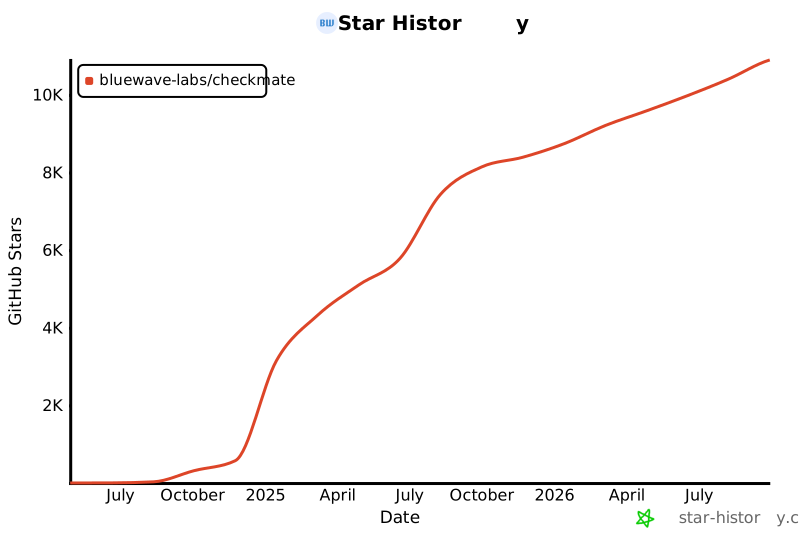](https://star-history.com/#bluewave-labs/bluewave-uptime&Date)
|
||||
[](https://star-history.com/#bluewave-labs/Checkmate&Date)
|
||||
|
||||
## Our sponsors
|
||||
|
||||
Thanks to [Gitbook](https://gitbook.io/) for giving us a free tier for their documentation platform, and [Poeditor](https://poeditor.com/) providing us a free account to use their i18n services. If you would like to sponsor Checkmate, please send an email to hello@bluewavelabs.ca
|
||||
|
||||
If you would like to sponsor a feature, [see this page](https://checkmate.so/sponsored-features).
|
||||
|
||||
Also check other developer and contributor-friendly projects of BlueWave:
|
||||
|
||||
- [VerifyWise](https://github.com/bluewave-labs/verifywise), the first open source AI governance platform.
|
||||
- [DataRoom](https://github.com/bluewave-labs/bluewave-dataroom), an secure file sharing application, aka dataroom.
|
||||
- [Guidefox](https://github.com/bluewave-labs/guidefox), an application that helps new users learn how to use your product via hints, tours, popups and banners.
|
||||
+1
-1
@@ -18,7 +18,7 @@
|
||||
<div id="root"></div>
|
||||
<script
|
||||
type="module"
|
||||
src="/src/main.jsx"
|
||||
src="/src/main.tsx"
|
||||
></script>
|
||||
</body>
|
||||
</html>
|
||||
Generated
+1272
-127
File diff suppressed because it is too large.
Load diff
+10
-2
@@ -12,6 +12,9 @@
|
||||
"format": "prettier --write .",
|
||||
"format-check": "prettier --check ."
|
||||
},
|
||||
"lint-staged": {
|
||||
"**/*": "prettier --write"
|
||||
},
|
||||
"dependencies": {
|
||||
"@emotion/react": "^11.13.3",
|
||||
"@emotion/styled": "^11.13.0",
|
||||
@@ -22,6 +25,7 @@
|
||||
"@mui/x-charts": "7.29.1",
|
||||
"@mui/x-date-pickers": "7.29.4",
|
||||
"@reduxjs/toolkit": "2.7.0",
|
||||
"@types/maplibre-gl": "^1.13.2",
|
||||
"axios": "^1.7.4",
|
||||
"dayjs": "1.11.13",
|
||||
"flag-icons": "7.3.2",
|
||||
@@ -30,13 +34,16 @@
|
||||
"i18next": "25.4.2",
|
||||
"joi": "17.13.3",
|
||||
"lucide-react": "^0.562.0",
|
||||
"maplibre-gl": "^5.19.0",
|
||||
"mui-color-input": "^7.0.0",
|
||||
"pretty-bytes": "^7.1.0",
|
||||
"pretty-ms": "^9.3.0",
|
||||
"react": "18.3.1",
|
||||
"react-dom": "^18.2.0",
|
||||
"react-hook-form": "^7.63.0",
|
||||
"react-i18next": "^15.4.0",
|
||||
"react-icons": "5.5.0",
|
||||
"react-map-gl": "^8.1.0",
|
||||
"react-redux": "9.2.0",
|
||||
"react-router": "^6.23.0",
|
||||
"react-router-dom": "^6.23.1",
|
||||
@@ -45,7 +52,7 @@
|
||||
"redux-persist": "6.0.0",
|
||||
"swr": "^2.3.6",
|
||||
"vite-plugin-svgr": "^4.2.0",
|
||||
"zod": "^4.1.11"
|
||||
"zod": "^4.3.6"
|
||||
},
|
||||
"devDependencies": {
|
||||
"@types/node": "24.5.2",
|
||||
@@ -56,8 +63,9 @@
|
||||
"eslint-plugin-react": "^7.34.1",
|
||||
"eslint-plugin-react-hooks": "^5.0.0",
|
||||
"eslint-plugin-react-refresh": "^0.4.6",
|
||||
"lint-staged": "^16.2.7",
|
||||
"prettier": "^3.3.3",
|
||||
"typescript": "5.9.3",
|
||||
"vite": "6.3.6"
|
||||
"vite": "6.4.1"
|
||||
}
|
||||
}
|
||||
@@ -0,0 +1,258 @@
|
||||
/**
|
||||
* Locale Migration Script
|
||||
*
|
||||
* Restructures all non-English locale files to match en.json's nested key structure.
|
||||
* Recovers translations via safe key-matching strategies, uses English placeholders
|
||||
* for unmatched keys.
|
||||
*
|
||||
* Usage: npx tsx client/scripts/migrate-locales.ts
|
||||
*
|
||||
* SAFETY: en.json is NEVER modified. Originals are backed up before overwriting.
|
||||
*/
|
||||
|
||||
import fs from "fs";
|
||||
import path from "path";
|
||||
|
||||
const LOCALES_DIR = path.resolve(import.meta.dirname, "../src/locales");
|
||||
const BACKUP_DIR = path.join(LOCALES_DIR, "backup");
|
||||
const REPORT_PATH = path.join(LOCALES_DIR, "migration-report.json");
|
||||
|
||||
// ── Helpers ──────────────────────────────────────────────────────────────────
|
||||
|
||||
/** Flatten a nested object into { "a.b.c": value } pairs */
|
||||
function flattenKeys(obj: Record<string, unknown>, prefix = ""): Record<string, string> {
|
||||
const result: Record<string, string> = {};
|
||||
for (const [key, value] of Object.entries(obj)) {
|
||||
const fullPath = prefix ? `${prefix}.${key}` : key;
|
||||
if (typeof value === "object" && value !== null && !Array.isArray(value)) {
|
||||
Object.assign(result, flattenKeys(value as Record<string, unknown>, fullPath));
|
||||
} else {
|
||||
result[fullPath] = String(value);
|
||||
}
|
||||
}
|
||||
return result;
|
||||
}
|
||||
|
||||
/** Set a value at a dot-separated path in a nested object */
|
||||
function setNestedValue(
|
||||
obj: Record<string, unknown>,
|
||||
keyPath: string,
|
||||
value: string
|
||||
): void {
|
||||
const parts = keyPath.split(".");
|
||||
let current = obj;
|
||||
for (let i = 0; i < parts.length - 1; i++) {
|
||||
const part = parts[i];
|
||||
if (!(part in current) || typeof current[part] !== "object") {
|
||||
current[part] = {};
|
||||
}
|
||||
current = current[part] as Record<string, unknown>;
|
||||
}
|
||||
current[parts[parts.length - 1]] = value;
|
||||
}
|
||||
|
||||
// ── Build mapping indexes from en.json ───────────────────────────────────────
|
||||
|
||||
function buildIndexes(enFlat: Record<string, string>) {
|
||||
const enKeys = Object.keys(enFlat);
|
||||
|
||||
// last segment -> en key paths
|
||||
const lastSegIndex: Record<string, string[]> = {};
|
||||
// last 2 segments -> en key paths
|
||||
const suffixIndex: Record<string, string[]> = {};
|
||||
|
||||
for (const keyPath of enKeys) {
|
||||
const parts = keyPath.split(".");
|
||||
const lastSeg = parts[parts.length - 1].toLowerCase();
|
||||
if (!lastSegIndex[lastSeg]) lastSegIndex[lastSeg] = [];
|
||||
lastSegIndex[lastSeg].push(keyPath);
|
||||
|
||||
if (parts.length >= 2) {
|
||||
const suffix = parts.slice(-2).join(".").toLowerCase();
|
||||
if (!suffixIndex[suffix]) suffixIndex[suffix] = [];
|
||||
suffixIndex[suffix].push(keyPath);
|
||||
}
|
||||
}
|
||||
|
||||
return { lastSegIndex, suffixIndex };
|
||||
}
|
||||
|
||||
// ── Mapping logic ────────────────────────────────────────────────────────────
|
||||
|
||||
type MatchStrategy = "exact" | "suffix-2" | "unique-name" | "english-placeholder";
|
||||
|
||||
interface KeyMatch {
|
||||
enKey: string;
|
||||
value: string;
|
||||
strategy: MatchStrategy;
|
||||
}
|
||||
|
||||
function buildMigratedLocale(
|
||||
enFlat: Record<string, string>,
|
||||
langFlat: Record<string, string>,
|
||||
indexes: ReturnType<typeof buildIndexes>
|
||||
): { matches: KeyMatch[]; result: Record<string, unknown> } {
|
||||
const { lastSegIndex, suffixIndex } = indexes;
|
||||
const matches: KeyMatch[] = [];
|
||||
const result: Record<string, unknown> = {};
|
||||
|
||||
// Build reverse lookup: for each orphan key in lang, index by last segment and suffix
|
||||
const langByLastSeg: Record<string, { key: string; value: string }[]> = {};
|
||||
const langBySuffix: Record<string, { key: string; value: string }[]> = {};
|
||||
|
||||
for (const [langKey, langValue] of Object.entries(langFlat)) {
|
||||
const parts = langKey.split(".");
|
||||
const lastSeg = parts[parts.length - 1].toLowerCase();
|
||||
if (!langByLastSeg[lastSeg]) langByLastSeg[lastSeg] = [];
|
||||
langByLastSeg[lastSeg].push({ key: langKey, value: langValue });
|
||||
|
||||
if (parts.length >= 2) {
|
||||
const suffix = parts.slice(-2).join(".").toLowerCase();
|
||||
if (!langBySuffix[suffix]) langBySuffix[suffix] = [];
|
||||
langBySuffix[suffix].push({ key: langKey, value: langValue });
|
||||
}
|
||||
}
|
||||
|
||||
for (const enKey of Object.keys(enFlat)) {
|
||||
const enValue = enFlat[enKey];
|
||||
const parts = enKey.split(".");
|
||||
const lastSeg = parts[parts.length - 1].toLowerCase();
|
||||
const suffix = parts.length >= 2 ? parts.slice(-2).join(".").toLowerCase() : null;
|
||||
|
||||
// Strategy 1: Exact path match
|
||||
if (langFlat[enKey] !== undefined) {
|
||||
const value = langFlat[enKey];
|
||||
setNestedValue(result, enKey, value);
|
||||
matches.push({ enKey, value, strategy: "exact" });
|
||||
continue;
|
||||
}
|
||||
|
||||
// Strategy 2: 2-segment suffix match (lang key suffix matches en key suffix, both unique)
|
||||
if (suffix) {
|
||||
const enCandidates = suffixIndex[suffix];
|
||||
const langCandidates = langBySuffix[suffix];
|
||||
if (
|
||||
enCandidates &&
|
||||
enCandidates.length === 1 &&
|
||||
langCandidates &&
|
||||
langCandidates.length === 1
|
||||
) {
|
||||
const value = langCandidates[0].value;
|
||||
setNestedValue(result, enKey, value);
|
||||
matches.push({ enKey, value, strategy: "suffix-2" });
|
||||
continue;
|
||||
}
|
||||
}
|
||||
|
||||
// Strategy 3: Unique last-segment match
|
||||
const enCandidates = lastSegIndex[lastSeg];
|
||||
const langCandidates = langByLastSeg[lastSeg];
|
||||
if (
|
||||
enCandidates &&
|
||||
enCandidates.length === 1 &&
|
||||
langCandidates &&
|
||||
langCandidates.length === 1
|
||||
) {
|
||||
const value = langCandidates[0].value;
|
||||
setNestedValue(result, enKey, value);
|
||||
matches.push({ enKey, value, strategy: "unique-name" });
|
||||
continue;
|
||||
}
|
||||
|
||||
// No match — use English placeholder
|
||||
setNestedValue(result, enKey, enValue);
|
||||
matches.push({ enKey, value: enValue, strategy: "english-placeholder" });
|
||||
}
|
||||
|
||||
return { matches, result };
|
||||
}
|
||||
|
||||
// ── Main ─────────────────────────────────────────────────────────────────────
|
||||
|
||||
function main() {
|
||||
// Load en.json
|
||||
const enPath = path.join(LOCALES_DIR, "en.json");
|
||||
const en = JSON.parse(fs.readFileSync(enPath, "utf8"));
|
||||
const enFlat = flattenKeys(en);
|
||||
const enKeyCount = Object.keys(enFlat).length;
|
||||
const indexes = buildIndexes(enFlat);
|
||||
|
||||
console.log(`English: ${enKeyCount} keys (source of truth — NOT modified)\n`);
|
||||
|
||||
// Find all non-English locale files
|
||||
const localeFiles = fs
|
||||
.readdirSync(LOCALES_DIR)
|
||||
.filter(
|
||||
(f: string) =>
|
||||
f.endsWith(".json") && f !== "en.json" && f !== "migration-report.json"
|
||||
);
|
||||
|
||||
if (localeFiles.length === 0) {
|
||||
console.log("No locale files to migrate.");
|
||||
return;
|
||||
}
|
||||
|
||||
// Create backup directory
|
||||
if (!fs.existsSync(BACKUP_DIR)) {
|
||||
fs.mkdirSync(BACKUP_DIR, { recursive: true });
|
||||
}
|
||||
|
||||
const report: Record<
|
||||
string,
|
||||
{
|
||||
total: number;
|
||||
exact: number;
|
||||
suffix: number;
|
||||
uniqueName: number;
|
||||
placeholder: number;
|
||||
}
|
||||
> = {};
|
||||
|
||||
for (const file of localeFiles) {
|
||||
const lang = file.replace(".json", "");
|
||||
const filePath = path.join(LOCALES_DIR, file);
|
||||
|
||||
// Backup original
|
||||
const backupPath = path.join(BACKUP_DIR, file);
|
||||
fs.copyFileSync(filePath, backupPath);
|
||||
|
||||
// Load and flatten
|
||||
const langData = JSON.parse(fs.readFileSync(filePath, "utf8"));
|
||||
const langFlat = flattenKeys(langData);
|
||||
|
||||
// Migrate
|
||||
const { matches, result } = buildMigratedLocale(enFlat, langFlat, indexes);
|
||||
|
||||
// Write migrated file
|
||||
fs.writeFileSync(filePath, JSON.stringify(result, null, "\t") + "\n", "utf8");
|
||||
|
||||
// Compute stats
|
||||
const stats = {
|
||||
total: enKeyCount,
|
||||
exact: matches.filter((m) => m.strategy === "exact").length,
|
||||
suffix: matches.filter((m) => m.strategy === "suffix-2").length,
|
||||
uniqueName: matches.filter((m) => m.strategy === "unique-name").length,
|
||||
placeholder: matches.filter((m) => m.strategy === "english-placeholder").length,
|
||||
};
|
||||
report[lang] = stats;
|
||||
|
||||
const translated = stats.exact + stats.suffix + stats.uniqueName;
|
||||
const pct = ((translated / enKeyCount) * 100).toFixed(1);
|
||||
console.log(
|
||||
`${lang.padEnd(8)} ${String(translated).padStart(4)} translated (${pct}%) | ` +
|
||||
`exact: ${stats.exact} suffix: ${stats.suffix} name: ${stats.uniqueName} ` +
|
||||
`placeholder: ${stats.placeholder}`
|
||||
);
|
||||
}
|
||||
|
||||
// Write report
|
||||
fs.writeFileSync(REPORT_PATH, JSON.stringify(report, null, "\t") + "\n", "utf8");
|
||||
|
||||
const totalLangs = localeFiles.length;
|
||||
console.log(
|
||||
`\nMigrated ${totalLangs} locale files. Originals backed up to locales/backup/`
|
||||
);
|
||||
console.log(`Report written to ${REPORT_PATH}`);
|
||||
}
|
||||
|
||||
main();
|
||||
@@ -1,52 +0,0 @@
|
||||
import { useEffect } from "react";
|
||||
import { useSelector } from "react-redux";
|
||||
import "react-toastify/dist/ReactToastify.css";
|
||||
import { ToastContainer } from "react-toastify";
|
||||
import { ThemeProvider } from "@emotion/react";
|
||||
import lightTheme from "./Utils/Theme/lightTheme";
|
||||
import darkTheme from "./Utils/Theme/darkTheme";
|
||||
import { CssBaseline, GlobalStyles } from "@mui/material";
|
||||
import { logger } from "./Utils/Logger"; // Import the logger
|
||||
import { networkService } from "./main";
|
||||
import { Routes } from "./Routes";
|
||||
import AppLayout from "@/Components/v1/Layouts/AppLayout";
|
||||
|
||||
function App() {
|
||||
const mode = useSelector((state) => state.ui.mode);
|
||||
|
||||
// Cleanup
|
||||
useEffect(() => {
|
||||
return () => {
|
||||
logger.cleanup();
|
||||
networkService.cleanup();
|
||||
};
|
||||
}, []);
|
||||
|
||||
const theme = mode === "light" ? lightTheme : darkTheme;
|
||||
|
||||
return (
|
||||
<ThemeProvider theme={theme}>
|
||||
<CssBaseline />
|
||||
<GlobalStyles
|
||||
styles={{
|
||||
body: {
|
||||
backgroundColor: theme.palette.background.main,
|
||||
},
|
||||
}}
|
||||
/>
|
||||
<AppLayout>
|
||||
<Routes />
|
||||
</AppLayout>
|
||||
<ToastContainer
|
||||
newestOnTop={true}
|
||||
theme={mode}
|
||||
style={{
|
||||
"--toastify-color-progress-light": "#7C8BA1",
|
||||
"--toastify-color-progress-dark": "#7C8BA1",
|
||||
}}
|
||||
/>
|
||||
</ThemeProvider>
|
||||
);
|
||||
}
|
||||
|
||||
export default App;
|
||||
@@ -0,0 +1,56 @@
|
||||
import { type CSSProperties } from "react";
|
||||
import { useSelector } from "react-redux";
|
||||
import "react-toastify/dist/ReactToastify.css";
|
||||
import { ToastContainer } from "react-toastify";
|
||||
import { ThemeProvider } from "@emotion/react";
|
||||
import { CssBaseline, GlobalStyles } from "@mui/material";
|
||||
import { SWRConfig } from "swr";
|
||||
import { Routes } from "./Routes";
|
||||
import AppLayout from "@/Components/layout/AppLayout";
|
||||
import type { RootState } from "@/Types/state";
|
||||
import { lightTheme, darkTheme } from "@/Utils/Theme/Theme";
|
||||
|
||||
const swrConfig = {
|
||||
dedupingInterval: 5000,
|
||||
revalidateOnFocus: false,
|
||||
revalidateOnReconnect: true,
|
||||
shouldRetryOnError: false,
|
||||
errorRetryCount: 2,
|
||||
errorRetryInterval: 1000,
|
||||
focusThrottleInterval: 5000,
|
||||
};
|
||||
|
||||
function App() {
|
||||
const mode = useSelector((state: RootState) => state.ui.mode);
|
||||
const theme = mode === "light" ? lightTheme : darkTheme;
|
||||
|
||||
return (
|
||||
<SWRConfig value={swrConfig}>
|
||||
<ThemeProvider theme={theme}>
|
||||
<CssBaseline />
|
||||
<GlobalStyles
|
||||
styles={{
|
||||
body: {
|
||||
backgroundColor: theme.palette.background.default,
|
||||
},
|
||||
}}
|
||||
/>
|
||||
<AppLayout>
|
||||
<Routes />
|
||||
</AppLayout>
|
||||
<ToastContainer
|
||||
newestOnTop={true}
|
||||
theme={mode}
|
||||
style={
|
||||
{
|
||||
"--toastify-color-progress-light": "#7C8BA1",
|
||||
"--toastify-color-progress-dark": "#7C8BA1",
|
||||
} as CSSProperties
|
||||
}
|
||||
/>
|
||||
</ThemeProvider>
|
||||
</SWRConfig>
|
||||
);
|
||||
}
|
||||
|
||||
export default App;
|
||||
@@ -1,53 +0,0 @@
|
||||
.wallet-adapter-dropdown {
|
||||
width: 100%;
|
||||
display: flex;
|
||||
flex-wrap: wrap;
|
||||
justify-content: center;
|
||||
align-items: center;
|
||||
gap: var(--env-var-spacing-1);
|
||||
}
|
||||
|
||||
.wallet-adapter-button {
|
||||
display: flex;
|
||||
align-items: center;
|
||||
justify-content: center;
|
||||
width: auto;
|
||||
height: var(--env-var-height-2) !important;
|
||||
font-size: var(--env-var-font-size-medium-plus) !important;
|
||||
font-weight: 500 !important;
|
||||
margin: 0;
|
||||
padding: calc(
|
||||
(var(--env-var-height-2) - var(--env-var-font-size-medium-plus) * 1.2) / 2
|
||||
)
|
||||
var(--env-var-spacing-1);
|
||||
white-space: nowrap;
|
||||
}
|
||||
|
||||
.wallet-adapter-modal-title {
|
||||
font-size: var(--font-size-h5) !important;
|
||||
}
|
||||
|
||||
/* Separator styling */
|
||||
.wallet-adapter-modal-divider {
|
||||
background-color: var(--border-color) !important;
|
||||
margin: var(--spacing-md) 0 !important;
|
||||
}
|
||||
|
||||
/* Responsive fixes */
|
||||
@media (max-width: 1200px) {
|
||||
.wallet-adapter-button {
|
||||
font-size: var(--env-var-font-size-medium) !important;
|
||||
padding: calc((var(--env-var-height-2) - var(--env-var-font-size-medium) * 1.2) / 2)
|
||||
var(--env-var-spacing-1-minus) !important;
|
||||
}
|
||||
}
|
||||
|
||||
@media (max-width: 900px) {
|
||||
.wallet-adapter-modal-wrapper {
|
||||
flex-direction: column !important;
|
||||
}
|
||||
|
||||
.wallet-adapter-modal-divider {
|
||||
margin: var(--spacing-sm) 0 !important;
|
||||
}
|
||||
}
|
||||
@@ -1,50 +0,0 @@
|
||||
// import { useMemo } from "react";
|
||||
// import { ConnectionProvider, WalletProvider } from "@solana/wallet-adapter-react";
|
||||
// import { WalletAdapterNetwork } from "@solana/wallet-adapter-base";
|
||||
// import {
|
||||
// UnsafeBurnerWalletAdapter,
|
||||
// PhantomWalletAdapter,
|
||||
// } from "@solana/wallet-adapter-wallets";
|
||||
|
||||
// import { WalletModalProvider } from "@solana/wallet-adapter-react-ui";
|
||||
// import { clusterApiUrl } from "@solana/web3.js";
|
||||
// import PropTypes from "prop-types";
|
||||
// import "./index.css";
|
||||
|
||||
// // Default styles that can be overridden by your app
|
||||
// import "@solana/wallet-adapter-react-ui/styles.css";
|
||||
|
||||
// export const Wallet = ({ children }) => {
|
||||
// // The network can be set to 'devnet', 'testnet', or 'mainnet-beta'.
|
||||
// const network = WalletAdapterNetwork.Mainnet;
|
||||
|
||||
// // You can also provide a custom RPC endpoint.
|
||||
// const endpoint = useMemo(() => clusterApiUrl(network), [network]);
|
||||
|
||||
// const wallets = useMemo(
|
||||
// () => [new PhantomWalletAdapter()],
|
||||
// // eslint-disable-next-line react-hooks/exhaustive-deps
|
||||
// [network]
|
||||
// );
|
||||
|
||||
// return (
|
||||
// <ConnectionProvider endpoint={endpoint}>
|
||||
// <WalletProvider
|
||||
// wallets={wallets}
|
||||
// autoConnect
|
||||
// >
|
||||
// <WalletModalProvider>{children}</WalletModalProvider>
|
||||
// </WalletProvider>
|
||||
// </ConnectionProvider>
|
||||
// );
|
||||
// };
|
||||
|
||||
// Wallet.propTypes = {
|
||||
// children: PropTypes.node,
|
||||
// };
|
||||
|
||||
const Wallet = ({ children }) => {
|
||||
return children;
|
||||
};
|
||||
|
||||
export default Wallet;
|
||||
File renamed without changes.
+2
-2
@@ -2,7 +2,7 @@ import Box from "@mui/material/Box";
|
||||
import { useTheme } from "@mui/material/styles";
|
||||
import type { CheckSnapshot } from "@/Types/Check";
|
||||
import { getResponseColor } from "@/Utils/DataUtils";
|
||||
import { HeatmapResponseTimeTooltip } from "@/Components/v2/common/charts/HeatmapResponseTimeTooltip";
|
||||
import { HeatmapResponseTimeTooltip } from "@/Components/common/charts/HeatmapResponseTimeTooltip";
|
||||
import type { SxProps } from "@mui/material/styles";
|
||||
import type { ResponsiveStyleValue } from "@mui/system";
|
||||
|
||||
@@ -32,7 +32,7 @@ export const HeatmapResponseTime = ({
|
||||
|
||||
if (!checks || checks.length === 0) return null;
|
||||
|
||||
const latestChecks = checks.slice(-25).reverse();
|
||||
const latestChecks = checks.slice(-25);
|
||||
|
||||
let data: Array<CheckSnapshot | PlaceholderCheck>;
|
||||
if (latestChecks.length !== 25) {
|
||||
+2
-1
@@ -57,7 +57,8 @@ export const HeatmapResponseTimeTooltip = ({
|
||||
{formatDateWithTz(check?.createdAt, "ddd, MMMM D, YYYY, HH:mm A", uiTimezone)}
|
||||
</Typography>
|
||||
<Typography>
|
||||
{t("common.labels.responseTime")}: {check.originalResponseTime.toFixed()} ms
|
||||
{t("common.labels.responseTime")}:{" "}
|
||||
{check?.originalResponseTime?.toFixed() ?? "N/A"} ms
|
||||
</Typography>
|
||||
<Typography textTransform={"capitalize"}>
|
||||
Status:{" "}
|
||||
@@ -0,0 +1,155 @@
|
||||
import Box from "@mui/material/Box";
|
||||
import Stack from "@mui/material/Stack";
|
||||
import Typography from "@mui/material/Typography";
|
||||
import { useTheme } from "@mui/material/styles";
|
||||
import type { ResponsiveStyleValue } from "@mui/system";
|
||||
import type { CheckSnapshot } from "@/Types/Check";
|
||||
import { HeatmapResponseTimeTooltip } from "./HeatmapResponseTimeTooltip";
|
||||
import { useMemo } from "react";
|
||||
import { useTranslation } from "react-i18next";
|
||||
|
||||
interface HistogramResponseTimeProps {
|
||||
checks: CheckSnapshot[];
|
||||
height?: ResponsiveStyleValue<number | string>;
|
||||
gap?: ResponsiveStyleValue<number | string>;
|
||||
showStats?: boolean;
|
||||
statsPosition?: "left" | "right";
|
||||
}
|
||||
|
||||
interface ResponseTimeStats {
|
||||
max: number | string;
|
||||
avg: number | string;
|
||||
}
|
||||
|
||||
const DEFAULT_HEIGHT = 50;
|
||||
|
||||
const calculateResponseTimeStats = (checks: CheckSnapshot[]): ResponseTimeStats => {
|
||||
if (!Array.isArray(checks) || checks.length === 0) {
|
||||
return { max: "-", avg: "-" };
|
||||
}
|
||||
|
||||
const validChecks = checks.filter((check) => check.originalResponseTime != null);
|
||||
if (validChecks.length === 0) {
|
||||
return { max: "-", avg: "-" };
|
||||
}
|
||||
|
||||
const responseTimes = validChecks.map((check) => check.originalResponseTime);
|
||||
const max = Math.max(...responseTimes);
|
||||
const avg = Math.round(
|
||||
responseTimes.reduce((sum, time) => sum + time, 0) / responseTimes.length
|
||||
);
|
||||
|
||||
return { max, avg };
|
||||
};
|
||||
|
||||
export const HistogramResponseTime = ({
|
||||
checks,
|
||||
height = DEFAULT_HEIGHT,
|
||||
gap,
|
||||
showStats = true,
|
||||
statsPosition = "right",
|
||||
}: HistogramResponseTimeProps) => {
|
||||
const theme = useTheme();
|
||||
const { t } = useTranslation();
|
||||
|
||||
const stats = useMemo(() => calculateResponseTimeStats(checks), [checks]);
|
||||
|
||||
if (!Array.isArray(checks) || checks.length === 0) return null;
|
||||
|
||||
const data =
|
||||
checks.length !== 25
|
||||
? [...checks, ...Array(25 - checks.length).fill({ status: "placeholder" })]
|
||||
: checks;
|
||||
|
||||
const chartHeight = typeof height === "number" ? `${height}px` : height;
|
||||
const gridGap = gap ?? theme.spacing(0.5);
|
||||
|
||||
const statsContent = showStats &&
|
||||
(typeof stats.max === "number" || typeof stats.avg === "number") && (
|
||||
<Stack
|
||||
justifyContent="center"
|
||||
alignItems={statsPosition === "left" ? "flex-end" : "flex-start"}
|
||||
minWidth={70}
|
||||
pr={statsPosition === "left" ? theme.spacing(8) : 0}
|
||||
pl={statsPosition === "right" ? theme.spacing(8) : 0}
|
||||
>
|
||||
<Typography variant="body2">
|
||||
{t("common.charts.histogram.avg", { value: stats.avg })}
|
||||
</Typography>
|
||||
<Typography variant="body2">
|
||||
{t("common.charts.histogram.max", { value: stats.max })}
|
||||
</Typography>
|
||||
</Stack>
|
||||
);
|
||||
|
||||
return (
|
||||
<Stack
|
||||
direction={statsPosition === "left" ? "row-reverse" : "row"}
|
||||
alignItems="center"
|
||||
sx={{ width: "100%" }}
|
||||
>
|
||||
<Box sx={{ flex: 1 }}>
|
||||
<Box
|
||||
sx={{
|
||||
width: "100%",
|
||||
display: "grid",
|
||||
gridTemplateColumns: "repeat(25, 1fr)",
|
||||
gap: gridGap,
|
||||
alignItems: "end",
|
||||
height: chartHeight,
|
||||
}}
|
||||
>
|
||||
{data.map((check, index) => {
|
||||
const isPlaceholder = (check as any).status === "placeholder";
|
||||
const heightPct = `${Math.max(0, Math.min(100, (check as any).responseTime ?? 0))}%`;
|
||||
const barColor =
|
||||
check.status === true
|
||||
? theme.palette.success.light
|
||||
: theme.palette.error.light;
|
||||
const bar = (
|
||||
<Box
|
||||
sx={{
|
||||
position: "relative",
|
||||
width: "100%",
|
||||
height: "100%",
|
||||
borderRadius: theme.spacing(1),
|
||||
bgcolor: theme.palette.action.hover,
|
||||
overflow: "hidden",
|
||||
}}
|
||||
>
|
||||
<Box
|
||||
sx={{
|
||||
position: "absolute",
|
||||
bottom: 0,
|
||||
left: 0,
|
||||
width: "100%",
|
||||
height: isPlaceholder ? 0 : heightPct,
|
||||
bgcolor: barColor,
|
||||
transition: "height 500ms cubic-bezier(0.4, 0, 0.2, 1)",
|
||||
}}
|
||||
/>
|
||||
</Box>
|
||||
);
|
||||
|
||||
return isPlaceholder ? (
|
||||
<Box
|
||||
key={index}
|
||||
sx={{ height: "100%" }}
|
||||
>
|
||||
{bar}
|
||||
</Box>
|
||||
) : (
|
||||
<HeatmapResponseTimeTooltip
|
||||
key={index}
|
||||
check={check}
|
||||
>
|
||||
{bar}
|
||||
</HeatmapResponseTimeTooltip>
|
||||
);
|
||||
})}
|
||||
</Box>
|
||||
</Box>
|
||||
{statsContent}
|
||||
</Stack>
|
||||
);
|
||||
};
|
||||
File renamed without changes.
+1
-1
@@ -1,7 +1,7 @@
|
||||
import Stack from "@mui/material/Stack";
|
||||
import Box from "@mui/material/Box";
|
||||
import Typography from "@mui/material/Typography";
|
||||
import { ToggleButtonGroup, ToggleButton } from "@/Components/v2/inputs";
|
||||
import { ToggleButtonGroup, ToggleButton } from "@/Components/inputs";
|
||||
import { useTheme } from "@mui/material/styles";
|
||||
import CircularProgress from "@mui/material/CircularProgress";
|
||||
import { useTranslation } from "react-i18next";
|
||||
@@ -0,0 +1,5 @@
|
||||
export * from "./charts/HistogramResponseTime";
|
||||
export * from "./charts/HeatmapResponseTime";
|
||||
export * from "./charts/HeatmapResponseTimeTooltip";
|
||||
export * from "./controls/HeaderCreate";
|
||||
export * from "./controls/HeaderTimeRange";
|
||||
@@ -0,0 +1,48 @@
|
||||
import { Avatar as MuiAvatar } from "@mui/material";
|
||||
import { useSelector } from "react-redux";
|
||||
import { useEffect, useState } from "react";
|
||||
import { useTheme } from "@mui/material";
|
||||
import type { RootState } from "@/Types/state";
|
||||
|
||||
interface AvatarProps {
|
||||
src?: string;
|
||||
small?: boolean;
|
||||
sx?: object;
|
||||
onClick?: (event: React.MouseEvent<HTMLDivElement>) => void;
|
||||
}
|
||||
|
||||
export const Avatar = ({ src, small, sx, onClick = () => {} }: AvatarProps) => {
|
||||
const { user } = useSelector((state: RootState) => state.auth);
|
||||
const theme = useTheme();
|
||||
if (!user) return null;
|
||||
|
||||
const style = small ? { width: 32, height: 32 } : { width: 64, height: 64 };
|
||||
|
||||
const [image, setImage] = useState<string>();
|
||||
useEffect(() => {
|
||||
if (user.avatarImage) {
|
||||
setImage(`data:image/png;base64,${user.avatarImage}`);
|
||||
}
|
||||
}, [user?.avatarImage]);
|
||||
|
||||
return (
|
||||
<MuiAvatar
|
||||
onClick={onClick}
|
||||
alt={`${user?.firstName} ${user?.lastName}`}
|
||||
src={src ? src : user?.avatarImage ? image : undefined}
|
||||
sx={{
|
||||
color: theme.palette.primary.contrastText,
|
||||
fontSize: small ? "16px" : "22px",
|
||||
fontWeight: 400,
|
||||
backgroundColor: theme.palette.primary.main,
|
||||
display: "inline-flex",
|
||||
|
||||
...style,
|
||||
...sx,
|
||||
}}
|
||||
>
|
||||
{user.firstName?.charAt(0)}
|
||||
{user.lastName?.charAt(0) || ""}
|
||||
</MuiAvatar>
|
||||
);
|
||||
};
|
||||
File renamed without changes.
+5
-4
@@ -1,7 +1,8 @@
|
||||
import { BaseBox } from "../design-elements";
|
||||
import { BaseBox } from ".";
|
||||
import Stack from "@mui/material/Stack";
|
||||
import Box from "@mui/material/Box";
|
||||
import Typography from "@mui/material/Typography";
|
||||
import { LAYOUT } from "@/Utils/Theme/constants";
|
||||
import type { ResponsiveStyleValue } from "@mui/system";
|
||||
|
||||
import { useTheme } from "@mui/material/styles";
|
||||
@@ -26,7 +27,7 @@ export const BaseChart = ({
|
||||
return (
|
||||
<BaseBox
|
||||
sx={{
|
||||
padding: padding ?? theme.spacing(8),
|
||||
padding: padding ?? theme.spacing(LAYOUT.MD),
|
||||
display: "flex",
|
||||
flex: 1,
|
||||
width: width,
|
||||
@@ -34,13 +35,13 @@ export const BaseChart = ({
|
||||
}}
|
||||
>
|
||||
<Stack
|
||||
gap={theme.spacing(8)}
|
||||
gap={theme.spacing(LAYOUT.MD)}
|
||||
flex={1}
|
||||
>
|
||||
<Stack
|
||||
direction="row"
|
||||
alignItems={"center"}
|
||||
gap={theme.spacing(4)}
|
||||
gap={theme.spacing(LAYOUT.XS)}
|
||||
>
|
||||
{icon && (
|
||||
<BaseBox
|
||||
+74
-18
@@ -1,14 +1,18 @@
|
||||
import Logo from "@/assets/icons/checkmate-icon.svg?react";
|
||||
import Stack from "@mui/material/Stack";
|
||||
import Box from "@mui/material/Box";
|
||||
import Alert from "@mui/material/Alert";
|
||||
import Link from "@mui/material/Link";
|
||||
import { LAYOUT, SPACING } from "@/Utils/Theme/constants";
|
||||
import {
|
||||
ErrorFallback,
|
||||
EmptyFallback,
|
||||
EmptyMonitorFallback,
|
||||
BaseFallback,
|
||||
} from "@/Components/v2/design-elements/Fallback";
|
||||
import { Breadcrumb } from "@/Components/v2/design-elements/Breadcrumb";
|
||||
} from "@/Components/design-elements/Fallback";
|
||||
import { Breadcrumb } from "@/Components/design-elements/Breadcrumb";
|
||||
import CircularProgress from "@mui/material/CircularProgress";
|
||||
import { HeaderAuthControls } from "@/Pages/Auth/components/HeaderAuthControls";
|
||||
|
||||
import type { StackProps } from "@mui/material/Stack";
|
||||
import { useTheme } from "@mui/material/styles";
|
||||
@@ -88,7 +92,7 @@ export const BasePage = ({
|
||||
|
||||
return (
|
||||
<Stack
|
||||
spacing={theme.spacing(10)}
|
||||
spacing={theme.spacing(LAYOUT.LG)}
|
||||
{...props}
|
||||
>
|
||||
<Breadcrumb breadcrumbOverride={breadcrumbOverride} />
|
||||
@@ -100,7 +104,7 @@ export const BasePage = ({
|
||||
interface BasePageWithStatesProps extends StackProps {
|
||||
loading: boolean;
|
||||
error: any;
|
||||
items: any[];
|
||||
totalCount: number;
|
||||
bullets: string[] | unknown;
|
||||
page: string;
|
||||
actionButtonText: string;
|
||||
@@ -111,7 +115,7 @@ interface BasePageWithStatesProps extends StackProps {
|
||||
export const BasePageWithStates = ({
|
||||
loading,
|
||||
error,
|
||||
items,
|
||||
totalCount,
|
||||
page,
|
||||
bullets,
|
||||
actionButtonText,
|
||||
@@ -119,9 +123,9 @@ export const BasePageWithStates = ({
|
||||
children,
|
||||
...props
|
||||
}: BasePageWithStatesProps) => {
|
||||
const showLoading = loading && (!items || items.length === 0);
|
||||
const showLoading = loading && totalCount === 0;
|
||||
|
||||
if (isEmpty(items)) {
|
||||
if (!loading && totalCount === 0) {
|
||||
return (
|
||||
<EmptyFallback
|
||||
bullets={bullets}
|
||||
@@ -146,23 +150,17 @@ export const BasePageWithStates = ({
|
||||
interface MonitorBasePageWithStatesProps extends StackProps {
|
||||
loading: boolean;
|
||||
error: any;
|
||||
items: any[];
|
||||
totalCount: number;
|
||||
page: string;
|
||||
actionLink?: string;
|
||||
children: React.ReactNode;
|
||||
priorityFallback?: React.ReactNode;
|
||||
}
|
||||
|
||||
const isEmpty = (items: any[]) => {
|
||||
if (!items) return true;
|
||||
if (Array.isArray(items) && items.length === 0) return true;
|
||||
return false;
|
||||
};
|
||||
|
||||
export const MonitorBasePageWithStates = ({
|
||||
loading,
|
||||
error,
|
||||
items,
|
||||
totalCount,
|
||||
page,
|
||||
actionLink,
|
||||
children,
|
||||
@@ -171,7 +169,7 @@ export const MonitorBasePageWithStates = ({
|
||||
}: MonitorBasePageWithStatesProps) => {
|
||||
const { t } = useTranslation();
|
||||
|
||||
const showLoading = loading && (!items || items.length === 0);
|
||||
const showLoading = loading && totalCount === 0;
|
||||
|
||||
if (priorityFallback) {
|
||||
return (
|
||||
@@ -180,12 +178,12 @@ export const MonitorBasePageWithStates = ({
|
||||
error={error}
|
||||
{...props}
|
||||
>
|
||||
{priorityFallback}
|
||||
<Stack height={"100%"}>{priorityFallback}</Stack>
|
||||
</BasePage>
|
||||
);
|
||||
}
|
||||
|
||||
if (!loading && isEmpty(items)) {
|
||||
if (!loading && totalCount === 0) {
|
||||
return (
|
||||
<EmptyMonitorFallback
|
||||
page={page}
|
||||
@@ -207,3 +205,61 @@ export const MonitorBasePageWithStates = ({
|
||||
</BasePage>
|
||||
);
|
||||
};
|
||||
|
||||
interface BaseAuthPageProps extends React.PropsWithChildren, StackProps {
|
||||
title: string;
|
||||
subtitle: string;
|
||||
}
|
||||
|
||||
export const BaseAuthPage = ({
|
||||
title,
|
||||
subtitle,
|
||||
children,
|
||||
...props
|
||||
}: BaseAuthPageProps) => {
|
||||
const theme = useTheme();
|
||||
return (
|
||||
<BasePage
|
||||
breadcrumbOverride={[]}
|
||||
gap={theme.spacing(LAYOUT.MD)}
|
||||
alignItems={"center"}
|
||||
justifyContent={"center"}
|
||||
minHeight="100vh"
|
||||
position={"relative"}
|
||||
{...props}
|
||||
>
|
||||
<HeaderAuthControls
|
||||
hideLogo
|
||||
py={theme.spacing(LAYOUT.XS)}
|
||||
position={"absolute"}
|
||||
top={0}
|
||||
left={0}
|
||||
/>
|
||||
<Box width={{ xs: 60, sm: 70, md: 80 }}>
|
||||
<Logo
|
||||
width={"100%"}
|
||||
height={"100%"}
|
||||
/>
|
||||
</Box>
|
||||
<Stack alignItems={"center"}>
|
||||
<Typography
|
||||
variant="h1"
|
||||
mb={theme.spacing(SPACING.LG)}
|
||||
>
|
||||
{title}
|
||||
</Typography>
|
||||
<Typography variant="h2">{subtitle}</Typography>
|
||||
</Stack>
|
||||
<Stack
|
||||
gap={theme.spacing(LAYOUT.MD)}
|
||||
width={{
|
||||
xs: "80%",
|
||||
md: "25%",
|
||||
lg: "15%",
|
||||
}}
|
||||
>
|
||||
{children}
|
||||
</Stack>
|
||||
</BasePage>
|
||||
);
|
||||
};
|
||||
File renamed without changes.
+3
-1
@@ -2,6 +2,7 @@ import Stack from "@mui/material/Stack";
|
||||
import Typography from "@mui/material/Typography";
|
||||
import { Check } from "lucide-react";
|
||||
import { useTheme } from "@mui/material/styles";
|
||||
import { LAYOUT } from "@/Utils/Theme/constants";
|
||||
|
||||
export const BulletPointCheck = ({
|
||||
text,
|
||||
@@ -21,12 +22,13 @@ export const BulletPointCheck = ({
|
||||
return (
|
||||
<Stack
|
||||
direction="row"
|
||||
gap={theme.spacing(6)}
|
||||
gap={theme.spacing(LAYOUT.SM)}
|
||||
alignItems="center"
|
||||
>
|
||||
<Check
|
||||
size={16}
|
||||
strokeWidth={1.5}
|
||||
color={variant === "info" ? theme.palette.text.secondary : colors[variant]}
|
||||
style={{
|
||||
flexShrink: 0,
|
||||
}}
|
||||
File renamed without changes.
+10
-14
@@ -1,7 +1,8 @@
|
||||
import Stack from "@mui/material/Stack";
|
||||
import Typography from "@mui/material/Typography";
|
||||
import { BulletPointCheck, SkeletonCard } from "@/Components/v2/design-elements";
|
||||
import { Button } from "@/Components/v2/inputs";
|
||||
import { BulletPointCheck, SkeletonCard } from "@/Components/design-elements";
|
||||
import { Button } from "@/Components/inputs";
|
||||
import { SPACING, LAYOUT } from "@/Utils/Theme/constants";
|
||||
|
||||
import { useNavigate } from "react-router";
|
||||
import useMediaQuery from "@mui/material/useMediaQuery";
|
||||
@@ -27,7 +28,7 @@ export const BaseFallback = ({ children, ...props }: BaseFallbackProps) => {
|
||||
lg: "50%",
|
||||
xl: "40%",
|
||||
}}
|
||||
padding={{ xs: theme.spacing(8), md: theme.spacing(16) }}
|
||||
padding={{ xs: theme.spacing(LAYOUT.MD), md: theme.spacing(LAYOUT.XXL) }}
|
||||
bgcolor={theme.palette.background.paper}
|
||||
border={1}
|
||||
borderColor={theme.palette.divider}
|
||||
@@ -55,7 +56,7 @@ export const ErrorFallback = ({
|
||||
<BaseFallback>
|
||||
<Typography
|
||||
variant="h1"
|
||||
marginY={theme.spacing(4)}
|
||||
marginY={theme.spacing(LAYOUT.XS)}
|
||||
color={theme.palette.text.secondary}
|
||||
>
|
||||
{title}
|
||||
@@ -81,20 +82,15 @@ export const EmptyFallback = ({
|
||||
return (
|
||||
<BaseFallback>
|
||||
<Stack
|
||||
gap={theme.spacing(10)}
|
||||
gap={theme.spacing(LAYOUT.MD)}
|
||||
zIndex={1}
|
||||
alignItems="center"
|
||||
>
|
||||
<Typography
|
||||
component="h1"
|
||||
color={theme.palette.primary.contrastText}
|
||||
>
|
||||
{title}
|
||||
</Typography>
|
||||
<Typography component="h1">{title}</Typography>
|
||||
<Stack
|
||||
sx={{
|
||||
flexWrap: "wrap",
|
||||
gap: theme.spacing(2),
|
||||
gap: theme.spacing(SPACING.MD),
|
||||
maxWidth: "1100px",
|
||||
width: "100%",
|
||||
}}
|
||||
@@ -139,7 +135,7 @@ export const EmptyMonitorFallback = ({
|
||||
return (
|
||||
<BaseFallback>
|
||||
<Stack
|
||||
gap={theme.spacing(10)}
|
||||
gap={theme.spacing(LAYOUT.MD)}
|
||||
zIndex={1}
|
||||
alignItems="center"
|
||||
>
|
||||
@@ -152,7 +148,7 @@ export const EmptyMonitorFallback = ({
|
||||
<Stack
|
||||
sx={{
|
||||
flexWrap: "wrap",
|
||||
gap: theme.spacing(2),
|
||||
gap: theme.spacing(SPACING.MD),
|
||||
maxWidth: "1100px",
|
||||
width: "100%",
|
||||
}}
|
||||
+49
@@ -1,3 +1,5 @@
|
||||
import { BaseChart } from "@/Components/design-elements";
|
||||
import Stack from "@mui/material/Stack";
|
||||
import Box from "@mui/material/Box";
|
||||
import Typography from "@mui/material/Typography";
|
||||
|
||||
@@ -104,3 +106,50 @@ export const Gauge = ({
|
||||
</Box>
|
||||
);
|
||||
};
|
||||
|
||||
export const DetailGauge = ({
|
||||
title,
|
||||
progress,
|
||||
upperLabel,
|
||||
upperValue,
|
||||
lowerLabel,
|
||||
lowerValue,
|
||||
}: {
|
||||
title: string;
|
||||
progress: number;
|
||||
upperLabel?: string;
|
||||
upperValue?: string | number;
|
||||
lowerLabel?: string;
|
||||
lowerValue?: string | number;
|
||||
}) => {
|
||||
const theme = useTheme();
|
||||
return (
|
||||
<BaseChart
|
||||
icon={null}
|
||||
title={title}
|
||||
maxWidth={225}
|
||||
>
|
||||
<Stack
|
||||
alignItems={"center"}
|
||||
mb={theme.spacing(4)}
|
||||
gap={theme.spacing(4)}
|
||||
>
|
||||
<Gauge progress={progress} />
|
||||
</Stack>
|
||||
<Stack
|
||||
direction={"row"}
|
||||
justifyContent={"space-between"}
|
||||
>
|
||||
<Typography>{upperLabel}</Typography>
|
||||
<Typography>{upperValue}</Typography>
|
||||
</Stack>
|
||||
<Stack
|
||||
direction={"row"}
|
||||
justifyContent={"space-between"}
|
||||
>
|
||||
<Typography>{lowerLabel}</Typography>
|
||||
<Typography>{lowerValue}</Typography>
|
||||
</Stack>
|
||||
</BaseChart>
|
||||
);
|
||||
};
|
||||
+1
@@ -4,6 +4,7 @@ interface IconProps {
|
||||
icon: LucideIcon;
|
||||
size?: number;
|
||||
strokeWidth?: number;
|
||||
stroke?: string;
|
||||
}
|
||||
|
||||
const Icon = ({ icon: Icon, size = 20, strokeWidth = 1.5 }: IconProps) => {
|
||||
+2
-5
@@ -1,11 +1,11 @@
|
||||
import type { Monitor } from "@/Types/Monitor";
|
||||
import Stack from "@mui/material/Stack";
|
||||
import Typography from "@mui/material/Typography";
|
||||
import { PulseDot, Dot } from "@/Components/v2/design-elements";
|
||||
import { PulseDot, Dot } from "@/Components/design-elements";
|
||||
import { getStatusColor, formatUrl } from "@/Utils/MonitorUtils";
|
||||
import { useTheme } from "@mui/material/styles";
|
||||
import prettyMilliseconds from "pretty-ms";
|
||||
import { typographyLevels } from "@/Utils/Theme/v2Palette";
|
||||
import { typographyLevels } from "@/Utils/Theme/Palette";
|
||||
import useMediaQuery from "@mui/material/useMediaQuery";
|
||||
export const MonitorStatus = ({ monitor }: { monitor: Monitor }) => {
|
||||
const theme = useTheme();
|
||||
@@ -19,11 +19,9 @@ export const MonitorStatus = ({ monitor }: { monitor: Monitor }) => {
|
||||
<Typography
|
||||
fontSize={typographyLevels.xl}
|
||||
fontWeight={500}
|
||||
color={theme.palette.primary.contrastText}
|
||||
overflow={"hidden"}
|
||||
textOverflow={"ellipsis"}
|
||||
whiteSpace={"nowrap"}
|
||||
maxWidth={isSmall ? "100%" : "calc((100vw - var(--env-var-width-2)) / 2)"}
|
||||
>
|
||||
{monitor.name}
|
||||
</Typography>
|
||||
@@ -40,7 +38,6 @@ export const MonitorStatus = ({ monitor }: { monitor: Monitor }) => {
|
||||
overflow={"hidden"}
|
||||
textOverflow={"ellipsis"}
|
||||
whiteSpace={"nowrap"}
|
||||
maxWidth={isSmall ? "100%" : "calc((100vw - var(--env-var-width-2)) / 2)"}
|
||||
>
|
||||
{formatUrl(monitor?.url)}
|
||||
</Typography>
|
||||
@@ -0,0 +1,63 @@
|
||||
import Box from "@mui/material/Box";
|
||||
import Stack from "@mui/material/Stack";
|
||||
import Typography from "@mui/material/Typography";
|
||||
import { useTheme } from "@mui/material/styles";
|
||||
import { useTranslation } from "react-i18next";
|
||||
import { WifiOff } from "lucide-react";
|
||||
import { useState, useEffect } from "react";
|
||||
|
||||
interface OfflineBannerProps {
|
||||
visible: boolean;
|
||||
}
|
||||
|
||||
export const OfflineBanner = ({ visible }: OfflineBannerProps) => {
|
||||
const theme = useTheme();
|
||||
const { t } = useTranslation();
|
||||
const [shouldRender, setShouldRender] = useState(visible);
|
||||
const [isAnimating, setIsAnimating] = useState(false);
|
||||
|
||||
useEffect(() => {
|
||||
if (visible) {
|
||||
setShouldRender(true);
|
||||
requestAnimationFrame(() => setIsAnimating(true));
|
||||
} else {
|
||||
setIsAnimating(false);
|
||||
const timer = setTimeout(() => setShouldRender(false), 1000);
|
||||
return () => clearTimeout(timer);
|
||||
}
|
||||
}, [visible]);
|
||||
|
||||
if (!shouldRender) return null;
|
||||
|
||||
return (
|
||||
<Box
|
||||
sx={{
|
||||
position: "fixed",
|
||||
top: isAnimating ? 0 : "-100%",
|
||||
left: 0,
|
||||
right: 0,
|
||||
zIndex: theme.zIndex.snackbar,
|
||||
backgroundColor: theme.palette.error.main,
|
||||
color: theme.palette.error.contrastText,
|
||||
px: theme.spacing(8),
|
||||
py: theme.spacing(4),
|
||||
transition: "top 1s ease-in-out",
|
||||
}}
|
||||
>
|
||||
<Stack
|
||||
direction="row"
|
||||
alignItems="center"
|
||||
justifyContent="center"
|
||||
gap={theme.spacing(4)}
|
||||
>
|
||||
<WifiOff size={20} />
|
||||
<Typography
|
||||
variant="body2"
|
||||
fontWeight={500}
|
||||
>
|
||||
{t("components.offlineBanner.serverUnreachable")}
|
||||
</Typography>
|
||||
</Stack>
|
||||
</Box>
|
||||
);
|
||||
};
|
||||
+15
-2
@@ -1,4 +1,17 @@
|
||||
import { Box, Stack, useTheme } from "@mui/material";
|
||||
import Box from "@mui/material/Box";
|
||||
import Stack from "@mui/material/Stack";
|
||||
import { useTheme, keyframes } from "@mui/material";
|
||||
|
||||
const ripple = keyframes`
|
||||
from {
|
||||
opacity: 1;
|
||||
transform: scale(0);
|
||||
}
|
||||
to {
|
||||
opacity: 0;
|
||||
transform: scale(2);
|
||||
}
|
||||
`;
|
||||
|
||||
interface PulseDotProps {
|
||||
color: string;
|
||||
@@ -28,7 +41,7 @@ export const PulseDot = ({ color }: PulseDotProps) => {
|
||||
height: "100%",
|
||||
backgroundColor: "inherit",
|
||||
borderRadius: "50%",
|
||||
animation: "ripple 1.8s ease-out infinite",
|
||||
animation: `${ripple} 1.8s ease-out infinite`,
|
||||
},
|
||||
"&::after": {
|
||||
content: `""`,
|
||||
File renamed without changes.
+5
-4
@@ -3,6 +3,7 @@ import Box from "@mui/material/Box";
|
||||
import Typography from "@mui/material/Typography";
|
||||
import { useTheme } from "@mui/material/styles";
|
||||
import useMediaQuery from "@mui/material/useMediaQuery";
|
||||
import { LAYOUT } from "@/Utils/Theme/constants";
|
||||
export const SplitBox = ({
|
||||
left,
|
||||
right,
|
||||
@@ -18,10 +19,10 @@ export const SplitBox = ({
|
||||
bgcolor={theme.palette.background.paper}
|
||||
border={1}
|
||||
borderColor={theme.palette.divider}
|
||||
borderRadius={theme.spacing(2)}
|
||||
borderRadius={theme.shape.borderRadius}
|
||||
>
|
||||
<Box
|
||||
padding={theme.spacing(15)}
|
||||
padding={theme.spacing(LAYOUT.XXL)}
|
||||
borderRight={isSmall ? 0 : 1}
|
||||
borderBottom={isSmall ? 1 : 0}
|
||||
borderColor={theme.palette.divider}
|
||||
@@ -37,7 +38,7 @@ export const SplitBox = ({
|
||||
</Box>
|
||||
<Box
|
||||
flex={1}
|
||||
padding={theme.spacing(15)}
|
||||
padding={theme.spacing(LAYOUT.XXL)}
|
||||
>
|
||||
{right}
|
||||
</Box>
|
||||
@@ -60,7 +61,7 @@ export const ConfigBox = ({
|
||||
return (
|
||||
<SplitBox
|
||||
left={
|
||||
<Stack spacing={theme.spacing(4)}>
|
||||
<Stack spacing={theme.spacing(LAYOUT.XS)}>
|
||||
<Typography
|
||||
textTransform={"capitalize"}
|
||||
component="h2"
|
||||
+2
-2
@@ -4,8 +4,8 @@ import Box from "@mui/material/Box";
|
||||
import { useTheme } from "@mui/material/styles";
|
||||
import { lighten } from "@mui/material/styles";
|
||||
import useMediaQuery from "@mui/material/useMediaQuery";
|
||||
import type { PaletteKey } from "@/Utils/Theme/v2Theme";
|
||||
import { BaseBox, TooltipWithInfo } from "@/Components/v2/design-elements";
|
||||
import type { PaletteKey } from "@/Utils/Theme/Theme";
|
||||
import { BaseBox, TooltipWithInfo } from "@/Components/design-elements";
|
||||
import type { SxProps } from "@mui/material";
|
||||
|
||||
type GradientBox = React.PropsWithChildren<{
|
||||
+53
-19
@@ -1,8 +1,7 @@
|
||||
import Stack from "@mui/material/Stack";
|
||||
import Typography from "@mui/material/Typography";
|
||||
import Box from "@mui/material/Box";
|
||||
import { BaseBox } from "@/Components/v2/design-elements";
|
||||
import Background from "@/assets/Images/background-grid.svg?react";
|
||||
import { BaseBox } from "@/Components/design-elements";
|
||||
import { useTranslation } from "react-i18next";
|
||||
import type { SxProps } from "@mui/material";
|
||||
|
||||
@@ -18,6 +17,7 @@ export const BGBox = ({ children, sx }: StatusBoxProps) => {
|
||||
return (
|
||||
<BaseBox
|
||||
sx={{
|
||||
backgroundColor: theme.palette.background.default,
|
||||
overflow: "hidden",
|
||||
position: "relative",
|
||||
flex: 1,
|
||||
@@ -27,11 +27,23 @@ export const BGBox = ({ children, sx }: StatusBoxProps) => {
|
||||
>
|
||||
<Box
|
||||
position="absolute"
|
||||
top="-10%"
|
||||
left="5%"
|
||||
>
|
||||
<Background />
|
||||
</Box>
|
||||
top={0}
|
||||
left={0}
|
||||
right={0}
|
||||
bottom={0}
|
||||
sx={{
|
||||
pointerEvents: "none",
|
||||
backgroundImage: `
|
||||
linear-gradient(${theme.palette.divider} 1px, transparent 1px),
|
||||
linear-gradient(90deg, ${theme.palette.divider} 1px, transparent 1px)
|
||||
`,
|
||||
backgroundSize: "24px 24px",
|
||||
maskImage:
|
||||
"linear-gradient(135deg, rgba(0,0,0,0) 0%, rgba(0,0,0,0) 30%, rgba(0,0,0,0.4) 100%)",
|
||||
WebkitMaskImage:
|
||||
"linear-gradient(135deg, rgba(0,0,0,0) 0%, rgba(0,0,0,0) 30%, rgba(0,0,0,0.4) 100%)",
|
||||
}}
|
||||
/>
|
||||
{children}
|
||||
</BaseBox>
|
||||
);
|
||||
@@ -105,6 +117,40 @@ export const PausedStatusBox = ({ n }: { n: number }) => {
|
||||
/>
|
||||
);
|
||||
};
|
||||
export const MaintenanceStatusBox = ({ n }: { n: number }) => {
|
||||
const theme = useTheme();
|
||||
const { t } = useTranslation();
|
||||
return (
|
||||
<StatusBox
|
||||
label={t("pages.common.monitors.status.maintenance")}
|
||||
n={n}
|
||||
color={theme.palette.warning.light}
|
||||
/>
|
||||
);
|
||||
};
|
||||
export const InitializingStatusBox = ({ n }: { n: number }) => {
|
||||
const theme = useTheme();
|
||||
const { t } = useTranslation();
|
||||
return (
|
||||
<StatusBox
|
||||
label={t("pages.common.monitors.status.initializing")}
|
||||
n={n}
|
||||
color={theme.palette.warning.light}
|
||||
/>
|
||||
);
|
||||
};
|
||||
export const BreachedStatusBox = ({ n }: { n: number }) => {
|
||||
const theme = useTheme();
|
||||
const { t } = useTranslation();
|
||||
return (
|
||||
<StatusBox
|
||||
label={t("pages.common.monitors.status.breached")}
|
||||
n={n}
|
||||
color={theme.palette.warning.main}
|
||||
/>
|
||||
);
|
||||
};
|
||||
|
||||
export const TotalChecksBox = ({ n }: { n: number }) => {
|
||||
const theme = useTheme();
|
||||
const { t } = useTranslation();
|
||||
@@ -138,15 +184,3 @@ export const UpChecksBox = ({ n }: { n: number }) => {
|
||||
/>
|
||||
);
|
||||
};
|
||||
|
||||
export const InitializingStatusBox = ({ n }: { n: number }) => {
|
||||
const theme = useTheme();
|
||||
const { t } = useTranslation();
|
||||
return (
|
||||
<StatusBox
|
||||
label={t("pages.common.monitors.status.initializing")}
|
||||
n={n}
|
||||
color={theme.palette.warning.light}
|
||||
/>
|
||||
);
|
||||
};
|
||||
+15
-24
@@ -1,5 +1,5 @@
|
||||
import Box from "@mui/material/Box";
|
||||
import { BaseBox } from "@/Components/v2/design-elements";
|
||||
import { BaseBox } from "@/Components/design-elements";
|
||||
import Typography from "@mui/material/Typography";
|
||||
|
||||
import type { MonitorStatus } from "@/Types/Monitor";
|
||||
@@ -11,33 +11,26 @@ import { useTranslation } from "react-i18next";
|
||||
export const ValueTypes = ["positive", "negative", "neutral"] as const;
|
||||
export type ValueType = (typeof ValueTypes)[number];
|
||||
|
||||
export const StatusLabel = ({
|
||||
status,
|
||||
isActive,
|
||||
sx,
|
||||
}: {
|
||||
status: MonitorStatus;
|
||||
isActive?: boolean;
|
||||
sx?: SxProps;
|
||||
}) => {
|
||||
export const StatusLabel = ({ status, sx }: { status: MonitorStatus; sx?: SxProps }) => {
|
||||
const { t } = useTranslation();
|
||||
const theme = useTheme();
|
||||
const palette = getStatusPalette(status);
|
||||
|
||||
const determineStatus = (
|
||||
isActive: boolean | undefined,
|
||||
status: MonitorStatus
|
||||
): string => {
|
||||
if (isActive === false) {
|
||||
const determineStatus = (status: MonitorStatus): string => {
|
||||
if (status === "up") {
|
||||
return t("pages.common.monitors.status.up");
|
||||
} else if (status === "down") {
|
||||
return t("pages.common.monitors.status.down");
|
||||
} else if (status === "breached") {
|
||||
return t("pages.common.monitors.status.breached");
|
||||
} else if (status === "maintenance") {
|
||||
return t("pages.common.monitors.status.maintenance");
|
||||
} else if (status === "paused") {
|
||||
return t("pages.common.monitors.status.paused");
|
||||
} else if (status === "initializing") {
|
||||
return t("pages.common.monitors.status.initializing");
|
||||
}
|
||||
|
||||
if (status === true) {
|
||||
return t("pages.common.monitors.status.up");
|
||||
}
|
||||
if (status === false) {
|
||||
return t("pages.common.monitors.status.down");
|
||||
}
|
||||
return t("pages.common.monitors.status.initializing");
|
||||
};
|
||||
|
||||
@@ -64,9 +57,7 @@ export const StatusLabel = ({
|
||||
borderRadius="50%"
|
||||
marginRight="5px"
|
||||
/>
|
||||
<Typography textTransform={"capitalize"}>
|
||||
{determineStatus(isActive, status)}
|
||||
</Typography>
|
||||
<Typography textTransform={"capitalize"}>{determineStatus(status)}</Typography>
|
||||
</BaseBox>
|
||||
);
|
||||
};
|
||||
+31
-12
@@ -27,8 +27,10 @@ import TablePagination from "@mui/material/TablePagination";
|
||||
import type { TablePaginationOwnProps } from "@mui/material/TablePagination";
|
||||
|
||||
import { useTranslation } from "react-i18next";
|
||||
import { useState, Fragment } from "react";
|
||||
import { useState, Fragment, useEffect } from "react";
|
||||
import { useTheme } from "@mui/material/styles";
|
||||
import { SPACING, LAYOUT } from "@/Utils/Theme/constants";
|
||||
import type { SxProps, Theme } from "@mui/material/styles";
|
||||
import useMediaQuery from "@mui/material/useMediaQuery";
|
||||
|
||||
export type Header<T> = {
|
||||
@@ -47,6 +49,7 @@ type DataTableProps<T extends { id?: string | number; _id?: string | number }> =
|
||||
renderExpandedContent?: (row: T) => React.ReactNode;
|
||||
emptyViewText?: string;
|
||||
emptyViewPositive?: boolean;
|
||||
getRowSx?: (row: T) => SxProps<Theme>;
|
||||
};
|
||||
|
||||
export function DataTable<
|
||||
@@ -64,6 +67,7 @@ export function DataTable<
|
||||
renderExpandedContent,
|
||||
emptyViewText,
|
||||
emptyViewPositive,
|
||||
getRowSx,
|
||||
}: DataTableProps<T>) {
|
||||
const theme = useTheme();
|
||||
const [expanded, setExpanded] = useState<(string | number) | null>(null);
|
||||
@@ -87,20 +91,20 @@ export function DataTable<
|
||||
// Return stack of cards for small screens
|
||||
if (isSmall && cardsOnSmallScreens) {
|
||||
return (
|
||||
<Stack spacing={theme.spacing(4)}>
|
||||
<Stack spacing={theme.spacing(LAYOUT.XS)}>
|
||||
{data.map((row) => {
|
||||
const key = row.id || row._id || Math.random();
|
||||
keys.push(key);
|
||||
return (
|
||||
<Stack
|
||||
onClick={() => (onRowClick ? onRowClick(row) : null)}
|
||||
spacing={theme.spacing(4)}
|
||||
spacing={theme.spacing(LAYOUT.XS)}
|
||||
sx={{
|
||||
borderStyle: "solid",
|
||||
borderWidth: 1,
|
||||
borderColor: theme.palette.divider,
|
||||
borderRadius: theme.shape.borderRadius,
|
||||
padding: theme.spacing(4),
|
||||
padding: theme.spacing(LAYOUT.XS),
|
||||
cursor: onRowClick ? "pointer" : "default",
|
||||
}}
|
||||
key={key}
|
||||
@@ -152,7 +156,7 @@ export function DataTable<
|
||||
<Table
|
||||
sx={{
|
||||
"&.MuiTable-root :is(.MuiTableHead-root, .MuiTableBody-root) :is(th, td)": {
|
||||
paddingLeft: theme.spacing(8),
|
||||
paddingLeft: theme.spacing(LAYOUT.MD),
|
||||
},
|
||||
"& .MuiTableCell-root": {
|
||||
borderBottom: `1px solid ${theme.palette.divider}`,
|
||||
@@ -165,13 +169,13 @@ export function DataTable<
|
||||
color: theme.palette.text.secondary,
|
||||
fontWeight: 500,
|
||||
textTransform: "uppercase",
|
||||
padding: `${theme.spacing(2)} ${theme.spacing(8)}`,
|
||||
padding: `${theme.spacing(SPACING.LG)} ${theme.spacing(LAYOUT.MD)}`,
|
||||
fontSize: theme.typography.fontSize,
|
||||
},
|
||||
"& :is(td)": {
|
||||
backgroundColor: theme.palette.background.paper,
|
||||
color: theme.palette.text.secondary,
|
||||
padding: `${theme.spacing(7)} ${theme.spacing(8)}`,
|
||||
padding: `${theme.spacing(LAYOUT.MD)} ${theme.spacing(LAYOUT.MD)}`,
|
||||
fontSize: theme.typography.fontSize,
|
||||
overflowX: "hidden",
|
||||
},
|
||||
@@ -204,6 +208,7 @@ export function DataTable<
|
||||
<TableRow
|
||||
sx={{
|
||||
cursor: onRowClick ? "pointer" : "default",
|
||||
...(getRowSx?.(row) as object),
|
||||
}}
|
||||
onClick={() => {
|
||||
if (expandableRows) handleExpand(row);
|
||||
@@ -454,12 +459,26 @@ function HasMoreTablePaginationActions(props: HasMoreTablePaginationActionsProps
|
||||
interface PaginationProps extends TablePaginationOwnProps {
|
||||
component?: React.ElementType;
|
||||
hasMore?: boolean;
|
||||
itemsOnPage?: number;
|
||||
}
|
||||
|
||||
export const Pagination = ({ ...props }: PaginationProps) => {
|
||||
const { hasMore, ...rest } = props;
|
||||
const { hasMore, itemsOnPage, ...rest } = props;
|
||||
const isSmall = useMediaQuery((theme: any) => theme.breakpoints.down("sm"));
|
||||
const theme = useTheme();
|
||||
|
||||
useEffect(() => {
|
||||
if (
|
||||
typeof itemsOnPage === "number" &&
|
||||
itemsOnPage === 0 &&
|
||||
rest.count > 0 &&
|
||||
rest.page > 0 &&
|
||||
rest.onPageChange
|
||||
) {
|
||||
rest.onPageChange(null, rest.page - 1);
|
||||
}
|
||||
}, [itemsOnPage, rest.count, rest.page, rest.onPageChange]);
|
||||
|
||||
const labelDisplayedRows = ({
|
||||
from,
|
||||
to,
|
||||
@@ -496,7 +515,7 @@ export const Pagination = ({ ...props }: PaginationProps) => {
|
||||
display: "grid",
|
||||
gridTemplateColumns: "1fr 1fr",
|
||||
gridAutoRows: "auto",
|
||||
rowGap: theme.spacing(1),
|
||||
rowGap: theme.spacing(SPACING.SM),
|
||||
alignItems: "center",
|
||||
justifyItems: "center",
|
||||
paddingLeft: 0,
|
||||
@@ -538,8 +557,8 @@ const EmptyView = ({ text, positive }: { text?: string; positive?: boolean }) =>
|
||||
alignItems={"center"}
|
||||
justifyContent={"center"}
|
||||
sx={{
|
||||
py: theme.spacing(12),
|
||||
px: theme.spacing(4),
|
||||
py: theme.spacing(LAYOUT.XL),
|
||||
px: theme.spacing(LAYOUT.XS),
|
||||
borderWidth: 1,
|
||||
borderStyle: "solid",
|
||||
borderColor: theme.palette.divider,
|
||||
@@ -556,7 +575,7 @@ const EmptyView = ({ text, positive }: { text?: string; positive?: boolean }) =>
|
||||
display: "flex",
|
||||
alignItems: "center",
|
||||
justifyContent: "center",
|
||||
mb: theme.spacing(2),
|
||||
mb: theme.spacing(SPACING.LG),
|
||||
}}
|
||||
>
|
||||
<Icon
|
||||
File renamed without changes.
@@ -0,0 +1,43 @@
|
||||
import Typography from "@mui/material/Typography";
|
||||
import Stack from "@mui/material/Stack";
|
||||
import type { StackProps } from "@mui/material/Stack";
|
||||
import Link from "@mui/material/Link";
|
||||
import { Link as RouterLink } from "react-router-dom";
|
||||
|
||||
import { useTheme } from "@mui/material/styles";
|
||||
|
||||
interface TextLinkProps extends StackProps {
|
||||
text: string;
|
||||
linkText: string;
|
||||
href: string;
|
||||
target?: "_self" | "_blank" | "_parent" | "_top";
|
||||
}
|
||||
|
||||
export const TextLink = ({
|
||||
text,
|
||||
linkText,
|
||||
href,
|
||||
target = "_self",
|
||||
...props
|
||||
}: TextLinkProps) => {
|
||||
const theme = useTheme();
|
||||
|
||||
return (
|
||||
<Stack
|
||||
direction="row"
|
||||
gap={theme.spacing(4)}
|
||||
{...props}
|
||||
>
|
||||
<Typography>{text}</Typography>
|
||||
<Link
|
||||
color="primary"
|
||||
to={href}
|
||||
component={RouterLink}
|
||||
target={target}
|
||||
{...(target === "_blank" && { rel: "noopener noreferrer" })}
|
||||
>
|
||||
{linkText}
|
||||
</Link>
|
||||
</Stack>
|
||||
);
|
||||
};
|
||||
File renamed without changes.
+3
@@ -18,3 +18,6 @@ export * from "./BaseChart";
|
||||
export * from "./Gauge";
|
||||
export * from "./Tabs";
|
||||
export * from "./SplitBox";
|
||||
export * from "./TextLink";
|
||||
export * from "./OfflineBanner";
|
||||
export * from "./Avatar";
|
||||
+3
-2
@@ -1,8 +1,9 @@
|
||||
import i18n from "../../../Utils/i18n.js";
|
||||
import i18n from "@/Utils/i18n.js";
|
||||
import { useSelector } from "react-redux";
|
||||
import { useEffect } from "react";
|
||||
import type { RootState } from "@/store";
|
||||
const I18nLoader = () => {
|
||||
const language = useSelector((state) => state.ui.language ?? "en");
|
||||
const language = useSelector((state: RootState) => state.ui.language ?? "en");
|
||||
|
||||
useEffect(() => {
|
||||
if (language && i18n.language !== language) {
|
||||
+1
-1
@@ -1,6 +1,6 @@
|
||||
import Autocomplete from "@mui/material/Autocomplete";
|
||||
import type { AutocompleteProps } from "@mui/material/Autocomplete";
|
||||
import { TextField, Checkbox } from "@/Components/v2/inputs";
|
||||
import { TextField, Checkbox } from "@/Components/inputs";
|
||||
import ListItem from "@mui/material/ListItem";
|
||||
import Stack from "@mui/material/Stack";
|
||||
import { useTheme } from "@mui/material/styles";
|
||||
File renamed without changes.
File renamed without changes.
+2
-2
@@ -1,9 +1,9 @@
|
||||
import { MuiColorInput } from "mui-color-input";
|
||||
import type { MuiColorInputProps } from "mui-color-input";
|
||||
import { typographyLevels } from "@/Utils/Theme/v2Palette";
|
||||
import { typographyLevels } from "@/Utils/Theme/Palette";
|
||||
import { useTheme } from "@mui/material";
|
||||
import Stack from "@mui/material/Stack";
|
||||
import { FieldLabel } from "@/Components/v2/inputs/FieldLabel";
|
||||
import { FieldLabel } from "@/Components/inputs/FieldLabel";
|
||||
|
||||
interface ColorPickerProps extends MuiColorInputProps {
|
||||
fieldLabel?: string;
|
||||
@@ -0,0 +1,100 @@
|
||||
import { DatePicker } from "@mui/x-date-pickers/DatePicker";
|
||||
import type { DatePickerProps } from "@mui/x-date-pickers/DatePicker";
|
||||
import type { Dayjs } from "dayjs";
|
||||
import { useTheme } from "@mui/material/styles";
|
||||
import Stack from "@mui/material/Stack";
|
||||
import Typography from "@mui/material/Typography";
|
||||
import { FieldLabel } from "./FieldLabel";
|
||||
import { Calendar } from "lucide-react";
|
||||
import { AdapterDayjs } from "@mui/x-date-pickers/AdapterDayjs";
|
||||
import { LocalizationProvider } from "@mui/x-date-pickers";
|
||||
|
||||
interface DatePickerComponentProps extends Omit<DatePickerProps<Dayjs>, "label"> {
|
||||
fieldLabel?: string;
|
||||
required?: boolean;
|
||||
error?: boolean;
|
||||
helperText?: string;
|
||||
}
|
||||
|
||||
export const DatePickerComponent = ({
|
||||
fieldLabel,
|
||||
required,
|
||||
error,
|
||||
helperText,
|
||||
...props
|
||||
}: DatePickerComponentProps) => {
|
||||
const theme = useTheme();
|
||||
|
||||
const picker = (
|
||||
<LocalizationProvider dateAdapter={AdapterDayjs}>
|
||||
<DatePicker
|
||||
{...props}
|
||||
slots={{
|
||||
openPickerIcon: () => (
|
||||
<Calendar
|
||||
size={20}
|
||||
stroke={theme.palette.text.secondary}
|
||||
/>
|
||||
),
|
||||
...props.slots,
|
||||
}}
|
||||
slotProps={{
|
||||
switchViewButton: { sx: { display: "none" } },
|
||||
nextIconButton: { sx: { ml: theme.spacing(2) } },
|
||||
day: {
|
||||
sx: {
|
||||
"&.MuiPickersDay-root.Mui-disabled": {
|
||||
color: theme.palette.text.disabled,
|
||||
},
|
||||
},
|
||||
},
|
||||
field: {
|
||||
sx: {
|
||||
width: "fit-content",
|
||||
"& > .MuiOutlinedInput-root": {
|
||||
flexDirection: "row-reverse",
|
||||
},
|
||||
"& input": {
|
||||
minHeight: 34,
|
||||
p: 0,
|
||||
pl: theme.spacing(3),
|
||||
pr: theme.spacing(5),
|
||||
},
|
||||
"& fieldset": {
|
||||
borderColor: error ? theme.palette.error.main : theme.palette.divider,
|
||||
borderRadius: theme.shape.borderRadius,
|
||||
},
|
||||
"&:not(:has(.Mui-disabled)):not(:has(.Mui-error)) .MuiOutlinedInput-root:not(:has(input:focus)):hover fieldset":
|
||||
{
|
||||
borderColor: error ? theme.palette.error.main : theme.palette.divider,
|
||||
},
|
||||
},
|
||||
},
|
||||
inputAdornment: { sx: { ml: 0 } },
|
||||
openPickerButton: {
|
||||
sx: {
|
||||
py: 0,
|
||||
mr: 0,
|
||||
},
|
||||
},
|
||||
...props.slotProps,
|
||||
}}
|
||||
/>
|
||||
</LocalizationProvider>
|
||||
);
|
||||
|
||||
return (
|
||||
<Stack spacing={theme.spacing(2)}>
|
||||
{fieldLabel && <FieldLabel required={required}>{fieldLabel}</FieldLabel>}
|
||||
{picker}
|
||||
{helperText && (
|
||||
<Typography
|
||||
variant="caption"
|
||||
color={error ? "error" : "text.secondary"}
|
||||
>
|
||||
{helperText}
|
||||
</Typography>
|
||||
)}
|
||||
</Stack>
|
||||
);
|
||||
};
|
||||
+15
-10
@@ -4,8 +4,8 @@ import DialogActions from "@mui/material/DialogActions";
|
||||
import DialogContent from "@mui/material/DialogContent";
|
||||
import DialogContentText from "@mui/material/DialogContentText";
|
||||
import DialogTitle from "@mui/material/DialogTitle";
|
||||
import { Button } from "@/Components/v2/inputs";
|
||||
import { typographyLevels } from "@/Utils/Theme/v2Palette";
|
||||
import { Button } from "@/Components/inputs";
|
||||
import { typographyLevels } from "@/Utils/Theme/Palette";
|
||||
import { useTranslation } from "react-i18next";
|
||||
import type { ReactNode } from "react";
|
||||
|
||||
@@ -23,6 +23,7 @@ export const DialogInput = ({
|
||||
children,
|
||||
maxWidth,
|
||||
fullWidth = false,
|
||||
additionalButtons,
|
||||
}: {
|
||||
open: boolean;
|
||||
title?: string;
|
||||
@@ -37,6 +38,7 @@ export const DialogInput = ({
|
||||
children?: ReactNode;
|
||||
maxWidth?: DialogProps["maxWidth"];
|
||||
fullWidth?: boolean;
|
||||
additionalButtons?: ReactNode;
|
||||
}) => {
|
||||
const { t } = useTranslation();
|
||||
return (
|
||||
@@ -59,14 +61,17 @@ export const DialogInput = ({
|
||||
>
|
||||
{cancelText ?? t("common.buttons.cancel")}
|
||||
</Button>
|
||||
<Button
|
||||
loading={loading}
|
||||
variant="contained"
|
||||
color={confirmColor}
|
||||
onClick={onConfirm}
|
||||
>
|
||||
{confirmText ?? t("common.buttons.confirm")}
|
||||
</Button>
|
||||
{additionalButtons}
|
||||
{onConfirm && (
|
||||
<Button
|
||||
loading={loading}
|
||||
variant="contained"
|
||||
color={confirmColor}
|
||||
onClick={onConfirm}
|
||||
>
|
||||
{confirmText ?? t("common.buttons.confirm")}
|
||||
</Button>
|
||||
)}
|
||||
</DialogActions>
|
||||
</Dialog>
|
||||
);
|
||||
+3
-1
@@ -9,7 +9,9 @@ interface FieldLabelProps {
|
||||
|
||||
export const FieldLabel = ({ children, required = false, htmlFor }: FieldLabelProps) => {
|
||||
const theme = useTheme();
|
||||
|
||||
if (children === " ") {
|
||||
children = "\u00A0";
|
||||
}
|
||||
return (
|
||||
<Typography
|
||||
component="label"
|
||||
+5
-5
@@ -38,11 +38,11 @@ export const ImageUpload = ({
|
||||
const isValidType = accept.some((type) => file.type.includes(type));
|
||||
const isValidSize = file.size <= maxSize;
|
||||
if (!isValidType) {
|
||||
setLocalError(t("common.errors.invalidFileFormat"));
|
||||
setLocalError(t("components.imageUpload.errors.invalidFileFormat"));
|
||||
return;
|
||||
}
|
||||
if (!isValidSize) {
|
||||
setLocalError(t("common.errors.invalidFileSize"));
|
||||
setLocalError(t("components.imageUpload.errors.invalidFileSize"));
|
||||
return;
|
||||
}
|
||||
setLocalError(null);
|
||||
@@ -137,15 +137,15 @@ export const ImageUpload = ({
|
||||
color="primary"
|
||||
fontWeight={500}
|
||||
>
|
||||
{t("common.imageUpload.clickToUpload")}
|
||||
{t("components.imageUpload.clickToUpload")}
|
||||
</Typography>{" "}
|
||||
{t("common.imageUpload.orDragAndDrop")}
|
||||
{t("components.imageUpload.orDragAndDrop")}
|
||||
</Typography>
|
||||
<Typography
|
||||
variant="caption"
|
||||
color="text.disabled"
|
||||
>
|
||||
{accept.join(", ").toUpperCase()} • {t("common.imageUpload.maxSize")}{" "}
|
||||
{accept.join(", ").toUpperCase()} • {t("components.imageUpload.maxSize")}{" "}
|
||||
{Math.round(maxSize / 1024 / 1024)}MB
|
||||
</Typography>
|
||||
</Stack>
|
||||
@@ -0,0 +1,100 @@
|
||||
import Stack from "@mui/material/Stack";
|
||||
import Box from "@mui/material/Box";
|
||||
import MenuItem from "@mui/material/MenuItem";
|
||||
import { Select } from "@/Components/inputs";
|
||||
import "flag-icons/css/flag-icons.min.css";
|
||||
|
||||
import { useTranslation } from "react-i18next";
|
||||
import { useTheme } from "@mui/material";
|
||||
import { useSelector } from "react-redux";
|
||||
import { useDispatch } from "react-redux";
|
||||
import { setLanguage } from "@/Features/UI/uiSlice";
|
||||
import type { RootState } from "@/Types/state";
|
||||
|
||||
const langMap: Record<string, string> = {
|
||||
cs: "cz",
|
||||
ja: "jp",
|
||||
uk: "ua",
|
||||
vi: "vn",
|
||||
};
|
||||
|
||||
export const LanguageSelector = () => {
|
||||
const { i18n } = useTranslation();
|
||||
const theme = useTheme();
|
||||
const { language = "en" } = useSelector((state: RootState) => state.ui);
|
||||
const dispatch = useDispatch();
|
||||
const handleChange = (event: any) => {
|
||||
const newLang = event.target.value;
|
||||
dispatch(setLanguage(newLang));
|
||||
};
|
||||
|
||||
const languages = Object.keys(i18n.options.resources || {});
|
||||
|
||||
return (
|
||||
<Select
|
||||
value={language}
|
||||
onChange={handleChange}
|
||||
size="small"
|
||||
// sx={{
|
||||
// minWidth: 80,
|
||||
// "& .MuiSelect-select": {
|
||||
// display: "flex",
|
||||
// alignItems: "center",
|
||||
// justifyContent: "center",
|
||||
// },
|
||||
// "& .MuiSelect-icon": {
|
||||
// alignSelf: "center",
|
||||
// },
|
||||
// }}
|
||||
>
|
||||
{languages.map((lang) => {
|
||||
let parsedLang = lang === "en" ? "gb" : lang;
|
||||
|
||||
if (parsedLang.includes("-")) {
|
||||
parsedLang = parsedLang.split("-")[1].toLowerCase();
|
||||
}
|
||||
|
||||
parsedLang = langMap[parsedLang] || parsedLang;
|
||||
|
||||
const flag = parsedLang ? `fi fi-${parsedLang}` : null;
|
||||
|
||||
return (
|
||||
<MenuItem
|
||||
key={lang}
|
||||
value={lang}
|
||||
sx={{
|
||||
display: "flex",
|
||||
justifyContent: "center",
|
||||
alignItems: "center",
|
||||
}}
|
||||
>
|
||||
<Stack
|
||||
direction="row"
|
||||
spacing={theme.spacing(2)}
|
||||
alignItems="center"
|
||||
justifyContent="center"
|
||||
>
|
||||
<Box
|
||||
component="span"
|
||||
sx={{
|
||||
display: "flex",
|
||||
alignItems: "center",
|
||||
}}
|
||||
>
|
||||
{flag && <span className={flag} />}
|
||||
</Box>
|
||||
<Box
|
||||
component="span"
|
||||
sx={{ textTransform: "uppercase" }}
|
||||
>
|
||||
{lang}
|
||||
</Box>
|
||||
</Stack>
|
||||
</MenuItem>
|
||||
);
|
||||
})}
|
||||
</Select>
|
||||
);
|
||||
};
|
||||
|
||||
export default LanguageSelector;
|
||||
File renamed without changes.
@@ -72,6 +72,12 @@ const SelectInputInner = <T,>(
|
||||
)}
|
||||
sx={{
|
||||
height: "34px",
|
||||
"& .MuiSelect-select": {
|
||||
display: "flex",
|
||||
alignItems: "center",
|
||||
height: "100%",
|
||||
boxSizing: "border-box",
|
||||
},
|
||||
"& .MuiSelect-icon": {
|
||||
right: theme.spacing(3),
|
||||
},
|
||||
+23
-4
@@ -11,20 +11,26 @@ import type { ResponsiveStyleValue } from "@mui/system";
|
||||
interface SliderInputProps extends SliderProps {
|
||||
sx?: SliderProps["sx"];
|
||||
showValue?: boolean;
|
||||
formatDisplayValue?: (value: number) => string;
|
||||
}
|
||||
|
||||
export const SliderInput = forwardRef<HTMLSpanElement, SliderInputProps>(
|
||||
({ sx, showValue = false, ...props }, ref) => {
|
||||
({ sx, showValue = false, formatDisplayValue, ...props }, ref) => {
|
||||
const theme = useTheme();
|
||||
const additionalSx = Array.isArray(sx) ? sx : sx ? [sx] : [];
|
||||
|
||||
const displayValue =
|
||||
showValue && formatDisplayValue && typeof props.value === "number"
|
||||
? formatDisplayValue(props.value)
|
||||
: props.value;
|
||||
|
||||
return (
|
||||
<Stack
|
||||
gap={theme.spacing(8)}
|
||||
direction={"row"}
|
||||
alignItems={"center"}
|
||||
>
|
||||
{showValue && <Typography>{props.value}</Typography>}
|
||||
{showValue && <Typography>{displayValue}</Typography>}
|
||||
<Slider
|
||||
{...props}
|
||||
ref={ref}
|
||||
@@ -41,7 +47,10 @@ export const SliderInput = forwardRef<HTMLSpanElement, SliderInputProps>(
|
||||
"& .MuiSlider-thumb": {
|
||||
backgroundColor: "#fff",
|
||||
"&:hover, &.Mui-focusVisible": {
|
||||
boxShadow: `0 0 0 8px ${theme.palette.primary.main}20`,
|
||||
boxShadow: "none",
|
||||
},
|
||||
"&:active": {
|
||||
boxShadow: "none",
|
||||
},
|
||||
},
|
||||
"& .MuiSlider-valueLabel": {
|
||||
@@ -60,12 +69,21 @@ interface SliderWithLabelProps extends SliderProps {
|
||||
fieldLabel?: string;
|
||||
required?: boolean;
|
||||
showValue?: boolean;
|
||||
formatDisplayValue?: (value: number) => string;
|
||||
sliderMaxWidth?: ResponsiveStyleValue<number | string>;
|
||||
}
|
||||
|
||||
export const SliderWithLabel = forwardRef<HTMLSpanElement, SliderWithLabelProps>(
|
||||
(
|
||||
{ fieldLabel, required, showValue = true, value, sliderMaxWidth = "100%", ...props },
|
||||
{
|
||||
fieldLabel,
|
||||
required,
|
||||
showValue = true,
|
||||
formatDisplayValue,
|
||||
value,
|
||||
sliderMaxWidth = "100%",
|
||||
...props
|
||||
},
|
||||
ref
|
||||
) => {
|
||||
const theme = useTheme();
|
||||
@@ -79,6 +97,7 @@ export const SliderWithLabel = forwardRef<HTMLSpanElement, SliderWithLabelProps>
|
||||
<SliderInput
|
||||
{...props}
|
||||
showValue={showValue}
|
||||
formatDisplayValue={formatDisplayValue}
|
||||
value={value}
|
||||
ref={ref}
|
||||
/>
|
||||
File renamed without changes.
@@ -0,0 +1,48 @@
|
||||
import IconButton from "@mui/material/IconButton";
|
||||
|
||||
import { Moon, Sun } from "lucide-react";
|
||||
|
||||
import { setMode } from "@/Features/UI/uiSlice.js";
|
||||
import { useTheme } from "@mui/material";
|
||||
import { useDispatch, useSelector } from "react-redux";
|
||||
import type { RootState } from "@/Types/state";
|
||||
|
||||
export const SwitchTheme = () => {
|
||||
const mode = useSelector((state: RootState) => state.ui.mode);
|
||||
const dispatch = useDispatch();
|
||||
const theme = useTheme();
|
||||
|
||||
const handleChange = () => {
|
||||
dispatch(setMode(mode === "light" ? "dark" : "light"));
|
||||
};
|
||||
return (
|
||||
<IconButton
|
||||
id="theme-toggle"
|
||||
onClick={handleChange}
|
||||
sx={{
|
||||
display: "flex",
|
||||
alignItems: "center",
|
||||
justifyContent: "center",
|
||||
"& svg": {
|
||||
transition: "stroke 0.2s ease",
|
||||
},
|
||||
"&:hover svg path, &:hover svg line, &:hover svg polyline, &:hover svg rect, &:hover svg circle":
|
||||
{
|
||||
stroke: theme.palette.primary.main,
|
||||
},
|
||||
}}
|
||||
>
|
||||
{mode === "light" ? (
|
||||
<Moon
|
||||
size={16}
|
||||
strokeWidth={1.5}
|
||||
/>
|
||||
) : (
|
||||
<Sun
|
||||
size={16}
|
||||
strokeWidth={1.5}
|
||||
/>
|
||||
)}
|
||||
</IconButton>
|
||||
);
|
||||
};
|
||||
+1
-1
@@ -1,7 +1,7 @@
|
||||
import { forwardRef } from "react";
|
||||
import TextField from "@mui/material/TextField";
|
||||
import type { TextFieldProps } from "@mui/material";
|
||||
import { typographyLevels } from "@/Utils/Theme/v2Palette";
|
||||
import { typographyLevels } from "@/Utils/Theme/Palette";
|
||||
import { useTheme } from "@mui/material/styles";
|
||||
import Stack from "@mui/material/Stack";
|
||||
import { FieldLabel } from "./FieldLabel";
|
||||
@@ -0,0 +1,61 @@
|
||||
import { MobileTimePicker } from "@mui/x-date-pickers/MobileTimePicker";
|
||||
import type { MobileTimePickerProps } from "@mui/x-date-pickers/MobileTimePicker";
|
||||
import type { Dayjs } from "dayjs";
|
||||
import { useTheme } from "@mui/material/styles";
|
||||
import Stack from "@mui/material/Stack";
|
||||
import { FieldLabel } from "./FieldLabel";
|
||||
import { AdapterDayjs } from "@mui/x-date-pickers/AdapterDayjs";
|
||||
import { LocalizationProvider } from "@mui/x-date-pickers";
|
||||
|
||||
interface TimePickerComponentProps extends Omit<MobileTimePickerProps<Dayjs>, "label"> {
|
||||
fieldLabel?: string;
|
||||
required?: boolean;
|
||||
}
|
||||
|
||||
export const TimePickerComponent = ({
|
||||
fieldLabel,
|
||||
required,
|
||||
...props
|
||||
}: TimePickerComponentProps) => {
|
||||
const theme = useTheme();
|
||||
|
||||
const picker = (
|
||||
<LocalizationProvider dateAdapter={AdapterDayjs}>
|
||||
<MobileTimePicker
|
||||
{...props}
|
||||
slotProps={{
|
||||
field: {
|
||||
sx: {
|
||||
width: "fit-content",
|
||||
"& input": {
|
||||
minHeight: 34,
|
||||
p: 0,
|
||||
px: theme.spacing(5),
|
||||
},
|
||||
"& fieldset": {
|
||||
borderColor: theme.palette.divider,
|
||||
borderRadius: theme.shape.borderRadius,
|
||||
},
|
||||
"&:not(:has(.Mui-disabled)):not(:has(.Mui-error)) .MuiOutlinedInput-root:not(:has(input:focus)):hover fieldset":
|
||||
{
|
||||
borderColor: theme.palette.divider,
|
||||
},
|
||||
},
|
||||
},
|
||||
...props.slotProps,
|
||||
}}
|
||||
/>
|
||||
</LocalizationProvider>
|
||||
);
|
||||
|
||||
if (fieldLabel) {
|
||||
return (
|
||||
<Stack spacing={theme.spacing(2)}>
|
||||
<FieldLabel required={required}>{fieldLabel}</FieldLabel>
|
||||
{picker}
|
||||
</Stack>
|
||||
);
|
||||
}
|
||||
|
||||
return picker;
|
||||
};
|
||||
File renamed without changes.
@@ -14,3 +14,7 @@ export * from "./Switch";
|
||||
export * from "./Slider";
|
||||
export * from "./ImageUpload";
|
||||
export * from "./ColorPicker";
|
||||
export { DatePickerComponent as DatePicker } from "./DatePicker";
|
||||
export { TimePickerComponent as TimePicker } from "./TimePicker";
|
||||
export * from "./LanguageSelector";
|
||||
export * from "./SwitchTheme";
|
||||
@@ -0,0 +1,54 @@
|
||||
import Box from "@mui/material/Box";
|
||||
import { useState, useEffect, useRef } from "react";
|
||||
import { useTheme } from "@mui/material/styles";
|
||||
import { OfflineBanner } from "@/Components/design-elements";
|
||||
import { setServerUnreachableCallback, get } from "@/Utils/ApiClient";
|
||||
|
||||
interface AppLayoutProps {
|
||||
children: React.ReactNode;
|
||||
}
|
||||
|
||||
const AppLayout = ({ children }: AppLayoutProps) => {
|
||||
const theme = useTheme();
|
||||
const [serverUnreachable, setServerUnreachable] = useState(false);
|
||||
const retryIntervalRef = useRef<number | null>(null);
|
||||
|
||||
useEffect(() => {
|
||||
setServerUnreachableCallback(setServerUnreachable);
|
||||
}, []);
|
||||
|
||||
useEffect(() => {
|
||||
if (serverUnreachable) {
|
||||
retryIntervalRef.current = window.setInterval(async () => {
|
||||
try {
|
||||
await get("/health", { timeout: 5000 });
|
||||
} catch {
|
||||
// NO_OP
|
||||
}
|
||||
}, 5000);
|
||||
} else if (retryIntervalRef.current) {
|
||||
clearInterval(retryIntervalRef.current);
|
||||
retryIntervalRef.current = null;
|
||||
}
|
||||
|
||||
return () => {
|
||||
if (retryIntervalRef.current) {
|
||||
clearInterval(retryIntervalRef.current);
|
||||
}
|
||||
};
|
||||
}, [serverUnreachable]);
|
||||
|
||||
return (
|
||||
<Box
|
||||
sx={{
|
||||
minHeight: "100vh",
|
||||
backgroundColor: theme.palette.background.default,
|
||||
}}
|
||||
>
|
||||
<OfflineBanner visible={serverUnreachable} />
|
||||
{children}
|
||||
</Box>
|
||||
);
|
||||
};
|
||||
|
||||
export default AppLayout;
|
||||
@@ -0,0 +1,44 @@
|
||||
import { Sidebar } from "@/Components/sidebar";
|
||||
import { Outlet } from "react-router";
|
||||
import Stack from "@mui/material/Stack";
|
||||
import { useMediaQuery } from "@mui/material";
|
||||
import { useSidebar } from "@/Hooks/useSidebar";
|
||||
|
||||
import { useTheme } from "@mui/material";
|
||||
|
||||
const RootLayout = () => {
|
||||
const theme = useTheme();
|
||||
const isSmall = useMediaQuery(theme.breakpoints.down("md"));
|
||||
const { collapsedWidth } = useSidebar();
|
||||
|
||||
return (
|
||||
<Stack flexDirection="row">
|
||||
<Sidebar />
|
||||
<Stack
|
||||
flex={1}
|
||||
padding={6}
|
||||
overflow={"hidden"}
|
||||
sx={{
|
||||
backgroundColor:
|
||||
theme.palette.mode === "dark"
|
||||
? "rgba(255, 255, 255, 0.01)"
|
||||
: "rgba(0, 0, 0, 0.01)",
|
||||
display: "flex",
|
||||
alignItems: "center",
|
||||
paddingLeft: isSmall ? `${collapsedWidth + 12}px` : 12,
|
||||
}}
|
||||
>
|
||||
<Stack
|
||||
maxWidth={1280}
|
||||
width="100%"
|
||||
paddingY={theme.spacing(6)}
|
||||
flex={1}
|
||||
>
|
||||
<Outlet />
|
||||
</Stack>
|
||||
</Stack>
|
||||
</Stack>
|
||||
);
|
||||
};
|
||||
|
||||
export default RootLayout;
|
||||
+15
-4
@@ -1,12 +1,22 @@
|
||||
import Stack from "@mui/material/Stack";
|
||||
import { Select, Button } from "@/Components/v2/inputs";
|
||||
import { Select, Button } from "@/Components/inputs";
|
||||
import MenuItem from "@mui/material/MenuItem";
|
||||
import useMediaQuery from "@mui/material/useMediaQuery";
|
||||
|
||||
import type { MonitorType } from "@/Types/Monitor";
|
||||
import { Typography, useTheme } from "@mui/material";
|
||||
import { useTranslation } from "react-i18next";
|
||||
|
||||
const types = ["http", "ping", "port", "docker", "game"];
|
||||
const types = ["http", "ping", "port", "docker", "game", "grpc", "websocket"];
|
||||
const typeDisplayNames: Record<string, string> = {
|
||||
http: "HTTP",
|
||||
ping: "Ping",
|
||||
port: "Port",
|
||||
docker: "Docker",
|
||||
game: "Game",
|
||||
grpc: "gRPC",
|
||||
websocket: "WebSocket",
|
||||
};
|
||||
const statuses = ["up", "down"];
|
||||
const states = ["active", "paused"];
|
||||
|
||||
@@ -30,6 +40,7 @@ export const ControlsFilter = ({
|
||||
onClearFilters: () => void;
|
||||
}) => {
|
||||
const theme = useTheme();
|
||||
const { t } = useTranslation();
|
||||
const isSmall = useMediaQuery(theme.breakpoints.down("md"));
|
||||
const isFilterActive =
|
||||
(selectedTypes?.length ?? 0) > 0 || selectedStatus !== "" || selectedState !== "";
|
||||
@@ -50,7 +61,7 @@ export const ControlsFilter = ({
|
||||
key={type}
|
||||
value={type}
|
||||
>
|
||||
<Typography textTransform={"capitalize"}>{type}</Typography>
|
||||
<Typography>{typeDisplayNames[type] ?? type}</Typography>
|
||||
</MenuItem>
|
||||
))}
|
||||
</Select>
|
||||
@@ -88,7 +99,7 @@ export const ControlsFilter = ({
|
||||
variant="contained"
|
||||
onClick={onClearFilters}
|
||||
>
|
||||
Clear Filters
|
||||
{t("common.buttons.clearFilters")}
|
||||
</Button>
|
||||
)}
|
||||
</Stack>
|
||||
@@ -0,0 +1,203 @@
|
||||
import { useRef, useEffect, useState } from "react";
|
||||
import { Box, Typography, Stack, useTheme, GlobalStyles } from "@mui/material";
|
||||
import Map, { Marker, Popup } from "react-map-gl/maplibre";
|
||||
import type { MapRef } from "react-map-gl/maplibre";
|
||||
import type { FlatGeoCheck } from "@/Types/GeoCheck";
|
||||
import "maplibre-gl/dist/maplibre-gl.css";
|
||||
|
||||
interface GeoChecksMapProps {
|
||||
geoChecks: FlatGeoCheck[];
|
||||
}
|
||||
|
||||
export const GeoChecksMap = ({ geoChecks }: GeoChecksMapProps) => {
|
||||
const mapRef = useRef<MapRef>(null);
|
||||
const [selectedCheck, setSelectedCheck] = useState<FlatGeoCheck | null>(null);
|
||||
const theme = useTheme();
|
||||
const isDarkMode = theme.palette.mode === "dark";
|
||||
|
||||
const mapPopupStyles = (
|
||||
<GlobalStyles
|
||||
styles={{
|
||||
".maplibregl-popup-content": {
|
||||
background: "transparent !important",
|
||||
padding: "0 !important",
|
||||
boxShadow: "none !important",
|
||||
},
|
||||
".maplibregl-popup-tip": {
|
||||
display: "none",
|
||||
},
|
||||
".maplibregl-ctrl-attrib": {
|
||||
display: "none",
|
||||
},
|
||||
".maplibregl-ctrl-logo": {
|
||||
display: "none",
|
||||
},
|
||||
".maplibregl-popup-close-button": {
|
||||
color: theme.palette.text.primary,
|
||||
background: "transparent",
|
||||
fontSize: "20px",
|
||||
padding: "4px",
|
||||
"&:hover": {
|
||||
backgroundColor: theme.palette.action.hover,
|
||||
},
|
||||
},
|
||||
}}
|
||||
/>
|
||||
);
|
||||
|
||||
useEffect(() => {
|
||||
if (geoChecks.length === 0 || !mapRef.current) return;
|
||||
|
||||
const bounds = geoChecks.reduce(
|
||||
(acc, check) => {
|
||||
return {
|
||||
minLng: Math.min(acc.minLng, check.location.longitude),
|
||||
maxLng: Math.max(acc.maxLng, check.location.longitude),
|
||||
minLat: Math.min(acc.minLat, check.location.latitude),
|
||||
maxLat: Math.max(acc.maxLat, check.location.latitude),
|
||||
};
|
||||
},
|
||||
{
|
||||
minLng: Infinity,
|
||||
maxLng: -Infinity,
|
||||
minLat: Infinity,
|
||||
maxLat: -Infinity,
|
||||
}
|
||||
);
|
||||
|
||||
if (bounds.minLng !== Infinity) {
|
||||
mapRef.current.fitBounds(
|
||||
[
|
||||
[bounds.minLng, bounds.minLat],
|
||||
[bounds.maxLng, bounds.maxLat],
|
||||
],
|
||||
{ padding: 50, duration: 1000 }
|
||||
);
|
||||
}
|
||||
}, [geoChecks]);
|
||||
|
||||
const getMarkerColor = (status: boolean): string => {
|
||||
return status ? theme.palette.success.main : theme.palette.error.main;
|
||||
};
|
||||
|
||||
const formatResponseTime = (timing: number): string => {
|
||||
return `${timing.toFixed(0)}ms`;
|
||||
};
|
||||
|
||||
return (
|
||||
<>
|
||||
{mapPopupStyles}
|
||||
<Box
|
||||
height={500}
|
||||
width={"100%"}
|
||||
borderRadius={theme.shape.borderRadius}
|
||||
overflow={"hidden"}
|
||||
>
|
||||
<Map
|
||||
ref={mapRef}
|
||||
initialViewState={{
|
||||
longitude: 0,
|
||||
latitude: 20,
|
||||
zoom: 1.5,
|
||||
}}
|
||||
style={{ height: "100%", width: "100%" }}
|
||||
mapStyle={
|
||||
isDarkMode
|
||||
? "https://basemaps.cartocdn.com/gl/dark-matter-gl-style/style.json"
|
||||
: "https://basemaps.cartocdn.com/gl/positron-gl-style/style.json"
|
||||
}
|
||||
>
|
||||
{geoChecks.map((check, index) => (
|
||||
<Marker
|
||||
key={`${check.id}-${index}`}
|
||||
longitude={check.location.longitude}
|
||||
latitude={check.location.latitude}
|
||||
anchor="bottom"
|
||||
onClick={(e: any) => {
|
||||
e.originalEvent.stopPropagation();
|
||||
setSelectedCheck(check);
|
||||
}}
|
||||
>
|
||||
<div
|
||||
style={{
|
||||
width: "10px",
|
||||
height: "10px",
|
||||
borderRadius: "50%",
|
||||
backgroundColor: getMarkerColor(check.status),
|
||||
boxShadow: "0 2px 4px rgba(0,0,0,0.3)",
|
||||
cursor: "pointer",
|
||||
}}
|
||||
/>
|
||||
</Marker>
|
||||
))}
|
||||
|
||||
{selectedCheck && (
|
||||
<Popup
|
||||
longitude={selectedCheck.location.longitude}
|
||||
latitude={selectedCheck.location.latitude}
|
||||
anchor="top"
|
||||
onClose={() => setSelectedCheck(null)}
|
||||
closeOnClick={false}
|
||||
>
|
||||
<Box
|
||||
sx={{
|
||||
minWidth: 200,
|
||||
p: theme.spacing(4),
|
||||
bgcolor: theme.palette.background.paper,
|
||||
borderWidth: 1,
|
||||
borderStyle: "solid",
|
||||
borderColor: theme.palette.divider,
|
||||
borderRadius: 1,
|
||||
}}
|
||||
>
|
||||
<Typography
|
||||
variant="subtitle1"
|
||||
fontWeight="bold"
|
||||
gutterBottom
|
||||
>
|
||||
{selectedCheck.location.city}, {selectedCheck.location.country}
|
||||
</Typography>
|
||||
<Stack spacing={0.5}>
|
||||
<Typography variant="body2">
|
||||
<Typography
|
||||
component="span"
|
||||
fontWeight="medium"
|
||||
>
|
||||
Status:
|
||||
</Typography>{" "}
|
||||
{selectedCheck.status ? "Up" : "Down"}
|
||||
</Typography>
|
||||
<Typography variant="body2">
|
||||
<Typography
|
||||
component="span"
|
||||
fontWeight="medium"
|
||||
>
|
||||
Status Code:
|
||||
</Typography>{" "}
|
||||
{selectedCheck.statusCode}
|
||||
</Typography>
|
||||
<Typography variant="body2">
|
||||
<Typography
|
||||
component="span"
|
||||
fontWeight="medium"
|
||||
>
|
||||
Response Time:
|
||||
</Typography>{" "}
|
||||
{formatResponseTime(selectedCheck.timings.total)}
|
||||
</Typography>
|
||||
<Typography
|
||||
variant="caption"
|
||||
color="text.secondary"
|
||||
sx={{ mt: 0.5 }}
|
||||
>
|
||||
{new Date(selectedCheck.createdAt).toLocaleString()}
|
||||
</Typography>
|
||||
</Stack>
|
||||
</Box>
|
||||
</Popup>
|
||||
)}
|
||||
</Map>
|
||||
</Box>
|
||||
</>
|
||||
);
|
||||
};
|
||||
@@ -0,0 +1,54 @@
|
||||
import Stack from "@mui/material/Stack";
|
||||
import { Tabs, Tab } from "@/Components/design-elements";
|
||||
import { useTheme } from "@mui/material/styles";
|
||||
import { useTranslation } from "react-i18next";
|
||||
import type { GeoContinent } from "@/Types/GeoCheck";
|
||||
|
||||
interface HeaderGeoTabsProps {
|
||||
geoCheckEnabled: boolean;
|
||||
locations: GeoContinent[] | undefined;
|
||||
selectedLocation: GeoContinent;
|
||||
onLocationChange: (location: GeoContinent) => void;
|
||||
}
|
||||
|
||||
export const HeaderGeoTabs = ({
|
||||
geoCheckEnabled,
|
||||
locations,
|
||||
selectedLocation,
|
||||
onLocationChange,
|
||||
}: HeaderGeoTabsProps) => {
|
||||
const { t } = useTranslation();
|
||||
const theme = useTheme();
|
||||
|
||||
if (!geoCheckEnabled || !locations || locations.length === 0) {
|
||||
return null;
|
||||
}
|
||||
|
||||
const handleChange = (_event: React.SyntheticEvent, newValue: GeoContinent) => {
|
||||
onLocationChange(newValue);
|
||||
};
|
||||
|
||||
return (
|
||||
<Stack
|
||||
spacing={{ xs: theme.spacing(8), md: 0 }}
|
||||
direction={{ xs: "column", md: "row" }}
|
||||
alignItems={"center"}
|
||||
justifyContent={"flex-start"}
|
||||
>
|
||||
<Tabs
|
||||
value={selectedLocation}
|
||||
onChange={handleChange}
|
||||
>
|
||||
{locations.map((location) => (
|
||||
<Tab
|
||||
key={location}
|
||||
label={t(
|
||||
`pages.createMonitor.form.geoChecks.option.locations.options.${location}`
|
||||
)}
|
||||
value={location}
|
||||
/>
|
||||
))}
|
||||
</Tabs>
|
||||
</Stack>
|
||||
);
|
||||
};
|
||||
+2
-2
@@ -1,6 +1,6 @@
|
||||
import Stack from "@mui/material/Stack";
|
||||
import { Icon, MonitorStatus } from "@/Components/v2/design-elements";
|
||||
import { Button } from "@/Components/v2/inputs";
|
||||
import { Icon, MonitorStatus } from "@/Components/design-elements";
|
||||
import { Button } from "@/Components/inputs";
|
||||
import { Settings, Pause, Play, Mail, Bug, Trash } from "lucide-react";
|
||||
|
||||
import { useTranslation } from "react-i18next";
|
||||
@@ -0,0 +1,35 @@
|
||||
import {
|
||||
UpStatusBox,
|
||||
DownStatusBox,
|
||||
PausedStatusBox,
|
||||
InitializingStatusBox,
|
||||
BreachedStatusBox,
|
||||
} from "@/Components/design-elements";
|
||||
import Stack from "@mui/material/Stack";
|
||||
|
||||
import type { MonitorsSummary } from "@/Types/Monitor";
|
||||
import { useTheme } from "@mui/material";
|
||||
|
||||
interface MonitorsSummaryProps {
|
||||
summary: MonitorsSummary | null;
|
||||
showBreached?: boolean;
|
||||
}
|
||||
|
||||
export const HeaderMonitorsSummary = ({
|
||||
summary,
|
||||
showBreached = false,
|
||||
}: MonitorsSummaryProps) => {
|
||||
const theme = useTheme();
|
||||
return (
|
||||
<Stack
|
||||
direction={{ xs: "column", md: "row" }}
|
||||
gap={theme.spacing(8)}
|
||||
>
|
||||
<UpStatusBox n={summary?.upMonitors || 0} />
|
||||
<DownStatusBox n={summary?.downMonitors || 0} />
|
||||
{showBreached && <BreachedStatusBox n={summary?.breachedMonitors || 0} />}
|
||||
<PausedStatusBox n={summary?.pausedMonitors || 0} />
|
||||
<InitializingStatusBox n={summary?.initializingMonitors || 0} />
|
||||
</Stack>
|
||||
);
|
||||
};
|
||||
+11
-6
@@ -1,9 +1,9 @@
|
||||
import Stack from "@mui/material/Stack";
|
||||
import { StatBox } from "@/Components/v2/design-elements";
|
||||
import { StatBox } from "@/Components/design-elements";
|
||||
|
||||
import prettyMilliseconds from "pretty-ms";
|
||||
import { useTheme } from "@mui/material/styles";
|
||||
import type { MonitorStats, Monitor } from "@/Types/Monitor";
|
||||
import { getHumanReadableDuration } from "@/Utils/timeUtilsLegacy.js";
|
||||
import { getStatusPalette } from "@/Utils/MonitorUtils";
|
||||
import { useTranslation } from "react-i18next";
|
||||
|
||||
@@ -32,11 +32,16 @@ export const MonitorStatBoxes = ({
|
||||
|
||||
// Determine time since last check
|
||||
const timeOfLastCheck = monitorStats?.lastCheckTimestamp || 0;
|
||||
const timeSinceLastCheck = Date.now() - timeOfLastCheck;
|
||||
const timeSinceLastCheck = Date.now() - timeOfLastCheck || 0;
|
||||
|
||||
const streakTime = getHumanReadableDuration(timeSinceLastFailure);
|
||||
const options = {
|
||||
secondsDecimalDigits: 0,
|
||||
millisecondsDecimalDigits: 0,
|
||||
};
|
||||
|
||||
const lastCheckTime = getHumanReadableDuration(timeSinceLastCheck);
|
||||
const streakTime = prettyMilliseconds(timeSinceLastFailure, options);
|
||||
|
||||
const lastCheckTime = prettyMilliseconds(timeSinceLastCheck, options);
|
||||
const palette = getStatusPalette(monitor?.status);
|
||||
|
||||
return (
|
||||
@@ -55,7 +60,7 @@ export const MonitorStatBoxes = ({
|
||||
/>
|
||||
<StatBox
|
||||
title={t("pages.common.monitors.statBoxes.lastResponseTime")}
|
||||
subtitle={monitorStats?.lastResponseTime + " ms"}
|
||||
subtitle={prettyMilliseconds(monitorStats?.lastResponseTime ?? 0)}
|
||||
/>
|
||||
|
||||
{monitor?.type === "http" && (
|
||||
+1
-1
@@ -1,4 +1,4 @@
|
||||
import { BaseChart, BaseBox } from "@/Components/v2/design-elements";
|
||||
import { BaseChart, BaseBox } from "@/Components/design-elements";
|
||||
import { Clock } from "lucide-react";
|
||||
import {
|
||||
AreaChart,
|
||||
+2
-2
@@ -1,4 +1,4 @@
|
||||
import { BaseChart } from "@/Components/v2/design-elements";
|
||||
import { BaseChart } from "@/Components/design-elements";
|
||||
import {
|
||||
AreaChart,
|
||||
Area,
|
||||
@@ -8,7 +8,7 @@ import {
|
||||
ResponsiveContainer,
|
||||
} from "recharts";
|
||||
import { Fragment, useId } from "react";
|
||||
import { XTick } from "@/Components/v2/monitors";
|
||||
import { XTick } from "@/Components/monitors";
|
||||
|
||||
import { useTheme } from "@mui/material/styles";
|
||||
import type { HardwareCheckStats } from "@/Types/Monitor";
|
||||
+1
-1
@@ -1,6 +1,6 @@
|
||||
import Stack from "@mui/material/Stack";
|
||||
import { Area, AreaChart, CartesianGrid, ResponsiveContainer, Tooltip } from "recharts";
|
||||
import { HistogramPageSpeedTooltip } from "@/Components/v2/monitors/charts/HistogramPageSpeedTooltip";
|
||||
import { HistogramPageSpeedTooltip } from "@/Components/monitors/charts/HistogramPageSpeedTooltip";
|
||||
import { useTheme } from "@mui/material/styles";
|
||||
import type { CheckSnapshot } from "@/Types/Check";
|
||||
import type { MonitorStatus } from "@/Types/Monitor";
|
||||
+6
-6
@@ -1,6 +1,6 @@
|
||||
import { BaseChart } from "@/Components/v2/design-elements";
|
||||
import { BaseChart } from "@/Components/design-elements";
|
||||
import { TrendingUp } from "lucide-react";
|
||||
import { XTick } from "@/Components/v2/monitors/";
|
||||
import { XTick } from "@/Components/monitors";
|
||||
import {
|
||||
XAxis,
|
||||
AreaChart,
|
||||
@@ -9,10 +9,10 @@ import {
|
||||
CartesianGrid,
|
||||
ResponsiveContainer,
|
||||
} from "recharts";
|
||||
import { HistogramPageSpeedScoresTooltip } from "@/Components/v2/monitors";
|
||||
import { HistogramPageSpeedScoresTooltip } from "@/Components/monitors";
|
||||
|
||||
import { useTheme } from "@mui/material/styles";
|
||||
import type { CheckSnapshot } from "@/Types/Check";
|
||||
import type { PageSpeedGroupedCheck } from "@/Types/Check";
|
||||
import type { Palette } from "@mui/material/styles";
|
||||
type PaletteColorKey = Extract<
|
||||
keyof Palette,
|
||||
@@ -52,7 +52,7 @@ export const HistogramPageSpeedDetails = ({
|
||||
checks,
|
||||
range,
|
||||
}: {
|
||||
checks: CheckSnapshot[];
|
||||
checks: PageSpeedGroupedCheck[];
|
||||
range: string;
|
||||
}) => {
|
||||
const theme = useTheme();
|
||||
@@ -73,7 +73,7 @@ export const HistogramPageSpeedDetails = ({
|
||||
>
|
||||
<AreaChart data={checks}>
|
||||
<XAxis
|
||||
dataKey={"createdAt"}
|
||||
dataKey={"bucketDate"}
|
||||
tick={(props) => (
|
||||
<XTick
|
||||
{...props}
|
||||
+8
-7
@@ -2,8 +2,9 @@ import Box from "@mui/material/Box";
|
||||
import Stack from "@mui/material/Stack";
|
||||
import Typography from "@mui/material/Typography";
|
||||
import { useTheme } from "@mui/material/styles";
|
||||
import { SPACING, LAYOUT } from "@/Utils/Theme/constants";
|
||||
import { formatDateWithTz } from "@/Utils/TimeUtils";
|
||||
import type { ConfigItem } from "@/Components/v2/monitors";
|
||||
import type { ConfigItem } from "@/Components/monitors";
|
||||
import type { TooltipProps } from "recharts";
|
||||
import { useSelector } from "react-redux";
|
||||
import type { RootState } from "@/Types/state";
|
||||
@@ -30,8 +31,8 @@ export const HistogramPageSpeedScoresTooltip = ({
|
||||
border: 1,
|
||||
borderColor: theme.palette.divider,
|
||||
borderRadius: theme.shape.borderRadius,
|
||||
py: theme.spacing(2),
|
||||
px: theme.spacing(4),
|
||||
py: theme.spacing(SPACING.LG),
|
||||
px: theme.spacing(LAYOUT.XS),
|
||||
}}
|
||||
>
|
||||
<Typography
|
||||
@@ -54,12 +55,12 @@ export const HistogramPageSpeedScoresTooltip = ({
|
||||
key={`${key}-tooltip`}
|
||||
direction="row"
|
||||
alignItems="center"
|
||||
gap={theme.spacing(3)}
|
||||
mt={theme.spacing(1)}
|
||||
gap={theme.spacing(SPACING.XXL)}
|
||||
mt={theme.spacing(SPACING.SM)}
|
||||
>
|
||||
<Box
|
||||
width={theme.spacing(4)}
|
||||
height={theme.spacing(4)}
|
||||
width={theme.spacing(LAYOUT.XS)}
|
||||
height={theme.spacing(LAYOUT.XS)}
|
||||
sx={{ borderRadius: "50%", backgroundColor: dotColor }}
|
||||
/>
|
||||
<Typography
|
||||
File renamed without changes.
+2
-2
@@ -1,9 +1,9 @@
|
||||
import Stack from "@mui/material/Stack";
|
||||
import Typography from "@mui/material/Typography";
|
||||
import { BaseChart } from "@/Components/v2/design-elements";
|
||||
import { BaseChart } from "@/Components/design-elements";
|
||||
import { useTheme } from "@mui/material/styles";
|
||||
import { useSelector } from "react-redux";
|
||||
import { formatDateWithTz } from "@/Utils/timeUtilsLegacy";
|
||||
import { formatDateWithTz } from "@/Utils/TimeUtils";
|
||||
import { useTranslation } from "react-i18next";
|
||||
import { ResponsiveContainer, BarChart, XAxis, Bar, Cell, Tooltip } from "recharts";
|
||||
import { getResponseTimeColor } from "@/Utils/MonitorUtils";
|
||||
+1
-1
@@ -1,4 +1,4 @@
|
||||
import { BaseChart } from "@/Components/v2/design-elements";
|
||||
import { BaseChart } from "@/Components/design-elements";
|
||||
import { FileText } from "lucide-react";
|
||||
import type { CheckAudits, CheckSnapshot } from "@/Types/Check";
|
||||
import { Pie, PieChart, ResponsiveContainer, Label } from "recharts";
|
||||
+1
-1
@@ -1,7 +1,7 @@
|
||||
import Stack from "@mui/material/Stack";
|
||||
import Box from "@mui/material/Box";
|
||||
import { BarChart3 } from "lucide-react";
|
||||
import { BaseChart } from "@/Components/v2/design-elements";
|
||||
import { BaseChart } from "@/Components/design-elements";
|
||||
import Typography from "@mui/material/Typography";
|
||||
|
||||
import type { CheckSnapshot } from "@/Types/Check";
|
||||
+1
-1
@@ -1,4 +1,4 @@
|
||||
import { BaseChart } from "@/Components/v2/design-elements";
|
||||
import { BaseChart } from "@/Components/design-elements";
|
||||
import Stack from "@mui/material/Stack";
|
||||
import Typography from "@mui/material/Typography";
|
||||
import { Gauge } from "lucide-react";
|
||||
@@ -1,6 +1,8 @@
|
||||
export * from "./ControlsFilter";
|
||||
export * from "./MonitorStatBoxes";
|
||||
export * from "./HeaderMonitorControls";
|
||||
export * from "./HeaderGeoTabs";
|
||||
export * from "./GeoChecksMap";
|
||||
export * from "./charts/HistogramStatus";
|
||||
export * from "./charts/RadialAvgResponse";
|
||||
export * from "./charts/HistogramDetails";
|
||||
@@ -11,3 +13,4 @@ export * from "./charts/PiePageSpeedLegend";
|
||||
export * from "./charts/HistogramPageSpeedDetails";
|
||||
export * from "./charts/HistogramPageSpeedDetailsTooltip";
|
||||
export * from "./charts/HistogramInfrastructure";
|
||||
export * from "./HeaderMonitorsSummary";
|
||||
@@ -0,0 +1,41 @@
|
||||
import { Navigate } from "react-router-dom";
|
||||
import { useSelector } from "react-redux";
|
||||
import type { RootState } from "@/Types/state";
|
||||
import type { UserRole } from "@/Types/User";
|
||||
|
||||
interface ProtectedRouteProps {
|
||||
children: React.ReactNode;
|
||||
}
|
||||
|
||||
export const ProtectedRoute = ({ children }: ProtectedRouteProps) => {
|
||||
const authState = useSelector((state: RootState) => state.auth);
|
||||
|
||||
return authState.authToken ? (
|
||||
children
|
||||
) : (
|
||||
<Navigate
|
||||
to="/login"
|
||||
replace
|
||||
/>
|
||||
);
|
||||
};
|
||||
|
||||
interface RoleProtectedRouteProps {
|
||||
roles: UserRole[];
|
||||
children: React.ReactNode;
|
||||
}
|
||||
|
||||
export const RoleProtectedRoute = ({ roles, children }: RoleProtectedRouteProps) => {
|
||||
const authState = useSelector((state: RootState) => state.auth);
|
||||
const userRoles = authState?.user?.role || [];
|
||||
const canAccess = userRoles.some((role) => roles.includes(role));
|
||||
|
||||
return canAccess ? (
|
||||
children
|
||||
) : (
|
||||
<Navigate
|
||||
to="/uptime"
|
||||
replace
|
||||
/>
|
||||
);
|
||||
};
|
||||
@@ -0,0 +1,189 @@
|
||||
import Stack from "@mui/material/Stack";
|
||||
import Box from "@mui/material/Box";
|
||||
import Typography from "@mui/material/Typography";
|
||||
import IconButton from "@mui/material/IconButton";
|
||||
import Menu from "@mui/material/Menu";
|
||||
import MenuItem from "@mui/material/MenuItem";
|
||||
import { useTheme } from "@mui/material";
|
||||
import { SPACING, LAYOUT } from "@/Utils/Theme/constants";
|
||||
import { useSelector, useDispatch } from "react-redux";
|
||||
import { useTranslation } from "react-i18next";
|
||||
import { useState } from "react";
|
||||
import { useNavigate } from "react-router";
|
||||
import { MoreVertical, LogOut } from "lucide-react";
|
||||
import { Avatar, Icon } from "@/Components/design-elements";
|
||||
import { clearAuthState } from "@/Features/Auth/authSlice.js";
|
||||
import type { RootState } from "@/Types/state.js";
|
||||
|
||||
interface AuthFooterProps {
|
||||
collapsed: boolean;
|
||||
accountMenuItems: Array<{
|
||||
name: string;
|
||||
path: string;
|
||||
icon: React.ReactNode;
|
||||
}>;
|
||||
}
|
||||
|
||||
export const AuthFooter = ({ collapsed, accountMenuItems }: AuthFooterProps) => {
|
||||
const { t } = useTranslation();
|
||||
const theme = useTheme();
|
||||
const user = useSelector((state: RootState) => state.auth.user);
|
||||
const navigate = useNavigate();
|
||||
const dispatch = useDispatch();
|
||||
const [anchorEl, setAnchorEl] = useState<null | HTMLElement>(null);
|
||||
|
||||
const menuOpen = Boolean(anchorEl);
|
||||
const handleMenuOpen = (e: React.MouseEvent<HTMLElement>) =>
|
||||
setAnchorEl(e.currentTarget);
|
||||
const handleMenuClose = () => setAnchorEl(null);
|
||||
|
||||
const handleNavigate = (path: string) => {
|
||||
handleMenuClose();
|
||||
navigate(path);
|
||||
};
|
||||
|
||||
const handleLogout = () => {
|
||||
dispatch(clearAuthState());
|
||||
navigate("/login");
|
||||
};
|
||||
|
||||
const getRoleText = () => {
|
||||
const role = user?.role ?? "";
|
||||
if (role.includes("superadmin"))
|
||||
return t("components.sidebar.authFooter.roles.superAdmin");
|
||||
if (role.includes("admin")) return t("components.sidebar.authFooter.roles.admin");
|
||||
if (role.includes("user")) return t("components.sidebar.authFooter.roles.user");
|
||||
if (role.includes("demo")) return t("components.sidebar.authFooter.roles.demoUser");
|
||||
return role;
|
||||
};
|
||||
|
||||
const filteredMenuItems = accountMenuItems.filter((item) => {
|
||||
if (!user) return false;
|
||||
if (item.name === "Password" && user.role?.includes("demo")) return false;
|
||||
if (item.name === "Team" && !user.role?.includes("superadmin")) return false;
|
||||
return true;
|
||||
});
|
||||
|
||||
const menuItemSx = {
|
||||
gap: theme.spacing(LAYOUT.MD),
|
||||
borderRadius: theme.shape.borderRadius,
|
||||
pl: theme.spacing(LAYOUT.XS),
|
||||
"& svg": { stroke: theme.palette.text.secondary },
|
||||
};
|
||||
|
||||
return (
|
||||
<Stack
|
||||
direction="row"
|
||||
alignItems="center"
|
||||
py={theme.spacing(LAYOUT.XS)}
|
||||
px={theme.spacing(LAYOUT.MD)}
|
||||
gap={theme.spacing(LAYOUT.MD)}
|
||||
>
|
||||
<Avatar
|
||||
small
|
||||
onClick={collapsed ? handleMenuOpen : undefined}
|
||||
sx={{ cursor: collapsed ? "pointer" : "default" }}
|
||||
/>
|
||||
|
||||
{!collapsed && (
|
||||
<Stack
|
||||
direction="row"
|
||||
alignItems="center"
|
||||
gap={theme.spacing(SPACING.MD)}
|
||||
minWidth={0}
|
||||
flex={1}
|
||||
>
|
||||
<Stack
|
||||
minWidth={0}
|
||||
flex={1}
|
||||
>
|
||||
<Typography
|
||||
fontWeight={500}
|
||||
noWrap
|
||||
sx={{ color: theme.palette.text.primary }}
|
||||
>
|
||||
{user?.firstName} {user?.lastName}
|
||||
</Typography>
|
||||
<Typography
|
||||
noWrap
|
||||
sx={{ textTransform: "capitalize", color: theme.palette.text.secondary }}
|
||||
>
|
||||
{getRoleText()}
|
||||
</Typography>
|
||||
</Stack>
|
||||
<IconButton
|
||||
onClick={handleMenuOpen}
|
||||
sx={{
|
||||
"&:focus": { outline: "none" },
|
||||
"& svg": { stroke: theme.palette.text.secondary },
|
||||
}}
|
||||
>
|
||||
<Icon
|
||||
icon={MoreVertical}
|
||||
size={22}
|
||||
/>
|
||||
</IconButton>
|
||||
</Stack>
|
||||
)}
|
||||
|
||||
<Menu
|
||||
anchorEl={anchorEl}
|
||||
open={menuOpen}
|
||||
onClose={handleMenuClose}
|
||||
disableScrollLock
|
||||
anchorOrigin={{ vertical: "top", horizontal: "right" }}
|
||||
slotProps={{
|
||||
paper: {
|
||||
sx: {
|
||||
mt: theme.spacing(-LAYOUT.XS),
|
||||
ml: collapsed ? theme.spacing(SPACING.LG) : 0,
|
||||
},
|
||||
},
|
||||
}}
|
||||
MenuListProps={{ sx: { p: 2, "& li": { m: 0 } } }}
|
||||
sx={{ ml: theme.spacing(LAYOUT.XS) }}
|
||||
>
|
||||
{collapsed && (
|
||||
<Box
|
||||
px={2}
|
||||
pb={2}
|
||||
sx={{ pointerEvents: "none" }}
|
||||
>
|
||||
<Typography
|
||||
fontWeight={500}
|
||||
fontSize={13}
|
||||
>
|
||||
{user?.firstName} {user?.lastName}
|
||||
</Typography>
|
||||
<Typography
|
||||
fontSize={12}
|
||||
sx={{ textTransform: "capitalize" }}
|
||||
>
|
||||
{getRoleText()}
|
||||
</Typography>
|
||||
</Box>
|
||||
)}
|
||||
{filteredMenuItems.map((item) => (
|
||||
<MenuItem
|
||||
key={item.name}
|
||||
onClick={() => handleNavigate(item.path)}
|
||||
sx={menuItemSx}
|
||||
>
|
||||
{item.icon}
|
||||
{item.name}
|
||||
</MenuItem>
|
||||
))}
|
||||
<MenuItem
|
||||
onClick={handleLogout}
|
||||
sx={menuItemSx}
|
||||
>
|
||||
<Icon
|
||||
icon={LogOut}
|
||||
size={20}
|
||||
/>
|
||||
{t("components.sidebar.authFooter.logOut")}
|
||||
</MenuItem>
|
||||
</Menu>
|
||||
</Stack>
|
||||
);
|
||||
};
|
||||
+15
-22
@@ -1,37 +1,37 @@
|
||||
import Stack from "@mui/material/Stack";
|
||||
import Stack, { type StackProps } from "@mui/material/Stack";
|
||||
import Box from "@mui/material/Box";
|
||||
import Typography from "@mui/material/Typography";
|
||||
import { useTheme } from "@mui/material/styles";
|
||||
import { useNavigate } from "react-router";
|
||||
import { toggleSidebar } from "@/Features/UI/uiSlice.js";
|
||||
import { useDispatch } from "react-redux";
|
||||
import { useTranslation } from "react-i18next";
|
||||
import PropTypes from "prop-types";
|
||||
import useSidebar from "@/Hooks/useSidebar";
|
||||
|
||||
const Logo = ({ collapsed }) => {
|
||||
export const Logo = (props: StackProps) => {
|
||||
const { t } = useTranslation();
|
||||
const theme = useTheme();
|
||||
const navigate = useNavigate();
|
||||
|
||||
const dispatch = useDispatch();
|
||||
const { collapsed } = useSidebar();
|
||||
return (
|
||||
<Stack
|
||||
pt={theme.spacing(6)}
|
||||
pb={theme.spacing(12)}
|
||||
pl={theme.spacing(8)}
|
||||
direction="row"
|
||||
alignItems="center"
|
||||
gap={theme.spacing(4)}
|
||||
onClick={() => navigate("/")}
|
||||
onClick={() => {
|
||||
dispatch(toggleSidebar());
|
||||
}}
|
||||
sx={{ cursor: "pointer" }}
|
||||
{...props}
|
||||
>
|
||||
<Typography
|
||||
pl={theme.spacing("1px")}
|
||||
minWidth={theme.spacing(16)}
|
||||
minHeight={theme.spacing(16)}
|
||||
display={"flex"}
|
||||
justifyContent={"center"}
|
||||
alignItems={"center"}
|
||||
backgroundColor={theme.palette.accent.main}
|
||||
bgcolor={theme.palette.primary.main}
|
||||
borderRadius={theme.shape.borderRadius}
|
||||
color={theme.palette.accent.contrastText}
|
||||
color={theme.palette.primary.contrastText}
|
||||
fontSize={18}
|
||||
>
|
||||
C
|
||||
@@ -49,9 +49,8 @@ const Logo = ({ collapsed }) => {
|
||||
<Typography
|
||||
lineHeight={1}
|
||||
mt={theme.spacing(2)}
|
||||
color={theme.palette.primary.contrastText}
|
||||
fontSize={"var(--env-var-font-size-medium-plus)"}
|
||||
sx={{ fontWeight: 500 }}
|
||||
variant="h2"
|
||||
fontWeight={500}
|
||||
>
|
||||
{t("common.appName")}
|
||||
</Typography>
|
||||
@@ -59,9 +58,3 @@ const Logo = ({ collapsed }) => {
|
||||
</Stack>
|
||||
);
|
||||
};
|
||||
|
||||
Logo.propTypes = {
|
||||
collapsed: PropTypes.bool,
|
||||
};
|
||||
|
||||
export default Logo;
|
||||
@@ -0,0 +1,120 @@
|
||||
import { Icon } from "@/Components/design-elements";
|
||||
|
||||
import {
|
||||
Globe,
|
||||
Gauge,
|
||||
Link,
|
||||
Bell,
|
||||
FileText,
|
||||
AlertTriangle,
|
||||
Wifi,
|
||||
Wrench,
|
||||
Database,
|
||||
Settings,
|
||||
HelpCircle,
|
||||
MessageCircle,
|
||||
Code,
|
||||
User,
|
||||
Lock,
|
||||
Users,
|
||||
} from "lucide-react";
|
||||
|
||||
export const getMenu = (t: Function) => {
|
||||
return [
|
||||
{
|
||||
name: t("components.sidebar.menu.uptime"),
|
||||
path: "uptime",
|
||||
icon: <Icon icon={Globe} />,
|
||||
},
|
||||
{
|
||||
name: t("components.sidebar.menu.pagespeed"),
|
||||
path: "pagespeed",
|
||||
icon: <Icon icon={Gauge} />,
|
||||
},
|
||||
{
|
||||
name: t("components.sidebar.menu.infrastructure"),
|
||||
path: "infrastructure",
|
||||
icon: <Icon icon={Link} />,
|
||||
},
|
||||
{
|
||||
name: t("components.sidebar.menu.notifications"),
|
||||
path: "notifications",
|
||||
icon: <Icon icon={Bell} />,
|
||||
},
|
||||
{
|
||||
name: t("components.sidebar.menu.checks"),
|
||||
path: "checks",
|
||||
icon: <Icon icon={FileText} />,
|
||||
},
|
||||
{
|
||||
name: t("components.sidebar.menu.incidents"),
|
||||
path: "incidents",
|
||||
icon: <Icon icon={AlertTriangle} />,
|
||||
},
|
||||
{
|
||||
name: t("components.sidebar.menu.statusPages"),
|
||||
path: "status",
|
||||
icon: <Icon icon={Wifi} />,
|
||||
},
|
||||
{
|
||||
name: t("components.sidebar.menu.maintenance"),
|
||||
path: "maintenance",
|
||||
icon: <Icon icon={Wrench} />,
|
||||
},
|
||||
{
|
||||
name: t("components.sidebar.menu.logs"),
|
||||
path: "logs",
|
||||
icon: <Icon icon={Database} />,
|
||||
},
|
||||
{
|
||||
name: t("components.sidebar.menu.settings"),
|
||||
icon: <Icon icon={Settings} />,
|
||||
path: "settings",
|
||||
},
|
||||
];
|
||||
};
|
||||
|
||||
export const getBottomMenu = (t: Function) => {
|
||||
return [
|
||||
{
|
||||
name: t("components.sidebar.bottomMenu.support"),
|
||||
path: "support",
|
||||
icon: <Icon icon={HelpCircle} />,
|
||||
},
|
||||
{
|
||||
name: t("components.sidebar.bottomMenu.discussions"),
|
||||
path: "discussions",
|
||||
icon: <Icon icon={MessageCircle} />,
|
||||
},
|
||||
{
|
||||
name: t("components.sidebar.bottomMenu.docs"),
|
||||
path: "docs",
|
||||
icon: <Icon icon={FileText} />,
|
||||
},
|
||||
{
|
||||
name: t("components.sidebar.bottomMenu.changelog"),
|
||||
path: "changelog",
|
||||
icon: <Icon icon={Code} />,
|
||||
},
|
||||
];
|
||||
};
|
||||
|
||||
export const getAccountMenu = (t: Function) => {
|
||||
return [
|
||||
{
|
||||
name: t("components.sidebar.accountMenu.profile"),
|
||||
path: "account/profile",
|
||||
icon: <Icon icon={User} />,
|
||||
},
|
||||
{
|
||||
name: t("components.sidebar.accountMenu.password"),
|
||||
path: "account/password",
|
||||
icon: <Icon icon={Lock} />,
|
||||
},
|
||||
{
|
||||
name: t("components.sidebar.accountMenu.team"),
|
||||
path: "account/team",
|
||||
icon: <Icon icon={Users} />,
|
||||
},
|
||||
];
|
||||
};
|
||||
+36
-22
@@ -3,19 +3,31 @@ import ListItemButton from "@mui/material/ListItemButton";
|
||||
import ListItemIcon from "@mui/material/ListItemIcon";
|
||||
import Box from "@mui/material/Box";
|
||||
import Typography from "@mui/material/Typography";
|
||||
import { useTheme } from "@emotion/react";
|
||||
import PropTypes from "prop-types";
|
||||
import { useTheme } from "@mui/material/styles";
|
||||
import useSidebar from "@/Hooks/useSidebar";
|
||||
|
||||
const NavItem = ({ item, collapsed, selected, onClick }) => {
|
||||
export interface NavData {
|
||||
name: string;
|
||||
icon: React.ReactElement;
|
||||
}
|
||||
|
||||
export const NavItem = ({
|
||||
item,
|
||||
selected,
|
||||
onClick,
|
||||
}: {
|
||||
item: NavData;
|
||||
selected: boolean;
|
||||
onClick: (event: React.MouseEvent) => void;
|
||||
}) => {
|
||||
const { collapsed } = useSidebar();
|
||||
const theme = useTheme();
|
||||
const iconStroke = selected
|
||||
? theme.palette.primary.contrastText
|
||||
: theme.palette.primary.contrastTextTertiary;
|
||||
const iconStroke = selected ? theme.palette.primary.main : theme.palette.text.secondary;
|
||||
|
||||
const buttonBgColor = selected ? theme.palette.secondary.main : "transparent";
|
||||
const buttonBgColor = selected ? theme.palette.action.selected : "transparent";
|
||||
const buttonBgHoverColor = selected
|
||||
? theme.palette.secondary.main
|
||||
: theme.palette.tertiary.main;
|
||||
? theme.palette.action.selected
|
||||
: theme.palette.action.hover;
|
||||
const fontWeight = selected ? 600 : 400;
|
||||
return (
|
||||
<Tooltip
|
||||
@@ -38,10 +50,14 @@ const NavItem = ({ item, collapsed, selected, onClick }) => {
|
||||
<ListItemButton
|
||||
sx={{
|
||||
backgroundColor: buttonBgColor,
|
||||
backgroundImage: "none",
|
||||
border: 1,
|
||||
borderColor: "transparent",
|
||||
"&:hover": {
|
||||
backgroundColor: buttonBgHoverColor,
|
||||
backgroundImage: "none",
|
||||
},
|
||||
height: 37,
|
||||
height: 32,
|
||||
gap: theme.spacing(4),
|
||||
borderRadius: theme.shape.borderRadius,
|
||||
px: theme.spacing(4),
|
||||
@@ -52,13 +68,20 @@ const NavItem = ({ item, collapsed, selected, onClick }) => {
|
||||
<ListItemIcon
|
||||
sx={{
|
||||
minWidth: 0,
|
||||
color: iconStroke,
|
||||
"& svg": {
|
||||
height: 20,
|
||||
width: 20,
|
||||
height: 16,
|
||||
width: 16,
|
||||
opacity: 0.81,
|
||||
transition: "stroke 0.2s ease",
|
||||
},
|
||||
"& svg path, & svg line, & svg polyline, & svg rect, & svg circle": {
|
||||
stroke: iconStroke,
|
||||
},
|
||||
".MuiListItemButton-root:hover &": {
|
||||
"& svg path, & svg line, & svg polyline, & svg rect, & svg circle": {
|
||||
stroke: theme.palette.primary.main,
|
||||
},
|
||||
},
|
||||
}}
|
||||
>
|
||||
{item.icon}
|
||||
@@ -73,7 +96,6 @@ const NavItem = ({ item, collapsed, selected, onClick }) => {
|
||||
>
|
||||
<Typography
|
||||
variant="body1"
|
||||
color={theme.palette.primary.contrastText}
|
||||
sx={{
|
||||
fontWeight: fontWeight,
|
||||
opacity: 0.9,
|
||||
@@ -86,11 +108,3 @@ const NavItem = ({ item, collapsed, selected, onClick }) => {
|
||||
</Tooltip>
|
||||
);
|
||||
};
|
||||
|
||||
NavItem.propTypes = {
|
||||
item: PropTypes.object,
|
||||
collapsed: PropTypes.bool,
|
||||
selected: PropTypes.bool,
|
||||
onClick: PropTypes.func,
|
||||
};
|
||||
export default NavItem;
|
||||
+29
-36
@@ -1,18 +1,26 @@
|
||||
import React from "react";
|
||||
import { Typography, IconButton, Stack, Box } from "@mui/material";
|
||||
import Icon from "../Icon";
|
||||
import { useTheme } from "@emotion/react";
|
||||
import { Icon } from "@/Components/design-elements";
|
||||
import { X } from "lucide-react";
|
||||
import { SPACING, LAYOUT } from "@/Utils/Theme/constants";
|
||||
|
||||
import { useTheme } from "@mui/material";
|
||||
import { useSelector, useDispatch } from "react-redux";
|
||||
import { useTranslation } from "react-i18next";
|
||||
import { setStarPromptOpen } from "../../../Features/UI/uiSlice.js";
|
||||
import { setStarPromptOpen } from "@/Features/UI/uiSlice.js";
|
||||
import type { RootState } from "@/Types/state.js";
|
||||
import useSidebar from "@/Hooks/useSidebar.js";
|
||||
|
||||
const StarPrompt = ({ repoUrl = "https://github.com/bluewave-labs/checkmate" }) => {
|
||||
export const StarPrompt = ({
|
||||
repoUrl = "https://github.com/bluewave-labs/checkmate",
|
||||
}: {
|
||||
repoUrl?: string;
|
||||
}) => {
|
||||
const theme = useTheme();
|
||||
const dispatch = useDispatch();
|
||||
const { t } = useTranslation();
|
||||
const isOpen = useSelector((state) => state.ui?.starPromptOpen ?? true);
|
||||
const mode = useSelector((state) => state.ui.mode);
|
||||
|
||||
const isOpen = useSelector((state: RootState) => state.ui?.starPromptOpen ?? true);
|
||||
const mode = useSelector((state: RootState) => state.ui.mode);
|
||||
const { collapsed } = useSidebar();
|
||||
const handleClose = () => {
|
||||
dispatch(setStarPromptOpen(false));
|
||||
};
|
||||
@@ -21,38 +29,30 @@ const StarPrompt = ({ repoUrl = "https://github.com/bluewave-labs/checkmate" })
|
||||
window.open(repoUrl, "_blank");
|
||||
};
|
||||
|
||||
if (collapsed) return null;
|
||||
if (!isOpen) return null;
|
||||
|
||||
return (
|
||||
<Stack
|
||||
direction="column"
|
||||
sx={{
|
||||
width: "100%",
|
||||
padding: `${theme.spacing(6)} ${theme.spacing(6)}`,
|
||||
borderTop: `1px solid ${theme.palette.primary.lowContrast}`,
|
||||
borderBottom: `1px solid ${theme.palette.primary.lowContrast}`,
|
||||
borderRadius: 0,
|
||||
gap: theme.spacing(1.5),
|
||||
}}
|
||||
gap={theme.spacing(LAYOUT.MD)}
|
||||
padding={theme.spacing(LAYOUT.SM)}
|
||||
width={"100%"}
|
||||
borderTop={`1px solid ${theme.palette.divider}`}
|
||||
borderBottom={`1px solid ${theme.palette.divider}`}
|
||||
>
|
||||
<Stack
|
||||
direction="row"
|
||||
justifyContent="space-between"
|
||||
alignItems="center"
|
||||
width="100%"
|
||||
pl={theme.spacing(4)}
|
||||
pl={theme.spacing(LAYOUT.XS)}
|
||||
>
|
||||
<Typography
|
||||
variant="subtitle2"
|
||||
sx={{
|
||||
color:
|
||||
mode === "dark"
|
||||
? theme.palette.primary.contrastText
|
||||
: theme.palette.text.primary,
|
||||
mt: theme.spacing(3),
|
||||
}}
|
||||
mt={theme.spacing(SPACING.XXL)}
|
||||
>
|
||||
{t("starPromptTitle")}
|
||||
{t("components.sidebar.starPrompt.title")}
|
||||
</Typography>
|
||||
<IconButton
|
||||
onClick={handleClose}
|
||||
@@ -60,7 +60,6 @@ const StarPrompt = ({ repoUrl = "https://github.com/bluewave-labs/checkmate" })
|
||||
sx={{
|
||||
color: theme.palette.text.primary,
|
||||
padding: 0,
|
||||
marginTop: theme.spacing(-5),
|
||||
"&:hover": {
|
||||
backgroundColor: "transparent",
|
||||
opacity: 0.8,
|
||||
@@ -68,23 +67,19 @@ const StarPrompt = ({ repoUrl = "https://github.com/bluewave-labs/checkmate" })
|
||||
}}
|
||||
>
|
||||
<Icon
|
||||
name="X"
|
||||
icon={X}
|
||||
size={20}
|
||||
/>
|
||||
</IconButton>
|
||||
</Stack>
|
||||
|
||||
<Typography
|
||||
variant="body1"
|
||||
sx={{
|
||||
color: theme.palette.primary.contrastTextTertiary,
|
||||
fontSize: "0.938rem",
|
||||
lineHeight: 1.5,
|
||||
mb: 1,
|
||||
px: theme.spacing(4),
|
||||
px: theme.spacing(LAYOUT.XS),
|
||||
}}
|
||||
>
|
||||
{t("starPromptDescription")}
|
||||
{t("components.sidebar.starPrompt.description")}
|
||||
</Typography>
|
||||
|
||||
<Box
|
||||
@@ -99,12 +94,10 @@ const StarPrompt = ({ repoUrl = "https://github.com/bluewave-labs/checkmate" })
|
||||
"&:hover": {
|
||||
opacity: 0.8,
|
||||
},
|
||||
pl: theme.spacing(4),
|
||||
pl: theme.spacing(LAYOUT.XS),
|
||||
filter: mode === "dark" ? "invert(1)" : "none",
|
||||
}}
|
||||
/>
|
||||
</Stack>
|
||||
);
|
||||
};
|
||||
|
||||
export default StarPrompt;
|
||||
@@ -0,0 +1,132 @@
|
||||
import { useEffect } from "react";
|
||||
import Backdrop from "@mui/material/Backdrop";
|
||||
import Stack from "@mui/material/Stack";
|
||||
import List from "@mui/material/List";
|
||||
import Divider from "@mui/material/Divider";
|
||||
import { LAYOUT } from "@/Utils/Theme/constants";
|
||||
import { useSidebar } from "@/Hooks/useSidebar.js";
|
||||
import { Logo } from "@/Components/sidebar/Logo";
|
||||
import { getMenu, getBottomMenu, getAccountMenu } from "@/Components/sidebar/Menu";
|
||||
import { NavItem } from "@/Components/sidebar/NavItem";
|
||||
import { StarPrompt } from "@/Components/sidebar/StarPrompt";
|
||||
import { AuthFooter } from "@/Components/sidebar/Authfooter";
|
||||
|
||||
import { useNavigate, useLocation } from "react-router";
|
||||
import { useTranslation } from "react-i18next";
|
||||
import { useTheme, useMediaQuery } from "@mui/material";
|
||||
import { useDispatch } from "react-redux";
|
||||
import { setCollapsed } from "@/Features/UI/uiSlice";
|
||||
|
||||
const URL_MAP: Record<string, string> = {
|
||||
support: "https://discord.com/invite/NAb6H3UTjK",
|
||||
discussions: "https://github.com/bluewave-labs/checkmate/discussions",
|
||||
docs: "https://bluewavelabs.gitbook.io/checkmate",
|
||||
changelog: "https://github.com/bluewave-labs/checkmate/releases",
|
||||
};
|
||||
|
||||
export const Sidebar = () => {
|
||||
const dispatch = useDispatch();
|
||||
const navigate = useNavigate();
|
||||
const location = useLocation();
|
||||
const { t } = useTranslation();
|
||||
const { width, transition, collapsed } = useSidebar();
|
||||
const theme = useTheme();
|
||||
const isSmall = useMediaQuery(theme.breakpoints.down("md"));
|
||||
const menu = getMenu(t);
|
||||
const bottomMenu = getBottomMenu(t);
|
||||
const accountMenu = getAccountMenu(t);
|
||||
|
||||
useEffect(() => {
|
||||
dispatch(setCollapsed({ collapsed: isSmall }));
|
||||
}, [isSmall, dispatch]);
|
||||
|
||||
const handleNavClick = (path: string) => {
|
||||
const url = URL_MAP[path];
|
||||
if (url) {
|
||||
window.open(url, "_blank", "noreferrer");
|
||||
} else {
|
||||
navigate(`/${path}`);
|
||||
}
|
||||
if (isSmall) {
|
||||
dispatch(setCollapsed({ collapsed: true }));
|
||||
}
|
||||
};
|
||||
|
||||
return (
|
||||
<>
|
||||
<Backdrop
|
||||
open={!collapsed && isSmall}
|
||||
onClick={() => dispatch(setCollapsed({ collapsed: true }))}
|
||||
sx={{ zIndex: 999 }}
|
||||
/>
|
||||
<Stack
|
||||
component="aside"
|
||||
position={isSmall ? "fixed" : "sticky"}
|
||||
top={0}
|
||||
left={0}
|
||||
minHeight={"100vh"}
|
||||
maxHeight={"100vh"}
|
||||
paddingTop={theme.spacing(LAYOUT.SM)}
|
||||
paddingBottom={theme.spacing(LAYOUT.SM)}
|
||||
gap={theme.spacing(LAYOUT.SM)}
|
||||
borderRight={`1px solid ${theme.palette.divider}`}
|
||||
width={width}
|
||||
sx={{
|
||||
touchAction: "none",
|
||||
transition: transition,
|
||||
zIndex: 1000,
|
||||
backdropFilter: "blur(8px)",
|
||||
}}
|
||||
>
|
||||
<List
|
||||
component="nav"
|
||||
disablePadding
|
||||
sx={{
|
||||
px: theme.spacing(LAYOUT.SM),
|
||||
flex: 1,
|
||||
}}
|
||||
>
|
||||
<Logo
|
||||
pt={theme.spacing(LAYOUT.MD)}
|
||||
pb={theme.spacing(LAYOUT.MD)}
|
||||
/>
|
||||
{menu.map((item) => {
|
||||
const selected = location.pathname.startsWith(`/${item.path}`);
|
||||
return (
|
||||
<NavItem
|
||||
key={item.path}
|
||||
item={item}
|
||||
selected={selected}
|
||||
onClick={() => handleNavClick(item.path)}
|
||||
/>
|
||||
);
|
||||
})}
|
||||
</List>
|
||||
<StarPrompt />
|
||||
<List
|
||||
component="nav"
|
||||
disablePadding
|
||||
sx={{ px: theme.spacing(LAYOUT.SM) }}
|
||||
>
|
||||
{bottomMenu.map((item) => {
|
||||
const selected = location.pathname.startsWith(`/${item.path}`);
|
||||
return (
|
||||
<NavItem
|
||||
key={item.path}
|
||||
item={item}
|
||||
selected={selected}
|
||||
onClick={() => handleNavClick(item.path)}
|
||||
/>
|
||||
);
|
||||
})}
|
||||
</List>
|
||||
<Divider sx={{ borderColor: theme.palette.divider }} />
|
||||
|
||||
<AuthFooter
|
||||
collapsed={collapsed}
|
||||
accountMenuItems={accountMenu}
|
||||
/>
|
||||
</Stack>
|
||||
</>
|
||||
);
|
||||
};
|
||||
@@ -1,228 +0,0 @@
|
||||
// Components
|
||||
import IconButton from "@mui/material/IconButton";
|
||||
import Menu from "@mui/material/Menu";
|
||||
import MenuItem from "@mui/material/MenuItem";
|
||||
import Icon from "../Icon";
|
||||
import Dialog from "../Dialog/index.jsx";
|
||||
|
||||
// Utils
|
||||
import { useState } from "react";
|
||||
import { useTheme } from "@emotion/react";
|
||||
import { useNavigate } from "react-router-dom";
|
||||
import { createToast } from "../../../Utils/toastUtils.jsx";
|
||||
|
||||
import PropTypes from "prop-types";
|
||||
import { usePauseMonitor, useDeleteMonitor } from "../../../Hooks/monitorHooks.js";
|
||||
|
||||
const ActionsMenu = ({
|
||||
monitor,
|
||||
isAdmin,
|
||||
updateRowCallback,
|
||||
pauseCallback,
|
||||
setIsLoading = () => {},
|
||||
}) => {
|
||||
const [anchorEl, setAnchorEl] = useState(null);
|
||||
const [actions, setActions] = useState({});
|
||||
const [isOpen, setIsOpen] = useState(false);
|
||||
const theme = useTheme();
|
||||
const [pauseMonitor, isPausing, error] = usePauseMonitor();
|
||||
const [deleteMonitor, isDeleting] = useDeleteMonitor();
|
||||
|
||||
const handleRemove = async (event) => {
|
||||
event.preventDefault();
|
||||
event.stopPropagation();
|
||||
let monitor = { id: actions.id };
|
||||
await deleteMonitor({ monitor });
|
||||
updateRowCallback();
|
||||
};
|
||||
|
||||
const handlePause = async () => {
|
||||
try {
|
||||
setIsLoading(true);
|
||||
await pauseMonitor({ monitorId: monitor.id });
|
||||
pauseCallback();
|
||||
} catch (error) {
|
||||
createToast({ body: "Failed to pause monitor." });
|
||||
} finally {
|
||||
setIsLoading(false);
|
||||
}
|
||||
};
|
||||
|
||||
const openMenu = (event, id, url) => {
|
||||
event.preventDefault();
|
||||
event.stopPropagation();
|
||||
setAnchorEl(event.currentTarget);
|
||||
setActions({ id: id, url: url });
|
||||
};
|
||||
|
||||
const openRemove = (e) => {
|
||||
closeMenu(e);
|
||||
setIsOpen(true);
|
||||
};
|
||||
|
||||
const closeMenu = (e) => {
|
||||
e.stopPropagation();
|
||||
setAnchorEl(null);
|
||||
};
|
||||
|
||||
const navigate = useNavigate();
|
||||
return (
|
||||
<>
|
||||
<IconButton
|
||||
aria-label="monitor actions"
|
||||
onClick={(event) => {
|
||||
event.stopPropagation();
|
||||
openMenu(event, monitor.id, monitor.type === "ping" ? null : monitor.url);
|
||||
}}
|
||||
sx={{
|
||||
"&:focus": {
|
||||
outline: "none",
|
||||
},
|
||||
"& svg path": {
|
||||
stroke: theme.palette.primary.contrastTextTertiary,
|
||||
},
|
||||
}}
|
||||
>
|
||||
<Icon
|
||||
name="Settings"
|
||||
size={20}
|
||||
/>
|
||||
</IconButton>
|
||||
|
||||
<Menu
|
||||
className="actions-menu"
|
||||
anchorEl={anchorEl}
|
||||
open={Boolean(anchorEl)}
|
||||
onClose={(e) => closeMenu(e)}
|
||||
disableScrollLock
|
||||
slotProps={{
|
||||
paper: {
|
||||
sx: {
|
||||
"& ul": {
|
||||
p: theme.spacing(2.5),
|
||||
backgroundColor: theme.palette.primary.main,
|
||||
},
|
||||
"& li": { m: 0, color: theme.palette.primary.contrastTextSecondary },
|
||||
/*
|
||||
This should not be set automatically on the last of type
|
||||
"& li:last-of-type": {
|
||||
color: theme.palette.error.main,
|
||||
}, */
|
||||
},
|
||||
},
|
||||
}}
|
||||
>
|
||||
{actions.url !== null ? (
|
||||
<MenuItem
|
||||
onClick={(e) => {
|
||||
closeMenu(e);
|
||||
e.stopPropagation();
|
||||
window.open(actions.url, "_blank", "noreferrer");
|
||||
}}
|
||||
>
|
||||
Open site
|
||||
</MenuItem>
|
||||
) : (
|
||||
""
|
||||
)}
|
||||
<MenuItem
|
||||
onClick={(e) => {
|
||||
e.stopPropagation();
|
||||
navigate(`/uptime/${actions.id}`);
|
||||
}}
|
||||
>
|
||||
Details
|
||||
</MenuItem>
|
||||
{/* TODO - pass monitor id to Incidents page */}
|
||||
<MenuItem
|
||||
onClick={(e) => {
|
||||
e.stopPropagation();
|
||||
navigate(`/incidents/${actions.id}`);
|
||||
}}
|
||||
>
|
||||
Incidents
|
||||
</MenuItem>
|
||||
{isAdmin && (
|
||||
<MenuItem
|
||||
onClick={(e) => {
|
||||
e.stopPropagation();
|
||||
|
||||
navigate(`/uptime/configure/${actions.id}`);
|
||||
}}
|
||||
>
|
||||
Configure
|
||||
</MenuItem>
|
||||
)}
|
||||
{isAdmin && (
|
||||
<MenuItem
|
||||
onClick={(e) => {
|
||||
e.stopPropagation();
|
||||
navigate(`/uptime/create/${actions.id}`);
|
||||
}}
|
||||
>
|
||||
Clone
|
||||
</MenuItem>
|
||||
)}
|
||||
{isAdmin && (
|
||||
<MenuItem
|
||||
onClick={(e) => {
|
||||
closeMenu(e);
|
||||
|
||||
e.stopPropagation();
|
||||
handlePause(e);
|
||||
}}
|
||||
>
|
||||
{monitor?.isActive === true ? "Pause" : "Resume"}
|
||||
</MenuItem>
|
||||
)}
|
||||
{isAdmin && (
|
||||
<MenuItem
|
||||
onClick={(e) => {
|
||||
e.stopPropagation();
|
||||
openRemove(e);
|
||||
}}
|
||||
sx={{ "&.MuiButtonBase-root": { color: theme.palette.error.main } }}
|
||||
>
|
||||
Remove
|
||||
</MenuItem>
|
||||
)}
|
||||
</Menu>
|
||||
<Dialog
|
||||
open={isOpen}
|
||||
theme={theme}
|
||||
title="Do you really want to delete this monitor?"
|
||||
description="Once deleted, this monitor cannot be retrieved."
|
||||
/* Do we need stop propagation? */
|
||||
onCancel={(e) => {
|
||||
e.stopPropagation();
|
||||
setIsOpen(false);
|
||||
}}
|
||||
confirmationButtonLabel="Delete"
|
||||
/* Do we need stop propagation? */
|
||||
onConfirm={(e) => {
|
||||
console.log(e);
|
||||
e.stopPropagation();
|
||||
handleRemove(e);
|
||||
}}
|
||||
isLoading={isDeleting}
|
||||
modelTitle="modal-delete-monitor"
|
||||
modelDescription="delete-monitor-confirmation"
|
||||
/>
|
||||
</>
|
||||
);
|
||||
};
|
||||
|
||||
ActionsMenu.propTypes = {
|
||||
monitor: PropTypes.shape({
|
||||
id: PropTypes.string,
|
||||
url: PropTypes.string,
|
||||
type: PropTypes.string,
|
||||
isActive: PropTypes.bool,
|
||||
}).isRequired,
|
||||
isAdmin: PropTypes.bool,
|
||||
updateRowCallback: PropTypes.func,
|
||||
pauseCallback: PropTypes.func,
|
||||
setIsLoading: PropTypes.func,
|
||||
};
|
||||
|
||||
export default ActionsMenu;
|
||||
@@ -1,9 +0,0 @@
|
||||
.alert {
|
||||
margin: 0;
|
||||
width: fit-content;
|
||||
}
|
||||
.alert,
|
||||
.alert button,
|
||||
.alert .MuiTypography-root {
|
||||
font-size: var(--env-var-font-size-medium);
|
||||
}
|
||||
@@ -1,138 +0,0 @@
|
||||
import PropTypes from "prop-types";
|
||||
import { useTheme } from "@emotion/react";
|
||||
import { Box, Button, IconButton, Stack, Typography } from "@mui/material";
|
||||
import Icon from "../Icon";
|
||||
import "./index.css";
|
||||
|
||||
/**
|
||||
* Icons mapping for different alert variants.
|
||||
* @type {Object<string, JSX.Element>}
|
||||
*/
|
||||
|
||||
const icons = {
|
||||
info: (
|
||||
<Icon
|
||||
name="Info"
|
||||
size={24}
|
||||
/>
|
||||
),
|
||||
error: (
|
||||
<Icon
|
||||
name="AlertCircle"
|
||||
size={24}
|
||||
/>
|
||||
),
|
||||
warning: (
|
||||
<Icon
|
||||
name="AlertTriangle"
|
||||
size={24}
|
||||
/>
|
||||
),
|
||||
};
|
||||
|
||||
/**
|
||||
* @param {Object} props
|
||||
* @param {'info' | 'error' | 'warning'} props.variant - The type of alert.
|
||||
* @param {string} [props.title] - The title of the alert.
|
||||
* @param {string} [props.body] - The body text of the alert.
|
||||
* @param {boolean} [props.isToast] - Indicates if the alert is used as a toast notification.
|
||||
* @param {boolean} [props.hasIcon] - Whether to display an icon in the alert.
|
||||
* @param {function} props.onClick - Toast dismiss function.
|
||||
* @returns {JSX.Element}
|
||||
*/
|
||||
|
||||
const Alert = ({ variant, title, body, isToast, hasIcon = true, onClick }) => {
|
||||
const theme = useTheme();
|
||||
/* TODO
|
||||
Do we need other variants for alert?
|
||||
*/
|
||||
|
||||
const text = theme.palette.secondary.contrastText;
|
||||
const border = theme.palette.alert.contrastText;
|
||||
const bg = theme.palette.alert.main;
|
||||
const icon = icons[variant];
|
||||
|
||||
return (
|
||||
<Stack
|
||||
direction="row"
|
||||
justifyContent="flex-start"
|
||||
alignItems={hasIcon ? "" : "center"}
|
||||
className="alert row-stack"
|
||||
gap={theme.spacing(8)}
|
||||
sx={{
|
||||
padding: hasIcon ? theme.spacing(8) : `${theme.spacing(4)} ${theme.spacing(8)}`,
|
||||
backgroundColor: bg,
|
||||
border: `solid 1px ${border}`,
|
||||
borderRadius: theme.shape.borderRadius,
|
||||
}}
|
||||
>
|
||||
{hasIcon && <Box sx={{ color: text }}>{icon}</Box>}
|
||||
<Stack
|
||||
direction="column"
|
||||
gap="2px"
|
||||
sx={{ flex: 1 }}
|
||||
>
|
||||
{title && (
|
||||
<Typography sx={{ fontWeight: "700", color: `${text}` }}>{title}</Typography>
|
||||
)}
|
||||
{body && (
|
||||
<Typography sx={{ fontWeight: "400", color: `${text}` }}>{body}</Typography>
|
||||
)}
|
||||
{hasIcon && isToast && (
|
||||
<Button
|
||||
variant="text"
|
||||
color="info"
|
||||
onClick={onClick}
|
||||
sx={{
|
||||
fontWeight: "600",
|
||||
width: "fit-content",
|
||||
mt: theme.spacing(4),
|
||||
padding: 0,
|
||||
minWidth: 0,
|
||||
}}
|
||||
>
|
||||
Dismiss
|
||||
</Button>
|
||||
)}
|
||||
</Stack>
|
||||
{isToast && (
|
||||
<IconButton
|
||||
onClick={onClick}
|
||||
sx={{
|
||||
alignSelf: "flex-start",
|
||||
ml: "auto",
|
||||
mr: "-5px",
|
||||
mt: hasIcon ? "-5px" : 0,
|
||||
padding: "5px",
|
||||
"&:focus": {
|
||||
outline: "none",
|
||||
},
|
||||
}}
|
||||
>
|
||||
<Icon
|
||||
name="X"
|
||||
size={20}
|
||||
/>
|
||||
</IconButton>
|
||||
)}
|
||||
</Stack>
|
||||
);
|
||||
};
|
||||
|
||||
Alert.propTypes = {
|
||||
variant: PropTypes.oneOf(["info", "error", "warning"]).isRequired,
|
||||
title: PropTypes.string,
|
||||
body: PropTypes.oneOfType([PropTypes.string, PropTypes.object]),
|
||||
isToast: PropTypes.bool,
|
||||
hasIcon: PropTypes.bool,
|
||||
onClick: function (props, propName, componentName) {
|
||||
if (props.isToast && !props[propName]) {
|
||||
return new Error(
|
||||
`Prop '${propName}' is required when 'isToast' is true in '${componentName}'.`
|
||||
);
|
||||
}
|
||||
return null;
|
||||
},
|
||||
};
|
||||
|
||||
export default Alert;
|
||||
@@ -1,68 +0,0 @@
|
||||
import PropTypes from "prop-types";
|
||||
import { Box, Stack, useTheme } from "@mui/material";
|
||||
// import useUtils from "../../Pages/Uptime/utils";
|
||||
|
||||
/**
|
||||
* A component that renders a pulsating dot with a specified color.
|
||||
*
|
||||
* @component
|
||||
* @example
|
||||
* // Example usage:
|
||||
* <PulseDot color="#f00" />
|
||||
*
|
||||
* @param {Object} props
|
||||
* @param {string} props.color - The color of the dot.
|
||||
* @returns {JSX.Element} The PulseDot component.
|
||||
*/
|
||||
|
||||
const PulseDot = ({ color }) => {
|
||||
const theme = useTheme();
|
||||
// const { statusToTheme } = useUtils();
|
||||
/* TODO refactor so it gets status and gets theme color. Then uses theme.palette.[themeColor].lowContrast */
|
||||
/* const themeColor = statusToTheme[status]; */
|
||||
|
||||
return (
|
||||
<Stack
|
||||
width="26px"
|
||||
height="24px"
|
||||
alignItems="center"
|
||||
justifyContent="center"
|
||||
>
|
||||
<Box
|
||||
minWidth="18px"
|
||||
minHeight="18px"
|
||||
sx={{
|
||||
position: "relative",
|
||||
backgroundColor: color,
|
||||
borderRadius: "50%",
|
||||
"&::before": {
|
||||
content: `""`,
|
||||
position: "absolute",
|
||||
width: "100%",
|
||||
height: "100%",
|
||||
backgroundColor: "inherit",
|
||||
borderRadius: "50%",
|
||||
animation: "ripple 1.8s ease-out infinite",
|
||||
},
|
||||
"&::after": {
|
||||
content: `""`,
|
||||
position: "absolute",
|
||||
width: "7px",
|
||||
height: "7px",
|
||||
borderRadius: "50%",
|
||||
backgroundColor: theme.palette.accent.contrastText,
|
||||
top: "50%",
|
||||
left: "50%",
|
||||
transform: "translate(-50%, -50%)",
|
||||
},
|
||||
}}
|
||||
/>
|
||||
</Stack>
|
||||
);
|
||||
};
|
||||
|
||||
PulseDot.propTypes = {
|
||||
color: PropTypes.string.isRequired,
|
||||
};
|
||||
|
||||
export default PulseDot;
|
||||
@@ -1,36 +0,0 @@
|
||||
import Icon from "../Icon";
|
||||
import PropTypes from "prop-types";
|
||||
|
||||
const ArrowLeft = ({ type, color = "#667085", ...props }) => {
|
||||
if (type === "double") {
|
||||
return (
|
||||
<Icon
|
||||
name="ChevronsLeft"
|
||||
color={color}
|
||||
{...props}
|
||||
/>
|
||||
);
|
||||
} else if (type === "long") {
|
||||
return (
|
||||
<Icon
|
||||
name="ArrowLeft"
|
||||
color={color}
|
||||
{...props}
|
||||
/>
|
||||
);
|
||||
} else {
|
||||
return (
|
||||
<Icon
|
||||
name="ChevronLeft"
|
||||
color={color}
|
||||
{...props}
|
||||
/>
|
||||
);
|
||||
}
|
||||
};
|
||||
|
||||
ArrowLeft.propTypes = {
|
||||
color: PropTypes.string,
|
||||
type: PropTypes.oneOf(["double", "long", "default"]),
|
||||
};
|
||||
export default ArrowLeft;
|
||||
@@ -1,29 +0,0 @@
|
||||
import Icon from "../Icon";
|
||||
import PropTypes from "prop-types";
|
||||
|
||||
const ArrowRight = ({ type, color = "#667085", ...props }) => {
|
||||
if (type === "double") {
|
||||
return (
|
||||
<Icon
|
||||
name="ChevronsRight"
|
||||
color={color}
|
||||
{...props}
|
||||
/>
|
||||
);
|
||||
} else {
|
||||
return (
|
||||
<Icon
|
||||
name="ChevronRight"
|
||||
color={color}
|
||||
{...props}
|
||||
/>
|
||||
);
|
||||
}
|
||||
};
|
||||
|
||||
ArrowRight.propTypes = {
|
||||
type: PropTypes.oneOf(["double", "default"]),
|
||||
color: PropTypes.string,
|
||||
};
|
||||
|
||||
export default ArrowRight;
|
||||
Whitespace-only changes.
@@ -1,73 +0,0 @@
|
||||
import { Avatar as MuiAvatar } from "@mui/material";
|
||||
import PropTypes from "prop-types";
|
||||
import { useSelector } from "react-redux";
|
||||
import { useEffect, useState } from "react";
|
||||
import { useTheme } from "@emotion/react";
|
||||
/**
|
||||
* @component
|
||||
* @param {Object} props
|
||||
* @param {string} props.src - Path to image for avatar
|
||||
* @param {boolean} props.small - Specifies if avatar should be large
|
||||
* @param {Object} [props.sx] - Additional styles to apply to the button.
|
||||
* @returns {JSX.Element}
|
||||
* @example
|
||||
* // Render a red label
|
||||
* <Avatar src="assets/img" first="Alex" last="Holliday" small />
|
||||
*/
|
||||
|
||||
const Avatar = ({ src, small, sx, onClick = () => {} }) => {
|
||||
const { user } = useSelector((state) => state.auth);
|
||||
const theme = useTheme();
|
||||
|
||||
const style = small ? { width: 32, height: 32 } : { width: 64, height: 64 };
|
||||
const border = small ? 1 : 3;
|
||||
|
||||
const [image, setImage] = useState();
|
||||
useEffect(() => {
|
||||
if (user.avatarImage) {
|
||||
setImage(`data:image/png;base64,${user.avatarImage}`);
|
||||
}
|
||||
}, [user?.avatarImage]);
|
||||
|
||||
return (
|
||||
<MuiAvatar
|
||||
onClick={onClick}
|
||||
alt={`${user?.firstName} ${user?.lastName}`}
|
||||
/* TODO What is the /static/images/avatar/2.jpg ?*/
|
||||
src={src ? src : user?.avatarImage ? image : "/static/images/avatar/2.jpg"}
|
||||
sx={{
|
||||
fontSize: small ? "16px" : "22px",
|
||||
fontWeight: 400,
|
||||
color: theme.palette.accent.contrastText,
|
||||
backgroundColor: theme.palette.accent.main, // Same BG color as checkmate BG in sidebar
|
||||
display: "inline-flex",
|
||||
/*
|
||||
TODO not sure what this is for*/
|
||||
"&::before": {
|
||||
content: `""`,
|
||||
position: "absolute",
|
||||
top: 0,
|
||||
left: 0,
|
||||
width: `100%`,
|
||||
height: `100%`,
|
||||
border: `${border}px solid rgba(255,255,255,0.2)`,
|
||||
borderRadius: "50%",
|
||||
},
|
||||
...style,
|
||||
...sx,
|
||||
}}
|
||||
>
|
||||
{user.firstName?.charAt(0)}
|
||||
{user.lastName?.charAt(0) || ""}
|
||||
</MuiAvatar>
|
||||
);
|
||||
};
|
||||
|
||||
Avatar.propTypes = {
|
||||
src: PropTypes.string,
|
||||
small: PropTypes.bool,
|
||||
sx: PropTypes.object,
|
||||
onClick: PropTypes.func,
|
||||
};
|
||||
|
||||
export default Avatar;
|
||||
@@ -1,22 +0,0 @@
|
||||
.MuiBreadcrumbs-root {
|
||||
min-height: 34px;
|
||||
}
|
||||
.MuiBreadcrumbs-root svg {
|
||||
width: 16px;
|
||||
min-height: 16px;
|
||||
}
|
||||
.MuiBreadcrumbs-root .MuiBreadcrumbs-li a {
|
||||
font-size: var(--env-var-font-size-medium);
|
||||
font-weight: 400;
|
||||
}
|
||||
.MuiBreadcrumbs-root .MuiBreadcrumbs-li:not(:last-child) {
|
||||
cursor: pointer;
|
||||
}
|
||||
.MuiBreadcrumbs-root .MuiBreadcrumbs-li:last-child a {
|
||||
font-weight: 500;
|
||||
opacity: 1;
|
||||
cursor: default;
|
||||
}
|
||||
.MuiBreadcrumbs-root .MuiBreadcrumbs-separator {
|
||||
margin: 0;
|
||||
}
|
||||
@@ -1,78 +0,0 @@
|
||||
import PropTypes from "prop-types";
|
||||
import { Box, Breadcrumbs as MUIBreadcrumbs } from "@mui/material";
|
||||
import { useTheme } from "@emotion/react";
|
||||
import { useNavigate } from "react-router-dom";
|
||||
import ArrowRight from "../ArrowRight/index.jsx";
|
||||
import "./index.css";
|
||||
|
||||
/**
|
||||
* Breadcrumbs component that displays a list of breadcrumb items.
|
||||
*
|
||||
* @param {Object} props
|
||||
* @param {Array} props.list - Array of breadcrumb items. Each item should have `name` and `path` properties.
|
||||
* @param {string} props.list.name - The name to display for the breadcrumb.
|
||||
* @param {string} props.list.path - The path to navigate to when the breadcrumb is clicked.
|
||||
*
|
||||
* @returns {JSX.Element} The rendered Breadcrumbs component.
|
||||
*/
|
||||
|
||||
const Breadcrumbs = ({ list }) => {
|
||||
const theme = useTheme();
|
||||
const navigate = useNavigate();
|
||||
|
||||
return (
|
||||
<MUIBreadcrumbs
|
||||
separator={<ArrowRight />}
|
||||
aria-label="breadcrumb"
|
||||
px={theme.spacing(2)}
|
||||
py={theme.spacing(3.5)}
|
||||
width="fit-content"
|
||||
backgroundColor={theme.palette.secondary.main}
|
||||
borderRadius={theme.shape.borderRadius}
|
||||
lineHeight="18px"
|
||||
sx={{
|
||||
"& .MuiBreadcrumbs-li a": {
|
||||
transition: "background-color 0.2s ease-in-out, color 0.2s ease-in-out",
|
||||
},
|
||||
"& .MuiBreadcrumbs-li:not(:last-of-type):hover a": {
|
||||
backgroundColor: theme.palette.secondary.contrastText,
|
||||
color: theme.palette.secondary.main,
|
||||
},
|
||||
}}
|
||||
>
|
||||
{list.map((item, index) => {
|
||||
return (
|
||||
<Box
|
||||
component="a"
|
||||
key={`${item.name}-${index}`}
|
||||
px={theme.spacing(4)}
|
||||
pt={theme.spacing(2)}
|
||||
pb={theme.spacing(3)}
|
||||
borderRadius={theme.shape.borderRadius}
|
||||
onClick={() => navigate(item.path)}
|
||||
sx={{
|
||||
opacity: 0.8,
|
||||
textTransform: "capitalize",
|
||||
"&, &:hover": {
|
||||
color: theme.palette.secondary.contrastText,
|
||||
},
|
||||
}}
|
||||
>
|
||||
{item.name}
|
||||
</Box>
|
||||
);
|
||||
})}
|
||||
</MUIBreadcrumbs>
|
||||
);
|
||||
};
|
||||
|
||||
Breadcrumbs.propTypes = {
|
||||
list: PropTypes.arrayOf(
|
||||
PropTypes.shape({
|
||||
name: PropTypes.string.isRequired,
|
||||
path: PropTypes.string.isRequired,
|
||||
}).isRequired
|
||||
).isRequired,
|
||||
};
|
||||
|
||||
export default Breadcrumbs;
|
||||
@@ -1,30 +0,0 @@
|
||||
import React from "react";
|
||||
import Button from "@mui/material/Button";
|
||||
import { styled } from "@mui/material/styles";
|
||||
|
||||
const RoundGradientButton = styled(Button)(({ theme }) => ({
|
||||
position: "relative",
|
||||
border: "5px solid transparent",
|
||||
backgroundClip: "padding-box",
|
||||
borderRadius: 30,
|
||||
fontSize: "1.2rem",
|
||||
color: theme.palette.primary.contrastText,
|
||||
backgroundColor: theme.palette.background.main,
|
||||
|
||||
"&:after": {
|
||||
position: "absolute",
|
||||
top: -3,
|
||||
left: -3,
|
||||
right: -3,
|
||||
bottom: -3,
|
||||
background:
|
||||
theme.palette.mode === "dark"
|
||||
? "linear-gradient(90deg, #842bd2, #ff5451, #8c52ff)"
|
||||
: "linear-gradient(90deg, #842bd2, #ff5451, #8c52ff)",
|
||||
content: '""',
|
||||
zIndex: -1,
|
||||
borderRadius: 30,
|
||||
},
|
||||
}));
|
||||
|
||||
export default RoundGradientButton;
|
||||
Loaded 100 of 710 files, more files were not shown because too many files have changed in this diff.
Show more
Reference in new issue
Block a user