Compare commits
332
Commits
| Author | SHA1 | Date | |
|---|---|---|---|
 Alexander Holliday |
7ee6d342e9 | ||
|
Alexander Holliday
|
343167012e | ||
|
Alex Holliday
|
5330fc3183 | ||
|
Alex Holliday
|
df7e348366 | ||
|
Alex Holliday
|
b2c3e08db3 | ||
|
Alexander Holliday
|
49d3737a93 | ||
|
Alexander Holliday
|
8ca62db317 | ||
|
Alex Holliday
|
3bb767b780 | ||
|
Alexander Holliday
|
20d27cb984 | ||
|
Alex Holliday
|
0322a96090 | ||
|
Alex Holliday
|
3dbad1743a | ||
|
Alex Holliday
|
f4c3ee16db | ||
|
Alexander Holliday
|
a7d5a84206 | ||
|
Alex Holliday
|
e86734cee9 | ||
|
Alex Holliday
|
cc84c37a2d | ||
|
Alex Holliday
|
e85e9dc2d4 | ||
|
Alex Holliday
|
1398ab6721 | ||
|
Alex Holliday
|
d32ea7f8c3 | ||
|
Alex Holliday
|
edeed00be6 | ||
 Gorkem Cetin |
4c7e96122f | ||
|
Alex Holliday
|
45c02e0f7f | ||
 gorkem-bwl |
aa7051095a | ||
|
Alex Holliday
|
fcb4fbf277 | ||
|
Alex Holliday
|
74a12754b6 | ||
|
Alexander Holliday
|
fe8213f8bb | ||
|
Alex Holliday
|
cf5691e250 | ||
|
Alex Holliday
|
f3b4b908fd | ||
|
Alexander Holliday
|
f58456961b | ||
|
Alex Holliday
|
91bdc662ca | ||
|
Alexander Holliday
|
53e04e6af2 | ||
|
Alex Holliday
|
301942d0eb | ||
|
Alex Holliday
|
29bb1615f5 | ||
|
Alexander Holliday
|
afc3ad237f | ||
|
Alex Holliday
|
e0ac040063 | ||
|
Alexander Holliday
|
f895125145 | ||
|
Alex Holliday
|
63031e938e | ||
|
Alex Holliday
|
4b82129199 | ||
|
Alexander Holliday
|
ccd176ba0b | ||
|
Alex Holliday
|
2dd9218910 | ||
|
Alex Holliday
|
5792ca624e | ||
|
gorkem-bwl
|
5716b5eea4 | ||
|
gorkem-bwl
|
c89dbebe98 | ||
|
gorkem-bwl
|
5d5d1dbb23 | ||
|
gorkem-bwl
|
93505f006c | ||
|
gorkem-bwl
|
a6204b7bf5 | ||
|
gorkem-bwl
|
9c21d71c44 | ||
|
gorkem-bwl
|
fef3f2c294 | ||
|
Gorkem Cetin
|
a617bd340a | ||
|
gorkem-bwl
|
23061e31d1 | ||
|
gorkem-bwl
|
34b1a9cdc2 | ||
|
gorkem-bwl
|
bab65770ce | ||
|
gorkem-bwl
|
ed3645c3d0 | ||
|
Alexander Holliday
|
0654e4adfa | ||
|
Alex Holliday
|
54c0e089a8 | ||
|
Gorkem Cetin
|
aee81a03fa | ||
|
gorkem-bwl
|
40bcf7f6ac | ||
|
Gorkem Cetin
|
e908d34b3a | ||
|
Gorkem Cetin
|
a706e68c6a | ||
|
gorkem-bwl
|
a2786a77ec | ||
|
gorkem-bwl
|
a5af4e48df | ||
|
gorkem-bwl
|
d80d939bd8 | ||
|
gorkem-bwl
|
5874efff3c | ||
|
gorkem-bwl
|
ab9e722caa | ||
|
gorkem-bwl
|
4f8f2f1422 | ||
|
gorkem-bwl
|
c6c50063d8 | ||
|
gorkem-bwl
|
b95d8886b9 | ||
|
gorkem-bwl
|
163f5ec1ec | ||
|
Gorkem Cetin
|
959e2ff7b8 | ||
|
gorkem-bwl
|
2f8765cf3e | ||
|
gorkem-bwl
|
7342385729 | ||
|
gorkem-bwl
|
671911dc1d | ||
|
gorkem-bwl
|
2ec55c6469 | ||
|
gorkem-bwl
|
d678b3a304 | ||
|
gorkem-bwl
|
bf3bd50624 | ||
|
gorkem-bwl
|
a4f69daae7 | ||
|
gorkem-bwl
|
127ee5508a | ||
|
gorkem-bwl
|
d71fbf8c06 | ||
|
gorkem-bwl
|
aa3e72ec6d | ||
|
gorkem-bwl
|
9d7f4929ad | ||
|
gorkem-bwl
|
319f667028 | ||
|
gorkem-bwl
|
bcab1a0a4d | ||
|
gorkem-bwl
|
11ea7dcb3b | ||
|
gorkem-bwl
|
1bff81c6bb | ||
|
gorkem-bwl
|
2016a208f2 | ||
|
gorkem-bwl
|
dfc1b65e4b | ||
|
gorkem-bwl
|
f7629eb1be | ||
|
gorkem-bwl
|
72fc28c1fa | ||
|
gorkem-bwl
|
da70d07051 | ||
|
gorkem-bwl
|
c6db7e6479 | ||
|
gorkem-bwl
|
82ad40ac82 | ||
|
gorkem-bwl
|
4fd9b2ecf5 | ||
|
gorkem-bwl
|
2dccf73050 | ||
|
gorkem-bwl
|
d6532c60a6 | ||
|
gorkem-bwl
|
99be8651aa | ||
|
gorkem-bwl
|
8ca53bd765 | ||
|
gorkem-bwl
|
26e49f6161 | ||
|
gorkem-bwl
|
cca027b5eb | ||
|
gorkem-bwl
|
51f9c09132 | ||
|
gorkem-bwl
|
897204ead3 | ||
|
gorkem-bwl
|
25735df0c6 | ||
|
gorkem-bwl
|
e3b6183e00 | ||
|
gorkem-bwl
|
b2741ad567 | ||
|
gorkem-bwl
|
7905e97a84 | ||
|
gorkem-bwl
|
b7d719132d | ||
|
gorkem-bwl
|
210e03cea0 | ||
|
gorkem-bwl
|
995fc59299 | ||
|
gorkem-bwl
|
cbd8236cb4 | ||
|
gorkem-bwl
|
095086cdfd | ||
|
gorkem-bwl
|
59846a041f | ||
|
gorkem-bwl
|
7d91d9e28b | ||
|
gorkem-bwl
|
752f59b09b | ||
|
gorkem-bwl
|
262c4eee93 | ||
|
gorkem-bwl
|
031a6fdf3c | ||
|
gorkem-bwl
|
ff208710d7 | ||
|
Gorkem Cetin
|
29f1041cc3 | ||
 ZeinebMegaadi |
a613bfb45a | ||
|
Gorkem Cetin
|
ed49fd41db | ||
 Aicha Lassoued |
625f9b588e | ||
|
Aicha Lassoued
|
6fa73dce49 | ||
|
Alexander Holliday
|
e8892af8ba | ||
|
Alexander Holliday
|
e413991e63 | ||
|
Alexander Holliday
|
e909ddd78b | ||
|
Alexander Holliday
|
2ed5015aee | ||
|
Alexander Holliday
|
6e89be2ac5 | ||
|
gorkem-bwl
|
50fb4f47fd | ||
|
gorkem-bwl
|
22f1d035b7 | ||
|
gorkem-bwl
|
f654310c4d | ||
|
gorkem-bwl
|
d44f7497a5 | ||
|
gorkem-bwl
|
dbccce445b | ||
|
gorkem-bwl
|
944ee74a1d | ||
|
gorkem-bwl
|
ad964446de | ||
|
Alexander Holliday
|
4402e4fbfa | ||
|
Alexander Holliday
|
6ed0818bad | ||
|
Alex Holliday
|
f2e3640e28 | ||
|
Alex Holliday
|
8bfffd540d | ||
|
Alexander Holliday
|
721f77ed26 | ||
|
Alex Holliday
|
559288fceb | ||
|
Alexander Holliday
|
8886566a8f | ||
|
Alex Holliday
|
28cb2aeacd | ||
|
Alexander Holliday
|
34f29e5ae6 | ||
|
Alex Holliday
|
cbd82e29af | ||
|
Alexander Holliday
|
50876e57b9 | ||
|
Alexander Holliday
|
b70916de20 | ||
|
Alex Holliday
|
3202a4276d | ||
|
Gorkem Cetin
|
7a8caec159 | ||
|
Alexander Holliday
|
7e7f1bb6ca | ||
|
Alex Holliday
|
5f12459bfd | ||
|
Alex Holliday
|
27e866ba08 | ||
|
Alex Holliday
|
f7a2b2af54 | ||
|
Alexander Holliday
|
3f35176651 | ||
|
Alex Holliday
|
62c7e20726 | ||
|
Alex Holliday
|
ff08645087 | ||
|
Alex Holliday
|
3e947ca2df | ||
|
Alex Holliday
|
cc32206547 | ||
|
Alexander Holliday
|
984a611d19 | ||
|
gorkem-bwl
|
39011e2e33 | ||
|
gorkem-bwl
|
4998fe4c94 | ||
|
Gorkem Cetin
|
247308b636 | ||
|
Alexander Holliday
|
33110cf6c8 | ||
|
Alexander Holliday
|
15c3fcb9b9 | ||
|
Alexander Holliday
|
d5295f4f6c | ||
|
Alexander Holliday
|
886e04710f | ||
|
Alexander Holliday
|
d0e79ea99c | ||
|
ZeinebMegaadi
|
a0568a44a6 | ||
 Smolcup |
4435a66255 | ||
|
Smolcup
|
dbc592b86b | ||
 SkyKing_PX |
47a78edba8 | ||
|
SkyKing_PX
|
f4fd836137 | ||
|
SkyKing_PX
|
6c6823cf76 | ||
|
SkyKing_PX
|
59187cc114 | ||
|
SkyKing_PX
|
0ad9ef15af | ||
|
SkyKing_PX
|
e23a185eaf | ||
|
SkyKing_PX
|
36cbe4096d | ||
|
SkyKing_PX
|
ab692f8033 | ||
|
SkyKing_PX
|
15542154f4 | ||
|
SkyKing_PX
|
7eb7fa1629 | ||
|
ZeinebMegaadi
|
7906fce77f | ||
  egeoztassandClaude Opus 4.6 |
c57614e8df | ||
|
egeoztassandClaude Opus 4.6
|
d5d6797f91 | ||
|
Alexander Holliday
|
77545e9cf7 | ||
|
Alex Holliday
|
29ea54419c | ||
|
Alexander Holliday
|
9042cb917a | ||
|
Alexander Holliday
|
a65e1071a5 | ||
|
Alex Holliday
|
4493cca871 | ||
|
Alex Holliday
|
999dfb13b9 | ||
|
Alex Holliday
|
97f4008f4c | ||
|
Alex Holliday
|
6152144807 | ||
|
Alex Holliday
|
b376fe9ab0 | ||
|
Alex Holliday
|
aa3e097e16 | ||
|
Alexander Holliday
|
d77aeeb46c | ||
|
Alex Holliday
|
82b7ab83dd | ||
|
Smolcup
|
88bc4e080d | ||
|
Alexander Holliday
|
fa6aef1e86 | ||
|
Gorkem Cetin
|
57ed0e1e7d | ||
|
ZeinebMegaadi
|
26077151ef | ||
|
Smolcup
|
55b05a2100 | ||
|
egeoztassandClaude Opus 4.6
|
9210259511 | ||
|
Alexander Holliday
|
e9a0914fad | ||
|
Alexander Holliday
|
f392bee287 | ||
|
egeoztassandClaude Opus 4.6
|
4281e87642 | ||
|
Alex Holliday
|
d40b766c83 | ||
|
Alexander Holliday
|
d139db7697 | ||
|
Alex Holliday
|
7547d1db2e | ||
|
Alex Holliday
|
24d7ead1d1 | ||
|
SkyKingPX
|
e60dbb9f74 | ||
|
Alexander Holliday
|
f12a96ce58 | ||
|
SkyKingPX
|
5920b92869 | ||
|
Alex Holliday
|
8f55d966f9 | ||
|
Alex Holliday
|
c7ef412d7a | ||
 mayssagl |
14f76ec10b | ||
|
ZeinebMegaadi
|
d532d13371 | ||
|
ZeinebMegaadi
|
58532d1ff6 | ||
|
Alexander Holliday
|
b5fe314dde | ||
|
SkyKingPX
|
0d163e7100 | ||
|
mayssagl
|
5dda0b51c3 | ||
|
Alexander Holliday
|
273aa7d01a | ||
|
egeoztassandClaude Opus 4.6
|
cc1b6df8f2 | ||
|
egeoztassandClaude Opus 4.6
|
97353bc7d2 | ||
|
SkyKingPX
|
10a703d657 | ||
|
SkyKingPX
|
b3077f6239 | ||
|
SkyKingPX
|
80ae5a1977 | ||
|
SkyKingPX
|
8579708f05 | ||
|
SkyKing_PX
|
675ec40836 | ||
|
SkyKingPX
|
7b164e4df5 | ||
|
Alexander Holliday
|
2be1b48995 | ||
|
Alex Holliday
|
be3b7c2e86 | ||
|
Alex Holliday
|
69bec42a66 | ||
|
Alexander Holliday
|
12b879ced5 | ||
|
Alex Holliday
|
9e24cc655c | ||
|
Alexander Holliday
|
95db80db5d | ||
|
Alexander Holliday
|
ab7f2c42f5 | ||
|
Alex Holliday
|
be462811ac | ||
|
Alex Holliday
|
564b356115 | ||
|
Alexander Holliday
|
bcacd42162 | ||
|
Alex Holliday
|
6f7fba5ae5 | ||
|
Alexander Holliday
|
61d753b119 | ||
|
ZeinebMegaadi
|
b482e871a3 | ||
|
ZeinebMegaadi
|
bca602f4b0 | ||
|
ZeinebMegaadi
|
f6222014b7 | ||
|
SkyKing_PX
|
360e8ad2a0 | ||
|
Alex Holliday
|
e8bcfdd21d | ||
|
Alexander Holliday
|
fd8dce8abe | ||
|
Alex Holliday
|
b9c14c76c9 | ||
|
Alex Holliday
|
bf60c52692 | ||
|
SkyKingPX
|
a8339c0169 | ||
|
Alex Holliday
|
d74f1bb6a8 | ||
|
Alexander Holliday
|
9bb7224fc4 | ||
|
Alex Holliday
|
403290db32 | ||
|
Alexander Holliday
|
98ae6b1105 | ||
|
Alex Holliday
|
2014825618 | ||
|
Alexander Holliday
|
4a61bc88d3 | ||
|
Alex Holliday
|
fa4c0632ae | ||
 mannilakash |
ece16158ef | ||
|
Alexander Holliday
|
bd27721685 | ||
|
Alex Holliday
|
7c8549d092 | ||
|
Alex Holliday
|
1e8c9d0187 | ||
|
Alexander Holliday
|
faa59ab694 | ||
|
Alex Holliday
|
de4de0f5db | ||
|
Alex Holliday
|
48c1e326c8 | ||
|
Alex Holliday
|
22f54391d0 | ||
|
Alex Holliday
|
0bb3320010 | ||
|
Alexander Holliday
|
7998bae87d | ||
|
Alex Holliday
|
ec929aef45 | ||
|
Alexander Holliday
|
77e72bc3bf | ||
|
Alex Holliday
|
e1b00ce735 | ||
|
Alex Holliday
|
0fcb38f7e6 | ||
|
Alex Holliday
|
b3930b31f2 | ||
|
Alexander Holliday
|
6222635eef | ||
|
Alex Holliday
|
dc7688bc13 | ||
|
Gorkem Cetin
|
c287cf16d1 | ||
|
Alexander Holliday
|
ff114b3ab2 | ||
|
Alex Holliday
|
233966b73d | ||
|
Alex Holliday
|
45d4779b45 | ||
|
Alexander Holliday
|
d608b5ea24 | ||
|
Alex Holliday
|
1ad750e2ef | ||
|
Alex Holliday
|
4d1af5e2b4 | ||
|
Alex Holliday
|
b515d688f4 | ||
|
Alex Holliday
|
ff92b307bb | ||
|
Alex Holliday
|
e4ffe0e267 | ||
|
Alex Holliday
|
2b121355c8 | ||
|
Alex Holliday
|
e7db938baa | ||
|
Alex Holliday
|
1b746d0f0a | ||
|
Alex Holliday
|
6886fc75de | ||
|
Alex Holliday
|
5c5f84a5b2 | ||
|
Alex Holliday
|
a12154523f | ||
|
Alex Holliday
|
6c8adf8594 | ||
|
Alex Holliday
|
a0f73e4e8d | ||
|
Alex Holliday
|
63efef65c7 | ||
|
Alex Holliday
|
dca09daf35 | ||
|
Alex Holliday
|
db833b441a | ||
|
Alex Holliday
|
bb55f3b3eb | ||
|
Alex Holliday
|
88e0660762 | ||
|
Alex Holliday
|
a8c172c77f | ||
|
Alex Holliday
|
b355da4aed | ||
|
Alexander Holliday
|
77a4bf9c36 | ||
 Adrien Touzouli |
6a0f4372c6 | ||
|
Alex Holliday
|
db378120be | ||
|
Alex Holliday
|
ba5368f942 | ||
|
Alex Holliday
|
7329306ccf | ||
|
Alex Holliday
|
365987c287 | ||
|
Gorkem Cetin
|
09d6147f75 | ||
|
Gorkem Cetin
|
86ab1f2146 | ||
|
Alexander Holliday
|
934f85f505 | ||
|
Alex Holliday
|
96beda5c47 | ||
|
Alexander Holliday
|
504d6157e5 | ||
|
Alex Holliday
|
628bca3e29 | ||
|
Alexander Holliday
|
2c76484bad | ||
|
Alex Holliday
|
22498756cd | ||
|
Alexander Holliday
|
7c61ca490c | ||
|
gorkem-bwl
|
96f9360280 | ||
|
gorkem-bwl
|
eb4a92c84f | ||
|
gorkem-bwl
|
c80720c8c9 | ||
|
Alexander Holliday
|
42e82af9bb | ||
|
Alex
|
7636d2d090 | ||
|
Alex Holliday
|
72728748f8 | ||
|
Alexander Holliday
|
c2170267e8 | ||
|
Alexander Holliday
|
321ca59380 | ||
|
Alexander Holliday
|
e3ecfe6ad8 | ||
|
Alexander Holliday
|
f4664eec16 | ||
|
Alexander Holliday
|
56f601e34b | ||
|
Alexander Holliday
|
1244ff6d93 | ||
|
Alexander Holliday
|
c0ea804c98 | ||
|
Alexander Holliday
|
c21cf29db6 | ||
|
Alexander Holliday
|
3d0da70ce6 | ||
|
Alexander Holliday
|
feb061240b | ||
|
Alexander Holliday
|
a924227805 | ||
|
Alexander Holliday
|
2144d3f8c0 | ||
|
Alexander Holliday
|
fcd6786149 | ||
|
Alexander Holliday
|
ea968ebf3c | ||
|
Alexander Holliday
|
8a7b852974 | ||
|
Alexander Holliday
|
c8d3e3b70c | ||
|
Alexander Holliday
|
7a90a6f9f4 |
No files matched your search
@@ -0,0 +1,2 @@
|
||||
* text=auto
|
||||
* text eol=lf
|
||||
@@ -1,27 +1,28 @@
|
||||
**(Please remove this line only before submitting your PR. Ensure that all relevant items are checked before submission.)**
|
||||
**(Please remove this line only before submitting your PR. Ensure that all relevant items are checked before submission.)**
|
||||
|
||||
## Describe your changes
|
||||
|
||||
Briefly describe the changes you made and their purpose.
|
||||
Briefly describe the changes you made and their purpose.
|
||||
|
||||
## Write your issue number after "Fixes "
|
||||
|
||||
Fixes #123
|
||||
Fixes #123
|
||||
|
||||
## Please ensure all items are checked off before requesting a review. "Checked off" means you need to add an "x" character between brackets so they turn into checkmarks.
|
||||
|
||||
- [ ] (Do not skip this or your PR will be closed) I deployed the application locally.
|
||||
- [ ] (Do not skip this or your PR will be closed) I have performed a self-review and testing of my code.
|
||||
- [ ] (Do not skip this or your PR will be closed) I have performed a self-reviewing and testing of my code.
|
||||
- [ ] I have included the issue # in the PR.
|
||||
- [ ] I have added i18n support to visible strings (instead of `<div>Add</div>`, use):
|
||||
- [ ] I have added i18n support to visible strings (instead of `<div>Add</div>`, use):
|
||||
|
||||
```Javascript
|
||||
const { t } = useTranslation();
|
||||
<div>{t('add')}</div>
|
||||
```
|
||||
|
||||
- [ ] I have **not** included any files that are not related to my pull request, including package-lock and package-json if dependencies have not changed
|
||||
- [ ] I didn't use any hardcoded values (otherwise it will not scale, and will make it difficult to maintain consistency across the application).
|
||||
- [ ] I made sure font sizes, color choices etc are all referenced from the theme. I don't have any hardcoded dimensions.
|
||||
- [ ] My PR is granular and targeted to one specific feature.
|
||||
- [ ] I ran `npm run format` in server and client directories, which automatically formats your code.
|
||||
- [ ] I took a screenshot or a video and attached to this PR if there is a UI change.
|
||||
|
||||
@@ -0,0 +1,23 @@
|
||||
name: Test Check (Server)
|
||||
on:
|
||||
pull_request:
|
||||
workflow_dispatch:
|
||||
|
||||
jobs:
|
||||
test-server:
|
||||
runs-on: ubuntu-latest
|
||||
steps:
|
||||
- uses: actions/checkout@v4
|
||||
|
||||
- name: Set up Node
|
||||
uses: actions/setup-node@v4
|
||||
with:
|
||||
node-version: 22
|
||||
|
||||
- name: Install server dependencies
|
||||
working-directory: server
|
||||
run: npm install
|
||||
|
||||
- name: Run server tests
|
||||
working-directory: server
|
||||
run: npm test
|
||||
+122
-104
@@ -1,120 +1,138 @@
|
||||
name: POEditor Translation Synchronization
|
||||
name: POEditor Translation Synchronization (disabled)
|
||||
|
||||
# This workflow is intentionally disabled — kept for reference only.
|
||||
# The full definition is preserved commented-out below. To re-enable,
|
||||
# delete the stub job and uncomment the section starting at `on:`.
|
||||
|
||||
on:
|
||||
# For manual triggering
|
||||
workflow_dispatch:
|
||||
inputs:
|
||||
languages:
|
||||
description: "Languages to synchronize (comma separated, e.g.: tr,en,es)"
|
||||
required: false
|
||||
default: "ar,zh-tw,cs,en,fi,fr,de,pt-br,ru,es,tr,ja,zh-cn,th"
|
||||
format:
|
||||
description: "Export format (key_value_json or json)"
|
||||
required: false
|
||||
default: "key_value_json"
|
||||
|
||||
permissions:
|
||||
contents: write
|
||||
pull-requests: write
|
||||
workflow_dispatch:
|
||||
|
||||
jobs:
|
||||
sync-translations:
|
||||
runs-on: ubuntu-latest
|
||||
permissions:
|
||||
contents: write
|
||||
issues: write
|
||||
pull-requests: write
|
||||
disabled:
|
||||
if: false
|
||||
runs-on: ubuntu-latest
|
||||
steps:
|
||||
- run: echo "This workflow is disabled. See comments below for the original definition."
|
||||
|
||||
steps:
|
||||
- name: Checkout code
|
||||
uses: actions/checkout@v3
|
||||
with:
|
||||
token: ${{ secrets.GITHUB_TOKEN }}
|
||||
fetch-depth: 0
|
||||
# ---------------------------------------------------------------------------
|
||||
# Original (disabled) workflow below. Do not uncomment if you don't know what you're doing.
|
||||
# ---------------------------------------------------------------------------
|
||||
|
||||
- name: Setup Node.js
|
||||
uses: actions/setup-node@v3
|
||||
with:
|
||||
node-version: "22"
|
||||
# on:
|
||||
# # For manual triggering
|
||||
# workflow_dispatch:
|
||||
# inputs:
|
||||
# languages:
|
||||
# description: "Languages to synchronize (comma separated, e.g.: tr,en,es)"
|
||||
# required: false
|
||||
# default: "ar,zh-tw,cs,en,fi,fr,de,pt-br,ru,es,tr,ja,zh-cn,th"
|
||||
# format:
|
||||
# description: "Export format (key_value_json or json)"
|
||||
# required: false
|
||||
# default: "key_value_json"
|
||||
|
||||
- name: Create package.json for scripts
|
||||
run: |
|
||||
mkdir -p .github/scripts
|
||||
cat > .github/scripts/package.json << EOF
|
||||
{
|
||||
"name": "poeditor-scripts",
|
||||
"version": "1.0.0",
|
||||
"private": true,
|
||||
"type": "module",
|
||||
"dependencies": {
|
||||
"axios": "^1.6.0",
|
||||
"fs-extra": "^11.1.1"
|
||||
}
|
||||
}
|
||||
EOF
|
||||
# permissions:
|
||||
# contents: write
|
||||
# pull-requests: write
|
||||
|
||||
- name: Install dependencies
|
||||
run: |
|
||||
cd .github/scripts
|
||||
npm install
|
||||
# jobs:
|
||||
# sync-translations:
|
||||
# runs-on: ubuntu-latest
|
||||
# permissions:
|
||||
# contents: write
|
||||
# issues: write
|
||||
# pull-requests: write
|
||||
|
||||
- name: Download translations from POEditor
|
||||
env:
|
||||
POEDITOR_API: ${{ secrets.POEDITOR_API }}
|
||||
POEDITOR_PROJECT_ID: ${{ secrets.POEDITOR_PROJECT_ID }}
|
||||
LANGUAGES: ${{ github.event.inputs.languages || 'tr,en' }}
|
||||
EXPORT_FORMAT: ${{ github.event.inputs.format || 'key_value_json' }}
|
||||
run: |
|
||||
mkdir -p temp
|
||||
node .github/scripts/download-translations.js
|
||||
# steps:
|
||||
# - name: Checkout code
|
||||
# uses: actions/checkout@v3
|
||||
# with:
|
||||
# token: ${{ secrets.GITHUB_TOKEN }}
|
||||
# fetch-depth: 0
|
||||
|
||||
- name: Verify translation files
|
||||
run: |
|
||||
echo "Verifying translation files..."
|
||||
for file in temp/*.json; do
|
||||
echo "Checking $file"
|
||||
if [ ! -s "$file" ]; then
|
||||
echo "Error: $file is empty or does not exist"
|
||||
exit 1
|
||||
fi
|
||||
# Validate JSON format
|
||||
cat "$file" | jq . > /dev/null || { echo "Error: $file is not valid JSON"; exit 1; }
|
||||
done
|
||||
echo "All translation files are valid"
|
||||
# - name: Setup Node.js
|
||||
# uses: actions/setup-node@v3
|
||||
# with:
|
||||
# node-version: "22"
|
||||
|
||||
- name: Copy translations to project
|
||||
run: |
|
||||
mkdir -p client/src/locales
|
||||
cp -r temp/* client/src/locales/
|
||||
echo "Translation files copied to client/src/locales/"
|
||||
# - name: Create package.json for scripts
|
||||
# run: |
|
||||
# mkdir -p .github/scripts
|
||||
# cat > .github/scripts/package.json << EOF
|
||||
# {
|
||||
# "name": "poeditor-scripts",
|
||||
# "version": "1.0.0",
|
||||
# "private": true,
|
||||
# "type": "module",
|
||||
# "dependencies": {
|
||||
# "axios": "^1.6.0",
|
||||
# "fs-extra": "^11.1.1"
|
||||
# }
|
||||
# }
|
||||
# EOF
|
||||
|
||||
- name: Get current date
|
||||
id: date
|
||||
run: echo "date=$(date +'%Y-%m-%d %H:%M:%S')" >> $GITHUB_OUTPUT
|
||||
# - name: Install dependencies
|
||||
# run: |
|
||||
# cd .github/scripts
|
||||
# npm install
|
||||
|
||||
- name: Format client code
|
||||
run: |
|
||||
cd client
|
||||
npm ci
|
||||
npm run format
|
||||
# - name: Download translations from POEditor
|
||||
# env:
|
||||
# POEDITOR_API: ${{ secrets.POEDITOR_API }}
|
||||
# POEDITOR_PROJECT_ID: ${{ secrets.POEDITOR_PROJECT_ID }}
|
||||
# LANGUAGES: ${{ github.event.inputs.languages || 'tr,en' }}
|
||||
# EXPORT_FORMAT: ${{ github.event.inputs.format || 'key_value_json' }}
|
||||
# run: |
|
||||
# mkdir -p temp
|
||||
# node .github/scripts/download-translations.js
|
||||
|
||||
- name: Create Pull Request
|
||||
uses: peter-evans/create-pull-request@v7
|
||||
with:
|
||||
token: ${{ secrets.GITHUB_TOKEN }}
|
||||
commit-message: "feat: translations updated from POEditor"
|
||||
title: "🌐 Updated Translations from POEditor"
|
||||
body: |
|
||||
This PR contains the latest translations from POEditor.
|
||||
# - name: Verify translation files
|
||||
# run: |
|
||||
# echo "Verifying translation files..."
|
||||
# for file in temp/*.json; do
|
||||
# echo "Checking $file"
|
||||
# if [ ! -s "$file" ]; then
|
||||
# echo "Error: $file is empty or does not exist"
|
||||
# exit 1
|
||||
# fi
|
||||
# # Validate JSON format
|
||||
# cat "$file" | jq . > /dev/null || { echo "Error: $file is not valid JSON"; exit 1; }
|
||||
# done
|
||||
# echo "All translation files are valid"
|
||||
|
||||
📅 Update Date: ${{ steps.date.outputs.date }}
|
||||
🔄 Updated Languages: ${{ github.event.inputs.languages || 'tr,en' }}
|
||||
# - name: Copy translations to project
|
||||
# run: |
|
||||
# mkdir -p client/src/locales
|
||||
# cp -r temp/* client/src/locales/
|
||||
# echo "Translation files copied to client/src/locales/"
|
||||
|
||||
⚠️ Please review the translations and approve the PR if everything looks correct.
|
||||
branch: translation-update-${{ github.run_number }}
|
||||
delete-branch: true
|
||||
base: develop
|
||||
add-paths: |
|
||||
client/src/locales/*.json
|
||||
committer: GitHub Action <github-actions[bot]@users.noreply.github.com>
|
||||
author: GitHub Action <github-actions[bot]@users.noreply.github.com>
|
||||
# - name: Get current date
|
||||
# id: date
|
||||
# run: echo "date=$(date +'%Y-%m-%d %H:%M:%S')" >> $GITHUB_OUTPUT
|
||||
|
||||
# - name: Format client code
|
||||
# run: |
|
||||
# cd client
|
||||
# npm ci
|
||||
# npm run format
|
||||
|
||||
# - name: Create Pull Request
|
||||
# uses: peter-evans/create-pull-request@v7
|
||||
# with:
|
||||
# token: ${{ secrets.GITHUB_TOKEN }}
|
||||
# commit-message: "feat: translations updated from POEditor"
|
||||
# title: "🌐 Updated Translations from POEditor"
|
||||
# body: |
|
||||
# This PR contains the latest translations from POEditor.
|
||||
|
||||
# 📅 Update Date: ${{ steps.date.outputs.date }}
|
||||
# 🔄 Updated Languages: ${{ github.event.inputs.languages || 'tr,en' }}
|
||||
|
||||
# ⚠️ Please review the translations and approve the PR if everything looks correct.
|
||||
# branch: translation-update-${{ github.run_number }}
|
||||
# delete-branch: true
|
||||
# base: develop
|
||||
# add-paths: |
|
||||
# client/src/locales/*.json
|
||||
# committer: GitHub Action <github-actions[bot]@users.noreply.github.com>
|
||||
# author: GitHub Action <github-actions[bot]@users.noreply.github.com>
|
||||
@@ -2,7 +2,7 @@ name: Demo deploy
|
||||
|
||||
on:
|
||||
push:
|
||||
branches: ["demo"]
|
||||
branches: [ "demo" ]
|
||||
workflow_dispatch:
|
||||
jobs:
|
||||
docker-build-and-push-client:
|
||||
@@ -84,7 +84,8 @@ jobs:
|
||||
script: |
|
||||
cd checkmate
|
||||
git pull
|
||||
cd docker/prod
|
||||
cd docker/unified
|
||||
docker compose down
|
||||
docker compose pull
|
||||
docker compose up -d
|
||||
docker system prune -af
|
||||
@@ -2,7 +2,7 @@ name: Staging deploy
|
||||
|
||||
on:
|
||||
push:
|
||||
branches: ["develop"]
|
||||
branches: [ "develop" ]
|
||||
|
||||
jobs:
|
||||
docker-build-and-push-client:
|
||||
@@ -78,13 +78,13 @@ jobs:
|
||||
- name: SSH into server and restart container using Docker Compose
|
||||
uses: appleboy/ssh-action@v1.2.2
|
||||
with:
|
||||
host: ${{ secrets.STAGING_SERVER_HOST }}
|
||||
username: ${{ secrets.STAGING_SERVER_USER }}
|
||||
key: ${{ secrets.STAGING_SERVER_SSH_KEY }}
|
||||
host: ${{ secrets.DEMO_SERVER_HOST }}
|
||||
username: ${{ secrets.DEMO_SERVER_USER }}
|
||||
key: ${{ secrets.DEMO_SERVER_SSH_KEY }}
|
||||
script: |
|
||||
cd checkmate
|
||||
git pull
|
||||
cd docker/staging
|
||||
cd docker/unified
|
||||
docker compose down
|
||||
docker compose pull
|
||||
docker compose up -d
|
||||
|
||||
+1
-3
@@ -3,10 +3,8 @@
|
||||
.VSCodeCounter
|
||||
*.sh
|
||||
mongo
|
||||
timescaledb
|
||||
node_modules/
|
||||
docs/architecture
|
||||
docs/reviews
|
||||
docs/todo
|
||||
docs/frontend
|
||||
docs/timescale
|
||||
docs/frontend
|
||||
@@ -12,20 +12,22 @@ Checkmate is an open-source uptime and infrastructure monitoring application. It
|
||||
```bash
|
||||
cd client
|
||||
npm install
|
||||
npm run dev # Start dev server at http://localhost:5173
|
||||
npm run dev -- --port 10001 --strictPort # Local dev port is 10001 (5173 is used by another project on this machine)
|
||||
npm run build # TypeScript check + production build
|
||||
npm run lint # ESLint (strict, max-warnings 0)
|
||||
npm run format # Prettier formatting
|
||||
npm run format-check # Check formatting
|
||||
```
|
||||
|
||||
Server `.env` on this machine is configured with `CLIENT_HOST="http://localhost:10001"` to match the client dev port. If you change the client port, keep `.env` in sync.
|
||||
|
||||
### Server (Node.js/Express)
|
||||
```bash
|
||||
cd server
|
||||
npm install
|
||||
npm run dev # Start with hot-reload (nodemon + tsx) at http://localhost:52345
|
||||
npm run build # TypeScript compile + path alias resolution
|
||||
npm run test # Run Mocha tests with c8 coverage
|
||||
npm run test # Run Jest tests with coverage
|
||||
npm run lint # ESLint v9
|
||||
npm run lint-fix # Auto-fix lint issues
|
||||
npm run format # Prettier formatting
|
||||
@@ -105,8 +107,66 @@ client/src/
|
||||
- **Queue/Cache**: Redis + BullMQ + Pulse (cron scheduling)
|
||||
- **i18n**: i18next + react-i18next (translations via PoEditor)
|
||||
|
||||
---
|
||||
|
||||
## Backend Architecture Patterns
|
||||
|
||||
### Repository Pattern & Separation of Concerns
|
||||
|
||||
The backend enforces a strict three-layer separation between HTTP handling, business logic, and data access:
|
||||
|
||||
```
|
||||
Request → Controller → Service → Repository → MongoDB (Mongoose)
|
||||
```
|
||||
|
||||
- **Controllers** (`/controllers`) handle HTTP concerns only: parsing request params, calling the appropriate service, and returning a response via the `responseHandler` middleware. They contain no business logic.
|
||||
- **Services** (`/service/business`) contain all business logic: deciding whether an incident should be created, whether a notification should fire, what state a monitor is in, etc.
|
||||
- **Repositories** (`/repositories`) are the sole layer that talks to MongoDB through Mongoose. They expose clean, reusable query methods (e.g. `findByMonitorId`, `createCheck`) so that services never construct raw DB queries directly.
|
||||
|
||||
This separation makes each layer independently testable and keeps Mongoose-specific code out of business logic. When adding a new feature, the pattern to follow is: add a repository method for any new DB query, call it from a service, and expose it via a controller route.
|
||||
|
||||
### Monitoring Flow: From Check to Notification
|
||||
|
||||
Background monitoring runs on a scheduled queue, not on the HTTP request cycle. The high-level flow for uptime monitoring is:
|
||||
|
||||
```
|
||||
Pulse (cron) → BullMQ Job → StatusService
|
||||
├── performs HTTP/port/ping check
|
||||
├── saves Check via CheckRepository
|
||||
├── evaluates monitor state change
|
||||
│ └── calls IncidentService (create / resolve incident)
|
||||
└── calls NotificationService (email, Slack, Discord, webhook)
|
||||
```
|
||||
|
||||
1. **Pulse** (cron scheduler) enqueues a job into a **BullMQ** queue for each active monitor at its configured interval.
|
||||
2. A **BullMQ worker** picks up the job and calls `StatusService`, which performs the actual check (HTTP request, TCP port probe, ping, etc.).
|
||||
3. The result is persisted as a `Check` document via the repository layer.
|
||||
4. `StatusService` compares the new result against the monitor's previous state. If the monitor transitions from up → down (or down → up), it delegates to `IncidentService` to open or resolve an `Incident` document.
|
||||
5. On a state change, `NotificationService` reads the monitor's configured `Notification` documents and dispatches alerts to all enabled channels (email, Discord, Slack, webhooks).
|
||||
|
||||
### Queue System (BullMQ + Redis)
|
||||
|
||||
Redis serves two roles: job queue storage for BullMQ and ephemeral caching. BullMQ manages concurrency, retries, and backpressure for monitoring jobs, ensuring checks are processed reliably even under load.
|
||||
|
||||
- Each monitor type (HTTP, port, ping, infrastructure) maps to its own queue worker so failures in one type don't block others.
|
||||
- Job scheduling interval is driven by the `interval` field on the `Monitor` model.
|
||||
- Failed jobs are retried with configurable backoff before being moved to a dead-letter state.
|
||||
- Redis is also used to cache frequently read data (e.g. aggregated stats) to reduce MongoDB query pressure.
|
||||
|
||||
When working on anything related to check scheduling, incident lifecycle, or notifications, trace the flow starting from the relevant BullMQ worker rather than from the controller layer.
|
||||
|
||||
---
|
||||
|
||||
## Code Conventions
|
||||
|
||||
### Frontend conventions (mandatory for `client/src`)
|
||||
Read `docs/frontend-conventions.md` before touching any `.tsx` file. Five rules, all enforced in code review:
|
||||
1. Prefer MUI native props over `sx` (e.g. `color={…}`, `bgcolor={…}`, `mt={…}` — not `sx={{ color, bgcolor, mt }}`).
|
||||
2. Use the full theme path for colors: `color={theme.palette.text.secondary}`, never `color="text.secondary"` (greppability).
|
||||
3. No hardcoded literals — use `LAYOUT.*`, `typographyLevels.*`, `theme.shape.borderRadius`, `theme.palette.*`.
|
||||
4. Use `useTheme()` inside components; don't `import { theme } from "@/Utils/Theme/Theme"`.
|
||||
5. Pair runtime tuples with derived types: `const X = [...] as const; type X = (typeof X)[number]`.
|
||||
|
||||
### Internationalization
|
||||
All user-facing strings must use the translation function:
|
||||
```javascript
|
||||
@@ -124,12 +184,13 @@ t('your.key') // Never hardcode UI strings
|
||||
- Both use ESLint with strict settings
|
||||
|
||||
### Testing
|
||||
Server tests use Mocha + Chai + Sinon:
|
||||
Server tests use Jest (with `--experimental-vm-modules` for ESM):
|
||||
```bash
|
||||
npm test # Run all tests with coverage
|
||||
npm test -- --grep "pattern" # Run specific tests
|
||||
npm test # Run all tests with coverage
|
||||
npm test -- -t "pattern" # Run tests matching name pattern
|
||||
npm test -- path/to/file.test.ts # Run a specific file
|
||||
```
|
||||
Test files: `server/tests/**/*.test.js`
|
||||
Test files: `server/test/**/*.test.ts`
|
||||
|
||||
## Database Models
|
||||
|
||||
@@ -142,4 +203,4 @@ Key Mongoose models in `/server/src/db/models/`:
|
||||
- **StatusPage** - Public status pages
|
||||
- **Notification** - Alert configuration (email, Discord, Slack, webhooks)
|
||||
- **MaintenanceWindow** - Scheduled maintenance periods
|
||||
- **AppSettings** - Global application settings
|
||||
- **AppSettings** - Global application settings
|
||||
+69
-69
@@ -1,69 +1,69 @@
|
||||
# Contributor Covenant Code of Conduct
|
||||
|
||||
## Our Pledge
|
||||
|
||||
We as members, contributors, and leaders pledge to make participation in the **bluewave-uptime** project and community a harassment-free experience for everyone, regardless of age, body size, visible or invisible disability, ethnicity, gender identity and expression, level of experience, education, socio-economic status, nationality, personal appearance, race, religion, or sexual identity and orientation.
|
||||
|
||||
We pledge to act and interact in ways that contribute to an open, welcoming, diverse, inclusive, and healthy community, especially during Hacktoberfest, where we encourage new contributors to join and feel supported.
|
||||
|
||||
## Our Standards
|
||||
|
||||
Examples of behavior that contributes to a positive environment for our community include:
|
||||
|
||||
- Demonstrating empathy and kindness toward other people
|
||||
- Being respectful of differing opinions, viewpoints, and experiences
|
||||
- Giving and gracefully accepting constructive feedback
|
||||
- Accepting responsibility and apologizing to those affected by our mistakes, and learning from the experience
|
||||
- Focusing on what is best not just for us as individuals, but for the overall community
|
||||
|
||||
Examples of unacceptable behavior include:
|
||||
|
||||
- The use of sexualized language or imagery, and sexual attention or advances of any kind
|
||||
- Trolling, insulting or derogatory comments, and personal or political attacks
|
||||
- Public or private harassment
|
||||
- Publishing others' private information, such as a physical or email address, without their explicit permission
|
||||
- Other conduct which could reasonably be considered inappropriate in a professional setting
|
||||
|
||||
## Our Responsibilities
|
||||
|
||||
Project maintainers are responsible for clarifying and enforcing our standards of acceptable behavior and will take appropriate and fair corrective action in response to any behavior that they deem inappropriate, threatening, offensive, or harmful.
|
||||
|
||||
Project maintainers have the right and responsibility to remove, edit, or reject comments, commits, code, wiki edits, issues, and other contributions that are not aligned with this Code of Conduct, especially during Hacktoberfest to ensure a positive experience for all contributors.
|
||||
|
||||
## Scope
|
||||
|
||||
This Code of Conduct applies within all project spaces, and it also applies when an individual is officially representing the project or its community in public spaces. Examples of representing our project include using an official project email address, posting via an official social media account, or acting as an appointed representative at an online or offline event.
|
||||
|
||||
## Enforcement
|
||||
|
||||
Instances of abusive, harassing, or otherwise unacceptable behavior may be reported by contacting the project team at hello@bluewavelabs.ca. All complaints will be reviewed and investigated promptly and fairly.
|
||||
|
||||
All project team members are obligated to respect the privacy and security of the reporter of any incident.
|
||||
|
||||
## Enforcement Guidelines
|
||||
|
||||
Project maintainers will follow these Community Impact Guidelines in determining the consequences for any action they deem in violation of this Code of Conduct:
|
||||
|
||||
### 1. Correction
|
||||
**Community Impact**: Use of inappropriate language or other behavior deemed unprofessional or unwelcome in the community.
|
||||
**Consequence**: A private, written warning from project maintainers, providing clarity around the nature of the violation and an explanation of why the behavior was inappropriate. A public apology may be requested.
|
||||
|
||||
### 2. Warning
|
||||
**Community Impact**: A violation through a single incident or series of actions.
|
||||
**Consequence**: A warning with consequences for continued behavior. No interaction with the people involved, including unsolicited interaction with those enforcing the Code of Conduct, for a specified period of time. This includes avoiding interactions in community spaces as well as external channels like social media. Violating these terms may lead to a temporary or permanent ban.
|
||||
|
||||
### 3. Temporary Ban
|
||||
**Community Impact**: A serious violation of community standards, including sustained inappropriate behavior.
|
||||
**Consequence**: A temporary ban from any sort of interaction or public communication with the community for a specified period of time. No public or private interaction with the people involved, including unsolicited interaction with those enforcing the Code of Conduct, is allowed during this period. Violating these terms may lead to a permanent ban.
|
||||
|
||||
### 4. Permanent Ban
|
||||
**Community Impact**: Demonstrating a pattern of violation of community standards, including sustained inappropriate behavior, harassment of an individual, or aggression toward or disparagement of classes of individuals.
|
||||
**Consequence**: A permanent ban from any sort of public interaction within the community.
|
||||
|
||||
## Attribution
|
||||
|
||||
This Code of Conduct is adapted from the [Contributor Covenant](https://www.contributor-covenant.org), version 2.0, available at https://www.contributor-covenant.org/version/2/0/code_of_conduct.html.
|
||||
|
||||
---
|
||||
|
||||
By following this Code of Conduct, we can ensure a welcoming and inclusive environment, encouraging new contributors to engage with the project and the community. Thank you for helping make **bluewave-uptime** a positive space for all!
|
||||
# Contributor Covenant Code of Conduct
|
||||
|
||||
## Our Pledge
|
||||
|
||||
We as members, contributors, and leaders pledge to make participation in the **checkmate** project and community a harassment-free experience for everyone, regardless of age, body size, visible or invisible disability, ethnicity, gender identity and expression, level of experience, education, socio-economic status, nationality, personal appearance, race, religion, or sexual identity and orientation.
|
||||
|
||||
We pledge to act and interact in ways that contribute to an open, welcoming, diverse, inclusive, and healthy community, especially during Hacktoberfest, where we encourage new contributors to join and feel supported.
|
||||
|
||||
## Our Standards
|
||||
|
||||
Examples of behavior that contributes to a positive environment for our community include:
|
||||
|
||||
- Demonstrating empathy and kindness toward other people
|
||||
- Being respectful of differing opinions, viewpoints, and experiences
|
||||
- Giving and gracefully accepting constructive feedback
|
||||
- Accepting responsibility and apologizing to those affected by our mistakes, and learning from the experience
|
||||
- Focusing on what is best not just for us as individuals, but for the overall community
|
||||
|
||||
Examples of unacceptable behavior include:
|
||||
|
||||
- The use of sexualized language or imagery, and sexual attention or advances of any kind
|
||||
- Trolling, insulting or derogatory comments, and personal or political attacks
|
||||
- Public or private harassment
|
||||
- Publishing others' private information, such as a physical or email address, without their explicit permission
|
||||
- Other conduct which could reasonably be considered inappropriate in a professional setting
|
||||
|
||||
## Our Responsibilities
|
||||
|
||||
Project maintainers are responsible for clarifying and enforcing our standards of acceptable behavior and will take appropriate and fair corrective action in response to any behavior that they deem inappropriate, threatening, offensive, or harmful.
|
||||
|
||||
Project maintainers have the right and responsibility to remove, edit, or reject comments, commits, code, wiki edits, issues, and other contributions that are not aligned with this Code of Conduct, especially during Hacktoberfest to ensure a positive experience for all contributors.
|
||||
|
||||
## Scope
|
||||
|
||||
This Code of Conduct applies within all project spaces, and it also applies when an individual is officially representing the project or its community in public spaces. Examples of representing our project include using an official project email address, posting via an official social media account, or acting as an appointed representative at an online or offline event.
|
||||
|
||||
## Enforcement
|
||||
|
||||
Instances of abusive, harassing, or otherwise unacceptable behavior may be reported by contacting the project team at hello@bluewavelabs.ca. All complaints will be reviewed and investigated promptly and fairly.
|
||||
|
||||
All project team members are obligated to respect the privacy and security of the reporter of any incident.
|
||||
|
||||
## Enforcement Guidelines
|
||||
|
||||
Project maintainers will follow these Community Impact Guidelines in determining the consequences for any action they deem in violation of this Code of Conduct:
|
||||
|
||||
### 1. Correction
|
||||
**Community Impact**: Use of inappropriate language or other behavior deemed unprofessional or unwelcome in the community.
|
||||
**Consequence**: A private, written warning from project maintainers, providing clarity around the nature of the violation and an explanation of why the behavior was inappropriate. A public apology may be requested.
|
||||
|
||||
### 2. Warning
|
||||
**Community Impact**: A violation through a single incident or series of actions.
|
||||
**Consequence**: A warning with consequences for continued behavior. No interaction with the people involved, including unsolicited interaction with those enforcing the Code of Conduct, for a specified period of time. This includes avoiding interactions in community spaces as well as external channels like social media. Violating these terms may lead to a temporary or permanent ban.
|
||||
|
||||
### 3. Temporary Ban
|
||||
**Community Impact**: A serious violation of community standards, including sustained inappropriate behavior.
|
||||
**Consequence**: A temporary ban from any sort of interaction or public communication with the community for a specified period of time. No public or private interaction with the people involved, including unsolicited interaction with those enforcing the Code of Conduct, is allowed during this period. Violating these terms may lead to a permanent ban.
|
||||
|
||||
### 4. Permanent Ban
|
||||
**Community Impact**: Demonstrating a pattern of violation of community standards, including sustained inappropriate behavior, harassment of an individual, or aggression toward or disparagement of classes of individuals.
|
||||
**Consequence**: A permanent ban from any sort of public interaction within the community.
|
||||
|
||||
## Attribution
|
||||
|
||||
This Code of Conduct is adapted from the [Contributor Covenant](https://www.contributor-covenant.org), version 2.0, available at https://www.contributor-covenant.org/version/2/0/code_of_conduct.html.
|
||||
|
||||
---
|
||||
|
||||
By following this Code of Conduct, we can ensure a welcoming and inclusive environment, encouraging new contributors to engage with the project and the community. Thank you for helping make **checkmate** a positive space for all!
|
||||
+11
-19
@@ -16,7 +16,7 @@ PS: **We work closely with contributors on our [Discord channel](https://discord
|
||||
Before you dive in, make sure you have these installed:
|
||||
|
||||
```bash
|
||||
# Check Node.js (v16+ required)
|
||||
# Check Node.js (v20+ required)
|
||||
node --version
|
||||
|
||||
# Check npm
|
||||
@@ -96,10 +96,16 @@ cd docker/dev
|
||||
|
||||
Build the Docker images:
|
||||
|
||||
Linux:
|
||||
```bash
|
||||
./build_images.sh
|
||||
```
|
||||
|
||||
Windows:
|
||||
```bash
|
||||
./build_images.bat
|
||||
```
|
||||
|
||||
Run MongoDB container:
|
||||
|
||||
```bash
|
||||
@@ -234,7 +240,7 @@ docker rm uptime_database_mongo
|
||||
|
||||
**Need more help?**
|
||||
|
||||
- Check the [full documentation](https://docs.checkmate.so)
|
||||
- Check the [full documentation](https://checkmate.so/docs)
|
||||
- Ask on [Discord](https://discord.com/invite/NAb6H3UTjK)
|
||||
|
||||
### Start contributing code?
|
||||
@@ -249,20 +255,6 @@ docker rm uptime_database_mongo
|
||||
|
||||
Start with [good first issues](https://github.com/bluewave-labs/checkmate/issues?q=is%3Aissue+is%3Aopen+label%3A%22good+first+issue%22).
|
||||
|
||||
### Improve the documentation?
|
||||
|
||||
Docs live in [checkmate-documentation](https://github.com/bluewave-labs/checkmate-documentation). You can fix typos, add guides, or explain features better.
|
||||
|
||||
### Help with translations?
|
||||
|
||||
We use [PoEditor](https://poeditor.com) for translations. You can:
|
||||
|
||||
- [Sign up and join your language team](https://poeditor.com/join/project/lRUoGZFCsJ).
|
||||
- Translate UI strings.
|
||||
- Ask questions on Discord in the relevant #translations channel.
|
||||
|
||||
Make sure all new UI strings in code use `t('key')`.
|
||||
|
||||
### Submit a pull request?
|
||||
|
||||
Follow the [pull request checklist](#pull-request-checklist). Your PR should:
|
||||
@@ -277,7 +269,7 @@ Follow the [pull request checklist](#pull-request-checklist). Your PR should:
|
||||
|
||||
## Code guidelines
|
||||
|
||||
- Use ESLint and Prettier (`npm run lint`).
|
||||
- Use ESLint and Prettier. Run `npm run lint` and `npm run format-check` in both `client` and `server`. If `format-check` reports issues, fix them with `npm run format` before committing.
|
||||
- Follow naming conventions: `camelCase` for variables, `PascalCase` for components, `UPPER_CASE` for constants.
|
||||
- No hard-coded strings — use `t('your.key')` for everything visible.
|
||||
- Use the shared theme and components. No magic numbers or hardcoded styles.
|
||||
@@ -298,7 +290,7 @@ Before submitting your pull request, please confirm the following:
|
||||
- You used the shared theme for any styling — no magic numbers or inline styles.
|
||||
- The pull request addresses only one issue or topic.
|
||||
- You added screenshots or a video for any UI-related changes.
|
||||
- Your code passes linting and has no TypeScript errors.
|
||||
- Your code passes `npm run lint`, `npm run format-check`, and `npm run build` in both `client` and `server` with no errors.
|
||||
|
||||
If one or more of these are missing, we may ask you to update your pull request before we can merge it.
|
||||
|
||||
@@ -310,7 +302,7 @@ If one or more of these are missing, we may ask you to update your pull request
|
||||
- `master` is used for stable releases.
|
||||
- Use descriptive branch names, like `fix/login-error` or `feat/add-alerts`.
|
||||
- Make sure that you are using the latest version.
|
||||
- Make sure you run the code locally. The Checkmate [documentation](https://docs.checkmate.so) covers it.
|
||||
- Make sure you run the code locally. The Checkmate [documentation](https://checkmate.so/docs) covers it.
|
||||
- Find out if the functionality is already covered, maybe by an individual configuration.
|
||||
- Perform a [search](/issues) to see if the enhancement has already been suggested. If it has, add a comment to the existing issue instead of opening a new one.
|
||||
- Find out whether your idea fits with the scope and aims of the project. It's up to you to make a strong case to convince the project's developers of the merits of this feature. Keep in mind that we want features that will be useful to the majority of our users and not just a small subset. If you're just targeting a minority of users, consider writing an add-on/plugin library.
|
||||
|
||||
+1
-1
@@ -33,4 +33,4 @@ Ensure you execute `npm run format` before submitting your pull requests in both
|
||||
|
||||
### Keep PRs focused
|
||||
|
||||
It may be tempting to address a bug you suddenly remembered or make some tiny adjustments in some component that bothers you, but don’t! Keep all commits in your pull request fully focused on the specific feature you are working on. Open up another PR if you want to fix a big or work on another feature.
|
||||
It may be tempting to address a bug you suddenly remembered or make some tiny adjustments in some component that bothers you, but don’t! Keep all commits in your pull request fully focused on the specific feature you are working on. Open up another PR if you want to fix a bug or work on another feature.
|
||||
+4
-4
@@ -49,11 +49,11 @@ Puedes ver la última versión de [Checkmate](https://checkmate-demo.bluewavelab
|
||||
|
||||
## Guía del usuario
|
||||
|
||||
Las instrucciones de uso se pueden encontrar [aquí](https://docs.checkmate.so/checkmate-2.1). Todavía está en desarrollo y parte de la información puede estar desactualizada ya que continuamente añadimos funciones cada semana. ¡Ten por seguro que estamos haciendo lo mejor posible! :)
|
||||
Las instrucciones de uso se pueden encontrar [aquí](https://checkmate.so/docs). Todavía está en desarrollo y parte de la información puede estar desactualizada ya que continuamente añadimos funciones cada semana. ¡Ten por seguro que estamos haciendo lo mejor posible! :)
|
||||
|
||||
## Instalación
|
||||
|
||||
Consulta las instrucciones de instalación en el [portal de documentación de Checkmate](https://docs.checkmate.so/checkmate-2.1/users-guide/quickstart).
|
||||
Consulta las instrucciones de instalación en el [portal de documentación de Checkmate](https://checkmate.so/docs/getting-started/installation).
|
||||
|
||||
Alternativamente, también puedes usar [Coolify](https://coolify.io/), [Elestio](https://elest.io/open-source/checkmate), [K8s](./charts/helm/checkmate/INSTALLATION.md) o [Pikapods](https://www.pikapods.com/) para desplegar rápidamente una instancia de Checkmate. Si deseas monitorear tu infraestructura de servidores, necesitarás el agente [Capture](https://github.com/bluewave-labs/capture). El repositorio de Capture también contiene las instrucciones de instalación.
|
||||
|
||||
@@ -76,7 +76,7 @@ También puedes ver el consumo de memoria de MongoDB y Redis en el mismo servido
|
||||
Si tienes alguna pregunta, sugerencia o comentario, tienes varias opciones:
|
||||
|
||||
- [Canal de Discord](https://discord.gg/NAb6H3UTjK)
|
||||
- [Discusiones en GitHub](https://github.com/bluewave-labs/bluewave-uptime/discussions)
|
||||
- [Discusiones en GitHub](https://github.com/bluewave-labs/checkmate/discussions)
|
||||
- [Grupo en Reddit](https://www.reddit.com/r/CheckmateMonitoring/)
|
||||
|
||||
¡No dudes en hacer preguntas o compartir tus ideas, nos encantaría saber de ti!
|
||||
@@ -147,7 +147,7 @@ Cómo contribuir:
|
||||
|
||||
0. Dale una estrella al repositorio :)
|
||||
1. Revisa la [guía para contribuidores](https://github.com/bluewave-labs/Checkmate/blob/develop/CONTRIBUTING.md). Se anima a los nuevos a revisar las etiquetas `good-first-issue`.
|
||||
2. Consulta la [estructura del proyecto](https://docs.checkmate.so/checkmate-2.1/developers-guide/general-project-structure) y la [visión general](https://bluewavelabs.gitbook.io/checkmate/developers-guide/high-level-overview).
|
||||
2. Consulta la [estructura del proyecto](https://deepwiki.com/bluewave-labs/Checkmate#system-architecture) y la [visión general](https://deepwiki.com/bluewave-labs/Checkmate#overview).
|
||||
3. Lee una estructura detallada de [Checkmate](https://deepwiki.com/bluewave-labs/Checkmate) si deseas profundizar en la arquitectura.
|
||||
4. Abre un issue si crees que has encontrado un error.
|
||||
5. Revisa los issues con la etiqueta `good-first-issue` si eres nuevo.
|
||||
|
||||
@@ -14,6 +14,8 @@
|
||||
|
||||
<p align="center"><strong>An open source uptime and infrastructure monitoring application</strong></p>
|
||||
|
||||
[](https://www.pikapods.com/pods?run=checkmate)
|
||||
|
||||
<img width="1660" alt="image" src="https://github.com/user-attachments/assets/b748f36d-a271-4965-ad0a-18bf153bbee7" />
|
||||
|
||||
This repository contains both the frontend and the backend of Checkmate, an open-source, self-hosted monitoring tool for tracking server hardware, uptime, response times, and incidents in real-time with beautiful visualizations. Checkmate regularly checks whether a server/website is accessible and performs optimally, providing real-time alerts and reports on the monitored services' availability, downtime, and response time.
|
||||
@@ -29,7 +31,6 @@ Checkmate has been stress-tested with 1000+ active monitors without any particul
|
||||
- [📦 Demo](#demo)
|
||||
- [🔗 User's guide](#users-guide)
|
||||
- [🛠️ Installation](#installation)
|
||||
- [🏁 Translations](#translations)
|
||||
- [🚀 Performance](#performance)
|
||||
- [💚 Questions & Ideas](#questions--ideas)
|
||||
- [🧩 Features](#features)
|
||||
@@ -42,7 +43,9 @@ Checkmate has been stress-tested with 1000+ active monitors without any particul
|
||||
|
||||
## Demo
|
||||
|
||||
You can see the latest build of [Checkmate](https://checkmate-demo.bluewavelabs.ca/) in action. The username is demouser@demo.com and the password is Demouser1! (just a note that we update the demo server from time to time, so if it doesn't work for you, please ping us on the Discussions channel).
|
||||
You can see the latest build of [Checkmate](https://demo.checkmate.so/) in action.
|
||||
|
||||
The username is demouser@demo.com and the password is Demouser1! (just a note that we update the demo server from time to time, so if it doesn't work for you, please ping us on the Discussions channel).
|
||||
|
||||
## User's guide
|
||||
|
||||
@@ -56,7 +59,7 @@ Usage instructions can be found [here](https://checkmate.so/docs).
|
||||
|
||||
See installation instructions in [Checkmate documentation portal](https://checkmate.so/docs).
|
||||
|
||||
Alternatively, you can also use [Elestio](https://elest.io/open-source/checkmate), [K8s](./charts/helm/checkmate/INSTALLATION.md), [Sive Host](https://sive.host) (South Africa) or [Pikapods](https://www.pikapods.com/) to quickly spin off a Checkmate instance. If you would like to monitor your server infrastructure, you'll need [Capture agent](https://github.com/bluewave-labs/capture). Capture repository also contains the installation instructions.
|
||||
Alternatively, you can also use [Coolify](https://coolify.io/), [Elestio](https://elest.io/open-source/checkmate), [K8s](./charts/helm/checkmate/INSTALLATION.md), [Sive Host](https://sive.host) (South Africa), [Cloudzy](https://cloudzy.com/marketplace/checkmate) or [Pikapods](https://www.pikapods.com/) to quickly spin off a Checkmate instance. If you would like to monitor your server infrastructure, you'll need [Capture agent](https://github.com/bluewave-labs/capture). Capture repository also contains the installation instructions.
|
||||
|
||||
### Using a Custom CA
|
||||
|
||||
@@ -64,11 +67,6 @@ If you need to monitor internal HTTPS endpoints with certificates from private C
|
||||
|
||||
For more documentation, see the [docs directory](./docs/).
|
||||
|
||||
|
||||
## Translations
|
||||
|
||||
If you would like to use Checkmate in your language, please [go to this page](https://poeditor.com/join/project/lRUoGZFCsJ) and register for the language you would like to translate Checkmate to.
|
||||
|
||||
## Performance
|
||||
|
||||
Thanks to extensive optimizations, Checkmate operates with an exceptionally small memory footprint, requiring minimal memory and CPU resources. Here’s the memory usage of a Node.js instance running on a server that monitors 323 servers every minute:
|
||||
@@ -116,6 +114,15 @@ Feel free to ask questions or share your ideas - we'd love to hear from you!
|
||||
|
||||
If you would like to sponsor an additional feature, [see this page](https://checkmate.so/sponsored-features).
|
||||
|
||||
## Monitor Lifecycle
|
||||
|
||||
1. A monitor executes a check (HTTP / ping / port / hardware via Capture agent)
|
||||
2. The result is stored (success/failure + response time)
|
||||
3. Recent check results are evaluated against the monitor's configured status change threshold
|
||||
4. If the monitor's status change threshold is met and the current status is not equal to the previous status, the monitor's state changes (e.g. `initializing`, `up`, `down`, `breached`)
|
||||
5. Upon a state change: an incident is either created or resolved, depending on the monitor's current status
|
||||
6. Notifications are triggered based on configuration
|
||||
|
||||
## Screenshots
|
||||
|
||||
<p>
|
||||
@@ -173,8 +180,3 @@ Here's how you can contribute:
|
||||
|
||||
[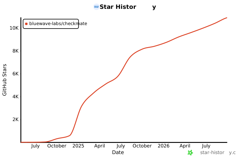](https://star-history.com/#bluewave-labs/Checkmate&Date)
|
||||
|
||||
## Our sponsors
|
||||
|
||||
Thanks to [Gitbook](https://gitbook.io/) for giving us a free tier for their documentation platform, and [Poeditor](https://poeditor.com/) providing us a free account to use their i18n services. If you would like to sponsor Checkmate, please send an email to hello@bluewavelabs.ca
|
||||
|
||||
If you would like to sponsor a feature, [see this page](https://checkmate.so/sponsored-features).
|
||||
@@ -1,3 +1,104 @@
|
||||
// MUI sx keys that have a native (system) prop equivalent.
|
||||
// Flagged when found inside an sx={{ ... }} object literal — see frontend-conventions.md rule #1.
|
||||
const SX_NATIVE_EQUIVALENT_KEYS = [
|
||||
"color",
|
||||
"bgcolor",
|
||||
"backgroundColor",
|
||||
"borderRadius",
|
||||
"border",
|
||||
"borderTop",
|
||||
"borderBottom",
|
||||
"borderLeft",
|
||||
"borderRight",
|
||||
"width",
|
||||
"height",
|
||||
"minHeight",
|
||||
"maxWidth",
|
||||
"minWidth",
|
||||
"maxHeight",
|
||||
"p",
|
||||
"pt",
|
||||
"pb",
|
||||
"px",
|
||||
"py",
|
||||
"pl",
|
||||
"pr",
|
||||
"m",
|
||||
"mt",
|
||||
"mb",
|
||||
"mx",
|
||||
"my",
|
||||
"ml",
|
||||
"mr",
|
||||
"display",
|
||||
"textAlign",
|
||||
"fontWeight",
|
||||
"fontSize",
|
||||
"lineHeight",
|
||||
"gap",
|
||||
];
|
||||
|
||||
// MUI components that accept system props as top-level attributes.
|
||||
// sx={{ color, p, mt, ... }} on these can be hoisted into native props.
|
||||
// Dialog*, Drawer*, Menu*, Tab*, Toolbar etc. only accept sx — don't flag those.
|
||||
const SX_HOISTABLE_COMPONENTS = [
|
||||
"Box",
|
||||
"Stack",
|
||||
"Typography",
|
||||
"Grid",
|
||||
"Container",
|
||||
"Paper",
|
||||
"Card",
|
||||
"CardContent",
|
||||
"CardActions",
|
||||
"CardHeader",
|
||||
"Divider",
|
||||
"Link",
|
||||
"Chip",
|
||||
];
|
||||
|
||||
const sxKeySelector = SX_HOISTABLE_COMPONENTS.flatMap((component) =>
|
||||
SX_NATIVE_EQUIVALENT_KEYS.map(
|
||||
(k) =>
|
||||
`JSXOpeningElement[name.name='${component}'] > JSXAttribute[name.name='sx'] > JSXExpressionContainer > ObjectExpression > Property[key.name='${k}']`
|
||||
)
|
||||
).join(", ");
|
||||
|
||||
const FRONTEND_CONVENTION_RULES = {
|
||||
// Rule #2 — color/bgcolor/borderColor as a string shorthand like "text.secondary".
|
||||
// Catches: <Typography color="text.secondary" /> — should be color={theme.palette.text.secondary}.
|
||||
"no-restricted-syntax": [
|
||||
"warn",
|
||||
{
|
||||
selector:
|
||||
"JSXAttribute[name.name=/^(color|bgcolor|borderColor)$/] > Literal[value=/\\./]",
|
||||
message:
|
||||
'Use the full theme path instead of a string shorthand. e.g. color={theme.palette.text.secondary} not color="text.secondary". See docs/frontend-conventions.md rule #2.',
|
||||
},
|
||||
{
|
||||
// Rule #1 — sx={{ key: ... }} where key has a native prop equivalent.
|
||||
selector: sxKeySelector,
|
||||
message:
|
||||
"Hoist this key out of `sx` onto the component as a native MUI prop (e.g. color={...}, mt={...}, width={...}). See docs/frontend-conventions.md rule #1.",
|
||||
},
|
||||
{
|
||||
// Rule #4 — importing the singleton theme from the Theme module.
|
||||
// Catches: import { theme } from "@/Utils/Theme/Theme" — should be useTheme() inside the component.
|
||||
selector:
|
||||
"ImportDeclaration[source.value='@/Utils/Theme/Theme'] > ImportSpecifier[imported.name='theme']",
|
||||
message:
|
||||
"Don't import { theme } from @/Utils/Theme/Theme — use the useTheme() hook inside the component. See docs/frontend-conventions.md rule #4.",
|
||||
},
|
||||
{
|
||||
// Rule #3 (subset) — Typography fontSize={13} is the body default; drop it.
|
||||
selector:
|
||||
"JSXOpeningElement[name.name='Typography'] JSXAttribute[name.name='fontSize'] > JSXExpressionContainer > Literal[value=13]",
|
||||
message:
|
||||
"fontSize={13} is the Typography body default — drop the prop. For other sizes use typographyLevels tokens. See docs/frontend-conventions.md rule #3.",
|
||||
},
|
||||
],
|
||||
};
|
||||
|
||||
module.exports = {
|
||||
root: true,
|
||||
env: { browser: true, es2020: true },
|
||||
@@ -15,9 +116,43 @@ module.exports = {
|
||||
"react/jsx-no-target-blank": "off",
|
||||
"react-refresh/only-export-components": ["warn", { allowConstantExport: true }],
|
||||
"react/no-unescaped-entities": "off",
|
||||
...FRONTEND_CONVENTION_RULES,
|
||||
},
|
||||
globals: {
|
||||
__APP_VERSION__: "readonly",
|
||||
process: "readonly",
|
||||
},
|
||||
overrides: [
|
||||
{
|
||||
files: ["**/*.ts", "**/*.tsx"],
|
||||
parser: "@typescript-eslint/parser",
|
||||
parserOptions: { ecmaVersion: "latest", sourceType: "module" },
|
||||
extends: [
|
||||
"eslint:recommended",
|
||||
"plugin:@typescript-eslint/recommended",
|
||||
"plugin:react/recommended",
|
||||
"plugin:react/jsx-runtime",
|
||||
"plugin:react-hooks/recommended",
|
||||
],
|
||||
plugins: ["@typescript-eslint", "react-refresh"],
|
||||
rules: {
|
||||
"react/jsx-no-target-blank": "off",
|
||||
"react-refresh/only-export-components": ["warn", { allowConstantExport: true }],
|
||||
"react/no-unescaped-entities": "off",
|
||||
"no-unused-vars": "off",
|
||||
"@typescript-eslint/no-unused-vars": [
|
||||
"warn",
|
||||
{ argsIgnorePattern: "^_", varsIgnorePattern: "^_" },
|
||||
],
|
||||
// TS handles these; eslint duplicates create noise on existing files.
|
||||
"@typescript-eslint/no-explicit-any": "off",
|
||||
"@typescript-eslint/ban-ts-comment": "off",
|
||||
"@typescript-eslint/ban-types": "off",
|
||||
"@typescript-eslint/no-empty-function": "off",
|
||||
"@typescript-eslint/no-empty-interface": "off",
|
||||
"@typescript-eslint/no-non-null-assertion": "off",
|
||||
...FRONTEND_CONVENTION_RULES,
|
||||
},
|
||||
},
|
||||
],
|
||||
};
|
||||
@@ -0,0 +1,18 @@
|
||||
Checkmate
|
||||
Copyright (c) BlueWave Labs
|
||||
|
||||
This product includes assets developed by third parties.
|
||||
|
||||
----------------------------------------------------------------------
|
||||
|
||||
King chess-piece silhouette used in the Checkmate logo
|
||||
(client/src/assets/icons/checkmate-icon.svg and
|
||||
client/public/checkmate_favicon.svg)
|
||||
is adapted from "Chess klt45.svg" by Cburnett, available at:
|
||||
https://commons.wikimedia.org/wiki/File:Chess_klt45.svg
|
||||
Licensed under Creative Commons Attribution-ShareAlike 3.0 Unported
|
||||
(CC BY-SA 3.0): https://creativecommons.org/licenses/by-sa/3.0/
|
||||
|
||||
The original artwork has been recolored from the white-with-black-stroke
|
||||
chess piece to the Checkmate brand green (#13715B) for use as a logo.
|
||||
Modifications: stroke color change only; geometry unchanged.
|
||||
Generated
+343
-7
@@ -1,12 +1,12 @@
|
||||
{
|
||||
"name": "client",
|
||||
"version": "0.0.0",
|
||||
"version": "3.7.1",
|
||||
"lockfileVersion": 3,
|
||||
"requires": true,
|
||||
"packages": {
|
||||
"": {
|
||||
"name": "client",
|
||||
"version": "0.0.0",
|
||||
"version": "3.7.1",
|
||||
"dependencies": {
|
||||
"@emotion/react": "^11.13.3",
|
||||
"@emotion/styled": "^11.13.0",
|
||||
@@ -20,7 +20,6 @@
|
||||
"@types/maplibre-gl": "^1.13.2",
|
||||
"axios": "^1.7.4",
|
||||
"dayjs": "1.11.13",
|
||||
"flag-icons": "7.3.2",
|
||||
"html2canvas": "^1.4.1",
|
||||
"human-interval": "2.0.1",
|
||||
"i18next": "25.4.2",
|
||||
@@ -50,6 +49,8 @@
|
||||
"@types/node": "24.5.2",
|
||||
"@types/react": "^18.2.66",
|
||||
"@types/react-dom": "^18.2.22",
|
||||
"@typescript-eslint/eslint-plugin": "^7.18.0",
|
||||
"@typescript-eslint/parser": "^7.18.0",
|
||||
"@vitejs/plugin-react": "^4.2.1",
|
||||
"eslint": "^8.57.0",
|
||||
"eslint-plugin-react": "^7.34.1",
|
||||
@@ -2351,6 +2352,238 @@
|
||||
"version": "0.0.6",
|
||||
"license": "MIT"
|
||||
},
|
||||
"node_modules/@typescript-eslint/eslint-plugin": {
|
||||
"version": "7.18.0",
|
||||
"resolved": "https://registry.npmjs.org/@typescript-eslint/eslint-plugin/-/eslint-plugin-7.18.0.tgz",
|
||||
"integrity": "sha512-94EQTWZ40mzBc42ATNIBimBEDltSJ9RQHCC8vc/PDbxi4k8dVwUAv4o98dk50M1zB+JGFxp43FP7f8+FP8R6Sw==",
|
||||
"dev": true,
|
||||
"license": "MIT",
|
||||
"dependencies": {
|
||||
"@eslint-community/regexpp": "^4.10.0",
|
||||
"@typescript-eslint/scope-manager": "7.18.0",
|
||||
"@typescript-eslint/type-utils": "7.18.0",
|
||||
"@typescript-eslint/utils": "7.18.0",
|
||||
"@typescript-eslint/visitor-keys": "7.18.0",
|
||||
"graphemer": "^1.4.0",
|
||||
"ignore": "^5.3.1",
|
||||
"natural-compare": "^1.4.0",
|
||||
"ts-api-utils": "^1.3.0"
|
||||
},
|
||||
"engines": {
|
||||
"node": "^18.18.0 || >=20.0.0"
|
||||
},
|
||||
"funding": {
|
||||
"type": "opencollective",
|
||||
"url": "https://opencollective.com/typescript-eslint"
|
||||
},
|
||||
"peerDependencies": {
|
||||
"@typescript-eslint/parser": "^7.0.0",
|
||||
"eslint": "^8.56.0"
|
||||
},
|
||||
"peerDependenciesMeta": {
|
||||
"typescript": {
|
||||
"optional": true
|
||||
}
|
||||
}
|
||||
},
|
||||
"node_modules/@typescript-eslint/parser": {
|
||||
"version": "7.18.0",
|
||||
"resolved": "https://registry.npmjs.org/@typescript-eslint/parser/-/parser-7.18.0.tgz",
|
||||
"integrity": "sha512-4Z+L8I2OqhZV8qA132M4wNL30ypZGYOQVBfMgxDH/K5UX0PNqTu1c6za9ST5r9+tavvHiTWmBnKzpCJ/GlVFtg==",
|
||||
"dev": true,
|
||||
"license": "BSD-2-Clause",
|
||||
"dependencies": {
|
||||
"@typescript-eslint/scope-manager": "7.18.0",
|
||||
"@typescript-eslint/types": "7.18.0",
|
||||
"@typescript-eslint/typescript-estree": "7.18.0",
|
||||
"@typescript-eslint/visitor-keys": "7.18.0",
|
||||
"debug": "^4.3.4"
|
||||
},
|
||||
"engines": {
|
||||
"node": "^18.18.0 || >=20.0.0"
|
||||
},
|
||||
"funding": {
|
||||
"type": "opencollective",
|
||||
"url": "https://opencollective.com/typescript-eslint"
|
||||
},
|
||||
"peerDependencies": {
|
||||
"eslint": "^8.56.0"
|
||||
},
|
||||
"peerDependenciesMeta": {
|
||||
"typescript": {
|
||||
"optional": true
|
||||
}
|
||||
}
|
||||
},
|
||||
"node_modules/@typescript-eslint/scope-manager": {
|
||||
"version": "7.18.0",
|
||||
"resolved": "https://registry.npmjs.org/@typescript-eslint/scope-manager/-/scope-manager-7.18.0.tgz",
|
||||
"integrity": "sha512-jjhdIE/FPF2B7Z1uzc6i3oWKbGcHb87Qw7AWj6jmEqNOfDFbJWtjt/XfwCpvNkpGWlcJaog5vTR+VV8+w9JflA==",
|
||||
"dev": true,
|
||||
"license": "MIT",
|
||||
"dependencies": {
|
||||
"@typescript-eslint/types": "7.18.0",
|
||||
"@typescript-eslint/visitor-keys": "7.18.0"
|
||||
},
|
||||
"engines": {
|
||||
"node": "^18.18.0 || >=20.0.0"
|
||||
},
|
||||
"funding": {
|
||||
"type": "opencollective",
|
||||
"url": "https://opencollective.com/typescript-eslint"
|
||||
}
|
||||
},
|
||||
"node_modules/@typescript-eslint/type-utils": {
|
||||
"version": "7.18.0",
|
||||
"resolved": "https://registry.npmjs.org/@typescript-eslint/type-utils/-/type-utils-7.18.0.tgz",
|
||||
"integrity": "sha512-XL0FJXuCLaDuX2sYqZUUSOJ2sG5/i1AAze+axqmLnSkNEVMVYLF+cbwlB2w8D1tinFuSikHmFta+P+HOofrLeA==",
|
||||
"dev": true,
|
||||
"license": "MIT",
|
||||
"dependencies": {
|
||||
"@typescript-eslint/typescript-estree": "7.18.0",
|
||||
"@typescript-eslint/utils": "7.18.0",
|
||||
"debug": "^4.3.4",
|
||||
"ts-api-utils": "^1.3.0"
|
||||
},
|
||||
"engines": {
|
||||
"node": "^18.18.0 || >=20.0.0"
|
||||
},
|
||||
"funding": {
|
||||
"type": "opencollective",
|
||||
"url": "https://opencollective.com/typescript-eslint"
|
||||
},
|
||||
"peerDependencies": {
|
||||
"eslint": "^8.56.0"
|
||||
},
|
||||
"peerDependenciesMeta": {
|
||||
"typescript": {
|
||||
"optional": true
|
||||
}
|
||||
}
|
||||
},
|
||||
"node_modules/@typescript-eslint/types": {
|
||||
"version": "7.18.0",
|
||||
"resolved": "https://registry.npmjs.org/@typescript-eslint/types/-/types-7.18.0.tgz",
|
||||
"integrity": "sha512-iZqi+Ds1y4EDYUtlOOC+aUmxnE9xS/yCigkjA7XpTKV6nCBd3Hp/PRGGmdwnfkV2ThMyYldP1wRpm/id99spTQ==",
|
||||
"dev": true,
|
||||
"license": "MIT",
|
||||
"engines": {
|
||||
"node": "^18.18.0 || >=20.0.0"
|
||||
},
|
||||
"funding": {
|
||||
"type": "opencollective",
|
||||
"url": "https://opencollective.com/typescript-eslint"
|
||||
}
|
||||
},
|
||||
"node_modules/@typescript-eslint/typescript-estree": {
|
||||
"version": "7.18.0",
|
||||
"resolved": "https://registry.npmjs.org/@typescript-eslint/typescript-estree/-/typescript-estree-7.18.0.tgz",
|
||||
"integrity": "sha512-aP1v/BSPnnyhMHts8cf1qQ6Q1IFwwRvAQGRvBFkWlo3/lH29OXA3Pts+c10nxRxIBrDnoMqzhgdwVe5f2D6OzA==",
|
||||
"dev": true,
|
||||
"license": "BSD-2-Clause",
|
||||
"dependencies": {
|
||||
"@typescript-eslint/types": "7.18.0",
|
||||
"@typescript-eslint/visitor-keys": "7.18.0",
|
||||
"debug": "^4.3.4",
|
||||
"globby": "^11.1.0",
|
||||
"is-glob": "^4.0.3",
|
||||
"minimatch": "^9.0.4",
|
||||
"semver": "^7.6.0",
|
||||
"ts-api-utils": "^1.3.0"
|
||||
},
|
||||
"engines": {
|
||||
"node": "^18.18.0 || >=20.0.0"
|
||||
},
|
||||
"funding": {
|
||||
"type": "opencollective",
|
||||
"url": "https://opencollective.com/typescript-eslint"
|
||||
},
|
||||
"peerDependenciesMeta": {
|
||||
"typescript": {
|
||||
"optional": true
|
||||
}
|
||||
}
|
||||
},
|
||||
"node_modules/@typescript-eslint/typescript-estree/node_modules/brace-expansion": {
|
||||
"version": "2.1.0",
|
||||
"resolved": "https://registry.npmjs.org/brace-expansion/-/brace-expansion-2.1.0.tgz",
|
||||
"integrity": "sha512-TN1kCZAgdgweJhWWpgKYrQaMNHcDULHkWwQIspdtjV4Y5aurRdZpjAqn6yX3FPqTA9ngHCc4hJxMAMgGfve85w==",
|
||||
"dev": true,
|
||||
"license": "MIT",
|
||||
"dependencies": {
|
||||
"balanced-match": "^1.0.0"
|
||||
}
|
||||
},
|
||||
"node_modules/@typescript-eslint/typescript-estree/node_modules/minimatch": {
|
||||
"version": "9.0.9",
|
||||
"resolved": "https://registry.npmjs.org/minimatch/-/minimatch-9.0.9.tgz",
|
||||
"integrity": "sha512-OBwBN9AL4dqmETlpS2zasx+vTeWclWzkblfZk7KTA5j3jeOONz/tRCnZomUyvNg83wL5Zv9Ss6HMJXAgL8R2Yg==",
|
||||
"dev": true,
|
||||
"license": "ISC",
|
||||
"dependencies": {
|
||||
"brace-expansion": "^2.0.2"
|
||||
},
|
||||
"engines": {
|
||||
"node": ">=16 || 14 >=14.17"
|
||||
},
|
||||
"funding": {
|
||||
"url": "https://github.com/sponsors/isaacs"
|
||||
}
|
||||
},
|
||||
"node_modules/@typescript-eslint/typescript-estree/node_modules/semver": {
|
||||
"version": "7.7.4",
|
||||
"resolved": "https://registry.npmjs.org/semver/-/semver-7.7.4.tgz",
|
||||
"integrity": "sha512-vFKC2IEtQnVhpT78h1Yp8wzwrf8CM+MzKMHGJZfBtzhZNycRFnXsHk6E5TxIkkMsgNS7mdX3AGB7x2QM2di4lA==",
|
||||
"dev": true,
|
||||
"license": "ISC",
|
||||
"bin": {
|
||||
"semver": "bin/semver.js"
|
||||
},
|
||||
"engines": {
|
||||
"node": ">=10"
|
||||
}
|
||||
},
|
||||
"node_modules/@typescript-eslint/utils": {
|
||||
"version": "7.18.0",
|
||||
"resolved": "https://registry.npmjs.org/@typescript-eslint/utils/-/utils-7.18.0.tgz",
|
||||
"integrity": "sha512-kK0/rNa2j74XuHVcoCZxdFBMF+aq/vH83CXAOHieC+2Gis4mF8jJXT5eAfyD3K0sAxtPuwxaIOIOvhwzVDt/kw==",
|
||||
"dev": true,
|
||||
"license": "MIT",
|
||||
"dependencies": {
|
||||
"@eslint-community/eslint-utils": "^4.4.0",
|
||||
"@typescript-eslint/scope-manager": "7.18.0",
|
||||
"@typescript-eslint/types": "7.18.0",
|
||||
"@typescript-eslint/typescript-estree": "7.18.0"
|
||||
},
|
||||
"engines": {
|
||||
"node": "^18.18.0 || >=20.0.0"
|
||||
},
|
||||
"funding": {
|
||||
"type": "opencollective",
|
||||
"url": "https://opencollective.com/typescript-eslint"
|
||||
},
|
||||
"peerDependencies": {
|
||||
"eslint": "^8.56.0"
|
||||
}
|
||||
},
|
||||
"node_modules/@typescript-eslint/visitor-keys": {
|
||||
"version": "7.18.0",
|
||||
"resolved": "https://registry.npmjs.org/@typescript-eslint/visitor-keys/-/visitor-keys-7.18.0.tgz",
|
||||
"integrity": "sha512-cDF0/Gf81QpY3xYyJKDV14Zwdmid5+uuENhjH2EqFaF0ni+yAyq/LzMaIJdhNJXZI7uLzwIlA+V7oWoyn6Curg==",
|
||||
"dev": true,
|
||||
"license": "MIT",
|
||||
"dependencies": {
|
||||
"@typescript-eslint/types": "7.18.0",
|
||||
"eslint-visitor-keys": "^3.4.3"
|
||||
},
|
||||
"engines": {
|
||||
"node": "^18.18.0 || >=20.0.0"
|
||||
},
|
||||
"funding": {
|
||||
"type": "opencollective",
|
||||
"url": "https://opencollective.com/typescript-eslint"
|
||||
}
|
||||
},
|
||||
"node_modules/@ungap/structured-clone": {
|
||||
"version": "1.3.0",
|
||||
"dev": true,
|
||||
@@ -2558,6 +2791,16 @@
|
||||
"url": "https://github.com/sponsors/ljharb"
|
||||
}
|
||||
},
|
||||
"node_modules/array-union": {
|
||||
"version": "2.1.0",
|
||||
"resolved": "https://registry.npmjs.org/array-union/-/array-union-2.1.0.tgz",
|
||||
"integrity": "sha512-HGyxoOTYUyCM6stUe6EJgnd4EoewAI7zMdfqO+kGjnlZmBDz/cR5pf8r/cR4Wq60sL/p0IkcjUEEPwS3GFrIyw==",
|
||||
"dev": true,
|
||||
"license": "MIT",
|
||||
"engines": {
|
||||
"node": ">=8"
|
||||
}
|
||||
},
|
||||
"node_modules/array.prototype.findlast": {
|
||||
"version": "1.2.5",
|
||||
"dev": true,
|
||||
@@ -3273,6 +3516,19 @@
|
||||
"node": ">=6"
|
||||
}
|
||||
},
|
||||
"node_modules/dir-glob": {
|
||||
"version": "3.0.1",
|
||||
"resolved": "https://registry.npmjs.org/dir-glob/-/dir-glob-3.0.1.tgz",
|
||||
"integrity": "sha512-WkrWp9GR4KXfKGYzOLmTuGVi1UWFfws377n9cc55/tb6DuqyF6pcQ5AbiHEshaDpY9v6oaSr2XCDidGmMwdzIA==",
|
||||
"dev": true,
|
||||
"license": "MIT",
|
||||
"dependencies": {
|
||||
"path-type": "^4.0.0"
|
||||
},
|
||||
"engines": {
|
||||
"node": ">=8"
|
||||
}
|
||||
},
|
||||
"node_modules/doctrine": {
|
||||
"version": "3.0.0",
|
||||
"dev": true,
|
||||
@@ -3815,6 +4071,36 @@
|
||||
"node": ">=6.0.0"
|
||||
}
|
||||
},
|
||||
"node_modules/fast-glob": {
|
||||
"version": "3.3.3",
|
||||
"resolved": "https://registry.npmjs.org/fast-glob/-/fast-glob-3.3.3.tgz",
|
||||
"integrity": "sha512-7MptL8U0cqcFdzIzwOTHoilX9x5BrNqye7Z/LuC7kCMRio1EMSyqRK3BEAUD7sXRq4iT4AzTVuZdhgQ2TCvYLg==",
|
||||
"dev": true,
|
||||
"license": "MIT",
|
||||
"dependencies": {
|
||||
"@nodelib/fs.stat": "^2.0.2",
|
||||
"@nodelib/fs.walk": "^1.2.3",
|
||||
"glob-parent": "^5.1.2",
|
||||
"merge2": "^1.3.0",
|
||||
"micromatch": "^4.0.8"
|
||||
},
|
||||
"engines": {
|
||||
"node": ">=8.6.0"
|
||||
}
|
||||
},
|
||||
"node_modules/fast-glob/node_modules/glob-parent": {
|
||||
"version": "5.1.2",
|
||||
"resolved": "https://registry.npmjs.org/glob-parent/-/glob-parent-5.1.2.tgz",
|
||||
"integrity": "sha512-AOIgSQCepiJYwP3ARnGx+5VnTu2HBYdzbGP45eLw1vr3zB3vZLeyed1sC9hnbcOc9/SrMyM5RPQrkGz4aS9Zow==",
|
||||
"dev": true,
|
||||
"license": "ISC",
|
||||
"dependencies": {
|
||||
"is-glob": "^4.0.1"
|
||||
},
|
||||
"engines": {
|
||||
"node": ">= 6"
|
||||
}
|
||||
},
|
||||
"node_modules/fast-json-stable-stringify": {
|
||||
"version": "2.1.0",
|
||||
"dev": true,
|
||||
@@ -3891,10 +4177,6 @@
|
||||
"url": "https://github.com/sponsors/sindresorhus"
|
||||
}
|
||||
},
|
||||
"node_modules/flag-icons": {
|
||||
"version": "7.3.2",
|
||||
"license": "MIT"
|
||||
},
|
||||
"node_modules/flat-cache": {
|
||||
"version": "3.2.0",
|
||||
"dev": true,
|
||||
@@ -4175,6 +4457,27 @@
|
||||
"url": "https://github.com/sponsors/ljharb"
|
||||
}
|
||||
},
|
||||
"node_modules/globby": {
|
||||
"version": "11.1.0",
|
||||
"resolved": "https://registry.npmjs.org/globby/-/globby-11.1.0.tgz",
|
||||
"integrity": "sha512-jhIXaOzy1sb8IyocaruWSn1TjmnBVs8Ayhcy83rmxNJ8q2uWKCAj3CnJY+KpGSXCueAPc0i05kVvVKtP1t9S3g==",
|
||||
"dev": true,
|
||||
"license": "MIT",
|
||||
"dependencies": {
|
||||
"array-union": "^2.1.0",
|
||||
"dir-glob": "^3.0.1",
|
||||
"fast-glob": "^3.2.9",
|
||||
"ignore": "^5.2.0",
|
||||
"merge2": "^1.4.1",
|
||||
"slash": "^3.0.0"
|
||||
},
|
||||
"engines": {
|
||||
"node": ">=10"
|
||||
},
|
||||
"funding": {
|
||||
"url": "https://github.com/sponsors/sindresorhus"
|
||||
}
|
||||
},
|
||||
"node_modules/gopd": {
|
||||
"version": "1.2.0",
|
||||
"license": "MIT",
|
||||
@@ -5142,6 +5445,16 @@
|
||||
"node": ">= 0.4"
|
||||
}
|
||||
},
|
||||
"node_modules/merge2": {
|
||||
"version": "1.4.1",
|
||||
"resolved": "https://registry.npmjs.org/merge2/-/merge2-1.4.1.tgz",
|
||||
"integrity": "sha512-8q7VEgMJW4J8tcfVPy8g09NcQwZdbwFEqhe/WZkoIzjn/3TGDwtOCYtXGxA3O8tPzpczCCDgv+P2P5y00ZJOOg==",
|
||||
"dev": true,
|
||||
"license": "MIT",
|
||||
"engines": {
|
||||
"node": ">= 8"
|
||||
}
|
||||
},
|
||||
"node_modules/micromatch": {
|
||||
"version": "4.0.8",
|
||||
"resolved": "https://registry.npmjs.org/micromatch/-/micromatch-4.0.8.tgz",
|
||||
@@ -6398,6 +6711,16 @@
|
||||
"url": "https://github.com/sponsors/isaacs"
|
||||
}
|
||||
},
|
||||
"node_modules/slash": {
|
||||
"version": "3.0.0",
|
||||
"resolved": "https://registry.npmjs.org/slash/-/slash-3.0.0.tgz",
|
||||
"integrity": "sha512-g9Q1haeby36OSStwb4ntCGGGaKsaVSjQ68fBxoQcutl5fS1vuY18H3wSt3jFyFtrkx+Kz0V1G85A4MyAdDMi2Q==",
|
||||
"dev": true,
|
||||
"license": "MIT",
|
||||
"engines": {
|
||||
"node": ">=8"
|
||||
}
|
||||
},
|
||||
"node_modules/slice-ansi": {
|
||||
"version": "7.1.2",
|
||||
"resolved": "https://registry.npmjs.org/slice-ansi/-/slice-ansi-7.1.2.tgz",
|
||||
@@ -6798,6 +7121,19 @@
|
||||
"node": ">=8.0"
|
||||
}
|
||||
},
|
||||
"node_modules/ts-api-utils": {
|
||||
"version": "1.4.3",
|
||||
"resolved": "https://registry.npmjs.org/ts-api-utils/-/ts-api-utils-1.4.3.tgz",
|
||||
"integrity": "sha512-i3eMG77UTMD0hZhgRS562pv83RC6ukSAC2GMNWc+9dieh/+jDM5u5YG+NHX6VNDRHQcHwmsTHctP9LhbC3WxVw==",
|
||||
"dev": true,
|
||||
"license": "MIT",
|
||||
"engines": {
|
||||
"node": ">=16"
|
||||
},
|
||||
"peerDependencies": {
|
||||
"typescript": ">=4.2.0"
|
||||
}
|
||||
},
|
||||
"node_modules/tslib": {
|
||||
"version": "2.8.1",
|
||||
"license": "0BSD"
|
||||
|
||||
+5
-3
@@ -1,13 +1,14 @@
|
||||
{
|
||||
"name": "client",
|
||||
"private": true,
|
||||
"version": "0.0.0",
|
||||
"version": "3.7.1",
|
||||
"type": "module",
|
||||
"scripts": {
|
||||
"dev": "vite",
|
||||
"build": "tsc -b && vite build",
|
||||
"build-dev": "tsc -b && vite build --mode development",
|
||||
"lint": "eslint . --ext js,jsx --report-unused-disable-directives --max-warnings 0",
|
||||
"lint": "eslint . --ext js,jsx,ts,tsx --report-unused-disable-directives",
|
||||
"lint-strict": "eslint . --ext js,jsx,ts,tsx --report-unused-disable-directives --max-warnings 0",
|
||||
"preview": "vite preview",
|
||||
"format": "prettier --write .",
|
||||
"format-check": "prettier --check ."
|
||||
@@ -28,7 +29,6 @@
|
||||
"@types/maplibre-gl": "^1.13.2",
|
||||
"axios": "^1.7.4",
|
||||
"dayjs": "1.11.13",
|
||||
"flag-icons": "7.3.2",
|
||||
"html2canvas": "^1.4.1",
|
||||
"human-interval": "2.0.1",
|
||||
"i18next": "25.4.2",
|
||||
@@ -58,6 +58,8 @@
|
||||
"@types/node": "24.5.2",
|
||||
"@types/react": "^18.2.66",
|
||||
"@types/react-dom": "^18.2.22",
|
||||
"@typescript-eslint/eslint-plugin": "^7.18.0",
|
||||
"@typescript-eslint/parser": "^7.18.0",
|
||||
"@vitejs/plugin-react": "^4.2.1",
|
||||
"eslint": "^8.57.0",
|
||||
"eslint-plugin-react": "^7.34.1",
|
||||
|
||||

@@ -1,49 +1,11 @@
|
||||
<svg width="32" height="32" viewBox="0 0 600 600" fill="none" xmlns="http://www.w3.org/2000/svg">
|
||||
<path d="M218.252 79.2667L218.045 78.4143C218.712 77.617 219.642 77.5282 220.615 77.4361C224.829 77.0374 243.307 76.7077 246.676 77.418C248.299 77.76 249.661 78.5248 250.932 79.5734C254.845 82.8003 259.018 88.0302 262.403 91.9284C263.57 93.2734 264.805 95.1623 266.183 96.2584C268.203 99.7185 274.532 101.602 278.167 102.623C278.397 102.688 278.631 102.741 278.863 102.797C274.983 106.185 272.016 110.321 268.272 113.745C272.574 124.188 286.689 184.953 289.397 187.986C290.165 188.212 290.291 188.048 291.045 187.739C290.627 188.446 290.337 189.3 289.588 189.656L288.963 188.533C286.703 188.347 273.044 195.497 269.836 196.808C267.39 197.808 264.851 198.458 262.414 199.405C261.197 196.797 260.413 193.923 259.329 191.244C254.43 179.142 250.091 166.843 245.71 154.552C240.241 139.206 234.226 124.026 228.882 108.642C226.389 101.466 223.549 94.5009 220.953 87.3749C220.026 84.8301 219.72 81.4795 218.252 79.2667Z" fill="#3158B7"/>
|
||||
<path d="M218.252 79.2667L218.045 78.4143C218.712 77.617 219.642 77.5282 220.615 77.4361C224.829 77.0374 243.307 76.7077 246.676 77.418C248.299 77.76 249.661 78.5248 250.932 79.5734C254.845 82.8003 259.018 88.0302 262.403 91.9284C263.57 93.2734 264.805 95.1623 266.183 96.2584C268.203 99.7185 274.532 101.602 278.167 102.623C278.397 102.688 278.631 102.741 278.863 102.797C274.983 106.185 272.016 110.321 268.272 113.745C266.08 111.774 263.588 110.159 261.208 108.427C256.477 104.982 251.692 101.649 246.906 98.282L233.54 88.9767C228.729 85.5908 223.823 81.3267 218.252 79.2667Z" fill="#73E4FA"/>
|
||||
<path d="M299.595 19.4005C302.177 17.8183 305.226 16.8946 307.955 15.5556C310.387 14.3626 312.673 12.8604 315.15 11.7619C315.624 11.5519 315.886 11.4697 316.398 11.4844C315.732 13.7848 316.431 26.6622 316.441 30.2652C316.474 42.2192 316.084 54.2432 316.385 66.1867C316.416 67.4343 316.377 68.6301 316.847 69.8026C316.457 79.0631 316.718 88.4086 316.651 97.6808L316.423 172.062C316.376 177.75 316.385 183.438 316.448 189.125C316.469 192.585 316.902 196.888 316.126 200.243C316.055 199.033 315.728 197.334 316.025 196.183C315.86 197.435 315.463 198.762 315.391 200.002C315.283 201.847 315.798 203.719 315.391 205.559C314.431 204.554 313.43 203.906 312.592 202.729C308.228 196.602 310.556 194.07 301.963 190.683C299.704 189.793 293.054 186.88 291.045 187.739C290.291 188.048 290.165 188.212 289.397 187.986C286.689 184.953 272.574 124.188 268.272 113.745C272.016 110.321 274.983 106.185 278.863 102.797C278.631 102.741 278.397 102.688 278.167 102.623C274.532 101.602 268.203 99.7184 266.183 96.2583C269.435 97.3504 272.901 97.5882 276.304 97.6583C280.306 97.7408 283.403 97.3026 286.383 94.3544C288.086 92.669 289.516 90.6569 291.136 88.8839C293.303 86.512 296.041 84.1801 297.633 81.3777C300.012 77.1924 299.115 62.4967 299.219 57.0841C296.538 56.7086 293.912 56.806 291.218 56.6995C288.184 56.5796 285.396 56.0507 283.294 53.6585C280.886 50.9188 280.696 47.3466 281.035 43.8756C282.423 29.6657 295.122 37.239 298.804 33.8184C299.712 32.9739 299.469 21.618 299.595 19.4005Z" fill="#3D7ECD"/>
|
||||
<path d="M362.288 269.421L362.773 270.062C364.332 274.37 365.193 279.073 366.359 283.516C368.419 291.371 370.61 299.194 372.793 307.015L395.769 388.039L411.304 442.863L415.766 458.213C416.528 460.836 417.569 463.467 417.96 466.175C417.89 466.842 418.03 466.869 417.485 467.324C413.349 466.406 409.11 465.92 404.942 465.147C396.892 463.653 388.881 461.984 380.817 460.552C380.516 459.221 380.489 457.712 380.305 456.347C379.896 453.327 379.359 450.33 378.694 447.356C376.712 438.738 374.16 430.227 372.075 421.626L351.327 334.35C349.071 324.725 347.019 314.981 344.607 305.405C342.561 297.284 340.078 289.201 338.622 280.946C339.912 280.649 340.991 280.35 342.142 279.684C345.072 278.136 348.264 277.064 351.221 275.536C354.9 273.636 358.345 270.649 362.288 269.421Z" fill="#73E4FA"/>
|
||||
<path d="M316.398 11.4845C316.949 11.6168 317.496 11.7682 318.021 11.982C320.527 13.0022 322.595 14.8975 325.025 16.0401C326.641 16.7993 328.506 17.0278 330.066 17.9189C330.615 18.2326 331.175 18.6401 331.516 19.1833C333.638 22.5617 329.941 33.143 334.144 34.5595C335.071 34.872 336.309 34.7269 337.278 34.6636C342.517 34.3216 346.04 34.3235 349.065 39.1827C350.891 42.117 351.841 45.3207 350.982 48.7564C350.164 52.0314 347.831 55.4635 344.902 57.2399C344.309 57.5993 343.657 57.8308 343.003 58.0488C342.382 58.2541 341.729 58.4831 341.176 58.8402C339.34 60.0257 337.705 61.6472 335.85 62.8819C335.083 63.3916 333.536 63.9343 333.114 64.7163C333.015 64.8989 332.938 65.0921 332.849 65.2797C331.994 71.778 330.942 74.7954 335.242 80.4525C338.105 84.2196 345.676 93.407 349.248 96.0711C350.329 96.8768 351.548 97.3899 352.858 97.674C354.638 97.679 356.567 97.8353 358.319 97.4932C366.986 95.8002 372.945 85.6789 379.155 80.1412C380.557 78.8916 382.117 77.8947 383.974 77.4926C387.385 76.754 391.296 77.2429 394.773 77.2627C400.744 77.2966 406.631 77.1509 412.603 77.4939C413.066 77.8038 413.08 77.6663 413.16 78.1487C413.385 79.5036 412.832 81.0938 412.41 82.377C409.805 90.2864 406.49 98.1119 403.607 105.936L387.525 150.29C383.617 161.269 379.569 172.195 375.381 183.07C373.017 189.241 370.826 195.663 367.756 201.518C366.906 200.846 366.105 200.384 365.115 199.946C357.118 196.547 349.468 191.947 341.757 187.926C341.211 187.423 341.102 187.207 340.301 187.318C338.422 187.579 336.346 188.419 334.502 188.929C330.434 190.055 321.796 191.764 319.469 195.652C318.572 197.151 317.692 200.22 316.337 201.245C316.225 200.886 316.145 200.621 316.126 200.243C316.902 196.888 316.469 192.585 316.448 189.125C316.385 183.438 316.377 177.75 316.423 172.062L316.651 97.6809C316.718 88.4087 316.457 79.0632 316.847 69.8027C316.377 68.6302 316.416 67.4344 316.385 66.1868C316.084 54.2433 316.474 42.2193 316.441 30.2653C316.431 26.6623 315.732 13.7849 316.398 11.4845Z" fill="#73E4FA"/>
|
||||
<path d="M332.127 57.4141C335.751 57.5106 339.378 57.8905 343.003 58.0488C342.382 58.2541 341.729 58.4831 341.176 58.8402C339.34 60.0257 337.705 61.6472 335.85 62.8819C335.083 63.3916 333.536 63.9343 333.114 64.7163C333.015 64.8989 332.938 65.0921 332.849 65.2797C332.684 62.6459 332.422 60.0356 332.127 57.4141Z" fill="black"/>
|
||||
<path d="M352.858 97.674C354.638 97.679 356.567 97.8353 358.319 97.4932C366.986 95.8002 372.945 85.6789 379.155 80.1412C380.557 78.8916 382.117 77.8947 383.974 77.4926C387.385 76.754 391.296 77.2429 394.773 77.2627C400.744 77.2966 406.631 77.1509 412.603 77.4939C412.123 77.5931 411.776 77.6589 411.35 77.9133C409.284 79.1482 407.188 81.3404 405.081 82.7802C394.559 89.9716 384.283 97.4873 373.787 104.715C371.042 106.605 368.398 108.696 365.587 110.481C363.016 106.042 360.879 102.667 356.684 99.576C355.908 99.004 354.963 98.1848 354.042 97.8844C353.777 97.7979 353.467 97.7915 353.199 97.7482C353.084 97.7297 352.972 97.6988 352.858 97.674Z" fill="#4F91E0"/>
|
||||
<path d="M316.847 69.8027C321.242 72.4105 326.84 79.7356 330.518 83.5726C335.063 88.3145 340.305 92.4625 345.078 96.9857C348.754 100.47 359.102 112.197 362.531 113.979C362.884 116.416 347.596 173.131 345.411 179.979C344.657 182.345 343.764 185.35 342.254 187.338C342.099 187.543 341.927 187.734 341.757 187.926C341.211 187.423 341.102 187.207 340.301 187.318C338.422 187.579 336.346 188.419 334.502 188.929C330.434 190.055 321.796 191.764 319.469 195.652C318.572 197.151 317.692 200.22 316.337 201.245C316.225 200.886 316.145 200.621 316.126 200.243C316.902 196.888 316.469 192.585 316.448 189.125C316.385 183.438 316.376 177.75 316.423 172.062L316.651 97.6809C316.718 88.4087 316.457 79.0632 316.847 69.8027Z" fill="#5BBFFC"/>
|
||||
<path d="M316.126 200.243C316.145 200.621 316.225 200.886 316.337 201.245C317.692 200.22 318.572 197.151 319.469 195.652C321.796 191.764 330.434 190.055 334.502 188.929C336.346 188.419 338.422 187.579 340.301 187.318C341.102 187.207 341.211 187.423 341.757 187.926C349.468 191.947 357.118 196.547 365.115 199.946C366.105 200.384 366.906 200.846 367.756 201.518C367.27 202.637 366.763 203.747 366.234 204.848C365.063 207.595 364.344 210.137 363.459 212.952C367.613 213.364 371.797 213.297 375.966 213.194C386.171 213.341 399.134 211.56 407.006 219.438C408.262 220.694 409.583 222.077 410.315 223.707C411.447 228.7 410.939 234.09 410.692 239.173C410.661 239.285 410.628 239.397 410.599 239.511C410.317 240.612 410.264 241.816 409.76 242.846C408.269 245.89 403.918 248.67 401.099 250.509L397.101 250.535C392.229 251.156 386.936 250.764 382.02 250.742C380.258 252.242 379.572 253.4 379.015 255.621C375.623 257.067 372.349 258.186 368.836 259.31C366.357 260.996 362.191 264.345 361.869 267.495C361.803 268.145 361.893 268.578 362.175 269.155L362.288 269.421C358.345 270.649 354.9 273.636 351.221 275.536C348.264 277.064 345.072 278.136 342.142 279.684C340.991 280.35 339.912 280.649 338.622 280.946L338.374 280.965L337.631 281.175C336.996 280.978 336.122 280.707 335.64 280.22C335.013 279.586 332.112 273.818 330.826 272.131C327.237 267.42 322.458 264.909 316.638 264.129L316.192 264.037C314.993 265.535 316.083 270.149 315.579 272.213C315.076 269.916 316.559 267.352 315.272 265.334C314.562 264.951 314 264.949 313.234 265.15C310.643 265.828 308.244 267.144 305.601 267.663L305.359 267.78C304.526 268.174 303.726 268.445 302.836 268.679L302.422 268.516C302.97 267.994 303.581 267.707 304.249 267.371C303.346 267.089 302.592 267.405 301.795 267.828C300.798 268.358 299.724 269.109 298.638 269.418C296.45 270.04 293.748 268.782 292.771 271.723C291.539 275.429 292.836 276.598 289.342 279.245L289.264 279.106L289.746 279.665C289.922 279.642 290.098 279.617 290.274 279.596C290.788 279.534 291.072 279.562 291.552 279.784C283.761 280.886 276.08 271.943 269.481 268.727C269.532 267.685 269.414 267.036 268.848 266.155C266.793 262.951 261.551 259.21 258.011 257.869C256.773 257.4 255.382 257.17 254.087 256.899C250.725 256.497 247.482 255.358 244.173 254.665C241.651 254.137 239.029 253.962 236.466 253.728C236.969 252.907 236.631 251.749 236.978 250.742C234.444 250.731 231.884 250.523 229.351 250.403C226.903 249.086 224.175 246.485 222.644 244.15C220.166 240.368 220.112 229.455 221.195 225.05C221.962 221.93 223.946 219.508 226.648 217.845C227.525 217.021 228.391 216.267 229.547 215.874C232.606 214.832 236.233 214.827 239.433 214.547C243.327 214.206 247.238 213.733 251.141 213.538C256.502 213.269 261.883 213.36 267.25 213.257C267.293 213.167 267.345 213.08 267.378 212.986C268.103 210.948 263.421 201.839 262.414 199.405C264.851 198.458 267.39 197.808 269.836 196.808C273.044 195.497 286.703 188.347 288.963 188.533L289.588 189.656C290.337 189.3 290.627 188.446 291.045 187.739C293.054 186.88 299.704 189.793 301.963 190.683C310.556 194.07 308.228 196.602 312.592 202.729C313.43 203.906 314.431 204.554 315.391 205.559C315.798 203.719 315.283 201.847 315.391 200.002C315.463 198.762 315.86 197.435 316.025 196.183C315.728 197.334 316.055 199.033 316.126 200.243Z" fill="#73E4FA"/>
|
||||
<path d="M226.648 217.845C227.525 217.021 228.391 216.267 229.547 215.874C232.606 214.832 236.233 214.827 239.433 214.547C243.327 214.206 247.238 213.733 251.141 213.538C256.502 213.269 261.883 213.36 267.25 213.257C273.5 213.971 279.834 213.445 286.108 213.605C286.028 213.626 285.948 213.648 285.867 213.666C283.762 214.153 281.367 213.997 279.208 214.037C272.251 214.165 265.326 213.83 258.375 213.88C253.031 213.919 247.886 214.67 242.578 215.017C240.895 215.127 236.024 214.805 235.01 216.105C234.814 216.356 234.778 216.499 234.672 216.773C235.26 217.358 235.736 217.319 236.534 217.341C240.179 217.439 243.921 217.212 247.585 217.238C254.057 217.283 260.516 217.54 266.99 217.551C270.978 217.557 278.548 217.235 282.283 217.919C273.611 218.558 264.721 217.948 256.023 218.03C249.71 217.873 243.396 217.847 237.081 217.954C233.732 217.991 229.946 218.398 226.648 217.845Z" fill="#4F91E0"/>
|
||||
<path d="M321 196.5C321.019 196.878 320.86 194.141 320.972 194.5C322.327 193.475 318.572 197.151 319.469 195.652C321.796 191.764 330.434 190.055 334.502 188.929C336.346 188.419 338.422 187.579 340.301 187.318C341.102 187.207 341.211 187.423 341.757 187.926C349.468 191.947 357.118 196.547 365.115 199.946C366.105 200.384 366.906 200.846 367.756 201.518C367.27 202.637 366.763 203.747 366.234 204.848C365.063 207.595 364.344 210.137 363.459 212.952L361.76 212.951C346.809 213.807 331.759 213.014 316.787 213.074L315.391 205.559C315.798 203.719 315.283 201.847 315.391 200.002C315.463 198.762 315.835 196.752 316 195.5C315.5 195 323.374 191.757 321 196.5Z" fill="#3158B7"/>
|
||||
<path d="M291.045 187.739C293.054 186.88 299.704 189.793 301.963 190.683C310.556 194.07 305.5 191.5 312.5 194.5C314 195 315.54 193.995 316.5 195L316.787 213.074C306.586 212.996 296.304 213.296 286.108 213.605C279.834 213.445 273.5 213.971 267.25 213.257C267.293 213.167 267.345 213.08 267.378 212.986C268.103 210.948 263.421 201.839 262.414 199.405C264.851 198.458 267.39 197.808 269.836 196.808C273.044 195.497 286.703 188.347 288.963 188.533L289.5 188.5C290.249 188.144 290.627 188.446 291.045 187.739Z" fill="#15337C"/>
|
||||
<path d="M316.158 217.961C333.626 218.066 351.372 216.648 368.745 218.663C369.093 229.235 368.662 239.88 368.76 250.467L387.46 250.44C390.609 250.437 393.982 250.193 397.101 250.535C392.229 251.156 386.936 250.764 382.02 250.742L316.217 250.777C316.034 247.101 316.2 243.334 316.205 239.649C316.23 232.42 316.215 225.19 316.158 217.961Z" fill="#5BBFFC"/>
|
||||
<path d="M229.351 250.403C226.903 249.086 224.175 246.485 222.644 244.15C220.166 240.368 220.112 229.455 221.195 225.05C221.962 221.93 223.946 219.508 226.648 217.845C229.946 218.398 233.732 217.991 237.081 217.954C243.396 217.847 249.71 217.873 256.023 218.03C264.721 217.948 273.611 218.558 282.283 217.919L316.158 217.961C316.215 225.19 316.23 232.42 316.205 239.649C316.2 243.334 316.034 247.101 316.217 250.777L382.02 250.742C380.258 252.242 379.572 253.4 379.015 255.621C375.623 257.067 372.349 258.186 368.836 259.31C366.357 260.996 362.191 264.345 361.869 267.495C361.803 268.145 361.893 268.578 362.175 269.155L362.288 269.421C358.345 270.649 354.9 273.636 351.221 275.536C348.264 277.064 345.072 278.136 342.142 279.684C340.991 280.35 339.912 280.649 338.622 280.946L338.374 280.965L337.631 281.175C336.996 280.978 336.122 280.707 335.64 280.22C335.013 279.586 332.112 273.818 330.826 272.131C327.237 267.42 322.458 264.909 316.638 264.129L316.192 264.037C314.993 265.535 316.083 270.149 315.579 272.213C315.076 269.916 316.559 267.352 315.272 265.334C314.562 264.951 314 264.949 313.234 265.15C310.643 265.828 308.244 267.144 305.601 267.663L305.359 267.78C304.526 268.174 303.726 268.445 302.836 268.679L302.422 268.516C302.97 267.994 303.581 267.707 304.249 267.371C303.346 267.089 302.592 267.405 301.795 267.828C300.798 268.358 299.724 269.109 298.638 269.418C296.45 270.04 293.748 268.782 292.771 271.723C291.539 275.429 292.836 276.598 289.342 279.245L289.264 279.106L289.746 279.665C289.922 279.642 290.098 279.617 290.274 279.596C290.788 279.534 291.072 279.562 291.552 279.784C283.761 280.886 276.08 271.943 269.481 268.727C269.532 267.685 269.414 267.036 268.848 266.155C266.793 262.951 261.551 259.21 258.011 257.869C256.773 257.4 255.382 257.17 254.087 256.899C250.725 256.497 247.482 255.358 244.173 254.665C241.651 254.137 239.029 253.962 236.466 253.728C236.969 252.907 236.631 251.749 236.978 250.742C234.444 250.731 231.884 250.523 229.351 250.403Z" fill="#3D7ECD"/>
|
||||
<path d="M229.5 250.5C227.052 249.183 224.175 246.485 222.644 244.15C220.166 240.368 220.112 229.455 221.195 225.05C221.962 221.93 223.946 219.508 226.648 217.845C229.946 218.398 233.732 217.991 237.081 217.954C243.396 217.847 249.71 217.873 256.023 218.03C258.057 218.243 260.081 218.239 262.124 218.245C262.036 228.982 261.779 239.713 261.935 250.452C267.117 250.445 282.096 249.873 286.095 250.724C281.121 250.989 276.017 250.759 271.029 250.75C261.584 250.723 252.14 250.748 242.696 250.824C240.816 250.676 238.867 250.759 236.978 250.742C234.444 250.731 232.033 250.62 229.5 250.5Z" fill="#3158B7"/>
|
||||
<path d="M242.696 250.824C252.14 250.748 261.584 250.723 271.029 250.75C276.017 250.759 281.121 250.989 286.095 250.724C296.126 250.796 306.188 250.976 316.217 250.777L382.02 250.742C380.258 252.242 379.572 253.4 379.015 255.621C375.623 257.067 372.349 258.186 368.836 259.31C366.357 260.996 362.191 264.345 361.869 267.495C361.803 268.145 361.893 268.578 362.175 269.155L362.288 269.421C358.345 270.649 354.9 273.636 351.221 275.536C348.264 277.064 345.072 278.136 342.142 279.684C340.991 280.35 339.912 280.649 338.622 280.946L338.374 280.965L337.631 281.175C336.996 280.978 336.122 280.707 335.64 280.22C335.013 279.586 332.112 273.818 330.826 272.131C327.237 267.42 322.458 264.909 316.638 264.129L316.192 264.037C314.993 265.535 316.083 270.149 315.579 272.213C315.076 269.916 316.559 267.352 315.272 265.334C314.562 264.951 314 264.949 313.234 265.15C310.643 265.828 308.244 267.144 305.601 267.663L305.359 267.78C304.526 268.174 303.726 268.445 302.836 268.679L302.422 268.516C302.97 267.994 303.581 267.707 304.249 267.371C303.346 267.089 302.592 267.405 301.795 267.828C300.798 268.358 299.724 269.109 298.638 269.418C296.45 270.04 293.748 268.782 292.771 271.723C291.539 275.429 292.836 276.598 289.342 279.245L289.264 279.106L289.746 279.665C289.922 279.642 290.098 279.617 290.274 279.596C290.788 279.534 291.072 279.562 291.552 279.784C283.761 280.886 276.08 271.943 269.481 268.727C269.532 267.685 269.414 267.036 268.848 266.155C266.793 262.951 261.551 259.21 258.011 257.869C256.773 257.4 255.382 257.17 254.087 256.899C250.725 256.497 247.482 255.358 244.173 254.665C241.651 254.137 239.029 253.962 236.466 253.728C236.969 252.907 236.631 251.749 236.978 250.742C238.867 250.759 240.816 250.676 242.696 250.824Z" fill="url(#paint0_linear_4222_6997)"/>
|
||||
<path d="M236.978 250.742C238.867 250.759 240.816 250.676 242.696 250.824C242.881 250.874 243.066 250.928 243.252 250.974C245.298 251.479 247.92 251.212 250.051 251.224C248.443 251.53 247.073 251.291 245.943 252.702C245.85 253.55 245.913 253.633 246.31 254.399C248.336 255.702 252.778 255.161 254.087 256.899C250.725 256.497 247.482 255.358 244.173 254.665C241.651 254.137 239.029 253.962 236.466 253.728C236.969 252.907 236.631 251.749 236.978 250.742Z" fill="#15337C"/>
|
||||
<path d="M315.839 263.948C315.537 262.501 315.708 261.013 315.229 259.629C314.46 258.966 313.976 259.049 312.984 258.933C313.102 258.884 313.213 258.814 313.338 258.787C315.769 258.246 325.519 258.983 328.801 258.983L357.499 259.017C359.803 259.006 366.156 258.505 368.097 258.96C368.485 259.051 368.546 259.119 368.836 259.31C366.357 260.996 362.191 264.345 361.869 267.495C361.803 268.145 361.893 268.578 362.175 269.155L362.288 269.421C358.345 270.649 354.9 273.636 351.221 275.536C348.264 277.064 345.072 278.136 342.142 279.684C340.991 280.35 339.912 280.649 338.622 280.946L338.374 280.965L337.631 281.175C336.996 280.978 336.122 280.707 335.64 280.22C335.013 279.586 332.112 273.818 330.826 272.131C327.237 267.42 322.458 264.909 316.638 264.129L316.192 264.037C314.993 265.535 316.083 270.149 315.579 272.213C315.076 269.916 316.559 267.352 315.272 265.334C314.562 264.951 314 264.949 313.234 265.15C310.643 265.828 308.244 267.144 305.601 267.663C307.941 265.704 312.848 264.583 315.839 263.948Z" fill="url(#paint1_linear_4222_6997)"/>
|
||||
<path d="M334.406 268.36C340.718 267.927 347.148 267.514 353.456 268.191C355.699 268.431 360.368 269.793 362.175 269.155L362.288 269.421C358.345 270.649 354.9 273.636 351.221 275.536C348.264 277.064 345.072 278.136 342.142 279.684C340.991 280.35 339.912 280.649 338.622 280.946L338.374 280.965C338.013 279.917 337.843 278.75 337.605 277.665C336.155 274.684 336.233 271.392 334.406 268.36Z" fill="#4F91E0"/>
|
||||
<path d="M337.605 277.665C338.101 277.244 338.105 277.263 338.759 277.253C340.026 277.925 341.077 278.732 342.142 279.684C340.991 280.35 339.912 280.649 338.622 280.946L338.374 280.965C338.013 279.917 337.843 278.75 337.605 277.665Z" fill="#5BBFFC"/>
|
||||
<path d="M162.994 506.672C163.51 506.136 164.063 505.686 164.643 505.225C167.325 506.032 178.659 505.485 182.142 505.49L221.176 505.555C226.755 505.582 232.376 505.443 237.949 505.628C269.102 506.183 300.329 505.731 331.491 505.742L372.011 505.764C380.199 505.77 388.457 505.962 396.635 505.618C396.442 517.711 396.022 529.884 396.433 541.975C409.395 542.082 422.357 542.091 435.32 542.002C441.062 542.005 447.41 541.469 453.076 542.23C457.801 542.254 462.724 542.135 467.419 542.679C465.179 543.78 463.234 548.572 462.043 550.796V551.298L462.794 551.648C454.827 551.784 446.872 552.172 438.929 552.813C436.511 552.995 434.06 552.553 431.644 552.413C428.22 552.214 424.779 552.237 421.352 552.25C402.933 552.322 384.531 552.526 366.11 552.346L227.563 552.274C215.642 552.277 203.672 552.344 191.757 552.13C182.178 551.958 172.491 551.389 162.923 551.866C164.053 549.046 163.345 544.905 162.658 542.024C162.018 536.512 162.277 530.737 162.288 525.186C162.299 519.081 161.931 512.699 162.994 506.672Z" fill="#15337C"/>
|
||||
<path d="M162.994 506.672C163.51 506.136 164.063 505.686 164.643 505.225C167.325 506.032 178.659 505.485 182.142 505.49L221.176 505.555C226.755 505.582 232.376 505.443 237.949 505.628C237.694 517.722 237.219 529.932 237.571 542.021L396.433 541.975C409.395 542.082 422.357 542.091 435.32 542.002C441.062 542.005 447.41 541.469 453.076 542.23C445.432 542.447 437.752 542.287 430.104 542.288L384.066 542.238L236.646 542.27L181.968 542.237C175.536 542.231 169.083 541.914 162.658 542.024C162.018 536.512 162.277 530.737 162.288 525.186C162.299 519.081 161.931 512.699 162.994 506.672Z" fill="#3158B7"/>
|
||||
<path d="M237.949 505.628C269.102 506.183 300.329 505.731 331.491 505.742L372.011 505.764C380.199 505.77 388.457 505.962 396.635 505.618C396.442 517.711 396.022 529.884 396.433 541.975L237.571 542.021C237.219 529.932 237.694 517.722 237.949 505.628Z" fill="#3D7ECD"/>
|
||||
<path d="M316.173 450.214L316.356 450.171C327.599 451.012 338.68 453.515 349.747 455.526C360.085 457.318 370.442 458.993 380.817 460.552C388.881 461.984 396.892 463.653 404.942 465.147C409.11 465.92 413.349 466.406 417.485 467.324C418.03 466.869 417.89 466.842 417.96 466.175C418.868 471.139 419.01 474.417 418.882 479.505C424.212 480.991 428.904 484.71 433.752 487.295L467.07 504.914C467.988 505.502 468.749 505.944 468.955 507.111C469.514 510.282 469.469 539.486 468.739 541.824C468.292 542.267 468.021 542.487 467.419 542.679C462.724 542.135 457.801 542.254 453.076 542.23C447.41 541.469 441.062 542.005 435.32 542.002C422.357 542.091 409.395 542.082 396.433 541.975C396.022 529.884 396.442 517.711 396.635 505.618C388.457 505.962 380.199 505.77 372.011 505.764L331.491 505.742C300.329 505.731 269.102 506.183 237.949 505.628C232.376 505.443 226.755 505.582 221.176 505.555L182.142 505.49C178.659 505.485 167.325 506.032 164.643 505.225C166.684 503.613 169.31 502.543 171.632 501.378C176.276 499.048 181.007 496.831 185.604 494.419C192.121 490.999 198.566 487.372 204.999 483.795C207.005 482.679 208.919 481.328 210.961 480.297C211.664 479.943 212.437 479.729 213.192 479.519C213.447 477.939 213.28 476.121 213.292 474.511C213.314 471.755 213.495 469.182 213.961 466.462C214.147 466.81 214.01 466.597 214.452 467.044C227.245 465.759 239.827 462.451 252.483 460.143C260.461 458.819 268.511 457.946 276.475 456.519L300.283 452.407C305.401 451.522 310.98 450.069 316.173 450.214Z" fill="#73E4FA"/>
|
||||
<path d="M316.173 450.214L316.356 450.171C327.599 451.012 338.68 453.515 349.747 455.526C360.085 457.318 370.442 458.993 380.817 460.552C388.881 461.984 396.892 463.653 404.942 465.147C409.11 465.92 413.349 466.406 417.485 467.324C418.03 466.869 417.89 466.842 417.96 466.175C418.868 471.139 419.01 474.417 418.882 479.505C407.542 478.716 395.89 479.365 384.514 479.436C370.443 479.525 356.374 479.202 342.302 479.225L326.141 479.166C322.94 479.164 319.619 479.396 316.441 479.069C316.286 469.43 316.022 459.862 316.173 450.214Z" fill="#3D7ECD"/>
|
||||
<path d="M467.07 504.914C467.988 505.502 468.749 505.944 468.955 507.111C469.514 510.282 469.469 539.486 468.739 541.824C468.292 542.267 468.021 542.487 467.419 542.679C462.724 542.135 457.801 542.254 453.076 542.23C447.41 541.469 441.062 542.005 435.32 542.002C422.357 542.091 409.395 542.082 396.433 541.975C396.022 529.884 396.442 517.711 396.635 505.618C399.774 505.933 403.063 505.785 406.221 505.786L422.299 505.784C435.31 505.785 448.476 506.228 461.464 505.68C463.339 505.6 465.314 505.634 467.07 504.914Z" fill="#5BBFFC"/>
|
||||
<path d="M252.483 460.143C260.461 458.819 268.511 457.946 276.475 456.519L300.283 452.407C305.401 451.522 310.98 450.069 316.173 450.214C316.022 459.862 316.286 469.43 316.441 479.069C313.41 479.108 310.372 479.425 307.371 479.847C292.468 483.6 277.556 488.899 263.025 493.906C257.708 495.738 251.924 497.128 246.801 499.408C243.673 500.8 240.545 502.657 238.239 505.216L351.838 505.253L382.181 505.431C386.77 505.429 392.191 504.724 396.635 505.618C388.457 505.962 380.199 505.77 372.011 505.764L331.491 505.742C300.329 505.731 269.102 506.183 237.949 505.628C232.376 505.443 226.755 505.582 221.176 505.555L182.142 505.49C178.659 505.485 167.325 506.032 164.643 505.225C166.684 503.613 169.31 502.543 171.632 501.378C176.276 499.048 181.007 496.831 185.604 494.419C192.121 490.999 198.566 487.372 204.999 483.795C207.005 482.679 208.919 481.328 210.961 480.297C211.664 479.943 212.437 479.729 213.192 479.519C213.447 477.939 213.28 476.121 213.292 474.511C213.314 471.755 213.495 469.182 213.961 466.462C214.147 466.81 214.01 466.597 214.452 467.044C227.245 465.759 239.827 462.451 252.483 460.143Z" fill="url(#paint2_linear_4222_6997)"/>
|
||||
<path d="M252.483 460.143C260.461 458.819 268.511 457.946 276.475 456.519L300.283 452.407C305.401 451.522 310.98 450.069 316.173 450.214C316.022 459.862 316.286 469.43 316.441 479.069C313.41 479.108 310.372 479.425 307.371 479.847C280.73 478.905 253.933 479.206 227.271 479.298C222.578 479.314 217.879 479.538 213.192 479.519C213.447 477.939 213.28 476.121 213.292 474.511C213.314 471.755 213.495 469.182 213.961 466.462C214.147 466.81 214.01 466.597 214.452 467.044C227.245 465.759 239.827 462.451 252.483 460.143Z" fill="#15337C"/>
|
||||
<path d="M305.601 267.663C308.244 267.144 310.643 265.828 313.234 265.15C314 264.949 314.562 264.951 315.272 265.334C316.559 267.352 315.076 269.916 315.579 272.213C316.083 270.149 314.993 265.535 316.192 264.037L316.638 264.129C322.458 264.909 327.237 267.42 330.826 272.131C332.112 273.818 335.013 279.586 335.64 280.22C336.122 280.707 336.996 280.978 337.631 281.175L338.374 280.965L338.622 280.946C340.078 289.201 342.561 297.284 344.607 305.405C347.019 314.981 349.071 324.725 351.327 334.35L372.075 421.626C374.16 430.227 376.712 438.738 378.694 447.356C379.359 450.33 379.896 453.327 380.305 456.347C380.489 457.712 380.516 459.221 380.817 460.552C370.442 458.993 360.085 457.318 349.747 455.526C338.68 453.515 327.599 451.012 316.356 450.171L316.173 450.214C310.98 450.069 305.401 451.522 300.283 452.407L276.475 456.519C268.511 457.946 260.461 458.819 252.483 460.143C239.827 462.451 227.245 465.759 214.452 467.044C214.01 466.597 214.147 466.81 213.961 466.462C217.335 455.731 219.76 444.734 222.73 433.889L237.945 379.405L269.481 268.727C276.08 271.943 283.761 280.886 291.552 279.784C291.072 279.562 290.788 279.534 290.274 279.596C290.098 279.617 289.922 279.642 289.746 279.665L289.264 279.106L289.342 279.245C292.836 276.598 291.539 275.429 292.771 271.723C293.748 268.782 296.45 270.04 298.638 269.418C299.724 269.109 300.798 268.358 301.795 267.828C302.592 267.405 303.346 267.089 304.249 267.371C303.581 267.707 302.97 267.994 302.422 268.516L302.836 268.679C303.726 268.445 304.526 268.174 305.359 267.78L305.601 267.663Z" fill="#3D7ECD"/>
|
||||
<path d="M213.961 466.462C217.335 455.731 219.76 444.734 222.73 433.889L237.945 379.405L269.481 268.727C276.08 271.943 283.761 280.886 291.552 279.784C294.318 279.786 297.526 280.103 300.239 279.671C302.32 279.34 293.35 281.165 295.5 281C292.765 282.129 294.815 282.321 291.94 282.461C291.8 282.468 291.66 282.481 291.519 282.489C291.435 282.494 291.35 282.496 291.266 282.5C290.329 287.67 289.473 292.882 288.349 298.015L265.21 399.097L256.243 437.602C255.364 441.302 250.844 457.078 251.4 459.744C251.766 459.902 252.097 460.037 252.483 460.143C239.827 462.451 227.245 465.759 214.452 467.044C214.01 466.597 214.147 466.81 213.961 466.462Z" fill="#3158B7"/>
|
||||
<path d="M316.638 264.129C322.458 264.909 327.237 267.42 330.826 272.131C332.112 273.818 335.013 279.586 335.64 280.22C336.122 280.707 336.996 280.978 337.631 281.175L338.374 280.965L338.622 280.946C340.078 289.201 342.561 297.284 344.607 305.405C347.019 314.981 349.071 324.725 351.327 334.35L372.075 421.626C374.16 430.227 376.712 438.738 378.694 447.356C379.359 450.33 379.896 453.327 380.305 456.347C380.489 457.712 380.516 459.221 380.817 460.552C370.442 458.993 360.085 457.318 349.747 455.526C338.68 453.515 327.599 451.012 316.356 450.171L316.124 267.318C316.132 266.225 316.016 265.039 316.638 264.129Z" fill="#5BBFFC"/>
|
||||
<path d="M162.602 542.012C222.681 542.667 282.903 542.133 343 542.146L421.144 542.172C436.934 542.179 452.86 542.406 468.631 542C468.259 556.284 468.631 576.5 466.168 585H164.5C162.602 574 162.11 556.297 162.602 542.012Z" fill="#2E57AB"/>
|
||||
<path d="M263.193 261.724L235.532 253.517L232.5 252.5L229.5 250.5L402 250L377.5 261.724L364 275.5L339.134 284H289.345L269.731 271.69L263.193 261.724Z" fill="#2950B6"/>
|
||||
<defs>
|
||||
<linearGradient id="paint0_linear_4222_6997" x1="313.33" y1="251.065" x2="313.326" y2="279.202" gradientUnits="userSpaceOnUse">
|
||||
<stop stop-color="#122869"/>
|
||||
<stop offset="1" stop-color="#2950B6"/>
|
||||
</linearGradient>
|
||||
<linearGradient id="paint1_linear_4222_6997" x1="342.025" y1="256.698" x2="339.592" y2="280.614" gradientUnits="userSpaceOnUse">
|
||||
<stop stop-color="#3052A7"/>
|
||||
<stop offset="1" stop-color="#2671CE"/>
|
||||
</linearGradient>
|
||||
<linearGradient id="paint2_linear_4222_6997" x1="233.914" y1="479.018" x2="235.081" y2="504.885" gradientUnits="userSpaceOnUse">
|
||||
<stop stop-color="#486DC9"/>
|
||||
<stop offset="1" stop-color="#599BEA"/>
|
||||
</linearGradient>
|
||||
</defs>
|
||||
<?xml version="1.0" encoding="UTF-8" standalone="no"?>
|
||||
<svg xmlns="http://www.w3.org/2000/svg" viewBox="0 0 45 45" width="45" height="45">
|
||||
<title>Checkmate</title>
|
||||
<desc>King silhouette adapted from Cburnett's chess set (Wikimedia Commons, CC BY-SA 3.0).</desc>
|
||||
<g fill="none" stroke="#13715B" stroke-linecap="round" stroke-linejoin="round" stroke-width="1.5">
|
||||
<path stroke-linejoin="miter" d="M22.5 11.63V6M20 8h5"/>
|
||||
<path fill="#fff" stroke-linecap="butt" stroke-linejoin="miter" d="M22.5 25s4.5-7.5 3-10.5c0 0-1-2.5-3-2.5s-3 2.5-3 2.5c-1.5 3 3 10.5 3 10.5"/>
|
||||
<path fill="#fff" d="M12.5 37c5.5 3.5 14.5 3.5 20 0v-7s9-4.5 6-10.5c-4-6.5-13.5-3.5-16 4V27v-3.5c-2.5-7.5-12-10.5-16-4-3 6 6 10.5 6 10.5v7"/>
|
||||
<path d="M12.5 30c5.5-3 14.5-3 20 0m-20 3.5c5.5-3 14.5-3 20 0m-20 3.5c5.5-3 14.5-3 20 0"/>
|
||||
</g>
|
||||
</svg>
|
||||
|
Before Width: | Height: | Size: 29 KiB After Width: | Height: | Size: 819 B |
@@ -0,0 +1,258 @@
|
||||
/**
|
||||
* Locale Migration Script
|
||||
*
|
||||
* Restructures all non-English locale files to match en.json's nested key structure.
|
||||
* Recovers translations via safe key-matching strategies, uses English placeholders
|
||||
* for unmatched keys.
|
||||
*
|
||||
* Usage: npx tsx client/scripts/migrate-locales.ts
|
||||
*
|
||||
* SAFETY: en.json is NEVER modified. Originals are backed up before overwriting.
|
||||
*/
|
||||
|
||||
import fs from "fs";
|
||||
import path from "path";
|
||||
|
||||
const LOCALES_DIR = path.resolve(import.meta.dirname, "../src/locales");
|
||||
const BACKUP_DIR = path.join(LOCALES_DIR, "backup");
|
||||
const REPORT_PATH = path.join(LOCALES_DIR, "migration-report.json");
|
||||
|
||||
// ── Helpers ──────────────────────────────────────────────────────────────────
|
||||
|
||||
/** Flatten a nested object into { "a.b.c": value } pairs */
|
||||
function flattenKeys(obj: Record<string, unknown>, prefix = ""): Record<string, string> {
|
||||
const result: Record<string, string> = {};
|
||||
for (const [key, value] of Object.entries(obj)) {
|
||||
const fullPath = prefix ? `${prefix}.${key}` : key;
|
||||
if (typeof value === "object" && value !== null && !Array.isArray(value)) {
|
||||
Object.assign(result, flattenKeys(value as Record<string, unknown>, fullPath));
|
||||
} else {
|
||||
result[fullPath] = String(value);
|
||||
}
|
||||
}
|
||||
return result;
|
||||
}
|
||||
|
||||
/** Set a value at a dot-separated path in a nested object */
|
||||
function setNestedValue(
|
||||
obj: Record<string, unknown>,
|
||||
keyPath: string,
|
||||
value: string
|
||||
): void {
|
||||
const parts = keyPath.split(".");
|
||||
let current = obj;
|
||||
for (let i = 0; i < parts.length - 1; i++) {
|
||||
const part = parts[i];
|
||||
if (!(part in current) || typeof current[part] !== "object") {
|
||||
current[part] = {};
|
||||
}
|
||||
current = current[part] as Record<string, unknown>;
|
||||
}
|
||||
current[parts[parts.length - 1]] = value;
|
||||
}
|
||||
|
||||
// ── Build mapping indexes from en.json ───────────────────────────────────────
|
||||
|
||||
function buildIndexes(enFlat: Record<string, string>) {
|
||||
const enKeys = Object.keys(enFlat);
|
||||
|
||||
// last segment -> en key paths
|
||||
const lastSegIndex: Record<string, string[]> = {};
|
||||
// last 2 segments -> en key paths
|
||||
const suffixIndex: Record<string, string[]> = {};
|
||||
|
||||
for (const keyPath of enKeys) {
|
||||
const parts = keyPath.split(".");
|
||||
const lastSeg = parts[parts.length - 1].toLowerCase();
|
||||
if (!lastSegIndex[lastSeg]) lastSegIndex[lastSeg] = [];
|
||||
lastSegIndex[lastSeg].push(keyPath);
|
||||
|
||||
if (parts.length >= 2) {
|
||||
const suffix = parts.slice(-2).join(".").toLowerCase();
|
||||
if (!suffixIndex[suffix]) suffixIndex[suffix] = [];
|
||||
suffixIndex[suffix].push(keyPath);
|
||||
}
|
||||
}
|
||||
|
||||
return { lastSegIndex, suffixIndex };
|
||||
}
|
||||
|
||||
// ── Mapping logic ────────────────────────────────────────────────────────────
|
||||
|
||||
type MatchStrategy = "exact" | "suffix-2" | "unique-name" | "english-placeholder";
|
||||
|
||||
interface KeyMatch {
|
||||
enKey: string;
|
||||
value: string;
|
||||
strategy: MatchStrategy;
|
||||
}
|
||||
|
||||
function buildMigratedLocale(
|
||||
enFlat: Record<string, string>,
|
||||
langFlat: Record<string, string>,
|
||||
indexes: ReturnType<typeof buildIndexes>
|
||||
): { matches: KeyMatch[]; result: Record<string, unknown> } {
|
||||
const { lastSegIndex, suffixIndex } = indexes;
|
||||
const matches: KeyMatch[] = [];
|
||||
const result: Record<string, unknown> = {};
|
||||
|
||||
// Build reverse lookup: for each orphan key in lang, index by last segment and suffix
|
||||
const langByLastSeg: Record<string, { key: string; value: string }[]> = {};
|
||||
const langBySuffix: Record<string, { key: string; value: string }[]> = {};
|
||||
|
||||
for (const [langKey, langValue] of Object.entries(langFlat)) {
|
||||
const parts = langKey.split(".");
|
||||
const lastSeg = parts[parts.length - 1].toLowerCase();
|
||||
if (!langByLastSeg[lastSeg]) langByLastSeg[lastSeg] = [];
|
||||
langByLastSeg[lastSeg].push({ key: langKey, value: langValue });
|
||||
|
||||
if (parts.length >= 2) {
|
||||
const suffix = parts.slice(-2).join(".").toLowerCase();
|
||||
if (!langBySuffix[suffix]) langBySuffix[suffix] = [];
|
||||
langBySuffix[suffix].push({ key: langKey, value: langValue });
|
||||
}
|
||||
}
|
||||
|
||||
for (const enKey of Object.keys(enFlat)) {
|
||||
const enValue = enFlat[enKey];
|
||||
const parts = enKey.split(".");
|
||||
const lastSeg = parts[parts.length - 1].toLowerCase();
|
||||
const suffix = parts.length >= 2 ? parts.slice(-2).join(".").toLowerCase() : null;
|
||||
|
||||
// Strategy 1: Exact path match
|
||||
if (langFlat[enKey] !== undefined) {
|
||||
const value = langFlat[enKey];
|
||||
setNestedValue(result, enKey, value);
|
||||
matches.push({ enKey, value, strategy: "exact" });
|
||||
continue;
|
||||
}
|
||||
|
||||
// Strategy 2: 2-segment suffix match (lang key suffix matches en key suffix, both unique)
|
||||
if (suffix) {
|
||||
const enCandidates = suffixIndex[suffix];
|
||||
const langCandidates = langBySuffix[suffix];
|
||||
if (
|
||||
enCandidates &&
|
||||
enCandidates.length === 1 &&
|
||||
langCandidates &&
|
||||
langCandidates.length === 1
|
||||
) {
|
||||
const value = langCandidates[0].value;
|
||||
setNestedValue(result, enKey, value);
|
||||
matches.push({ enKey, value, strategy: "suffix-2" });
|
||||
continue;
|
||||
}
|
||||
}
|
||||
|
||||
// Strategy 3: Unique last-segment match
|
||||
const enCandidates = lastSegIndex[lastSeg];
|
||||
const langCandidates = langByLastSeg[lastSeg];
|
||||
if (
|
||||
enCandidates &&
|
||||
enCandidates.length === 1 &&
|
||||
langCandidates &&
|
||||
langCandidates.length === 1
|
||||
) {
|
||||
const value = langCandidates[0].value;
|
||||
setNestedValue(result, enKey, value);
|
||||
matches.push({ enKey, value, strategy: "unique-name" });
|
||||
continue;
|
||||
}
|
||||
|
||||
// No match — use English placeholder
|
||||
setNestedValue(result, enKey, enValue);
|
||||
matches.push({ enKey, value: enValue, strategy: "english-placeholder" });
|
||||
}
|
||||
|
||||
return { matches, result };
|
||||
}
|
||||
|
||||
// ── Main ─────────────────────────────────────────────────────────────────────
|
||||
|
||||
function main() {
|
||||
// Load en.json
|
||||
const enPath = path.join(LOCALES_DIR, "en.json");
|
||||
const en = JSON.parse(fs.readFileSync(enPath, "utf8"));
|
||||
const enFlat = flattenKeys(en);
|
||||
const enKeyCount = Object.keys(enFlat).length;
|
||||
const indexes = buildIndexes(enFlat);
|
||||
|
||||
console.log(`English: ${enKeyCount} keys (source of truth — NOT modified)\n`);
|
||||
|
||||
// Find all non-English locale files
|
||||
const localeFiles = fs
|
||||
.readdirSync(LOCALES_DIR)
|
||||
.filter(
|
||||
(f: string) =>
|
||||
f.endsWith(".json") && f !== "en.json" && f !== "migration-report.json"
|
||||
);
|
||||
|
||||
if (localeFiles.length === 0) {
|
||||
console.log("No locale files to migrate.");
|
||||
return;
|
||||
}
|
||||
|
||||
// Create backup directory
|
||||
if (!fs.existsSync(BACKUP_DIR)) {
|
||||
fs.mkdirSync(BACKUP_DIR, { recursive: true });
|
||||
}
|
||||
|
||||
const report: Record<
|
||||
string,
|
||||
{
|
||||
total: number;
|
||||
exact: number;
|
||||
suffix: number;
|
||||
uniqueName: number;
|
||||
placeholder: number;
|
||||
}
|
||||
> = {};
|
||||
|
||||
for (const file of localeFiles) {
|
||||
const lang = file.replace(".json", "");
|
||||
const filePath = path.join(LOCALES_DIR, file);
|
||||
|
||||
// Backup original
|
||||
const backupPath = path.join(BACKUP_DIR, file);
|
||||
fs.copyFileSync(filePath, backupPath);
|
||||
|
||||
// Load and flatten
|
||||
const langData = JSON.parse(fs.readFileSync(filePath, "utf8"));
|
||||
const langFlat = flattenKeys(langData);
|
||||
|
||||
// Migrate
|
||||
const { matches, result } = buildMigratedLocale(enFlat, langFlat, indexes);
|
||||
|
||||
// Write migrated file
|
||||
fs.writeFileSync(filePath, JSON.stringify(result, null, "\t") + "\n", "utf8");
|
||||
|
||||
// Compute stats
|
||||
const stats = {
|
||||
total: enKeyCount,
|
||||
exact: matches.filter((m) => m.strategy === "exact").length,
|
||||
suffix: matches.filter((m) => m.strategy === "suffix-2").length,
|
||||
uniqueName: matches.filter((m) => m.strategy === "unique-name").length,
|
||||
placeholder: matches.filter((m) => m.strategy === "english-placeholder").length,
|
||||
};
|
||||
report[lang] = stats;
|
||||
|
||||
const translated = stats.exact + stats.suffix + stats.uniqueName;
|
||||
const pct = ((translated / enKeyCount) * 100).toFixed(1);
|
||||
console.log(
|
||||
`${lang.padEnd(8)} ${String(translated).padStart(4)} translated (${pct}%) | ` +
|
||||
`exact: ${stats.exact} suffix: ${stats.suffix} name: ${stats.uniqueName} ` +
|
||||
`placeholder: ${stats.placeholder}`
|
||||
);
|
||||
}
|
||||
|
||||
// Write report
|
||||
fs.writeFileSync(REPORT_PATH, JSON.stringify(report, null, "\t") + "\n", "utf8");
|
||||
|
||||
const totalLangs = localeFiles.length;
|
||||
console.log(
|
||||
`\nMigrated ${totalLangs} locale files. Originals backed up to locales/backup/`
|
||||
);
|
||||
console.log(`Report written to ${REPORT_PATH}`);
|
||||
}
|
||||
|
||||
main();
|
||||
+21
-2
@@ -33,6 +33,14 @@ function App() {
|
||||
body: {
|
||||
backgroundColor: theme.palette.background.default,
|
||||
},
|
||||
".Toastify__progress-bar": {
|
||||
height: 2,
|
||||
bottom: 0,
|
||||
top: "auto",
|
||||
},
|
||||
".Toastify__progress-bar--bg": {
|
||||
display: "none",
|
||||
},
|
||||
}}
|
||||
/>
|
||||
<AppLayout>
|
||||
@@ -41,12 +49,23 @@ function App() {
|
||||
<ToastContainer
|
||||
newestOnTop={true}
|
||||
theme={mode}
|
||||
icon={false}
|
||||
style={
|
||||
{
|
||||
"--toastify-color-progress-light": "#7C8BA1",
|
||||
"--toastify-color-progress-dark": "#7C8BA1",
|
||||
"--toastify-color-progress-light": theme.palette.primary.main,
|
||||
"--toastify-color-progress-dark": theme.palette.primary.main,
|
||||
"--toastify-toast-min-height": "40px",
|
||||
"--toastify-toast-padding": "8px 12px",
|
||||
"--toastify-toast-width": "auto",
|
||||
} as CSSProperties
|
||||
}
|
||||
toastStyle={{
|
||||
minHeight: 40,
|
||||
padding: "8px 12px",
|
||||
width: "auto",
|
||||
maxWidth: "min(560px, calc(100vw - 32px))",
|
||||
}}
|
||||
progressStyle={{ height: 2 }}
|
||||
/>
|
||||
</ThemeProvider>
|
||||
</SWRConfig>
|
||||
|
||||
@@ -8,7 +8,7 @@ import type { ResponsiveStyleValue } from "@mui/system";
|
||||
import { useTheme } from "@mui/material/styles";
|
||||
|
||||
type BaseChartProps = React.PropsWithChildren<{
|
||||
icon: React.ReactNode;
|
||||
icon?: React.ReactNode;
|
||||
title: string;
|
||||
width?: number | string;
|
||||
maxWidth?: number | string;
|
||||
@@ -17,7 +17,6 @@ type BaseChartProps = React.PropsWithChildren<{
|
||||
|
||||
export const BaseChart = ({
|
||||
children,
|
||||
icon,
|
||||
title,
|
||||
width = "100%",
|
||||
maxWidth = "100%",
|
||||
@@ -38,34 +37,12 @@ export const BaseChart = ({
|
||||
gap={theme.spacing(LAYOUT.MD)}
|
||||
flex={1}
|
||||
>
|
||||
<Stack
|
||||
direction="row"
|
||||
alignItems={"center"}
|
||||
gap={theme.spacing(LAYOUT.XS)}
|
||||
<Typography
|
||||
variant="eyebrow"
|
||||
color="text.secondary"
|
||||
>
|
||||
{icon && (
|
||||
<BaseBox
|
||||
sx={{
|
||||
display: "flex",
|
||||
alignItems: "center",
|
||||
justifyContent: "center",
|
||||
width: 34,
|
||||
height: 34,
|
||||
backgroundColor: theme.palette.action.hover,
|
||||
"& svg": {
|
||||
width: 20,
|
||||
height: 20,
|
||||
"& path": {
|
||||
stroke: theme.palette.text.secondary,
|
||||
},
|
||||
},
|
||||
}}
|
||||
>
|
||||
{icon}
|
||||
</BaseBox>
|
||||
)}
|
||||
<Typography variant="h2">{title}</Typography>
|
||||
</Stack>
|
||||
{title}
|
||||
</Typography>
|
||||
<Box flex={1}>{children}</Box>
|
||||
</Stack>
|
||||
</BaseBox>
|
||||
|
||||
@@ -1,18 +1,19 @@
|
||||
import Logo from "@/assets/icons/checkmate-icon.svg?react";
|
||||
import Stack from "@mui/material/Stack";
|
||||
import Box from "@mui/material/Box";
|
||||
import Alert from "@mui/material/Alert";
|
||||
import Link from "@mui/material/Link";
|
||||
import { LAYOUT, SPACING } from "@/Utils/Theme/constants";
|
||||
import { LAYOUT } from "@/Utils/Theme/constants";
|
||||
import {
|
||||
ErrorFallback,
|
||||
EmptyFallback,
|
||||
EmptyMonitorFallback,
|
||||
BaseFallback,
|
||||
} from "@/Components/design-elements/Fallback";
|
||||
import { EmptyState } from "@/Components/design-elements/EmptyState";
|
||||
import { NoticeBanner } from "@/Components/design-elements/NoticeBanner";
|
||||
import { Breadcrumb } from "@/Components/design-elements/Breadcrumb";
|
||||
import { PageHeader } from "@/Components/design-elements/PageHeader";
|
||||
import CircularProgress from "@mui/material/CircularProgress";
|
||||
import { HeaderAuthControls } from "@/Pages/Auth/components/HeaderAuthControls";
|
||||
import { LanguageSelector, SwitchTheme } from "@/Components/inputs";
|
||||
|
||||
import type { StackProps } from "@mui/material/Stack";
|
||||
import { useTheme } from "@mui/material/styles";
|
||||
@@ -21,16 +22,15 @@ import { Link as RouterLink } from "react-router-dom";
|
||||
import { Typography } from "@mui/material";
|
||||
|
||||
export const PageSpeedKeyPriorityFallback = () => {
|
||||
const theme = useTheme();
|
||||
const { t } = useTranslation();
|
||||
return (
|
||||
<BaseFallback>
|
||||
<Alert
|
||||
severity="warning"
|
||||
sx={{
|
||||
width: "100%",
|
||||
maxWidth: 600,
|
||||
}}
|
||||
>
|
||||
<Typography>
|
||||
<EmptyState
|
||||
fullscreen
|
||||
title={t("pages.pageSpeed.fallback.title")}
|
||||
description={t("pages.pageSpeed.fallback.description")}
|
||||
alert={
|
||||
<NoticeBanner severity="warning">
|
||||
<Trans
|
||||
i18nKey="common.alerts.pageSpeedApiKey.content"
|
||||
components={{
|
||||
@@ -38,15 +38,18 @@ export const PageSpeedKeyPriorityFallback = () => {
|
||||
<Link
|
||||
component={RouterLink}
|
||||
to="/settings"
|
||||
color="inherit"
|
||||
fontWeight="inherit"
|
||||
color={theme.palette.primary.main}
|
||||
fontWeight={600}
|
||||
sx={{
|
||||
textDecoration: "underline",
|
||||
}}
|
||||
/>
|
||||
),
|
||||
}}
|
||||
/>
|
||||
</Typography>
|
||||
</Alert>
|
||||
</BaseFallback>
|
||||
</NoticeBanner>
|
||||
}
|
||||
/>
|
||||
);
|
||||
};
|
||||
|
||||
@@ -55,6 +58,9 @@ interface BasePageProps extends StackProps {
|
||||
error?: boolean;
|
||||
children: React.ReactNode;
|
||||
breadcrumbOverride?: string[];
|
||||
headerKey?: string;
|
||||
backTo?: string;
|
||||
backLabel?: string;
|
||||
}
|
||||
|
||||
export const BasePage = ({
|
||||
@@ -62,9 +68,13 @@ export const BasePage = ({
|
||||
error,
|
||||
children,
|
||||
breadcrumbOverride,
|
||||
headerKey,
|
||||
backTo,
|
||||
backLabel,
|
||||
...props
|
||||
}: BasePageProps) => {
|
||||
const theme = useTheme();
|
||||
const { t } = useTranslation();
|
||||
|
||||
if (loading) {
|
||||
return (
|
||||
@@ -95,7 +105,16 @@ export const BasePage = ({
|
||||
spacing={theme.spacing(LAYOUT.LG)}
|
||||
{...props}
|
||||
>
|
||||
<Breadcrumb breadcrumbOverride={breadcrumbOverride} />
|
||||
{headerKey ? (
|
||||
<PageHeader
|
||||
title={t(`pages.${headerKey}.header.title`)}
|
||||
description={t(`pages.${headerKey}.header.description`)}
|
||||
backTo={backTo}
|
||||
backLabel={backLabel}
|
||||
/>
|
||||
) : (
|
||||
<Breadcrumb breadcrumbOverride={breadcrumbOverride} />
|
||||
)}
|
||||
{children}
|
||||
</Stack>
|
||||
);
|
||||
@@ -105,11 +124,12 @@ interface BasePageWithStatesProps extends StackProps {
|
||||
loading: boolean;
|
||||
error: any;
|
||||
totalCount: number;
|
||||
bullets: string[] | unknown;
|
||||
description?: string;
|
||||
page: string;
|
||||
actionButtonText: string;
|
||||
actionLink: string;
|
||||
children: React.ReactNode;
|
||||
headerKey?: string;
|
||||
}
|
||||
|
||||
export const BasePageWithStates = ({
|
||||
@@ -117,10 +137,11 @@ export const BasePageWithStates = ({
|
||||
error,
|
||||
totalCount,
|
||||
page,
|
||||
bullets,
|
||||
description,
|
||||
actionButtonText,
|
||||
actionLink,
|
||||
children,
|
||||
headerKey,
|
||||
...props
|
||||
}: BasePageWithStatesProps) => {
|
||||
const showLoading = loading && totalCount === 0;
|
||||
@@ -128,7 +149,7 @@ export const BasePageWithStates = ({
|
||||
if (!loading && totalCount === 0) {
|
||||
return (
|
||||
<EmptyFallback
|
||||
bullets={bullets}
|
||||
description={description}
|
||||
title={page}
|
||||
actionButtonText={actionButtonText}
|
||||
actionLink={actionLink}
|
||||
@@ -140,6 +161,7 @@ export const BasePageWithStates = ({
|
||||
<BasePage
|
||||
loading={showLoading}
|
||||
error={error}
|
||||
headerKey={headerKey}
|
||||
{...props}
|
||||
>
|
||||
{children}
|
||||
@@ -155,6 +177,7 @@ interface MonitorBasePageWithStatesProps extends StackProps {
|
||||
actionLink?: string;
|
||||
children: React.ReactNode;
|
||||
priorityFallback?: React.ReactNode;
|
||||
headerKey?: string;
|
||||
}
|
||||
|
||||
export const MonitorBasePageWithStates = ({
|
||||
@@ -165,6 +188,7 @@ export const MonitorBasePageWithStates = ({
|
||||
actionLink,
|
||||
children,
|
||||
priorityFallback,
|
||||
headerKey,
|
||||
...props
|
||||
}: MonitorBasePageWithStatesProps) => {
|
||||
const { t } = useTranslation();
|
||||
@@ -172,15 +196,7 @@ export const MonitorBasePageWithStates = ({
|
||||
const showLoading = loading && totalCount === 0;
|
||||
|
||||
if (priorityFallback) {
|
||||
return (
|
||||
<BasePage
|
||||
loading={loading}
|
||||
error={error}
|
||||
{...props}
|
||||
>
|
||||
<Stack height={"100%"}>{priorityFallback}</Stack>
|
||||
</BasePage>
|
||||
);
|
||||
return <>{priorityFallback}</>;
|
||||
}
|
||||
|
||||
if (!loading && totalCount === 0) {
|
||||
@@ -188,7 +204,7 @@ export const MonitorBasePageWithStates = ({
|
||||
<EmptyMonitorFallback
|
||||
page={page}
|
||||
title={t(`pages.${page}.fallback.title`)}
|
||||
bullets={t(`pages.${page}.fallback.checks`, { returnObjects: true })}
|
||||
description={t(`pages.${page}.fallback.description`)}
|
||||
actionButtonText={t(`pages.${page}.fallback.actionButton`)}
|
||||
actionLink={actionLink || ""}
|
||||
/>
|
||||
@@ -199,6 +215,7 @@ export const MonitorBasePageWithStates = ({
|
||||
<BasePage
|
||||
loading={showLoading}
|
||||
error={error}
|
||||
headerKey={headerKey}
|
||||
{...props}
|
||||
>
|
||||
{children}
|
||||
@@ -215,51 +232,163 @@ export const BaseAuthPage = ({
|
||||
title,
|
||||
subtitle,
|
||||
children,
|
||||
...props
|
||||
component,
|
||||
onSubmit,
|
||||
}: BaseAuthPageProps) => {
|
||||
const theme = useTheme();
|
||||
const { t } = useTranslation();
|
||||
return (
|
||||
<BasePage
|
||||
breadcrumbOverride={[]}
|
||||
gap={theme.spacing(LAYOUT.MD)}
|
||||
alignItems={"center"}
|
||||
justifyContent={"center"}
|
||||
<Stack
|
||||
direction={{ xs: "column", md: "row" }}
|
||||
minHeight="100vh"
|
||||
position={"relative"}
|
||||
{...props}
|
||||
width="100%"
|
||||
position="relative"
|
||||
sx={{ backgroundColor: theme.palette.background.default }}
|
||||
>
|
||||
<HeaderAuthControls
|
||||
hideLogo
|
||||
py={theme.spacing(LAYOUT.XS)}
|
||||
position={"absolute"}
|
||||
top={0}
|
||||
left={0}
|
||||
/>
|
||||
<Box width={{ xs: 60, sm: 70, md: 80 }}>
|
||||
<Logo
|
||||
width={"100%"}
|
||||
height={"100%"}
|
||||
/>
|
||||
</Box>
|
||||
<Stack alignItems={"center"}>
|
||||
<Typography
|
||||
variant="h1"
|
||||
mb={theme.spacing(SPACING.LG)}
|
||||
<Stack
|
||||
flex={1}
|
||||
alignItems="center"
|
||||
justifyContent="center"
|
||||
position="relative"
|
||||
px={theme.spacing(LAYOUT.MD)}
|
||||
py={{ xs: theme.spacing(20), md: theme.spacing(12) }}
|
||||
>
|
||||
<Stack
|
||||
direction="row"
|
||||
spacing={theme.spacing(2)}
|
||||
alignItems="center"
|
||||
sx={{
|
||||
position: "absolute",
|
||||
top: theme.spacing(LAYOUT.MD),
|
||||
right: theme.spacing(LAYOUT.MD),
|
||||
zIndex: 3,
|
||||
}}
|
||||
>
|
||||
{title}
|
||||
</Typography>
|
||||
<Typography variant="h2">{subtitle}</Typography>
|
||||
<LanguageSelector />
|
||||
<SwitchTheme />
|
||||
</Stack>
|
||||
<Box
|
||||
component={component as React.ElementType}
|
||||
onSubmit={onSubmit}
|
||||
sx={{
|
||||
display: "flex",
|
||||
flexDirection: "column",
|
||||
gap: theme.spacing(LAYOUT.MD),
|
||||
width: "100%",
|
||||
maxWidth: 360,
|
||||
}}
|
||||
>
|
||||
<Stack
|
||||
direction="row"
|
||||
alignItems="center"
|
||||
gap={theme.spacing(3)}
|
||||
mb={theme.spacing(2)}
|
||||
>
|
||||
<Box width={28}>
|
||||
<Logo width="100%" />
|
||||
</Box>
|
||||
<Typography sx={{ fontWeight: 500, letterSpacing: "-0.01em", fontSize: 16 }}>
|
||||
{t("common.appName")}
|
||||
</Typography>
|
||||
</Stack>
|
||||
<Stack gap={theme.spacing(2)}>
|
||||
<Typography
|
||||
sx={{
|
||||
fontSize: 26,
|
||||
fontWeight: 400,
|
||||
lineHeight: 1.15,
|
||||
letterSpacing: "-0.02em",
|
||||
color: theme.palette.text.primary,
|
||||
}}
|
||||
>
|
||||
{title}
|
||||
</Typography>
|
||||
<Typography
|
||||
sx={{
|
||||
fontSize: 14,
|
||||
color: theme.palette.text.secondary,
|
||||
}}
|
||||
>
|
||||
{subtitle}
|
||||
</Typography>
|
||||
</Stack>
|
||||
{children}
|
||||
</Box>
|
||||
</Stack>
|
||||
<Stack
|
||||
gap={theme.spacing(LAYOUT.MD)}
|
||||
width={{
|
||||
xs: "80%",
|
||||
md: "25%",
|
||||
lg: "15%",
|
||||
flex={1}
|
||||
justifyContent="space-between"
|
||||
display={{ xs: "none", md: "flex" }}
|
||||
sx={{
|
||||
background: "linear-gradient(135deg, #0c4d3d 0%, #155a48 60%, #0f5d4a 100%)",
|
||||
color: "#fff",
|
||||
p: theme.spacing(28),
|
||||
position: "relative",
|
||||
overflow: "hidden",
|
||||
"&::after": {
|
||||
content: '""',
|
||||
position: "absolute",
|
||||
inset: 0,
|
||||
backgroundImage: `
|
||||
linear-gradient(45deg, rgba(255,255,255,0.04) 25%, transparent 25%),
|
||||
linear-gradient(-45deg, rgba(255,255,255,0.04) 25%, transparent 25%),
|
||||
linear-gradient(45deg, transparent 75%, rgba(255,255,255,0.04) 75%),
|
||||
linear-gradient(-45deg, transparent 75%, rgba(255,255,255,0.04) 75%)
|
||||
`,
|
||||
backgroundSize: "80px 80px",
|
||||
backgroundPosition: "0 0, 0 40px, 40px -40px, -40px 0px",
|
||||
maskImage: "linear-gradient(135deg, transparent 0%, black 70%)",
|
||||
WebkitMaskImage: "linear-gradient(135deg, transparent 0%, black 70%)",
|
||||
pointerEvents: "none",
|
||||
},
|
||||
}}
|
||||
>
|
||||
{children}
|
||||
<div />
|
||||
<Stack sx={{ position: "relative", zIndex: 1, gap: theme.spacing(4) }}>
|
||||
<Typography
|
||||
sx={{
|
||||
fontSize: 13,
|
||||
fontWeight: 600,
|
||||
textTransform: "uppercase",
|
||||
letterSpacing: "0.12em",
|
||||
color: "rgba(255,255,255,0.75)",
|
||||
}}
|
||||
>
|
||||
{t("pages.auth.brandPanel.eyebrow")}
|
||||
</Typography>
|
||||
<Typography
|
||||
sx={{
|
||||
fontSize: 44,
|
||||
fontWeight: 400,
|
||||
lineHeight: 1.1,
|
||||
letterSpacing: "-0.02em",
|
||||
maxWidth: 460,
|
||||
}}
|
||||
>
|
||||
{t("pages.auth.brandPanel.tagline")}
|
||||
</Typography>
|
||||
<Typography
|
||||
sx={{
|
||||
fontSize: 17,
|
||||
lineHeight: 1.5,
|
||||
color: "rgba(255,255,255,0.75)",
|
||||
maxWidth: 460,
|
||||
}}
|
||||
>
|
||||
{t("pages.auth.brandPanel.description")}
|
||||
</Typography>
|
||||
</Stack>
|
||||
<Typography
|
||||
sx={{
|
||||
position: "relative",
|
||||
zIndex: 1,
|
||||
color: "rgba(255,255,255,0.5)",
|
||||
fontSize: 12,
|
||||
}}
|
||||
>
|
||||
v{__APP_VERSION__}
|
||||
</Typography>
|
||||
</Stack>
|
||||
</BasePage>
|
||||
</Stack>
|
||||
);
|
||||
};
|
||||
@@ -0,0 +1,158 @@
|
||||
import Stack from "@mui/material/Stack";
|
||||
import Typography from "@mui/material/Typography";
|
||||
import { useTheme } from "@mui/material/styles";
|
||||
import { Link as RouterLink } from "react-router-dom";
|
||||
import { Button } from "@/Components/inputs";
|
||||
import { LAYOUT } from "@/Utils/Theme/constants";
|
||||
import { EmptyStateIllustration } from "./EmptyStateIllustration";
|
||||
|
||||
import type { ReactNode } from "react";
|
||||
|
||||
interface EmptyStateProps {
|
||||
title: string;
|
||||
description?: ReactNode;
|
||||
actionText?: string;
|
||||
actionTo?: string;
|
||||
onAction?: () => void;
|
||||
secondaryText?: string;
|
||||
secondaryHref?: string;
|
||||
compact?: boolean;
|
||||
fullscreen?: boolean;
|
||||
alert?: ReactNode;
|
||||
children?: ReactNode;
|
||||
}
|
||||
|
||||
export const EmptyState = ({
|
||||
title,
|
||||
description,
|
||||
actionText,
|
||||
actionTo,
|
||||
onAction,
|
||||
secondaryText,
|
||||
secondaryHref,
|
||||
compact = false,
|
||||
fullscreen = false,
|
||||
alert,
|
||||
children,
|
||||
}: EmptyStateProps) => {
|
||||
const theme = useTheme();
|
||||
|
||||
if (compact) {
|
||||
return (
|
||||
<Stack
|
||||
direction="row"
|
||||
alignItems="center"
|
||||
gap={theme.spacing(LAYOUT.MD)}
|
||||
sx={{ py: theme.spacing(LAYOUT.MD), px: theme.spacing(LAYOUT.SM) }}
|
||||
>
|
||||
<EmptyStateIllustration
|
||||
width={80}
|
||||
height={60}
|
||||
/>
|
||||
<Stack sx={{ flex: 1 }}>
|
||||
<Typography
|
||||
sx={{
|
||||
fontSize: 14,
|
||||
fontWeight: 400,
|
||||
color: theme.palette.text.secondary,
|
||||
}}
|
||||
>
|
||||
{title}
|
||||
</Typography>
|
||||
{description && (
|
||||
<Typography
|
||||
sx={{
|
||||
fontSize: 13,
|
||||
color: theme.palette.text.secondary,
|
||||
lineHeight: 1.55,
|
||||
}}
|
||||
>
|
||||
{description}
|
||||
</Typography>
|
||||
)}
|
||||
</Stack>
|
||||
</Stack>
|
||||
);
|
||||
}
|
||||
|
||||
return (
|
||||
<Stack
|
||||
alignItems="center"
|
||||
justifyContent="center"
|
||||
sx={{
|
||||
...(fullscreen && { minHeight: "65vh" }),
|
||||
py: theme.spacing(LAYOUT.XXL),
|
||||
px: theme.spacing(LAYOUT.MD),
|
||||
textAlign: "center",
|
||||
}}
|
||||
>
|
||||
<EmptyStateIllustration />
|
||||
<Typography
|
||||
sx={{
|
||||
mt: theme.spacing(LAYOUT.MD),
|
||||
mb: theme.spacing(LAYOUT.XS),
|
||||
fontSize: 14,
|
||||
fontWeight: 400,
|
||||
color: theme.palette.text.secondary,
|
||||
}}
|
||||
>
|
||||
{title}
|
||||
</Typography>
|
||||
{description && (
|
||||
<Typography
|
||||
sx={{
|
||||
maxWidth: 360,
|
||||
fontSize: 13,
|
||||
color: theme.palette.text.secondary,
|
||||
lineHeight: 1.55,
|
||||
mb: theme.spacing(LAYOUT.LG),
|
||||
}}
|
||||
>
|
||||
{description}
|
||||
</Typography>
|
||||
)}
|
||||
{alert && (
|
||||
<Stack sx={{ width: "100%", maxWidth: 520, mb: theme.spacing(LAYOUT.MD) }}>
|
||||
{alert}
|
||||
</Stack>
|
||||
)}
|
||||
{(actionText || secondaryText) && (
|
||||
<Stack
|
||||
direction="row"
|
||||
alignItems="center"
|
||||
gap={theme.spacing(LAYOUT.MD)}
|
||||
>
|
||||
{actionText && (actionTo || onAction) && (
|
||||
<Button
|
||||
variant="contained"
|
||||
color="primary"
|
||||
{...(actionTo
|
||||
? { component: RouterLink, to: actionTo }
|
||||
: { onClick: onAction })}
|
||||
>
|
||||
{actionText}
|
||||
</Button>
|
||||
)}
|
||||
{secondaryText && secondaryHref && (
|
||||
<Typography
|
||||
component="a"
|
||||
href={secondaryHref}
|
||||
target="_blank"
|
||||
rel="noopener"
|
||||
sx={{
|
||||
fontSize: 13,
|
||||
fontWeight: 500,
|
||||
color: theme.palette.primary.main,
|
||||
textDecoration: "none",
|
||||
"&:hover": { textDecoration: "underline" },
|
||||
}}
|
||||
>
|
||||
{secondaryText} →
|
||||
</Typography>
|
||||
)}
|
||||
</Stack>
|
||||
)}
|
||||
{children}
|
||||
</Stack>
|
||||
);
|
||||
};
|
||||
@@ -0,0 +1,197 @@
|
||||
import { useTheme } from "@mui/material/styles";
|
||||
|
||||
interface EmptyStateIllustrationProps {
|
||||
width?: number | string;
|
||||
height?: number | string;
|
||||
}
|
||||
|
||||
const PALETTE = {
|
||||
light: {
|
||||
grid: "#CBD5E1",
|
||||
backFill: "#F5F7FA",
|
||||
backStroke: "#D5DBE3",
|
||||
backInner: "#B6C2CF",
|
||||
frontFill: "#EAF5F0",
|
||||
frontStroke: "#7DBFAA",
|
||||
frontInner: "#4DAF94",
|
||||
},
|
||||
dark: {
|
||||
grid: "#3A4452",
|
||||
backFill: "#475569",
|
||||
backStroke: "#64748B",
|
||||
backInner: "#CBD5E1",
|
||||
frontFill: "#0F5D4A",
|
||||
frontStroke: "#4DAF94",
|
||||
frontInner: "#B5E2D2",
|
||||
},
|
||||
};
|
||||
|
||||
export const EmptyStateIllustration = ({
|
||||
width = 160,
|
||||
height = 120,
|
||||
}: EmptyStateIllustrationProps) => {
|
||||
const theme = useTheme();
|
||||
const p = theme.palette.mode === "dark" ? PALETTE.dark : PALETTE.light;
|
||||
return (
|
||||
<svg
|
||||
viewBox="0 0 160 120"
|
||||
width={width}
|
||||
height={height}
|
||||
aria-hidden="true"
|
||||
>
|
||||
<g
|
||||
stroke={p.grid}
|
||||
strokeWidth="0.75"
|
||||
>
|
||||
<line
|
||||
x1="16"
|
||||
y1="0"
|
||||
x2="16"
|
||||
y2="120"
|
||||
/>
|
||||
<line
|
||||
x1="56"
|
||||
y1="0"
|
||||
x2="56"
|
||||
y2="120"
|
||||
strokeDasharray="3 3"
|
||||
/>
|
||||
<line
|
||||
x1="104"
|
||||
y1="0"
|
||||
x2="104"
|
||||
y2="120"
|
||||
strokeDasharray="3 3"
|
||||
/>
|
||||
<line
|
||||
x1="144"
|
||||
y1="0"
|
||||
x2="144"
|
||||
y2="120"
|
||||
/>
|
||||
<line
|
||||
x1="0"
|
||||
y1="12"
|
||||
x2="160"
|
||||
y2="12"
|
||||
/>
|
||||
<line
|
||||
x1="0"
|
||||
y1="44"
|
||||
x2="160"
|
||||
y2="44"
|
||||
strokeDasharray="3 3"
|
||||
/>
|
||||
<line
|
||||
x1="0"
|
||||
y1="76"
|
||||
x2="160"
|
||||
y2="76"
|
||||
strokeDasharray="3 3"
|
||||
/>
|
||||
<line
|
||||
x1="0"
|
||||
y1="108"
|
||||
x2="160"
|
||||
y2="108"
|
||||
/>
|
||||
</g>
|
||||
|
||||
<g>
|
||||
<rect
|
||||
x="38"
|
||||
y="22"
|
||||
width="92"
|
||||
height="42"
|
||||
rx="6"
|
||||
fill={p.backFill}
|
||||
stroke={p.backStroke}
|
||||
strokeWidth="0.5"
|
||||
/>
|
||||
<rect
|
||||
x="48"
|
||||
y="32"
|
||||
width="14"
|
||||
height="22"
|
||||
rx="2"
|
||||
fill={p.backInner}
|
||||
opacity="0.5"
|
||||
/>
|
||||
<rect
|
||||
x="68"
|
||||
y="34"
|
||||
width="50"
|
||||
height="2.5"
|
||||
rx="1.25"
|
||||
fill={p.backInner}
|
||||
opacity="0.7"
|
||||
/>
|
||||
<rect
|
||||
x="68"
|
||||
y="42"
|
||||
width="38"
|
||||
height="2.5"
|
||||
rx="1.25"
|
||||
fill={p.backInner}
|
||||
opacity="0.55"
|
||||
/>
|
||||
<rect
|
||||
x="68"
|
||||
y="50"
|
||||
width="44"
|
||||
height="2.5"
|
||||
rx="1.25"
|
||||
fill={p.backInner}
|
||||
opacity="0.55"
|
||||
/>
|
||||
<rect
|
||||
x="22"
|
||||
y="50"
|
||||
width="92"
|
||||
height="42"
|
||||
rx="6"
|
||||
fill={p.frontFill}
|
||||
stroke={p.frontStroke}
|
||||
strokeWidth="0.5"
|
||||
strokeOpacity="0.4"
|
||||
/>
|
||||
<rect
|
||||
x="32"
|
||||
y="60"
|
||||
width="14"
|
||||
height="22"
|
||||
rx="2"
|
||||
fill={p.frontInner}
|
||||
opacity="0.35"
|
||||
/>
|
||||
<rect
|
||||
x="52"
|
||||
y="62"
|
||||
width="50"
|
||||
height="2.5"
|
||||
rx="1.25"
|
||||
fill={p.frontInner}
|
||||
opacity="0.55"
|
||||
/>
|
||||
<rect
|
||||
x="52"
|
||||
y="70"
|
||||
width="38"
|
||||
height="2.5"
|
||||
rx="1.25"
|
||||
fill={p.frontInner}
|
||||
opacity="0.4"
|
||||
/>
|
||||
<rect
|
||||
x="52"
|
||||
y="78"
|
||||
width="44"
|
||||
height="2.5"
|
||||
rx="1.25"
|
||||
fill={p.frontInner}
|
||||
opacity="0.4"
|
||||
/>
|
||||
</g>
|
||||
</svg>
|
||||
);
|
||||
};
|
||||
@@ -1,12 +1,8 @@
|
||||
import Stack from "@mui/material/Stack";
|
||||
import Typography from "@mui/material/Typography";
|
||||
import { BulletPointCheck, SkeletonCard } from "@/Components/design-elements";
|
||||
import { Button } from "@/Components/inputs";
|
||||
import { SPACING, LAYOUT } from "@/Utils/Theme/constants";
|
||||
|
||||
import { useNavigate } from "react-router";
|
||||
import useMediaQuery from "@mui/material/useMediaQuery";
|
||||
import { useTheme } from "@mui/material/styles";
|
||||
import { LAYOUT } from "@/Utils/Theme/constants";
|
||||
import { EmptyState } from "./EmptyState";
|
||||
|
||||
import type { StackProps } from "@mui/material/Stack";
|
||||
|
||||
interface BaseFallbackProps extends StackProps {
|
||||
@@ -15,30 +11,13 @@ interface BaseFallbackProps extends StackProps {
|
||||
|
||||
export const BaseFallback = ({ children, ...props }: BaseFallbackProps) => {
|
||||
const theme = useTheme();
|
||||
const isSmall = useMediaQuery(theme.breakpoints.down("md"));
|
||||
|
||||
return (
|
||||
<Stack
|
||||
alignItems={"center"}
|
||||
margin={isSmall ? "inherit" : "auto"}
|
||||
marginTop={isSmall ? "33%" : "10%"}
|
||||
width={{
|
||||
sm: "90%",
|
||||
md: "70%",
|
||||
lg: "50%",
|
||||
xl: "40%",
|
||||
}}
|
||||
padding={{ xs: theme.spacing(LAYOUT.MD), md: theme.spacing(LAYOUT.XXL) }}
|
||||
bgcolor={theme.palette.background.paper}
|
||||
border={1}
|
||||
borderColor={theme.palette.divider}
|
||||
borderRadius={theme.shape.borderRadius}
|
||||
sx={{
|
||||
borderStyle: "dashed",
|
||||
}}
|
||||
alignItems="center"
|
||||
justifyContent="center"
|
||||
sx={{ width: "100%", py: theme.spacing(LAYOUT.LG) }}
|
||||
{...props}
|
||||
>
|
||||
<SkeletonCard showHalo={true} />
|
||||
{children}
|
||||
</Stack>
|
||||
);
|
||||
@@ -51,126 +30,56 @@ export const ErrorFallback = ({
|
||||
title: string;
|
||||
subtitle: string;
|
||||
}) => {
|
||||
const theme = useTheme();
|
||||
return (
|
||||
<BaseFallback>
|
||||
<Typography
|
||||
variant="h1"
|
||||
marginY={theme.spacing(LAYOUT.XS)}
|
||||
color={theme.palette.text.secondary}
|
||||
>
|
||||
{title}
|
||||
</Typography>
|
||||
<Typography>{subtitle}</Typography>
|
||||
</BaseFallback>
|
||||
<EmptyState
|
||||
fullscreen
|
||||
title={title}
|
||||
description={subtitle}
|
||||
/>
|
||||
);
|
||||
};
|
||||
|
||||
export const EmptyFallback = ({
|
||||
title,
|
||||
bullets,
|
||||
description,
|
||||
actionButtonText,
|
||||
actionLink,
|
||||
}: {
|
||||
title: string;
|
||||
bullets: any;
|
||||
description?: string;
|
||||
actionButtonText: string;
|
||||
actionLink: string;
|
||||
}) => {
|
||||
const theme = useTheme();
|
||||
const navigate = useNavigate();
|
||||
return (
|
||||
<BaseFallback>
|
||||
<Stack
|
||||
gap={theme.spacing(LAYOUT.MD)}
|
||||
zIndex={1}
|
||||
alignItems="center"
|
||||
>
|
||||
<Typography component="h1">{title}</Typography>
|
||||
<Stack
|
||||
sx={{
|
||||
flexWrap: "wrap",
|
||||
gap: theme.spacing(SPACING.MD),
|
||||
maxWidth: "1100px",
|
||||
width: "100%",
|
||||
}}
|
||||
>
|
||||
{Array.isArray(bullets) &&
|
||||
bullets?.map((bullet: string) => (
|
||||
<BulletPointCheck
|
||||
text={bullet}
|
||||
key={`${bullet}-${Math.random()}`}
|
||||
/>
|
||||
))}
|
||||
</Stack>
|
||||
<Stack>
|
||||
<Button
|
||||
variant="contained"
|
||||
color="primary"
|
||||
onClick={() => navigate(actionLink)}
|
||||
>
|
||||
{actionButtonText}
|
||||
</Button>
|
||||
</Stack>
|
||||
</Stack>
|
||||
</BaseFallback>
|
||||
<EmptyState
|
||||
fullscreen
|
||||
title={title}
|
||||
description={description}
|
||||
actionText={actionButtonText}
|
||||
actionTo={actionLink}
|
||||
/>
|
||||
);
|
||||
};
|
||||
|
||||
export const EmptyMonitorFallback = ({
|
||||
page,
|
||||
title,
|
||||
bullets,
|
||||
description,
|
||||
actionButtonText,
|
||||
actionLink,
|
||||
}: {
|
||||
page: string;
|
||||
title: string;
|
||||
bullets: any;
|
||||
description?: string;
|
||||
actionButtonText: string;
|
||||
actionLink: string;
|
||||
}) => {
|
||||
const theme = useTheme();
|
||||
const navigate = useNavigate();
|
||||
return (
|
||||
<BaseFallback>
|
||||
<Stack
|
||||
gap={theme.spacing(LAYOUT.MD)}
|
||||
zIndex={1}
|
||||
alignItems="center"
|
||||
>
|
||||
<Typography
|
||||
component="h1"
|
||||
color={theme.palette.primary.contrastText}
|
||||
>
|
||||
{title}
|
||||
</Typography>
|
||||
<Stack
|
||||
sx={{
|
||||
flexWrap: "wrap",
|
||||
gap: theme.spacing(SPACING.MD),
|
||||
maxWidth: "1100px",
|
||||
width: "100%",
|
||||
}}
|
||||
>
|
||||
{Array.isArray(bullets) &&
|
||||
bullets?.map((bullet: string, index: number) => (
|
||||
<BulletPointCheck
|
||||
text={bullet}
|
||||
key={`${(page + "Monitors").trim().split(" ")[0]}-${index}`}
|
||||
/>
|
||||
))}
|
||||
</Stack>
|
||||
<Stack>
|
||||
<Button
|
||||
variant="contained"
|
||||
color="primary"
|
||||
onClick={() => navigate(actionLink)}
|
||||
>
|
||||
{actionButtonText}
|
||||
</Button>
|
||||
</Stack>
|
||||
</Stack>
|
||||
</BaseFallback>
|
||||
<EmptyState
|
||||
fullscreen
|
||||
title={title}
|
||||
description={description}
|
||||
actionText={actionButtonText}
|
||||
actionTo={actionLink}
|
||||
/>
|
||||
);
|
||||
};
|
||||
@@ -114,6 +114,7 @@ export const DetailGauge = ({
|
||||
upperValue,
|
||||
lowerLabel,
|
||||
lowerValue,
|
||||
maxWidth = 225,
|
||||
}: {
|
||||
title: string;
|
||||
progress: number;
|
||||
@@ -121,13 +122,14 @@ export const DetailGauge = ({
|
||||
upperValue?: string | number;
|
||||
lowerLabel?: string;
|
||||
lowerValue?: string | number;
|
||||
maxWidth?: number;
|
||||
}) => {
|
||||
const theme = useTheme();
|
||||
return (
|
||||
<BaseChart
|
||||
icon={null}
|
||||
title={title}
|
||||
maxWidth={225}
|
||||
maxWidth={maxWidth}
|
||||
>
|
||||
<Stack
|
||||
alignItems={"center"}
|
||||
|
||||
@@ -17,7 +17,7 @@ export const MonitorStatus = ({ monitor }: { monitor: Monitor }) => {
|
||||
return (
|
||||
<Stack>
|
||||
<Typography
|
||||
fontSize={typographyLevels.xl}
|
||||
fontSize={typographyLevels.xxl}
|
||||
fontWeight={500}
|
||||
overflow={"hidden"}
|
||||
textOverflow={"ellipsis"}
|
||||
@@ -34,7 +34,7 @@ export const MonitorStatus = ({ monitor }: { monitor: Monitor }) => {
|
||||
<Typography
|
||||
fontSize={typographyLevels.l}
|
||||
fontWeight={"bolder"}
|
||||
fontFamily={"monospace"}
|
||||
fontFamily={theme.typography.fontFamilyMonospace}
|
||||
overflow={"hidden"}
|
||||
textOverflow={"ellipsis"}
|
||||
whiteSpace={"nowrap"}
|
||||
|
||||
@@ -0,0 +1,55 @@
|
||||
import Stack from "@mui/material/Stack";
|
||||
import Box from "@mui/material/Box";
|
||||
import Typography from "@mui/material/Typography";
|
||||
import { useTheme, alpha } from "@mui/material/styles";
|
||||
import { LAYOUT } from "@/Utils/Theme/constants";
|
||||
import { typographyLevels } from "@/Utils/Theme/Palette";
|
||||
|
||||
export const Severities = ["info", "warning", "error"] as const;
|
||||
export type Severity = (typeof Severities)[number];
|
||||
|
||||
const SEVERITY_GLYPH: Record<Severity, string> = {
|
||||
info: "ⓘ",
|
||||
warning: "⚠",
|
||||
error: "✕",
|
||||
};
|
||||
|
||||
interface NoticeBannerProps {
|
||||
severity?: Severity;
|
||||
children: React.ReactNode;
|
||||
}
|
||||
|
||||
export const NoticeBanner = ({ severity = "info", children }: NoticeBannerProps) => {
|
||||
const theme = useTheme();
|
||||
const tone = theme.palette[severity].main;
|
||||
return (
|
||||
<Stack
|
||||
direction="row"
|
||||
alignItems="flex-start"
|
||||
gap={theme.spacing(LAYOUT.SM)}
|
||||
width={"100%"}
|
||||
p={theme.spacing(LAYOUT.MD)}
|
||||
borderRadius={theme.shape.borderRadius}
|
||||
border={`1px solid ${alpha(tone, 0.45)}`}
|
||||
bgcolor={alpha(tone, 0.08)}
|
||||
textAlign={"left"}
|
||||
>
|
||||
<Box
|
||||
component="span"
|
||||
color={tone}
|
||||
fontSize={typographyLevels.xl}
|
||||
lineHeight={1}
|
||||
mt={LAYOUT.XXS}
|
||||
aria-hidden
|
||||
>
|
||||
{SEVERITY_GLYPH[severity]}
|
||||
</Box>
|
||||
<Typography
|
||||
color={theme.palette.text.primary}
|
||||
lineHeight={1.55}
|
||||
>
|
||||
{children}
|
||||
</Typography>
|
||||
</Stack>
|
||||
);
|
||||
};
|
||||
@@ -0,0 +1,164 @@
|
||||
import Stack from "@mui/material/Stack";
|
||||
import Typography from "@mui/material/Typography";
|
||||
import Box from "@mui/material/Box";
|
||||
import Tooltip from "@mui/material/Tooltip";
|
||||
import { Link as RouterLink } from "react-router-dom";
|
||||
import { useTranslation } from "react-i18next";
|
||||
import { useTheme } from "@mui/material/styles";
|
||||
import { ChevronLeft, HelpCircle, FileText, Code } from "lucide-react";
|
||||
|
||||
import type { ReactNode } from "react";
|
||||
|
||||
const EXTERNAL_LINKS = {
|
||||
support: "https://discord.com/invite/NAb6H3UTjK",
|
||||
docs: "https://checkmate.so/docs",
|
||||
changelog: "https://github.com/bluewave-labs/checkmate/releases",
|
||||
};
|
||||
|
||||
interface PageHeaderProps {
|
||||
title: string;
|
||||
description?: ReactNode;
|
||||
backTo?: string;
|
||||
backLabel?: string;
|
||||
}
|
||||
|
||||
export const PageHeader = ({
|
||||
title,
|
||||
description,
|
||||
backTo,
|
||||
backLabel,
|
||||
}: PageHeaderProps) => {
|
||||
const theme = useTheme();
|
||||
const { t } = useTranslation();
|
||||
|
||||
const linkItems: { key: keyof typeof EXTERNAL_LINKS; icon: ReactNode }[] = [
|
||||
{
|
||||
key: "support",
|
||||
icon: (
|
||||
<HelpCircle
|
||||
size={16}
|
||||
strokeWidth={1.6}
|
||||
/>
|
||||
),
|
||||
},
|
||||
{
|
||||
key: "docs",
|
||||
icon: (
|
||||
<FileText
|
||||
size={16}
|
||||
strokeWidth={1.6}
|
||||
/>
|
||||
),
|
||||
},
|
||||
{
|
||||
key: "changelog",
|
||||
icon: (
|
||||
<Code
|
||||
size={16}
|
||||
strokeWidth={1.6}
|
||||
/>
|
||||
),
|
||||
},
|
||||
];
|
||||
|
||||
return (
|
||||
<Stack
|
||||
direction="row"
|
||||
alignItems="flex-start"
|
||||
justifyContent="space-between"
|
||||
gap={6}
|
||||
sx={{ mb: theme.spacing(8) }}
|
||||
>
|
||||
<Stack gap={theme.spacing(1)}>
|
||||
{backTo && backLabel && (
|
||||
<Box
|
||||
component={RouterLink}
|
||||
to={backTo}
|
||||
sx={{
|
||||
display: "inline-flex",
|
||||
alignItems: "center",
|
||||
gap: 0.5,
|
||||
textDecoration: "none",
|
||||
color: theme.palette.text.secondary,
|
||||
fontSize: 13,
|
||||
mb: theme.spacing(1),
|
||||
"&:hover": { color: theme.palette.text.primary },
|
||||
}}
|
||||
>
|
||||
<ChevronLeft
|
||||
size={14}
|
||||
strokeWidth={1.8}
|
||||
/>
|
||||
{backLabel}
|
||||
</Box>
|
||||
)}
|
||||
<Typography
|
||||
sx={{
|
||||
fontSize: 26,
|
||||
fontWeight: 400,
|
||||
color: theme.palette.text.primary,
|
||||
lineHeight: 1.15,
|
||||
letterSpacing: "-0.02em",
|
||||
}}
|
||||
>
|
||||
{title}
|
||||
</Typography>
|
||||
{description && (
|
||||
<Typography
|
||||
sx={{
|
||||
fontSize: 14,
|
||||
color: theme.palette.text.secondary,
|
||||
lineHeight: 1.55,
|
||||
maxWidth: 640,
|
||||
}}
|
||||
>
|
||||
{description}
|
||||
</Typography>
|
||||
)}
|
||||
</Stack>
|
||||
<Box
|
||||
sx={{
|
||||
display: "inline-flex",
|
||||
alignItems: "center",
|
||||
border: `1px solid ${theme.palette.divider}`,
|
||||
borderRadius: 1,
|
||||
overflow: "hidden",
|
||||
backgroundColor: theme.palette.background.paper,
|
||||
flexShrink: 0,
|
||||
}}
|
||||
>
|
||||
{linkItems.map((item, idx) => (
|
||||
<Tooltip
|
||||
key={item.key}
|
||||
title={t(`components.pageHeader.links.${item.key}`)}
|
||||
>
|
||||
<Box
|
||||
component="a"
|
||||
href={EXTERNAL_LINKS[item.key]}
|
||||
target="_blank"
|
||||
rel="noopener noreferrer"
|
||||
sx={{
|
||||
display: "inline-flex",
|
||||
alignItems: "center",
|
||||
justifyContent: "center",
|
||||
width: 36,
|
||||
height: 32,
|
||||
color: theme.palette.text.secondary,
|
||||
borderRight:
|
||||
idx < linkItems.length - 1
|
||||
? `1px solid ${theme.palette.divider}`
|
||||
: "none",
|
||||
"&:hover": {
|
||||
backgroundColor: theme.palette.action.hover,
|
||||
color: theme.palette.text.primary,
|
||||
},
|
||||
}}
|
||||
>
|
||||
{item.icon}
|
||||
</Box>
|
||||
</Tooltip>
|
||||
))}
|
||||
</Box>
|
||||
</Stack>
|
||||
);
|
||||
};
|
||||
@@ -53,7 +53,7 @@ export const ConfigBox = ({
|
||||
rightContent,
|
||||
}: {
|
||||
title: string;
|
||||
subtitle: string;
|
||||
subtitle: React.ReactNode;
|
||||
leftContent?: React.ReactNode;
|
||||
rightContent: React.ReactNode;
|
||||
}) => {
|
||||
@@ -63,9 +63,9 @@ export const ConfigBox = ({
|
||||
left={
|
||||
<Stack spacing={theme.spacing(LAYOUT.XS)}>
|
||||
<Typography
|
||||
textTransform={"capitalize"}
|
||||
component="h2"
|
||||
variant="h2"
|
||||
variant="eyebrow"
|
||||
color="text.secondary"
|
||||
>
|
||||
{title}
|
||||
</Typography>
|
||||
|
||||
@@ -69,7 +69,12 @@ export const StatBox = ({
|
||||
>
|
||||
<Stack onClick={onClick}>
|
||||
<Box sx={{ display: "flex", alignItems: "center", gap: theme.spacing(2) }}>
|
||||
<Typography color={textColor}>{title}</Typography>
|
||||
<Typography
|
||||
variant="eyebrow"
|
||||
color={palette ? textColor : "text.secondary"}
|
||||
>
|
||||
{title}
|
||||
</Typography>
|
||||
{tooltip && (
|
||||
<TooltipWithInfo
|
||||
title={tooltip}
|
||||
|
||||
@@ -21,7 +21,7 @@ export const BGBox = ({ children, sx }: StatusBoxProps) => {
|
||||
overflow: "hidden",
|
||||
position: "relative",
|
||||
flex: 1,
|
||||
padding: theme.spacing(4),
|
||||
padding: theme.spacing(6),
|
||||
...sx,
|
||||
}}
|
||||
>
|
||||
@@ -65,9 +65,13 @@ const StatusBox = ({
|
||||
<BGBox sx={sx}>
|
||||
<Stack spacing={theme.spacing(4)}>
|
||||
<Typography
|
||||
variant={"h2"}
|
||||
textTransform="uppercase"
|
||||
color={theme.palette.text.secondary}
|
||||
sx={{
|
||||
fontSize: 11,
|
||||
fontWeight: 500,
|
||||
letterSpacing: "0.08em",
|
||||
}}
|
||||
>
|
||||
{label}
|
||||
</Typography>
|
||||
|
||||
@@ -18,10 +18,9 @@ import {
|
||||
ChevronsRight,
|
||||
ChevronLeft,
|
||||
ChevronRight,
|
||||
Coffee,
|
||||
Ellipsis,
|
||||
PartyPopper,
|
||||
} from "lucide-react";
|
||||
import { EmptyState } from "./EmptyState";
|
||||
|
||||
import TablePagination from "@mui/material/TablePagination";
|
||||
import type { TablePaginationOwnProps } from "@mui/material/TablePagination";
|
||||
@@ -163,14 +162,19 @@ export function DataTable<
|
||||
},
|
||||
"& .MuiTableHead-root .MuiTableRow-root": {
|
||||
height: "28px",
|
||||
borderBottom: `1px solid ${theme.palette.divider}`,
|
||||
},
|
||||
"& .MuiTableHead-root .MuiTableCell-root": {
|
||||
borderBottom: "none",
|
||||
},
|
||||
"& :is(th)": {
|
||||
backgroundColor: theme.palette.background.paper,
|
||||
color: theme.palette.text.secondary,
|
||||
fontWeight: 500,
|
||||
textTransform: "uppercase",
|
||||
letterSpacing: "0.08em",
|
||||
padding: `${theme.spacing(SPACING.LG)} ${theme.spacing(LAYOUT.MD)}`,
|
||||
fontSize: theme.typography.fontSize,
|
||||
fontSize: 11,
|
||||
},
|
||||
"& :is(td)": {
|
||||
backgroundColor: theme.palette.background.paper,
|
||||
@@ -548,49 +552,18 @@ export const Pagination = ({ ...props }: PaginationProps) => {
|
||||
);
|
||||
};
|
||||
|
||||
const EmptyView = ({ text, positive }: { text?: string; positive?: boolean }) => {
|
||||
const theme = useTheme();
|
||||
const EmptyView = ({ text }: { text?: string; positive?: boolean }) => {
|
||||
const { t } = useTranslation();
|
||||
const Icon = positive ? PartyPopper : Coffee;
|
||||
const theme = useTheme();
|
||||
return (
|
||||
<Stack
|
||||
alignItems={"center"}
|
||||
justifyContent={"center"}
|
||||
<Box
|
||||
sx={{
|
||||
py: theme.spacing(LAYOUT.XL),
|
||||
px: theme.spacing(LAYOUT.XS),
|
||||
borderWidth: 1,
|
||||
borderStyle: "solid",
|
||||
borderColor: theme.palette.divider,
|
||||
borderRadius: theme.shape.borderRadius,
|
||||
textAlign: "center",
|
||||
border: `1px solid ${theme.palette.divider}`,
|
||||
borderRadius: 1,
|
||||
backgroundColor: theme.palette.background.paper,
|
||||
}}
|
||||
>
|
||||
<Box
|
||||
sx={{
|
||||
width: 64,
|
||||
height: 64,
|
||||
borderRadius: "50%",
|
||||
backgroundColor: theme.palette.action.hover,
|
||||
display: "flex",
|
||||
alignItems: "center",
|
||||
justifyContent: "center",
|
||||
mb: theme.spacing(SPACING.LG),
|
||||
}}
|
||||
>
|
||||
<Icon
|
||||
size={28}
|
||||
strokeWidth={1}
|
||||
color={theme.palette.text.secondary}
|
||||
/>
|
||||
</Box>
|
||||
<Typography
|
||||
variant="subtitle1"
|
||||
color={theme.palette.text.primary}
|
||||
sx={{ fontWeight: 500 }}
|
||||
>
|
||||
{text ?? t("common.table.empty")}
|
||||
</Typography>
|
||||
</Stack>
|
||||
<EmptyState title={text ?? t("common.table.empty")} />
|
||||
</Box>
|
||||
);
|
||||
};
|
||||
@@ -16,16 +16,15 @@ export const Tooltip = ({ placement = "top", ...props }: StyledTooltipProps) =>
|
||||
slotProps={{
|
||||
tooltip: {
|
||||
sx: {
|
||||
background:
|
||||
backgroundColor:
|
||||
theme.palette.mode === "dark"
|
||||
? "linear-gradient(135deg, #1a1a2e 0%, #16213e 100%)"
|
||||
: "linear-gradient(135deg, #2c3e50 0%, #1a252f 100%)",
|
||||
backgroundColor: "transparent",
|
||||
color: "#ffffff",
|
||||
? theme.palette.grey[900]
|
||||
: theme.palette.grey[800],
|
||||
color: theme.palette.common.white,
|
||||
fontSize: "13px",
|
||||
padding: `${theme.spacing(4)} ${theme.spacing(5)}`,
|
||||
borderRadius: `${theme.shape.borderRadius}px`,
|
||||
boxShadow: "0 8px 24px rgba(0, 0, 0, 0.4)",
|
||||
boxShadow: theme.shadows[6],
|
||||
},
|
||||
},
|
||||
}}
|
||||
|
||||
@@ -1,5 +1,8 @@
|
||||
export * from "./Breadcrumb";
|
||||
export * from "./PageHeader";
|
||||
export * from "./BasePage";
|
||||
export * from "./EmptyState";
|
||||
export * from "./EmptyStateIllustration";
|
||||
export * from "./Fallback";
|
||||
export * from "./SkeletonCard";
|
||||
export * from "./BulletPointCheck";
|
||||
@@ -19,5 +22,6 @@ export * from "./Gauge";
|
||||
export * from "./Tabs";
|
||||
export * from "./SplitBox";
|
||||
export * from "./TextLink";
|
||||
export * from "./NoticeBanner";
|
||||
export * from "./OfflineBanner";
|
||||
export * from "./Avatar";
|
||||
@@ -1,19 +1,43 @@
|
||||
import Button from "@mui/material/Button";
|
||||
import type { ButtonProps } from "@mui/material/Button";
|
||||
import { useTheme } from "@mui/material/styles";
|
||||
import { useTheme, darken } from "@mui/material/styles";
|
||||
import { HOVER } from "@/Utils/Theme/constants";
|
||||
|
||||
const PALETTE_COLORS = [
|
||||
"primary",
|
||||
"secondary",
|
||||
"error",
|
||||
"warning",
|
||||
"info",
|
||||
"success",
|
||||
] as const;
|
||||
type PaletteColor = (typeof PALETTE_COLORS)[number];
|
||||
|
||||
export const ButtonInput = ({ sx, ...props }: ButtonProps) => {
|
||||
const theme = useTheme();
|
||||
const outlinedSx =
|
||||
|
||||
const hoverOverrides: Record<string, unknown> = { boxShadow: "none" };
|
||||
|
||||
if (props.variant === "outlined") {
|
||||
hoverOverrides.borderColor = theme.palette.text.secondary;
|
||||
}
|
||||
|
||||
if (props.variant === "contained") {
|
||||
const colorKey = (props.color ?? "primary") as PaletteColor;
|
||||
const palette = theme.palette[colorKey];
|
||||
if (palette && typeof palette === "object" && "main" in palette) {
|
||||
hoverOverrides.backgroundColor = darken(palette.main, HOVER.DARKEN);
|
||||
}
|
||||
}
|
||||
|
||||
const variantSx =
|
||||
props.variant === "outlined"
|
||||
? {
|
||||
color: theme.palette.text.primary,
|
||||
borderColor: theme.palette.divider,
|
||||
"&:hover": {
|
||||
borderColor: theme.palette.text.secondary,
|
||||
},
|
||||
}
|
||||
: {};
|
||||
|
||||
return (
|
||||
<Button
|
||||
{...props}
|
||||
@@ -26,10 +50,8 @@ export const ButtonInput = ({ sx, ...props }: ButtonProps) => {
|
||||
textOverflow: "ellipsis",
|
||||
overflow: "hidden",
|
||||
boxShadow: "none",
|
||||
"&:hover": {
|
||||
boxShadow: "none",
|
||||
},
|
||||
...outlinedSx,
|
||||
"&:hover": hoverOverrides,
|
||||
...variantSx,
|
||||
...sx,
|
||||
}}
|
||||
/>
|
||||
|
||||
@@ -2,10 +2,12 @@ import Dialog from "@mui/material/Dialog";
|
||||
import type { DialogProps } from "@mui/material/Dialog";
|
||||
import DialogActions from "@mui/material/DialogActions";
|
||||
import DialogContent from "@mui/material/DialogContent";
|
||||
import DialogContentText from "@mui/material/DialogContentText";
|
||||
import DialogTitle from "@mui/material/DialogTitle";
|
||||
import Typography from "@mui/material/Typography";
|
||||
import Box from "@mui/material/Box";
|
||||
import { Button } from "@/Components/inputs";
|
||||
import { typographyLevels } from "@/Utils/Theme/Palette";
|
||||
import { LAYOUT } from "@/Utils/Theme/constants";
|
||||
import { useTheme } from "@mui/material/styles";
|
||||
import { useTranslation } from "react-i18next";
|
||||
import type { ReactNode } from "react";
|
||||
|
||||
@@ -16,7 +18,6 @@ export const DialogInput = ({
|
||||
onConfirm,
|
||||
onCancel,
|
||||
confirmColor = "primary",
|
||||
cancelColor = "error",
|
||||
loading = false,
|
||||
cancelText,
|
||||
confirmText,
|
||||
@@ -31,7 +32,6 @@ export const DialogInput = ({
|
||||
onConfirm?(item: any): any;
|
||||
onCancel?(item: any): any;
|
||||
confirmColor?: "error" | "primary";
|
||||
cancelColor?: "error" | "primary";
|
||||
loading?: boolean;
|
||||
cancelText?: string;
|
||||
confirmText?: string;
|
||||
@@ -41,22 +41,58 @@ export const DialogInput = ({
|
||||
additionalButtons?: ReactNode;
|
||||
}) => {
|
||||
const { t } = useTranslation();
|
||||
const theme = useTheme();
|
||||
return (
|
||||
<Dialog
|
||||
open={open}
|
||||
maxWidth={maxWidth}
|
||||
fullWidth={fullWidth}
|
||||
onClose={(_event, reason) => {
|
||||
if (reason !== "backdropClick" && onCancel) onCancel(undefined);
|
||||
}}
|
||||
>
|
||||
{title && <DialogTitle sx={{ fontSize: typographyLevels.l }}>{title}</DialogTitle>}
|
||||
<DialogContent>
|
||||
{content && <DialogContentText>{content}</DialogContentText>}
|
||||
{children}
|
||||
</DialogContent>
|
||||
<DialogActions>
|
||||
{title && (
|
||||
<DialogTitle
|
||||
pb={theme.spacing(LAYOUT.XS)}
|
||||
bgcolor={theme.palette.action.hover}
|
||||
borderBottom={`1px solid ${theme.palette.divider}`}
|
||||
>
|
||||
<Typography
|
||||
component="span"
|
||||
variant="h2"
|
||||
fontWeight={600}
|
||||
display={"block"}
|
||||
>
|
||||
{title}
|
||||
</Typography>
|
||||
{content && (
|
||||
<Typography
|
||||
variant="body1"
|
||||
color={theme.palette.text.secondary}
|
||||
mt={theme.spacing(LAYOUT.XS)}
|
||||
display={"block"}
|
||||
>
|
||||
{content}
|
||||
</Typography>
|
||||
)}
|
||||
</DialogTitle>
|
||||
)}
|
||||
{children && (
|
||||
<DialogContent sx={{ pt: theme.spacing(LAYOUT.MD) }}>
|
||||
<Box pt={theme.spacing(LAYOUT.XS)}>{children}</Box>
|
||||
</DialogContent>
|
||||
)}
|
||||
<DialogActions
|
||||
sx={{
|
||||
p: theme.spacing(LAYOUT.MD),
|
||||
pt: theme.spacing(LAYOUT.SM),
|
||||
backgroundColor: theme.palette.action.hover,
|
||||
borderTop: `1px solid ${theme.palette.divider}`,
|
||||
}}
|
||||
>
|
||||
<Button
|
||||
loading={loading}
|
||||
variant="contained"
|
||||
color={cancelColor}
|
||||
variant="outlined"
|
||||
onClick={onCancel}
|
||||
>
|
||||
{cancelText ?? t("common.buttons.cancel")}
|
||||
|
||||
@@ -15,9 +15,9 @@ export const FieldLabel = ({ children, required = false, htmlFor }: FieldLabelPr
|
||||
return (
|
||||
<Typography
|
||||
component="label"
|
||||
variant="body1"
|
||||
htmlFor={htmlFor}
|
||||
sx={{
|
||||
fontSize: "14px",
|
||||
fontWeight: 500,
|
||||
color: theme.palette.text.secondary,
|
||||
marginBottom: theme.spacing(2),
|
||||
|
||||
@@ -126,7 +126,12 @@ export const ImageUpload = ({
|
||||
onChange={(e) => handleFile(e.target.files?.[0])}
|
||||
style={{ position: "absolute", inset: 0, opacity: 0, cursor: "pointer" }}
|
||||
/>
|
||||
<Upload size={24} />
|
||||
<Upload
|
||||
size={20}
|
||||
strokeWidth={1.5}
|
||||
color="currentColor"
|
||||
style={{ opacity: 0.7 }}
|
||||
/>
|
||||
<Typography
|
||||
variant="body2"
|
||||
color="text.secondary"
|
||||
|
||||
@@ -1,26 +1,33 @@
|
||||
import Stack from "@mui/material/Stack";
|
||||
import Box from "@mui/material/Box";
|
||||
import MenuItem from "@mui/material/MenuItem";
|
||||
import { Select } from "@/Components/inputs";
|
||||
import "flag-icons/css/flag-icons.min.css";
|
||||
|
||||
import { useTranslation } from "react-i18next";
|
||||
import { useTheme } from "@mui/material";
|
||||
import { useSelector } from "react-redux";
|
||||
import { useDispatch } from "react-redux";
|
||||
import { setLanguage } from "@/Features/UI/uiSlice";
|
||||
import type { RootState } from "@/Types/state";
|
||||
|
||||
const langMap: Record<string, string> = {
|
||||
cs: "cz",
|
||||
ja: "jp",
|
||||
uk: "ua",
|
||||
vi: "vn",
|
||||
export const languageNames: Record<string, string> = {
|
||||
en: "English",
|
||||
de: "Deutsch",
|
||||
es: "Español",
|
||||
fr: "Français",
|
||||
"pt-BR": "Português (BR)",
|
||||
cs: "Čeština",
|
||||
fi: "Suomi",
|
||||
tr: "Türkçe",
|
||||
ru: "Русский",
|
||||
uk: "Українська",
|
||||
ar: "العربية",
|
||||
th: "ไทย",
|
||||
vi: "Tiếng Việt",
|
||||
ja: "日本語",
|
||||
"zh-CN": "简体中文",
|
||||
"zh-TW": "繁體中文",
|
||||
};
|
||||
|
||||
export const LanguageSelector = () => {
|
||||
const { i18n } = useTranslation();
|
||||
const theme = useTheme();
|
||||
const { language = "en" } = useSelector((state: RootState) => state.ui);
|
||||
const dispatch = useDispatch();
|
||||
const handleChange = (event: any) => {
|
||||
@@ -35,64 +42,15 @@ export const LanguageSelector = () => {
|
||||
value={language}
|
||||
onChange={handleChange}
|
||||
size="small"
|
||||
// sx={{
|
||||
// minWidth: 80,
|
||||
// "& .MuiSelect-select": {
|
||||
// display: "flex",
|
||||
// alignItems: "center",
|
||||
// justifyContent: "center",
|
||||
// },
|
||||
// "& .MuiSelect-icon": {
|
||||
// alignSelf: "center",
|
||||
// },
|
||||
// }}
|
||||
>
|
||||
{languages.map((lang) => {
|
||||
let parsedLang = lang === "en" ? "gb" : lang;
|
||||
|
||||
if (parsedLang.includes("-")) {
|
||||
parsedLang = parsedLang.split("-")[1].toLowerCase();
|
||||
}
|
||||
|
||||
parsedLang = langMap[parsedLang] || parsedLang;
|
||||
|
||||
const flag = parsedLang ? `fi fi-${parsedLang}` : null;
|
||||
|
||||
return (
|
||||
<MenuItem
|
||||
key={lang}
|
||||
value={lang}
|
||||
sx={{
|
||||
display: "flex",
|
||||
justifyContent: "center",
|
||||
alignItems: "center",
|
||||
}}
|
||||
>
|
||||
<Stack
|
||||
direction="row"
|
||||
spacing={theme.spacing(2)}
|
||||
alignItems="center"
|
||||
justifyContent="center"
|
||||
>
|
||||
<Box
|
||||
component="span"
|
||||
sx={{
|
||||
display: "flex",
|
||||
alignItems: "center",
|
||||
}}
|
||||
>
|
||||
{flag && <span className={flag} />}
|
||||
</Box>
|
||||
<Box
|
||||
component="span"
|
||||
sx={{ textTransform: "uppercase" }}
|
||||
>
|
||||
{lang}
|
||||
</Box>
|
||||
</Stack>
|
||||
</MenuItem>
|
||||
);
|
||||
})}
|
||||
{languages.map((lang) => (
|
||||
<MenuItem
|
||||
key={lang}
|
||||
value={lang}
|
||||
>
|
||||
{languageNames[lang] ?? lang}
|
||||
</MenuItem>
|
||||
))}
|
||||
</Select>
|
||||
);
|
||||
};
|
||||
|
||||
@@ -1,52 +1,13 @@
|
||||
import Radio from "@mui/material/Radio";
|
||||
import type { RadioProps } from "@mui/material/Radio";
|
||||
import { useTheme } from "@mui/material/styles";
|
||||
import { Circle, CircleDot } from "lucide-react";
|
||||
import FormControlLabel from "@mui/material/FormControlLabel";
|
||||
import Typography from "@mui/material/Typography";
|
||||
|
||||
interface RadioInputProps extends RadioProps {}
|
||||
|
||||
export const RadioInput = ({ ...props }: RadioInputProps) => {
|
||||
const theme = useTheme();
|
||||
return (
|
||||
<Radio
|
||||
{...props}
|
||||
icon={
|
||||
<Circle
|
||||
size={16}
|
||||
strokeWidth={1.5}
|
||||
/>
|
||||
}
|
||||
checkedIcon={
|
||||
<CircleDot
|
||||
size={14}
|
||||
strokeWidth={1.5}
|
||||
/>
|
||||
}
|
||||
sx={{
|
||||
padding: 0,
|
||||
mt: theme.spacing(0.5),
|
||||
color: theme.palette.text.secondary,
|
||||
"&.Mui-checked": {
|
||||
color: theme.palette.primary.main,
|
||||
"& svg circle": {
|
||||
fill: theme.palette.primary.main,
|
||||
},
|
||||
},
|
||||
"& .MuiSvgIcon-root": {
|
||||
fontSize: 16,
|
||||
},
|
||||
"& svg": {
|
||||
stroke: "currentColor",
|
||||
},
|
||||
"& svg path, & svg line, & svg polyline, & svg rect, & svg circle": {
|
||||
stroke: "currentColor",
|
||||
fill: "none",
|
||||
},
|
||||
}}
|
||||
/>
|
||||
);
|
||||
return <Radio {...props} />;
|
||||
};
|
||||
|
||||
export const RadioWithDescription = ({
|
||||
@@ -79,7 +40,6 @@ export const RadioWithDescription = ({
|
||||
backgroundColor: theme.palette.background.paper,
|
||||
},
|
||||
"& .MuiButtonBase-root": {
|
||||
p: 0,
|
||||
mr: theme.spacing(6),
|
||||
},
|
||||
}}
|
||||
|
||||
@@ -11,15 +11,14 @@ interface SelectInputProps<T> extends Omit<SelectProps<T>, "label"> {
|
||||
fieldLabel?: string;
|
||||
required?: boolean;
|
||||
placeholder?: string;
|
||||
placeholderColor?: string;
|
||||
}
|
||||
|
||||
const SelectInputInner = <T,>(
|
||||
{ fieldLabel, required, placeholder, placeholderColor, ...props }: SelectInputProps<T>,
|
||||
{ fieldLabel, required, placeholder, ...props }: SelectInputProps<T>,
|
||||
ref: React.ForwardedRef<HTMLDivElement>
|
||||
) => {
|
||||
const theme = useTheme();
|
||||
const emptyPlaceholderColor = placeholderColor || theme.palette.text.disabled;
|
||||
const emptyPlaceholderColor = theme.palette.text.secondary;
|
||||
|
||||
const renderValue = (selected: unknown) => {
|
||||
const isMultiple = Boolean((props as { multiple?: boolean }).multiple);
|
||||
|
||||
@@ -21,24 +21,16 @@ export const SwitchComponent = forwardRef<HTMLInputElement, SwitchComponentProps
|
||||
},
|
||||
}}
|
||||
sx={[
|
||||
{
|
||||
"& .MuiSwitch-switchBase": {
|
||||
"&.Mui-checked": {
|
||||
color: "#E0E0E0",
|
||||
"& + .MuiSwitch-track": {
|
||||
backgroundColor: theme.palette.primary.main,
|
||||
opacity: 1,
|
||||
border: 0,
|
||||
...(dualOption
|
||||
? [
|
||||
{
|
||||
"& .MuiSwitch-track": {
|
||||
backgroundColor: theme.palette.primary.main,
|
||||
opacity: 1,
|
||||
},
|
||||
},
|
||||
},
|
||||
},
|
||||
...(dualOption && {
|
||||
"& .MuiSwitch-track": {
|
||||
backgroundColor: theme.palette.primary.main,
|
||||
opacity: 1,
|
||||
},
|
||||
}),
|
||||
},
|
||||
]
|
||||
: []),
|
||||
...additionalSx,
|
||||
]}
|
||||
/>
|
||||
|
||||
@@ -5,6 +5,7 @@ import { typographyLevels } from "@/Utils/Theme/Palette";
|
||||
import { useTheme } from "@mui/material/styles";
|
||||
import Stack from "@mui/material/Stack";
|
||||
import { FieldLabel } from "./FieldLabel";
|
||||
import { LAYOUT } from "@/Utils/Theme/constants";
|
||||
|
||||
interface TextInputProps extends Omit<TextFieldProps, "label"> {
|
||||
fieldLabel?: string;
|
||||
@@ -12,39 +13,53 @@ interface TextInputProps extends Omit<TextFieldProps, "label"> {
|
||||
}
|
||||
|
||||
export const TextInput = forwardRef<HTMLInputElement, TextInputProps>(function TextInput(
|
||||
{ fieldLabel, required, ...props },
|
||||
{ fieldLabel, required, sx, ...props },
|
||||
ref
|
||||
) {
|
||||
const theme = useTheme();
|
||||
|
||||
const innerSx = {
|
||||
width: "100%",
|
||||
"& .MuiOutlinedInput-root": {
|
||||
borderRadius: theme.shape.borderRadius,
|
||||
height: 34,
|
||||
fontSize: typographyLevels.base,
|
||||
overflow: "hidden",
|
||||
},
|
||||
"& .MuiOutlinedInput-notchedOutline": {
|
||||
borderColor: theme.palette.divider,
|
||||
},
|
||||
"&:hover .MuiOutlinedInput-notchedOutline": {
|
||||
borderColor: theme.palette.divider,
|
||||
},
|
||||
"& .MuiFormHelperText-root": {
|
||||
marginLeft: 0,
|
||||
marginRight: 0,
|
||||
marginTop: theme.spacing(1),
|
||||
},
|
||||
"& input:-webkit-autofill, & input:-webkit-autofill:hover, & input:-webkit-autofill:focus, & input:-webkit-autofill:active":
|
||||
{
|
||||
WebkitBoxShadow: `0 0 0 100px ${theme.palette.background.default} inset !important`,
|
||||
WebkitTextFillColor: `${theme.palette.text.primary} !important`,
|
||||
caretColor: theme.palette.text.primary,
|
||||
transition: "background-color 5000s ease-in-out 0s",
|
||||
},
|
||||
};
|
||||
|
||||
const input = (
|
||||
<TextField
|
||||
{...props}
|
||||
inputRef={ref}
|
||||
sx={{
|
||||
"& .MuiOutlinedInput-root": {
|
||||
borderRadius: theme.shape.borderRadius,
|
||||
height: 34,
|
||||
fontSize: typographyLevels.base,
|
||||
},
|
||||
"& .MuiOutlinedInput-notchedOutline": {
|
||||
borderColor: theme.palette.divider,
|
||||
},
|
||||
"&:hover .MuiOutlinedInput-notchedOutline": {
|
||||
borderColor: theme.palette.divider,
|
||||
},
|
||||
"& .MuiFormHelperText-root": {
|
||||
marginLeft: 0,
|
||||
marginRight: 0,
|
||||
marginTop: theme.spacing(1),
|
||||
},
|
||||
}}
|
||||
sx={fieldLabel ? innerSx : { ...innerSx, ...sx }}
|
||||
/>
|
||||
);
|
||||
|
||||
if (fieldLabel) {
|
||||
return (
|
||||
<Stack spacing={theme.spacing(2)}>
|
||||
<Stack
|
||||
spacing={theme.spacing(LAYOUT.XXS)}
|
||||
sx={sx}
|
||||
>
|
||||
<FieldLabel required={required}>{fieldLabel}</FieldLabel>
|
||||
{input}
|
||||
</Stack>
|
||||
|
||||
@@ -3,8 +3,17 @@ import ToggleButtonGroup from "@mui/material/ToggleButtonGroup";
|
||||
import type { ToggleButtonProps } from "@mui/material/ToggleButton";
|
||||
import type { ToggleButtonGroupProps } from "@mui/material/ToggleButtonGroup";
|
||||
import { useTheme } from "@mui/material/styles";
|
||||
import { alpha } from "@mui/material/styles";
|
||||
|
||||
export const ToggleButtonInput = ({ sx, ...props }: ToggleButtonProps) => {
|
||||
const theme = useTheme();
|
||||
const isDark = theme.palette.mode === "dark";
|
||||
const selectedBg = isDark
|
||||
? alpha(theme.palette.primary.main, 0.22)
|
||||
: alpha(theme.palette.primary.main, 0.06);
|
||||
const selectedHoverBg = isDark
|
||||
? alpha(theme.palette.primary.main, 0.3)
|
||||
: alpha(theme.palette.primary.main, 0.1);
|
||||
return (
|
||||
<ToggleButton
|
||||
{...props}
|
||||
@@ -17,8 +26,18 @@ export const ToggleButtonInput = ({ sx, ...props }: ToggleButtonProps) => {
|
||||
textOverflow: "ellipsis",
|
||||
overflow: "hidden",
|
||||
boxShadow: "none",
|
||||
color: theme.palette.text.secondary,
|
||||
"&:hover": {
|
||||
boxShadow: "none",
|
||||
backgroundColor: theme.palette.action.hover,
|
||||
},
|
||||
"&.Mui-selected": {
|
||||
backgroundColor: selectedBg,
|
||||
color: theme.palette.text.primary,
|
||||
fontWeight: 500,
|
||||
"&:hover": {
|
||||
backgroundColor: selectedHoverBg,
|
||||
},
|
||||
},
|
||||
...sx,
|
||||
}}
|
||||
@@ -34,7 +53,6 @@ export const ToggleButtonGroupInput = ({ sx, ...props }: ToggleButtonGroupProps)
|
||||
sx={{
|
||||
"& .MuiToggleButtonGroup-grouped": {
|
||||
borderColor: theme.palette.divider,
|
||||
|
||||
borderRadius: 0,
|
||||
"&:first-of-type": {
|
||||
borderTopLeftRadius: 2,
|
||||
|
||||
@@ -25,10 +25,7 @@ export const MonitorStatBoxes = ({
|
||||
}
|
||||
|
||||
const timeOfLastFailure = monitorStats?.timeOfLastFailure || 0;
|
||||
const timeSinceLastFailure =
|
||||
timeOfLastFailure > 0
|
||||
? Date.now() - timeOfLastFailure
|
||||
: Date.now() - new Date(monitorStats?.createdAt || 0).getTime();
|
||||
const timeSinceLastFailure = timeOfLastFailure > 0 ? Date.now() - timeOfLastFailure : 0;
|
||||
|
||||
// Determine time since last check
|
||||
const timeOfLastCheck = monitorStats?.lastCheckTimestamp || 0;
|
||||
@@ -42,6 +39,12 @@ export const MonitorStatBoxes = ({
|
||||
const streakTime = prettyMilliseconds(timeSinceLastFailure, options);
|
||||
|
||||
const lastCheckTime = prettyMilliseconds(timeSinceLastCheck, options);
|
||||
const isActive =
|
||||
monitor?.status === "up" ||
|
||||
monitor?.status === "paused" ||
|
||||
monitor?.status === "maintenance" ||
|
||||
monitor?.status === "initializing" ||
|
||||
monitor?.status === "breached";
|
||||
const palette = getStatusPalette(monitor?.status);
|
||||
|
||||
return (
|
||||
@@ -51,8 +54,12 @@ export const MonitorStatBoxes = ({
|
||||
>
|
||||
<StatBox
|
||||
palette={palette}
|
||||
title={t("pages.common.monitors.statBoxes.activeFor")}
|
||||
subtitle={streakTime}
|
||||
title={
|
||||
isActive
|
||||
? t("pages.common.monitors.statBoxes.activeFor")
|
||||
: t("pages.common.monitors.statBoxes.serviceIsDown")
|
||||
}
|
||||
subtitle={isActive ? streakTime : ""}
|
||||
/>
|
||||
<StatBox
|
||||
title={t("pages.common.monitors.statBoxes.lastCheck")}
|
||||
|
||||
@@ -52,7 +52,7 @@ export const RadialAvgResponse = ({ avg, max }: { avg: number; max: number }) =>
|
||||
>
|
||||
<RadialBar
|
||||
dataKey="value"
|
||||
background={{ fill: theme.palette[palette].light }}
|
||||
background={{ fill: theme.palette.action.disabledBackground }}
|
||||
>
|
||||
<Cell visibility={"hidden"} />
|
||||
<Cell fill={theme.palette[palette].main} />
|
||||
@@ -75,13 +75,14 @@ export const RadialAvgResponse = ({ avg, max }: { avg: number; max: number }) =>
|
||||
}}
|
||||
>
|
||||
<Typography
|
||||
variant="h6"
|
||||
variant="eyebrow"
|
||||
color={theme.palette[palette].main}
|
||||
textAlign={"center"}
|
||||
>
|
||||
{msg[palette]}
|
||||
</Typography>
|
||||
<Typography
|
||||
variant="h6"
|
||||
variant="h1"
|
||||
textAlign={"center"}
|
||||
>{`${avg?.toFixed()}ms`}</Typography>
|
||||
</Stack>
|
||||
|
||||
@@ -68,7 +68,12 @@ export const AuthFooter = ({ collapsed, accountMenuItems }: AuthFooterProps) =>
|
||||
gap: theme.spacing(LAYOUT.MD),
|
||||
borderRadius: theme.shape.borderRadius,
|
||||
pl: theme.spacing(LAYOUT.XS),
|
||||
"& svg": { stroke: theme.palette.text.secondary },
|
||||
"& svg": {
|
||||
height: 16,
|
||||
width: 16,
|
||||
opacity: 0.81,
|
||||
stroke: theme.palette.text.secondary,
|
||||
},
|
||||
};
|
||||
|
||||
return (
|
||||
|
||||
@@ -6,6 +6,7 @@ import { toggleSidebar } from "@/Features/UI/uiSlice.js";
|
||||
import { useDispatch } from "react-redux";
|
||||
import { useTranslation } from "react-i18next";
|
||||
import useSidebar from "@/Hooks/useSidebar";
|
||||
import KingIcon from "@/assets/icons/checkmate-icon.svg?react";
|
||||
|
||||
export const Logo = (props: StackProps) => {
|
||||
const { t } = useTranslation();
|
||||
@@ -23,19 +24,21 @@ export const Logo = (props: StackProps) => {
|
||||
sx={{ cursor: "pointer" }}
|
||||
{...props}
|
||||
>
|
||||
<Typography
|
||||
minWidth={theme.spacing(16)}
|
||||
minHeight={theme.spacing(16)}
|
||||
display={"flex"}
|
||||
justifyContent={"center"}
|
||||
alignItems={"center"}
|
||||
bgcolor={theme.palette.primary.main}
|
||||
borderRadius={theme.shape.borderRadius}
|
||||
color={theme.palette.primary.contrastText}
|
||||
fontSize={18}
|
||||
<Box
|
||||
sx={{
|
||||
width: theme.spacing(16),
|
||||
height: theme.spacing(16),
|
||||
display: "flex",
|
||||
justifyContent: "center",
|
||||
alignItems: "center",
|
||||
"& svg": {
|
||||
width: "100%",
|
||||
height: "100%",
|
||||
},
|
||||
}}
|
||||
>
|
||||
C
|
||||
</Typography>
|
||||
<KingIcon />
|
||||
</Box>
|
||||
<Box
|
||||
overflow={"hidden"}
|
||||
sx={{
|
||||
|
||||
@@ -9,7 +9,7 @@ import {
|
||||
AlertTriangle,
|
||||
Wifi,
|
||||
Wrench,
|
||||
Database,
|
||||
ScrollText,
|
||||
Settings,
|
||||
HelpCircle,
|
||||
MessageCircle,
|
||||
@@ -64,7 +64,7 @@ export const getMenu = (t: Function) => {
|
||||
{
|
||||
name: t("components.sidebar.menu.logs"),
|
||||
path: "logs",
|
||||
icon: <Icon icon={Database} />,
|
||||
icon: <Icon icon={ScrollText} />,
|
||||
},
|
||||
{
|
||||
name: t("components.sidebar.menu.settings"),
|
||||
|
||||
@@ -22,7 +22,9 @@ export const NavItem = ({
|
||||
}) => {
|
||||
const { collapsed } = useSidebar();
|
||||
const theme = useTheme();
|
||||
const iconStroke = selected ? theme.palette.primary.main : theme.palette.text.secondary;
|
||||
const iconStroke = selected
|
||||
? theme.palette.sidebar.accent
|
||||
: theme.palette.text.secondary;
|
||||
|
||||
const buttonBgColor = selected ? theme.palette.action.selected : "transparent";
|
||||
const buttonBgHoverColor = selected
|
||||
@@ -79,7 +81,7 @@ export const NavItem = ({
|
||||
},
|
||||
".MuiListItemButton-root:hover &": {
|
||||
"& svg path, & svg line, & svg polyline, & svg rect, & svg circle": {
|
||||
stroke: theme.palette.primary.main,
|
||||
stroke: theme.palette.sidebar.accent,
|
||||
},
|
||||
},
|
||||
}}
|
||||
|
||||
@@ -6,7 +6,7 @@ import Divider from "@mui/material/Divider";
|
||||
import { LAYOUT } from "@/Utils/Theme/constants";
|
||||
import { useSidebar } from "@/Hooks/useSidebar.js";
|
||||
import { Logo } from "@/Components/sidebar/Logo";
|
||||
import { getMenu, getBottomMenu, getAccountMenu } from "@/Components/sidebar/Menu";
|
||||
import { getMenu, getAccountMenu } from "@/Components/sidebar/Menu";
|
||||
import { NavItem } from "@/Components/sidebar/NavItem";
|
||||
import { StarPrompt } from "@/Components/sidebar/StarPrompt";
|
||||
import { AuthFooter } from "@/Components/sidebar/Authfooter";
|
||||
@@ -20,7 +20,7 @@ import { setCollapsed } from "@/Features/UI/uiSlice";
|
||||
const URL_MAP: Record<string, string> = {
|
||||
support: "https://discord.com/invite/NAb6H3UTjK",
|
||||
discussions: "https://github.com/bluewave-labs/checkmate/discussions",
|
||||
docs: "https://bluewavelabs.gitbook.io/checkmate",
|
||||
docs: "https://checkmate.so/docs",
|
||||
changelog: "https://github.com/bluewave-labs/checkmate/releases",
|
||||
};
|
||||
|
||||
@@ -33,7 +33,6 @@ export const Sidebar = () => {
|
||||
const theme = useTheme();
|
||||
const isSmall = useMediaQuery(theme.breakpoints.down("md"));
|
||||
const menu = getMenu(t);
|
||||
const bottomMenu = getBottomMenu(t);
|
||||
const accountMenu = getAccountMenu(t);
|
||||
|
||||
useEffect(() => {
|
||||
@@ -103,23 +102,6 @@ export const Sidebar = () => {
|
||||
})}
|
||||
</List>
|
||||
<StarPrompt />
|
||||
<List
|
||||
component="nav"
|
||||
disablePadding
|
||||
sx={{ px: theme.spacing(LAYOUT.SM) }}
|
||||
>
|
||||
{bottomMenu.map((item) => {
|
||||
const selected = location.pathname.startsWith(`/${item.path}`);
|
||||
return (
|
||||
<NavItem
|
||||
key={item.path}
|
||||
item={item}
|
||||
selected={selected}
|
||||
onClick={() => handleNavClick(item.path)}
|
||||
/>
|
||||
);
|
||||
})}
|
||||
</List>
|
||||
<Divider sx={{ borderColor: theme.palette.divider }} />
|
||||
|
||||
<AuthFooter
|
||||
|
||||
@@ -57,7 +57,11 @@ export const usePost = <B = any, R = any>() => {
|
||||
...config?.headers,
|
||||
},
|
||||
});
|
||||
toastSuccess(res.data?.msg || "Operation successful");
|
||||
if (res.data?.success === false) {
|
||||
toastError(res.data?.msg || "Operation failed");
|
||||
} else {
|
||||
toastSuccess(res.data?.msg || "Operation successful");
|
||||
}
|
||||
|
||||
return res.data;
|
||||
} catch (err: any) {
|
||||
|
||||
@@ -4,8 +4,9 @@ export const useToast = () => {
|
||||
const showToast = (message: string, options?: ToastOptions) => {
|
||||
toast.dismiss();
|
||||
const baseStyle: React.CSSProperties = {
|
||||
whiteSpace: "pre-line",
|
||||
wordBreak: "break-word",
|
||||
whiteSpace: "nowrap",
|
||||
overflow: "hidden",
|
||||
textOverflow: "ellipsis",
|
||||
};
|
||||
toast(message, {
|
||||
...options,
|
||||
|
||||
@@ -0,0 +1,37 @@
|
||||
import { useState } from "react";
|
||||
|
||||
export const useClientPagination = <T>(rows: T[], initialRowsPerPage = 10) => {
|
||||
const [page, setPage] = useState(0);
|
||||
const [rowsPerPage, setRowsPerPage] = useState(initialRowsPerPage);
|
||||
|
||||
const handlePageChange = (
|
||||
_e: React.MouseEvent<HTMLButtonElement> | null,
|
||||
newPage: number
|
||||
) => {
|
||||
setPage(newPage);
|
||||
};
|
||||
|
||||
const handleRowsPerPageChange = (
|
||||
e: React.ChangeEvent<HTMLTextAreaElement | HTMLInputElement>
|
||||
) => {
|
||||
setPage(0);
|
||||
setRowsPerPage(Number(e.target.value));
|
||||
};
|
||||
|
||||
const pagedRows = rows.slice(page * rowsPerPage, page * rowsPerPage + rowsPerPage);
|
||||
|
||||
return {
|
||||
page,
|
||||
rowsPerPage,
|
||||
pagedRows,
|
||||
paginationProps: {
|
||||
component: "div" as const,
|
||||
count: rows.length,
|
||||
page,
|
||||
rowsPerPage,
|
||||
onPageChange: handlePageChange,
|
||||
onRowsPerPageChange: handleRowsPerPageChange,
|
||||
itemsOnPage: pagedRows.length,
|
||||
},
|
||||
};
|
||||
};
|
||||
@@ -60,6 +60,24 @@ function buildDefaults(data: Notification | null): NotificationFormData {
|
||||
address: data.address || "",
|
||||
};
|
||||
}
|
||||
if (data?.type === "twilio") {
|
||||
return {
|
||||
type: "twilio",
|
||||
notificationName: data.notificationName || "",
|
||||
accountSid: data.accountSid || "",
|
||||
accessToken: data.accessToken || "",
|
||||
phone: data.phone || "",
|
||||
twilioPhoneNumber: data.twilioPhoneNumber || "",
|
||||
};
|
||||
}
|
||||
if (data?.type === "pushover") {
|
||||
return {
|
||||
type: "pushover",
|
||||
notificationName: data.notificationName || "",
|
||||
address: data.address || "",
|
||||
accessToken: data.accessToken || "",
|
||||
};
|
||||
}
|
||||
// Default: email (covers both data === null and data.type === "email")
|
||||
return {
|
||||
type: "email",
|
||||
|
||||
@@ -1,6 +1,10 @@
|
||||
import { useMemo } from "react";
|
||||
import { statusPageSchema, type StatusPageFormData } from "@/Validation/statusPage";
|
||||
import type { StatusPage } from "@/Types/StatusPage";
|
||||
import {
|
||||
DEFAULT_STATUS_PAGE_THEME,
|
||||
DEFAULT_STATUS_PAGE_THEME_MODE,
|
||||
} from "@/Types/StatusPage";
|
||||
import type { Monitor } from "@/Types/Monitor";
|
||||
|
||||
interface UseStatusPageFormOptions {
|
||||
@@ -28,7 +32,7 @@ export const useStatusPageForm = ({
|
||||
url: data?.url || generateDefaultUrl(),
|
||||
timezone: data?.timezone || Intl.DateTimeFormat().resolvedOptions().timeZone,
|
||||
type: data?.type || ["uptime"],
|
||||
color: data?.color || "#4169E1",
|
||||
color: data?.color || "#13715B",
|
||||
monitors: data?.monitors || [],
|
||||
isPublished: data?.isPublished ?? false,
|
||||
showCharts: data?.showCharts ?? true,
|
||||
@@ -36,6 +40,8 @@ export const useStatusPageForm = ({
|
||||
showAdminLoginLink: data?.showAdminLoginLink ?? false,
|
||||
showInfrastructure: data?.showInfrastructure ?? false,
|
||||
customCSS: data?.customCSS || "",
|
||||
theme: data?.theme ?? DEFAULT_STATUS_PAGE_THEME,
|
||||
themeMode: data?.themeMode ?? DEFAULT_STATUS_PAGE_THEME_MODE,
|
||||
logo: transformLogo(data?.logo),
|
||||
};
|
||||
|
||||
|
||||
@@ -1,15 +1,18 @@
|
||||
import { Stack } from "@mui/material";
|
||||
import { useTheme } from "@mui/material";
|
||||
import { useState, useMemo } from "react";
|
||||
import { useTranslation } from "react-i18next";
|
||||
import { HeaderTeamControls } from "./components/HeaderTeamControls";
|
||||
import { TeamTable } from "./components/TeamTable";
|
||||
import { InviteTeamMemberDialog } from "./components/InviteTeamMemberDialog";
|
||||
import { AddTeamMemberDialog } from "./components/AddTeamMemberDialog";
|
||||
import { EmptyState } from "@/Components/design-elements";
|
||||
import { useGet } from "@/Hooks/UseApi";
|
||||
import type { User, UserRole } from "@/Types/User";
|
||||
|
||||
export const TabTeam = () => {
|
||||
const theme = useTheme();
|
||||
const { t } = useTranslation();
|
||||
const [filter, setFilter] = useState<UserRole | "">("");
|
||||
const [inviteDialogOpen, setInviteDialogOpen] = useState(false);
|
||||
const [addMemberDialogOpen, setAddMemberDialogOpen] = useState(false);
|
||||
@@ -33,6 +36,9 @@ export const TabTeam = () => {
|
||||
refetch();
|
||||
};
|
||||
|
||||
const totalUsers = users?.length ?? 0;
|
||||
const noUsers = users !== undefined && totalUsers === 0;
|
||||
|
||||
return (
|
||||
<Stack gap={theme.spacing(8)}>
|
||||
<HeaderTeamControls
|
||||
@@ -41,7 +47,15 @@ export const TabTeam = () => {
|
||||
onInviteClick={handleOpenInviteDialog}
|
||||
onAddMemberClick={handleOpenAddMemberDialog}
|
||||
/>
|
||||
<TeamTable users={filteredUsers} />
|
||||
{noUsers ? (
|
||||
<EmptyState
|
||||
fullscreen
|
||||
title={t("pages.account.team.fallback.title")}
|
||||
description={t("pages.account.team.fallback.description")}
|
||||
/>
|
||||
) : (
|
||||
<TeamTable users={filteredUsers} />
|
||||
)}
|
||||
<InviteTeamMemberDialog
|
||||
open={inviteDialogOpen}
|
||||
onClose={handleCloseInviteDialog}
|
||||
|
||||
@@ -9,6 +9,7 @@ import { useAddTeamMemberForm } from "@/Hooks/useAddTeamMemberForm";
|
||||
import type { AddTeamMemberFormData } from "@/Validation/addTeamMember";
|
||||
import type { UserRole, User } from "@/Types/User";
|
||||
import { usePost } from "@/Hooks/UseApi";
|
||||
import { LAYOUT } from "@/Utils/Theme/constants";
|
||||
|
||||
interface AddTeamMemberDialogProps {
|
||||
open: boolean;
|
||||
@@ -43,6 +44,7 @@ export const AddTeamMemberDialog = ({
|
||||
const roleOptions: { value: UserRole; label: string }[] = [
|
||||
{ value: "admin", label: t("common.auth.roles.admin") },
|
||||
{ value: "user", label: t("common.auth.roles.user") },
|
||||
{ value: "demo", label: t("common.auth.roles.demo") },
|
||||
];
|
||||
|
||||
const handleClose = () => {
|
||||
@@ -81,38 +83,40 @@ export const AddTeamMemberDialog = ({
|
||||
maxWidth="sm"
|
||||
fullWidth
|
||||
>
|
||||
<Stack
|
||||
gap={theme.spacing(4)}
|
||||
mt={theme.spacing(4)}
|
||||
>
|
||||
<Controller
|
||||
name="firstName"
|
||||
control={control}
|
||||
render={({ field, fieldState }) => (
|
||||
<TextField
|
||||
{...field}
|
||||
fieldLabel={t("common.form.name.option.firstName.label")}
|
||||
placeholder={t("common.form.name.option.firstName.placeholder")}
|
||||
error={!!fieldState.error}
|
||||
helperText={fieldState.error?.message ?? ""}
|
||||
fullWidth
|
||||
/>
|
||||
)}
|
||||
/>
|
||||
<Controller
|
||||
name="lastName"
|
||||
control={control}
|
||||
render={({ field, fieldState }) => (
|
||||
<TextField
|
||||
{...field}
|
||||
fieldLabel={t("common.form.name.option.lastName.label")}
|
||||
placeholder={t("common.form.name.option.lastName.placeholder")}
|
||||
error={!!fieldState.error}
|
||||
helperText={fieldState.error?.message ?? ""}
|
||||
fullWidth
|
||||
/>
|
||||
)}
|
||||
/>
|
||||
<Stack gap={theme.spacing(LAYOUT.XS)}>
|
||||
<Stack
|
||||
direction="row"
|
||||
gap={theme.spacing(LAYOUT.XS)}
|
||||
>
|
||||
<Controller
|
||||
name="firstName"
|
||||
control={control}
|
||||
render={({ field, fieldState }) => (
|
||||
<TextField
|
||||
{...field}
|
||||
fieldLabel={t("common.form.name.option.firstName.label")}
|
||||
placeholder={t("common.form.name.option.firstName.placeholder")}
|
||||
error={!!fieldState.error}
|
||||
helperText={fieldState.error?.message ?? ""}
|
||||
sx={{ flex: 1 }}
|
||||
/>
|
||||
)}
|
||||
/>
|
||||
<Controller
|
||||
name="lastName"
|
||||
control={control}
|
||||
render={({ field, fieldState }) => (
|
||||
<TextField
|
||||
{...field}
|
||||
fieldLabel={t("common.form.name.option.lastName.label")}
|
||||
placeholder={t("common.form.name.option.lastName.placeholder")}
|
||||
error={!!fieldState.error}
|
||||
helperText={fieldState.error?.message ?? ""}
|
||||
sx={{ flex: 1 }}
|
||||
/>
|
||||
)}
|
||||
/>
|
||||
</Stack>
|
||||
<Controller
|
||||
name="email"
|
||||
control={control}
|
||||
@@ -150,36 +154,41 @@ export const AddTeamMemberDialog = ({
|
||||
</Select>
|
||||
)}
|
||||
/>
|
||||
<Controller
|
||||
name="password"
|
||||
control={control}
|
||||
render={({ field, fieldState }) => (
|
||||
<TextField
|
||||
{...field}
|
||||
fieldLabel={t("pages.auth.common.form.option.password.label")}
|
||||
placeholder={t("pages.auth.common.form.option.password.placeholder")}
|
||||
type="password"
|
||||
error={!!fieldState.error}
|
||||
helperText={fieldState.error?.message ?? ""}
|
||||
fullWidth
|
||||
/>
|
||||
)}
|
||||
/>
|
||||
<Controller
|
||||
name="confirm"
|
||||
control={control}
|
||||
render={({ field, fieldState }) => (
|
||||
<TextField
|
||||
{...field}
|
||||
fieldLabel={t("pages.auth.common.form.option.confirmPassword.label")}
|
||||
placeholder={t("pages.auth.common.form.option.password.placeholder")}
|
||||
type="password"
|
||||
error={!!fieldState.error}
|
||||
helperText={fieldState.error?.message ?? ""}
|
||||
fullWidth
|
||||
/>
|
||||
)}
|
||||
/>
|
||||
<Stack
|
||||
direction="row"
|
||||
gap={theme.spacing(LAYOUT.XS)}
|
||||
>
|
||||
<Controller
|
||||
name="password"
|
||||
control={control}
|
||||
render={({ field, fieldState }) => (
|
||||
<TextField
|
||||
{...field}
|
||||
fieldLabel={t("pages.auth.common.form.option.password.label")}
|
||||
placeholder={t("pages.auth.common.form.option.password.placeholder")}
|
||||
type="password"
|
||||
error={!!fieldState.error}
|
||||
helperText={fieldState.error?.message ?? ""}
|
||||
sx={{ flex: 1 }}
|
||||
/>
|
||||
)}
|
||||
/>
|
||||
<Controller
|
||||
name="confirm"
|
||||
control={control}
|
||||
render={({ field, fieldState }) => (
|
||||
<TextField
|
||||
{...field}
|
||||
fieldLabel={t("pages.auth.common.form.option.confirmPassword.label")}
|
||||
placeholder={t("pages.auth.common.form.option.password.placeholder")}
|
||||
type="password"
|
||||
error={!!fieldState.error}
|
||||
helperText={fieldState.error?.message ?? ""}
|
||||
sx={{ flex: 1 }}
|
||||
/>
|
||||
)}
|
||||
/>
|
||||
</Stack>
|
||||
</Stack>
|
||||
</Dialog>
|
||||
);
|
||||
|
||||
@@ -9,6 +9,7 @@ import type { UserRole } from "@/Types/User";
|
||||
import { useInviteForm } from "@/Hooks/useInviteForm";
|
||||
import type { InviteFormData } from "@/Validation/invite";
|
||||
import { usePost } from "@/Hooks/UseApi";
|
||||
import { LAYOUT } from "@/Utils/Theme/constants";
|
||||
|
||||
const CLIENT_HOST = import.meta.env.VITE_APP_CLIENT_HOST;
|
||||
|
||||
@@ -48,6 +49,7 @@ export const InviteTeamMemberDialog = ({
|
||||
const roleOptions: { value: UserRole; label: string }[] = [
|
||||
{ value: "admin", label: t("common.auth.roles.admin") },
|
||||
{ value: "user", label: t("common.auth.roles.user") },
|
||||
{ value: "demo", label: t("common.auth.roles.demo") },
|
||||
];
|
||||
|
||||
const handleGenerateToken = async (data: InviteFormData) => {
|
||||
@@ -94,10 +96,7 @@ export const InviteTeamMemberDialog = ({
|
||||
</Button>
|
||||
}
|
||||
>
|
||||
<Stack
|
||||
gap={theme.spacing(4)}
|
||||
mt={theme.spacing(4)}
|
||||
>
|
||||
<Stack gap={theme.spacing(LAYOUT.XS)}>
|
||||
<Controller
|
||||
name="email"
|
||||
control={control}
|
||||
|
||||
@@ -2,8 +2,10 @@ import Typography from "@mui/material/Typography";
|
||||
import { useNavigate } from "react-router-dom";
|
||||
import { useTranslation } from "react-i18next";
|
||||
import { Table } from "@/Components/design-elements";
|
||||
import { Pagination } from "@/Components/design-elements/Table";
|
||||
import type { Header } from "@/Components/design-elements/Table";
|
||||
import { useIsAdmin } from "@/Hooks/useIsAdmin";
|
||||
import { useClientPagination } from "@/Hooks/useClientPagination";
|
||||
import type { User } from "@/Types/User";
|
||||
|
||||
interface TeamTableProps {
|
||||
@@ -14,6 +16,7 @@ export const TeamTable = ({ users }: TeamTableProps) => {
|
||||
const { t } = useTranslation();
|
||||
const navigate = useNavigate();
|
||||
const isAdmin = useIsAdmin();
|
||||
const { pagedRows, paginationProps } = useClientPagination(users);
|
||||
|
||||
const headers: Header<User>[] = [
|
||||
{
|
||||
@@ -51,10 +54,13 @@ export const TeamTable = ({ users }: TeamTableProps) => {
|
||||
};
|
||||
|
||||
return (
|
||||
<Table
|
||||
headers={headers}
|
||||
data={users}
|
||||
onRowClick={isAdmin ? handleRowClick : undefined}
|
||||
/>
|
||||
<>
|
||||
<Table
|
||||
headers={headers}
|
||||
data={pagedRows}
|
||||
onRowClick={isAdmin ? handleRowClick : undefined}
|
||||
/>
|
||||
{users.length > 0 && <Pagination {...paginationProps} />}
|
||||
</>
|
||||
);
|
||||
};
|
||||
@@ -25,7 +25,7 @@ const Account = ({ open = "profile" }: AccountProps) => {
|
||||
}, [open]);
|
||||
|
||||
return (
|
||||
<BasePage>
|
||||
<BasePage headerKey="account">
|
||||
<Tabs
|
||||
value={activeTab}
|
||||
onChange={(_, newValue: number) => setActiveTab(newValue)}
|
||||
|
||||
@@ -1,6 +1,7 @@
|
||||
import { BaseAuthPage, TextLink } from "@/Components/design-elements";
|
||||
import { Button, TextField } from "@/Components/inputs";
|
||||
|
||||
import { useEffect, useState } from "react";
|
||||
import { useTranslation } from "react-i18next";
|
||||
import { useForm, Controller } from "react-hook-form";
|
||||
import { zodResolver } from "@hookform/resolvers/zod/dist/zod.js";
|
||||
@@ -9,7 +10,7 @@ import type { LoginFormData } from "@/Validation/login";
|
||||
import { useDispatch } from "react-redux";
|
||||
import { useNavigate } from "react-router-dom";
|
||||
import { setAuthState } from "@/Features/Auth/authSlice";
|
||||
import { usePost } from "@/Hooks/UseApi";
|
||||
import { useLazyGet, usePost } from "@/Hooks/UseApi";
|
||||
|
||||
const LoginPage = () => {
|
||||
const { t } = useTranslation();
|
||||
@@ -17,6 +18,17 @@ const LoginPage = () => {
|
||||
const navigate = useNavigate();
|
||||
const { post, loading } = usePost();
|
||||
|
||||
const [isCheckingAdmin, setIsCheckingAdmin] = useState(true);
|
||||
const { get } = useLazyGet<boolean>();
|
||||
|
||||
useEffect(() => {
|
||||
get("/auth/users/superadmin").then((res) => {
|
||||
if (res?.data === false) navigate("/register", { replace: true });
|
||||
else setIsCheckingAdmin(false);
|
||||
});
|
||||
// eslint-disable-next-line react-hooks/exhaustive-deps
|
||||
}, []);
|
||||
|
||||
const { schema, defaults } = useLoginForm();
|
||||
|
||||
const { control, handleSubmit } = useForm<LoginFormData>({
|
||||
@@ -24,6 +36,8 @@ const LoginPage = () => {
|
||||
defaultValues: defaults,
|
||||
});
|
||||
|
||||
if (isCheckingAdmin) return null;
|
||||
|
||||
const onSubmit = async (data: LoginFormData) => {
|
||||
if (loading) return;
|
||||
|
||||
@@ -82,12 +96,6 @@ const LoginPage = () => {
|
||||
linkText={t("pages.auth.login.links.forgotPassword.linkText")}
|
||||
href="/forgot-password"
|
||||
/>
|
||||
<TextLink
|
||||
alignSelf={"center"}
|
||||
text={t("pages.auth.login.links.register.text")}
|
||||
linkText={t("pages.auth.login.links.register.linkText")}
|
||||
href="/register"
|
||||
/>
|
||||
</BaseAuthPage>
|
||||
);
|
||||
};
|
||||
|
||||
@@ -1,16 +1,17 @@
|
||||
import { BaseAuthPage } from "@/Components/design-elements";
|
||||
import { Button, TextField } from "@/Components/inputs";
|
||||
import Alert from "@mui/material/Alert";
|
||||
import { useForm, Controller } from "react-hook-form";
|
||||
import { zodResolver } from "@hookform/resolvers/zod/dist/zod.js";
|
||||
import { useRegisterForm } from "@/Hooks/useRegisterForm";
|
||||
import type { RegisterFormData } from "@/Validation/register";
|
||||
import { useTranslation } from "react-i18next";
|
||||
import { usePost, useGet } from "@/Hooks/UseApi";
|
||||
import { useLazyGet, usePost } from "@/Hooks/UseApi";
|
||||
import { setAuthState } from "@/Features/Auth/authSlice";
|
||||
import { useDispatch } from "react-redux";
|
||||
import { useNavigate, useParams } from "react-router-dom";
|
||||
import type { AuthResponse } from "@/Types/User";
|
||||
import { useEffect, useRef } from "react";
|
||||
import { useEffect, useRef, useState } from "react";
|
||||
|
||||
interface RegisterPayload {
|
||||
user: Omit<RegisterFormData, "confirm">;
|
||||
@@ -32,21 +33,23 @@ const RegisterPage = () => {
|
||||
const { post: verifyToken } = usePost<{ token: string }, InviteVerifyResponse>();
|
||||
const hasVerified = useRef(false);
|
||||
|
||||
const { data: superAdminExists, isLoading: isCheckingAdmin } = useGet<boolean>(
|
||||
token ? null : "/auth/users/superadmin"
|
||||
);
|
||||
const [isCheckingAdmin, setIsCheckingAdmin] = useState(!token);
|
||||
const { get } = useLazyGet<boolean>();
|
||||
|
||||
useEffect(() => {
|
||||
if (token) return;
|
||||
get("/auth/users/superadmin").then((res) => {
|
||||
if (res?.data === true) navigate("/login", { replace: true });
|
||||
else setIsCheckingAdmin(false);
|
||||
});
|
||||
// eslint-disable-next-line react-hooks/exhaustive-deps
|
||||
}, []);
|
||||
|
||||
const { control, handleSubmit, setError, reset } = useForm<RegisterFormData>({
|
||||
resolver: zodResolver(schema),
|
||||
defaultValues: defaults,
|
||||
});
|
||||
|
||||
useEffect(() => {
|
||||
if (superAdminExists === true) {
|
||||
navigate("/login", { replace: true });
|
||||
}
|
||||
}, [superAdminExists, navigate]);
|
||||
|
||||
useEffect(() => {
|
||||
if (!token || hasVerified.current) return;
|
||||
hasVerified.current = true;
|
||||
@@ -92,6 +95,23 @@ const RegisterPage = () => {
|
||||
title={t("pages.auth.register.title")}
|
||||
subtitle={t("pages.auth.register.subtitle")}
|
||||
>
|
||||
{!token && (
|
||||
<Alert
|
||||
severity="info"
|
||||
icon={false}
|
||||
sx={(theme) => ({
|
||||
fontSize: 13,
|
||||
lineHeight: 1.55,
|
||||
color: theme.palette.text.secondary,
|
||||
backgroundColor: theme.palette.action.hover,
|
||||
border: `1px solid ${theme.palette.divider}`,
|
||||
borderRadius: 1,
|
||||
"& .MuiAlert-message": { padding: 0 },
|
||||
})}
|
||||
>
|
||||
{t("pages.auth.register.setupNotice")}
|
||||
</Alert>
|
||||
)}
|
||||
<Controller
|
||||
name="firstName"
|
||||
control={control}
|
||||
|
||||
@@ -1,6 +1,7 @@
|
||||
import Stack from "@mui/material/Stack";
|
||||
import {
|
||||
BasePage,
|
||||
EmptyState,
|
||||
TotalChecksBox,
|
||||
UpChecksBox,
|
||||
DownChecksBox,
|
||||
@@ -102,8 +103,19 @@ const Checks = () => {
|
||||
const downChecks = summaryResponse?.downChecks || 0;
|
||||
const upChecks = totalChecks - (summaryResponse?.downChecks || 0);
|
||||
|
||||
const noMonitors = !isLoadingMonitors && (monitorsResponse?.length ?? 0) === 0;
|
||||
if (noMonitors) {
|
||||
return (
|
||||
<EmptyState
|
||||
fullscreen
|
||||
title={t("pages.checks.fallback.title")}
|
||||
description={t("pages.checks.fallback.description")}
|
||||
/>
|
||||
);
|
||||
}
|
||||
|
||||
return (
|
||||
<BasePage>
|
||||
<BasePage headerKey="checks">
|
||||
<Stack
|
||||
direction={{ xs: "column", md: "row" }}
|
||||
gap={4}
|
||||
|
||||
@@ -359,7 +359,20 @@ const CreateMonitorPage = () => {
|
||||
|
||||
<ConfigBox
|
||||
title={t("pages.createMonitor.form.general.title")}
|
||||
subtitle={t(`pages.createMonitor.form.general.description.${watchedType}`)}
|
||||
subtitle={
|
||||
<Trans
|
||||
i18nKey={`pages.createMonitor.form.general.description.${watchedType}`}
|
||||
components={{
|
||||
gamedigLink: (
|
||||
<Link
|
||||
href="https://github.com/gamedig/node-gamedig/blob/master/GAMES_LIST.md"
|
||||
target="_blank"
|
||||
rel="noopener noreferrer"
|
||||
/>
|
||||
),
|
||||
}}
|
||||
/>
|
||||
}
|
||||
rightContent={
|
||||
<Stack spacing={theme.spacing(LAYOUT.MD)}>
|
||||
{/* URL/Host/Container field - not shown for hardware */}
|
||||
|
||||
@@ -20,6 +20,24 @@ interface CardDetailsProps {
|
||||
sx?: object;
|
||||
}
|
||||
|
||||
const SectionHeading = ({ children }: { children: React.ReactNode }) => {
|
||||
const theme = useTheme();
|
||||
|
||||
return (
|
||||
<Typography
|
||||
component="h2"
|
||||
variant="eyebrow"
|
||||
color={theme.palette.text.secondary}
|
||||
>
|
||||
{children}
|
||||
</Typography>
|
||||
);
|
||||
};
|
||||
|
||||
const Cell = ({ children }: { children: React.ReactNode }) => (
|
||||
<Typography variant="body1">{children}</Typography>
|
||||
);
|
||||
|
||||
export const CardDetails = ({ incident, monitor, sx }: CardDetailsProps) => {
|
||||
const { t } = useTranslation();
|
||||
const theme = useTheme();
|
||||
@@ -33,22 +51,18 @@ export const CardDetails = ({ incident, monitor, sx }: CardDetailsProps) => {
|
||||
gap={theme.spacing(LAYOUT.MD)}
|
||||
sx={sx}
|
||||
>
|
||||
<Typography textTransform={"uppercase"}>
|
||||
{t("pages.incidents.dialog.details.title")}
|
||||
</Typography>
|
||||
<SectionHeading>{t("pages.incidents.dialog.details.title")}</SectionHeading>
|
||||
<BaseBox padding={LAYOUT.MD}>
|
||||
<Stack gap={theme.spacing(LAYOUT.MD)}>
|
||||
<Typography textTransform={"uppercase"}>
|
||||
{t("pages.incidents.dialog.details.overview")}
|
||||
</Typography>
|
||||
<Divider />
|
||||
|
||||
<SectionHeading>{t("pages.incidents.dialog.details.overview")}</SectionHeading>
|
||||
<Grid
|
||||
container
|
||||
spacing={theme.spacing(LAYOUT.MD)}
|
||||
alignItems="center"
|
||||
>
|
||||
<Grid size={2}>{t("pages.incidents.dialog.details.status")}</Grid>
|
||||
<Grid size={2}>
|
||||
<Cell>{t("pages.incidents.dialog.details.status")}</Cell>
|
||||
</Grid>
|
||||
<Grid size={10}>
|
||||
<ValueLabel
|
||||
value={incident.status ? "negative" : "positive"}
|
||||
@@ -61,15 +75,17 @@ export const CardDetails = ({ incident, monitor, sx }: CardDetailsProps) => {
|
||||
</Grid>
|
||||
{monitor && (
|
||||
<>
|
||||
<Grid size={2}>{t("pages.incidents.dialog.details.monitor")}</Grid>
|
||||
<Grid size={2}>
|
||||
<Cell>{t("pages.incidents.dialog.details.monitor")}</Cell>
|
||||
</Grid>
|
||||
<Grid size={10}>
|
||||
<Typography>{monitor.name ?? "N/A"}</Typography>
|
||||
<Cell>{monitor.name ?? "N/A"}</Cell>
|
||||
</Grid>
|
||||
<Grid size={2}>
|
||||
<Typography>{t("pages.incidents.dialog.details.url")}</Typography>
|
||||
<Cell>{t("pages.incidents.dialog.details.url")}</Cell>
|
||||
</Grid>
|
||||
<Grid size={10}>
|
||||
<Typography>{monitor.url ?? "N/A"}</Typography>
|
||||
<Cell>{monitor.url ?? "N/A"}</Cell>
|
||||
</Grid>
|
||||
</>
|
||||
)}
|
||||
@@ -78,51 +94,48 @@ export const CardDetails = ({ incident, monitor, sx }: CardDetailsProps) => {
|
||||
</BaseBox>
|
||||
<BaseBox padding={LAYOUT.MD}>
|
||||
<Stack gap={theme.spacing(LAYOUT.MD)}>
|
||||
<Typography textTransform={"uppercase"}>
|
||||
{t("pages.incidents.dialog.details.analysis")}
|
||||
</Typography>
|
||||
<Divider />
|
||||
<SectionHeading>{t("pages.incidents.dialog.details.analysis")}</SectionHeading>
|
||||
<Grid
|
||||
container
|
||||
spacing={theme.spacing(LAYOUT.MD)}
|
||||
>
|
||||
<Grid size={6}>
|
||||
<Typography>{t("pages.incidents.dialog.details.timeline")}</Typography>
|
||||
<Cell>{t("pages.incidents.dialog.details.timeline")}</Cell>
|
||||
</Grid>
|
||||
<Grid size={6}>
|
||||
<Typography>{t("pages.incidents.dialog.details.detailsLabel")}</Typography>
|
||||
<Cell>{t("pages.incidents.dialog.details.detailsLabel")}</Cell>
|
||||
</Grid>
|
||||
<Grid size={6}>
|
||||
<Divider></Divider>
|
||||
<Divider />
|
||||
</Grid>
|
||||
<Grid size={6}>
|
||||
<Divider></Divider>
|
||||
<Divider />
|
||||
</Grid>
|
||||
<Grid size={2}>
|
||||
<Typography>{t("pages.incidents.dialog.details.startedAt")}</Typography>
|
||||
<Cell>{t("pages.incidents.dialog.details.startedAt")}</Cell>
|
||||
</Grid>
|
||||
<Grid size={4}>
|
||||
<Typography>
|
||||
<Cell>
|
||||
{formatDateWithTz(incident.startTime, "D MMM YYYY, h:mm A", uiTimezone)}
|
||||
</Typography>
|
||||
</Cell>
|
||||
</Grid>
|
||||
<Grid size={2}>
|
||||
<Typography>{t("pages.incidents.dialog.details.statusCode")}</Typography>
|
||||
<Cell>{t("pages.incidents.dialog.details.statusCode")}</Cell>
|
||||
</Grid>
|
||||
<Grid size={4}>
|
||||
<Typography>{incident.statusCode ?? "N/A"}</Typography>
|
||||
<Cell>{incident.statusCode ?? "N/A"}</Cell>
|
||||
</Grid>
|
||||
<Grid size={2}>
|
||||
<Typography>{t("pages.incidents.dialog.details.downtime")}</Typography>
|
||||
<Cell>{t("pages.incidents.dialog.details.downtime")}</Cell>
|
||||
</Grid>
|
||||
<Grid size={4}>
|
||||
<Typography>{getIncidentsDuration(incident)}</Typography>
|
||||
<Cell>{getIncidentsDuration(incident)}</Cell>
|
||||
</Grid>
|
||||
<Grid size={2}>
|
||||
<Typography>{t("pages.incidents.dialog.details.message")}</Typography>
|
||||
<Cell>{t("pages.incidents.dialog.details.message")}</Cell>
|
||||
</Grid>
|
||||
<Grid size={4}>
|
||||
<Typography>{incident.message ?? "N/A"}</Typography>
|
||||
<Cell>{incident.message ?? "N/A"}</Cell>
|
||||
</Grid>
|
||||
</Grid>
|
||||
</Stack>
|
||||
@@ -130,60 +143,53 @@ export const CardDetails = ({ incident, monitor, sx }: CardDetailsProps) => {
|
||||
{!incident.status && (
|
||||
<BaseBox padding={LAYOUT.MD}>
|
||||
<Stack gap={theme.spacing(LAYOUT.XS)}>
|
||||
<Typography textTransform={"uppercase"}>
|
||||
<SectionHeading>
|
||||
{t("pages.incidents.dialog.details.resolutionDetails")}
|
||||
</Typography>
|
||||
<Divider />
|
||||
</SectionHeading>
|
||||
<Grid
|
||||
container
|
||||
spacing={theme.spacing(LAYOUT.MD)}
|
||||
alignItems="center"
|
||||
>
|
||||
<Grid size={2}>
|
||||
<Typography>{t("pages.incidents.dialog.details.resolvedAt")}</Typography>
|
||||
<Cell>{t("pages.incidents.dialog.details.resolvedAt")}</Cell>
|
||||
</Grid>
|
||||
<Grid size={10}>
|
||||
<Typography>
|
||||
<Cell>
|
||||
{incident.endTime
|
||||
? formatDateWithTz(incident.endTime, "D MMM YYYY, h:mm A", uiTimezone)
|
||||
: "N/A"}
|
||||
</Typography>
|
||||
</Cell>
|
||||
</Grid>
|
||||
<Grid size={2}>
|
||||
<Typography>
|
||||
{t("pages.incidents.dialog.details.resolutionType")}
|
||||
</Typography>
|
||||
<Cell>{t("pages.incidents.dialog.details.resolutionType")}</Cell>
|
||||
</Grid>
|
||||
<Grid size={10}>
|
||||
<Typography>
|
||||
<Cell>
|
||||
{incident.resolutionType
|
||||
? t(
|
||||
`pages.incidents.dialog.details.resolutionTypes.${incident.resolutionType}`
|
||||
)
|
||||
: "N/A"}
|
||||
</Typography>
|
||||
</Cell>
|
||||
</Grid>
|
||||
{incident.resolvedBy && (
|
||||
<>
|
||||
<Grid size={2}>
|
||||
<Typography>
|
||||
{t("pages.incidents.dialog.details.resolvedBy")}
|
||||
</Typography>
|
||||
<Cell>{t("pages.incidents.dialog.details.resolvedBy")}</Cell>
|
||||
</Grid>
|
||||
<Grid size={10}>
|
||||
<Typography>
|
||||
{incident.resolvedByEmail ?? incident.resolvedBy}
|
||||
</Typography>
|
||||
<Cell>{incident.resolvedByEmail ?? incident.resolvedBy}</Cell>
|
||||
</Grid>
|
||||
</>
|
||||
)}
|
||||
{incident.comment && (
|
||||
<>
|
||||
<Grid size={2}>
|
||||
<Typography>{t("pages.incidents.dialog.details.comment")}</Typography>
|
||||
<Cell>{t("pages.incidents.dialog.details.comment")}</Cell>
|
||||
</Grid>
|
||||
<Grid size={10}>
|
||||
<Typography>{incident.comment}</Typography>
|
||||
<Cell>{incident.comment}</Cell>
|
||||
</Grid>
|
||||
</>
|
||||
)}
|
||||
|
||||
@@ -1,8 +1,7 @@
|
||||
import Stack from "@mui/material/Stack";
|
||||
import Typography from "@mui/material/Typography";
|
||||
import Divider from "@mui/material/Divider";
|
||||
import Grid from "@mui/material/Grid";
|
||||
import { BaseBox, ValueLabel } from "@/Components/design-elements";
|
||||
import { BaseBox, Icon, ValueLabel } from "@/Components/design-elements";
|
||||
import { CircleCheck, TriangleAlert, Bell, Wrench, Globe } from "lucide-react";
|
||||
import Box from "@mui/material/Box";
|
||||
|
||||
@@ -25,6 +24,7 @@ const SummaryItem = ({ icon, label, value }: SummaryItemProps) => {
|
||||
alignItems="center"
|
||||
justifyContent="space-between"
|
||||
gap={theme.spacing(2)}
|
||||
minHeight={32}
|
||||
>
|
||||
<Stack
|
||||
direction="row"
|
||||
@@ -32,10 +32,10 @@ const SummaryItem = ({ icon, label, value }: SummaryItemProps) => {
|
||||
gap={theme.spacing(2)}
|
||||
>
|
||||
{icon}
|
||||
<Typography variant="body2">{label}</Typography>
|
||||
<Typography variant="body1">{label}</Typography>
|
||||
</Stack>
|
||||
<Typography
|
||||
variant="body2"
|
||||
variant="body1"
|
||||
fontWeight={600}
|
||||
>
|
||||
{value}
|
||||
@@ -67,15 +67,11 @@ export const SummaryCard = ({
|
||||
>
|
||||
<Typography
|
||||
component="h2"
|
||||
sx={{
|
||||
textTransform: "uppercase",
|
||||
fontWeight: 500,
|
||||
fontSize: 13,
|
||||
}}
|
||||
variant="eyebrow"
|
||||
color={theme.palette.text.secondary}
|
||||
>
|
||||
{title}
|
||||
</Typography>
|
||||
<Divider />
|
||||
{children}
|
||||
</Stack>
|
||||
</BaseBox>
|
||||
@@ -97,10 +93,13 @@ export const SummaryCardActiveIncidents = ({
|
||||
const activeCount = summary.totalActive;
|
||||
const hasActive = activeCount > 0;
|
||||
const color = hasActive ? theme.palette.error.main : theme.palette.success.main;
|
||||
const icon = hasActive ? (
|
||||
<TriangleAlert color={color} />
|
||||
) : (
|
||||
<CircleCheck color={color} />
|
||||
const icon = (
|
||||
<Box sx={{ color, display: "inline-flex" }}>
|
||||
<Icon
|
||||
icon={hasActive ? TriangleAlert : CircleCheck}
|
||||
size={32}
|
||||
/>
|
||||
</Box>
|
||||
);
|
||||
const msg = t("pages.incidents.summaryCard.activeIncidents.active", {
|
||||
count: activeCount,
|
||||
@@ -133,10 +132,7 @@ const SummaryIncidentItem = ({ incident }: { incident: IncidentSummaryItem }) =>
|
||||
container
|
||||
alignItems="center"
|
||||
spacing={2}
|
||||
sx={{
|
||||
width: "100%",
|
||||
py: theme.spacing(0.5),
|
||||
}}
|
||||
sx={{ width: "100%", minHeight: 32 }}
|
||||
>
|
||||
<Grid
|
||||
size={{ xs: 12, lg: 5 }}
|
||||
@@ -147,7 +143,7 @@ const SummaryIncidentItem = ({ incident }: { incident: IncidentSummaryItem }) =>
|
||||
gap: theme.spacing(2),
|
||||
}}
|
||||
>
|
||||
<Globe />
|
||||
<Icon icon={Globe} />
|
||||
<Typography
|
||||
variant="body1"
|
||||
fontWeight={500}
|
||||
@@ -159,9 +155,7 @@ const SummaryIncidentItem = ({ incident }: { incident: IncidentSummaryItem }) =>
|
||||
|
||||
<Grid
|
||||
size={{ xs: 12, md: 6, lg: 3 }}
|
||||
sx={{
|
||||
display: "flex",
|
||||
}}
|
||||
sx={{ display: "flex" }}
|
||||
>
|
||||
<ValueLabel
|
||||
value={incident.status ? "negative" : "positive"}
|
||||
@@ -173,7 +167,7 @@ const SummaryIncidentItem = ({ incident }: { incident: IncidentSummaryItem }) =>
|
||||
size={{ xs: 12, md: 6, lg: 4 }}
|
||||
sx={{
|
||||
textAlign: { xs: "left", md: "right" },
|
||||
fontWeight: 500,
|
||||
fontWeight: 600,
|
||||
}}
|
||||
>
|
||||
<Typography variant="body1">{duration}</Typography>
|
||||
@@ -190,22 +184,17 @@ export const SummaryCardLatestIncidents = ({
|
||||
summary,
|
||||
}: SummaryCardLatestIncidentsProps) => {
|
||||
const { t } = useTranslation();
|
||||
const theme = useTheme();
|
||||
|
||||
const latestIncidents = summary?.latestIncidents ?? [];
|
||||
|
||||
return (
|
||||
<SummaryCard title={t("pages.incidents.summaryCard.latestIncidents.title")}>
|
||||
<Stack gap={theme.spacing(4)}>
|
||||
{latestIncidents.slice(0, 3).map((incident, index) => (
|
||||
<Box key={incident.id}>
|
||||
<SummaryIncidentItem incident={incident} />
|
||||
{index < latestIncidents.length - 1 && (
|
||||
<Divider sx={{ mt: theme.spacing(2) }} />
|
||||
)}
|
||||
</Box>
|
||||
))}
|
||||
</Stack>
|
||||
{latestIncidents.slice(0, 3).map((incident) => (
|
||||
<SummaryIncidentItem
|
||||
key={incident.id}
|
||||
incident={incident}
|
||||
/>
|
||||
))}
|
||||
</SummaryCard>
|
||||
);
|
||||
};
|
||||
@@ -224,17 +213,17 @@ export const SummaryCardStats = ({ summary }: SummaryCardStatsProps) => {
|
||||
return (
|
||||
<SummaryCard title={t("pages.incidents.summaryCard.incidentStats.title")}>
|
||||
<SummaryItem
|
||||
icon={<Bell size={18} />}
|
||||
icon={<Icon icon={Bell} />}
|
||||
label={t("pages.incidents.summaryCard.incidentStats.totalIncidents")}
|
||||
value={summary?.total || 0}
|
||||
/>
|
||||
<SummaryItem
|
||||
icon={<TriangleAlert size={18} />}
|
||||
icon={<Icon icon={TriangleAlert} />}
|
||||
label={t("pages.incidents.summaryCard.incidentStats.mostAffectedMonitor")}
|
||||
value={mostAffected}
|
||||
/>
|
||||
<SummaryItem
|
||||
icon={<Wrench size={18} />}
|
||||
icon={<Icon icon={Wrench} />}
|
||||
label={t("pages.incidents.summaryCard.incidentStats.avgResolutionTime")}
|
||||
value={
|
||||
summary.total > 0
|
||||
|
||||
@@ -75,7 +75,7 @@ export const ControlsIncidentFilter = ({
|
||||
variant="contained"
|
||||
onClick={onClearFilters}
|
||||
>
|
||||
{t("pages.incidents.filters.clearFilters")}
|
||||
{t("common.buttons.clearFilters")}
|
||||
</Button>
|
||||
)}
|
||||
</Stack>
|
||||
|
||||
@@ -1,9 +1,7 @@
|
||||
import { useState, useEffect } from "react";
|
||||
import Box from "@mui/material/Box";
|
||||
import { Dialog, TextField } from "@/Components/inputs";
|
||||
import { usePut } from "@/Hooks/UseApi";
|
||||
import { useTranslation } from "react-i18next";
|
||||
import { useTheme } from "@mui/material";
|
||||
|
||||
interface DialogResolutionProps {
|
||||
open: boolean;
|
||||
@@ -19,7 +17,6 @@ export const DialogResolution = ({
|
||||
onResolved,
|
||||
}: DialogResolutionProps) => {
|
||||
const { t } = useTranslation();
|
||||
const theme = useTheme();
|
||||
const [comment, setComment] = useState("");
|
||||
const { put: resolveIncident, loading: isResolving } = usePut();
|
||||
|
||||
@@ -50,22 +47,19 @@ export const DialogResolution = ({
|
||||
onCancel={handleCancel}
|
||||
onConfirm={handleConfirm}
|
||||
confirmColor="error"
|
||||
cancelColor="primary"
|
||||
loading={isResolving}
|
||||
maxWidth="sm"
|
||||
fullWidth
|
||||
>
|
||||
<Box sx={{ mt: theme.spacing(4) }}>
|
||||
<TextField
|
||||
fieldLabel={t("pages.incidents.dialog.resolveIncident.option.comment.label")}
|
||||
placeholder={t(
|
||||
"pages.incidents.dialog.resolveIncident.option.comment.placeholder"
|
||||
)}
|
||||
value={comment}
|
||||
onChange={(e) => setComment(e.target.value)}
|
||||
fullWidth
|
||||
/>
|
||||
</Box>
|
||||
<TextField
|
||||
fieldLabel={t("pages.incidents.dialog.resolveIncident.option.comment.label")}
|
||||
placeholder={t(
|
||||
"pages.incidents.dialog.resolveIncident.option.comment.placeholder"
|
||||
)}
|
||||
value={comment}
|
||||
onChange={(e) => setComment(e.target.value)}
|
||||
fullWidth
|
||||
/>
|
||||
</Dialog>
|
||||
);
|
||||
};
|
||||
@@ -1,4 +1,4 @@
|
||||
import { BasePage } from "@/Components/design-elements";
|
||||
import { BasePage, EmptyState } from "@/Components/design-elements";
|
||||
import Stack from "@mui/material/Stack";
|
||||
import Typography from "@mui/material/Typography";
|
||||
import Divider from "@mui/material/Divider";
|
||||
@@ -15,6 +15,7 @@ import { HeaderTimeRange } from "@/Components/common";
|
||||
import { ControlsIncidentFilter } from "@/Pages/Incidents/Components/ControlsIncidentFilter";
|
||||
|
||||
import { useGet } from "@/Hooks/UseApi";
|
||||
import { LAYOUT } from "@/Utils/Theme/constants";
|
||||
import { useState, useEffect, useMemo } from "react";
|
||||
import { useParams } from "react-router-dom";
|
||||
import type { Incident, IncidentsResponse, IncidentSummary } from "@/Types/Incident";
|
||||
@@ -153,8 +154,20 @@ const IncidentsPage = () => {
|
||||
refetchSummary();
|
||||
};
|
||||
|
||||
const trulyEmpty = summaryData !== undefined && (summaryData?.total ?? 0) === 0;
|
||||
|
||||
if (trulyEmpty) {
|
||||
return (
|
||||
<EmptyState
|
||||
fullscreen
|
||||
title={t("pages.incidents.fallback.title")}
|
||||
description={t("pages.incidents.fallback.description")}
|
||||
/>
|
||||
);
|
||||
}
|
||||
|
||||
return (
|
||||
<BasePage>
|
||||
<BasePage headerKey="incidents">
|
||||
<Stack
|
||||
direction={{ xs: "column", md: "row" }}
|
||||
gap={theme.spacing(8)}
|
||||
@@ -171,11 +184,12 @@ const IncidentsPage = () => {
|
||||
setSelectedResolutionType={setFilter}
|
||||
onClearFilters={handleClearFilters}
|
||||
/>
|
||||
{activeIncidentsCount > 0 ? (
|
||||
{activeIncidentsCount > 0 && (
|
||||
<>
|
||||
<Typography
|
||||
variant="h6"
|
||||
sx={{ mb: theme.spacing(4), textTransform: "uppercase" }}
|
||||
variant="eyebrow"
|
||||
color={theme.palette.text.secondary}
|
||||
mb={theme.spacing(LAYOUT.XS)}
|
||||
>
|
||||
{t("pages.incidents.table.activeIncidents")}
|
||||
</Typography>
|
||||
@@ -193,18 +207,12 @@ const IncidentsPage = () => {
|
||||
/>
|
||||
<Divider />
|
||||
</>
|
||||
) : (
|
||||
<Typography
|
||||
variant="body1"
|
||||
sx={{ mb: theme.spacing(4), color: theme.palette.success.main }}
|
||||
>
|
||||
{t("pages.incidents.summaryCard.activeIncidents.active_zero")}
|
||||
</Typography>
|
||||
)}
|
||||
|
||||
<Typography
|
||||
variant="h6"
|
||||
sx={{ mb: theme.spacing(4), textTransform: "uppercase" }}
|
||||
variant="eyebrow"
|
||||
color={theme.palette.text.secondary}
|
||||
mb={theme.spacing(LAYOUT.XS)}
|
||||
>
|
||||
{t("pages.incidents.table.resolvedIncidents")}
|
||||
</Typography>
|
||||
|
||||
@@ -1,4 +1,6 @@
|
||||
import Grid from "@mui/material/Grid";
|
||||
import Stack from "@mui/material/Stack";
|
||||
import { NoticeBanner } from "@/Components/design-elements";
|
||||
import { HistogramInfrastructure } from "@/Components/monitors";
|
||||
|
||||
import { useTranslation } from "react-i18next";
|
||||
@@ -6,6 +8,7 @@ import type { HardwareCheckStats } from "@/Types/Monitor";
|
||||
import { useMemo } from "react";
|
||||
import { useTheme } from "@mui/material/styles";
|
||||
import useMediaQuery from "@mui/material/useMediaQuery";
|
||||
import { LAYOUT } from "@/Utils/Theme/constants";
|
||||
|
||||
const formatBytesToMB = (value: number) => `${(value / (1024 * 1024)).toFixed(2)} MB`;
|
||||
|
||||
@@ -60,6 +63,11 @@ const getChartConfigs = (
|
||||
return configs;
|
||||
};
|
||||
|
||||
const hasAnyNetworkTraffic = (checks: HardwareCheckStats[]): boolean =>
|
||||
checks.some((c) =>
|
||||
c.net?.some((iface) => iface.bytesSentPerSecond > 0 || iface.deltaBytesRecv > 0)
|
||||
);
|
||||
|
||||
export const InfraNetworkCharts = ({
|
||||
checks,
|
||||
dateRange,
|
||||
@@ -74,35 +82,43 @@ export const InfraNetworkCharts = ({
|
||||
() => getChartConfigs(theme, checks, t),
|
||||
[theme, checks, t]
|
||||
);
|
||||
const showNoTrafficNotice = chartConfigs.length > 0 && !hasAnyNetworkTraffic(checks);
|
||||
|
||||
return (
|
||||
<Grid
|
||||
container
|
||||
spacing={theme.spacing(8)}
|
||||
>
|
||||
{chartConfigs.map((config) => {
|
||||
return (
|
||||
<Grid
|
||||
size={isSmall ? 12 : 6}
|
||||
key={`${config.type}-${config.interfaceName ?? config.idx ?? ""}`}
|
||||
>
|
||||
<HistogramInfrastructure
|
||||
dateRange={dateRange}
|
||||
title={config.title}
|
||||
type={config.type}
|
||||
idx={config.idx}
|
||||
checks={checks}
|
||||
xKey="bucketDate"
|
||||
dataKeys={config.dataKeys}
|
||||
gradient={true}
|
||||
gradientStartColor={config.gradientStartColor}
|
||||
gradientEndColor="#ffffff"
|
||||
strokeColor={config.strokeColor}
|
||||
yAxisFormatter={formatBytesToMB}
|
||||
/>
|
||||
</Grid>
|
||||
);
|
||||
})}
|
||||
</Grid>
|
||||
<Stack gap={theme.spacing(LAYOUT.XS)}>
|
||||
{showNoTrafficNotice && (
|
||||
<NoticeBanner severity="warning">
|
||||
{t("pages.infrastructure.charts.labels.netNoTraffic")}
|
||||
</NoticeBanner>
|
||||
)}
|
||||
<Grid
|
||||
container
|
||||
spacing={theme.spacing(LAYOUT.MD)}
|
||||
>
|
||||
{chartConfigs.map((config) => {
|
||||
return (
|
||||
<Grid
|
||||
size={isSmall ? 12 : 6}
|
||||
key={`${config.type}-${config.interfaceName ?? config.idx ?? ""}`}
|
||||
>
|
||||
<HistogramInfrastructure
|
||||
dateRange={dateRange}
|
||||
title={config.title}
|
||||
type={config.type}
|
||||
idx={config.idx}
|
||||
checks={checks}
|
||||
xKey="bucketDate"
|
||||
dataKeys={config.dataKeys}
|
||||
gradient={true}
|
||||
gradientStartColor={config.gradientStartColor}
|
||||
gradientEndColor="#ffffff"
|
||||
strokeColor={config.strokeColor}
|
||||
yAxisFormatter={formatBytesToMB}
|
||||
/>
|
||||
</Grid>
|
||||
);
|
||||
})}
|
||||
</Grid>
|
||||
</Stack>
|
||||
);
|
||||
};
|
||||
@@ -80,14 +80,6 @@ export const InfraMonitorsTable = ({
|
||||
|
||||
const getActions = (monitor: Monitor): ActionMenuItem[] => {
|
||||
return [
|
||||
{
|
||||
id: 1,
|
||||
label: t("pages.common.monitors.actions.openSite"),
|
||||
action: () => {
|
||||
window.open(monitor.url, "_blank", "noreferrer");
|
||||
},
|
||||
closeMenu: true,
|
||||
},
|
||||
{
|
||||
id: 2,
|
||||
label: t("pages.common.monitors.actions.details"),
|
||||
|
||||
@@ -122,6 +122,7 @@ const InfrastructureMonitors = () => {
|
||||
|
||||
return (
|
||||
<MonitorBasePageWithStates
|
||||
headerKey="infrastructure"
|
||||
loading={isLoading}
|
||||
error={monitorsWithChecksError}
|
||||
totalCount={effectiveTotalCount}
|
||||
|
||||
@@ -1,13 +1,16 @@
|
||||
import Stack from "@mui/material/Stack";
|
||||
import Typography from "@mui/material/Typography";
|
||||
import { Stats } from "@/Pages/Logs/components/Stats";
|
||||
import { StatGauges } from "@/Pages/Logs/components/StatGauges";
|
||||
|
||||
import { useTheme } from "@mui/material";
|
||||
import { useTranslation } from "react-i18next";
|
||||
import { useGet } from "@/Hooks/UseApi";
|
||||
import type { Diagnostics } from "@/Types/Diagnostics";
|
||||
|
||||
export const TabDiagnostics = () => {
|
||||
const theme = useTheme();
|
||||
const { t } = useTranslation();
|
||||
const {
|
||||
data: diagnostics,
|
||||
isLoading: _isLoading,
|
||||
@@ -16,9 +19,35 @@ export const TabDiagnostics = () => {
|
||||
} = useGet<Diagnostics>("/diagnostic/system", {}, { refreshInterval: 5000 });
|
||||
|
||||
return (
|
||||
<Stack gap={theme.spacing(8)}>
|
||||
<Stats diagnostics={diagnostics} />
|
||||
<StatGauges diagnostics={diagnostics} />
|
||||
<Stack gap={theme.spacing(12)}>
|
||||
<Stack gap={theme.spacing(4)}>
|
||||
<Stack gap={theme.spacing(1)}>
|
||||
<Typography
|
||||
variant="eyebrow"
|
||||
color="text.secondary"
|
||||
>
|
||||
{t("pages.logs.diagnostics.sections.runtimeStats.title")}
|
||||
</Typography>
|
||||
<Typography color={theme.palette.text.secondary}>
|
||||
{t("pages.logs.diagnostics.sections.runtimeStats.description")}
|
||||
</Typography>
|
||||
</Stack>
|
||||
<Stats diagnostics={diagnostics} />
|
||||
</Stack>
|
||||
<Stack gap={theme.spacing(4)}>
|
||||
<Stack gap={theme.spacing(1)}>
|
||||
<Typography
|
||||
variant="eyebrow"
|
||||
color="text.secondary"
|
||||
>
|
||||
{t("pages.logs.diagnostics.sections.memoryCpu.title")}
|
||||
</Typography>
|
||||
<Typography color={theme.palette.text.secondary}>
|
||||
{t("pages.logs.diagnostics.sections.memoryCpu.description")}
|
||||
</Typography>
|
||||
</Stack>
|
||||
<StatGauges diagnostics={diagnostics} />
|
||||
</Stack>
|
||||
</Stack>
|
||||
);
|
||||
};
|
||||
@@ -4,6 +4,7 @@ import Typography from "@mui/material/Typography";
|
||||
import { useSelector } from "react-redux";
|
||||
import { Select } from "@/Components/inputs";
|
||||
import { TableLogs } from "@/Pages/Logs/components/TableLogs";
|
||||
import { EmptyState } from "@/Components/design-elements";
|
||||
|
||||
import { useTheme } from "@mui/material";
|
||||
import { useGet } from "@/Hooks/UseApi";
|
||||
@@ -15,7 +16,7 @@ import type { RootState } from "@/Types/state";
|
||||
|
||||
export const TabLogs = () => {
|
||||
const theme = useTheme();
|
||||
const { data: logs } = useGet<Log[]>("/logs");
|
||||
const { data: logs, isLoading } = useGet<Log[]>("/logs");
|
||||
const [selectedLogLevel, setSelectedLogLevel] = useState<LogLevelOption>("all");
|
||||
const [page, setPage] = useState(0);
|
||||
const rowsPerPage = useSelector(
|
||||
@@ -33,6 +34,16 @@ export const TabLogs = () => {
|
||||
const paginatedLogs =
|
||||
filteredLogs?.slice(page * rowsPerPage, page * rowsPerPage + rowsPerPage) ?? [];
|
||||
|
||||
if (!isLoading && (logs?.length ?? 0) === 0) {
|
||||
return (
|
||||
<EmptyState
|
||||
fullscreen
|
||||
title={t("pages.logs.fallback.title")}
|
||||
description={t("pages.logs.fallback.description")}
|
||||
/>
|
||||
);
|
||||
}
|
||||
|
||||
return (
|
||||
<Stack gap={theme.spacing(8)}>
|
||||
<Select
|
||||
|
||||
@@ -1,20 +1,22 @@
|
||||
import Stack from "@mui/material/Stack";
|
||||
import Typography from "@mui/material/Typography";
|
||||
import Box from "@mui/material/Box";
|
||||
import { TableJobs, TableFailedJobs } from "./components/TableJobs";
|
||||
|
||||
import { useTheme } from "@mui/material";
|
||||
import { useTranslation } from "react-i18next";
|
||||
import { useTranslation, Trans } from "react-i18next";
|
||||
import { useGet, usePost } from "@/Hooks/UseApi";
|
||||
import type { QueueData } from "@/Types/Queue";
|
||||
import { Metrics } from "@/Pages/Logs/components/Metrics";
|
||||
import { Button } from "@/Components/inputs";
|
||||
import { EmptyState } from "@/Components/design-elements";
|
||||
|
||||
export const TabQueue = () => {
|
||||
const theme = useTheme();
|
||||
const { t } = useTranslation();
|
||||
const {
|
||||
data: queueData,
|
||||
// isLoading,
|
||||
isLoading,
|
||||
// error,
|
||||
refetch,
|
||||
} = useGet<QueueData>("/queue/all-metrics", {}, { refreshInterval: 5000 });
|
||||
@@ -23,6 +25,17 @@ export const TabQueue = () => {
|
||||
|
||||
const jobs = queueData?.jobs ?? [];
|
||||
const metrics = queueData?.metrics ?? null;
|
||||
const hasNeverRun = !isLoading && metrics !== null && (metrics.totalRuns ?? 0) === 0;
|
||||
const noQueueData = !isLoading && metrics === null && jobs.length === 0;
|
||||
if (hasNeverRun || noQueueData) {
|
||||
return (
|
||||
<EmptyState
|
||||
fullscreen
|
||||
title={t("pages.logs.queueFallback.title")}
|
||||
description={t("pages.logs.queueFallback.description")}
|
||||
/>
|
||||
);
|
||||
}
|
||||
|
||||
const handleFlushQueue = async () => {
|
||||
await post("/queue/flush", {});
|
||||
@@ -30,22 +43,65 @@ export const TabQueue = () => {
|
||||
};
|
||||
|
||||
return (
|
||||
<Stack gap={theme.spacing(8)}>
|
||||
<Stack gap={theme.spacing(16)}>
|
||||
<Metrics metrics={metrics} />
|
||||
<Typography
|
||||
variant="h6"
|
||||
sx={{ textTransform: "uppercase" }}
|
||||
>
|
||||
{t("pages.logs.jobQueue")}
|
||||
</Typography>
|
||||
<TableJobs jobs={jobs} />
|
||||
<Typography
|
||||
variant="h6"
|
||||
sx={{ textTransform: "uppercase" }}
|
||||
>
|
||||
{t("pages.logs.failedJobs")}
|
||||
</Typography>
|
||||
<TableFailedJobs metrics={metrics} />
|
||||
<Stack gap={theme.spacing(3)}>
|
||||
<Stack gap={theme.spacing(1)}>
|
||||
<Typography
|
||||
variant="eyebrow"
|
||||
color="text.secondary"
|
||||
>
|
||||
{t("pages.logs.jobQueue")}
|
||||
</Typography>
|
||||
<Typography
|
||||
sx={{
|
||||
fontSize: 13,
|
||||
color: theme.palette.text.secondary,
|
||||
}}
|
||||
>
|
||||
<Trans
|
||||
i18nKey="pages.logs.jobQueueExplainer"
|
||||
components={{
|
||||
highlight: (
|
||||
<Box
|
||||
component="span"
|
||||
sx={{
|
||||
backgroundColor:
|
||||
theme.palette.mode === "dark"
|
||||
? "rgba(19, 113, 91, 0.18)"
|
||||
: "#ECF7F2",
|
||||
color: theme.palette.text.primary,
|
||||
px: 1,
|
||||
py: 0.25,
|
||||
borderRadius: 0.5,
|
||||
}}
|
||||
/>
|
||||
),
|
||||
}}
|
||||
/>
|
||||
</Typography>
|
||||
</Stack>
|
||||
<TableJobs jobs={jobs} />
|
||||
</Stack>
|
||||
<Stack gap={theme.spacing(3)}>
|
||||
<Stack gap={theme.spacing(1)}>
|
||||
<Typography
|
||||
variant="eyebrow"
|
||||
color="text.secondary"
|
||||
>
|
||||
{t("pages.logs.failedJobs")}
|
||||
</Typography>
|
||||
<Typography
|
||||
sx={{
|
||||
fontSize: 13,
|
||||
color: theme.palette.text.secondary,
|
||||
}}
|
||||
>
|
||||
{t("pages.logs.failedJobsExplainer")}
|
||||
</Typography>
|
||||
</Stack>
|
||||
<TableFailedJobs metrics={metrics} />
|
||||
</Stack>
|
||||
<Stack alignItems={"flex-end"}>
|
||||
<Button
|
||||
variant="contained"
|
||||
|
||||
@@ -1,4 +1,4 @@
|
||||
import Stack from "@mui/material/Stack";
|
||||
import Box from "@mui/material/Box";
|
||||
import { DetailGauge } from "@/Components/design-elements";
|
||||
|
||||
import { getPercentage, formatPercentageFromWhole } from "@/Utils/FormatUtils";
|
||||
@@ -11,62 +11,78 @@ interface StatGaugesProps {
|
||||
diagnostics: Diagnostics | null;
|
||||
}
|
||||
|
||||
const PLACEHOLDER = "—";
|
||||
|
||||
export const StatGauges = ({ diagnostics }: StatGaugesProps) => {
|
||||
const theme = useTheme();
|
||||
const { t } = useTranslation();
|
||||
if (!diagnostics) {
|
||||
return null;
|
||||
}
|
||||
|
||||
const heapTotalSize = getPercentage(
|
||||
diagnostics?.v8HeapStats?.totalHeapSizeBytes,
|
||||
diagnostics?.v8HeapStats?.heapSizeLimitBytes
|
||||
);
|
||||
const heapTotalSize = diagnostics
|
||||
? getPercentage(
|
||||
diagnostics.v8HeapStats?.totalHeapSizeBytes,
|
||||
diagnostics.v8HeapStats?.heapSizeLimitBytes
|
||||
)
|
||||
: 0;
|
||||
const heapUsedSize = diagnostics
|
||||
? getPercentage(
|
||||
diagnostics.v8HeapStats?.usedHeapSizeBytes,
|
||||
diagnostics.v8HeapStats?.heapSizeLimitBytes
|
||||
)
|
||||
: 0;
|
||||
const actualHeapUsed = diagnostics
|
||||
? getPercentage(
|
||||
diagnostics.v8HeapStats?.usedHeapSizeBytes,
|
||||
diagnostics.v8HeapStats?.totalHeapSizeBytes
|
||||
)
|
||||
: 0;
|
||||
const cpuUsage = diagnostics?.cpuUsage?.usagePercentage ?? 0;
|
||||
|
||||
const heapUsedSize = getPercentage(
|
||||
diagnostics?.v8HeapStats?.usedHeapSizeBytes,
|
||||
diagnostics?.v8HeapStats?.heapSizeLimitBytes
|
||||
);
|
||||
|
||||
const actualHeapUsed = getPercentage(
|
||||
diagnostics?.v8HeapStats?.usedHeapSizeBytes,
|
||||
diagnostics?.v8HeapStats?.totalHeapSizeBytes
|
||||
);
|
||||
const fmt = (n: number) => (diagnostics ? formatPercentageFromWhole(n) : PLACEHOLDER);
|
||||
const bytes = (n: number | undefined) =>
|
||||
diagnostics ? prettyBytes(n ?? 0) : PLACEHOLDER;
|
||||
|
||||
return (
|
||||
<Stack
|
||||
direction={{ xs: "column", md: "row" }}
|
||||
gap={theme.spacing(8)}
|
||||
<Box
|
||||
sx={{
|
||||
display: "grid",
|
||||
gridTemplateColumns: { xs: "1fr", md: "repeat(4, 1fr)" },
|
||||
gap: theme.spacing(8),
|
||||
"& > *": { width: "100% !important" },
|
||||
}}
|
||||
>
|
||||
<DetailGauge
|
||||
maxWidth={9999}
|
||||
title={t("pages.logs.diagnostics.gauges.heapAllocation")}
|
||||
progress={heapTotalSize}
|
||||
upperValue={formatPercentageFromWhole(heapTotalSize)}
|
||||
upperValue={fmt(heapTotalSize)}
|
||||
lowerLabel={t("pages.logs.diagnostics.gauges.total")}
|
||||
lowerValue={prettyBytes(diagnostics.v8HeapStats?.heapSizeLimitBytes ?? 0)}
|
||||
lowerValue={bytes(diagnostics?.v8HeapStats?.heapSizeLimitBytes)}
|
||||
/>
|
||||
<DetailGauge
|
||||
maxWidth={9999}
|
||||
title={t("pages.logs.diagnostics.gauges.heapUsage")}
|
||||
progress={heapUsedSize}
|
||||
upperLabel={t("pages.logs.diagnostics.gauges.availableMemoryPercentage")}
|
||||
upperValue={formatPercentageFromWhole(heapUsedSize)}
|
||||
upperValue={fmt(heapUsedSize)}
|
||||
lowerLabel={t("pages.logs.diagnostics.gauges.used")}
|
||||
lowerValue={prettyBytes(diagnostics.v8HeapStats?.usedHeapSizeBytes ?? 0)}
|
||||
lowerValue={bytes(diagnostics?.v8HeapStats?.usedHeapSizeBytes)}
|
||||
/>
|
||||
<DetailGauge
|
||||
maxWidth={9999}
|
||||
title={t("pages.logs.diagnostics.gauges.heapUtilization")}
|
||||
progress={actualHeapUsed}
|
||||
upperLabel={t("pages.logs.diagnostics.gauges.allocatedPercentage")}
|
||||
upperValue={formatPercentageFromWhole(actualHeapUsed)}
|
||||
upperValue={fmt(actualHeapUsed)}
|
||||
lowerLabel={t("pages.logs.diagnostics.gauges.total")}
|
||||
lowerValue={prettyBytes(diagnostics.v8HeapStats?.usedHeapSizeBytes ?? 0)}
|
||||
lowerValue={bytes(diagnostics?.v8HeapStats?.usedHeapSizeBytes)}
|
||||
/>
|
||||
<DetailGauge
|
||||
maxWidth={9999}
|
||||
title={t("pages.logs.diagnostics.gauges.instantCpuUsage")}
|
||||
progress={diagnostics.cpuUsage?.usagePercentage ?? 0}
|
||||
progress={cpuUsage}
|
||||
upperLabel={t("pages.logs.diagnostics.gauges.usedSPercentage")}
|
||||
upperValue={formatPercentageFromWhole(diagnostics.cpuUsage?.usagePercentage ?? 0)}
|
||||
upperValue={fmt(cpuUsage)}
|
||||
/>
|
||||
</Stack>
|
||||
</Box>
|
||||
);
|
||||
};
|
||||
@@ -1,4 +1,4 @@
|
||||
import Stack from "@mui/material/Stack";
|
||||
import Box from "@mui/material/Box";
|
||||
import { StatBox } from "@/Components/design-elements";
|
||||
|
||||
import prettyBytes from "pretty-bytes";
|
||||
@@ -11,41 +11,59 @@ interface StatsProps {
|
||||
diagnostics: Diagnostics | null;
|
||||
}
|
||||
|
||||
const PLACEHOLDER = "—";
|
||||
|
||||
export const Stats = ({ diagnostics }: StatsProps) => {
|
||||
const { t } = useTranslation();
|
||||
const theme = useTheme();
|
||||
|
||||
if (!diagnostics) {
|
||||
return null;
|
||||
}
|
||||
const eventLoopDelay = diagnostics
|
||||
? prettyMilliseconds(diagnostics.eventLoopDelayMs ?? 0, {
|
||||
millisecondsDecimalDigits: 2,
|
||||
})
|
||||
: PLACEHOLDER;
|
||||
const uptime = diagnostics
|
||||
? prettyMilliseconds(diagnostics.uptimeMs ?? 0, { hideSeconds: true })
|
||||
: PLACEHOLDER;
|
||||
const usedHeap = diagnostics
|
||||
? prettyBytes(diagnostics.v8HeapStats?.usedHeapSizeBytes ?? 0)
|
||||
: PLACEHOLDER;
|
||||
const totalHeap = diagnostics
|
||||
? prettyBytes(diagnostics.v8HeapStats?.totalHeapSizeBytes ?? 0)
|
||||
: PLACEHOLDER;
|
||||
const osMemory = diagnostics
|
||||
? prettyBytes(diagnostics.osStats?.totalMemoryBytes ?? 0)
|
||||
: PLACEHOLDER;
|
||||
|
||||
return (
|
||||
<Stack
|
||||
direction={{ xs: "column", md: "row" }}
|
||||
gap={theme.spacing(8)}
|
||||
<Box
|
||||
sx={{
|
||||
display: "grid",
|
||||
gridTemplateColumns: { xs: "1fr", md: "repeat(5, 1fr)" },
|
||||
gap: theme.spacing(8),
|
||||
"& > *": { width: "100% !important" },
|
||||
}}
|
||||
>
|
||||
<StatBox
|
||||
title={t("pages.logs.diagnostics.stats.eventLoopDelay")}
|
||||
subtitle={prettyMilliseconds(diagnostics.eventLoopDelayMs ?? 0, {
|
||||
millisecondsDecimalDigits: 2,
|
||||
})}
|
||||
subtitle={eventLoopDelay}
|
||||
/>
|
||||
<StatBox
|
||||
title={t("pages.logs.diagnostics.stats.uptime")}
|
||||
subtitle={prettyMilliseconds(diagnostics.uptimeMs ?? 0, { hideSeconds: true })}
|
||||
subtitle={uptime}
|
||||
/>
|
||||
<StatBox
|
||||
title={t("pages.logs.diagnostics.stats.usedHeapSize")}
|
||||
subtitle={prettyBytes(diagnostics.v8HeapStats?.usedHeapSizeBytes ?? 0)}
|
||||
subtitle={usedHeap}
|
||||
/>
|
||||
<StatBox
|
||||
title={t("pages.logs.diagnostics.stats.totalHeapSize")}
|
||||
subtitle={prettyBytes(diagnostics.v8HeapStats?.totalHeapSizeBytes ?? 0)}
|
||||
subtitle={totalHeap}
|
||||
/>
|
||||
<StatBox
|
||||
title={t("pages.logs.diagnostics.stats.osMemoryLimit")}
|
||||
subtitle={prettyBytes(diagnostics.osStats?.totalMemoryBytes ?? 0)}
|
||||
subtitle={osMemory}
|
||||
/>
|
||||
</Stack>
|
||||
</Box>
|
||||
);
|
||||
};
|
||||
@@ -22,77 +22,92 @@ export const TableJobs = ({ jobs }: TableJobsProps) => {
|
||||
id: job.monitorId,
|
||||
}));
|
||||
|
||||
const cellSx = {
|
||||
whiteSpace: "nowrap" as const,
|
||||
overflow: "hidden",
|
||||
textOverflow: "ellipsis",
|
||||
maxWidth: 220,
|
||||
};
|
||||
|
||||
const headers: Header<QueueJobWithId>[] = [
|
||||
{
|
||||
id: "id",
|
||||
content: t("common.table.headers.monitorId"),
|
||||
render: (row) => <Typography fontFamily={"monospace"}>{row.monitorId}</Typography>,
|
||||
render: (row) => (
|
||||
<Typography
|
||||
fontFamily={theme.typography.fontFamilyMonospace}
|
||||
title={String(row.monitorId)}
|
||||
sx={cellSx}
|
||||
>
|
||||
{row.monitorId}
|
||||
</Typography>
|
||||
),
|
||||
},
|
||||
{
|
||||
id: "url",
|
||||
content: t("common.table.headers.url"),
|
||||
render: (row) => <Typography>{row.monitorUrl}</Typography>,
|
||||
},
|
||||
{
|
||||
id: "interval",
|
||||
content: t("common.table.headers.interval"),
|
||||
render: (row) => (
|
||||
<Typography>{prettyMilliseconds(row.monitorInterval ?? 0)}</Typography>
|
||||
<Typography title={row.monitorUrl ?? ""} sx={cellSx}>
|
||||
{row.monitorUrl}
|
||||
</Typography>
|
||||
),
|
||||
},
|
||||
{
|
||||
id: "type",
|
||||
content: t("common.table.headers.type"),
|
||||
render: (row) => <Typography>{row.monitorType}</Typography>,
|
||||
render: (row) => <Typography sx={cellSx}>{row.monitorType}</Typography>,
|
||||
},
|
||||
{
|
||||
id: "active",
|
||||
content: t("common.table.headers.active"),
|
||||
render: (row) => <Typography>{row.active.toString()}</Typography>,
|
||||
},
|
||||
{
|
||||
id: "runCount",
|
||||
content: t("pages.logs.table.headers.runCount"),
|
||||
render: (row) => <Typography>{row.runCount}</Typography>,
|
||||
},
|
||||
{
|
||||
id: "failCount",
|
||||
content: t("pages.logs.table.headers.failCount"),
|
||||
render: (row) => <Typography>{row.failCount}</Typography>,
|
||||
id: "interval",
|
||||
content: t("common.table.headers.interval"),
|
||||
render: (row) => (
|
||||
<Typography sx={cellSx}>{prettyMilliseconds(row.monitorInterval ?? 0)}</Typography>
|
||||
),
|
||||
},
|
||||
{
|
||||
id: "lastRun",
|
||||
content: t("pages.logs.table.headers.lastRunAt"),
|
||||
render: (row) => <Typography>{formatTimestamp(row.lastRunAt)}</Typography>,
|
||||
},
|
||||
{
|
||||
id: "lockedAt",
|
||||
content: t("pages.logs.table.headers.lockedAt"),
|
||||
render: (row) => <Typography>{formatTimestamp(row.lockedAt)}</Typography>,
|
||||
},
|
||||
|
||||
{
|
||||
id: "lastFinish",
|
||||
content: t("pages.logs.table.headers.lastFinishedAt"),
|
||||
render: (row) => <Typography>{formatTimestamp(row.lastFinishedAt)}</Typography>,
|
||||
render: (row) => {
|
||||
const v = formatTimestamp(row.lastRunAt) ?? "-";
|
||||
return (
|
||||
<Typography title={v} sx={cellSx}>
|
||||
{v}
|
||||
</Typography>
|
||||
);
|
||||
},
|
||||
},
|
||||
{
|
||||
id: "lastRunTook",
|
||||
content: t("pages.logs.table.headers.lastRunTook"),
|
||||
render: (row) => {
|
||||
const value = row.lastRunTook ? prettyMilliseconds(row.lastRunTook) : "-";
|
||||
return <Typography>{value}</Typography>;
|
||||
return <Typography sx={cellSx}>{value}</Typography>;
|
||||
},
|
||||
},
|
||||
{
|
||||
id: "lockedAt",
|
||||
content: t("pages.logs.table.headers.lockedAt"),
|
||||
render: (row) => {
|
||||
const v = formatTimestamp(row.lockedAt) ?? "-";
|
||||
return (
|
||||
<Typography title={v} sx={cellSx}>
|
||||
{v}
|
||||
</Typography>
|
||||
);
|
||||
},
|
||||
},
|
||||
];
|
||||
|
||||
const isDark = theme.palette.mode === "dark";
|
||||
const runningBg = isDark ? "rgba(19, 113, 91, 0.18)" : "#ECF7F2";
|
||||
|
||||
return (
|
||||
<Table
|
||||
headers={headers}
|
||||
data={jobsWithId}
|
||||
getRowSx={(row) => ({
|
||||
...(row.lockedAt && {
|
||||
"& td": { backgroundColor: theme.palette.success.light },
|
||||
"& td": { backgroundColor: runningBg },
|
||||
}),
|
||||
})}
|
||||
/>
|
||||
@@ -106,6 +121,7 @@ interface TableFailedJobsProps {
|
||||
}
|
||||
export const TableFailedJobs = ({ metrics }: TableFailedJobsProps) => {
|
||||
const { t } = useTranslation();
|
||||
const theme = useTheme();
|
||||
if (!metrics) {
|
||||
return null;
|
||||
}
|
||||
@@ -122,7 +138,11 @@ export const TableFailedJobs = ({ metrics }: TableFailedJobsProps) => {
|
||||
id: "monitorId",
|
||||
content: t("common.table.headers.monitorId"),
|
||||
render: (row) => {
|
||||
return <Typography fontFamily={"monospace"}>{row.monitorId}</Typography>;
|
||||
return (
|
||||
<Typography fontFamily={theme.typography.fontFamilyMonospace}>
|
||||
{row.monitorId}
|
||||
</Typography>
|
||||
);
|
||||
},
|
||||
},
|
||||
{
|
||||
|
||||
@@ -45,6 +45,7 @@ const LevelBadge = ({ level }: { level: LogLevel }) => {
|
||||
|
||||
export const TableLogs = ({ logs, logCount, page, setPage }: TableLogsProps) => {
|
||||
const { t } = useTranslation();
|
||||
const theme = useTheme();
|
||||
const dispatch = useDispatch();
|
||||
const rowsPerPage = useSelector(
|
||||
(state: RootState) => state?.ui?.logs?.rowsPerPage ?? 15
|
||||
@@ -55,7 +56,7 @@ export const TableLogs = ({ logs, logCount, page, setPage }: TableLogsProps) =>
|
||||
id: "timestamp",
|
||||
content: t("pages.logs.table.headers.timestamp"),
|
||||
render: (row) => (
|
||||
<Typography sx={{ fontFamily: "monospace" }}>
|
||||
<Typography sx={{ fontFamily: theme.typography.fontFamilyMonospace }}>
|
||||
{formatTimestamp(row.timestamp)}
|
||||
</Typography>
|
||||
),
|
||||
@@ -74,7 +75,9 @@ export const TableLogs = ({ logs, logCount, page, setPage }: TableLogsProps) =>
|
||||
id: "method",
|
||||
content: t("pages.logs.table.headers.method"),
|
||||
render: (row) => (
|
||||
<Typography fontFamily={"monospace"}>{row.method || "-"}</Typography>
|
||||
<Typography fontFamily={theme.typography.fontFamilyMonospace}>
|
||||
{row.method || "-"}
|
||||
</Typography>
|
||||
),
|
||||
},
|
||||
{
|
||||
|
||||
@@ -10,7 +10,7 @@ const LogsPage = () => {
|
||||
const { t } = useTranslation();
|
||||
const [activeTab, setActiveTab] = useState<number>(1);
|
||||
return (
|
||||
<BasePage>
|
||||
<BasePage headerKey="logs">
|
||||
<Tabs
|
||||
value={activeTab}
|
||||
onChange={(_, newValue: number) => setActiveTab(newValue)}
|
||||
|
||||
@@ -32,11 +32,10 @@ const MaintenanceWindowPage = () => {
|
||||
|
||||
return (
|
||||
<BasePageWithStates
|
||||
headerKey="maintenanceWindow"
|
||||
page={t("pages.maintenanceWindow.fallback.title")}
|
||||
totalCount={maintenanceWindowCount}
|
||||
bullets={
|
||||
t("pages.maintenanceWindow.fallback.checks", { returnObjects: true }) as string[]
|
||||
}
|
||||
description={t("pages.maintenanceWindow.fallback.description")}
|
||||
loading={isLoading}
|
||||
error={!!error}
|
||||
actionButtonText={t("pages.maintenanceWindow.fallback.actionButton")}
|
||||
|
||||
@@ -1,7 +1,10 @@
|
||||
import { ActionsMenu, type ActionMenuItem } from "@/Components/actions-menu";
|
||||
import Box from "@mui/material/Box";
|
||||
import Typography from "@mui/material/Typography";
|
||||
import type { Header } from "@/Components/design-elements/Table";
|
||||
import { Table } from "@/Components/design-elements";
|
||||
import { Pagination } from "@/Components/design-elements/Table";
|
||||
import { useClientPagination } from "@/Hooks/useClientPagination";
|
||||
|
||||
import type { Notification } from "@/Types/Notification";
|
||||
import { useNavigate } from "react-router";
|
||||
@@ -20,6 +23,7 @@ export const NotificationsTable = ({
|
||||
const navigate = useNavigate();
|
||||
const { t } = useTranslation();
|
||||
const theme = useTheme();
|
||||
const { pagedRows, paginationProps } = useClientPagination(notifications);
|
||||
|
||||
const getActions = (channel: Notification): ActionMenuItem[] => {
|
||||
return [
|
||||
@@ -68,7 +72,23 @@ export const NotificationsTable = ({
|
||||
id: "destination",
|
||||
content: t("pages.notifications.table.headers.destination"),
|
||||
render: (row) => {
|
||||
return <Typography>{row?.address}</Typography>;
|
||||
return (
|
||||
<Box sx={{ maxWidth: 320, mx: "auto" }}>
|
||||
<Typography
|
||||
title={row?.address}
|
||||
sx={{
|
||||
direction: "rtl",
|
||||
textAlign: "left",
|
||||
unicodeBidi: "plaintext",
|
||||
whiteSpace: "nowrap",
|
||||
overflow: "hidden",
|
||||
textOverflow: "ellipsis",
|
||||
}}
|
||||
>
|
||||
{row?.address}
|
||||
</Typography>
|
||||
</Box>
|
||||
);
|
||||
},
|
||||
},
|
||||
{
|
||||
@@ -82,15 +102,16 @@ export const NotificationsTable = ({
|
||||
return headers;
|
||||
};
|
||||
|
||||
const headers = getHeaders();
|
||||
|
||||
return (
|
||||
<Table
|
||||
headers={headers}
|
||||
data={notifications}
|
||||
onRowClick={(row) => {
|
||||
navigate(`/notifications/configure/${row.id}`);
|
||||
}}
|
||||
/>
|
||||
<>
|
||||
<Table
|
||||
headers={getHeaders()}
|
||||
data={pagedRows}
|
||||
onRowClick={(row) => {
|
||||
navigate(`/notifications/configure/${row.id}`);
|
||||
}}
|
||||
/>
|
||||
{notifications.length > 0 && <Pagination {...paginationProps} />}
|
||||
</>
|
||||
);
|
||||
};
|
||||
@@ -147,30 +147,33 @@ const NotificationsCreatePage = () => {
|
||||
/>
|
||||
}
|
||||
/>
|
||||
{watchedType !== "matrix" && watchedType !== "telegram" && (
|
||||
<ConfigBox
|
||||
title={addressConfig.title}
|
||||
subtitle={addressConfig.description}
|
||||
rightContent={
|
||||
<Controller
|
||||
name="address"
|
||||
control={control}
|
||||
defaultValue={"address" in defaults ? defaults.address : ""}
|
||||
render={({ field, fieldState }) => (
|
||||
<TextField
|
||||
{...field}
|
||||
type="text"
|
||||
fieldLabel={addressConfig.fieldLabel}
|
||||
placeholder={addressConfig.placeholder}
|
||||
fullWidth
|
||||
error={!!fieldState.error}
|
||||
helperText={fieldState.error?.message ?? ""}
|
||||
/>
|
||||
)}
|
||||
/>
|
||||
}
|
||||
/>
|
||||
)}
|
||||
{watchedType !== "matrix" &&
|
||||
watchedType !== "telegram" &&
|
||||
watchedType !== "pushover" &&
|
||||
watchedType !== "twilio" && (
|
||||
<ConfigBox
|
||||
title={addressConfig.title}
|
||||
subtitle={addressConfig.description}
|
||||
rightContent={
|
||||
<Controller
|
||||
name="address"
|
||||
control={control}
|
||||
defaultValue={"address" in defaults ? defaults.address : ""}
|
||||
render={({ field, fieldState }) => (
|
||||
<TextField
|
||||
{...field}
|
||||
type="text"
|
||||
fieldLabel={addressConfig.fieldLabel}
|
||||
placeholder={addressConfig.placeholder}
|
||||
fullWidth
|
||||
error={!!fieldState.error}
|
||||
helperText={fieldState.error?.message ?? ""}
|
||||
/>
|
||||
)}
|
||||
/>
|
||||
}
|
||||
/>
|
||||
)}
|
||||
{watchedType === "telegram" && (
|
||||
<ConfigBox
|
||||
title={t("pages.notifications.form.telegram.title")}
|
||||
@@ -214,6 +217,134 @@ const NotificationsCreatePage = () => {
|
||||
}
|
||||
/>
|
||||
)}
|
||||
{watchedType === "pushover" && (
|
||||
<ConfigBox
|
||||
title={t("pages.notifications.form.pushover.title")}
|
||||
subtitle={t("pages.notifications.form.pushover.description")}
|
||||
rightContent={
|
||||
<Stack spacing={theme.spacing(8)}>
|
||||
<Controller
|
||||
name="accessToken"
|
||||
control={control}
|
||||
defaultValue={"accessToken" in defaults ? defaults.accessToken : ""}
|
||||
render={({ field, fieldState }) => (
|
||||
<TextField
|
||||
{...field}
|
||||
type="text"
|
||||
fieldLabel={t("pages.notifications.form.pushover.optionAppToken")}
|
||||
placeholder={t(
|
||||
"pages.notifications.form.pushover.placeholderAppToken"
|
||||
)}
|
||||
fullWidth
|
||||
error={!!fieldState.error}
|
||||
helperText={fieldState.error?.message ?? ""}
|
||||
/>
|
||||
)}
|
||||
/>
|
||||
<Controller
|
||||
name="address"
|
||||
control={control}
|
||||
defaultValue={"address" in defaults ? defaults.address : ""}
|
||||
render={({ field, fieldState }) => (
|
||||
<TextField
|
||||
{...field}
|
||||
type="text"
|
||||
fieldLabel={t("pages.notifications.form.pushover.optionUserKey")}
|
||||
placeholder={t(
|
||||
"pages.notifications.form.pushover.placeholderUserKey"
|
||||
)}
|
||||
fullWidth
|
||||
error={!!fieldState.error}
|
||||
helperText={fieldState.error?.message ?? ""}
|
||||
/>
|
||||
)}
|
||||
/>
|
||||
</Stack>
|
||||
}
|
||||
/>
|
||||
)}
|
||||
{watchedType === "twilio" && (
|
||||
<ConfigBox
|
||||
title={t("pages.notifications.form.twilio.title")}
|
||||
subtitle={t("pages.notifications.form.twilio.description")}
|
||||
rightContent={
|
||||
<Stack spacing={theme.spacing(8)}>
|
||||
<Controller
|
||||
name="accountSid"
|
||||
control={control}
|
||||
defaultValue={"accountSid" in defaults ? defaults.accountSid : ""}
|
||||
render={({ field, fieldState }) => (
|
||||
<TextField
|
||||
{...field}
|
||||
type="text"
|
||||
fieldLabel={t("pages.notifications.form.twilio.optionAccountSid")}
|
||||
placeholder={t(
|
||||
"pages.notifications.form.twilio.placeholderAccountSid"
|
||||
)}
|
||||
fullWidth
|
||||
error={!!fieldState.error}
|
||||
helperText={fieldState.error?.message ?? ""}
|
||||
/>
|
||||
)}
|
||||
/>
|
||||
<Controller
|
||||
name="accessToken"
|
||||
control={control}
|
||||
defaultValue={"accessToken" in defaults ? defaults.accessToken : ""}
|
||||
render={({ field, fieldState }) => (
|
||||
<TextField
|
||||
{...field}
|
||||
type="text"
|
||||
fieldLabel={t("pages.notifications.form.twilio.optionAuthToken")}
|
||||
placeholder={t(
|
||||
"pages.notifications.form.twilio.placeholderAuthToken"
|
||||
)}
|
||||
fullWidth
|
||||
error={!!fieldState.error}
|
||||
helperText={fieldState.error?.message ?? ""}
|
||||
/>
|
||||
)}
|
||||
/>
|
||||
<Controller
|
||||
name="twilioPhoneNumber"
|
||||
control={control}
|
||||
defaultValue={
|
||||
"twilioPhoneNumber" in defaults ? defaults.twilioPhoneNumber : ""
|
||||
}
|
||||
render={({ field, fieldState }) => (
|
||||
<TextField
|
||||
{...field}
|
||||
type="text"
|
||||
fieldLabel={t("pages.notifications.form.twilio.optionFromNumber")}
|
||||
placeholder={t(
|
||||
"pages.notifications.form.twilio.placeholderFromNumber"
|
||||
)}
|
||||
fullWidth
|
||||
error={!!fieldState.error}
|
||||
helperText={fieldState.error?.message ?? ""}
|
||||
/>
|
||||
)}
|
||||
/>
|
||||
<Controller
|
||||
name="phone"
|
||||
control={control}
|
||||
defaultValue={"phone" in defaults ? defaults.phone : ""}
|
||||
render={({ field, fieldState }) => (
|
||||
<TextField
|
||||
{...field}
|
||||
type="text"
|
||||
fieldLabel={t("pages.notifications.form.twilio.optionToNumber")}
|
||||
placeholder={t("pages.notifications.form.twilio.placeholderToNumber")}
|
||||
fullWidth
|
||||
error={!!fieldState.error}
|
||||
helperText={fieldState.error?.message ?? ""}
|
||||
/>
|
||||
)}
|
||||
/>
|
||||
</Stack>
|
||||
}
|
||||
/>
|
||||
)}
|
||||
{watchedType === "matrix" && (
|
||||
<ConfigBox
|
||||
title={t("pages.notifications.form.matrix.title")}
|
||||
|
||||
@@ -39,10 +39,9 @@ const NotificationsPage = () => {
|
||||
|
||||
return (
|
||||
<BasePageWithStates
|
||||
headerKey="notifications"
|
||||
page={t("pages.notifications.fallback.title")}
|
||||
bullets={
|
||||
t("pages.notifications.fallback.checks", { returnObjects: true }) as string[]
|
||||
}
|
||||
description={t("pages.notifications.fallback.description")}
|
||||
loading={isLoading || isValidating}
|
||||
error={!!error}
|
||||
totalCount={notifications?.length ?? 0}
|
||||
|
||||
@@ -77,6 +77,7 @@ const PageSpeedMonitorsPage = () => {
|
||||
|
||||
return (
|
||||
<MonitorBasePageWithStates
|
||||
headerKey="pageSpeed"
|
||||
loading={isLoading}
|
||||
error={monitorsError || settingsError}
|
||||
totalCount={summary?.totalMonitors ?? 0}
|
||||
|
||||
@@ -24,6 +24,7 @@ import type { SettingsFormData, SettingsFormInput } from "@/Validation/settings"
|
||||
import { useState } from "react";
|
||||
import { Controller } from "react-hook-form";
|
||||
import { TextField, Button, FieldLabel, SliderWithLabel } from "@/Components/inputs";
|
||||
import { languageNames } from "@/Components/inputs/LanguageSelector";
|
||||
import { Box, Typography } from "@mui/material";
|
||||
import { useDelete } from "@/Hooks/UseApi";
|
||||
|
||||
@@ -277,6 +278,7 @@ export const SettingsPage = () => {
|
||||
|
||||
return (
|
||||
<BasePage
|
||||
headerKey="settings"
|
||||
component="form"
|
||||
onSubmit={form.handleSubmit(onSubmit, onError)}
|
||||
>
|
||||
@@ -326,7 +328,7 @@ export const SettingsPage = () => {
|
||||
key={lang}
|
||||
value={lang}
|
||||
>
|
||||
{lang.toUpperCase()}
|
||||
{languageNames[lang] ?? lang}
|
||||
</MenuItem>
|
||||
))}
|
||||
</Select>
|
||||
@@ -578,11 +580,11 @@ export const SettingsPage = () => {
|
||||
<Box
|
||||
component="pre"
|
||||
sx={{
|
||||
fontFamily: "monospace",
|
||||
fontFamily: theme.typography.fontFamilyMonospace,
|
||||
p: 2,
|
||||
borderRadius: 1,
|
||||
overflow: "auto",
|
||||
backgroundColor: theme.palette.mode === "dark" ? "#1e1e1e" : "#f5f5f5",
|
||||
backgroundColor: theme.palette.action.hover,
|
||||
}}
|
||||
>
|
||||
<code>
|
||||
@@ -972,21 +974,21 @@ export const SettingsPage = () => {
|
||||
setIsDemoMonitorsDialogOpen(false);
|
||||
}}
|
||||
loading={isDeletingAllMonitors}
|
||||
/>
|
||||
confirmColor="error"
|
||||
confirmText={t("common.buttons.removeMonitors")}
|
||||
>
|
||||
<Typography variant="body1">
|
||||
{t("pages.settings.form.removeMonitors.dialog.paragraph")}
|
||||
</Typography>
|
||||
</Dialog>
|
||||
|
||||
{/* Sticky Save Button */}
|
||||
<Stack
|
||||
direction="row"
|
||||
justifyContent="flex-end"
|
||||
sx={{
|
||||
position: "sticky",
|
||||
bottom: 0,
|
||||
backgroundColor: theme.palette.background.paper,
|
||||
borderTop: `1px solid ${theme.palette.divider}`,
|
||||
padding: theme.spacing(LAYOUT.MD),
|
||||
marginLeft: theme.spacing(-LAYOUT.MD),
|
||||
marginRight: theme.spacing(-LAYOUT.MD),
|
||||
marginBottom: theme.spacing(-LAYOUT.MD),
|
||||
zIndex: 1000,
|
||||
}}
|
||||
>
|
||||
|
||||
@@ -0,0 +1,66 @@
|
||||
import { useTranslation } from "react-i18next";
|
||||
import Stack from "@mui/material/Stack";
|
||||
import RadioGroup from "@mui/material/RadioGroup";
|
||||
import MenuItem from "@mui/material/MenuItem";
|
||||
import { useTheme } from "@mui/material/styles";
|
||||
import { RadioWithDescription, Select } from "@/Components/inputs";
|
||||
import {
|
||||
STATUS_PAGE_THEMES,
|
||||
STATUS_PAGE_THEME_MODES,
|
||||
type StatusPageTheme,
|
||||
type StatusPageThemeMode,
|
||||
} from "@/Types/StatusPage";
|
||||
|
||||
interface Props {
|
||||
theme: StatusPageTheme;
|
||||
themeMode: StatusPageThemeMode;
|
||||
onThemeChange: (value: StatusPageTheme) => void;
|
||||
onThemeModeChange: (value: StatusPageThemeMode) => void;
|
||||
}
|
||||
|
||||
export const ThemePicker = ({
|
||||
theme,
|
||||
themeMode,
|
||||
onThemeChange,
|
||||
onThemeModeChange,
|
||||
}: Props) => {
|
||||
const { t } = useTranslation();
|
||||
const muiTheme = useTheme();
|
||||
|
||||
return (
|
||||
<Stack spacing={muiTheme.spacing(6)}>
|
||||
<RadioGroup
|
||||
value={theme}
|
||||
onChange={(_, value) => onThemeChange(value as StatusPageTheme)}
|
||||
>
|
||||
<Stack spacing={muiTheme.spacing(4)}>
|
||||
{STATUS_PAGE_THEMES.map((option) => (
|
||||
<RadioWithDescription
|
||||
key={option}
|
||||
value={option}
|
||||
label={t(`pages.statusPages.form.theme.options.${option}.name`)}
|
||||
description={t(
|
||||
`pages.statusPages.form.theme.options.${option}.description`
|
||||
)}
|
||||
/>
|
||||
))}
|
||||
</Stack>
|
||||
</RadioGroup>
|
||||
|
||||
<Select
|
||||
fieldLabel={t("pages.statusPages.form.themeMode.label")}
|
||||
value={themeMode}
|
||||
onChange={(e) => onThemeModeChange(e.target.value as StatusPageThemeMode)}
|
||||
>
|
||||
{STATUS_PAGE_THEME_MODES.map((mode) => (
|
||||
<MenuItem
|
||||
key={mode}
|
||||
value={mode}
|
||||
>
|
||||
{t(`pages.statusPages.form.themeMode.${mode}`)}
|
||||
</MenuItem>
|
||||
))}
|
||||
</Select>
|
||||
</Stack>
|
||||
);
|
||||
};
|
||||
@@ -34,6 +34,7 @@ import timezones from "@/Utils/timezones.json";
|
||||
import { useNavigate, useParams } from "react-router-dom";
|
||||
import axios from "axios";
|
||||
import { HeaderConfigStatusControls } from "./Components/HeaderConfigStatusControls";
|
||||
import { ThemePicker } from "./Components/ThemePicker";
|
||||
|
||||
const monitorsUrl = (() => {
|
||||
const params = new URLSearchParams();
|
||||
@@ -139,6 +140,8 @@ const CreateStatusPage = () => {
|
||||
fd.append("showUptimePercentage", String(data.showUptimePercentage));
|
||||
fd.append("showAdminLoginLink", String(data.showAdminLoginLink));
|
||||
fd.append("showInfrastructure", String(data.showInfrastructure));
|
||||
if (data.theme) fd.append("theme", data.theme);
|
||||
if (data.themeMode) fd.append("themeMode", data.themeMode);
|
||||
|
||||
data.monitors.forEach((monitorId) => {
|
||||
fd.append("monitors[]", monitorId);
|
||||
@@ -438,6 +441,30 @@ const CreateStatusPage = () => {
|
||||
</Stack>
|
||||
}
|
||||
/>
|
||||
<ConfigBox
|
||||
title={t("pages.statusPages.form.theme.title")}
|
||||
subtitle={t("pages.statusPages.form.theme.description")}
|
||||
rightContent={
|
||||
<Controller
|
||||
name="theme"
|
||||
control={control}
|
||||
render={({ field: themeField }) => (
|
||||
<Controller
|
||||
name="themeMode"
|
||||
control={control}
|
||||
render={({ field: modeField }) => (
|
||||
<ThemePicker
|
||||
theme={themeField.value ?? "refined"}
|
||||
themeMode={modeField.value ?? "auto"}
|
||||
onThemeChange={themeField.onChange}
|
||||
onThemeModeChange={modeField.onChange}
|
||||
/>
|
||||
)}
|
||||
/>
|
||||
)}
|
||||
/>
|
||||
}
|
||||
/>
|
||||
<ConfigBox
|
||||
title={t("pages.statusPages.form.features.title")}
|
||||
subtitle={t("pages.statusPages.form.features.description")}
|
||||
|
||||
@@ -8,7 +8,7 @@ import { Settings, ExternalLink } from "lucide-react";
|
||||
import { useTheme } from "@mui/material";
|
||||
import { useTranslation } from "react-i18next";
|
||||
import { useNavigate } from "react-router-dom";
|
||||
import type { StatusPage } from "@/Types/StatusPage";
|
||||
import { PUBLIC_STATUS_PAGE_PREFIX, type StatusPage } from "@/Types/StatusPage";
|
||||
|
||||
interface HeaderStatusPageControlsProps {
|
||||
isAdmin: boolean;
|
||||
@@ -50,7 +50,7 @@ export const HeaderStatusPageControls = ({
|
||||
<Typography
|
||||
onClick={() => {
|
||||
window.open(
|
||||
`/status/public/${statusPage.url}`,
|
||||
`${PUBLIC_STATUS_PAGE_PREFIX}/${statusPage.url}`,
|
||||
"_blank",
|
||||
"noopener,noreferrer"
|
||||
);
|
||||
|
||||
@@ -1,246 +0,0 @@
|
||||
import Stack from "@mui/material/Stack";
|
||||
import Typography from "@mui/material/Typography";
|
||||
import { Gauge } from "@/Components/design-elements";
|
||||
import { useTheme } from "@mui/material/styles";
|
||||
import { useTranslation } from "react-i18next";
|
||||
import prettyBytes from "pretty-bytes";
|
||||
import type { Monitor } from "@/Types/Monitor";
|
||||
import Grid from "@mui/material/Grid";
|
||||
import useMediaQuery from "@mui/material/useMediaQuery";
|
||||
import Box from "@mui/material/Box";
|
||||
import { LAYOUT, SPACING } from "@/Utils/Theme/constants";
|
||||
|
||||
const GAUGE_RADIUS = 60;
|
||||
const GAUGE_STROKE_WIDTH = 12;
|
||||
const PERCENTAGE_MULTIPLIER = 100;
|
||||
|
||||
interface StatusPageMonitor extends Monitor {
|
||||
checks?: Monitor["recentChecks"];
|
||||
}
|
||||
|
||||
interface MetricDetail {
|
||||
label: string;
|
||||
value: string;
|
||||
}
|
||||
|
||||
interface MetricConfig {
|
||||
key: string;
|
||||
label: string;
|
||||
hasData: boolean;
|
||||
progress: number;
|
||||
details: MetricDetail[];
|
||||
}
|
||||
|
||||
const MetricDetailRow = ({ label, value }: MetricDetail) => {
|
||||
const theme = useTheme();
|
||||
return (
|
||||
<Stack
|
||||
direction="row"
|
||||
justifyContent="space-between"
|
||||
>
|
||||
<Typography
|
||||
variant="body2"
|
||||
color={theme.palette.text.secondary}
|
||||
>
|
||||
{label}
|
||||
</Typography>
|
||||
<Typography variant="body2">{value}</Typography>
|
||||
</Stack>
|
||||
);
|
||||
};
|
||||
|
||||
interface MetricItemProps {
|
||||
label: string;
|
||||
progress: number;
|
||||
details?: MetricDetail[];
|
||||
}
|
||||
|
||||
const MetricItem = ({ label, progress, details }: MetricItemProps) => {
|
||||
const theme = useTheme();
|
||||
const isSmall = useMediaQuery(theme.breakpoints.down("md"));
|
||||
return (
|
||||
<Grid
|
||||
size={isSmall ? 12 : 4}
|
||||
sx={{
|
||||
display: "flex",
|
||||
flexDirection: "column",
|
||||
alignItems: "center",
|
||||
textAlign: "center",
|
||||
gap: theme.spacing(SPACING.LG),
|
||||
padding: theme.spacing(LAYOUT.XS),
|
||||
borderRight: isSmall ? "none" : `1px solid ${theme.palette.divider}`,
|
||||
borderBottom: isSmall ? `1px solid ${theme.palette.divider}` : "none",
|
||||
"&:last-child": {
|
||||
borderRight: "none",
|
||||
borderBottom: "none",
|
||||
paddingBottom: theme.spacing(SPACING.LG),
|
||||
},
|
||||
}}
|
||||
>
|
||||
<Box
|
||||
display="flex"
|
||||
flexDirection="column"
|
||||
alignItems="center"
|
||||
>
|
||||
<Gauge
|
||||
progress={progress}
|
||||
radius={GAUGE_RADIUS}
|
||||
strokeWidth={GAUGE_STROKE_WIDTH}
|
||||
/>
|
||||
<Typography variant="body2">{label}</Typography>
|
||||
</Box>
|
||||
{details && details.length > 0 && (
|
||||
<Box
|
||||
width="100%"
|
||||
paddingX={theme.spacing(LAYOUT.LG)}
|
||||
>
|
||||
{details.map((detail) => (
|
||||
<MetricDetailRow
|
||||
key={detail.label}
|
||||
label={detail.label}
|
||||
value={detail.value}
|
||||
/>
|
||||
))}
|
||||
</Box>
|
||||
)}
|
||||
</Grid>
|
||||
);
|
||||
};
|
||||
|
||||
type LatestCheck = NonNullable<Monitor["recentChecks"]>[number];
|
||||
|
||||
const buildCpuMetric = (
|
||||
check: LatestCheck,
|
||||
t: (key: string) => string
|
||||
): MetricConfig | null => {
|
||||
if (!check.cpu || typeof check.cpu.usage_percent !== "number") {
|
||||
return null;
|
||||
}
|
||||
const usagePercent = (check.cpu.usage_percent ?? 0) * PERCENTAGE_MULTIPLIER;
|
||||
return {
|
||||
key: "cpu",
|
||||
label: t("pages.statusPages.monitorsList.infrastructure.cpu"),
|
||||
hasData: true,
|
||||
progress: usagePercent,
|
||||
details: [
|
||||
{
|
||||
label: t("pages.statusPages.monitorsList.infrastructure.usage"),
|
||||
value: `${usagePercent.toFixed(2)}%`,
|
||||
},
|
||||
],
|
||||
};
|
||||
};
|
||||
|
||||
const buildMemoryMetric = (
|
||||
check: LatestCheck,
|
||||
t: (key: string) => string
|
||||
): MetricConfig | null => {
|
||||
if (
|
||||
!check.memory ||
|
||||
typeof check.memory.usage_percent !== "number" ||
|
||||
typeof check.memory.used_bytes !== "number" ||
|
||||
typeof check.memory.total_bytes !== "number"
|
||||
) {
|
||||
return null;
|
||||
}
|
||||
return {
|
||||
key: "memory",
|
||||
label: t("pages.statusPages.monitorsList.infrastructure.memory"),
|
||||
hasData: true,
|
||||
progress: (check.memory.usage_percent ?? 0) * PERCENTAGE_MULTIPLIER,
|
||||
details: [
|
||||
{
|
||||
label: t("pages.statusPages.monitorsList.infrastructure.used"),
|
||||
value: prettyBytes(check.memory.used_bytes ?? 0),
|
||||
},
|
||||
{
|
||||
label: t("pages.statusPages.monitorsList.infrastructure.total"),
|
||||
value: prettyBytes(check.memory.total_bytes ?? 0),
|
||||
},
|
||||
],
|
||||
};
|
||||
};
|
||||
|
||||
const buildDiskMetric = (
|
||||
check: LatestCheck,
|
||||
t: (key: string) => string
|
||||
): MetricConfig | null => {
|
||||
if (!check.disk || check.disk.length === 0) {
|
||||
return null;
|
||||
}
|
||||
const disks = check.disk;
|
||||
const avgUsagePercent =
|
||||
(disks.reduce((acc, disk) => acc + (disk?.usage_percent ?? 0), 0) / disks.length) *
|
||||
PERCENTAGE_MULTIPLIER;
|
||||
const totalUsedBytes = disks.reduce((acc, disk) => acc + (disk?.used_bytes ?? 0), 0);
|
||||
const totalTotalBytes = disks.reduce((acc, disk) => acc + (disk?.total_bytes ?? 0), 0);
|
||||
|
||||
return {
|
||||
key: "disk",
|
||||
label: t("pages.statusPages.monitorsList.infrastructure.disk"),
|
||||
hasData: true,
|
||||
progress: avgUsagePercent,
|
||||
details: [
|
||||
{
|
||||
label: t("pages.statusPages.monitorsList.infrastructure.used"),
|
||||
value: prettyBytes(totalUsedBytes),
|
||||
},
|
||||
{
|
||||
label: t("pages.statusPages.monitorsList.infrastructure.total"),
|
||||
value: prettyBytes(totalTotalBytes),
|
||||
},
|
||||
],
|
||||
};
|
||||
};
|
||||
|
||||
export const InfrastructureMetrics = ({ monitor }: { monitor: StatusPageMonitor }) => {
|
||||
const theme = useTheme();
|
||||
const { t } = useTranslation();
|
||||
|
||||
const latestCheck = monitor.recentChecks?.[0] ?? monitor.checks?.[0];
|
||||
|
||||
if (!latestCheck) {
|
||||
return (
|
||||
<Typography
|
||||
variant="body2"
|
||||
color={theme.palette.text.secondary}
|
||||
>
|
||||
{t("pages.statusPages.monitorsList.noData")}
|
||||
</Typography>
|
||||
);
|
||||
}
|
||||
|
||||
const metrics: MetricConfig[] = [
|
||||
buildCpuMetric(latestCheck, t),
|
||||
buildMemoryMetric(latestCheck, t),
|
||||
buildDiskMetric(latestCheck, t),
|
||||
].filter((m): m is MetricConfig => m !== null);
|
||||
|
||||
if (metrics.length === 0) {
|
||||
return (
|
||||
<Typography
|
||||
variant="body2"
|
||||
color={theme.palette.text.secondary}
|
||||
>
|
||||
{t("pages.statusPages.monitorsList.noData")}
|
||||
</Typography>
|
||||
);
|
||||
}
|
||||
|
||||
return (
|
||||
<Grid
|
||||
container
|
||||
alignItems="center"
|
||||
padding={theme.spacing(LAYOUT.XS)}
|
||||
>
|
||||
{metrics.map(({ key, label, progress, details }) => (
|
||||
<MetricItem
|
||||
key={key}
|
||||
label={label}
|
||||
progress={progress}
|
||||
details={details}
|
||||
/>
|
||||
))}
|
||||
</Grid>
|
||||
);
|
||||
};
|
||||
@@ -1,171 +0,0 @@
|
||||
import Stack from "@mui/material/Stack";
|
||||
import { useTranslation } from "react-i18next";
|
||||
import Box from "@mui/material/Box";
|
||||
import Typography from "@mui/material/Typography";
|
||||
import { HistogramResponseTime, HeatmapResponseTime } from "@/Components/common";
|
||||
import { StatusLabel, BaseBox } from "@/Components/design-elements";
|
||||
import { SwitchComponent } from "@/Components/inputs";
|
||||
import { InfrastructureMetrics } from "@/Pages/StatusPage/Status/Components/InfrastructureMetrics";
|
||||
|
||||
import { useTheme, type Theme } from "@mui/material/styles";
|
||||
import { useSelector } from "react-redux";
|
||||
import { useState } from "react";
|
||||
import type { Monitor } from "@/Types/Monitor";
|
||||
import type { StatusPage } from "@/Types/StatusPage";
|
||||
import { getMonitorTypeLabel } from "@/Types/StatusPage";
|
||||
import type { RootState } from "@/Types/state";
|
||||
import { LAYOUT, SPACING } from "@/Utils/Theme/constants";
|
||||
|
||||
interface StatusPageMonitor extends Monitor {
|
||||
checks?: Monitor["recentChecks"];
|
||||
}
|
||||
|
||||
interface MonitorsListProps {
|
||||
statusPage: StatusPage;
|
||||
monitors: StatusPageMonitor[];
|
||||
}
|
||||
|
||||
const getMonitorBadgeStyles = (monitorType: string, theme: Theme) => {
|
||||
const bg =
|
||||
monitorType === "hardware" ? theme.palette.info.light : theme.palette.success.light;
|
||||
return {
|
||||
backgroundColor: bg,
|
||||
color: theme.palette.background.paper,
|
||||
padding: `${theme.spacing(SPACING.SM)} ${theme.spacing(SPACING.LG)}`,
|
||||
borderRadius: theme.shape.borderRadius,
|
||||
};
|
||||
};
|
||||
|
||||
const MonitorHeader = ({
|
||||
monitor,
|
||||
showURL,
|
||||
}: {
|
||||
monitor: StatusPageMonitor;
|
||||
showURL: boolean;
|
||||
}) => {
|
||||
const theme = useTheme();
|
||||
const { t } = useTranslation();
|
||||
|
||||
return (
|
||||
<Stack
|
||||
direction="row"
|
||||
alignItems="center"
|
||||
justifyContent="space-between"
|
||||
gap={theme.spacing(LAYOUT.XS)}
|
||||
mb={theme.spacing(LAYOUT.XS)}
|
||||
>
|
||||
<Box sx={{ overflow: "hidden", minWidth: 0, flex: 1 }}>
|
||||
<Stack
|
||||
direction="row"
|
||||
alignItems="center"
|
||||
gap={theme.spacing(SPACING.LG)}
|
||||
mb={theme.spacing(SPACING.SM)}
|
||||
>
|
||||
<Typography
|
||||
variant="h6"
|
||||
sx={{ overflow: "hidden", textOverflow: "ellipsis", whiteSpace: "nowrap" }}
|
||||
>
|
||||
{monitor.name}
|
||||
</Typography>
|
||||
<Typography
|
||||
variant="caption"
|
||||
sx={getMonitorBadgeStyles(monitor.type ?? "", theme)}
|
||||
>
|
||||
{getMonitorTypeLabel(monitor.type, t)}
|
||||
</Typography>
|
||||
</Stack>
|
||||
{showURL && monitor.url && (
|
||||
<Typography
|
||||
variant="body2"
|
||||
color={theme.palette.text.secondary}
|
||||
sx={{ overflow: "hidden", textOverflow: "ellipsis", whiteSpace: "nowrap" }}
|
||||
>
|
||||
{monitor.url}
|
||||
</Typography>
|
||||
)}
|
||||
</Box>
|
||||
<StatusLabel status={monitor.status} />
|
||||
</Stack>
|
||||
);
|
||||
};
|
||||
|
||||
const MonitorContent = ({
|
||||
monitor,
|
||||
statusPage,
|
||||
chartType,
|
||||
}: {
|
||||
monitor: StatusPageMonitor;
|
||||
statusPage: StatusPage;
|
||||
chartType: string;
|
||||
}) => {
|
||||
const theme = useTheme();
|
||||
|
||||
if (monitor.type === "hardware") {
|
||||
if (statusPage.showInfrastructure === false) return null;
|
||||
return <InfrastructureMetrics monitor={monitor} />;
|
||||
}
|
||||
|
||||
if (statusPage.showCharts === false) return null;
|
||||
|
||||
const checks = monitor.checks?.slice().reverse() ?? [];
|
||||
return (
|
||||
<Box sx={{ overflow: "hidden", minWidth: 0, flex: 1, mb: theme.spacing(SPACING.LG) }}>
|
||||
{chartType === "histogram" ? (
|
||||
<HistogramResponseTime
|
||||
height={{ xs: 50, md: 100 }}
|
||||
gap={{ xs: theme.spacing(SPACING.SM), md: theme.spacing(LAYOUT.SM) }}
|
||||
checks={checks}
|
||||
/>
|
||||
) : (
|
||||
<HeatmapResponseTime checks={checks} />
|
||||
)}
|
||||
</Box>
|
||||
);
|
||||
};
|
||||
|
||||
export const MonitorsList = ({ statusPage, monitors }: MonitorsListProps) => {
|
||||
const theme = useTheme();
|
||||
const { t } = useTranslation();
|
||||
const showURL = useSelector((state: RootState) => state.ui?.showURL);
|
||||
const [chartType, setChartType] = useState<"histogram" | "heatmap">("histogram");
|
||||
|
||||
return (
|
||||
<Stack gap={theme.spacing(LAYOUT.MD)}>
|
||||
{statusPage.showCharts && (
|
||||
<Stack
|
||||
direction="row"
|
||||
alignItems="center"
|
||||
gap={theme.spacing(LAYOUT.SM)}
|
||||
>
|
||||
<Typography>{t("pages.statusPages.monitorsList.chartTypeHeatmap")}</Typography>
|
||||
<SwitchComponent
|
||||
dualOption
|
||||
value={chartType}
|
||||
checked={chartType === "histogram"}
|
||||
onChange={(e) => setChartType(e.target.checked ? "histogram" : "heatmap")}
|
||||
/>
|
||||
<Typography>
|
||||
{t("pages.statusPages.monitorsList.chartTypeHistogram")}
|
||||
</Typography>
|
||||
</Stack>
|
||||
)}
|
||||
|
||||
{monitors.map((monitor) => (
|
||||
<BaseBox
|
||||
key={monitor.id}
|
||||
padding={theme.spacing(LAYOUT.MD)}
|
||||
>
|
||||
<MonitorHeader
|
||||
monitor={monitor}
|
||||
showURL={showURL}
|
||||
/>
|
||||
<MonitorContent
|
||||
monitor={monitor}
|
||||
statusPage={statusPage}
|
||||
chartType={chartType}
|
||||
/>
|
||||
</BaseBox>
|
||||
))}
|
||||
</Stack>
|
||||
);
|
||||
};
|
||||
@@ -1,58 +0,0 @@
|
||||
import { AlertTriangle, CircleCheck } from "lucide-react";
|
||||
import Stack from "@mui/material/Stack";
|
||||
import Typography from "@mui/material/Typography";
|
||||
|
||||
import { useTranslation } from "react-i18next";
|
||||
import type { Theme } from "@mui/material";
|
||||
import { useTheme } from "@mui/material";
|
||||
import type { Monitor } from "@/Types/Monitor";
|
||||
|
||||
const getMonitorStatus = (monitors: Monitor[], theme: Theme, t: Function) => {
|
||||
const monitorsStatus: Record<string, any> = {
|
||||
icon: <AlertTriangle size={24} />,
|
||||
};
|
||||
|
||||
if (monitors.every((monitor) => monitor.status === "up")) {
|
||||
monitorsStatus.msg = t("pages.statusPages.statusBar.allUp");
|
||||
monitorsStatus.color = theme.palette.success.main;
|
||||
monitorsStatus.icon = <CircleCheck size={24} />;
|
||||
return monitorsStatus;
|
||||
} else if (monitors.every((monitor) => monitor.status === "down")) {
|
||||
monitorsStatus.msg = t("pages.statusPages.statusBar.allDown");
|
||||
monitorsStatus.color = theme.palette.error.main;
|
||||
return monitorsStatus;
|
||||
} else if (monitors.some((monitor) => monitor.status === "down")) {
|
||||
monitorsStatus.msg = t("pages.statusPages.statusBar.degraded");
|
||||
monitorsStatus.color = theme.palette.warning.main;
|
||||
return monitorsStatus;
|
||||
} else {
|
||||
monitorsStatus.msg = t("pages.statusPages.statusBar.unknown");
|
||||
monitorsStatus.color = theme.palette.warning.main;
|
||||
return monitorsStatus;
|
||||
}
|
||||
};
|
||||
|
||||
interface StatusBarProps {
|
||||
monitors: Monitor[];
|
||||
}
|
||||
|
||||
export const StatusBar = ({ monitors }: StatusBarProps) => {
|
||||
const theme = useTheme();
|
||||
const { t } = useTranslation();
|
||||
const monitorsStatus = getMonitorStatus(monitors, theme, t);
|
||||
|
||||
return (
|
||||
<Stack
|
||||
direction="row"
|
||||
alignItems="center"
|
||||
justifyContent="center"
|
||||
gap={theme.spacing(2)}
|
||||
height={theme.spacing(30)}
|
||||
bgcolor={monitorsStatus.color}
|
||||
borderRadius={theme.shape.borderRadius}
|
||||
>
|
||||
{monitorsStatus.icon}
|
||||
<Typography>{monitorsStatus.msg}</Typography>
|
||||
</Stack>
|
||||
);
|
||||
};
|
||||
@@ -1,18 +1,43 @@
|
||||
import { BasePage, BaseFallback } from "@/Components/design-elements";
|
||||
import { StatusBar } from "@/Pages/StatusPage/Status/Components/StatusBar";
|
||||
import { MonitorsList } from "@/Pages/StatusPage/Status/Components/MonitorsList";
|
||||
import Typography from "@mui/material/Typography";
|
||||
import { Link } from "react-router-dom";
|
||||
import Stack from "@mui/material/Stack";
|
||||
import Box from "@mui/material/Box";
|
||||
|
||||
import { useMediaQuery, useTheme } from "@mui/material";
|
||||
import { useTheme } from "@mui/material";
|
||||
import { useTranslation } from "react-i18next";
|
||||
import { useIsAdmin } from "@/Hooks/useIsAdmin";
|
||||
import { useLocation, useParams } from "react-router-dom";
|
||||
import { useGet } from "@/Hooks/UseApi";
|
||||
import type { StatusPageResponse } from "@/Types/StatusPage";
|
||||
import type { Monitor } from "@/Types/Monitor";
|
||||
import { resolveStatusPageTheme } from "@/Types/StatusPage";
|
||||
import {
|
||||
PUBLIC_STATUS_PAGE_PREFIX,
|
||||
type StatusPage,
|
||||
type StatusPageResponse,
|
||||
type StatusPageTheme,
|
||||
} from "@/Types/StatusPage";
|
||||
import { HeaderStatusPageControls } from "./Components/HeaderStatusPageControls";
|
||||
import { StatusPageThemeProvider } from "./themes/StatusPageThemeProvider";
|
||||
import { RefinedStatusPage } from "./themes/refined/RefinedStatusPage";
|
||||
import { ModernStatusPage } from "./themes/modern/ModernStatusPage";
|
||||
import { BoldStatusPage } from "./themes/bold/BoldStatusPage";
|
||||
import { EditorialStatusPage } from "./themes/editorial/EditorialStatusPage";
|
||||
import { BrowserFrame } from "./themes/BrowserFrame";
|
||||
|
||||
type ThemedRendererProps = {
|
||||
statusPage: StatusPage;
|
||||
monitors: (Monitor & { checks?: Monitor["recentChecks"] })[];
|
||||
};
|
||||
|
||||
const THEMED_RENDERERS: Record<
|
||||
StatusPageTheme,
|
||||
React.ComponentType<ThemedRendererProps>
|
||||
> = {
|
||||
refined: RefinedStatusPage,
|
||||
modern: ModernStatusPage,
|
||||
bold: BoldStatusPage,
|
||||
editorial: EditorialStatusPage,
|
||||
};
|
||||
|
||||
const StatusPageView = () => {
|
||||
const theme = useTheme();
|
||||
@@ -20,8 +45,8 @@ const StatusPageView = () => {
|
||||
const { url } = useParams();
|
||||
const isAdmin = useIsAdmin();
|
||||
const location = useLocation();
|
||||
const isSmall = useMediaQuery(theme.breakpoints.down("md"));
|
||||
const isPublic = location.pathname.startsWith("/status/public");
|
||||
|
||||
const isPublic = location.pathname.startsWith(PUBLIC_STATUS_PAGE_PREFIX);
|
||||
|
||||
const apiUrl = url ? `/status-page/${url}?type=uptime&type=infrastructure` : null;
|
||||
|
||||
@@ -65,48 +90,47 @@ const StatusPageView = () => {
|
||||
);
|
||||
}
|
||||
|
||||
let sx: React.CSSProperties = {};
|
||||
const ThemedRenderer = THEMED_RENDERERS[resolveStatusPageTheme(statusPage.theme)];
|
||||
const themedRenderer = (
|
||||
<ThemedRenderer
|
||||
statusPage={statusPage}
|
||||
monitors={monitors}
|
||||
/>
|
||||
);
|
||||
|
||||
// Public route: render directly on the viewport, themed background covers everything.
|
||||
if (isPublic) {
|
||||
sx.paddingTop = theme.spacing(20);
|
||||
sx.paddingLeft = isSmall ? "5vw" : "20vw";
|
||||
sx.paddingRight = isSmall ? "5vw" : "20vw";
|
||||
return (
|
||||
<StatusPageThemeProvider
|
||||
theme={statusPage.theme}
|
||||
themeMode={statusPage.themeMode}
|
||||
paintBody
|
||||
>
|
||||
{themedRenderer}
|
||||
</StatusPageThemeProvider>
|
||||
);
|
||||
}
|
||||
|
||||
const logoSrc = statusPage.logo?.data
|
||||
? `data:${statusPage.logo.contentType};base64,${statusPage.logo.data}`
|
||||
: null;
|
||||
|
||||
const publicUrl = `${window.location.origin}${PUBLIC_STATUS_PAGE_PREFIX}/${statusPage.url}`;
|
||||
return (
|
||||
<BasePage
|
||||
loading={isLoading}
|
||||
error={error}
|
||||
sx={sx}
|
||||
breadcrumbOverride={isPublic ? [] : undefined}
|
||||
breadcrumbOverride={undefined}
|
||||
sx={{ flex: 1, minHeight: 0 }}
|
||||
>
|
||||
<HeaderStatusPageControls
|
||||
isAdmin={isAdmin}
|
||||
statusPage={statusPage}
|
||||
isPublic={isPublic}
|
||||
/>
|
||||
{logoSrc && (
|
||||
<Box
|
||||
component="img"
|
||||
src={logoSrc}
|
||||
alignSelf={"flex-start"}
|
||||
alt={statusPage.companyName}
|
||||
sx={{
|
||||
maxHeight: 120,
|
||||
maxWidth: "100%",
|
||||
objectFit: "contain",
|
||||
mb: 2,
|
||||
}}
|
||||
/>
|
||||
)}
|
||||
<StatusBar monitors={monitors} />
|
||||
<MonitorsList
|
||||
statusPage={statusPage}
|
||||
monitors={monitors}
|
||||
isPublic={false}
|
||||
/>
|
||||
<StatusPageThemeProvider
|
||||
theme={statusPage.theme}
|
||||
themeMode={statusPage.themeMode}
|
||||
transparent
|
||||
>
|
||||
<BrowserFrame url={publicUrl}>{themedRenderer}</BrowserFrame>
|
||||
</StatusPageThemeProvider>
|
||||
</BasePage>
|
||||
);
|
||||
};
|
||||
|
||||
@@ -0,0 +1,70 @@
|
||||
import type { ReactNode } from "react";
|
||||
import Box from "@mui/material/Box";
|
||||
import { useStatusPageTheme } from "./StatusPageThemeProvider";
|
||||
|
||||
interface Props {
|
||||
url: string;
|
||||
children: ReactNode;
|
||||
}
|
||||
|
||||
export const BrowserFrame = ({ url, children }: Props) => {
|
||||
const { tokens } = useStatusPageTheme();
|
||||
|
||||
return (
|
||||
<Box
|
||||
sx={{
|
||||
width: "100%",
|
||||
minHeight: "calc(100vh - 180px)",
|
||||
display: "flex",
|
||||
flexDirection: "column",
|
||||
borderRadius: "12px",
|
||||
overflow: "hidden",
|
||||
border: `1px solid ${tokens.border}`,
|
||||
background: tokens.surface,
|
||||
color: tokens.text,
|
||||
}}
|
||||
>
|
||||
<Box
|
||||
sx={{
|
||||
display: "flex",
|
||||
alignItems: "center",
|
||||
gap: 1.25,
|
||||
padding: "10px 14px",
|
||||
background: tokens.bg,
|
||||
borderBottom: `1px solid ${tokens.border}`,
|
||||
}}
|
||||
>
|
||||
<Box sx={{ display: "flex", gap: 0.75 }}>
|
||||
<Box
|
||||
sx={{ width: 12, height: 12, borderRadius: "50%", background: "#ff5f57" }}
|
||||
/>
|
||||
<Box
|
||||
sx={{ width: 12, height: 12, borderRadius: "50%", background: "#febc2e" }}
|
||||
/>
|
||||
<Box
|
||||
sx={{ width: 12, height: 12, borderRadius: "50%", background: "#28c840" }}
|
||||
/>
|
||||
</Box>
|
||||
<Box
|
||||
sx={{
|
||||
flex: 1,
|
||||
padding: "4px 12px",
|
||||
marginLeft: 2,
|
||||
borderRadius: "6px",
|
||||
background: tokens.surface,
|
||||
border: `1px solid ${tokens.border}`,
|
||||
fontFamily: "ui-monospace, Menlo, monospace",
|
||||
fontSize: 12,
|
||||
color: tokens.textMuted,
|
||||
overflow: "hidden",
|
||||
textOverflow: "ellipsis",
|
||||
whiteSpace: "nowrap",
|
||||
}}
|
||||
>
|
||||
{url}
|
||||
</Box>
|
||||
</Box>
|
||||
<Box sx={{ flex: 1, minHeight: 0 }}>{children}</Box>
|
||||
</Box>
|
||||
);
|
||||
};
|
||||
@@ -0,0 +1,142 @@
|
||||
import {
|
||||
createContext,
|
||||
useContext,
|
||||
useEffect,
|
||||
useMemo,
|
||||
useState,
|
||||
type ReactNode,
|
||||
} from "react";
|
||||
import {
|
||||
DEFAULT_STATUS_PAGE_THEME,
|
||||
resolveStatusPageTheme,
|
||||
resolveStatusPageThemeMode,
|
||||
type StatusPageTheme,
|
||||
type StatusPageThemeMode,
|
||||
} from "@/Types/StatusPage";
|
||||
import { themeTokens, type StatusPageThemeTokens } from "./tokens";
|
||||
|
||||
type ResolvedMode = "light" | "dark";
|
||||
|
||||
interface StatusPageThemeContextValue {
|
||||
theme: StatusPageTheme;
|
||||
mode: ResolvedMode;
|
||||
tokens: StatusPageThemeTokens;
|
||||
}
|
||||
|
||||
const StatusPageThemeContext = createContext<StatusPageThemeContextValue | null>(null);
|
||||
|
||||
const resolveSystemMode = (): ResolvedMode => {
|
||||
if (typeof window === "undefined" || !window.matchMedia) return "light";
|
||||
return window.matchMedia("(prefers-color-scheme: dark)").matches ? "dark" : "light";
|
||||
};
|
||||
|
||||
interface Props {
|
||||
theme?: StatusPageTheme;
|
||||
themeMode?: StatusPageThemeMode;
|
||||
/**
|
||||
* When true, paint the document body with the theme background so it
|
||||
* covers beyond the provider's wrapper (useful on the public route
|
||||
* where no admin shell sits behind). Defaults to false for admin
|
||||
* previews that already have an app background.
|
||||
*/
|
||||
paintBody?: boolean;
|
||||
/**
|
||||
* When true, the provider's wrapper div does NOT paint its own
|
||||
* background or set a min-height. Use this when the wrapper is
|
||||
* inside a clipped container (e.g. BrowserFrame) that already sets
|
||||
* the visible background, so the wrapper's bg doesn't bleed past the
|
||||
* container's rounded corners.
|
||||
*/
|
||||
transparent?: boolean;
|
||||
children: ReactNode;
|
||||
}
|
||||
|
||||
export const StatusPageThemeProvider = ({
|
||||
theme,
|
||||
themeMode,
|
||||
paintBody = false,
|
||||
transparent = false,
|
||||
children,
|
||||
}: Props) => {
|
||||
const resolvedTheme = resolveStatusPageTheme(theme);
|
||||
const resolvedThemeMode = resolveStatusPageThemeMode(themeMode);
|
||||
|
||||
const [systemMode, setSystemMode] = useState<ResolvedMode>(resolveSystemMode);
|
||||
|
||||
useEffect(() => {
|
||||
if (resolvedThemeMode !== "auto") return;
|
||||
if (typeof window === "undefined" || !window.matchMedia) return;
|
||||
const mq = window.matchMedia("(prefers-color-scheme: dark)");
|
||||
// Reconcile on first paint whenever we (re-)enter auto mode — only
|
||||
// when it disagrees with the stored value, so we don't trigger an
|
||||
// extra render on the common hot path.
|
||||
const next: ResolvedMode = mq.matches ? "dark" : "light";
|
||||
setSystemMode((prev) => (prev === next ? prev : next));
|
||||
const handler = (e: MediaQueryListEvent) =>
|
||||
setSystemMode(e.matches ? "dark" : "light");
|
||||
mq.addEventListener("change", handler);
|
||||
return () => mq.removeEventListener("change", handler);
|
||||
}, [resolvedThemeMode]);
|
||||
|
||||
useEffect(() => {
|
||||
if (!paintBody || typeof document === "undefined") return;
|
||||
const html = document.documentElement;
|
||||
const body = document.body;
|
||||
const prev = {
|
||||
htmlBg: html.style.background,
|
||||
bodyBg: body.style.background,
|
||||
bodyMargin: body.style.margin,
|
||||
htmlColorScheme: html.style.colorScheme,
|
||||
};
|
||||
const resolvedMode = resolvedThemeMode === "auto" ? systemMode : resolvedThemeMode;
|
||||
const bg = themeTokens[resolvedTheme][resolvedMode].bg;
|
||||
html.style.background = bg;
|
||||
body.style.background = bg;
|
||||
body.style.margin = "0";
|
||||
html.style.colorScheme = resolvedMode;
|
||||
return () => {
|
||||
html.style.background = prev.htmlBg;
|
||||
body.style.background = prev.bodyBg;
|
||||
body.style.margin = prev.bodyMargin;
|
||||
html.style.colorScheme = prev.htmlColorScheme;
|
||||
};
|
||||
}, [paintBody, resolvedTheme, resolvedThemeMode, systemMode]);
|
||||
|
||||
const resolvedMode: ResolvedMode =
|
||||
resolvedThemeMode === "auto" ? systemMode : resolvedThemeMode;
|
||||
const tokens = themeTokens[resolvedTheme][resolvedMode];
|
||||
|
||||
const value = useMemo(
|
||||
() => ({ theme: resolvedTheme, mode: resolvedMode, tokens }),
|
||||
[resolvedTheme, resolvedMode, tokens]
|
||||
);
|
||||
|
||||
return (
|
||||
<StatusPageThemeContext.Provider value={value}>
|
||||
<div
|
||||
style={
|
||||
transparent
|
||||
? undefined
|
||||
: {
|
||||
background: tokens.bg,
|
||||
minHeight: "100vh",
|
||||
}
|
||||
}
|
||||
>
|
||||
{children}
|
||||
</div>
|
||||
</StatusPageThemeContext.Provider>
|
||||
);
|
||||
};
|
||||
|
||||
export const useStatusPageTheme = (): StatusPageThemeContextValue => {
|
||||
const ctx = useContext(StatusPageThemeContext);
|
||||
if (!ctx) {
|
||||
return {
|
||||
theme: DEFAULT_STATUS_PAGE_THEME,
|
||||
mode: resolveSystemMode(),
|
||||
tokens: themeTokens[DEFAULT_STATUS_PAGE_THEME][resolveSystemMode()],
|
||||
};
|
||||
}
|
||||
return ctx;
|
||||
};
|
||||
@@ -0,0 +1,207 @@
|
||||
import { useMemo, useState } from "react";
|
||||
import Box from "@mui/material/Box";
|
||||
import Stack from "@mui/material/Stack";
|
||||
import { useTranslation } from "react-i18next";
|
||||
import type { Monitor } from "@/Types/Monitor";
|
||||
import type { StatusPage } from "@/Types/StatusPage";
|
||||
import { getMonitorTypeLabel } from "@/Types/StatusPage";
|
||||
import { ThemedHeatmap } from "../shared/ThemedHeatmap";
|
||||
import { ThemedHistogram } from "../shared/ThemedHistogram";
|
||||
import { ThemedInfrastructure } from "../shared/ThemedInfrastructure";
|
||||
import {
|
||||
monitorBadgeTone,
|
||||
monoFirstChar,
|
||||
resolveOverallStatus,
|
||||
statusBadgeKey,
|
||||
} from "../shared/overallStatus";
|
||||
import { useStatusPageTheme } from "../StatusPageThemeProvider";
|
||||
import { boldStyles } from "./styles";
|
||||
|
||||
type StatusPageMonitor = Monitor & { checks?: Monitor["recentChecks"] };
|
||||
|
||||
interface Props {
|
||||
statusPage: StatusPage;
|
||||
monitors: StatusPageMonitor[];
|
||||
}
|
||||
|
||||
export const BoldStatusPage = ({ statusPage, monitors }: Props) => {
|
||||
const { t } = useTranslation();
|
||||
const { tokens, mode } = useStatusPageTheme();
|
||||
const styles = useMemo(() => boldStyles(tokens, mode === "dark"), [tokens, mode]);
|
||||
const [chartMode, setChartMode] = useState<"heatmap" | "histogram">("heatmap");
|
||||
|
||||
const overall = resolveOverallStatus(monitors, t, { iconSize: 18 });
|
||||
const logoSrc = statusPage.logo?.data
|
||||
? `data:${statusPage.logo.contentType};base64,${statusPage.logo.data}`
|
||||
: null;
|
||||
|
||||
return (
|
||||
<Box sx={styles.page}>
|
||||
<Box
|
||||
component="header"
|
||||
sx={styles.top}
|
||||
>
|
||||
<Box sx={styles.brand}>
|
||||
{logoSrc ? (
|
||||
<Box
|
||||
component="img"
|
||||
src={logoSrc}
|
||||
alt={statusPage.companyName}
|
||||
sx={styles.logoImg}
|
||||
/>
|
||||
) : (
|
||||
<Box sx={styles.logoConic}>{monoFirstChar(statusPage.companyName)}</Box>
|
||||
)}
|
||||
{statusPage.companyName}
|
||||
</Box>
|
||||
</Box>
|
||||
|
||||
<Box sx={styles.hero}>
|
||||
<Box
|
||||
component="h1"
|
||||
sx={styles.heroTitle}
|
||||
>
|
||||
<Box
|
||||
component="span"
|
||||
sx={styles.heroCheck(overall.tone)}
|
||||
>
|
||||
{overall.icon}
|
||||
</Box>
|
||||
{overall.message}
|
||||
</Box>
|
||||
<Box
|
||||
component="p"
|
||||
sx={styles.heroSub}
|
||||
>
|
||||
{t("pages.statusPages.statusBar.monitoringSummary", {
|
||||
count: monitors.length,
|
||||
})}
|
||||
</Box>
|
||||
</Box>
|
||||
|
||||
{statusPage.showCharts && (
|
||||
<Box sx={styles.chartSwitchWrap}>
|
||||
<Box
|
||||
sx={styles.chartSwitch}
|
||||
role="radiogroup"
|
||||
>
|
||||
<Box
|
||||
component="button"
|
||||
type="button"
|
||||
role="radio"
|
||||
aria-checked={chartMode === "heatmap"}
|
||||
onClick={() => setChartMode("heatmap")}
|
||||
sx={styles.chartSwitchButton(chartMode === "heatmap")}
|
||||
>
|
||||
{t("pages.statusPages.monitorsList.chartTypeHeatmap")}
|
||||
</Box>
|
||||
<Box
|
||||
component="button"
|
||||
type="button"
|
||||
role="radio"
|
||||
aria-checked={chartMode === "histogram"}
|
||||
onClick={() => setChartMode("histogram")}
|
||||
sx={styles.chartSwitchButton(chartMode === "histogram")}
|
||||
>
|
||||
{t("pages.statusPages.monitorsList.chartTypeHistogram")}
|
||||
</Box>
|
||||
</Box>
|
||||
</Box>
|
||||
)}
|
||||
|
||||
<Stack
|
||||
component="ul"
|
||||
sx={styles.monitorList}
|
||||
>
|
||||
{monitors.map((monitor) => {
|
||||
const isHardware = monitor.type === "hardware";
|
||||
const showInfra = isHardware && statusPage.showInfrastructure !== false;
|
||||
const showChart = !isHardware && statusPage.showCharts !== false;
|
||||
const badgeTone = monitorBadgeTone(monitor.status);
|
||||
|
||||
return (
|
||||
<Box
|
||||
component="li"
|
||||
key={monitor.id}
|
||||
sx={styles.card}
|
||||
>
|
||||
<Box sx={styles.cardRow}>
|
||||
<Box sx={styles.cardLeft}>
|
||||
<Box sx={styles.monitorName}>{monitor.name}</Box>
|
||||
<Box sx={styles.monitorMeta}>
|
||||
<Box
|
||||
component="span"
|
||||
sx={isHardware ? styles.pillHardware : styles.pill}
|
||||
>
|
||||
{getMonitorTypeLabel(monitor.type, t)}
|
||||
</Box>
|
||||
{monitor.url && (
|
||||
<Box
|
||||
component="span"
|
||||
sx={styles.monitorUrl}
|
||||
title={monitor.url}
|
||||
>
|
||||
{monitor.url}
|
||||
</Box>
|
||||
)}
|
||||
</Box>
|
||||
</Box>
|
||||
<Box
|
||||
component="span"
|
||||
sx={styles.badge(badgeTone)}
|
||||
>
|
||||
{t(statusBadgeKey[monitor.status])}
|
||||
</Box>
|
||||
</Box>
|
||||
|
||||
{showInfra && (
|
||||
<ThemedInfrastructure
|
||||
monitor={monitor}
|
||||
sxApi={{
|
||||
containerSx: styles.infra,
|
||||
emptySx: styles.infraEmpty,
|
||||
gaugeSx: styles.gauge,
|
||||
gaugeLabelSx: styles.gaugeLabel,
|
||||
gaugeValueSx: styles.gaugeValue,
|
||||
gaugeBarSx: styles.gaugeBar,
|
||||
gaugeFillSx: styles.gaugeFill,
|
||||
gaugeSubSx: styles.gaugeSub,
|
||||
}}
|
||||
/>
|
||||
)}
|
||||
{showChart &&
|
||||
(chartMode === "heatmap" ? (
|
||||
<ThemedHeatmap
|
||||
checks={monitor.recentChecks ?? []}
|
||||
containerSx={styles.heatmap}
|
||||
cellSx={styles.heatmapCell}
|
||||
/>
|
||||
) : (
|
||||
<ThemedHistogram
|
||||
checks={monitor.recentChecks ?? []}
|
||||
containerSx={styles.histogram}
|
||||
barSx={styles.bar}
|
||||
statsSx={styles.chartStats}
|
||||
/>
|
||||
))}
|
||||
</Box>
|
||||
);
|
||||
})}
|
||||
</Stack>
|
||||
|
||||
<Box
|
||||
component="footer"
|
||||
sx={styles.footer}
|
||||
>
|
||||
{t("pages.statusPages.footer.poweredBy")}{" "}
|
||||
<a
|
||||
href="https://checkmate.so"
|
||||
target="_blank"
|
||||
rel="noopener noreferrer"
|
||||
>
|
||||
Checkmate
|
||||
</a>
|
||||
</Box>
|
||||
</Box>
|
||||
);
|
||||
};
|
||||
@@ -0,0 +1,404 @@
|
||||
import type { SxProps, Theme } from "@mui/material/styles";
|
||||
import type { StatusPageThemeTokens } from "../tokens";
|
||||
import { type OverallTone, toneColor, toneSoft } from "../shared/overallStatus";
|
||||
import { BOLD_SANS_STACK, MONO_STACK } from "../shared/fontStacks";
|
||||
|
||||
export type BoldHeatCell = "fast" | "med" | "slow" | "down" | "empty";
|
||||
export type BoldBarKind = "up" | "down" | "empty";
|
||||
export type BoldGaugeFill = "ok" | "warm" | "hot";
|
||||
|
||||
export interface BoldStyles {
|
||||
page: SxProps<Theme>;
|
||||
top: SxProps<Theme>;
|
||||
brand: SxProps<Theme>;
|
||||
logoConic: SxProps<Theme>;
|
||||
logoImg: SxProps<Theme>;
|
||||
hero: SxProps<Theme>;
|
||||
heroTitle: SxProps<Theme>;
|
||||
heroCheck: (tone: OverallTone) => SxProps<Theme>;
|
||||
heroSub: SxProps<Theme>;
|
||||
chartSwitchWrap: SxProps<Theme>;
|
||||
chartSwitch: SxProps<Theme>;
|
||||
chartSwitchButton: (active: boolean) => SxProps<Theme>;
|
||||
monitorList: SxProps<Theme>;
|
||||
card: SxProps<Theme>;
|
||||
cardRow: SxProps<Theme>;
|
||||
cardLeft: SxProps<Theme>;
|
||||
monitorName: SxProps<Theme>;
|
||||
monitorMeta: SxProps<Theme>;
|
||||
pill: SxProps<Theme>;
|
||||
pillHardware: SxProps<Theme>;
|
||||
monitorUrl: SxProps<Theme>;
|
||||
badge: (tone: OverallTone) => SxProps<Theme>;
|
||||
heatmap: SxProps<Theme>;
|
||||
heatmapCell: (kind: BoldHeatCell) => SxProps<Theme>;
|
||||
histogram: SxProps<Theme>;
|
||||
bar: (kind: BoldBarKind, heightPct: number) => SxProps<Theme>;
|
||||
chartStats: SxProps<Theme>;
|
||||
infra: SxProps<Theme>;
|
||||
infraEmpty: SxProps<Theme>;
|
||||
gauge: SxProps<Theme>;
|
||||
gaugeLabel: SxProps<Theme>;
|
||||
gaugeValue: SxProps<Theme>;
|
||||
gaugeBar: SxProps<Theme>;
|
||||
gaugeFill: (level: BoldGaugeFill, widthPct: number) => SxProps<Theme>;
|
||||
gaugeSub: SxProps<Theme>;
|
||||
footer: SxProps<Theme>;
|
||||
}
|
||||
|
||||
export const boldStyles = (
|
||||
tokens: StatusPageThemeTokens,
|
||||
isDark: boolean
|
||||
): BoldStyles => {
|
||||
const heatCellBg: Record<BoldHeatCell, string> = {
|
||||
fast: tokens.up,
|
||||
med: `color-mix(in srgb, ${tokens.up} 70%, #ffffff 30%)`,
|
||||
slow: tokens.warn,
|
||||
down: tokens.down,
|
||||
empty: tokens.border,
|
||||
};
|
||||
const heatCellShadow: Record<BoldHeatCell, string> = {
|
||||
fast: `0 0 6px color-mix(in srgb, ${tokens.up} 18%, transparent)`,
|
||||
med: `0 0 6px color-mix(in srgb, ${tokens.up} 18%, transparent)`,
|
||||
slow: `0 0 6px color-mix(in srgb, ${tokens.warn} 20%, transparent)`,
|
||||
down: `0 0 6px color-mix(in srgb, ${tokens.down} 20%, transparent)`,
|
||||
empty: "none",
|
||||
};
|
||||
|
||||
const barBg: Record<BoldBarKind, string> = {
|
||||
up: tokens.up,
|
||||
down: tokens.down,
|
||||
empty: tokens.border,
|
||||
};
|
||||
|
||||
const gaugeFillBg: Record<BoldGaugeFill, string> = {
|
||||
ok: `linear-gradient(90deg, ${tokens.up}, color-mix(in srgb, ${tokens.up} 70%, #ffffff 30%))`,
|
||||
warm: `linear-gradient(90deg, ${tokens.warn}, #fbbf24)`,
|
||||
hot: `linear-gradient(90deg, ${tokens.down}, #fb7185)`,
|
||||
};
|
||||
|
||||
const heroBgLight = `linear-gradient(135deg, color-mix(in srgb, ${tokens.up} 8%, transparent), transparent 60%), ${tokens.surface}`;
|
||||
const heroBgDark = `linear-gradient(135deg, color-mix(in srgb, ${tokens.up} 16%, transparent), transparent 60%), ${tokens.surface}`;
|
||||
|
||||
const heroGlowLight = `radial-gradient(400px 200px at 20% 30%, color-mix(in srgb, ${tokens.up} 14%, transparent), transparent 60%), radial-gradient(300px 200px at 90% 80%, color-mix(in srgb, ${tokens.upStrong} 10%, transparent), transparent 60%)`;
|
||||
const heroGlowDark = `radial-gradient(400px 200px at 20% 30%, color-mix(in srgb, ${tokens.up} 32%, transparent), transparent 60%), radial-gradient(300px 200px at 90% 80%, color-mix(in srgb, ${tokens.upStrong} 22%, transparent), transparent 60%)`;
|
||||
|
||||
return {
|
||||
page: {
|
||||
flex: "1 0 auto",
|
||||
maxWidth: 1040,
|
||||
width: "100%",
|
||||
mx: "auto",
|
||||
p: "56px 24px 96px",
|
||||
fontFamily: BOLD_SANS_STACK,
|
||||
fontSize: 14,
|
||||
lineHeight: 1.55,
|
||||
color: tokens.text,
|
||||
WebkitFontSmoothing: "antialiased",
|
||||
},
|
||||
|
||||
top: {
|
||||
display: "flex",
|
||||
alignItems: "center",
|
||||
justifyContent: "space-between",
|
||||
mb: "36px",
|
||||
},
|
||||
brand: {
|
||||
display: "flex",
|
||||
alignItems: "center",
|
||||
gap: "14px",
|
||||
fontWeight: 700,
|
||||
fontSize: 16,
|
||||
letterSpacing: "-0.01em",
|
||||
color: tokens.text,
|
||||
},
|
||||
logoConic: {
|
||||
width: 36,
|
||||
height: 36,
|
||||
borderRadius: "12px",
|
||||
background: `conic-gradient(from 140deg, ${tokens.up}, ${tokens.upStrong}, #0f766e, ${tokens.up})`,
|
||||
display: "grid",
|
||||
placeItems: "center",
|
||||
color: "#05070a",
|
||||
fontWeight: 900,
|
||||
fontSize: 14,
|
||||
boxShadow: `0 8px 24px color-mix(in srgb, ${tokens.up} 30%, transparent), inset 0 1px 0 rgba(255, 255, 255, 0.2)`,
|
||||
},
|
||||
logoImg: { maxHeight: 36, maxWidth: 140, objectFit: "contain" },
|
||||
|
||||
hero: {
|
||||
position: "relative",
|
||||
borderRadius: "22px",
|
||||
padding: "36px 36px 32px",
|
||||
mb: "28px",
|
||||
background: isDark ? heroBgDark : heroBgLight,
|
||||
border: `1px solid ${tokens.border}`,
|
||||
overflow: "hidden",
|
||||
"&::before": {
|
||||
content: '""',
|
||||
position: "absolute",
|
||||
inset: 0,
|
||||
background: isDark ? heroGlowDark : heroGlowLight,
|
||||
pointerEvents: "none",
|
||||
opacity: 0.8,
|
||||
zIndex: 0,
|
||||
...(isDark ? { mixBlendMode: "screen" } : {}),
|
||||
},
|
||||
"& > *": { position: "relative", zIndex: 1 },
|
||||
},
|
||||
heroTitle: {
|
||||
m: 0,
|
||||
fontSize: 34,
|
||||
fontWeight: 800,
|
||||
letterSpacing: "-0.02em",
|
||||
lineHeight: 1.1,
|
||||
color: tokens.text,
|
||||
display: "flex",
|
||||
alignItems: "center",
|
||||
gap: "10px",
|
||||
},
|
||||
heroCheck: (tone) => ({
|
||||
display: "inline-grid",
|
||||
placeItems: "center",
|
||||
width: 32,
|
||||
height: 32,
|
||||
borderRadius: "50%",
|
||||
background: toneColor(tone, tokens),
|
||||
color: tone === "down" ? "#fff" : "#05070a",
|
||||
flexShrink: 0,
|
||||
boxShadow: `0 0 0 6px ${toneSoft(tone, tokens)}`,
|
||||
}),
|
||||
heroSub: { mt: "10px", mb: 0, color: tokens.textMuted, fontSize: 14 },
|
||||
|
||||
chartSwitchWrap: { display: "flex", justifyContent: "flex-end", mb: "16px" },
|
||||
chartSwitch: {
|
||||
display: "inline-flex",
|
||||
border: `1px solid ${tokens.border}`,
|
||||
borderRadius: "999px",
|
||||
background: tokens.surface,
|
||||
p: "3px",
|
||||
gap: "2px",
|
||||
},
|
||||
chartSwitchButton: (active) => ({
|
||||
border: 0,
|
||||
background: active ? tokens.upSoft : "transparent",
|
||||
fontFamily: "inherit",
|
||||
fontSize: 11,
|
||||
padding: "8px 18px",
|
||||
cursor: "pointer",
|
||||
color: active ? tokens.up : tokens.textMuted,
|
||||
fontWeight: 700,
|
||||
textTransform: "uppercase",
|
||||
letterSpacing: "0.12em",
|
||||
transition: "background 0.2s, color 0.2s",
|
||||
borderRadius: "999px",
|
||||
"&:hover": { color: active ? tokens.up : tokens.text },
|
||||
}),
|
||||
|
||||
monitorList: {
|
||||
listStyle: "none",
|
||||
m: 0,
|
||||
p: 0,
|
||||
display: "flex",
|
||||
flexDirection: "column",
|
||||
gap: "14px",
|
||||
},
|
||||
card: {
|
||||
background: tokens.surface,
|
||||
border: `1px solid ${tokens.border}`,
|
||||
borderRadius: "18px",
|
||||
overflow: "hidden",
|
||||
transition: "transform 0.2s cubic-bezier(0.2, 0.8, 0.2, 1), border-color 0.2s",
|
||||
"&:hover": {
|
||||
transform: "translateY(-3px)",
|
||||
borderColor: `color-mix(in srgb, ${tokens.up} 40%, ${tokens.border})`,
|
||||
},
|
||||
},
|
||||
cardRow: {
|
||||
display: "grid",
|
||||
gridTemplateColumns: "1fr auto",
|
||||
alignItems: "center",
|
||||
gap: "24px",
|
||||
p: "22px 28px",
|
||||
},
|
||||
cardLeft: { minWidth: 0 },
|
||||
monitorName: {
|
||||
fontWeight: 700,
|
||||
fontSize: 17,
|
||||
letterSpacing: "-0.01em",
|
||||
color: tokens.text,
|
||||
overflow: "hidden",
|
||||
textOverflow: "ellipsis",
|
||||
whiteSpace: "nowrap",
|
||||
},
|
||||
monitorMeta: {
|
||||
display: "flex",
|
||||
gap: "10px",
|
||||
alignItems: "center",
|
||||
mt: "6px",
|
||||
flexWrap: "wrap",
|
||||
},
|
||||
pill: {
|
||||
fontSize: 10,
|
||||
textTransform: "uppercase",
|
||||
letterSpacing: "0.1em",
|
||||
color: tokens.textMuted,
|
||||
background: `color-mix(in srgb, ${tokens.surface} 80%, ${tokens.bg})`,
|
||||
border: `1px solid ${tokens.border}`,
|
||||
padding: "3px 10px",
|
||||
borderRadius: "999px",
|
||||
fontWeight: 700,
|
||||
},
|
||||
pillHardware: {
|
||||
fontSize: 10,
|
||||
textTransform: "uppercase",
|
||||
letterSpacing: "0.1em",
|
||||
padding: "3px 10px",
|
||||
borderRadius: "999px",
|
||||
fontWeight: 700,
|
||||
color: tokens.up,
|
||||
borderColor: `color-mix(in srgb, ${tokens.up} 40%, transparent)`,
|
||||
border: `1px solid color-mix(in srgb, ${tokens.up} 40%, transparent)`,
|
||||
background: tokens.upSoft,
|
||||
},
|
||||
monitorUrl: {
|
||||
fontSize: 12,
|
||||
color: tokens.textMuted,
|
||||
fontFamily: MONO_STACK,
|
||||
overflow: "hidden",
|
||||
textOverflow: "ellipsis",
|
||||
whiteSpace: "nowrap",
|
||||
maxWidth: 300,
|
||||
},
|
||||
|
||||
badge: (tone) => ({
|
||||
fontSize: 11,
|
||||
fontWeight: 800,
|
||||
padding: "6px 14px",
|
||||
borderRadius: "999px",
|
||||
display: "inline-flex",
|
||||
alignItems: "center",
|
||||
gap: "7px",
|
||||
textTransform: "uppercase",
|
||||
letterSpacing: "0.08em",
|
||||
whiteSpace: "nowrap",
|
||||
background: toneSoft(tone, tokens),
|
||||
color: toneColor(tone, tokens),
|
||||
"&::before": {
|
||||
content: '""',
|
||||
width: 6,
|
||||
height: 6,
|
||||
borderRadius: "50%",
|
||||
background: "currentColor",
|
||||
boxShadow: "0 0 8px currentColor",
|
||||
},
|
||||
}),
|
||||
|
||||
heatmap: {
|
||||
padding: "0 28px 22px",
|
||||
display: "grid",
|
||||
gridTemplateColumns: "repeat(25, 1fr)",
|
||||
gap: "3px",
|
||||
height: 48,
|
||||
},
|
||||
heatmapCell: (kind) => ({
|
||||
borderRadius: "3px",
|
||||
background: heatCellBg[kind],
|
||||
boxShadow: heatCellShadow[kind],
|
||||
opacity: kind === "empty" ? 0.4 : 1,
|
||||
transition: "transform 0.15s",
|
||||
"&:hover": { transform: "scaleY(1.2)" },
|
||||
}),
|
||||
|
||||
histogram: {
|
||||
padding: "0 28px",
|
||||
display: "grid",
|
||||
gridTemplateColumns: "repeat(25, 1fr)",
|
||||
gap: "3px",
|
||||
alignItems: "flex-end",
|
||||
height: 48,
|
||||
},
|
||||
bar: (kind, heightPct) => ({
|
||||
background: barBg[kind],
|
||||
borderRadius: "3px",
|
||||
minHeight: 4,
|
||||
opacity: kind === "empty" ? 0.4 : 1,
|
||||
height: `${heightPct}%`,
|
||||
}),
|
||||
chartStats: {
|
||||
padding: "0 28px 22px",
|
||||
fontSize: 11,
|
||||
color: tokens.textMuted,
|
||||
fontVariantNumeric: "tabular-nums",
|
||||
fontWeight: 700,
|
||||
letterSpacing: "0.05em",
|
||||
},
|
||||
|
||||
infra: {
|
||||
padding: "18px 28px 26px",
|
||||
display: "grid",
|
||||
gridTemplateColumns: { xs: "1fr", md: "repeat(3, 1fr)" },
|
||||
gap: "16px",
|
||||
},
|
||||
infraEmpty: {
|
||||
padding: "18px 28px 26px",
|
||||
color: tokens.textMuted,
|
||||
fontSize: 13,
|
||||
},
|
||||
gauge: {
|
||||
border: `1px solid ${tokens.border}`,
|
||||
borderRadius: "16px",
|
||||
p: "16px 18px",
|
||||
background: `color-mix(in srgb, ${tokens.surface} 80%, ${tokens.bg})`,
|
||||
},
|
||||
gaugeLabel: {
|
||||
fontSize: 10,
|
||||
color: tokens.textMuted,
|
||||
textTransform: "uppercase",
|
||||
letterSpacing: "0.12em",
|
||||
fontWeight: 700,
|
||||
},
|
||||
gaugeValue: {
|
||||
fontSize: 30,
|
||||
fontWeight: 800,
|
||||
letterSpacing: "-0.02em",
|
||||
mt: "6px",
|
||||
fontVariantNumeric: "tabular-nums",
|
||||
color: tokens.text,
|
||||
},
|
||||
gaugeBar: {
|
||||
height: 6,
|
||||
background: tokens.border,
|
||||
borderRadius: "3px",
|
||||
overflow: "hidden",
|
||||
mt: "12px",
|
||||
},
|
||||
gaugeFill: (level, widthPct) => ({
|
||||
display: "block",
|
||||
height: "100%",
|
||||
background: gaugeFillBg[level],
|
||||
borderRadius: "3px",
|
||||
transition: "width 0.9s cubic-bezier(0.2, 0.8, 0.2, 1)",
|
||||
width: `${Math.max(0, Math.min(100, widthPct))}%`,
|
||||
}),
|
||||
gaugeSub: {
|
||||
fontSize: 11,
|
||||
color: tokens.textMuted,
|
||||
mt: "10px",
|
||||
fontVariantNumeric: "tabular-nums",
|
||||
},
|
||||
|
||||
footer: {
|
||||
textAlign: "center",
|
||||
color: tokens.textMuted,
|
||||
fontSize: 12,
|
||||
mt: "52px",
|
||||
"& a": {
|
||||
color: tokens.up,
|
||||
textDecoration: "underline",
|
||||
textUnderlineOffset: "3px",
|
||||
fontWeight: 800,
|
||||
},
|
||||
},
|
||||
};
|
||||
};
|
||||
@@ -0,0 +1,224 @@
|
||||
import { useMemo, useState } from "react";
|
||||
import Box from "@mui/material/Box";
|
||||
import Stack from "@mui/material/Stack";
|
||||
import { useTranslation } from "react-i18next";
|
||||
import type { Monitor } from "@/Types/Monitor";
|
||||
import type { StatusPage } from "@/Types/StatusPage";
|
||||
import { getMonitorTypeLabel } from "@/Types/StatusPage";
|
||||
import { ThemedHeatmap } from "../shared/ThemedHeatmap";
|
||||
import { ThemedHistogram } from "../shared/ThemedHistogram";
|
||||
import { ThemedInfrastructure } from "../shared/ThemedInfrastructure";
|
||||
import {
|
||||
monitorBadgeTone,
|
||||
resolveOverallStatus,
|
||||
statusBadgeKey,
|
||||
} from "../shared/overallStatus";
|
||||
import { useStatusPageTheme } from "../StatusPageThemeProvider";
|
||||
import { editorialStyles } from "./styles";
|
||||
|
||||
type StatusPageMonitor = Monitor & { checks?: Monitor["recentChecks"] };
|
||||
|
||||
interface Props {
|
||||
statusPage: StatusPage;
|
||||
monitors: StatusPageMonitor[];
|
||||
}
|
||||
|
||||
export const EditorialStatusPage = ({ statusPage, monitors }: Props) => {
|
||||
const { t } = useTranslation();
|
||||
const { tokens } = useStatusPageTheme();
|
||||
const styles = useMemo(() => editorialStyles(tokens), [tokens]);
|
||||
const [chartMode, setChartMode] = useState<"heatmap" | "histogram">("heatmap");
|
||||
|
||||
const todayLabel = useMemo(
|
||||
() =>
|
||||
new Date().toLocaleDateString(undefined, {
|
||||
year: "numeric",
|
||||
month: "long",
|
||||
day: "numeric",
|
||||
}),
|
||||
[]
|
||||
);
|
||||
|
||||
const overall = resolveOverallStatus(monitors, t, {
|
||||
allUpKey: "pages.statusPages.editorial.allUp",
|
||||
});
|
||||
const logoSrc = statusPage.logo?.data
|
||||
? `data:${statusPage.logo.contentType};base64,${statusPage.logo.data}`
|
||||
: null;
|
||||
|
||||
return (
|
||||
<Box sx={styles.page}>
|
||||
<Box
|
||||
component="header"
|
||||
sx={styles.top}
|
||||
>
|
||||
<Box sx={styles.brandWrap}>
|
||||
{logoSrc && (
|
||||
<Box
|
||||
component="img"
|
||||
src={logoSrc}
|
||||
alt={statusPage.companyName}
|
||||
sx={styles.logoImg}
|
||||
/>
|
||||
)}
|
||||
<Box
|
||||
component="h2"
|
||||
sx={styles.brandEyebrow}
|
||||
>
|
||||
{statusPage.companyName}
|
||||
</Box>
|
||||
<Box
|
||||
component="h1"
|
||||
sx={styles.brandTitle}
|
||||
>
|
||||
{t("pages.statusPages.editorial.reportTitle")}
|
||||
</Box>
|
||||
</Box>
|
||||
</Box>
|
||||
|
||||
<Box
|
||||
component="p"
|
||||
sx={styles.statusLine}
|
||||
>
|
||||
<Box
|
||||
component="span"
|
||||
sx={styles.statusDot(overall.tone)}
|
||||
/>
|
||||
{overall.message}
|
||||
</Box>
|
||||
<Box
|
||||
component="p"
|
||||
sx={styles.dateline}
|
||||
>
|
||||
{todayLabel} ·{" "}
|
||||
{t("pages.statusPages.statusBar.monitoringSummary", {
|
||||
count: monitors.length,
|
||||
})}
|
||||
</Box>
|
||||
|
||||
{statusPage.showCharts && (
|
||||
<Box sx={styles.chartSwitchWrap}>
|
||||
<Box
|
||||
sx={styles.chartSwitch}
|
||||
role="radiogroup"
|
||||
>
|
||||
<Box
|
||||
component="button"
|
||||
type="button"
|
||||
role="radio"
|
||||
aria-checked={chartMode === "heatmap"}
|
||||
onClick={() => setChartMode("heatmap")}
|
||||
sx={styles.chartSwitchButton(chartMode === "heatmap")}
|
||||
>
|
||||
{t("pages.statusPages.monitorsList.chartTypeHeatmap")}
|
||||
</Box>
|
||||
<Box
|
||||
component="button"
|
||||
type="button"
|
||||
role="radio"
|
||||
aria-checked={chartMode === "histogram"}
|
||||
onClick={() => setChartMode("histogram")}
|
||||
sx={styles.chartSwitchButton(chartMode === "histogram")}
|
||||
>
|
||||
{t("pages.statusPages.monitorsList.chartTypeHistogram")}
|
||||
</Box>
|
||||
</Box>
|
||||
</Box>
|
||||
)}
|
||||
|
||||
<Stack
|
||||
component="ul"
|
||||
sx={styles.monitorList}
|
||||
>
|
||||
{monitors.map((monitor) => {
|
||||
const isHardware = monitor.type === "hardware";
|
||||
const showInfra = isHardware && statusPage.showInfrastructure !== false;
|
||||
const showChart = !isHardware && statusPage.showCharts !== false;
|
||||
const badgeTone = monitorBadgeTone(monitor.status);
|
||||
|
||||
return (
|
||||
<Box
|
||||
component="li"
|
||||
key={monitor.id}
|
||||
sx={styles.card}
|
||||
>
|
||||
<Box sx={styles.cardRow}>
|
||||
<Box sx={styles.cardLeft}>
|
||||
<Box sx={styles.monitorName}>{monitor.name}</Box>
|
||||
<Box sx={styles.monitorMeta}>
|
||||
<Box
|
||||
component="span"
|
||||
sx={isHardware ? styles.pillHardware : styles.pill}
|
||||
>
|
||||
{getMonitorTypeLabel(monitor.type, t)}
|
||||
</Box>
|
||||
{monitor.url && (
|
||||
<Box
|
||||
component="span"
|
||||
sx={styles.monitorUrl}
|
||||
title={monitor.url}
|
||||
>
|
||||
{monitor.url}
|
||||
</Box>
|
||||
)}
|
||||
</Box>
|
||||
</Box>
|
||||
<Box
|
||||
component="span"
|
||||
sx={styles.badge(badgeTone)}
|
||||
>
|
||||
{t(statusBadgeKey[monitor.status])}
|
||||
</Box>
|
||||
</Box>
|
||||
|
||||
{showInfra && (
|
||||
<ThemedInfrastructure
|
||||
monitor={monitor}
|
||||
sxApi={{
|
||||
containerSx: styles.infra,
|
||||
emptySx: styles.infraEmpty,
|
||||
gaugeSx: styles.gauge,
|
||||
gaugeLabelSx: styles.gaugeLabel,
|
||||
gaugeValueSx: styles.gaugeValue,
|
||||
gaugeBarSx: styles.gaugeBar,
|
||||
gaugeFillSx: styles.gaugeFill,
|
||||
gaugeSubSx: styles.gaugeSub,
|
||||
}}
|
||||
/>
|
||||
)}
|
||||
{showChart &&
|
||||
(chartMode === "heatmap" ? (
|
||||
<ThemedHeatmap
|
||||
checks={monitor.recentChecks ?? []}
|
||||
containerSx={styles.heatmap}
|
||||
cellSx={styles.heatmapCell}
|
||||
/>
|
||||
) : (
|
||||
<ThemedHistogram
|
||||
checks={monitor.recentChecks ?? []}
|
||||
containerSx={styles.histogram}
|
||||
barSx={styles.bar}
|
||||
statsSx={styles.chartStats}
|
||||
/>
|
||||
))}
|
||||
</Box>
|
||||
);
|
||||
})}
|
||||
</Stack>
|
||||
|
||||
<Box
|
||||
component="footer"
|
||||
sx={styles.footer}
|
||||
>
|
||||
{t("pages.statusPages.footer.poweredBy")}{" "}
|
||||
<a
|
||||
href="https://checkmate.so"
|
||||
target="_blank"
|
||||
rel="noopener noreferrer"
|
||||
>
|
||||
Checkmate
|
||||
</a>
|
||||
</Box>
|
||||
</Box>
|
||||
);
|
||||
};
|
||||
Loaded 100 of 325 files, more files were not shown because too many files have changed in this diff.
Show more
Reference in new issue
Block a user